& f e i h c s i Modal m g o l a di s a m m dile Hidde de Vries 8 June 2023 CSS Day, Amsterdam
Slide 1
Slide 2
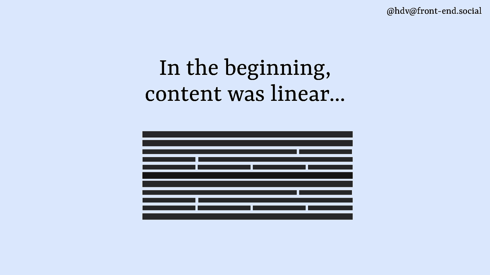
@hdv@front-end.social In the beginning, content was linear…
Slide 3

@hdv@front-end.social Today, it can overlap in all sorts of ways
Slide 4
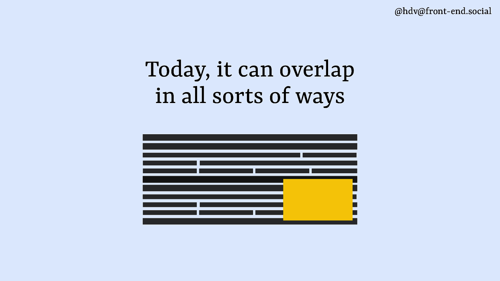
@hdv@front-end.social Today, it can overlap in all sorts of ways
Slide 5
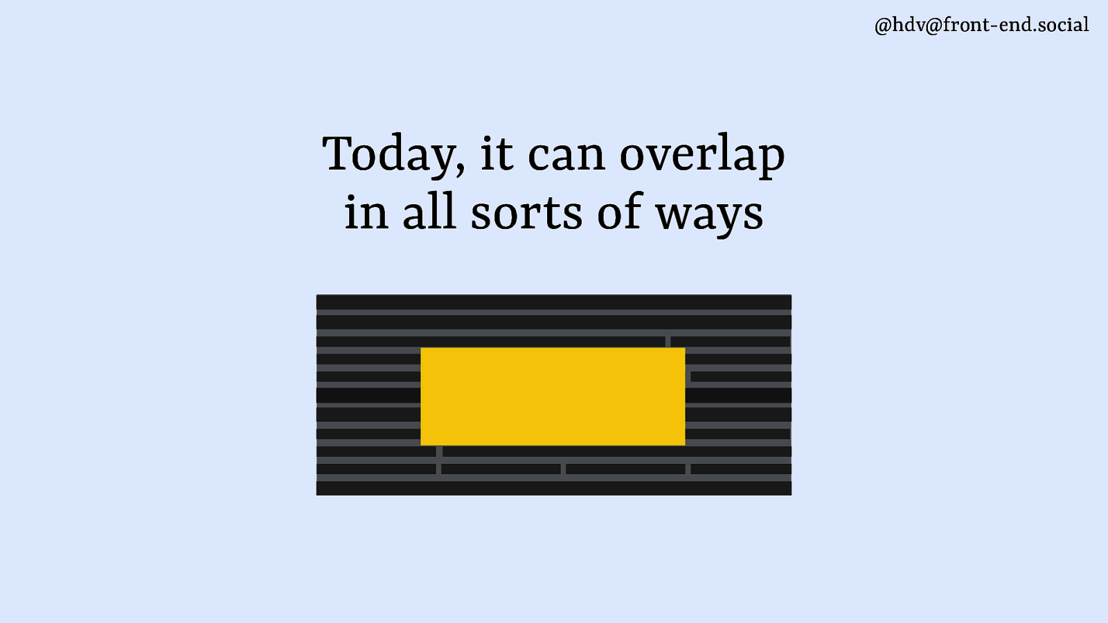
@hdv@front-end.social Today, it can overlap in all sorts of ways
Slide 6
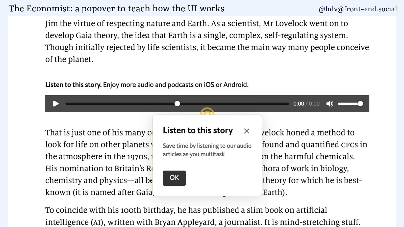
The Economist: a popover to teach how the UI works @hdv@front-end.social
Slide 7
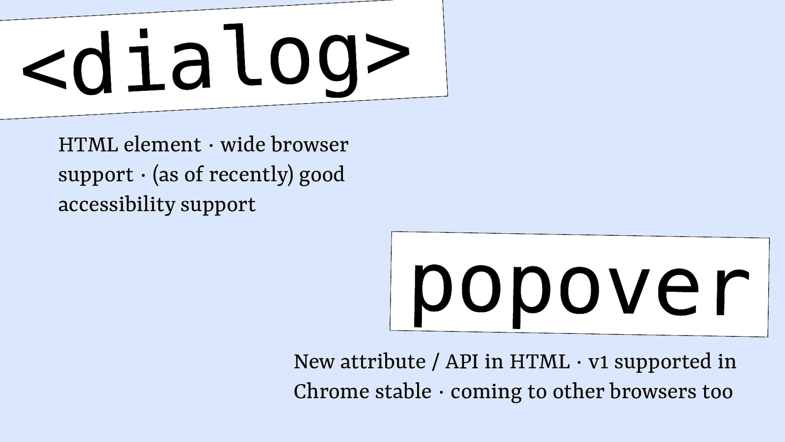
g o l a i <d HTML element ∙ wide browser support ∙ (as of recently) good accessibility support popover New attribute / API in HTML ∙ v1 supported in Chrome stable ∙ coming to other browsers too
Slide 8
Slide 9

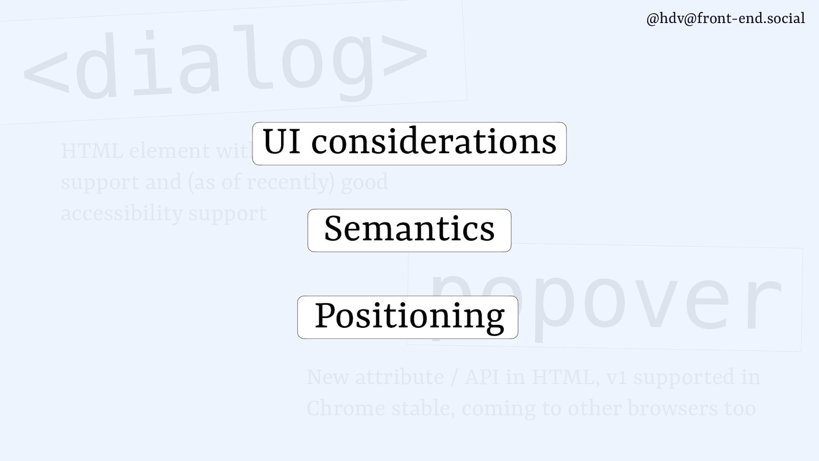
g o l a i <d @hdv@front-end.social UI considerations HTML element with wide browser support and (as of recently) good accessibility support Semantics popover Positioning New attribute / API in HTML, v1 supported in Chrome stable, coming to other browsers too
Slide 10
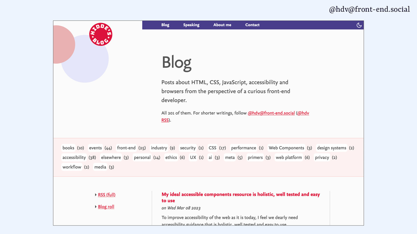
@hdv@front-end.social Hi, I’m Hidde developer relations + accessibility at NL Design System participant at Open UI CG hidde.blog LIKE & SUBSCRIBE
Slide 11
@hdv@front-end.social
Slide 12
@hdv@front-end.social music films concerts books …
Slide 13
@hdv@front-end.social hidde.blog words
Slide 14
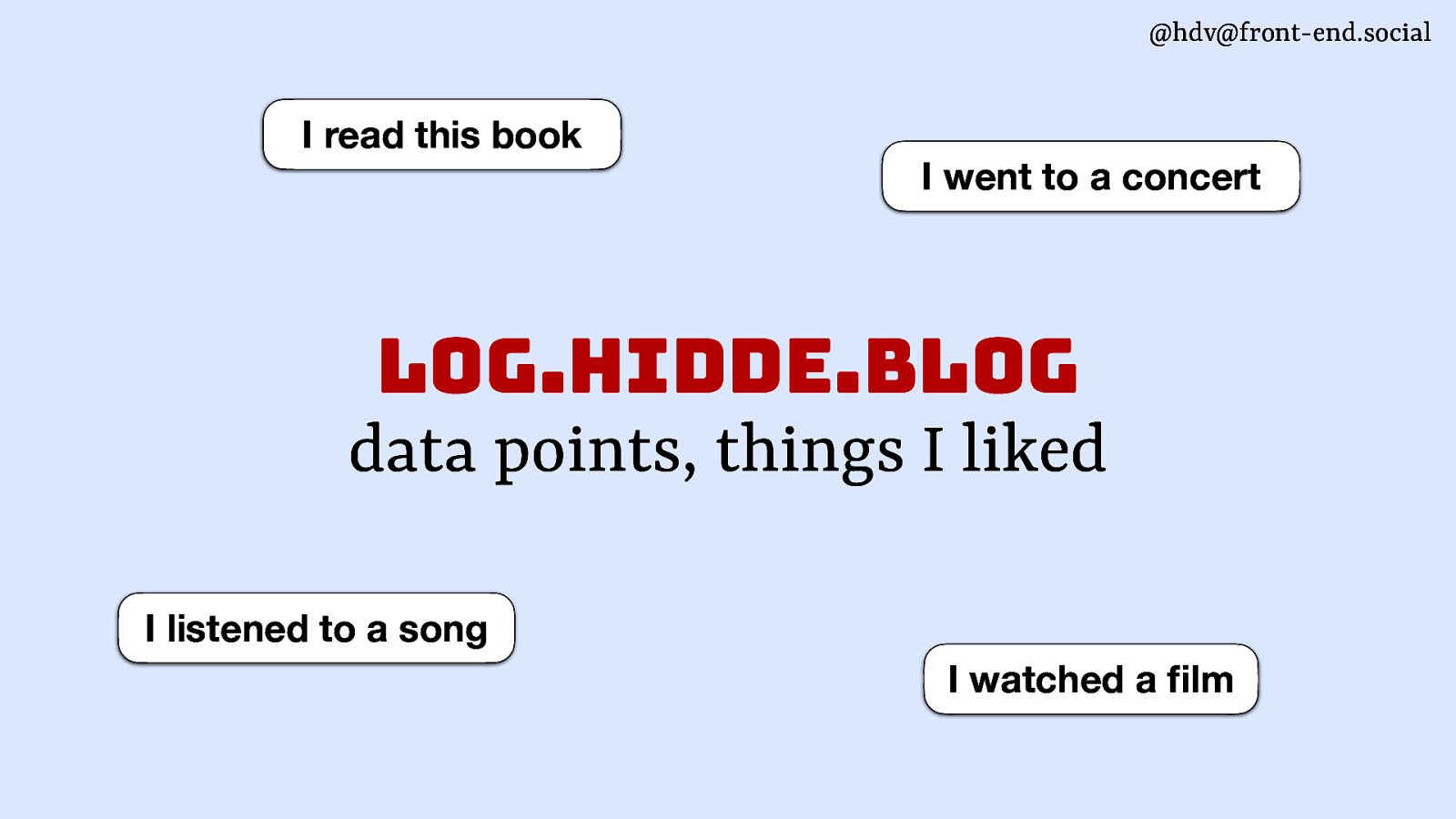
@hdv@front-end.social I read this book I went to a concert log.hidde.blog data points, things I liked I listened to a song fi I watched a lm
Slide 15
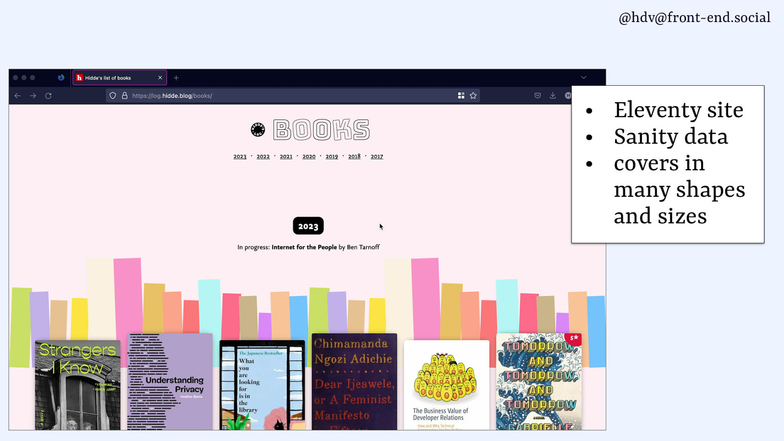
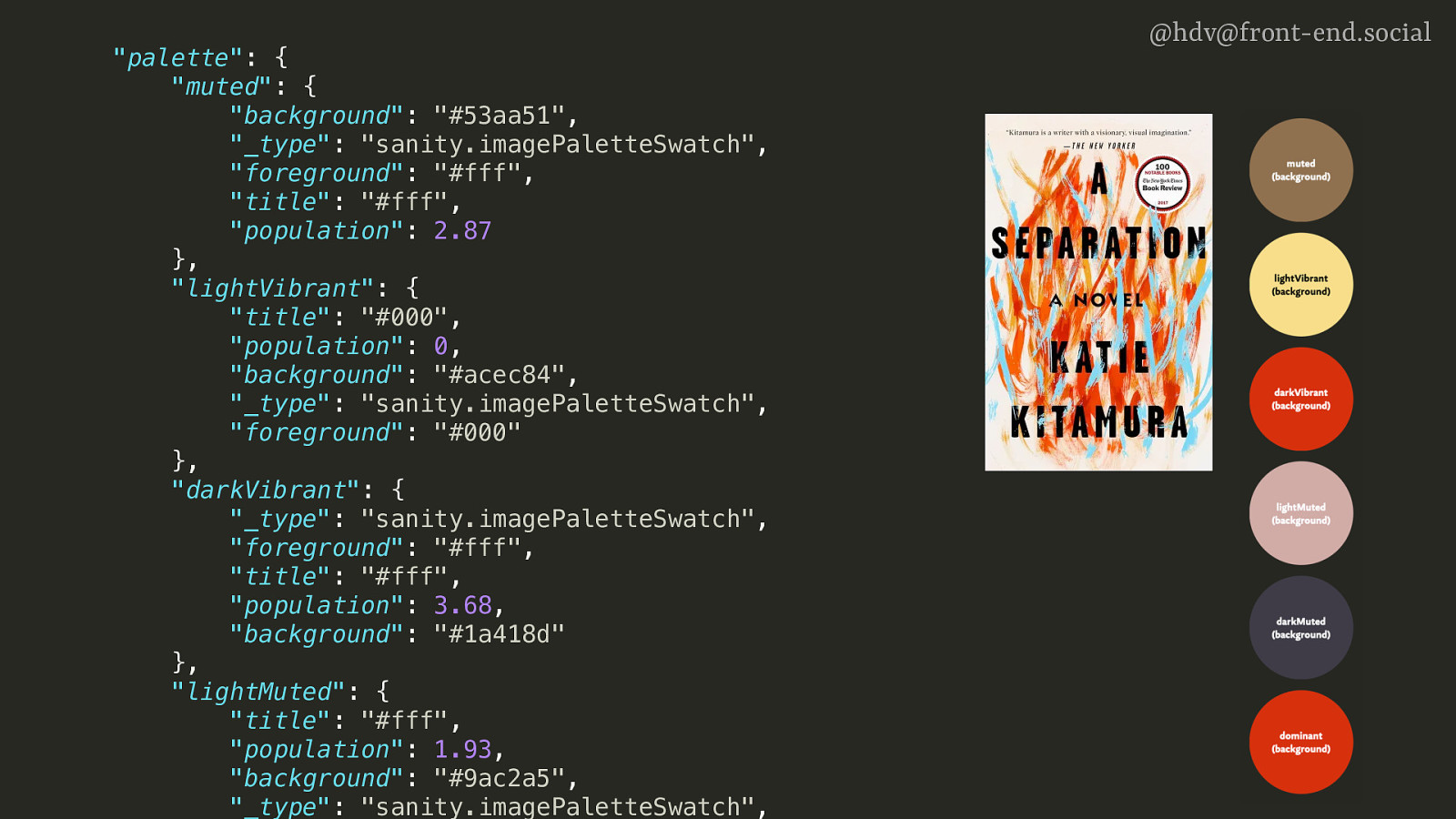
@hdv@front-end.social • • • Eleventy site Sanity data covers in many shapes and sizes
Slide 16
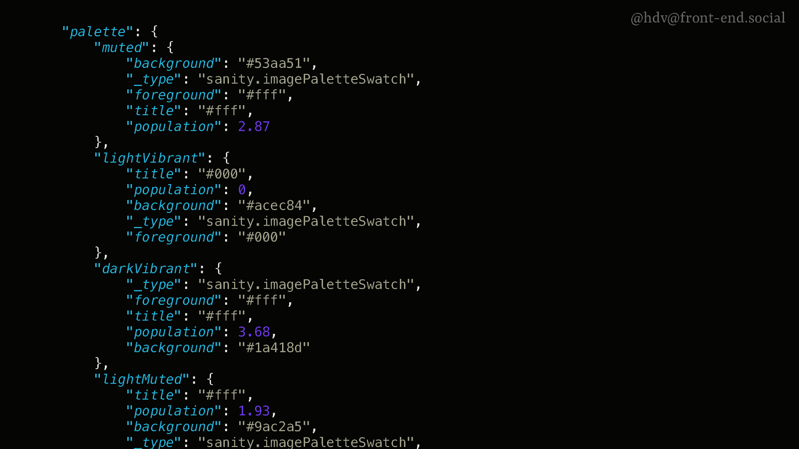
“palette”: { “muted”: { “background”: “#53aa51”, “_type”: “sanity.imagePaletteSwatch”, “foreground”: “#fff”, “title”: “#fff”, “population”: 2.87 }, “lightVibrant”: { “title”: “#000”, “population”: 0, “background”: “#acec84”, “_type”: “sanity.imagePaletteSwatch”, “foreground”: “#000” }, “darkVibrant”: { “_type”: “sanity.imagePaletteSwatch”, “foreground”: “#fff”, “title”: “#fff”, “population”: 3.68, “background”: “#1a418d” }, “lightMuted”: { “title”: “#fff”, “population”: 1.93, “background”: “#9ac2a5”, “_type”: “sanity.imagePaletteSwatch”, @hdv@front-end.social
Slide 17
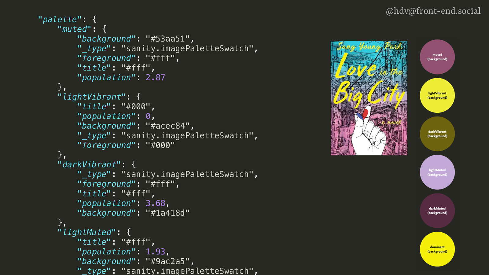
“palette”: { “muted”: { “background”: “#53aa51”, “_type”: “sanity.imagePaletteSwatch”, “foreground”: “#fff”, “title”: “#fff”, “population”: 2.87 }, “lightVibrant”: { “title”: “#000”, “population”: 0, “background”: “#acec84”, “_type”: “sanity.imagePaletteSwatch”, “foreground”: “#000” }, “darkVibrant”: { “_type”: “sanity.imagePaletteSwatch”, “foreground”: “#fff”, “title”: “#fff”, “population”: 3.68, “background”: “#1a418d” }, “lightMuted”: { “title”: “#fff”, “population”: 1.93, “background”: “#9ac2a5”, “_type”: “sanity.imagePaletteSwatch”, @hdv@front-end.social
Slide 18
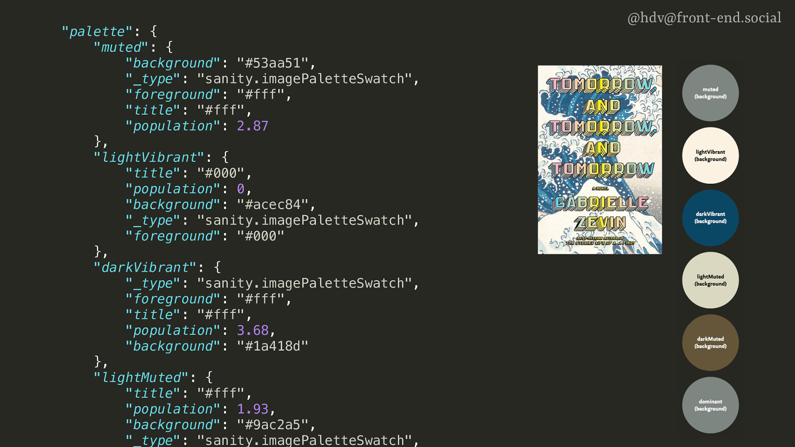
“palette”: { “muted”: { “background”: “#53aa51”, “_type”: “sanity.imagePaletteSwatch”, “foreground”: “#fff”, “title”: “#fff”, “population”: 2.87 }, “lightVibrant”: { “title”: “#000”, “population”: 0, “background”: “#acec84”, “_type”: “sanity.imagePaletteSwatch”, “foreground”: “#000” }, “darkVibrant”: { “_type”: “sanity.imagePaletteSwatch”, “foreground”: “#fff”, “title”: “#fff”, “population”: 3.68, “background”: “#1a418d” }, “lightMuted”: { “title”: “#fff”, “population”: 1.93, “background”: “#9ac2a5”, “_type”: “sanity.imagePaletteSwatch”, @hdv@front-end.social
Slide 19
“palette”: { “muted”: { “background”: “#53aa51”, “_type”: “sanity.imagePaletteSwatch”, “foreground”: “#fff”, “title”: “#fff”, “population”: 2.87 }, “lightVibrant”: { “title”: “#000”, “population”: 0, “background”: “#acec84”, “_type”: “sanity.imagePaletteSwatch”, “foreground”: “#000” }, “darkVibrant”: { “_type”: “sanity.imagePaletteSwatch”, “foreground”: “#fff”, “title”: “#fff”, “population”: 3.68, “background”: “#1a418d” }, “lightMuted”: { “title”: “#fff”, “population”: 1.93, “background”: “#9ac2a5”, “_type”: “sanity.imagePaletteSwatch”, @hdv@front-end.social
Slide 20
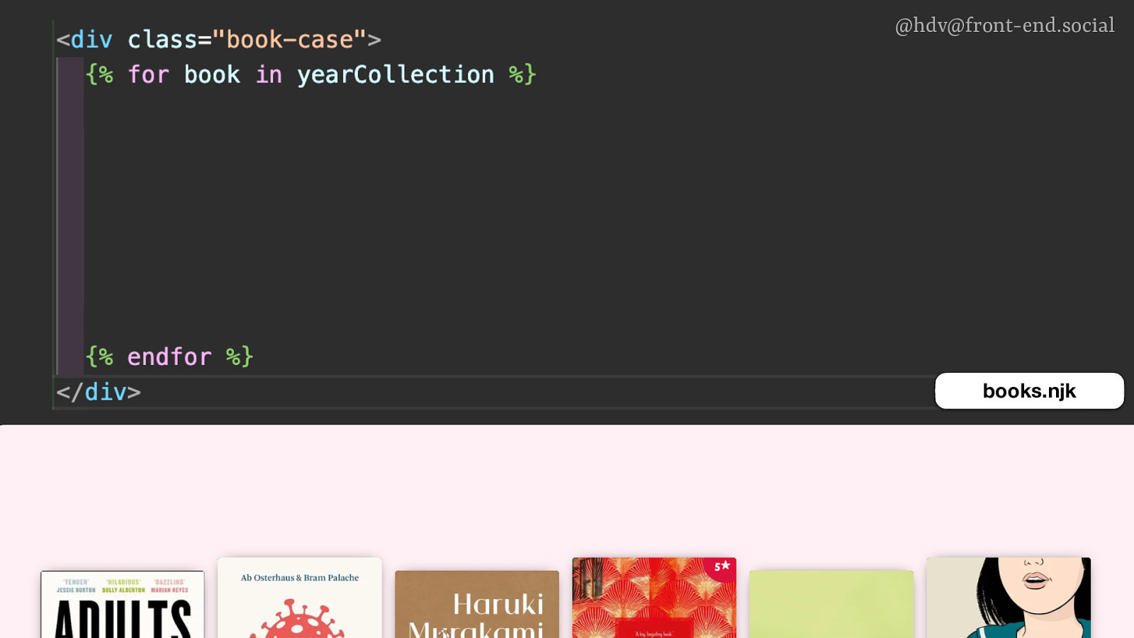
@hdv@front-end.social books.njk
Slide 21
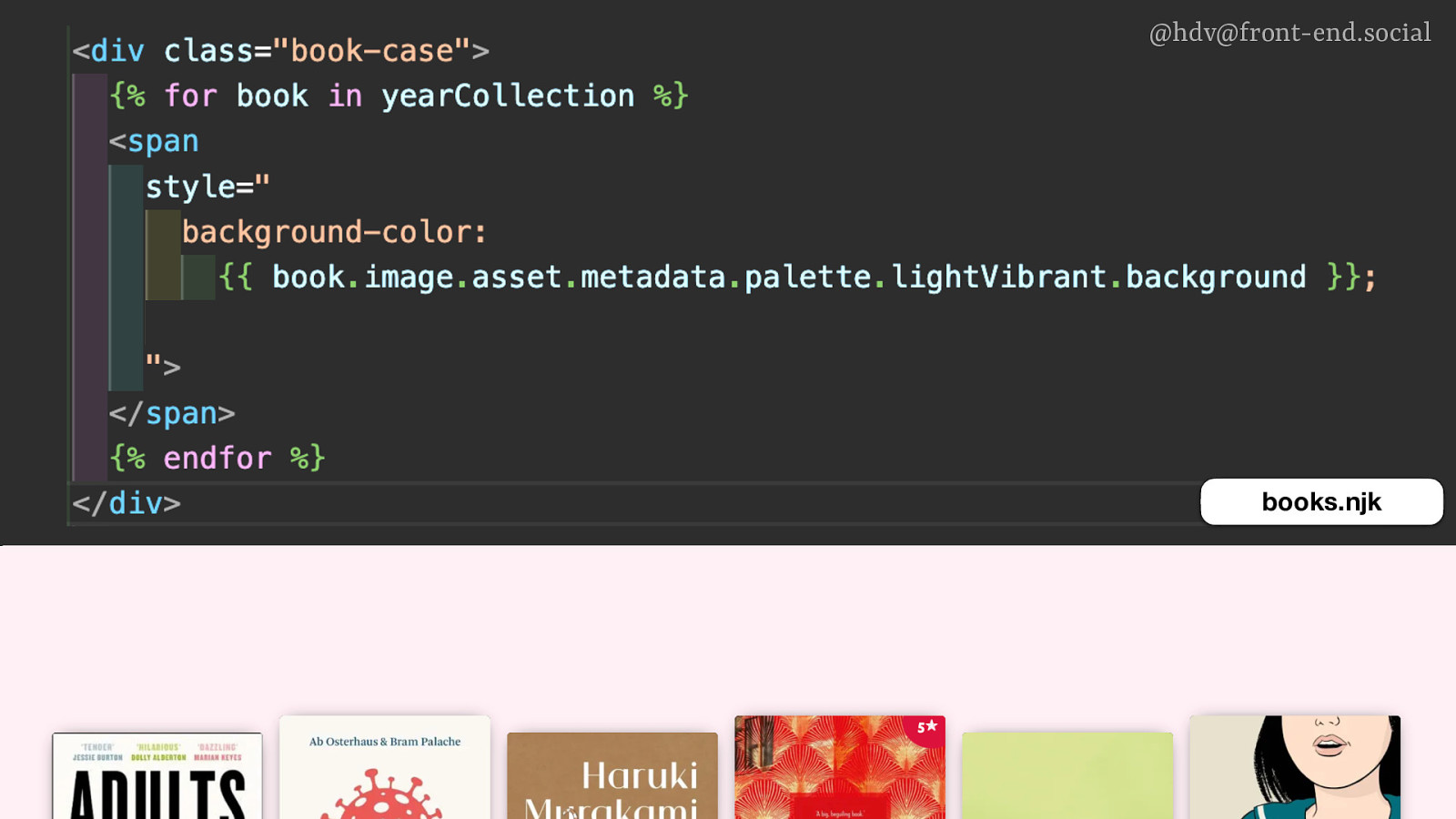
@hdv@front-end.social books.njk
Slide 22
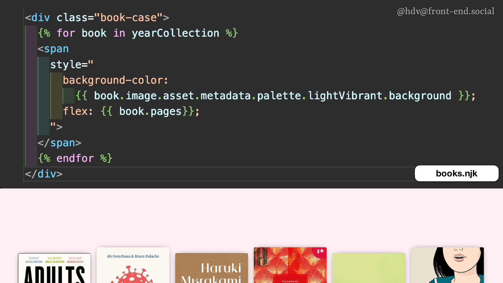
@hdv@front-end.social books.njk
Slide 23
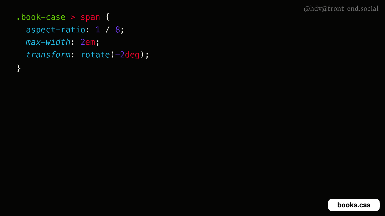
.book-case > span { @hdv@front-end.social aspect-ratio: 1 / 8; max-width: 2em; transform: rotate(-2deg); } books.css
Slide 24

.book-case > span { @hdv@front-end.social aspect-ratio: 1 / 8; max-width: 2em; transform: rotate(-2deg); } books.css
Slide 25
@hdv@front-end.social
Slide 26
@hdv@front-end.social dialogs vs popovers
Slide 27
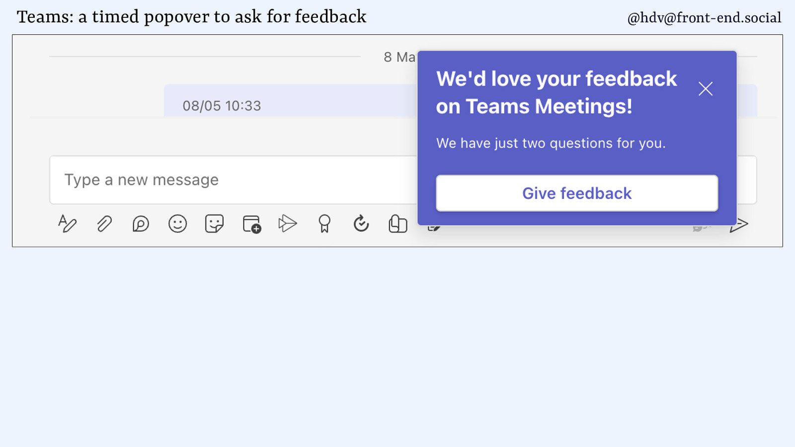
Teams: a timed popover to ask for feedback @hdv@front-end.social
Slide 28
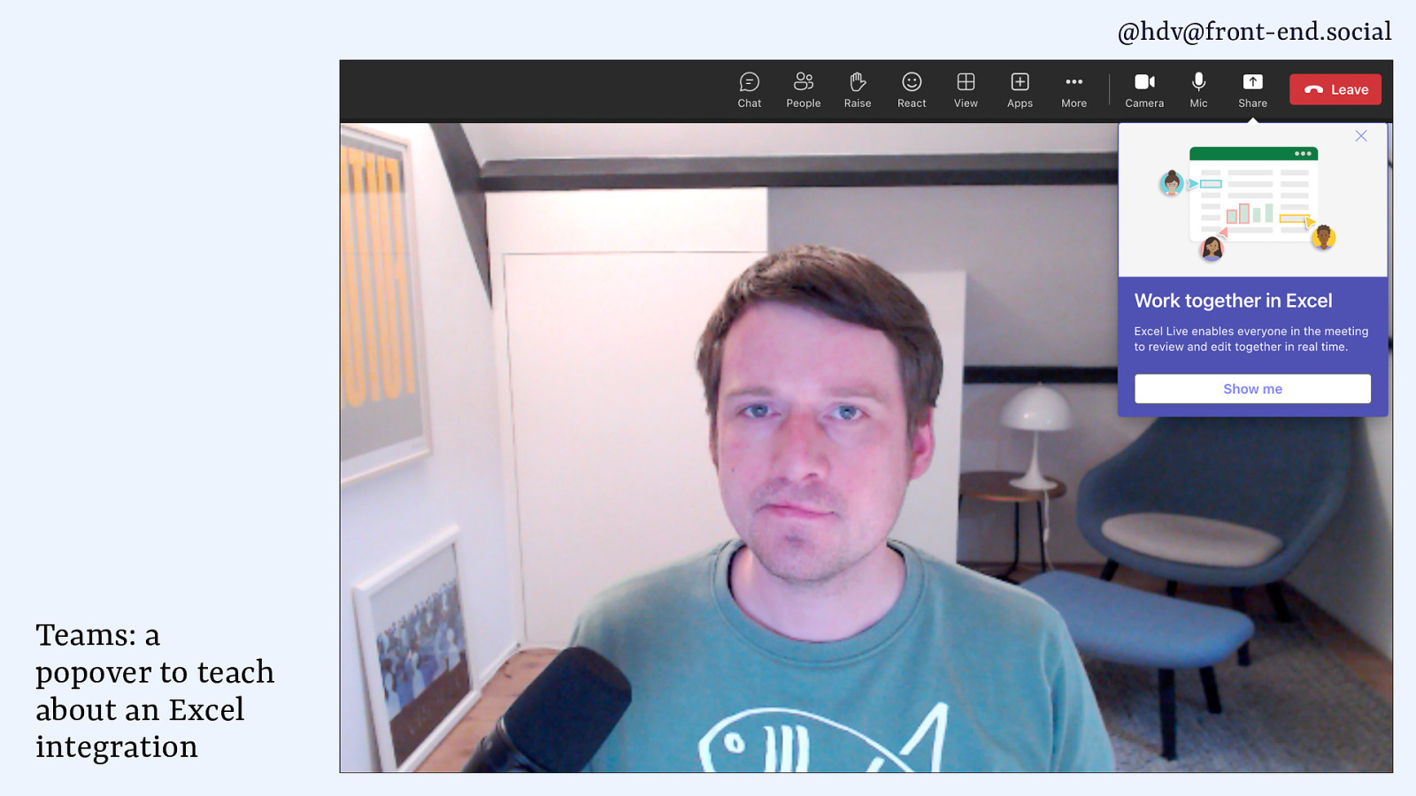
@hdv@front-end.social Teams: a popover to teach about an Excel integration
Slide 29
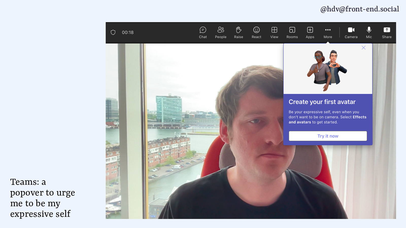
@hdv@front-end.social Teams: a popover to urge me to be my expressive self
Slide 30
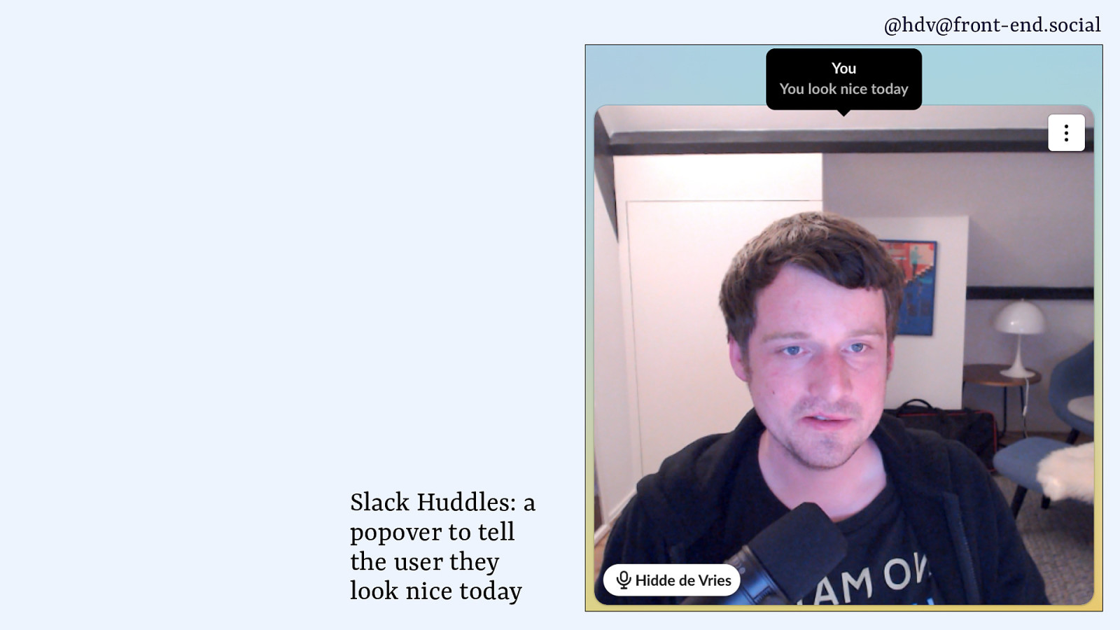
@hdv@front-end.social Slack Huddles: a popover to tell the user they look nice today
Slide 31
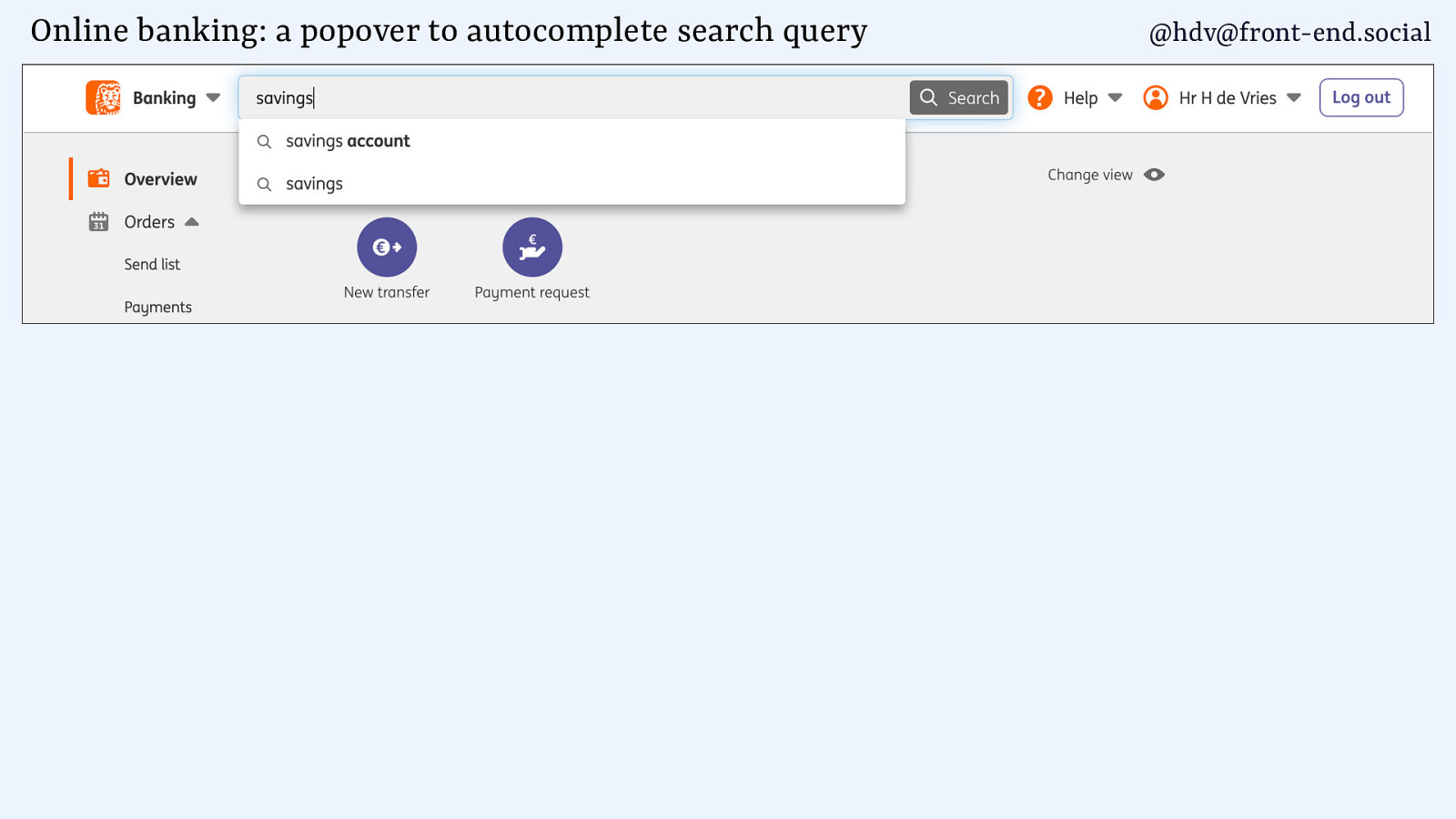
Online banking: a popover to autocomplete search query @hdv@front-end.social
Slide 32
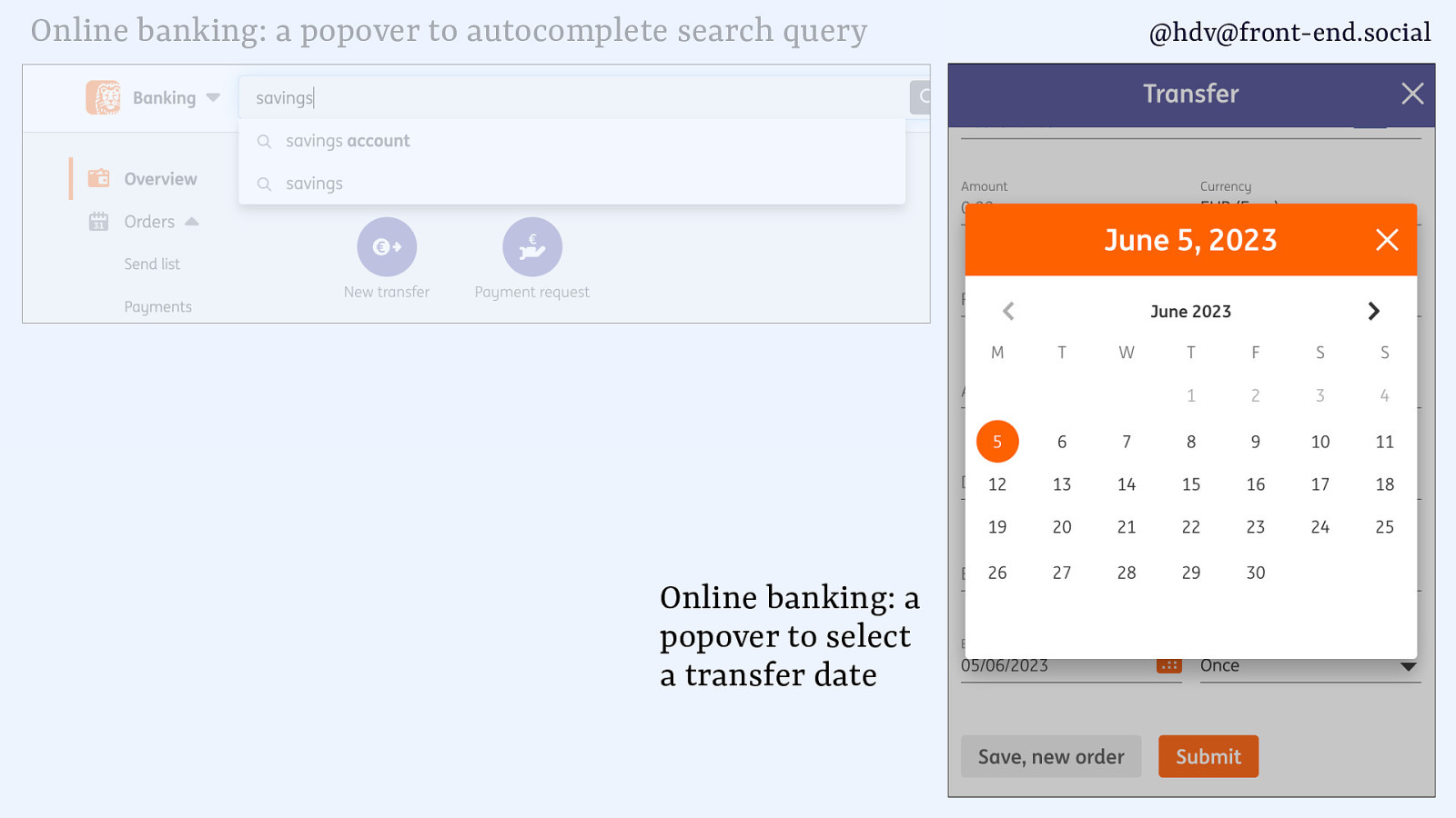
Online banking: a popover to autocomplete search query Online banking: a popover to select a transfer date @hdv@front-end.social
Slide 33
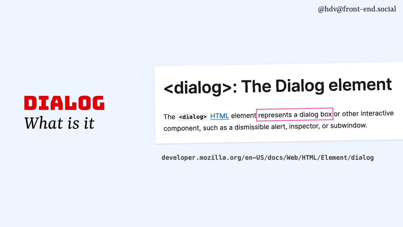
@hdv@front-end.social dialog What is it developer.mozilla.org/en-US/docs/Web/HTML/Element/dialog
Slide 34
@hdv@front-end.social dialog What is it Additional window to your main window. a.k.a. “descendant window” or “subwindow”
Slide 35
@hdv@front-end.social dialog What is it Usually contains an action or task for the user, sometimes has critical information
Slide 36
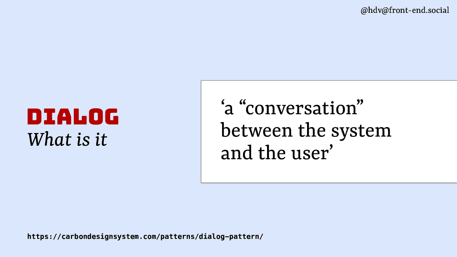
@hdv@front-end.social dialog What is it ‘a “conversation” between the system and the user’ https://carbondesignsystem.com/patterns/dialog-pattern/
Slide 37

@hdv@front-end.social
fi fi dialog What is it (typically) Do you want to continue, yes or no If you want to open a new le, what shall we do with your current le? How do you want to crop this image, where is the hot spot?
Slide 38
@hdv@front-end.social
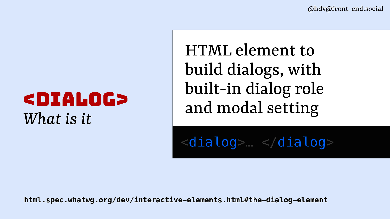
<dialog> What is it HTML element to build dialogs, with built-in dialog role and modal setting <dialog>… </dialog> html.spec.whatwg.org/dev/interactive-elements.html#the-dialog-elementSlide 39
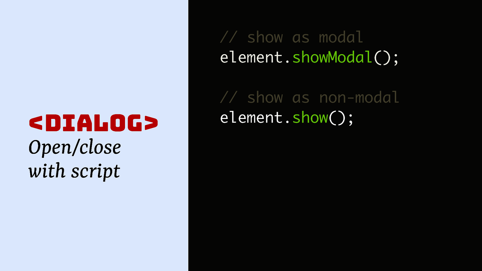
@hdv@front-end.social // show as modal element.showModal();
<dialog> Open/close with script // show as non-modal element.show();Slide 40

@hdv@front-end.social // dialog element <dialog>…</dialog> comes with role, modal setting, closeon-Esc etc
Slide 41
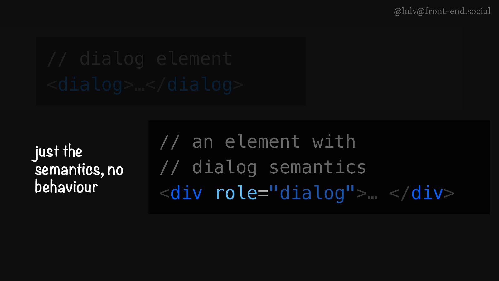
@hdv@front-end.social // dialog element <dialog>…</dialog> just the semantics, no behaviour comes with semantics, top layer, inertness, close-on-Esc etc // an element with // dialog semantics <div role=”dialog”>… </div>
Slide 42
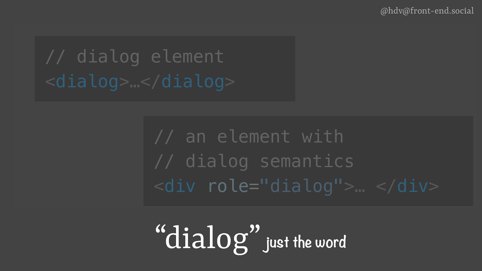
@hdv@front-end.social // dialog element <dialog>…</dialog> just the semantics, no behaviour comes with semantics, top layer, inertness, close-on-Esc etc // an element with // dialog semantics <div role=”dialog”>… </div> “dialog” just the word
Slide 43
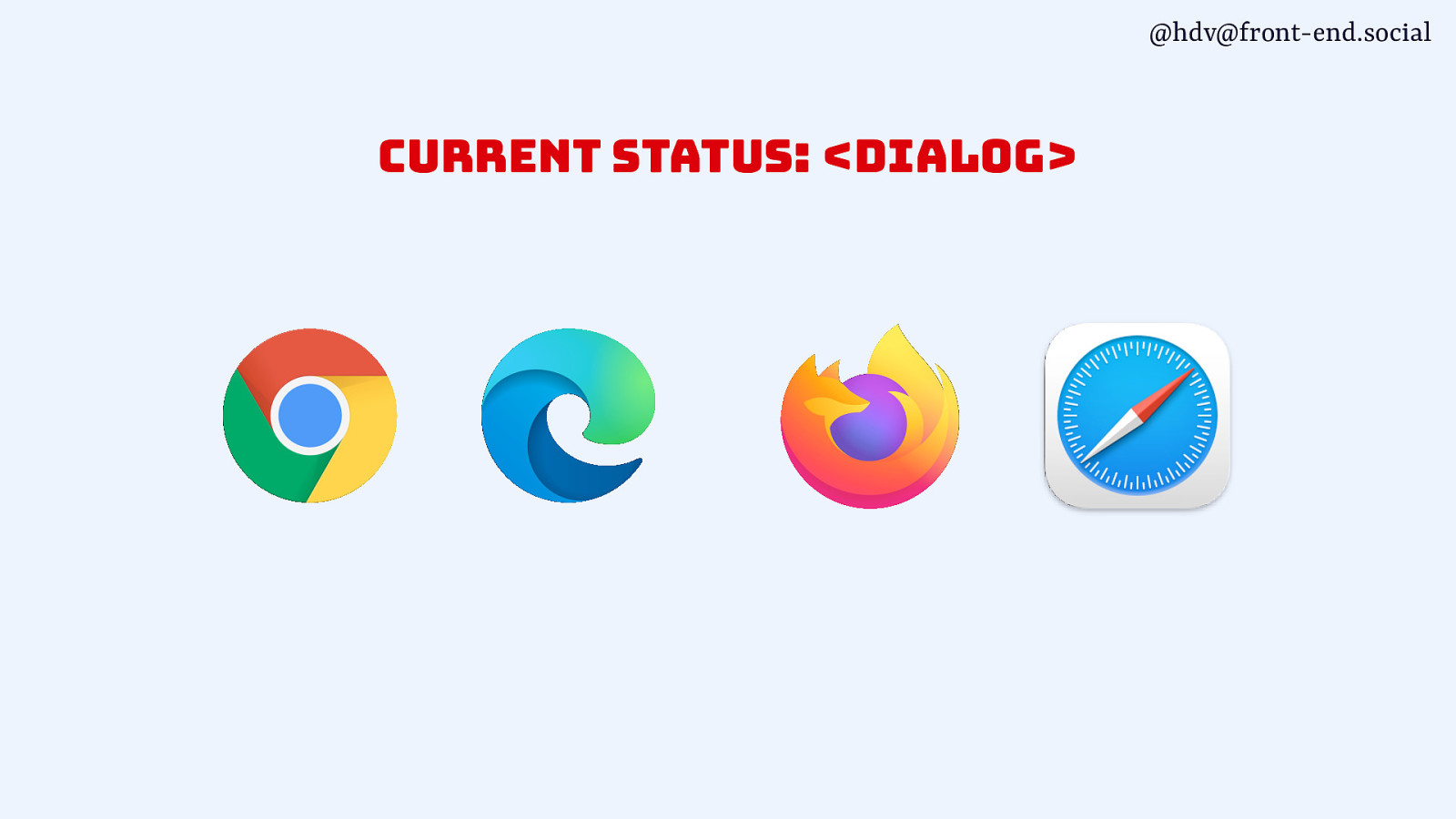
@hdv@front-end.social current status: <dialog>
Slide 44
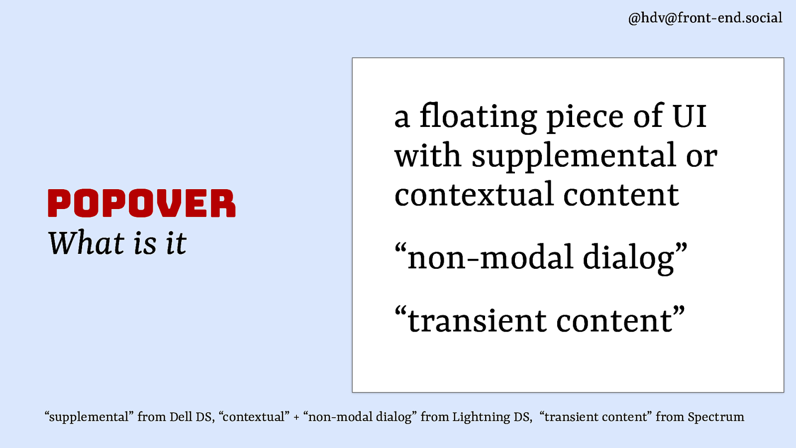
@hdv@front-end.social popover What is it a loating piece of UI with supplemental or contextual content “non-modal dialog” “transient content” f “supplemental” from Dell DS, “contextual” + “non-modal dialog” from Lightning DS, “transient content” from Spectrum
Slide 45
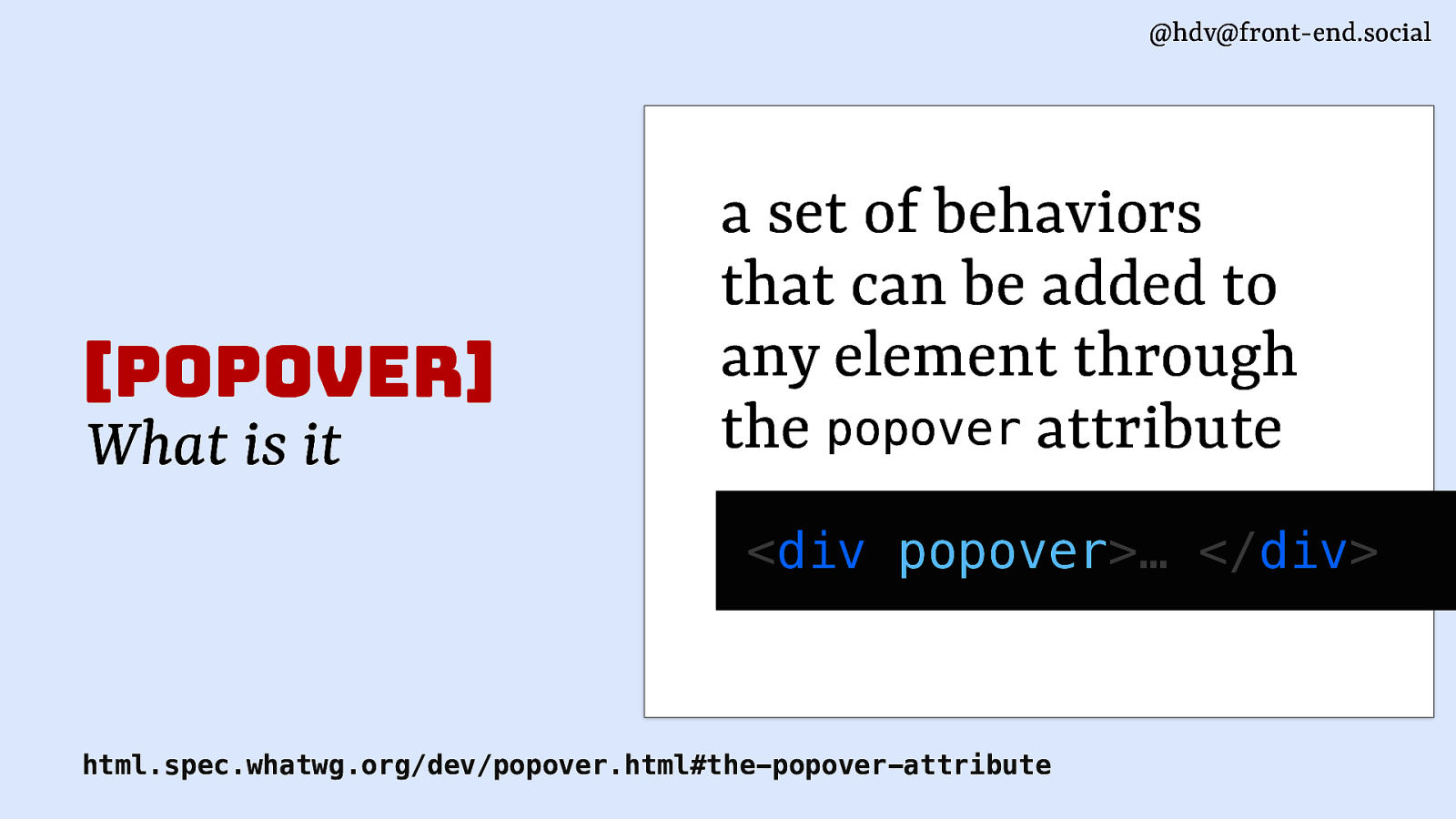
@hdv@front-end.social [popover] What is it a set of behaviors that can be added to any element through the popover attribute <div popover>… </div> html.spec.whatwg.org/dev/popover.html#the-popover-attribute
Slide 46

@hdv@front-end.social [popover] Use cases <select>’s listbox content pickers form element suggestions action menus teaching UI
Slide 47
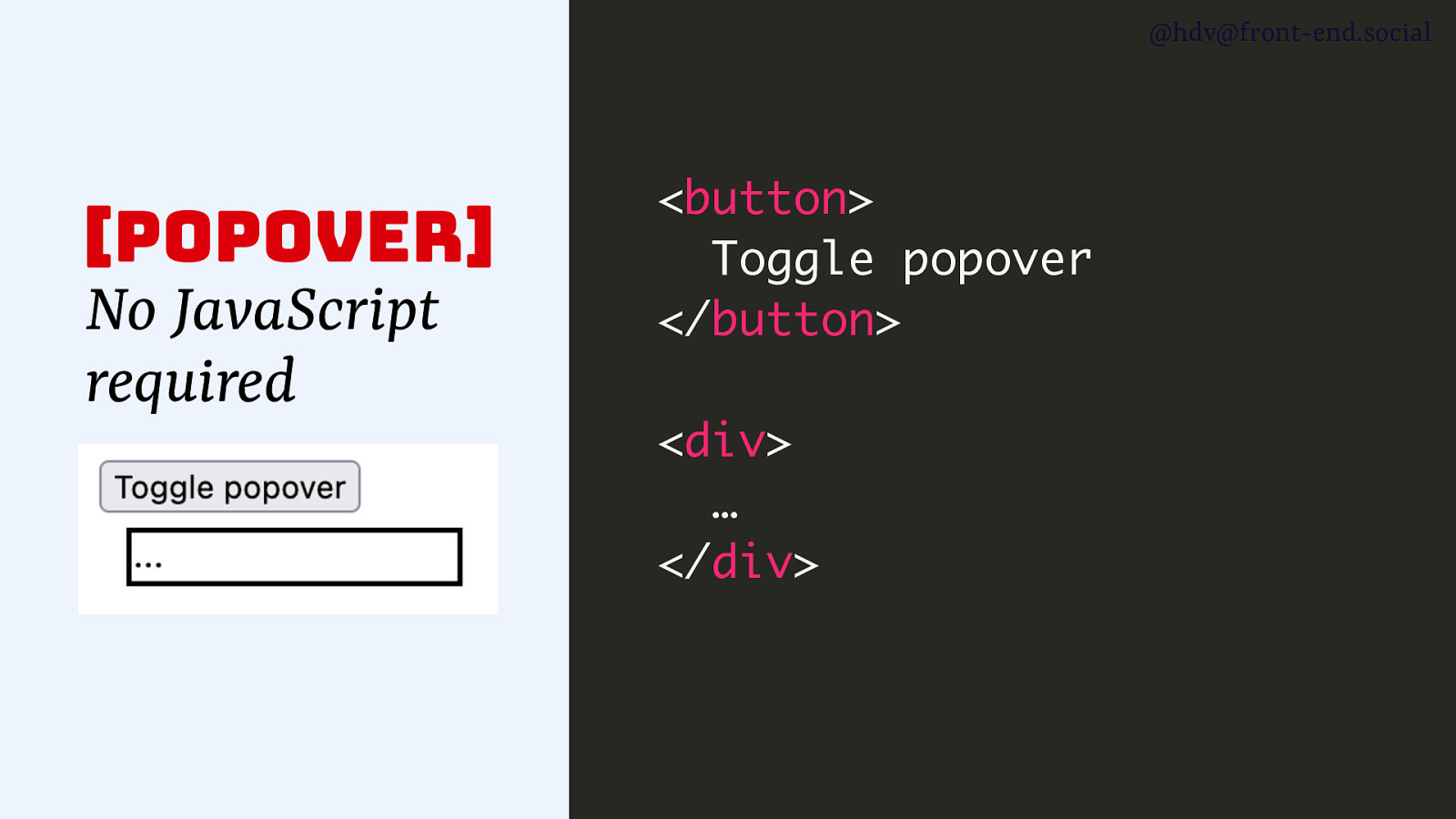
@hdv@front-end.social [popover] No JavaScript required <button> Toggle popover </button> <div> … </div>
Slide 48
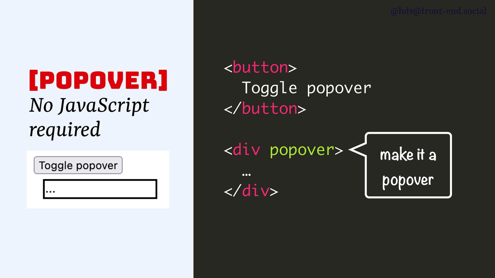
@hdv@front-end.social [popover] No JavaScript required <button> Toggle popover </button> <div popover> … </div> make it a popover
Slide 49
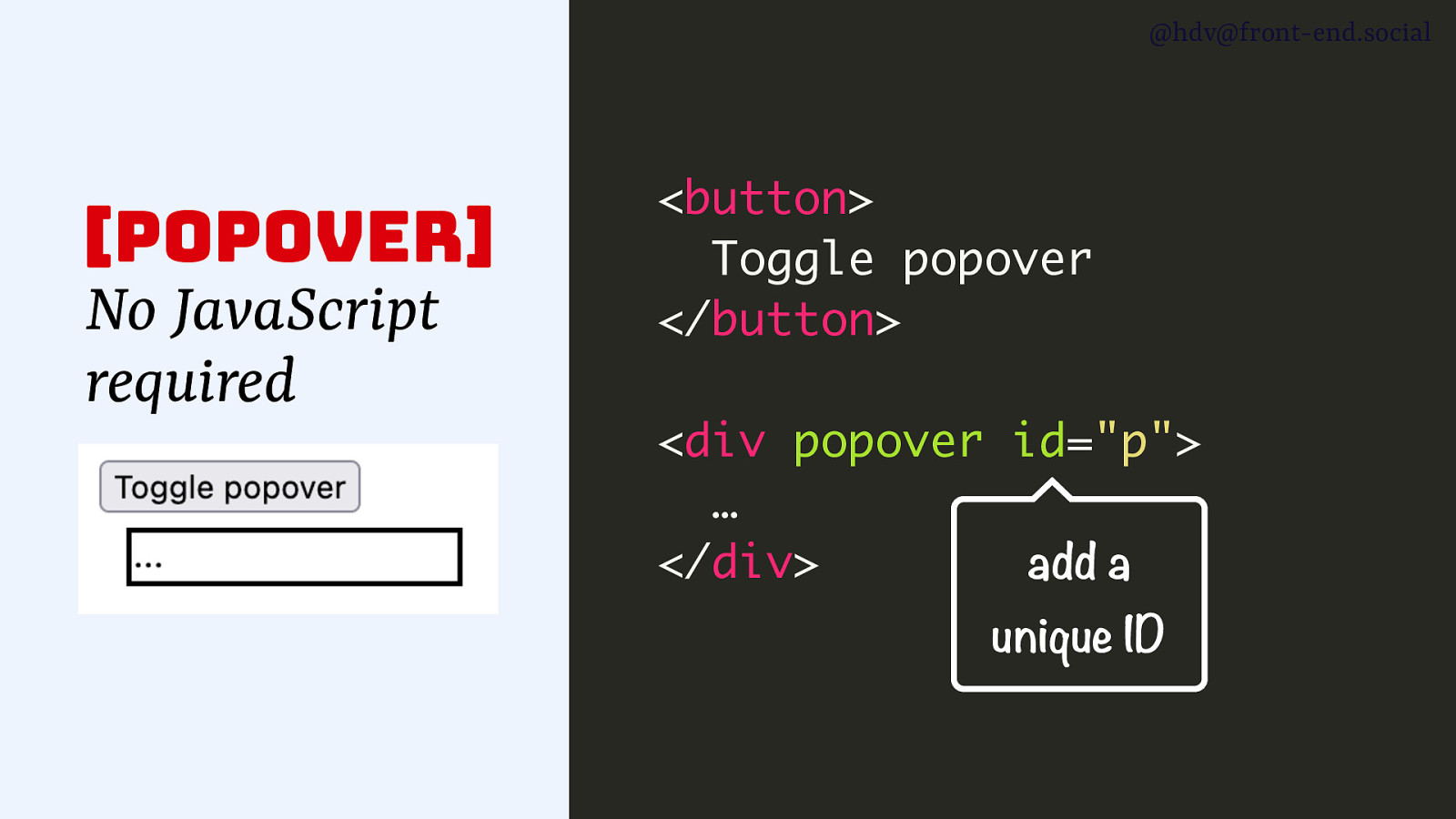
@hdv@front-end.social [popover] No JavaScript required <button> Toggle popover </button> <div popover id=”p”> … </div> add a unique ID
Slide 50
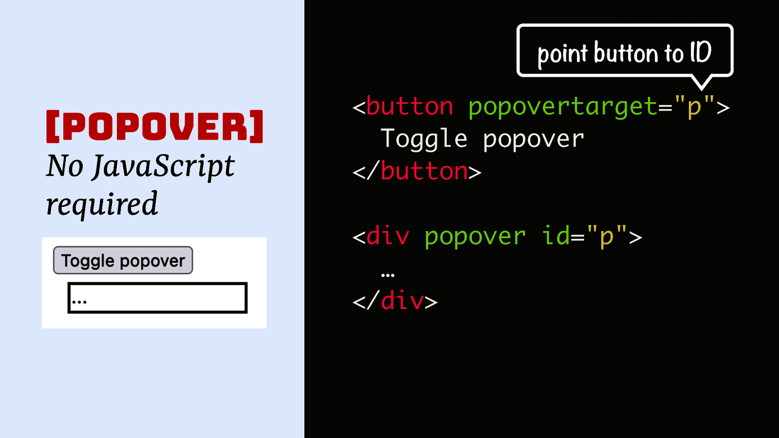
@hdv@front-end.social point button to ID [popover] No JavaScript required <button popovertarget=”p”> Toggle popover </button> <div popover id=”p”> … </div>
Slide 51

@hdv@front-end.social do we want this for dialog too? github.com/whatwg/html/issues/3567
Slide 52
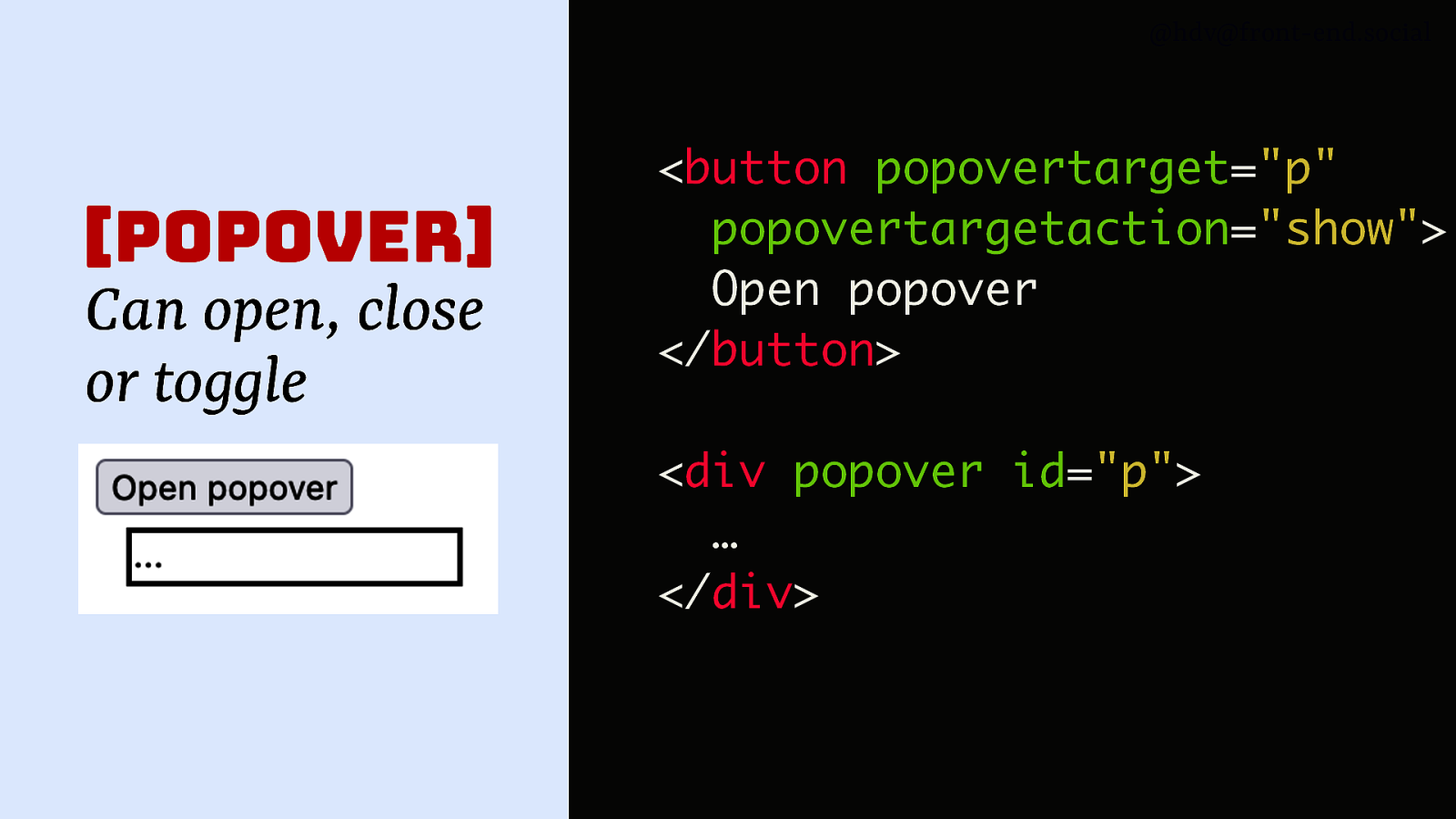
@hdv@front-end.social [popover] Can open, close or toggle <button popovertarget=”p” popovertargetaction=”show”> Open popover </button> <div popover id=”p”> … </div>
Slide 53
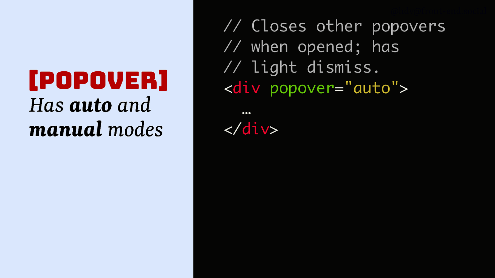
@hdv@front-end.social [popover] Has auto and manual modes // Closes other popovers // when opened; has // light dismiss. <div popover=”auto”> … </div>
Slide 54
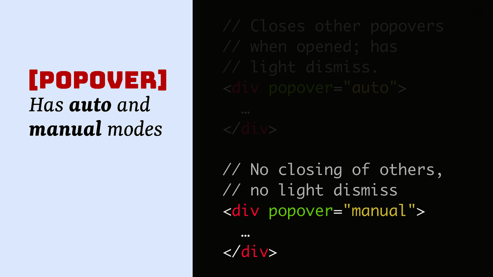
@hdv@front-end.social [popover] Has auto and manual modes // Closes other popovers // when opened; has // light dismiss. <div popover=”auto”> … </div> // No closing of others, // no light dismiss <div popover=”manual”> … </div>
Slide 55
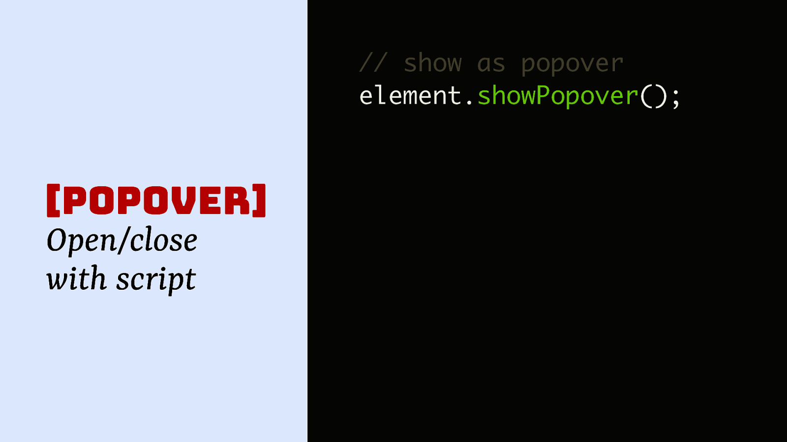
@hdv@front-end.social // show as popover element.showPopover(); [popover] Open/close with script
Slide 56
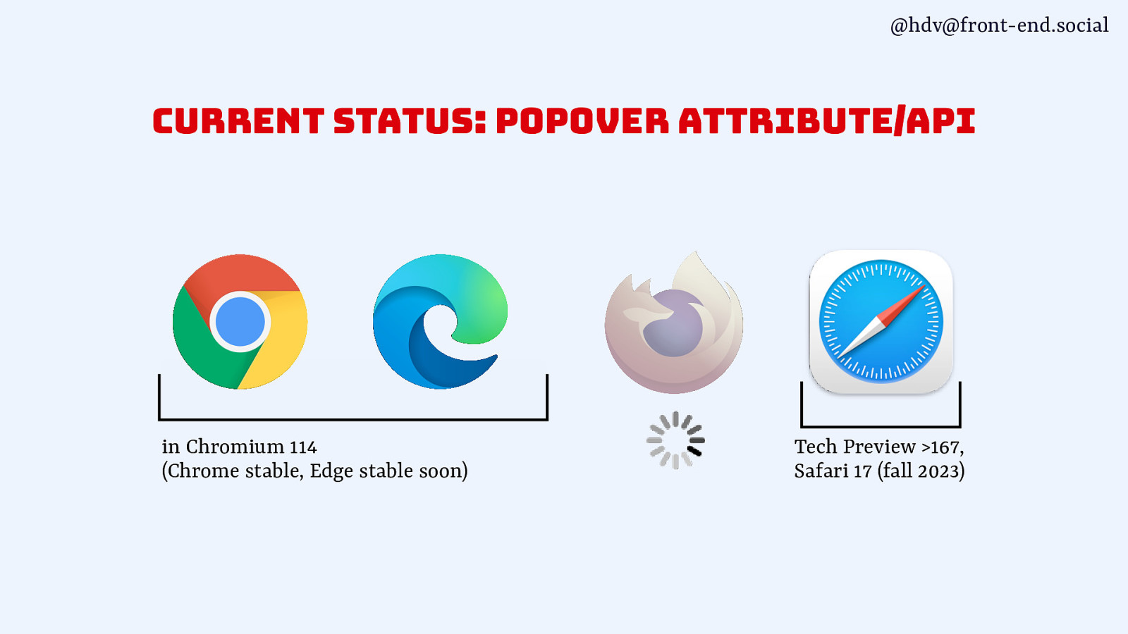
@hdv@front-end.social current status: popover attribute/api in Chromium 114 (Chrome stable, Edge stable soon) Tech Preview >167, Safari 17 (fall 2023)
Slide 57
@hdv@front-end.social 🤔 How are these patterns different?
Slide 58
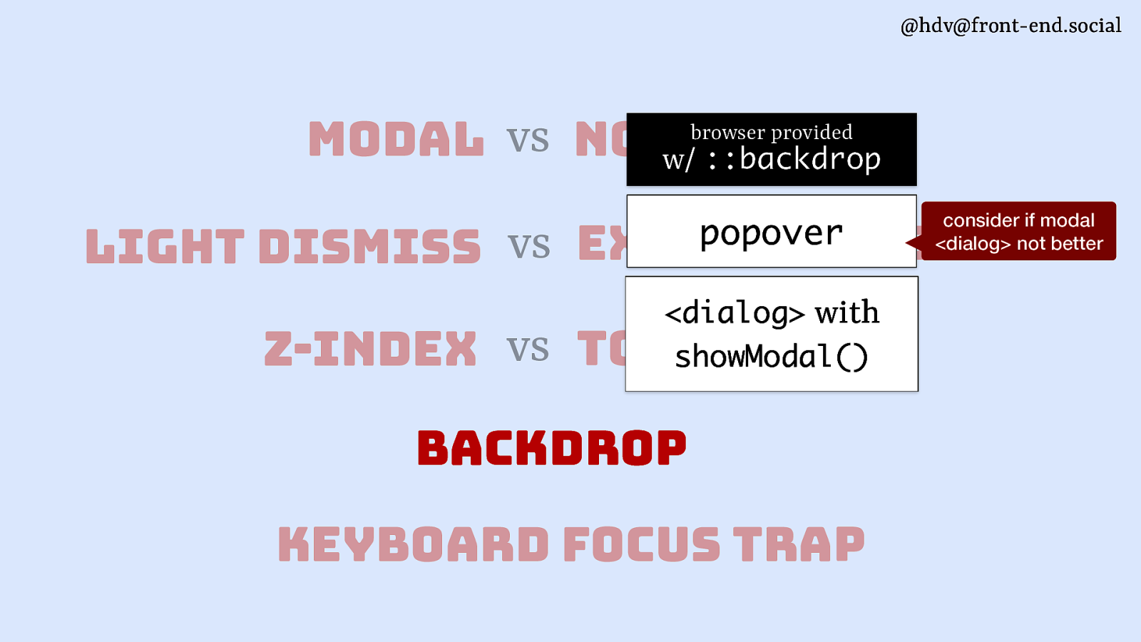
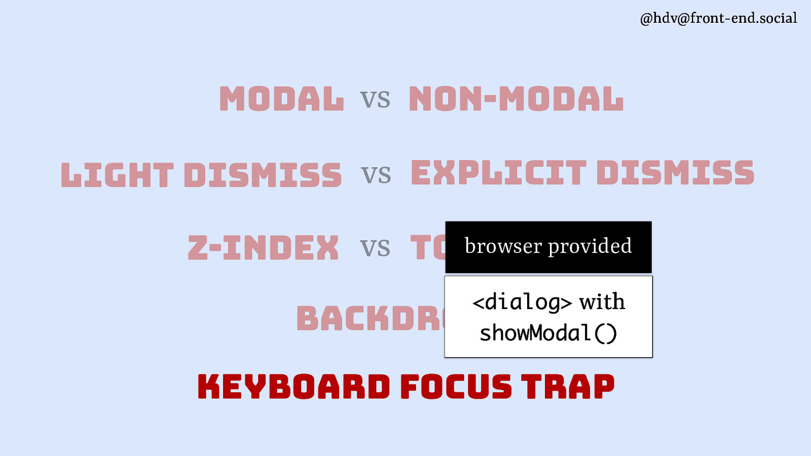
@hdv@front-end.social modal vs non-modal
Slide 59
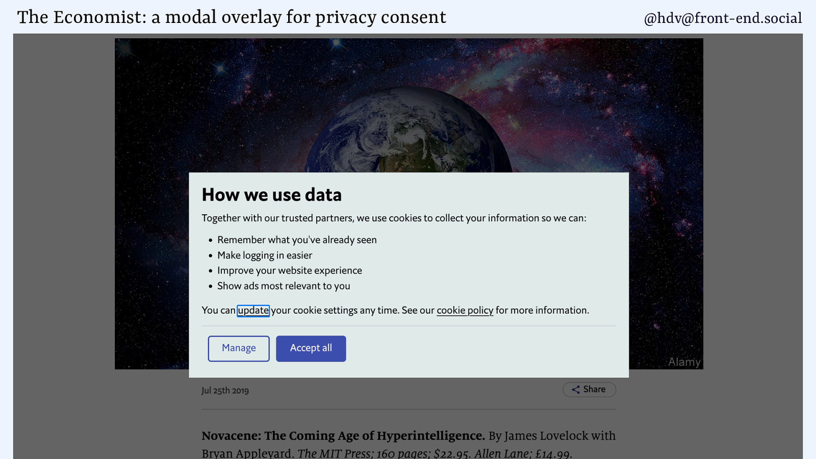
The Economist: a modal overlay for privacy consent @hdv@front-end.social
Slide 60
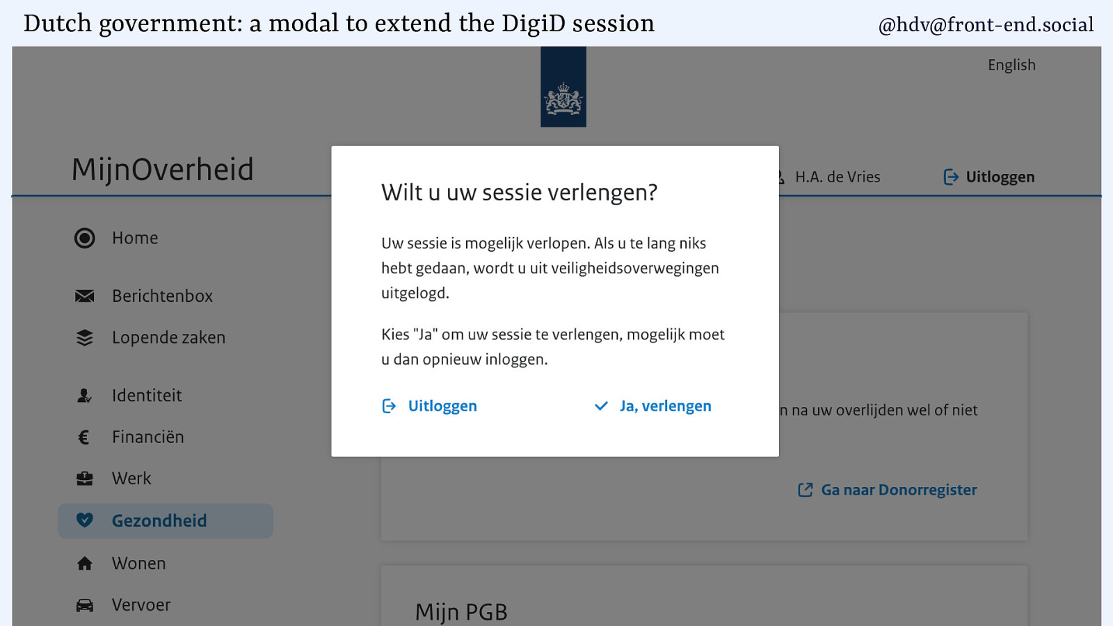
Dutch government: a modal to extend the DigiD session @hdv@front-end.social
Slide 61
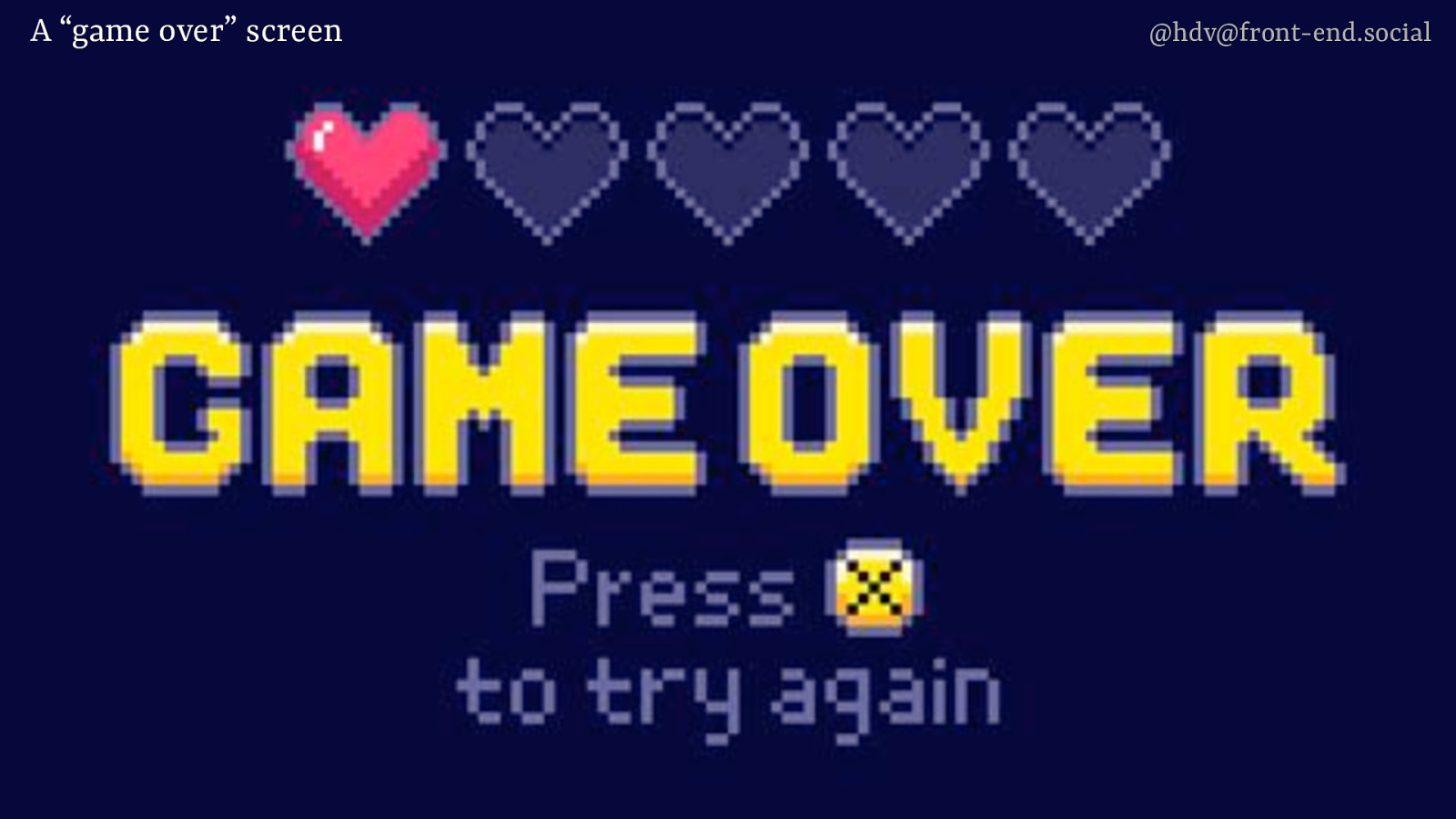
A “game over” screen @hdv@front-end.social
Slide 62
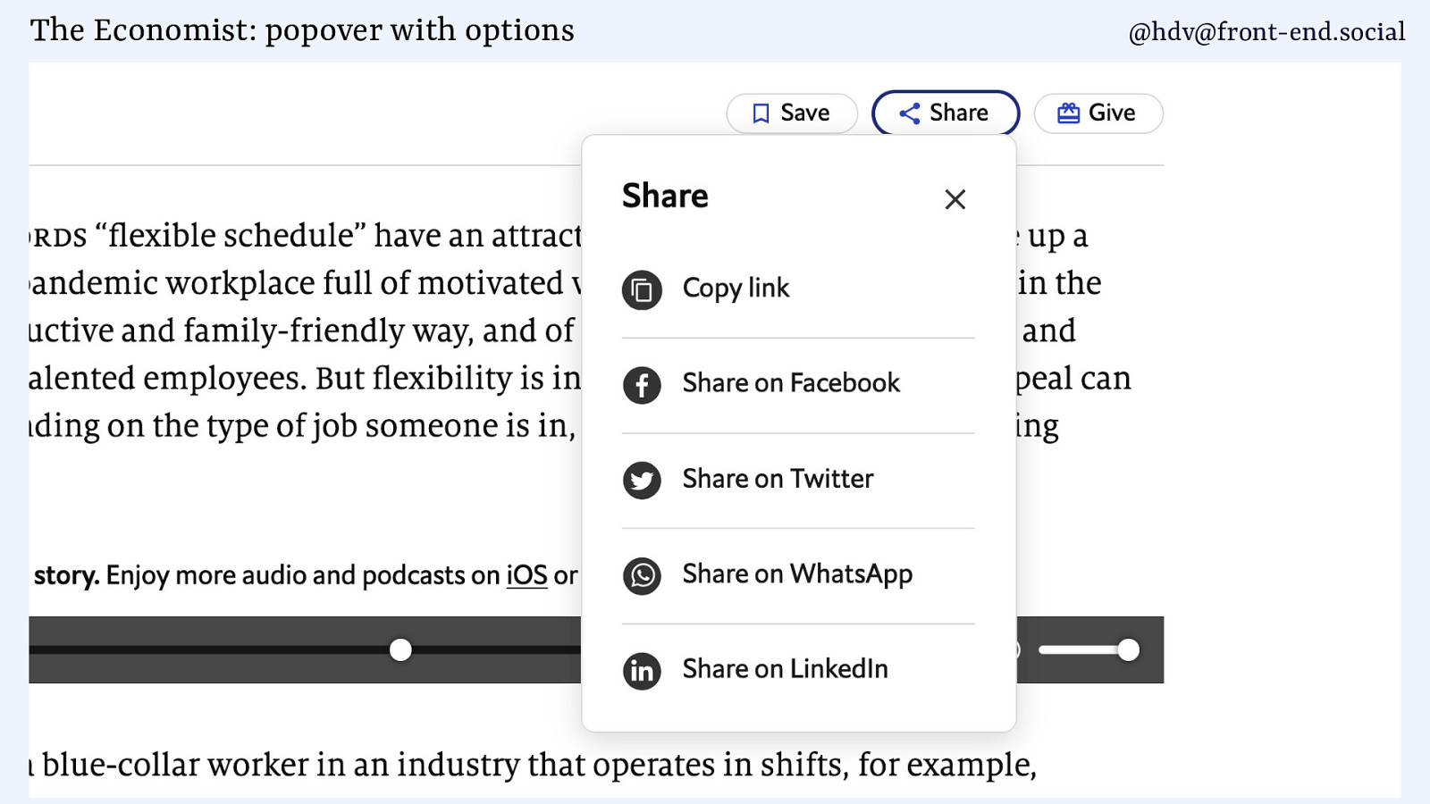
The Economist: popover with options @hdv@front-end.social
Slide 63
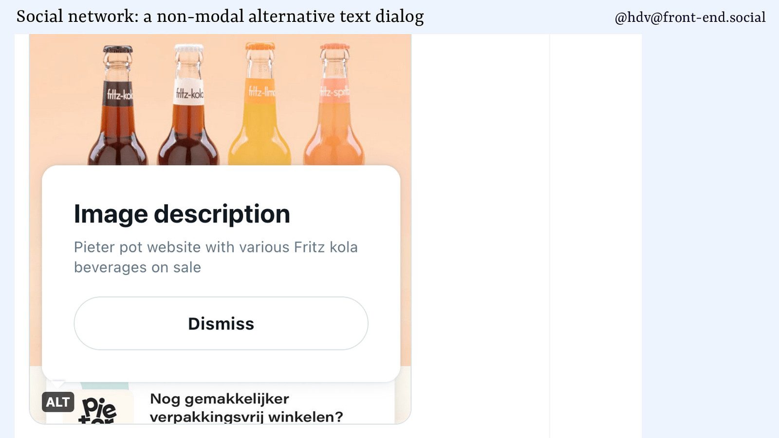
Social network: a non-modal alternative text dialog @hdv@front-end.social
Slide 64
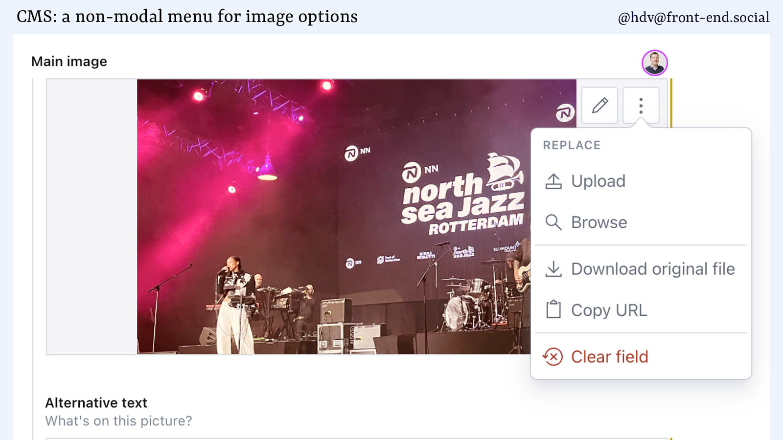
CMS: a non-modal menu for image options @hdv@front-end.social
Slide 65
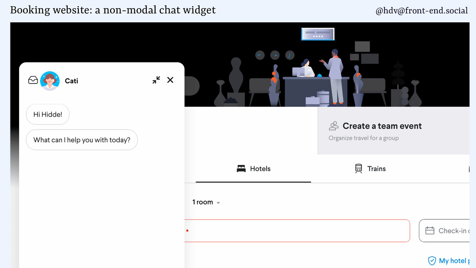
Booking website: a non-modal chat widget @hdv@front-end.social
Slide 66
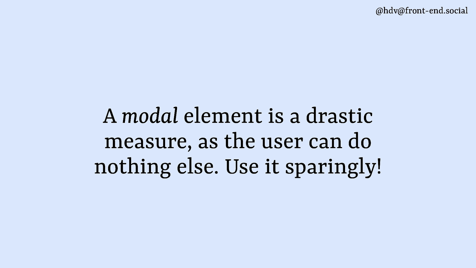
@hdv@front-end.social A modal element is a drastic measure, as the user can do nothing else. Use it sparingly!
Slide 67
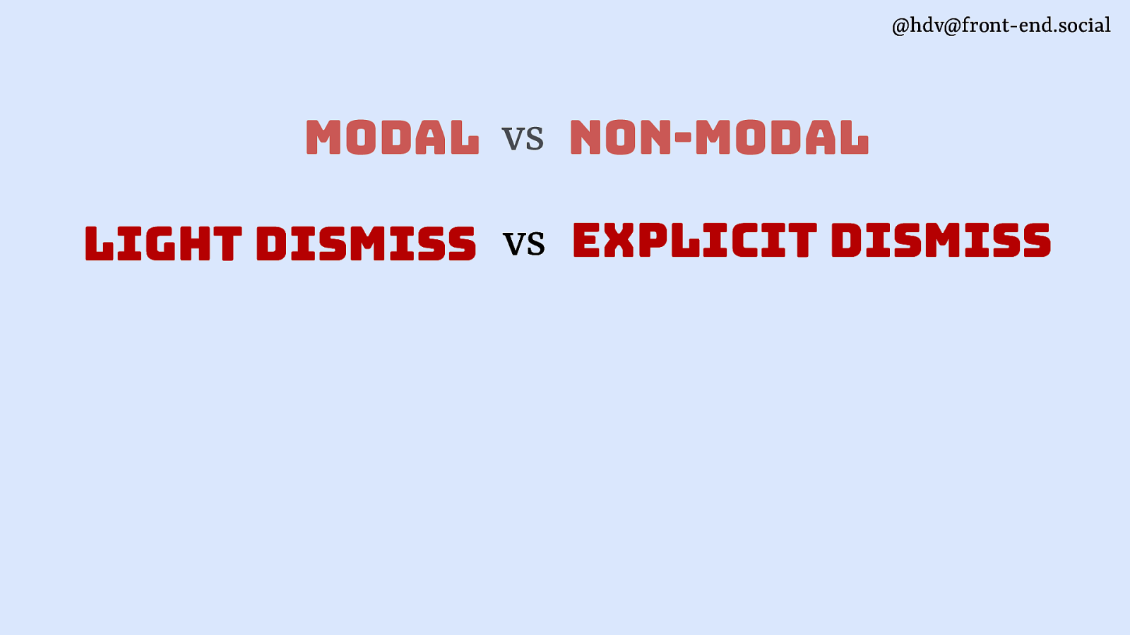
@hdv@front-end.social modal vs non-modal light dismiss vs explicit dismiss
Slide 68
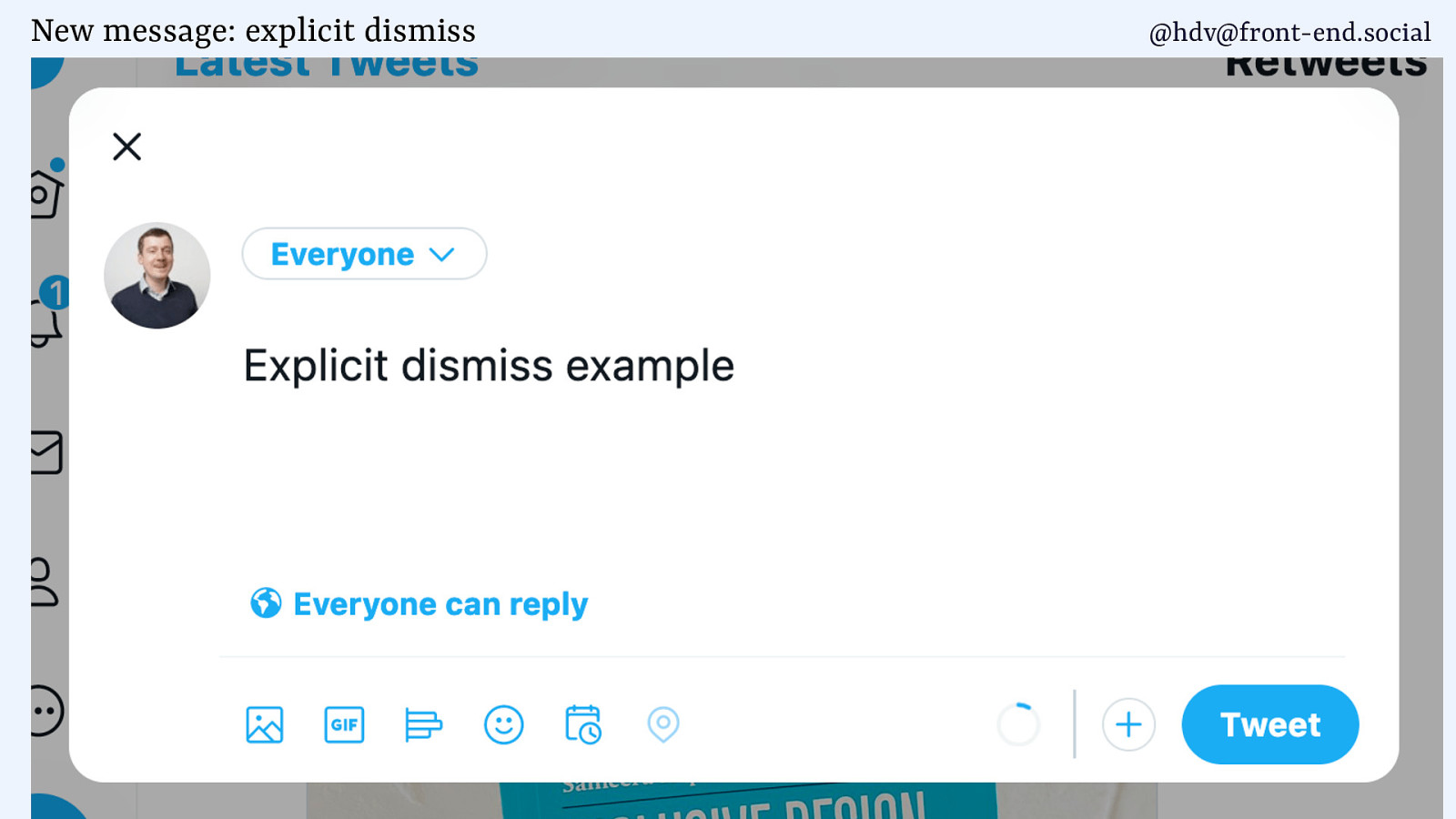
New message: explicit dismiss @hdv@front-end.social
Slide 69
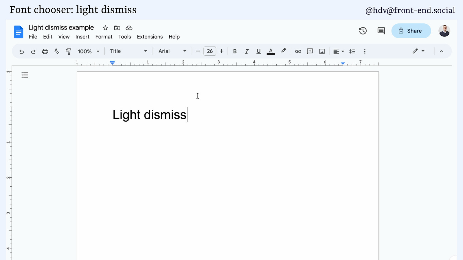
Font chooser: light dismiss @hdv@front-end.social
Slide 70
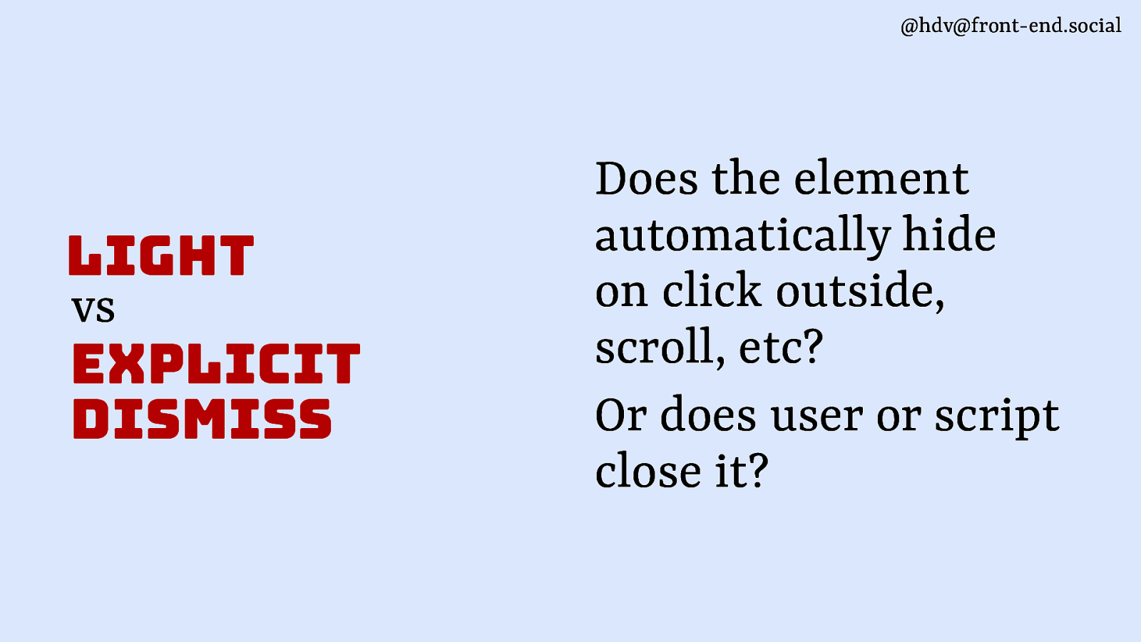
@hdv@front-end.social light vs explicit dismiss Does the element automatically hide on click outside, scroll, etc? Or does user or script close it?
Slide 71
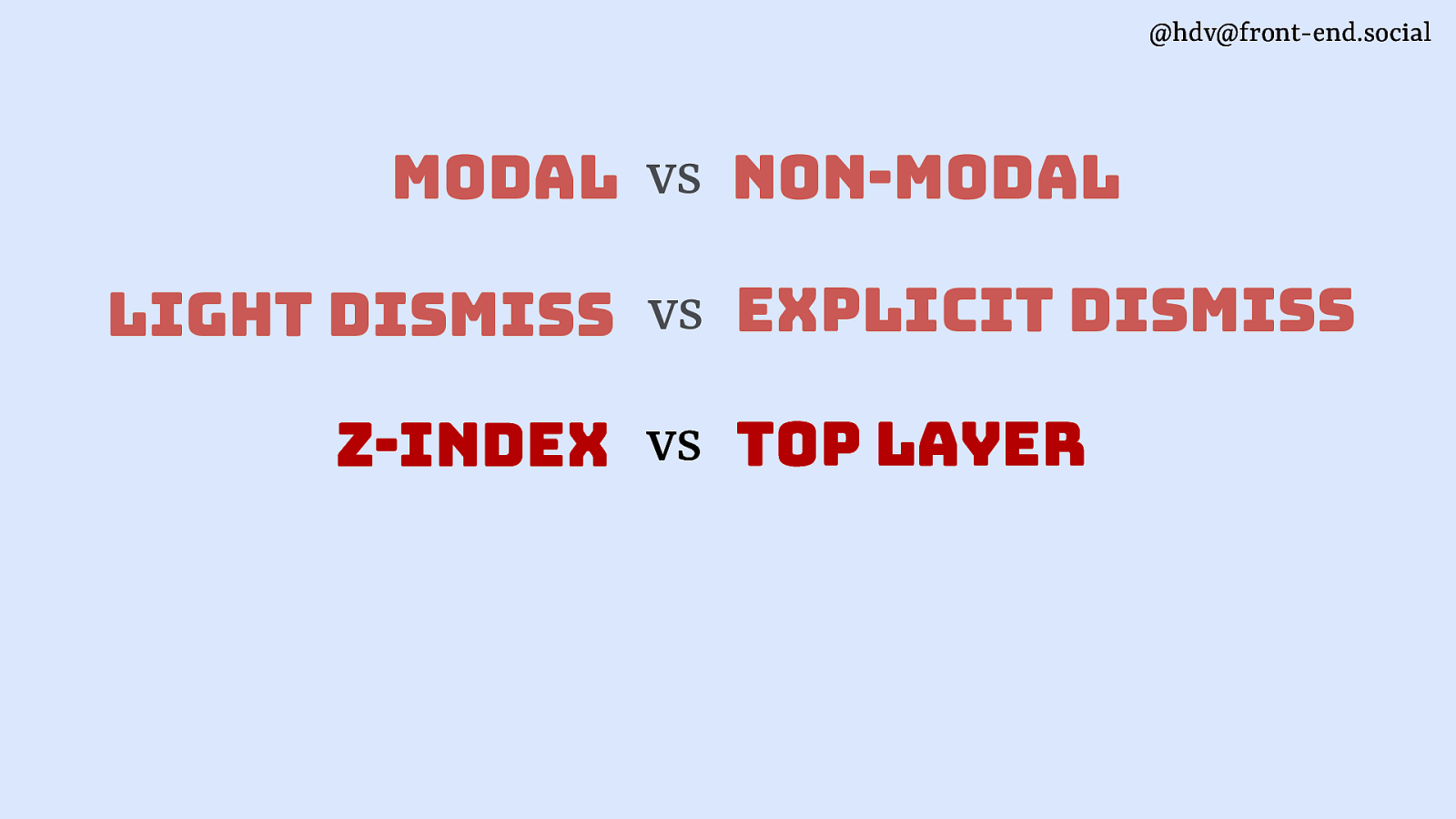
@hdv@front-end.social modal vs non-modal light dismiss vs explicit dismiss z-index vs top layer
Slide 72
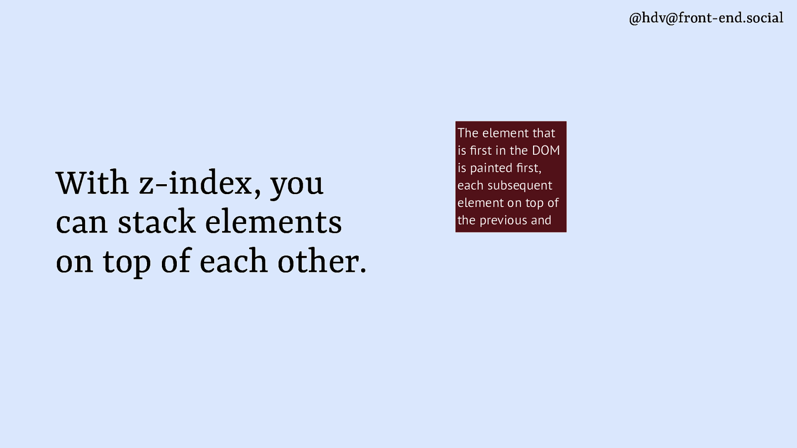
@hdv@front-end.social fi fi With z-index, you can stack elements on top of each other. The element that is rst in the DOM is painted rst, each subsequent element on top of the previous and
Slide 73
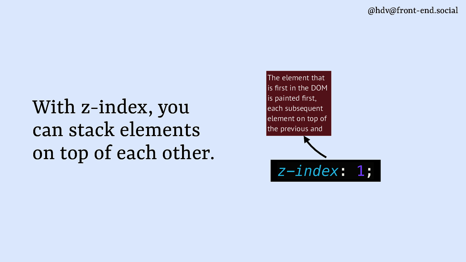
@hdv@front-end.social fi fi With z-index, you can stack elements on top of each other. The element that is rst in the DOM is painted rst, each subsequent element on top of the previous and z-index: 1;
Slide 74
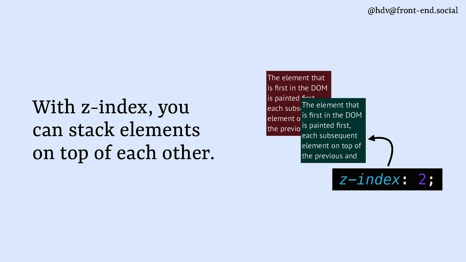
@hdv@front-end.social With z-index, you can stack elements on top of each other. The element that is rst in the DOM is painted rst, The element that each subsequent rstofin the DOM element onistop is painted rst, the previous and each subsequent element on top of the previous and fi fi fi fi z-index: 2;
Slide 75
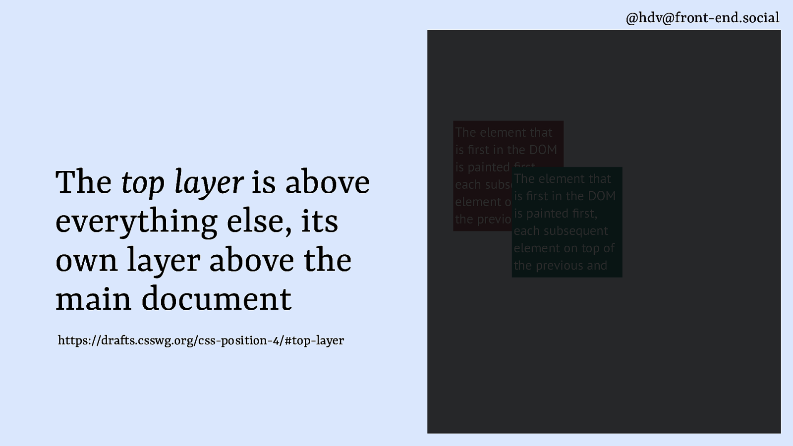
@hdv@front-end.social The top layer is above everything else, its own layer above the main document ft fi fi fi fi https://dra s.csswg.org/css-position-4/#top-layer The element that is rst in the DOM is painted rst, The element that each subsequent rstofin the DOM element onistop is painted rst, the previous and each subsequent element on top of the previous and
Slide 76
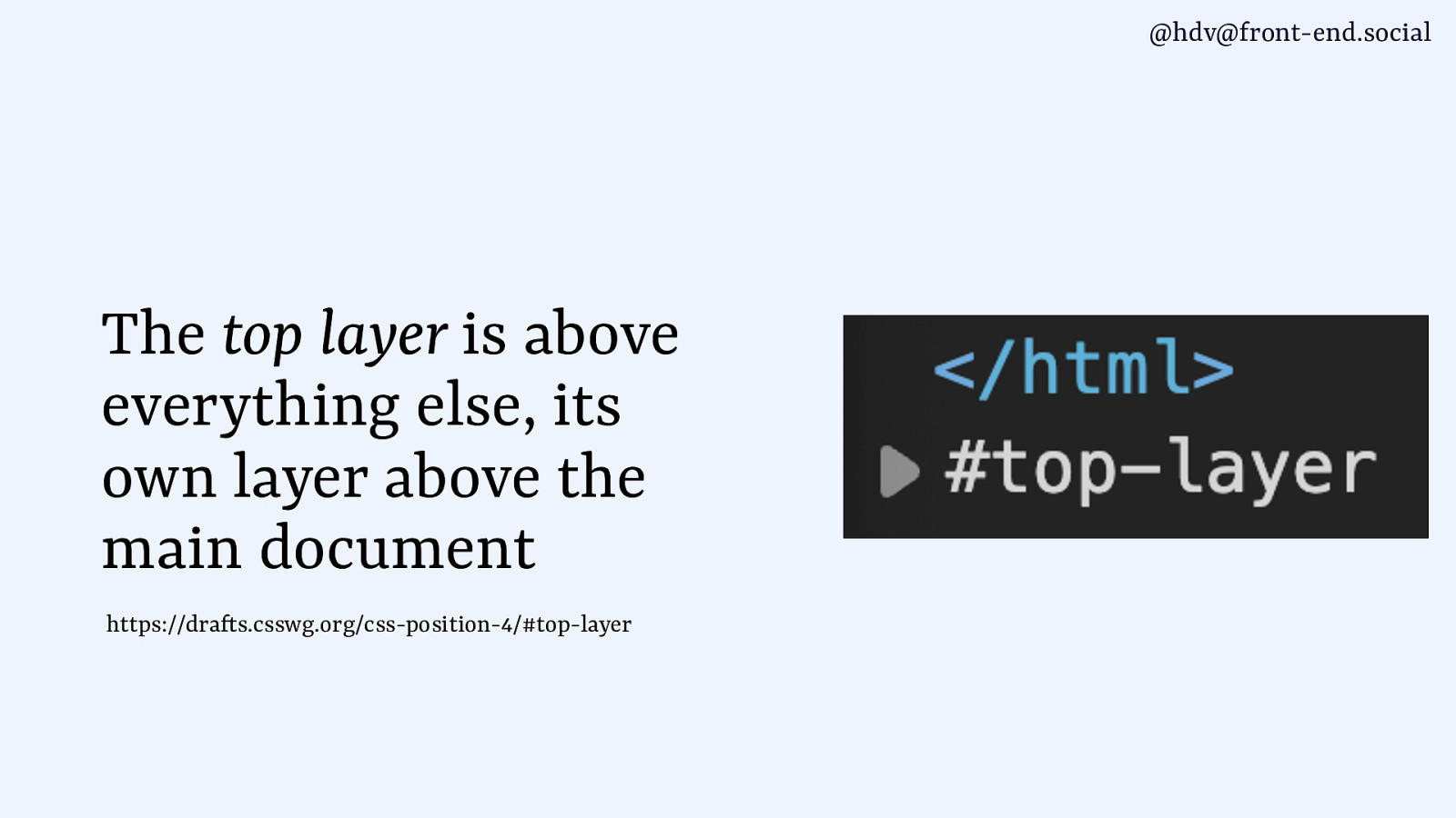
@hdv@front-end.social The top layer is above everything else, its own layer above the main document ft https://dra s.csswg.org/css-position-4/#top-layer
Slide 77
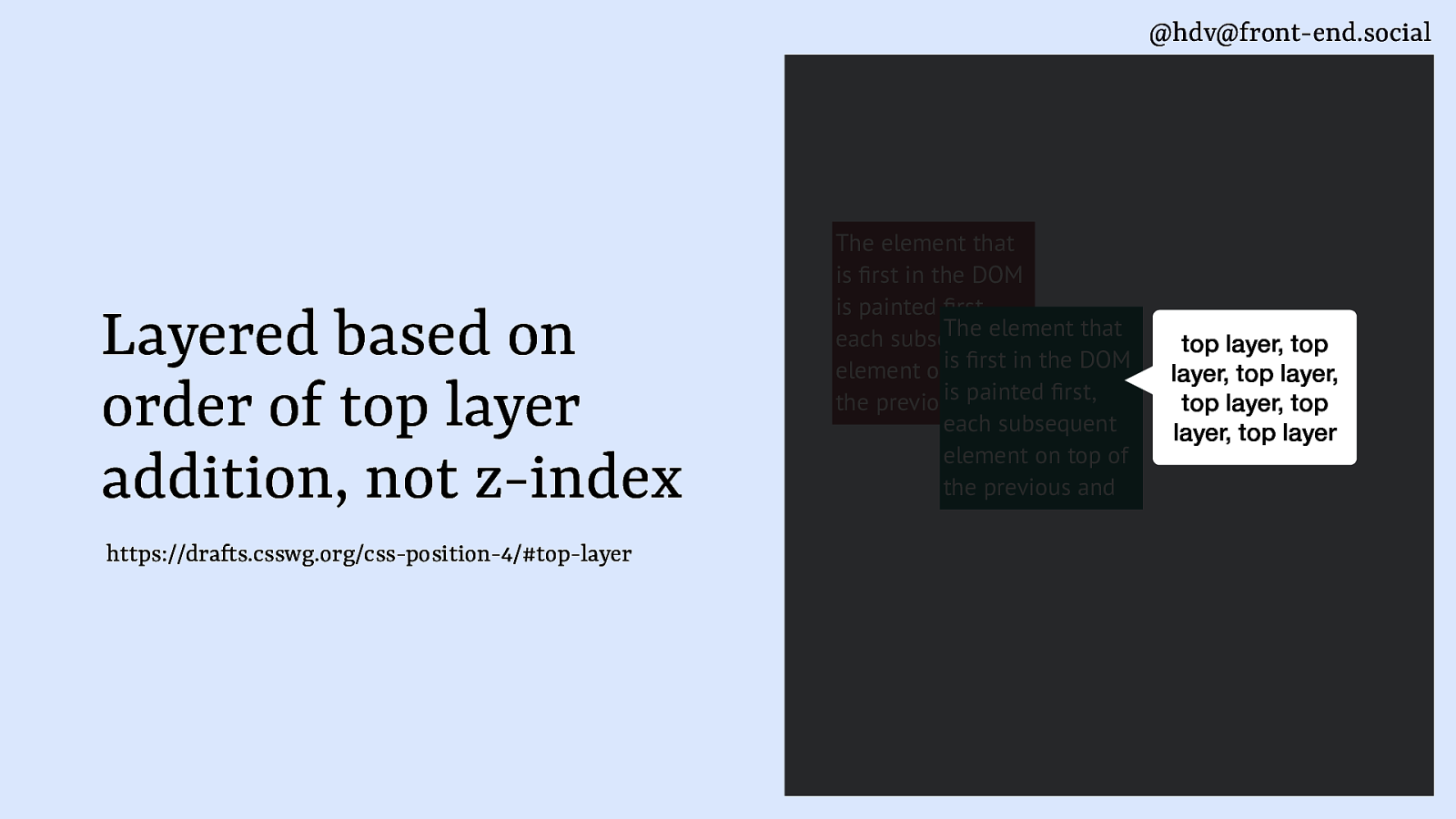
@hdv@front-end.social Layered based on order of top layer addition, not z-index ft fi fi fi fi https://dra s.csswg.org/css-position-4/#top-layer The element that is rst in the DOM is painted rst, The element that each subsequent rstofin the DOM element onistop is painted rst, the previous and each subsequent element on top of the previous and top layer, top layer, top layer, top layer, top layer, top layer
Slide 78
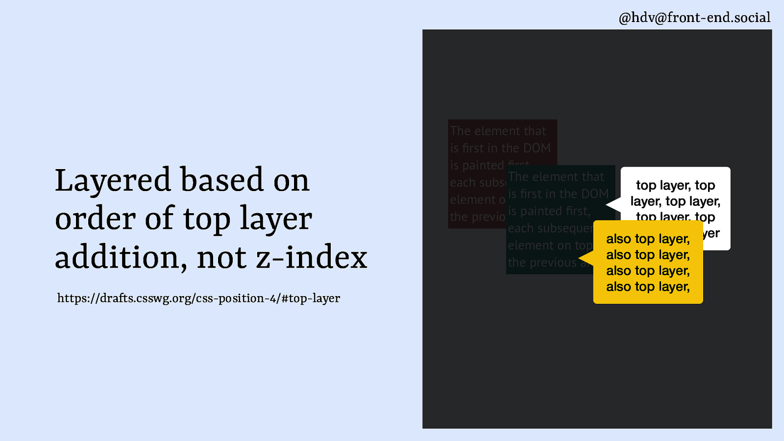
@hdv@front-end.social Layered based on order of top layer addition, not z-index ft fi fi fi fi https://dra s.csswg.org/css-position-4/#top-layer The element that is rst in the DOM is painted rst, The element that each subsequent top layer, top rstofin the DOM element onistop layer, top layer, is painted rst, the previous and top layer, top each subsequent layer, top layer also top layer, element on top of also top layer, the previous and also top layer, also top layer,
Slide 79
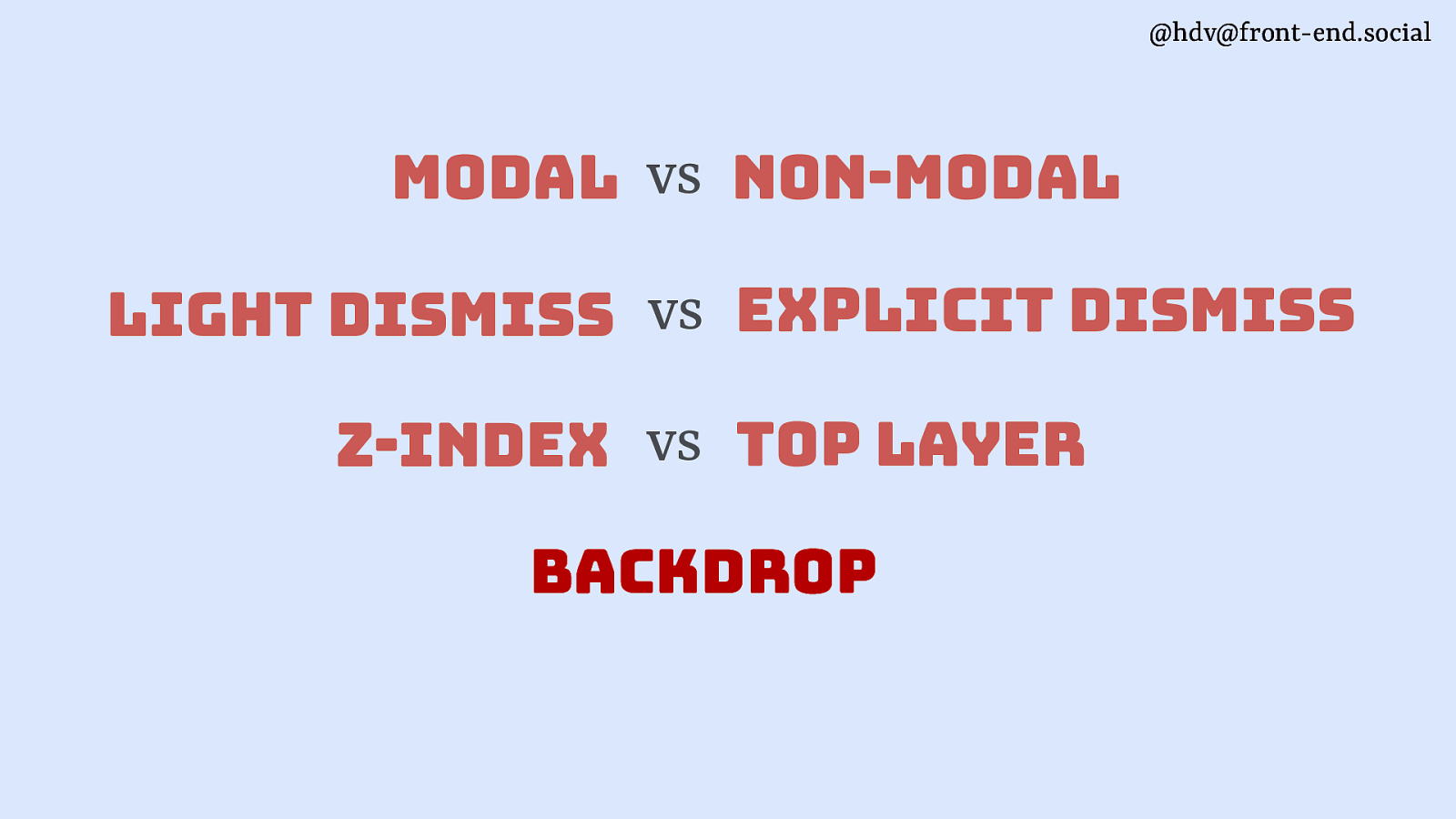
@hdv@front-end.social modal vs non-modal light dismiss vs explicit dismiss z-index vs top layer backdrop
Slide 80
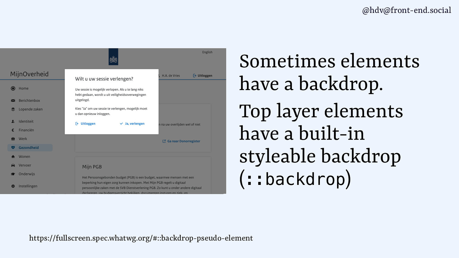
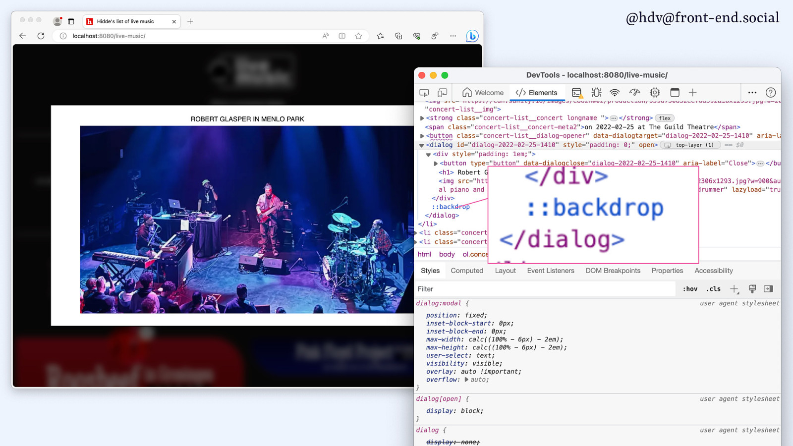
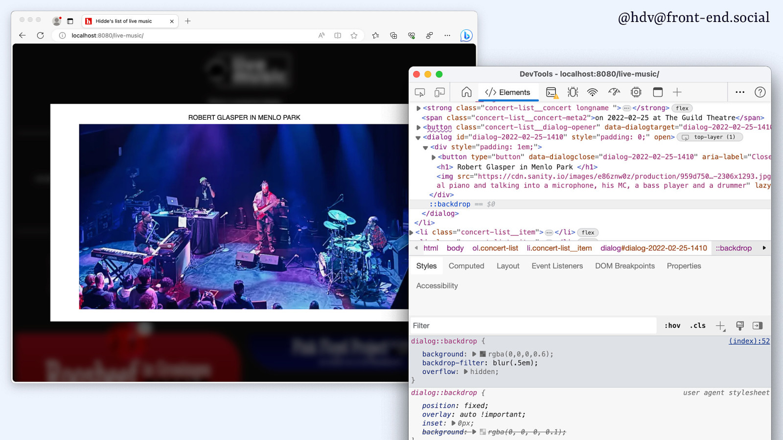
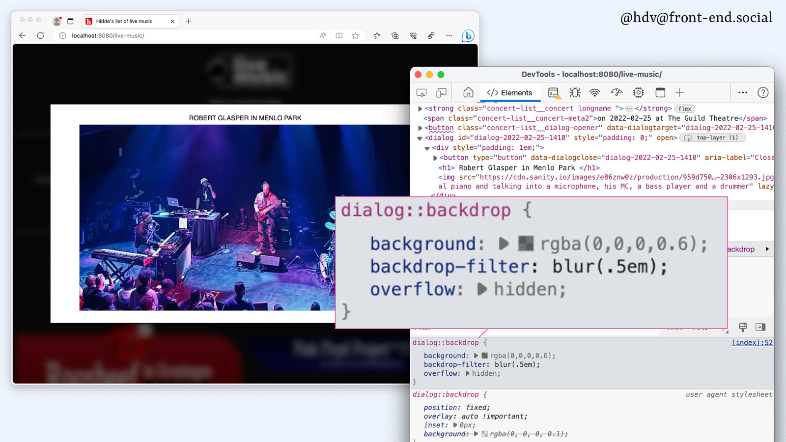
@hdv@front-end.social Sometimes elements have a backdrop. Top layer elements have a built-in styleable backdrop (::backdrop) https://fullscreen.spec.whatwg.org/#::backdrop-pseudo-element
Slide 81
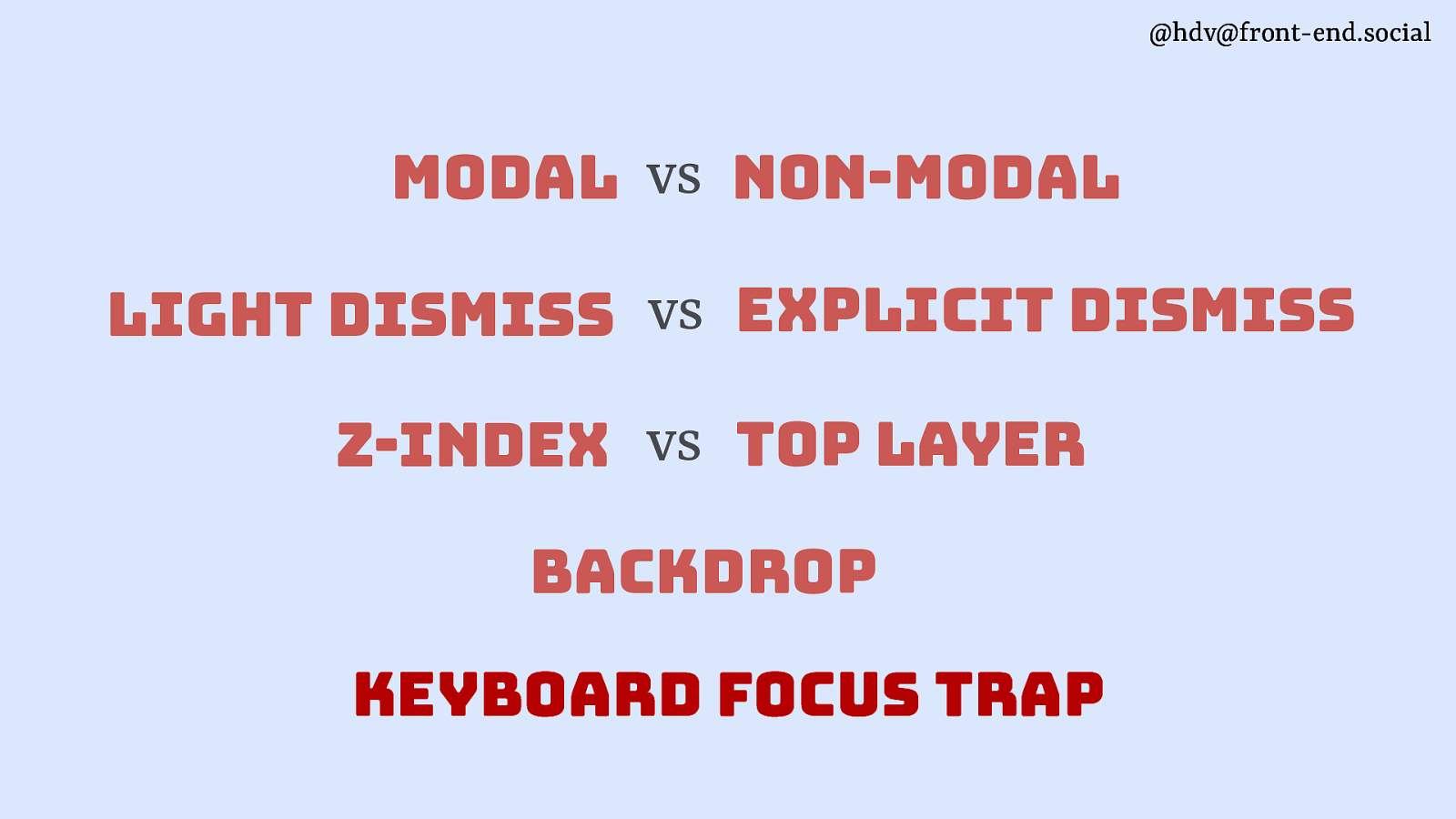
@hdv@front-end.social modal vs non-modal light dismiss vs explicit dismiss z-index vs top layer backdrop keyboard focus trap
Slide 82

@hdv@front-end.social keyboard focus trap Sometimes you want to prevent users from exiting a component with their Tab key. This is always temporary.
Slide 83
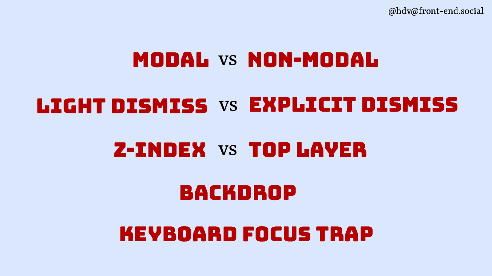
@hdv@front-end.social modal vs non-modal light dismiss vs explicit dismiss z-index vs top layer backdrop keyboard focus trap
Slide 84
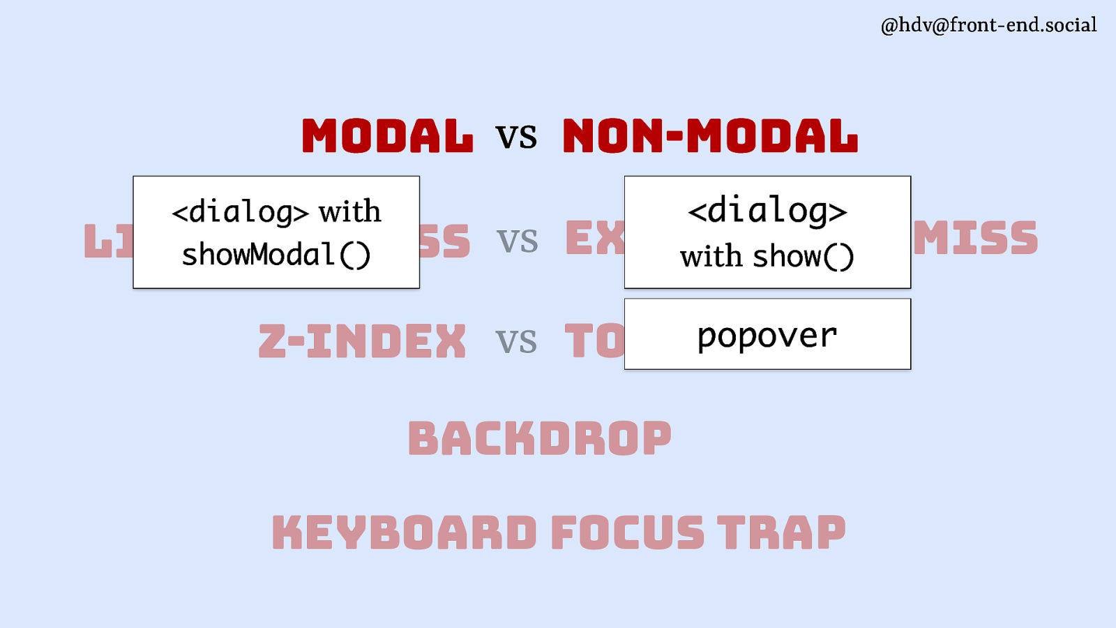
@hdv@front-end.social modal vs non-modal <dialog>
<dialog> with showModal() dismiss light dismiss vs explicit with show() popover vs top layer z-index backdrop keyboard focus trapSlide 85
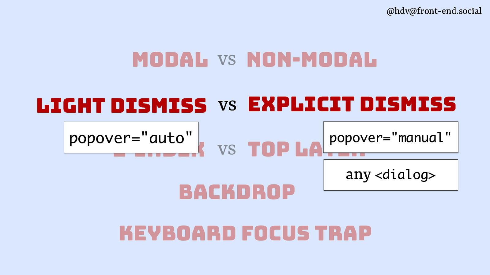
@hdv@front-end.social modal vs non-modal light dismiss vs explicit dismiss popover=”auto” popover=”manual” z-index vs top layer backdrop any <dialog> keyboard focus trap
Slide 86
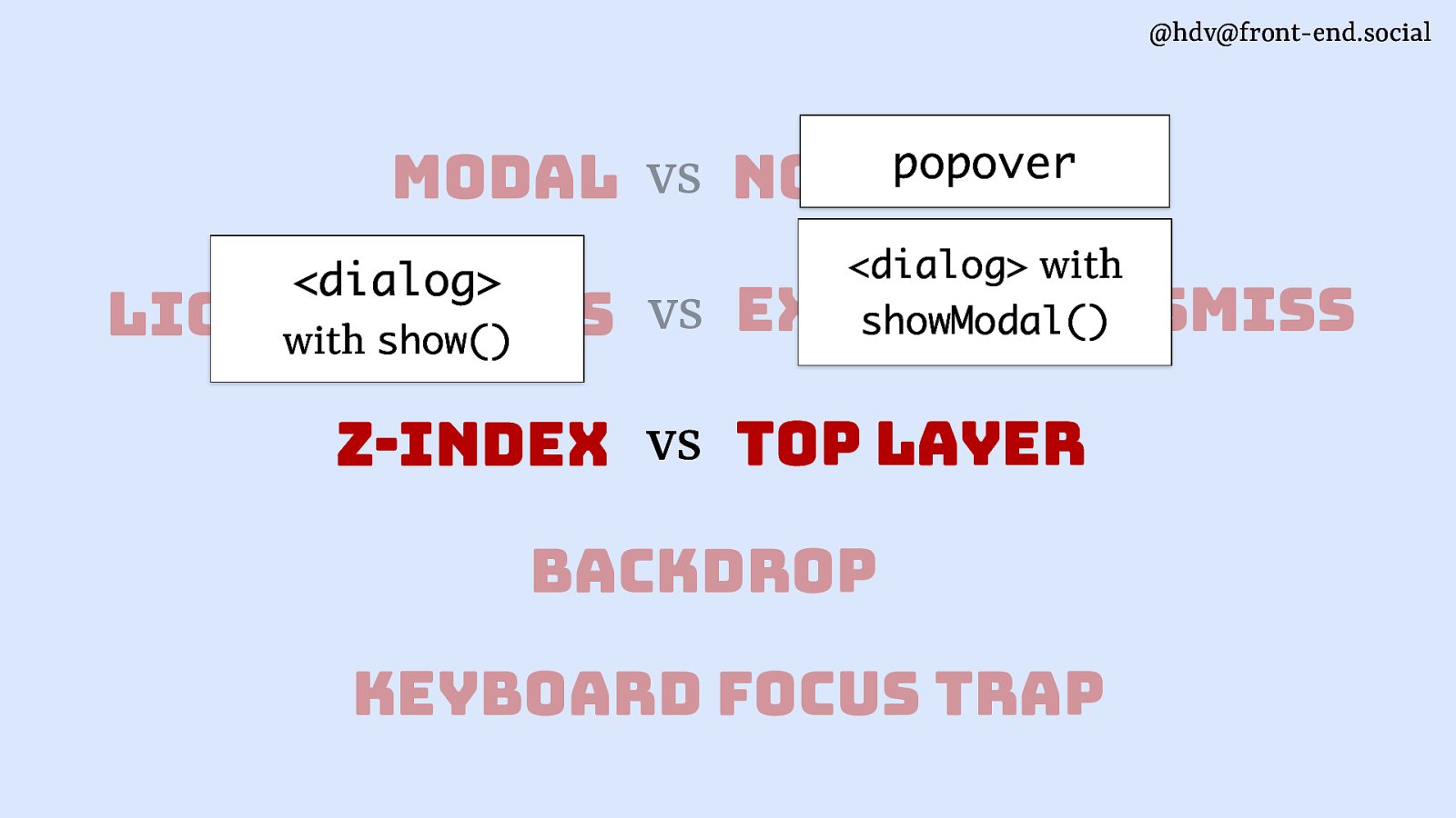
@hdv@front-end.social modal vs <dialog> popover non-modal <dialog> with showModal() vs explicit dismiss light dismiss with show() z-index vs top layer backdrop keyboard focus trap
Slide 87

@hdv@front-end.social modal vs non-modal w/ ::backdrop browser provided light dismiss vs consider if modal <dialog> not better popover explicit dismiss <dialog> with showModal() z-index vs top layer backdrop keyboard focus trap
Slide 88
@hdv@front-end.social modal vs non-modal w/ ::backdrop browser provided light dismiss vs consider if modal <dialog> not better popover explicit dismiss <dialog> with showModal() z-index vs top layer backdrop keyboard focus trap
Slide 89
@hdv@front-end.social modal vs non-modal light dismiss vs explicit dismiss browser provided vs top layer z-index <dialog> with showModal() backdrop keyboard focus trap
Slide 90
@hdv@front-end.social semantics
Slide 91
@hdv@front-end.social “What is this thing?”
Slide 92
@hdv@front-end.social “What is this thing on the page?”
Slide 93
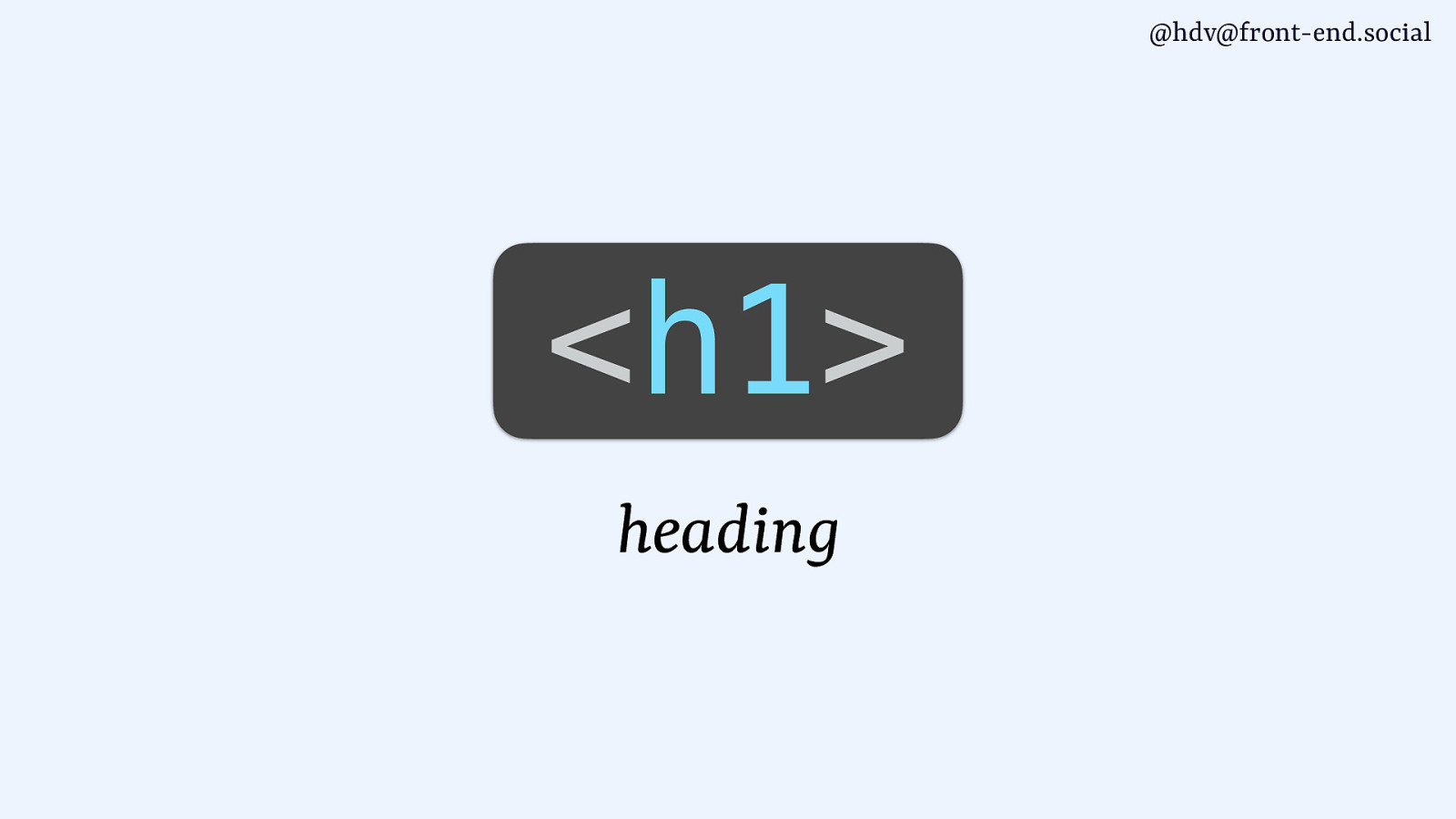
@hdv@front-end.social
<h1> headingSlide 94
@hdv@front-end.social
<h1> headingSlide 95
@hdv@front-end.social <a> link
Slide 96
@hdv@front-end.social
<li> list itemSlide 97
@hdv@front-end.social
<dialog> dialogSlide 98
@hdv@front-end.social
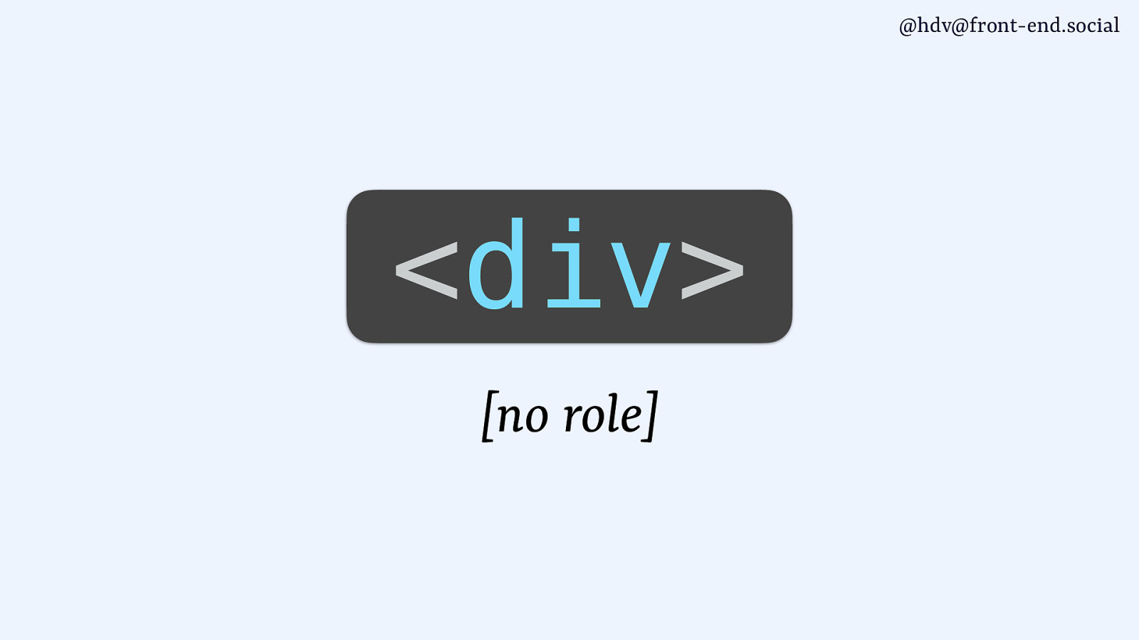
<div> [no role]Slide 99
@hdv@front-end.social
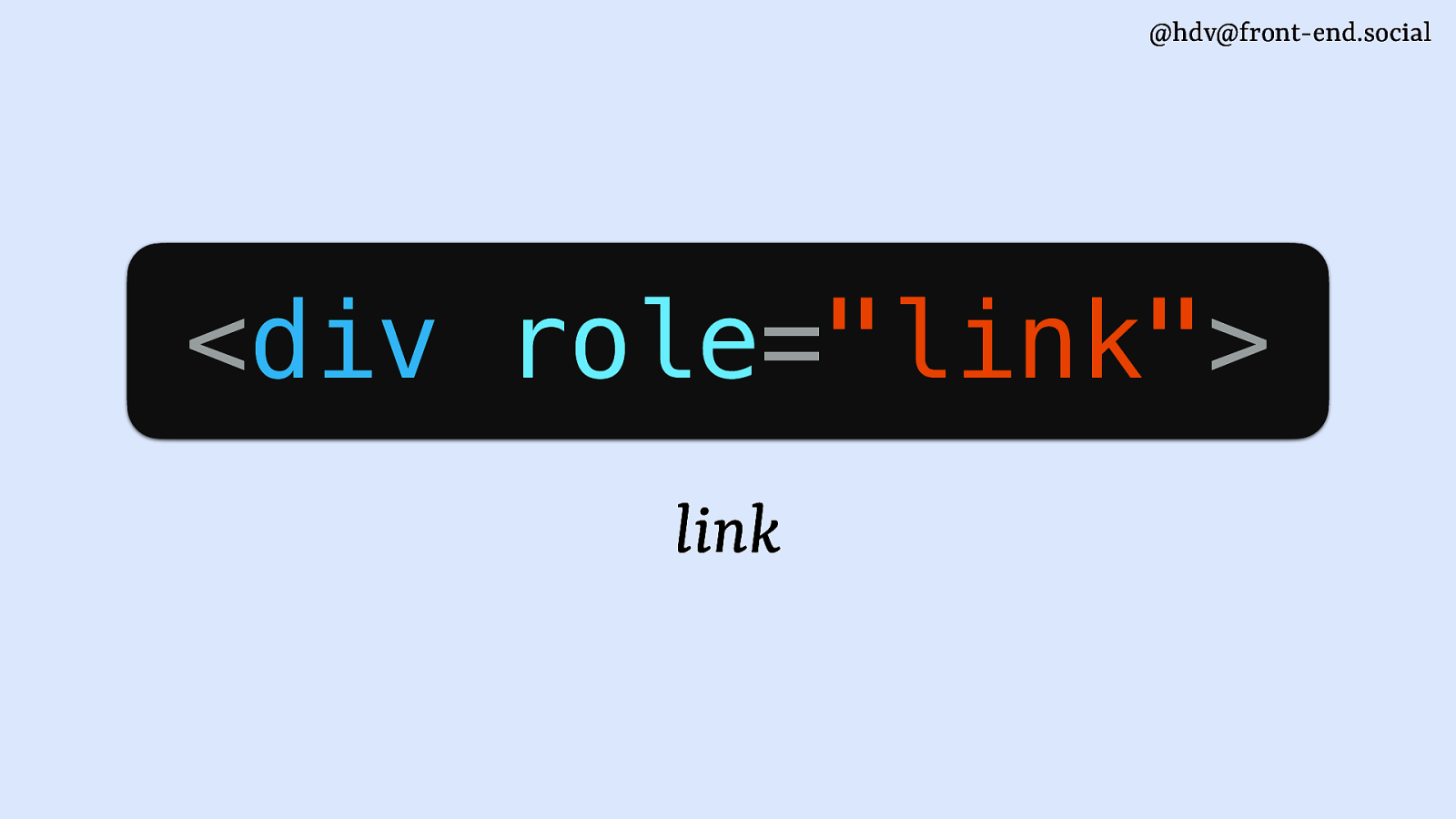
<div role=”link”> linkSlide 100
@hdv@front-end.social
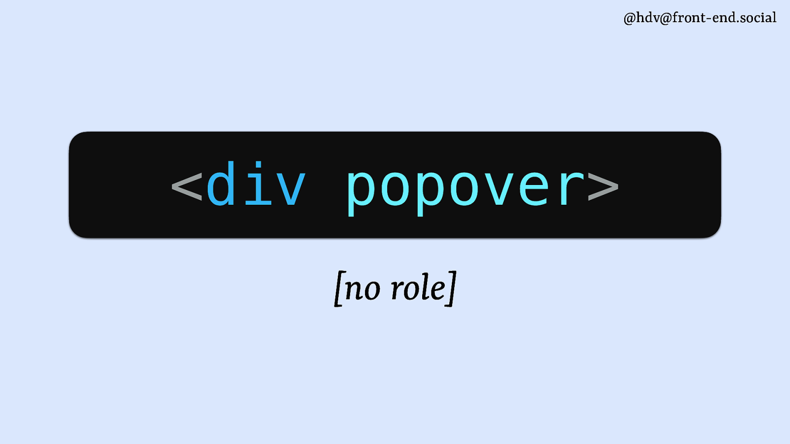
<div popover> [no role]Slide 101
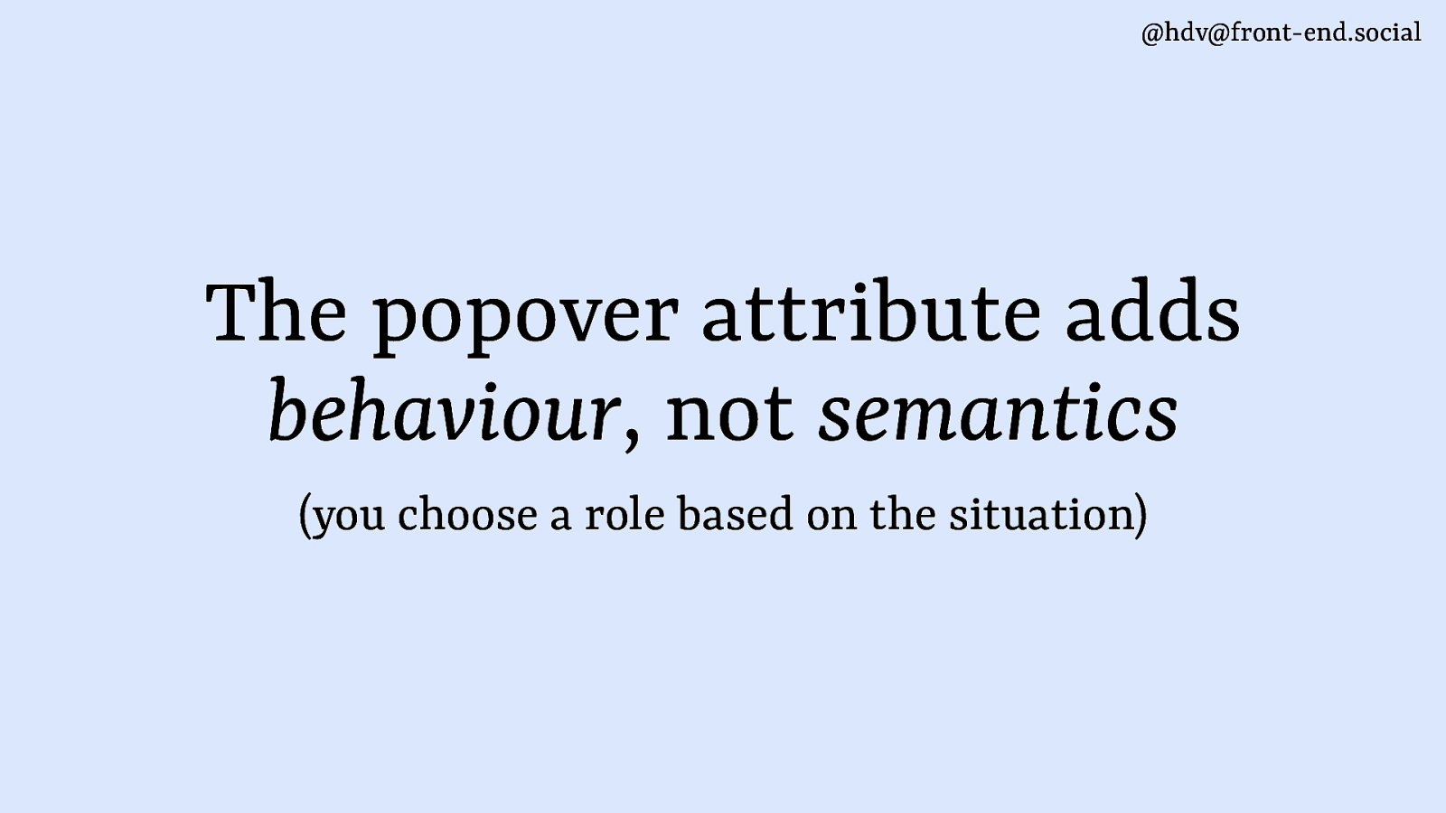
@hdv@front-end.social The popover attribute adds behaviour, not semantics (you choose a role based on the situation)
Slide 102
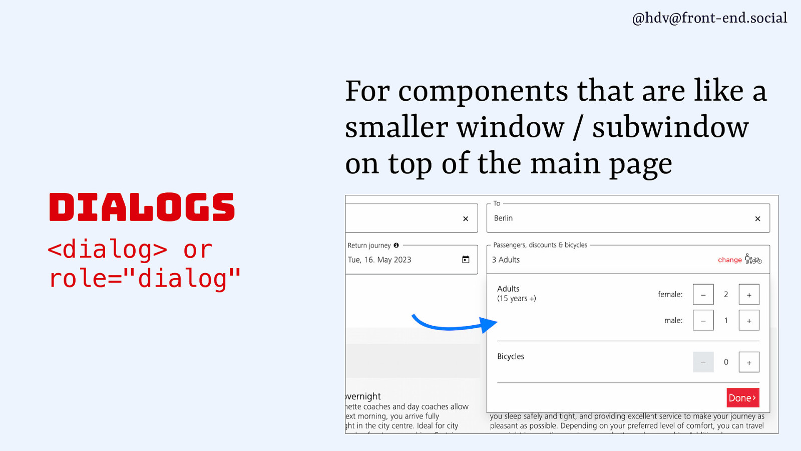
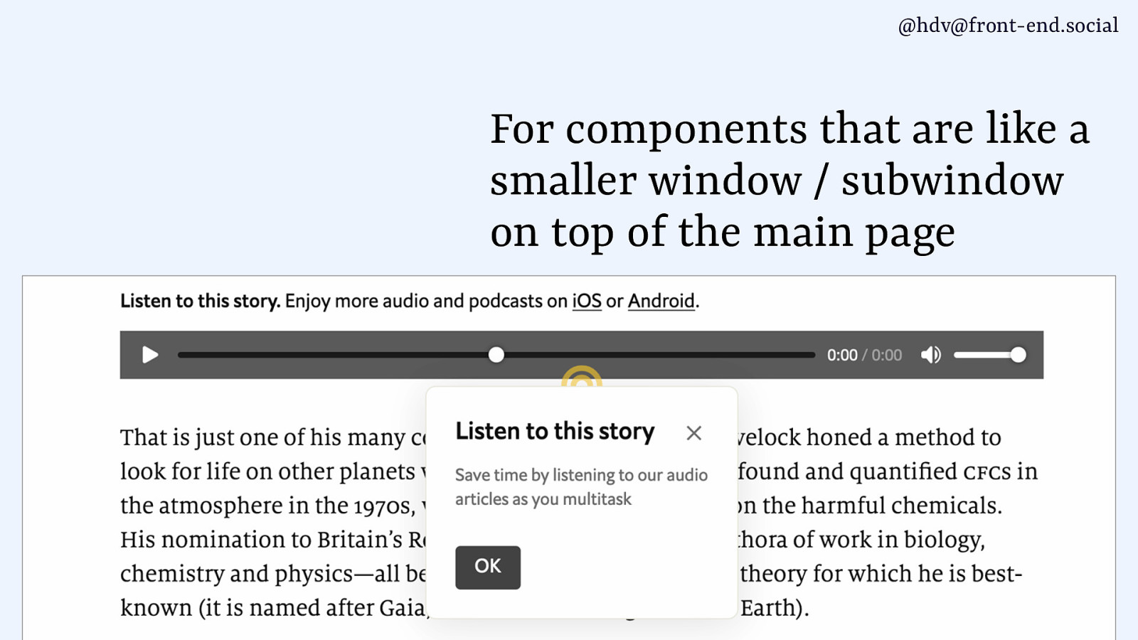
@hdv@front-end.social For components that are like a smaller window / subwindow on top of the main page dialogs <dialog> or role=”dialog”
Slide 103
@hdv@front-end.social For components that are like a smaller window / subwindow on top of the main page
Slide 104
@hdv@front-end.social For components that are like a smaller window / subwindow on top of the main page
Slide 105
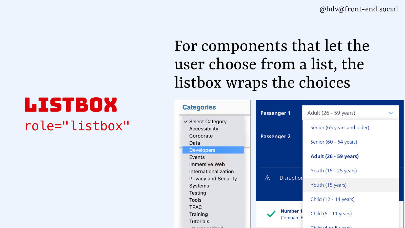
@hdv@front-end.social For components that let the user choose from a list, the listbox wraps the choices listbox role=”listbox”
Slide 106

@hdv@front-end.social For components that let the user choose from a list, the listbox wraps the choices listbox role=”listbox” listbox role=”listbox”
Slide 107
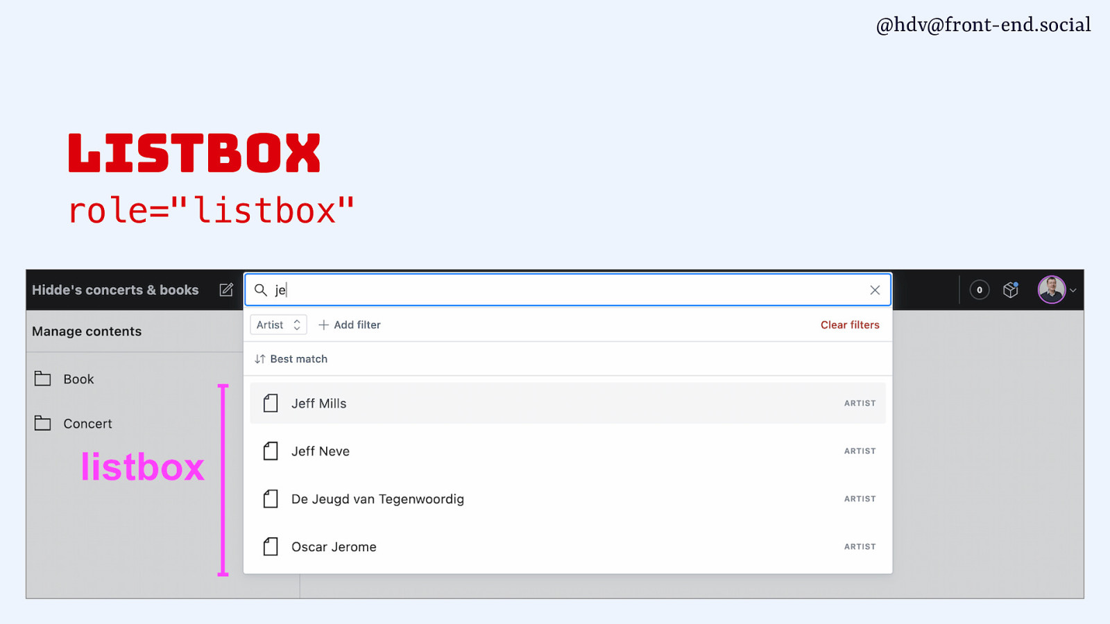
@hdv@front-end.social listbox role=”listbox”
Slide 108
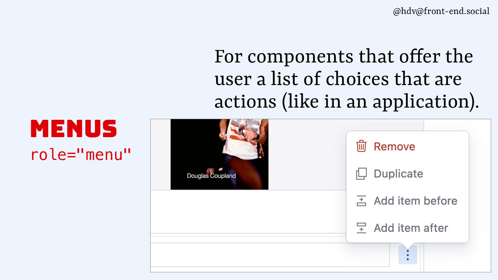
@hdv@front-end.social For components that o fer the user a list of choices that are actions (like in an application). menus f role=”menu”
Slide 109

@hdv@front-end.social For components that o fer the user a list of choices that are actions (like in an application). menus f role=”menu”
Slide 110
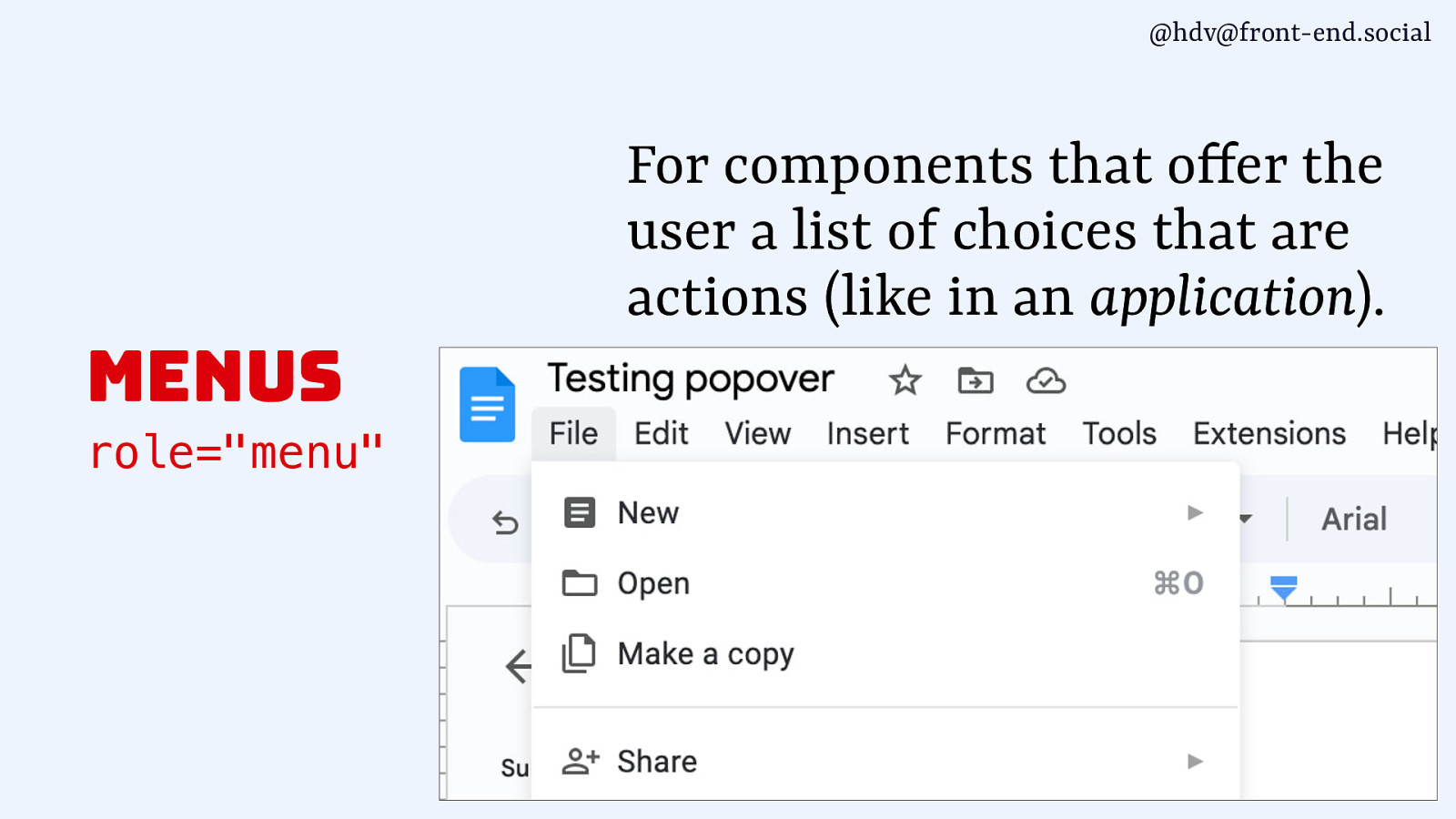
@hdv@front-end.social For components that o fer the user a list of choices that are actions (like in an application). menus f role=”menu”
Slide 111

@hdv@front-end.social For components that o fer the user a list of choices that are actions (like in an application). menus
role=”menu”
f marcozehe.de/wai-aria-menus-use-with-care/ not for navigations / meganavigations not to be confused with <menu>, which has a built-in list role could complicate things for screenreader users, use sparsely
Slide 112
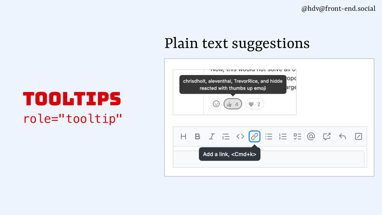
@hdv@front-end.social Plain text suggestions tooltips role=”tooltip”
Slide 113
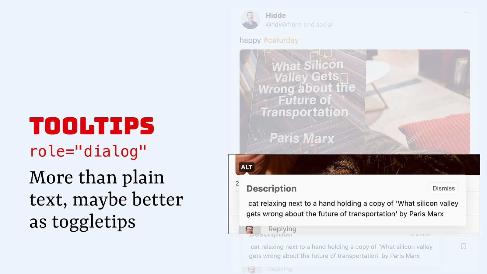
tooltips role=”dialog” More than plain text, maybe better as toggletips
Slide 114
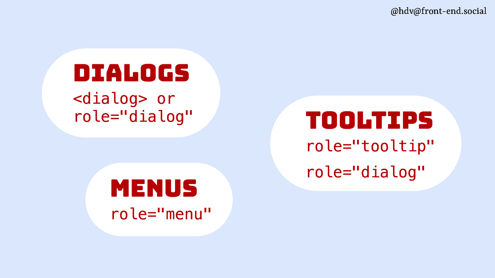
@hdv@front-end.social dialogs <dialog> or role=”dialog” tooltips role=”tooltip” menus role=”menu” role=”dialog”
Slide 115
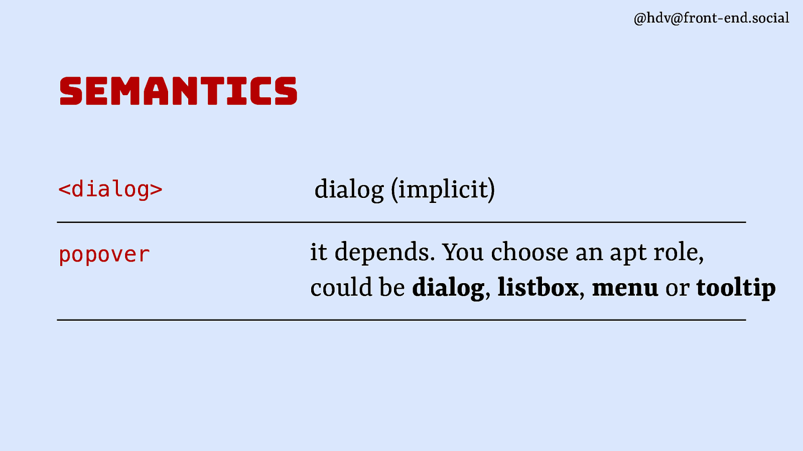
@hdv@front-end.social semantics <dialog> dialog (implicit) popover it depends. You choose an apt role, could be dialog, listbox, menu or tooltip
Slide 116
@hdv@front-end.social positioning
Slide 117
@hdv@front-end.social
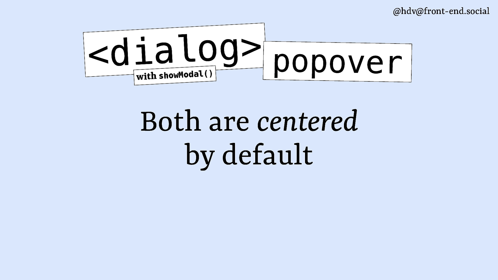
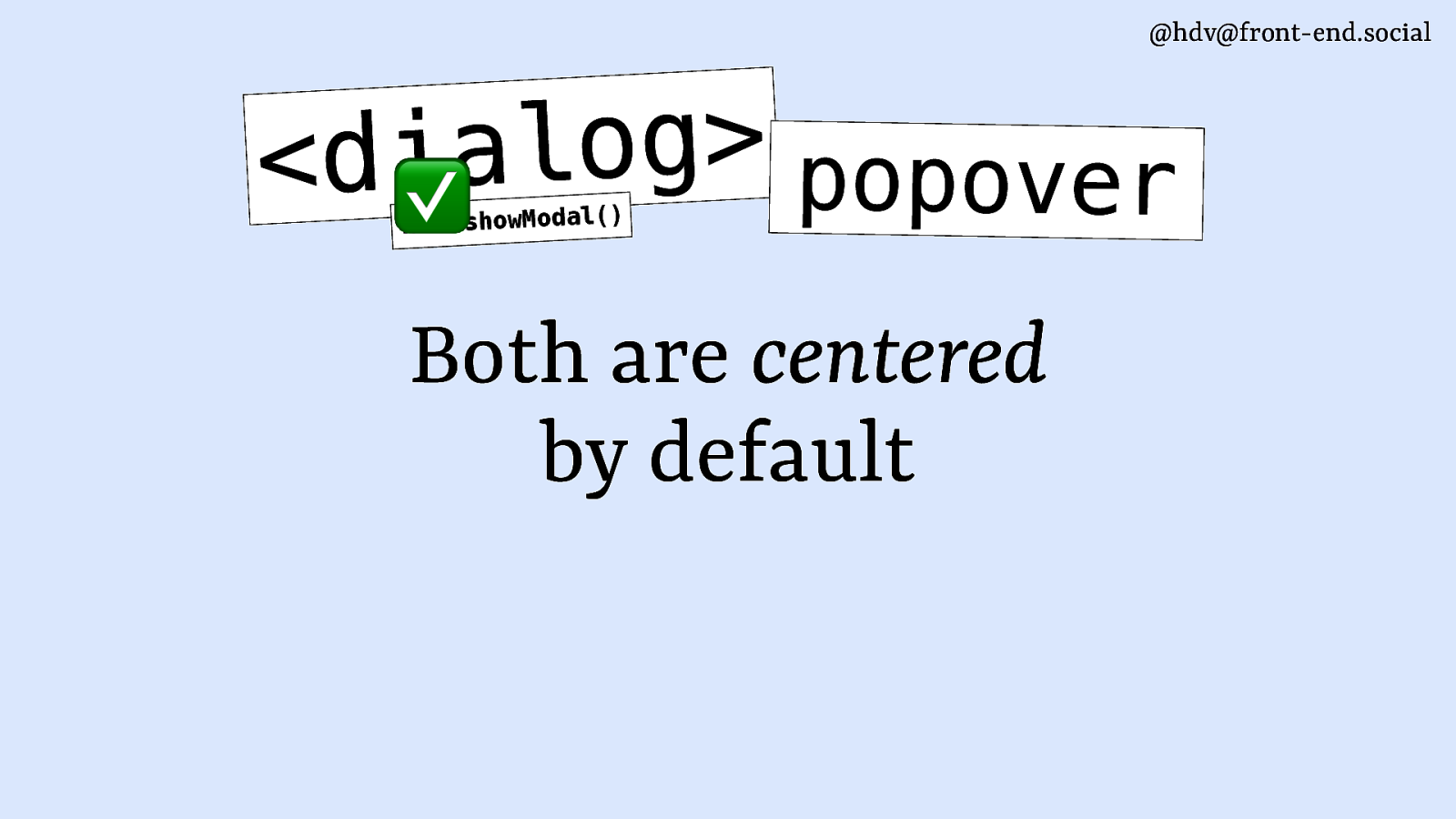
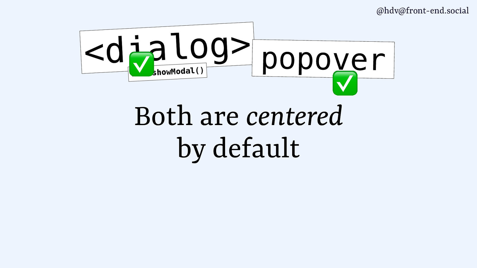
g o l a i d < popover ) ( l a d o M w o h s h t i w Both are centered by default
Slide 118
@hdv@front-end.social
Slide 119

@hdv@front-end.social // concert-list.njk <ol> {% for concert in concerts %} <li> … </li> {% endfor %} </ol>
Slide 120
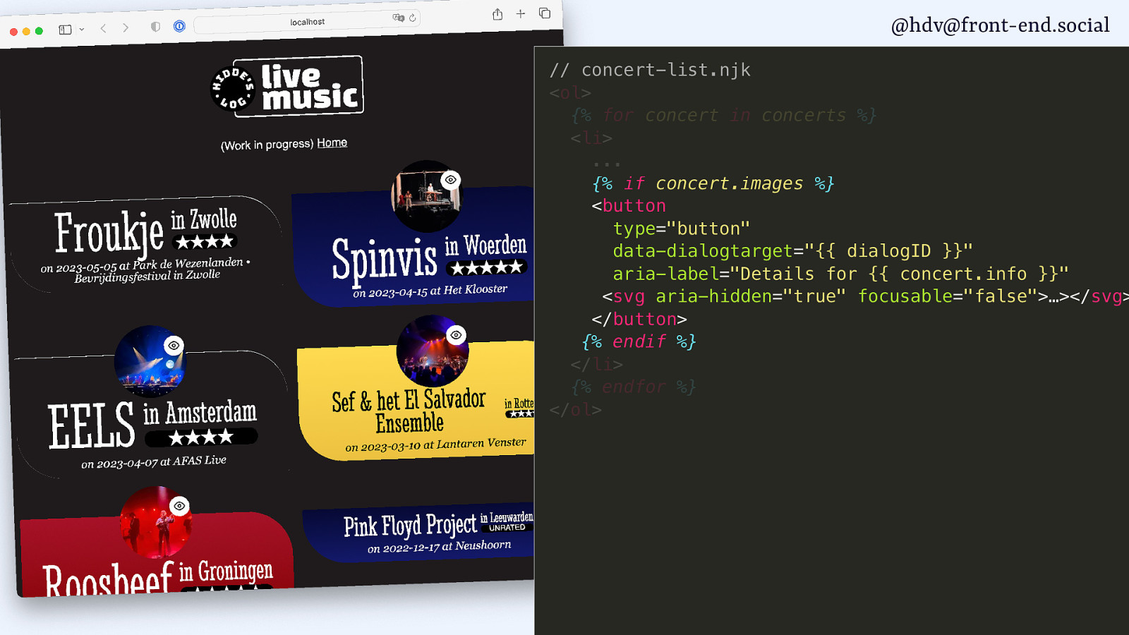
@hdv@front-end.social // concert-list.njk <ol> {% for concert in concerts %} <li> … {% if concert.images %} <button type=”button” data-dialogtarget=”{{ dialogID }}” aria-label=”Details for {{ concert.info }}” <svg aria-hidden=”true” focusable=”false”>…></svg> </button> {% endif %} </li> {% endfor %} </ol>
Slide 121
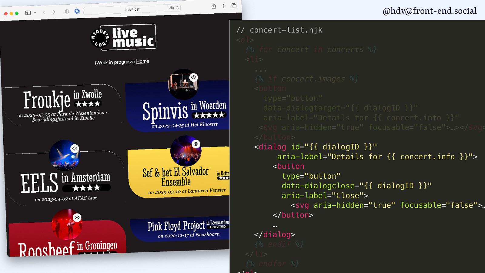
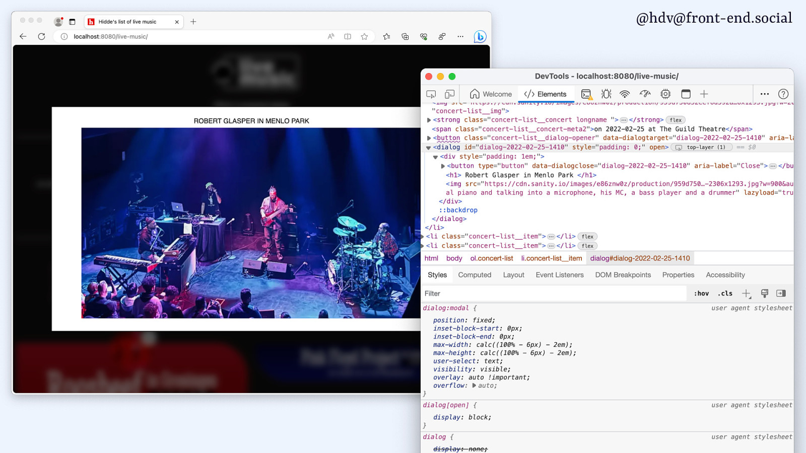
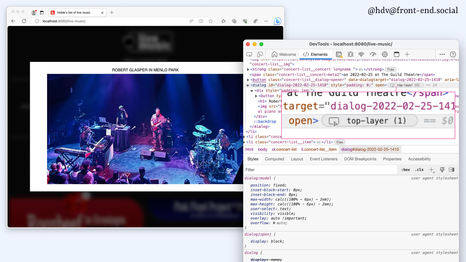
@hdv@front-end.social // concert-list.njk <ol> {% for concert in concerts %} <li> … {% if concert.images %} <button type=”button” data-dialogtarget=”{{ dialogID }}” aria-label=”Details for {{ concert.info }}” <svg aria-hidden=”true” focusable=”false”>…></svg> </button> <dialog id=”{{ dialogID }}” aria-label=”Details for {{ concert.info }}”> <button type=”button” data-dialogclose=”{{ dialogID }}” aria-label=”Close”> <svg aria-hidden=”true” focusable=”false”>… </button> … </dialog> {% endif %} </li> {% endfor %}
Slide 122
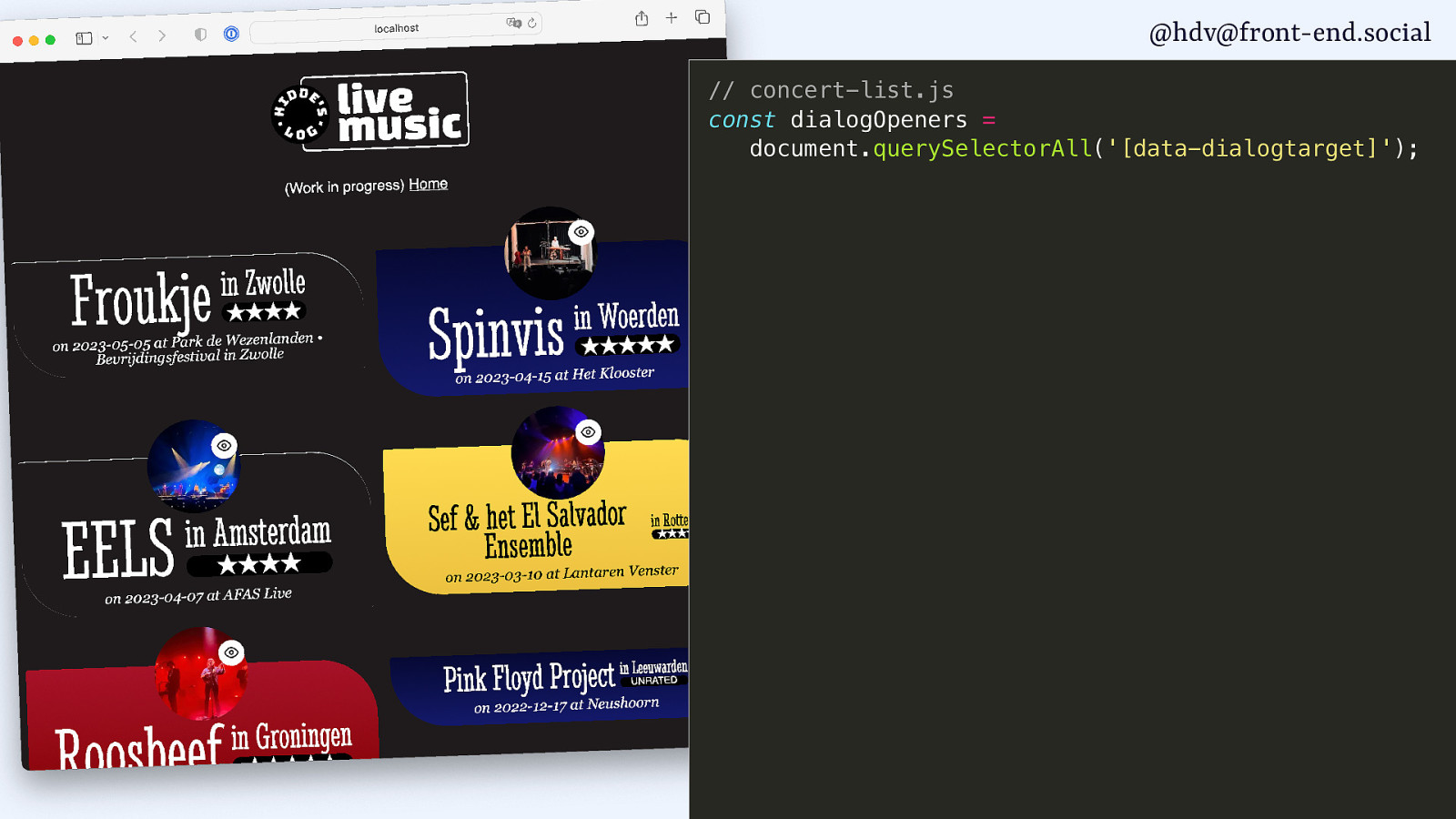
@hdv@front-end.social // concert-list.js const dialogOpeners = document.querySelectorAll(‘[data-dialogtarget]’);
Slide 123
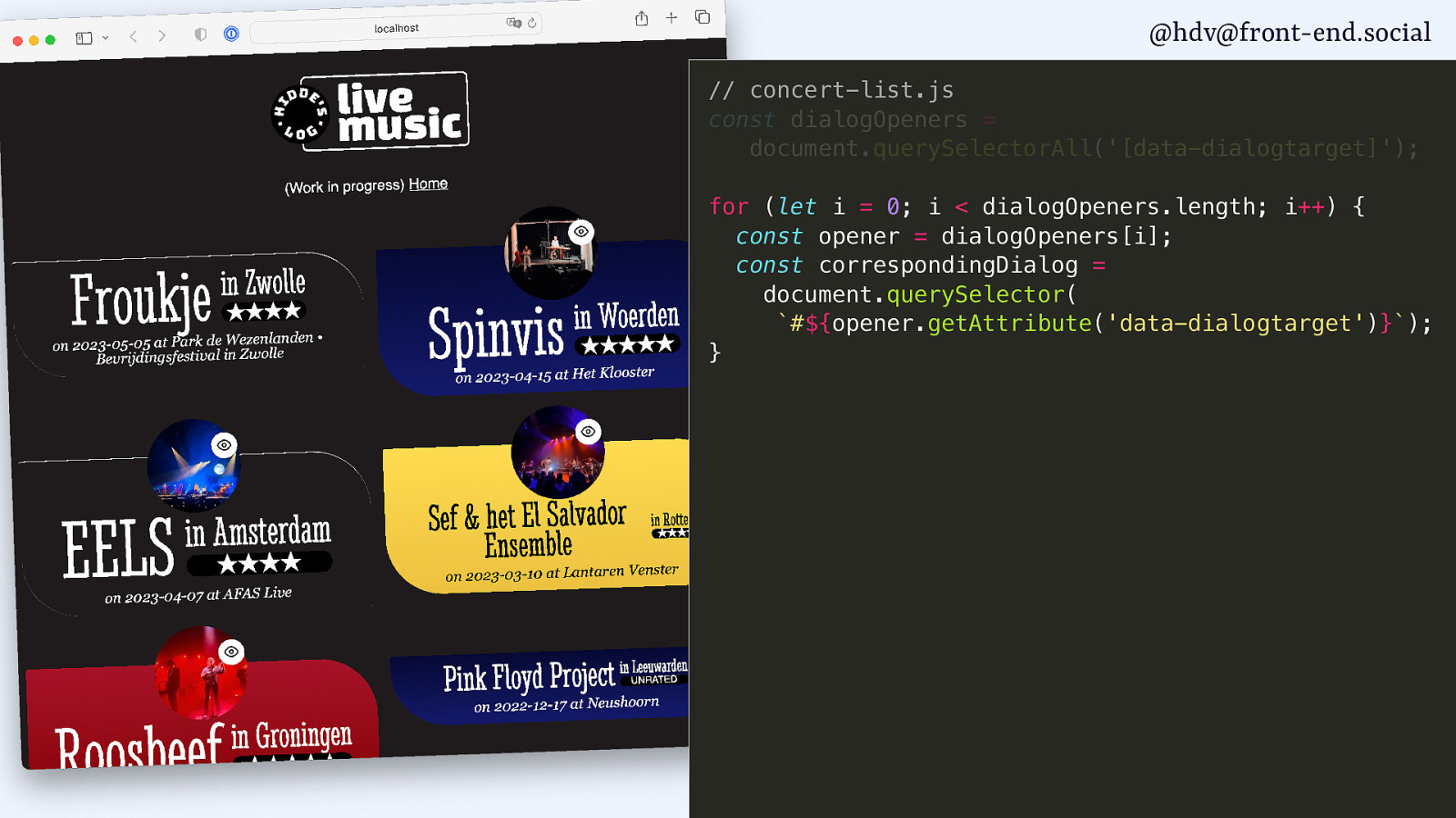
@hdv@front-end.social // concert-list.js const dialogOpeners = document.querySelectorAll(‘[data-dialogtarget]’); for (let i = 0; i < dialogOpeners.length; i++) { const opener = dialogOpeners[i]; const correspondingDialog = document.querySelector( #${opener.getAttribute('data-dialogtarget')}); }
Slide 124

@hdv@front-end.social // concert-list.js const dialogOpeners = document.querySelectorAll(‘[data-dialogtarget]’); for (let i = 0; i < dialogOpeners.length; i++) { const opener = dialogOpeners[i]; const correspondingDialog = document.querySelector( #${opener.getAttribute('data-dialogtarget')}); opener.addEventListener(‘click’, function() { correspondingDialog.showModal(); }); }
Slide 125
@hdv@front-end.social
Slide 126
@hdv@front-end.social
Slide 127
@hdv@front-end.social
Slide 128
@hdv@front-end.social
Slide 129
@hdv@front-end.social
Slide 130
@hdv@front-end.social
g o l a i d < ✅ popover ) ( l a d o M w o h s h t i w Both are centered by default
Slide 131
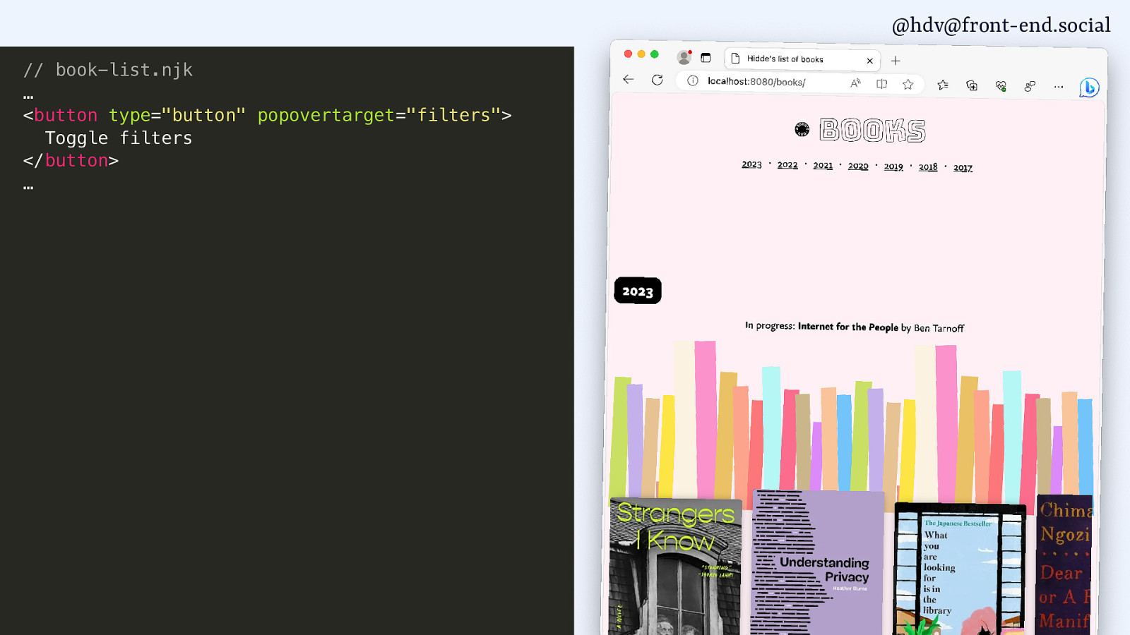
@hdv@front-end.social // book-list.njk … <button type=”button” popovertarget=”filters”> Toggle filters </button> …
Slide 132
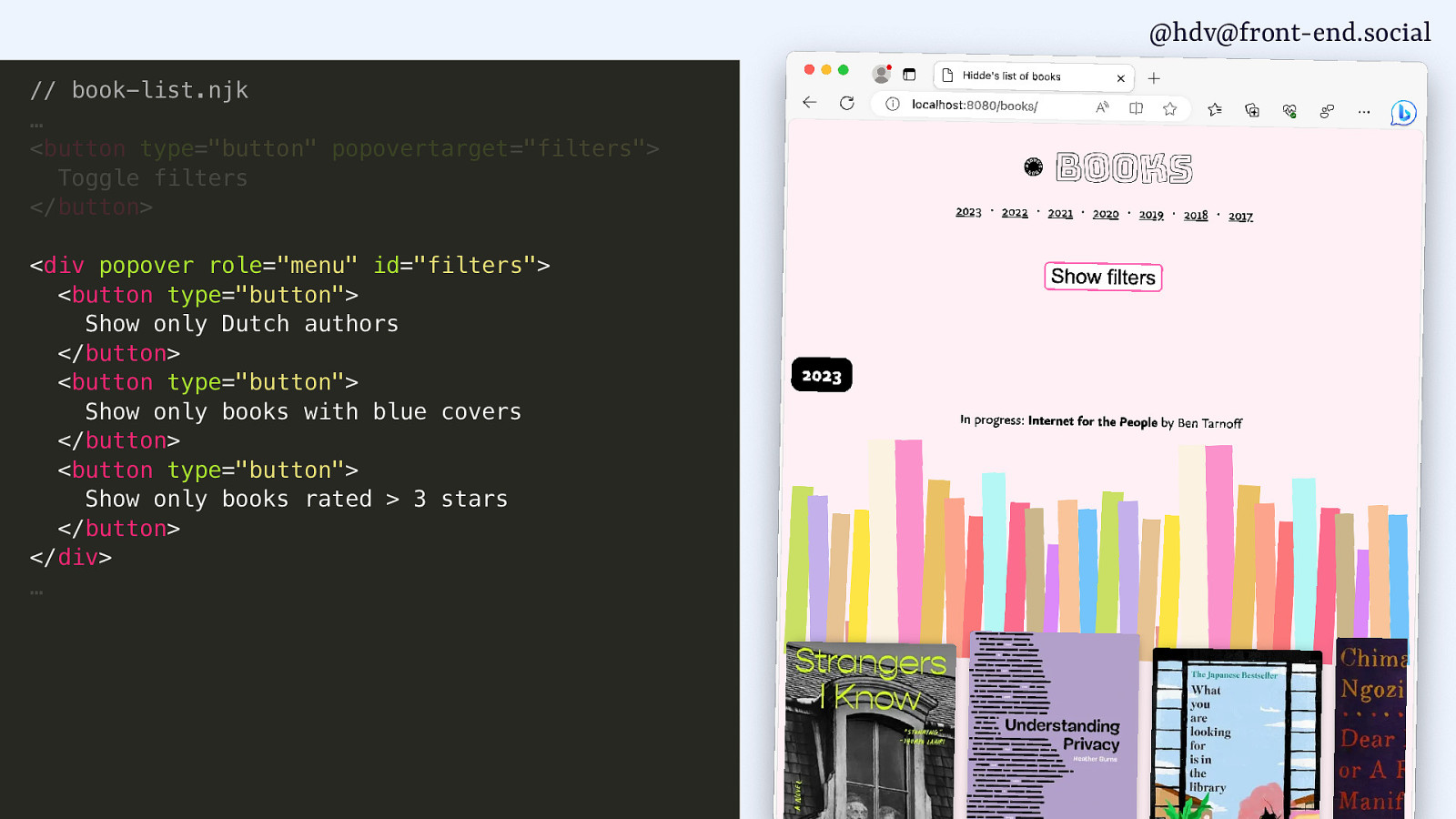
@hdv@front-end.social // book-list.njk … <button type=”button” popovertarget=”filters”> Toggle filters </button> <div popover role=”menu” id=”filters”> <button type=”button”> Show only Dutch authors </button> <button type=”button”> Show only books with blue covers </button> <button type=”button”> Show only books rated > 3 stars </button> </div> …
Slide 133

@hdv@front-end.social // book-list.njk … <button type=”button” popovertarget=”filters”> Toggle filters </button> <div popover role=”menu” id=”filters”> <button type=”button”> Show only Dutch authors </button> <button type=”button”> Show only books with blue covers </button> <button type=”button”> Show only books rated > 3 stars </button> </div> …
Slide 134
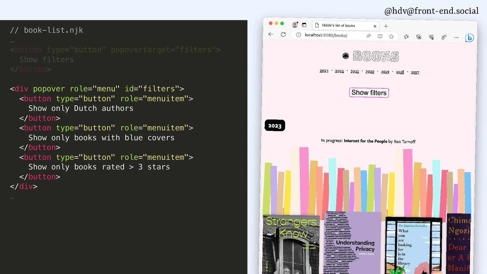
@hdv@front-end.social // book-list.njk … <button type=”button” popovertarget=”filters”> Show filters </button> <div popover role=”menu” id=”filters”> <button type=”button” role=”menuitem”> Show only Dutch authors </button> <button type=”button” role=”menuitem”> Show only books with blue covers </button> <button type=”button” role=”menuitem”> Show only books rated > 3 stars </button> </div> …
Slide 135
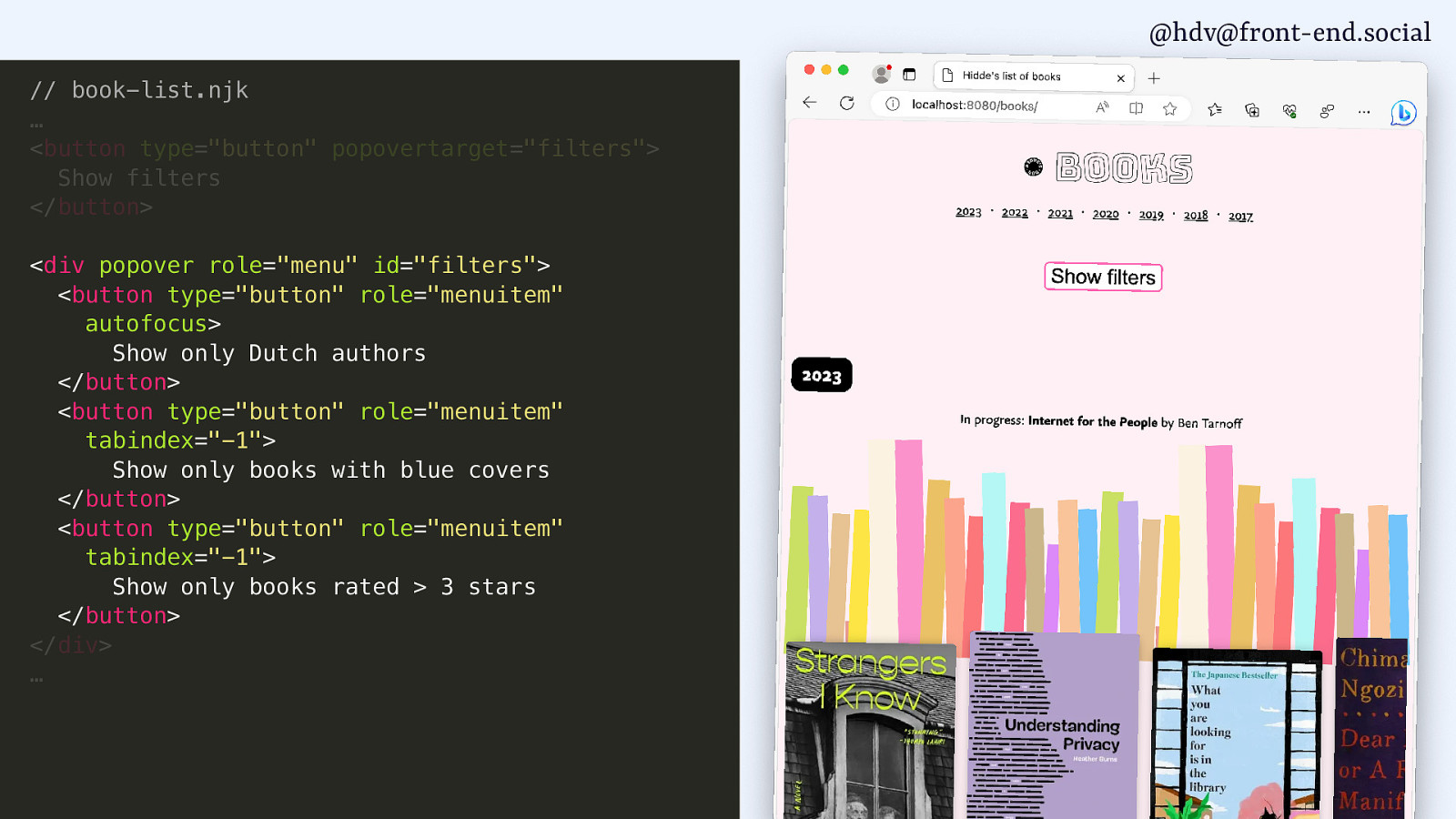
@hdv@front-end.social // book-list.njk … <button type=”button” popovertarget=”filters”> Show filters </button> <div popover role=”menu” id=”filters”> <button type=”button” role=”menuitem” autofocus> Show only Dutch authors </button> <button type=”button” role=”menuitem” tabindex=”-1”> Show only books with blue covers </button> <button type=”button” role=”menuitem” tabindex=”-1”> Show only books rated > 3 stars </button> </div> …
Slide 136
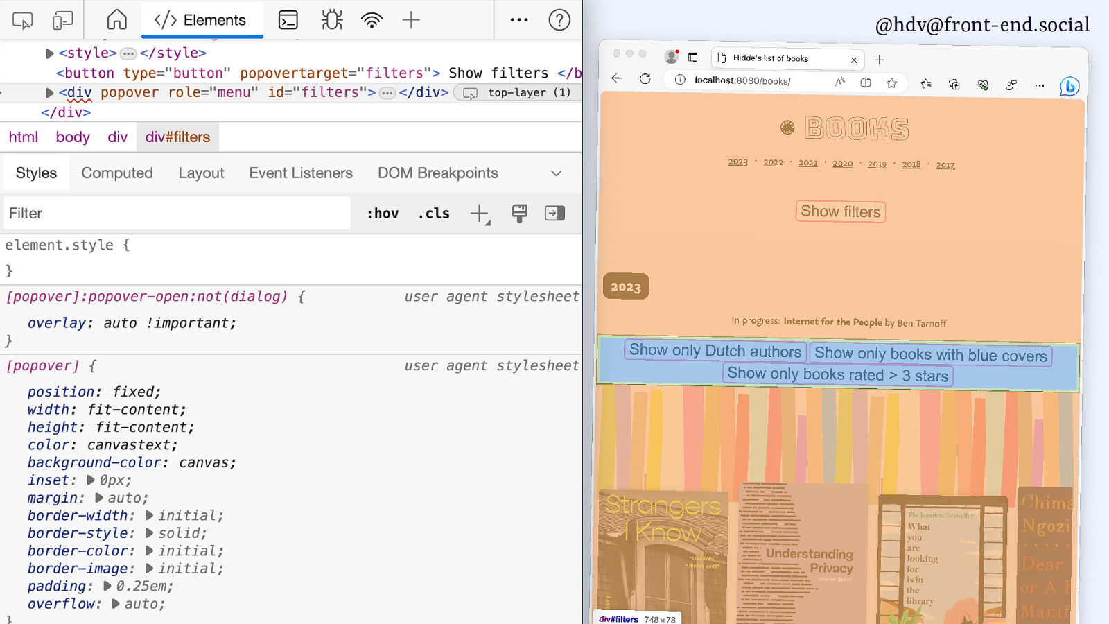
@hdv@front-end.social // book-list.njk … <button type=”button” popovertarget=”filters”> Show filters </button> <div popover role=”menu” id=”filters”> <button type=”button”> Show only Dutch authors </button> <button type=”button”> Show only books with blue covers </button> <button type=”button”> Show only books rated > 3 stars </button> </div> …
Slide 137
@hdv@front-end.social
g o l a i d < ✅ popover ) ( l a d o M w o h s h t i w ✅ Both are centered by default
Slide 138
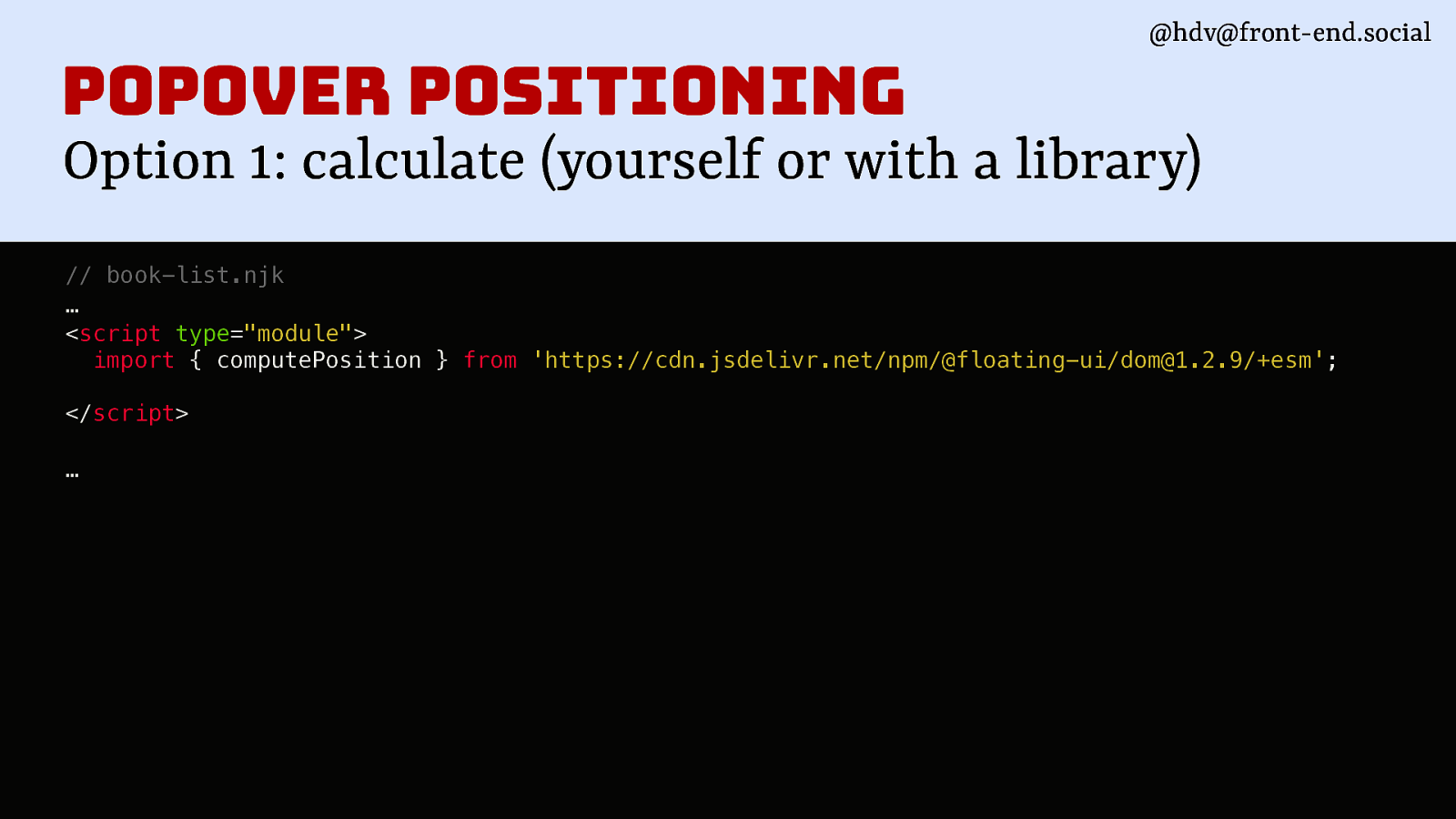
@hdv@front-end.social popover positioning Option 1: calculate (yourself or with a library) // book-list.njk … <script type=”module”> import { computePosition } from ‘https://cdn.jsdelivr.net/npm/@floating-ui/dom@1.2.9/+esm’; </script> …
Slide 139
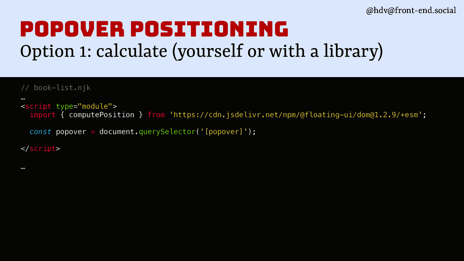
@hdv@front-end.social popover positioning Option 1: calculate (yourself or with a library) // book-list.njk … <script type=”module”> import { computePosition } from ‘https://cdn.jsdelivr.net/npm/@floating-ui/dom@1.2.9/+esm’; const popover = document.querySelector(‘[popover]’); </script> …
Slide 140
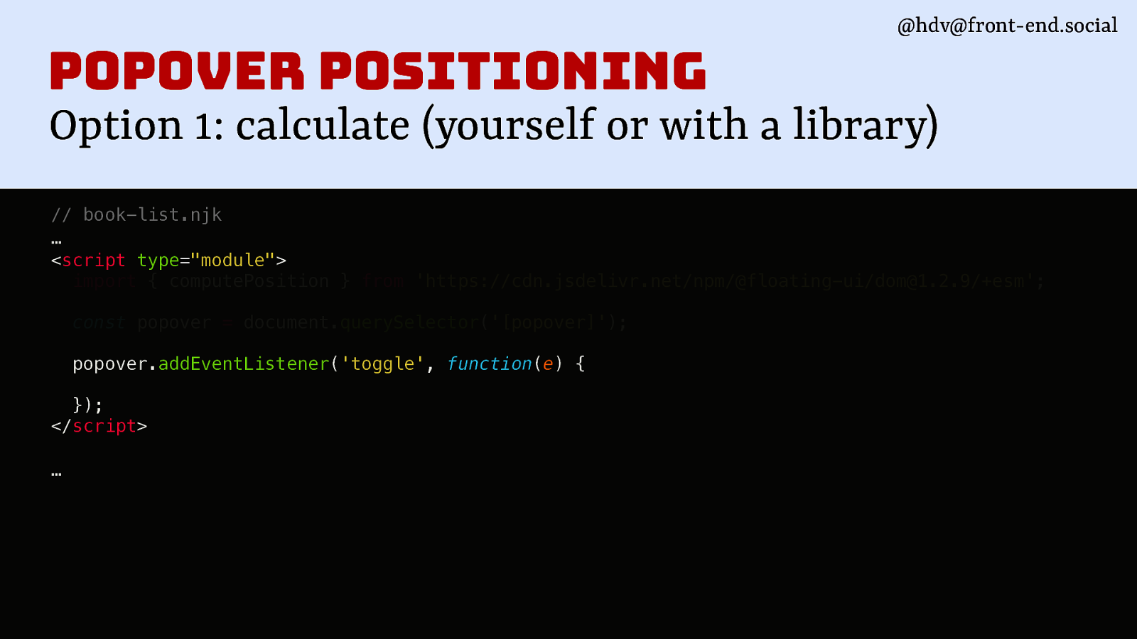
@hdv@front-end.social popover positioning Option 1: calculate (yourself or with a library) // book-list.njk … <script type=”module”> import { computePosition } from ‘https://cdn.jsdelivr.net/npm/@floating-ui/dom@1.2.9/+esm’; const popover = document.querySelector(‘[popover]’); popover.addEventListener(‘toggle’, function(e) { }); </script> …
Slide 141
@hdv@front-end.social
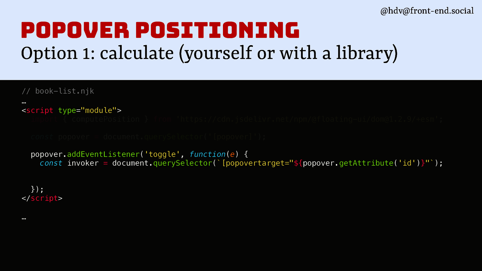
popover positioning Option 1: calculate (yourself or with a library) // book-list.njk … <script type=”module”> import { computePosition } from ‘https://cdn.jsdelivr.net/npm/@floating-ui/dom@1.2.9/+esm’; const popover = document.querySelector(‘[popover]’); popover.addEventListener(‘toggle’, function(e) { const invoker = document.querySelector([popovertarget="${popover.getAttribute('id')}"); }); </script> …
Slide 142
@hdv@front-end.social
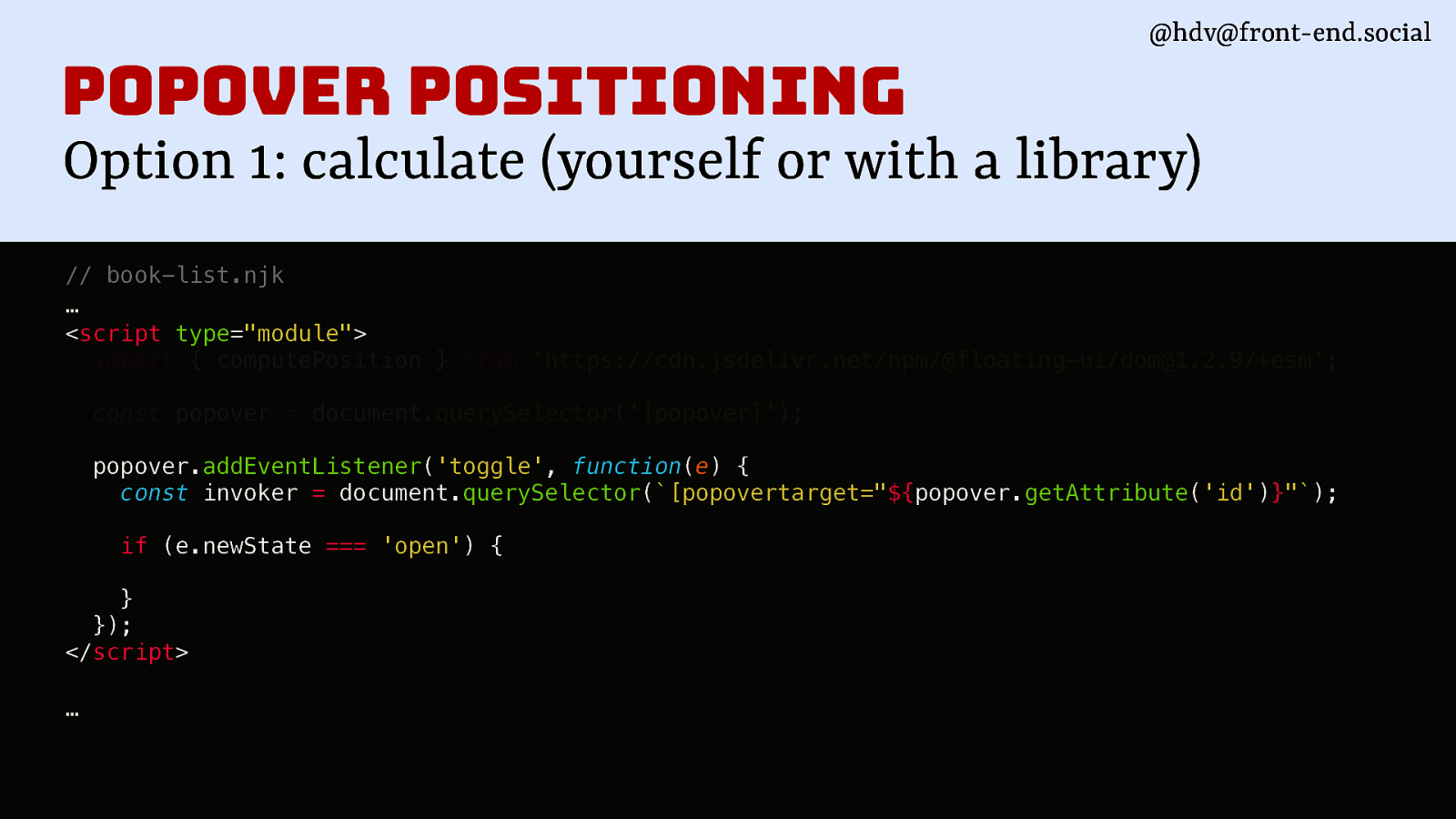
popover positioning Option 1: calculate (yourself or with a library) // book-list.njk … <script type=”module”> import { computePosition } from ‘https://cdn.jsdelivr.net/npm/@floating-ui/dom@1.2.9/+esm’; const popover = document.querySelector(‘[popover]’); popover.addEventListener(‘toggle’, function(e) { const invoker = document.querySelector([popovertarget="${popover.getAttribute('id')}"); if (e.newState === ‘open’) { } }); </script> …
Slide 143
@hdv@front-end.social
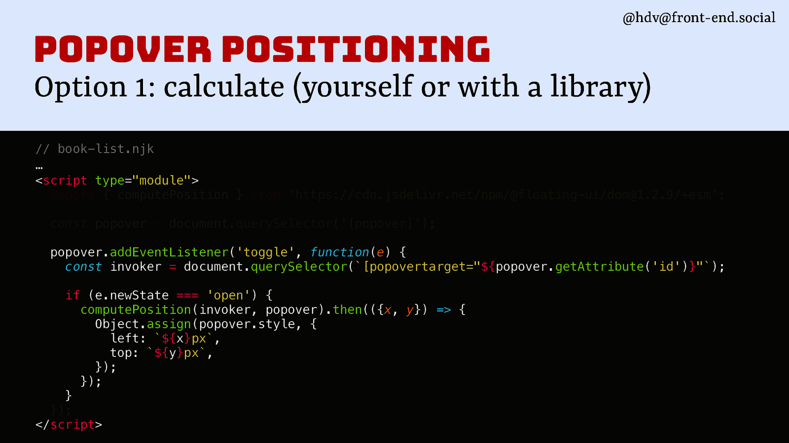
popover positioning Option 1: calculate (yourself or with a library) // book-list.njk … <script type=”module”> import { computePosition } from ‘https://cdn.jsdelivr.net/npm/@floating-ui/dom@1.2.9/+esm’; const popover = document.querySelector(‘[popover]’); popover.addEventListener(‘toggle’, function(e) { const invoker = document.querySelector([popovertarget="${popover.getAttribute('id')}"); if (e.newState === ‘open’) { computePosition(invoker, popover).then(({x, y}) => { Object.assign(popover.style, { left: ${x}px, top: ${y}px, }); }); } }); </script>
Slide 144
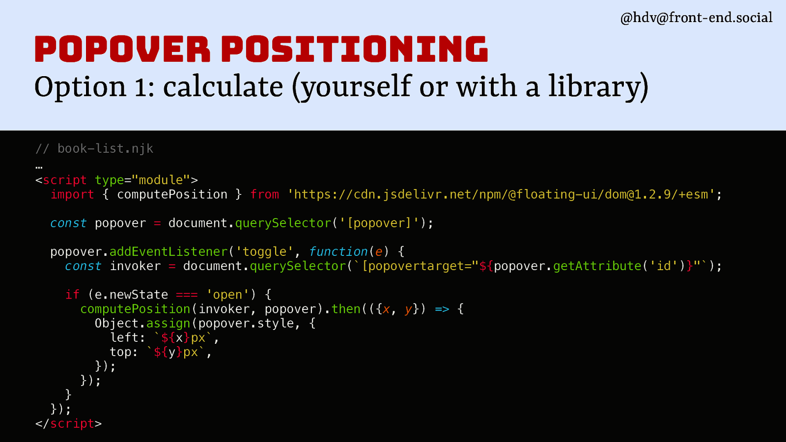
@hdv@front-end.social
popover positioning Option 1: calculate (yourself or with a library) // book-list.njk … <script type=”module”> import { computePosition } from ‘https://cdn.jsdelivr.net/npm/@floating-ui/dom@1.2.9/+esm’; const popover = document.querySelector(‘[popover]’); popover.addEventListener(‘toggle’, function(e) { const invoker = document.querySelector([popovertarget="${popover.getAttribute('id')}"); if (e.newState === ‘open’) { computePosition(invoker, popover).then(({x, y}) => { Object.assign(popover.style, { left: ${x}px, top: ${y}px, }); }); } }); </script>
Slide 145
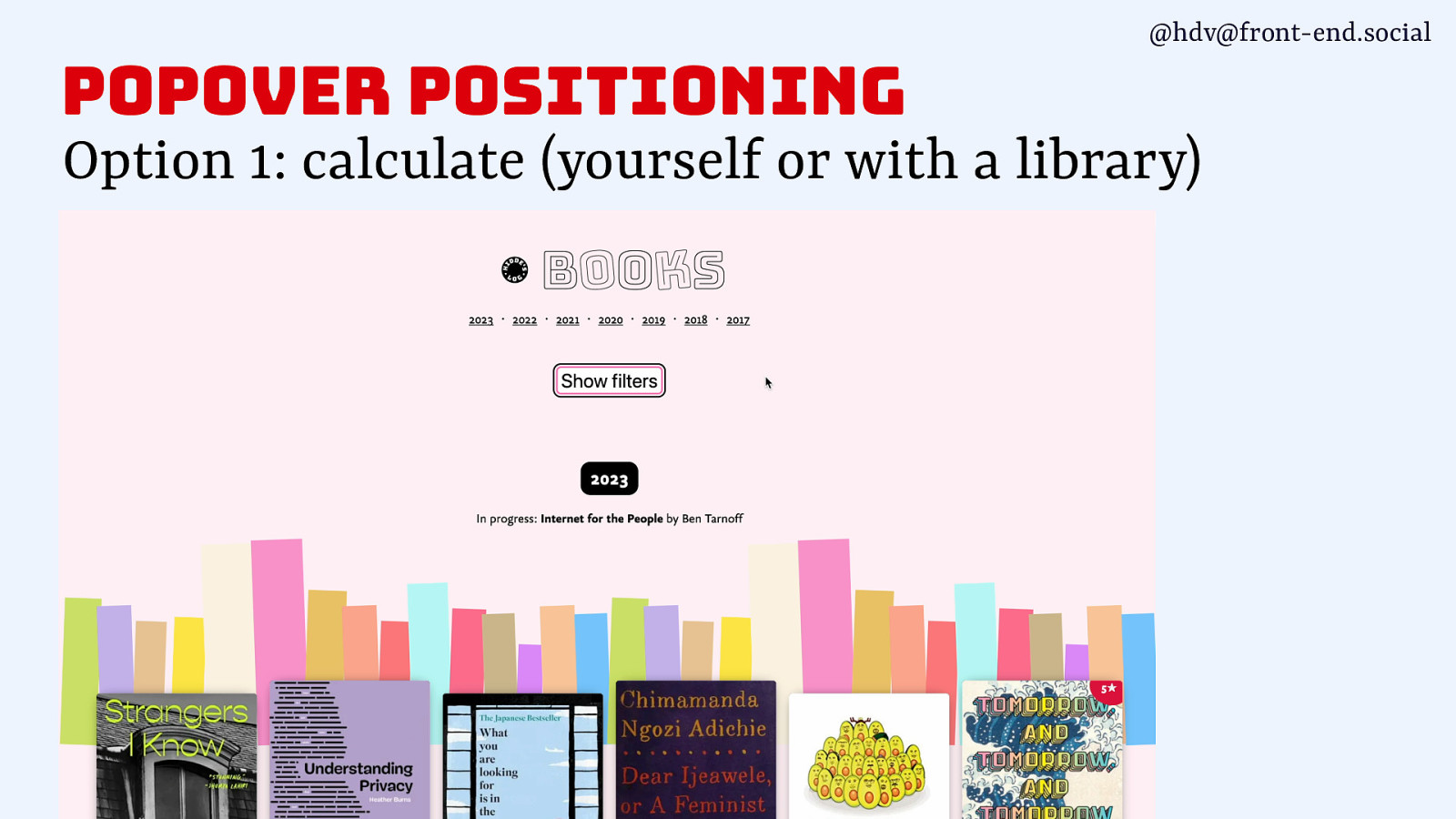
@hdv@front-end.social popover positioning Option 1: calculate (yourself or with a library)
Slide 146
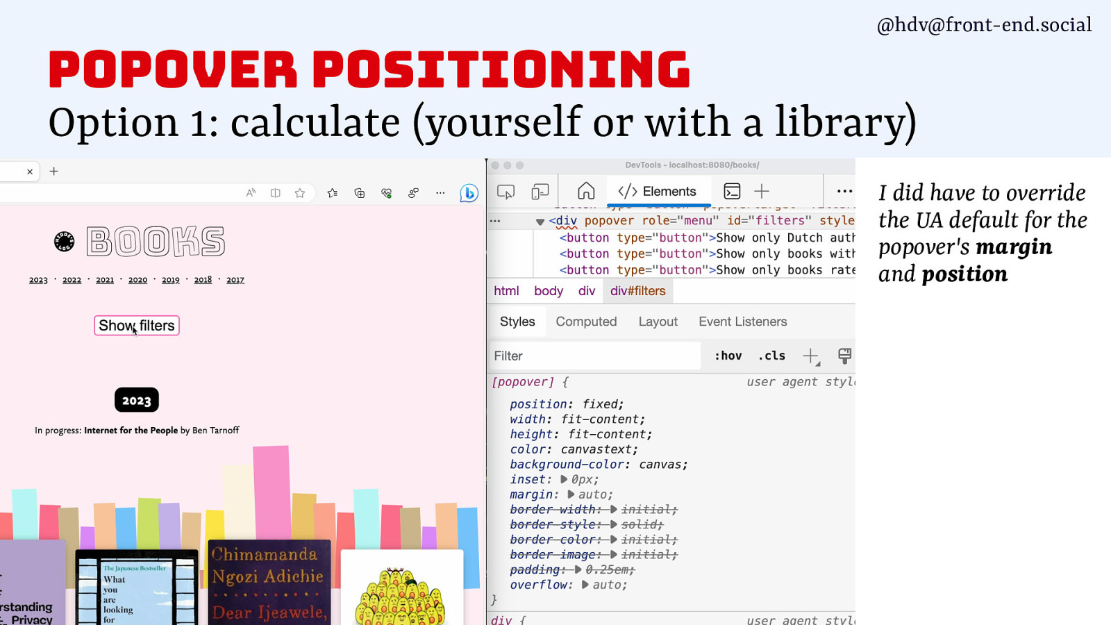
@hdv@front-end.social popover positioning Option 1: calculate (yourself or with a library) I did have to override the UA default for the popover’s margin and position
Slide 147
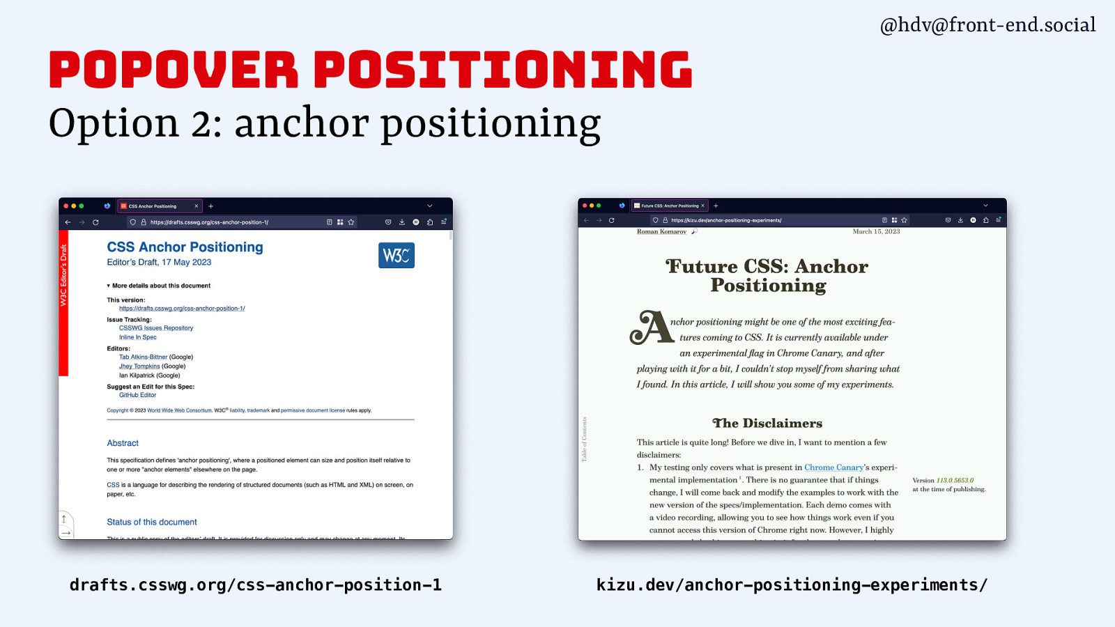
@hdv@front-end.social popover positioning Option 2: anchor positioning drafts.csswg.org/css-anchor-position-1 kizu.dev/anchor-positioning-experiments/
Slide 148
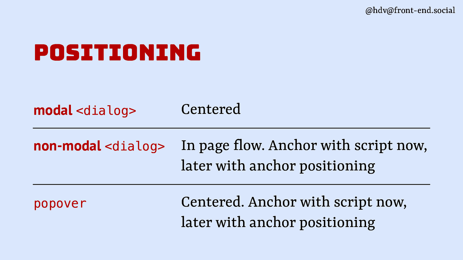
@hdv@front-end.social positioning Centered non-modal <dialog> In page low. Anchor with script now, later with anchor positioning popover Centered. Anchor with script now, later with anchor positioning f modal <dialog>
Slide 149
@hdv@front-end.social
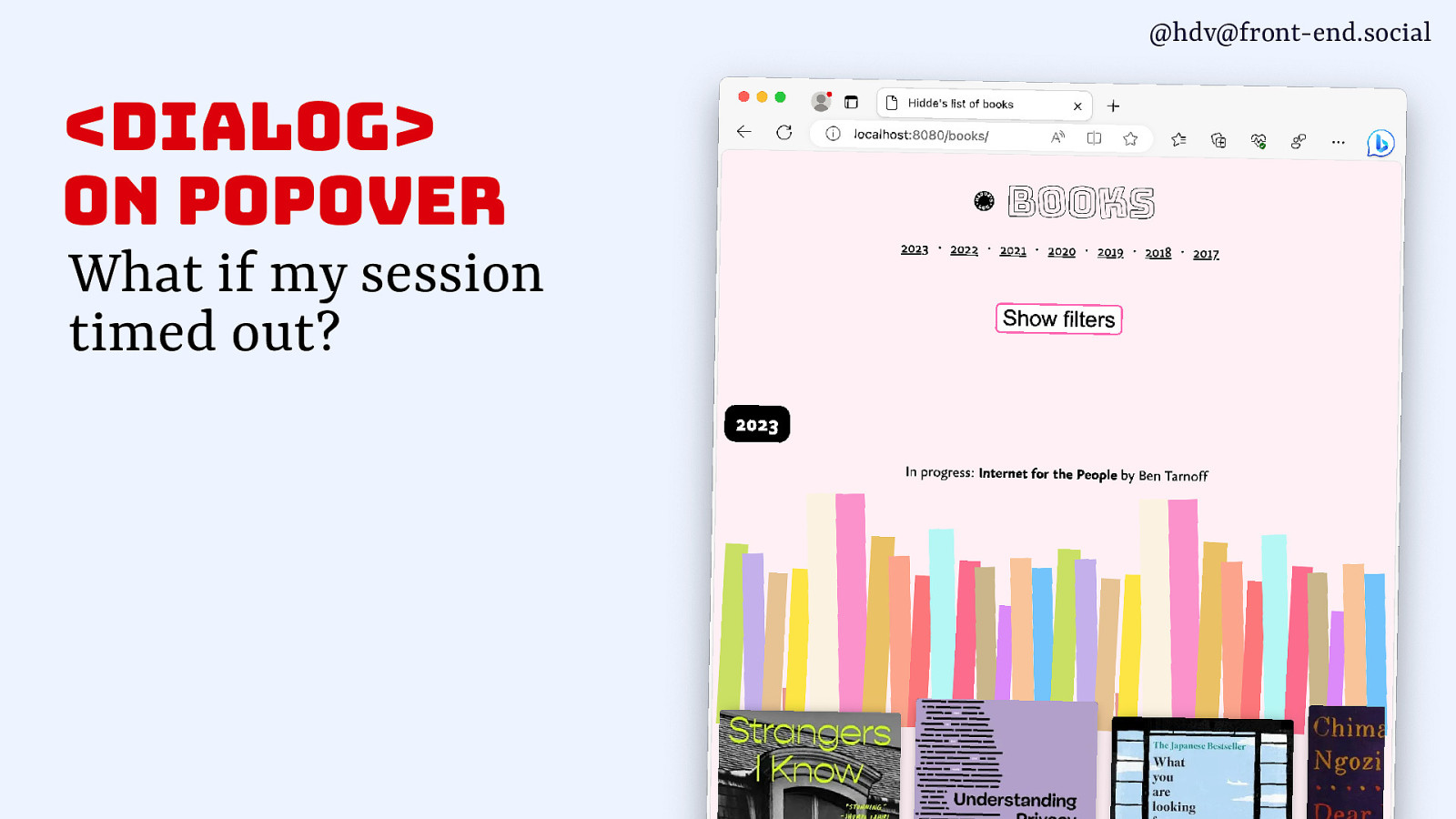
<dialog> on popover What if my session timed out?Slide 150
@hdv@front-end.social
Slide 151
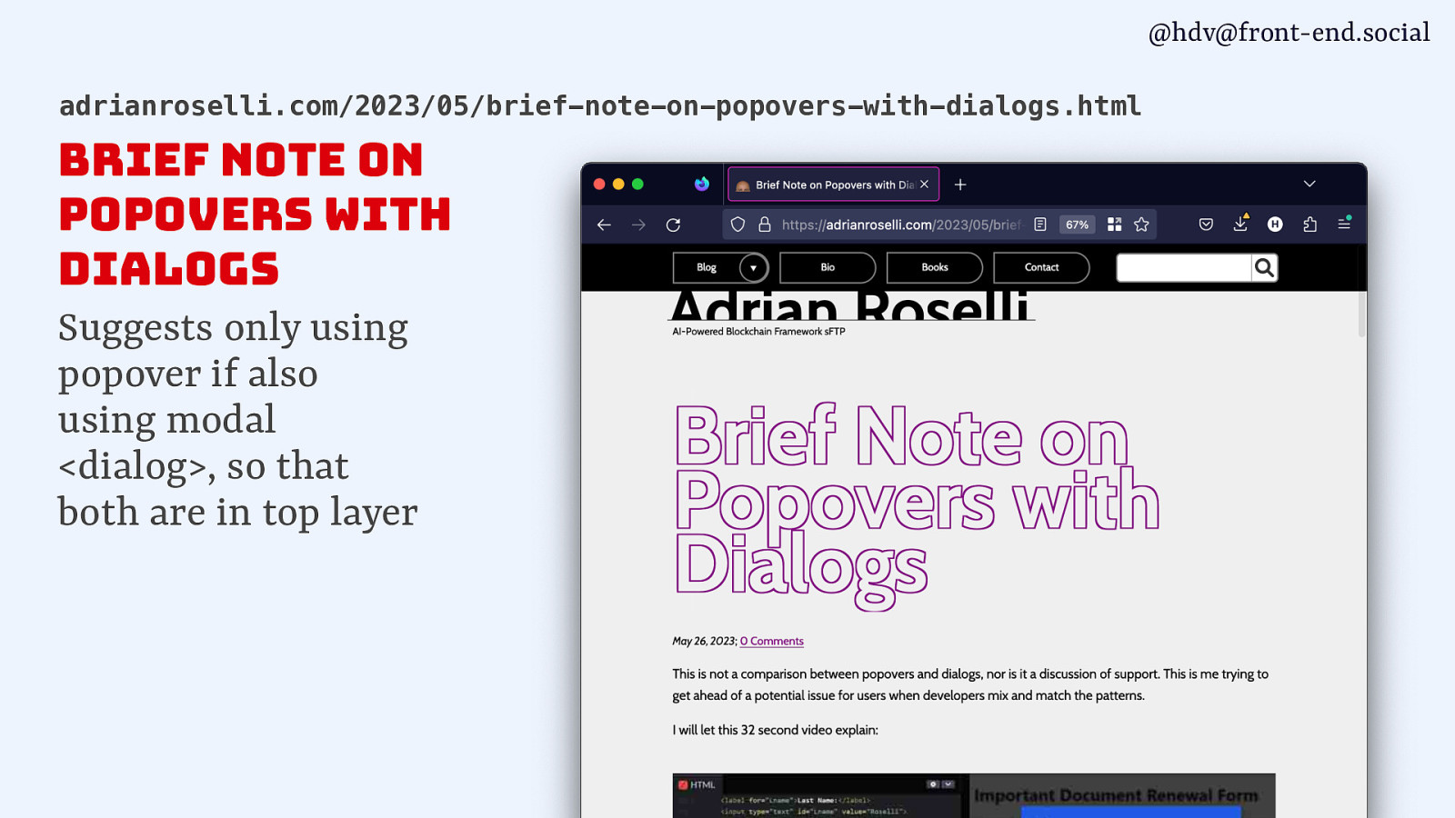
@hdv@front-end.social adrianroselli.com/2023/05/brief-note-on-popovers-with-dialogs.html Brief Note on Popovers with Dialogs Suggests only using popover if also using modal <dialog>, so that both are in top layer
Slide 152
@hdv@front-end.social wrapping up
Slide 153
g o l a i <d @hdv@front-end.social UI considerations HTML element with wide browser support and (as of recently) good accessibility support Semantics popover Positioning New attribute / API in HTML, v1 supported in Chrome stable, coming to other browsers too
Slide 154
thank you! Questions @hdv on most platforms Slides/resources talks.hiddedevries.nl