Hello!
Slide 1

Slide 2
So… I’ve been into web development and accessibility for a while… the more I was involved in things like writing audit reports, I had friends reach out with accessibility questions. One specific question that came up in a conversation I had a couple of weeks ago was this: “Why isn’t accessibility easier?”
A friend asked me this, they are a developer and very focused on accesssibility. Of course, we all know, accessibility is never done, it is iterative, continuous, etcetera. However, people working in web teams will need to merge that PR or show that design to their client. And it can be hard to know if you’re doing accessibility right.
So it’s a valid question. Of course accessibility doesn’t have to be easier just to accommodate developers, designers and content folks… that would be ableist. But for web accessibility to be much wider implemented, making it easier to apply is probably the fastest way and make the accessibility movement more productive.
And again, my friend was not after a quick shortcut or easy way out, they knew what they were doing and were pretty well versed in accessibility. And still…
Slide 3
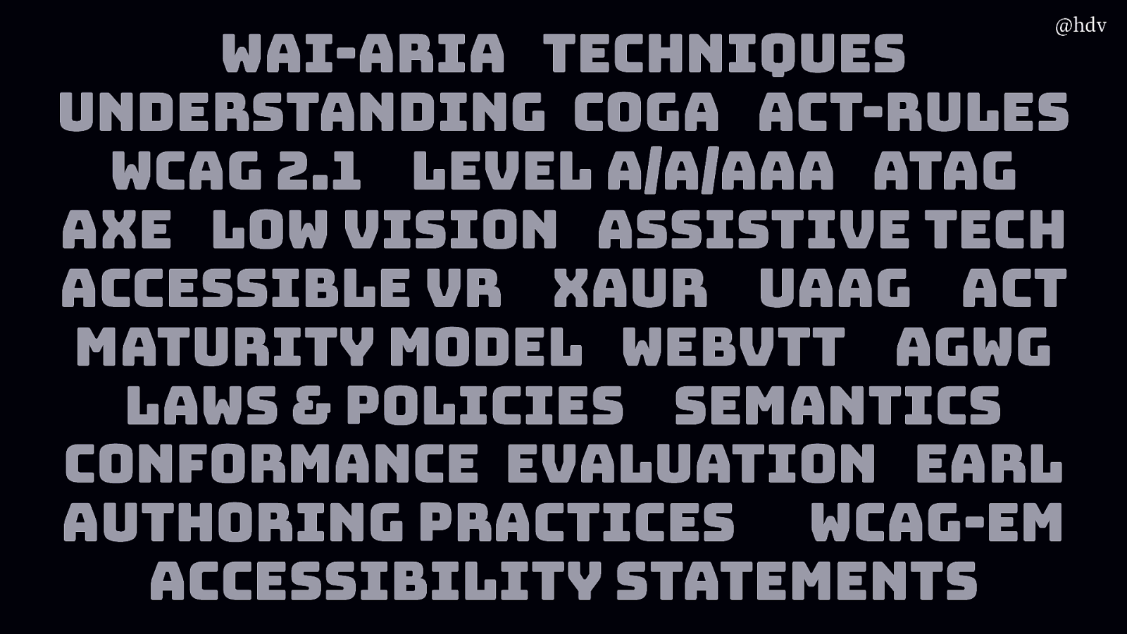
When I worked at W3C/WAI, among other things, I learned a lot of acronyms. Like, there’s WAI-ARIA, Techniques, Understanding Documents, specific guidance for people with cognitive disabilities, the WCAG standard, soon to be superseded by WCAG 2.1, with WCAG 3.0 also kind of coming up, but still in the works. WCAG has levels, there is also ATAG, which is about authoring tools, like CMSes, there’s testing tools like Axe, specific guidance about low vision. There’s a lot to know about assitstive tech and accessible VR. Actually there is a great doc abbreviated to XAUR that has lots of useful info for VR devs to think about when they want to make accessible experiences. There’s UAAG, for browsers, ACT, again, a maturity model for organisations that do accesssibility and want to professionalise their practice, WebVTT, a standard for subtitling and things like that, AGWG, the working group that makes the accessibility guidelines, lots of laws and policies, semantics is a whole talk in itself, conformance evaluation matters and with EARL you get an interoperable data format, authoring practices are a thing for ARIA, WCAG-EM is an evaluation method and then accessibility statements are increasingly important.
I know, it’s a lot… so I get why people would feel lost when they think about accessibility. Sorry for the tangent.
I asked my friend what they found hard about accessibility and together we got to three different aspects.
Slide 4
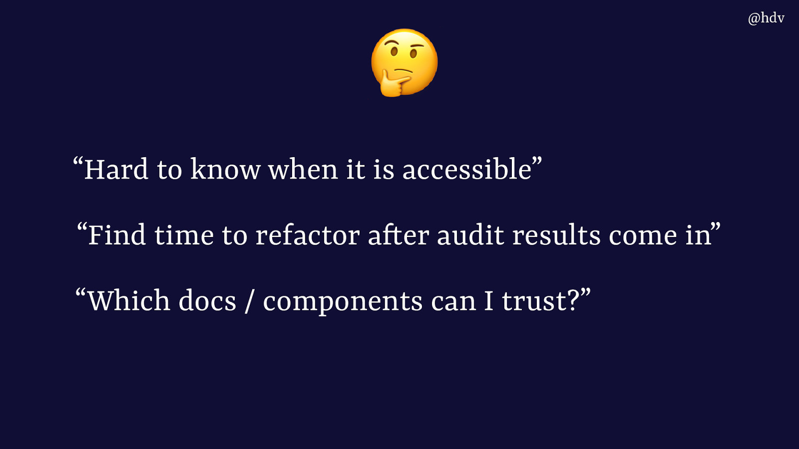
First, it’s hard to know when something is accessible. Like, how do you know you’ve done enough.
Then, what if you’ve had an audit report done and the results come in, how can you get time from your manager to focus on it?
Which documents or components can I actually trust, there seems to be a lot out there and people say they aren’t all great.
Slide 5
In this talk I want to show you a bit of the accessibility landscape as I know it, and hopefully help you think about and argue for why it makes sense to do accessibility earlier. Shifting left, as in, moving this work to earlier.
Slide 6
My name is Hidde, I write on a URL called hidde dot blog, do feel free to like and subscribe.
I have worked as an accessibility specialist for a long time, doing audits and workshops and things like that.
I currently work at Sanity.io, where we’re on a mission to make it much easier to work with content on the web.
Slide 7
Web accessibility is basically to ensure people with disabilities can use our site/app.
Slide 8
Or that they can use our service
Slide 9
Or that they can buy our product
Slide 10
Ultimately it is about hat everyone gets an excellent user experience, as Andy said earlier.
Slide 11
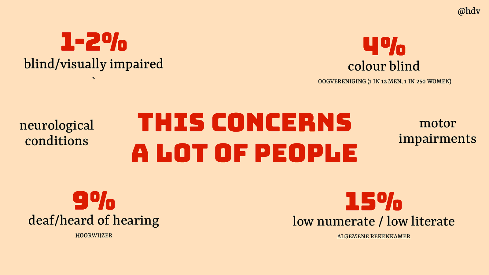
When we say “people with disabilities”, we mean a large and very varied group of people. 1-2% of the population is blind or visually impaired. 4% is colour blind. 15% is low literature or low numerate. 9% is deaf or hard of hearing. Some people have neurological conditions or motor impairments. These people can overlap too and it’s safe to assume everyone has different degrees of these specific disabilities.
Slide 12
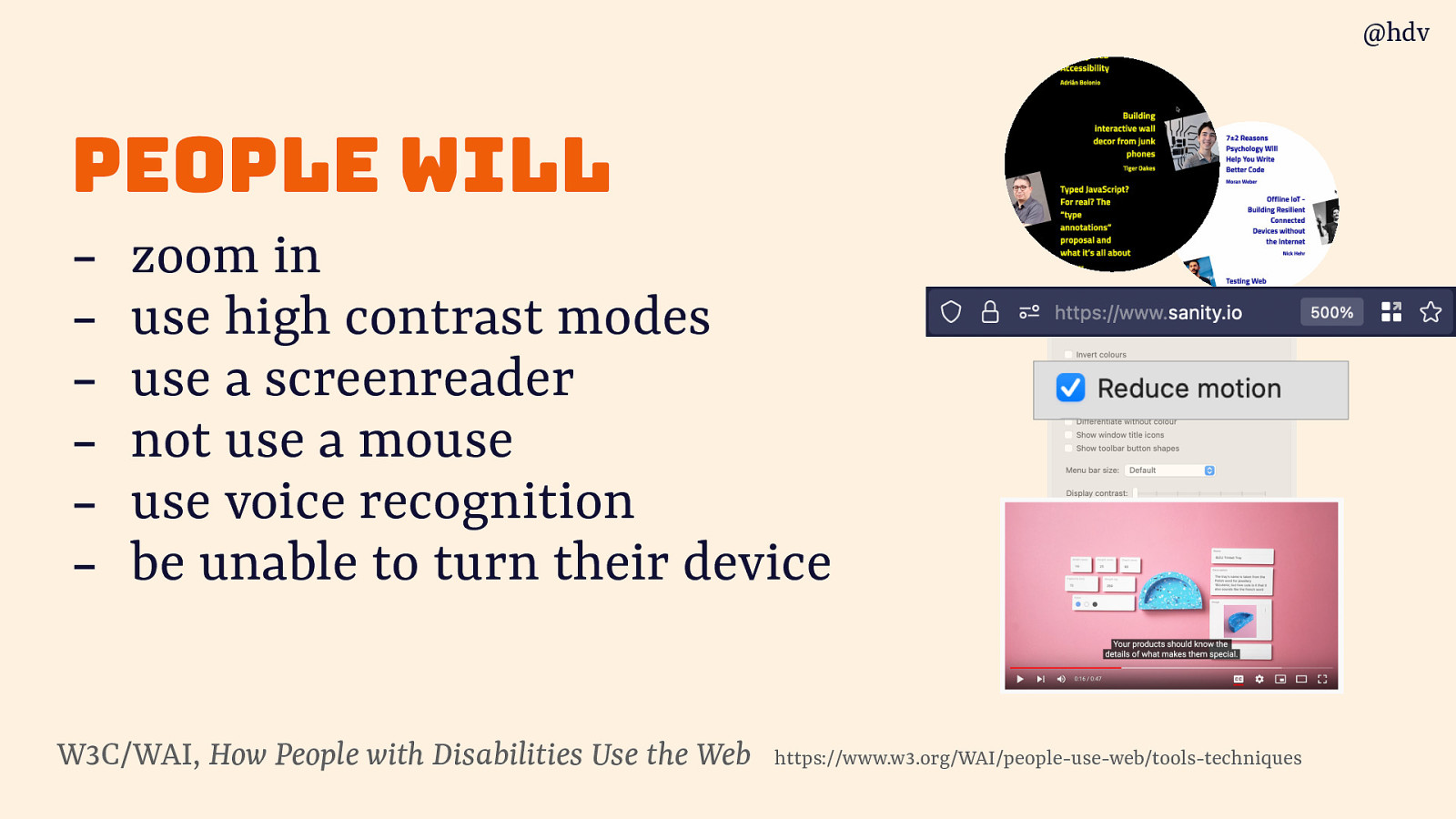
A different way I like to think about it is thinking about what people will want to do on our site. And if our site puts of barriers that prevents such actions. We can be sure that people will come to zoom in, use high contrast modes, use a screenreader, or voice navigation. There will be users who cannot use a mouse or cannot turn their device.
Slide 13
Basically what it comes down to is to assume less about how people use our product. We assume a lot in the web space.
Slide 14

We used to assume websites were exactly 800 by 600 pixels. That was the size, that’s what we designed for and wrote CSS for.
Slide 15
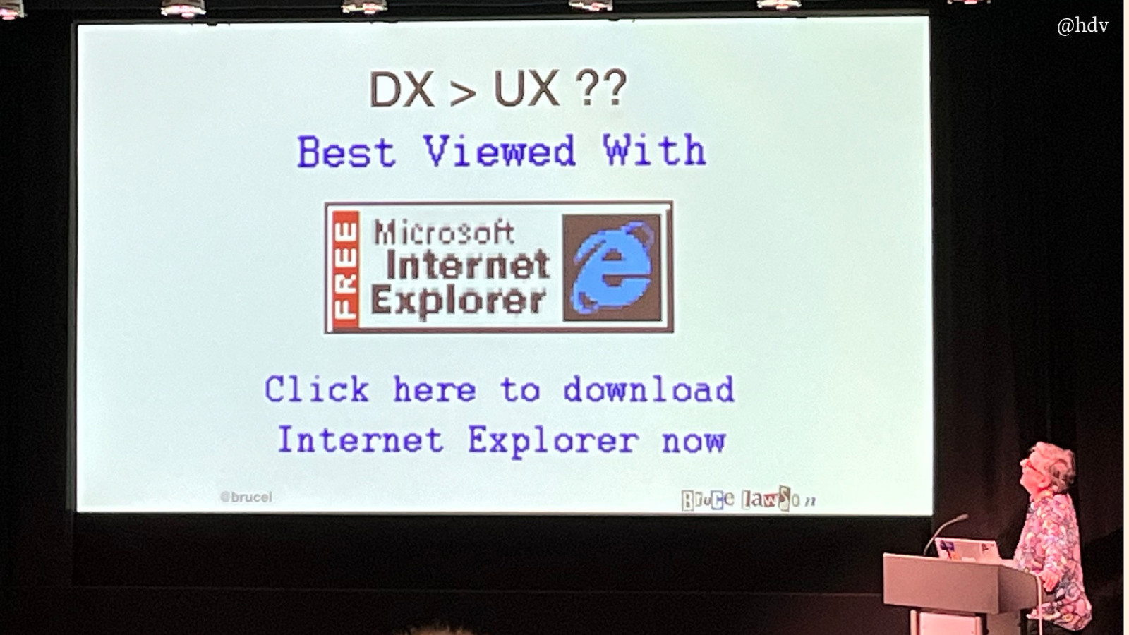
This was around the same time as when many websites were best viewed with Internet Explorer.
Slide 16
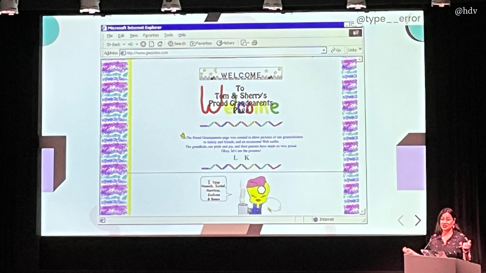
And when Geocities was the tool we all used and loved.
Slide 17

Until Steve Jobs did that presentation when he went ‘it’s an iPod… it’s a phone… it’s an internet device!’ Blackberries existed and they had browsers, I believe, but this moment was probably the moment when people started taking mobile web seriously. And the moment when our assumptions were once again proven wrong. At first we got used to zooming into web pages on the tiny screen, responsive design seemed ridiculous, but after time did it’s thing, we’re now very much used to the fact that we have no idea which devices people will use to access our websites.
Slide 18
The three paths to accessibility
So we’ve seen a bit about what accessibility is, let’s now talk about how we can approach it in day to day work. But first I need to get something out of the way: accessibility isn’t absolute.
Slide 19
Some products claim they’re “100% accessible”. There isn’t such a thing, nothing is a 100% accessible.
Slide 20
The opposite is also claimed… sometimes I hear accessibility specialists say something is inaccessible, but if we’re honest, nothing is ever 100% inaccessible either. Accessibility is a spectrum, somewhere between 5% and 95%, there’s always going to be some people who can access a website, what we’re trying to do in this field to find as many barriers as we can in our products and fix them.
Slide 21
Accessibility is a spectrum and claims about accessiblity can’t be very absolute for three reasons. The first is people: people have different ways of using their computer, they have different barriers because of different combinations of disability, assistive technologies and browsers.
Slide 22
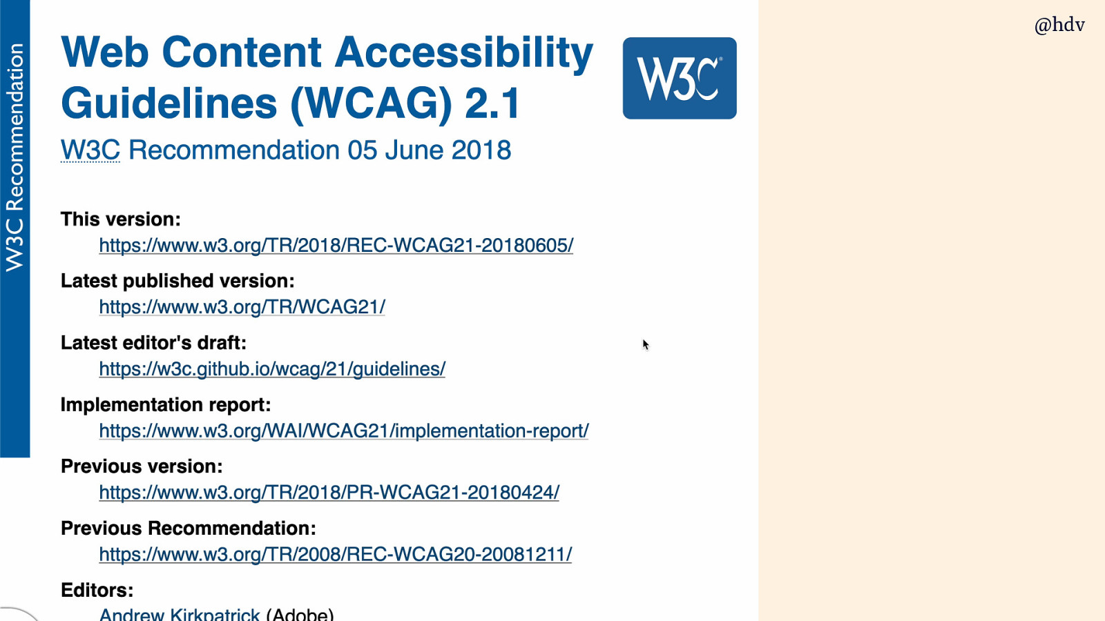
It even says at much in WCAG, Layers of Guidance section:
even content that conforms at the highest level (AAA) will not be accessible to individuals with all types, degrees, or combinations of disability, particularly in the cognitive language and learning areas. Authors are encouraged to consider the full range of techniques, including the advisory techniques, as well as to seek relevant advice about current best practice to ensure that Web content is accessible, as far as possible, to this community.
Slide 23
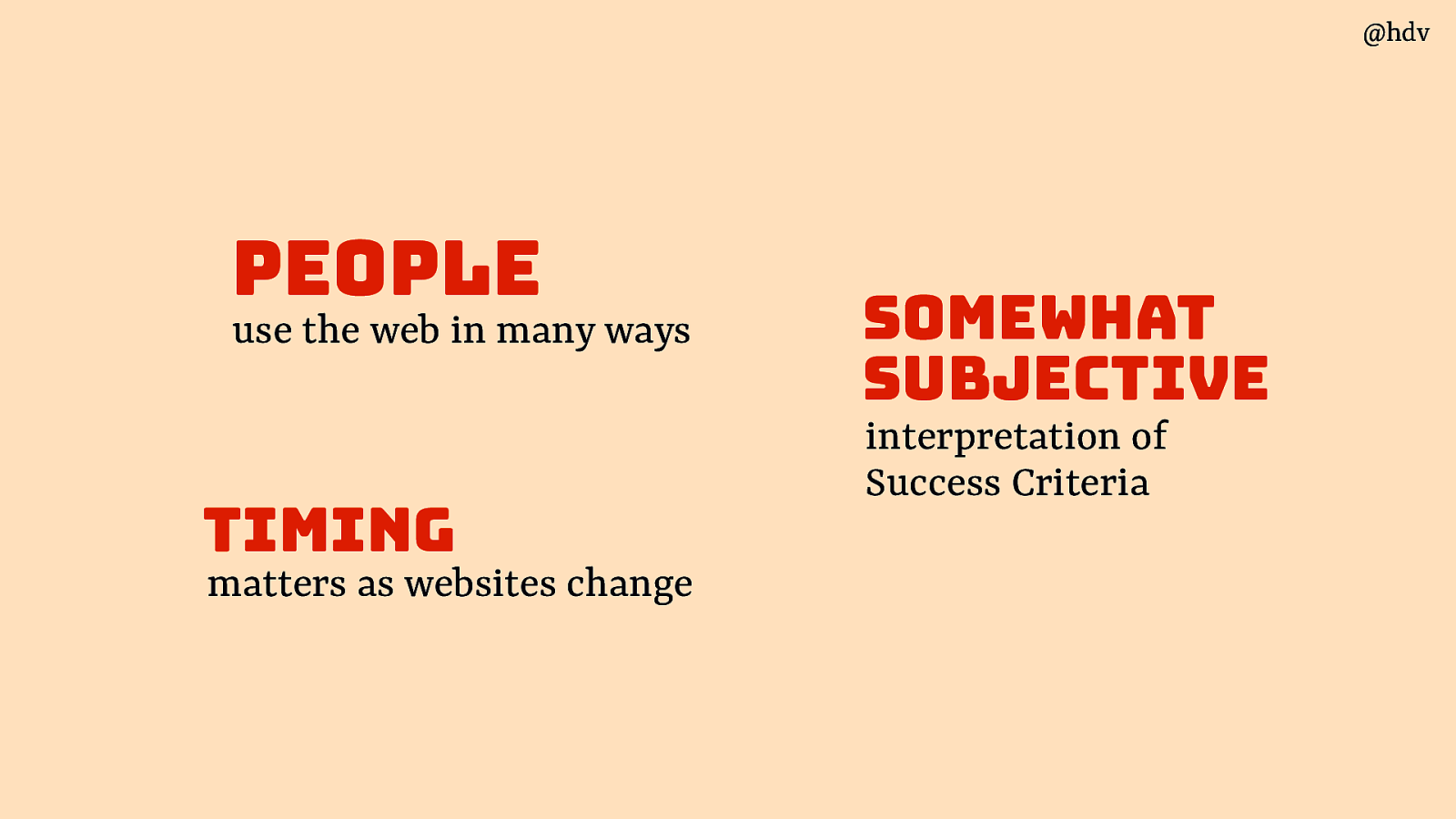
The second reason accessibility isn’t absolute is because the Successs Criteria in WCAG, and of course we can’t equate them with accessibility, but these Success Criteria are somewhat subjective. That is not because the people who made them aren’t very smart, they are very smart, the reason is that if we had very absolute criteria, they would be very specific and we would need, like, 3000 of them and that would be much more impractical.
So yes, we should all chase perfect accessibility, but at the same realise that such a thing doesn’t exist, and any step towards that is helpful.
Slide 24
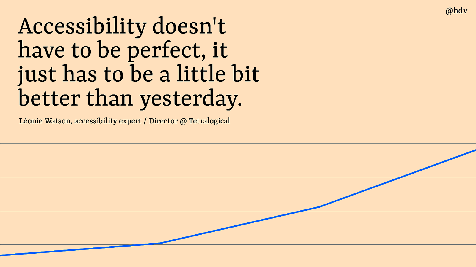
Léonie Watson said this much better than I can: “accessibility doesn’t have to be perfect, it just has to be a little bit better than yesterday”. This is an attitude I live by, not because I want to do the bare minimum, I want to do the maximum, really, it’s more about recognising that accessibility/inaccessibility is a continuum, and even small steps help to get closer to the accessibility side of things and further away from the inaccessibility side of things.
Slide 25
So yes, accessibility is not absolute for a couple of reasons, but sometimes it makes to pretend it is. It can make sense to do that, for instance if you are the European Commission and want to monitor the state of accessibility across all European Union countries. It makes sense to then assume a set of WCAG reports is meaningful, and it is, even if we know interpretation differences can exist. It is meaningful because it can show the state of accessibilility and measure progress.
Slide 26
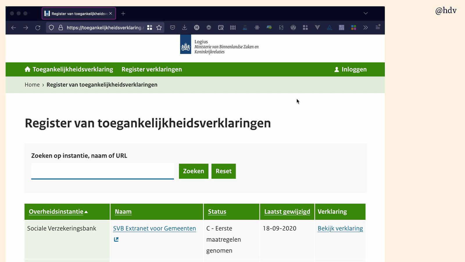
The Dutch government had a registry of accessibility statementd, which are backed by WCAG audit reports. It gives them insights like that 1.3.1 is most often not met, and helps them measure. It also helps push accessibility within organisations, a list created a buzz and managers want to make OKRs and KPIs and whatnot around getting a better score to get on this list and look good. There used to be this thing in Dutch government where a website could earn a green man, which was literally a drawing of a green man that you could place in your site’s footer to show off WCAG compliance. It was a whole thing, and even still today people sometimes talk about digital accessibility in terms of the green man, though I don’t think they still award them.
Slide 27
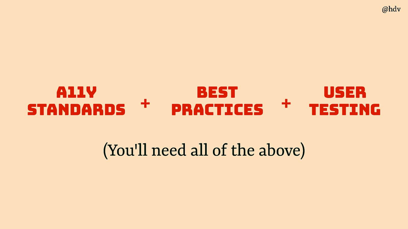
Ok, so accessibility isn’t absolute, we need a framework to help us get acccessibility right in our orgs. I believe there are three parts to a sound accessibility strategy: standards, best practices and user testing.
Slide 28
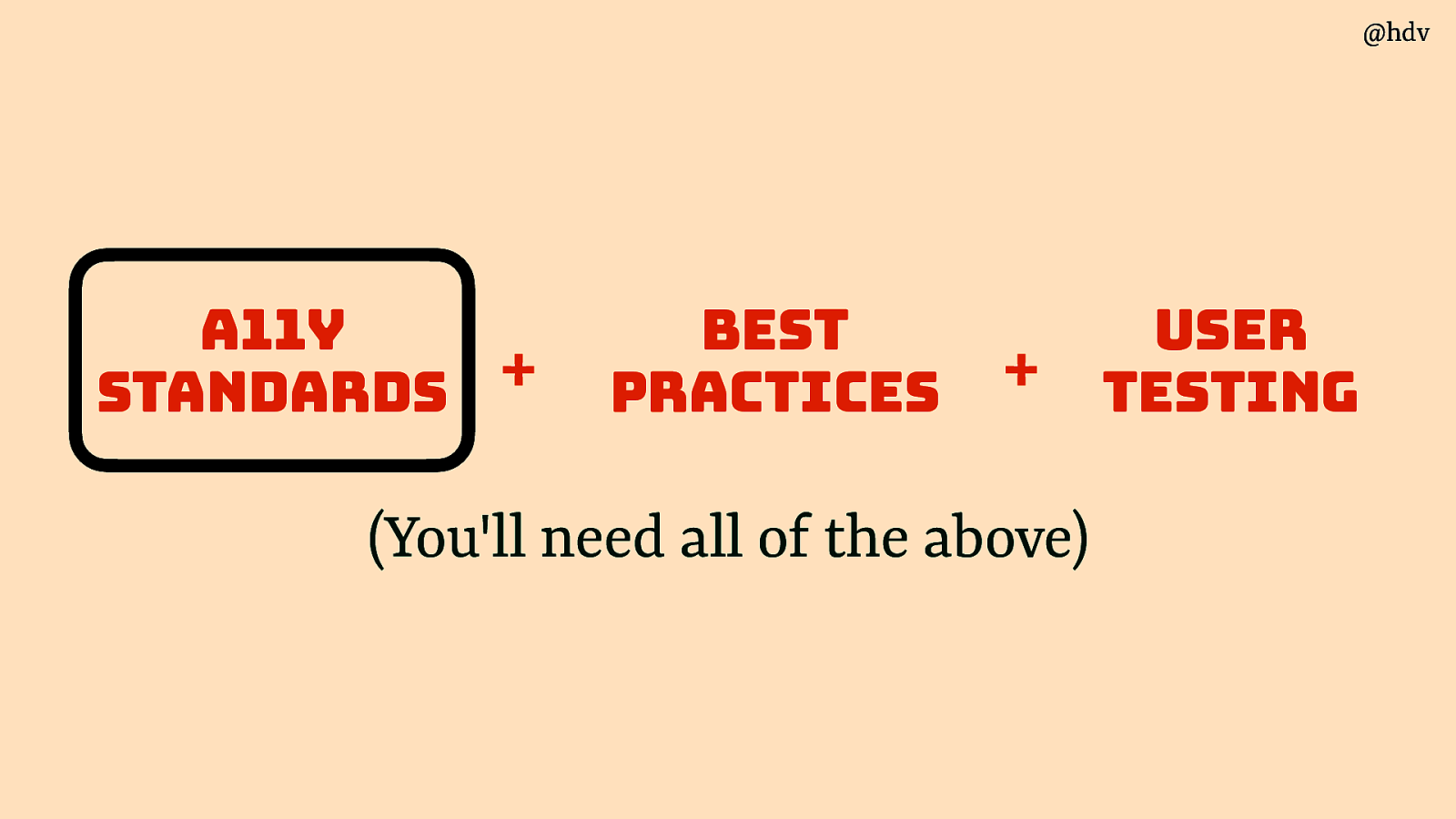
Let’s start with standards.
Slide 29
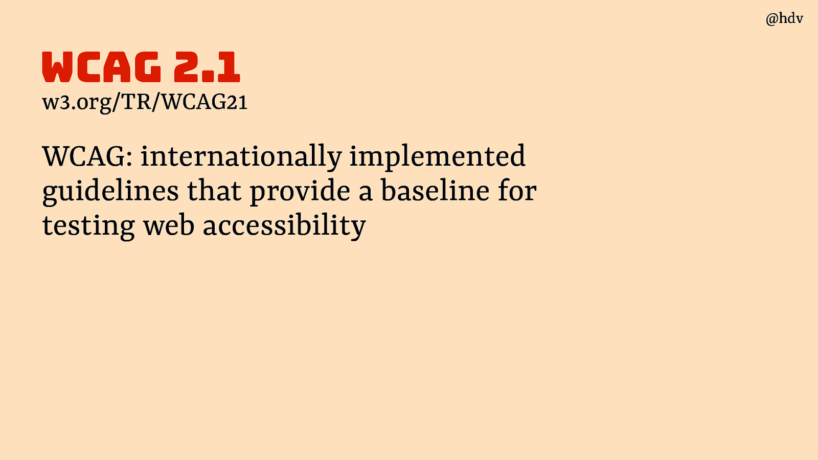
The standard most people look at is WCAG: they are internationally implemented guidelines that provide a baseline for testing web accessibility. Internationally in the sense that in countries across the globe, from the US to Taiwan to all over Europe, this standard is what a government means when they demand accessibility.
Slide 30
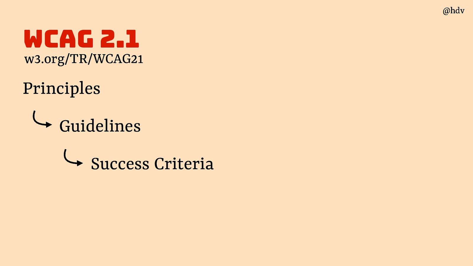
WCAG is divided into Principles, which have Guidelines, which have Success Criteria.
Slide 31
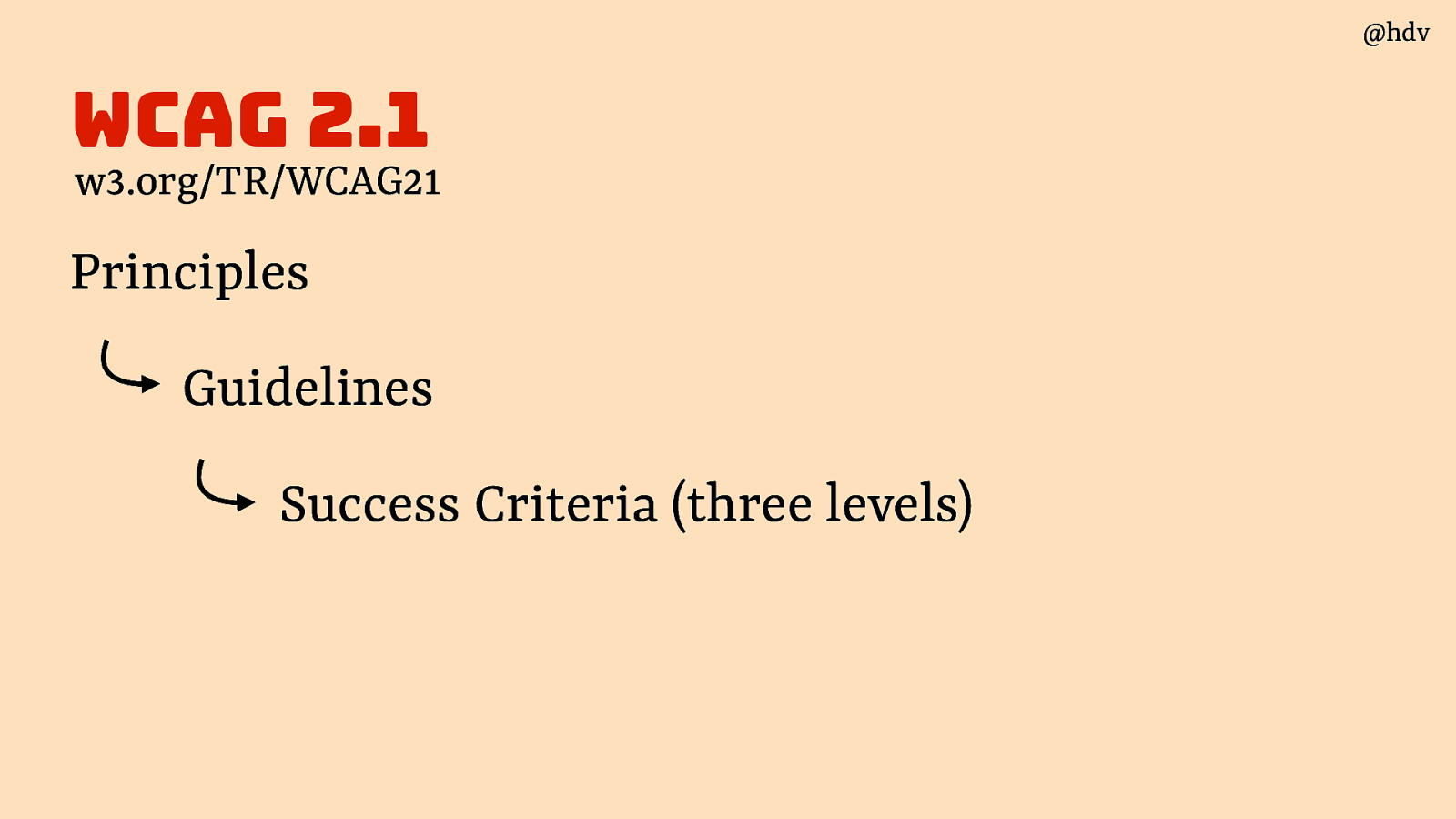
The Success Criteria are in three levels, A, AA and AAA.
Slide 32
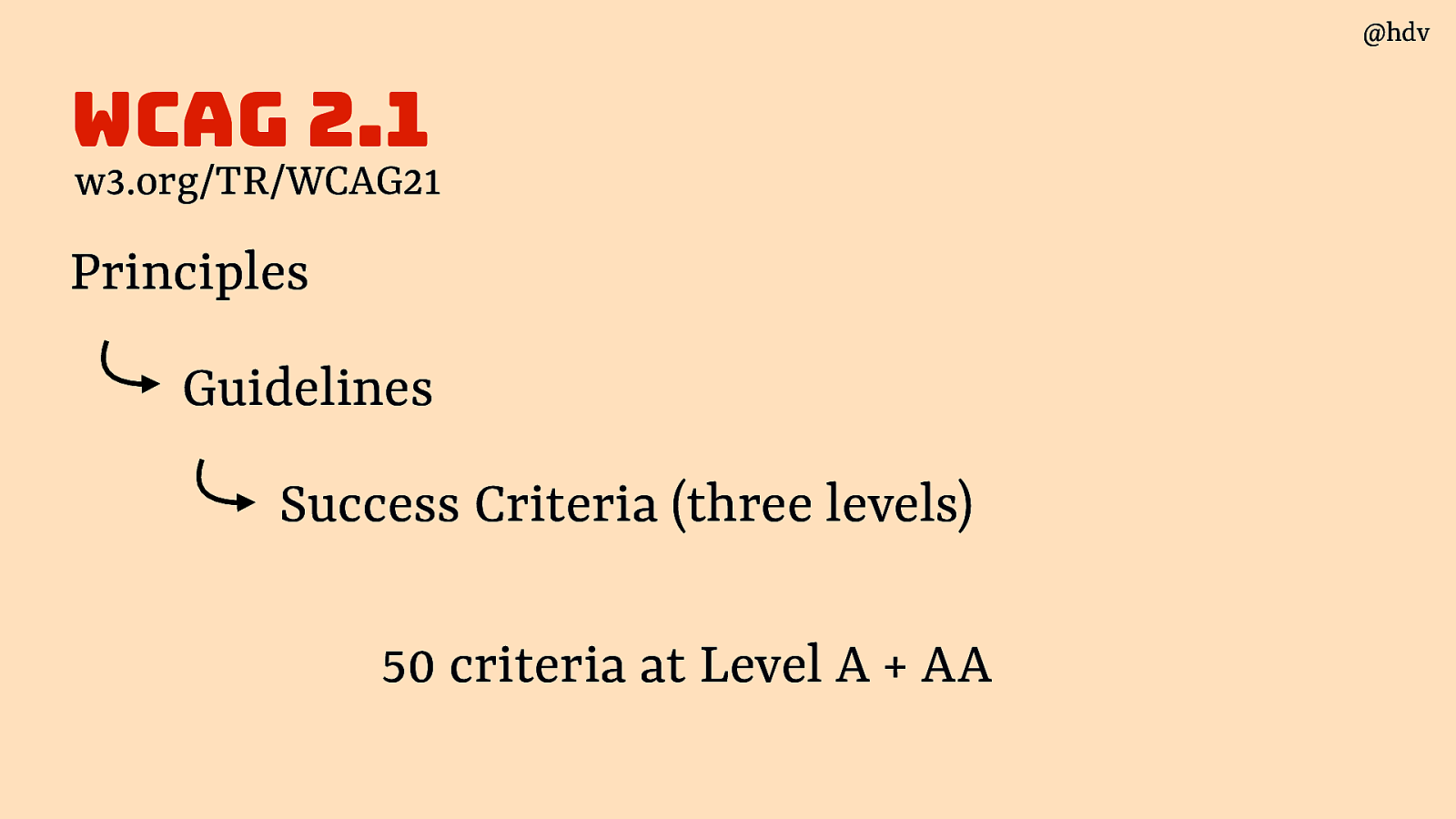
Most commonly, A and AA (‘double A’) are used or required. This comes down to 50 criteria.
Slide 33
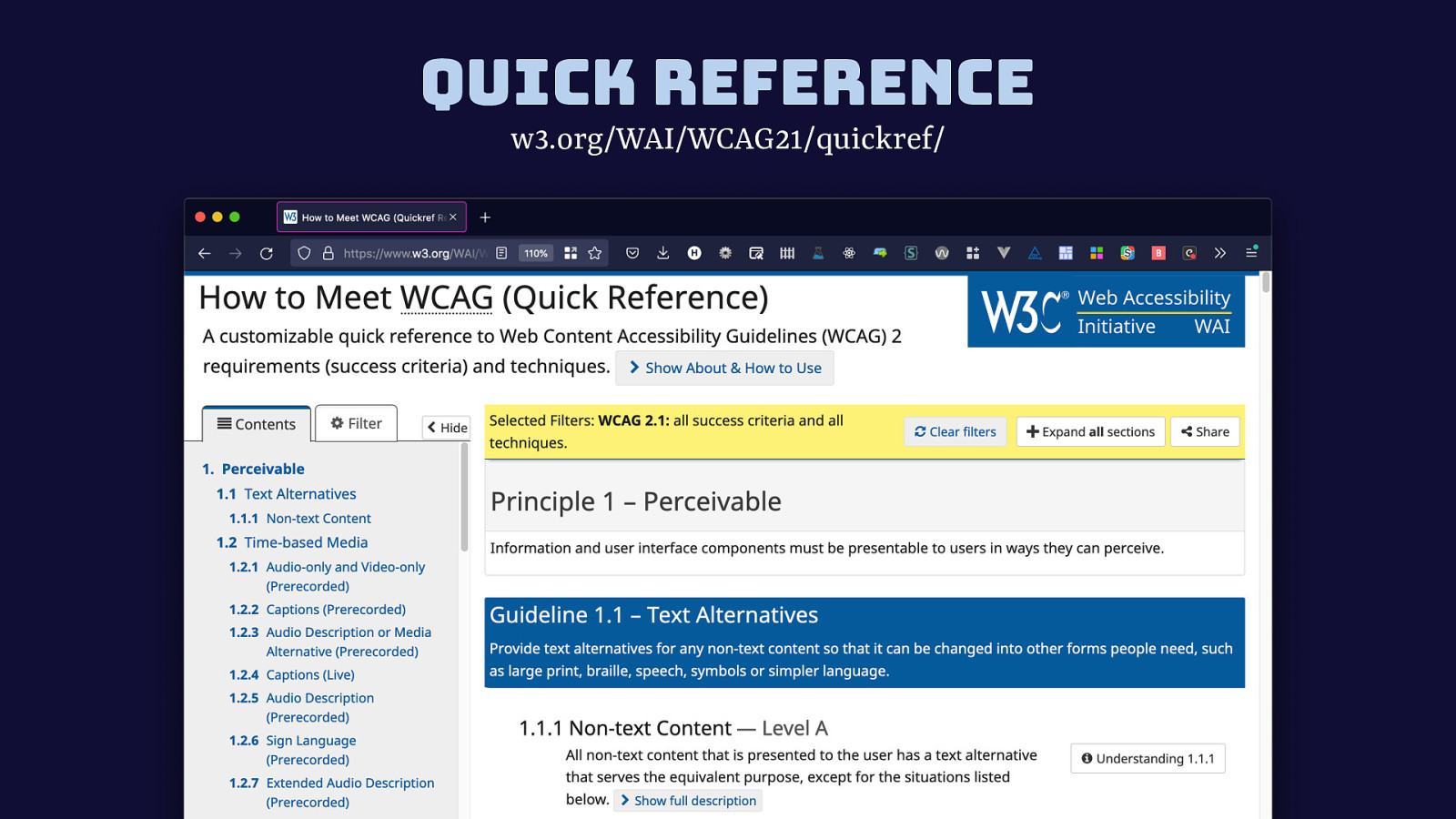
Instead of the official standard text, I recommend this page called Quick Reference, it is exactly the same content as the official spec, but it is easier to find things because the boilerplate standard text is taken out and easier navigation is added in.
Slide 34
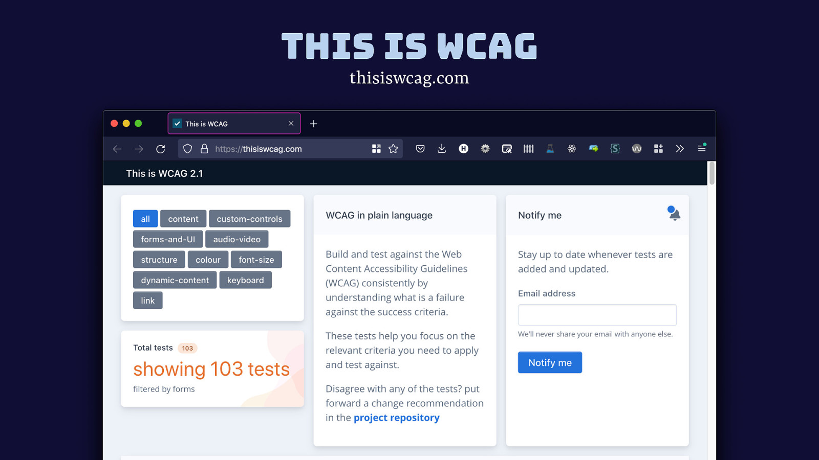
There are also sites like this is wcag that are derivatives of WCAG itself. They are not the same and beware taking their wording as the law, but they are very useful as they offer plain language. In my opinion, somewhat or a hot take, WCAG itself should and could be plain language. After all the details are worked out, content designers should get in and rewrite it focused just on readability. But this hasn’t been a priority, and it is all fair enough, the working group is busy and has lots of other priorities, like making new criteria and even a whole new standard (WCAG 3, that does have easier to understand language as a goal; I do really hope the end result will have plain language).
Slide 35
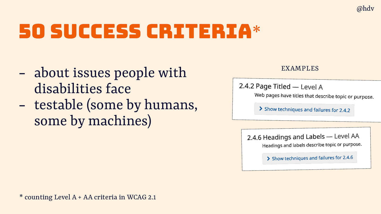
So we have 50 Success Criteria, each is created to be about issues people with disabilities face and to be testable (some by humans, some by machines).
Slide 36
Testing if a website meets each of these 50 criteria results in a WCAG conformance report and sometimes is used to issue a VPAT.
Slide 37
In summary, WCAG is a useful, testable baseline to measure your products and compare products.
Slide 38
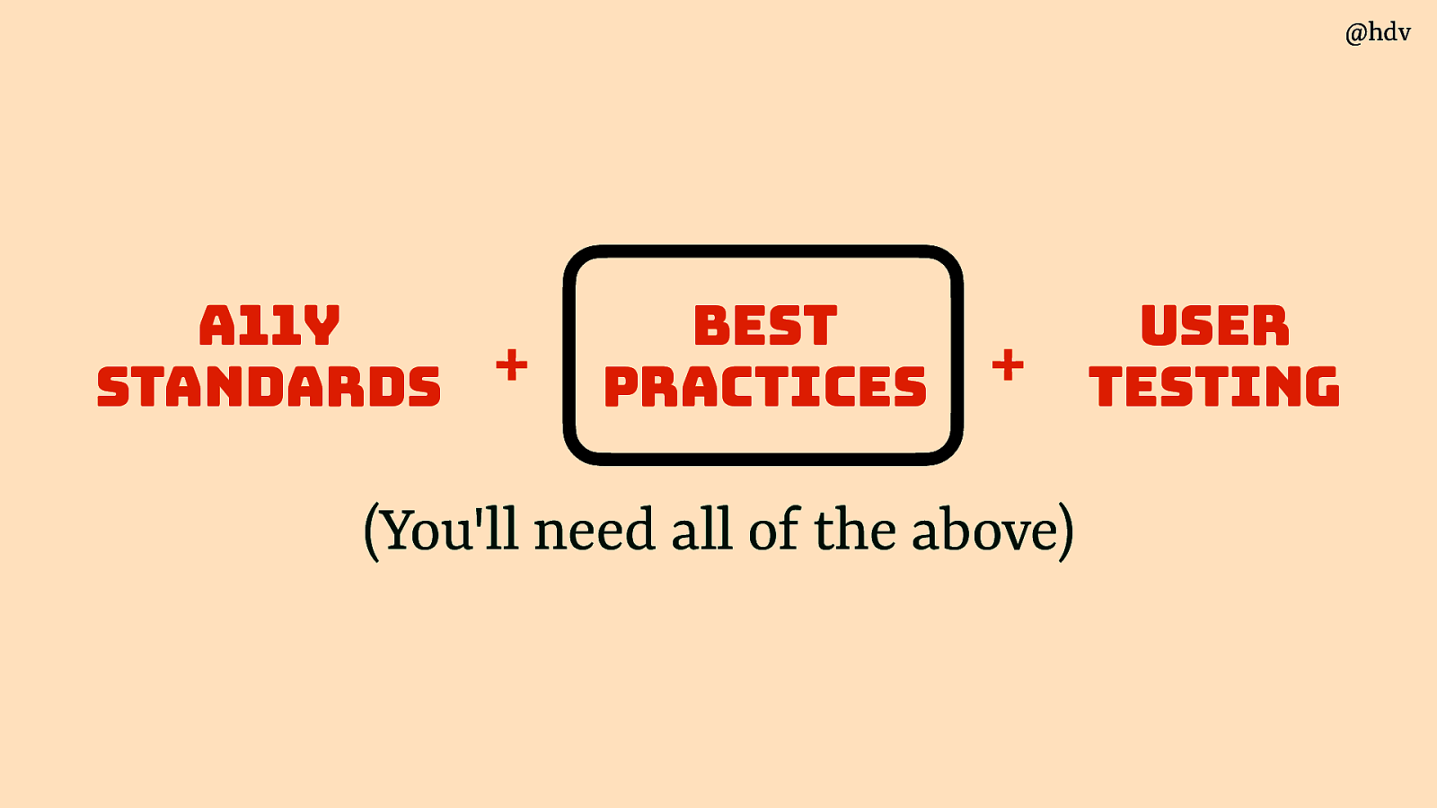
Ok, let’s look at best practices next.
Slide 39
There are a lot of best practices out there. A word of warning though… be careful about what you adopt, look for well-tested patterns
Slide 40
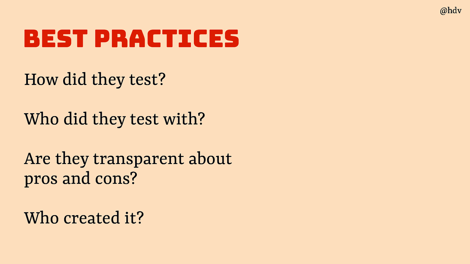
Four questions to ask:
- How did they test?
- Who did they test with?
- Are they transparent about pros and cons?
- Who created it?
Slide 41
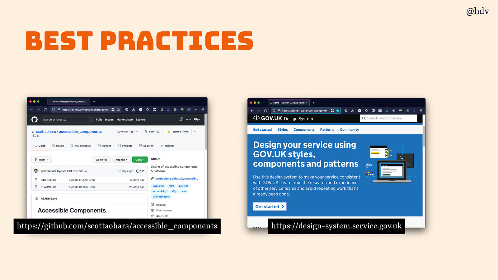
Two great sets of patterns are Scott O’Hara’s repo of accessible components and the gov.uk design system
Slide 42
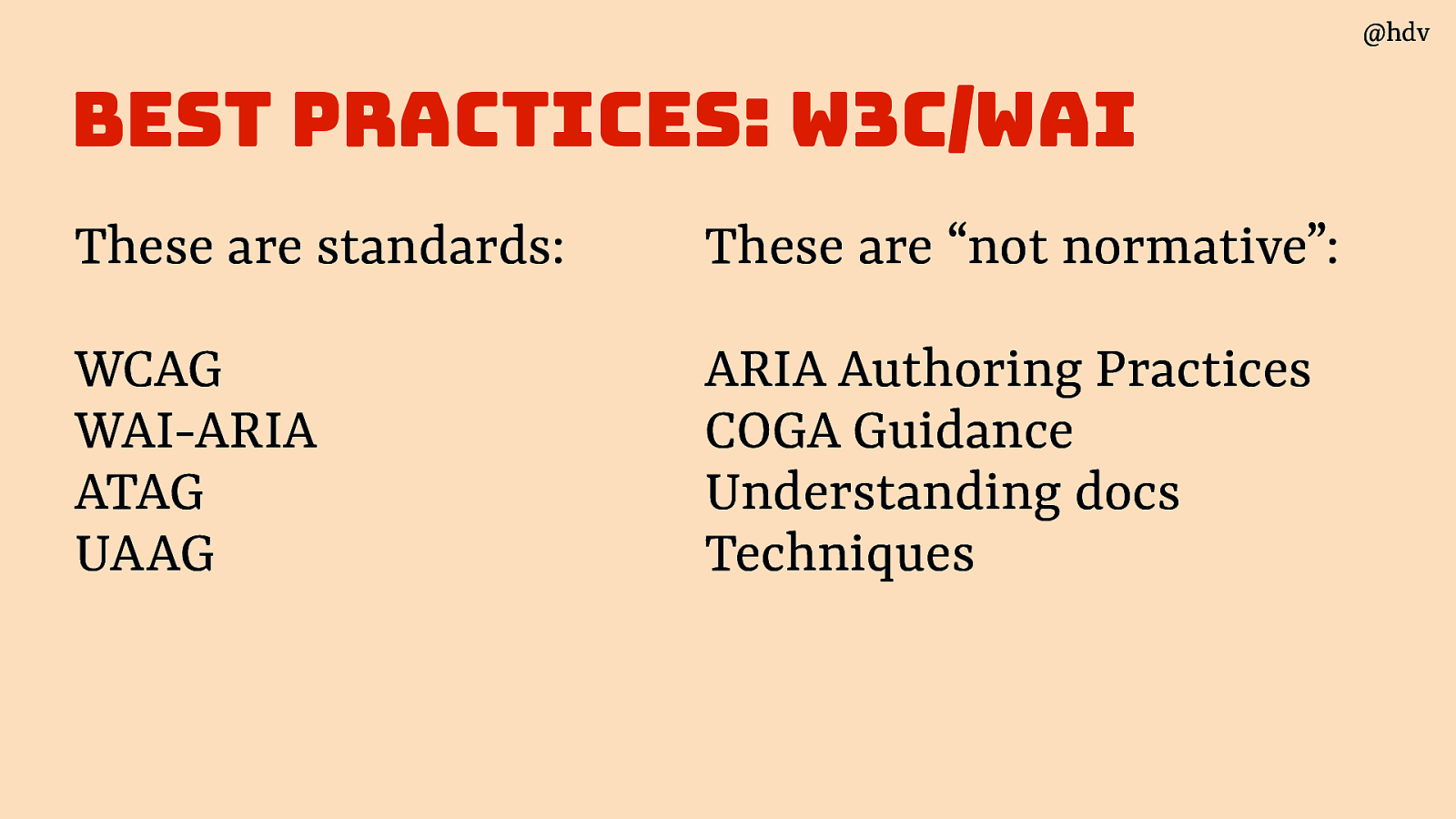
Another set of best practices I should mention snd that people are confused about is the information on the W3C/WAI website. I uses to work there and part of my job was to make this guidance easier to understand and find. I got a little stuck in the bureaucracy, but did get a very clear picture of what sort of information the W3C site has.
These are accessibility standards, meaning they are normative documents. They say what you (or browsers, or other tech) must do. They have gone through the infamous W3C Standards Process, they’ve been implemented and consensus exists between a huge range of stakeholders, it takes years to make these:
- WCAG
- WAI-ARIA
- ATAG
- UAAG
These, on the other hand, are “not normative”:
- ARIA Authoring Practices
- COGA Guidance
- Understanding docs
- Techniques
They have not gone through that same consensus process.
Slide 43
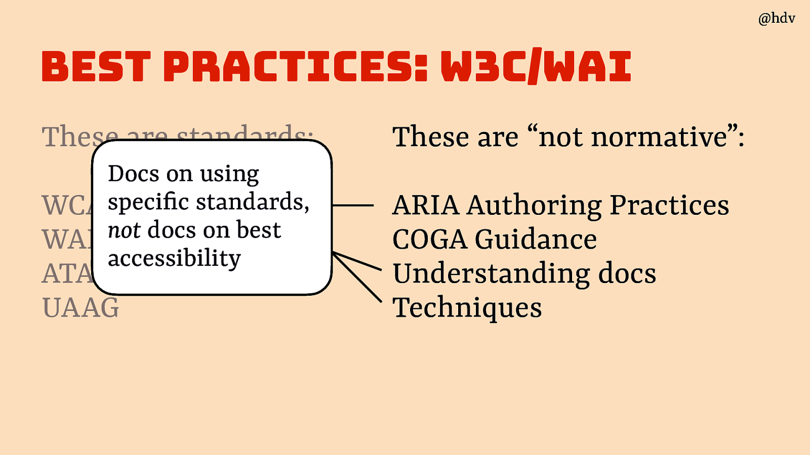
Importantly, they are docs about specific standards, often produced by the same groups who make the standards. They are about how to use that standard, NOT general accessibility (even if full of useful accessibility advice).
Slide 44
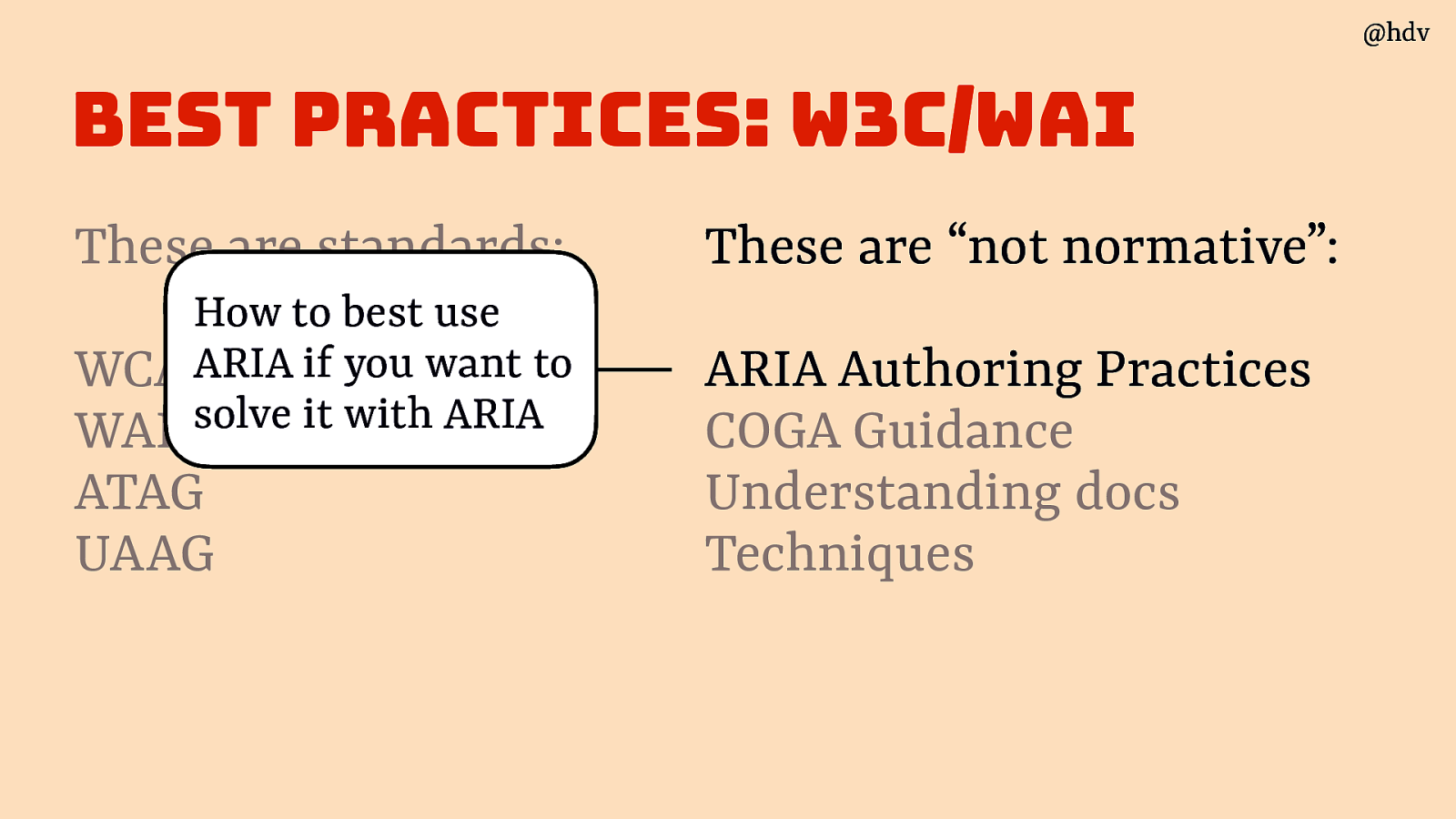
Like ARIA Authoring Practices Guide (APG), it’s about how to use ARIA if you want to use ARIA, not how to make the most accessible thing. It’s like a manual for a hammer; it won’t tell you what the best approach to your DYI project, but is great at helping with hammer-specific questions.
APG is not holistic accessibility advice to help you find the best way to build your thing with whatever combination of tech, it’s about applying ARIA specifically.
I should emphasise APG is great and full of very useful advice and often very helpful. But also that it wasn’t user tested (except informally), and does not say anything about browser support or assistive tech support.
There is a super cool project called ARIA-AT that will measure browser and AT support, automatically, I am very excited for results of that showing up in places like APG and maybe MDN.
Slide 45
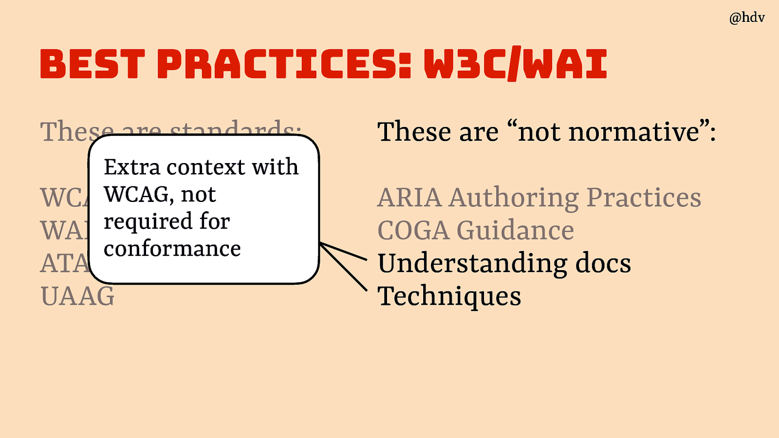
WCAG also has non normative supporting guidance, Techniques and Understanding docs. They are not required for conformance. They do have useful information sometimes. Note that some of these can also be outdated or very outdated, there is a large backlog of issues and PRs filed against these. Again, the responsible working groups have a lot on their plate and these docs are not always at the top of the priorities currently.
Slide 46
In summary, best practices should help you nd out what accessible patterns look like.
Slide 47
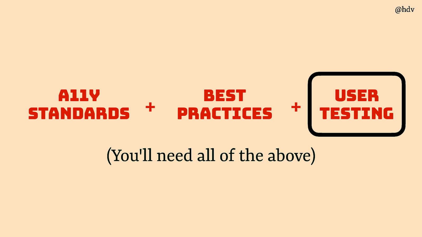
Then the last part: user testing.
Slide 48
There’s a few things to look for when testing with users with disabilities.
Source: W3C, Involving Users in Web Projects for Better, Easier Accessibility
Slide 49
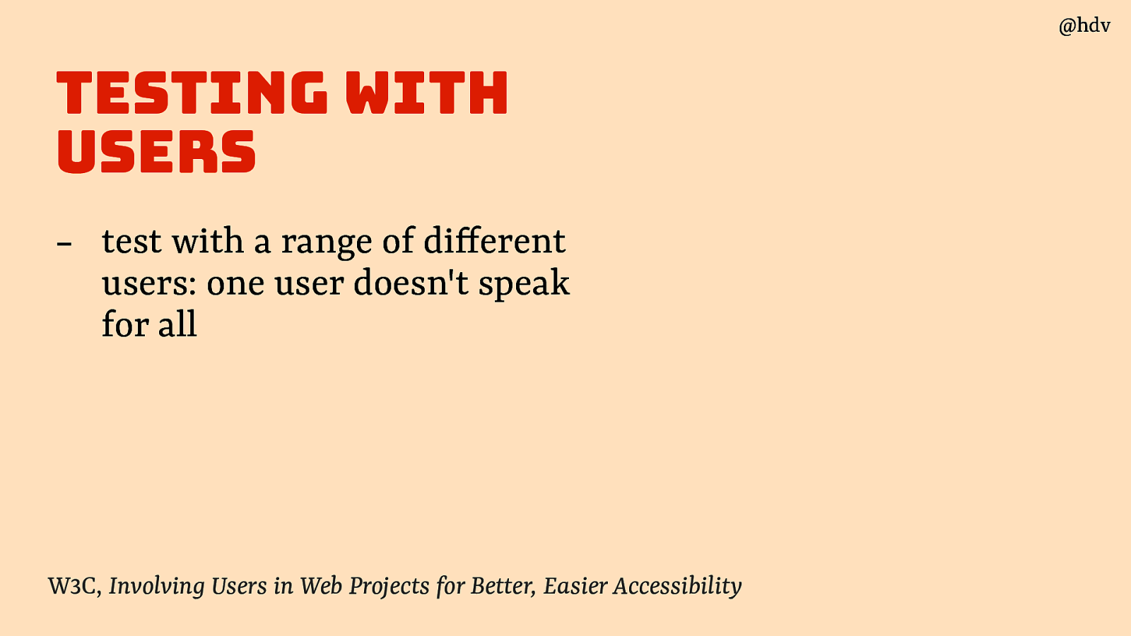
The first: test with a range of di ferent users: one user doesn’t speak for all.
Slide 50
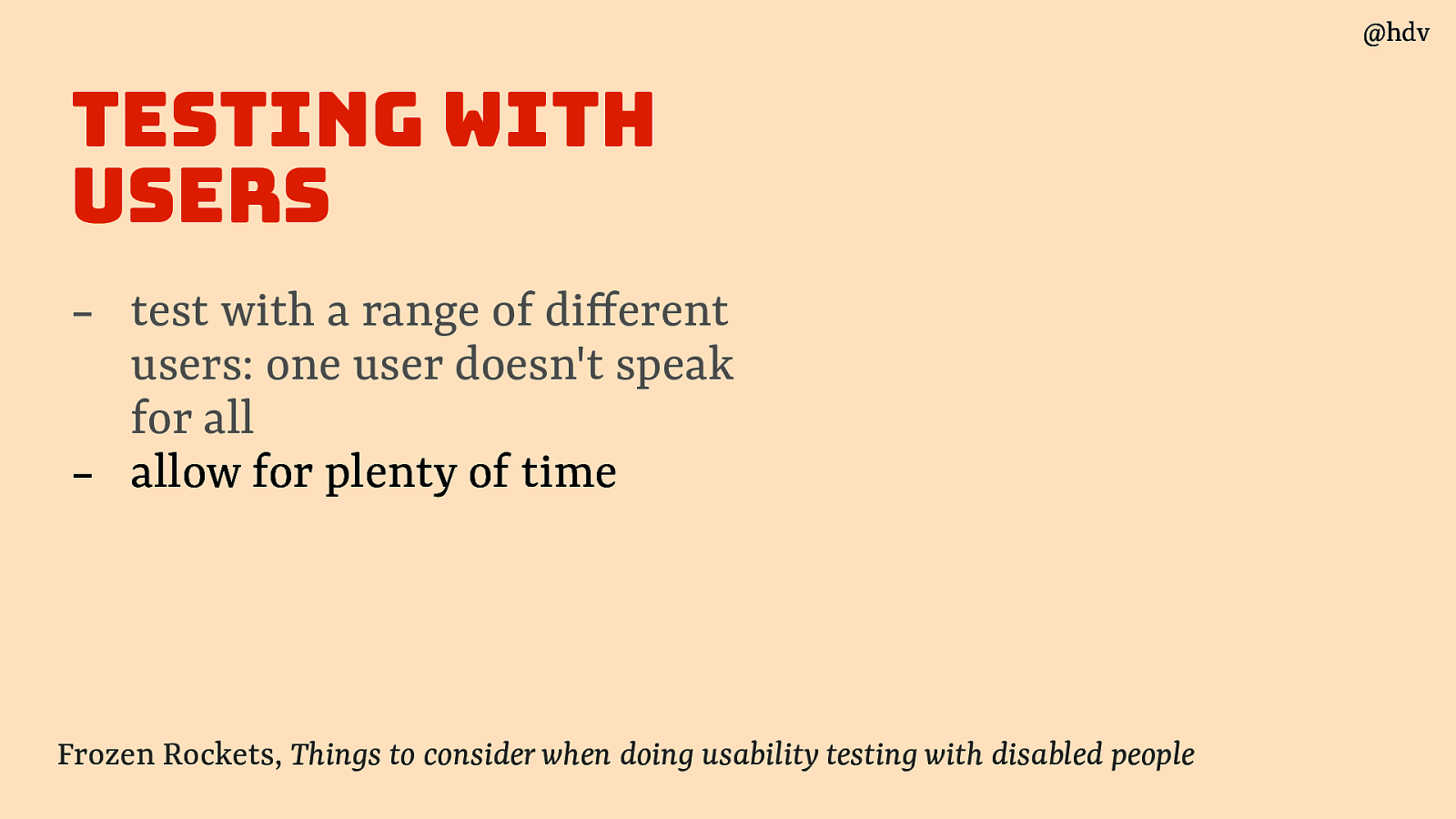
Second: allow for plenty of time, users may need a bit more time to set up depending on how they use their machine or it may take some time to set up it they use theirs.
Slide 51
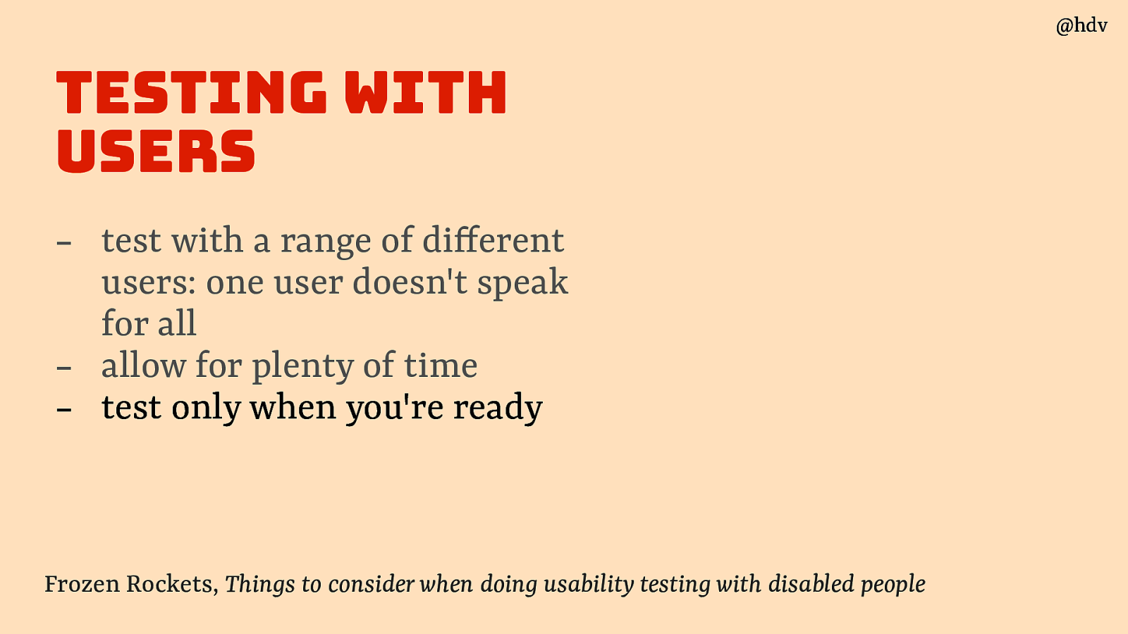
Best only test only when you’re ready, meaning ideally only when you meet all 50 WCAG A/AA criteria. You don’t want your test users to point out fruit that was already low-hanging.
Source: Frozen Rockets, Things to consider when doing usability testing with disabled people
Slide 52
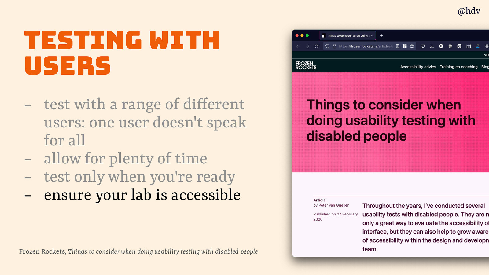
Lastly: make sure your testing lab itself is accessible and has the necessary accomodations for the users that you invited.
Slide 53
In summary: user testing will help you test assumptions
Slide 54
Practical checks
Ok, so we’ve looked at what accessibility is, let’s now look at what we can do day to day to make our sites more accessible. The following suggestions are all things that I’ve commonly seen in audits I did, they’re a bit like a ‘best of’ (worst off, really) of my audits. They’re also all things that are relatively easy to spot and do.
Slide 55
We’ll start with manual testing: tests that most people on the team can do.
Slide 56
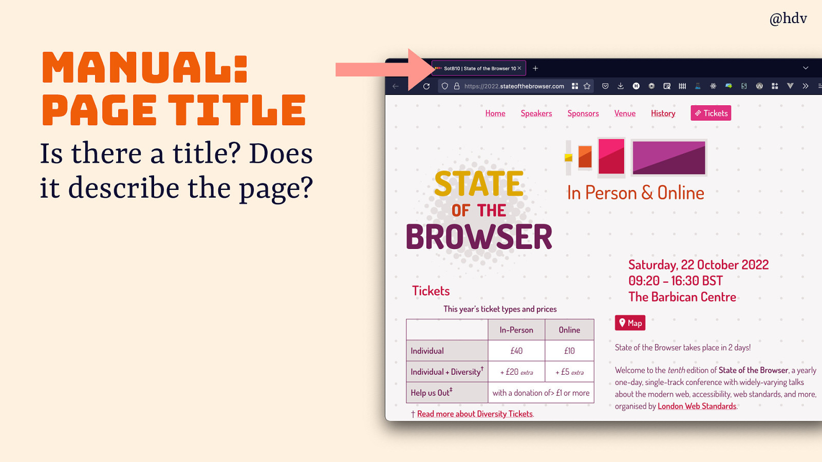
Starting with a page title:
- Is there a title?
- Does it describe the page?
Slide 57
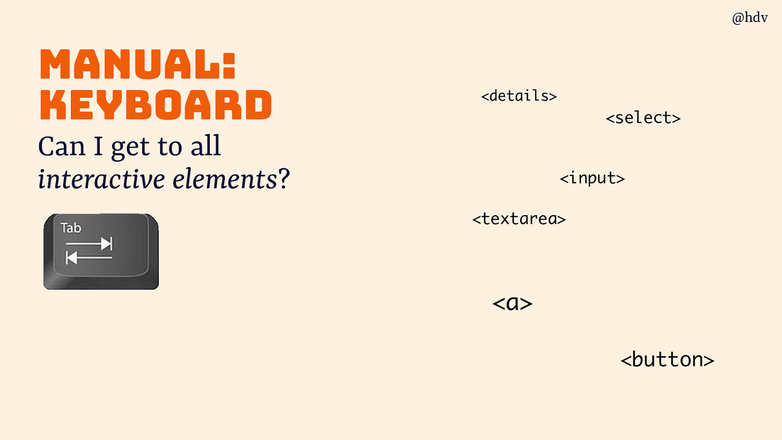
Test everything with a keyboard:
- Can I get to all interactive elements? (anything you can click on)
Slide 58
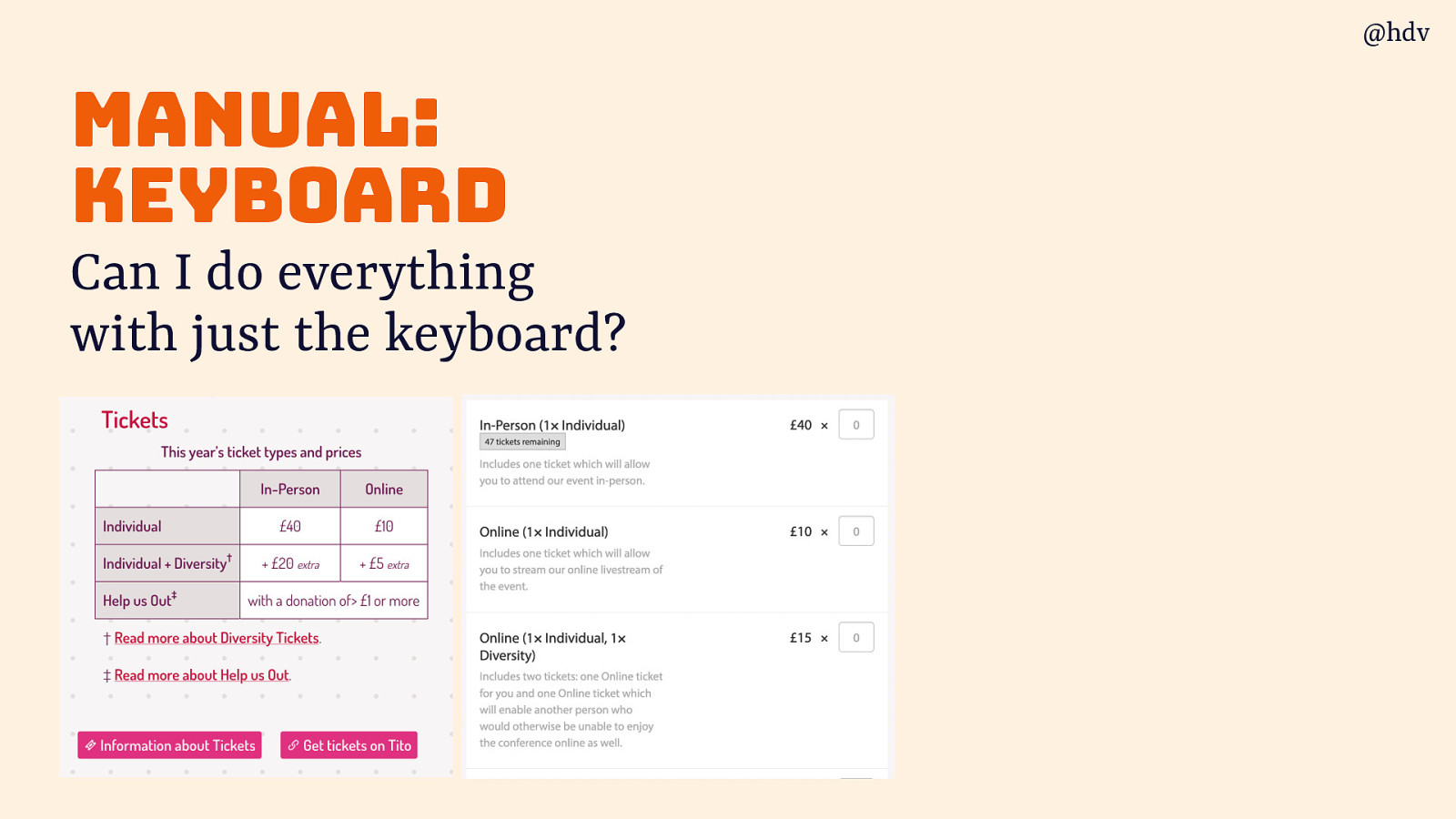
Can you do everything with just the keyboard? Think processes, like can you buy a ticket, and every part of that, like multiple tickets and entering in the details, can the whole process be completed with just a keyboard?
Slide 59
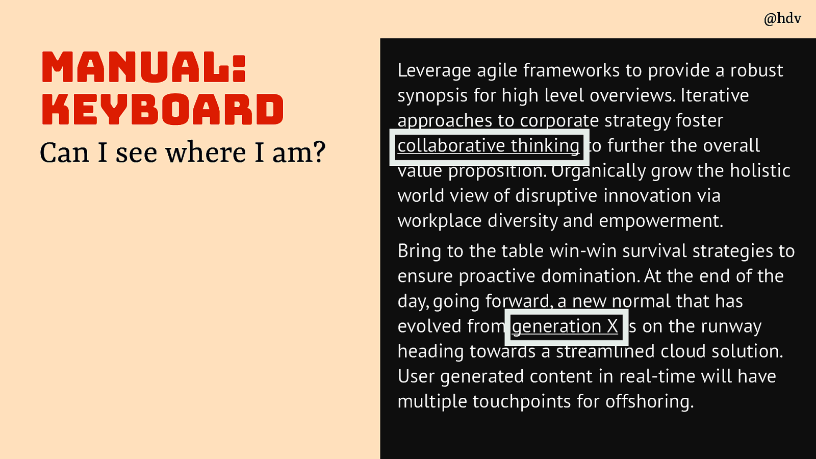
Also important when testing with a keyboard, and you’ll probably find out soon: can you see where you are?
Slide 60
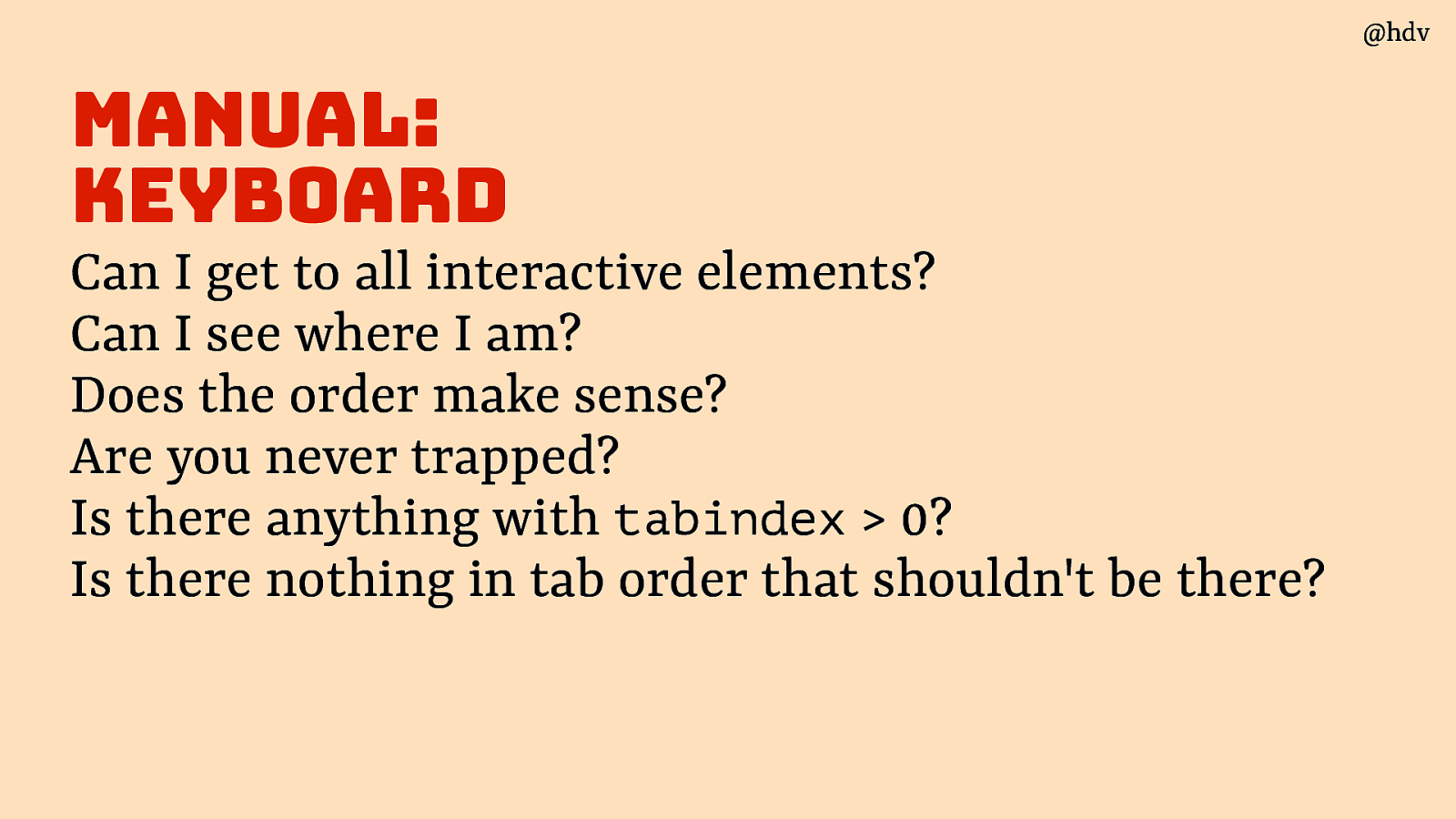
Does the order make sense? Are you never trapped? Is there anything with tabindex > 0? Is there nothing in tab order that shouldn’t be there?
Slide 61
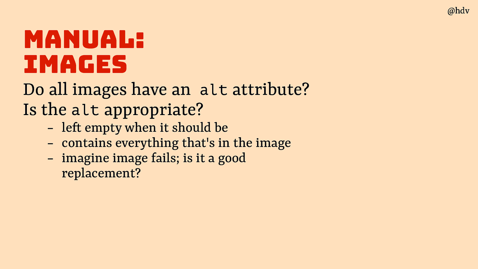
Moving on to images. Do all images have an alt attribute? Is the alt appropriate (eg empty when it should be; contains everything that’s in the image - imagine image fails, is it a good replacement?)
Slide 62
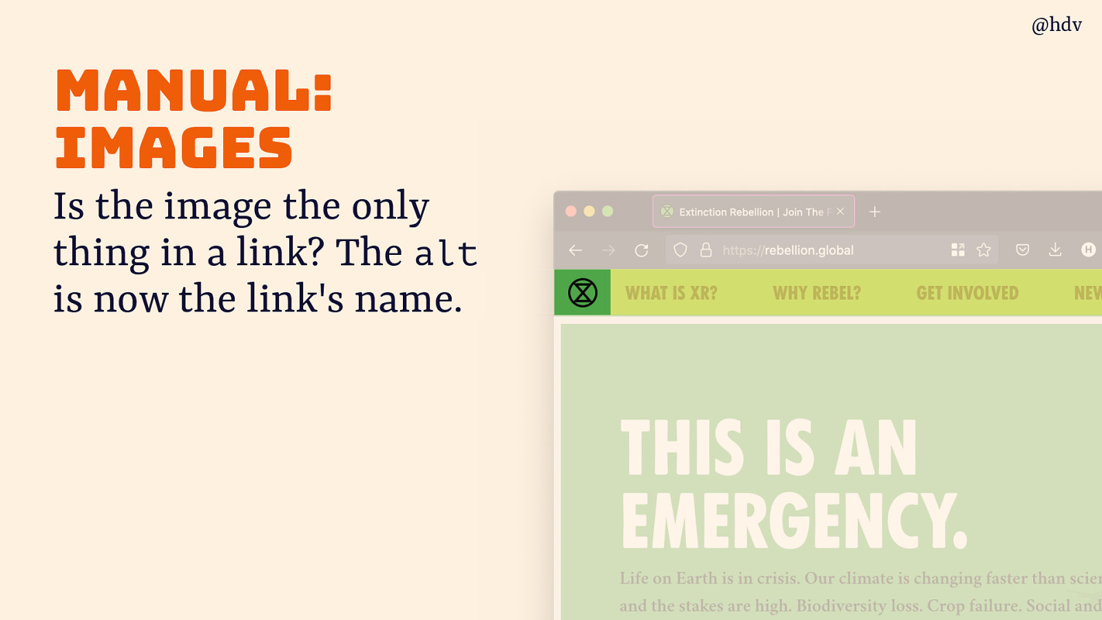
Is the image the only thing in a link? The alt is now the link’s name, so if it goes to the homepage, even if the logo doesn’t contain a drawing of your homepage, it still makes sense to add the word homepage in that alt, so that the link name is clearer and more effective.
Slide 63
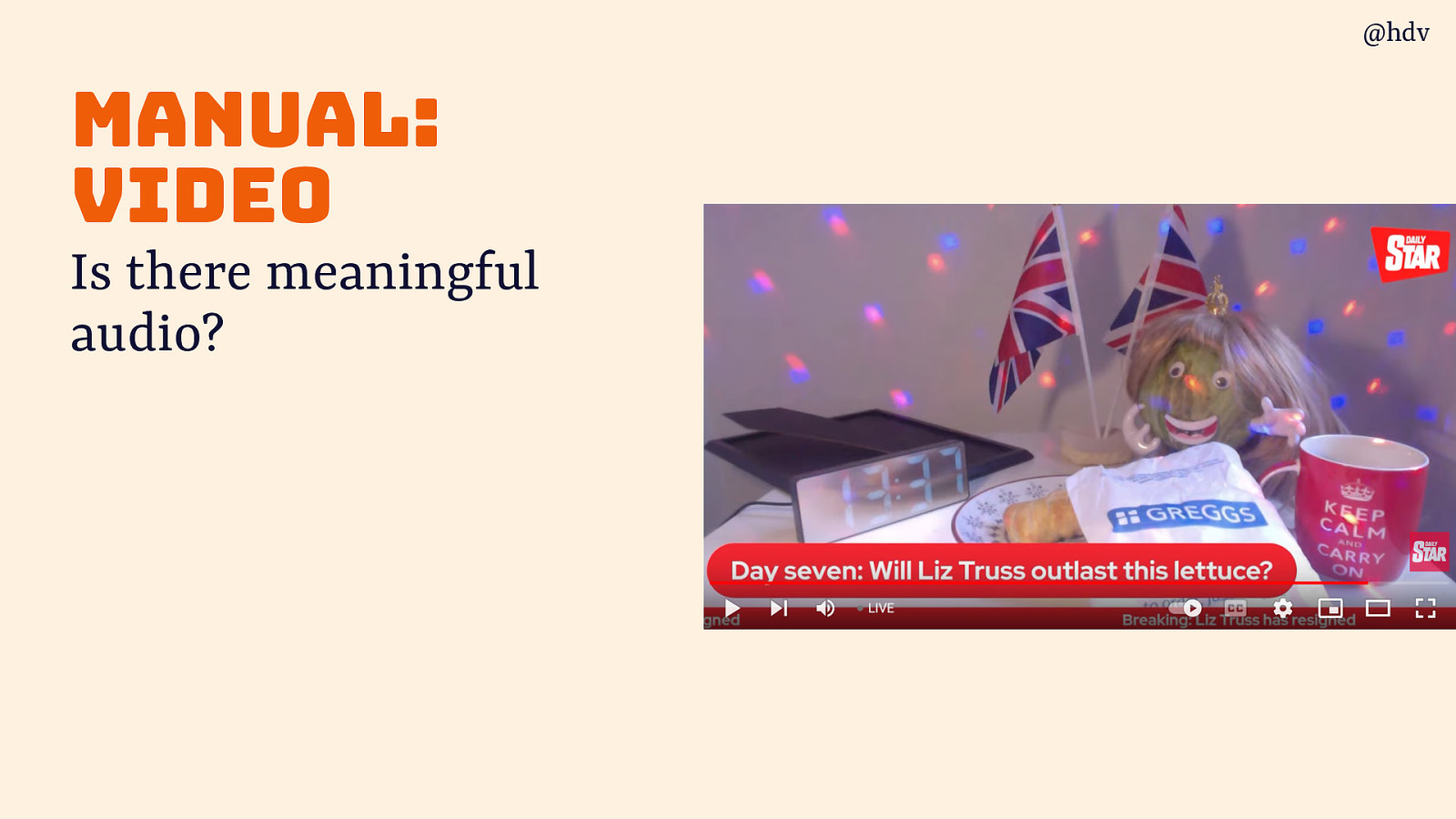
When you use a video: Is there meaningful audio?
Slide 64
If so, are captions available and correct? Is everything that’s visible also in audio?
Slide 65
Regarding audio, is everything in the audio available as text?
Slide 66
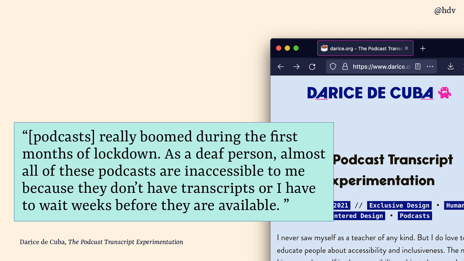
This is important when you publish podcasts. My friend Darice loves podcasts and wrote a great post about them:
“[podcasts] really boomed during the rst months of lockdown. As a deaf person, almost all of these podcasts are inaccessible to me because they don’t have transcripts or I have to wait weeks before they are available. ”
Source: Darice de Cuba, The Podcast Transcript Experimentation
Slide 67
When you look at headings, ask: do they describe the section they’re a heading of?
Slide 68
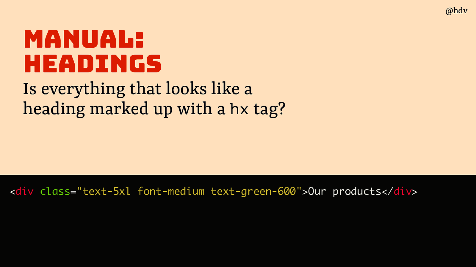
And is everything that looks like a heading marked up with a hx tag?
Some popular UI frameworks allow you to style anything through classnames, but HTML is for structure too so the h1, h2, h3 etc tags matter, especially for users who browse by headings (common among screenreader users).
<div class=”text-5xl font-medium text-green-600”>Our products</div>Slide 69
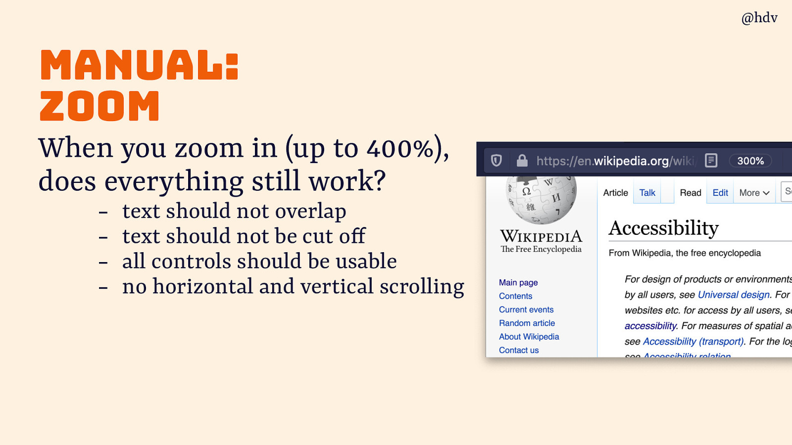
Another great test everyone can do: zoom! When you zoom in (say, up to 400%), does everything still work?
- text should not overlap
- text should not be cut off
- all controls should be usable
- no horizontal and vertical scrolling
Slide 70
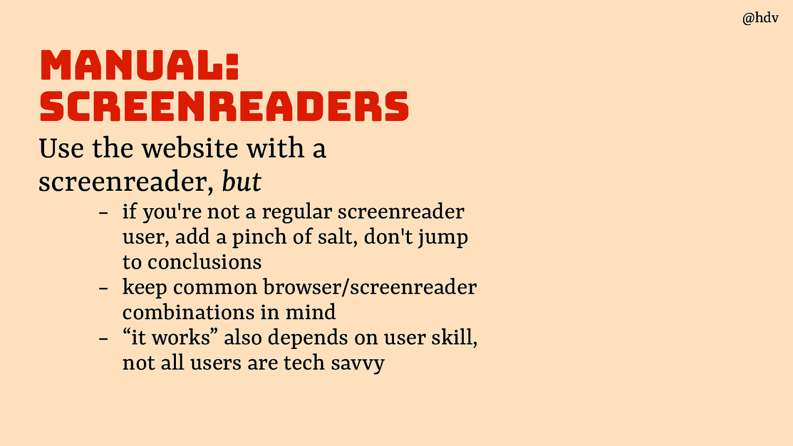
If you’re not a screenreader user, testing with screenreaders can help to some extent, but:
- add a pinch of salt, don’t jump to conclusions
- keep common browser/screenreader combinations in mind
- “it works” also depends on user skill, not all users are tech savvy
Slide 71
Moving on to semi-automated testing: tests that remove some of the manual work so you can make decisions quicker
Slide 72
Firefox dev tools have a great way to visualise tabbing order, Microsoft Accessibility Insights offer something like that too.
Slide 73
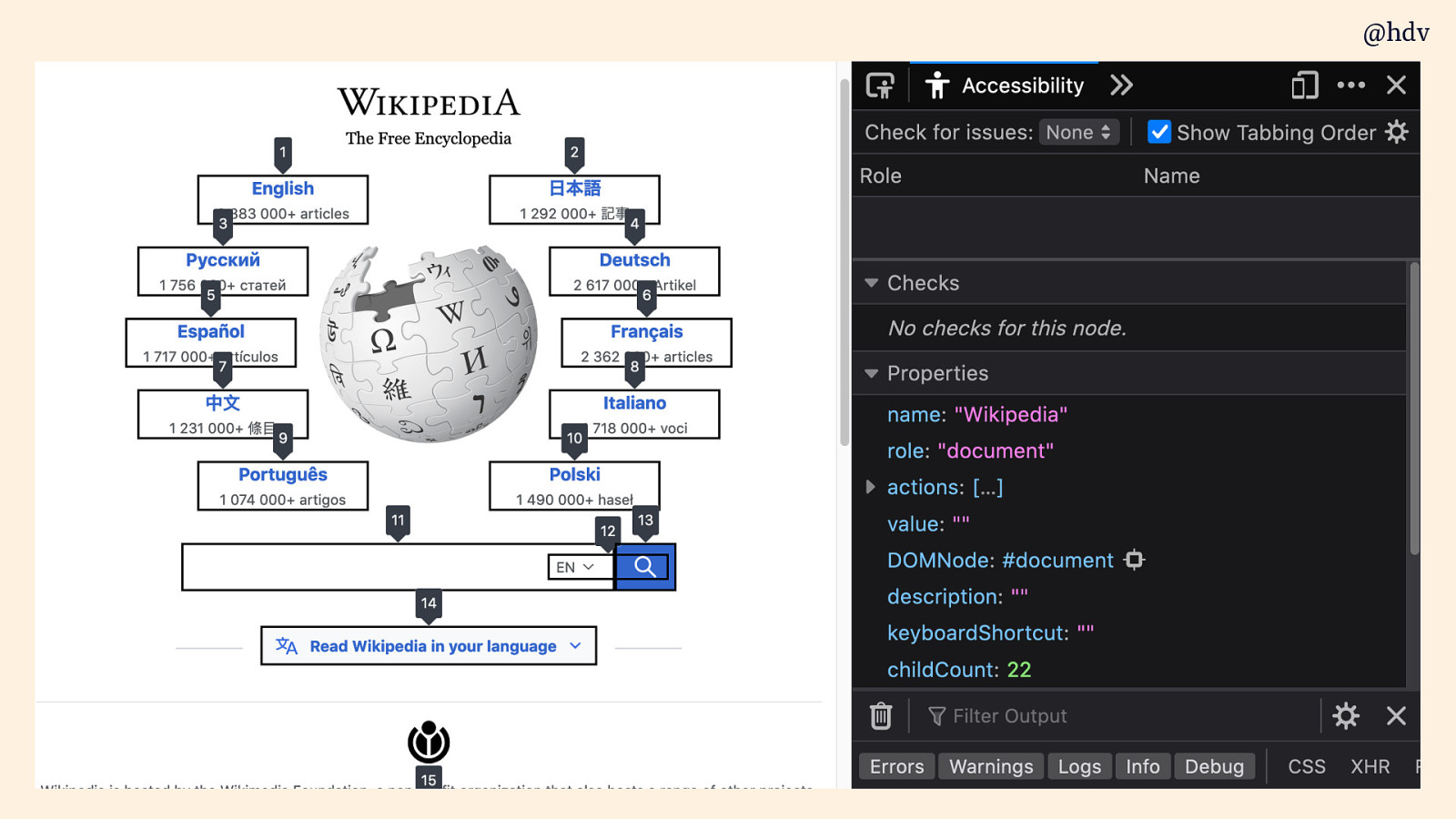
They basically display numbers with each of the tab stops. You can use this to see it it is logical.
Slide 74
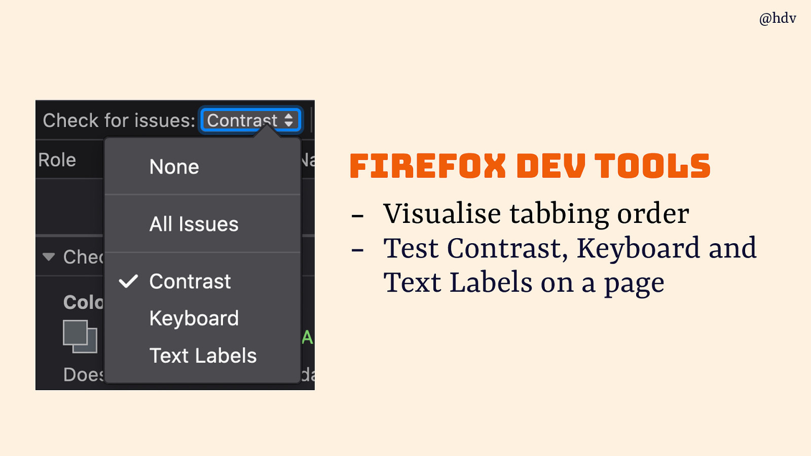
You can also tun tests to test Contrast, Keyboard and Text Labels on a page.
Slide 75
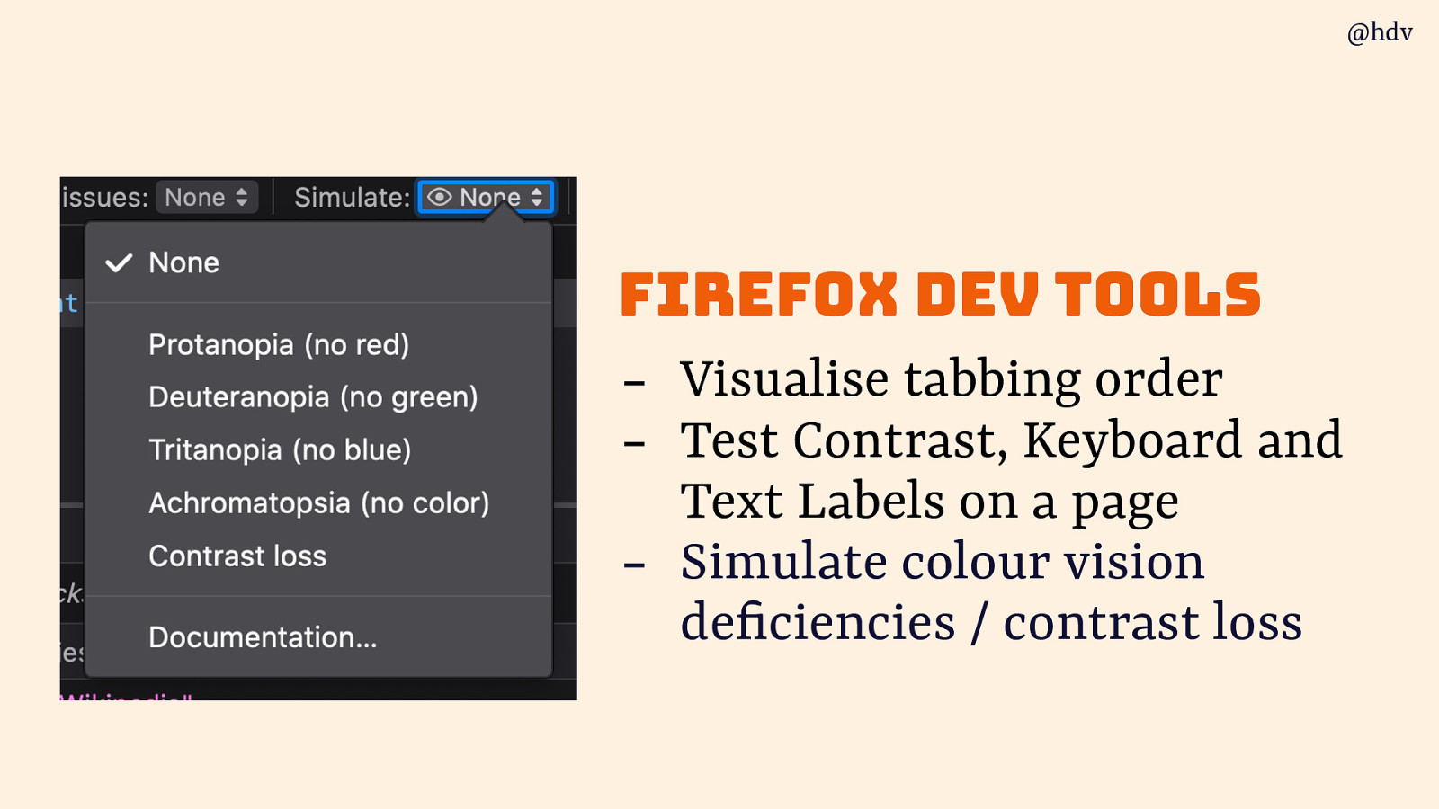
And there are simulations for various colour deficiencies. Polypane, the developer browser Andy mentioned earlier, has a lot of these too, and so do Edge and Chrome.
Slide 76
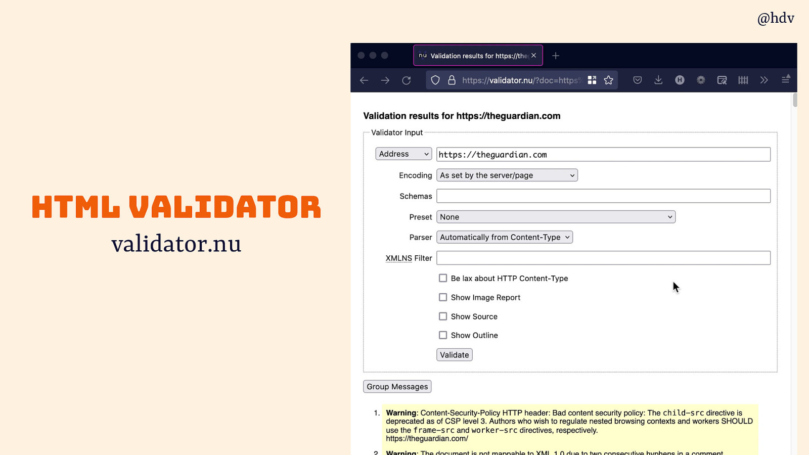
One under appreciate tool in my toolkit is the html validator, I know you all write valir HTML only, but it you messed something up, this happens to me all the time, the validator helps you find weird quirks.
Slide 77
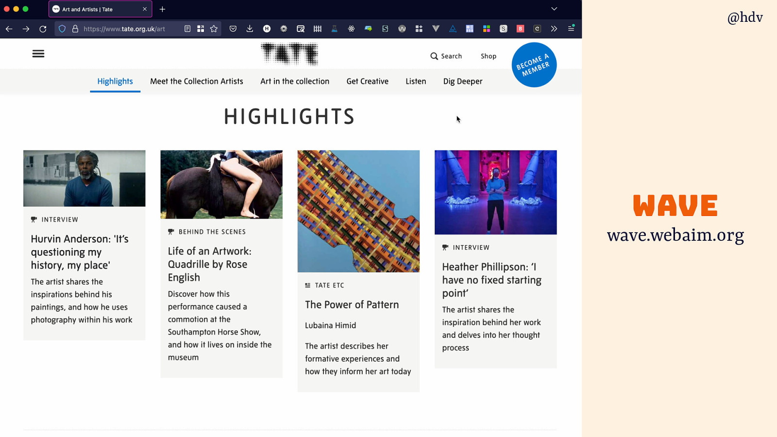
wave is another tool you can run on a page and it will point out some issues and give you useful diagnostics.
Slide 78
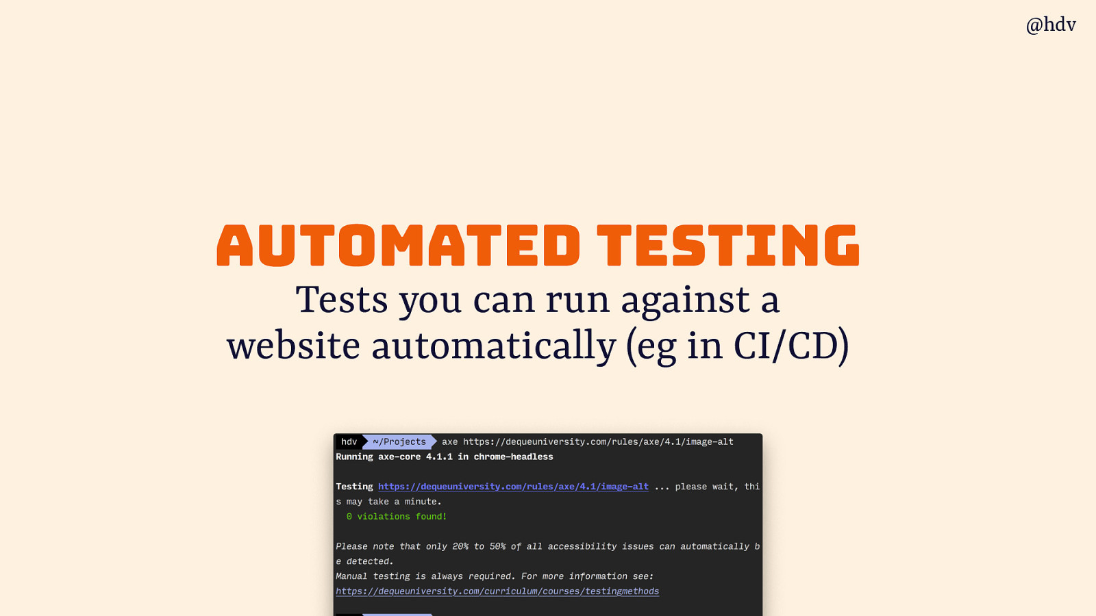
Then there is automated testing, for me one of the most frequently asked questions, tests you can run against a website automatically (eg in CI/CD).
Slide 79

Various tools exist for this, like axe, Tenon and Siteimprove. Most of these integrate with your CI/CD and can export to interoperable data formats
Slide 80
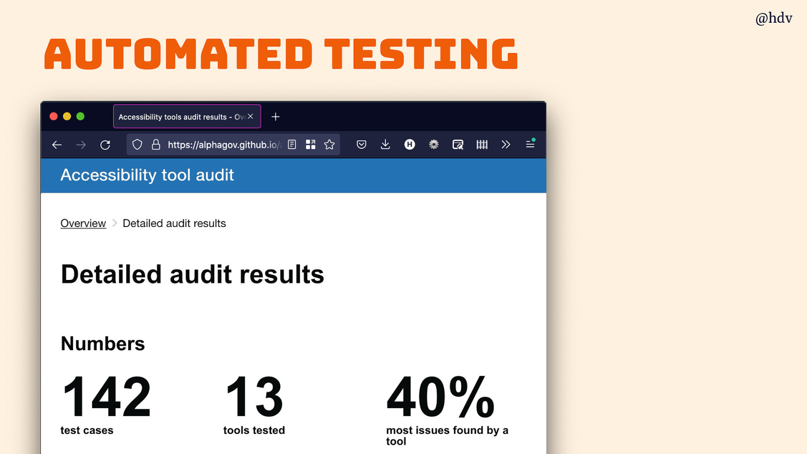
The gov.uk folks did a useful comparison of such automated testing tools.
Slide 81
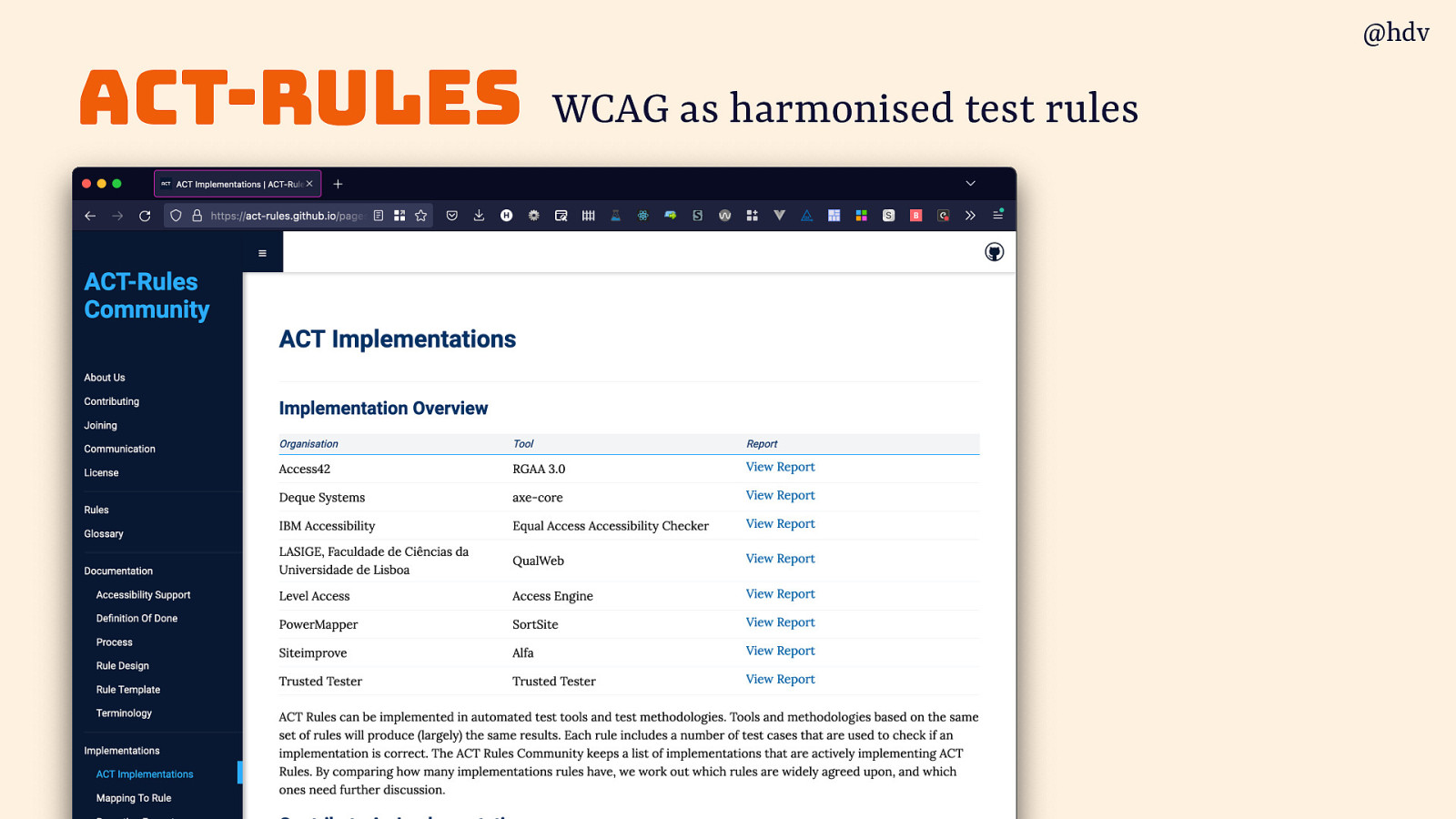
A cool project in this regard is called ACT-Rules , they try to interpret WCAG as harmonised test rules, so that they are the same across tools.
Slide 82

It's easier when you do it earlier
All of these checks and tools help you do accessibility a bit earlier than audit time.
Slide 83

Try to find barriers in your site before it deploys, this is a super power
Slide 84

It’s easier when you do it earlier…
Slide 85
… when you pick a CMS that supports accessibility…
Slide 86
…check designs before building…
Slide 87
…check builds before merging…
Slide 88
… check merged code before shipping, etc
Slide 89
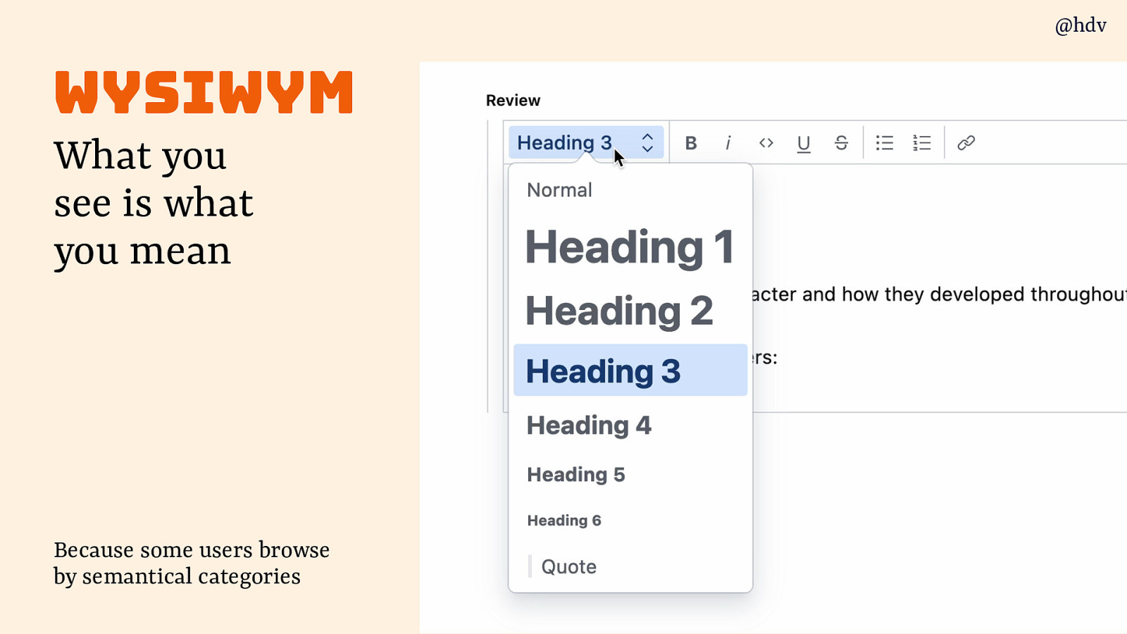
One thing that can help is to use a CMS that supports WYSIWYM: what you see is what you mean. Because some users browse by semantical categories and it you can define those rather than what stuff looks like, that’s a big win.
Slide 90
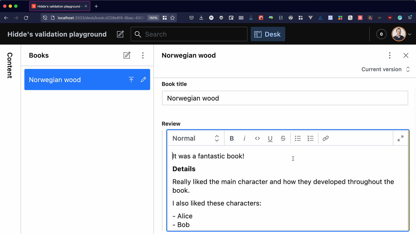
Or what if you could use your CMS as an accessibility assistant? Like Clippy the Paperclip, it helped people write content while they were writing it. It’s a fine line between useful and annoying, but I think if done well it can be huge for accessibility.
With Kitty Giraudel I experimented with finding and warning about content accessibility issues in Sanity’s Portable Text editor. Because all the content is stored as structured data, we can go in and traverse the trees to find stuff like:
- a list that is really paragraphs starting with - or *, rather than an actual list
- a paragraph with only bold text, that should probably be a heading
- links that are named ‘click here’
Slide 91
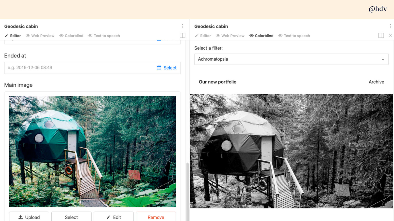
If your CMS supports custom previews, why not create previews that let you check accessibility, like colour deficiency previews or a preview that only contains the headings so you can see if they have a good structure (WordPress has something like that)
Slide 92
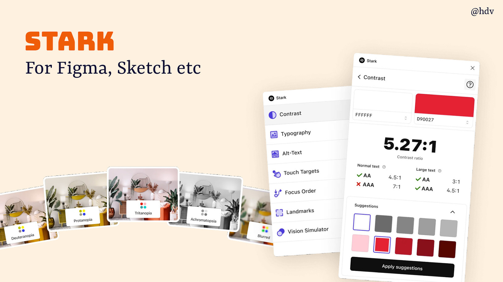
Stark is a tool you can use in your design software that helps you find contrast issuee and define accessibility considerations in your design. Integrated with for Figma, Sketch etc
Slide 93
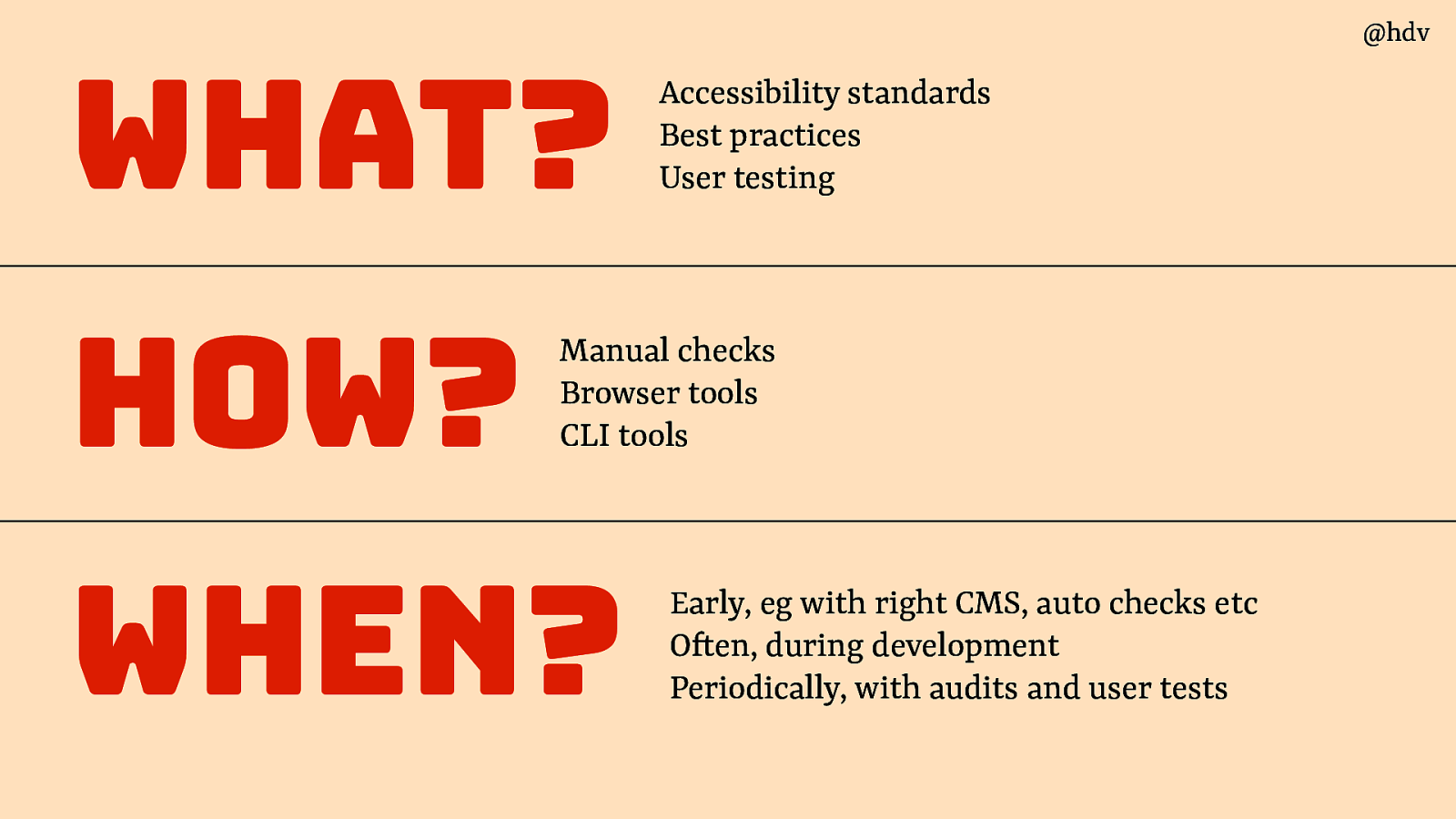
Ok; so in summary, we talked about:
- What: Accessibility standards Best practices User testing
- How: with manual checks, browser tools and ci/cd checks
- When: early, eg with right CMS, auto checks etc; during development; periodically, with audits and user tests
Slide 94
Returning to my friends question… “Why Isn’t Accessibility easier?”
Yes, it isn’t easy, and part has to do with the very nature of accessibility: it isn’t a binary thing, and with how browser support and standards development work, doing accessibility in your organisation can be a very daunting task.
But I think we all agree we need the web to be accessible and we need our organisations to do a serious effort. There is a lot we can do and there are a lot of small tasks that are relatively easy, and every bit we can do to make it better than yesterday matters.
Slide 95
Thank you!