Hello!
(Slide: Breaking barriers with your CMS, by Hidde de Vries, 3 October, Amsterdam.)
A presentation at Fronteers Jam Session in October 2019 in Amsterdam, Netherlands by Hidde de Vries
Hello!
(Slide: Breaking barriers with your CMS, by Hidde de Vries, 3 October, Amsterdam.)
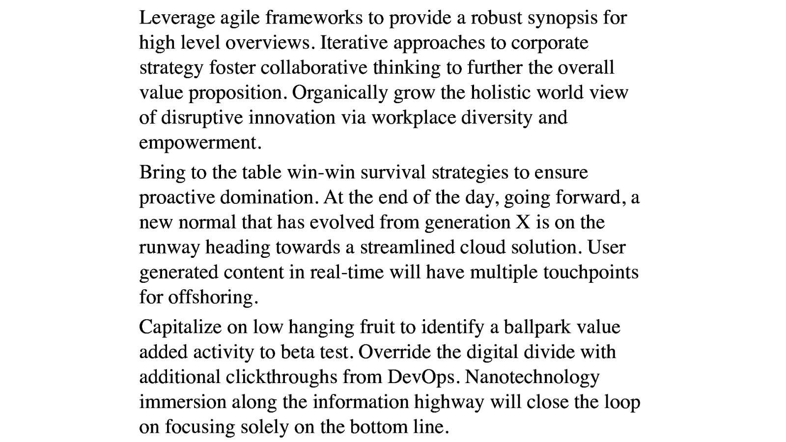
It’s been a long time since content on the web looks like this. Boring, with hardly any effort put into lay-out. It’s like a wall of text with lots of words and little whitespace. Hardly any visual interestingness!
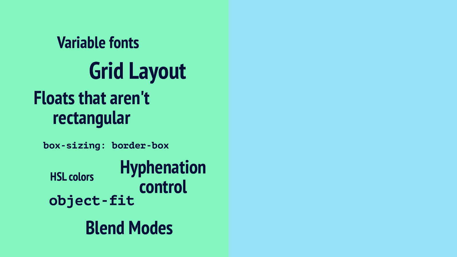
One reason this has changed now is that we have modern CSS. We now have tools like Grid Layout, that lets us control white-space and use proportions, variable fonts and blend modes.
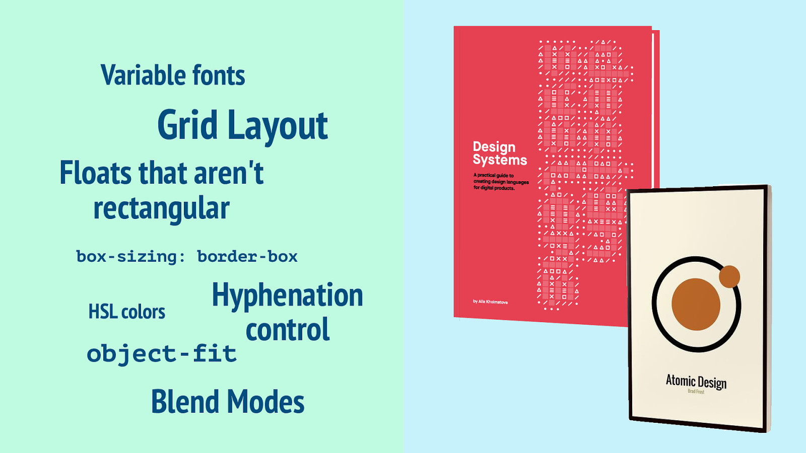
And something else happened: thanks to the work of people like Alla Kholmatova and Brad Frost, we’ve really started to think about our work not in terms of pages, but in terms of components, or patterns… distinct pieces.
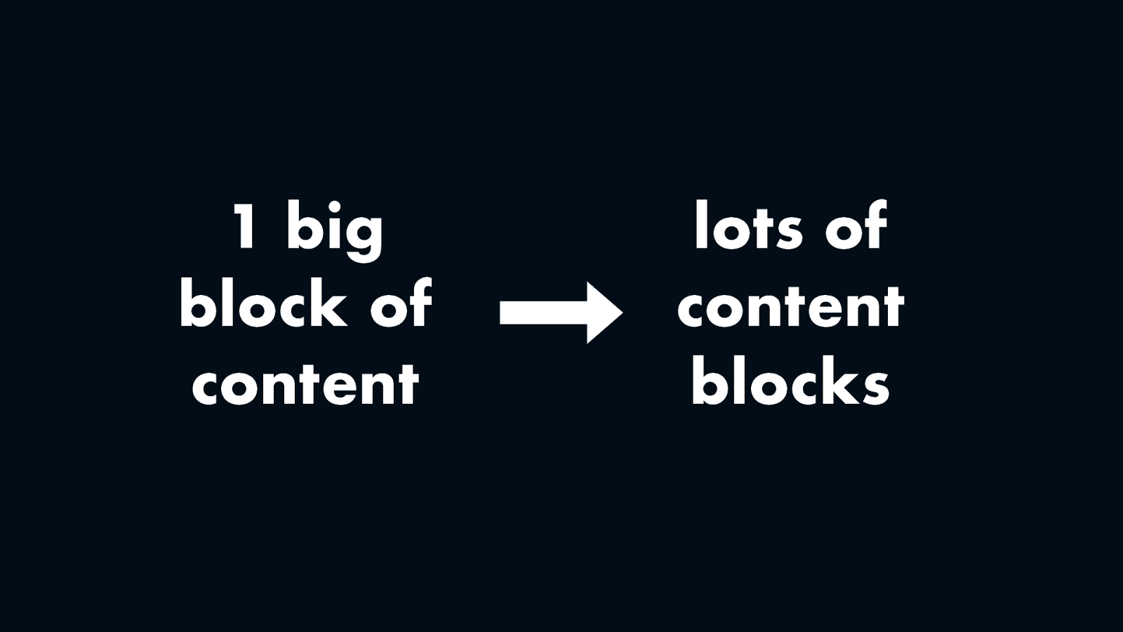
So basically… we’ve moved from having one big block of content towards having lots of content blocks on our pages.
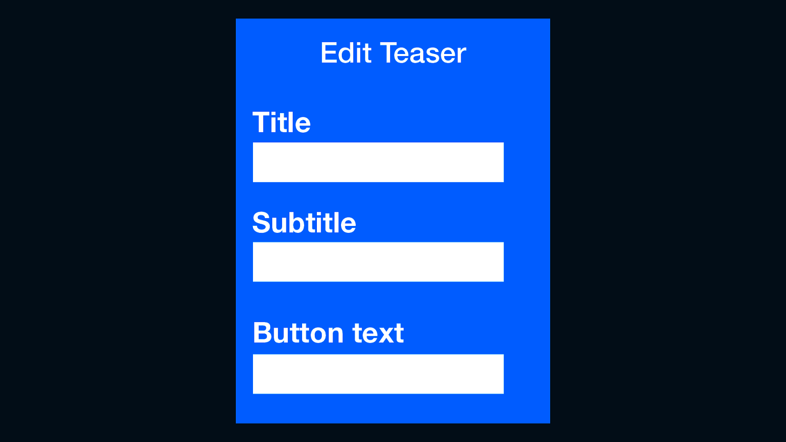
That leaves us with a content management challenge, because we can’t really do WYSIWYG… we might have an Edit Teaser block that lets users enter a title, subtitle and button text. From a front-end perspective, we’ll have these values as strings and can write our own HTML around that.
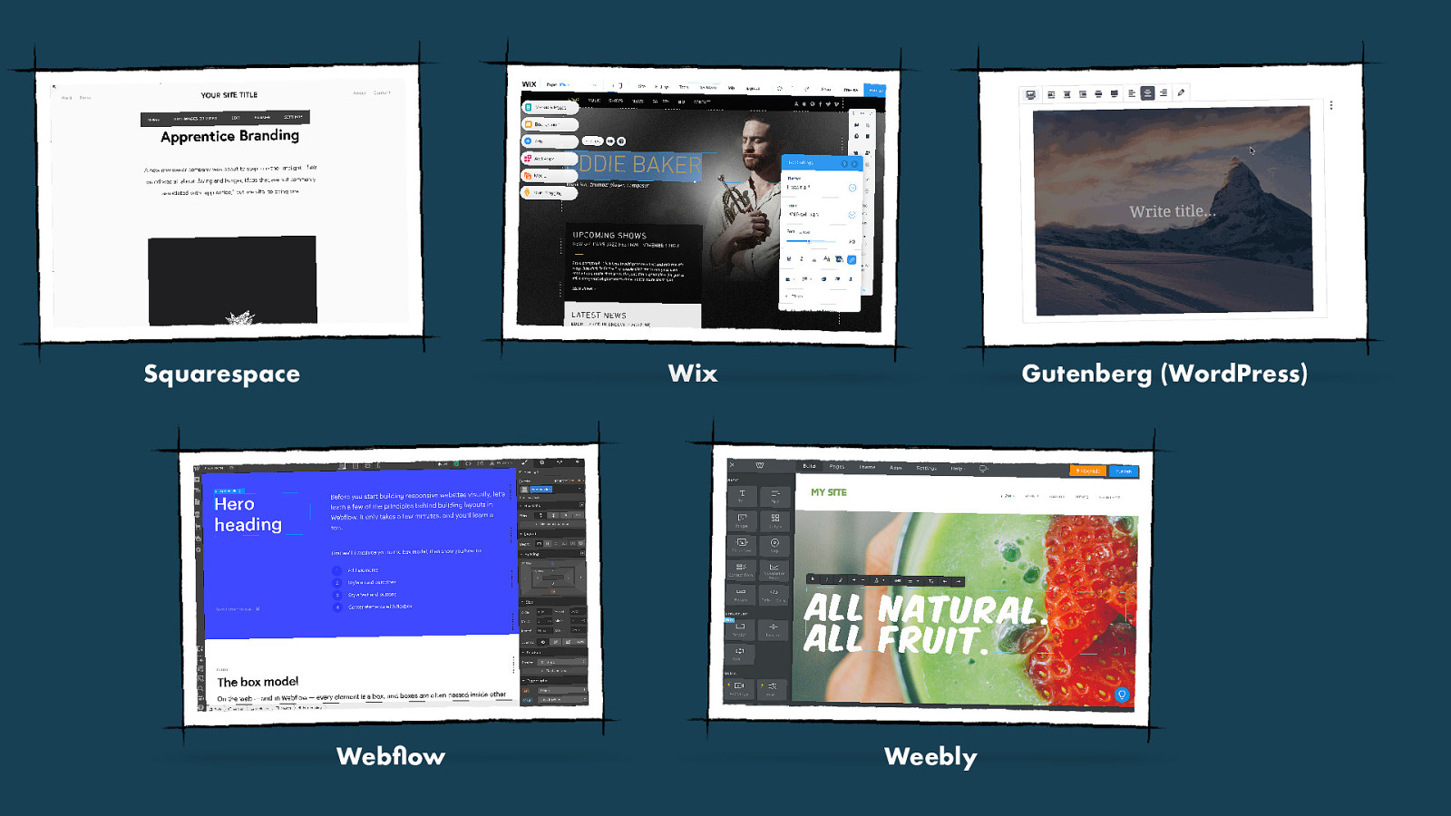
But there’s a different trend on the market, which attracts many people, with products like Wix, Squarespace and Webflow: visual content editors, or as they’re also called: “no code editors”. Great for people who want to manage content, but not write code. But it will probably worry you if you’re a front-end developer, because what does that mean, not writing code? Where does the code come from? and that brings me to something else…
What about the accessibility? I would say accessibility is critical for any system that manages web content.
CMSes are also an opportunity for web accessibility.
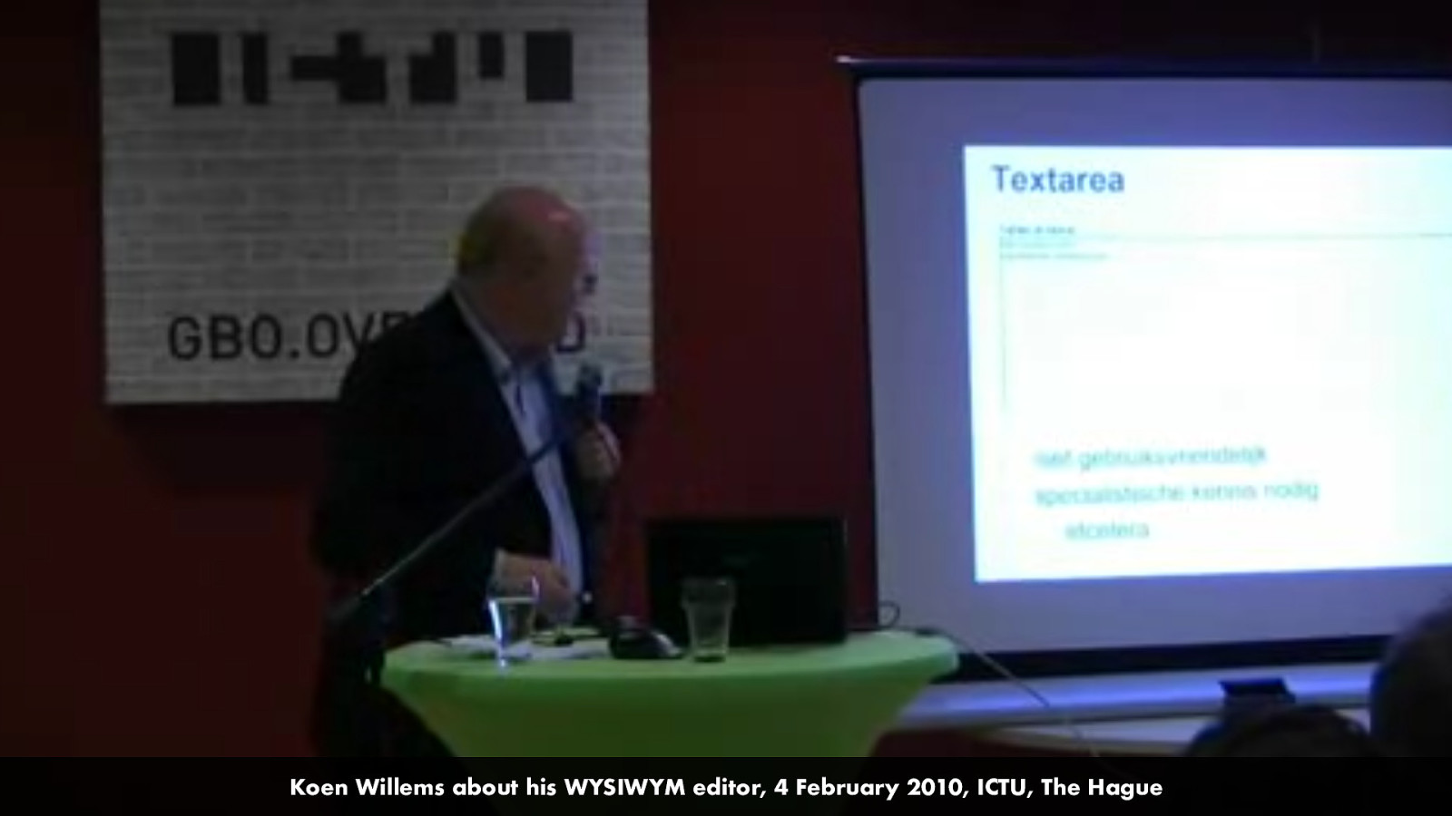
I should mention that I am not the only one who has thought about this… in fact, I saw Koen Willems, the organiser of this evening, talk about his WYSIWYM editor almost 10 years ago.
Slide: 4 February 2010, ICTU, The Hague
At the W3C, where I work at the Web Accessibility Initiative, I work on the accessibility of tools like CMSes.
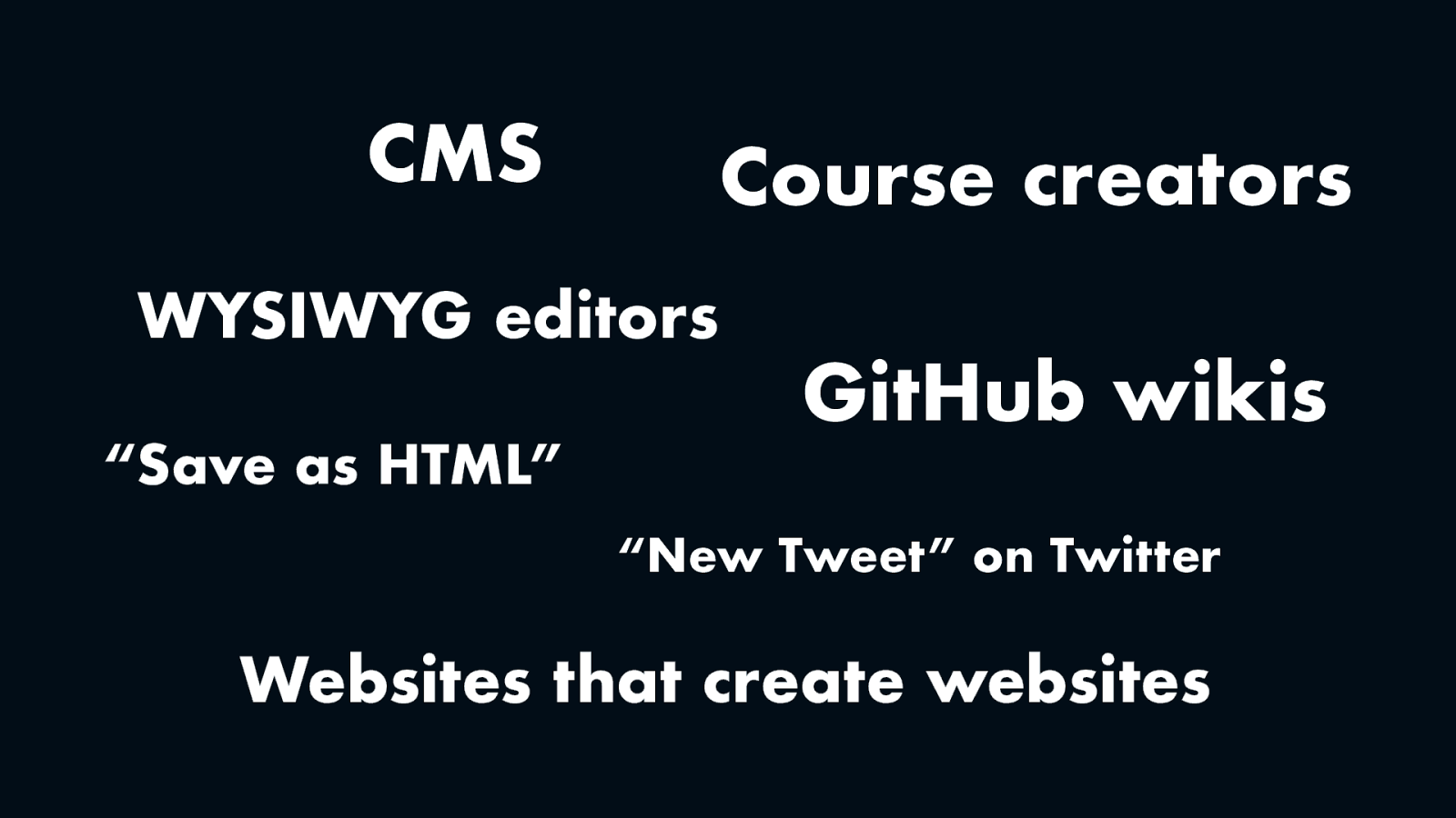
We like to see CMSes as part of a larger group that also includes tools to create digital learning environments, wysiwyg editors, wikis, social media and websites that create websites.
Slide: CMS, Course creators, WYSIWYG editors, “Save as HTML”, GitHub wikis, “New Tweet” on Twitter, Websites that create websites
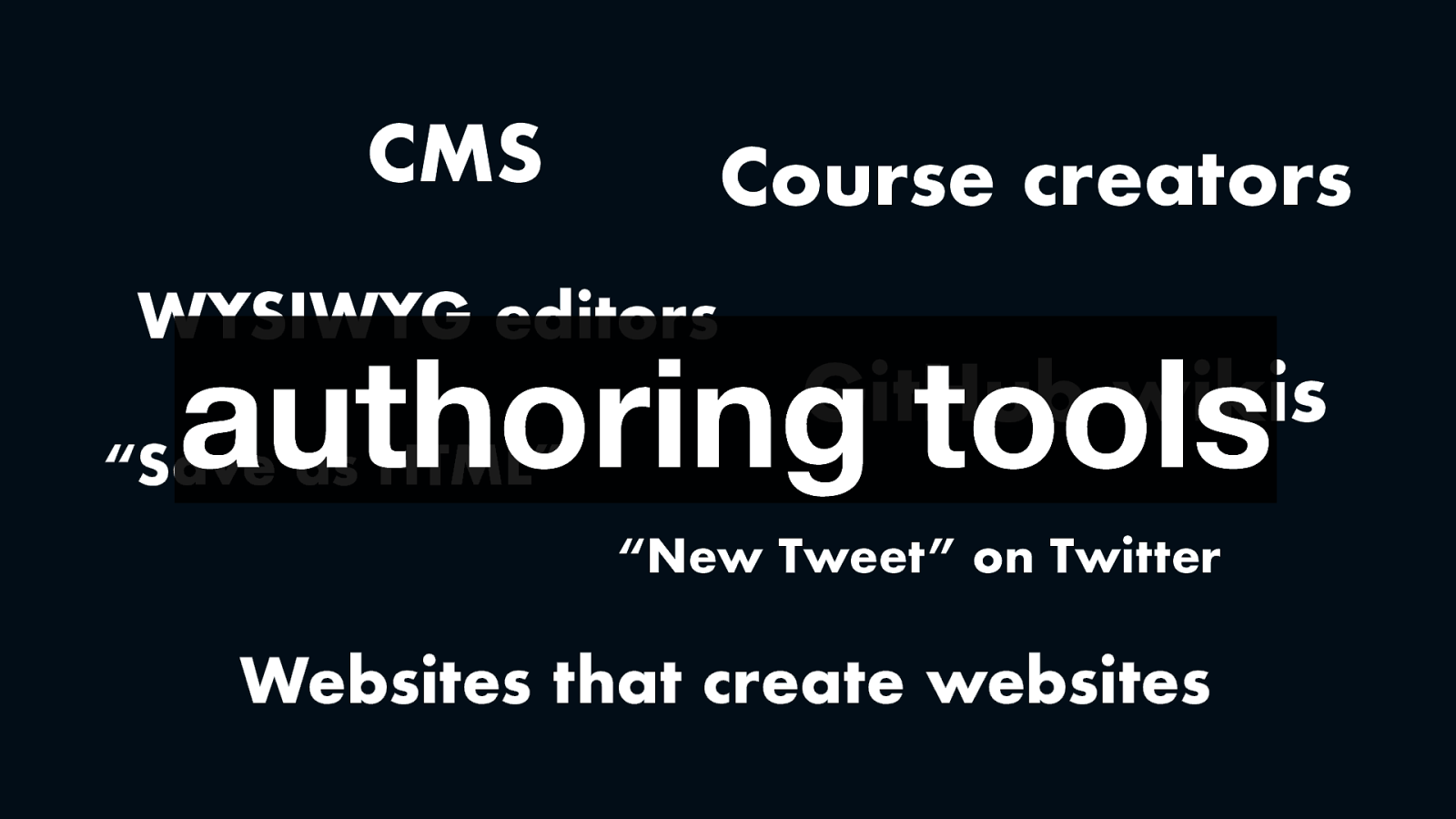
We call these kinds of tools “authoring tools”, a term you might see in various accessibility standards and guidance.
In short, authoring tools are tools that create web content.
And the interesting thing about them is… they can improve lots of accessibility at once. It’s great to improve the accessibility of one web page, but what if you could work on accessibility right within the system that creates all your pages?
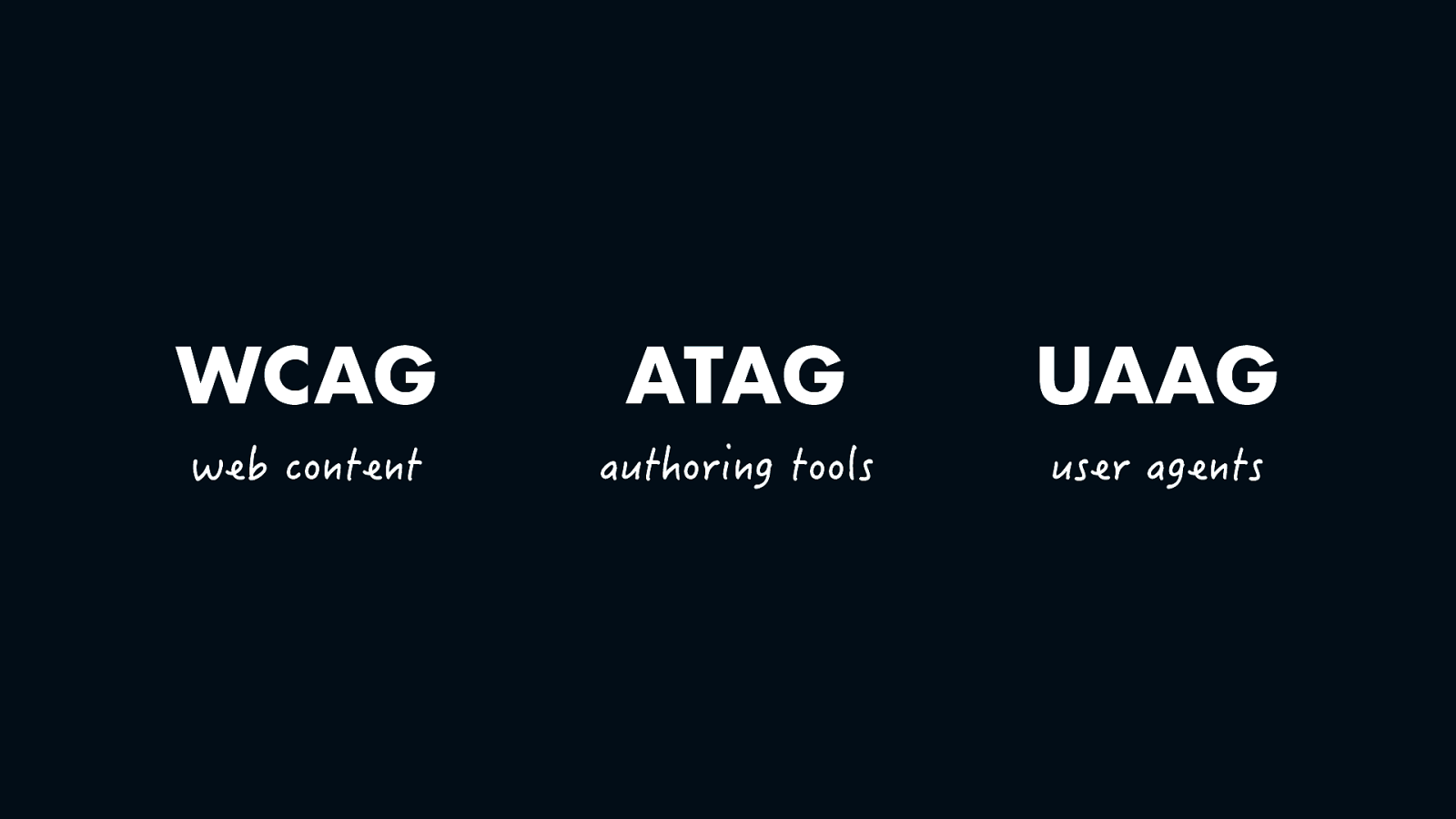
At the W3C we have not one but three standards for web accessibility. WCAG for web content, this one the best known and adopted by governments worldwide, including the European Union, UAAG for browsers or user agents and ATAG for authoring tools. Yes, there is an accessibility specification just about the accessibility of tools like CMSes.
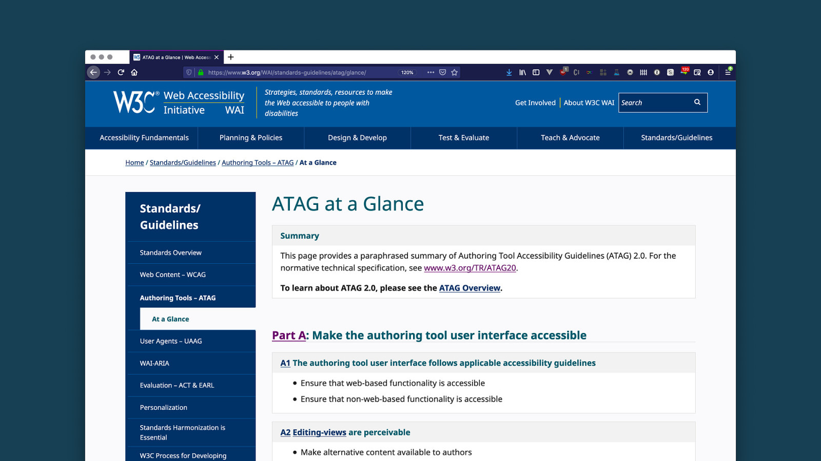
If you’d like to know more about this standard, check out this ATAG at a glance page, I’ll share the link to it later.
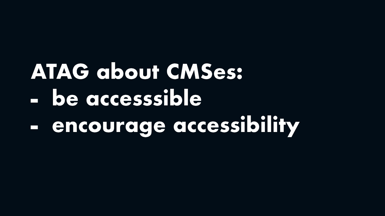
If I had to summarise this long document in two bullet points, it wants CMSes, and tools like it, to do two things. One, they should be accessible, so that people with disabilities can use them. Two, they should encourage accessibility, so that they have output that many people can use.
I’ll give examples of both of these aspects, so that you get an idea of what this could mean.
Let’s look at the first part first. For content editors, we need an accessible editing experience.
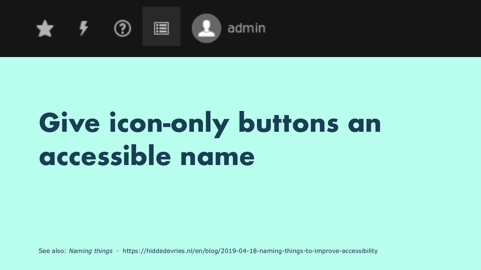
One thing I saw in a lot of CMSes that I looked at, is that they use buttons that are just icons. Often, they would not have an “accessible name”, which means in the markup there is nothing that describes what these buttons do, programmatically associated with the button, which means they are not useful to many users of assistive technology.
See also: Naming things ・ https://hiddedevries.nl/en/blog/2019-04-18-naming-things-to-improve-accessibility
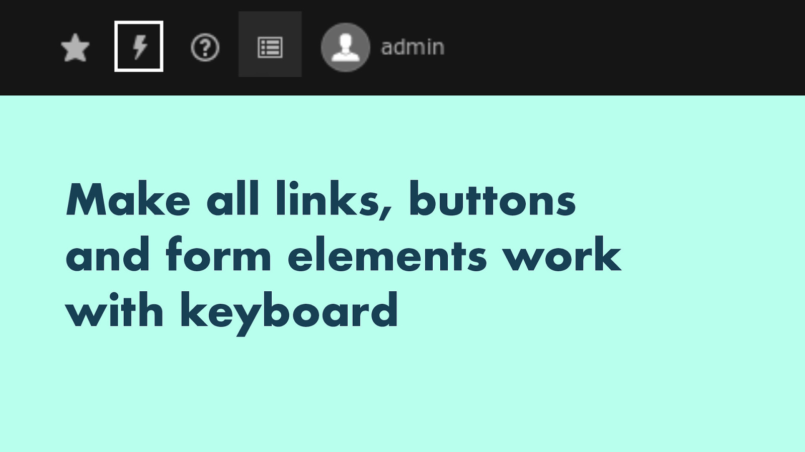
Another common issue is that not everything on the editing screen can be reached with a keyboard, often because someone has set outline none somewhere in their CSS.
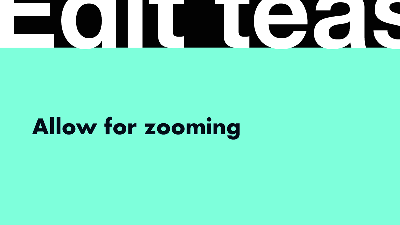
And lastly, some CMSes are hard to use for people who want to zoom in, which people with some visual impairments need, they would commonly want to zoom in 200, 300 or 400%, and often CMS editing layouts break. Unlike the text I showed at the start, where it is easier to zoom because the browser just needs to make the words bigger and reflow text, zooming an interface with a sticky header and/or footer is trickier.
Then the second part: accessible output, which is relevant for users of the website created with the CMS.

Maybe someone designed a beautiful 35% off image that you couldn’t do with CSS so it is an image and it needs alternative text.
Code: <img src=”discount.bmp” alt=”“>
See also: An alt decision tree ・ https://www.w3.org/WAI/tutorials/images/decision-tree/ 35% off
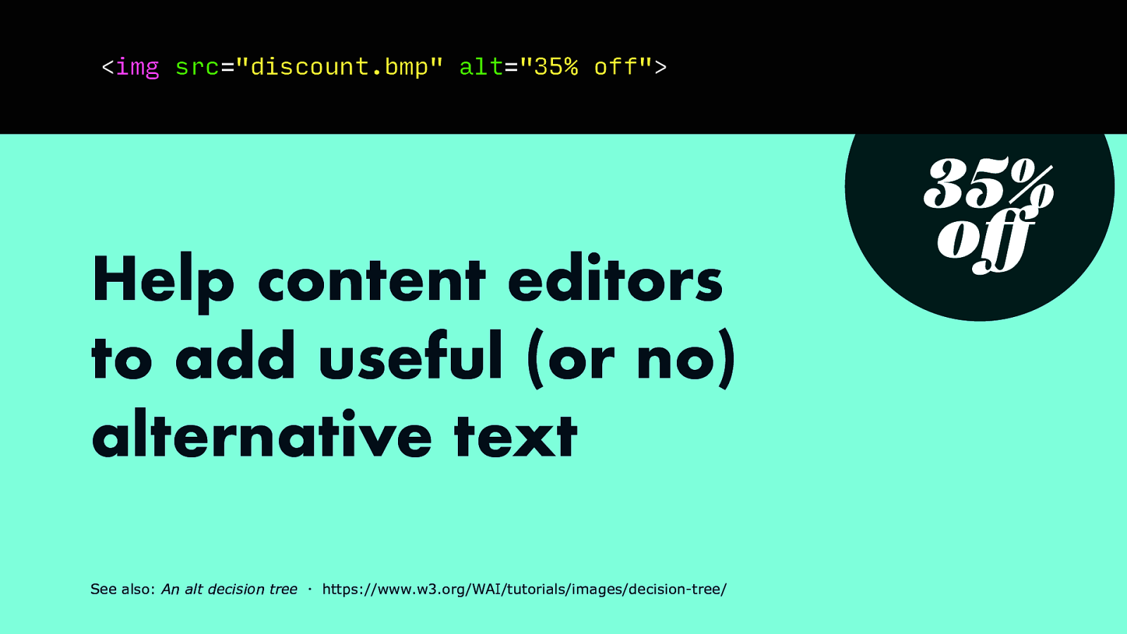
The alt attribute takes a text string that could reasonably replace the image, so in our case that would simply be the text ‘35% off’. A CMS could explain what is required here, and depending on how well it does, influence whether that actually happens. It could force users to make a choice between ‘this is a stock photo / decoration’ versus ‘here is the text that could replace the image’.
Code: <img src=”discount.bmp” alt=”35% off”>
See also: An alt decision tree ・ https://www.w3.org/WAI/tutorials/images/decision-tree/ 35% off
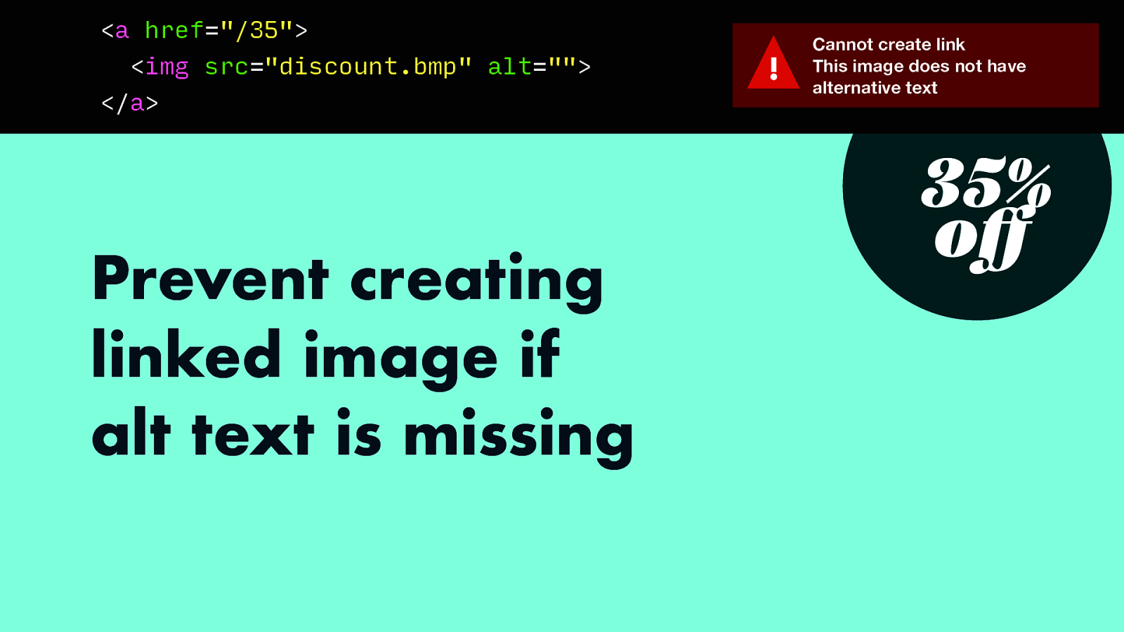
And if someone creates a link out of an image, the alternative text becomes of the image could become the link text if there’s nothing else, so in that case, a CMS could display a warning if it is missing. This would prevent inaccessibility before it ships to the user.
Code: <a href=”/35”> <img src=”discount.bmp” alt=”“> </a>

Another idea where a CMS could prevent inaccessibility is by verifying spelling. A button spelled ‘swbmit’ will be hard to pronounce for screenreaders and to understand for screenreader users. Having a spellcheck in the editor could prevent this problem.
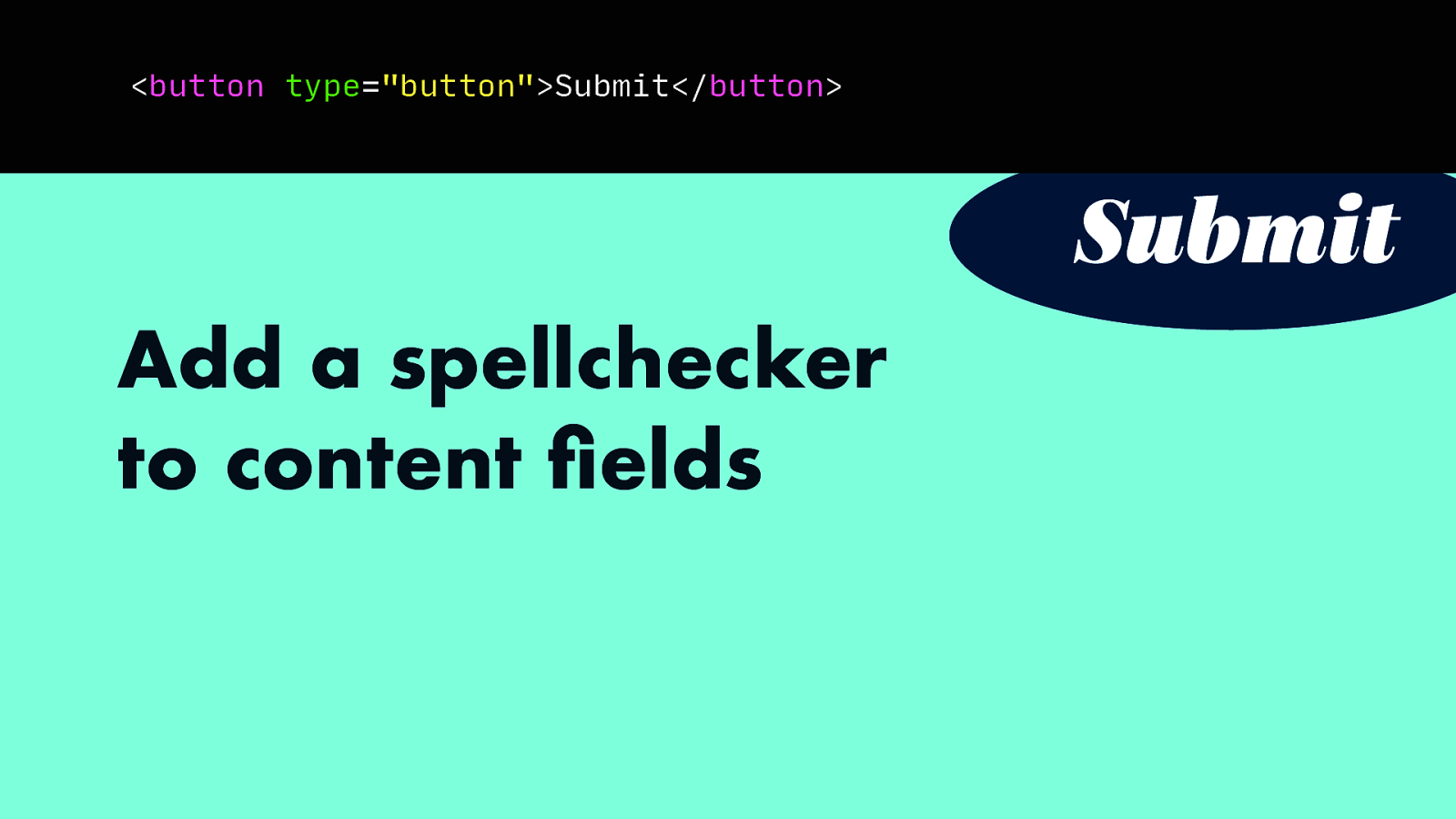
And fix it before it goes live to users.
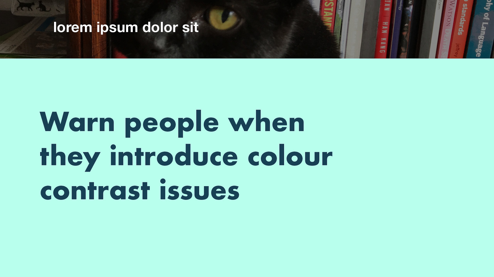
My last example is about colour contrast. What if you’ve designed a beautiful header with a dark photo of my cat and white text right on top of that image. It has plenty of contrast and works fine.
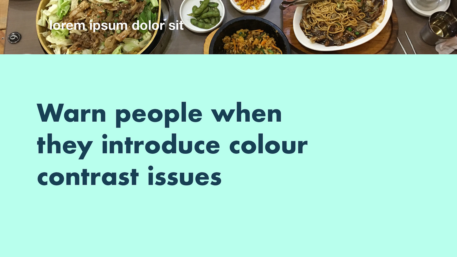
If someone replaces the image with one of Korean food though, the contrast is gone nad the text hard to read. We could programmatically detect this, warn the user and potentially say “sorry, you’re not allowed to publish this page, it has text that is hard to read”.
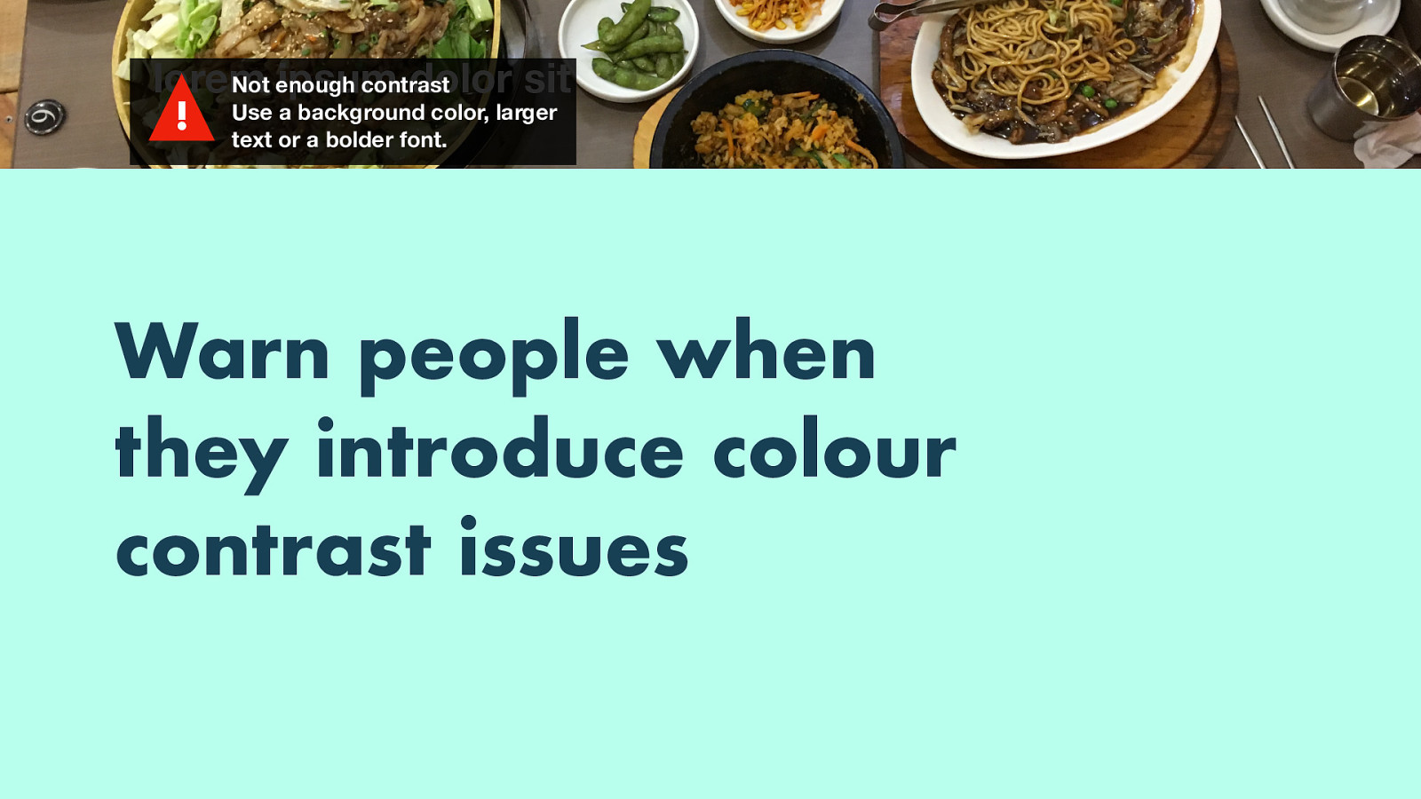
(Example of warning: not enough contrast, use a background color, larger text or a bolder font)
So, in summary, you can break barriers with your CMS, in two ways: one is to make it work for people with disabilities, so that there is no barriers for your colleagues or employees; the other is for end users, by building accessibility checks right into the editing screen and preventing inaccessibility before it goes live.
I’d like to leave you with these questions: how is your content authored (or: where is your HTML created?), and is there a potential for breaking barriers right there? I’d love to hear about your thoughts! You can tweet me at @hdv, or find the slides on Notist. Thanks for your time!