Hello Amsterdam! Let’s talk about dialogs and popovers.
Slide 1
Slide 2
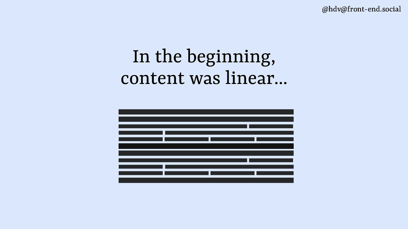
The web used to be just linear content…
Slide 3
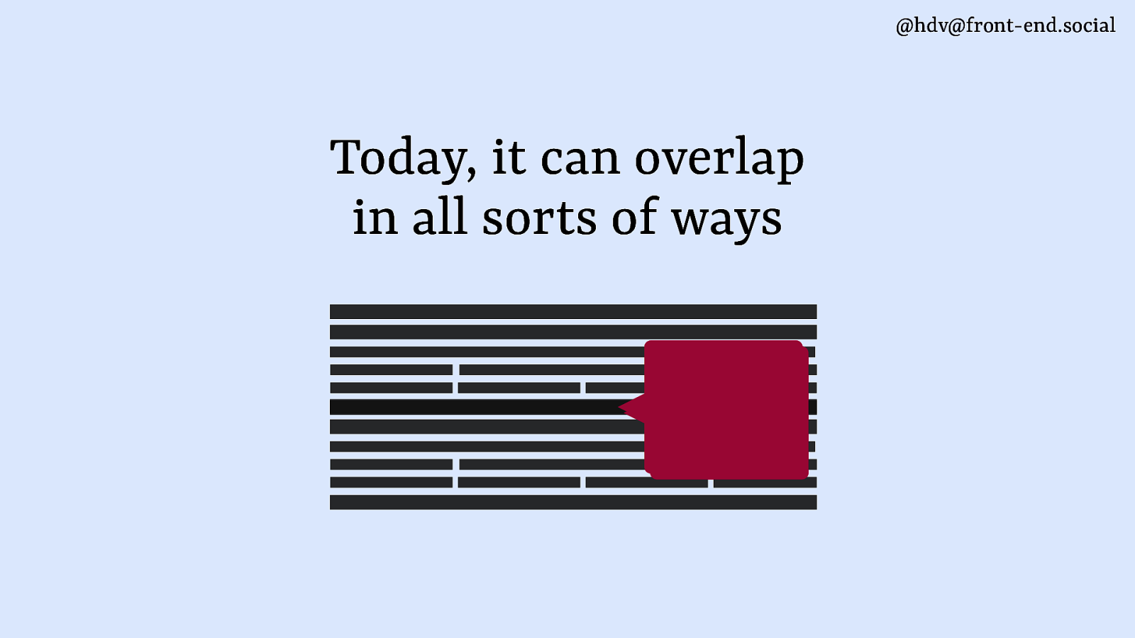
but these days we make content overlap in all sorts of ways.
Slide 4
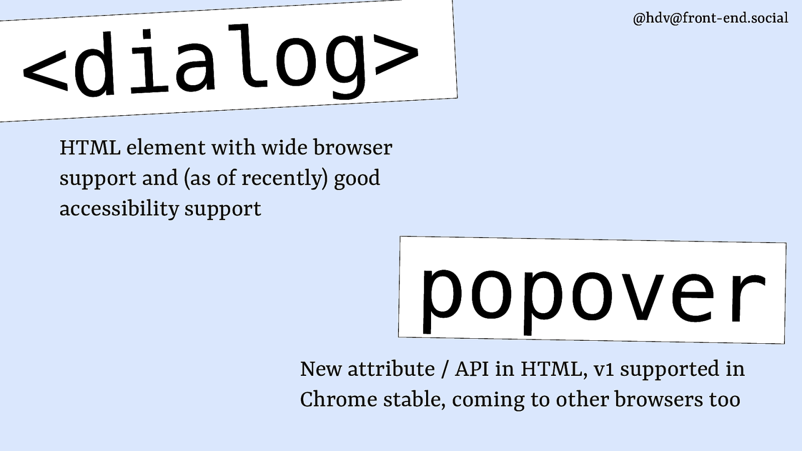
I want to talk to you about two very exciting bits of the HTML specification: the dialog element, which has been around for a while, and the popover attribute, which is very new and landed in Chrome stable just last week. Other browers are working on it and the spec is still undergoing tweaks and improvements.
Slide 5
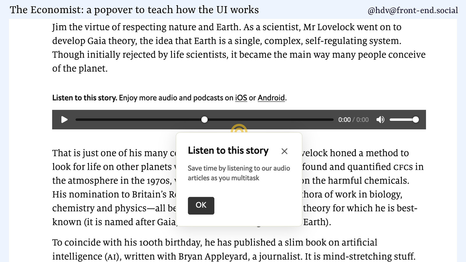
Examples of popovers include teaching UI, where a web page shows the user how to use a thing, in this case the audio player at The Economist.
They are used in all sorts of ways, also to advertise products.
Slide 6
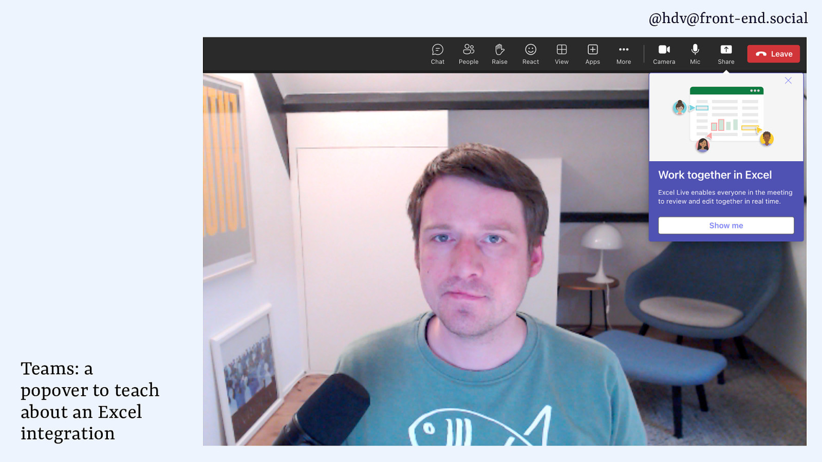
Like Microsoft did the other day, showing an ad for Excel while I was in a serious business meeting. (screenshot of Teams meeting with popover advertising Excel)
Slide 7
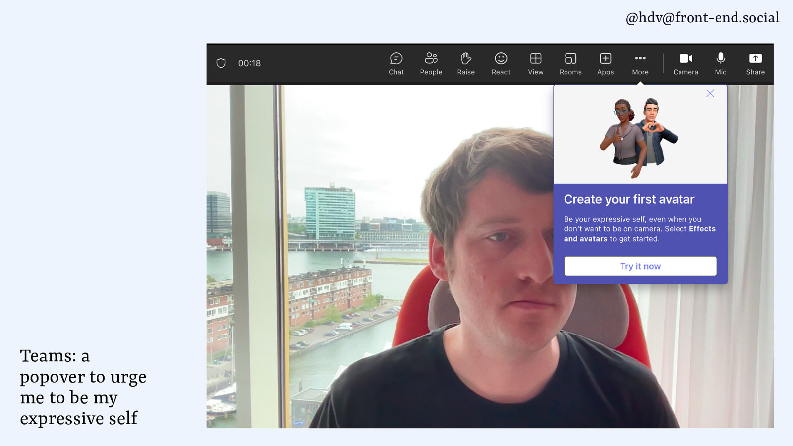
This morning it urged me to be my expressive self (screenshot of another meeting where a popover talks about creating an avatar with that phrasing)
Slide 8
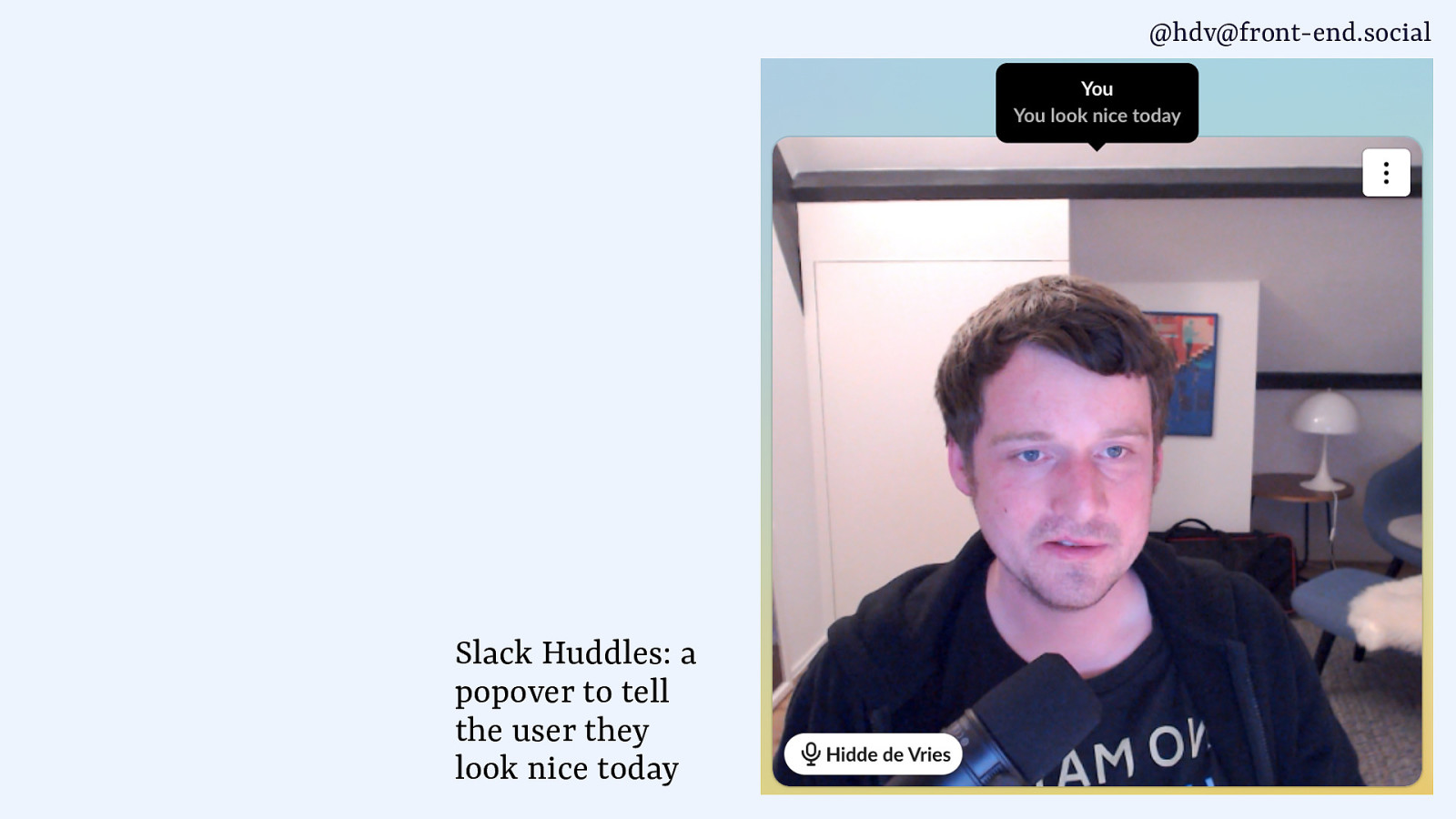
I prefer what Slack does, when you hover your own image it tells you you look nice today.
Okay, so what are these patterns…
Slide 9
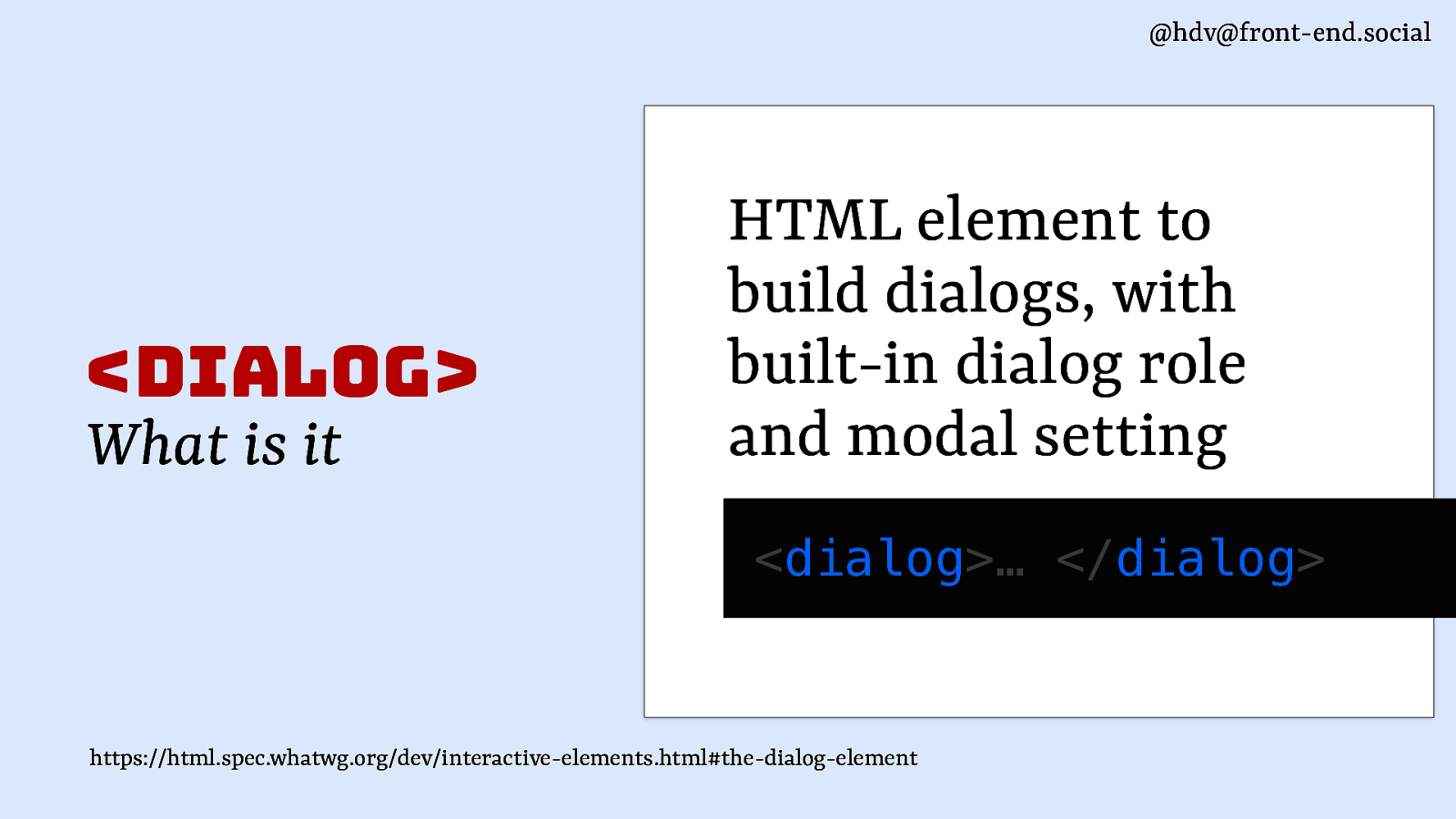
The dialog element exists to build dialogs, it has built in dialog semantics and a modal setting (so it’s different from divs with just that role).
Slide 10
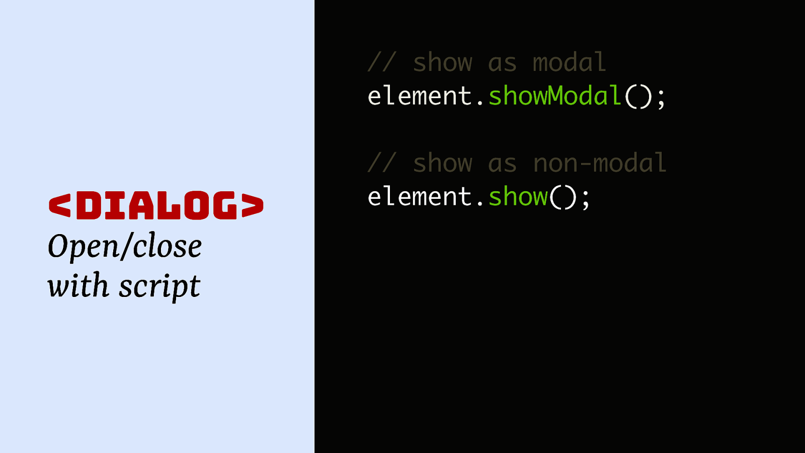
Using this element will give you two methods, showModal() to show it as a modal, and show to show it as a non modal, that you can call on the element.
Slide 11
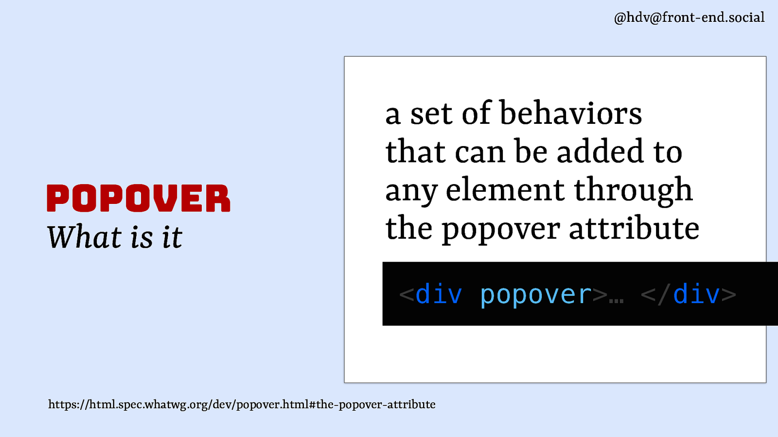
Popover is an attribute, it adds a set of behaviours to an element.
Slide 12
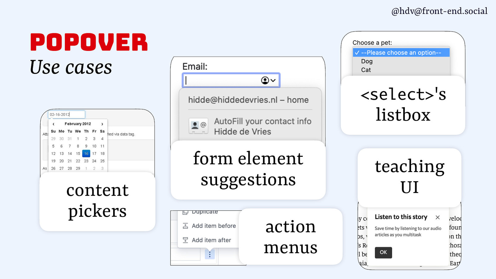
With popover you can build things like content pickers, form element suggestions, action menus, listboxes and, as shown before, teaching UI.
Slide 13
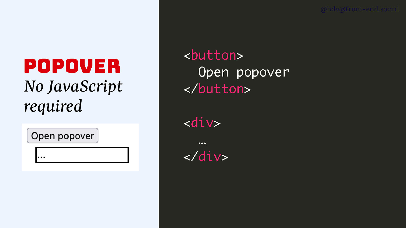
You don’t neded JavaScript to add toggling behaviour… basically to make a popover work, add the popover attribute to any element.
Slide 14
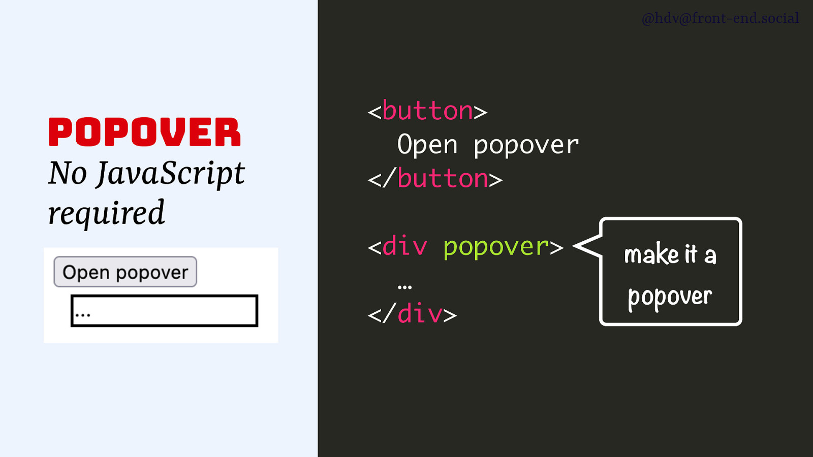
This makes it a popover.
Slide 15
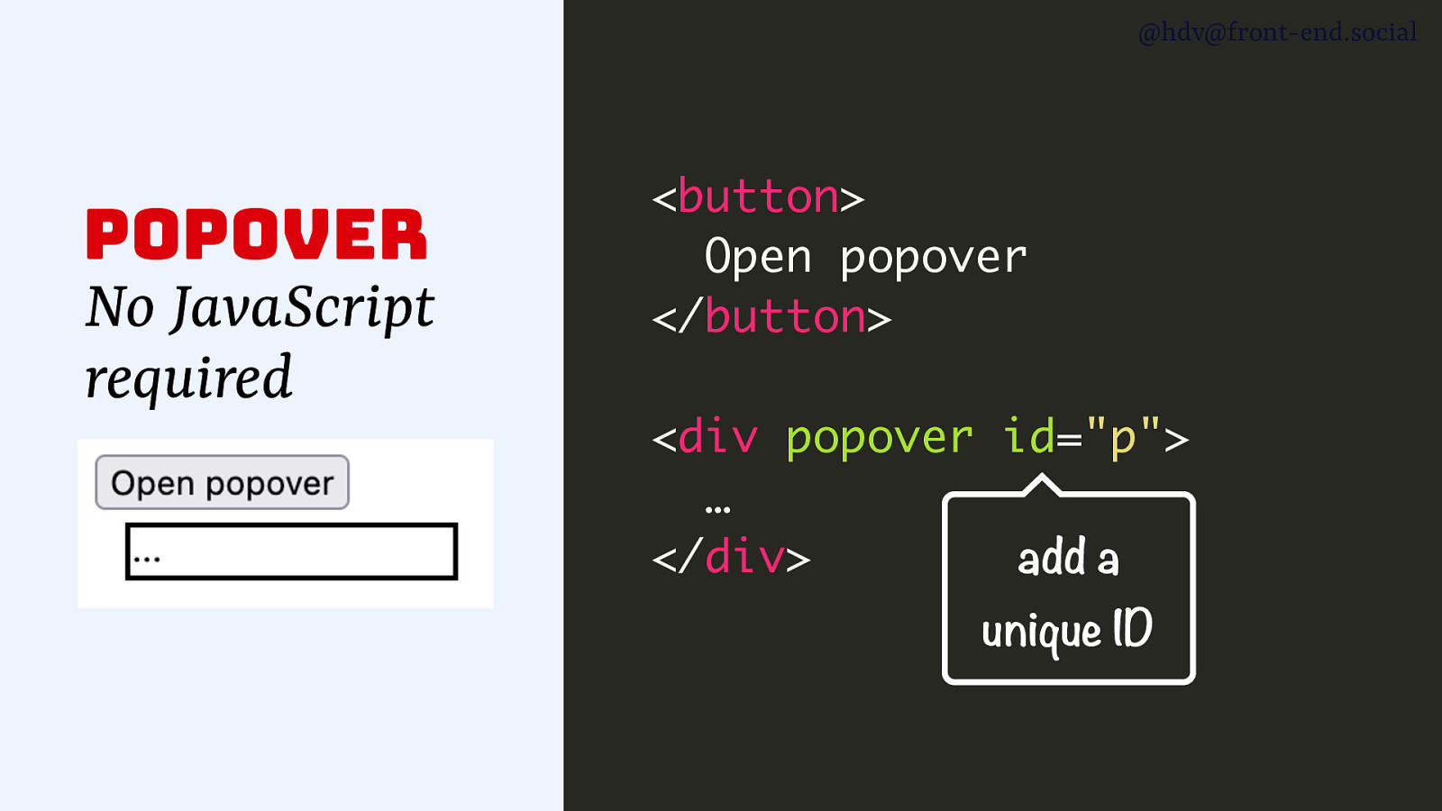
Then add a unique ID
Slide 16
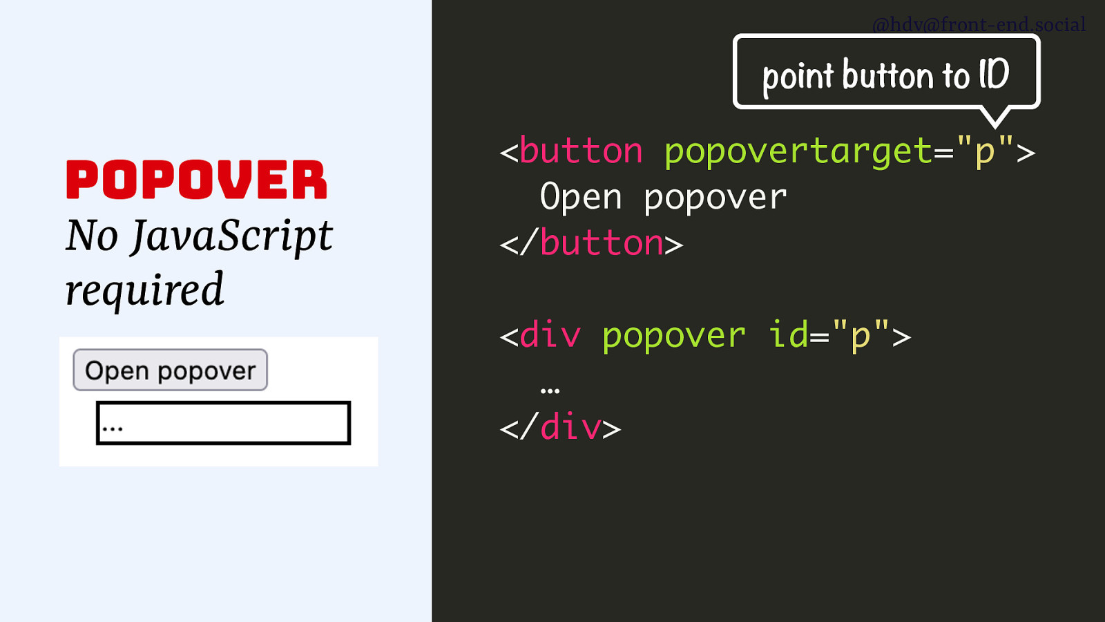
and refer to it from the button using the popovertarget attribute. That’s it, the button will now toggle the popover.
Slide 17
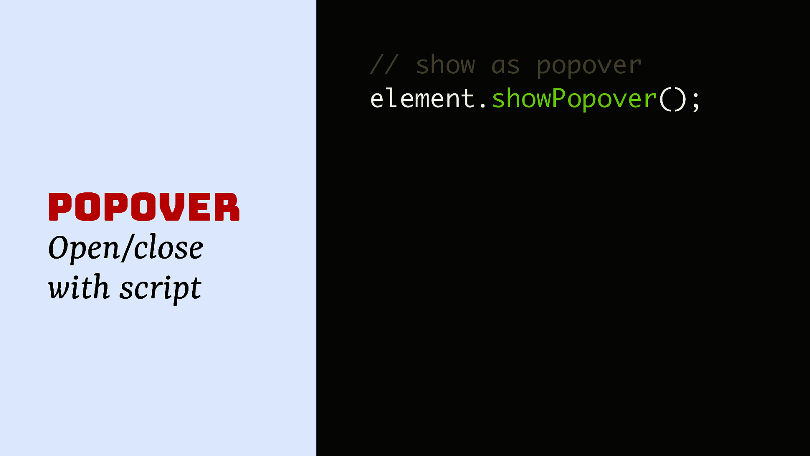
Of course you can do it via script too, with the showPopover method, for instance if you want to time it, like I think Microsoft did to me in Teams, as that appeared and disappeared without any action from me.
Slide 18
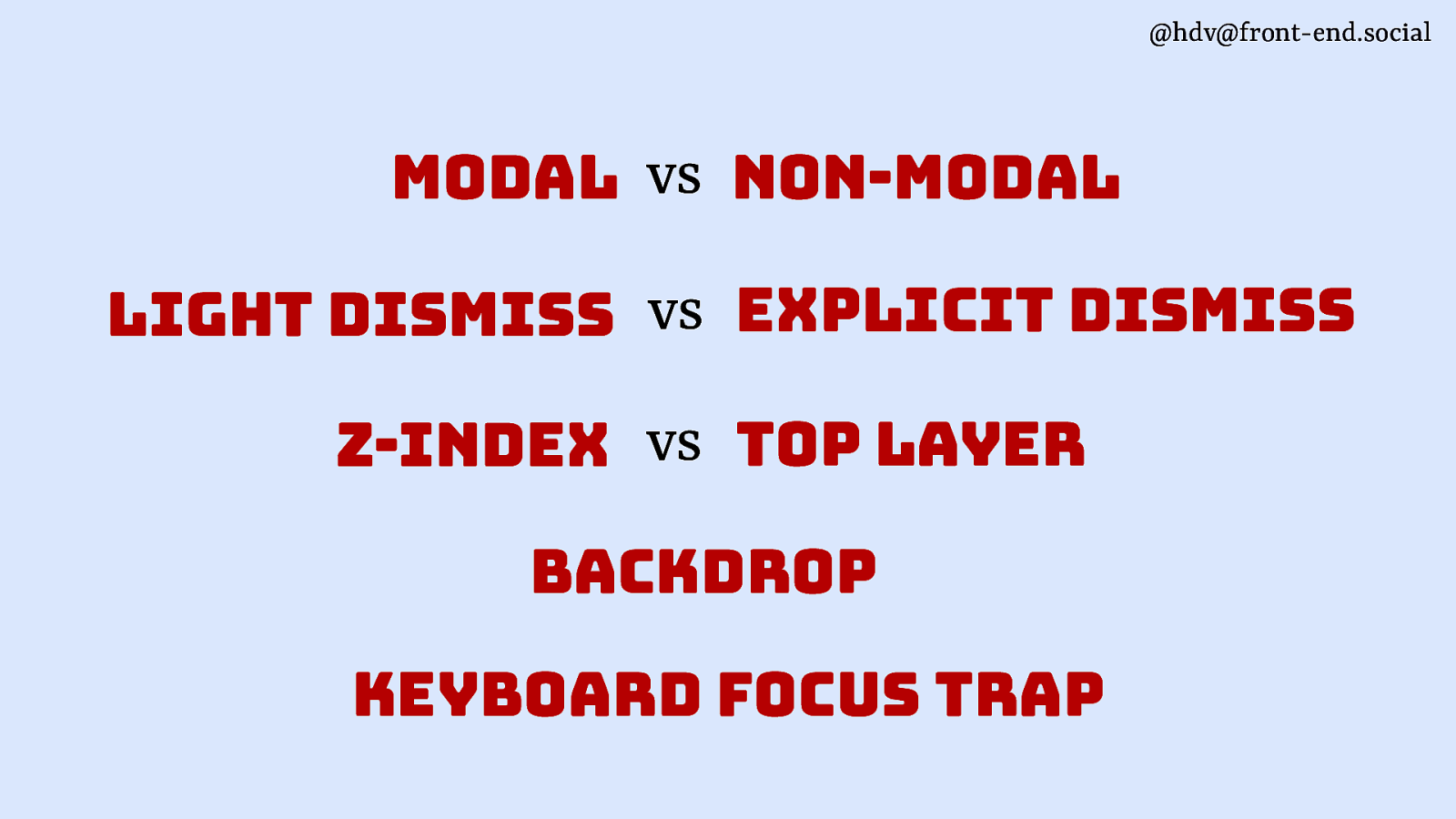
Looking at these patterns and working on popover at the Open UI CG, I kept thing, wait, how are these patterns actually different? It’s nuanced. I want to take you through a couple of axes on which they are different.
Slide 19
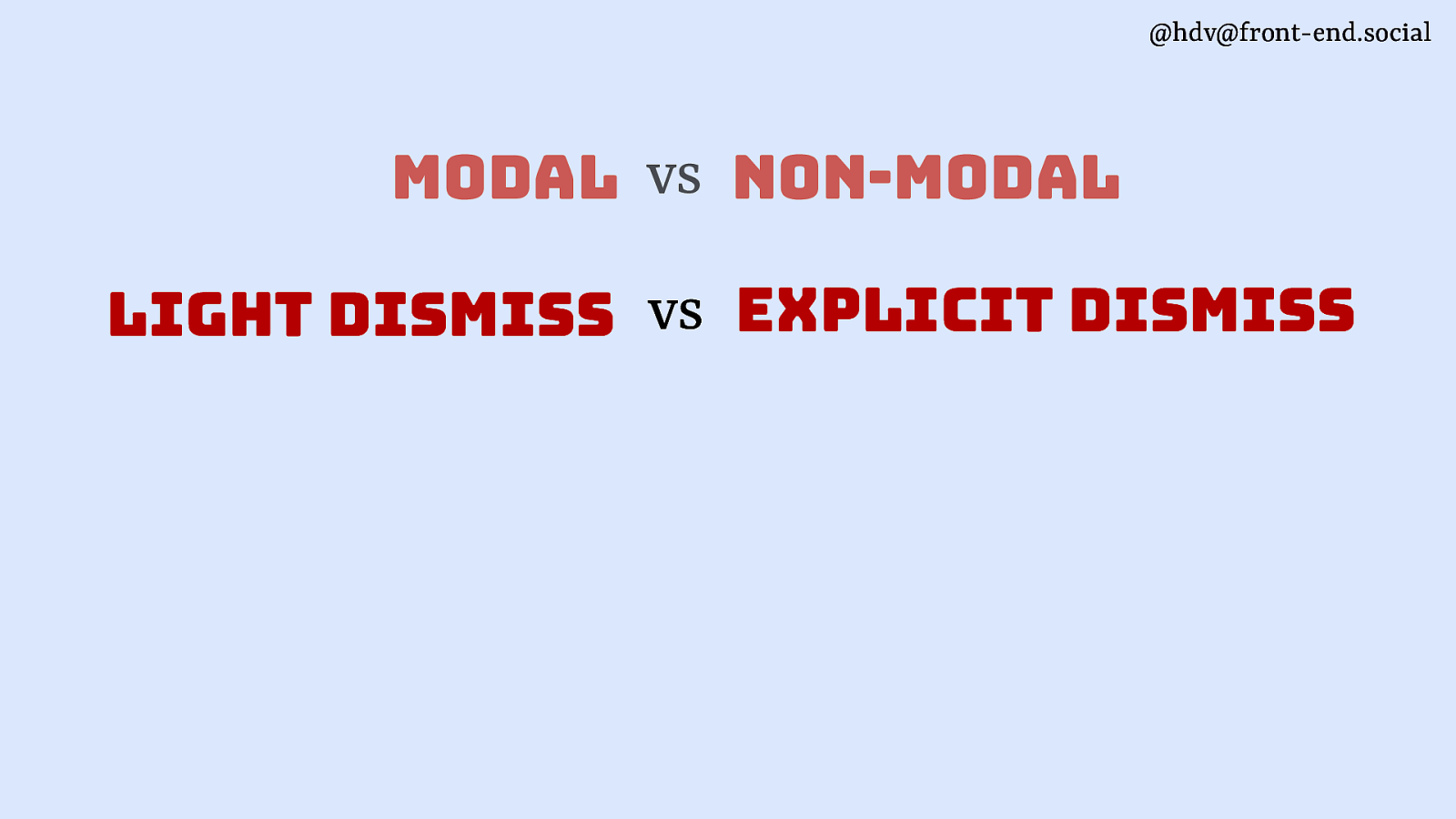
The first is modal vs non modal.
Slide 20
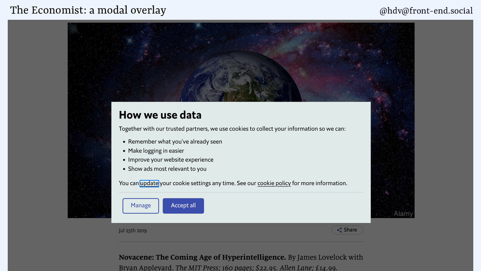
Something is modal when it is the only thing a user can interact with. Everything else is blocked from interaction, can’t click stuff, tab to it, select it, etc.
A good use case is when you’ve decided to track your users and need to, by European law, get their consent. Can’t really place any cookies before you have a yes, don’t really want to let the user go ahead without the tracking.
Slide 21
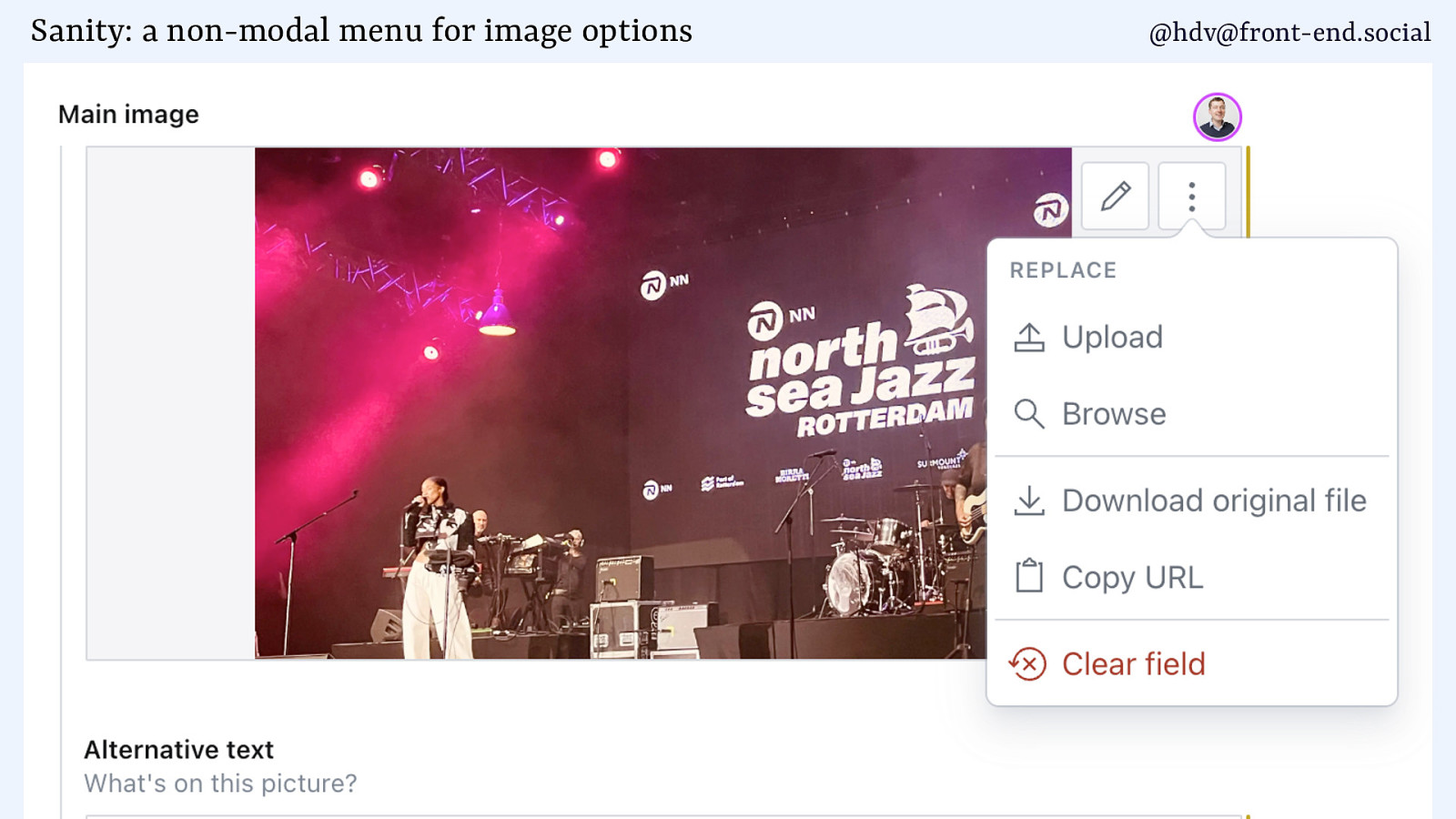
An example of a non modal dialog is a menu, like in this CMS where you can change some options for an image.
Slide 22
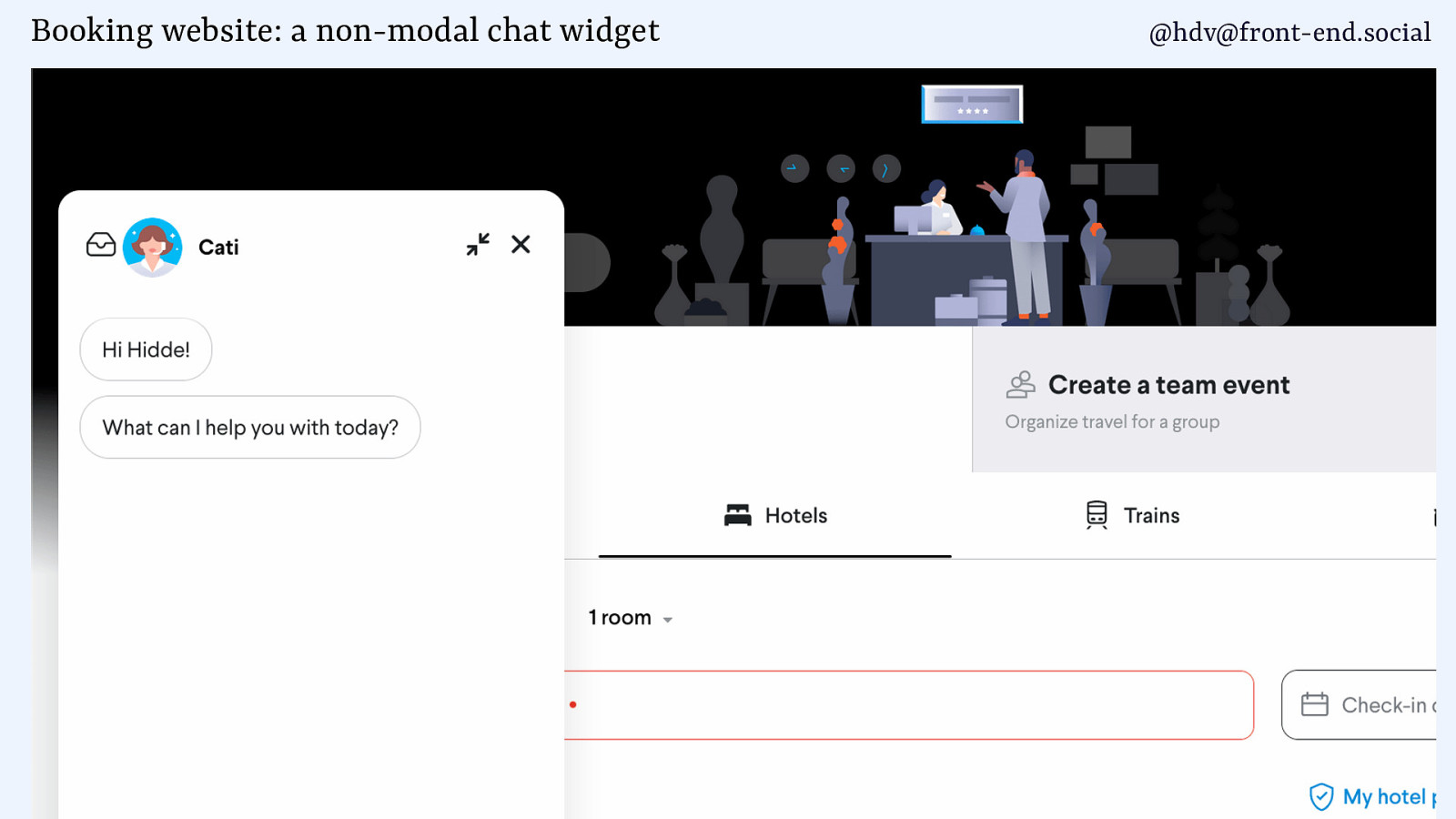
Or a chat widget that appears on a train booking UI. Chances are your users want to continue doing other stuff on the page and need access to that.
Slide 23
Then, dismissing our component…
Slide 24
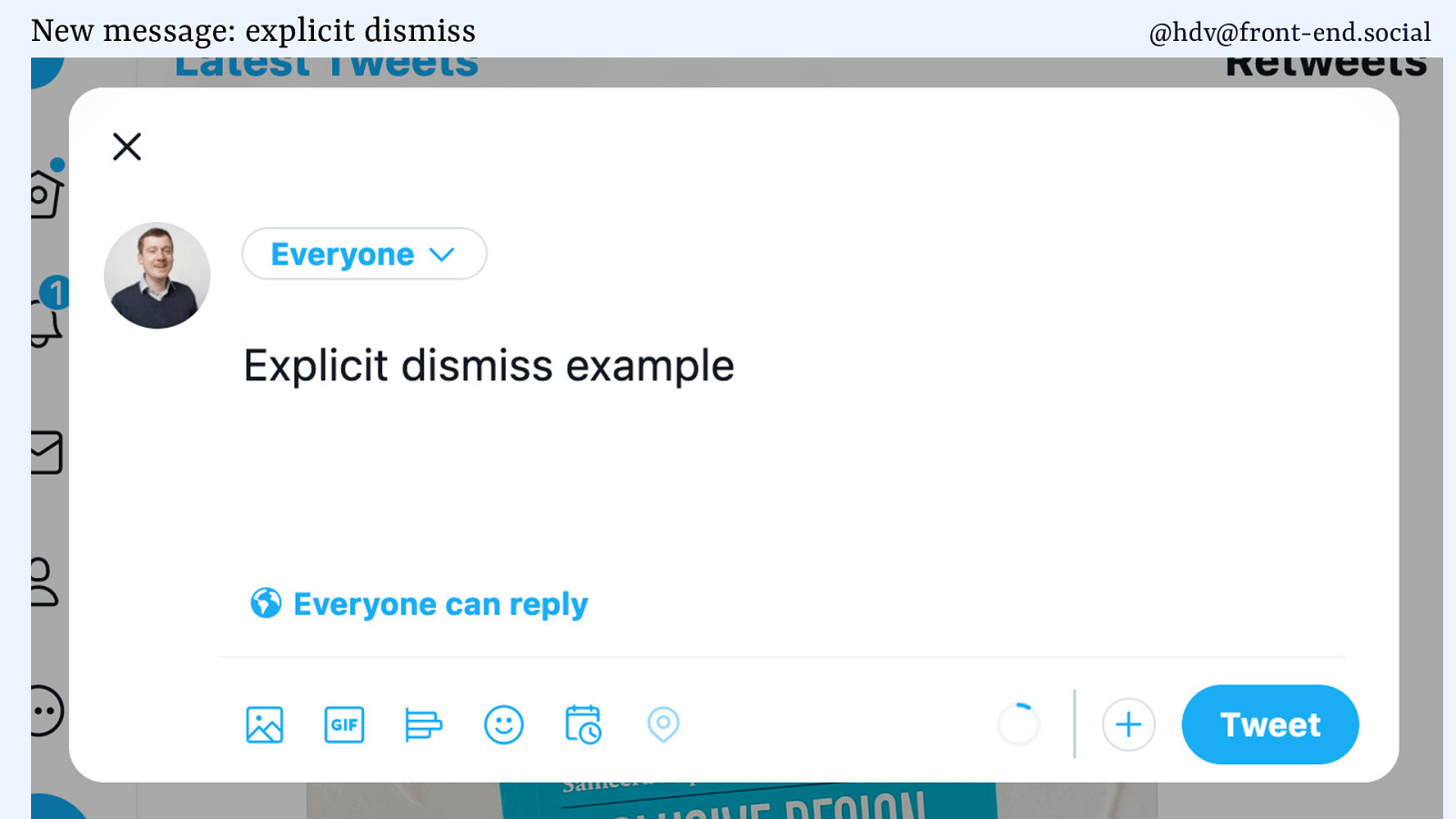
sometimes that happens explicitly like when there is a button to close your dialog.
Slide 25
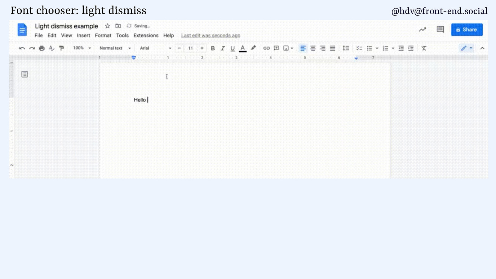
And then there’s light dismiss, when something disappears kind of when it has to, like in Google Docs when you’re choosing a font and click outside of that font chooser, it just goes away and that feels natural.
Slide 26
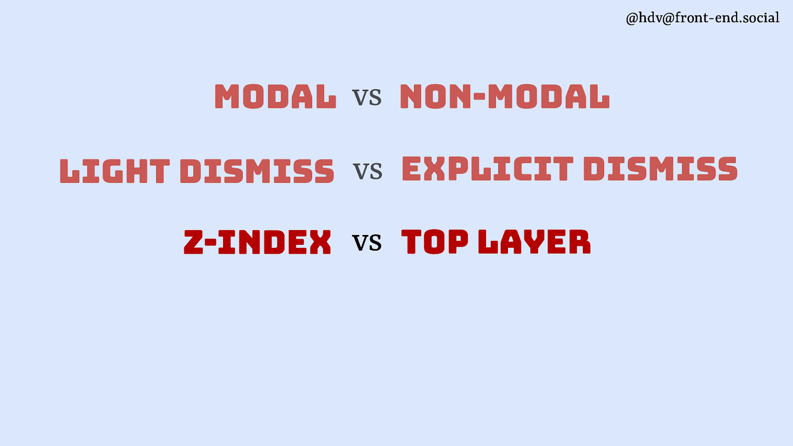
Next is layering.
Slide 27
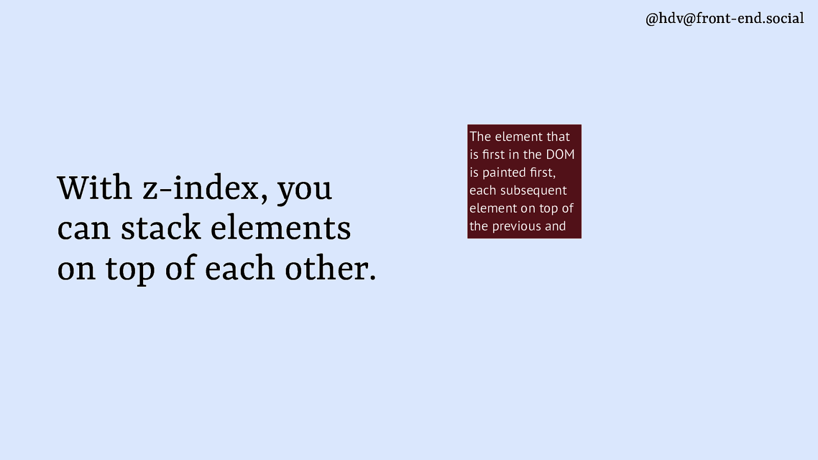
With z-index you can control the order in which elements appear that are in the same place.
Slide 28
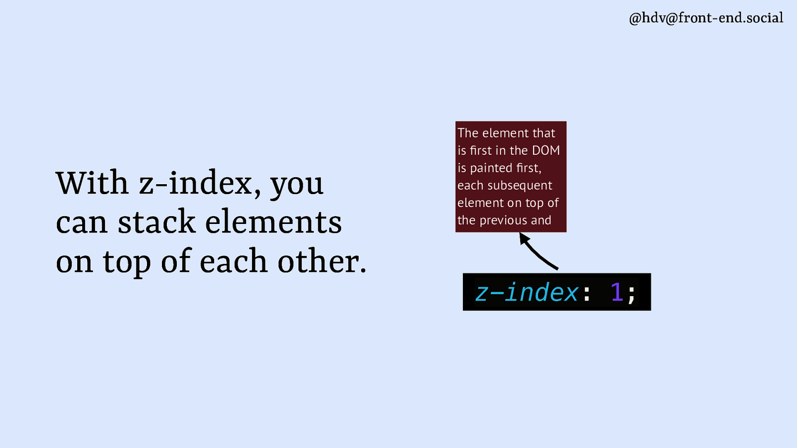
If one thing has a z-index of 1
Slide 29
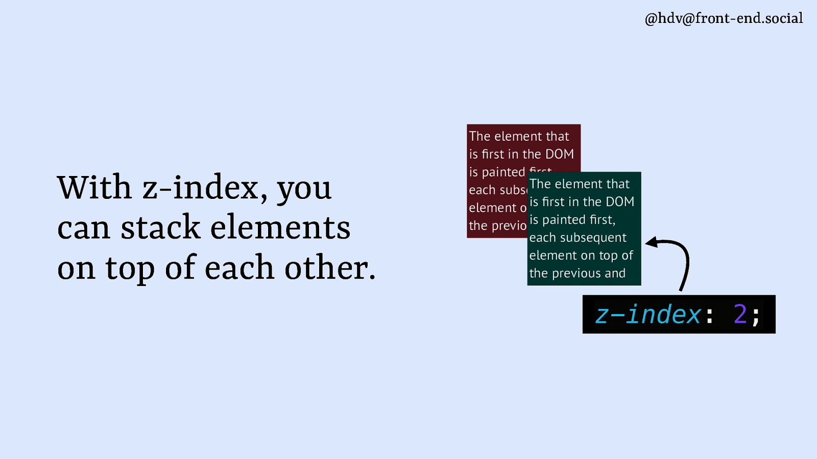
and another a z-index of 2, that last one appears on top of the first. And of course we have all seen bigger numbers than this.
Slide 30
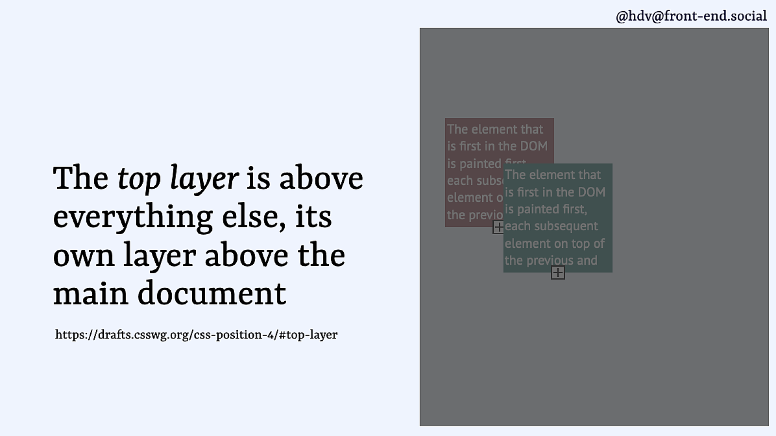
The top layer, then, sits on top of all of that. It’s a layer of its own, so while all of your z-indexing happens in the main document, the top layer is kind of a sibling of your root element.
Slide 31
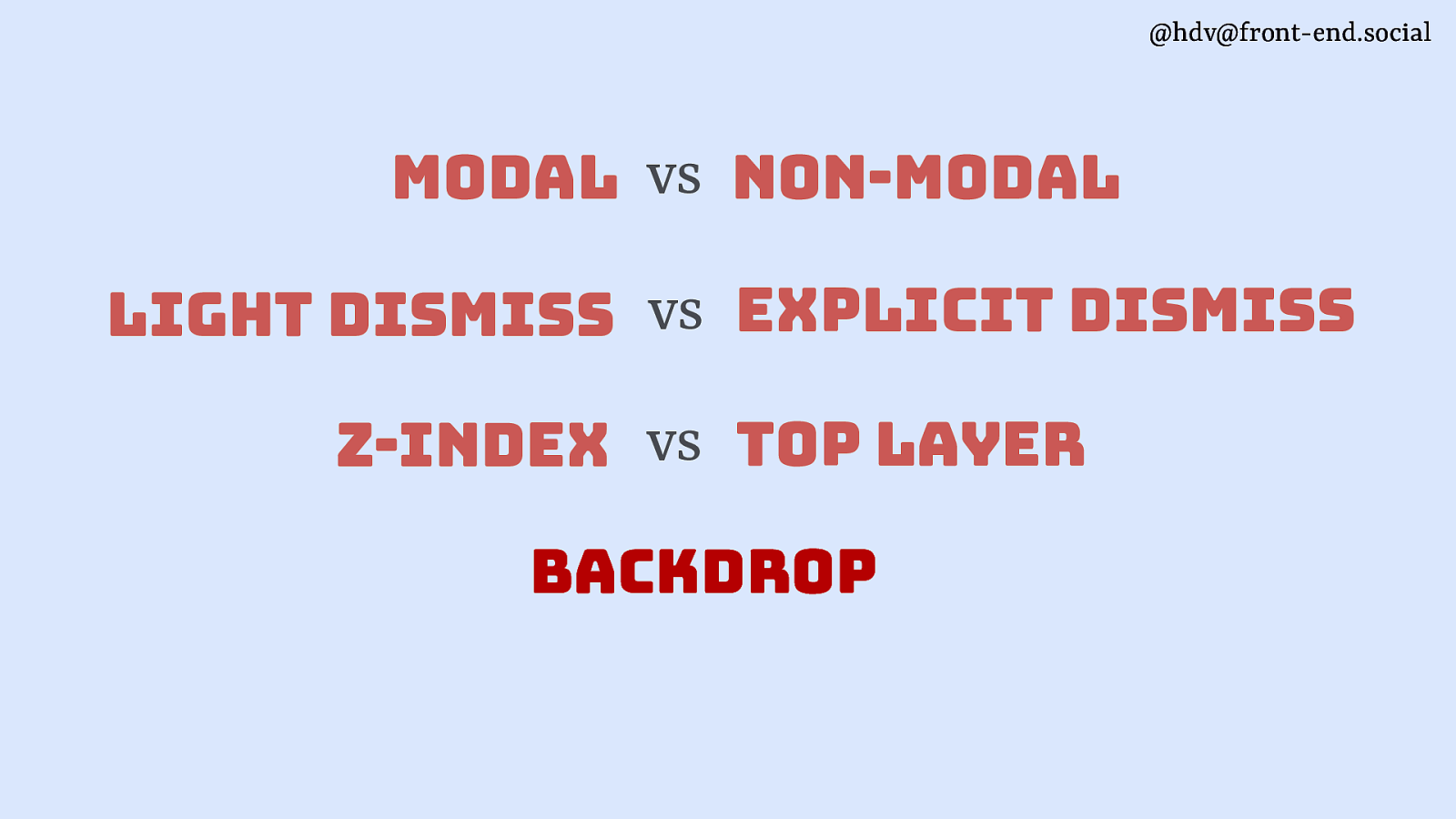
Next, some of your elements may have a backdrop.
Slide 32
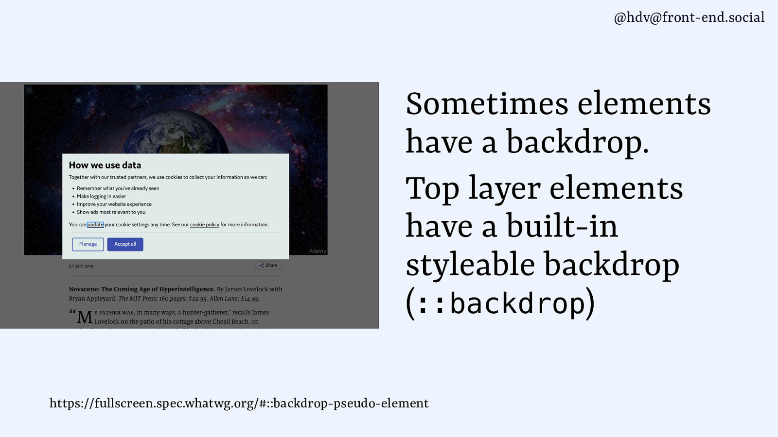
You get these for free from the browser, if your element is in the top layer. It is styleable with ::backdrop, so you can do all sorts of blurring, colouring and semi transparancy.
Slide 33
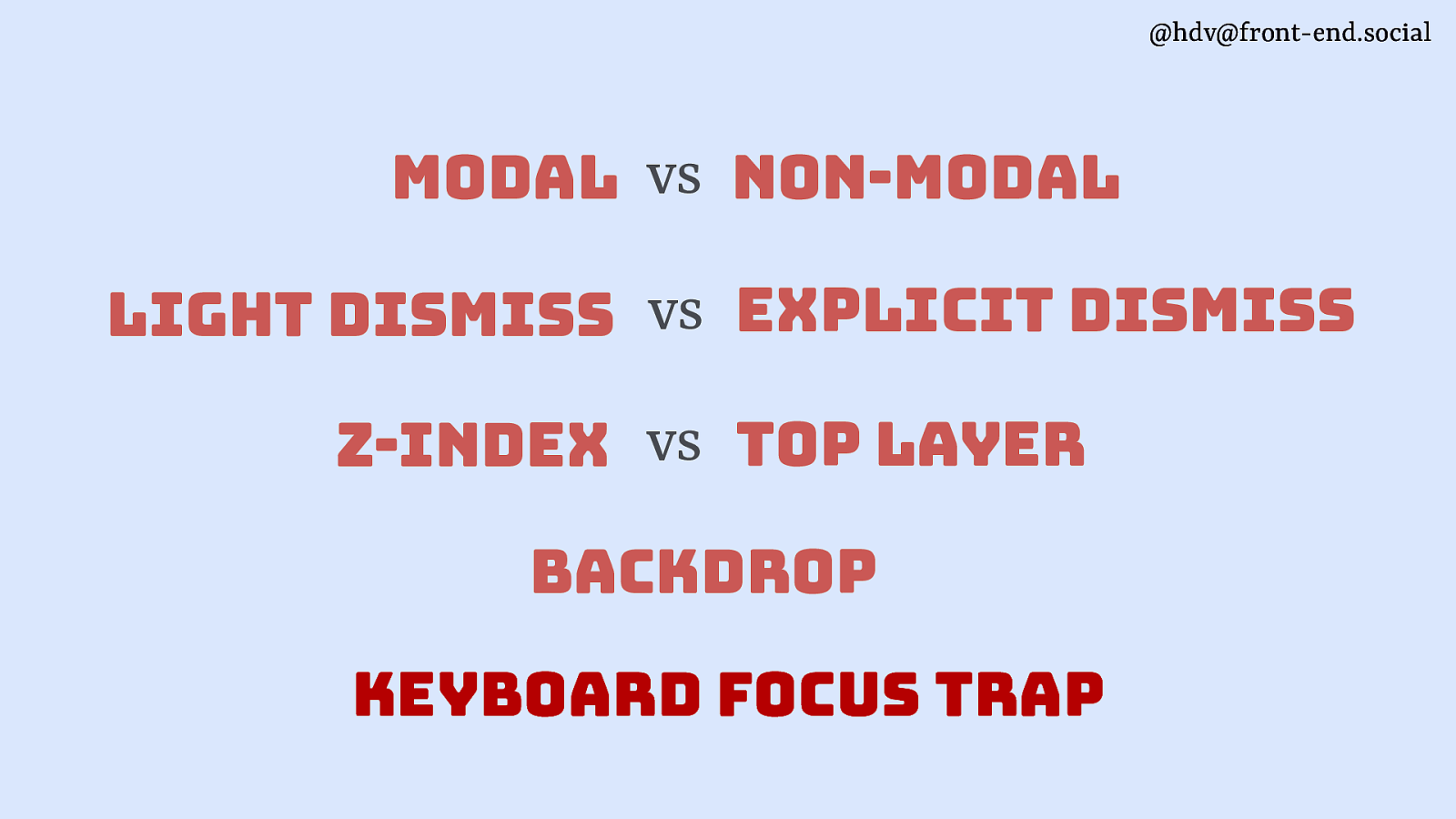
Then the last one is the keyboard focus trap, sometimes you want to prevent users from tabbing outside of your component.
Slide 34
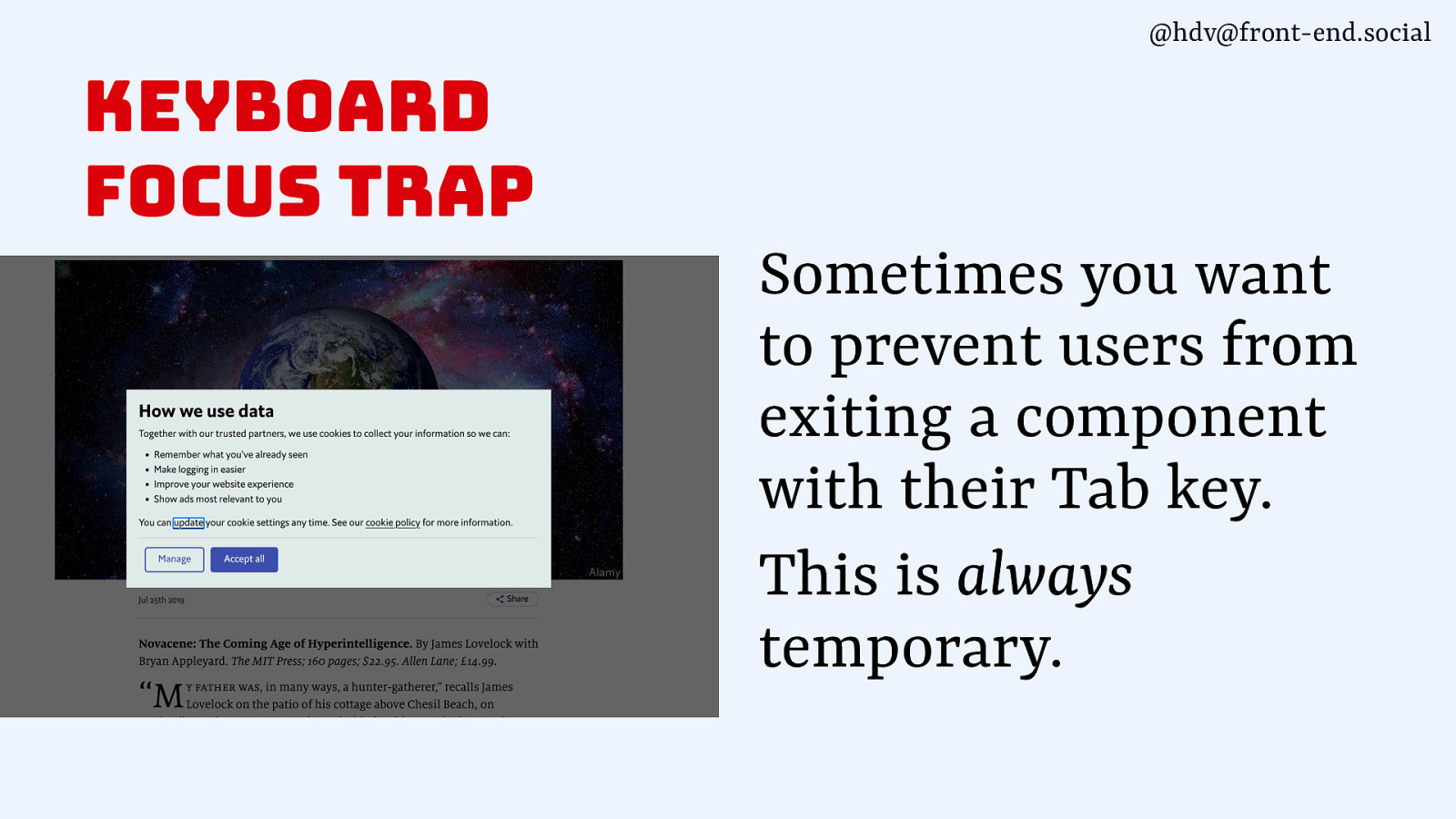
This is always a temporary thing, for instance when it’s a modal overlay or something like a complex calendar widgets that would be inconvenient to tab outside of.
Slide 35
So that’s a bunch of differences that can exist between dialogs and popovers. Let’s look at how they relate in turn.
Slide 36
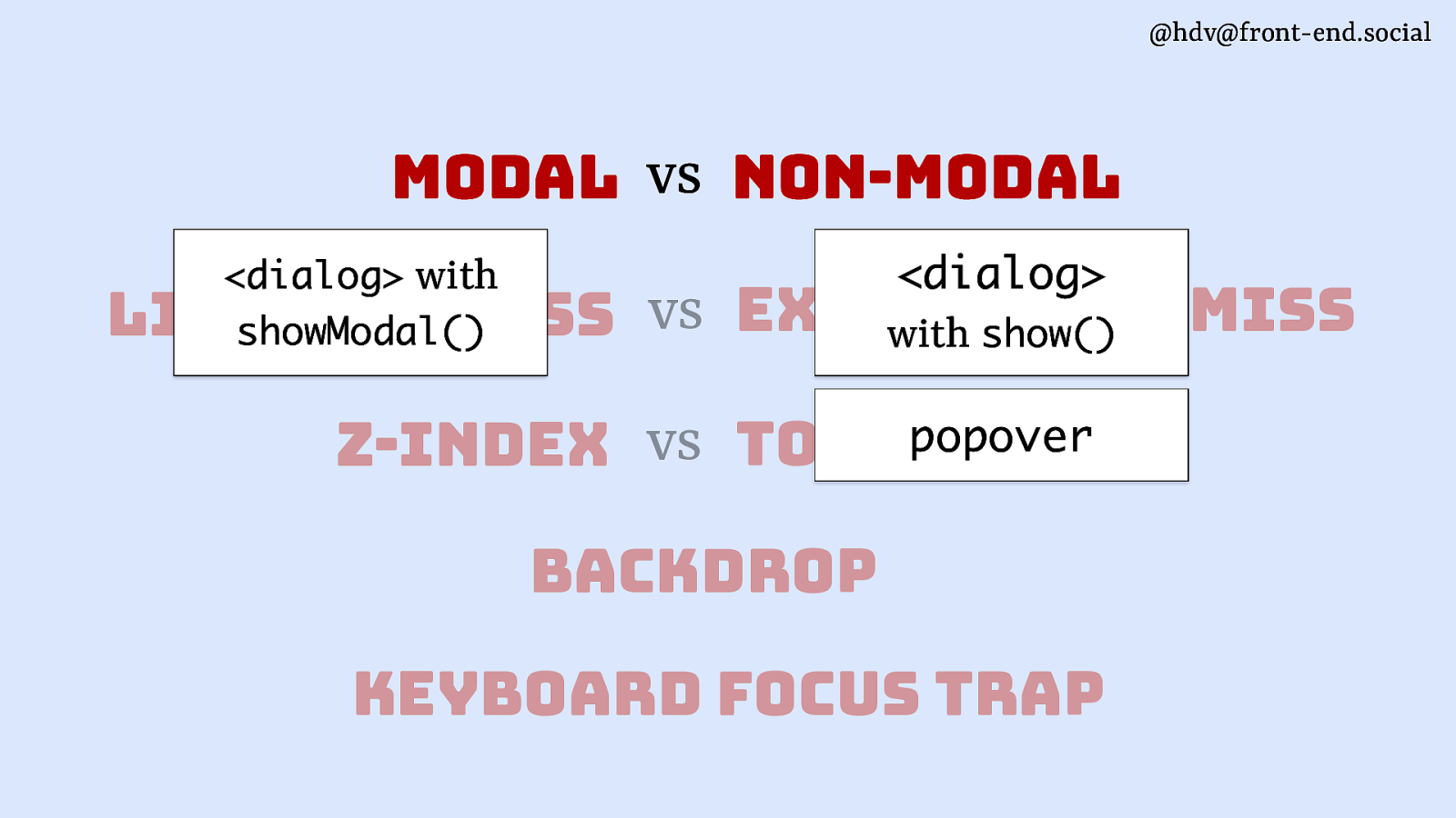
Dialog elements with showModal(), I’ll just say modal dialogs now, are modal. Dialogs with show() and popovers are non-modal.
Slide 37
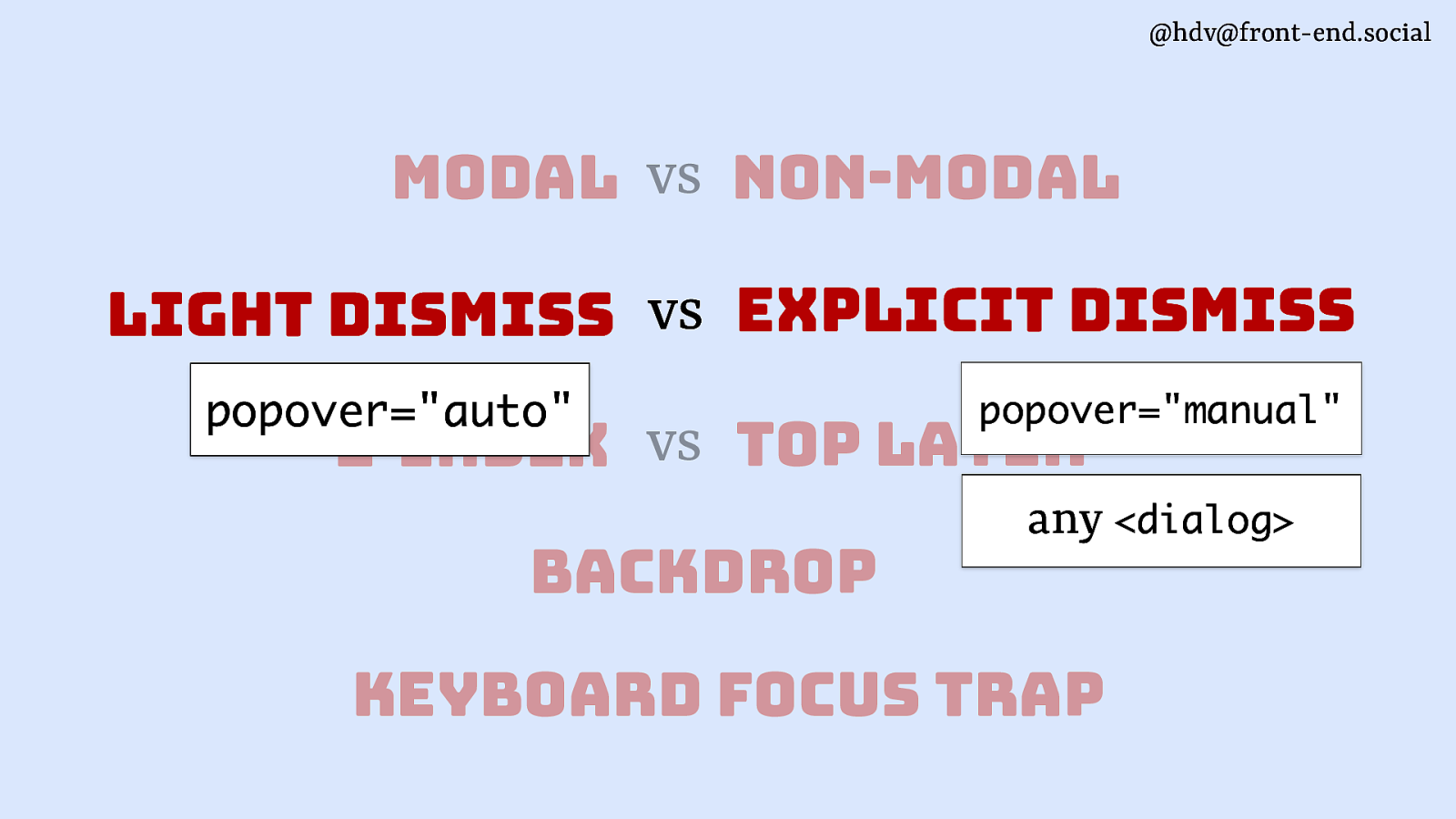
Popovers of the auto type, which is the default, have light dismiss. Popovers of the manual type don’t, they need to explicitly dismiss, the same goes for any dialogs.
Slide 38
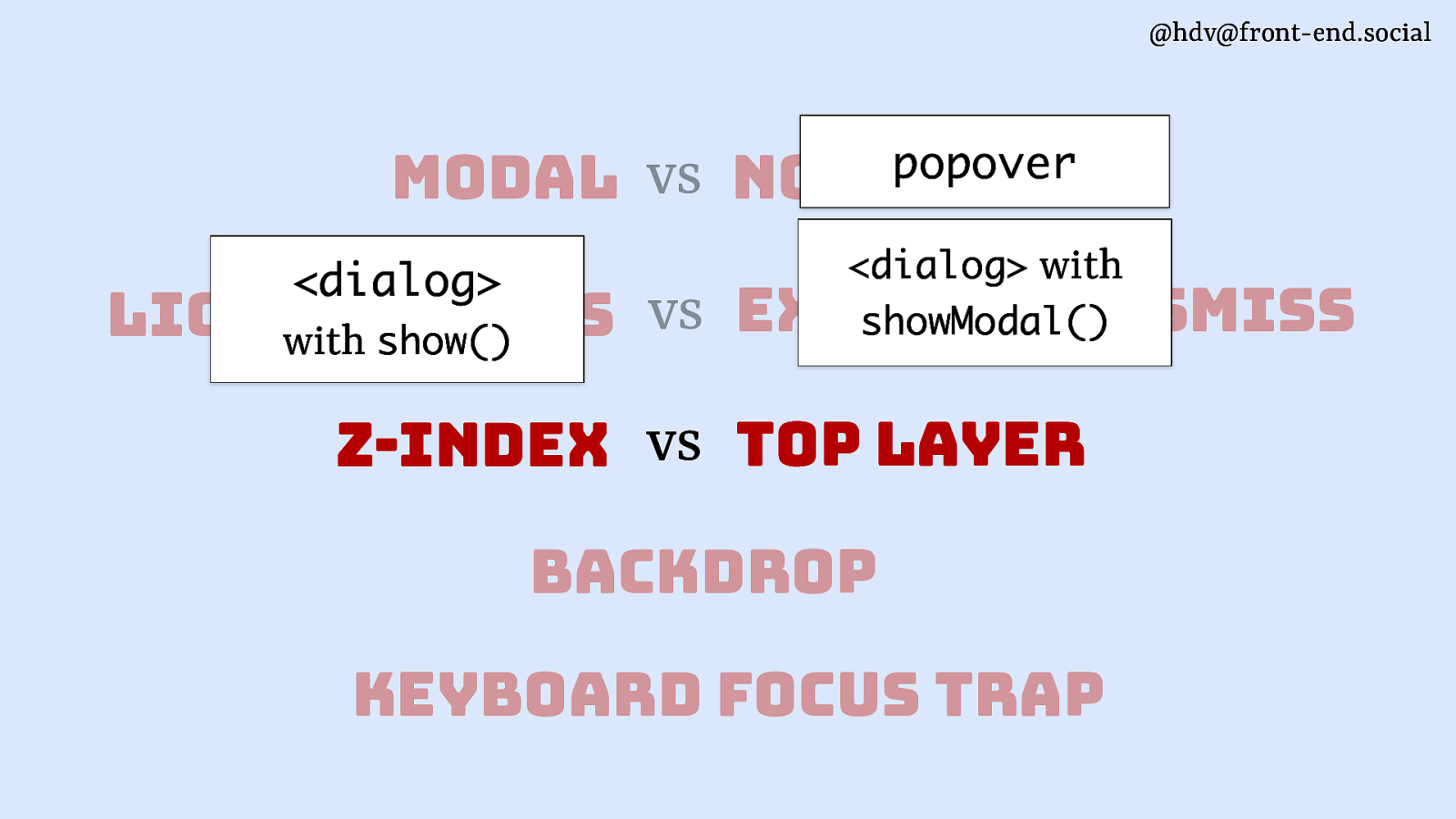
Layering then… popovers and modal <dialog>s are in the top layer, for other dialogs you’ll have to set up a z-index.
Slide 39
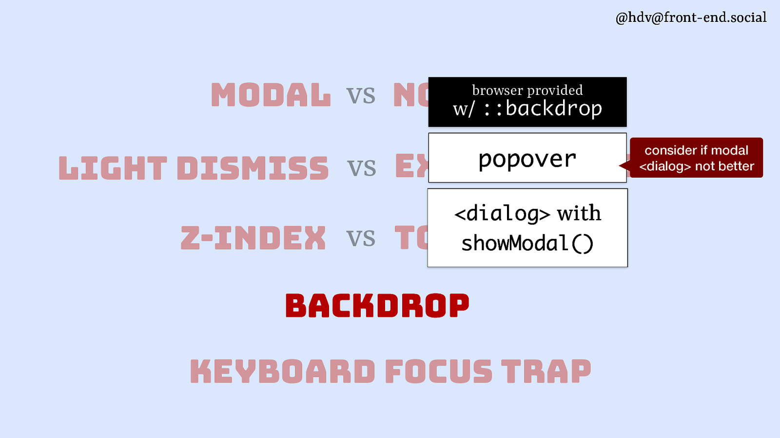
These top layer elements are also the ones that get a browser provided backdrop. Do note though, if your’re considering a backdrop for a popover, chances are you might actually want a modal dialog, because if you’re obscuring the background you’re usually kind of making it unavailable, so why not go full modal? (There are use cases, but not many)
Slide 40
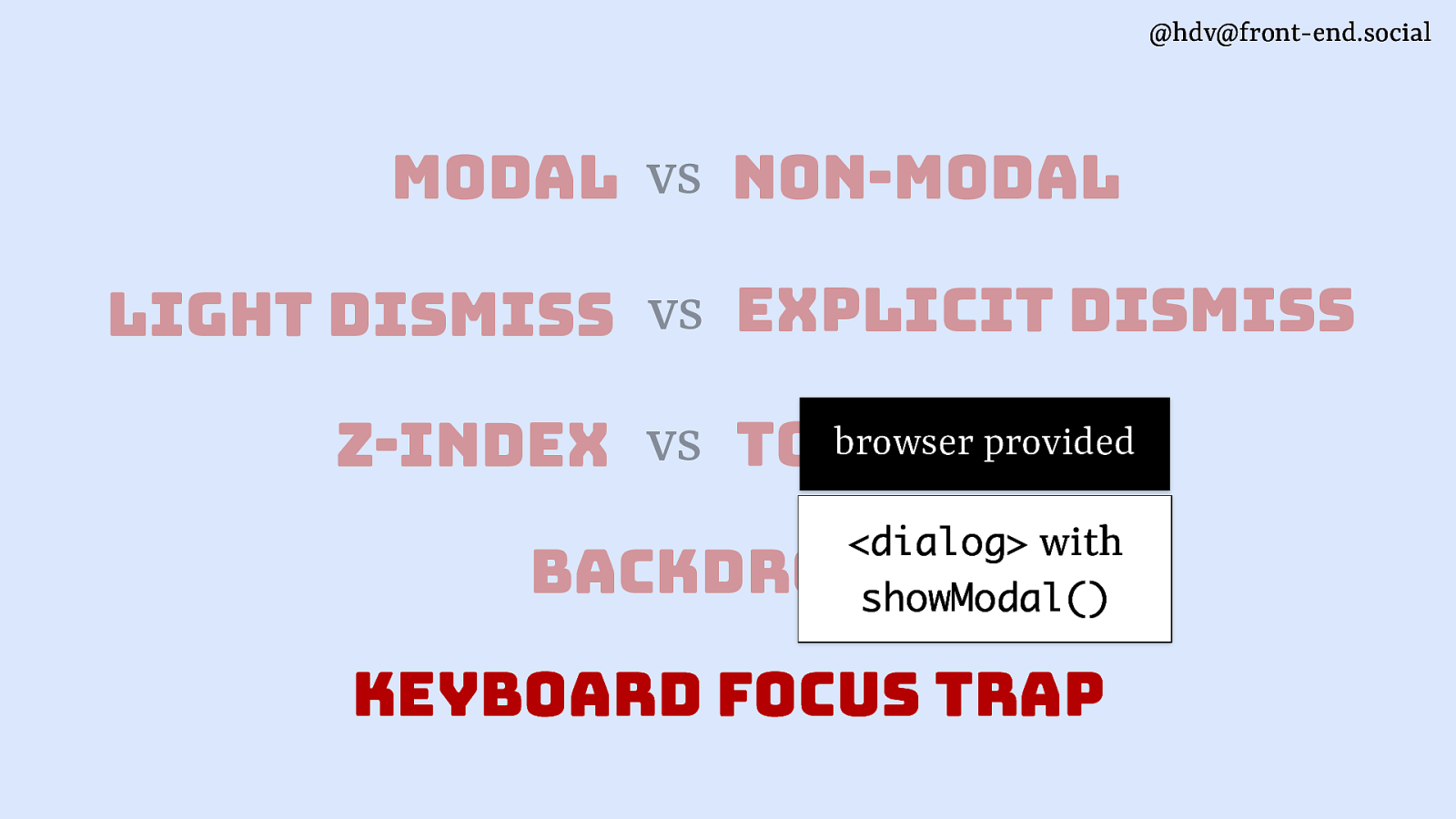
Lastly, browser provided keyboard focus traps, they come with modal <dialog>s.
Slide 41
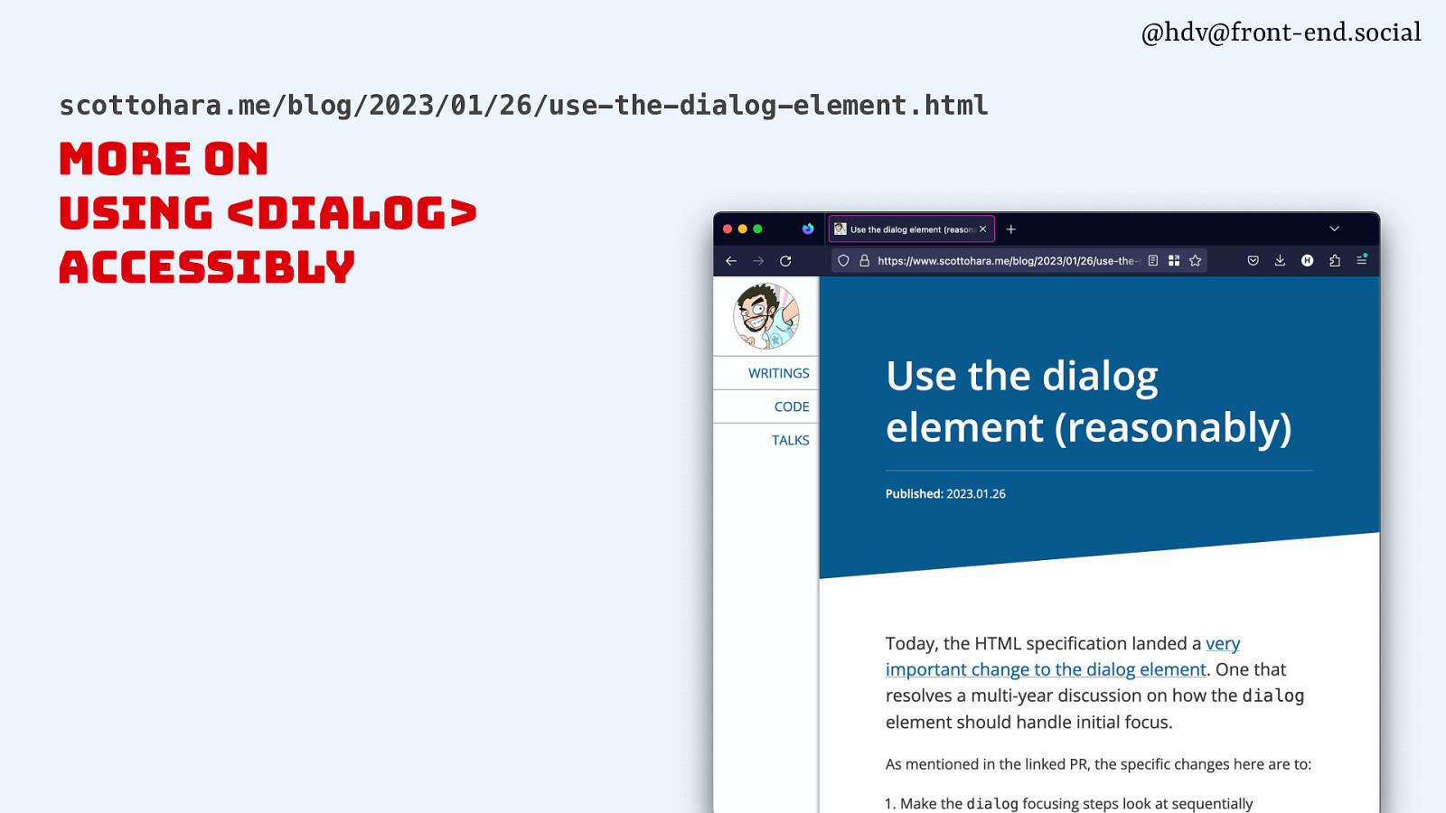
To understand better when to use <dialog> and what accessibility pitfalls could be involved, I recommend Scott O’Hara’s posts on dialogs, including his latest on using <dialog> reasonably.
Slide 42
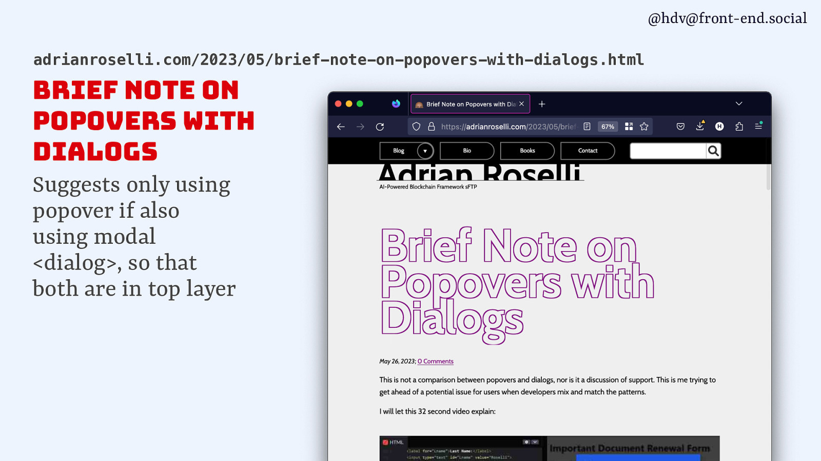
There is also a great post from Adrian Roselli who noted that if you’re using popovers, you should also replace dialogs with official modal <dialog>s as then they’re both in the top layer.
Slide 43
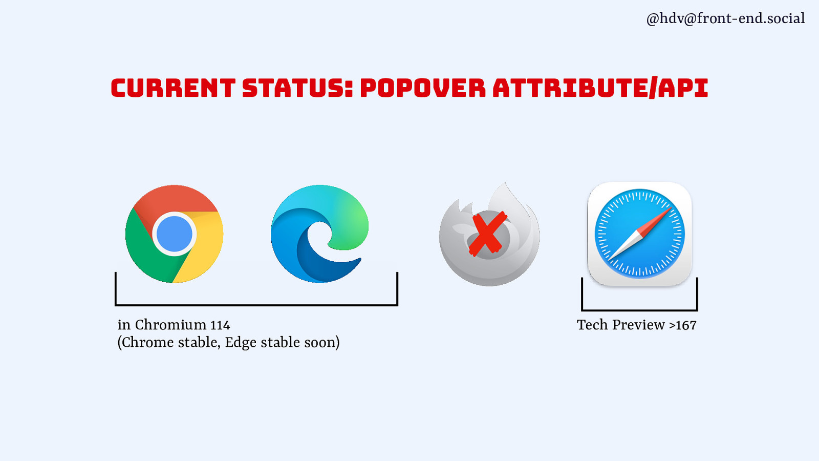
Then a quick note on support… popover just shipped in Chrome and will come to Edge soon, is in Safari Tech Preview and is in active development in Firefox.
Slide 44
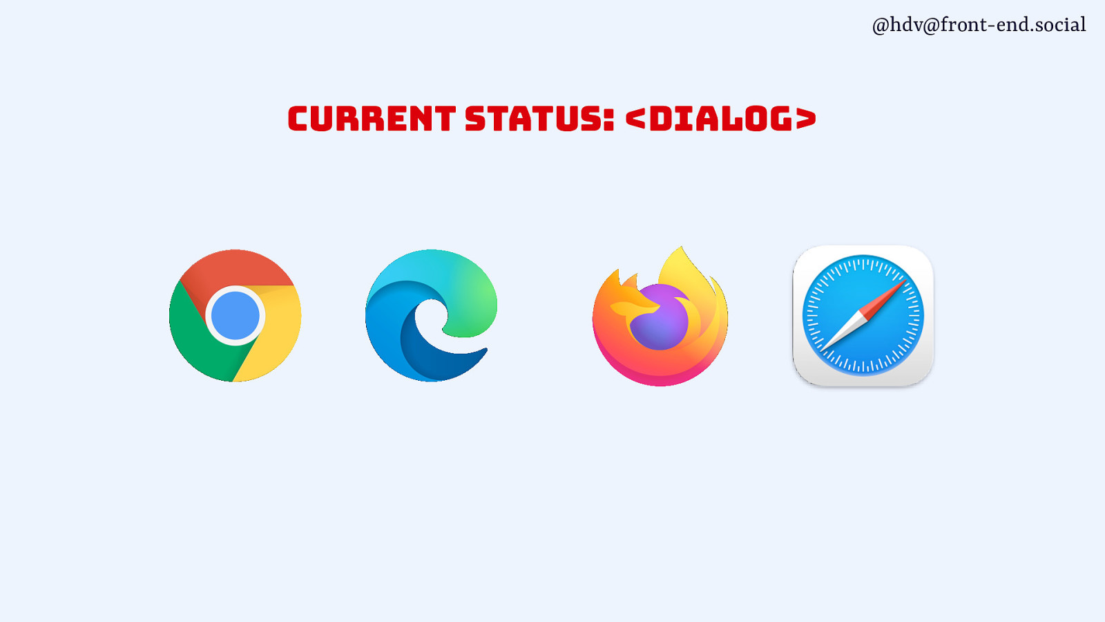
Dialog is supported pretty much everywhere.
Slide 45
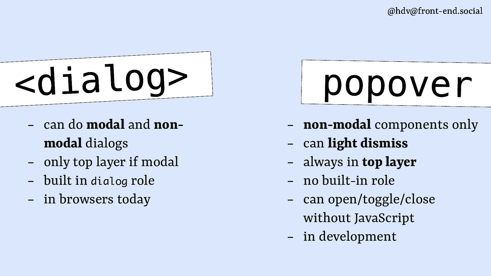
so, in summary, a <dialog> :
- can do modal and non-modal dialogs
- only top layer if modal
- built in dialog role
- in browsers today
whereas a popover:
- non-modal components only
- can light dismiss
- always in top layer
- no built in role
- can open/toggle/close without JavaScript
- in development
Slide 46
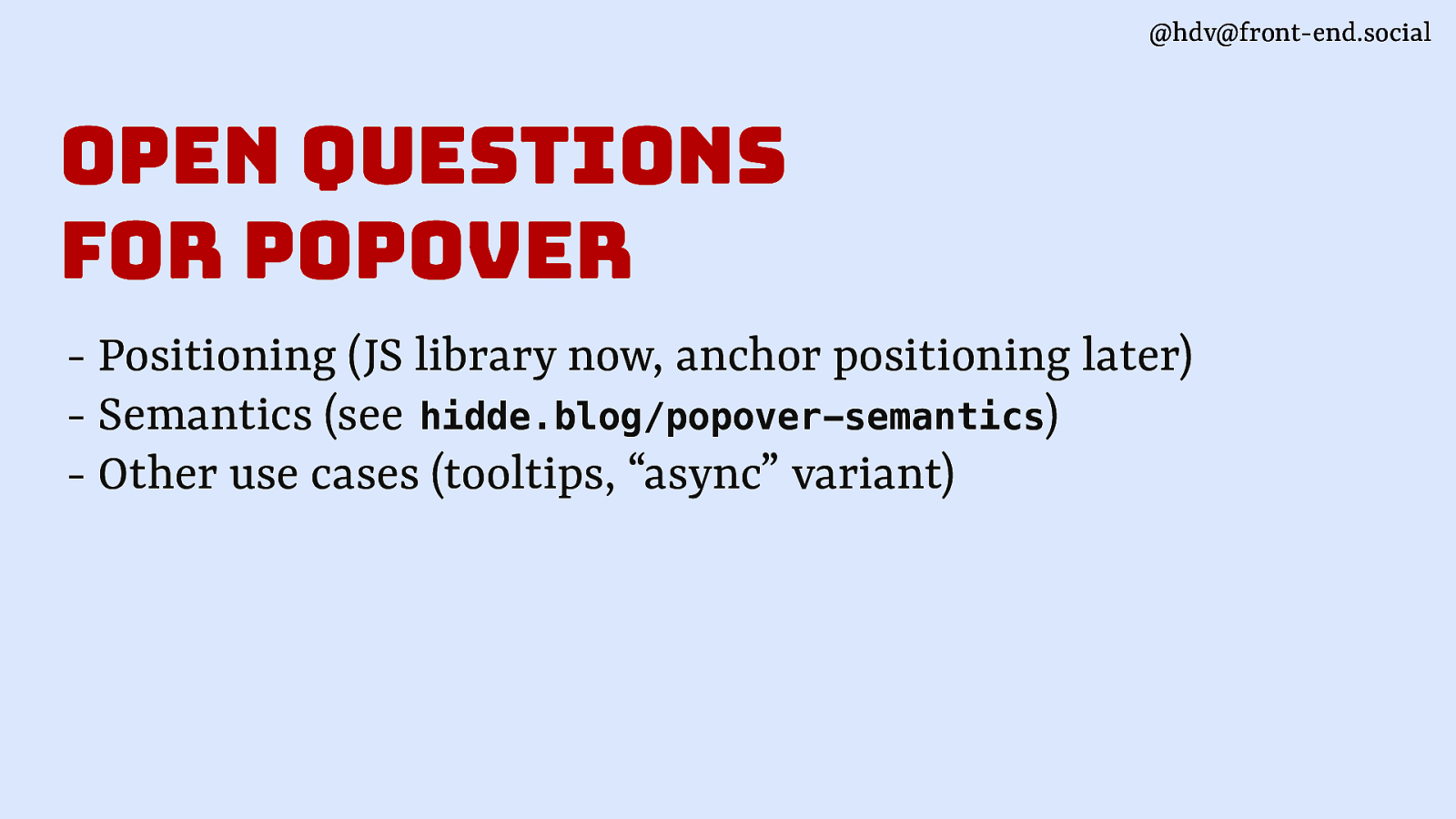
There are still some open questions re popovers, including how to position them (use a JS library now, probably anchor positioning later when it is in browsers), semantics (I have a blog post on this at hidde.blog/popover-semantics) and other somewhat trickier use cases we’re working on at Open UI, like tooltips.
Slide 47
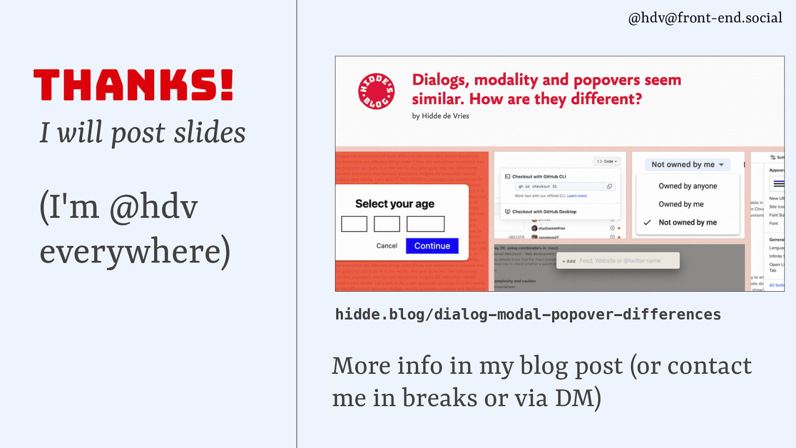
Thanks for your attention! I’ll share these slides online, am hdv everywhere, and if you want to read more on what I shared today at your own pace, check out my blog post on hidde.blog/dialog-modal-popover-differences, find me in the break or slide in my DMs.