s e z i s o t u a On in Grid Layout 0 2 0 -2 0 -1 2 , S S .C K L A T , s ie r V e Hidde d
Slide 1
Slide 2
Hidde de Vries Freelance front-end developer, accessibility specialistfrom Rotterdam, Netherlands. @hdv ◇ hidde.blog
Slide 3

|||||||| Fixed canvas
Slide 4
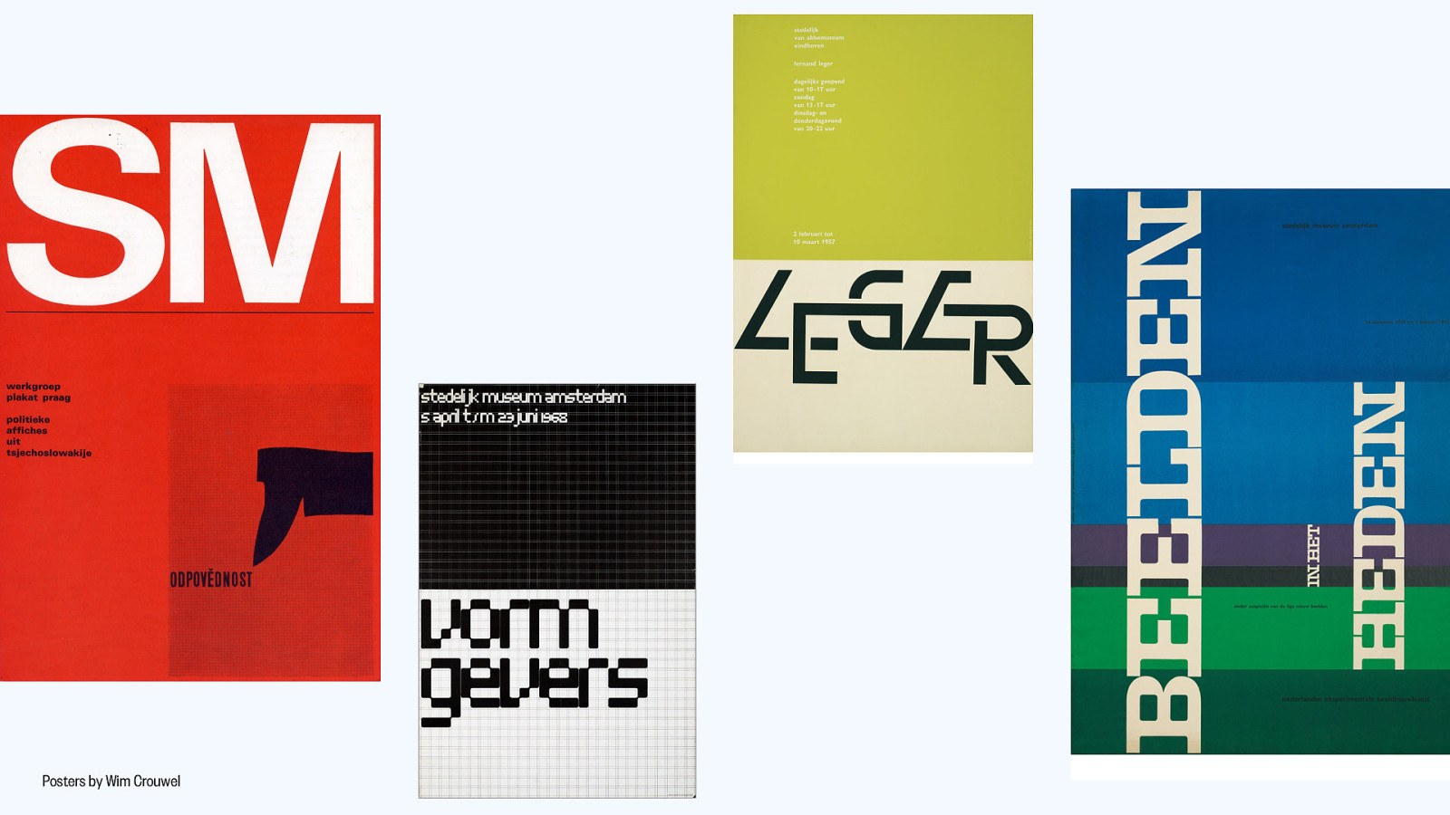
Posters by Wim Crouwel
Slide 5
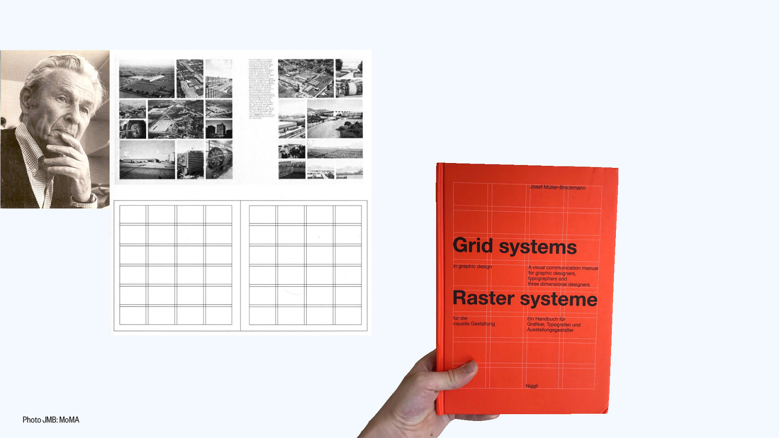
Photo JMB: MoMA
Slide 6
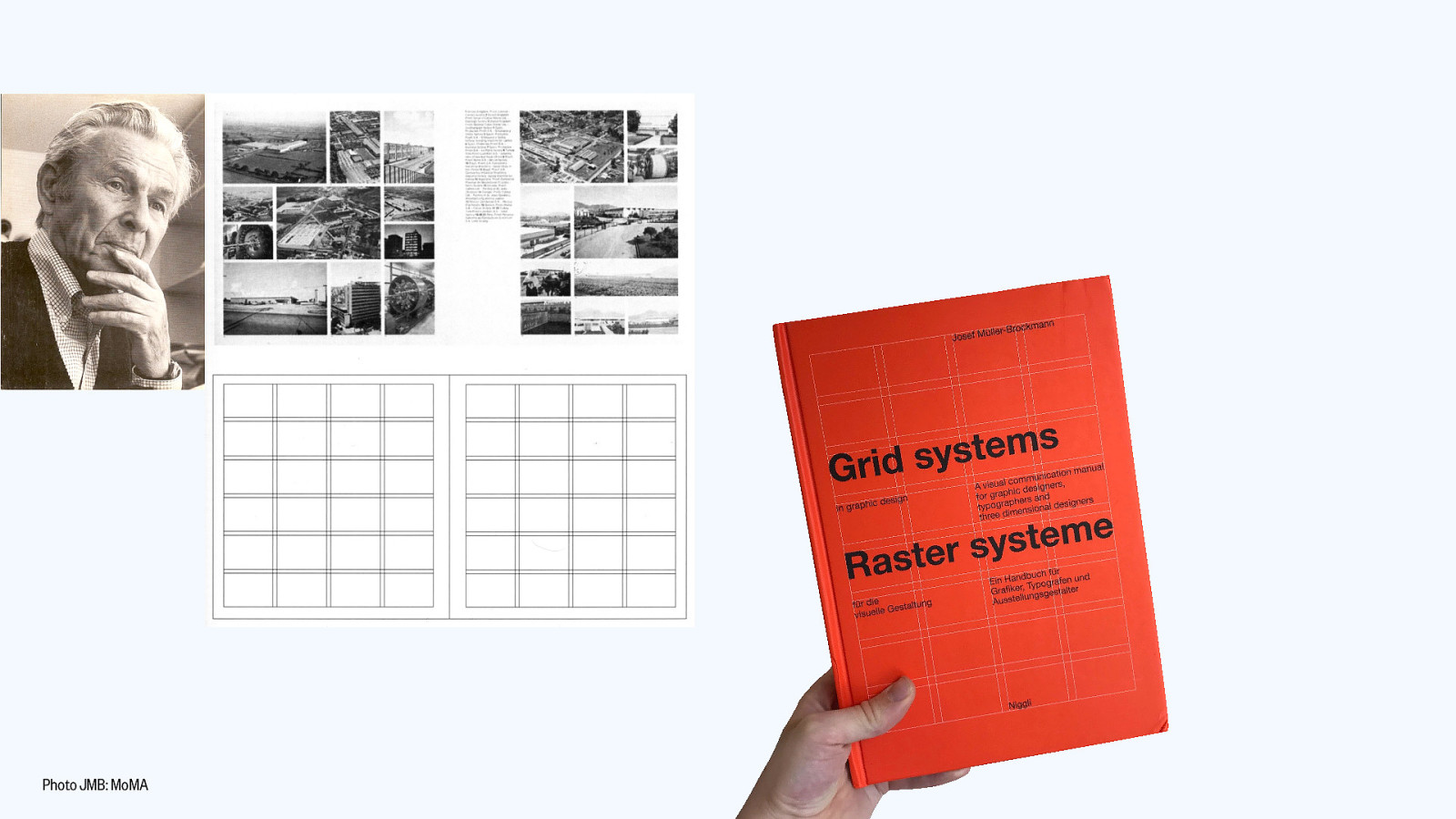
Photo JMB: MoMA
Slide 7
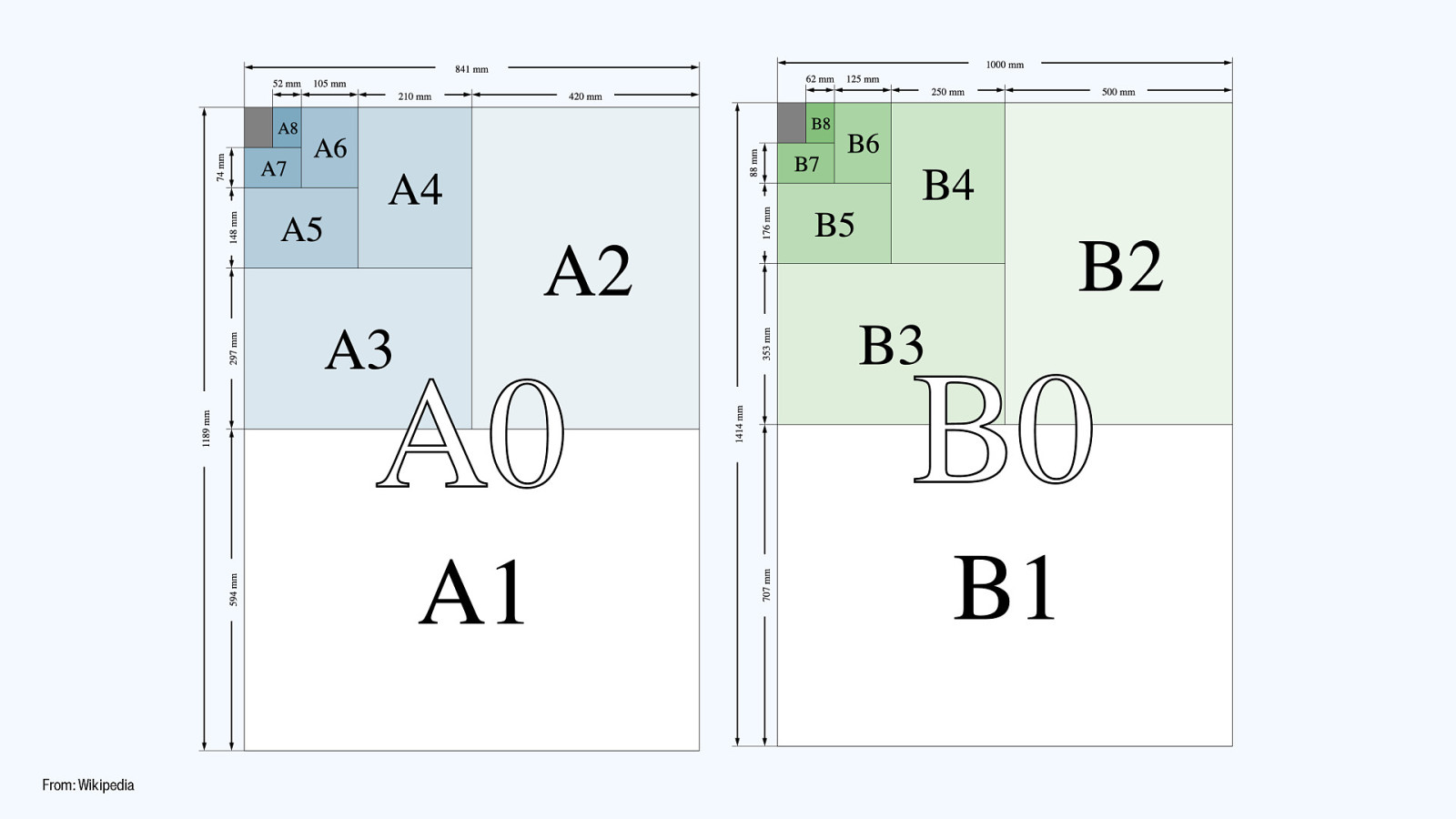
From: Wikipedia
Slide 8

Digital posters From: Emerce
Slide 9
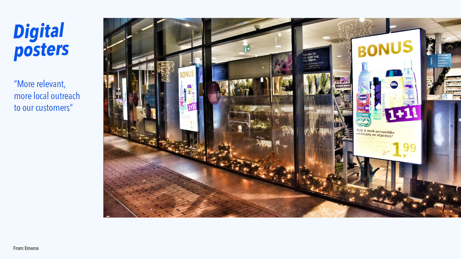
Digital posters “More relevant, more local outreach to our customers” From: Emerce
Slide 10
Digital posters COULD! USE! CSS! From: Emerce
Slide 11
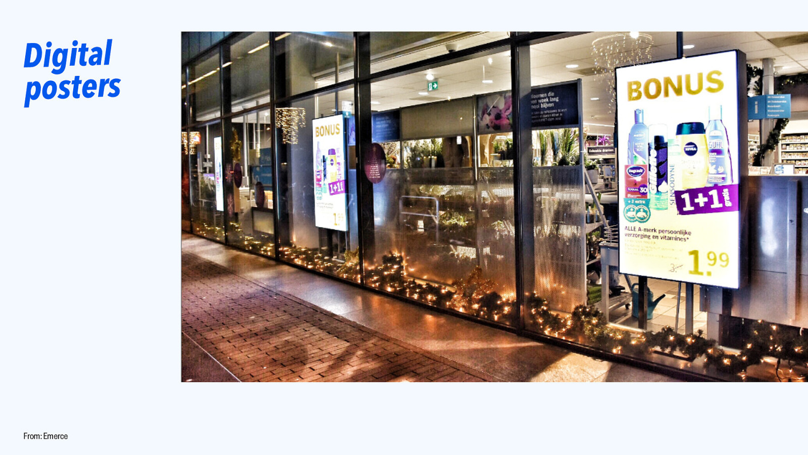
Digital posters From: Emerce
Slide 12

The web From: CERN (home.cern)
Slide 13

The web is everywhere, there are infinite canvases.
Slide 14

The web is everywhere, there are infinite canvases. And lots of languages.
Slide 15

The web is everywhere, there are infinite canvases. And lots of languages. And a lot of writing systems.
Slide 16
The web is everywhere, there are infinite canvases. And lots of languages. And a lot of writing systems. CSS is here to help!
Slide 17
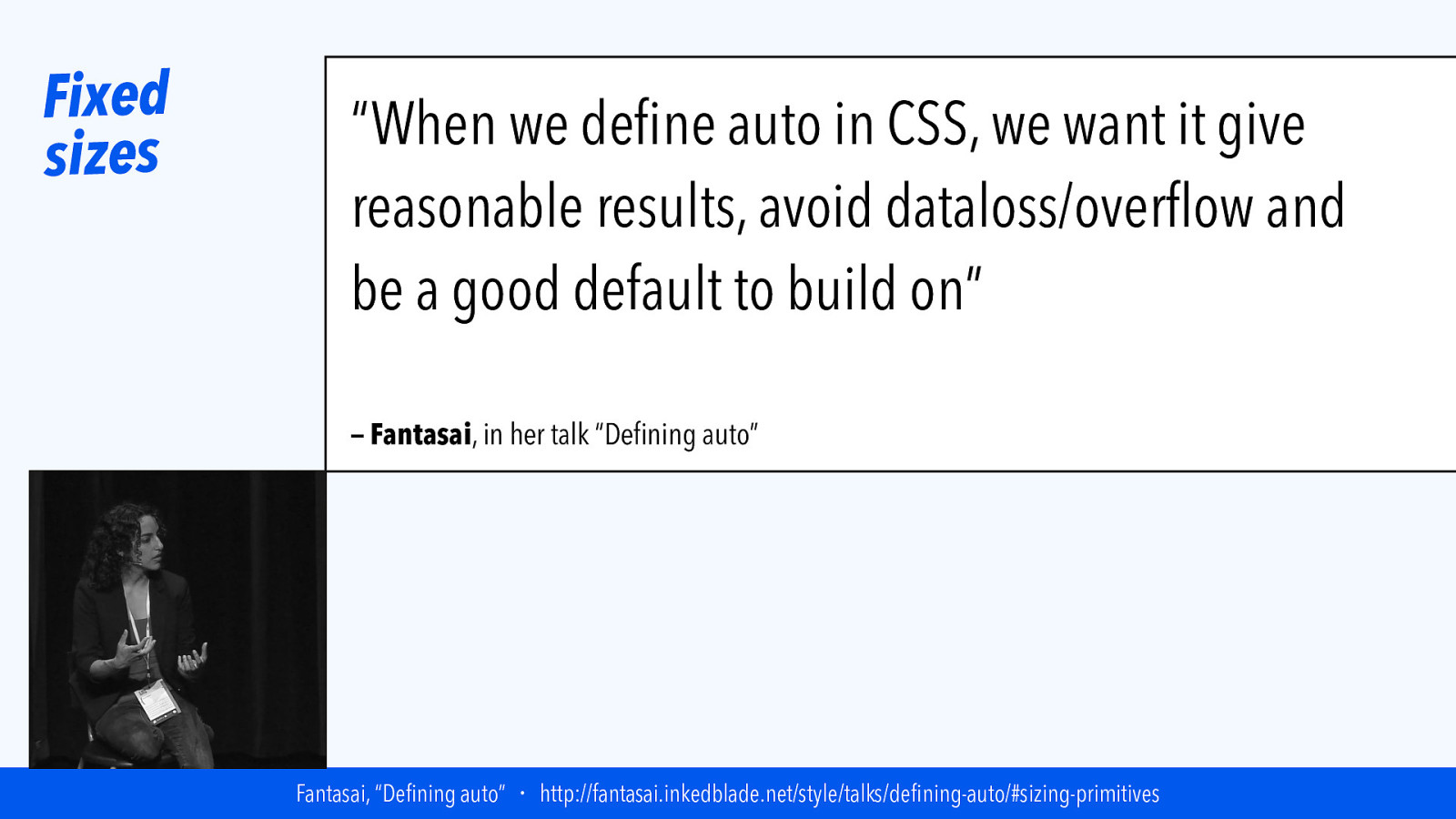
Fixed sizes “When we define auto in CSS, we want it give reasonable results, avoid dataloss/overflow and be a good default to build on” — Fantasai, in her talk “Defining auto” Fantasai, “Defining auto” ・ http://fantasai.inkedblade.net/style/talks/defining-auto/#sizing-primitives
Slide 18

|||||||| TErminLOgy
Slide 19
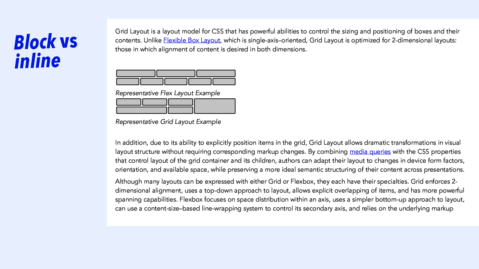
Block vs inline Grid Layout is a layout model for CSS that has powerful abilities to control the sizing and positioning of boxes and their contents. Unlike Flexible Box Layout, which is single-axis–oriented, Grid Layout is optimized for 2-dimensional layouts: those in which alignment of content is desired in both dimensions. Representative Flex Layout Example Representative Grid Layout Example In addition, due to its ability to explicitly position items in the grid, Grid Layout allows dramatic transformations in visual layout structure without requiring corresponding markup changes. By combining media queries with the CSS properties that control layout of the grid container and its children, authors can adapt their layout to changes in device form factors, orientation, and available space, while preserving a more ideal semantic structuring of their content across presentations. Although many layouts can be expressed with either Grid or Flexbox, they each have their specialties. Grid enforces 2dimensional alignment, uses a top-down approach to layout, allows explicit overlapping of items, and has more powerful spanning capabilities. Flexbox focuses on space distribution within an axis, uses a simpler bottom-up approach to layout, can use a content-size–based line-wrapping system to control its secondary axis, and relies on the underlying markup
Slide 20
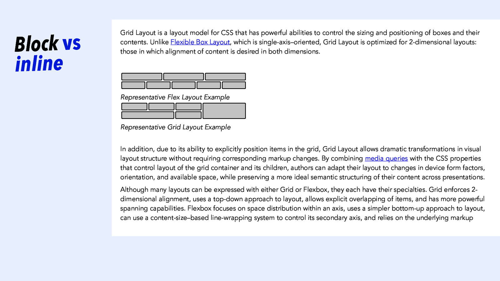
Block vs inline Grid Layout is a layout model for CSS that has powerful abilities to control the sizing and positioning of boxes and their contents. Unlike Flexible Box Layout, which is single-axis–oriented, Grid Layout is optimized for 2-dimensional layouts: those in which alignment of content is desired in both dimensions. Representative Flex Layout Example Representative Grid Layout Example In addition, due to its ability to explicitly position items in the grid, Grid Layout allows dramatic transformations in visual layout structure without requiring corresponding markup changes. By combining media queries with the CSS properties that control layout of the grid container and its children, authors can adapt their layout to changes in device form factors, orientation, and available space, while preserving a more ideal semantic structuring of their content across presentations. Although many layouts can be expressed with either Grid or Flexbox, they each have their specialties. Grid enforces 2dimensional alignment, uses a top-down approach to layout, allows explicit overlapping of items, and has more powerful spanning capabilities. Flexbox focuses on space distribution within an axis, uses a simpler bottom-up approach to layout, can use a content-size–based line-wrapping system to control its secondary axis, and relies on the underlying markup
Slide 21
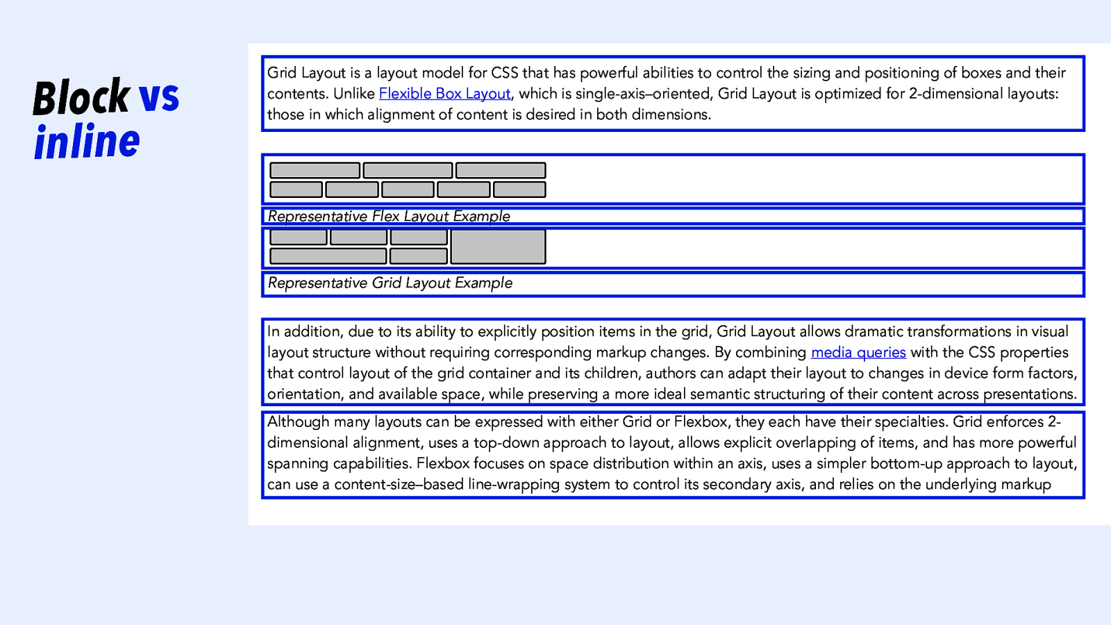
Block vs inline Grid Layout is a layout model for CSS that has powerful abilities to control the sizing and positioning of boxes and their contents. Unlike Flexible Box Layout, which is single-axis–oriented, Grid Layout is optimized for 2-dimensional layouts: those in which alignment of content is desired in both dimensions. Representative Flex Layout Example Representative Grid Layout Example In addition, due to its ability to explicitly position items in the grid, Grid Layout allows dramatic transformations in visual layout structure without requiring corresponding markup changes. By combining media queries with the CSS properties that control layout of the grid container and its children, authors can adapt their layout to changes in device form factors, orientation, and available space, while preserving a more ideal semantic structuring of their content across presentations. Although many layouts can be expressed with either Grid or Flexbox, they each have their specialties. Grid enforces 2dimensional alignment, uses a top-down approach to layout, allows explicit overlapping of items, and has more powerful spanning capabilities. Flexbox focuses on space distribution within an axis, uses a simpler bottom-up approach to layout, can use a content-size–based line-wrapping system to control its secondary axis, and relies on the underlying markup
Slide 22
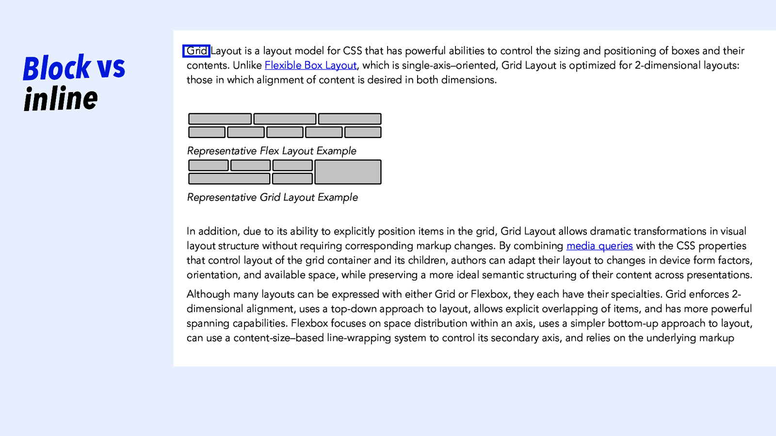
Block vs inline Grid Layout is a layout model for CSS that has powerful abilities to control the sizing and positioning of boxes and their contents. Unlike Flexible Box Layout, which is single-axis–oriented, Grid Layout is optimized for 2-dimensional layouts: those in which alignment of content is desired in both dimensions. Representative Flex Layout Example Representative Grid Layout Example In addition, due to its ability to explicitly position items in the grid, Grid Layout allows dramatic transformations in visual layout structure without requiring corresponding markup changes. By combining media queries with the CSS properties that control layout of the grid container and its children, authors can adapt their layout to changes in device form factors, orientation, and available space, while preserving a more ideal semantic structuring of their content across presentations. Although many layouts can be expressed with either Grid or Flexbox, they each have their specialties. Grid enforces 2dimensional alignment, uses a top-down approach to layout, allows explicit overlapping of items, and has more powerful spanning capabilities. Flexbox focuses on space distribution within an axis, uses a simpler bottom-up approach to layout, can use a content-size–based line-wrapping system to control its secondary axis, and relies on the underlying markup
Slide 23
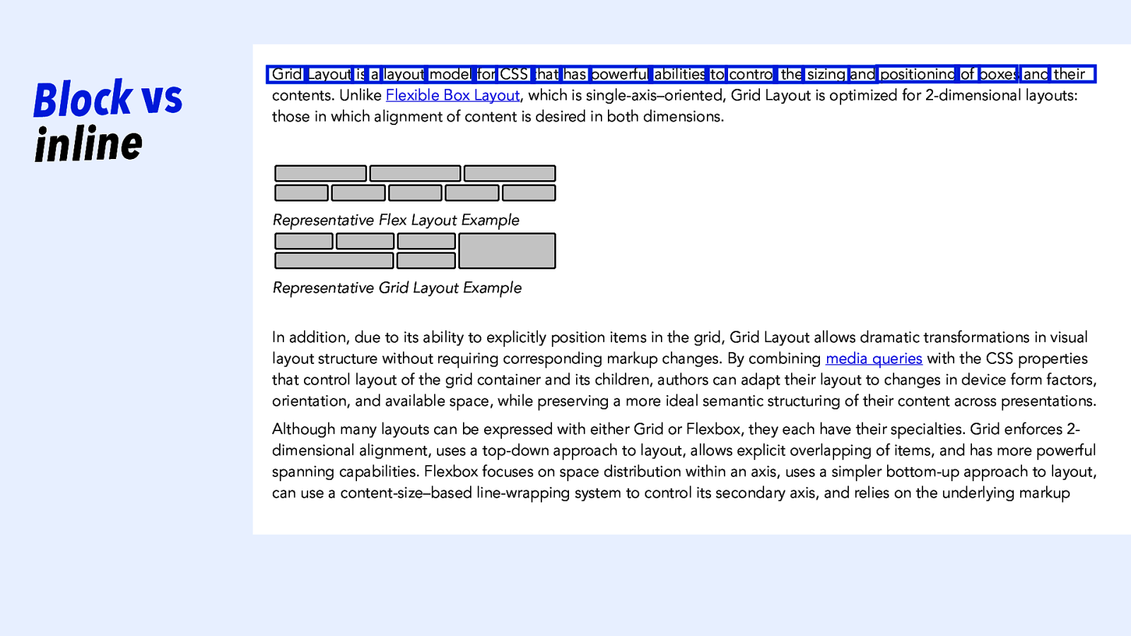
Block vs inline Grid Layout is a layout model for CSS that has powerful abilities to control the sizing and positioning of boxes and their contents. Unlike Flexible Box Layout, which is single-axis–oriented, Grid Layout is optimized for 2-dimensional layouts: those in which alignment of content is desired in both dimensions. Representative Flex Layout Example Representative Grid Layout Example In addition, due to its ability to explicitly position items in the grid, Grid Layout allows dramatic transformations in visual layout structure without requiring corresponding markup changes. By combining media queries with the CSS properties that control layout of the grid container and its children, authors can adapt their layout to changes in device form factors, orientation, and available space, while preserving a more ideal semantic structuring of their content across presentations. Although many layouts can be expressed with either Grid or Flexbox, they each have their specialties. Grid enforces 2dimensional alignment, uses a top-down approach to layout, allows explicit overlapping of items, and has more powerful spanning capabilities. Flexbox focuses on space distribution within an axis, uses a simpler bottom-up approach to layout, can use a content-size–based line-wrapping system to control its secondary axis, and relies on the underlying markup
Slide 24
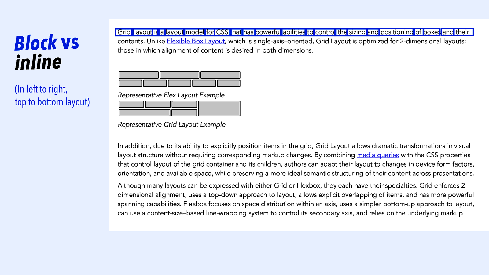
Block vs inline (In left to right, top to bottom layout) Grid Layout is a layout model for CSS that has powerful abilities to control the sizing and positioning of boxes and their contents. Unlike Flexible Box Layout, which is single-axis–oriented, Grid Layout is optimized for 2-dimensional layouts: those in which alignment of content is desired in both dimensions. Representative Flex Layout Example Representative Grid Layout Example In addition, due to its ability to explicitly position items in the grid, Grid Layout allows dramatic transformations in visual layout structure without requiring corresponding markup changes. By combining media queries with the CSS properties that control layout of the grid container and its children, authors can adapt their layout to changes in device form factors, orientation, and available space, while preserving a more ideal semantic structuring of their content across presentations. Although many layouts can be expressed with either Grid or Flexbox, they each have their specialties. Grid enforces 2dimensional alignment, uses a top-down approach to layout, allows explicit overlapping of items, and has more powerful spanning capabilities. Flexbox focuses on space distribution within an axis, uses a simpler bottom-up approach to layout, can use a content-size–based line-wrapping system to control its secondary axis, and relies on the underlying markup
Slide 25
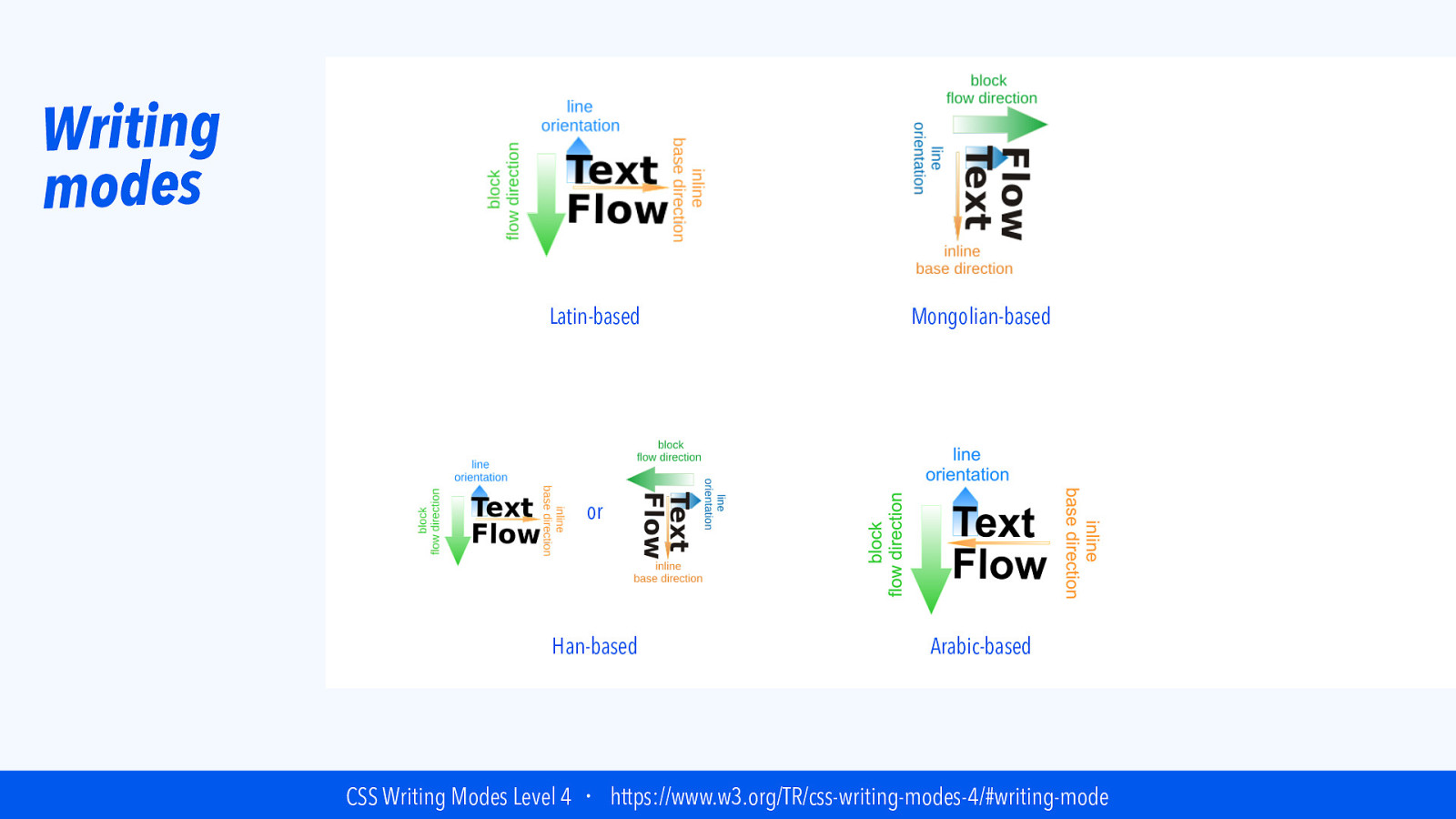
Writing modes Latin-based Mongolian-based or Han-based Arabic-based CSS Writing Modes Level 4 ・ https://www.w3.org/TR/css-writing-modes-4/#writing-mode
Slide 26

Writing modes Latin-based Mongolian-based or Han-based Arabic-based CSS Writing Modes Level 4 ・ https://www.w3.org/TR/css-writing-modes-4/#writing-mode
Slide 27
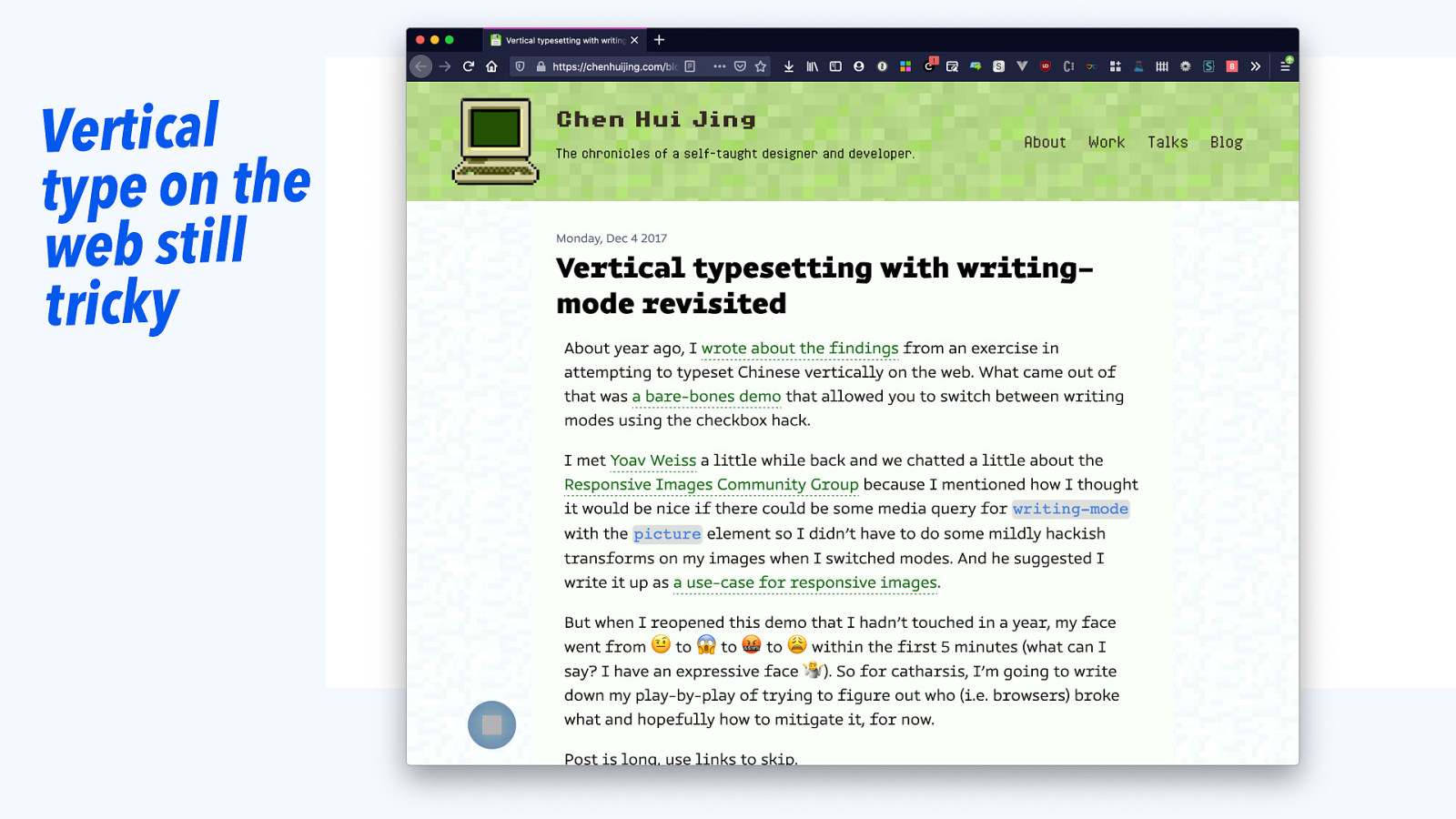
Vertical type on the web still tricky
Slide 28
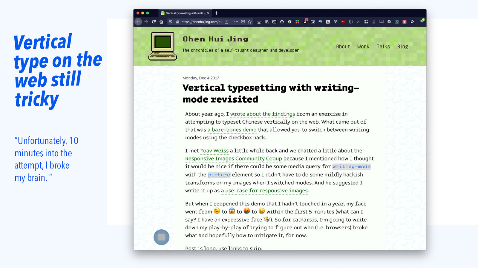
Vertical type on the web still tricky “Unfortunately, 10 minutes into the attempt, I broke my brain. ”
Slide 29
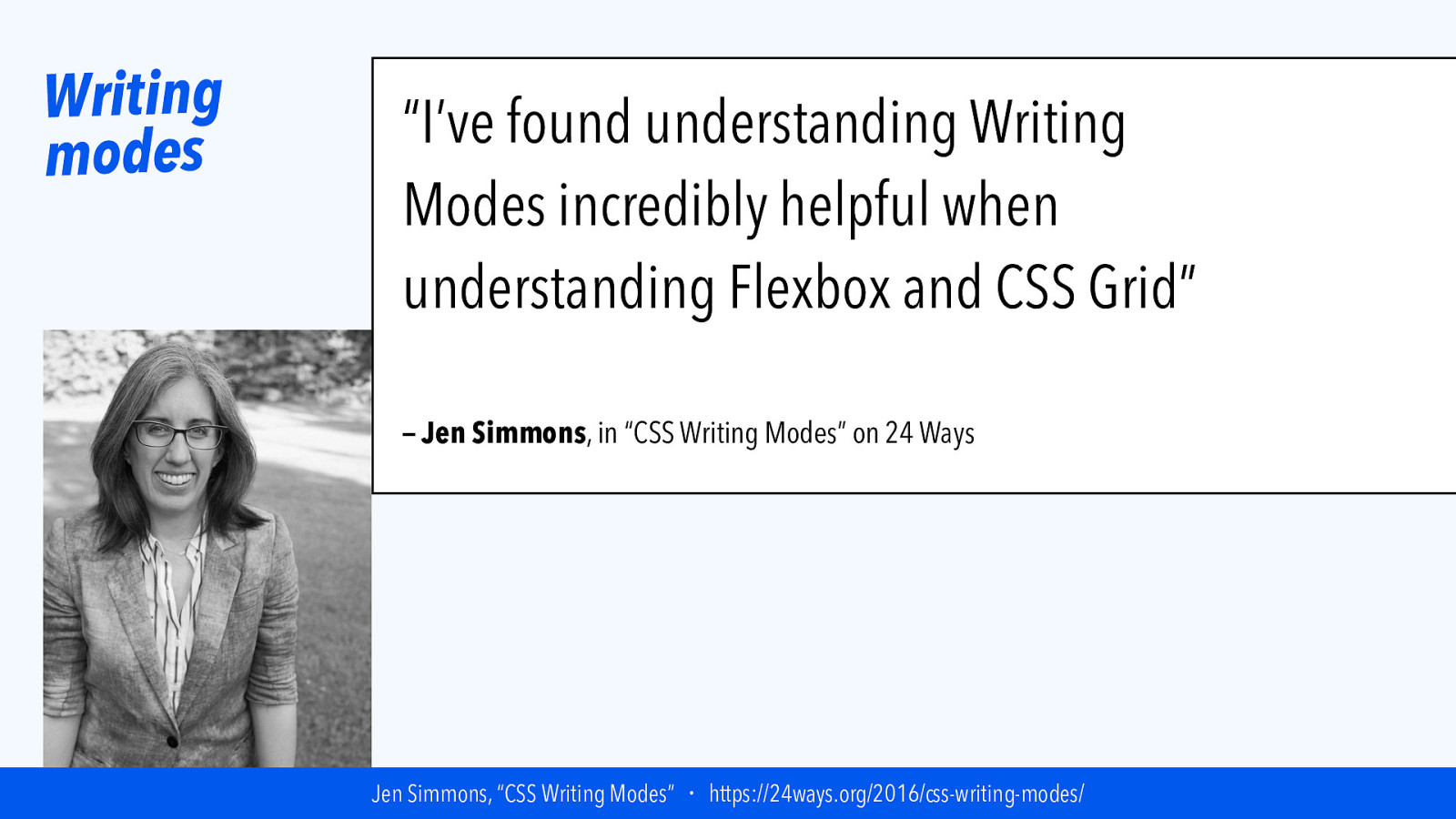
Writing modes “I’ve found understanding Writing Modes incredibly helpful when understanding Flexbox and CSS Grid” — Jen Simmons, in “CSS Writing Modes” on 24 Ways Jen Simmons, “CSS Writing Modes” ・ https://24ways.org/2016/css-writing-modes/
Slide 30

Writing modes Latin-based Mongolian-based or Han-based Arabic-based CSS Writing Modes Level 4 ・ https://www.w3.org/TR/css-writing-modes-4/#writing-mode
Slide 31
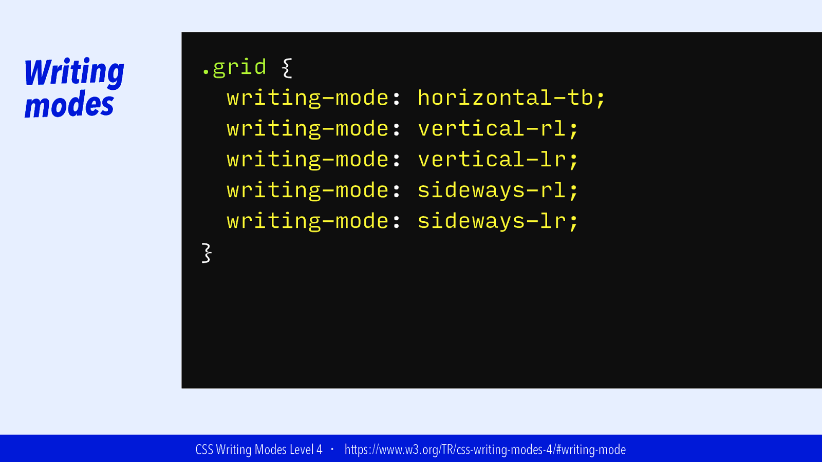
Writing modes .grid { writing-mode: writing-mode: writing-mode: Latin-based writing-mode: writing-mode: } horizontal-tb; vertical-rl; vertical-lr; Mongolian-based sideways-rl; sideways-lr; or Han-based Arabic-based CSS Writing Modes Level 4 ・ https://www.w3.org/TR/css-writing-modes-4/#writing-mode
Slide 32
|||||||| THe Grid ConTAiner
Slide 33

Creating a Grid .grid { display: grid; } grid-template-columns: 200px 5cm 10cm 500px 5cm; 100px; }
Slide 34
Inline size
Slide 35
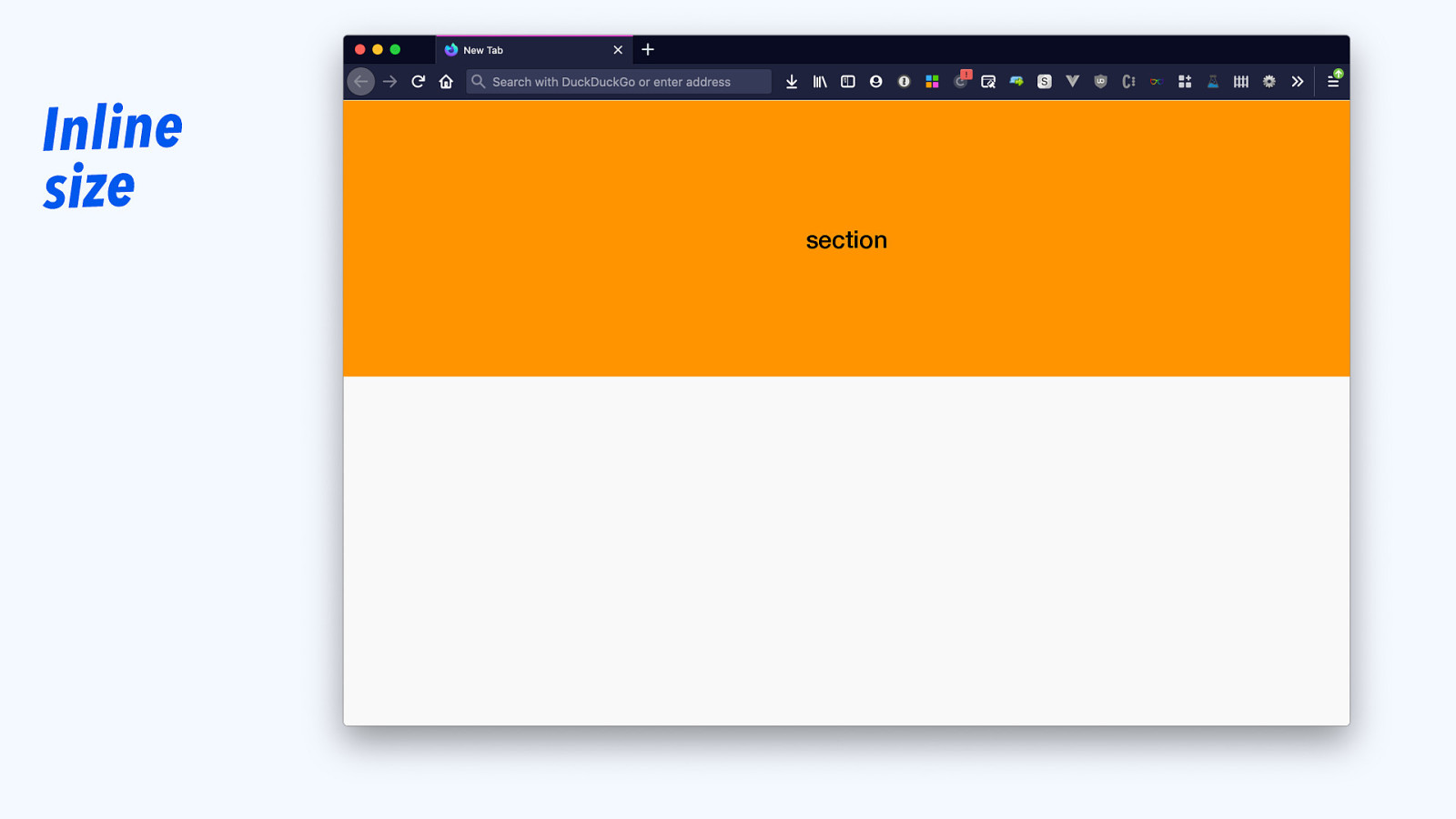
Inline size section
Slide 36
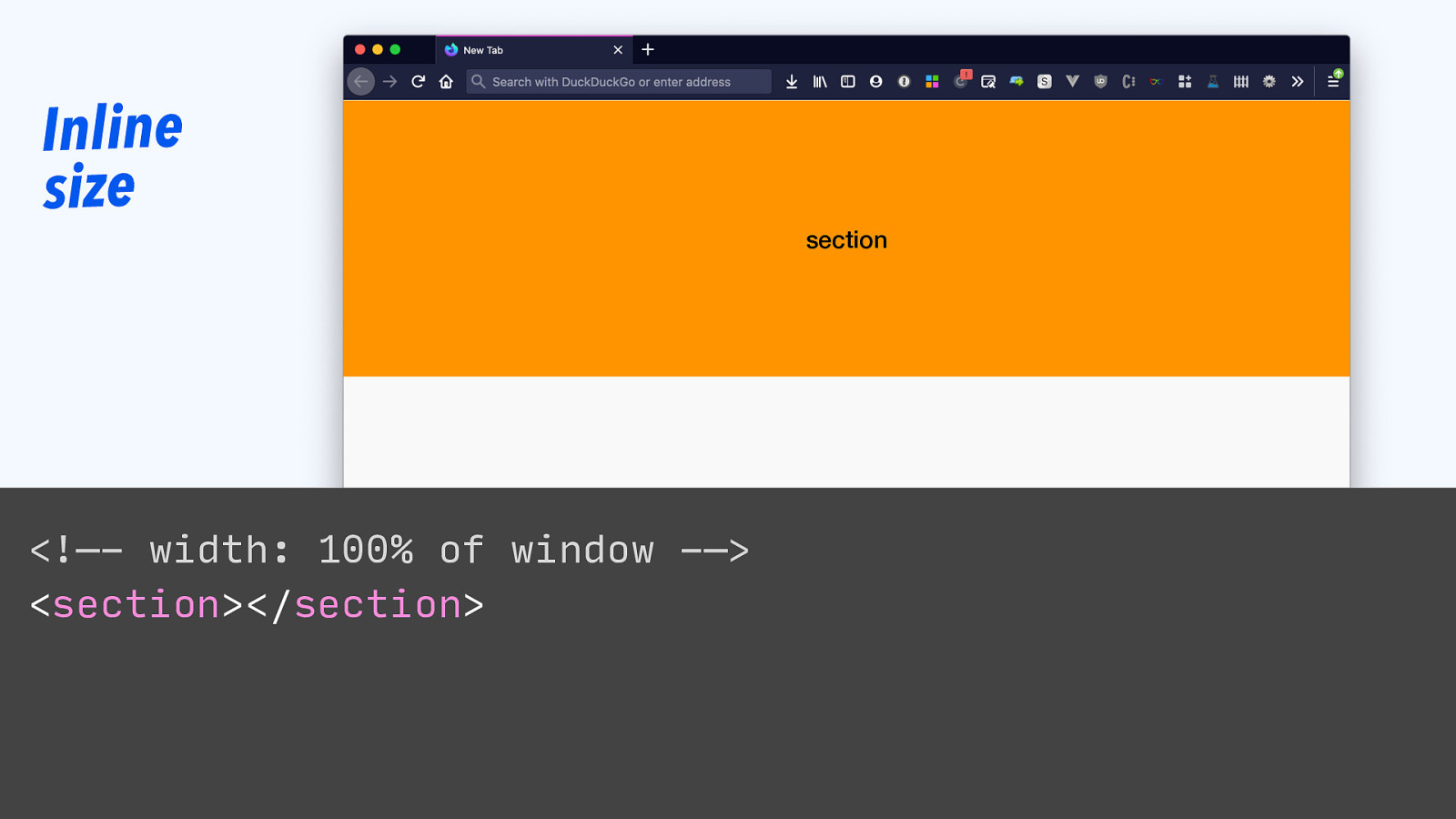
Inline size <!—- width: 100% of window -—> <section></section> section
Slide 37
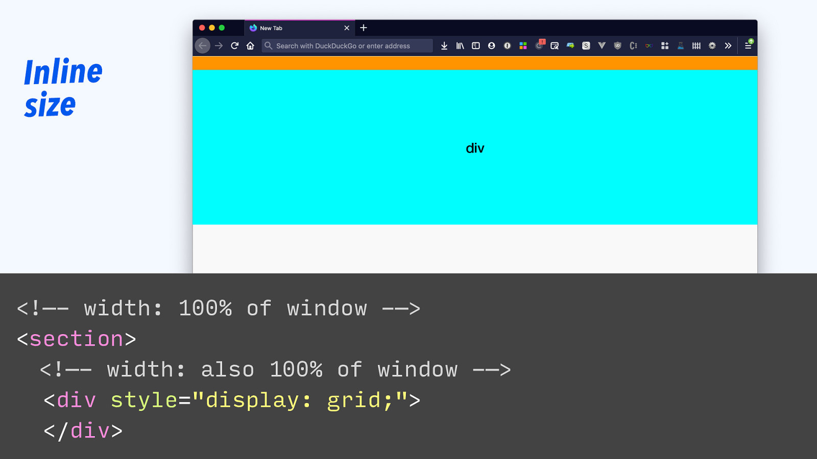
Inline size section div <!—- width: 100% of window -—> <section> <!—- width: also 100% of window -—> <div style=”display: grid;”> </div>
Slide 38
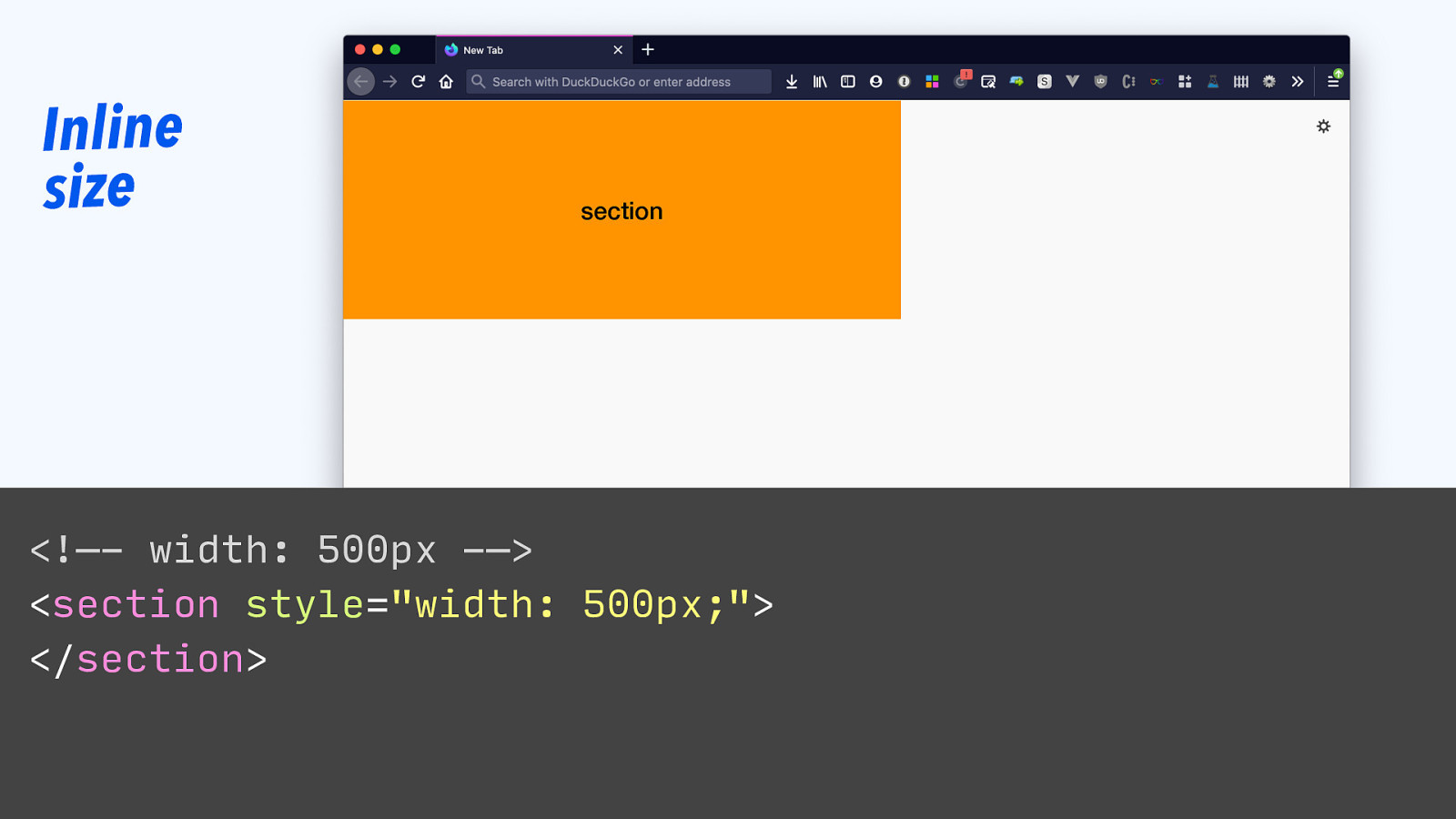
Inline size section <!—- width: 500px -—> <section style=”width: 500px;”> </section>
Slide 39
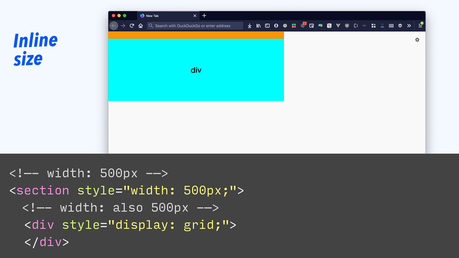
Inline size section div <!—- width: 500px -—> <section style=”width: 500px;”> <!—- width: also 500px -—> <div style=”display: grid;”> </div>
Slide 40
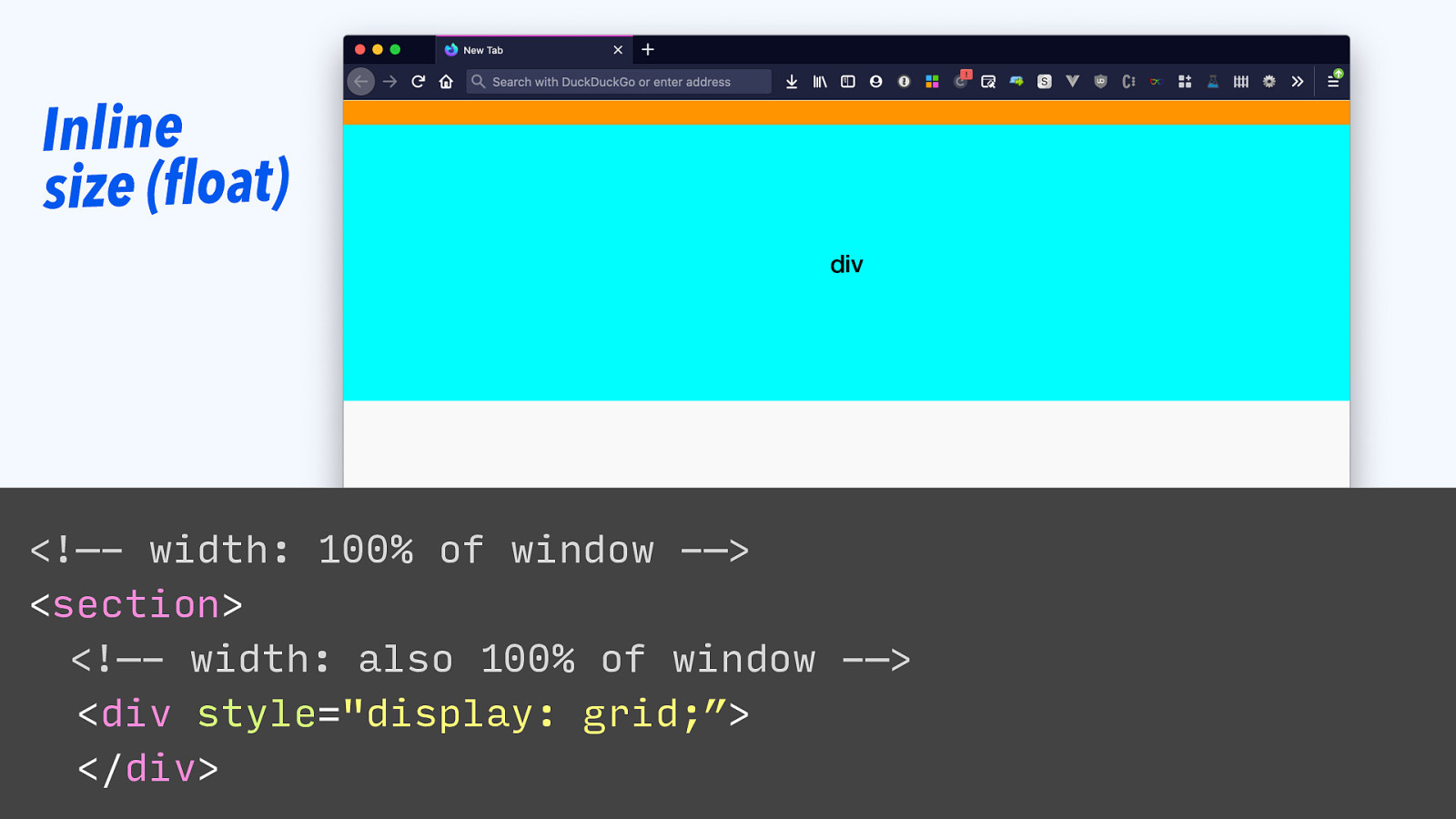
Inline size (float) section div <!—- width: 100% of window -—> <section> <!—- width: also 100% of window -—> <div style=”display: grid;”> </div>
Slide 41
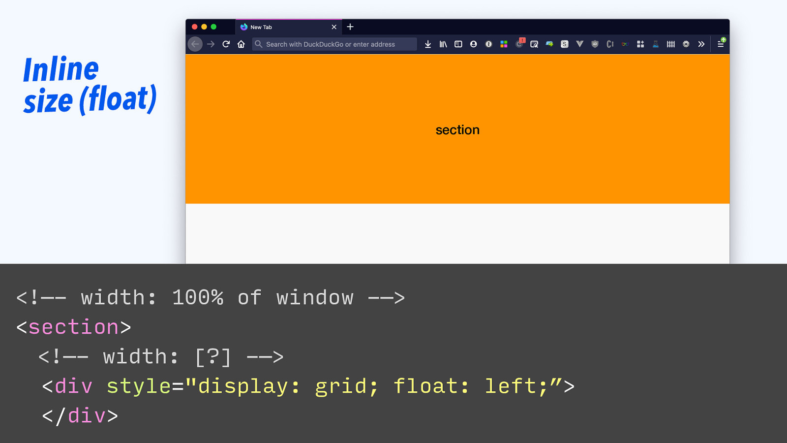
Inline size (float) section <!—- width: 100% of window -—> <section> <!—- width: [?] -—> <div style=”display: grid; float: left;”> </div>
Slide 42
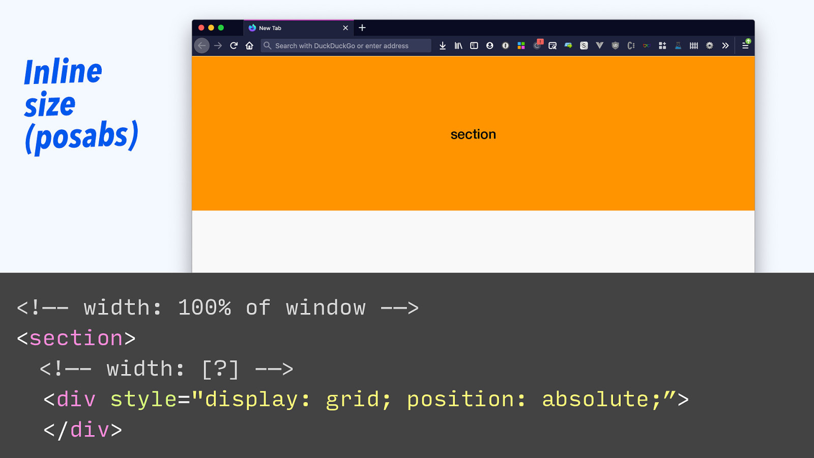
Inline size (posabs) section <!—- width: 100% of window -—> <section> <!—- width: [?] -—> <div style=”display: grid; position: absolute;”> </div>
Slide 43
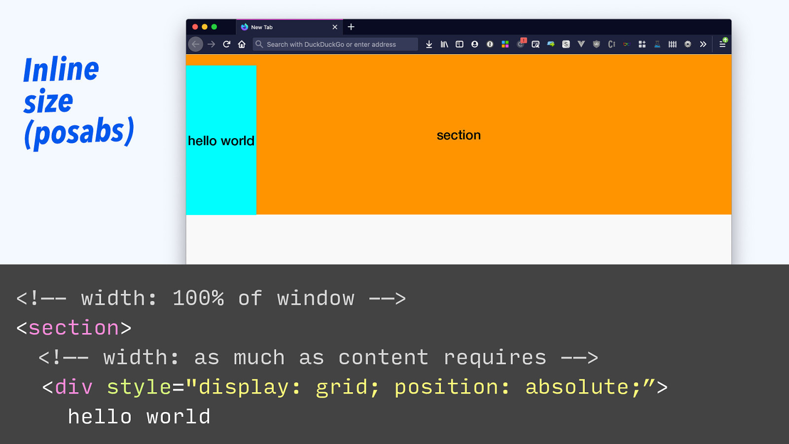
Inline size (posabs) hello world section <!—- width: 100% of window -—> <section> <!—- width: as much as content requires -—> <div style=”display: grid; position: absolute;”> hello world
Slide 44
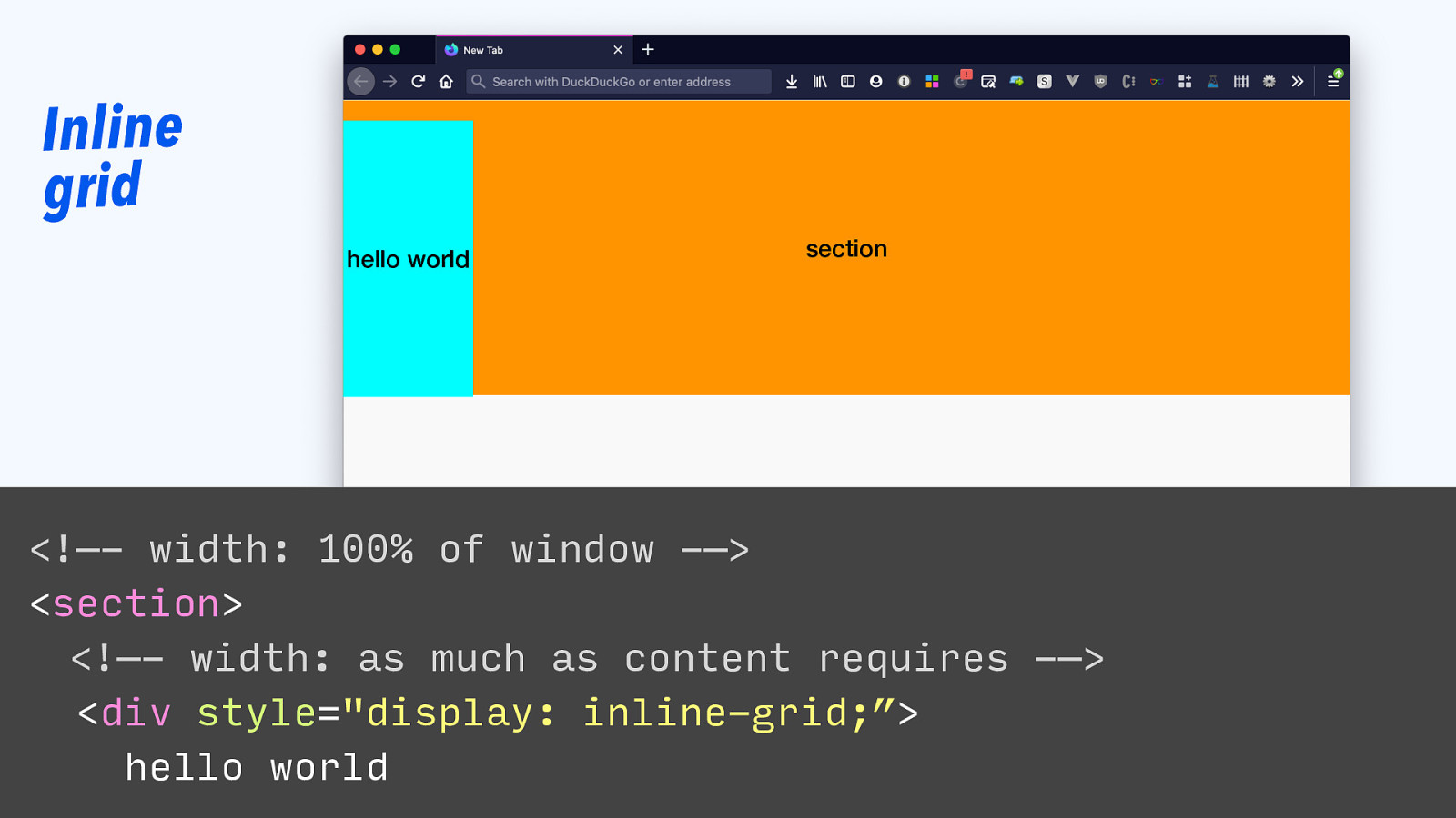
Inline grid hello world section <!—- width: 100% of window -—> <section> <!—- width: as much as content requires -—> <div style=”display: inline-grid;”> hello world
Slide 45

|||||||| Grid conTAiner inLIne
Slide 46
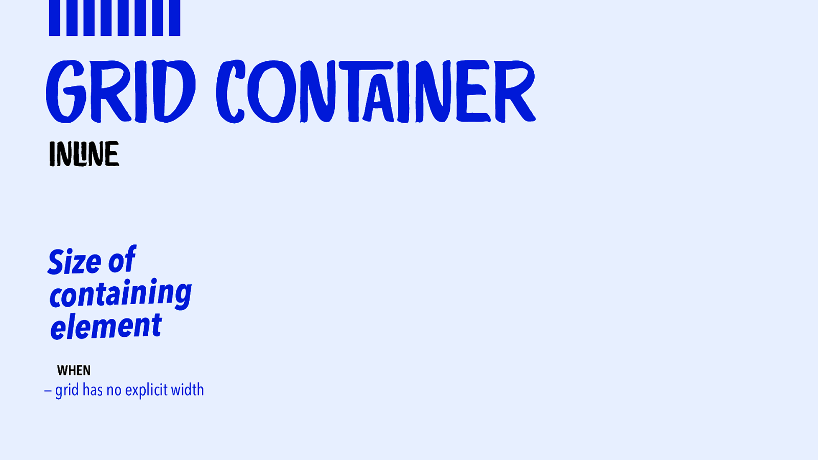
|||||||| Grid conTAiner inLIne Size of containing element WHEN — grid has no explicit width
Slide 47
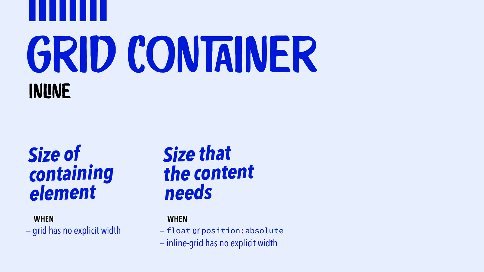
|||||||| Grid conTAiner inLIne Size of containing element WHEN — grid has no explicit width Size that the content needs WHEN — float or position:absolute — inline-grid has no explicit width
Slide 48
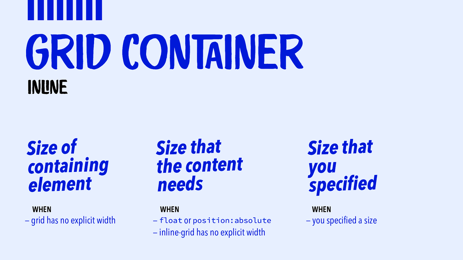
|||||||| Grid conTAiner inLIne Size of containing element WHEN — grid has no explicit width Size that the content needs WHEN — float or position:absolute — inline-grid has no explicit width Size that you specified WHEN — you specified a size
Slide 49
|||||||| Grid conTAiner bLOck size
Slide 50
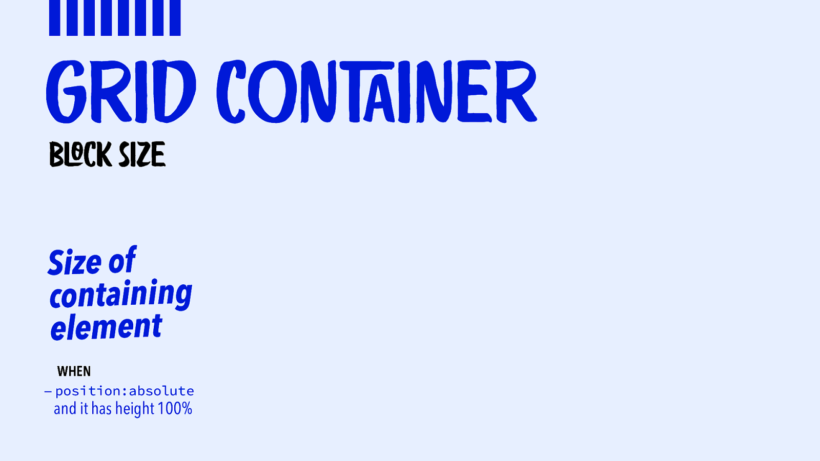
|||||||| Grid conTAiner bLOck size Size of containing element WHEN — position:absolute and it has height 100%
Slide 51
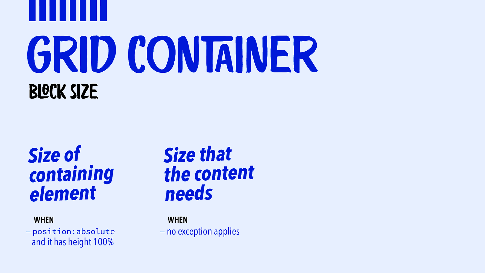
|||||||| Grid conTAiner bLOck size Size of containing element WHEN — position:absolute and it has height 100% Size that the content needs WHEN — no exception applies
Slide 52
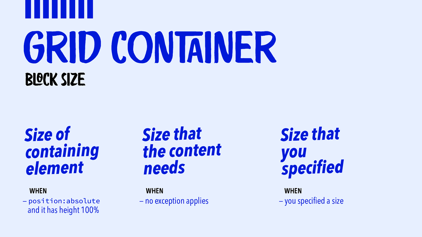
|||||||| Grid conTAiner bLOck size Size of containing element WHEN — position:absolute and it has height 100% Size that the content needs WHEN — no exception applies Size that you specified WHEN — you specified a size
Slide 53
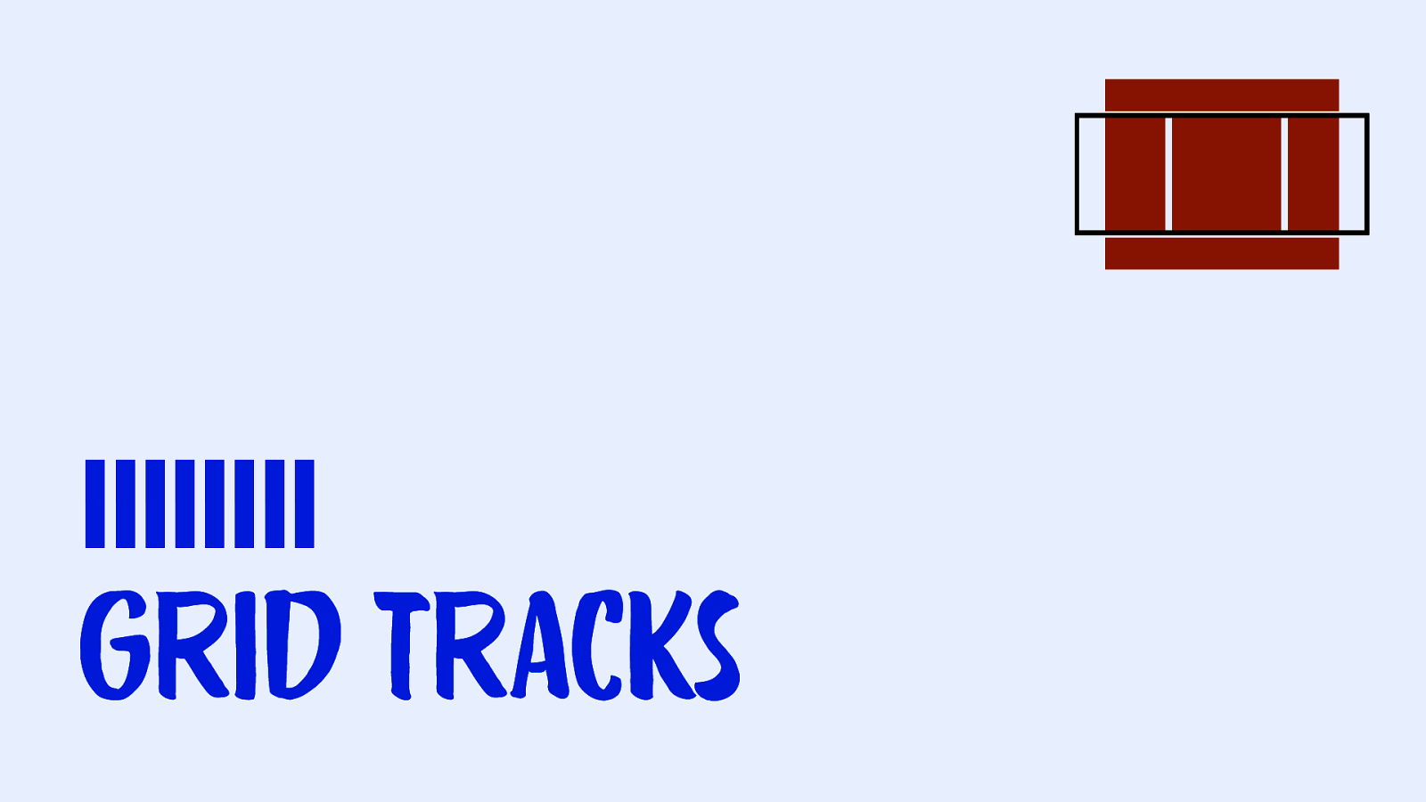
|||||||| Grid Tracks
Slide 54
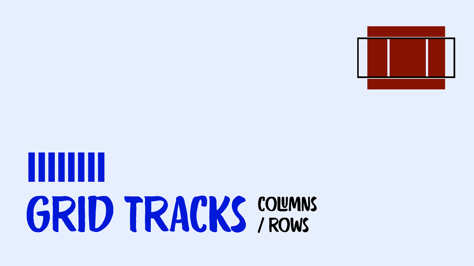
|||||||| Grid Tracks coLUmns / rows
Slide 55
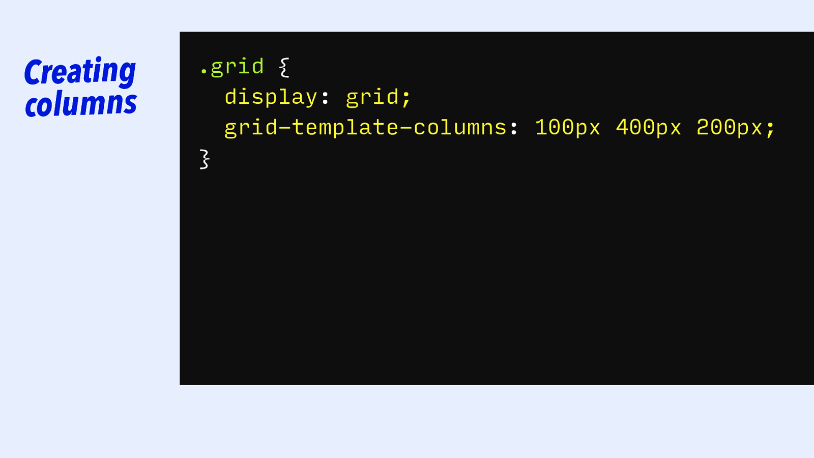
Creating columns .grid { display: grid; grid-template-columns: 100px 5cm 10cm 200px 500px 400px 5cm; 100px; 200px; }
Slide 56
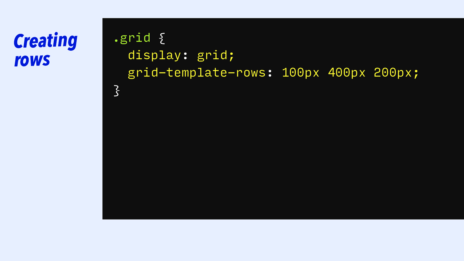
Creating rows .grid { display: grid; grid-template-columns: grid-template-rows: 100px 5cm400px 200px 10cm 500px 5cm; 200px; 100px; }
Slide 57
|||||||| Grid Tracks: FIXED
Slide 58

Fixed sizes .grid { display: grid; grid-template-columns: 5cm 10cm 5cm; }
Slide 59

Fixed sizes .grid { display: grid; grid-template-columns: 200px 5cm 10cm 500px 5cm; 100px; }
Slide 60

Fixed sizes .grid { display: grid; grid-template-columns: 50em 5cm 10cm 200px 120ch 500px 5cm; 50rem; 100px; }
Slide 61

Fixed sizes .grid { display: grid; grid-template-columns: /* use any size here */; } CSS Values and Units Module Level 3 ・ https://www.w3.org/TR/css-values-3/
Slide 62

Fixed sizes RELATIVE .grid { display: grid; grid-template-columns: /* use any size here */; } CSS Values and Units Module Level 3 ・ https://www.w3.org/TR/css-values-3/
Slide 63
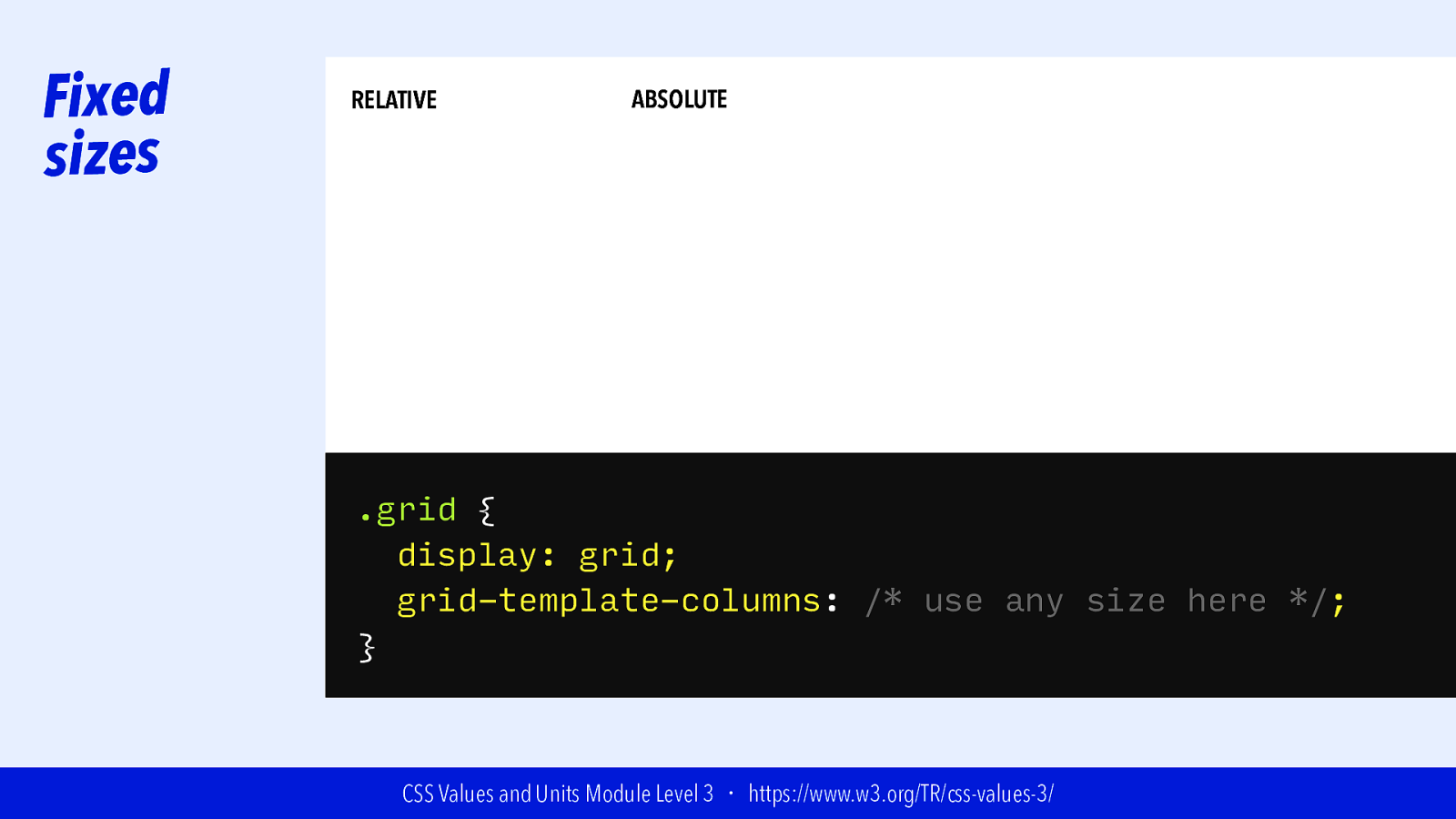
Fixed sizes RELATIVE ABSOLUTE .grid { display: grid; grid-template-columns: /* use any size here */; } CSS Values and Units Module Level 3 ・ https://www.w3.org/TR/css-values-3/
Slide 64
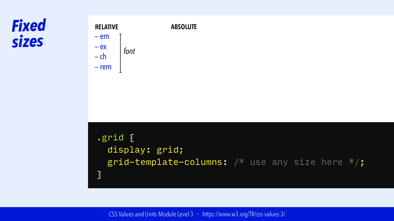
Fixed sizes ABSOLUTE RELATIVE — em — ex — ch — rem font .grid { display: grid; grid-template-columns: /* use any size here */; } CSS Values and Units Module Level 3 ・ https://www.w3.org/TR/css-values-3/
Slide 65
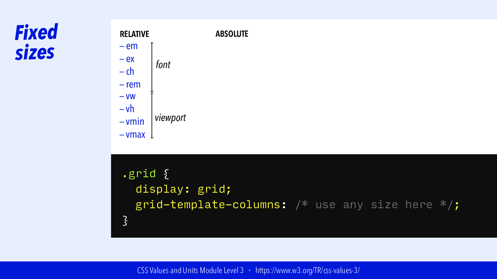
Fixed sizes RELATIVE — em — ex font — ch — rem — vw — vh viewport — vmin — vmax ABSOLUTE .grid { display: grid; grid-template-columns: /* use any size here */; } CSS Values and Units Module Level 3 ・ https://www.w3.org/TR/css-values-3/
Slide 66

Fixed sizes RELATIVE — em — ex font — ch — rem — vw — vh viewport — vmin — vmax ABSOLUTE — cm — mm —Q — in — pc — pt — px .grid { display: grid; grid-template-columns: /* use any size here */; } CSS Values and Units Module Level 3 ・ https://www.w3.org/TR/css-values-3/
Slide 67

Fixed sizes RELATIVE — em — ex font — ch — rem — vw — vh viewport — vmin — vmax ABSOLUTE — cm — mm —Q — in — pc — pt — px 1cm = 96px/2.54 .grid { display: grid; grid-template-columns: /* use any size here */; } CSS Values and Units Module Level 3 ・ https://www.w3.org/TR/css-values-3/
Slide 68

Fixed sizes RELATIVE — em — ex font — ch — rem — vw — vh viewport — vmin — vmax ABSOLUTE — cm — mm —Q — in — pc — pt — px 1cm = 96px/2.54 1mm = 1/10th of 1cm .grid { display: grid; grid-template-columns: /* use any size here */; } CSS Values and Units Module Level 3 ・ https://www.w3.org/TR/css-values-3/
Slide 69

Fixed sizes RELATIVE — em — ex font — ch — rem — vw — vh viewport — vmin — vmax ABSOLUTE — cm 1cm = 96px/2.54 — mm 1mm = 1/10th of 1cm — Q 1Q = 1/40th of 1cm — in — pc — pt — px .grid { display: grid; grid-template-columns: /* use any size here */; } CSS Values and Units Module Level 3 ・ https://www.w3.org/TR/css-values-3/
Slide 70
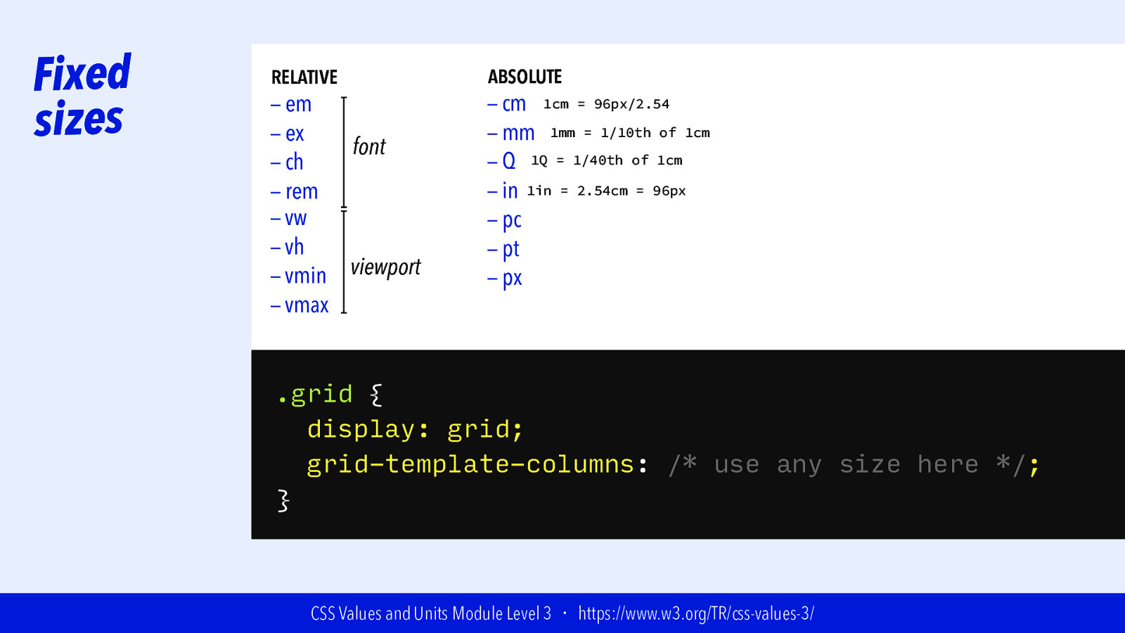
Fixed sizes RELATIVE — em — ex font — ch — rem — vw — vh viewport — vmin — vmax ABSOLUTE — cm 1cm = 96px/2.54 — mm 1mm = 1/10th of 1cm — Q 1Q = 1/40th of 1cm — in 1in = 2.54cm = 96px — pc — pt — px .grid { display: grid; grid-template-columns: /* use any size here */; } CSS Values and Units Module Level 3 ・ https://www.w3.org/TR/css-values-3/
Slide 71

Fixed sizes RELATIVE — em — ex font — ch — rem — vw — vh viewport — vmin — vmax ABSOLUTE — cm 1cm = 96px/2.54 — mm 1mm = 1/10th of 1cm — Q 1Q = 1/40th of 1cm — in 1in = 2.54cm = 96px — pc 1pc = 1/6th of 1in — pt — px .grid { display: grid; grid-template-columns: /* use any size here */; } CSS Values and Units Module Level 3 ・ https://www.w3.org/TR/css-values-3/
Slide 72
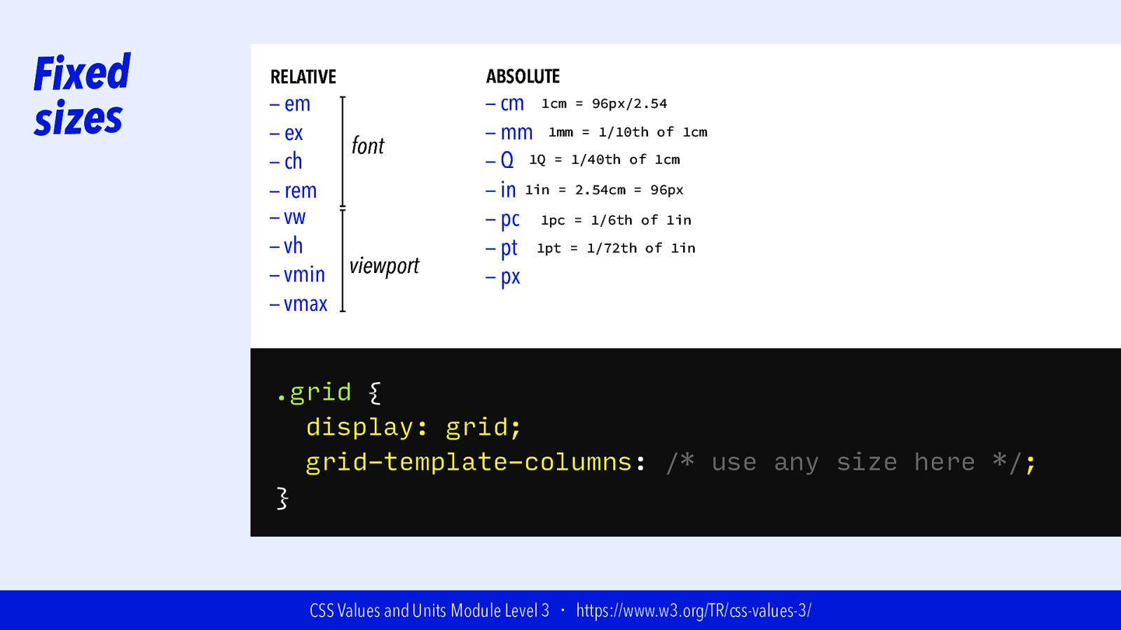
Fixed sizes RELATIVE — em — ex font — ch — rem — vw — vh viewport — vmin — vmax ABSOLUTE — cm 1cm = 96px/2.54 — mm 1mm = 1/10th of 1cm — Q 1Q = 1/40th of 1cm — in 1in = 2.54cm = 96px — pc 1pc = 1/6th of 1in — pt 1pt = 1/72th of 1in — px .grid { display: grid; grid-template-columns: /* use any size here */; } CSS Values and Units Module Level 3 ・ https://www.w3.org/TR/css-values-3/
Slide 73

Fixed sizes RELATIVE — em — ex font — ch — rem — vw — vh viewport — vmin — vmax ABSOLUTE — cm 1cm = 96px/2.54 — mm 1mm = 1/10th of 1cm — Q 1Q = 1/40th of 1cm — in 1in = 2.54cm = 96px — pc 1pc = 1/6th of 1in — pt 1pt = 1/72th of 1in — px 1px = 1/96th of 1in .grid { display: grid; grid-template-columns: /* use any size here */; } CSS Values and Units Module Level 3 ・ https://www.w3.org/TR/css-values-3/
Slide 74
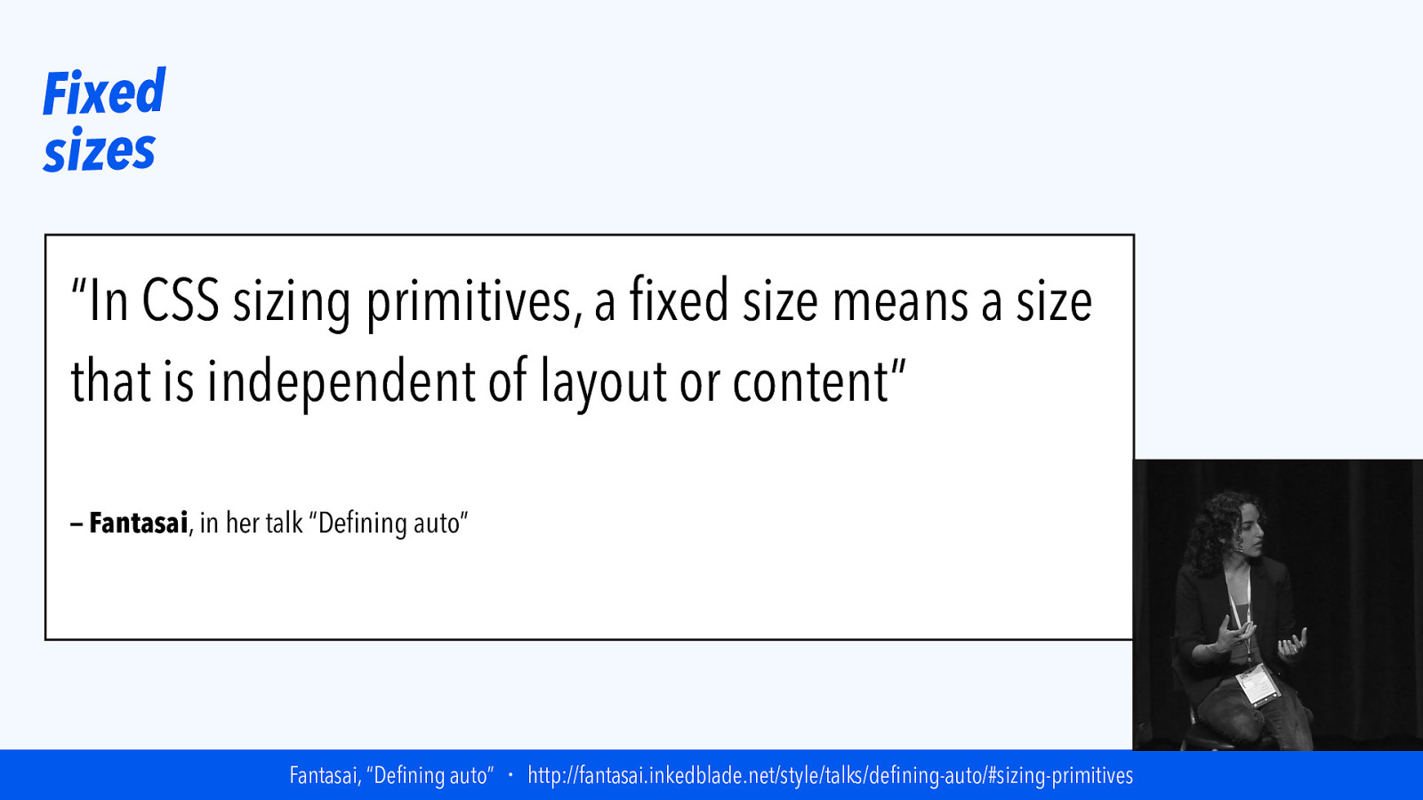
Fixed sizes “In CSS sizing primitives, a fixed size means a size that is independent of layout or content” — Fantasai, in her talk “Defining auto” Fantasai, “Defining auto” ・ http://fantasai.inkedblade.net/style/talks/defining-auto/#sizing-primitives
Slide 75

Fixed track sizes
Slide 76
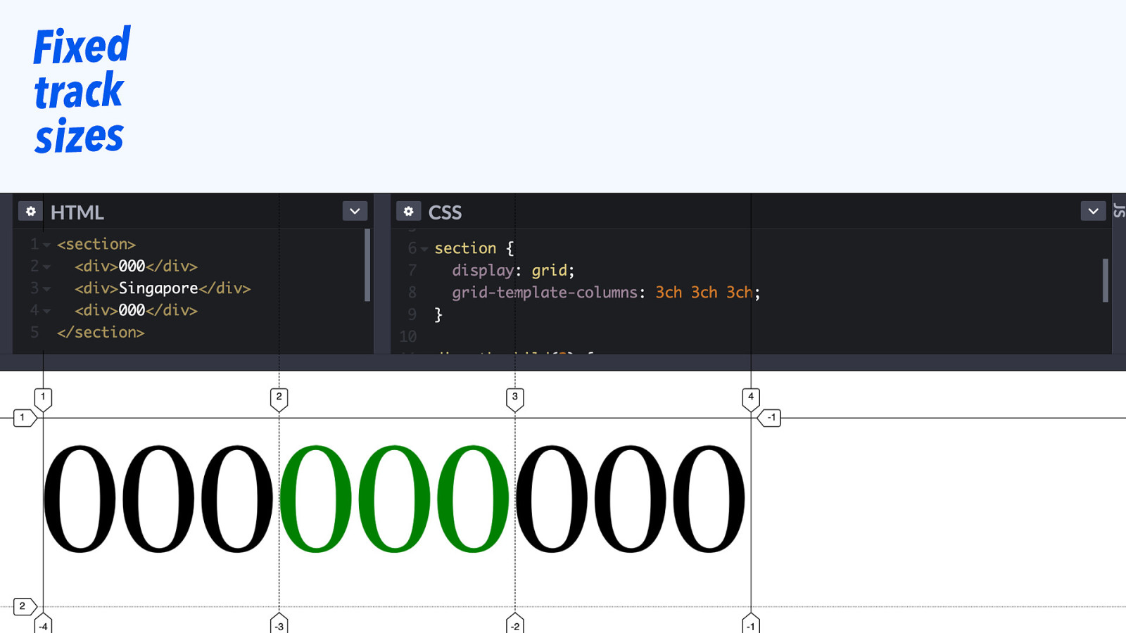
Fixed track sizes
Slide 77
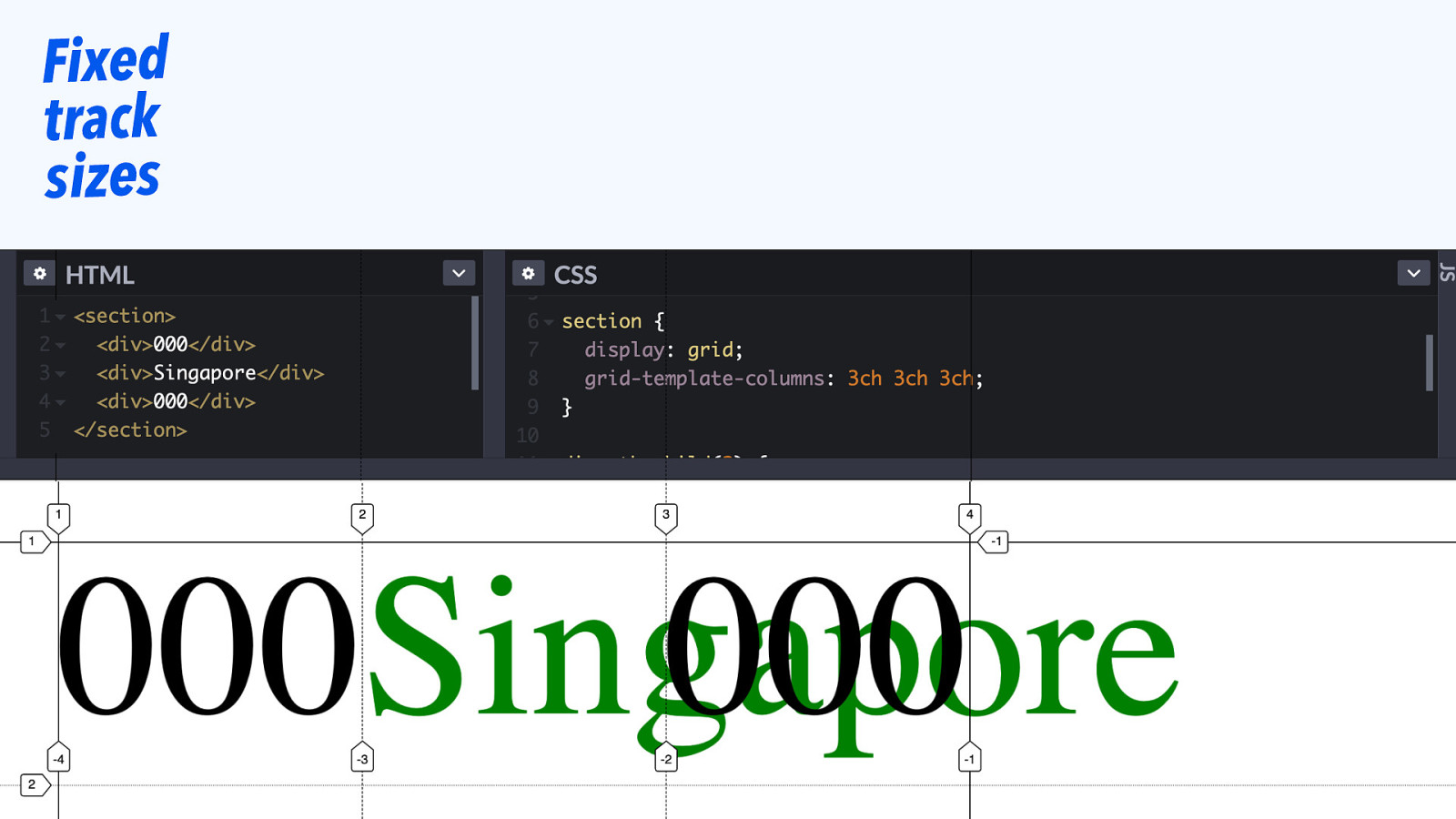
Fixed track sizes
Slide 78
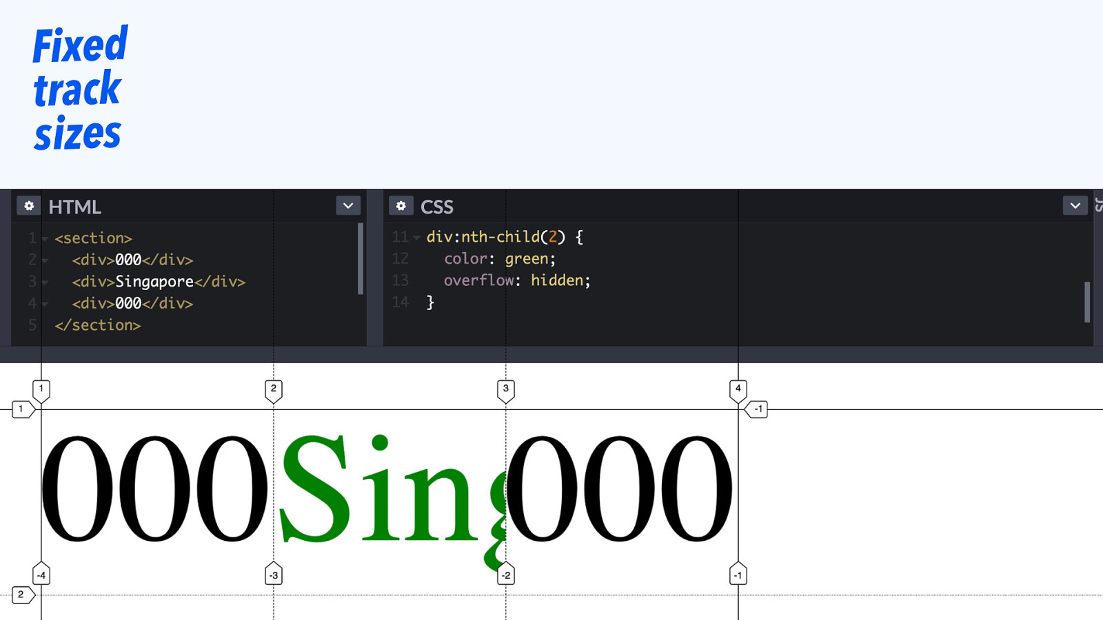
Fixed track sizes
Slide 79
|||||||| Grid Tracks: FRACTIONS
Slide 80
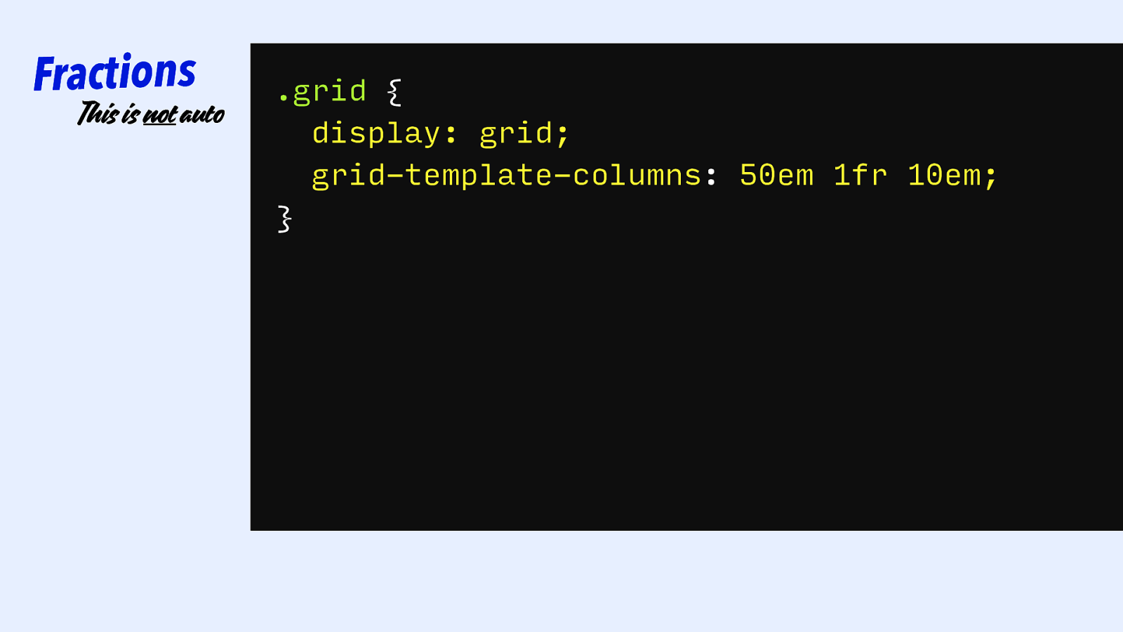
Fractions This is not auto .grid { display: grid; grid-template-columns: 50em 1fr 10em; }
Slide 81
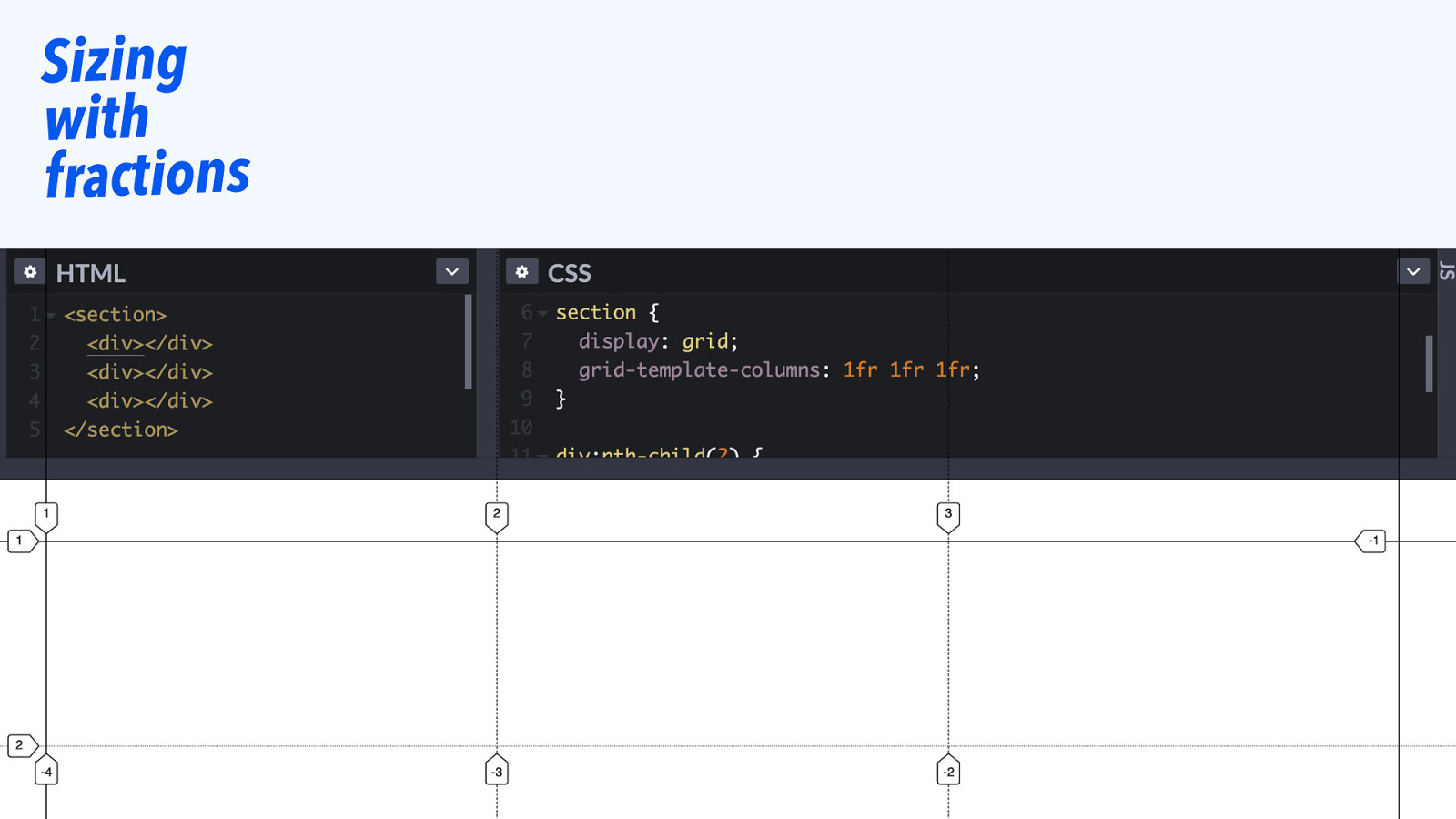
Sizing with fractions
Slide 82
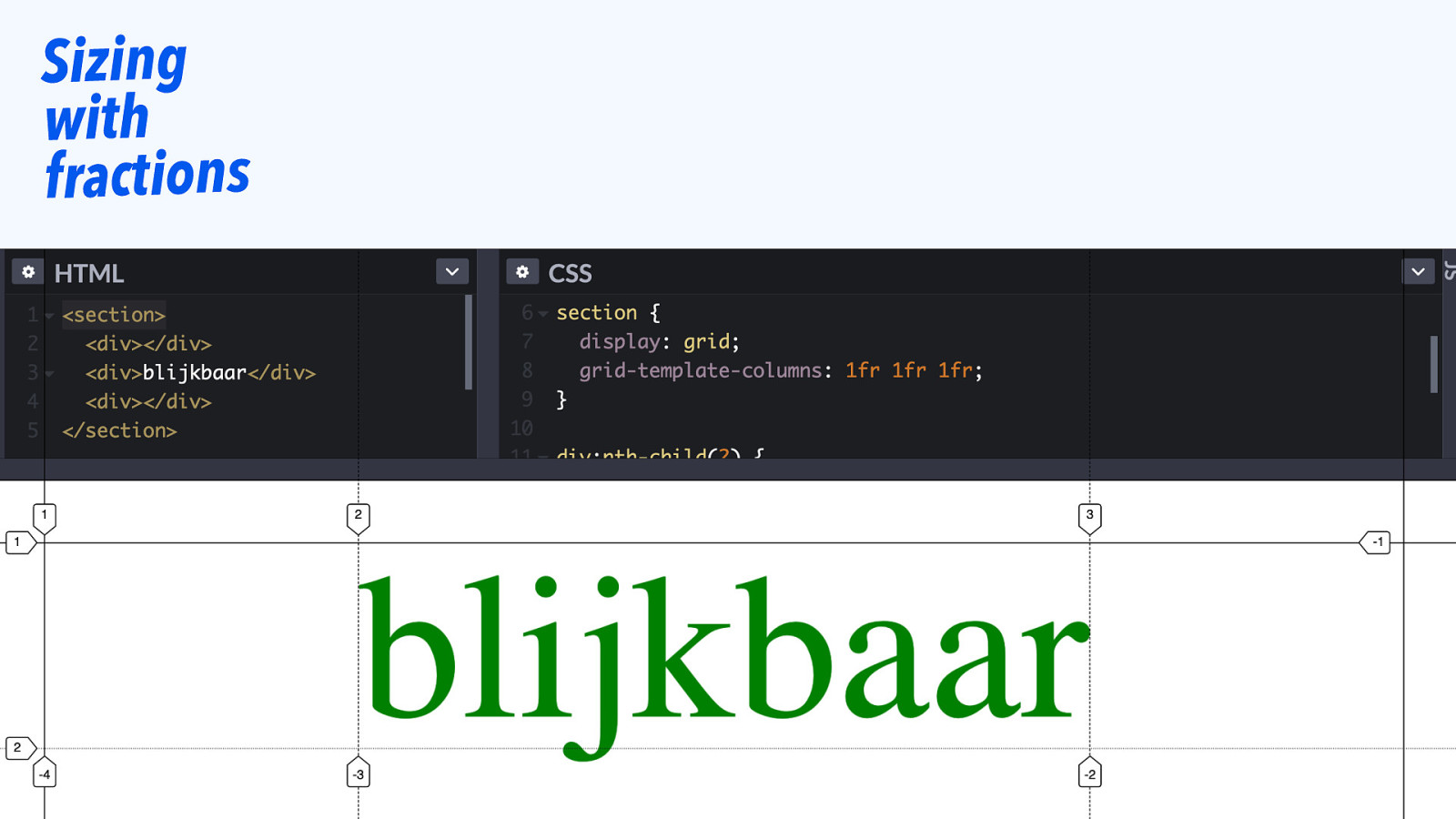
Sizing with fractions
Slide 83

This default is a feature, usually you don’t want text on top of other text.
Slide 84
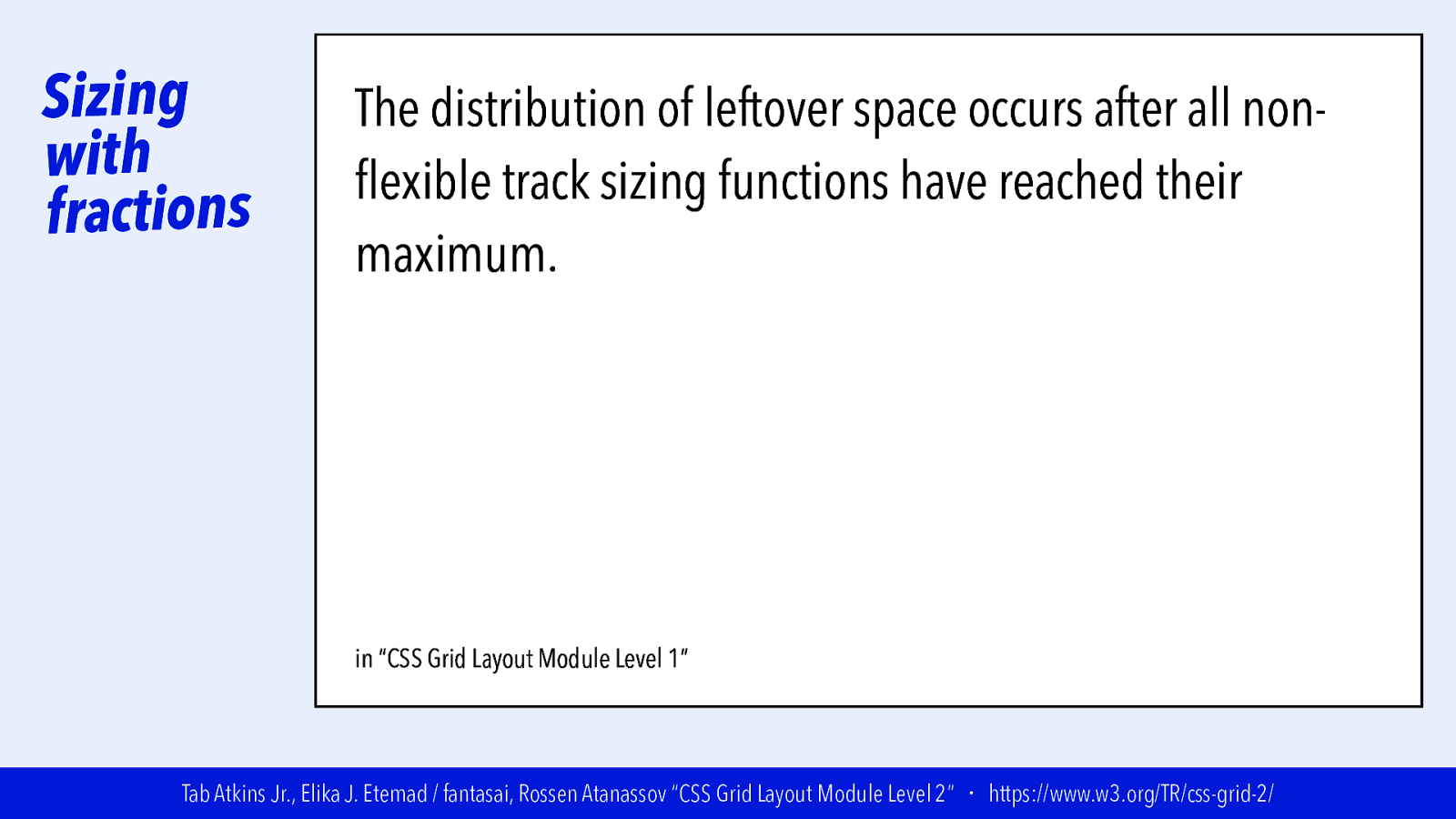
Sizing with fractions The distribution of leftover space occurs after all nonflexible track sizing functions have reached their maximum. The total size of such rows or columns is subtracted from the available space, yielding the leftover space, which is then divided among the flexsized rows and columns in proportion to their flex factor. in “CSS Grid Layout Module Level 1” Tab Atkins Jr., Elika J. Etemad / fantasai, Rossen Atanassov “CSS Grid Layout Module Level 2” ・ https://www.w3.org/TR/css-grid-2/
Slide 85
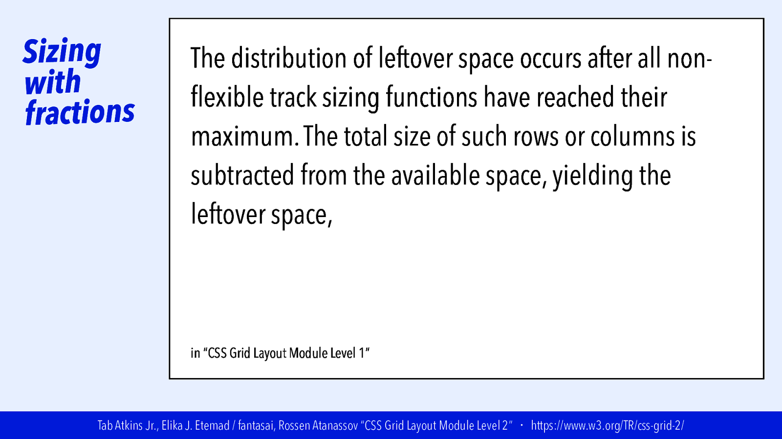
Sizing with fractions The distribution of leftover space occurs after all nonflexible track sizing functions have reached their maximum. The total size of such rows or columns is subtracted from the available space, yielding the leftover space, which is then divided among the flexsized rows and columns in proportion to their flex factor. in “CSS Grid Layout Module Level 1” Tab Atkins Jr., Elika J. Etemad / fantasai, Rossen Atanassov “CSS Grid Layout Module Level 2” ・ https://www.w3.org/TR/css-grid-2/
Slide 86
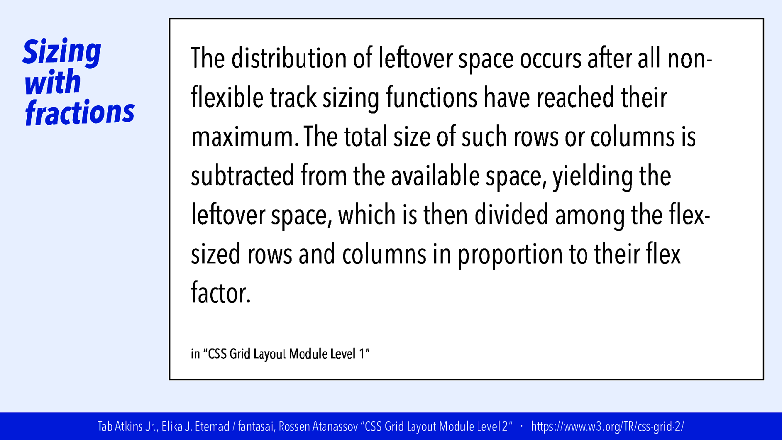
Sizing with fractions The distribution of leftover space occurs after all nonflexible track sizing functions have reached their maximum. The total size of such rows or columns is subtracted from the available space, yielding the leftover space, which is then divided among the flexsized rows and columns in proportion to their flex factor. in “CSS Grid Layout Module Level 1” Tab Atkins Jr., Elika J. Etemad / fantasai, Rossen Atanassov “CSS Grid Layout Module Level 2” ・ https://www.w3.org/TR/css-grid-2/
Slide 87
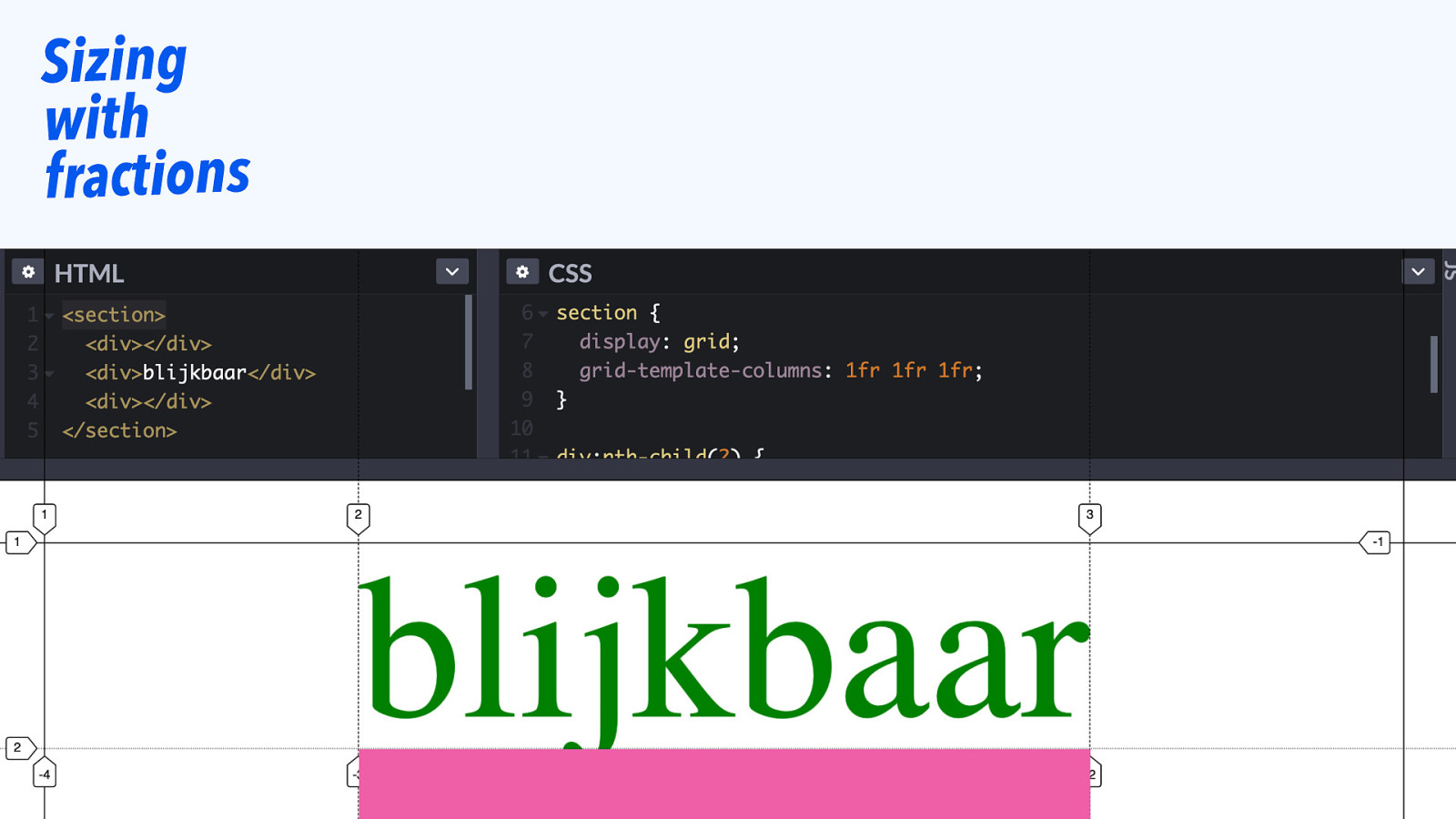
Sizing with fractions
Slide 88
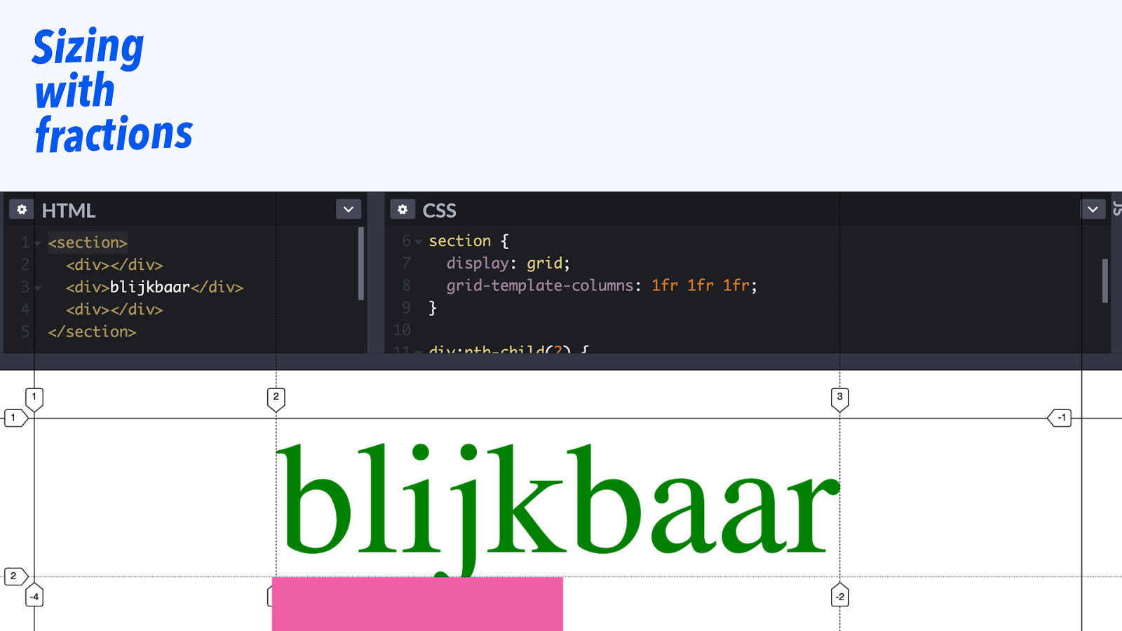
Sizing with fractions
Slide 89

One cell in a track can affect the whole track’s size.
Slide 90
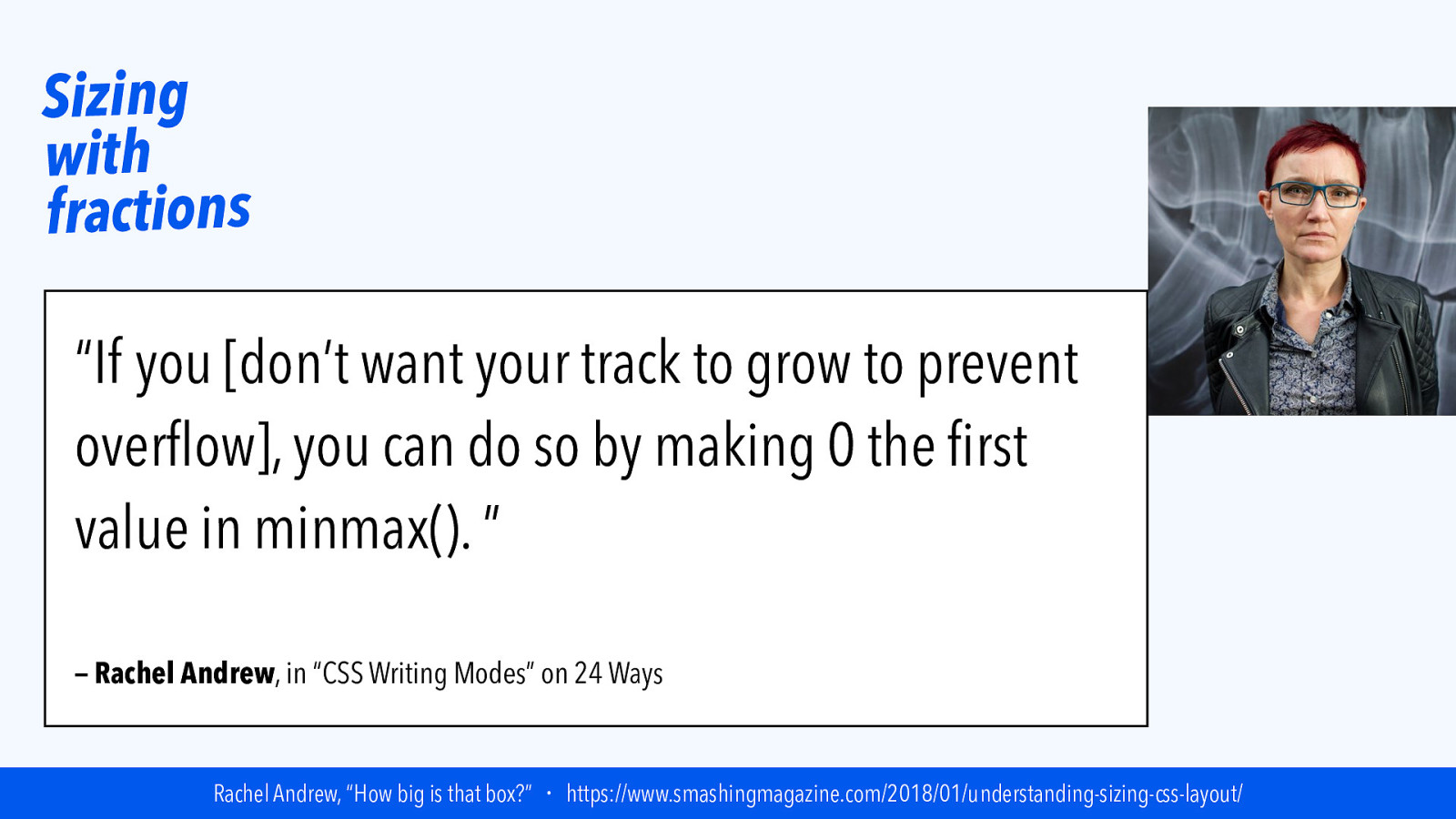
Sizing with fractions “If you [don’t want your track to grow to prevent overflow], you can do so by making 0 the first value in minmax(). ” — Rachel Andrew, in “CSS Writing Modes” on 24 Ways Rachel Andrew, “How big is that box?” ・ https://www.smashingmagazine.com/2018/01/understanding-sizing-css-layout/
Slide 91
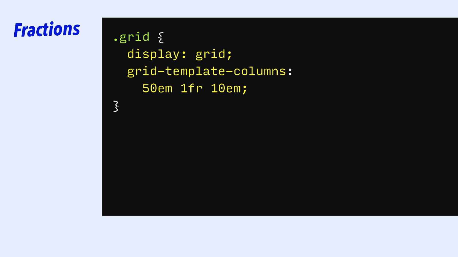
Fractions .grid { display: grid; grid-template-columns: 50em 1fr 10em; }
Slide 92
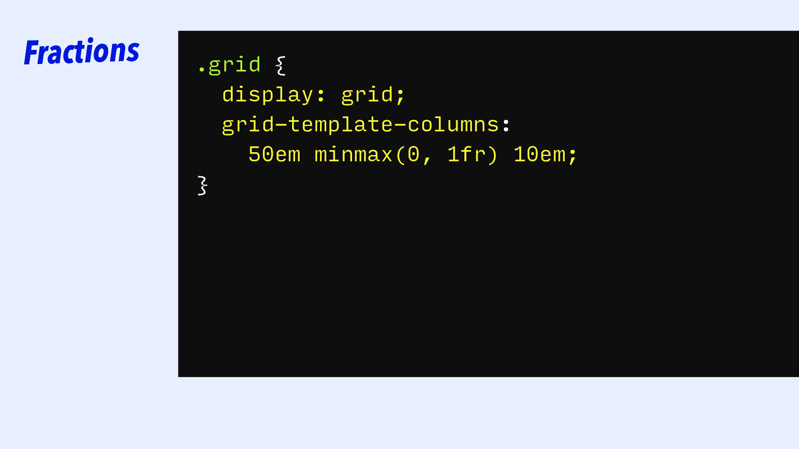
Fractions .grid { display: grid; grid-template-columns: 50em minmax(0, 1fr) 10em; }
Slide 93

|||||||| Grid Tracks: keywords
Slide 94
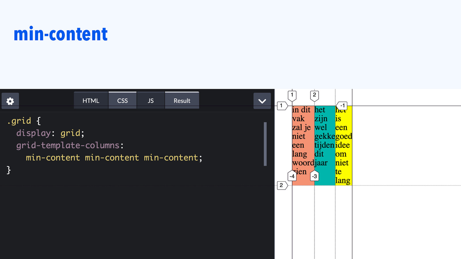
min-content
Slide 95
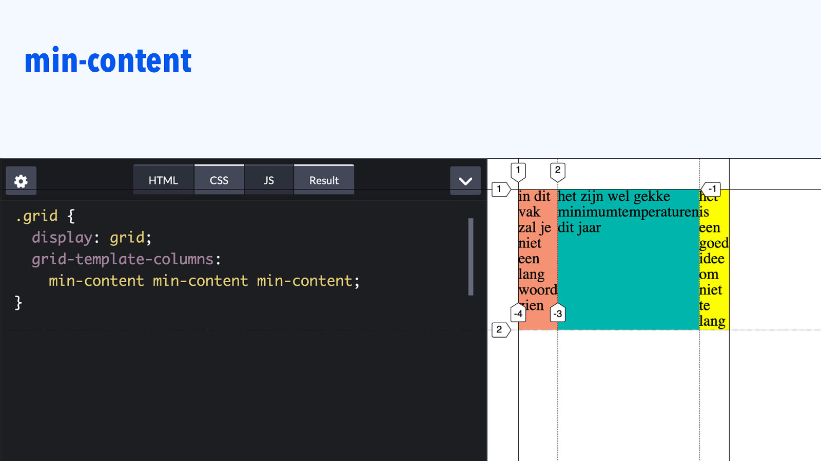
min-content
Slide 96
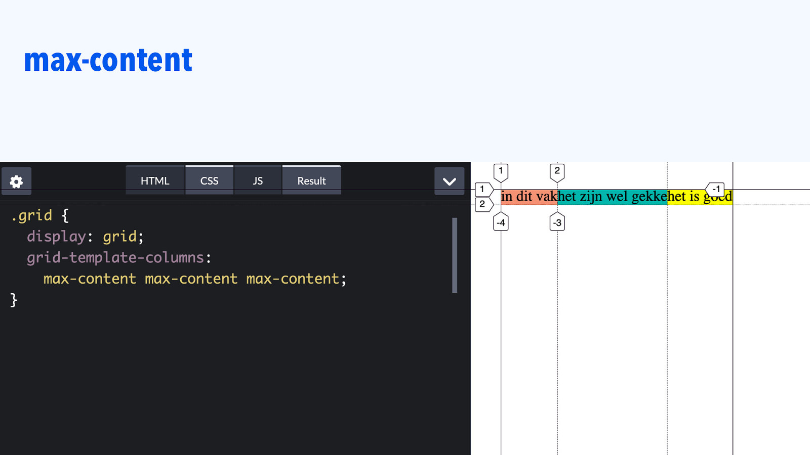
max-content
Slide 97
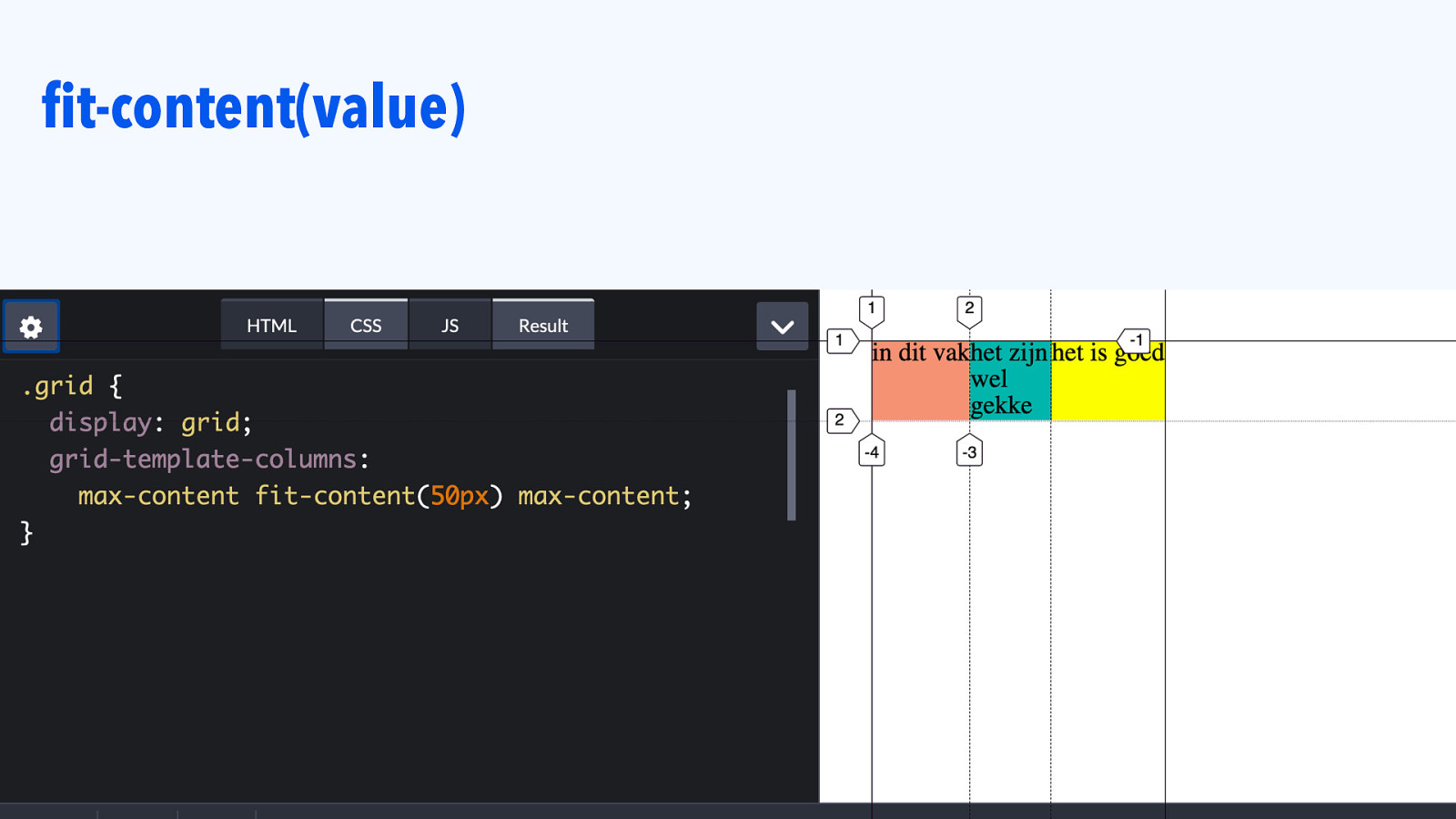
fit-content(value)
Slide 98

|||||||| Grid Tracks: AUTO
Slide 99

Auto track size .grid { display: grid; grid-template-columns: 50em auto 10em; }
Slide 100
Auto is what you’ll get if you don’t size your track. (Overridable with grid-auto-rows / grid-auto-columns)
Slide 101

Auto track size .grid { display: grid; }
Slide 102
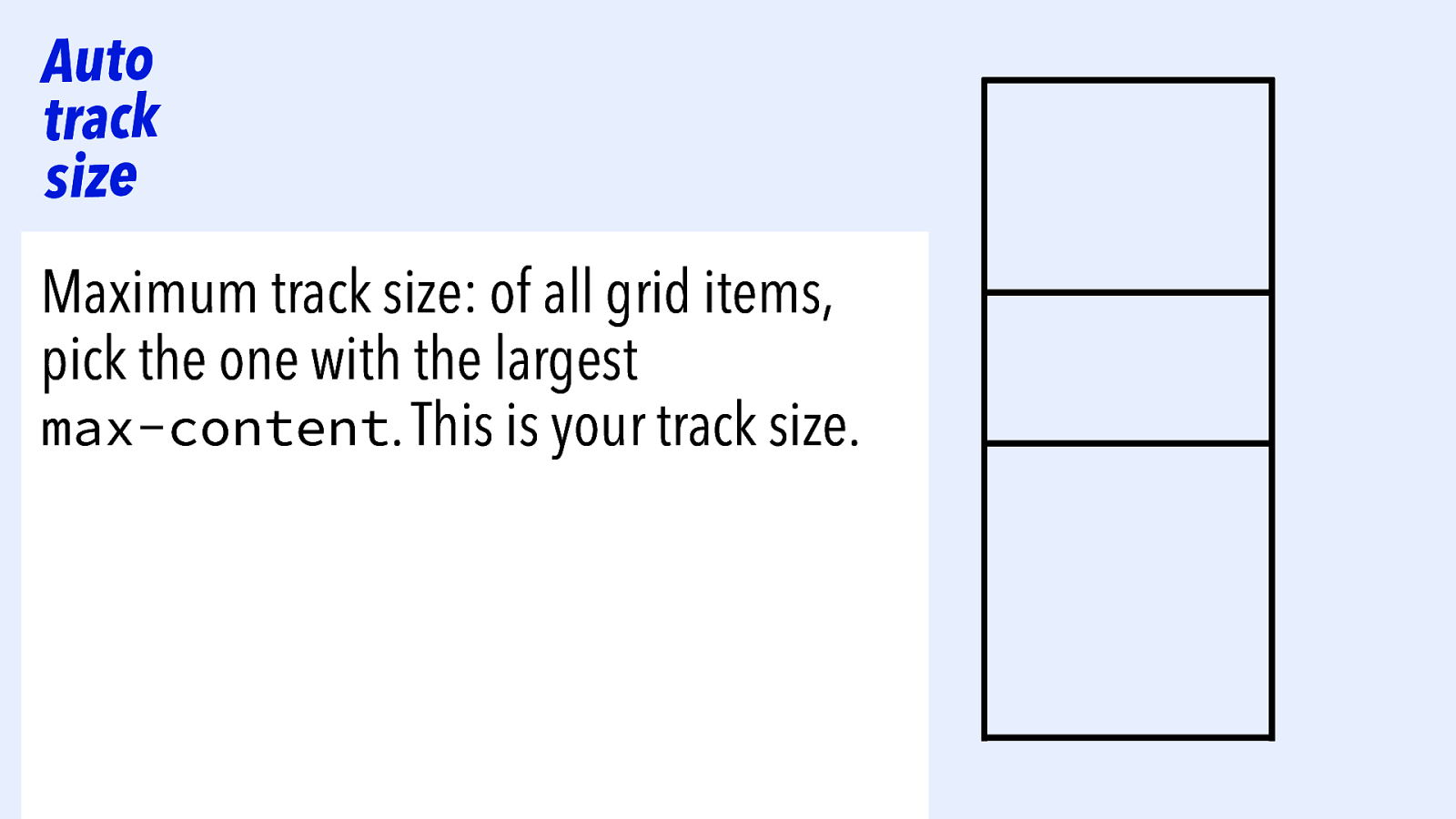
Auto track size Maximum track size: of all grid items, pick the one with the largest max-content. This is your track size.
Slide 103
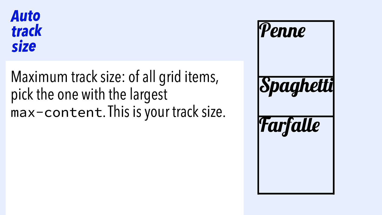
Auto track size Maximum track size: of all grid items, pick the one with the largest max-content. This is your track size. Penne Spaghetti Farfalle
Slide 104
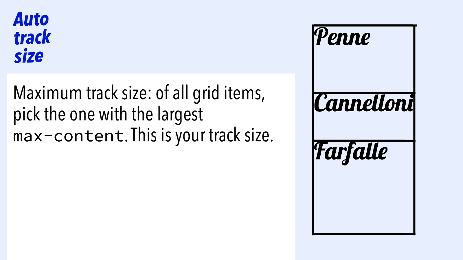
Auto track size Maximum track size: of all grid items, pick the one with the largest max-content. This is your track size. Penne Cannelloni Farfalle
Slide 105
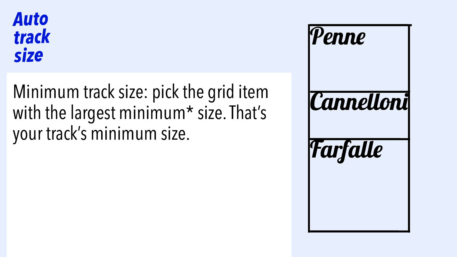
Auto track size Minimum track size: pick the grid item with the largest minimum* size. That’s your track’s minimum size. Penne Cannelloni Farfalle
Slide 106
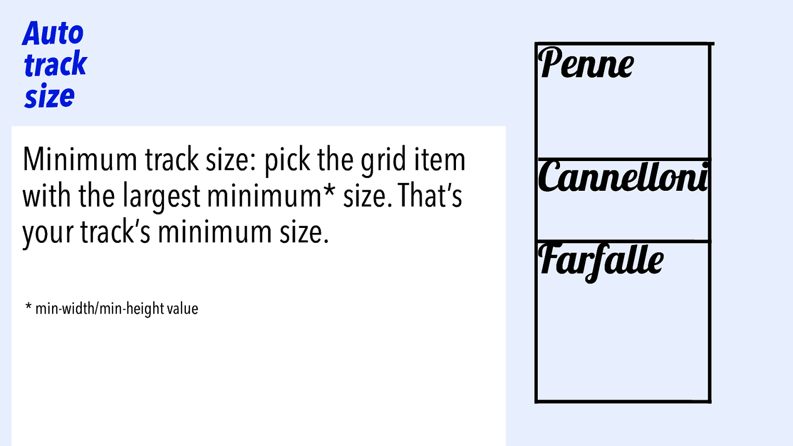
Auto track size Minimum track size: pick the grid item with the largest minimum* size. That’s your track’s minimum size. * min-width/min-height value Penne Cannelloni Farfalle
Slide 107
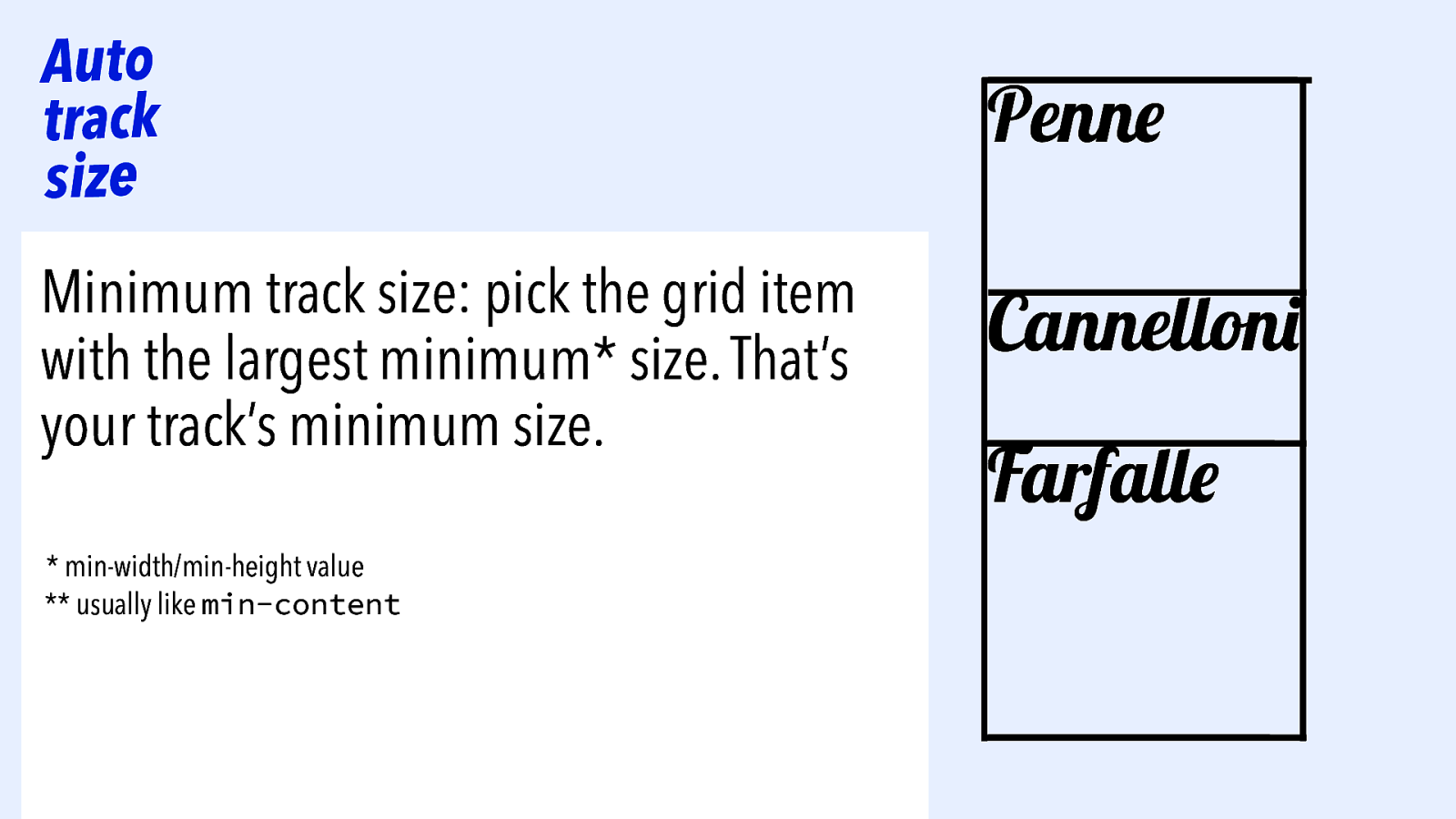
Auto track size Minimum track size: pick the grid item with the largest minimum* size. That’s your track’s minimum size. * min-width/min-height value ** usually like min-content Penne Cannelloni Farfalle
Slide 108

|||||||| Grid tracks
Slide 109
|||||||| Grid tracks Size you specified WHEN — you use fixed sizing units (relative or absolute)
Slide 110
|||||||| Grid tracks Size you specified WHEN — you use fixed sizing units (relative or absolute) u o y n a h t e r o M specified WHEN — there’s a long word
Slide 111
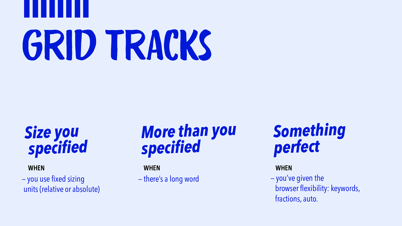
|||||||| Grid tracks Size you specified WHEN — you use fixed sizing units (relative or absolute) u o y n a h t e r o M specified WHEN — there’s a long word Something perfect WHEN — you’ve given the browser flexibility: keywords, fractions, auto.
Slide 112
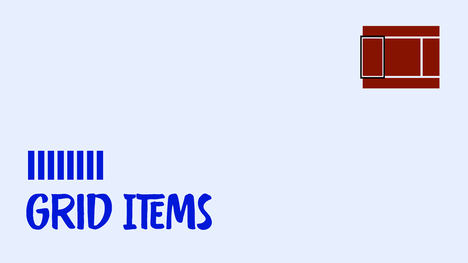
|||||||| Grid ITEms
Slide 113

Grid item size depends on alignment.
Slide 114
Alignment is what happens when you have more space than content.
Slide 115
Alignment is what happens when you have more space than content.
Slide 116
Alignment is what happens when you have more space than content.
Slide 117
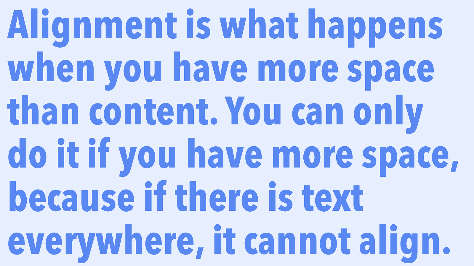
Alignment is what happens when you have more space than content. You can only do it if you have more space, because if there is text everywhere, it cannot align.
Slide 118
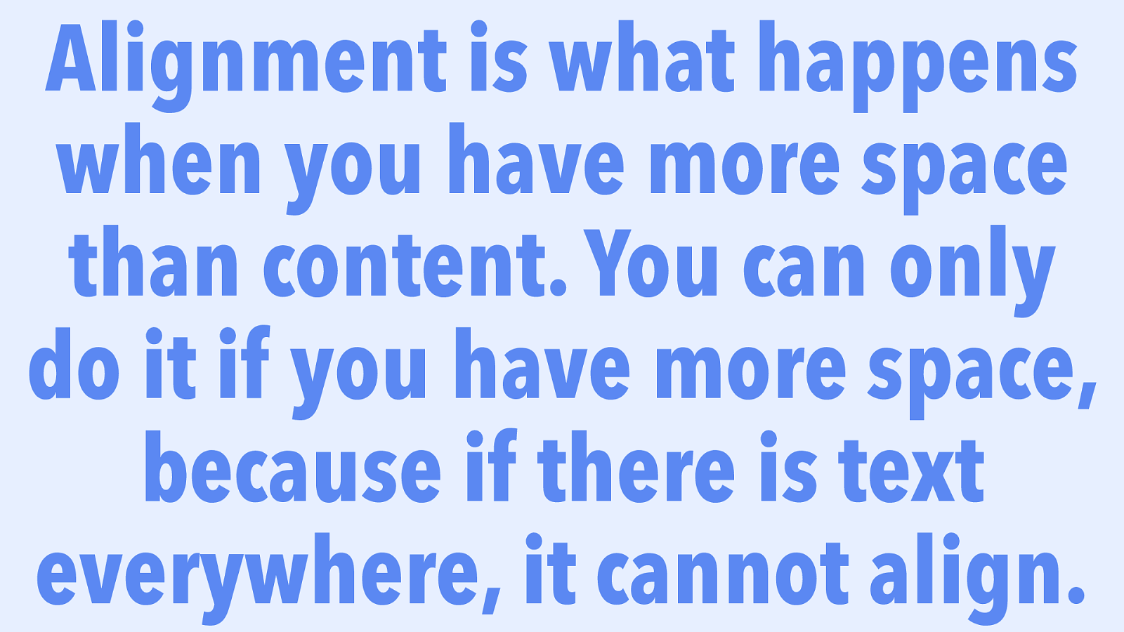
Alignment is what happens when you have more space than content. You can only do it if you have more space, because if there is text everywhere, it cannot align.
Slide 119
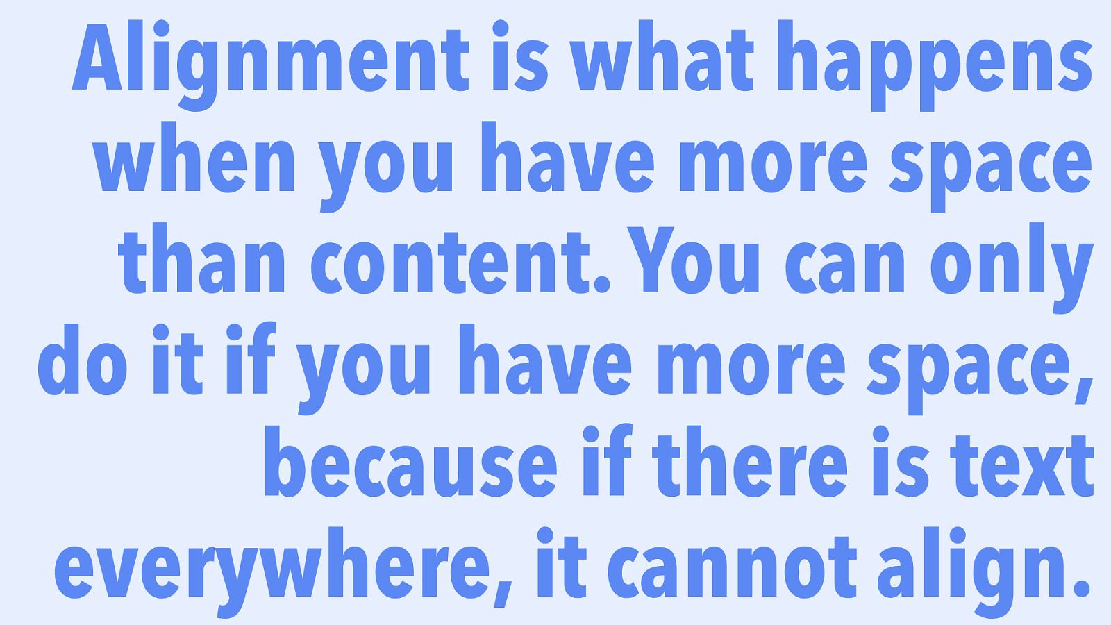
Alignment is what happens when you have more space than content. You can only do it if you have more space, because if there is text everywhere, it cannot align.
Slide 120
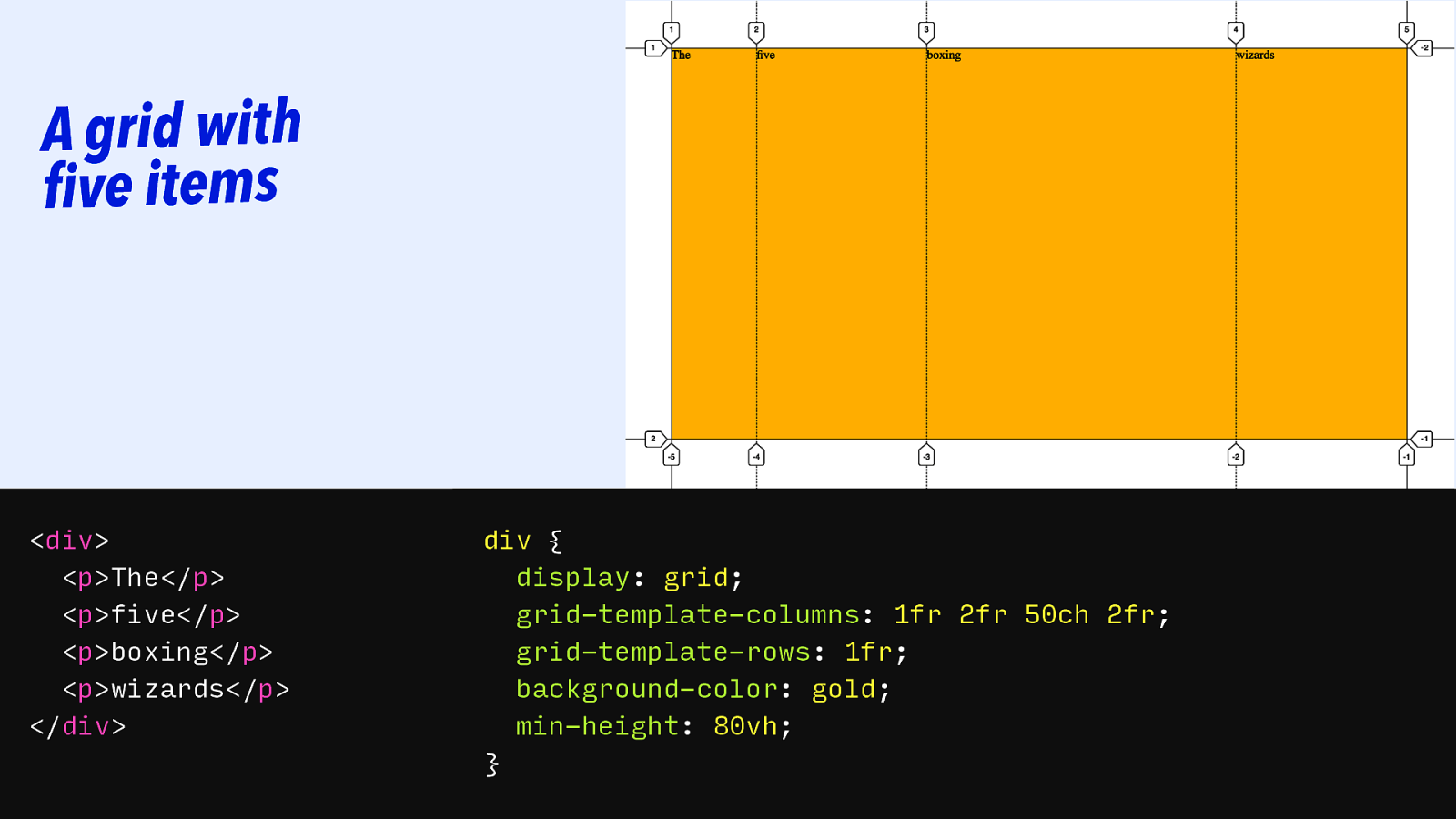
A grid with five items
<div> <p>The</p> <p>five</p> <p>boxing</p> <p>wizards</p> </div> div { display: grid; grid-template-columns: 1fr 2fr 50ch 2fr; grid-template-rows: 1fr; background-color: gold; min-height: 80vh; }Slide 121
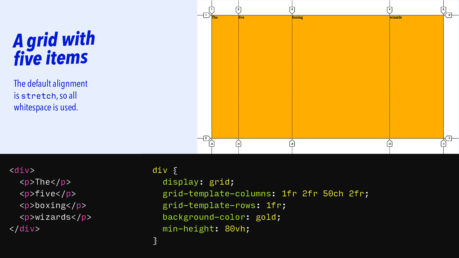
A grid with five items The default alignment is stretch, so all whitespace is used.
<div> <p>The</p> <p>five</p> <p>boxing</p> <p>wizards</p> </div> div { display: grid; grid-template-columns: 1fr 2fr 50ch 2fr; grid-template-rows: 1fr; background-color: gold; min-height: 80vh; }Slide 122
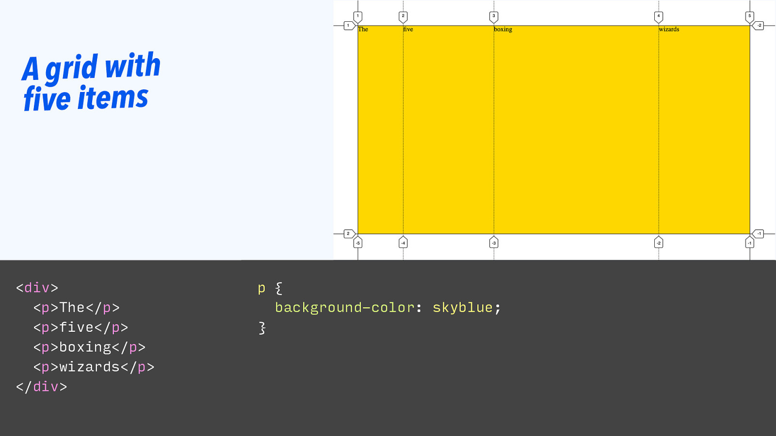
A grid with five items
<div> <p>The</p> <p>five</p> <p>boxing</p> <p>wizards</p> </div> p { background-color: skyblue; }Slide 123
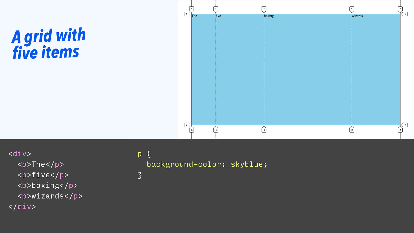
A grid with five items
<div> <p>The</p> <p>five</p> <p>boxing</p> <p>wizards</p> </div> p { background-color: skyblue; }Slide 124
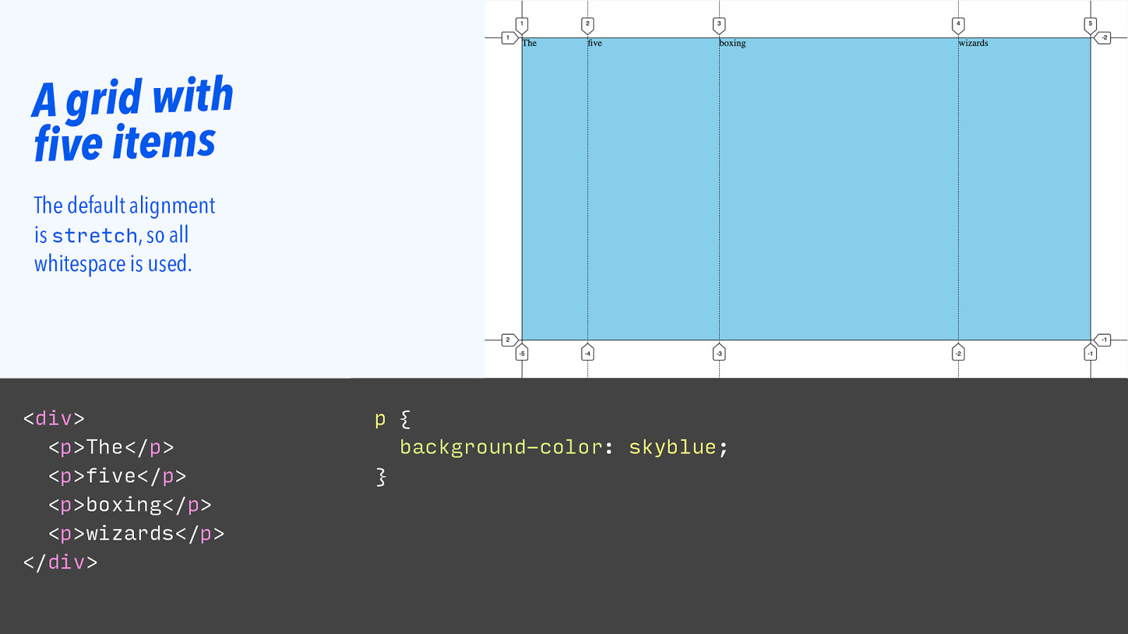
A grid with five items The default alignment is stretch, so all whitespace is used.
<div> <p>The</p> <p>five</p> <p>boxing</p> <p>wizards</p> </div> p { background-color: skyblue; }Slide 125
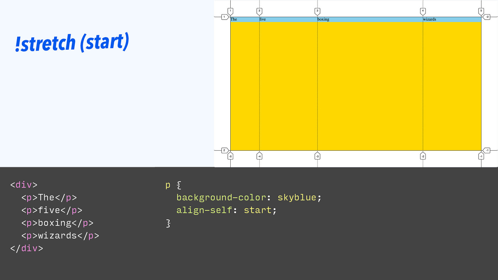
!stretch (start)
<div> <p>The</p> <p>five</p> <p>boxing</p> <p>wizards</p> </div> p { background-color: skyblue; align-self: start; }Slide 126

!stretch (start) If grid items are aligned other than stretch, their size is what is needed.
<div> <p>The</p> <p>five</p> <p>boxing</p> <p>wizards</p> </div> p { background-color: skyblue; align-self: start; }Slide 127

!stretch (start) If grid items are aligned other than stretch, their size is what is needed.
<div> <p>The</p> <p>five</p> <p>boxing</p> <p>wizards</p> </div> p { background-color: skyblue; margin-bottom: auto; }Slide 128

!stretch (start) If grid items are aligned other than stretch, their size is what is needed.
<div> <p>The</p> <p>five</p> <p>boxing</p> <p>wizards</p> </div> p { background-color: skyblue; margin-block-end: auto; }Slide 129
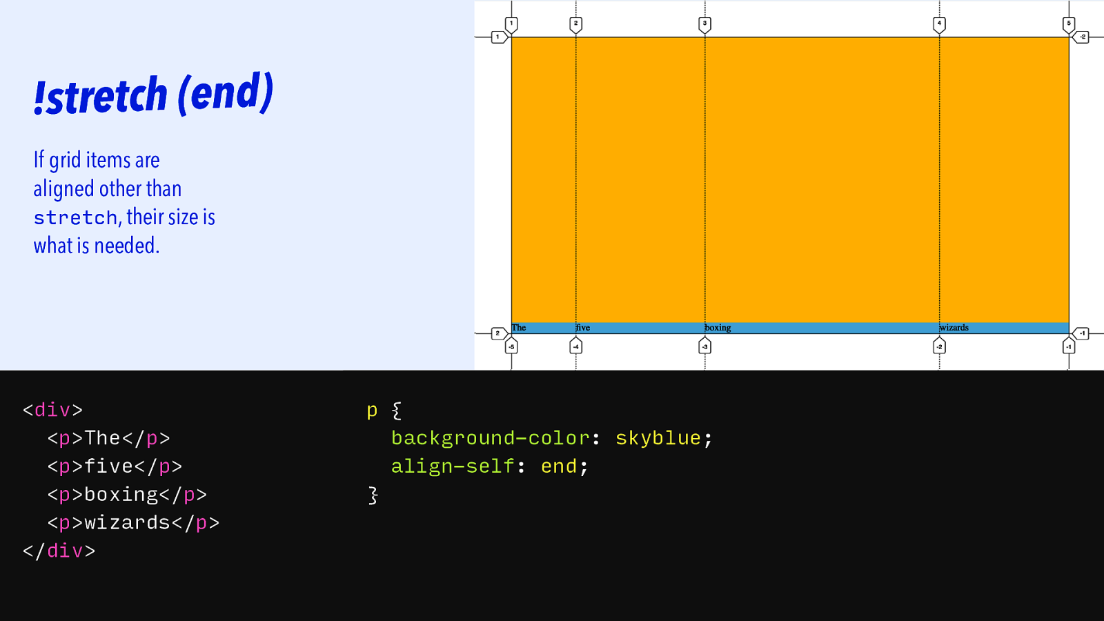
!stretch (end) If grid items are aligned other than stretch, their size is what is needed.
<div> <p>The</p> <p>five</p> <p>boxing</p> <p>wizards</p> </div> p { background-color: skyblue; align-self: end; }Slide 130
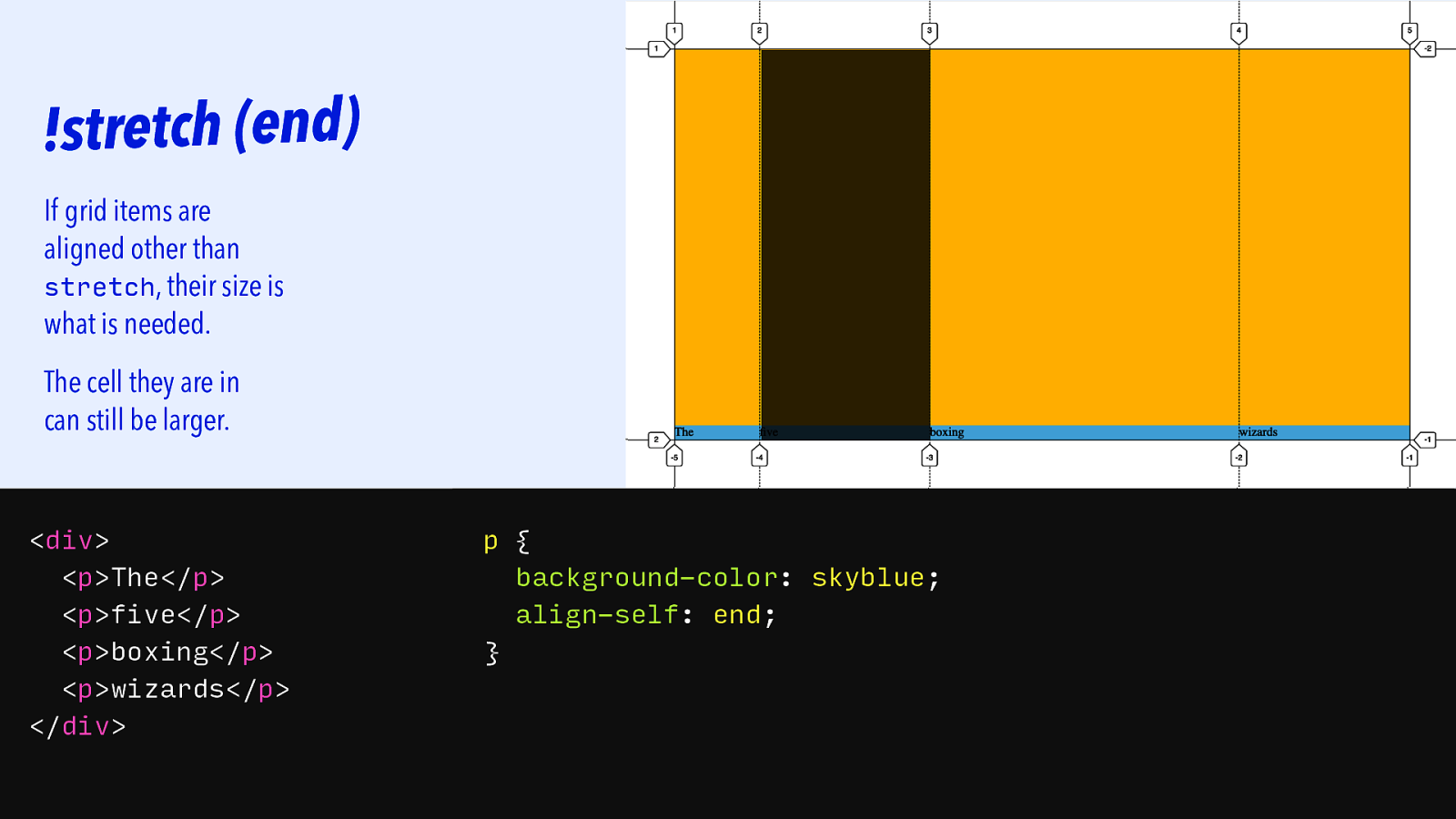
!stretch (end) If grid items are aligned other than stretch, their size is what is needed. The cell they are in can still be larger.
<div> <p>The</p> <p>five</p> <p>boxing</p> <p>wizards</p> </div> p { background-color: skyblue; align-self: end; }Slide 131

|||||||| Grid ITEms
Slide 132
|||||||| Grid ITEms Size of track WHEN — item is aligned “stretch”
Slide 133
|||||||| Grid ITEms Size of track WHEN — item is aligned “stretch” Size that the s d e e n t n e t n o c WHEN — item is aligned in a way that leaves whitespace
Slide 134
|||||||| Grid ITEms Size of track WHEN — item is aligned “stretch” Size that the s d e e n t n e t n o c WHEN — item is aligned in a way that leaves whitespace , or has an auto margin that returns whitespace to the track
Slide 135

|||||||| ConcLUding…
Slide 136

Slide 137
Grid Layout helps with more international CSS, by being less physical.
Slide 138
Grid Layout helps with more international CSS, by being less physical. For websites, letting the browser decide flexibly, can make your life easier.
Slide 139

MORE READING/WATCHING ‣ Tab Atkins Jr., Elika J. Etemad / fantasai, Rossen Atanassov “CSS Grid Layout Module Level 2” (https:// www.w3.org/TR/css-grid-2/) ‣ Rachel Andrew, “How Big Is That Box? Understanding Sizing In CSS Layout” (https:// www.smashingmagazine.com/2018/01/understandingsizing-css-layout/) ‣ Elika J. Etemad (fantasai), “Defining auto” (https:// vimeo.com/134597090) ‣ Hui Jing Chen, “Vertical typesetting with writing-mode revisited” (https://chenhuijing.com/blog/verticaltypesetting-revisited/#%F0%9F%91%9F) ‣ Rachel Andrew, “Writing Modes and CSS Layout” (https://www.smashingmagazine.com/2019/08/ writing-modes-layout/) ‣ Jen Simmons, “CSS Writing Modes” (https:// 24ways.org/2016/css-writing-modes/)
Slide 140
MORE READING/WATCHING ‣ Tab Atkins Jr., Elika J. Etemad / fantasai, Rossen Atanassov “CSS Grid Layout Module Level 2” (https:// www.w3.org/TR/css-grid-2/) ‣ Rachel Andrew, “How Big Is That Box? Understanding Sizing In CSS Layout” (https:// www.smashingmagazine.com/2018/01/understandingsizing-css-layout/) ‣ Elika J. Etemad (fantasai), “Defining auto” (https:// vimeo.com/134597090) ‣ Hui Jing Chen, “Vertical typesetting with writing-mode revisited” (https://chenhuijing.com/blog/verticaltypesetting-revisited/#%F0%9F%91%9F) ‣ Rachel Andrew, “Writing Modes and CSS Layout” (https://www.smashingmagazine.com/2019/08/ writing-modes-layout/) ‣ Jen Simmons, “CSS Writing Modes” (https:// 24ways.org/2016/css-writing-modes/) Slides: https://talks.hiddedevries.nl Questions: @hdv Thank you!