Could browsers fix more accessibility problems automatically?

A presentation at Accessibility Club Meetup in November 2021 in Düsseldorf, Germany by Hidde de Vries

Slide 1

Slide 1

Hello, everyone, you may not be surprised to hear that there are lots of accessibility problems on the web. And a lot of us are working to make sure that there are less accessibility problems and that the web becomes more accessible and we all work hard to try and make sure that, that is the case. Now, one thing that I feel is important to note is that not all of the inaccessible content on the web actually has a team behind it that we could ask to kind of improve that situation.

There might be a lot of content on the web that’s just lying around there, that people are trying to access, and that has accessibility problems in it. Accessibility is a shared responsibility between authors, between browsers, between authoring tools as well, and between assistive technology. So all of these different factors are important if we want to have an accessible web. Now, parameters I feel browsers are in the right part of the stack, they are in an interesting part of the stack because they are able to address some of these problems automatically. That’s my gist, and that’s what I’m today going to try and convince you of as well. I think browsers could do more to fix accessibility problems automatically and today’s talk, we’ll go into how.
Slide 2

Slide 2

Now, my name is Hidde, I am a freelance accessibility and front-end consultant for organizations such as the Dutch Government, Mozilla and the World Wide Web Consortium. I write as well, on hidde.blog. Feel free to like and subscribe. You can use RSS for that to access that content.

Slide 3

Slide 3

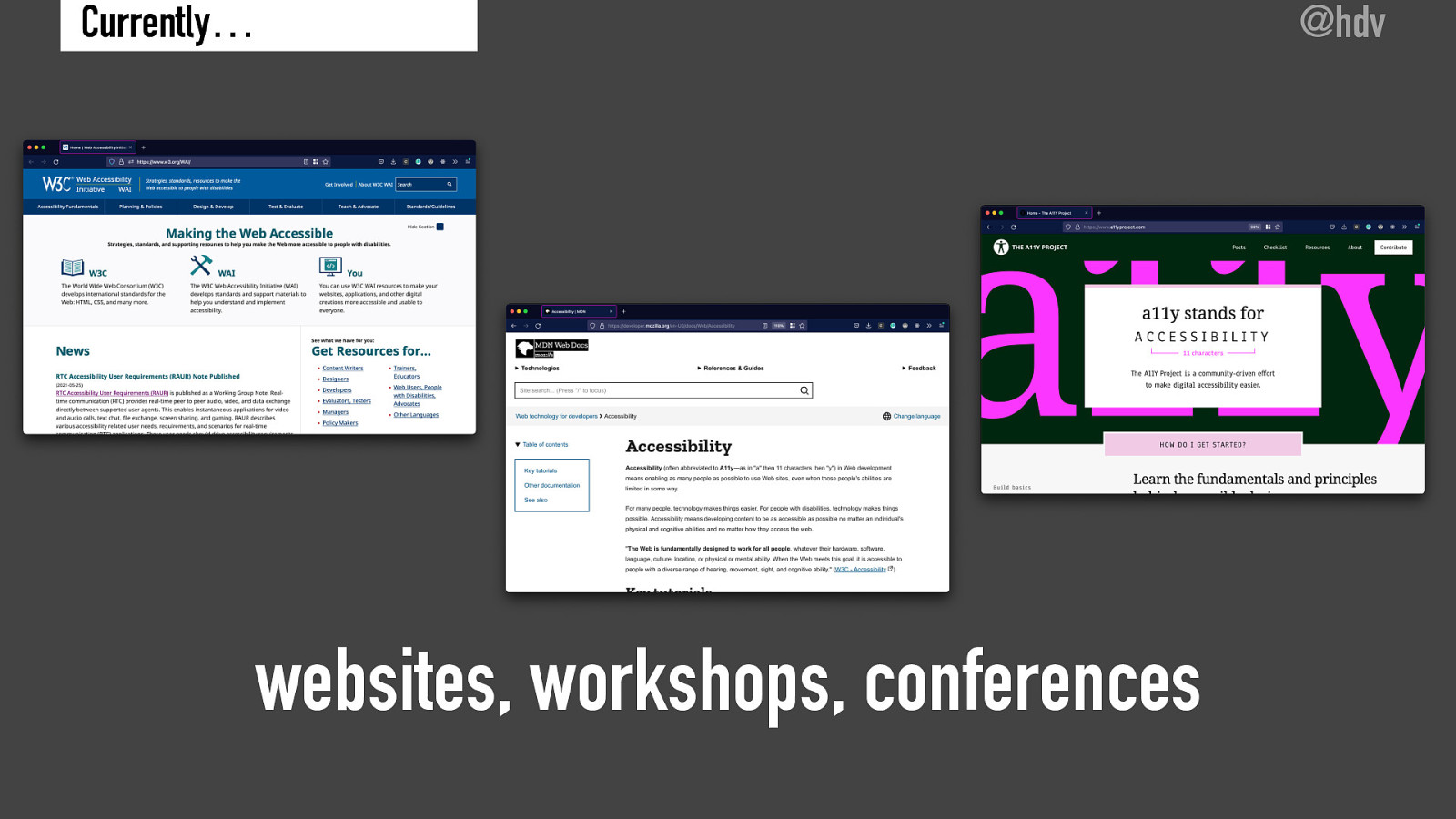
Now, a lot of us do accessibility outreach through websites, and workshops, and conferences. There’s websites like the World Wide Web Consortium’s WAI, Web Accessibility Initiative, w3.org/WAI.

There is the Mozilla Developer Network.

There is the Accessibility Project.

And all of these websites are there to help people figure out how to make websites more accessible in all sorts of ways.

Of course, many of us teach workshops to teams and organizations that are trying to make their sites more accessible.

People go to conferences, attend conference talks, give them, so a lot of this is happening.

And a lot of it is like furthering our field and ensuring that the web becomes more accessible.

Slide 4

Slide 4

Now, all of this outreach is really great, but I feel it does not reach all.

There’s always going to be people who are, don’t get this information, they didn’t find out about making the web accessible.

They were never taught, you know, they should be.

And of course, there is also a lot of websites out there, as I mentioned before, that may not have a specialized team that is actually working on that content.

And still, people might want to access that content.

So accessibility outreach doesn’t reach everyone.

And I feel for that reason, it makes sense to look at ways to automate some of this work.

Slide 5

Slide 5

Now, we can detect accessibility problems automatically and I think that’s a really interesting, interesting field.

Slide 6

Slide 6

Something to mention in that regard is ACT-Rules, which is a task force of the accessibility guidelines working group at the W3C and ACT-Rules is a group of people working for vendors of automated testing tools to try and harmonize, and somehow standardize what accessibility testing rules look like.

So in some way you could say they are an interpretation of WCAG written as testing rules.

Slide 7

Slide 7

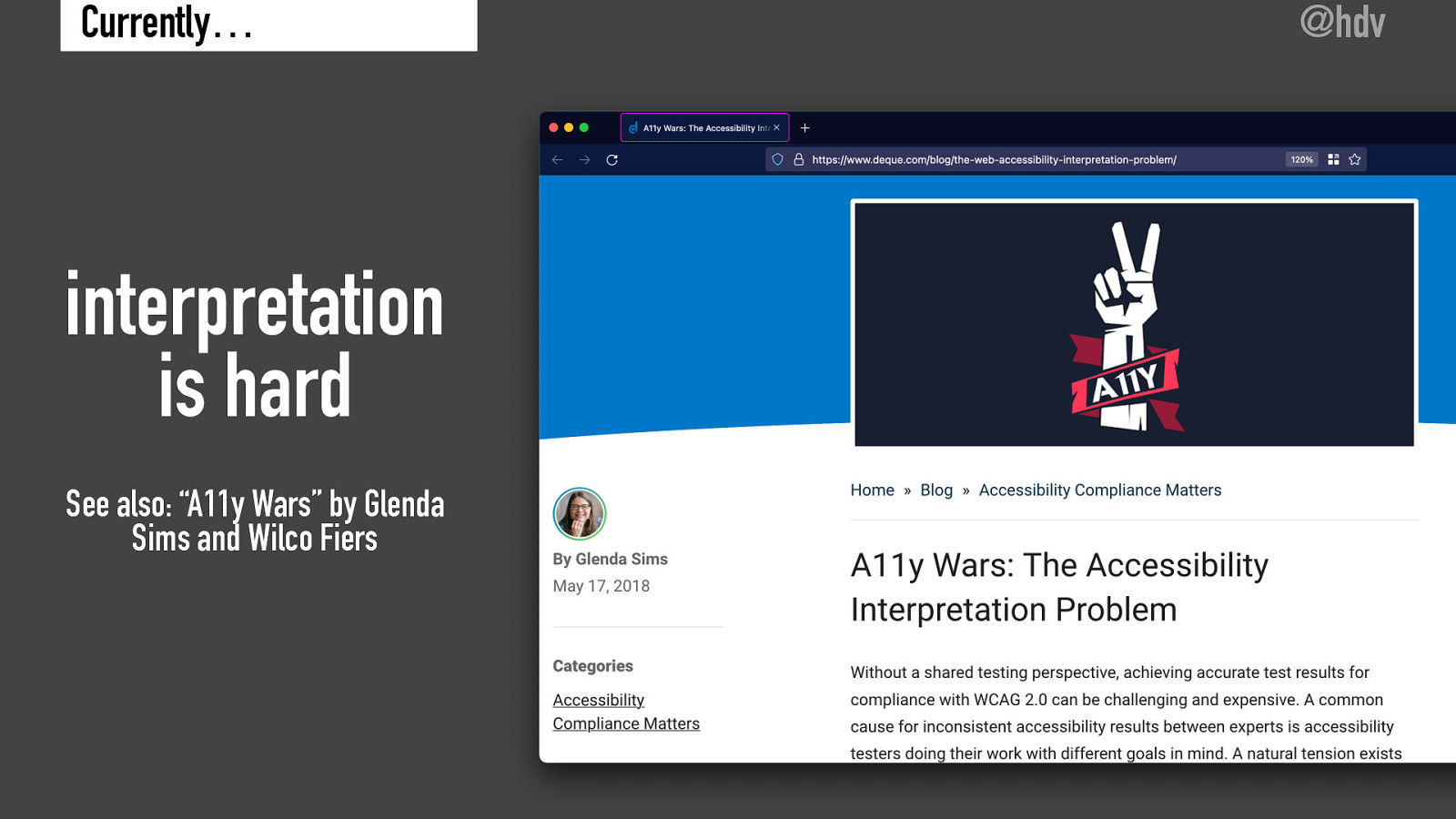
Now, interpretation is hard, that’s one thing to note, as Wilco Fiers and Glenda Sims have done in their blog post, “Accessibility Wars: The Accessibility Interpretation Problem.” This blog post is all about, if you ask a number of different accessibility specialists to look at your website, they may give you completely different results or somewhat different results because sometimes they might interpret some of the WCAG criteria differently.

Interpretation is difficult, and this is nobody’s fault.

If we would have a standard with very easy to interpret guidelines, we would need a lot of them.

We would need a lot more success criteria to make that work.

So it is a balancing act between how easy is it to test?

How objective are these criteria? Versus, how many of them do we need?

And lots of other factors as people well versed in WCAG might well know.
Slide 8

Slide 8

Okay, so we can automatically detect issues on websites and that made me think maybe we can also automatically fix issues.

Slide 9

Slide 9

It’s important to note that we cannot automatically detect everything, we are talking about a small subset of issues here, so we can automatically detect the small subset issues and also automatically fix any small subset of issues, so it’s not everything but it is something.

Slide 10

Slide 10

Now important to know is, and I’ll repeat this later in the presentation, it doesn’t relieve website owners from their responsibility.

So ultimately, anyone who owns a website needs to make sure that it is accessible anyone who builds a website needs to make sure they do this in an accessible manner and designers and content people they’re all responsible.

But if they fail to do it, end users might still want to access the content, hence I feel it is important to try and look at other ways that inaccessible content could still be fixed by browser in some way.

But yeah I don’t mean this as a get out of jail for free card.

Slide 11

Slide 11

In fact, I feel these are kind of parallel structures so on the one hand organizations need to get their accessibility right, they all need to look at making sure that they have the right governance structures.

Make sure that the right people are in charge, that they hire developers that know what they’re doing.

Web designers that understand the principles of accessibility, et cetera, et cetera.

That’s one path, but then I think parallel to that, we could also try and make sure that browsers can fix things when they are able to and this talk is very much about this last bit, when are they able to do that?

And when would that make sense?

Slide 12

Slide 12

Now this may remind you of accessibility overlays, and I should highlight that, you know, accessibility overlays have issues.

They include that some of the vendors of these overlays, they make false claims, so an overlay is a product that website owners can buy and install on their website.

Sometimes it’s advertised as you can only, you only need to put in one line of JavaScript and automatically your website will now be accessible.

Claims like that are very tricky because as we said before, we can only detect a very small subset of issues and anyone who claims that they can detect all accessibility issues is lying.

Something else that is a problem with overlays is that they don’t always work well. And sometimes they might make things worse as well, for people with disabilities.

So that is a thing to look out for.

I don’t think it’s a problem necessarily with automatically fixing issues per se. I think it’s a problem with how the specific overlay products have implemented and if it shows one thing, it is that this isn’t an easy thing to do because you do need to get it completely right for it to really, really make sense.

Something else to say about overlays is that they only fix the websites that they’re installed on. So some of these overlay vendorsmay sell their product and charge per website, so the website owner will need to pay and not all websites will have these overlays.

So if you would install an accessibility overlay, you’re not really contributing to the larger problem of, you know, websites on the web at large, not just the ones that you want to fix, but all of the websites on the web. I think that scope is more interesting and that’s the scope we’re looking at today.

Another thing to say about overlays is that they often don’t work well with the DOM updates, which are done of course, by a single page applications.

They will replace parts of your web page sometimes based on what is happening in JavaScript, so just states that is kept in JavaScript will influence which part of the DOM are replaced, and these overlays might not always realize that part of the DOM has been replaced. So sometimes that just doesn’t work very well.

So these are caveats and you can find these and more on a website called overlayfactsheets.com and on this website, a number of accessibility practitioners, including myself, have signed this manifesto where we say, you know, accessibility overlays have issues and, you know, please don’t use them.

Slide 13

Slide 13

This is also something that users of overlays say. There’s a blog post by Connor Scott-Gardner a blind student who was using one of these overlays and reviewed it on his blog.

And there, he said it was far easier to navigate the post without the overlay. So many of these users actually are saying, if we would remove the overlay, things would be a lot easier for us.

Now, that’s not good news for the overlays, that’s not great and that’s definitely something we would want to avoid if we are gonna try and fix these problems in a browser.

Slide 14

Slide 14

So there are a lot of caveats, yet still I feel otherwise I wouldn’t be standing here talking to you today, I feel like we could fix more problems automatically with browsers, with all these caveats in mind. So we have to make sure that we get the heuristics right, and that we don’t make the mistakes that some of these overlays are making. And also realize that the scope of what we can do and what we cannot do, because you know, it’s about a small subset and it should be about a small subset.

Slide 15

Slide 15

So the way that I’ve structured this talk, is that I’ll be introducing a number of different features that I imagine browsers could have. Now I’m imagining all of these as checkboxes, just for the sake of argument, but I imagine any browser engineer or user experience people at the browser might find better ways to add that dysfunctionality. I’m just saying they’re checkboxes so that we have something to talk about it today, but, you know, I imagine these to be implemented in whatever way works best in the particular browser. So let’s look at the first and the first number that I have are actually features that already exist in browsers. And later I’ll be talking about some features that don’t exist yet, but I feel they could. Now the first one I want to talk about is, what if browsers let us force readability?

Slide 16

Slide 16

So what if there is a setting that would force readability? And if you turn it on stuff that is previously not readable, becomes readable magically, this is important because as Oliver Reichenstein of, an information architect said, web design is 95% typography. It is incredibly important for websites to get their topography right and yet we do find a lot of websites that struggle getting their layout right.

Slide 17

Slide 17

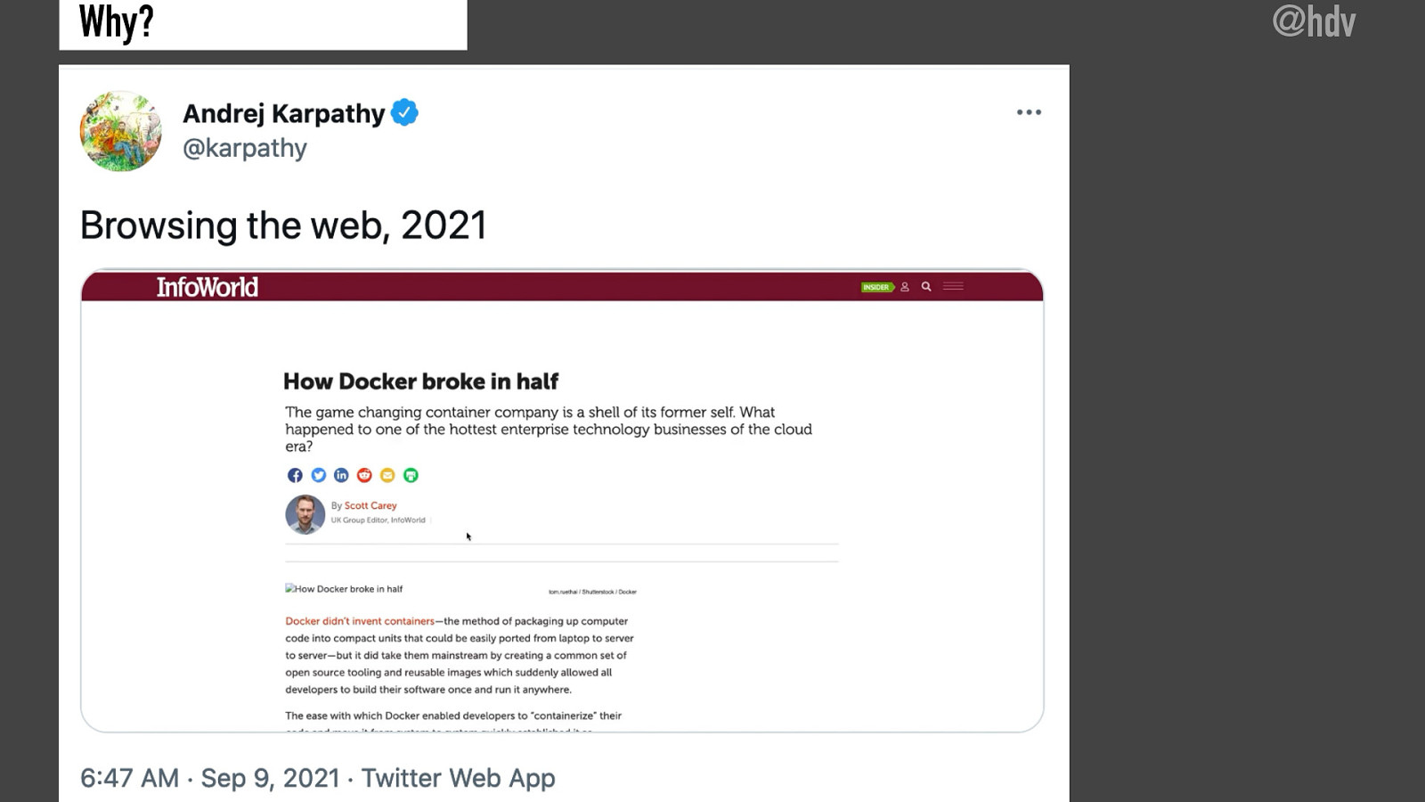
Partly because they implement things like cookie warnings because they must collect data, so they must have cookie warnings, things like paywalls, advertising that takes over most of the page and then sometimes there’s these newsletters subscription things that kind of appear on top of the page and all of these things together combined on one web page can really make it hard to browse the web in 2021. So this is a problem and browsers have taken notes because they have actually implemented stuff to make readability better.

Slide 18

Slide 18

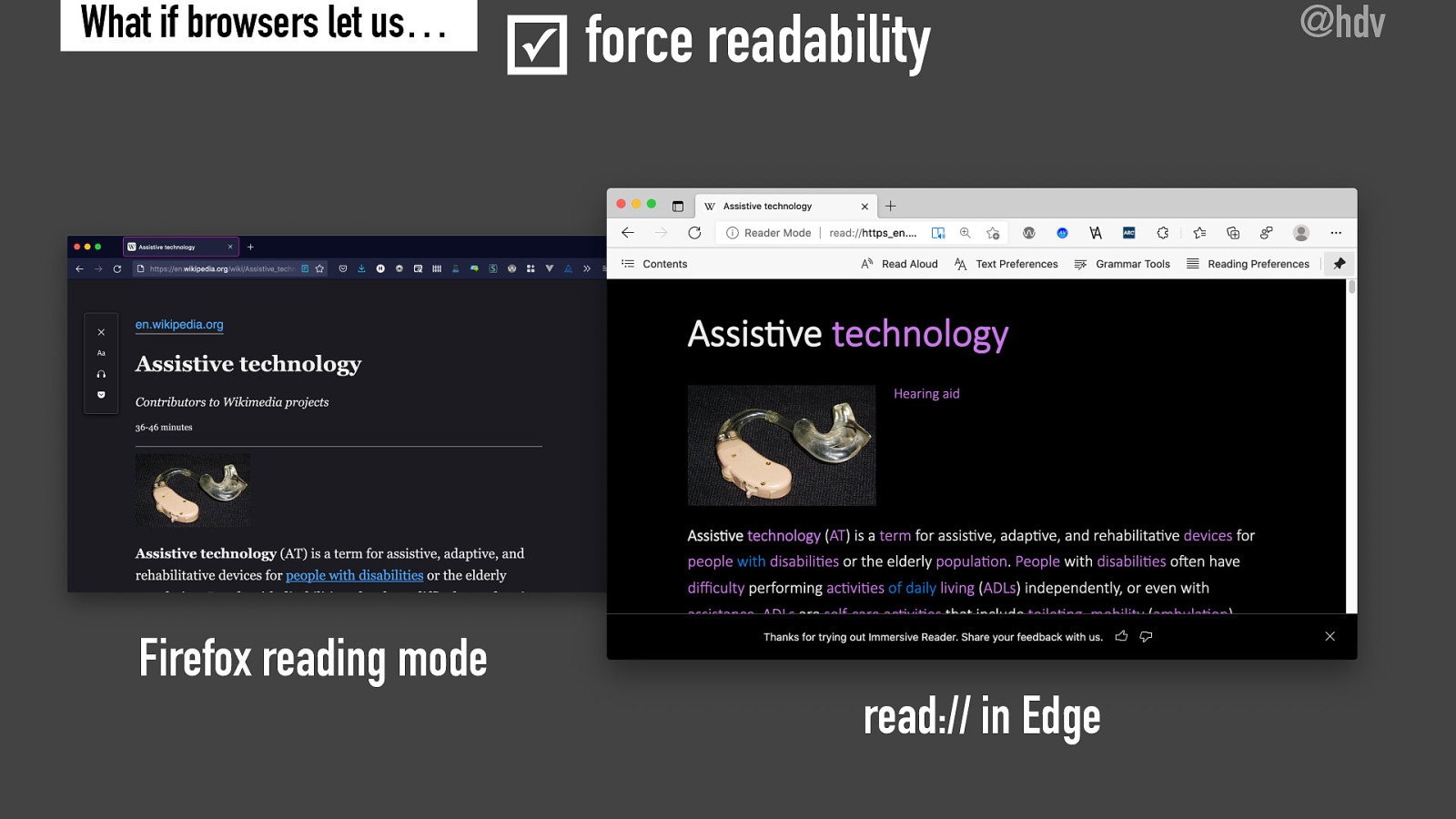
So what if you saw some content that you found hard to read, if you could check this checkbox that says force readability and all of a sudden your content is formatted in a way that makes a lot more sense. So line lengths are nice and make it easy to read, the type phase is something that you find easy to read, the color scheme makes sense and all of the kind of rubbish in the page has disappeared.

Slide 19

Slide 19

And now this is actually functionality that exists in browsers today.

Slide 20

Slide 20

Firefox has this as a reading mode, it’s on Edge, it’s in a lot of mobile problems, including on iOS. And often you can do things like change the color scheme, pick fonts that you prefer, you can even often have the content be read aloud to you, if that makes more sense for you. So a lot of customization is possible here. So this first functionality, force reliability is something that actually exists in browsers today.

Slide 21

Slide 21

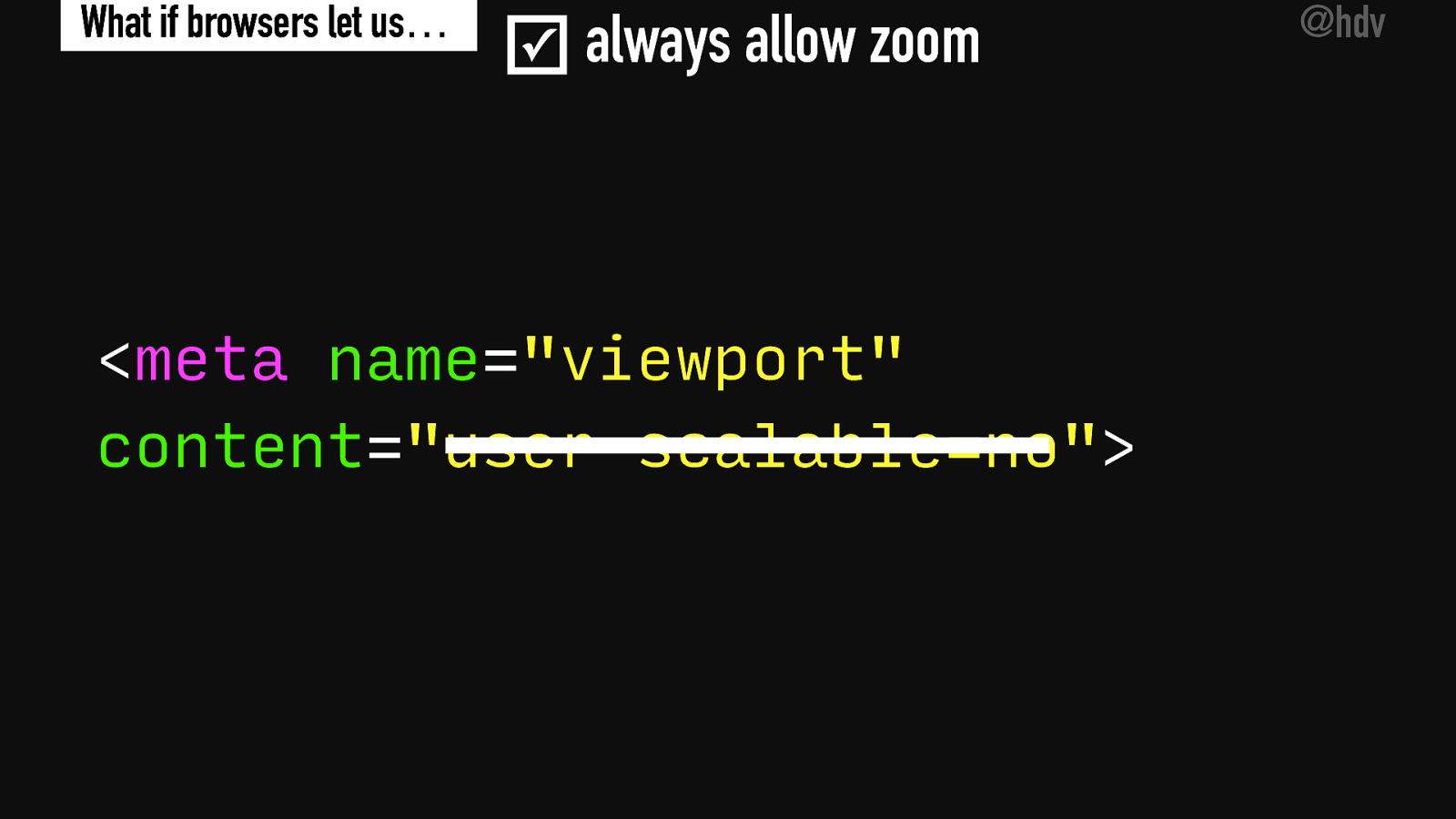
What about zoom? I think that’s another aspect that many users of the web would like to do, but there is a thing in web pages that they sometimes do, which is, that they disallow users to zoom. Now, sometimes that’s because they don’t want the user interface to be zoomed for one reason or another. But often this is problematic for end users because they might not be able to read the content and they need the zooming in order to do that basic thing, accessing the content. So I’m proposing what if we had a checkbox? What if browsers would let us always allow zoom and the checkbox, would just do that.

Slide 22

Slide 22

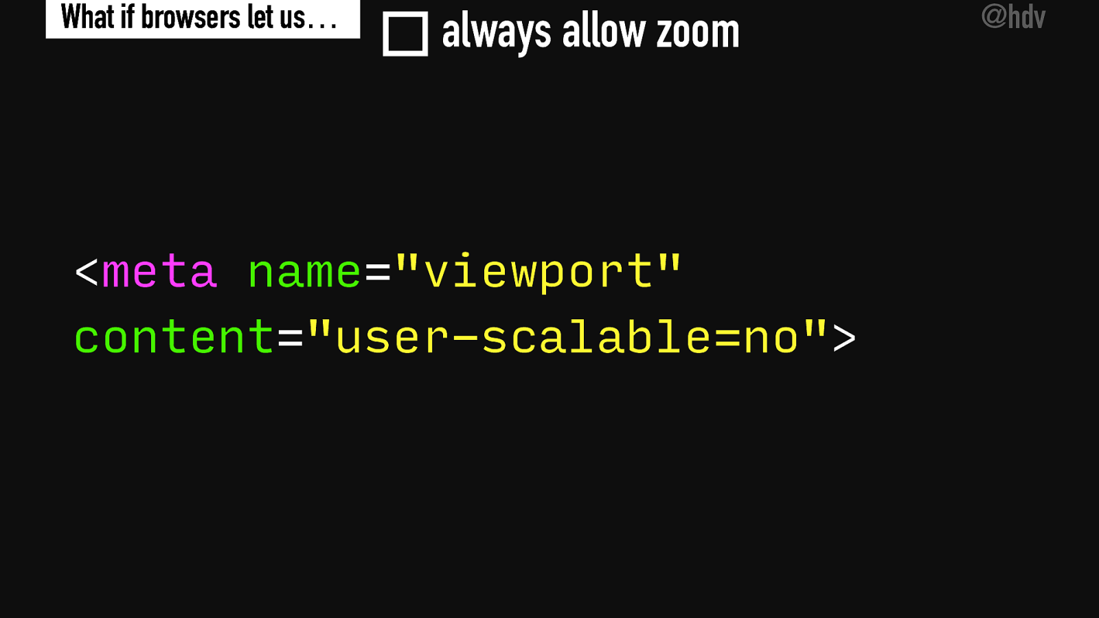
So there’s the meta tag, name equals viewport, content user scalable- no, that is something that prevents the zooming and if we would get rid of that user scalable-no, somehow or if the browser would do that, that content would suddenly become a whole lot more accessible.

Slide 23

Slide 23

It would get rid of that user scalable-no thing.

Slide 24

Slide 24

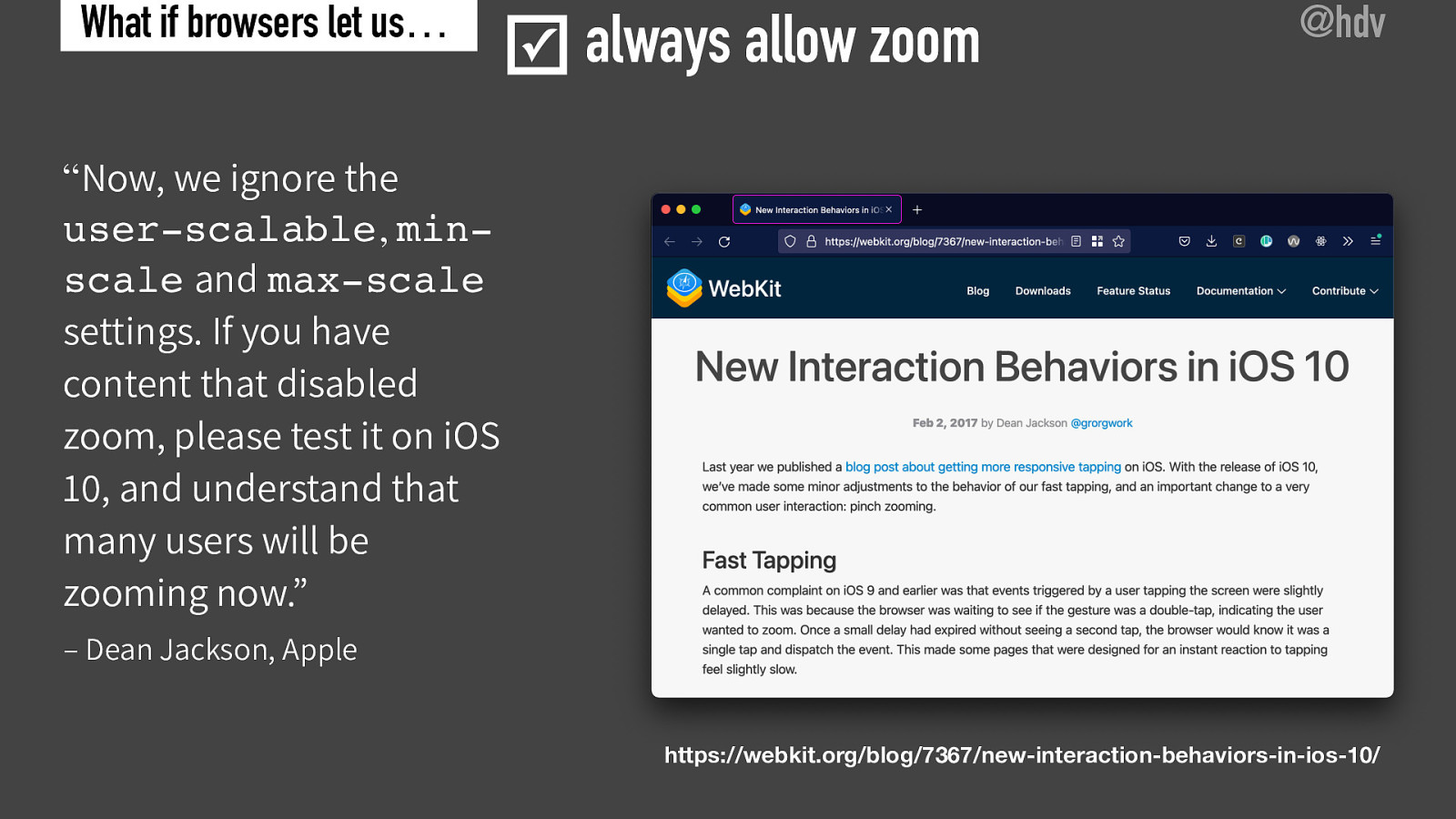
Now this is actually something that also exists, not as a checkbox, but it’s something that some browsers have started doing by default. For instance, Apple announced in 201 that they ignore, they started ignoring the user-scalable min-scale and max-scale settings and they recommend developers to test with that, because, you know, they want to make sure that users are able to zoom and they kind of prioritize the user here above kind of what the developer wants. Now, sometimes this can be tricky for developers. I once worked on a product where we had avatars for users, they would upload their photo and then they wouldn’t be able to crop the content. Now, this is really hard to build for touchscreens, if you’re not able to suppress zoom because pinching to do your cropping will then conflict with zooming in the webpage.

So that was kind of an example of where it would be useful to suppress zoom, but I feel like it’s been abused so much that it only makes sense that browsers have decided, you know what, we’re going to disallow this for everyone, always, There are still a couple of browsers that will listen to this meta tag, so, I feel like it would be good if they would also follow what Apple has done here.

Slide 25

Slide 25

Now, what about color contrast? It’s among one of the most common accessibility issues on the web.

Slide 26

Slide 26

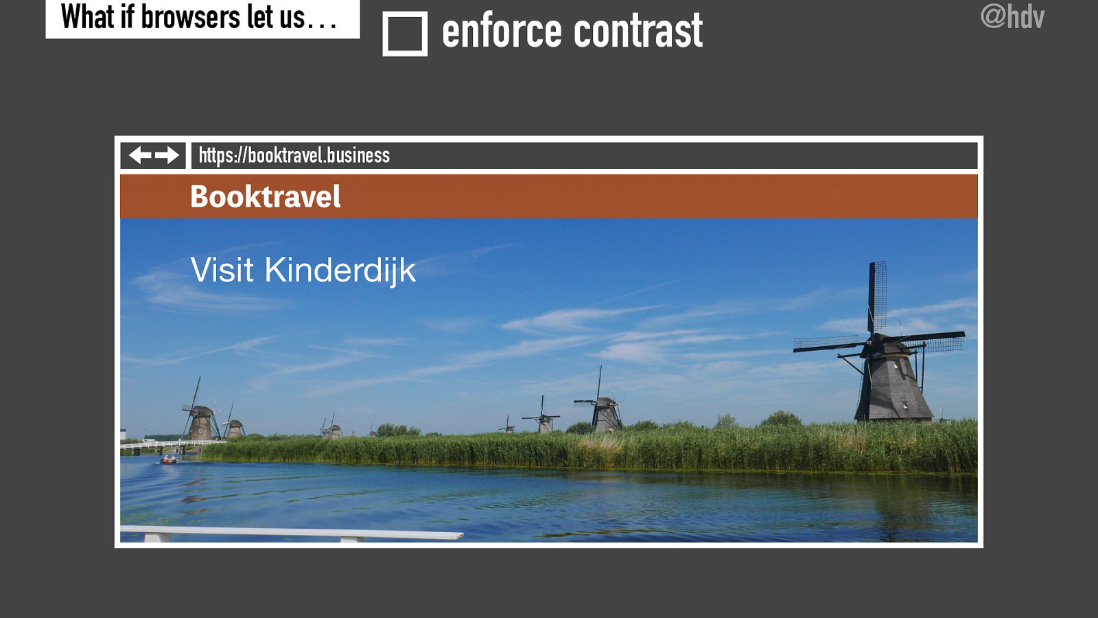
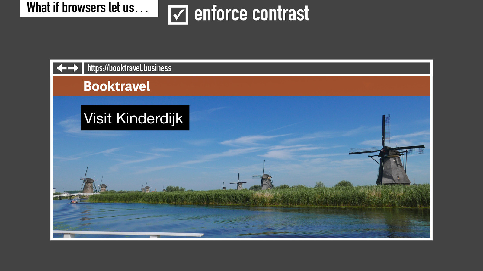
And I feel like there’s a lot that browsers could actually do to make contrast better independent of what websites do. Imagine you have this webpage where there’s a photo in the top of the web page, which has a bit of text overlaying it. Now often this has been designed by a designer to have picked a photo and some color, and maybe they have taken contrast into account. But then this content goes into a content management system, someone replaces the photo and doesn’t realize that they’ve now introduced a color contrast problem, and this could easily happen, so if you have a very light photo with some light text on it, then often, you know, what happens is that the content becomes unreadable for large amount of users.

Slide 27

Slide 27

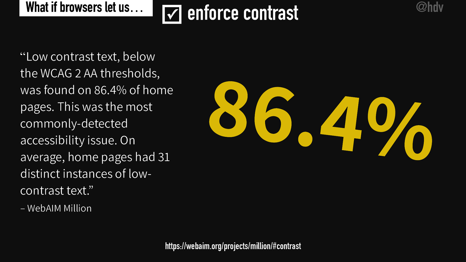
And this is a very, very common issue. I’m quoting WebAIM Millionaire and they said in their latest report, that “low contrast text below the WCAG 2AA thresholds was found on 86.4% of home pages. It was the most commonly detected accessibility issue. And on average home page had 31 distinct instances of low contrast text” so it is very common that web pages have color contrast issues and if they do, they often have many issues as well. 86.4, that’s a lot of websites and basically the users of these websites are at the mercy of content creators, at the mercy of web designers, to get readable content for themselves.

Slide 28

Slide 28

How could browsers fix that?

Slide 29

Slide 29

So something that a browser could do to fix this problem, independently of what the website owner wants is that they could draw back plates behind low contrast text so if there’s a white text that is on top of a light photo, what they can do is draw a black background behind that white text.

Slide 30

Slide 30

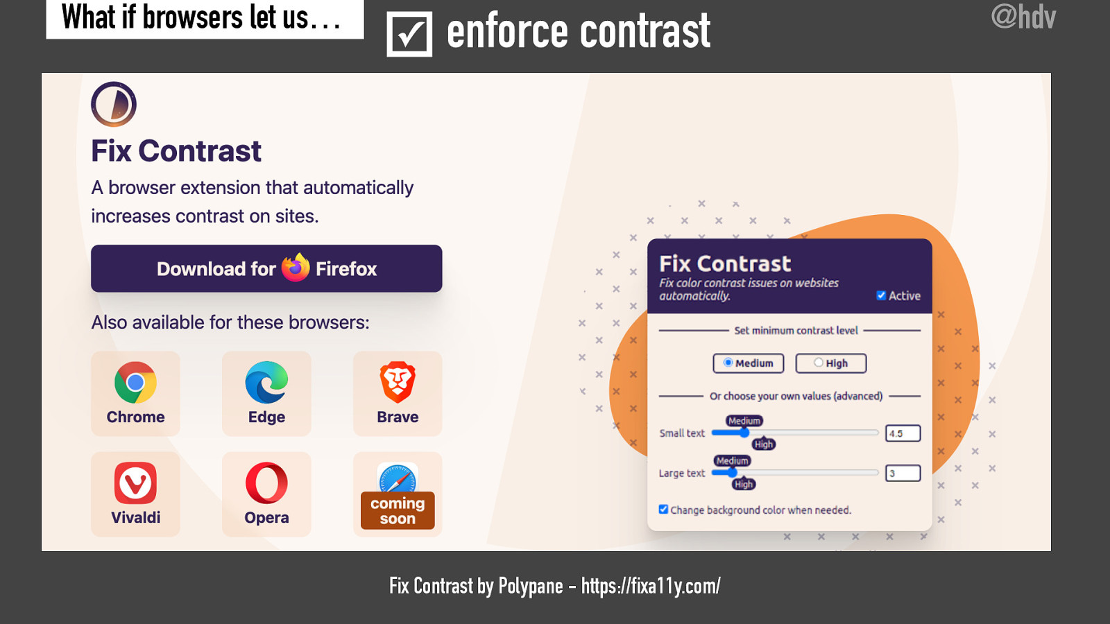
This is actually something that the people behind the Polypane browser have built in the form of a plugin. They call this the Fix Contrast plugin, and you can download it for various browsers. And what it will do is when it’s turned on, it’s going to look for contrast issues and automatically fix them, so if you have a bit of light gray text on a webpage, it is going to bump that up to kind of black text if it’s on a white background, just to make sure that the contrast is sufficient and in the settings, you can say how much contrast you want. So whether you want it to meet WCAG double A, or maybe triple A, or even some custom value, if you want a lot of contrast. Now, if you browse the web with this thing turned on, you will see a lot of websites that are not as the web designer intended it or as the content the editor has intended it, but you do see these web pages in a way that works for you.

Slide 31

Slide 31

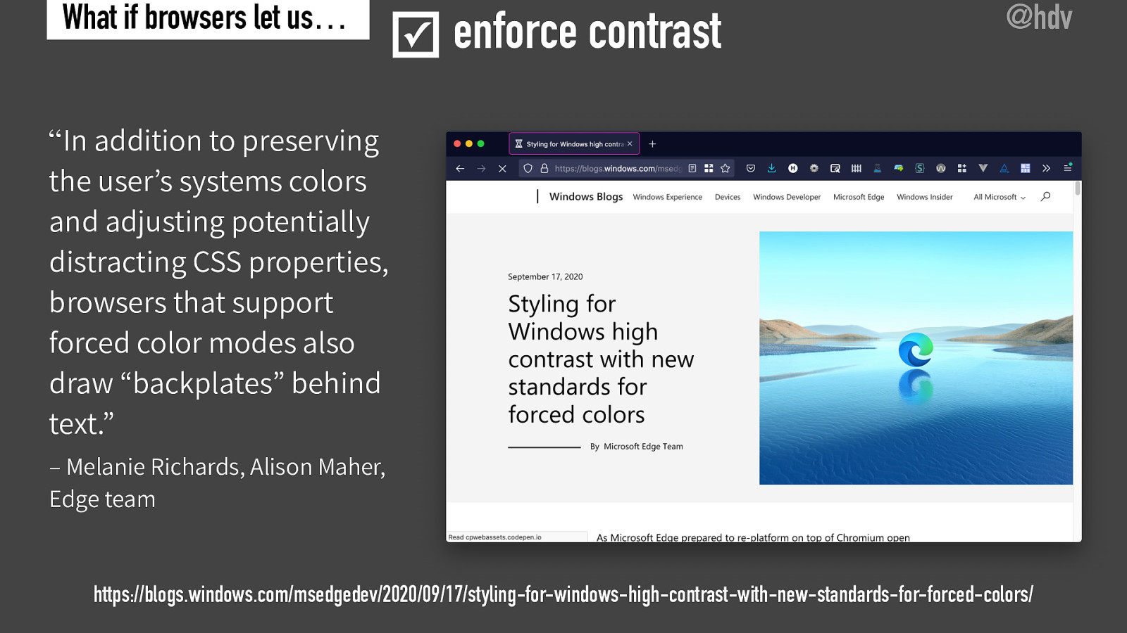
So these are, I think, this is functionality that is very useful for end users and it gives them more control over how they view websites. Now, this is also something that Microsoft Edge will do when you have Windows high contrast mode turned on, there’s a blog post by Melanie Richards and Alison Maher called “Styling for Windows high contrast with new standards for forced colors.” And in this blog post, they explain a number of things about how high contrast and forced colors works. But they also explained that in some instances, the browser will draw backplates behind text a bit like I mentioned before, where if you have a bit of white text on a white background, you would draw a black bar underneath and you know, this can have lots of different variations, but the gist of it is that you adjust the contrast by adding a background color to text that would otherwise have insufficient contrast.

Slide 32

Slide 32

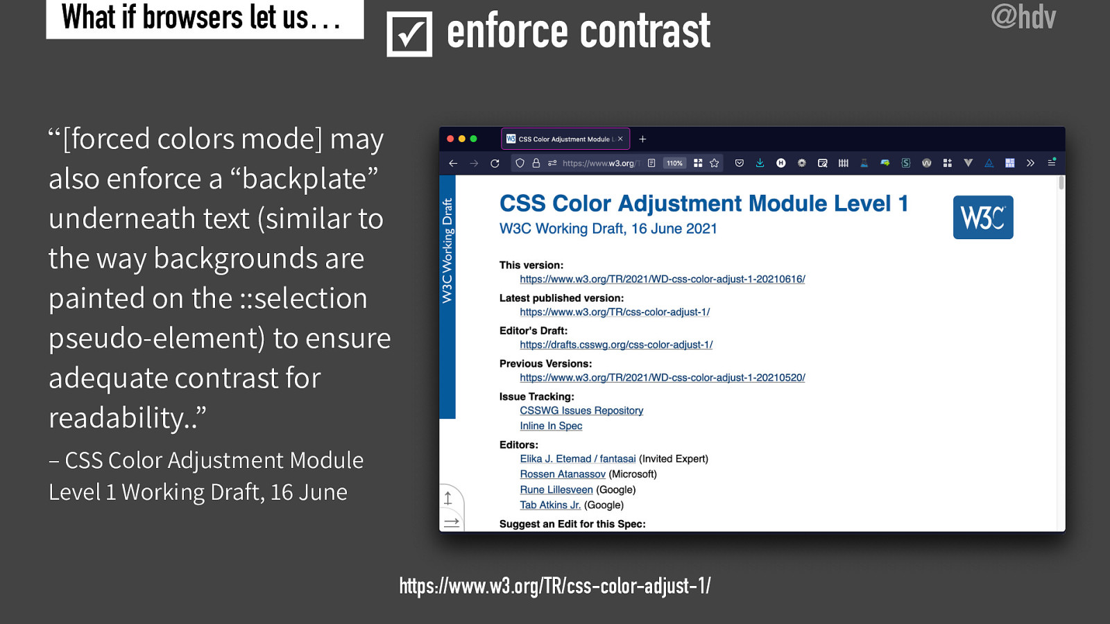
Now, this is actually something you can also find in the CSS specification “Color Adjustment Module Level 1.” And in this module, which is about things including force colors mode, they also recommend or say that browsers could enforce a backplate. They say they may also enforce the backplate, actually record it properly. And so this has also made it to the standard for colors. Color adjustment module as I said, level one.

Slide 33

Slide 33

Now, one other issue that I find when I audit websites is that they don’t offer a focus indication. This is something that browsers do by default, so when you’re browsing a webpage with just your tab key, or when you’re using certain assistive technologies, you rely on the focus indication to find out where you are on a page. And sometimes websites will

Slide 34

Slide 34

And sometimes websites will use CSS to turn that off because just like you can turn off the mouse indicator. You can also turn off the focus indicator and this is something that sometimes website owners decide to do. And this means that people using that website will be unable to access and find out where they are.

Slide 35

Slide 35

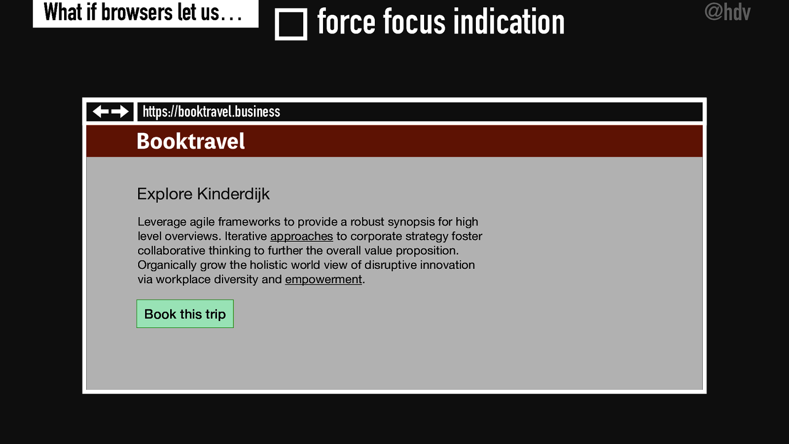
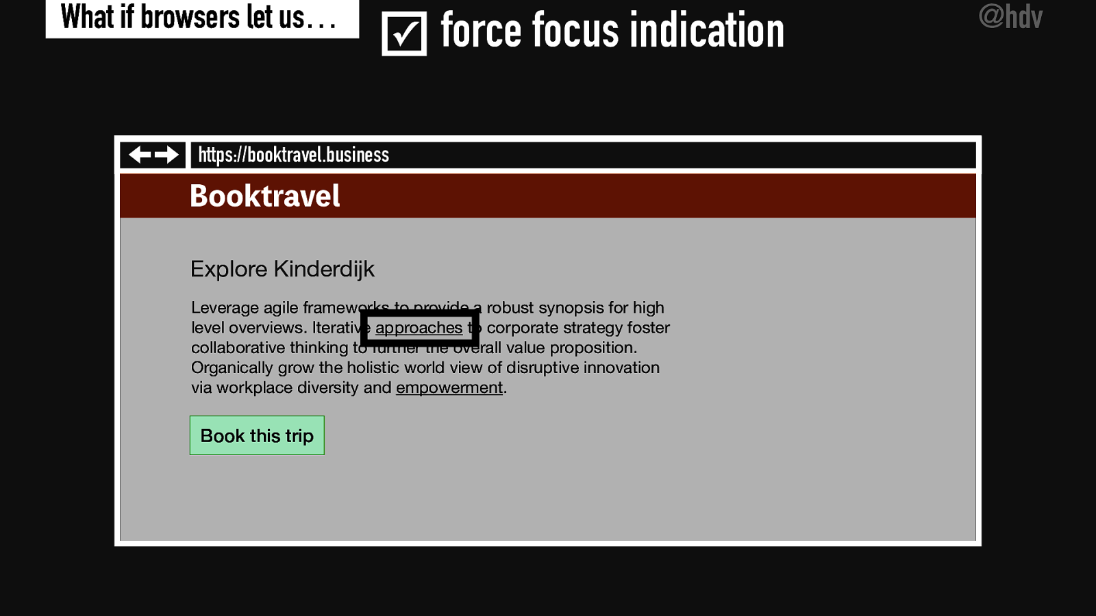
So on this slide, you see a screenshot of a bit of text with some links in it and I’m currently focused on the link approaches, but you cannot see it because the website owner has decided to undo the focus style, so you don’t know where I am. Now, if I would turn on this new checkbox called force focus indication, the browser would just highlight it for me in a very clear manner, so it would maybe use a 10 pixel black border to just say, you know, this link is the current one, this is the one you’re currently on. Now, this is very utilitarian, like you just want to know where you are on the page and you don’t care if it’s pretty or not. So maybe the original website designer would shrug when they see this. and not like what this looks like. But as a user, you now know where you are and that’s kind of your goal when you’re on this website, because you want to find out which link here are clicking on and maybe you want to, you know, book a trip or whatever, get on with the task that you’re on this website for.

Slide 36

Slide 36

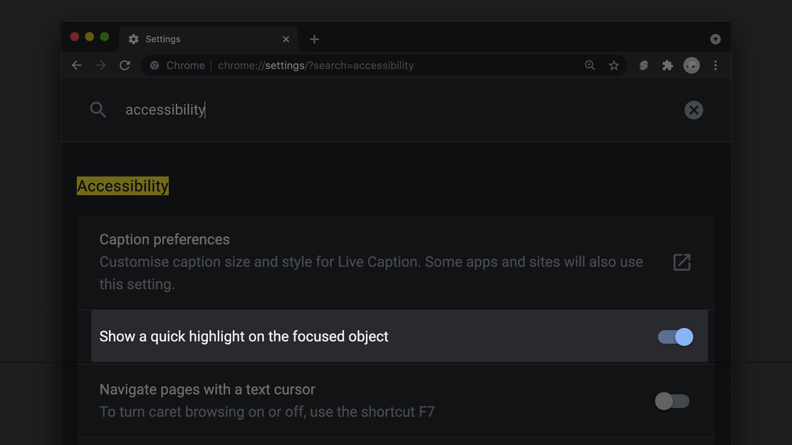
So force focus indication would help you do that and help you understand where you are. Now, this is actually something that is in the Chrome browser. Chrome has an accessibility settings, and there’s this feature called “Show a quick highlight on the focused object.” And if you turn it on, what it will do is show a quick highlight, as the feature says, it’s not going to stay there, so, it is going to disappear. It’s not exactly what I’m proposing here, but if that’s very close to that, and it is a really good way to figure out where you are on web pages, even if those web pages have turned off focused indication.

Slide 37

Slide 37

Now looking at the next piece of functionality, I think routers could also suppress autoplay. If there was a setting called suppress autoplay, they would be able to make web content a lot more accessible because sometimes audio, video and gifs can disturb users.

Slide 38

Slide 38

And sometimes videos and gifs can actually cause seizures with some users with disabilities. And this is a problem, and you know, some website owners will make sure that content doesn’t autoplay, or there’s a possibility to pause this content.

Slide 39

Slide 39

And they should if they’re following WCAG but if they don’t, then the user might still encounter this content, so I feel like a setting like this suppress autoplay would really help those users. Browsers could just suppress what the video is doing, what the audio is doing and let the user choose when to play.

And I’ve seen some browsers are able to do this with videos, so, not do any autoplay and I feel like this would be a feature that would be very helpful for some users.

Slide 40

Slide 40

Now, what about navigation by landmark? I feel that could be another setting that would be very useful for people with disabilities and everyone alike.

Slide 41

Slide 41

So landmarks can make it easier to efficiently jump to a specific parts of a web page. You might have a header or a couple of navigation elements. You might have a footer or a main element, and you want people to jump to that area.

Slide 42

Slide 42

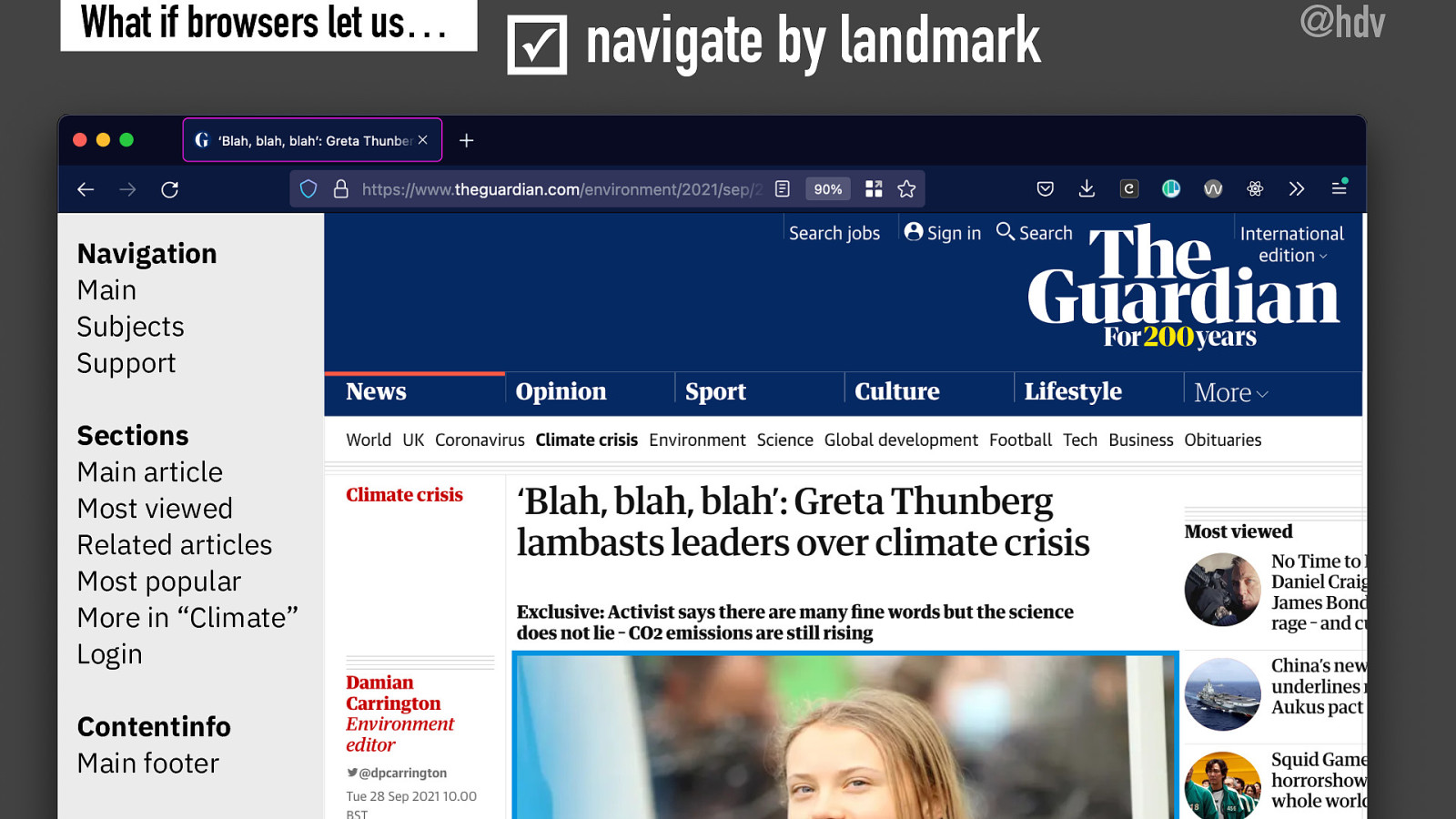
Now, if you use the right markup you are able to specify what your landmarks are on the page and that way you make it easier for people to find these landmarks, but currently landmarks can only be navigated to using certain assistive technologies.

So certain screen readers will offer a menu that allow you to jump to landmarks directly. What I think would be really useful is if browsers would actually display these landmarks and allow any user to jump to the right area.

Slide 43

Slide 43

So here I have a screenshot of an article in The Guardian and here is a list of navigations, main, subjects and support, and basically what this would do is it would allow you to jump to any of these navigations. There’s a list of sections main article, most viewed, most popular and again, you would be able to jump to the sections directly. This is something that screen reader users can do if they use that landmark menu. And I think it would be nice if all users would be able to do this and maybe it would even encourage developers to name their landmarks well, and to choose their landmarks well. Now this one is a little bit risky because even on, on this particular webpage, I’ve had to make up the names for these landmarks because they didn’t exist on this prominent newspaper website. So a problem with this functionality may be that there are not a lot of websites that actually have useful landmarks. Maybe this functionality could help developers understand how they need to do that, but, you know, it might not make the functionality very useful. So that’s a little bit of a chicken and egg problem and a problem that’s also currently experienced by people who use screen readers. And it would be something that then more people would experience, but it wouldn’t necessarily be good. So, you know, I’m a bit torn between whether this is a good idea or not.

Slide 44

Slide 44

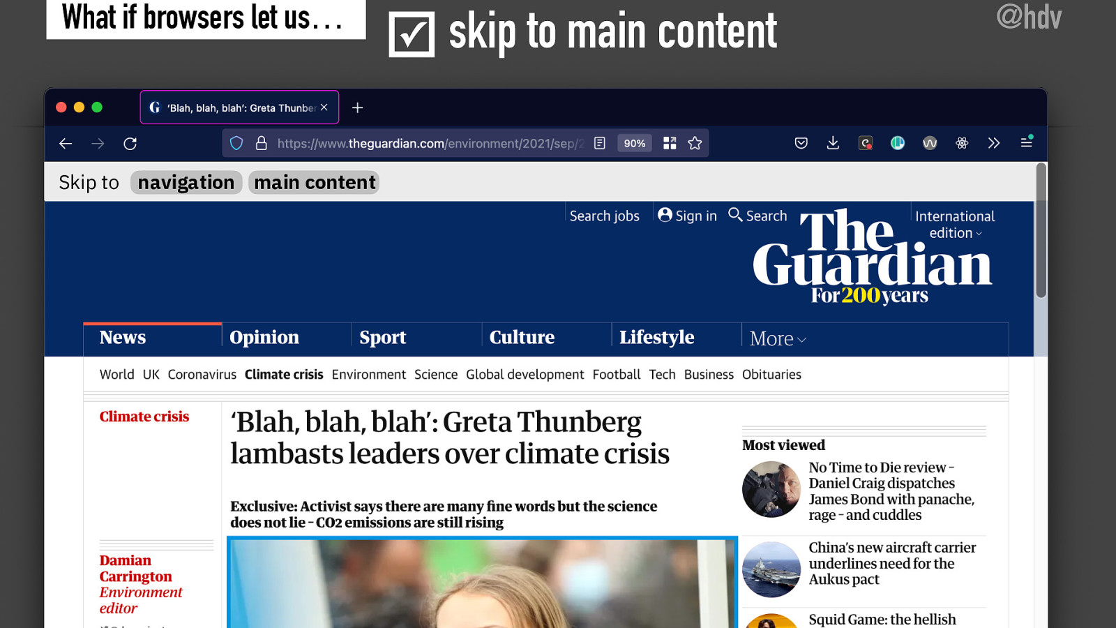
Kind of related to that, you could also have a functionality called skip to main content, which would automatically have some skip links for users.

Slide 45

Slide 45

Because currently web developers implement their own skip links so that users can skip to the main content or skip navigation, that sort of thing.

Slide 46

Slide 46

Now, what if browsers would provide a skip link whenever a main element is available, or maybe there are multiple available, which, you know, according to the specification you shouldn’t be doing, but you know, some websites do that, I know for sure. What if browsers would take that information and display a skip link, maybe based on, again, a checkbox where the user says, I want to see skip links when they are available.

Slide 47

Slide 47

So they could display a bar on top of a page, which allows you to skip to any of the named landmarks, perhaps, or maybe only to the navigational landmarks or the main landmarks. I think that would be a very useful thing to have as well, very closely related to that landmarks menu that I mentioned earlier.

Slide 48

Slide 48

Now let’s move to sticky content. A lot of web designers love to make things stick on the web and it is currently possible because in CSS, we have disposition, sticky functionality. And I think that is a really cool thing to have.

Slide 49

Slide 49

But for some users, it might be quite disturbing, especially if users have their page zoomed in and the content kind of overlaps with a lot of other content, so sometimes sticky elements can cover too much of the screen, especially when zoom is used.

Slide 50

Slide 50

So I feel like it could be really helpful if browsers would stop the sticking. Again with some kind of setting that you could find in accessibility settings or somewhere else called unstick content and it would just automatically get rid of all the position sticking elements. When I looked a bit into this, I did find a couple of browser plugins and bookmarklets that you could use to do this, but wouldn’t it be nice if browsers would offer this by default?

Slide 51

Slide 51

Now, another one that’s interesting, I think is to avoid overlap in content. That would also be a very useful feature to have built into browsers because sometimes elements start to overlap and especially happens when a user zooms in, more than the designer had expected.

Slide 52

Slide 52

So commonly, overlap wouldn’t really exist when the website is used in kind of a 100% zoom because often the website would have been tested on that zoom level, but not all website owners test their websites where zoom level was like two, three, 400%, they should do when they want to meet WCAG.

Slide 53

Slide 53

But as I mentioned before, not all websites are doing that. So sometimes that could cause elements on the web page to overlap and I feel like it would be really helpful if browsers would automatically stop that and avoid overlapping content. This could make the web page look worse and not as intended. It would make things less aesthetically pleasing, but it would be a really nice thing to have for end users so that they can access all the content that’s there without seeing overlap. So basically browsers would be acting when overlap happens and prioritize readability over UI perfection.

Slide 54

Slide 54

Now, one other thing that I think is interesting that browsers could do is to stop truncation

Slide 55

Slide 55

Because truncation sometimes gets used as a content design strategy as Karen McGrane once beautifully said, and it is not a good strategy.

Slide 56

Slide 56

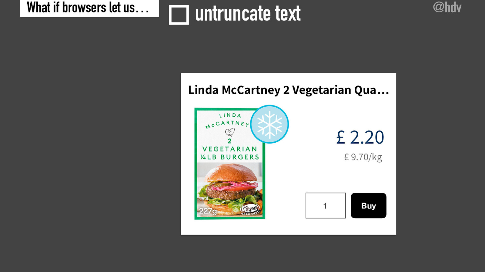
Let’s say for instance, we are on a website that displays some sausages that you can purchase, Linda McCartney, vegetarian qua and then there’s three dots that is not very helpful for users because then they don’t know what sort of product they are looking at.

Slide 57

Slide 57

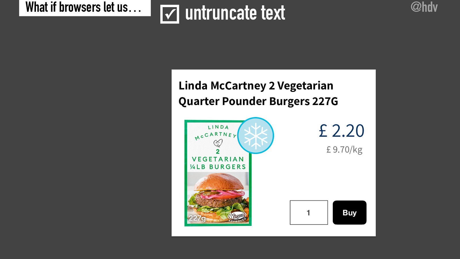
Now, browsers would actually ignore that, this is done with a CSS property called text overflow. If it’s set to ellipses and the element has overflow hidden, these three dots are displayed. Now what a browser to do is kind of, get rid of the application of that property and kind of undo that and make sure that the whole content is displayed so that users can then see what they’re actually looking at.

Slide 58

Slide 58

In this case, it is Linda McCartney, two vegetarian quarter pounder burgers that are 22 grams.

Slide 59

Slide 59

So with that feature turned on, untruncates texts, all of the stuff on the web would no longer be truncated and it would just display the whole content.

Now, of course, this is only something you can do when the truncation is done with CSS, some websites will actually truncate on the server and then websites, you know, browsers couldn’t do much about that, but at least they could try and do it when CSS was involved.

Slide 60

Slide 60

So I’ve named a number of examples where browsers could step in, again, I wanna emphasize it’s not a “get out of jail free” card, although, you know, developers could then assume the browsers will fix their problems. I think it is really important to see this as a parallel track, so on the one hand developers, yes, they need to get their accessibility right, organizations as a whole need to get their accessibility right, but on the other hand, we can still try to fix things when organizations don’t.

Slide 61

Slide 61

So with that in mind, I think there are a couple more things we could look at, if browsers would guess more, but the ones I’m going to talk about now, I think are a bit more experimental, but just to give me some thoughts. One thing that Safari does is it guesses accessible names.

Slide 62

Slide 62

So when you have an input that is labeled, but the label is not programmatically associated with the input, so maybe you have a development just in front of an input that happens to describe what the input is for, the browser starts to guess that, that might be the accessible name for that input. Now this is a little bit risky because what if that content is not related, but if you compare it to maybe the default, which is completely unnamed input, which has zero context, it might be useful to add that that empty div or that the div will know no relationship and try and make that the accessible name, because in many cases it will actually be more useful than nothing. So this is something that Safari does for inputs. Maybe more browsers could do more of this sometimes.

Slide 63

Slide 63

But it’s really hard to guess, for instance, maybe all one line paragraphs that ends without a period are headings, that might be useful to have. And I know of a CMS that will actually give you warnings when you have a paragraph that actually looks like a heading, but maybe it’s too much to guess and it would cause too many mistakes.

Slide 64

Slide 64

Maybe browsers could use the button role as a hint to then decides to allow an element to be in the focus order and to be used by just a keyboard or maybe not, maybe that is too risky. When I asked this on Twitter, I got varied responses and many people said, well, if you try and do that, maybe you’ ll find that there are a lot of problems, like what if rows get nested and what if there are things you don’t expect, so, you know, this might not be worth exploring, it might be worth exploring, I’m not too sure.

Slide 65

Slide 65

And maybe you could automatically detect bullets and numbers and decide based on that whether something is a list. Again, this may be too risky or it may be helpful to end-users, I think it is important for us to kind of think about this and I invite you to do that.

Slide 66

Slide 66

I’m looking forward to comments on this talk as well. Maybe people have ideas of why some of the things are or are not good ideas to pursue. So with caveats in mind, could browsers fix more accessibility problems automatically? I hope in this talk, I have convinced you that at least in some occasions it might actually be useful if browsers step in and fix web content because for end users it is better if some of these problems are fixed than if they are not, regardless of whether developers do their job or not.

Slide 67

Slide 67

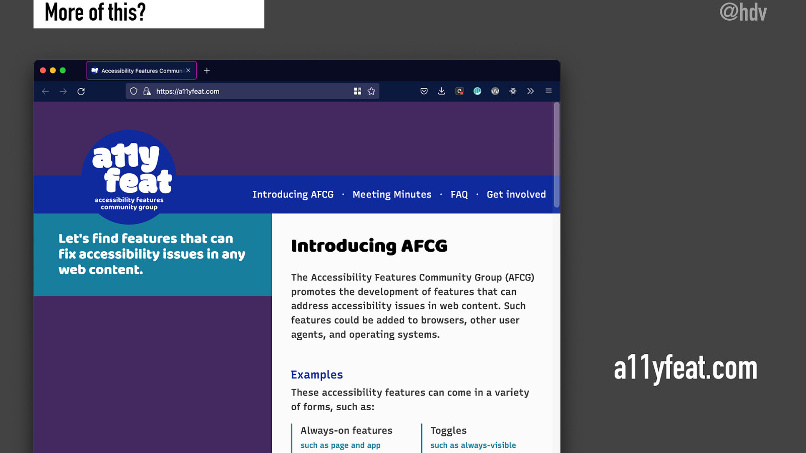
Now some of us have been looking at this problem as well in a W3C community grope, community group, sorry. That is called ally feat or accessibility features. And the goal of this group is to find features that can fix accessibility features in any web content. And we’re distinguishing between a number of different features, like some stuff that might always be on, some things that might be toggles. And the goal of this group is to kind of collect these features, make a list of them, figure out if they are in browsers or maybe not, prototype sometimes and try and encourage browsers to implement some of these features. So this community group, I started together with Eric Eggert and Wilco Fiers, it is currently paused because many of us are too busy to run it. And it would be something that we would be interesting to pursue more in the future. And if this sounds like your thing, definitely get in touch and maybe we can restart some of this group’s work.

Slide 68

Slide 68

With that, I wanna thank you so much for listening and I want to let you know that you can follow me on Twitter @hdv and ask me any questions there as well. Feel free to send me an email on hidde@hiddedevries.nl or follow my blog on hidde.blog. Now thanks very much for listening. And it was a pleasure to be here. I hope you enjoy all of the other talks as well.