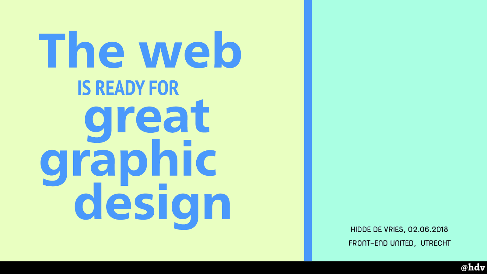
The web
IS READY FOR
great
graphic
design
Slide 1
Slide 2
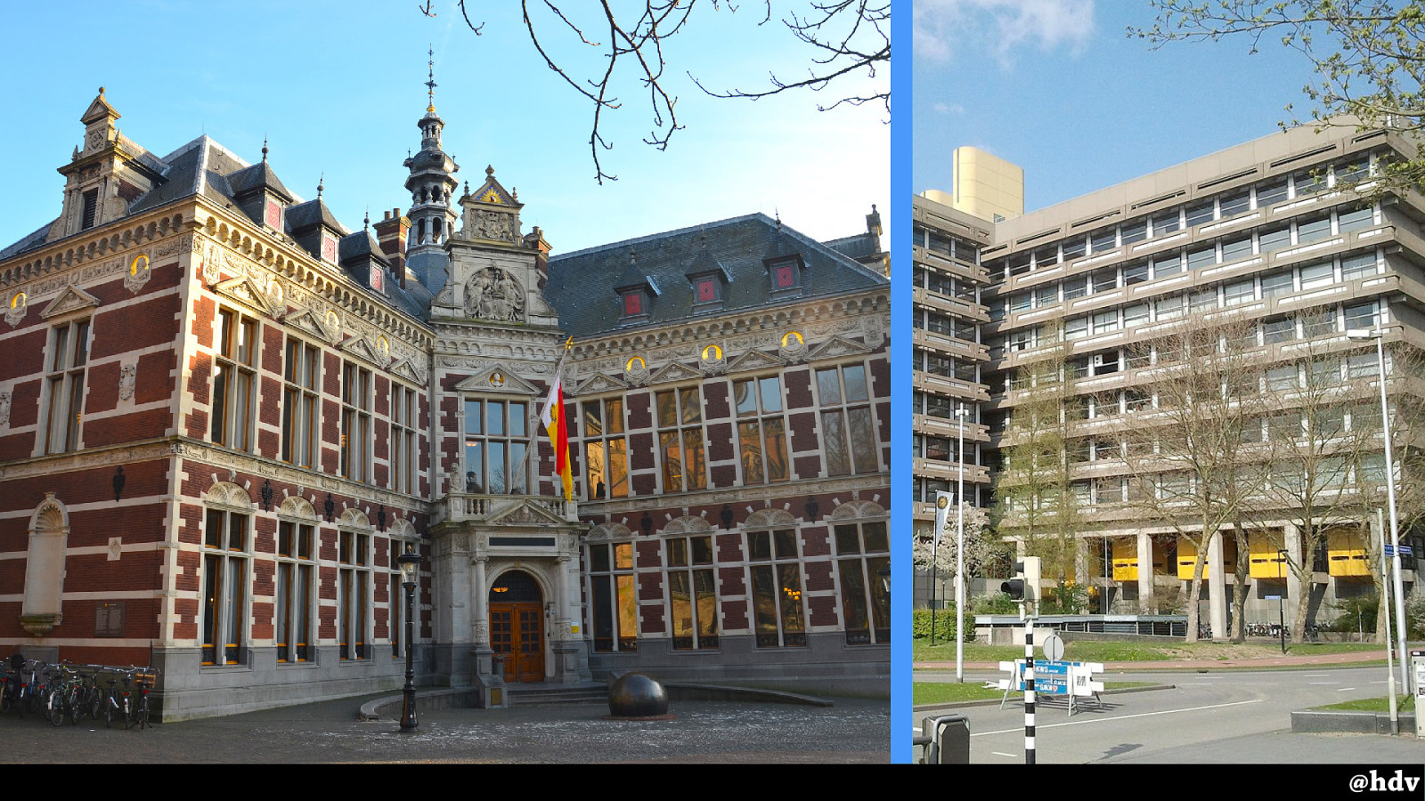
It's great to be here in Utrecht, I've lived here a couple of years as I studied at Utrecht University, it's this pretty building, also the buildings I had lectures in, the computer science and philosophy departments, looked like this and were way out of the city.
Slide 3
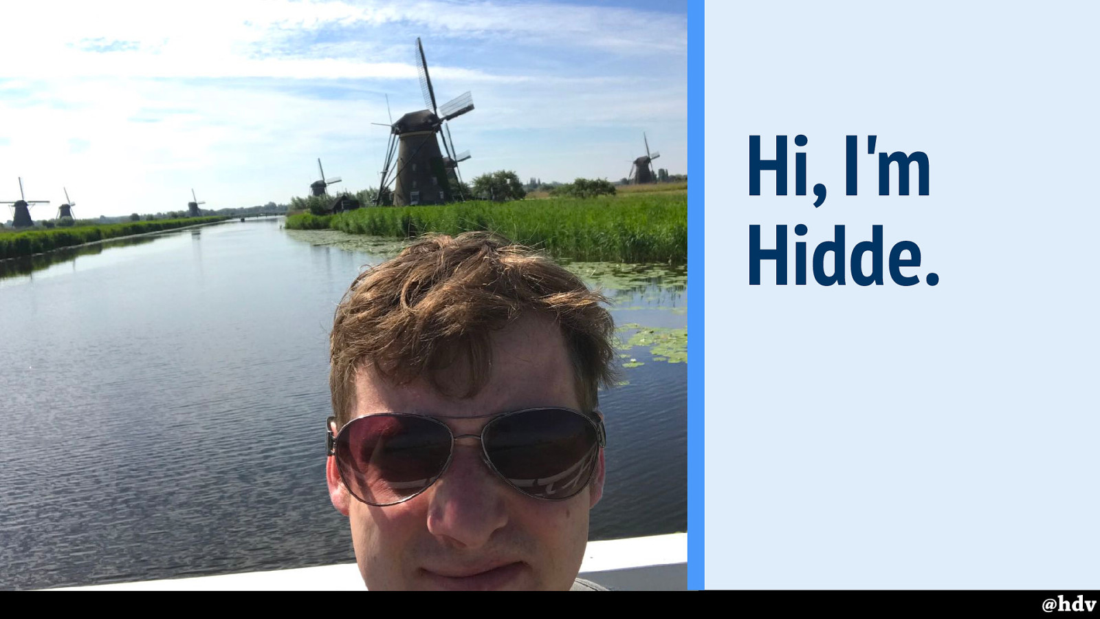
My name is Hidde, I am a front-end web developer from The Netherlands, I work as a freelancer slash contractor for all sorts of organisations and companies like the Dutch government.
Slide 4
Currently I work for Mozilla, I am a contractor in their Open Innovation team, which works on ways to make it easier for people to work together on open source software.
Slide 5
I wanted to talk to you today about graphic design and the web.
Slide 6
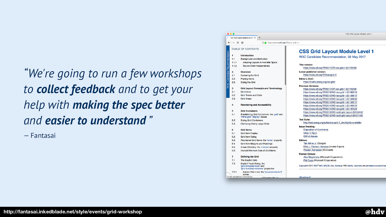
“We're going to run a few workshops to collect feedback and to get your help with making the spec better and easier to understand” — Fantasai
http://fantasai.inkedblade.net/style/events/grid-workshop
My main reason for looking into this is probably that Grid Layout was going to get built into browsers…
And a workshop; in 2016, Fantasai, one of the creators of Grid Layout and too many other specs to count, tweeted about her idea for a workshop. It involved getting together, reading a spec, understanding it and making it more understandable for others.
Slide 7
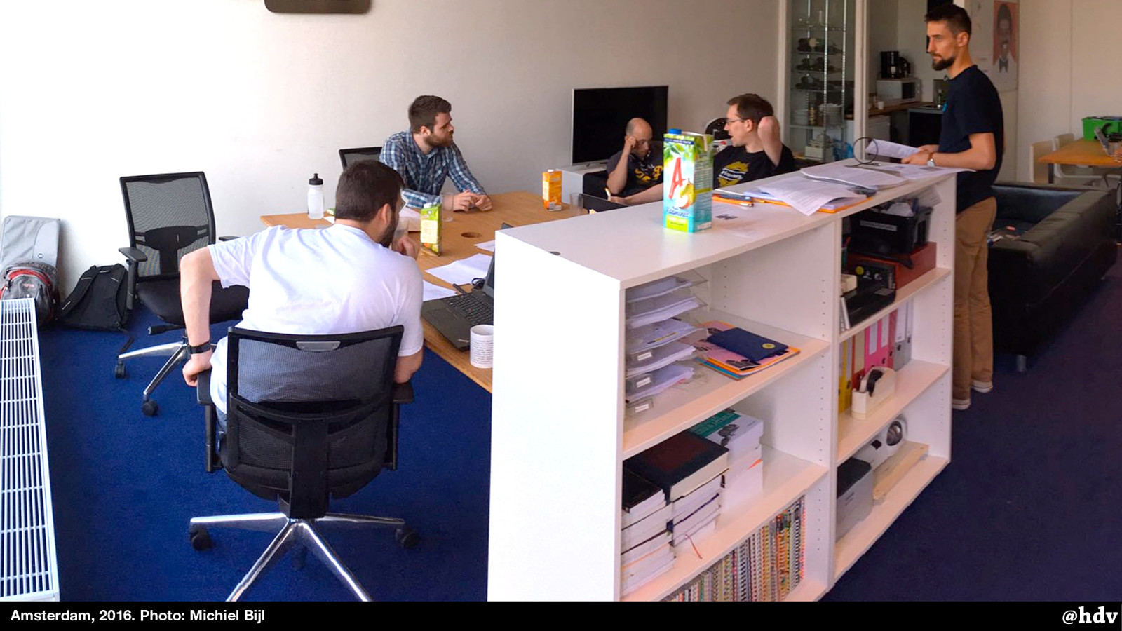
It was a sunny day like today and we sat in a warm o ffi ce with that long spec. In the train back, I kept feeling “shit I'll need to know more than just CSS -I'll need to read more about graphic design history now” I had always been interested in that stuff, so I had a few books, but I started to buy more.
I also started reading some older blog posts about layout on the web, and took out the books that taught me how to build websites.
Slide 8
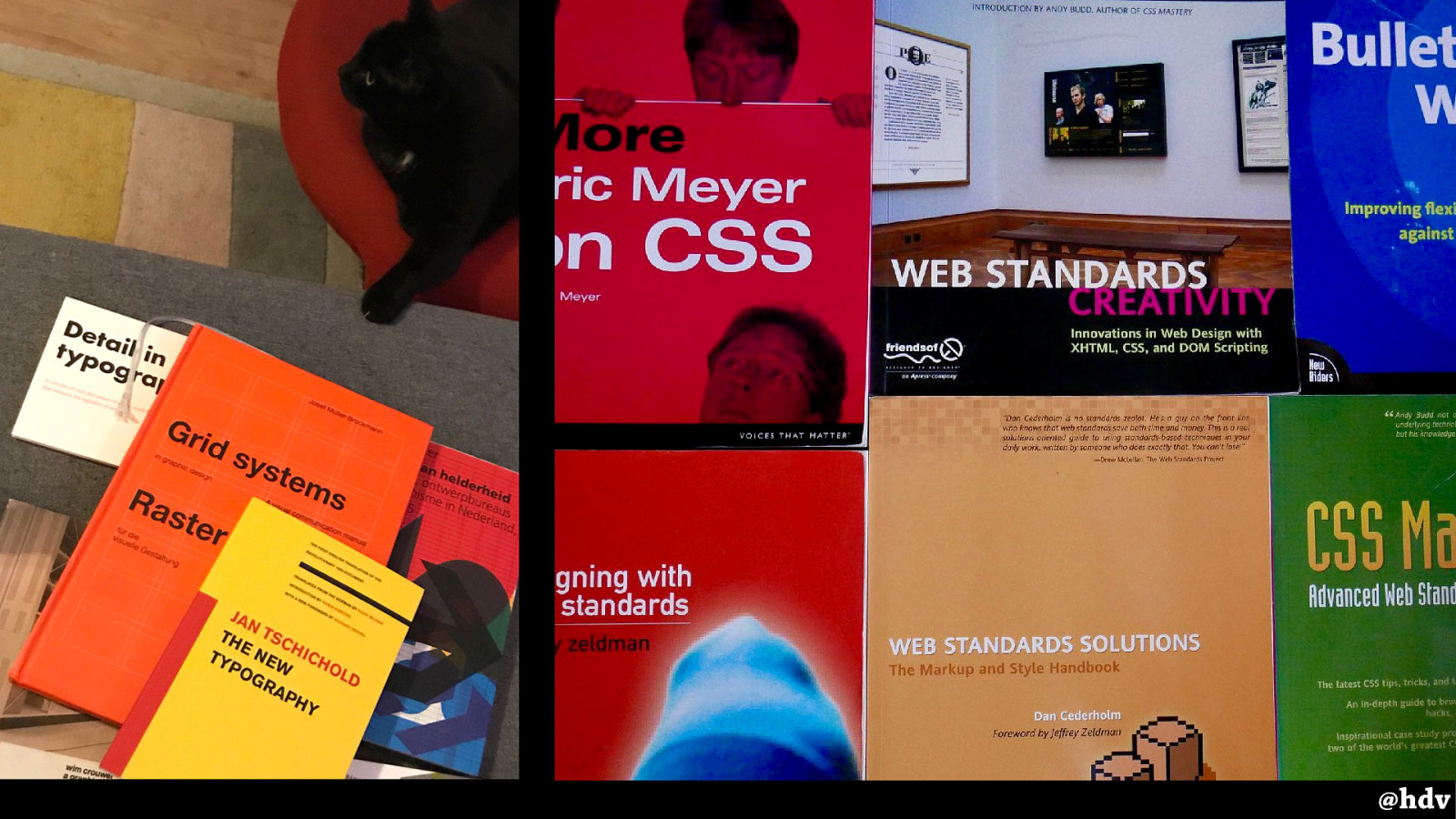
It was fascinating to have a look through. These books describe things like how you can build navigation bars with CSS, do tabbed layouts with rounded corners and shadows… I remember how inspiring they were at the time, but also realised that a lot of the things in there are currently possible with JUST CSS.
Slide 9
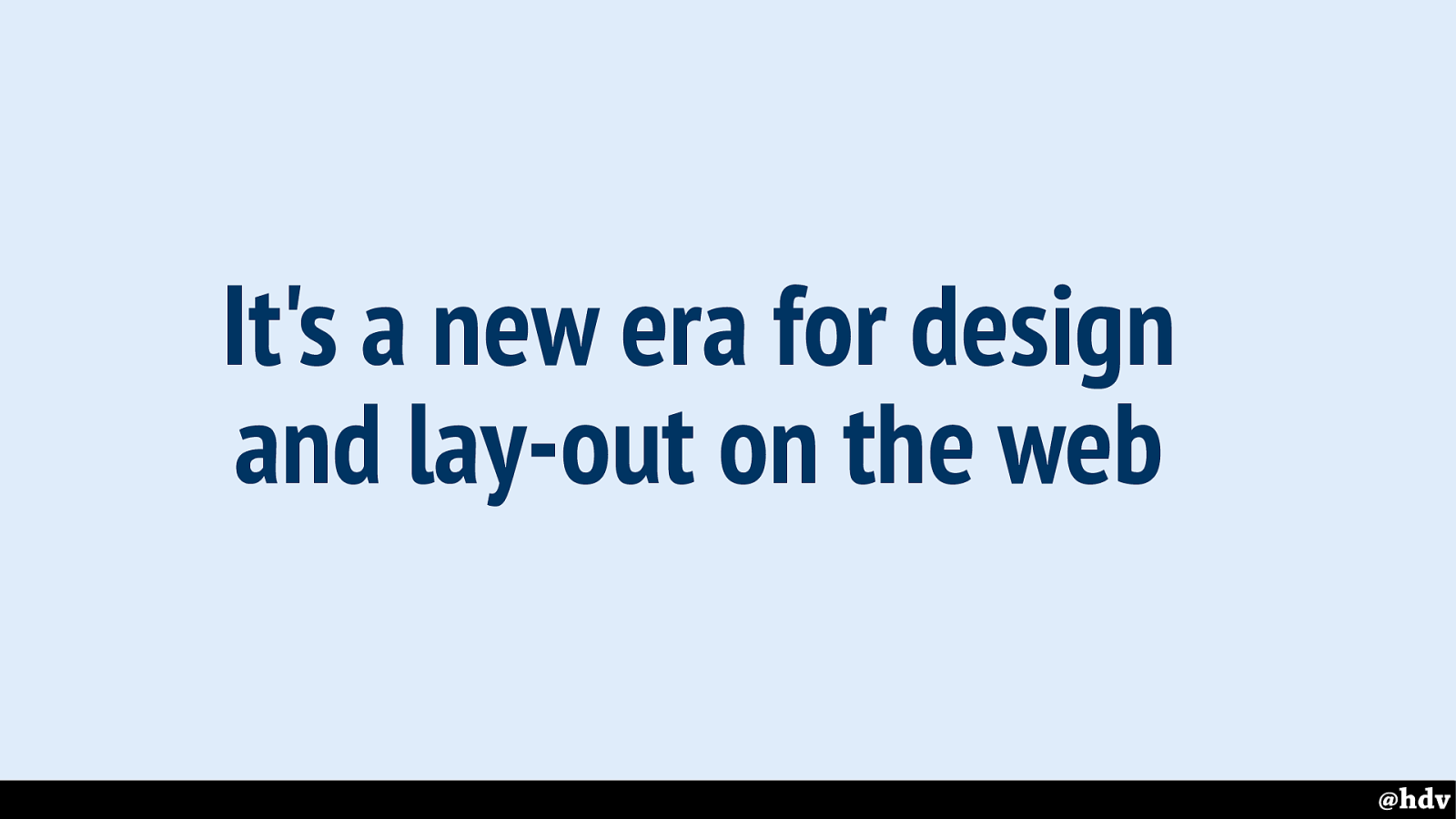
It's a new era for design and lay-out on the web
Its clearly a new era for design and lay-out on the web. We have stuff built in to browsers now that did not exist before.
Slide 10
I'm afraid I don't have a definition of great graphic design. I may have chosen the wrong word, really. Because what's great is up to any individual.
Slide 11
There's a particular direction in recent graphic design history I wanted to look at.
Why? It is still popular around us, many of us have phones that could be characterised as modernised. It is also, like CSS, pretty rule-based and it started as a response to the industrialisation: we got more machines around us and needed an aesthetic to match. We now have the web… more machines than ever!
Slide 12
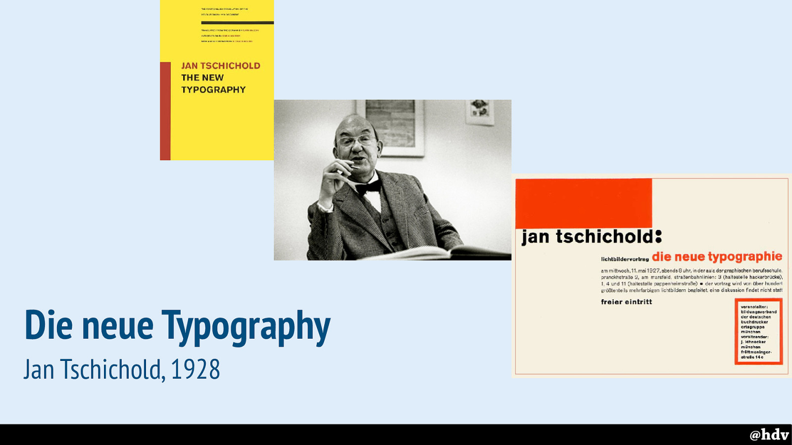
Let's start with one of the fathers of modernism in graphic design. In 1928, Jan Tschichold published his manifesto “Die neue Typographie”, or “The new typography”. It was meant as a handbook for printers, but super interesting for those of us interested in typography. I read the modern English translation, published years later and complimented with various introductions and some context.
In a short history lesson, he takes us from old typography, basically designing books, to modern art in various shapes, and talks about some examples of New Typography. The old typography has serif typefaces, hand drawn decorations and, I guess, more elaborate visuals… the new typography is much more to the point.
Slide 13
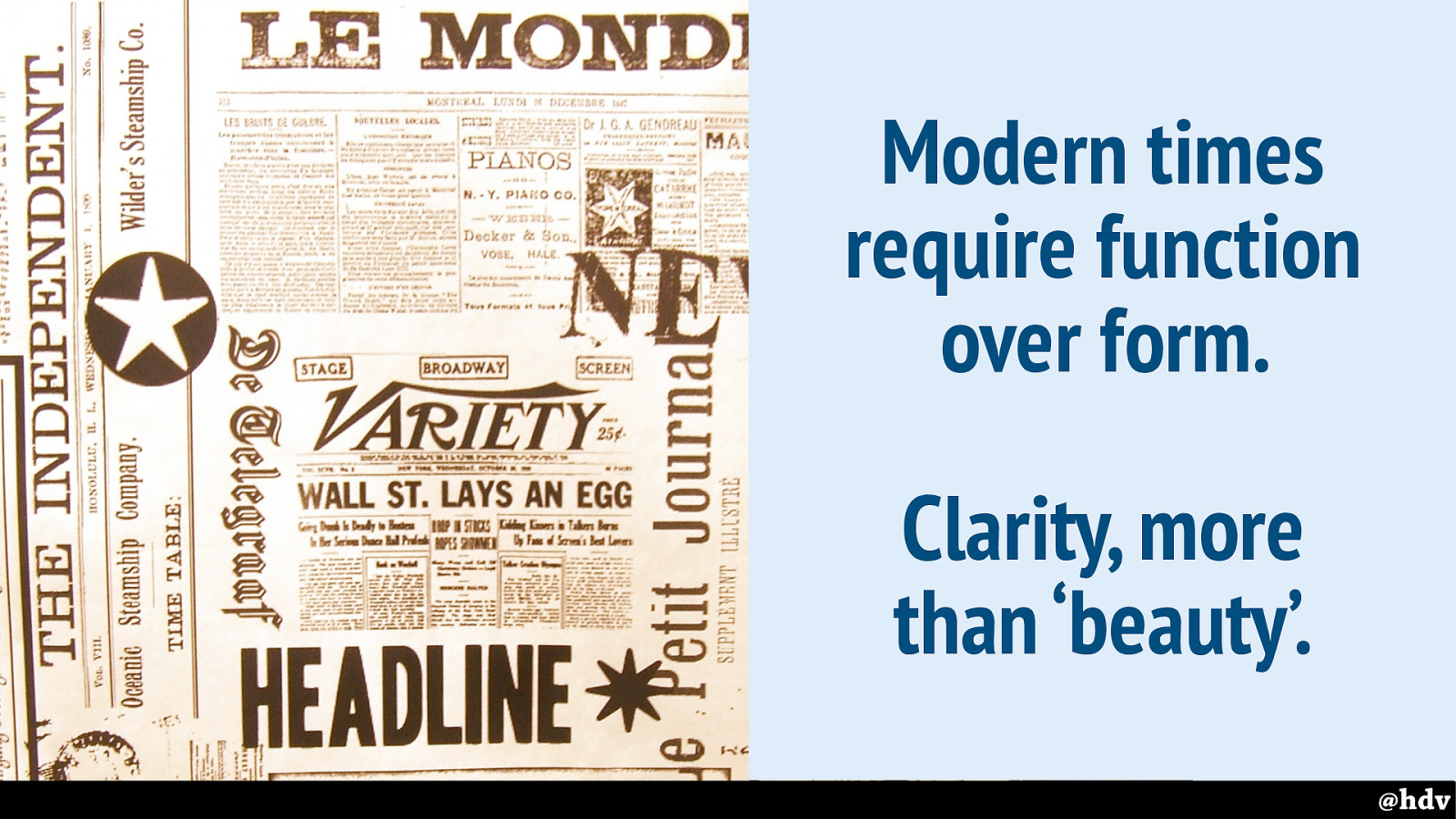
He talked about the need to adapt type: because people get more and more “printed matter” in their hands, it can't just be beautiful, it needs to consider readability (“we no longer read quietly line by line, but glance quickly over the whole, and only if our interest is awakened, do we study it in detail” - DNT, 64).
If 1928 was a modern time, then 2018 definitely is. We may not have ‘printed matter’ in our hands, but wow, most of us have a lot of text in our days. We see this principle still followed on the web, with companies using user testing to figure out which clarity they need.
Slide 14
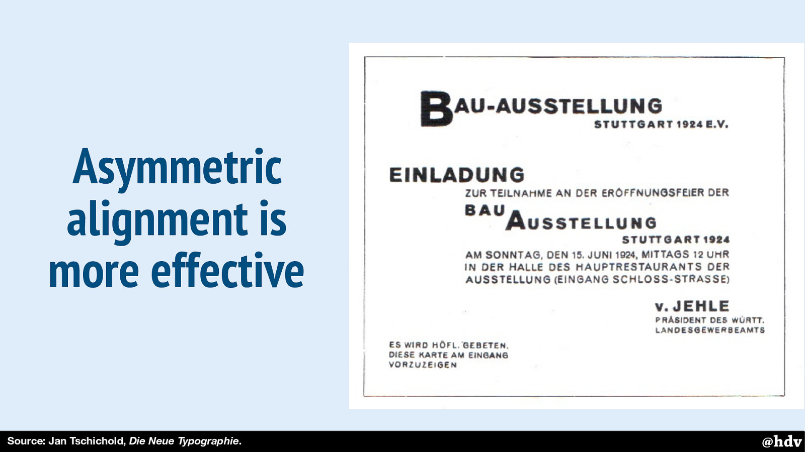
And then he talked about the advantages of asymmetry. Showing some examples where text is just centered on a page, he explains that it is di ffi cult to focus, it lacks effectiveness.
Asymmetry should lead to better reading order, too. This image is an example of something Tschichold considered to have good reading order.
Slide 15
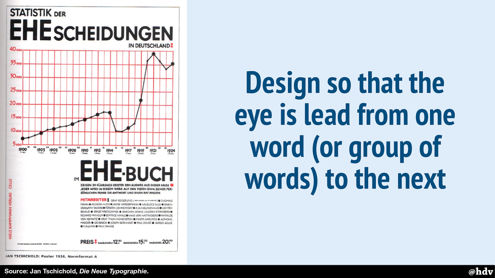
Here's another example: this poster has contrasts between red and black colors, and large and small font sizes. And the text column isn't exactly half of the page.
Slide 16
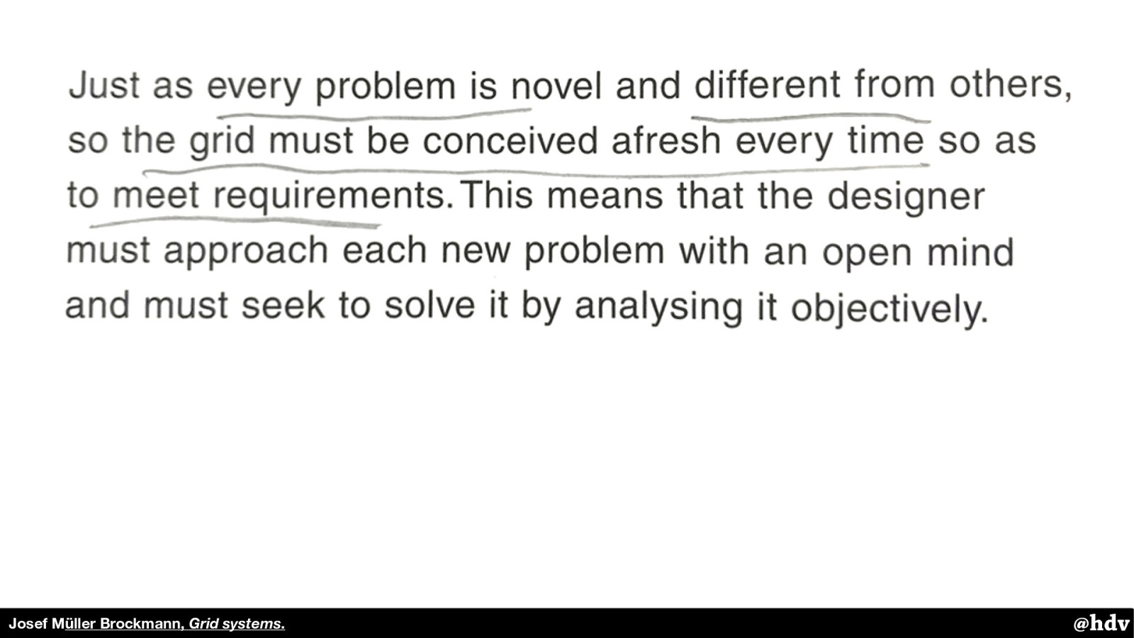
If we think clearly and approach each task with a fresh and determined mind, a good solution will usually result.
— Jan Tschichold In: The New Typography, 69. “ @hdv Lastly, Tschichold emphasised we should be intentional about our work. This may be at odds with how flexible the web is, we can have good intentions, but our solutions won't look the same in every browser.
Slide 17
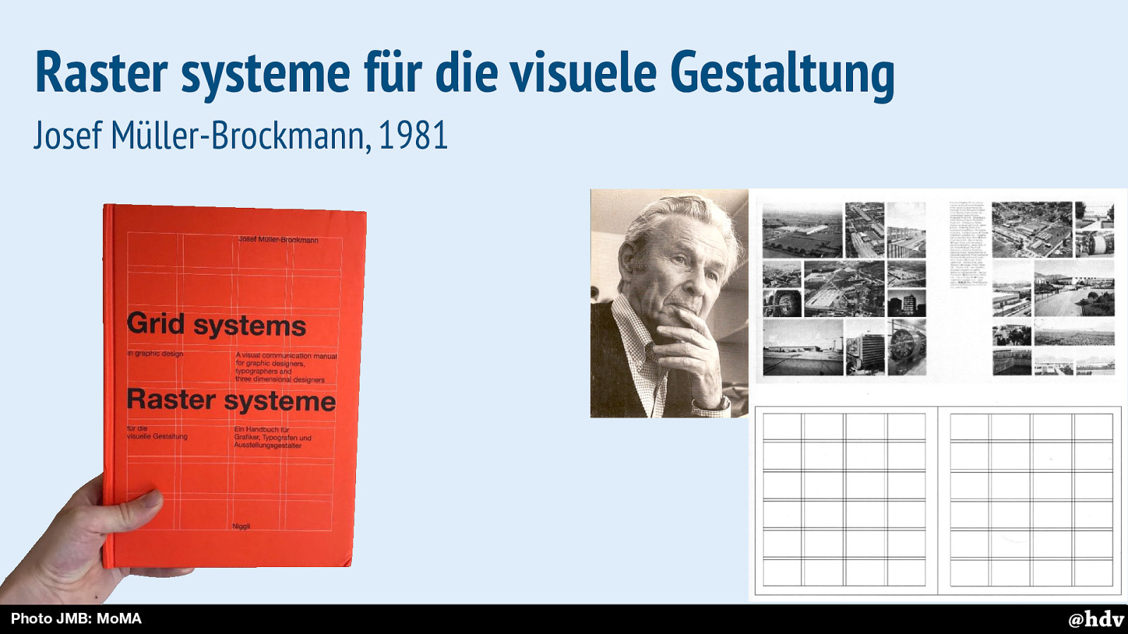
The clarity that Tschichold was after, Müller-Brockmann continued thinking about to make it better. Designing with grids was a large part of that.
Slide 18
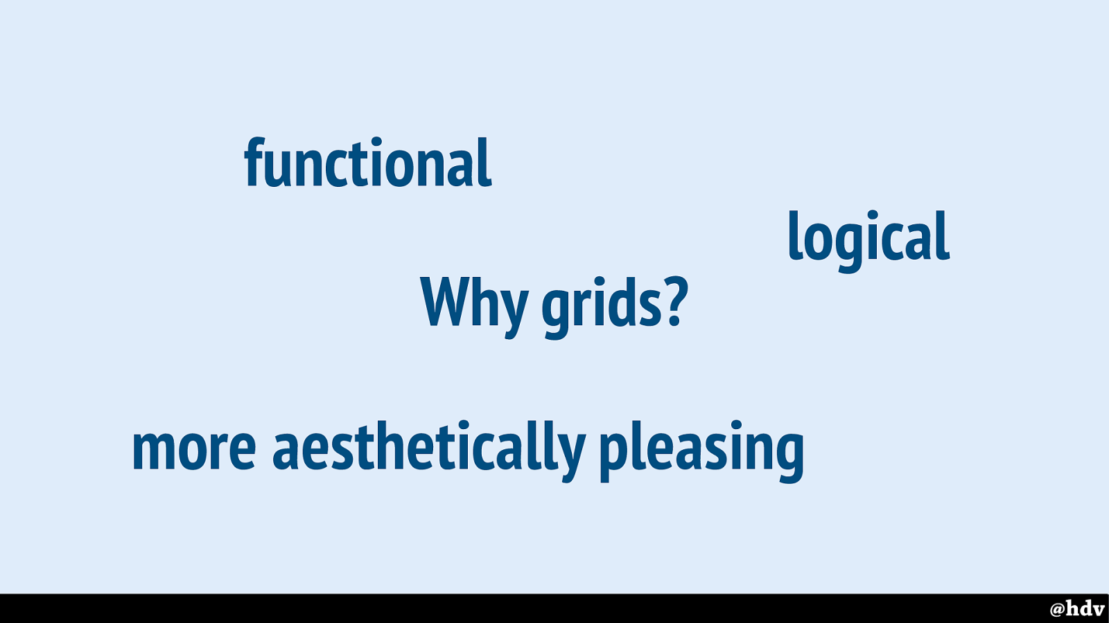
Müller-Brockmann explains why we'd want grids in the first place.
He explains that if you have a bunch of content that needs to go into a lay-out, a grid can give solutions that are functional, logical, and just look better.
Slide 19
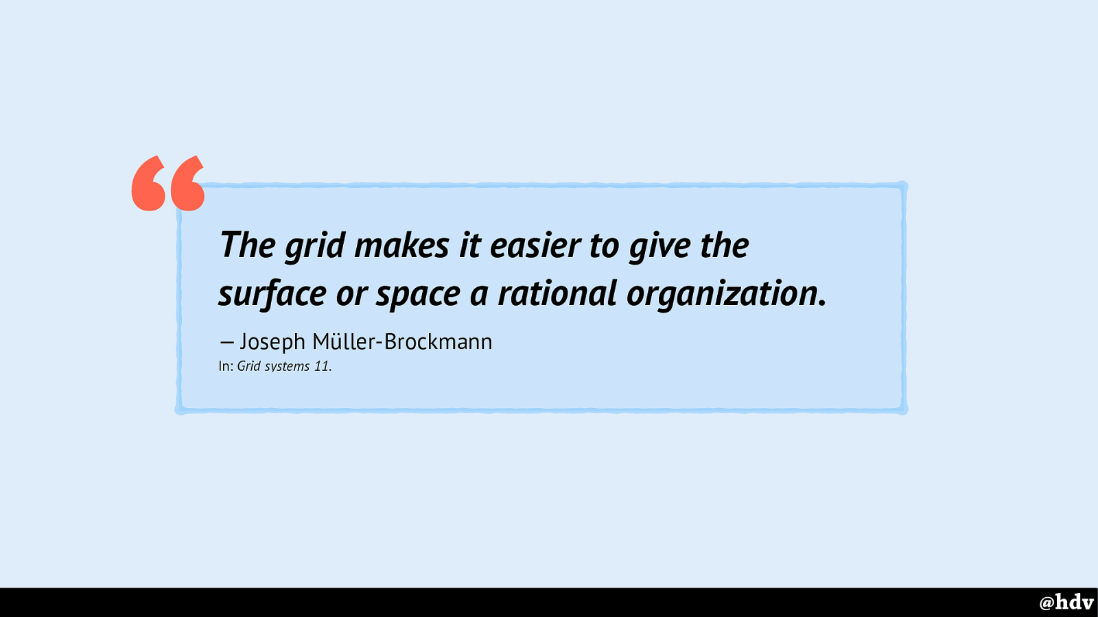
The grid makes it easier to give the surface or space a rational organization.
— Joseph Müller-Brockmann “
When a grid is applied to it, a surface an more easily be organised in a way that is rational.
Slide 20
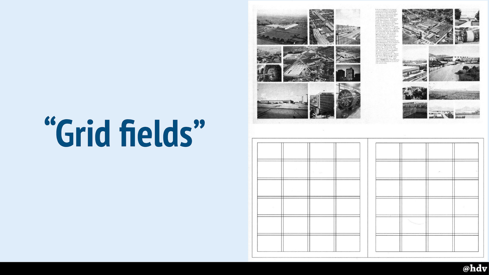
Müller-Brockman talks a lot about dividing the page into what he calls ‘grid fields’, we would these ‘grid cells’ in CSS Grid Layout terminology. He divides the paper into fields.
Slide 21
Müller-Brockmann, like Tschichold, talked about how important it is to be intentional about designing something for your requirements. I don't think he meant every page should have a different design, he was after a systematic approach. This matches our style guide world well.
Slide 22
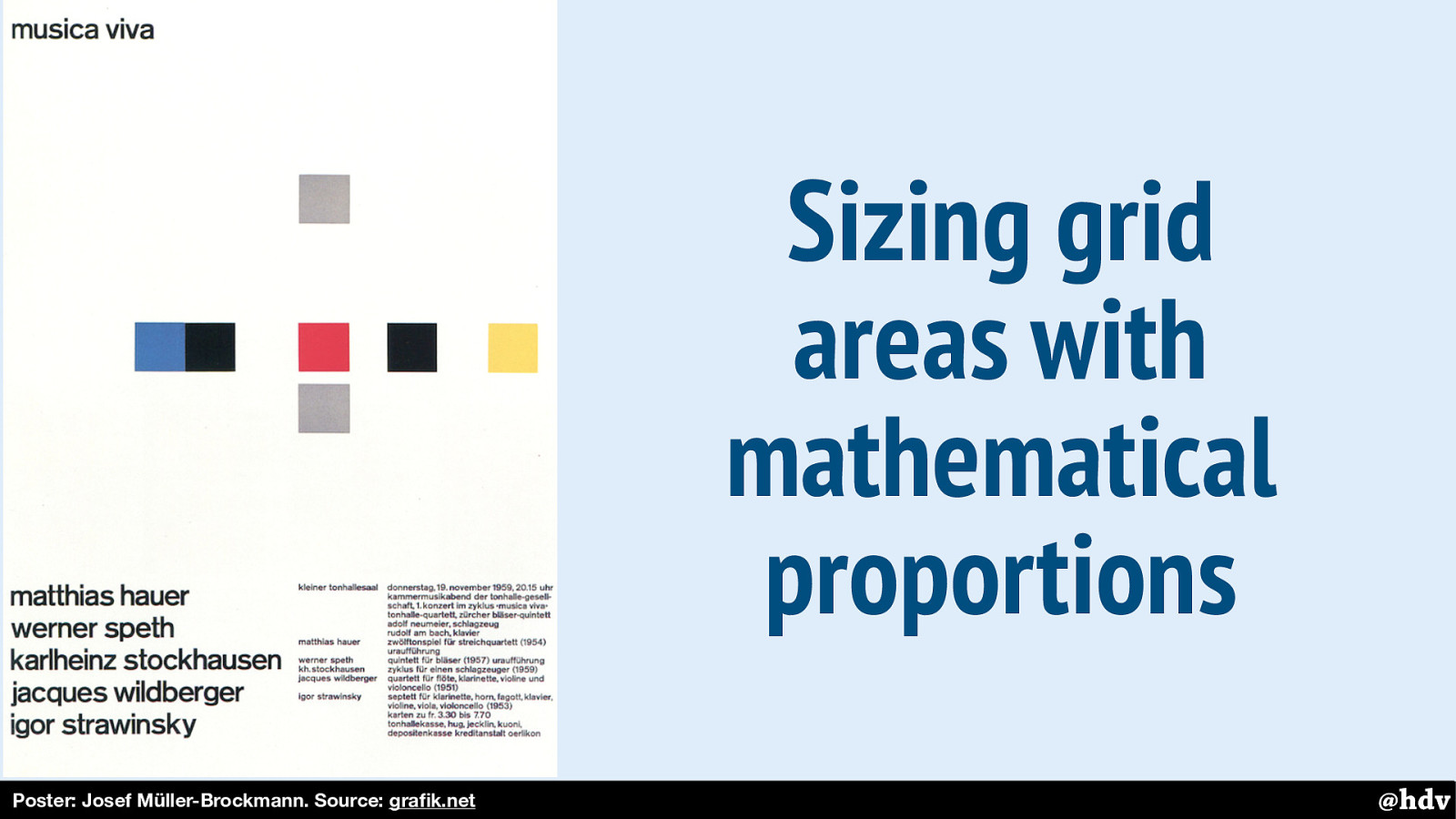
Müller-Brockmann really believed in the benefits of mathematical proportions in grids. Not only as a way to make a more interesting or pretty design, but also to aid focus and create order and hierarchy.
Here's on example.
Slide 23
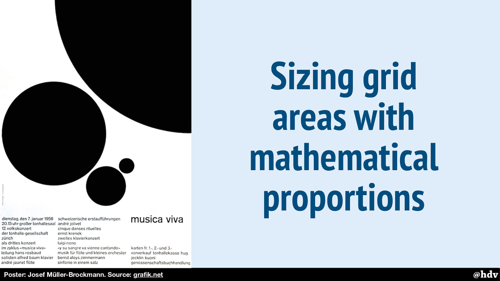
And here is another.
Slide 24
In the early sixties, modernism got very popular in the Netherlands, for a large part because of this man: Wim Crouwel, graphic designer and known for his grid-heavy design work and his agency Total Design.
Slide 25
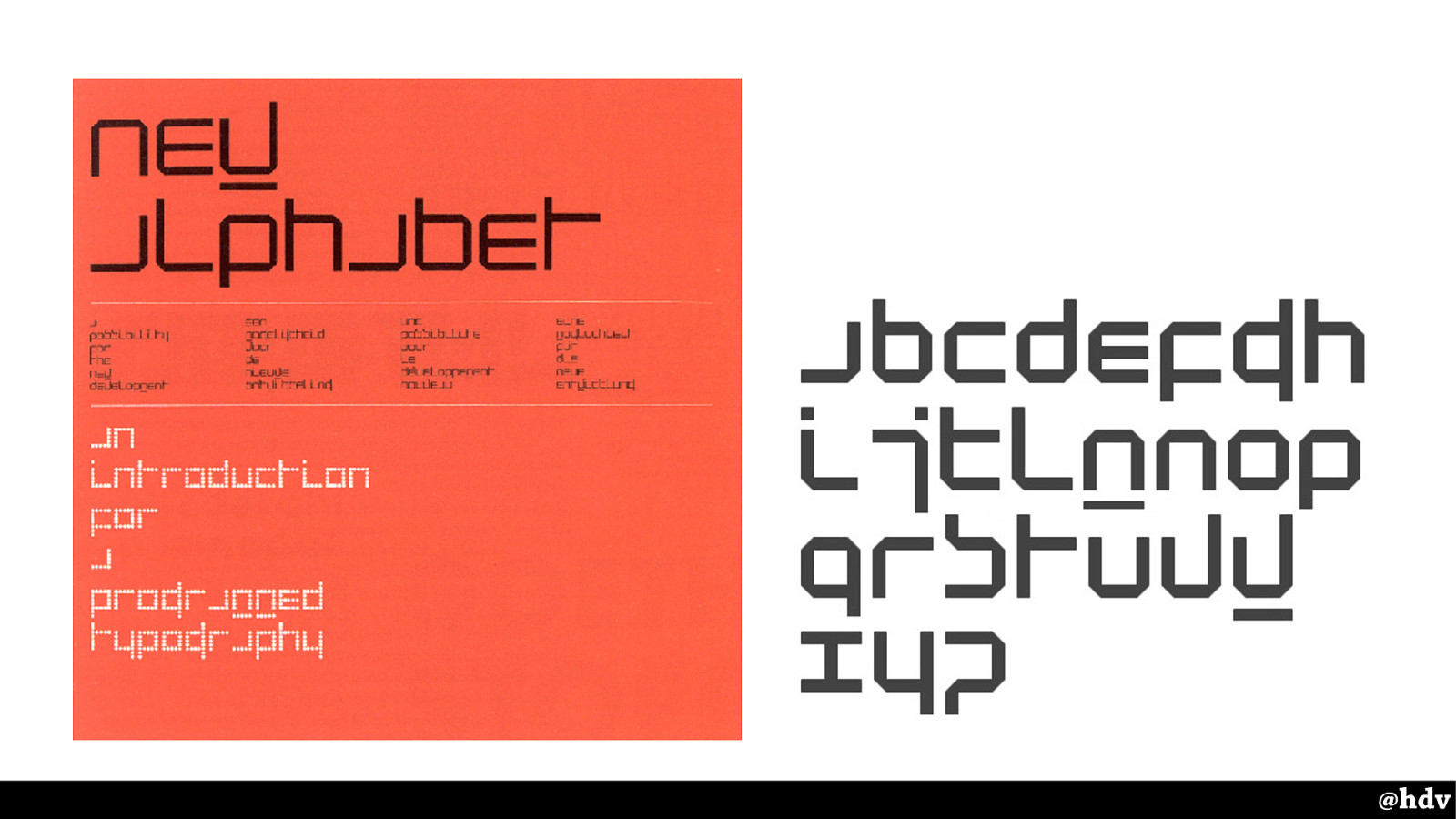
He is well-known for this creation of his: The New Alphabet. In a response to how screens work, with rasters, so everything is squares. That made rendering serif fonts like Garamond impossible, so he came up with an aesthetic that took the constraint into account. This typeface only uses horizontal and vertical lines. Consequently, it is super hard to read especially the a and the w. So the title says 'new alphabet'.
Slide 26
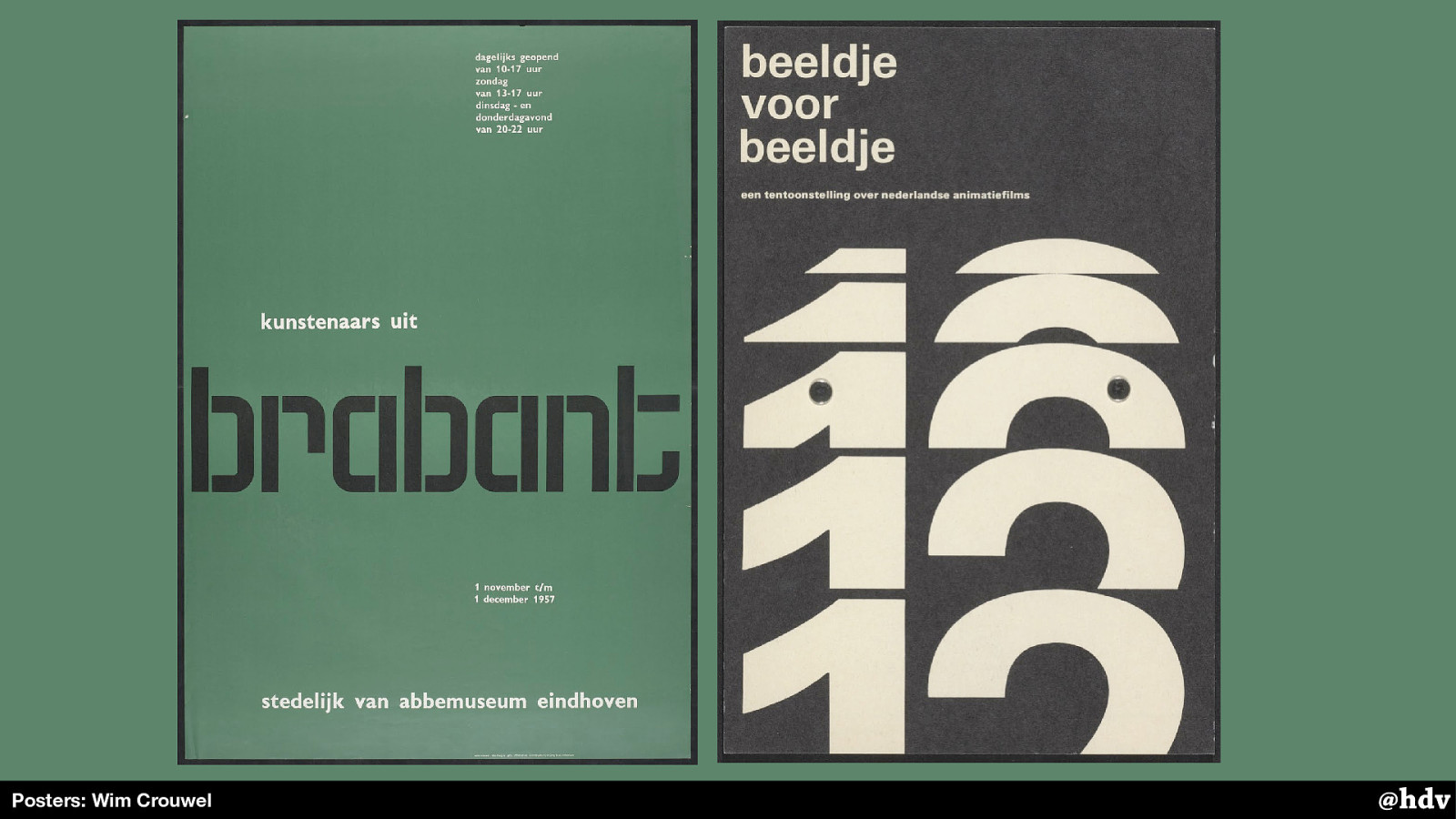
His designs were typography heavy, and had creative use of whitespace.
Slide 27
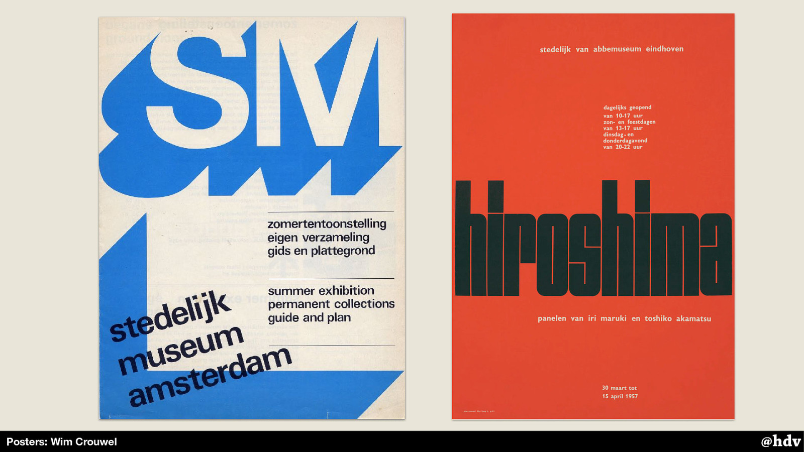
Sometimes with graphical elements, and with rotations. The poster on the right is one of his most famous, he created the typeface for this poster specifically.
Slide 28
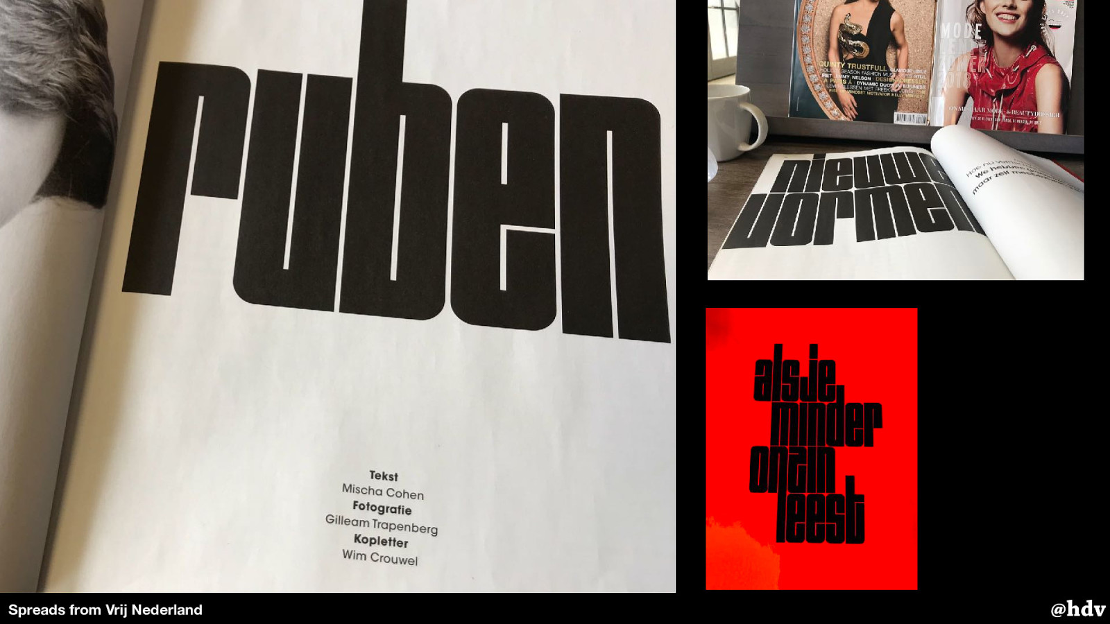
In this year's redesign, the Dutch magazine Vrij Nederland used the 'Shima' typeface for some of its headings. This is special, they even credit the type designer along with the author and photographer.
Slide 29
We've seen some examples of posters for museums and events, but really, a lot of modernism in graphic design took off when corporations started getting ‘house styles’. It became quite a thing in the early sixties.
Companies realised that their visual style was all over the place and they desired on system to make themselves more recognisable and get more trust from their customers or the general public.
Slide 30
You could say it was during this time that we had something like design systems 1.0. With different materials, of course, but perhaps similar goals.
Slide 31
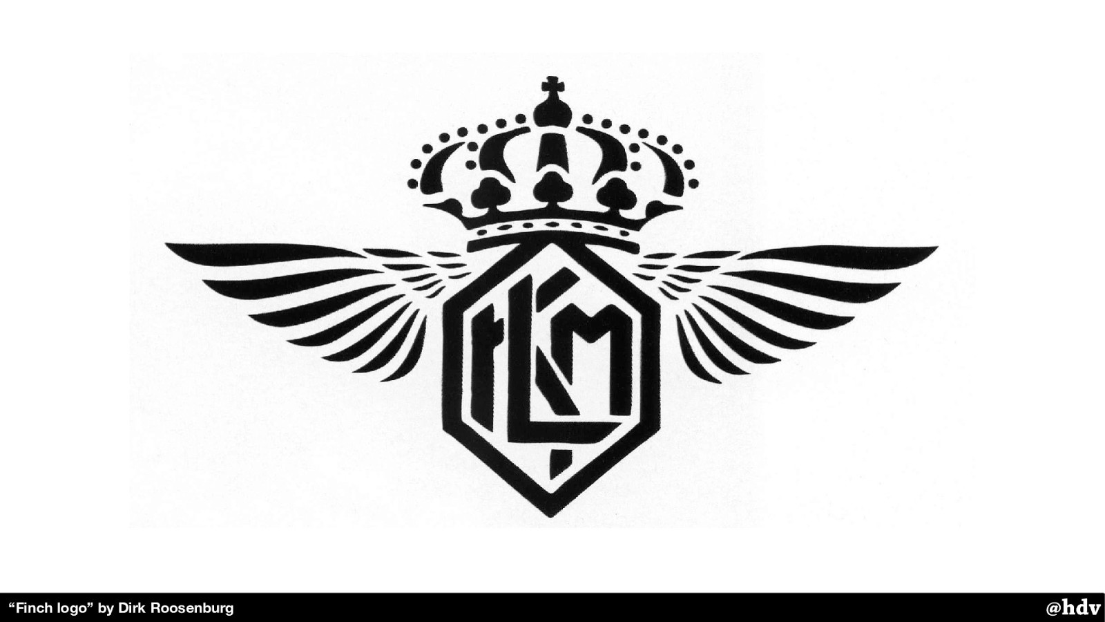
The first company in the Netherlands that introduced their own ‘house style’ is KLM, the airline.
They used to have this as a logo. As you look at it, you might see some recognisability problems right away. The crown is pretty ok, although it is quite eloborate. The letters ‘KLM’ are downright hard to recognise. But they're there.
Slide 32
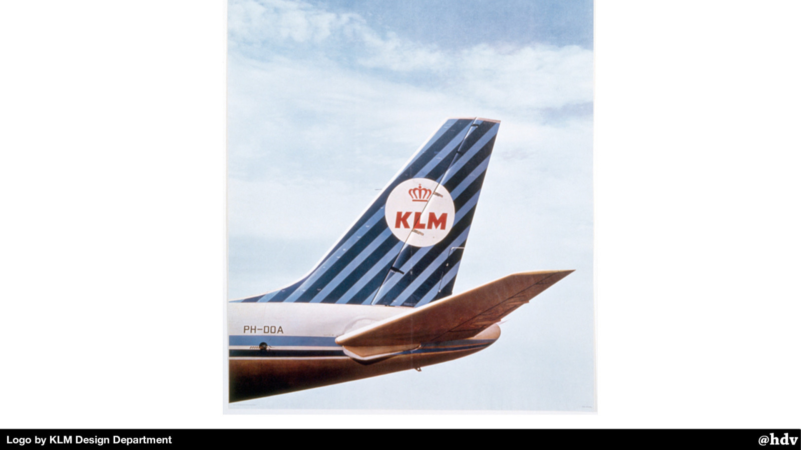
Their internal design team worked with an American design company that helped them develop an identity that they could use on planes, newspaper ads, napkins, you name it. It had colourful stripes and a much simplified version of the logo.
Slide 33
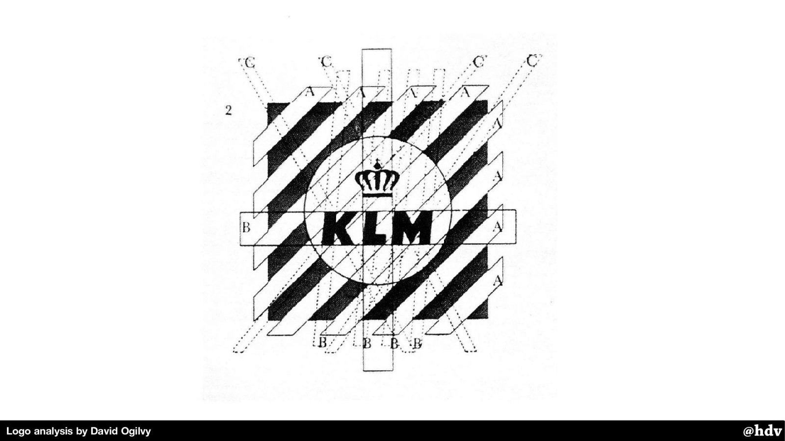
But it was still a bit complex in shape, they found in further research. The designer David Ogilvy drew these lines on top of the logo, as part of his research, and found it was still quite a lot of lines.
Slide 34
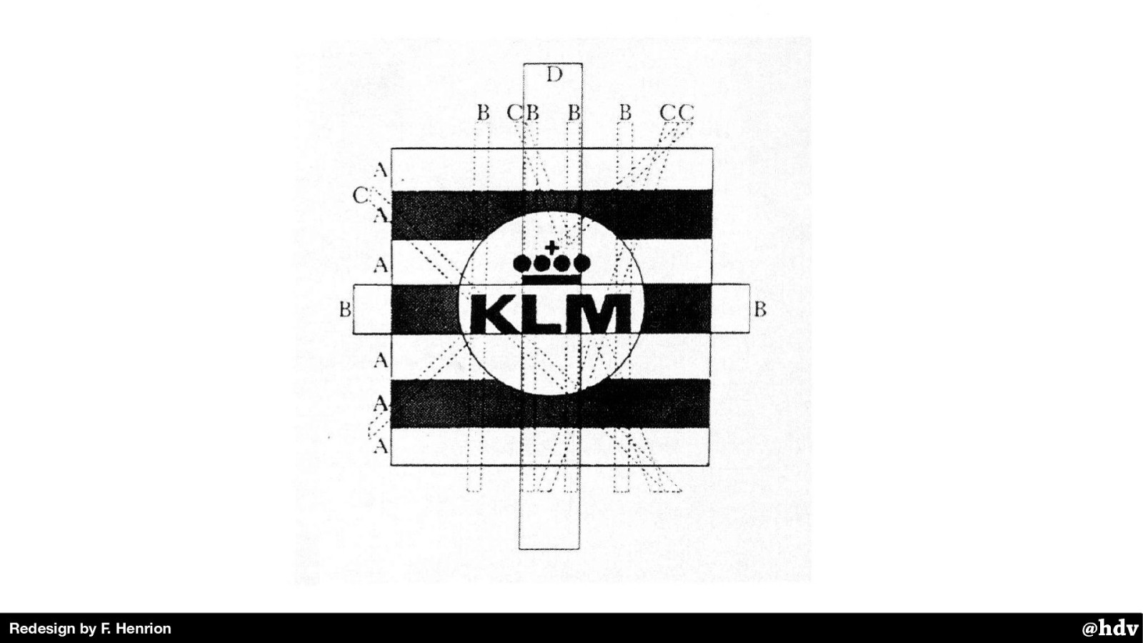
With only a few changes that hardly changed the feel of the logo, they were able to have a much simpler shape, and, perhaps, more recognisable.
With the KLM redesign, Dutch agencies started to realise that they could take on large house style projects, and they did. Total Design, which Wim Crowed co-founded, is one of those pioneering agencies.
Slide 35
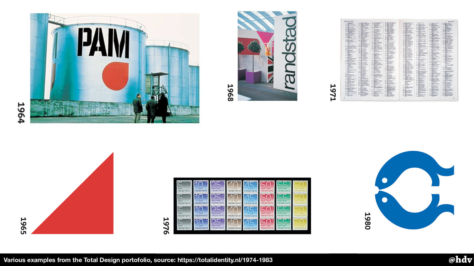
Various examples from the Total Design portofolio, source: https://totalidentity.nl/1974-1983 They completely restyled the PAM, but also worked on phonebooks, stamps and many other visual identities.
Together with Tel Design, they also did a new house style for the national railways.
Slide 36

Designed in 1968, it looked like this and it is still around. This redesign project went massively over budget, but it was very effective and, indeed, timeless.
Slide 37
Modernist graphic design wasn't just about visuals: it was also during this time that things like paper sizes and colours started to get standardised.
With huge advantages, including financial advantages: it made large corporations much more e ffi cient and it aided the idea of having one visual style everywhere.
Slide 38
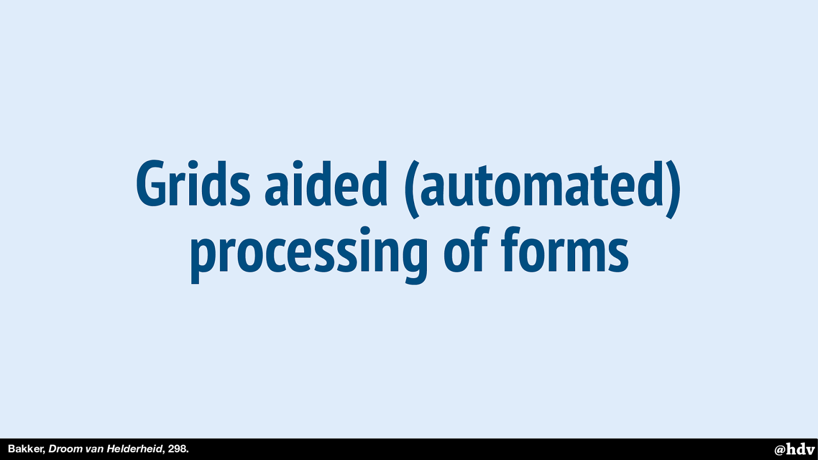
Grids were super popular, and even used to make print easier work with computer involvement. Because if the phone number in a form is always placed in the same place, that is easier to process and paves the way for automated processing with computers.
Slide 39
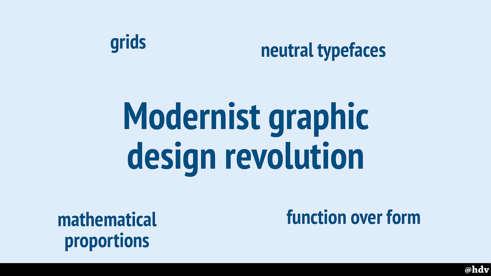
@hdv Modernist graphic design revolution In the sixties and seventies of the last centuries, many, many large companies in The Netherlands got some sort of house style, almost all of them in an orderly, modernist way. With grids, neutral typefaces, simple shapes, mathematical proportions, et cetera.
Slide 40
Not everybody liked this modernist revolution
Slide 41
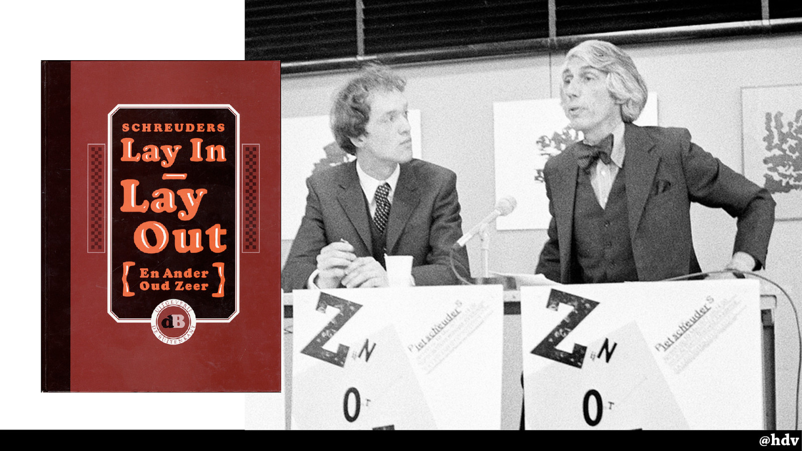
The designer Piet Schreuders, the Dutch amongst us may know him for his work for VPRO and de Poezenkrant, wrote an essay in which he openly criticised the work by his modernist colleagues.
This is him on the left, graphic designer Wim Crouwel on the right, he is presenting his book. During the presentation he teared apart one of Crouwel's posters. Quite the statement.
Slide 42
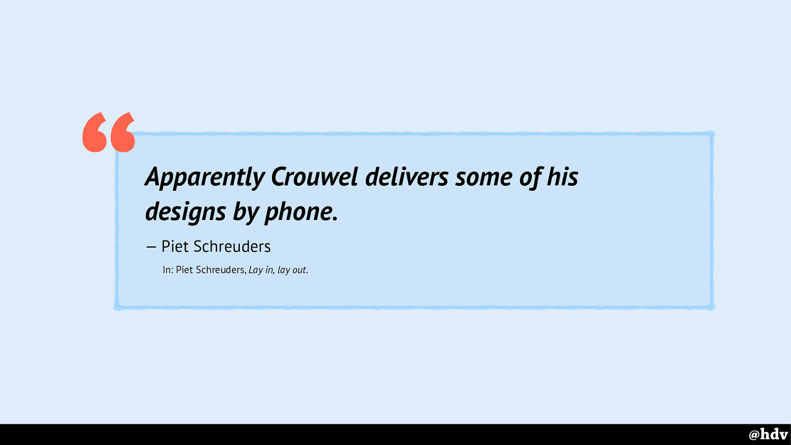
Apparently Crouwel delivers some of his designs by phone .
— Piet Schreuders
In: Piet Schreuders, Lay in, lay out . “ @hdv Schreuders spent several pages ridiculing Crouwel's work, for example he says it is too mundane: apparently so simple the designs can be delivered by phone.
Lay In, Lay Out is still sold, much recommended reading, it is very funny and puts all that modernism nicely into perspective.
Slide 43
Swiss typography looks so neat, tidy and sanitised that all the life has gone out of it .
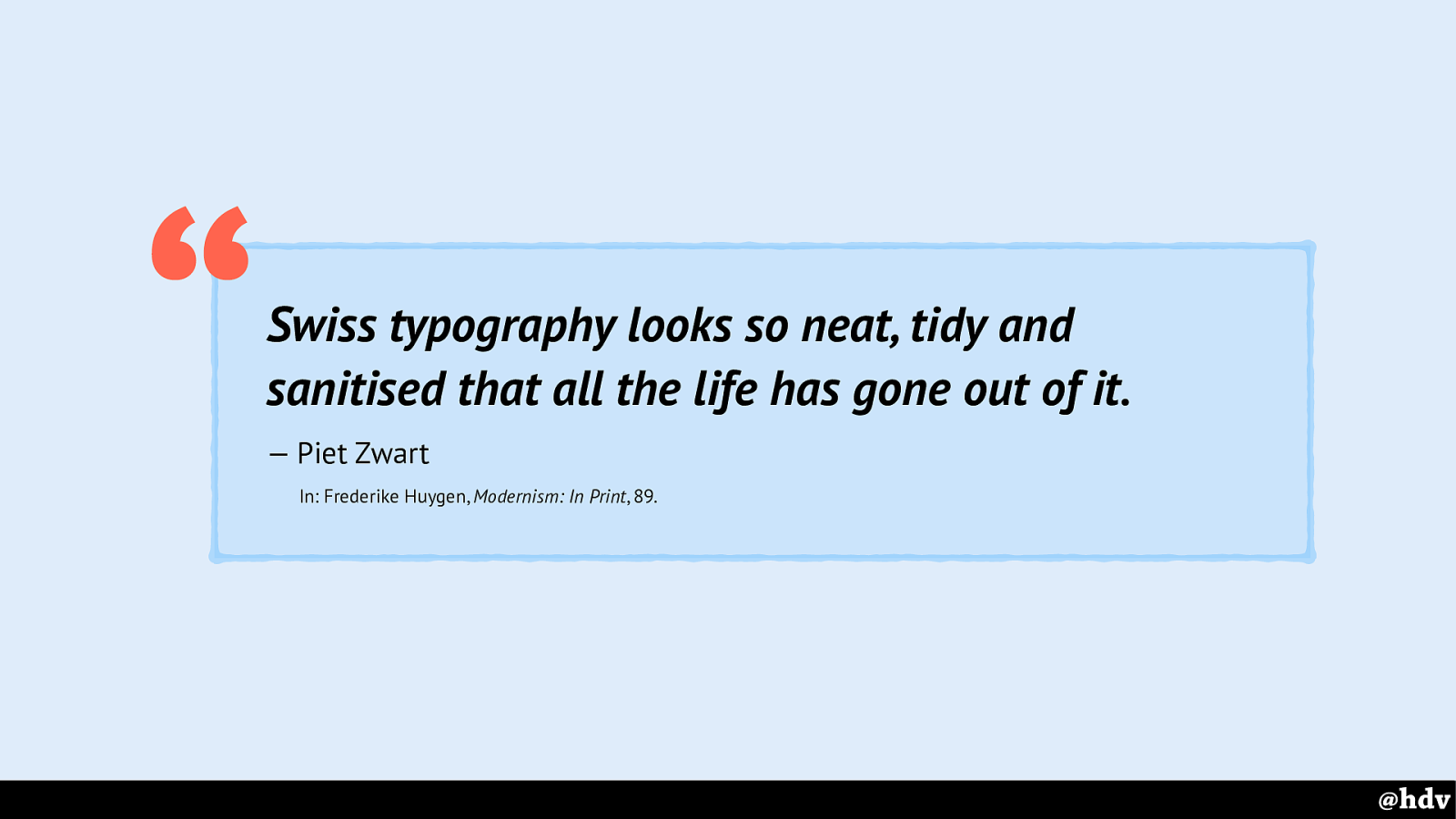
— Piet Zwart
In: Frederike Huygen, Modernism: In Print , 89. “
Other graphic designers like Piet Zwart also commented on the downsides of modernism: all the life has gone out of it.
Slide 44
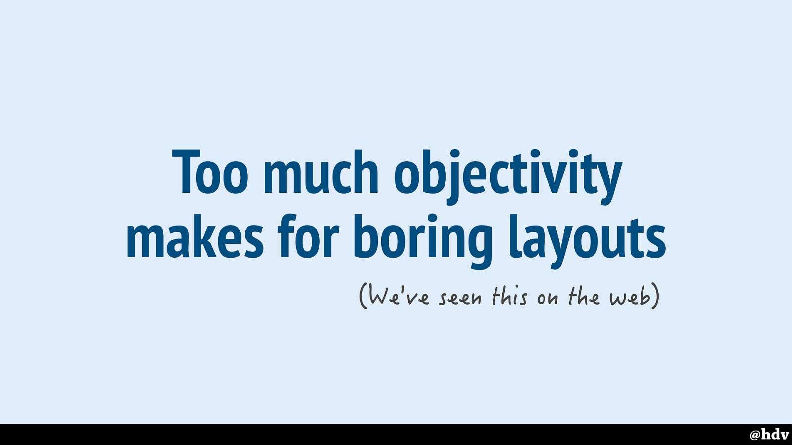
Too much objectivity makes for boring layouts
If we're using grid to create too much order, that might make for a boring layout.
Slide 45
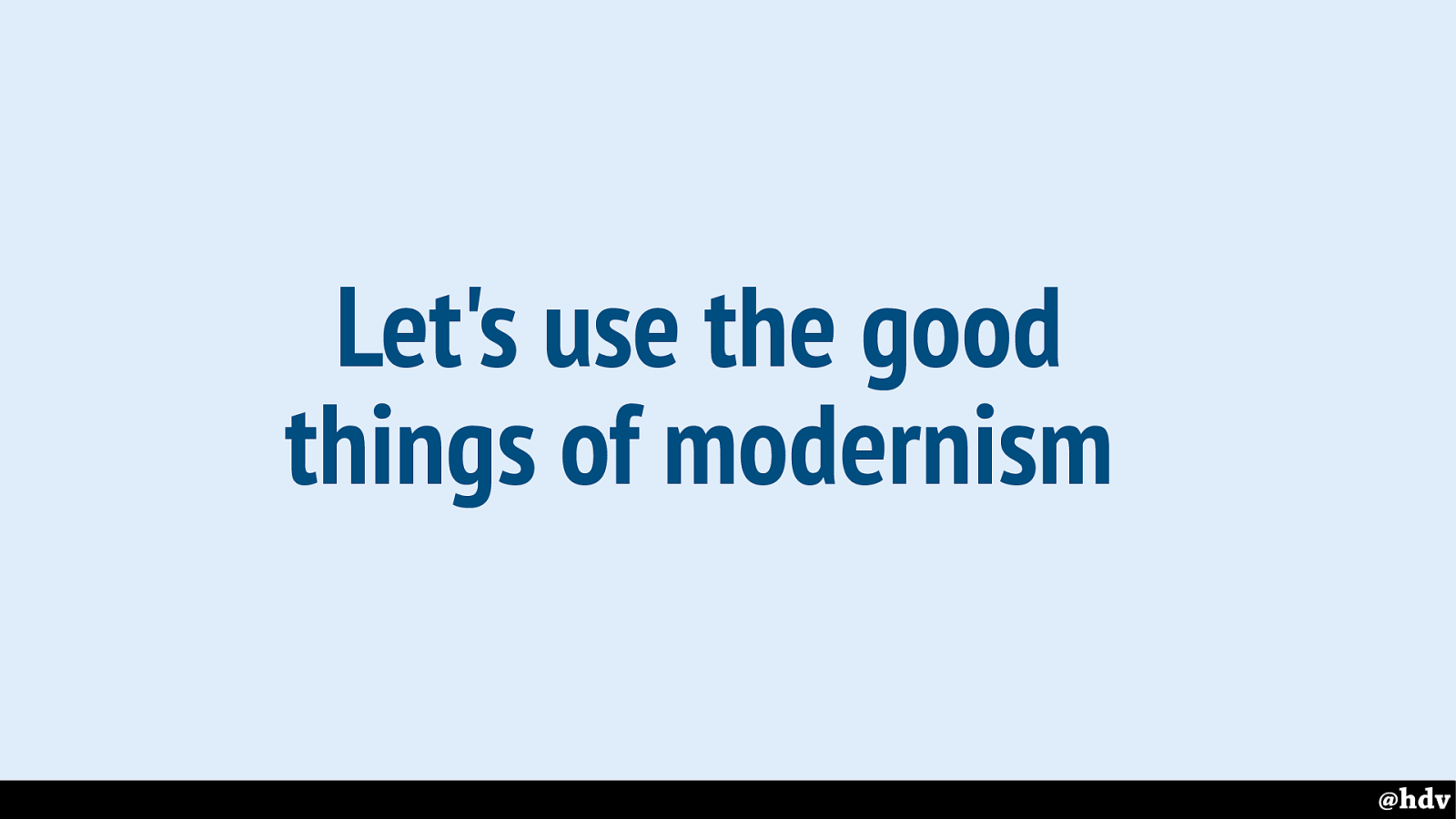
Let's use the good things of modernism.
So not all of modernism is great, it is good to keep a critical view on things. But let's see if we can use some of the good things of modernism in CSS: intentional whitespace for example.
Slide 46
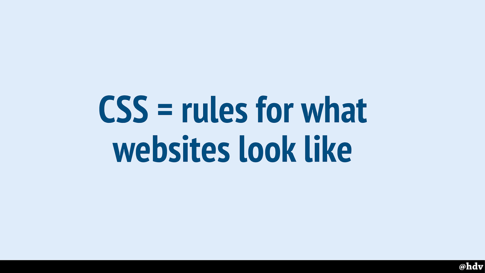
My vision on CSS is that it is a language to set rules for what websites look like.
Slide 47
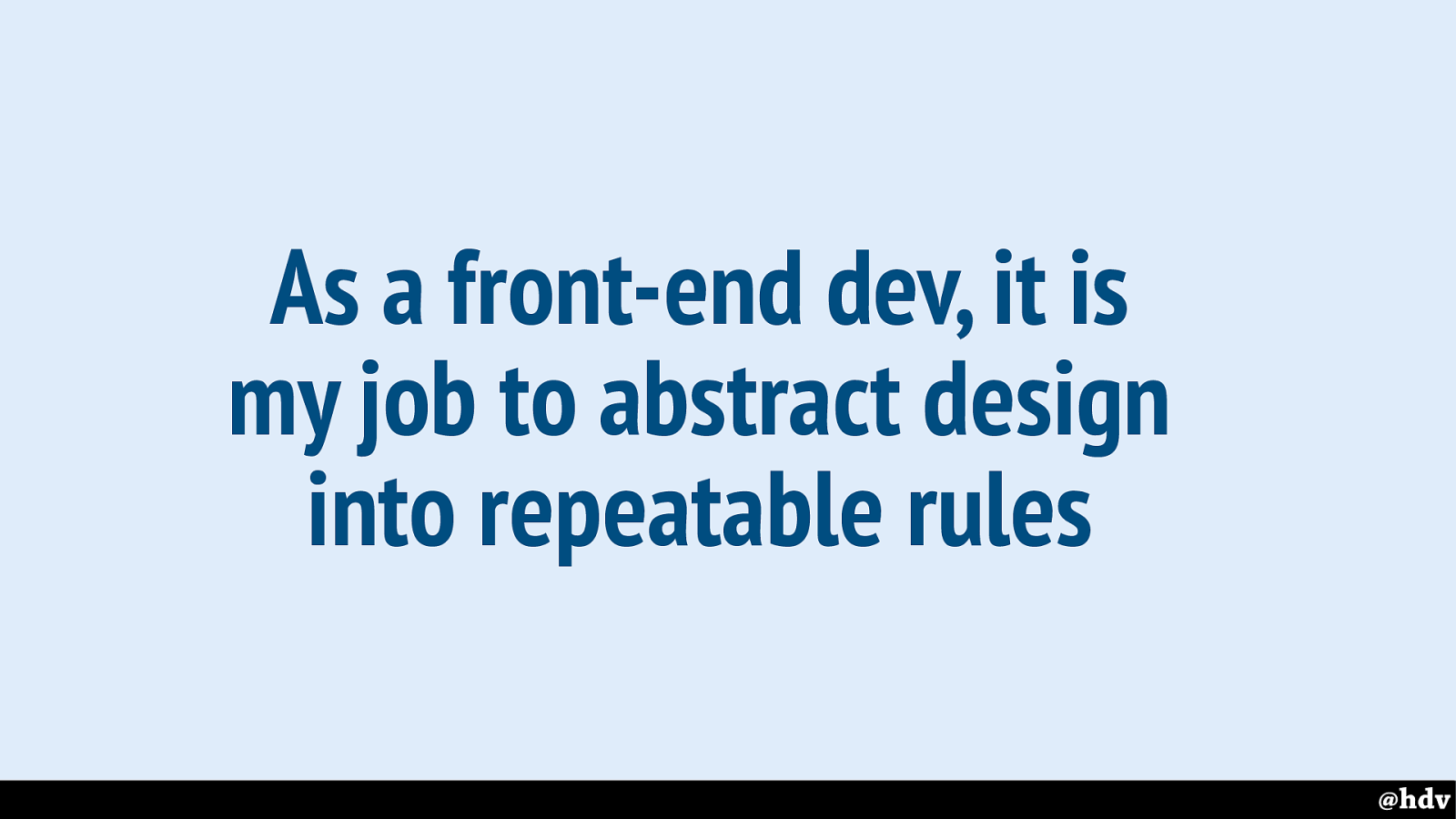
As a front-end dev, it is my job to abstract design into repeatable rules
And that's a large part of my job as a front-end developer writing CSS. I take designs and turn them into repeatable rules. Trying hard not to take the life out of them.
Slide 48
Doing great graphic design in CSS
Slide 49
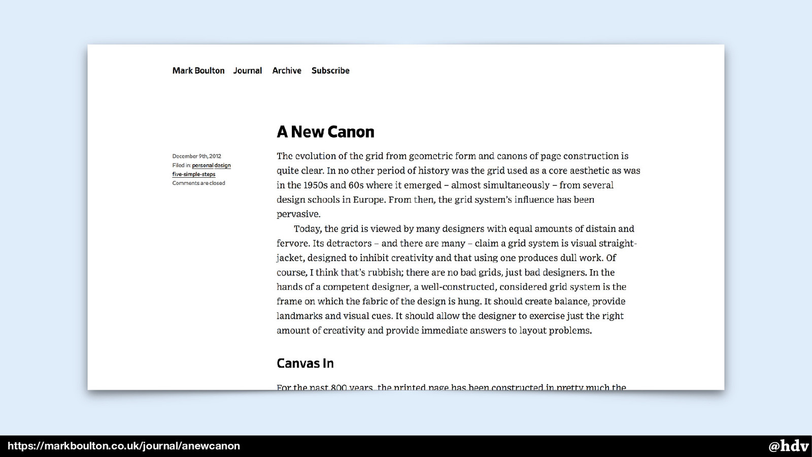
https://markboulton.co.uk/journal/anewcanon
A lot has been written about doing great graphic design in CSS. In 2012, Mark Boulton already reapplied Tschichold's New Typography to the web in an article called The New Canon. A lot has changed since then, and a lot of the maths that he had to work out at the time, we can now leave to the browser.
Slide 50
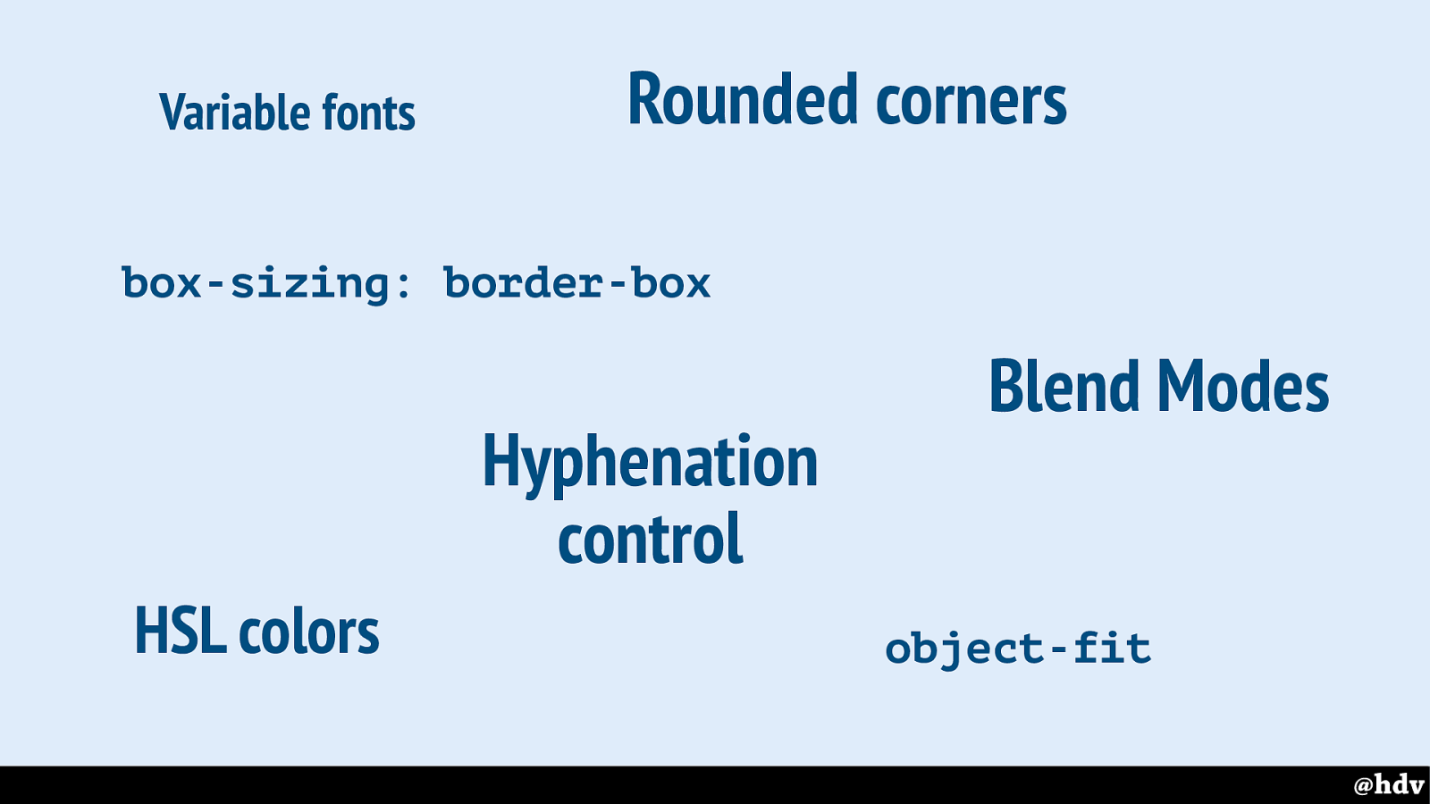
Rounded corners box-sizing: border-box Hyphenation control object-fit HSL colors Blend Modes Variable fonts
There have been many improvements in CSS recently, that make graphic design on the web easier.
Slide 51
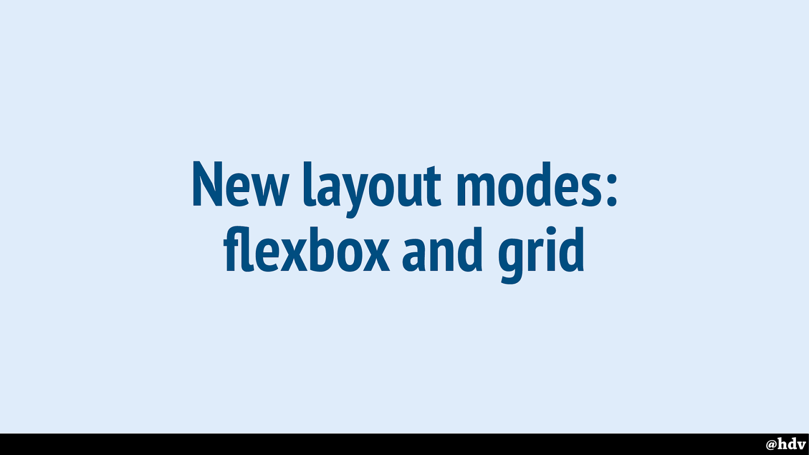
But I'll focus on layout. Because it seems that is where before we could not do a lot of things that make graphic design great. And now we can. Flexbox and grid are new and well-supported.
If you take away one thing from this presentations: these are the first non-hacky methods for doing lay-out on the web and they are built in right into the browser. Into all recent versions of all browsers. They'll let us define what we want, and make the browser deal with the mathematical fiddly bits.
Slide 52
So equal heights is one thing that has traditionally been difficult to deal with. I've had this often, where I was building a design that had three perfectly lined up columns, each with the same content.
Slide 53
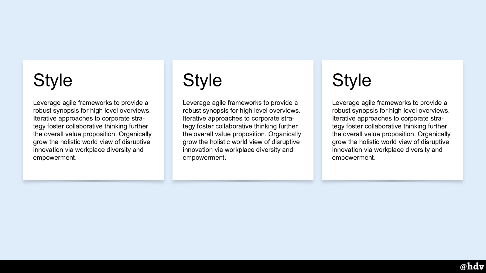
Something like this. Fits perfectly.
Slide 54
This is fixed in our two new layout modes. Both grid cells and flex items have a default size of ‘stretch’, which makes them fill all available space.
Slide 55
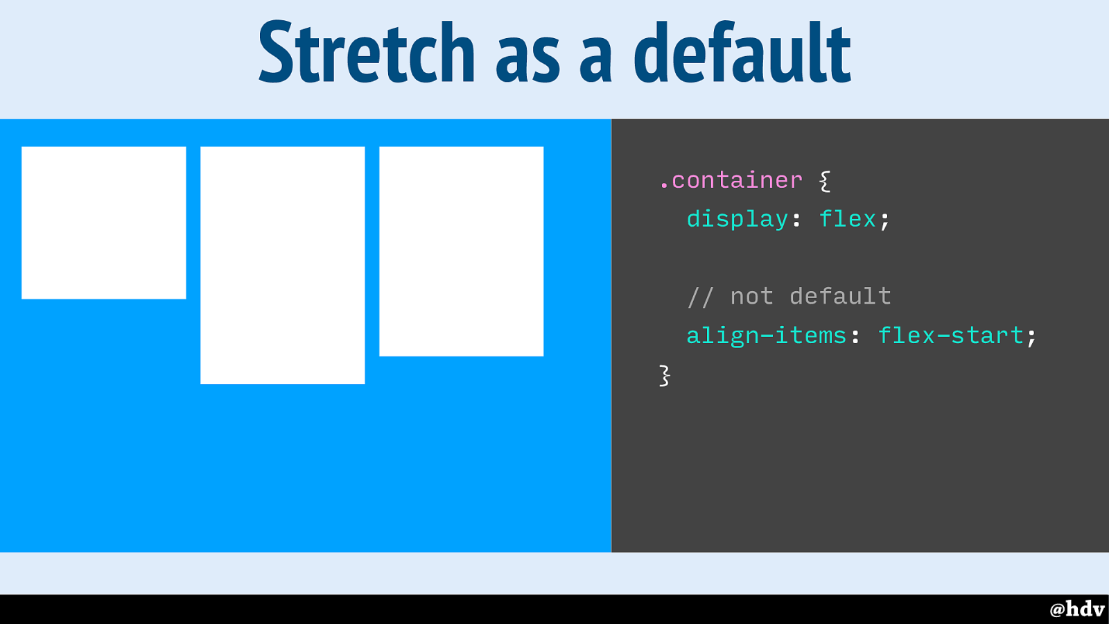
Let's look at this in practice. So because grid and flexbox allow left over space to exist and be reassigned, we can choose where we want it. So here we have three items aligned to the start of the container.
Slide 56
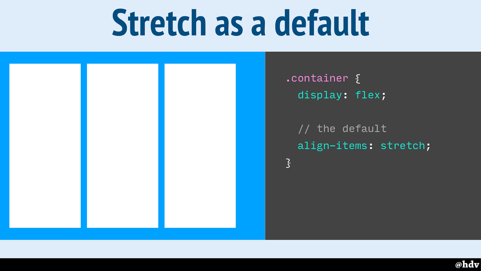
With stretch, these items will take all available space. The 'stretch' value is actually the default, so by default these things get the same height. (And the size of the container depends on the tallest item)
Slide 57
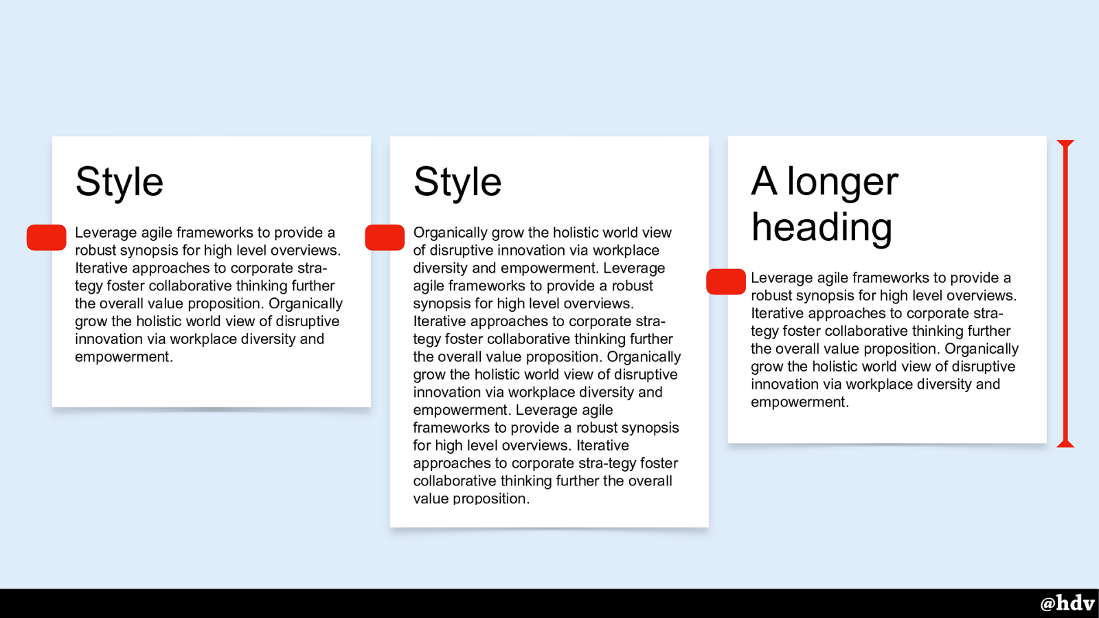
A large part of what makes great graphic design, I think, is composition. It's about where you put things and which places you leave empty, intentionally.
Slide 58
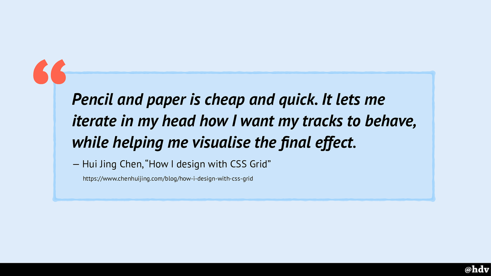
The best article I saw recently about designing with Grid Layout, is written by Hui Jing Chen, she explains that when building grid layouts, it helps her a lot to sketch them out on paper.
Slide 59
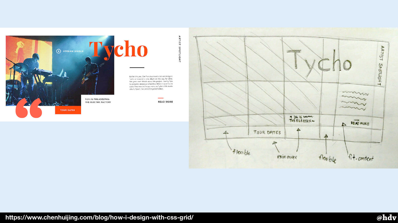
Here's the example she shows in her article: the design on the left and the sketch on the right. She explains it is great for figuring out which parts of your grid will be flexible and which parts are fixed. As we'll see in a minute, CSS Grid Layout lets you do anything you like, so it is super useful to sit down and decide what you want.
I think it will also be a great approach if you're trying to have whitespace in your design, if you need to decide where it needs to go.
Slide 60

So here's a bit of content in its default mode. With no further CSS applied to it, it just takes up all the available space in the viewport.
Slide 61
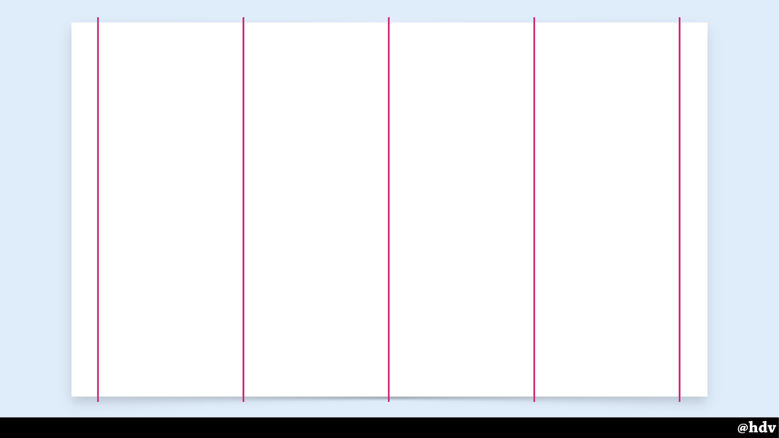
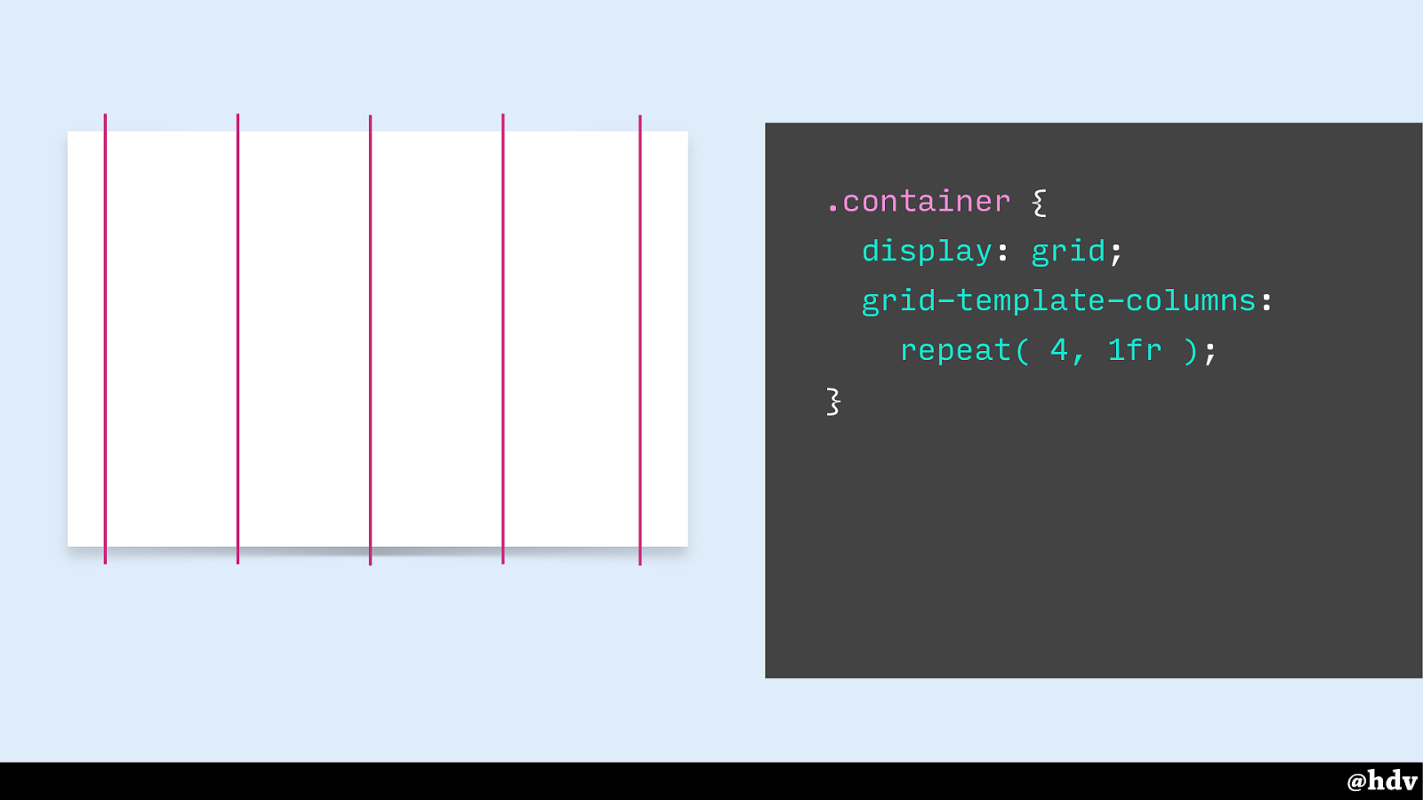
Maybe we want to organise this layout into four columns.
Slide 62
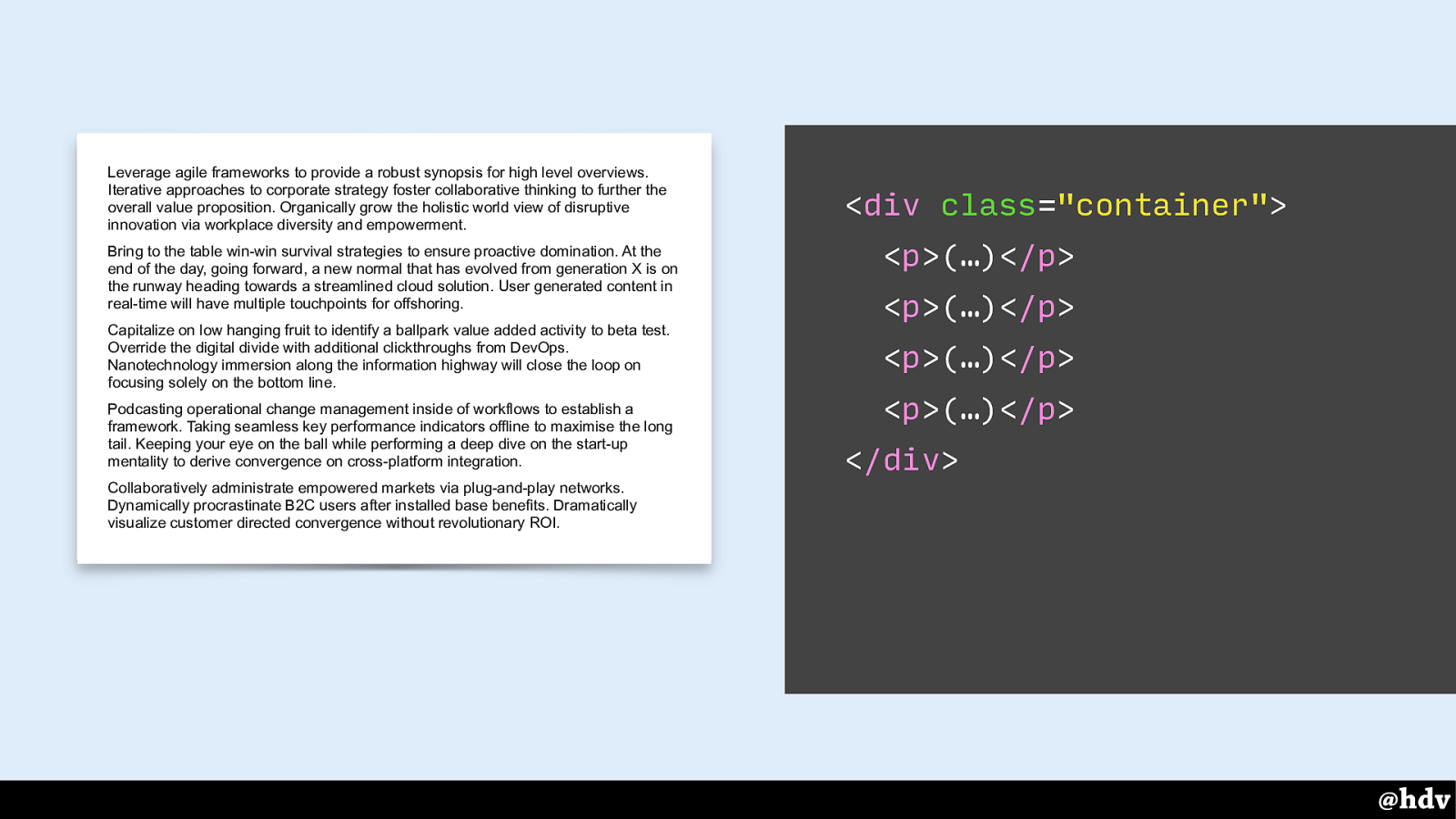
This is the page as I showed it before, it has four paragraphs of text. So: four columns, four paragraphs.
Slide 63
This is the page as I showed it before, it has four paragraphs of text. So: four columns, four paragraphs.
Slide 64
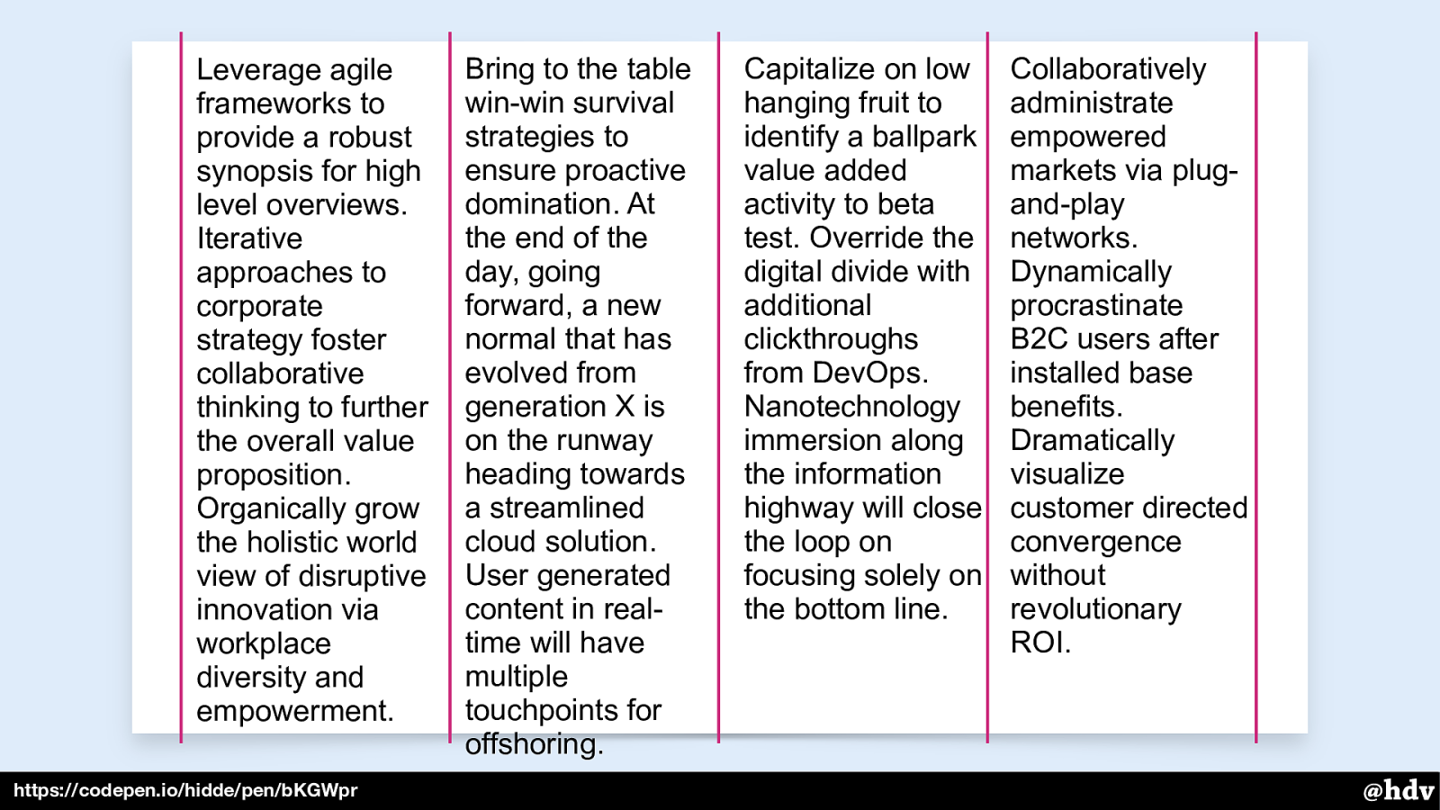
Auto placement will put each of these paragraphs into the first available column. So the first paragraph goes into the first column, the second goes into the second column.
Slide 65
https://codepen.io/hidde/pen/bKGWpr
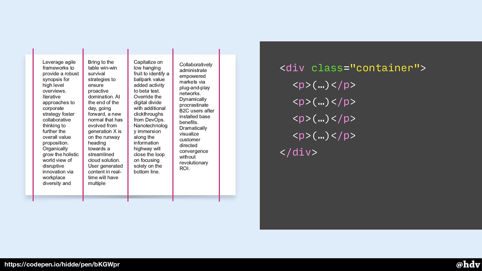
Each paragraph goes into a column. This is because they are direct children of the grid container, and direct children become grid items.
What if we wanted to group them and put them all into one column? We can do that by wrapping the paragraphs into one element.
Slide 66
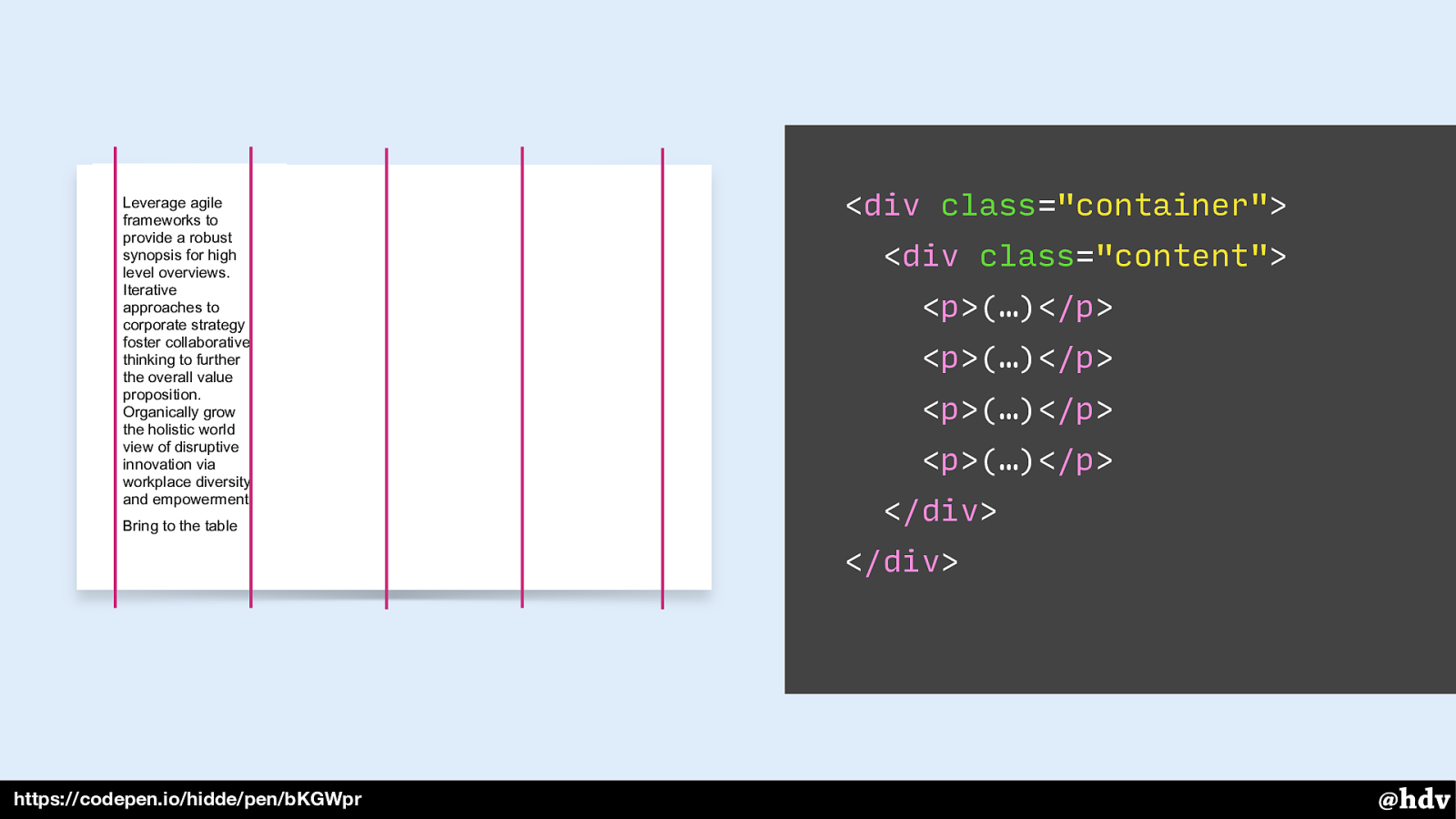
Now that one element is the only grid item and it goes into the first available container.
Slide 67
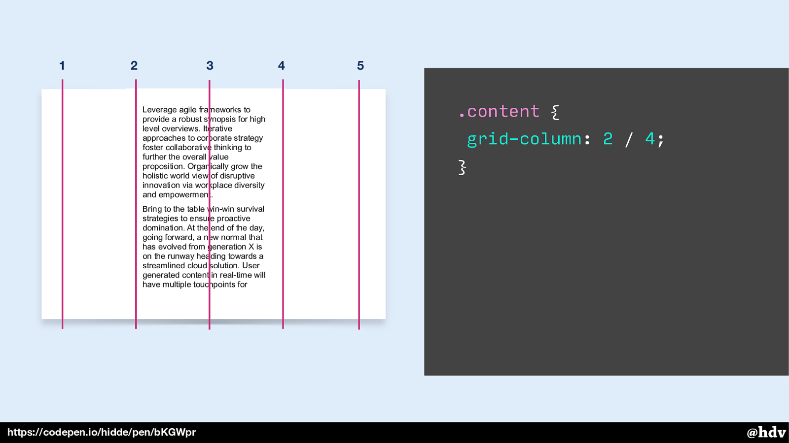
Grid Layout also lets us intentionally place content in specific grid columns. For example, we can put content into the second and third column. Note that with this syntax, we're putting content between numbered grid lines.
Slide 68
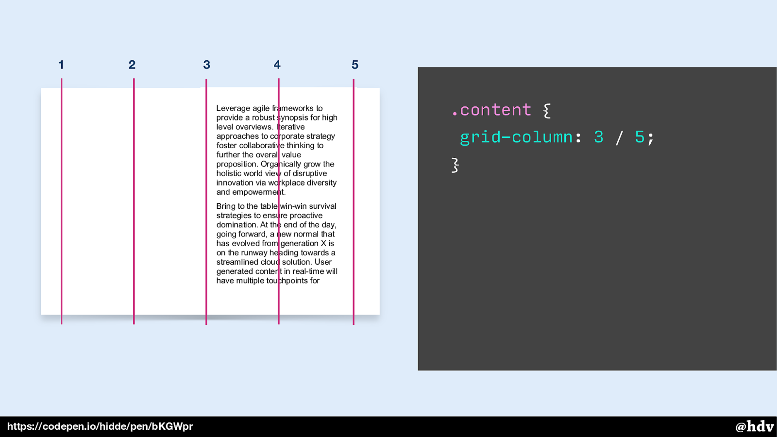
Or in the two last columns.
Slide 69
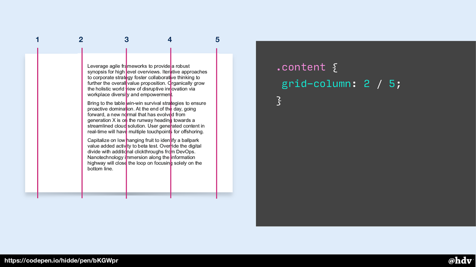
Or three columns, that also works.
Slide 70
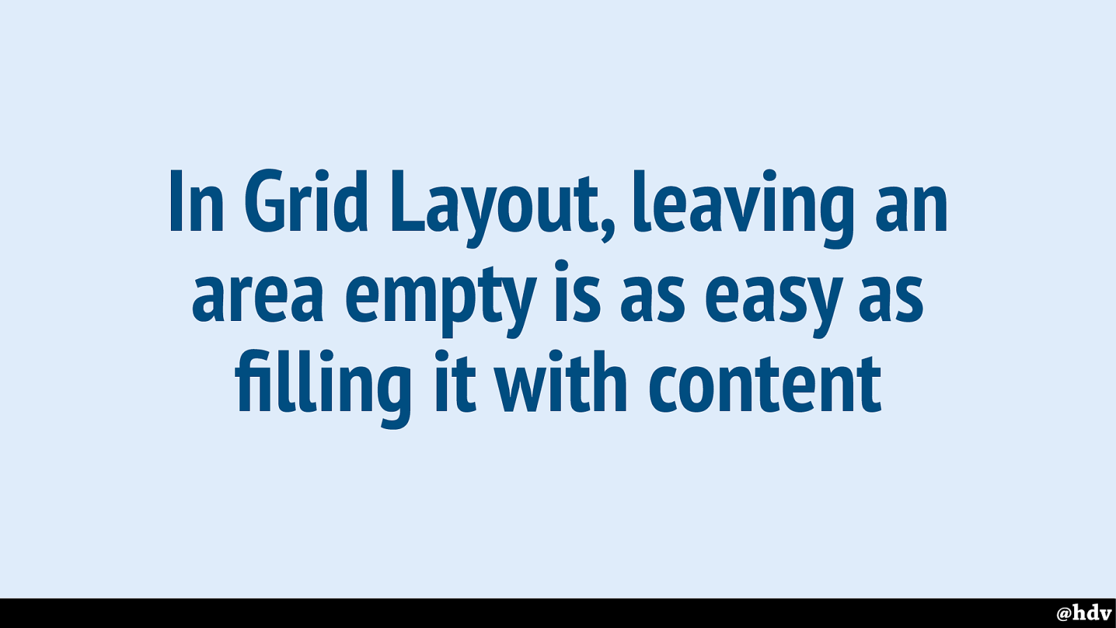
The point is, in Grid Layout it is as easy to fill parts of the grid with content as to leave them empty and have whitespace. The whitespace will stay, we don't need to add content to them for them to remain visible.
Slide 71
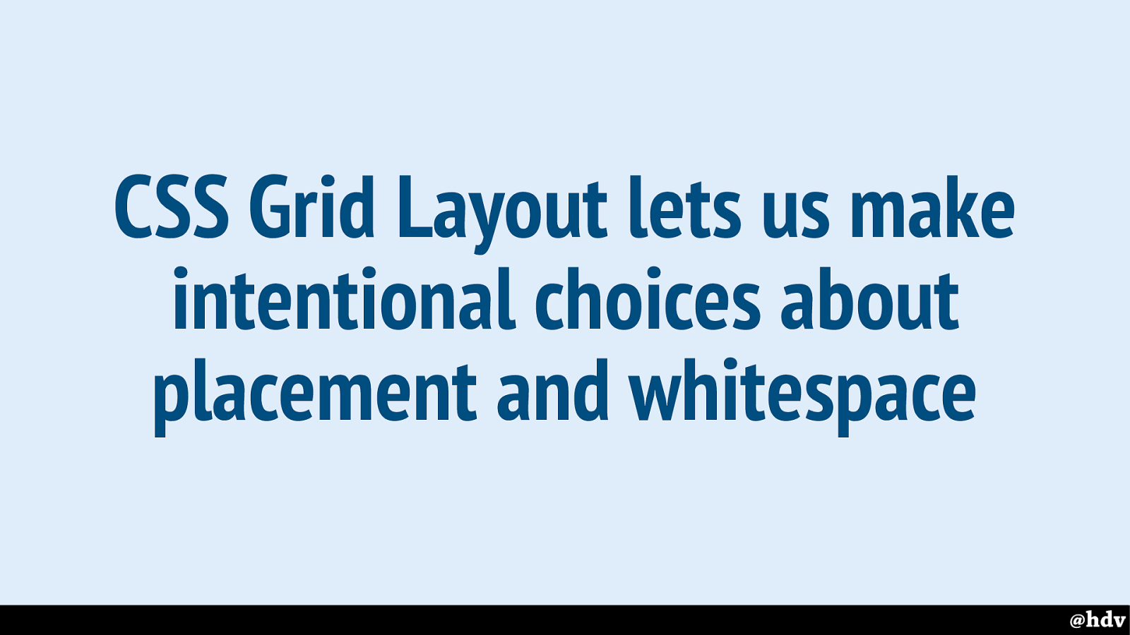
CSS Grid Layout lets us make intentional choices about placement and whitespace.
Old graphic design heroes talked about making deliberate choices about whitespace and where to put things, how to organise things. CSS Grid Layout is the first thing in CSS that brings that kind of intentional choices to the web.
Slide 72
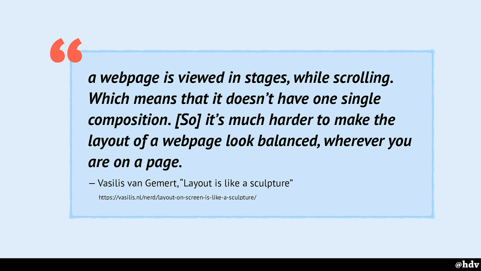
quote: a webpage is viewed in stages, while scrolling. Which means that it doesn’t have one single composition. [So] it’s much harder to make the layout of a webpage look balanced, wherever you are on a page. — Vasilis van Gemert, “Layout is like a sculpture”
https://vasilis.nl/nerd/layout-on-screen-is-like-a-sculpture/ “
It's still the web, so intentional placement is harder than in print. It's all about composition, and that is arguably harder on the web. This is due to scrollbars, you never see the whole thing. Vasilis van Gemert wrote a great short post on this.
Slide 73
A second thing that we see the great graphic designers do a lot, is to use mathematical proportions to lay things out. Both flexbox and Grid Layout let us do this.
Neither is better than the other. Flexbox let us do this from items, Grid Layout from the container.
Slide 74
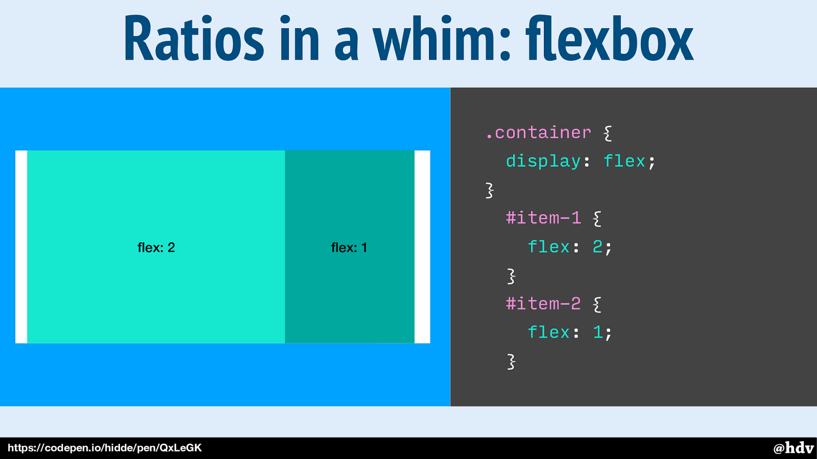
When we set display:flex to the container, its direct children become flex items, which means we can give them flex properties. With flex, we can say something about their size in relation to the other items in the same flex container.
Slide 75
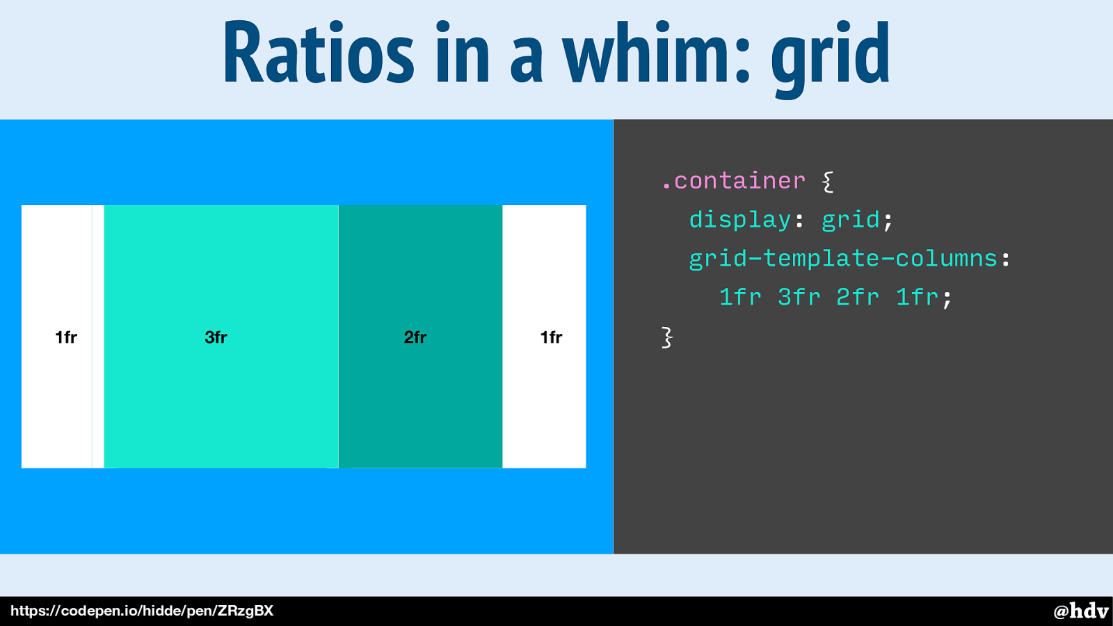
With Grid Layout, we work from the container, we define the layout on the container. In this example, I am creating a grid with some columns, so each value in that grid- template-columns property is one column. They are set with the fr unit, which means fraction. Basically, we're saying that the second column can be 3 times as wide as the first, the third twice as big.
Slide 76
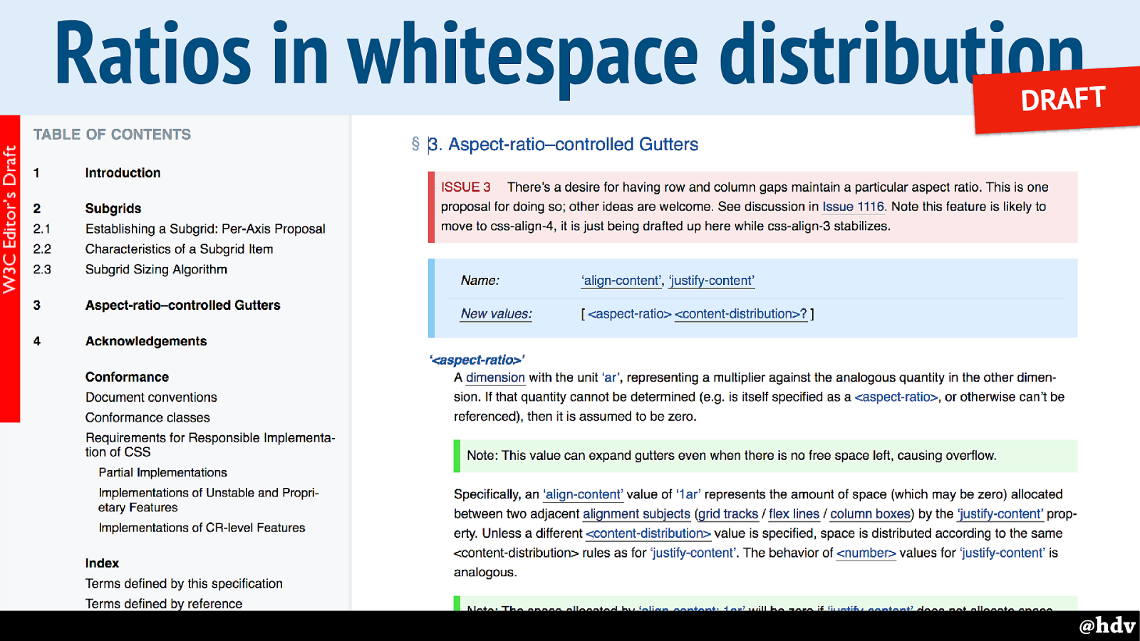
With the newly proposed ar unit, you could have the space between be a ratio between row and column gaps!
Slide 77
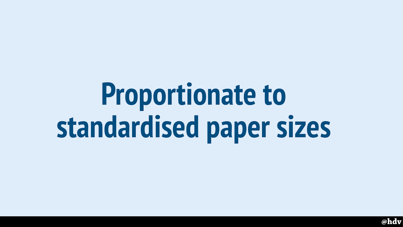
Another thing that kept last century's designers busy is standardised paper sizes. They based some of their grids on standard paper sizes. Can we do something similar?
Slide 78
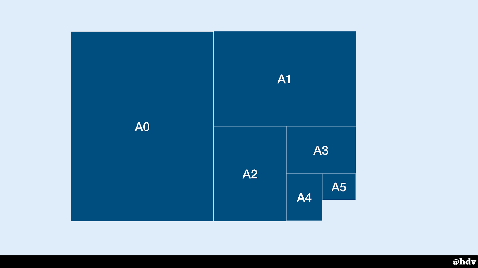
Paper sizes, for example.
Slide 79
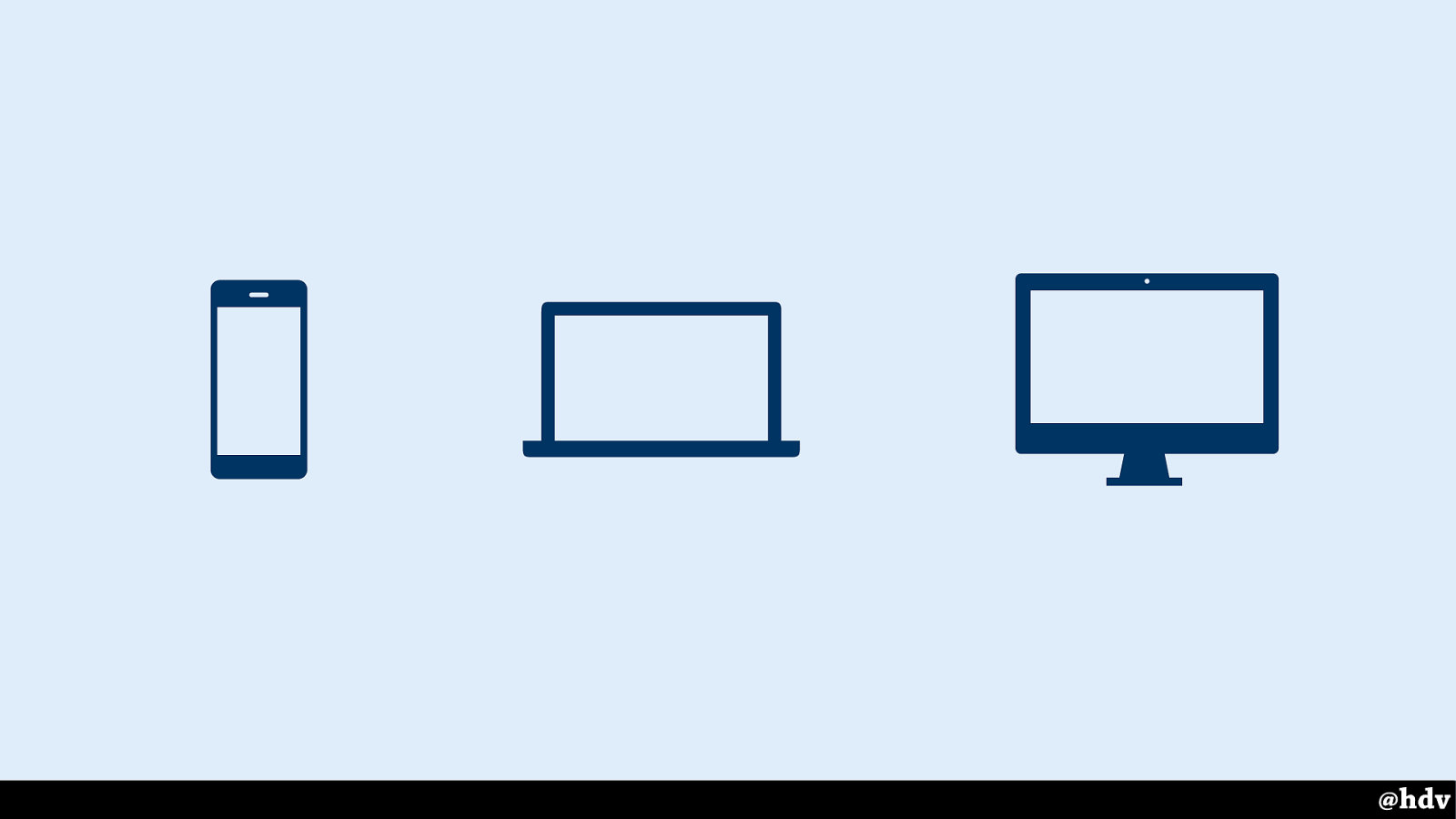
Here's our standard, right? Phones, laptops desktops. Boom. Easy. Or is it? Wouldn't it be great?
Slide 80
I still see this happen it at my clients, designers design stuff for specific viewports, e.g. one iPhone design, one iPad design and one MacBook design.
It is not the worst thing ever, it can even work well, as long as we keep in mind there's hundreds of possibilities in between.
Slide 81
We're working for any viewport when designing for the web.
Slide 82

Viewport width is a number between 1 and 100 and basically a percentage of the viewport. Vh is the same for height.
Slide 83
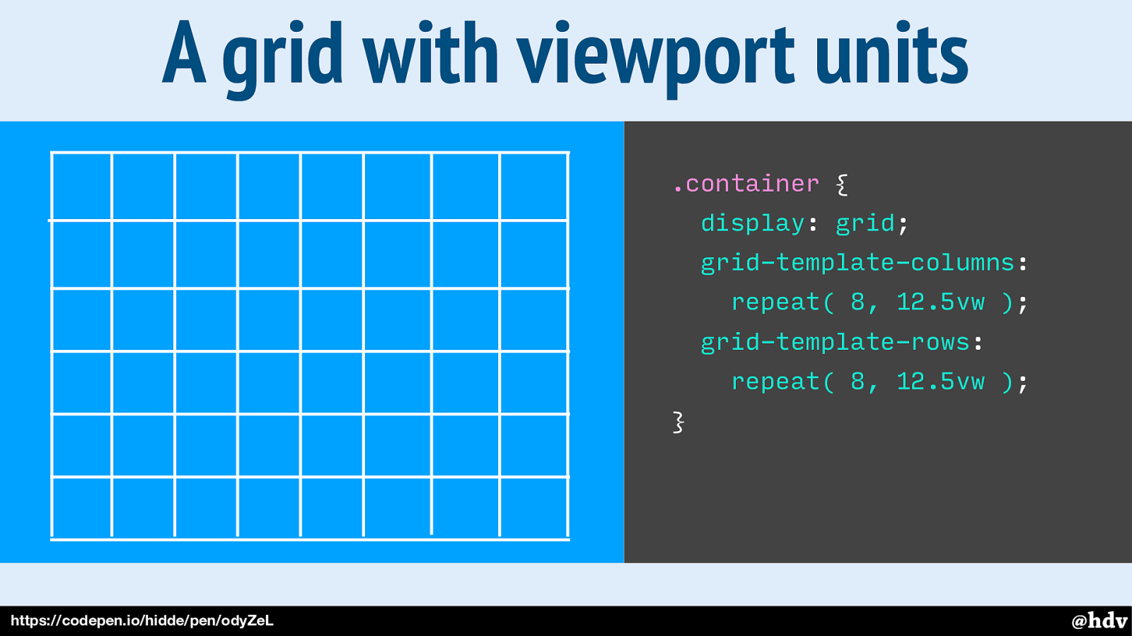
We can base our layouts on viewport units and create some ‘grid fields’, or as we call them in CSS, ‘grid cells’.
Slide 84
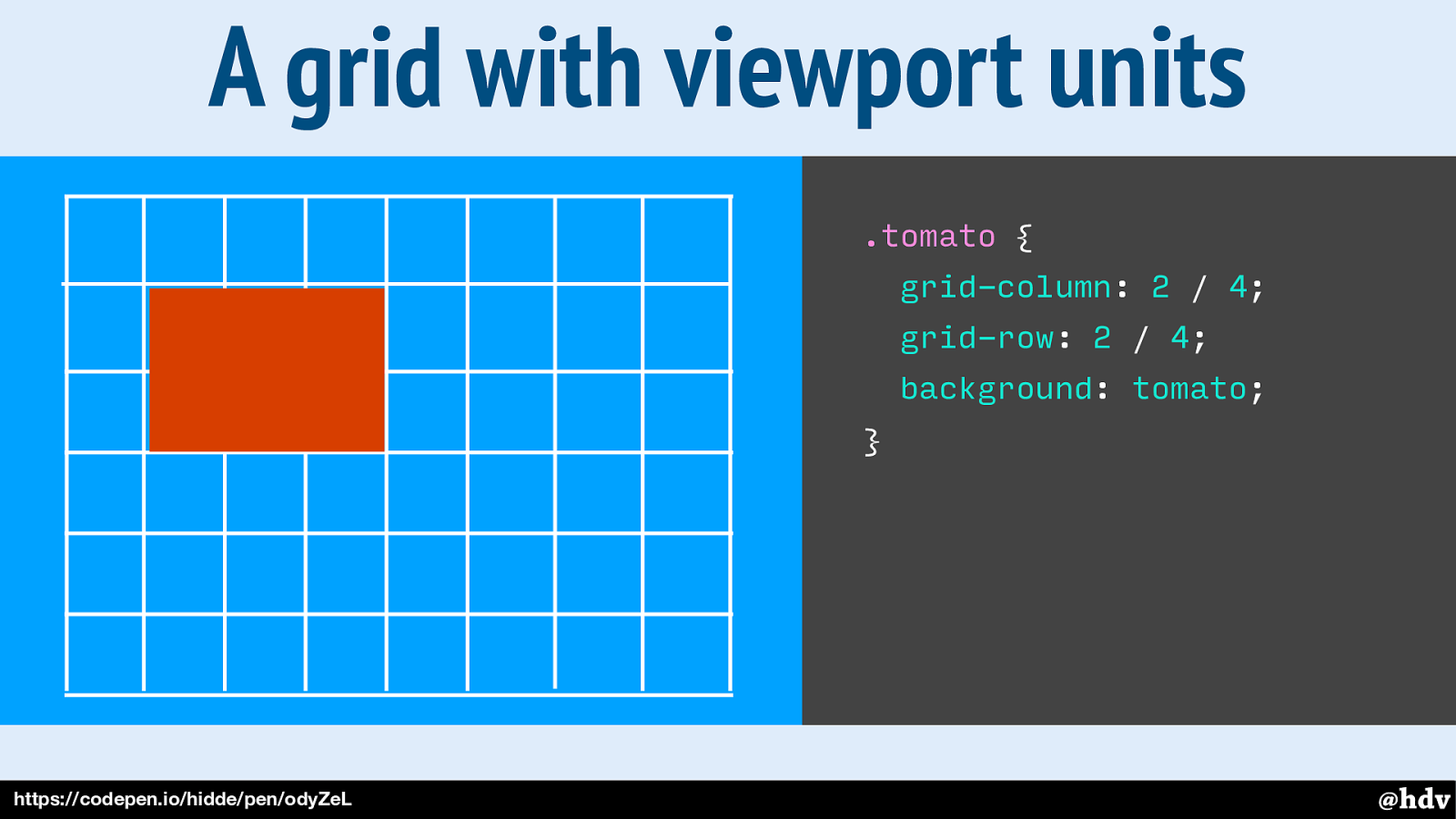
So if we add a div called tomato onto it, we can tell it which cells to occupy.
Slide 85
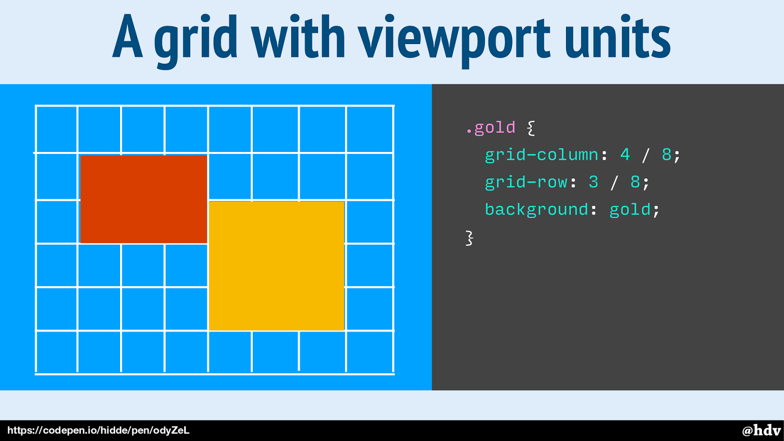
And let's add another div, called gold.
Slide 86
And let's add another div, called gold.
Slide 87
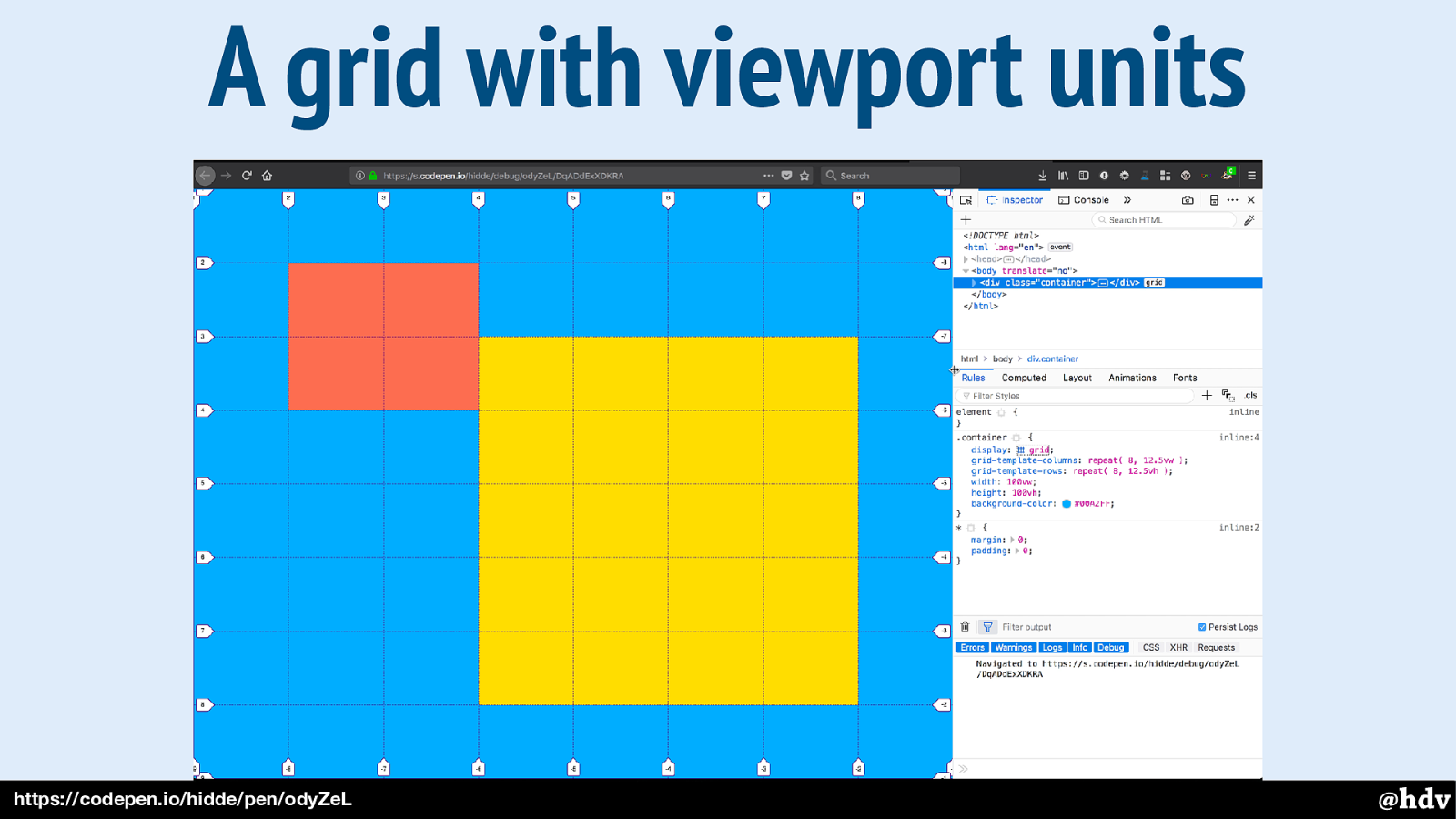
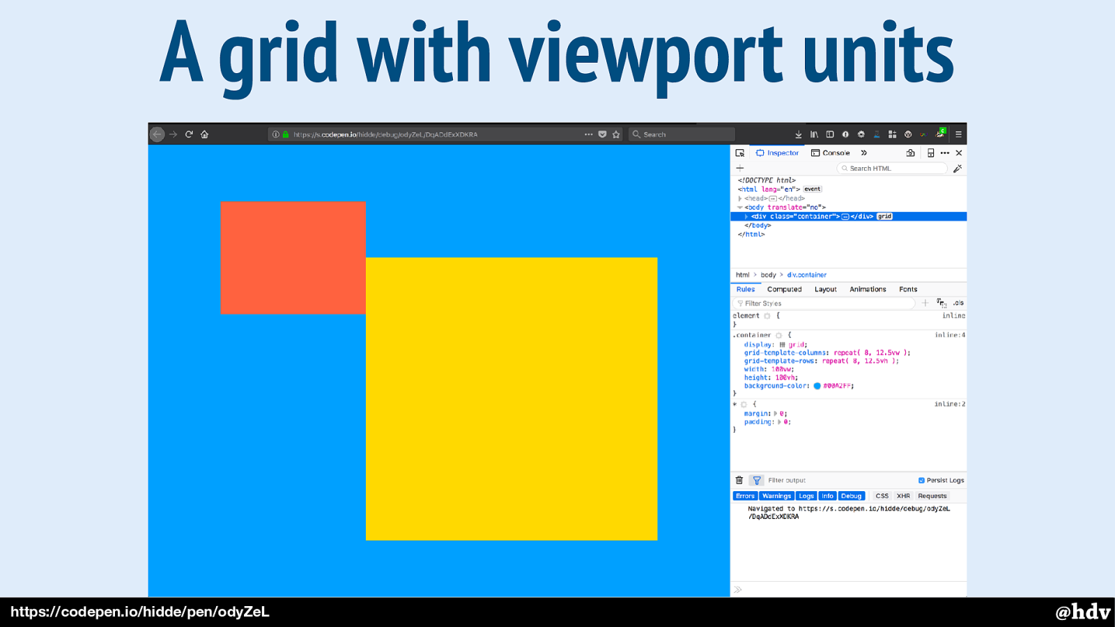
And this is what it looks like with the Grid overlayed, using Firefox' Grid inspector.
Slide 88
Grid Layout helps mixing typography with photo, as it lets us put two things into the same place.
Slide 89
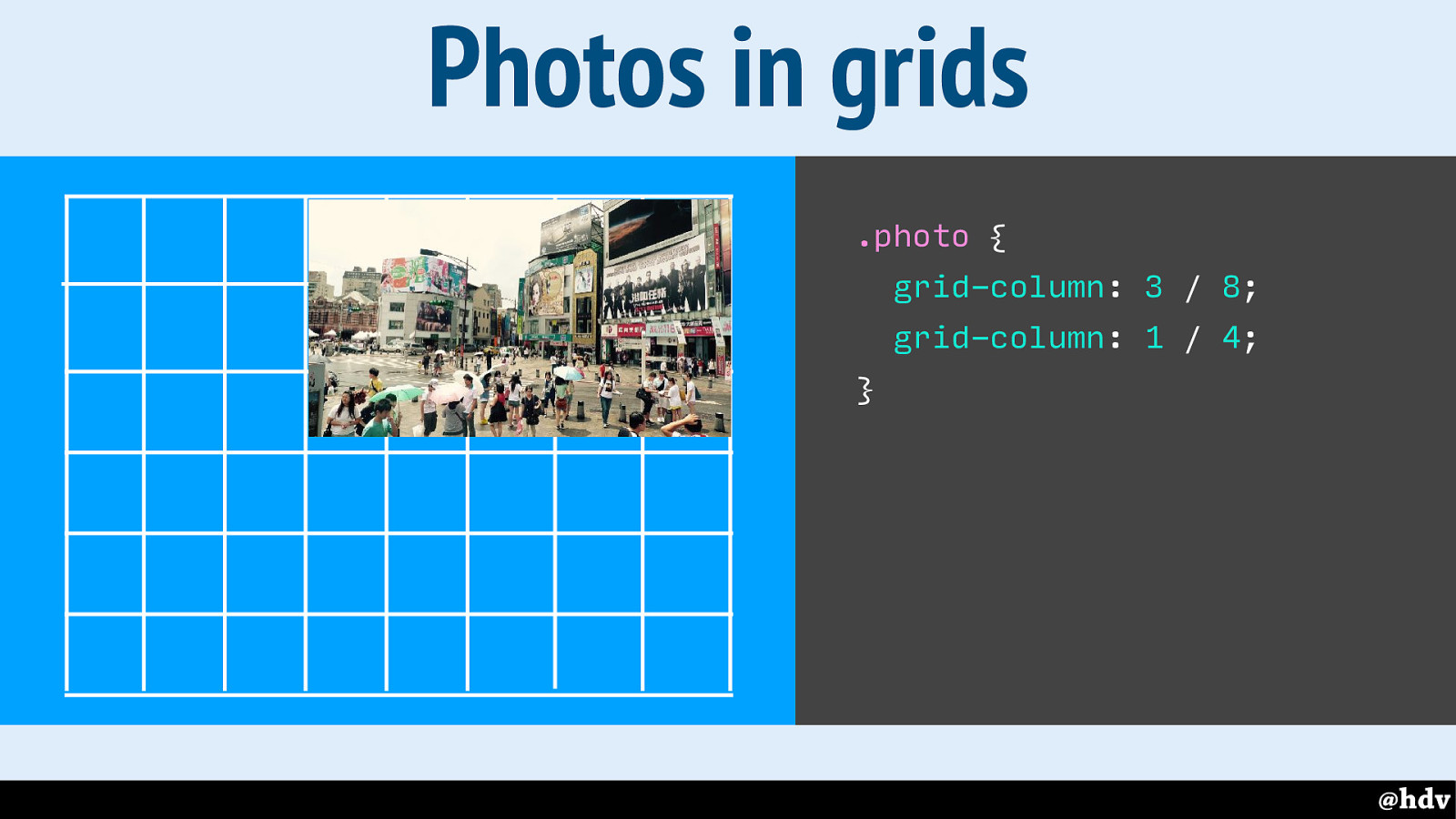
So here we're positioning a photo on the grid.
Slide 90
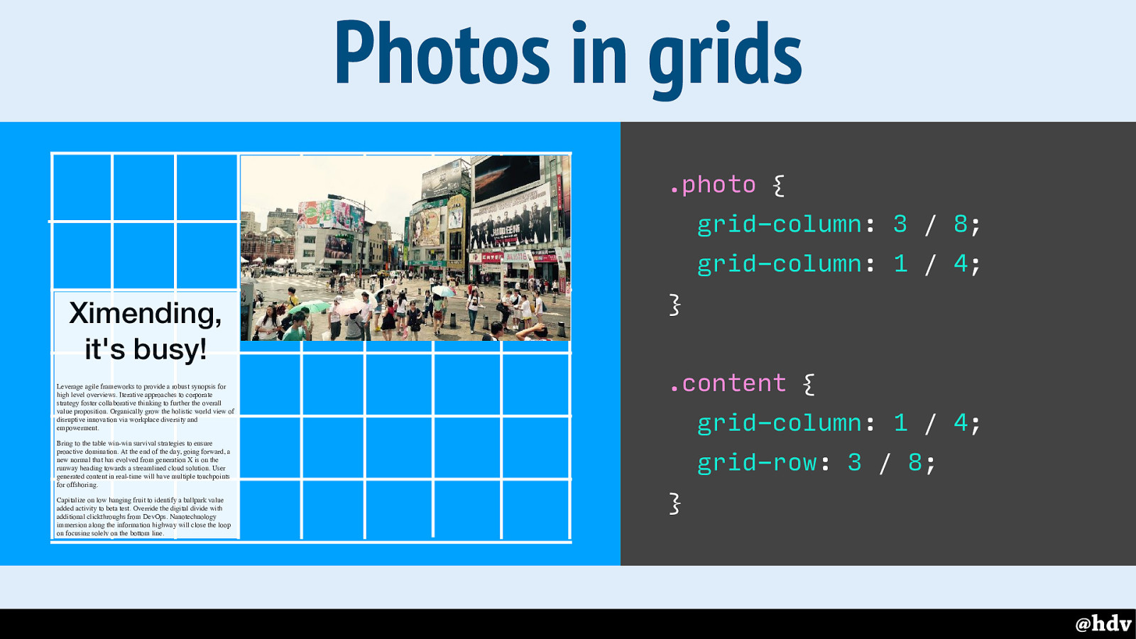
Let's add some content, too.
Slide 91
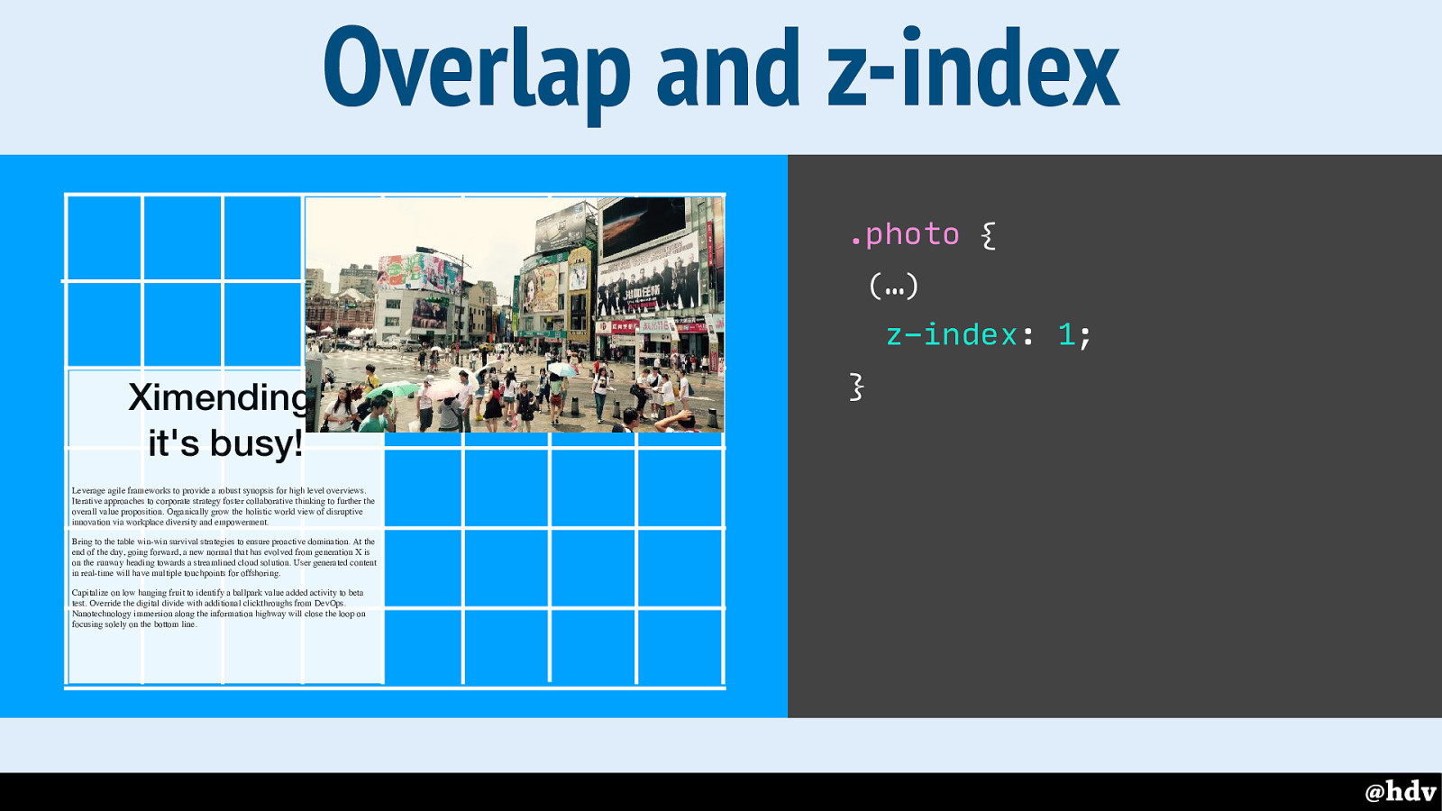
If we make the content use more grid cells, it overlaps with the photo, following source order. With z-index we can actually influence this.
Slide 92
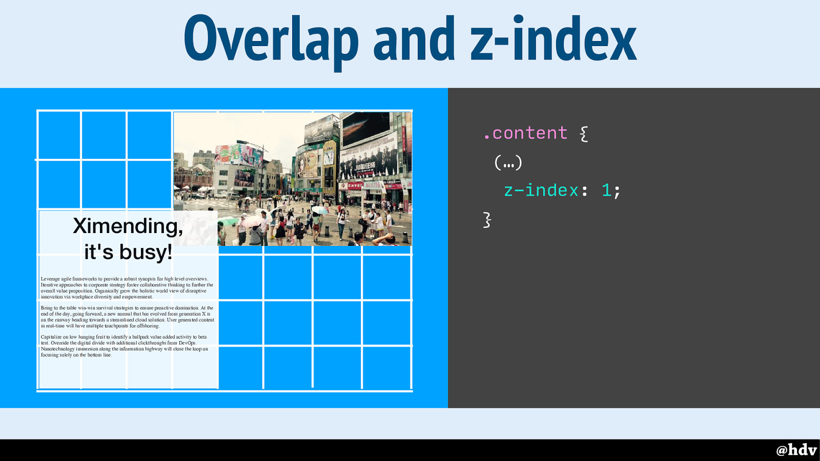
Just like you would with position: absolute, but without having to absolutely position anything.
Slide 93
There is many other things to new lay-out too, for example the masking and shapes we saw yesterday at Aga's talk.
Slide 94
So, can we say we're ready for great graphic design? Well, for one reason we can't. There's one question people have kept asking me when I talked about this in workshops.
Slide 95
Will everything look the same in every browser? If you've been to any web conferences in the last 10 years, it must really sound like a broken record, but I'll repeat it once more: it doesn't need to. Website's don't need to look the same in every browser.
But I'll try and be realistic, I know we don't all live in happy land, some of us work for huge corporate clients, where process demands things to be the same. When I talked to some friends that work on big sites, one of them said they will wait a couple of years, until IE11 is no longer used, before they start using Grid Layout. That's the real world some people are in.
With that in mind, let me try to show you Grid is ok to use NOW.
Slide 96
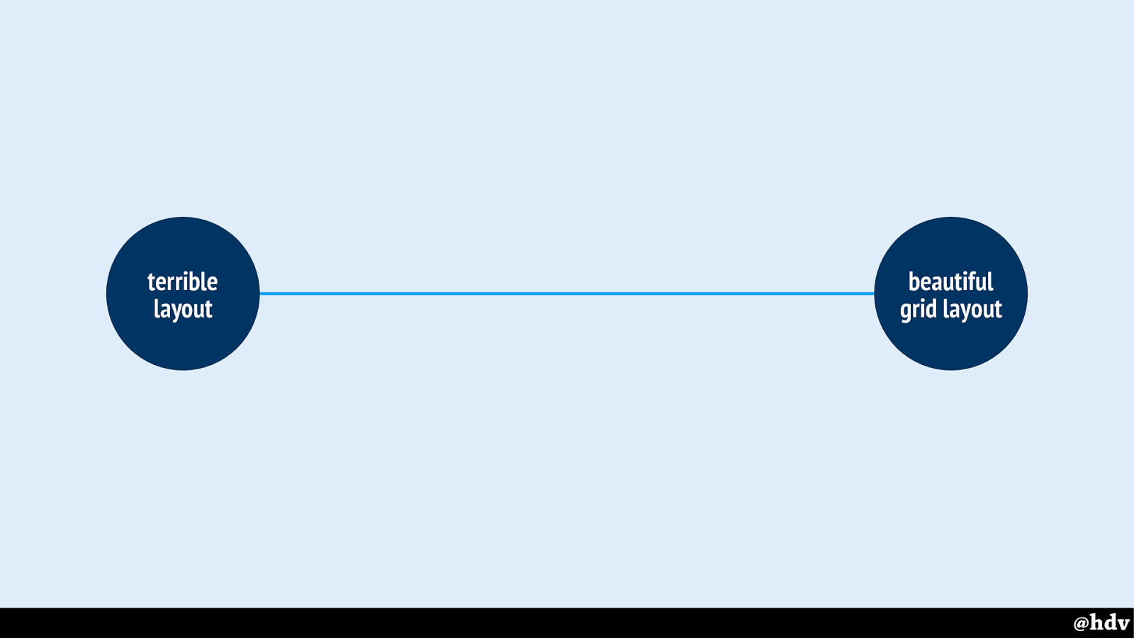
've drawn a quick line as to what can happen between browsers that support grid and those that don't.
Slide 97
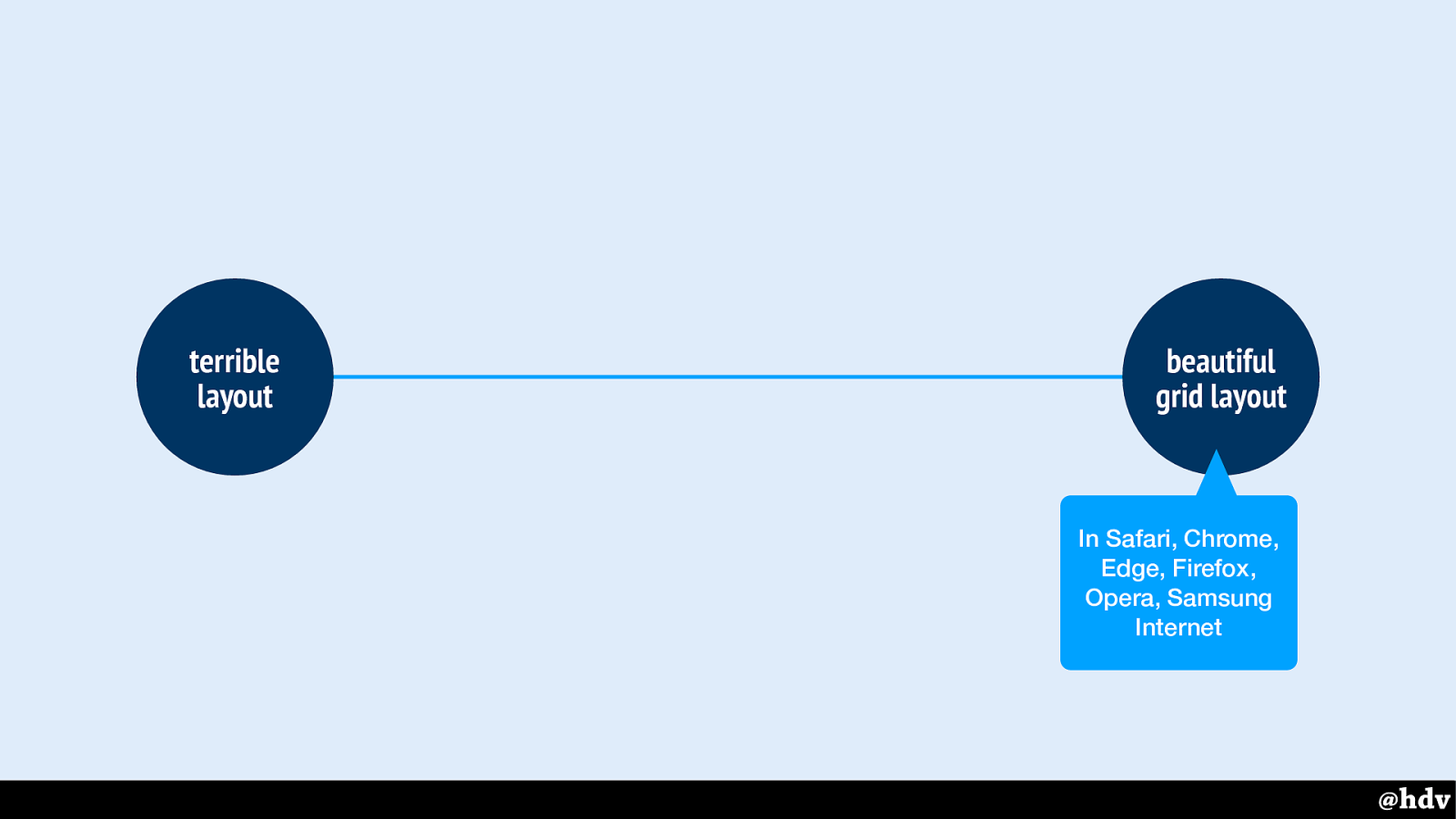
Supporting browsers will have beautiful grid layout, and non supporting ones terrible layout. Maybe?
Slide 98
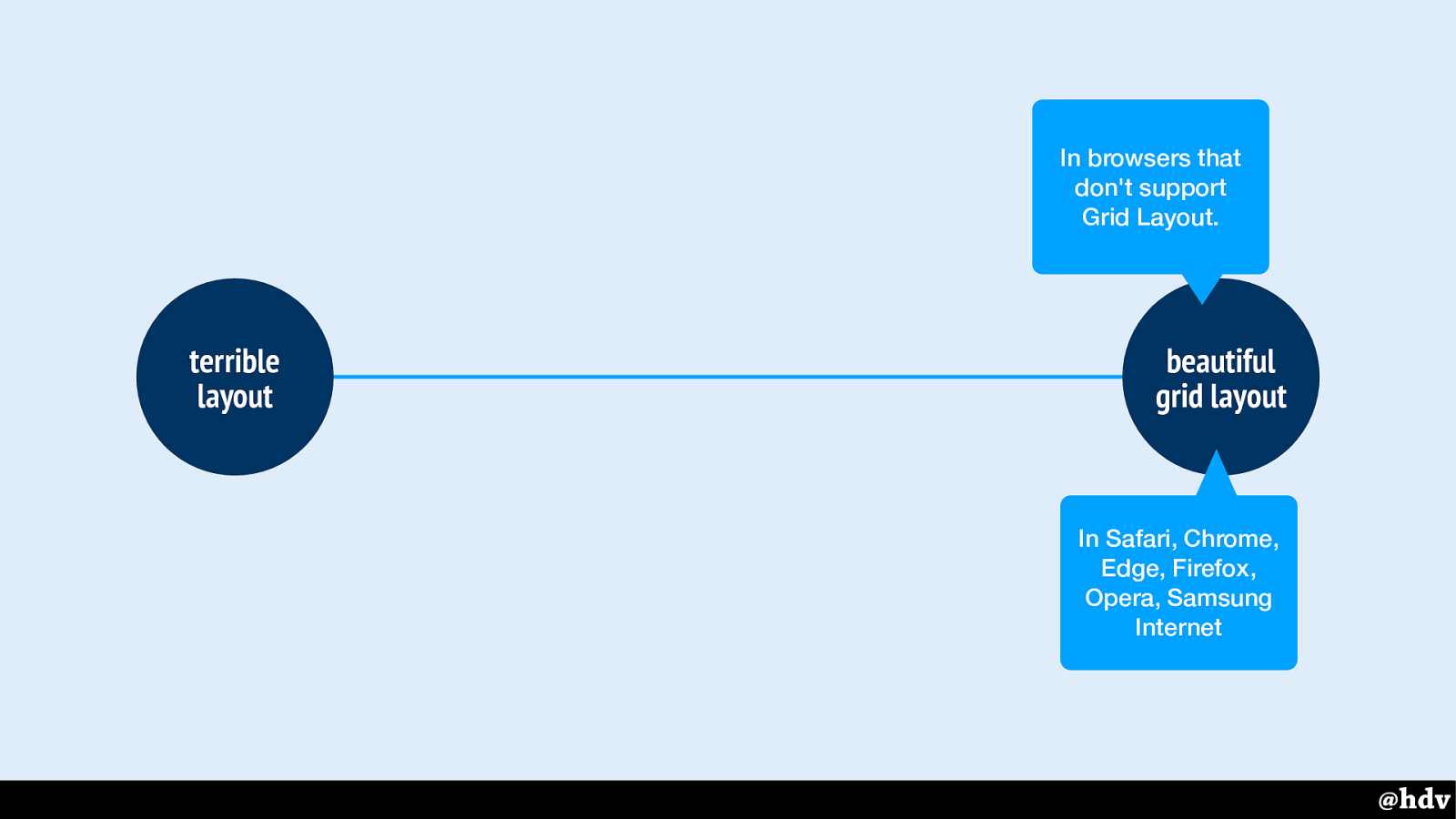
Some will try to get exactly the same layout in browsers that don't support Grid Layout, or look for frameworks or tools that help do this. But this might take so much time that you might as well just use technologies that work in more browsers. If it was possible it would be doing math that the browser was doing directly in JavaScript which then executes in the browser. In browsers that are older to begin with! Oh and you can't do much CSS custom layout stuff via JavaScript, not until Houdini, which is only in new browsers!
Slide 99
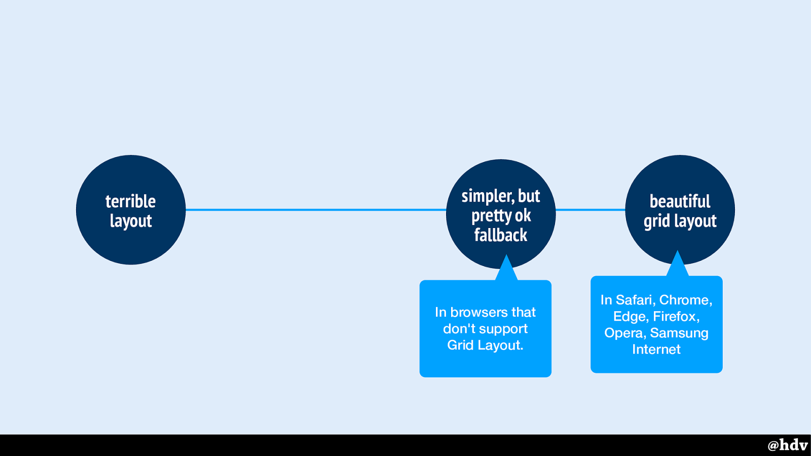
It really doesn't have to be like that, we can have a simple fallback that effectively makes the content look pretty ok.
That fallback will then work in browsers that don't support grid lay-out, so that nobody needs to suffer from a terrible layout.
I really recommend keeping this simple, for everyone's sanity: people building it now, people maintaining it later.
Slide 100
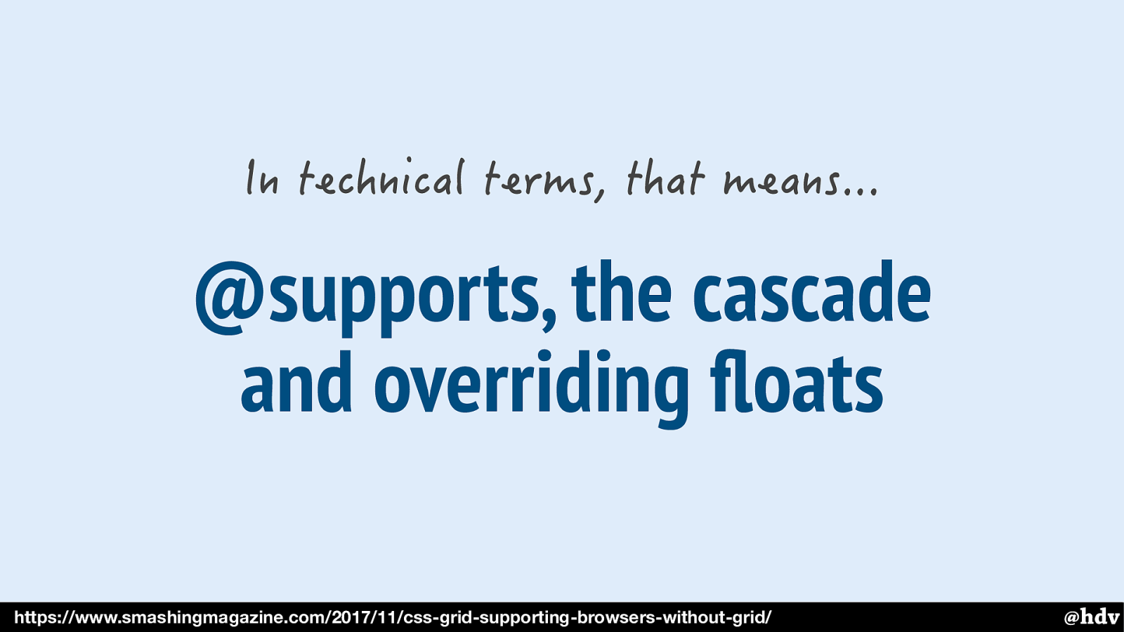
These are some ways to do that. But the technology is probably not even the most important thing, if you keep it simple you don't need to go overboard with complex stuff. The more important problem is probably this:
Slide 101
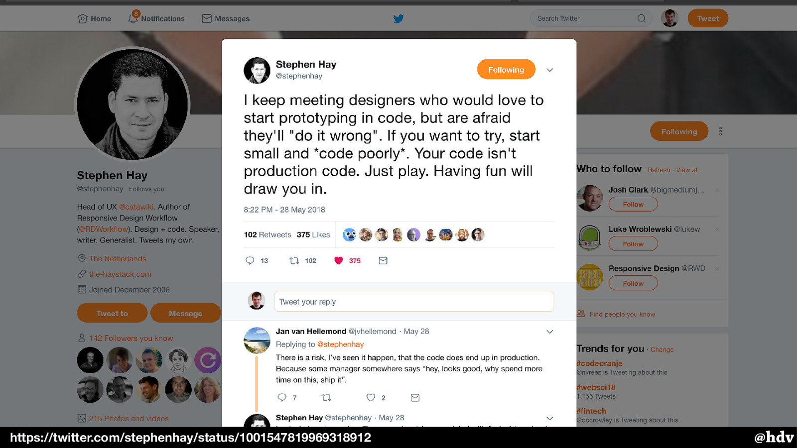
Stephen Hay tweeted theo there day about designers that are afraid to prototype. Don't be, play with this stuff if it interests you, I guess just don't force the team to ship prototypes to PROD.
Slide 102
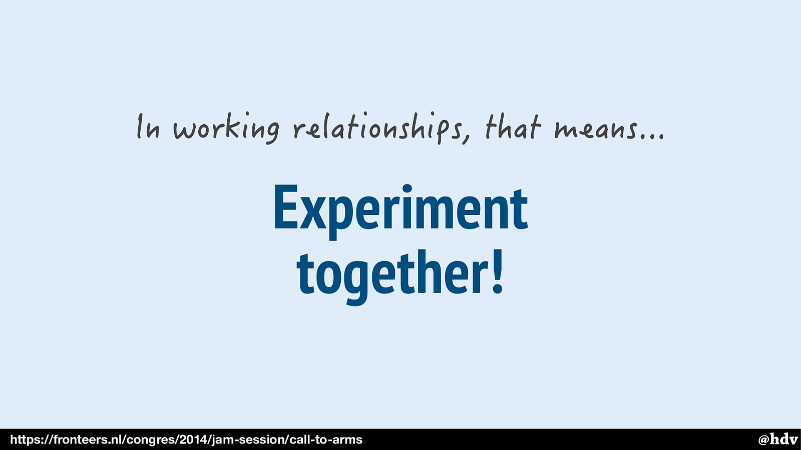
Experiment together! For designers that could mean playing with this, like I said, and for developers it could mean showing what's possible, make some Codepens. Maaike de Laat, who used to be a front-end dev, now UX designer urged front-enders to take responsibility for this at Fronteers conference a couple of years ago: it's the front-enders responsibility to keep designers up to date with what's possible.
Slide 103
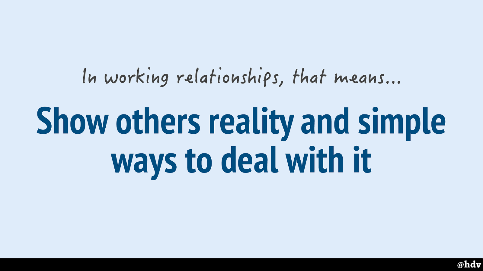
And I think it's important to make sure people know what our reality is like, if we can't technically make everything the same everywhere, that was never possible, but I know there are people who believe it to be possible, we need to show that to whoever believes it and introduce the team to SIMPLE ways to deal with it, for everyone's sanity, keep fallbacks simple.
Slide 104
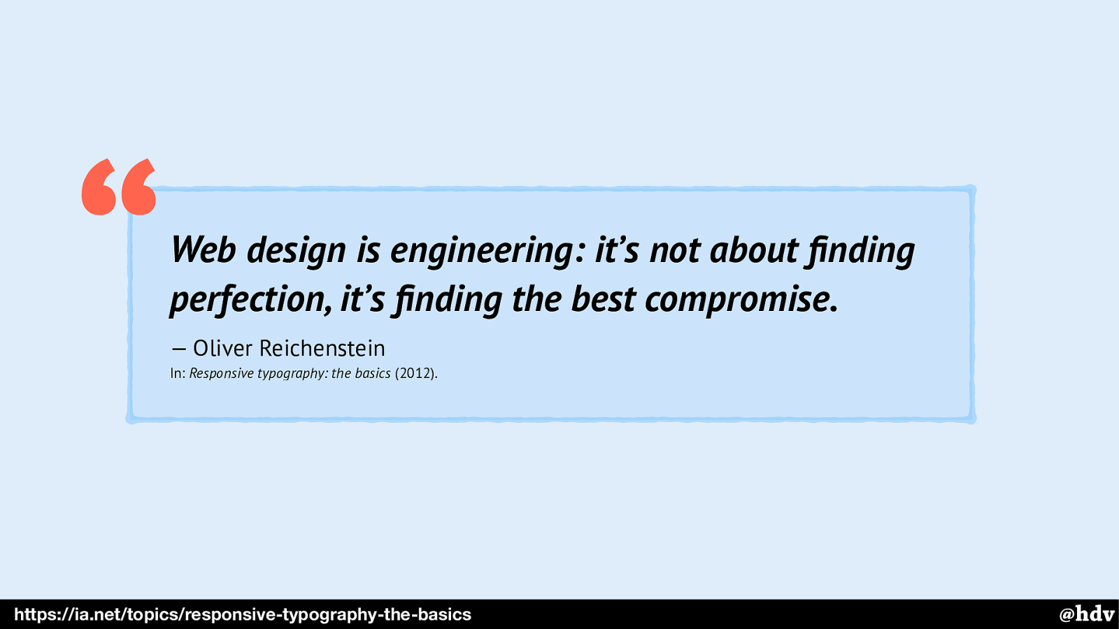
Web design is engineering: it’s not about finding perfection, it’s finding the best compromise.
— Oliver Reichenstein In: Responsive typography: the basics (2012). “
https://ia.net/topics/responsive-typography-the-basics Oliver Reichenstein said it too about designing for the web… find compromises!
Slide 105
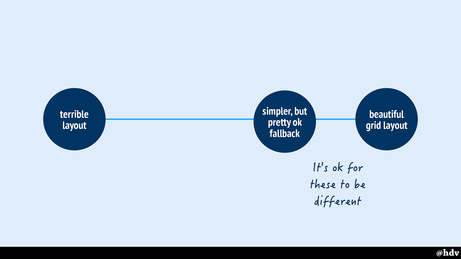
And keep in mind that it is ok for these to be different, we can have different but equally-good-looking layouts.
Slide 106
But should we stop there? Vasilis, who I mentioned earlier, laughed when I talked to him about the slides I was preparing about modernist graphic design… is that all there is to it, that we can be inspired by graphic design? What if we turn it around, how can we make it so that graphic designers get inspired by our web design?
Slide 107
Well, at least I hope I've shown that things that used to be hard are now built-in to browsers
Slide 108
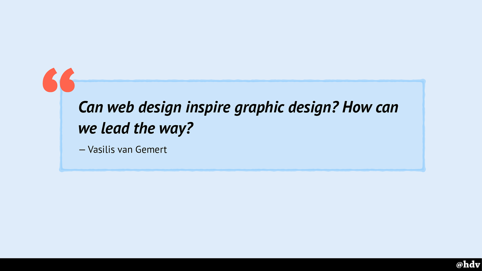
Can web design inspire graphic design? How can we lead the way?
— Vasilis van Gemert
How can we lead the way? How can we make great web design that is better than the graphic design of the day, and can inspire modern graphic design?
Slide 109
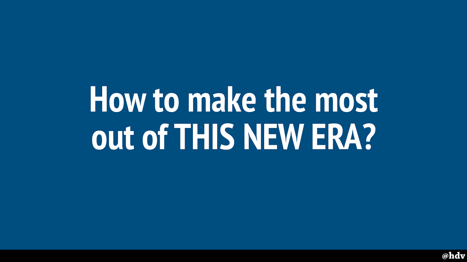
How to make the most out of this new era?
Slide 110
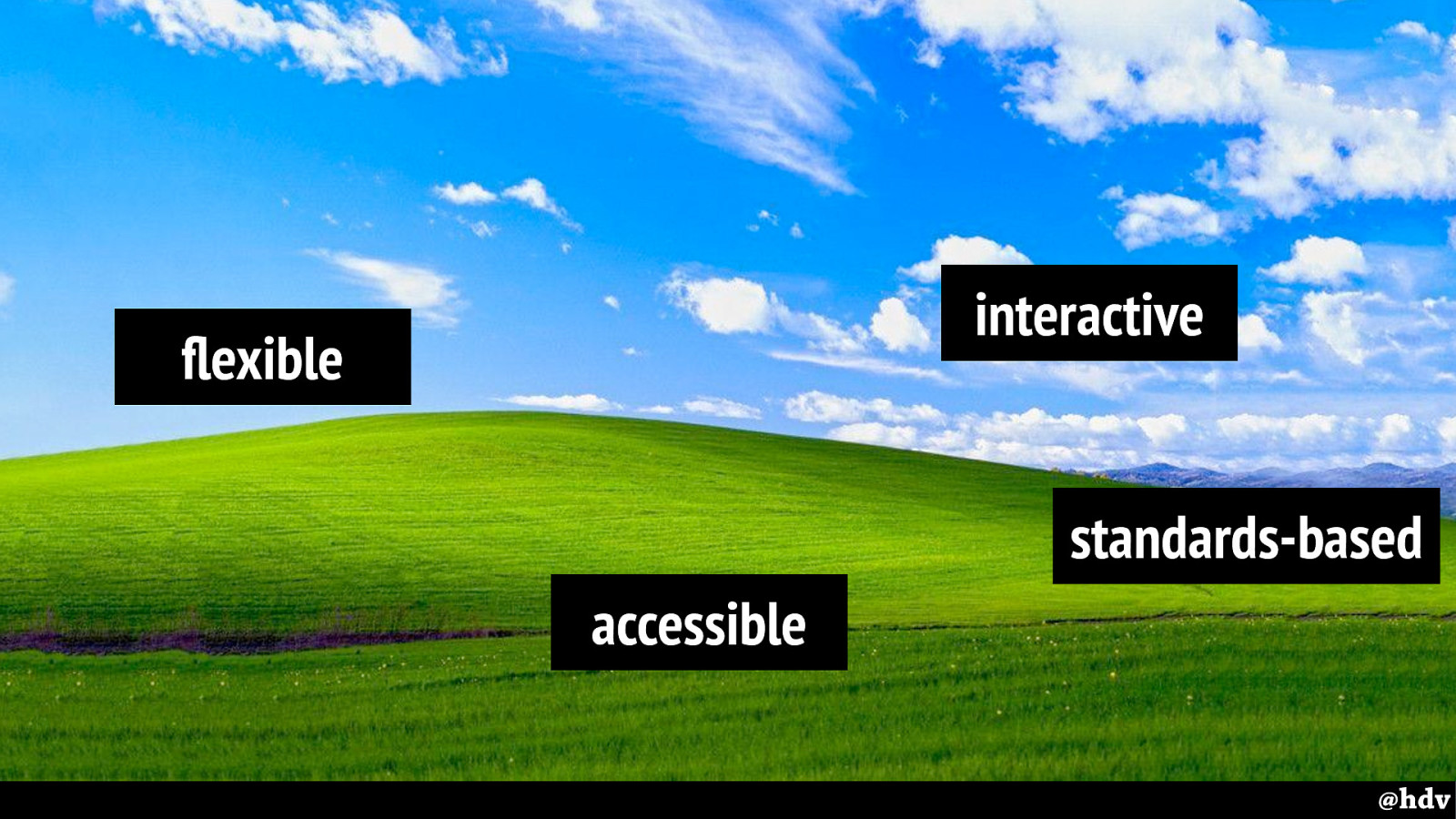
To have great graphic design on the web, that can truly inspire print design, we'll at least need to get these defaults for the web right. We'll need to embrace these defaults and to create great experiences that make them more usable than traditional graphic design.
Slide 111
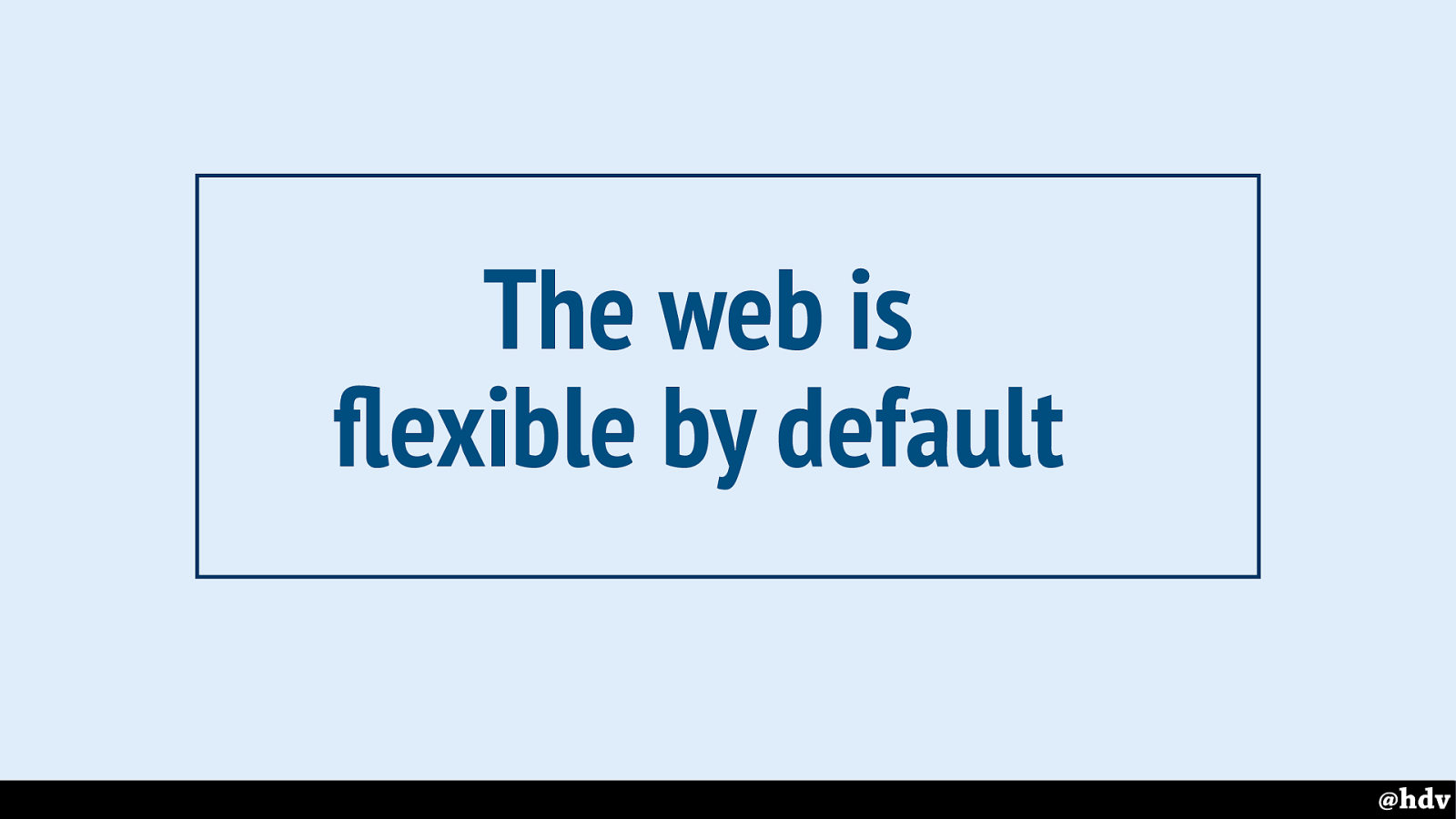
First, the web is flexible by default.
Slide 112
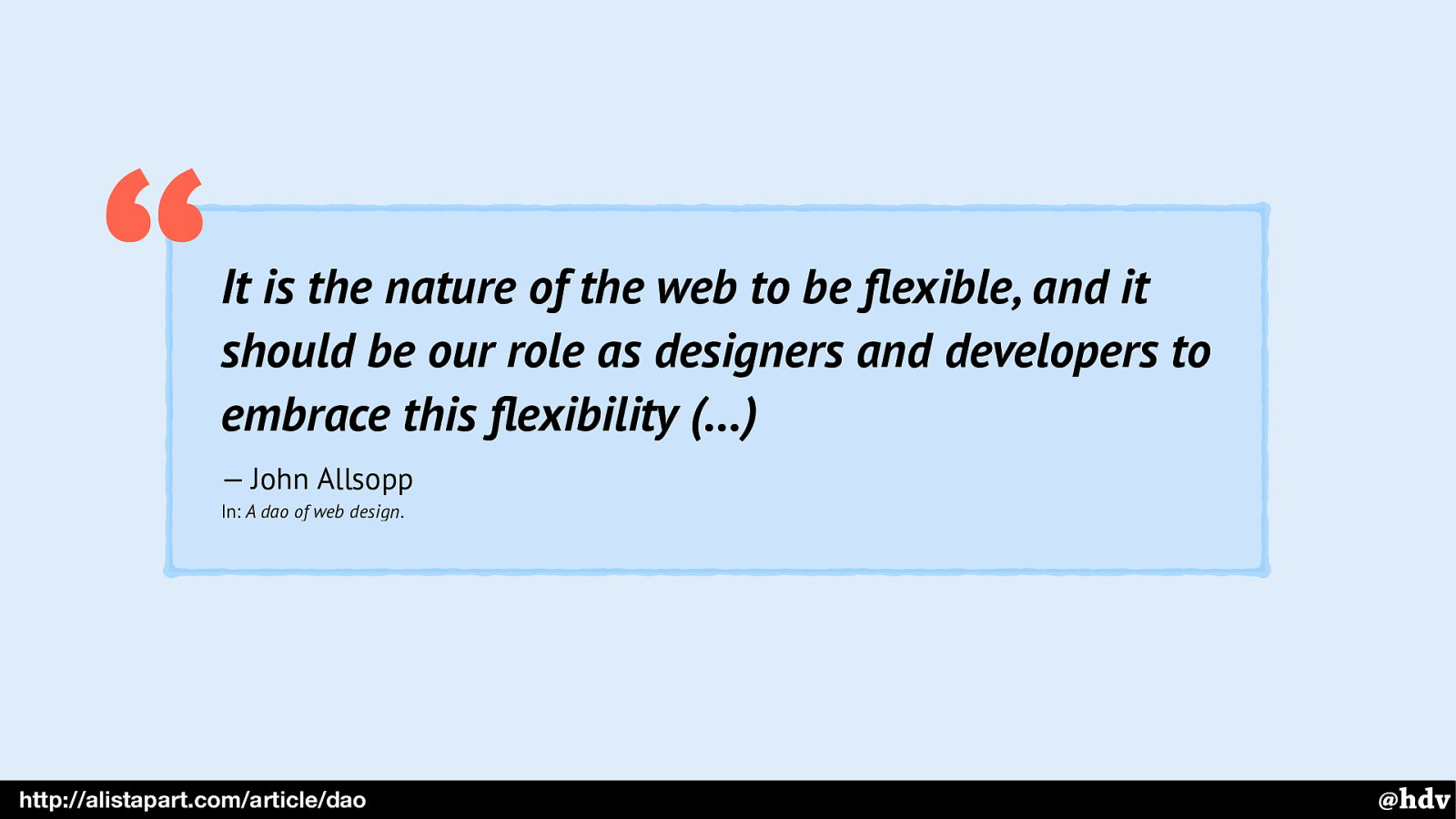
It is the nature of the web to be flexible, and it should be our role as designers and developers to embrace this flexibility (…)
— John Allsopp In: A dao of web design . “ @hdv http://alistapart.com/article/dao A great article about this is by John Alssopp, if you're not familiar with it, it sparked that whole responsive design revolution. He explains we should let it go.
Slide 113
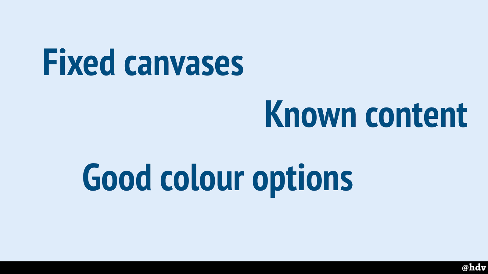
Making print work is more easy in the sense that canvases are fixed, the content is known and there are standards for colours that you can rely on somewhat.
Slide 114
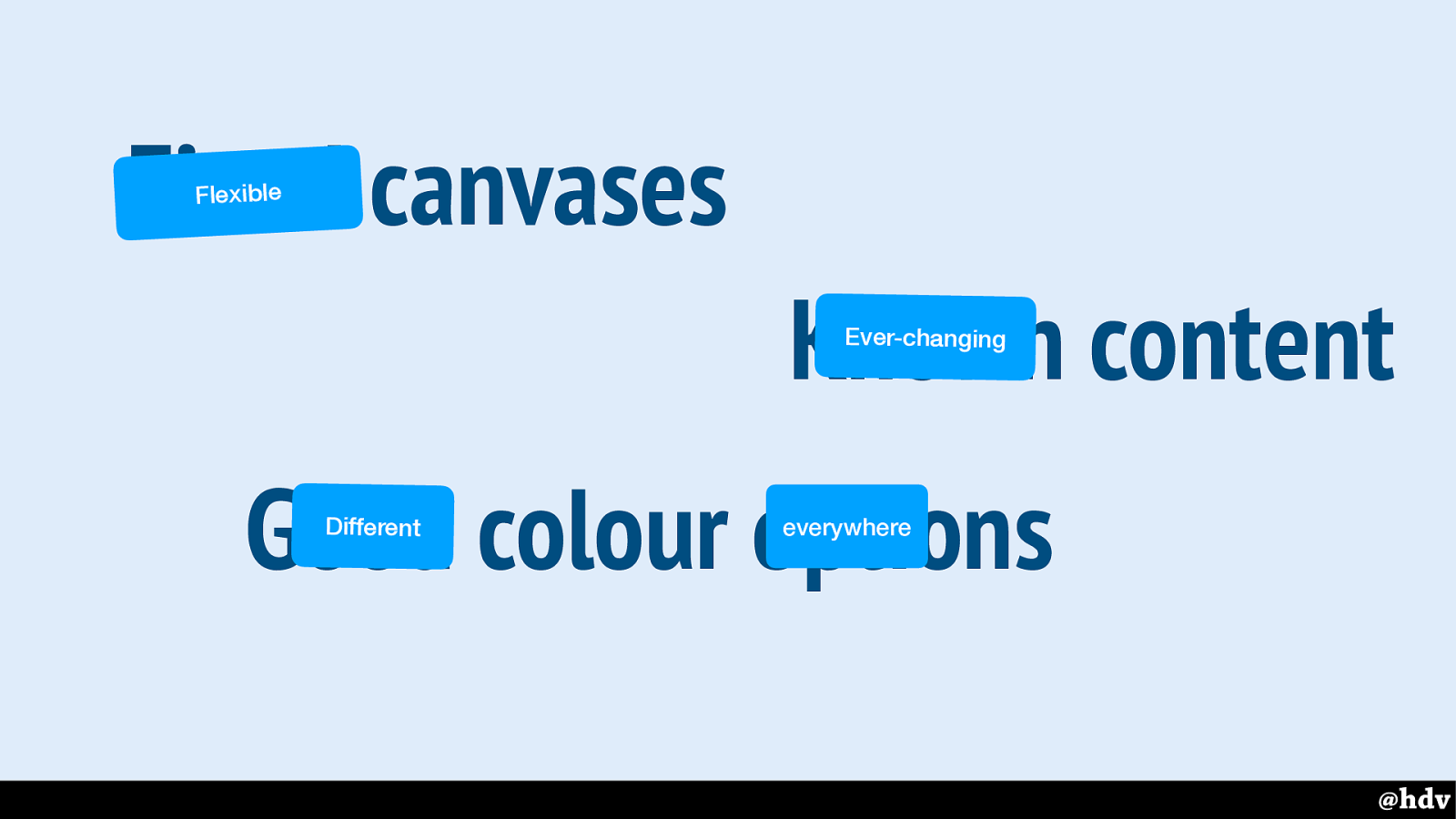
Not on the web… our canvases are flexible, content changes all the time, colours are different in different
Slide 115
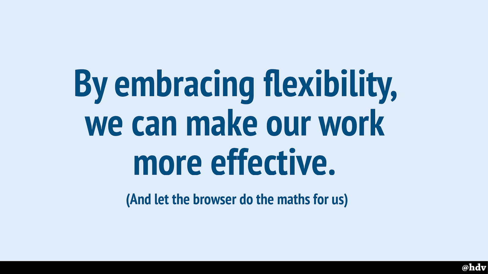
Embracing flexibility is going to help us worry less about the things that don't really matter…
Slide 116
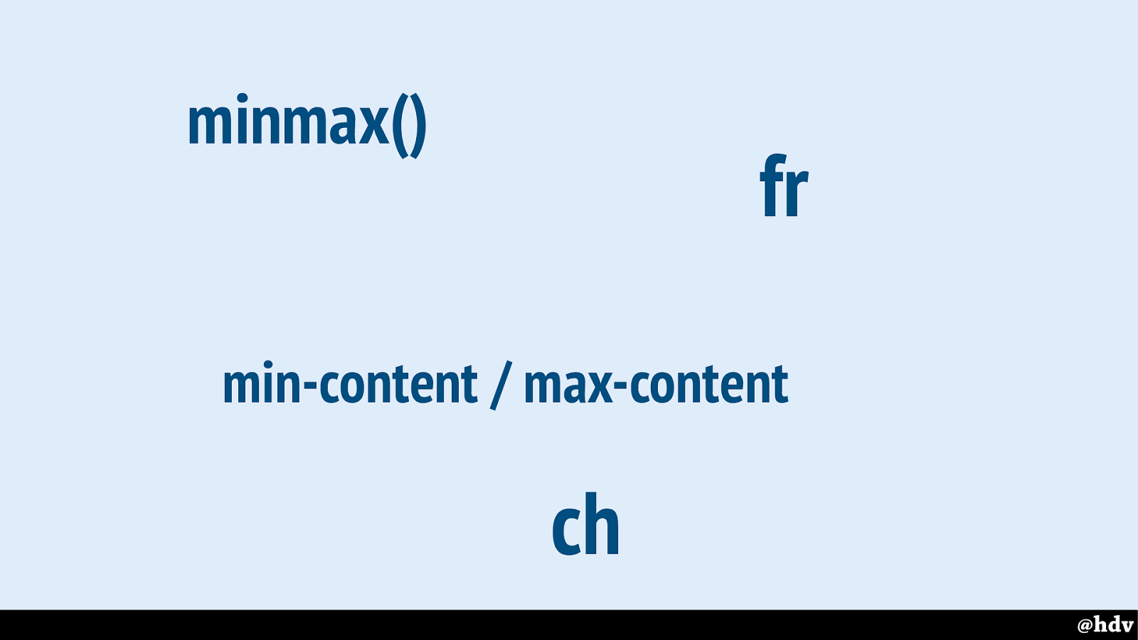
We can use things like flexible units to leave more to the browser.
Slide 117
https://www.w3.org/TR/css3-values/#font-relative-lengths
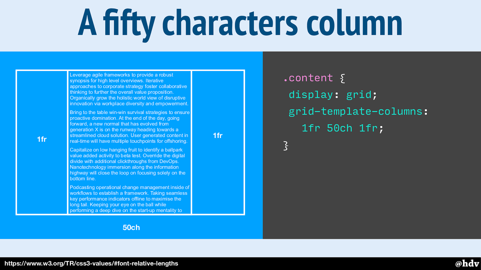
ch is the width of a zero, it is roughly .5em-1em depending on writing mode and axis, and we can use it in grid definitions. Here's a grid with a 1fr column left and right and one of 50ch in the middle.
Slide 118
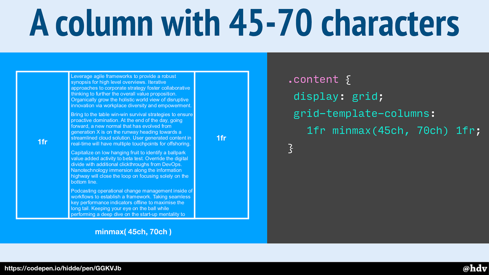
We can also be between two values and that lets the browser decide based on how much space there is in the viewport.
Slide 119
The web is also accessible by default! Accessibility is one of the basic principles the web was built on.
Slide 120
It's mostly text. One reason is that is mostly text, and text has this magic ability of being super transformable.
Slide 121
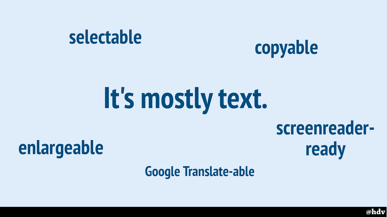
We can put it into Google Translate, make it larger, copy paste it or select it… you name it!
Slide 122
Text lets us have accessibility automatically. Text lets us have a lot of accessibility for free, I mean, we don't need to do anything special to make these things work.
Slide 123

Here's the website of a cinema I wanted to visit in Taiwan. In the menu at the top I was looking for a link about ticket sales. I thought I'd just copy paste the contents of the menu items, but that didn't work.
Slide 124
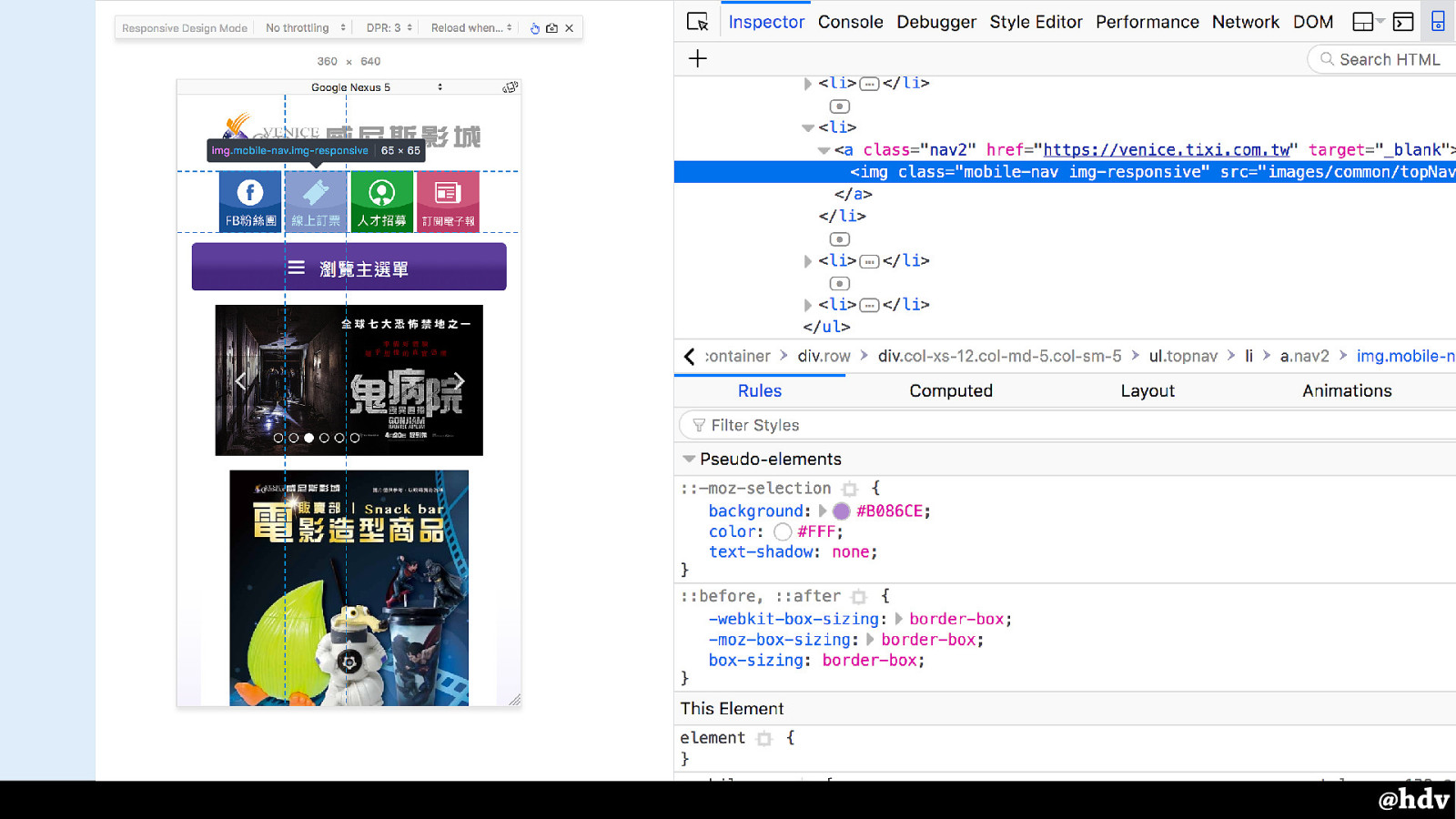
The layout of these buttons was so advanced that they decided to use images instead of text plus CSS. They didn't have alt text either, so no copy pasting for me. Text would have helped here.
Slide 125
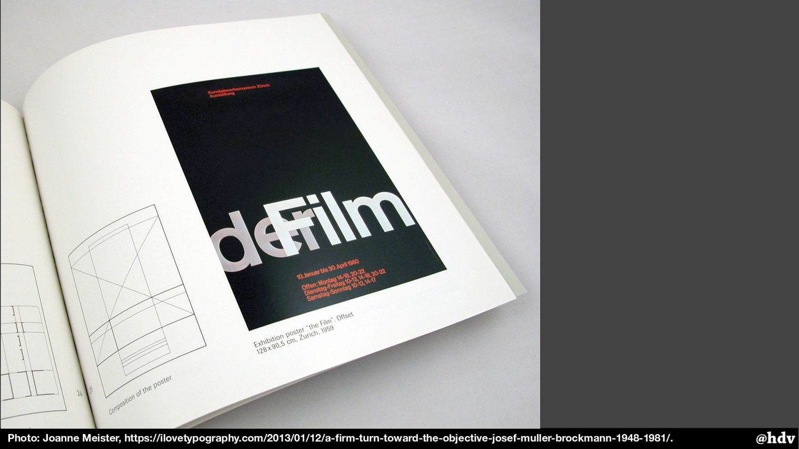
Photo: Joanne Meister, https://ilovetypography.com/2013/01/12/a-firm-turn-toward-the-objective-josef-muller-brockmann-1948-1981/
Using text can really be helpful. The other day I built this poster with HTML and CSS.
Slide 126
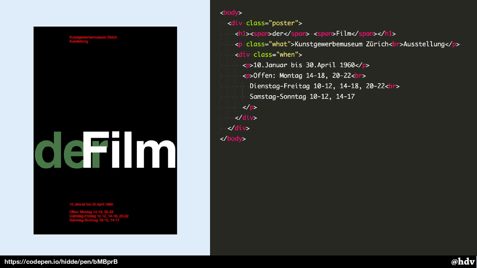
https://codepen.io/hidde/pen/bMBprB
This is the HTML I used for it. It has some structure to it, with the name of the exhibition as the main heading in the page, and the other info, location, dates and opening times, in paragraphs.
Slide 127
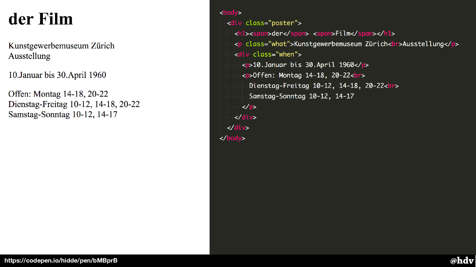
https://codepen.io/hidde/pen/bMBprB By doing this in the browser, we have usable text under the hood.
The structure works well without CSS, too. And sometimes people don't see your CSS; the obvious example is people who cannot see it and use screen reader software, but also people like me who use content blockers to access the web.
Slide 128
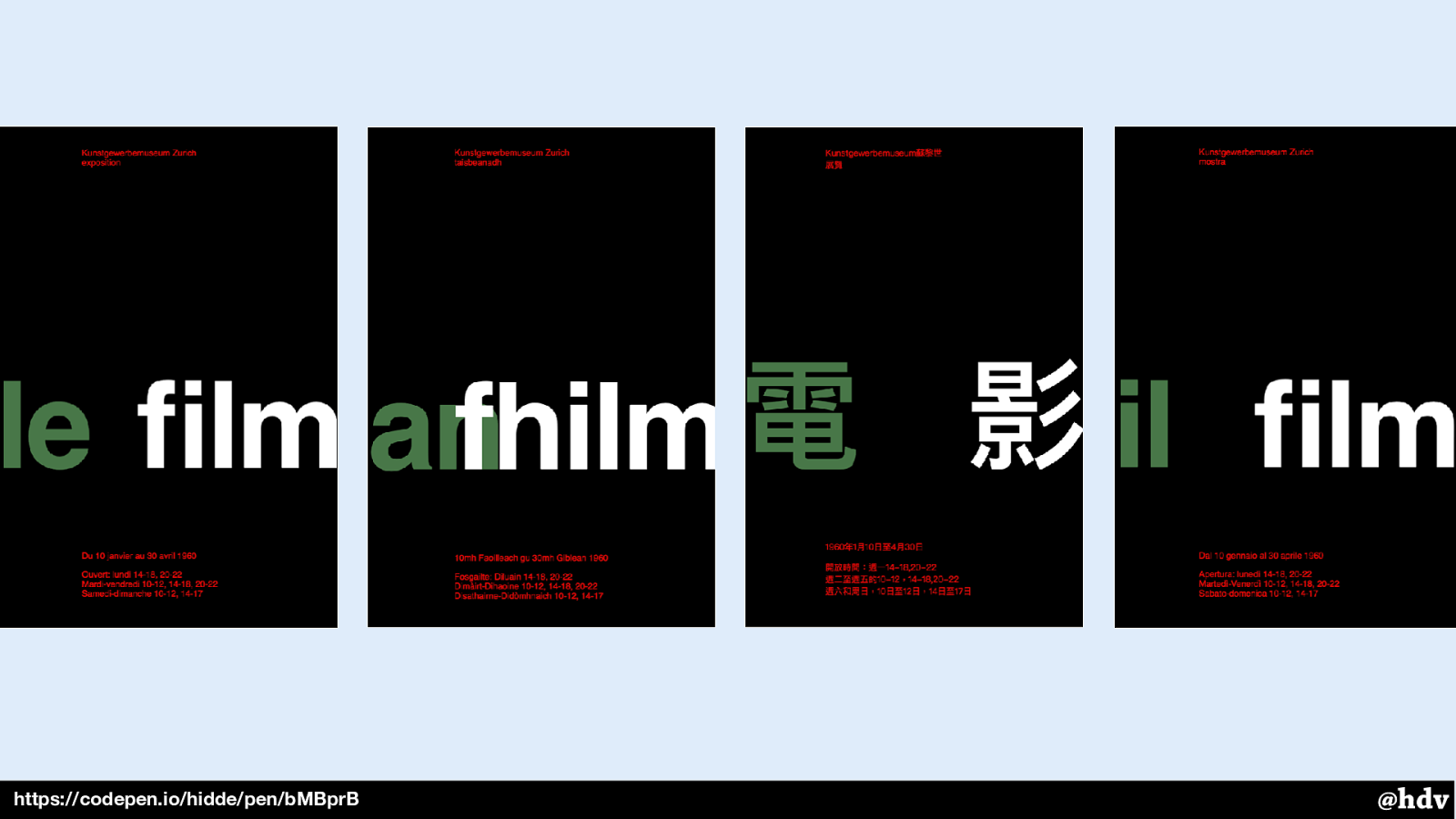
https://codepen.io/hidde/pen/bMBprB Added benefit of text: I could easily get some translated posters in the same layout.
Slide 129
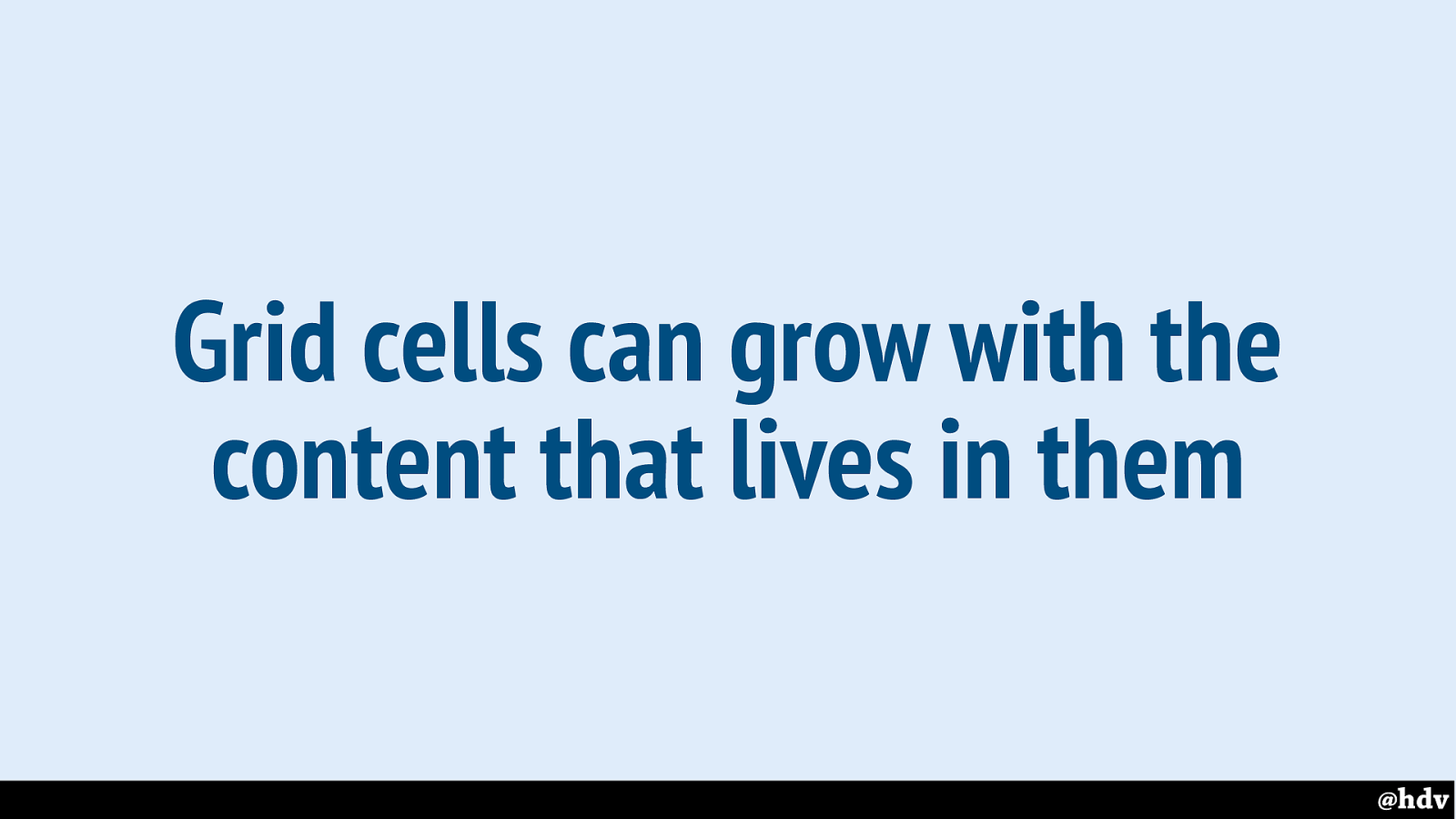
Grid cells can grow with the content that lives in them.
In web lay-out, we can do more awesome with this, because Grid Layouts can grow with the content that lives in them, so content changes will likely work. Print work can't deal with more content than fits on the page, on the web our canvases are somewhat unlimited. Scrolling ftw!
Slide 130
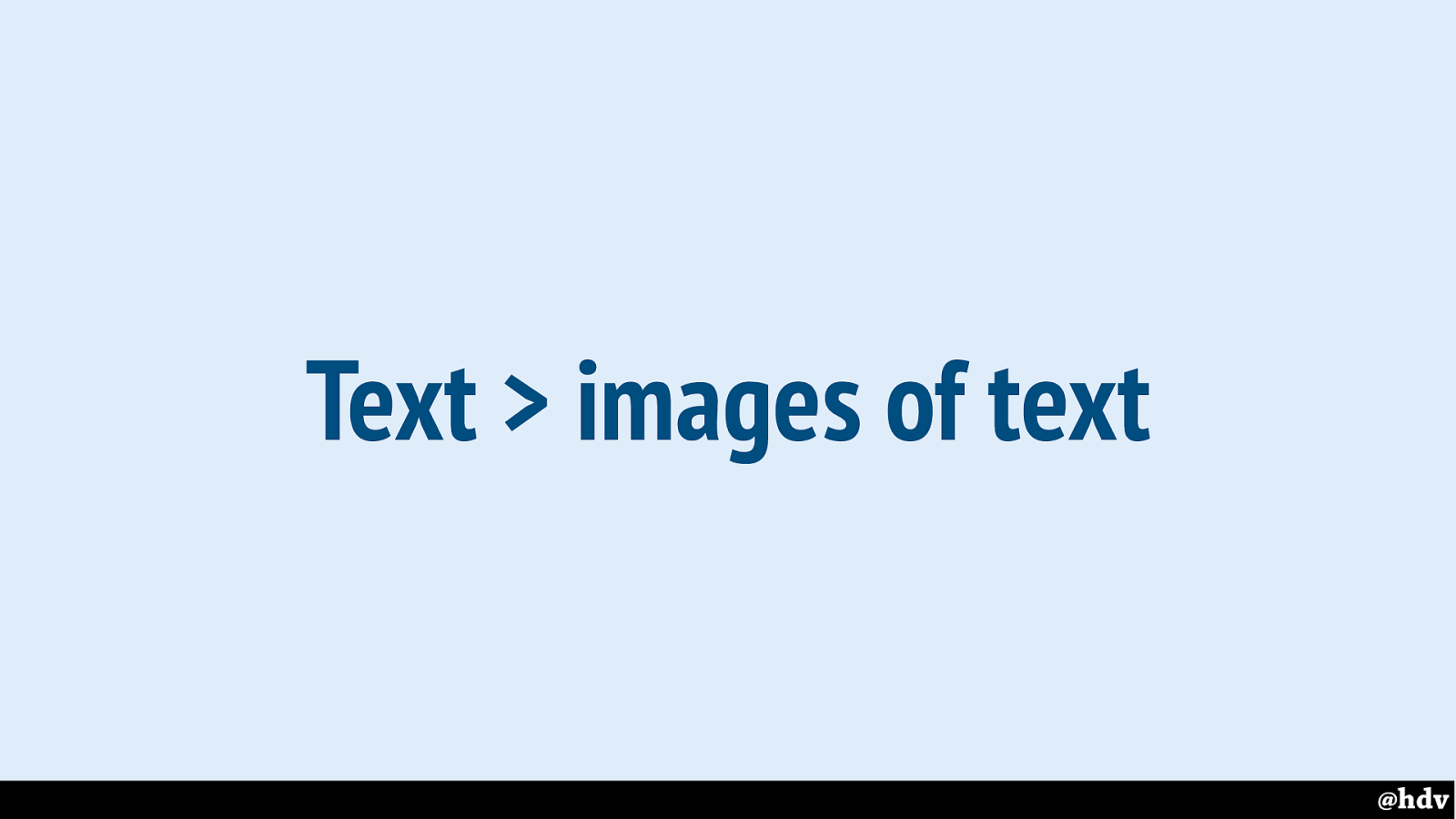
Text works better than images of text, it can help more people.
Anyway, for accessibility, make sure you use mostly text, it lets you have more adaptability, translatability, et cetera (or alternatives if you have to use images).
Slide 131
The web is interactive by default!
Slide 132
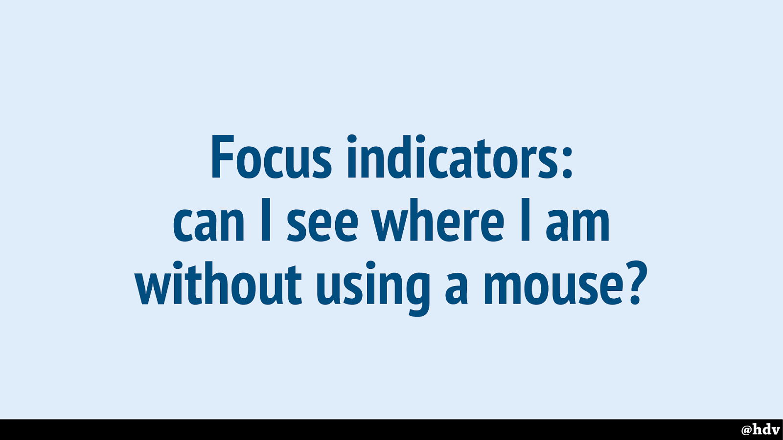
Focus indicators: can I see where I am without using a mouse?
We can see where we are, for example when we are on a form and tabbing through it with a keyboard.
Slide 133
Hide and show: display on demand for less UI clutter
If content doesn't all fit we can make some it only appear on demand. Try that on print work!
Slide 134
Do transitions make design more pleasurable?
We can animate things!
Slide 135
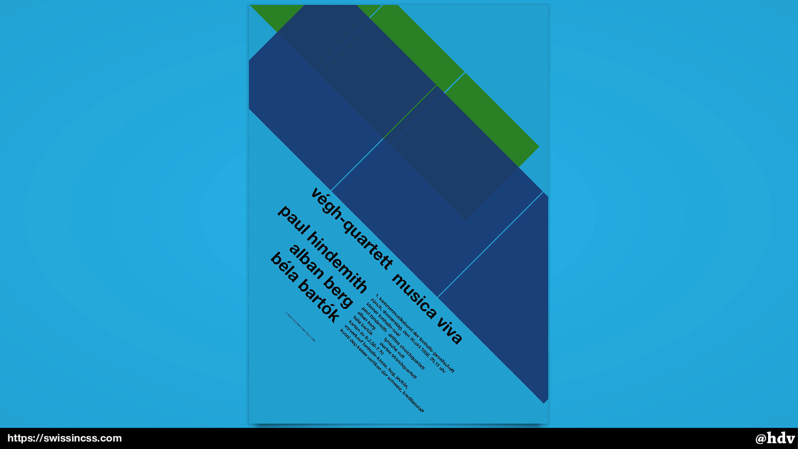
https://swissincss.com
We can animate things!
Slide 136
The web is built on web standards
Lastly, another great default of the web and that can help us make beter designs for the web: it is built on standards. Just like the graphic designers could benefit from standard paper sizes, we have standard languages to write out code in, and browsers that pretty much interpret them the same way.
Slide 137
Understanding the standards themselves pays off
When doing CSS and particularly layout in CSS, I think it is super important to understand the standards. The actual vanilla stuff. For two reasons: it is easier to tweak things if you use CSS itself, and you can make more use of the features that are on offer.
Slide 138
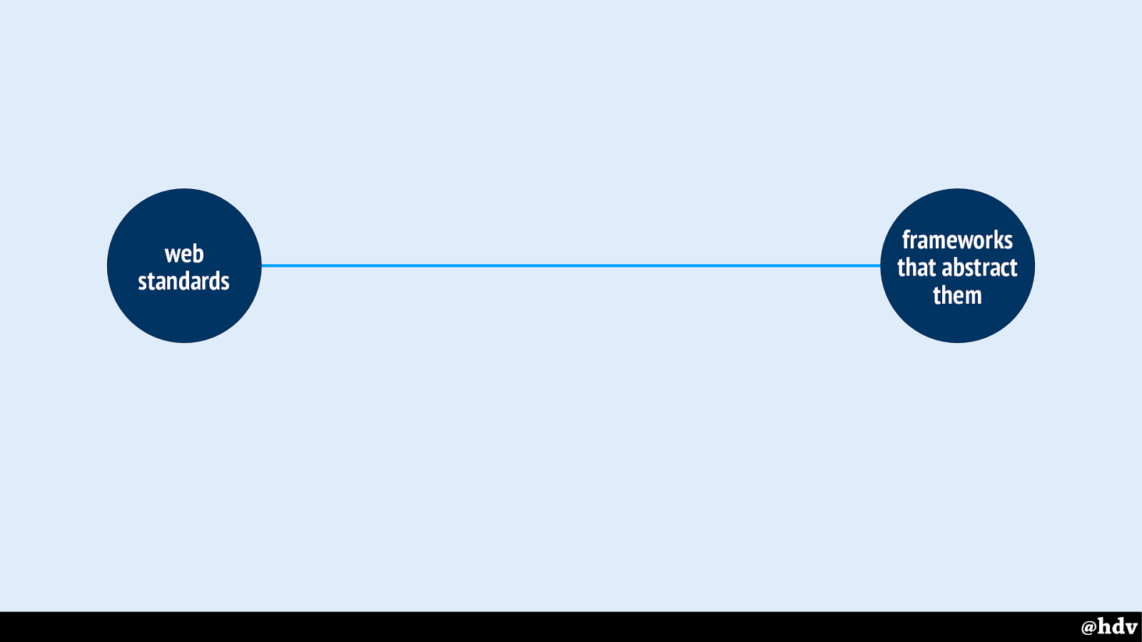
I've drawn another line, I think it is web standards on the one hand and frameworks that abstract them on the other.
Slide 139
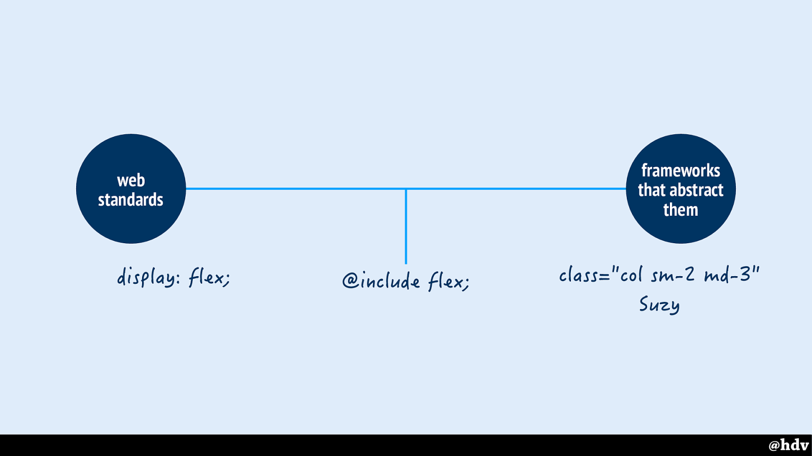
In a CSS web standards world, we would write things like display: flex. A bit further down the line, you'll find people use mixing for flexbox, or layout frameworks like Suzy. And on the far right, there's classname-based frameworks that will 'do everything for you'.
These abstractions were super useful in the past, because (arguably) they abstracted weird hacks to legible code. But with modern CSS, we have layout tools built in, the actual vanilla stuff is already legible.
Slide 140
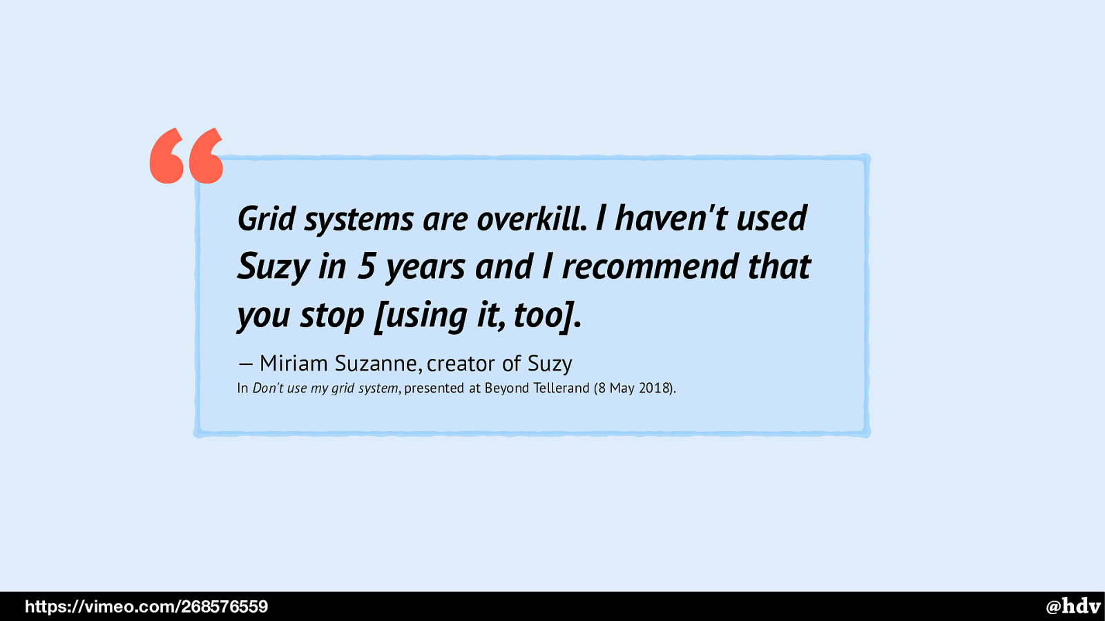
Grid systems are overkill. I haven't used Suzy in 5 years and I recommend that you stop [using it, too].
— Miriam Suzanne, creator of Suzy In Don't use my grid system , presented at Beyond Tellerand (8 May 2018). “ @hdv https://vimeo.com/268576559 Even the inventor of Suzy no longer uses it, she said at Beyond Tellerand conference, the other day.
Slide 141
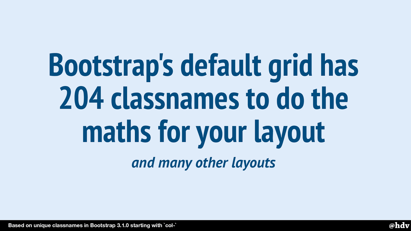
Bootstrap's default grid has 204 classnames to do the maths for your layout
Based on unique classnames in Bootstrap 3.1.0 starting with col-
and many other layouts
And it saves a lot of overhead. Bootstrap has classnames for every possible layout case, it solves every possible problem, but you likely only ever going to need a couple of those. Of course, that can be automated, but it's pretty cool to not have to do that.
Slide 142

Choose vanilla! There are plenty of frameworks that will ‘do the work for you’, but that won't let you do ‘great graphic design’.
It's Tschichold and Müller-Brockman, but also many others after them, say that part of great design is doing things intentionally. That means staying as close as possible to the standards that browsers implement, rather than abstractions people make. Choose vanilla!
Slide 143
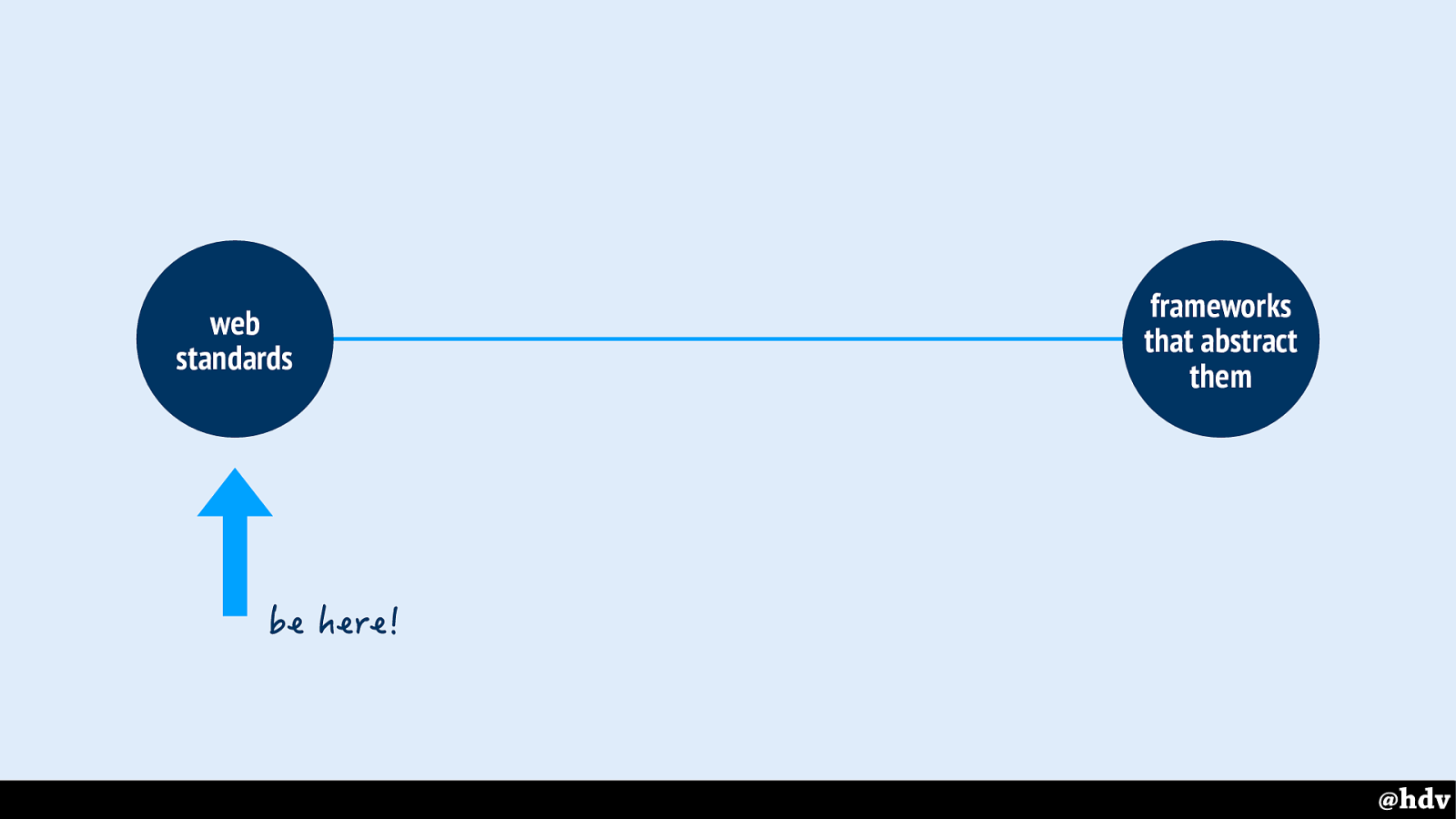
You want to be on this side of the scale.
Slide 144
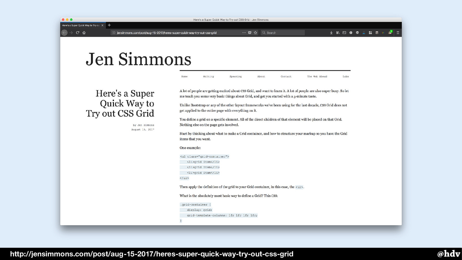
http://jensimmons.com/post/aug-15-2017/heres-super-quick-way-try-out-css-grid
If this all inspired you to learn more about Grid Layout, check out Jen Simmons' post to get started.
Slide 145
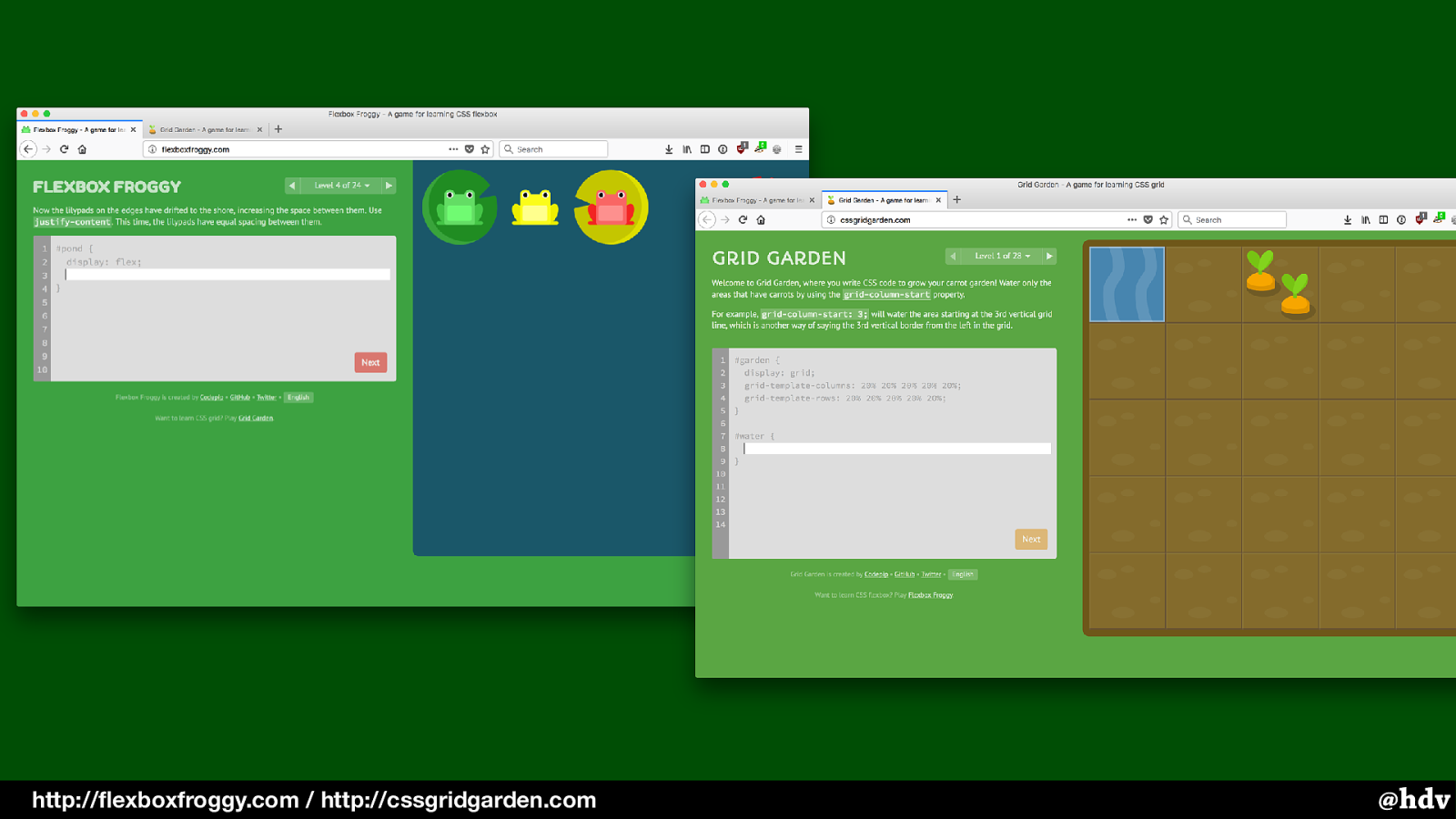
Or learn more by positioning frogs or carrots.
Slide 146
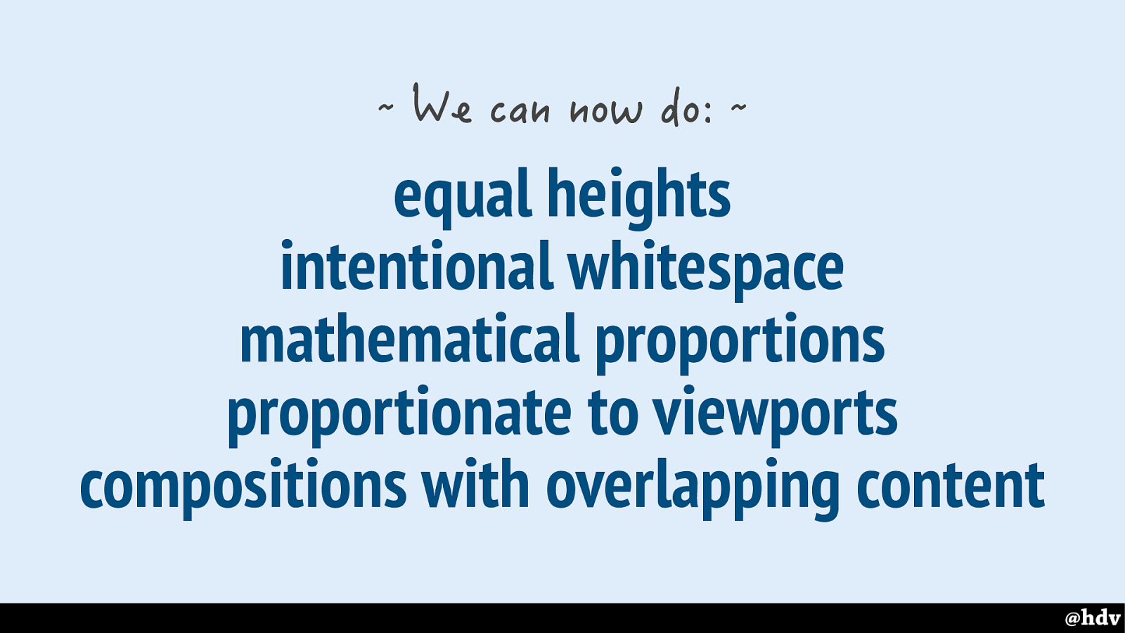
So in summary: we can now do these things that characterise great graphic design: equal heights, intentional whitespace, proportions and overlapping content.
Slide 147
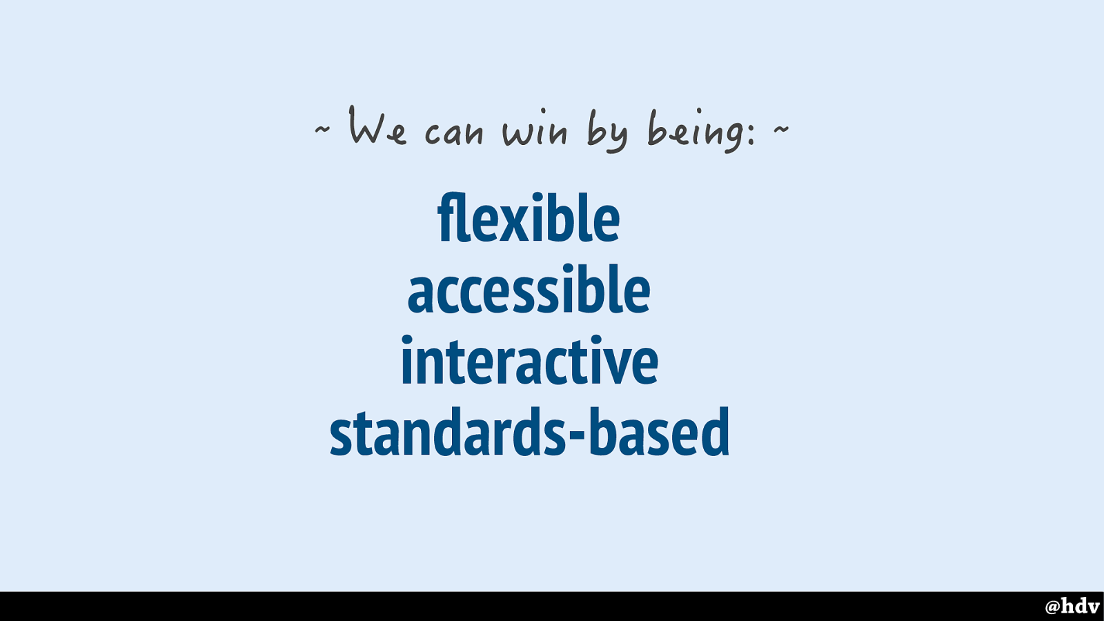
But we can do them better than the great graphic designers because of the web's defaults!
This is definitely not a game, of course, nobody needs to win, or, I should say, we can all win. I'm hoping more and more graphic designers will make effective and pleasurable things for the web, now that a lot of graphic design tools are built into browsers, and there are all these advantages they can leverage.
Slide 148
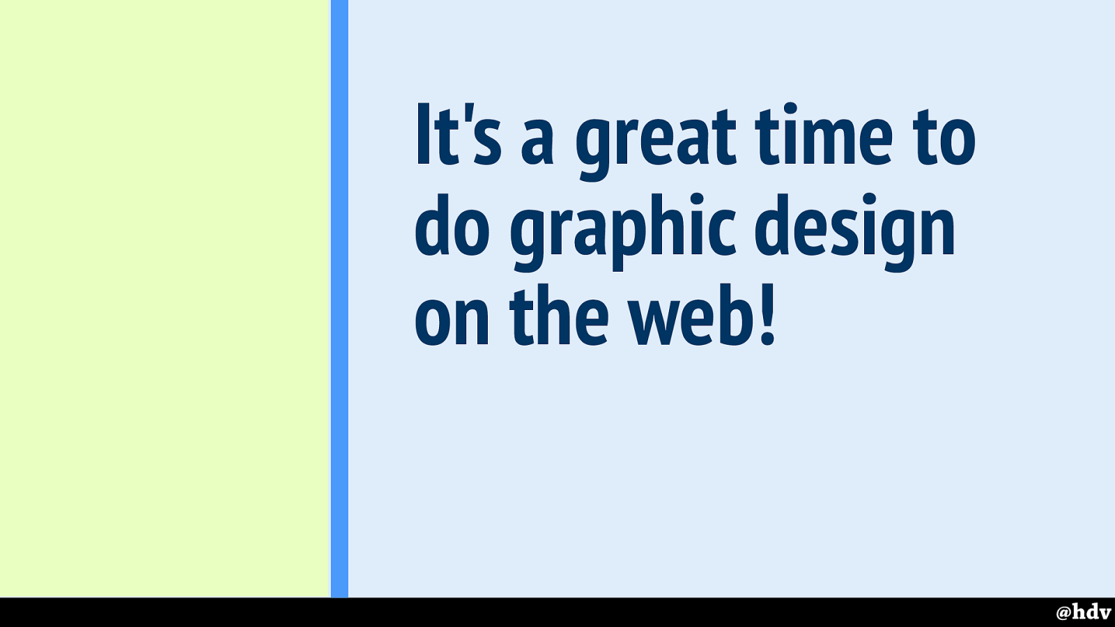
So yea, especially we get good at its defaults, it is a great time to be doing graphic design on the web!
Slide 149
hidde@hiddedevries.nl https://hiddedevries.nl/en /blog https://noti.st/hdv
Many thanks to Vasilis van Gemert, Krijn Hoetmer, Jenny Shen and Peter van Grieken. Thanks, that was all for me! My slides and all the links are on Notist, that's noti.st slash hdv.