Slide 1
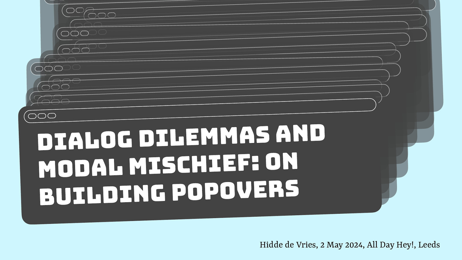
Slide 2
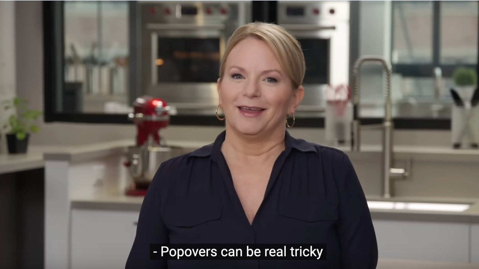
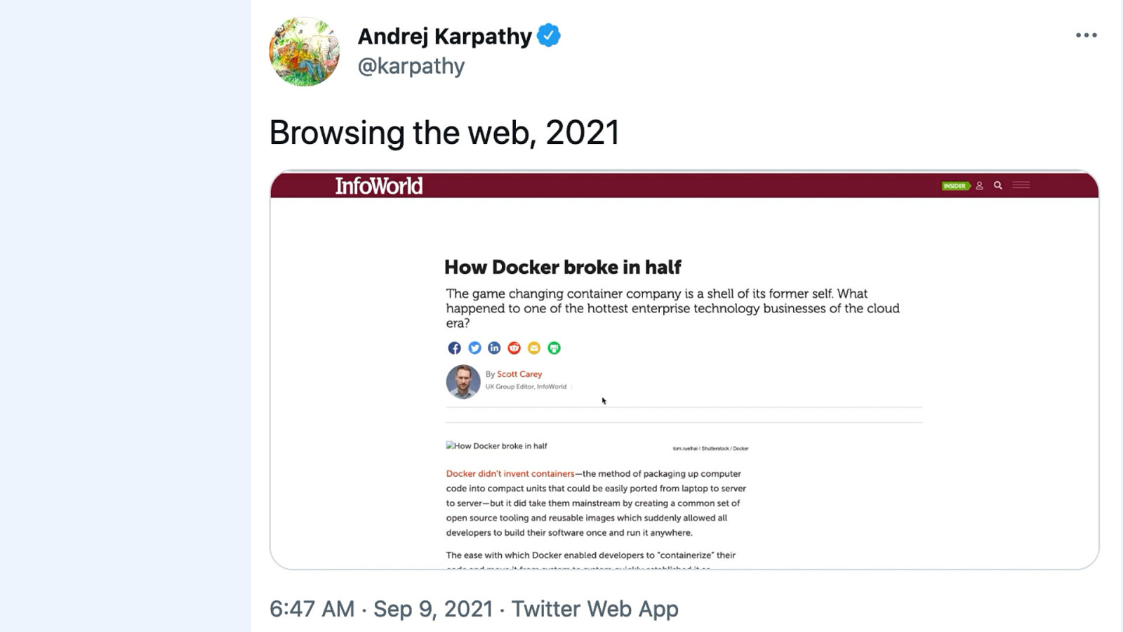
The other day I was watching another YouTube video trying to teach me to cook in America’s Test Kitchen, and it was interesting to see them say that popovers are real tricky.
Slide 3
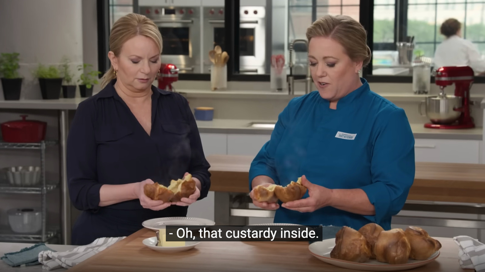
I don’t know how many of you are aware, I mean, we’re in Yorkshire here, that in the US, they call Yorkshire puddings popovers. The custardy inside. I didn’t know this.
Slide 4
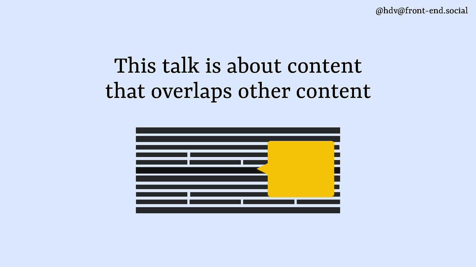
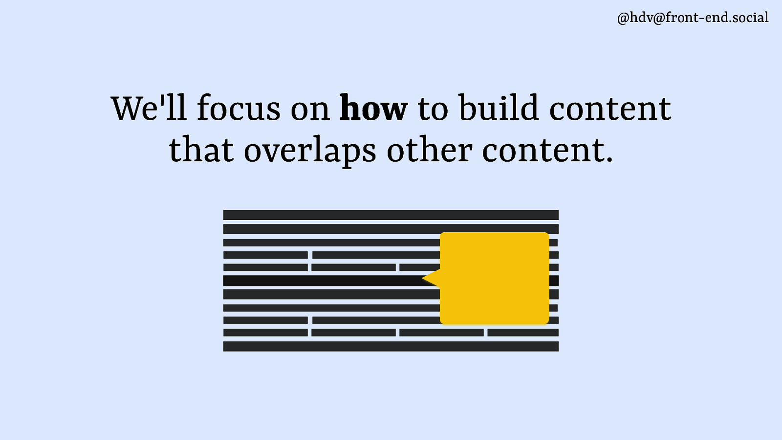
This talk isn’t about food, it’s about content that overlaps other content, and that is something that a lot of people find frustrating about today’s web. Like, we got websites these days that have things overlapping all the time.
Slide 5
Like, there’s your cookie consent and your thing that wants you to apply to the website, like join their membership thingy. There is ads everywhere. And then sometimes there’s even, like, overlays that go right on top of all of that to try and get you to sign up for a newsletter. There’s a lot of that kind of stuff on the web, where people are making it really hard to actually enjoy content on the web.
Slide 6
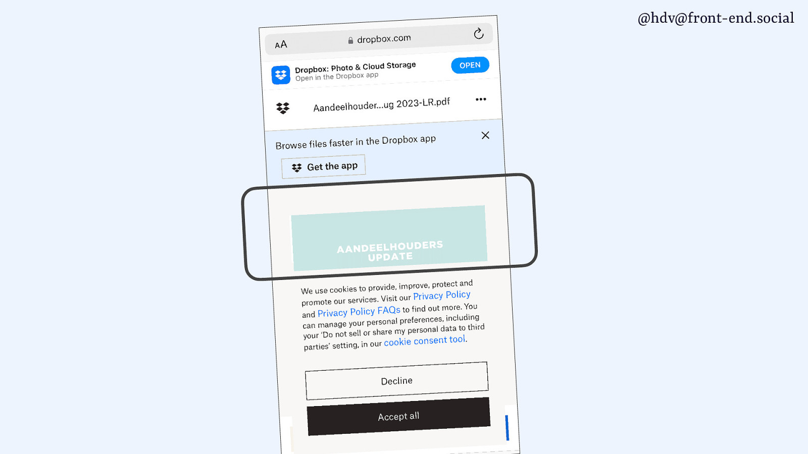
I got this email the other day where the content was like 10% of the screen and everything else was stuff overlaying on top of other stuff.
Slide 7
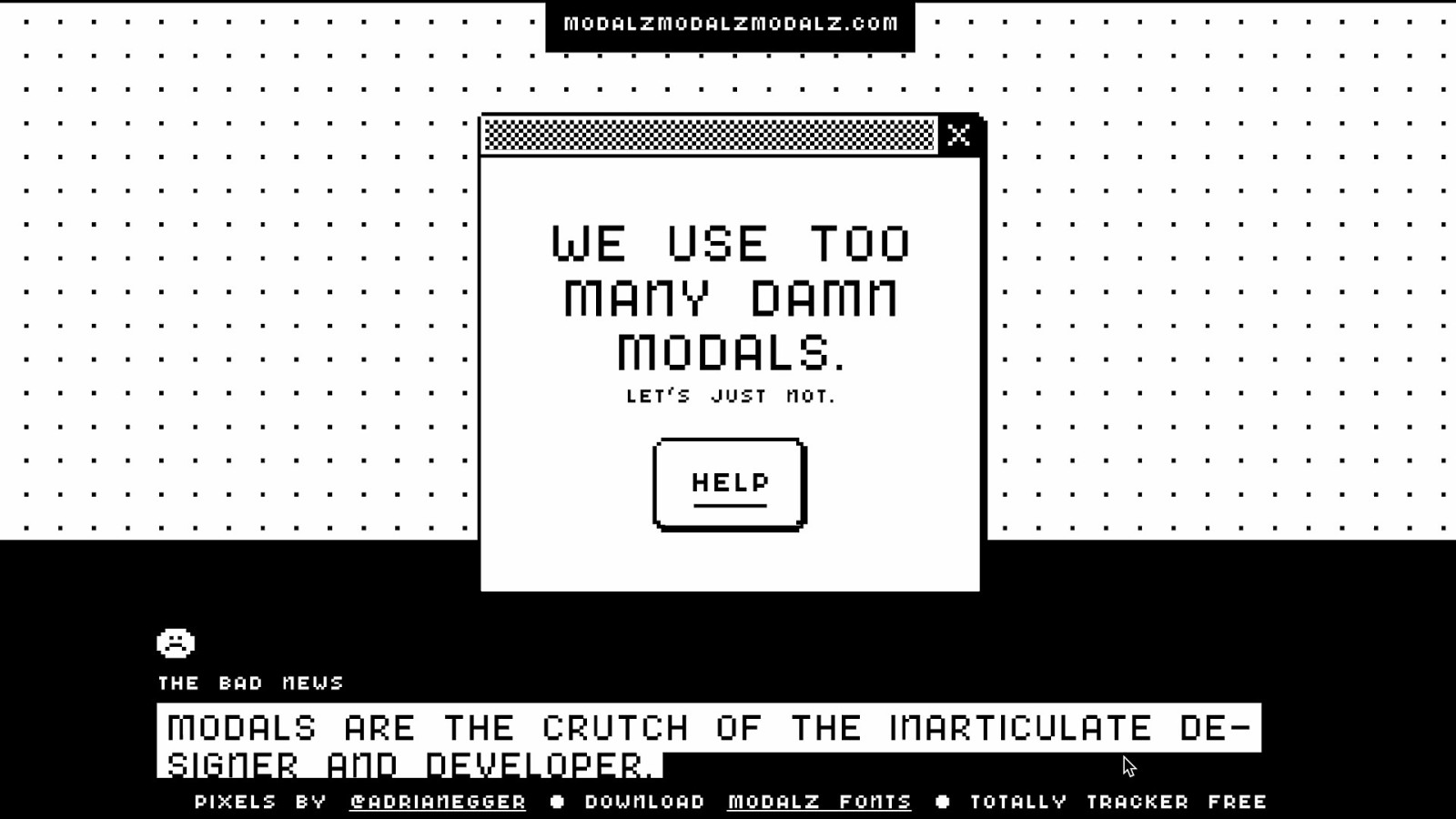
There’s even a website called modalzmodalzmodalz.com, with a Z, which goes into all the different reasons of why you should probably not be using a modal.
Slide 8
And I am not going to try to convince you today, you don’t have to build modals. I’m gonna focus on how to build them.
Slide 9
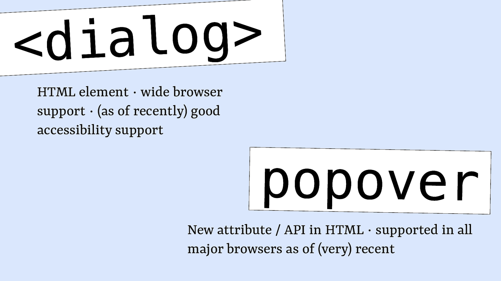
So if you are going to build popovers, dialogs, or modal elements, this is the talk for you, and I’m going to talk about them specifically regards to new-ish web technologies that are both in HTML. On the one hand, the dialog element, and on the other hand, the Popover API or attribute.
Popover is fairly new, and as of very recently, two weeks ago, it shipped in Firefox, meaning that it is now available across all major browsers, which is, you know, about time to start talking about it, I guess. And then the dialog element has been around for a bit longer, but there have been accessibility concerns for a while and lots of kind of bugs around that that have been fixed.
Slide 10
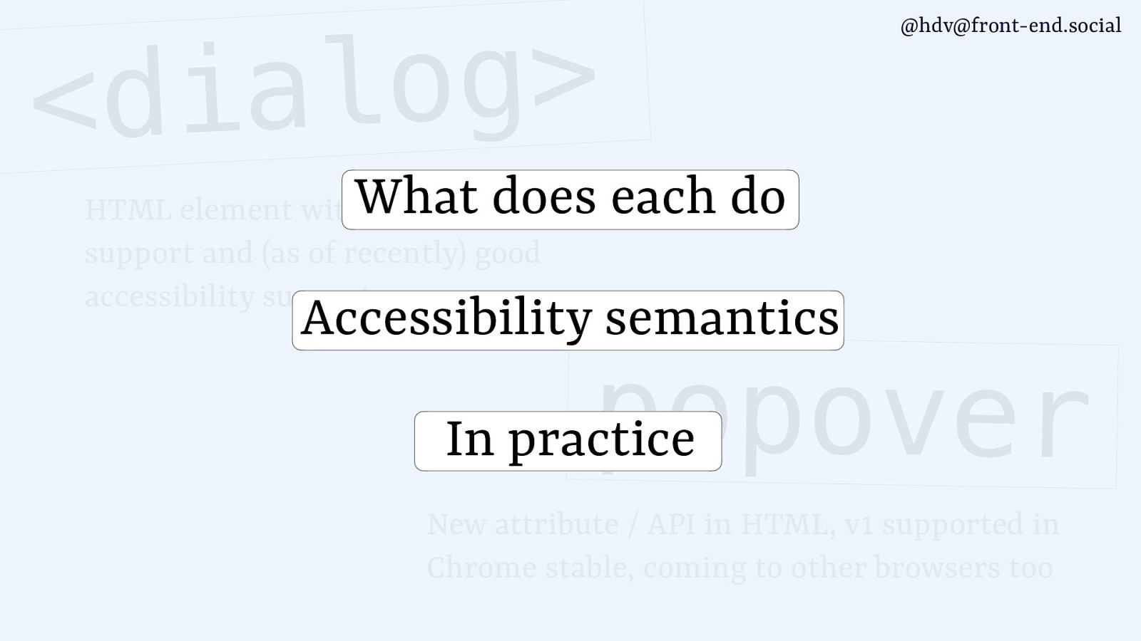
So in today’s talk, I will focus on kind of what each of those things does and how they kind of are different. Then I’ll talk about accessibility semantics, what kind of things you can consider and what kind of things you get for free, as well, by using these features. And then we’ll look at some gotchas that you’ll find when you use them in practise.
Slide 11
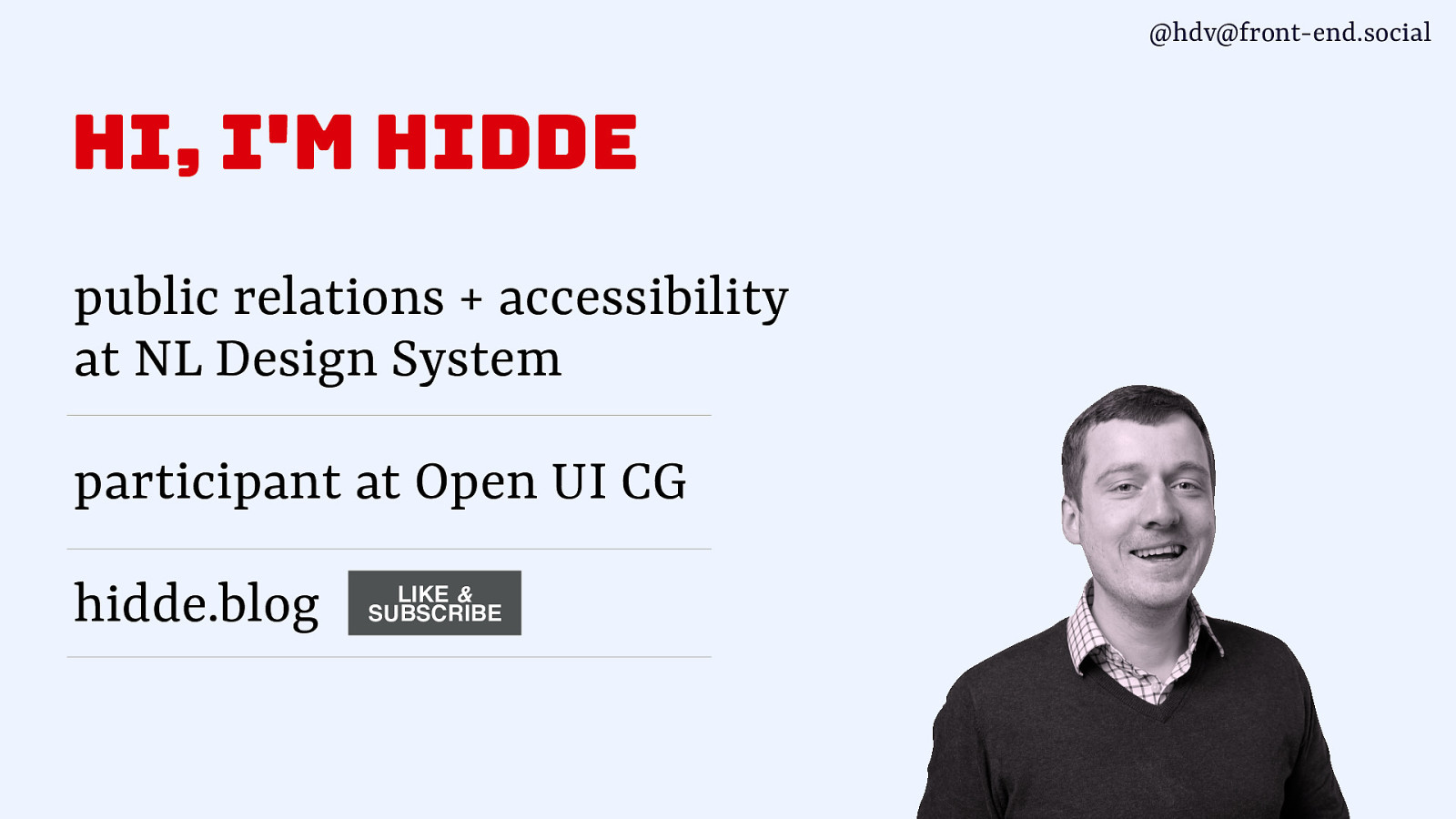
I am Hidde. I am a freelancer at the Dutch government, I work as an accessibility specialist at the NL Design System team, which, you know, if you wanna talk about design systems, let’s do it in the break. We make and design system there. And I also am a part of Open UI, which is a community group at the W3C, where the popover attribute was invented. So, I’ve been watching that and felt the urge to talk about it more. And I also have my own blog that you can subscribe to via RSS, it’s on hidde.blog.
Slide 12
I am from the Netherlands, and we have Eurovision coming up, so I wanted to bring that to your attention, that you can actually cast your vote for the Netherlands, for this guy. It’s Joost Klein.
I’ll try and pronounce it in English. Joost Klein in Dutch. And he does this kind of happy hardcore song about some very serious subjects, about his troubled childhood and mental health issues. But it also is happy hardcore, and that’s a genre that we don’t hear much about anymore these days. But he got some of the old heroes from that type of music to come and join him on that track. It’s the only kind of export product of Dutch music, which I guess in the UK, there’s lots of export products, and most of the good music comes from here, but we’ve got this. So consider voting for us, you know, at Eurovision. Cast your votes.
Slide 13
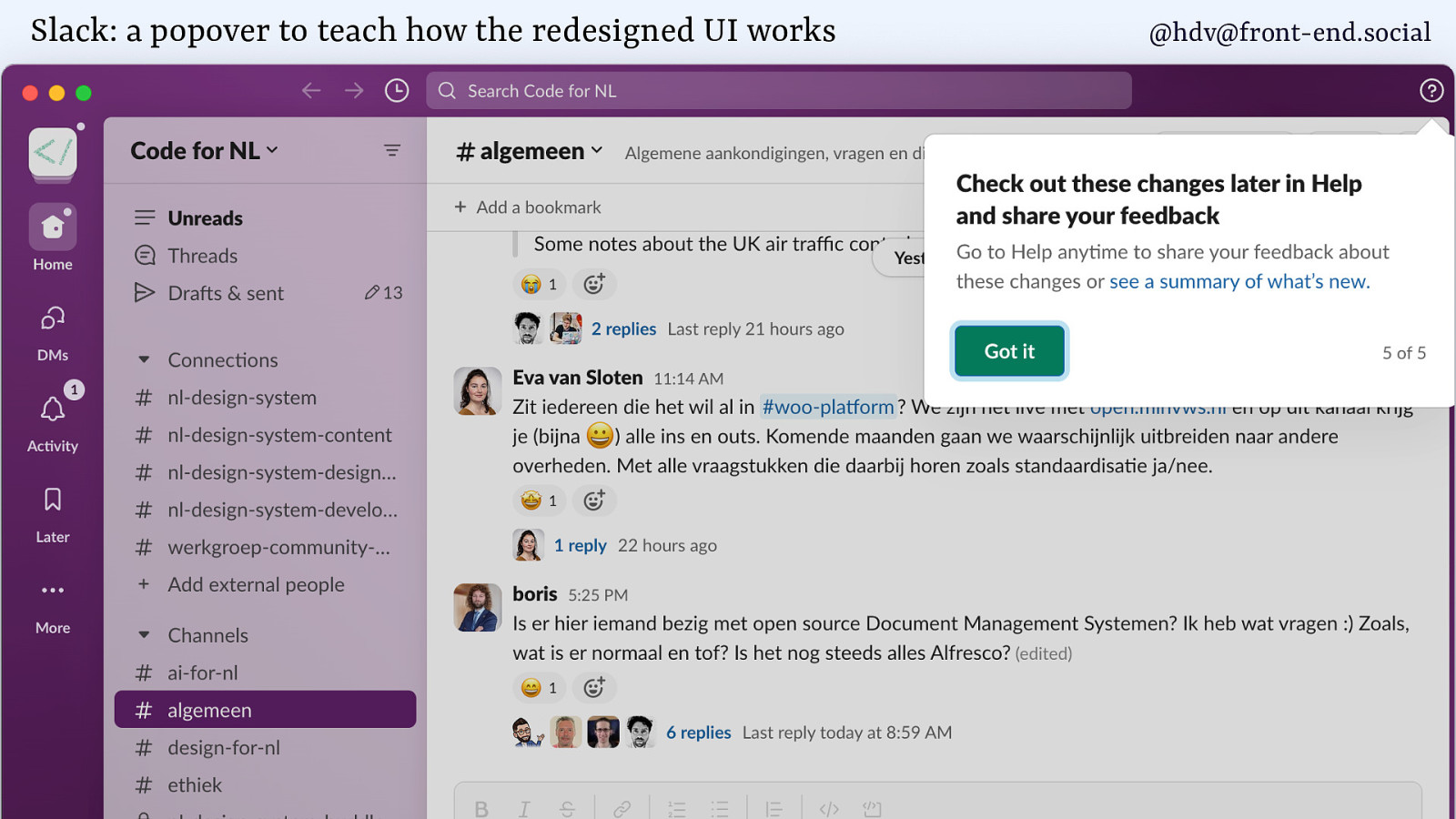
I’m going to talk you through some different patterns, dialogs, popovers, and I’ll draw some of my examples from work productivity software like Slack.
In Slack, they recently had a new UI. Who’s using the new Slack? Yes, lots of hands there. I find it somewhat confusing, but luckily, they have popovers that teach you how the UI works, and it’s a common use case for popovers. It basically goes in and, you know, gives you some information about how to do a thing, and, like, takes you from feature to feature.
Slide 14
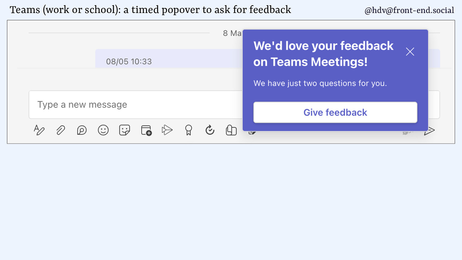
Another piece of work productivity software that I am actually forced to use for a lot of my clients is Microsoft Teams, and they really like to do popovers as well. And there you are, or Teams Work or School, as it is now named, for those of you who know. So, in Teams, you get popovers to ask you for feedback, they go right on top of the chat that you’re currently having with your colleague.
Slide 15
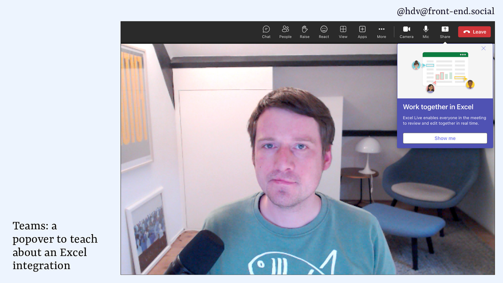
I also get popovers for other products that Microsoft makes, because they also make a famous spreadsheet software that they advertise as popovers in their UI. So while you’re waiting for your colleague to join a call, you might get a popover that tells you about that nice Excel integration that they have.
Slide 16
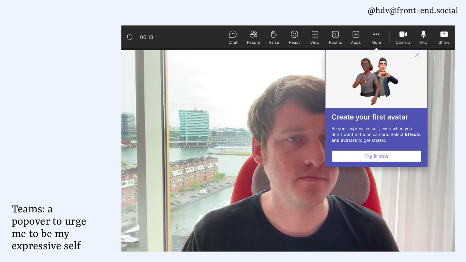
And the other day, they even urged me to be my expressive self by creating an avatar in their system. I didn’t do it.
Slide 17
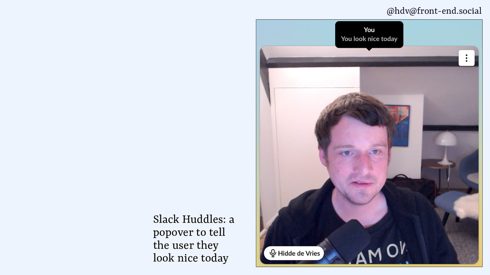
In Slack, they also use popovers like tiny tooltips that tell you you look nice today. And the good thing about it is they don’t even check, they do it regardless of what you look like that day.
Slide 18
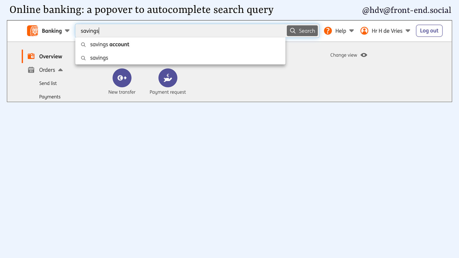
Other popovers are in business software or, like, banking, like autocompletes.
Slide 19
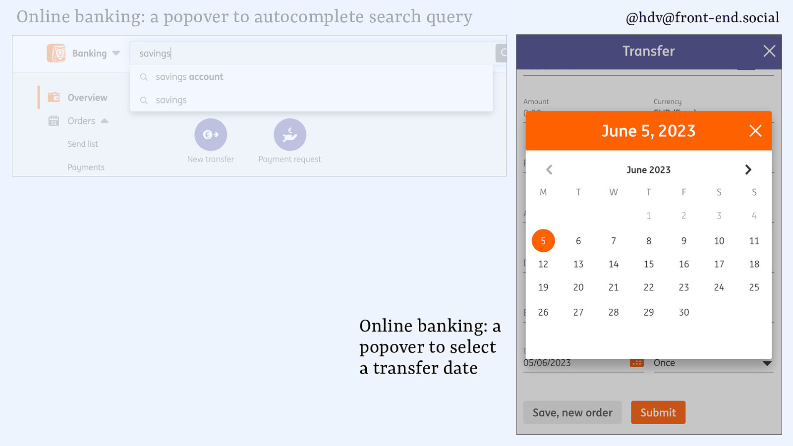
And calendars.
Slide 20
They’re basically everywhere. And that’s kind of what makes it a bit confusing as a subject, because there are a lot of things that can be considered dialogs or popovers, and or sometimes dialogs or modal dialogs. And it gets a little confusing. And as we’ll find in this talk, sometimes these definitions also somewhat overlap. So I’m gonna try and kind of disentangle these different concepts for you and give you some information on, like, how to, you know, differentiate between them.
Slide 21
We’ll start with dialogs.
Slide 22
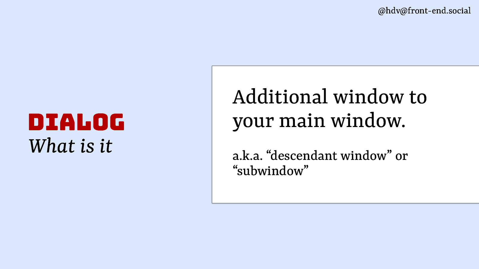
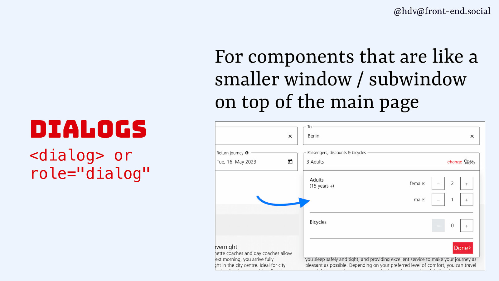
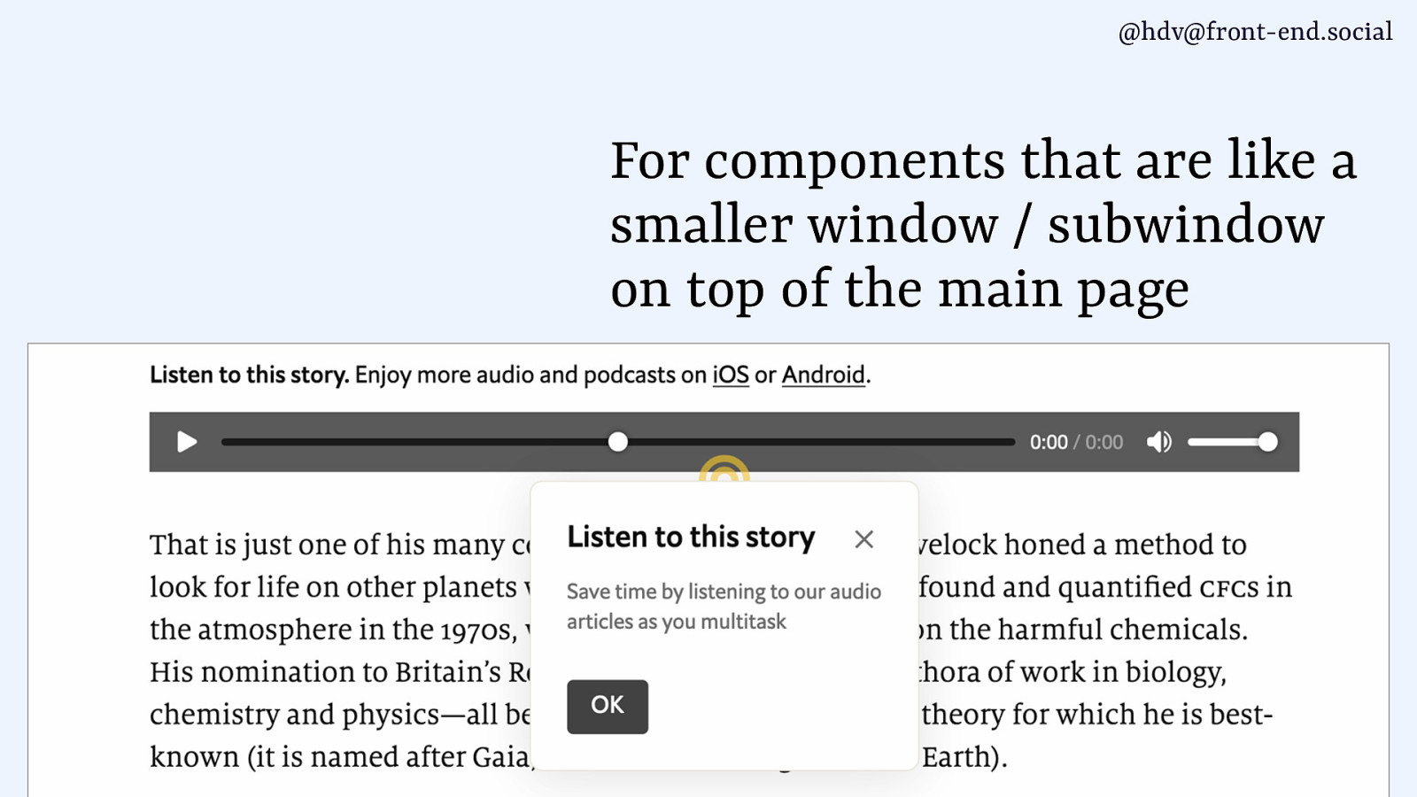
So a dialog is basically an additional window to your main window. It’s like a descendant window or a sub window.
Slide 23
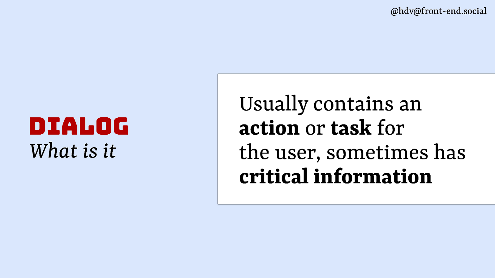
Usually it contains a task or an action, something critical that the user needs to be aware of.
Slide 24
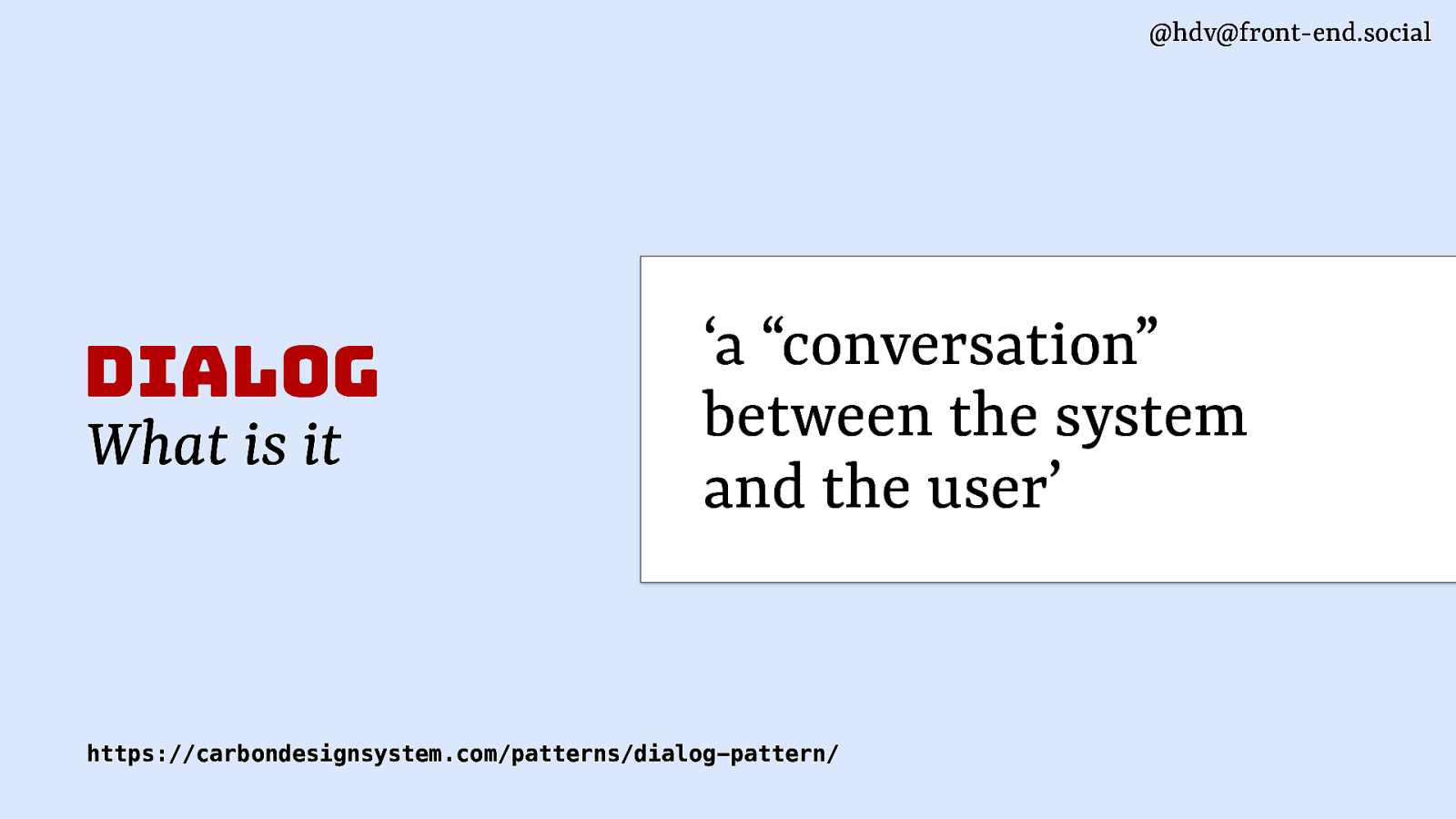
It’s also like a conversation as it’s described in some design systems, or, you know, a dialog, if you will, and it contains things like, do you want to continue, yes or no?
Slide 25
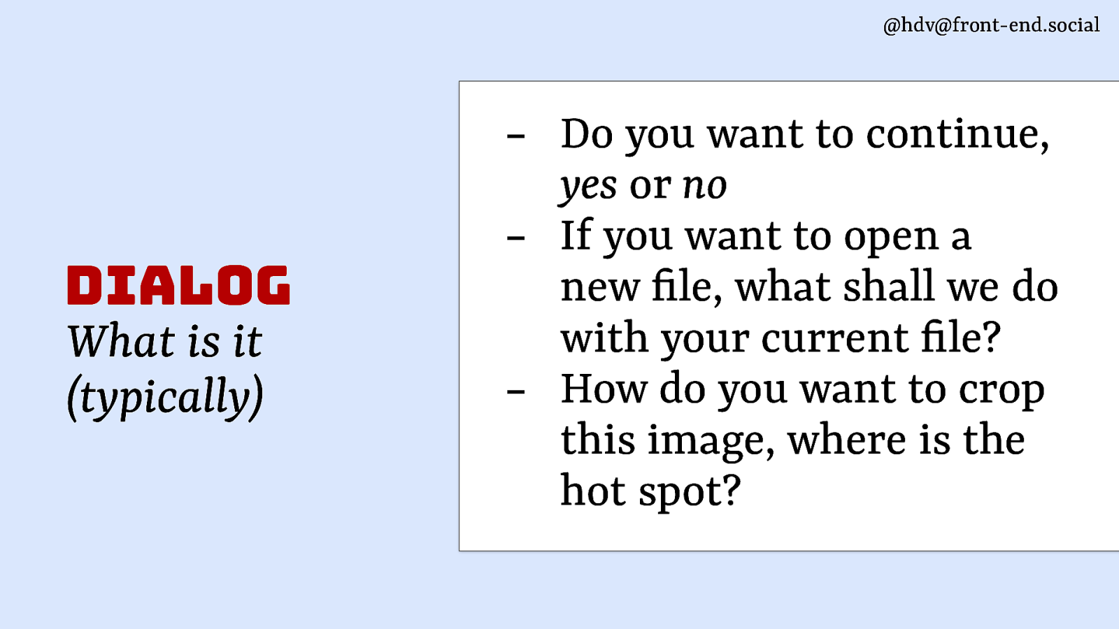
Or if you have a document and you’re opening a new document, what do you wanna do with the old one? How do you wanna crop this image? Like, it’s all these kinds of things where the system wants to know stuff from the user. That’s what a dialog is in general.
Slide 26
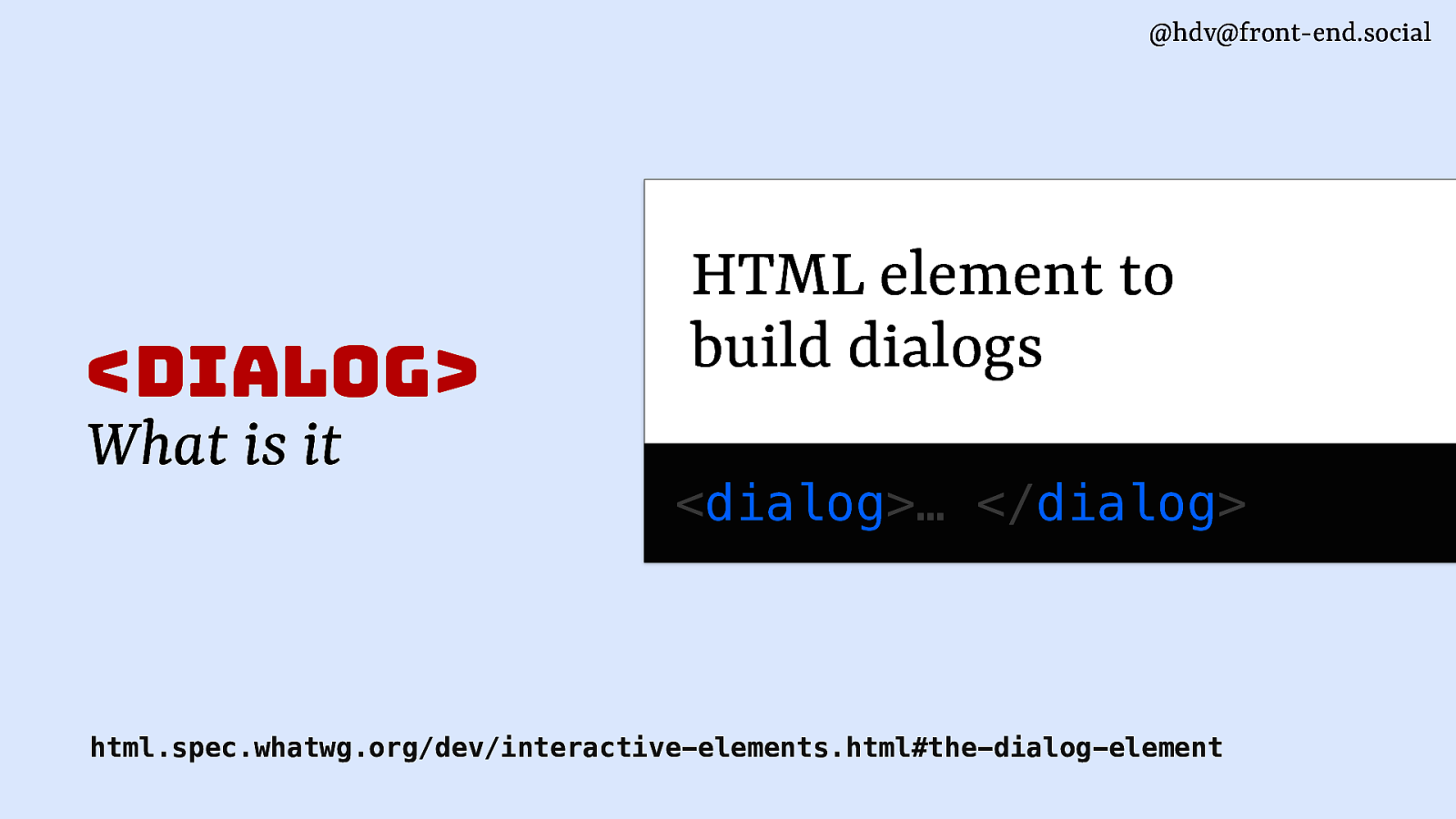
Now, in HTML, we’ve got the dialog element that I mentioned, and it is basically meant to build those kinds of things. So it’s the dialog tag that you get in HTML.
Slide 27
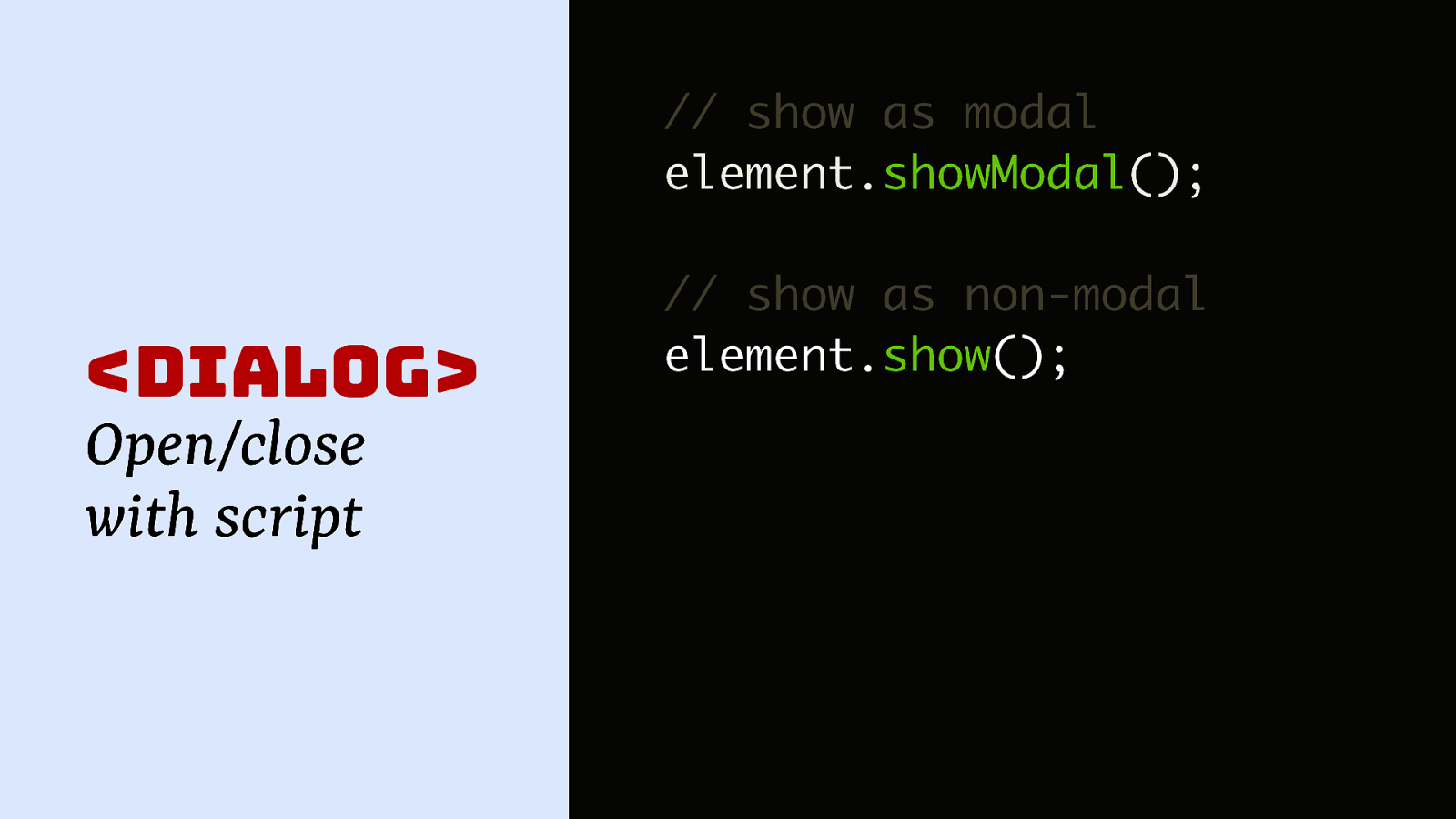
You can use that alongside of the methods that it comes with, so you can call showModal on the dialog, and that shows it as a modal. You also have show as a method available, so that lets you show it as a non-modal. So we’ve got two kind of different ways of opening dialogs that are built into that dialog element.
Slide 28
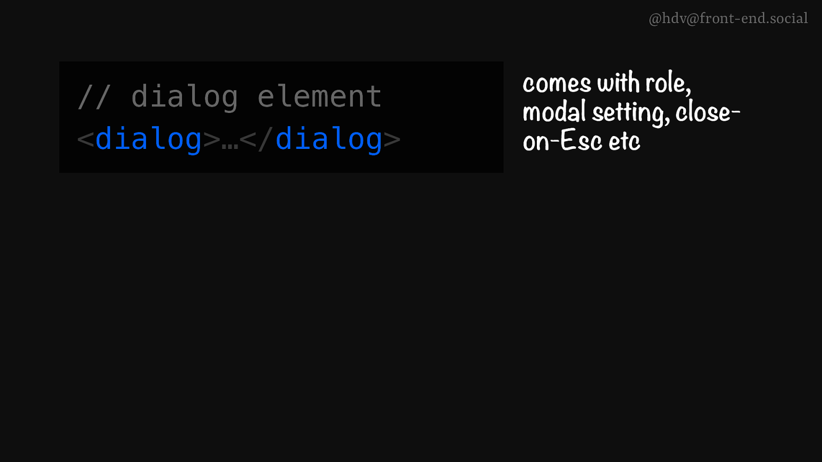
When we’re talking about dialogs, it’s important to kind of differentiate between the dialog element itself, which comes with a bunch of things built in, that modal setting that I mentioned, but also roles, like, the dialog roles built in, and it will also close on Escape. So it comes with a few things that are built into it.
Slide 29
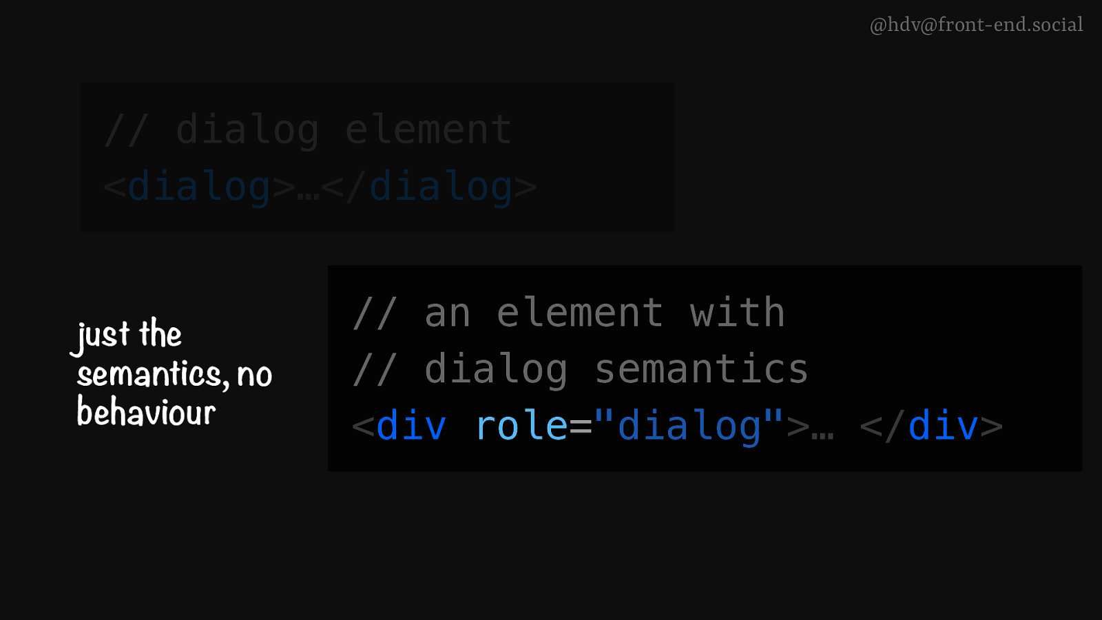
Now, if your design system doesn’t use dialogs now, it might be using divs with the role of dialog, and that seems similar, but the only thing that that does is add the role to the element, but it doesn’t have any of the added behaviours, so it won’t have a modal mode and it won’t do the keyboard behaviour unless you add that to there yourself, which you can do, it’s perfectly valid. But just to show you, these are different.
Slide 30
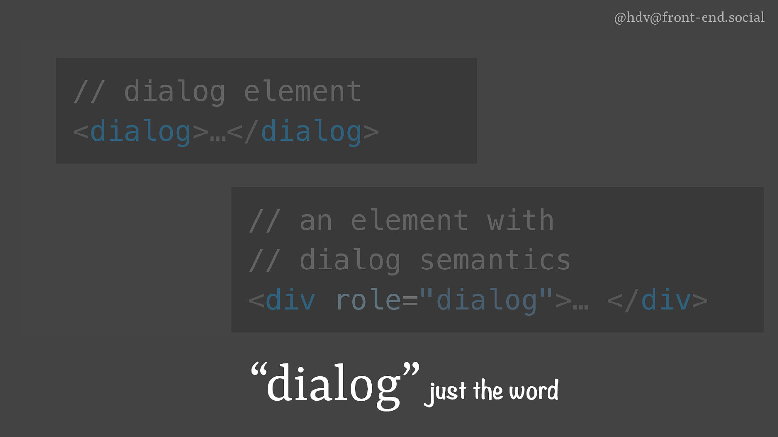
And then there’s dialog, just the word, which, you know, you might be using in the conversations with designers, developers, and you might just be talking about it, and you might not be adding the role or using the dialog element. So that’s important to kind of differentiate between.
Slide 31
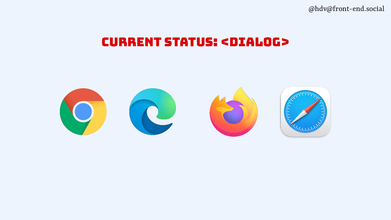
dialog is supported across all major browsers. Nothing really interesting there. There were some accessibility bugs, as I mentioned, and there’s still some.
Slide 32
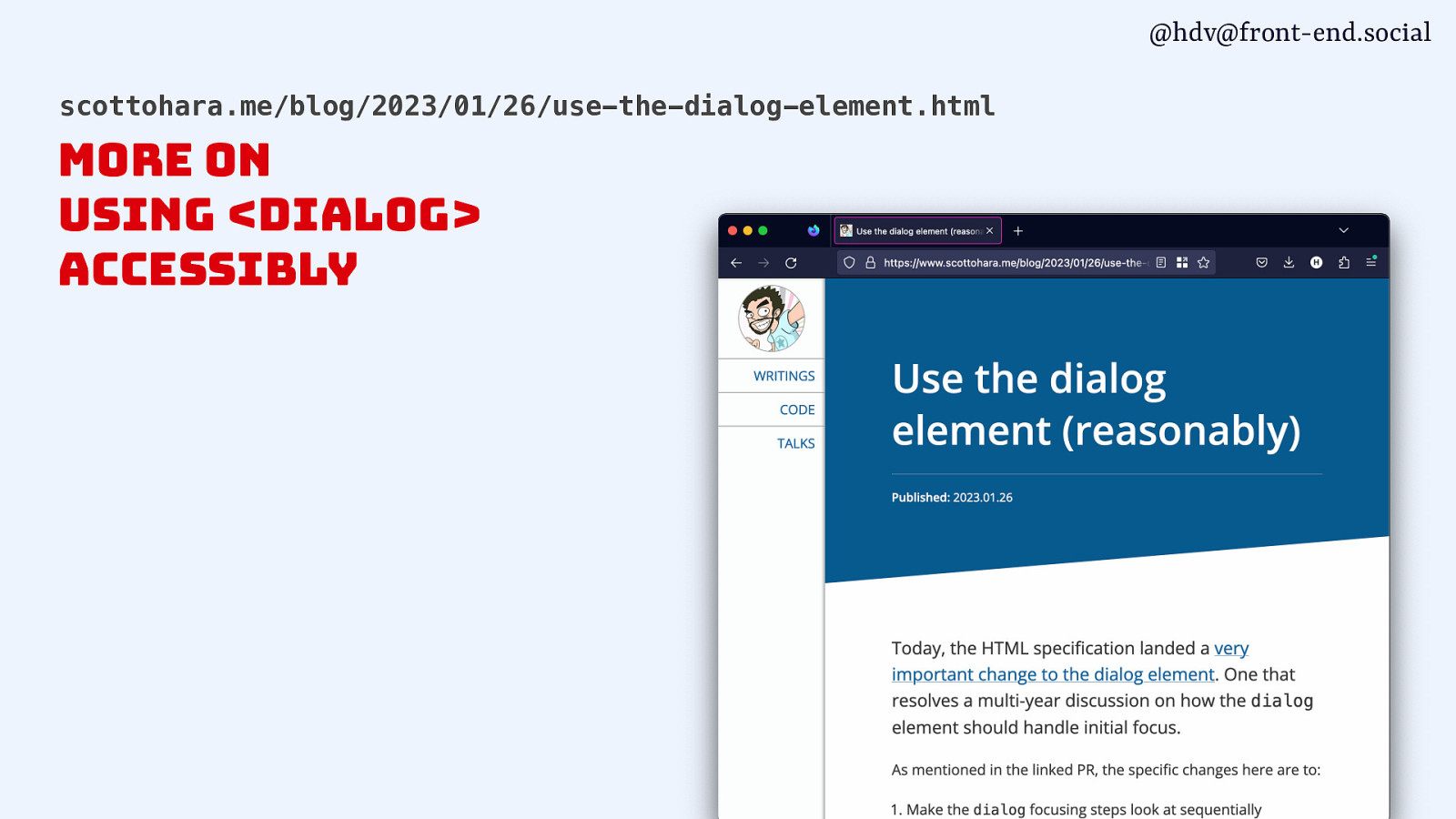
If you want to kind of go into the details of that, I recommend this blog post by Scott O’Hara, who wrote a post about all the problems, and then more recently, he wrote this one called “Use the dialog element reasonably”, where he basically explained, yeah, you can use it today, there’s still some issues, and he links to what the other issues were.
Slide 33

Ok; that’s dialogs covered.
Slide 34
Let’s go to popovers.
Slide 35
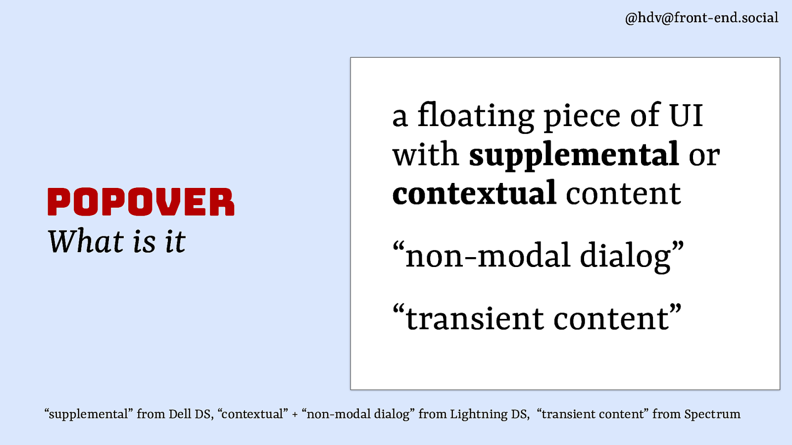
They’re somewhat similar, but not exactly the same. ‘Cause popovers are a floating piece of UI that has supplemental content, contextual content. It’s also referred to as a non-modal dialog. So, dialog, popover. Or transient content.
Slide 36
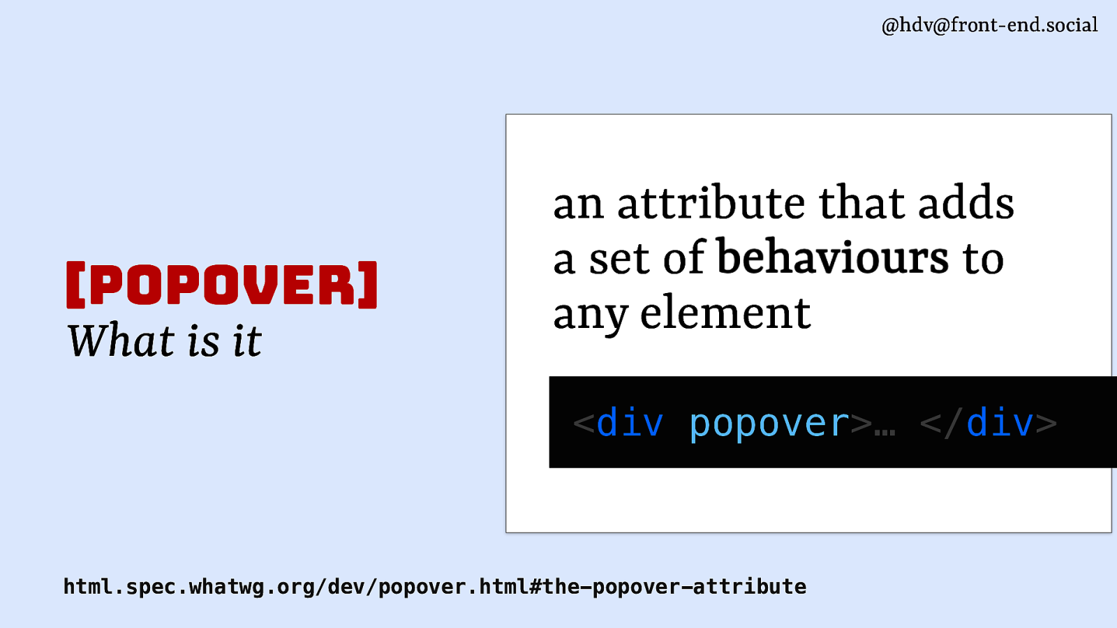
Now, in HTML, the popover attribute is an attribute that adds a set of behaviours, and it can do that to any element, so you can stick it on a div or you can stick it onto other elements.
Slide 37
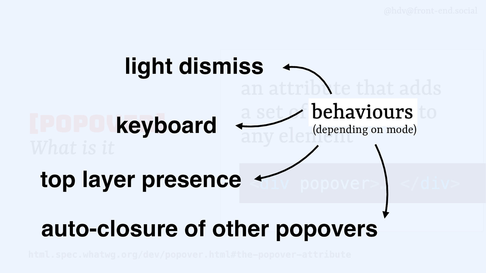
Those behaviours include things like light dismiss, keyboard behaviour, top layer presence, can auto-close other popovers depending on what mode you set it to.
Slide 38
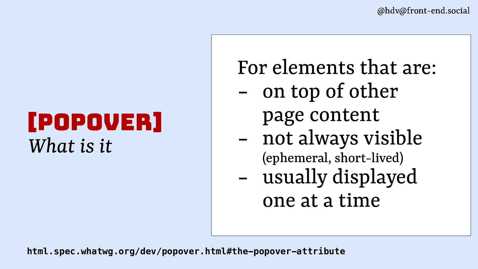
popover is meant for elements that are on top of other page content, content that’s not always visible, so it will show at certain times and it will go away, or you click it to go away. That makes it ephemeral. And they’re usually displayed one at a time.
Slide 39
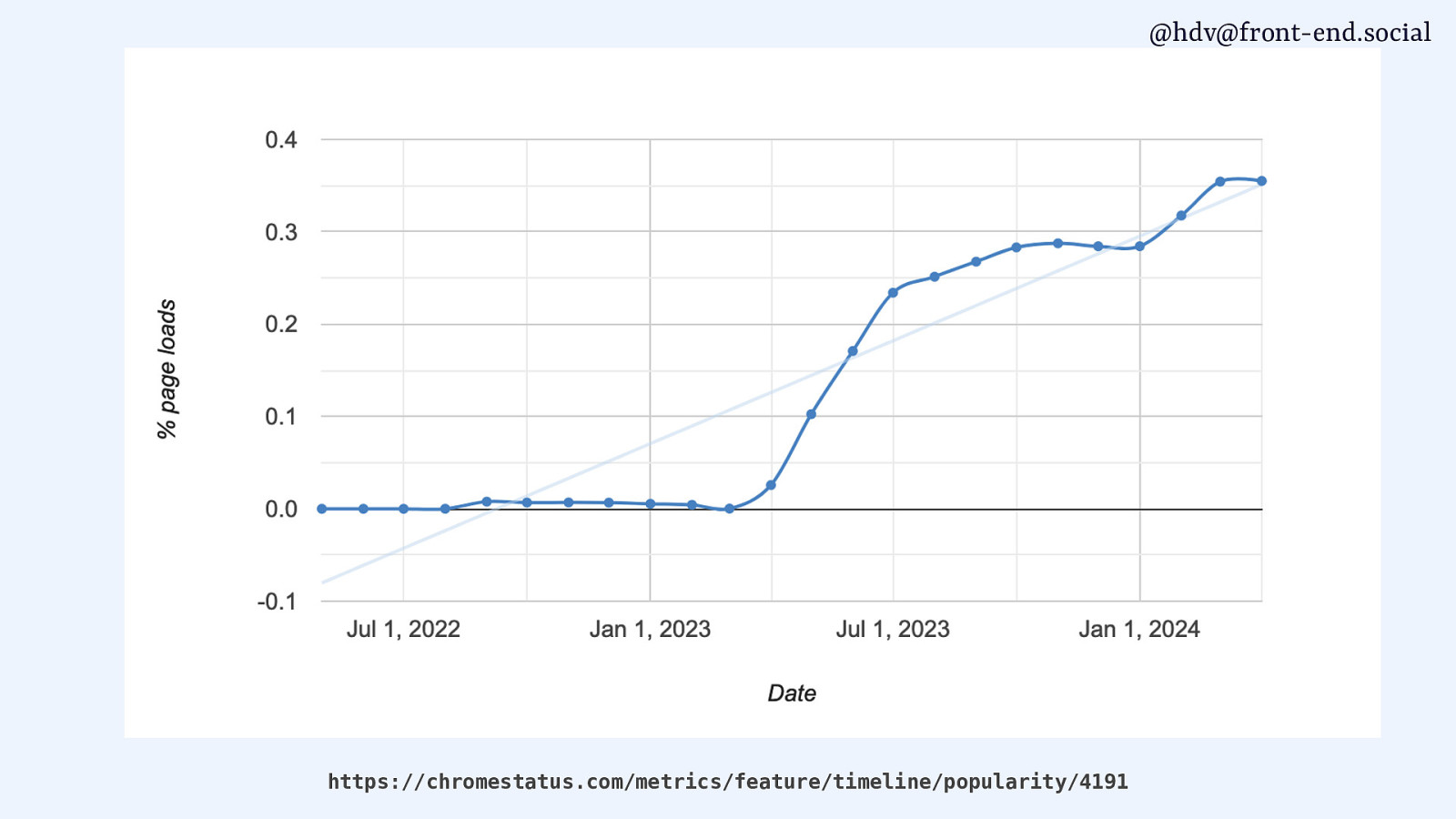
popovers are increasing in usage because now support is starting to come.
Slide 40
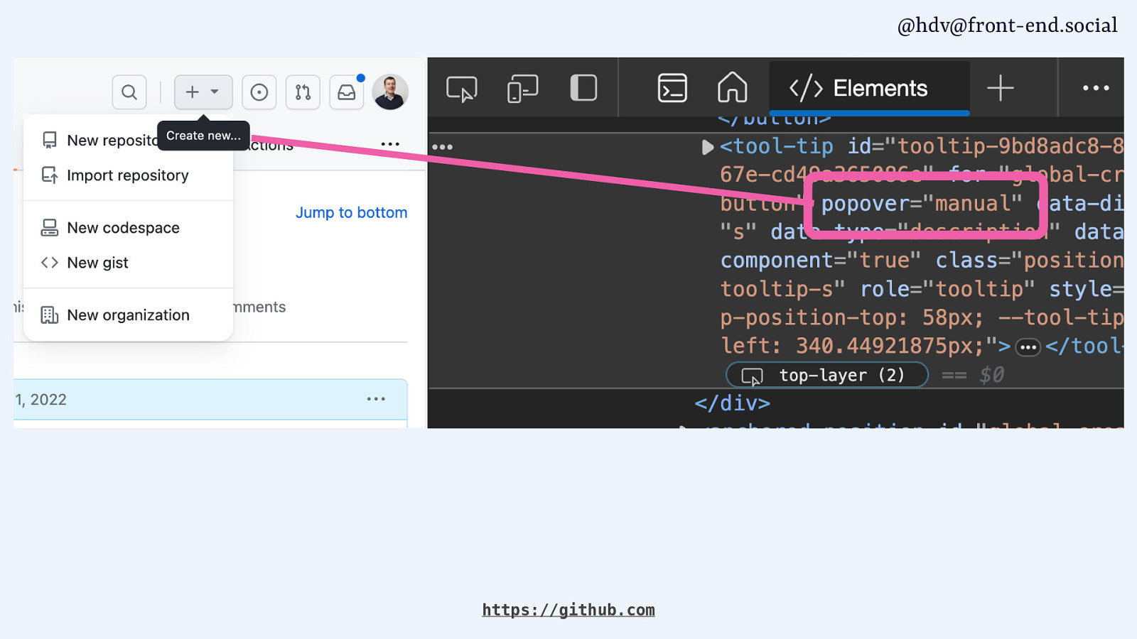
If you want to actually see it in production, you can go to github.com, because on GitHub, the menus and the tooltips are actually popovers today. So if you look in the source code, you’ll see that that tooltip, for instance, is a popover=”manual”.
Slide 41
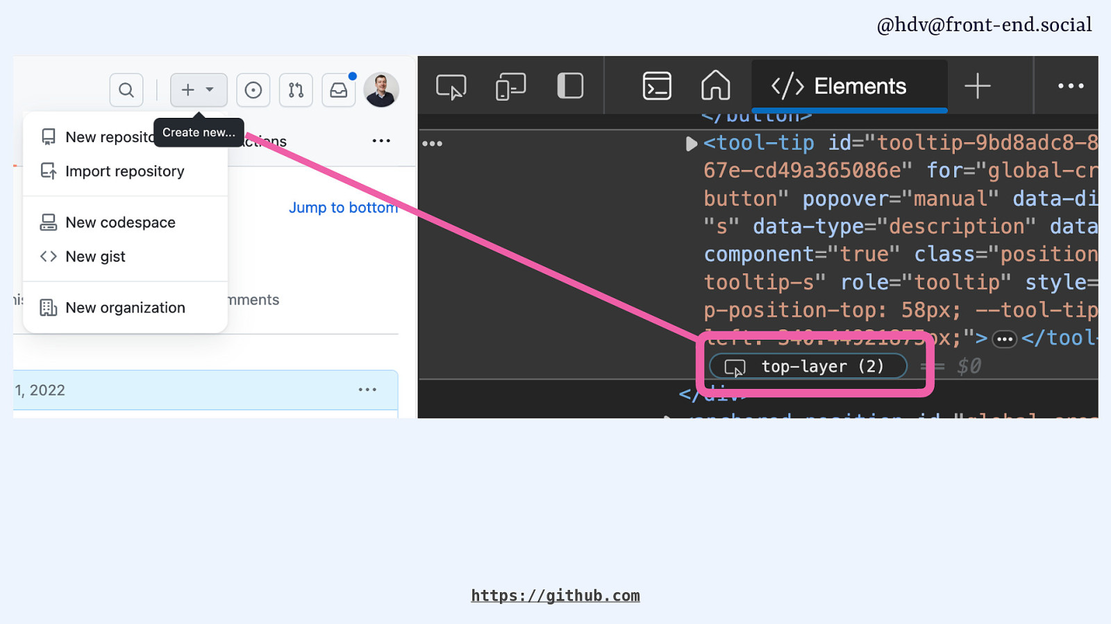
And that it lives in the top layer. We’ll get into that in a bit. But yeah, you can see that on GitHub. It’s coming to other tools as well.
Slide 42
One of the developers working on Photoshop for the web posted that they are working on adding popover there, too. I checked it this morning and it wasn’t in there yet, at least not in the free thing I could use this morning, but yeah, I’m sure they are working on it.
Slide 43
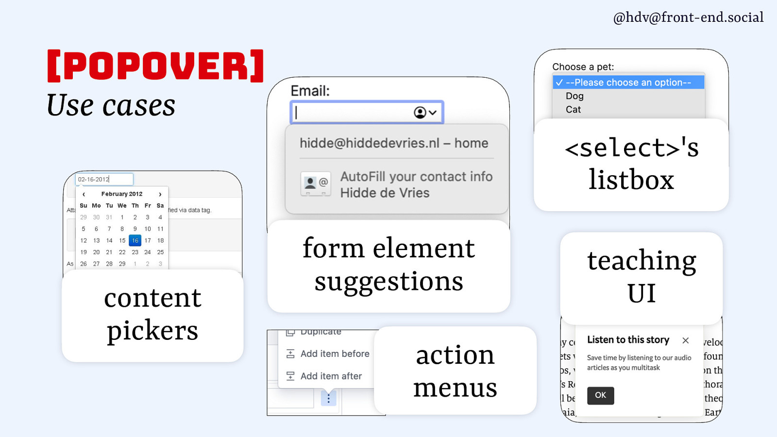
popover has lots of different use cases. You can use it for content pickers, form element suggestions, action menus. The listbox of a select has a popover in the browser, but you can also, if you built your own, do that too. And teaching UI as well, as I showed earlier.
Slide 44
Now, the cool thing about popover, making it kind of boring technology, in that sense, is that it works without JavaScript, so you don’t require JavaScript to actually build popover that works and that allows you to toggle it.
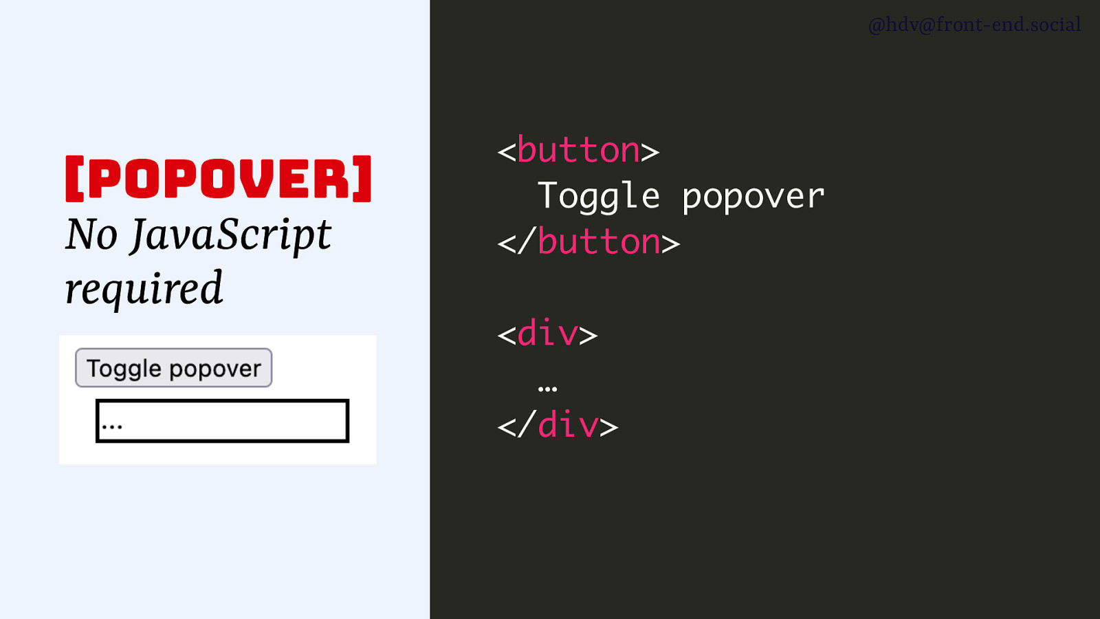
Slide 45
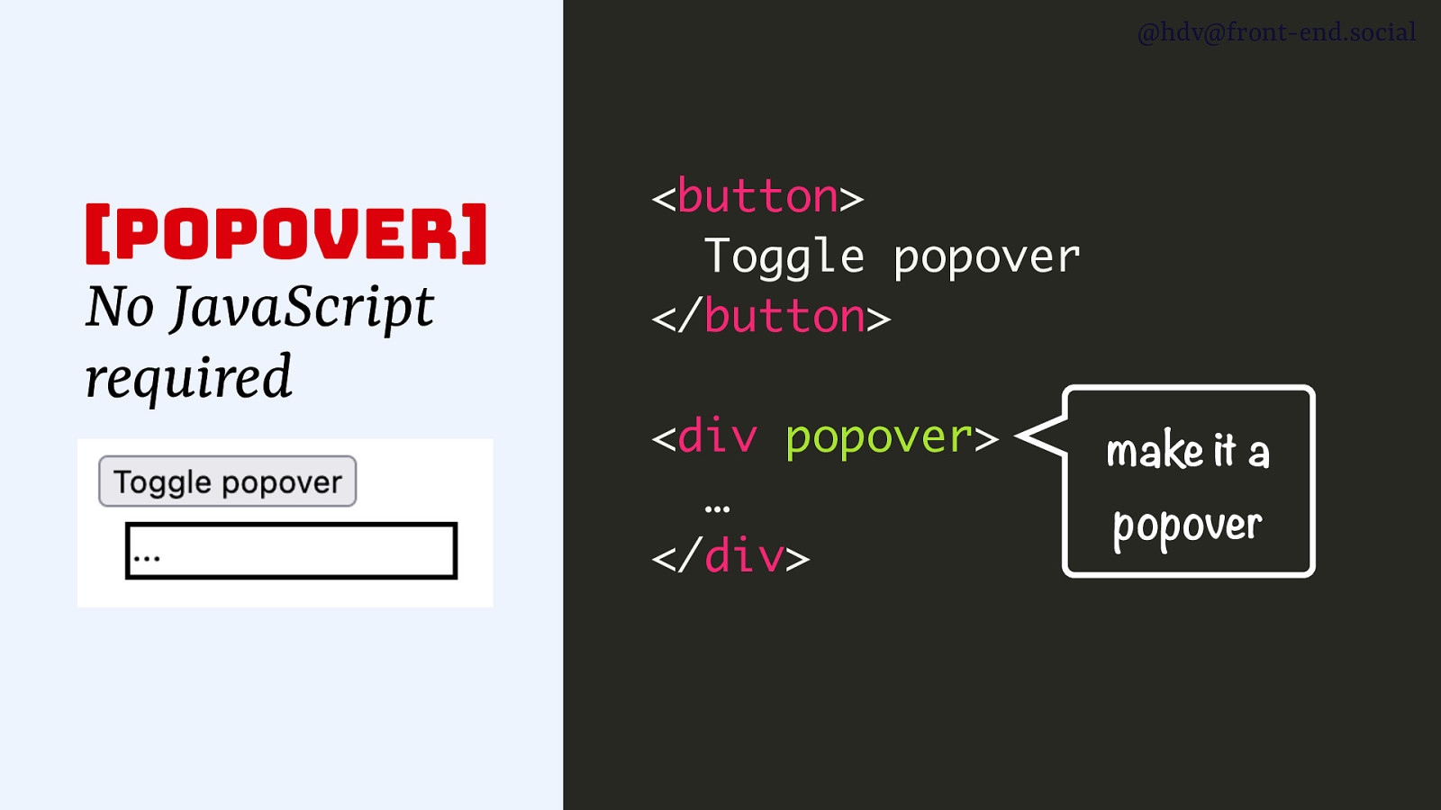
If you have a button and a div, and the div is the popover, you add the popover attribute to the div, and that makes it a popover. So as soon as you add that, it’s going to have the popover behaviours.
Slide 46
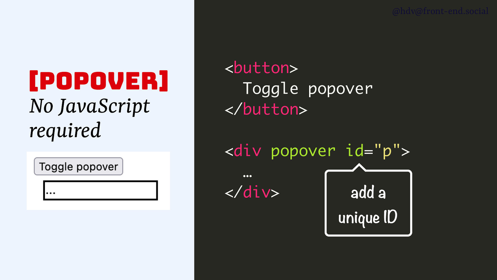
Now, to make the button work together with the popover, you basically add an ID to the popover.
Slide 47
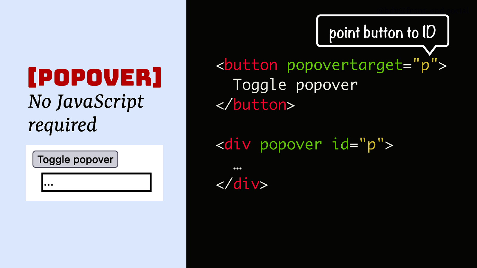
Then you refer to that ID from your button with popovertarget. As soon as you do that, the button turns into a toggle for the popover, so when you click it, it will show, and when you click it again, it will hide.
Slide 48
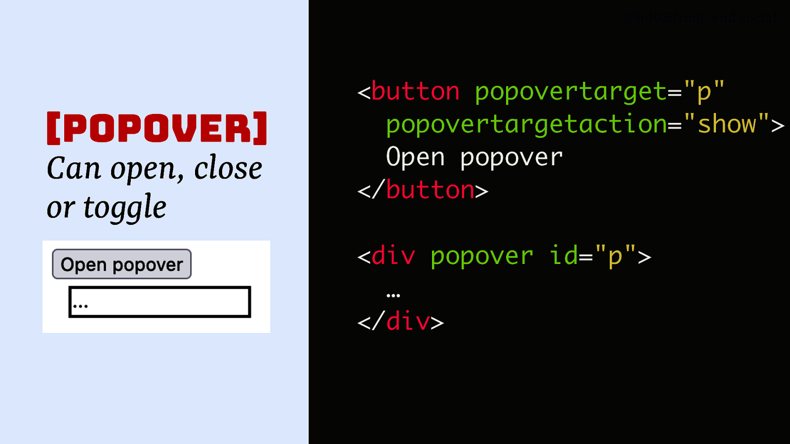
You can also set specifically what you want it to do, so you can set popovertargetaction to show or to hide and, you know, control exactly what you want it to do.
Slide 49
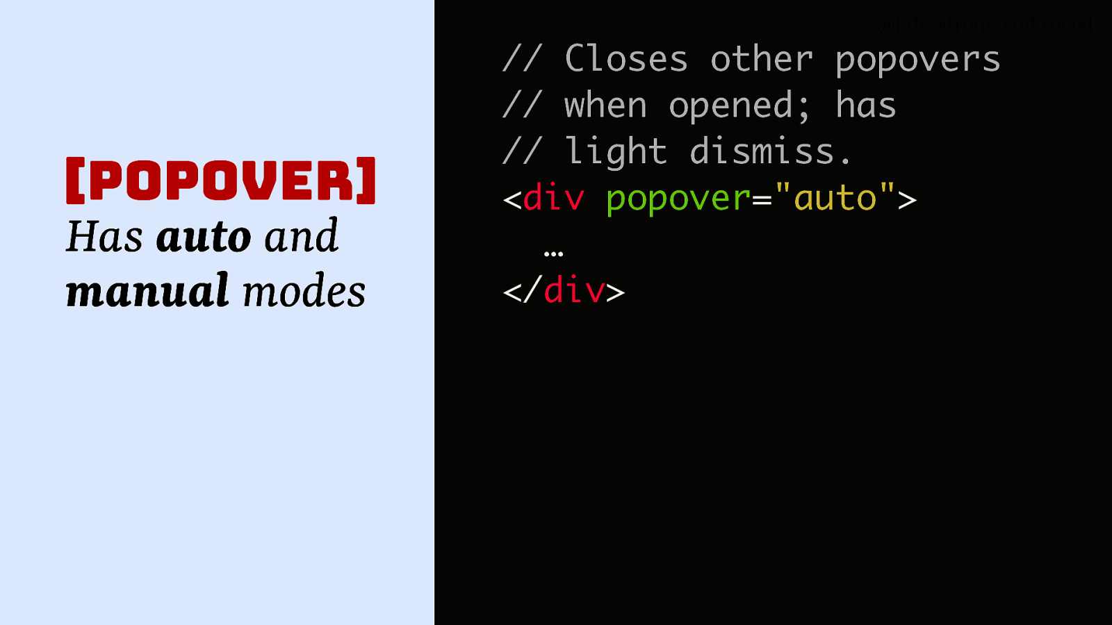
there are different modes for popover. So you can use the popover attribute on its own, that will set it to the auto mode, which you can also set explicitly with the auto value, and that will make a popover, and it closes auto popovers when they’re open, and it also has light dismiss, meaning when you click outside of it, it will go away.
Slide 50
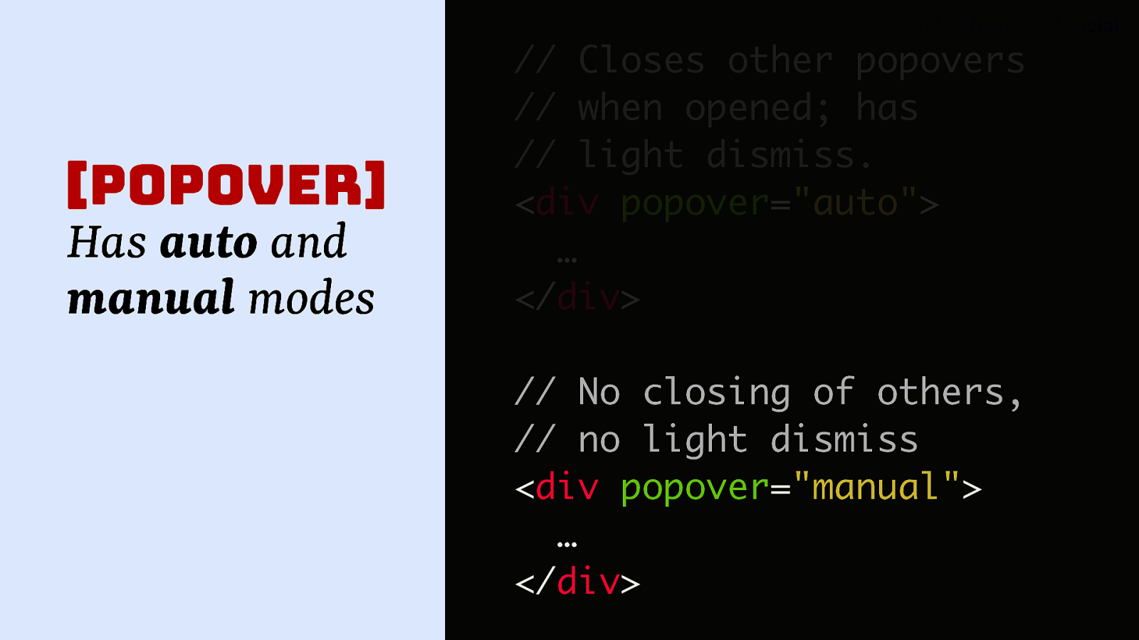
There’s also popover=”manual”, which is basically the opposite of the auto version, so it doesn’t close others and it doesn’t have light dismiss. A use case for that is when you make toast messages, for instance, you maybe don’t want them to go away, you want someone to explicitly dismiss that. It’s also used by GitHub for those tooltips because they want them to show on hover, so it makes sense for them to manually do all the opening and closing and all of that.
Slide 51
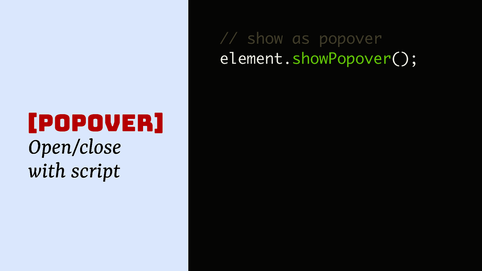
You can also do it with script just like with dialog, so you can do element.showPopover(), and then you call that showPopover method on your element, and it will show it as a popover.
Slide 52
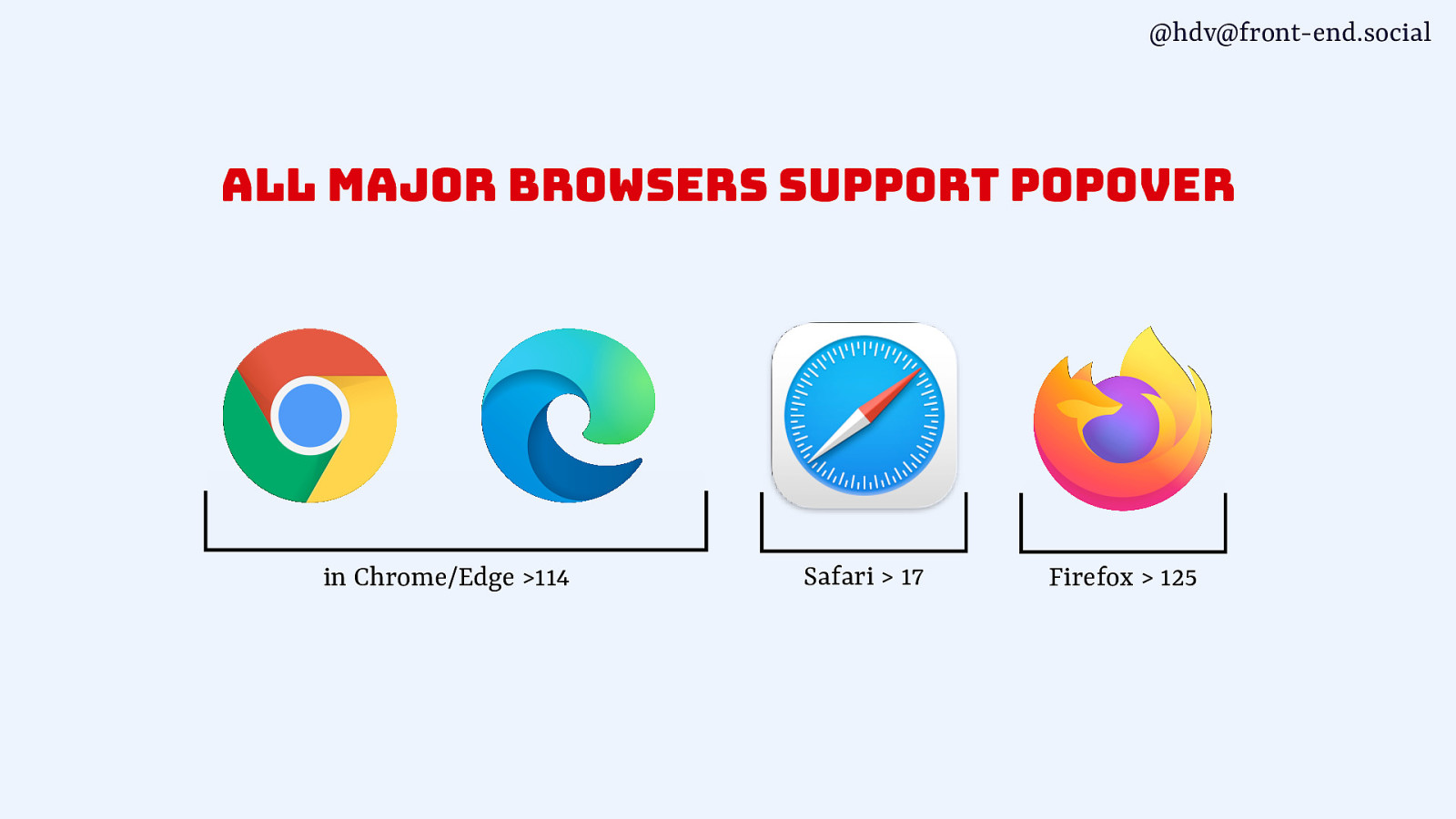
Popover is, as of very recent, supported across all major browsers now, which means you can really start to play with it.
Slide 53
ut like me, when I first looked into this, you might be left with this question, like, how are these patterns actually different? Because they’re all content that overlays other content, and popovers are sometimes called dialog, so what’s the deal?
Slide 54
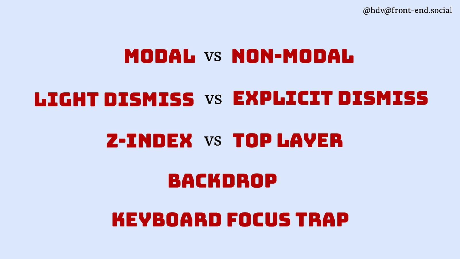
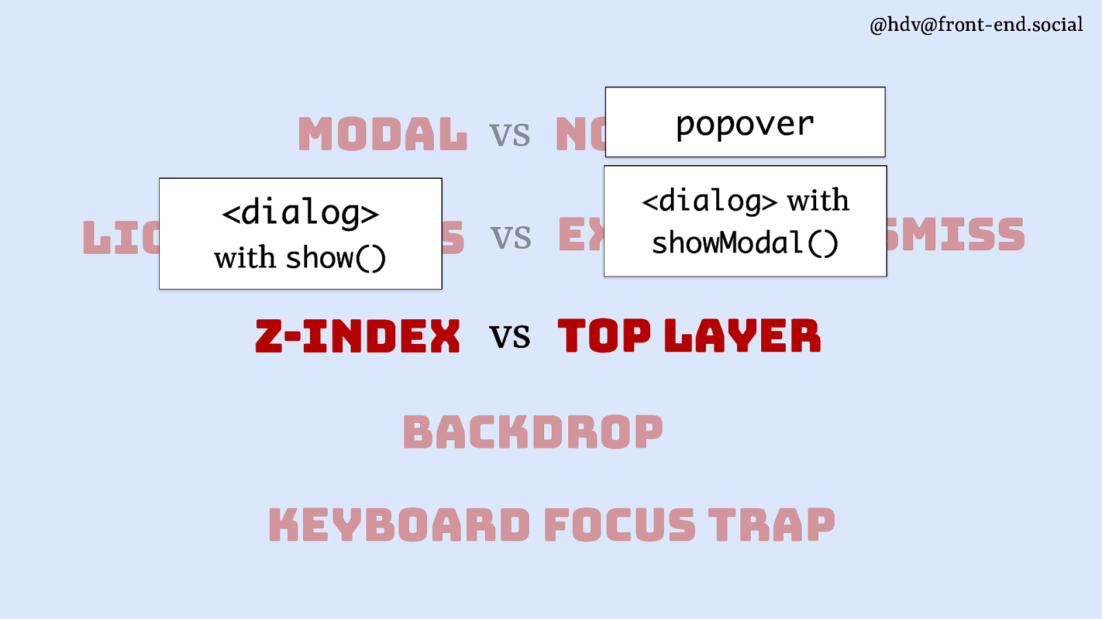
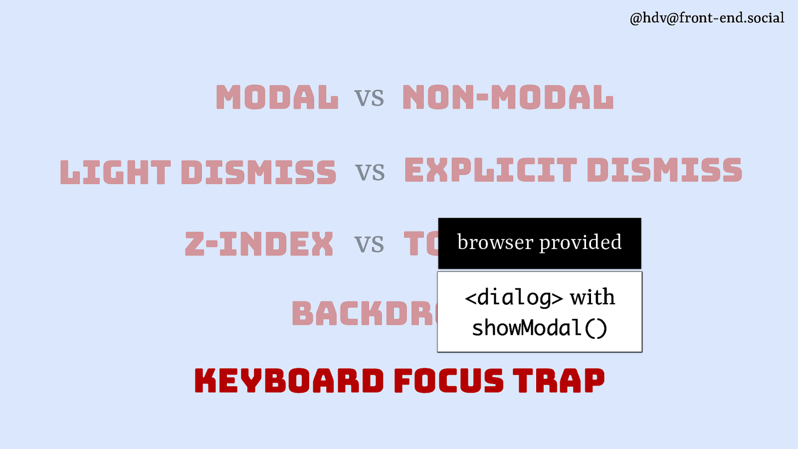
I want to take you through a couple of different angles in which they are quite different and in which they can be different, or you can make them different. The first one is modal versus non-modal. That’s a major one.
Slide 55
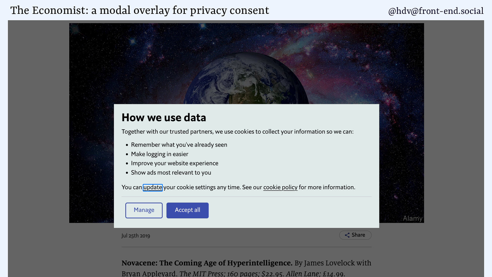
So, modal is basically a bit of content that you have on a page where the user can only interact with that bit of content, and everything else on the page is made inert or not available, basically. And an example of that is a cookie consent thingy, because usually you don’t want to have your users interact with the page before you know if you’re allowed to track them. If you decide to track them, you need to have their permission, so it makes sense to, you know, block everything, or, you know, just don’t track would be the easier way, as well, to get out of that. But if you are tracking, that is probably the way you can do it.
Slide 56
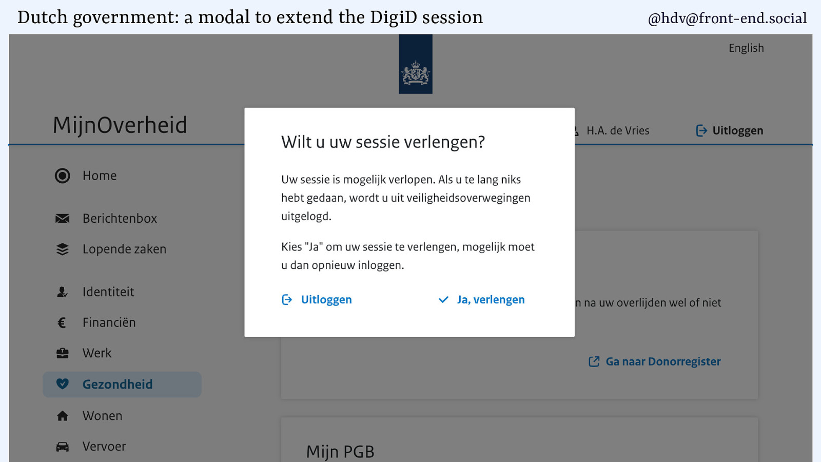
Another example of a modal is something we do at the Dutch government, where if you log in with the centralised login system that works on all Dutch government websites, you get a 15 minute timeout for security reasons. And that means that if you’re filling out a tax return and it takes you more than 15 minutes, which is likely for a lot of people ‘cause these things are complex, you know, I’m not going to make fun of my own forms, but yeah, there are complexities there, you want to offer the user a way to extend their session. And that is what this popover or model overlay does. So basically, there’s a button that says, “You are going to be logged out, do you want to extend it?” And by clicking that button, you get another 15 minutes. This is a bit annoying for users to do, but it’s annoying in the sense that an alarm clock is annoying in the morning. You know you’ve got to wake up, so you want that interruption, but you know, we can all agree, it is an interruption to whatever you were doing, like sleeping in the alarm clock case. So, that is kind of what this is. Like, you don’t really want to bother the user, but if, you know, the alternative is worse, then that’s what you’re doing.
Slide 57
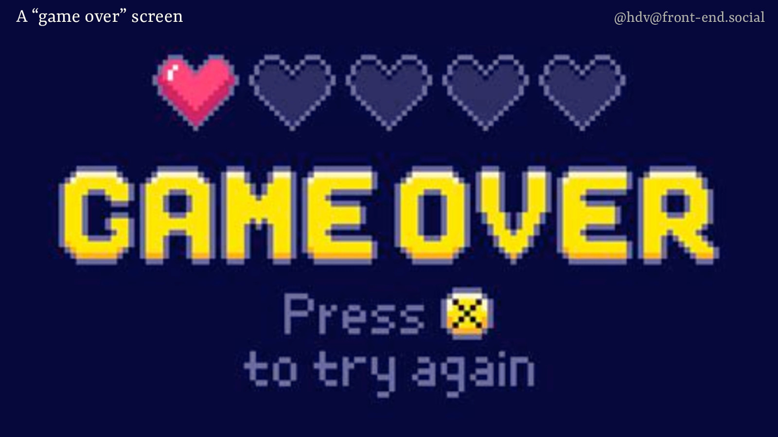
A game over screen is another example of a modal overlay. Because you’ve played the game and you died, you can no longer go back to the actual game. The only thing you’re allowed to see is the game over screen. You’re dead, so you can either, like, go back, try again, or look at this screen, but there’s no way you’re going to access the game again.
Slide 58
And as I mentioned earlier, modals are overused quite a bit on the web. My children’s daycare introduced this new system for logging permissions. Permissions like, can we take your kid’s photos? Can we upload them to this portal? Can we put them on social media? No. There is this list of permissions, and then each one of them, if you click them, it opens a modal. And then inside of that, when you make your choice, there’s another modal. They really like material UI. Or they didn’t have time, you know, to make it better. But they could have used a checkbox or, like, a radio button for this. So by all means, don’t use modals if you don’t have to, if it’s not of the essence.
Slide 59
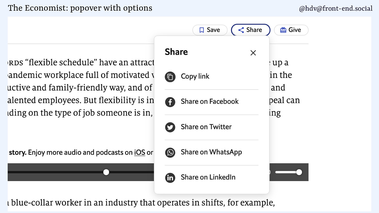
Some examples of non-modals include this one, where there’s a list of share links that you can open.
Slide 60
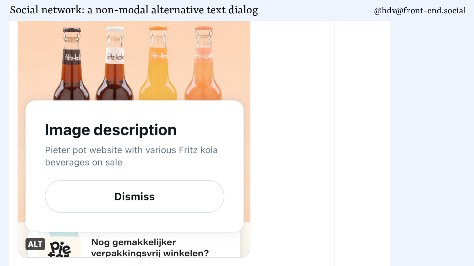
Or alternative texts on that social media that we shall not name. So if you get alternative text, you can dismiss that. That’s a non-modal.
Slide 61
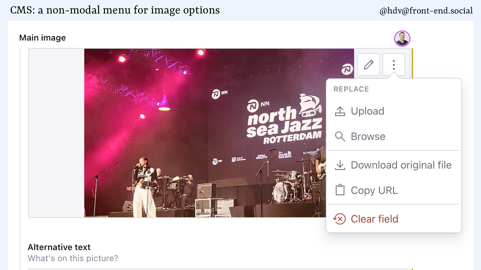
Action menus like this one in a CMS, you get a bunch of different buttons that you can click, and that’s an example of content that pops up on top of other content.
Slide 62
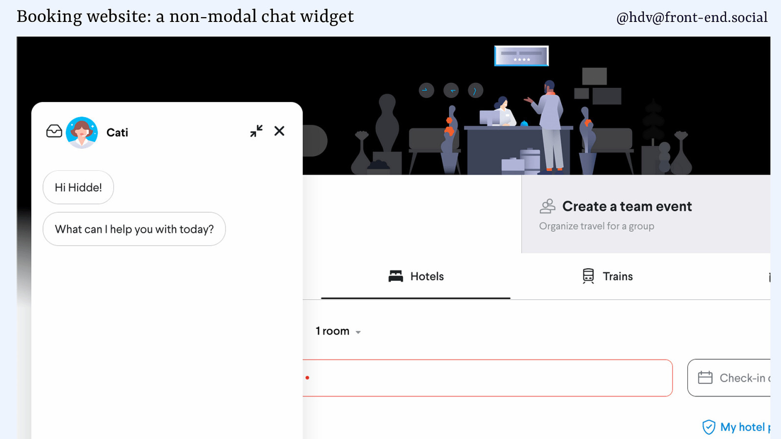
And then there is chat widgets as well. You don’t want those to be modal, because people want to browse the rest of the page, or maybe they don’t really want to chat and they want to click that away or have it light dismiss.
Slide 63
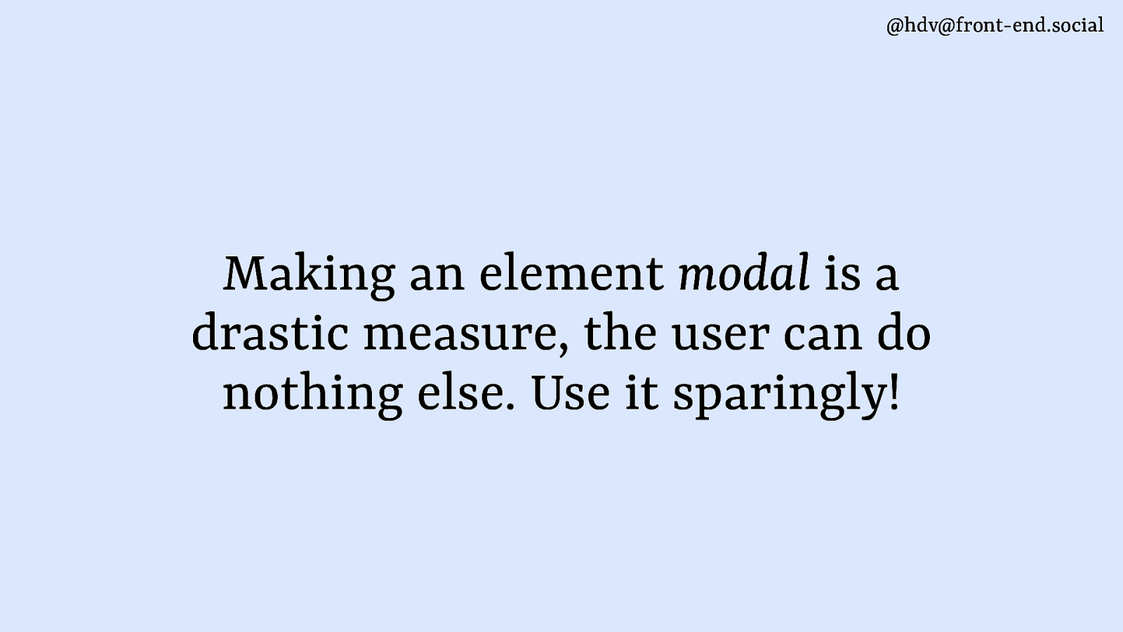
MMking something modal is a drastic measure. You only want to do it if it is of the essence. So yeah, like the alarm in the morning, sometimes you’ve got to set it or you’ll be late for work.
Slide 64
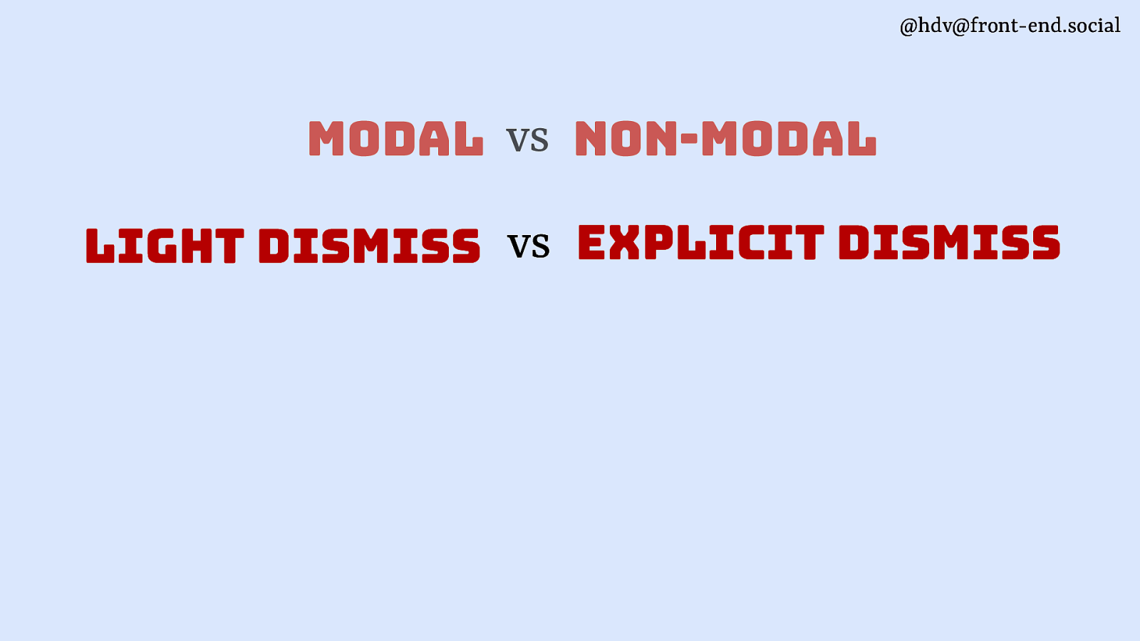
Another angle that these things can be quite different is in how you dismiss them.
Slide 65
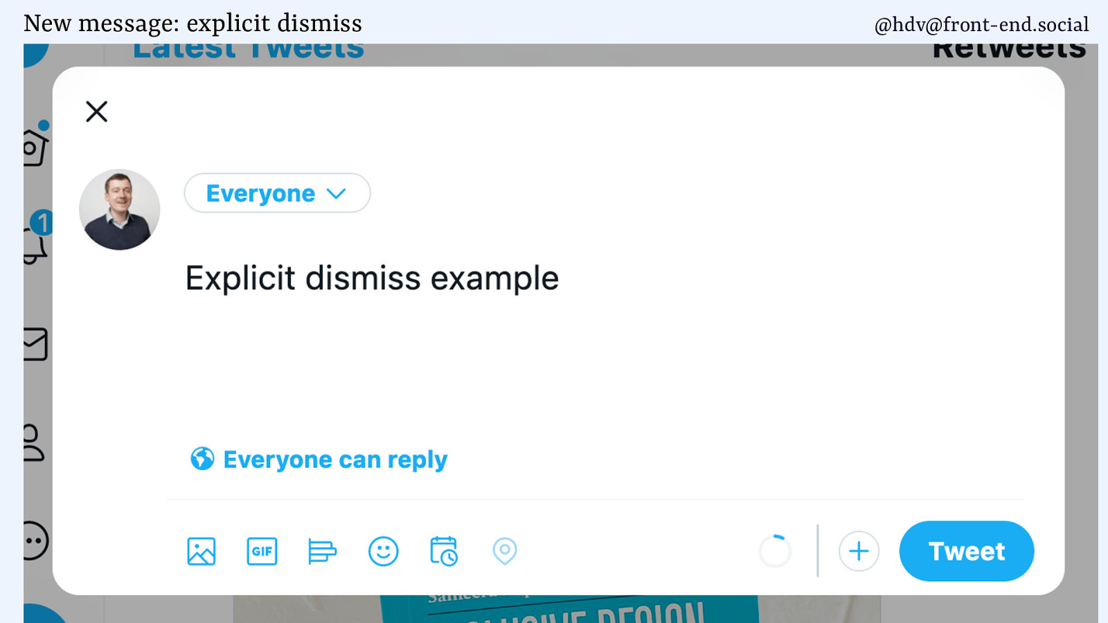
A lot of patterns are explicit dismiss, meaning that the user will have to press a button to dismiss the dialog.
Slide 66
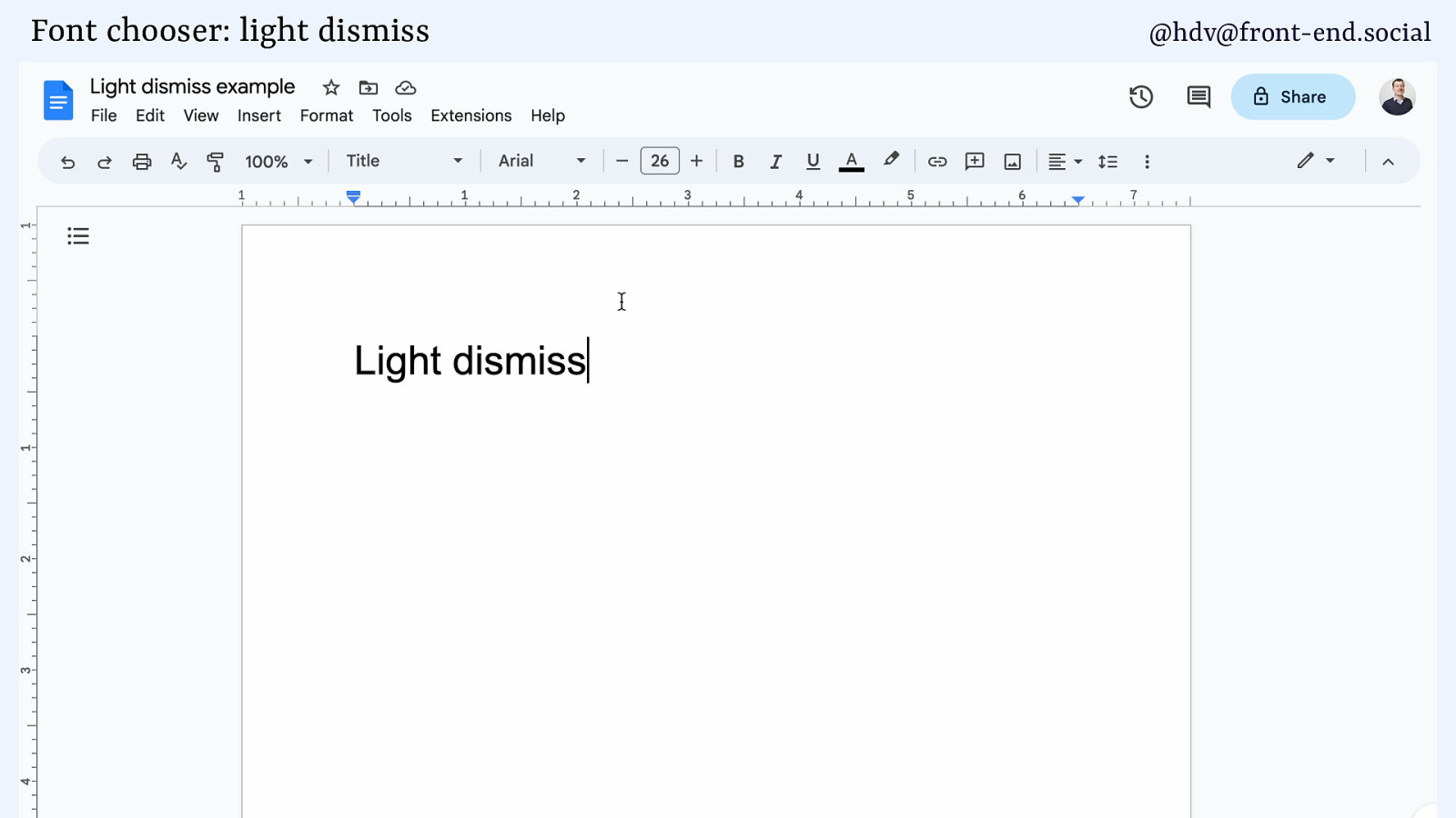
Other things are light dismiss, meaning that based on some heuristics, the popover will go away, which is the case when you select a font on Google Docs. Like, you wouldn’t expect there to be a close button for this. It makes more sense that when you don’t need it, it just goes away.
Slide 67
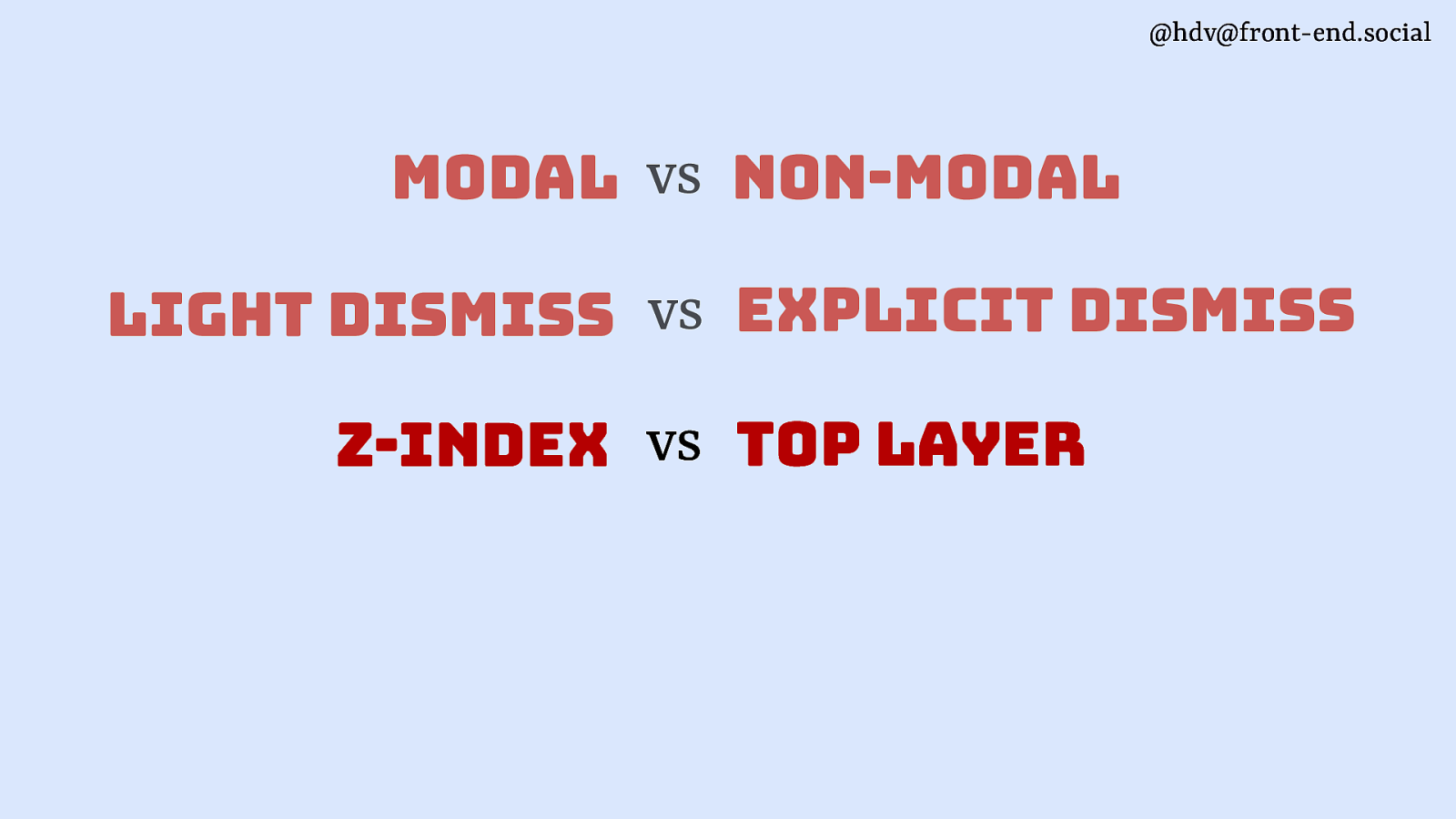
Then there’s the difference between layering.
Slide 68
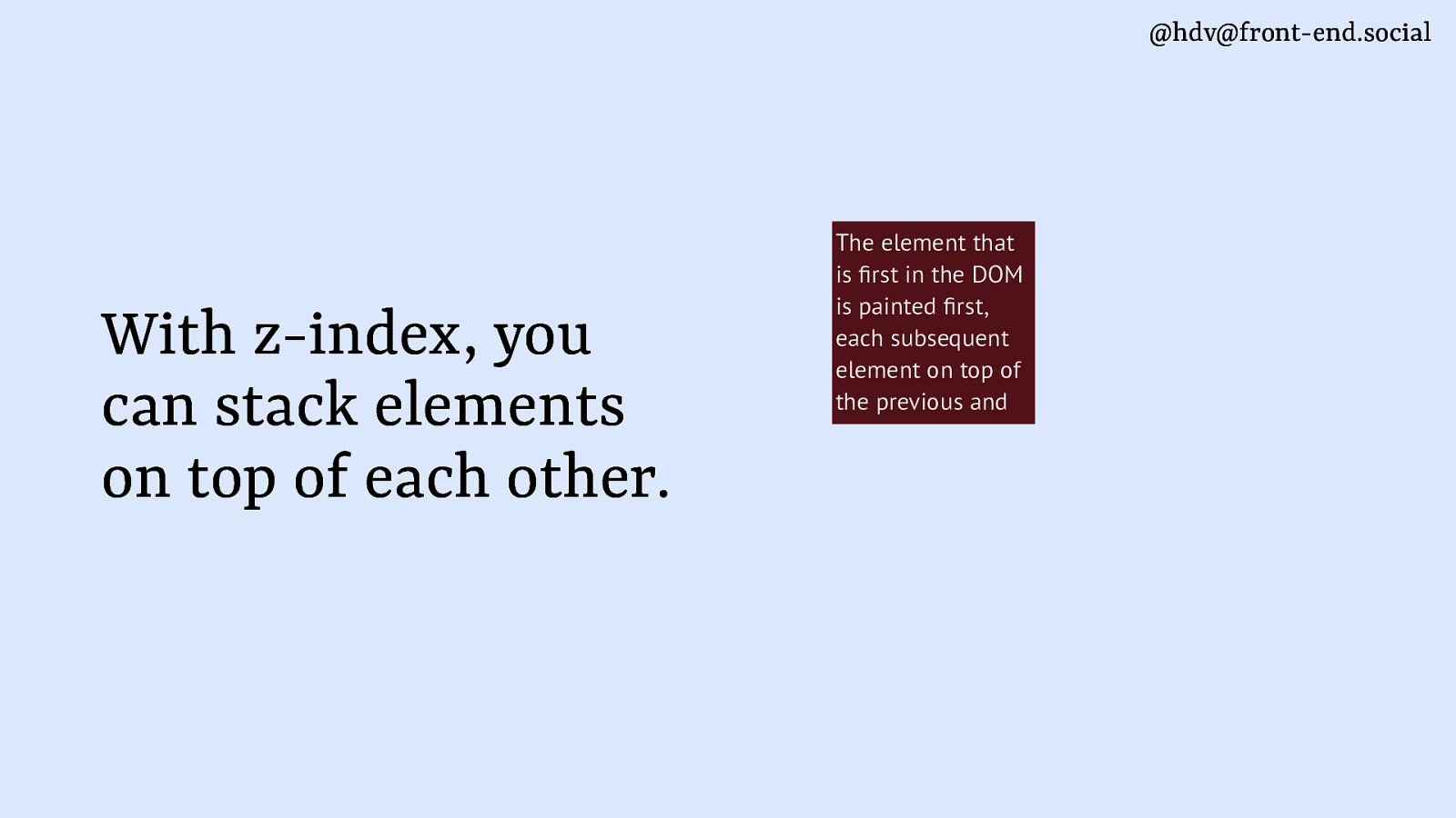
A lot of people will be familiar with z-index.
Slide 69
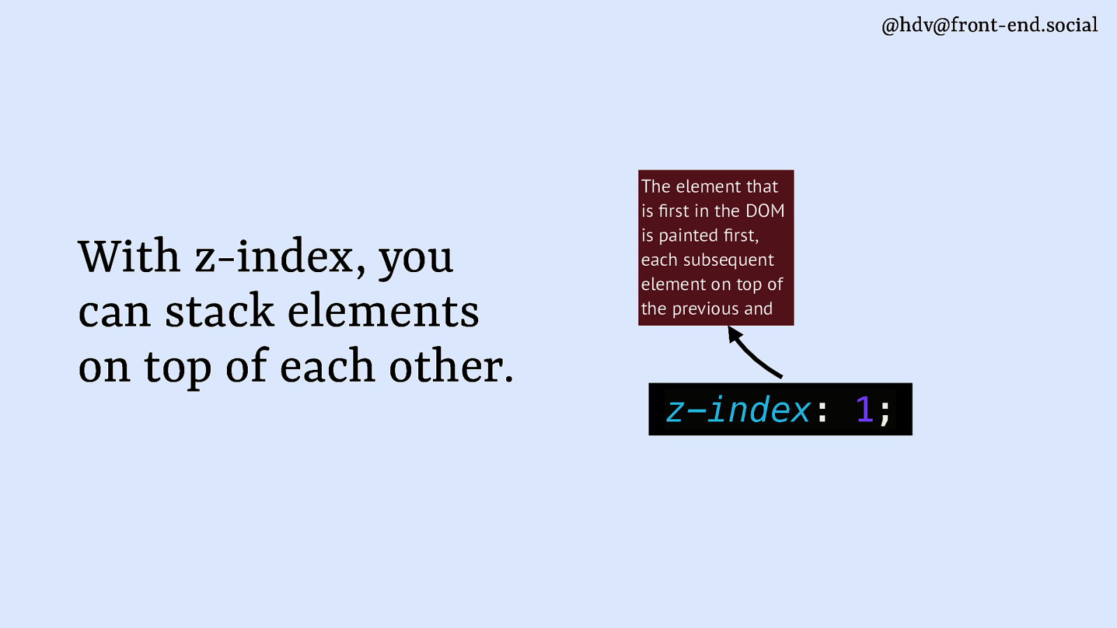
When you have different elements that are in the same place on your page, you can use the z-index to set the order of them.
Slide 70
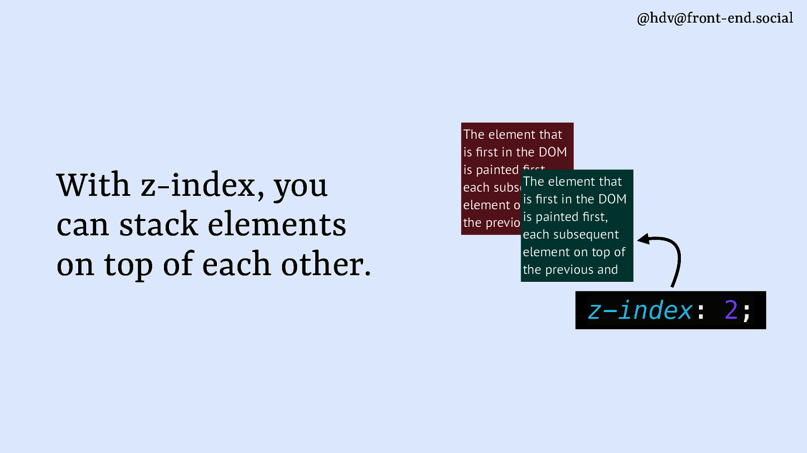
So, they are ordered by the paint order, the DOM order by default, but you can change the order around with numbers.
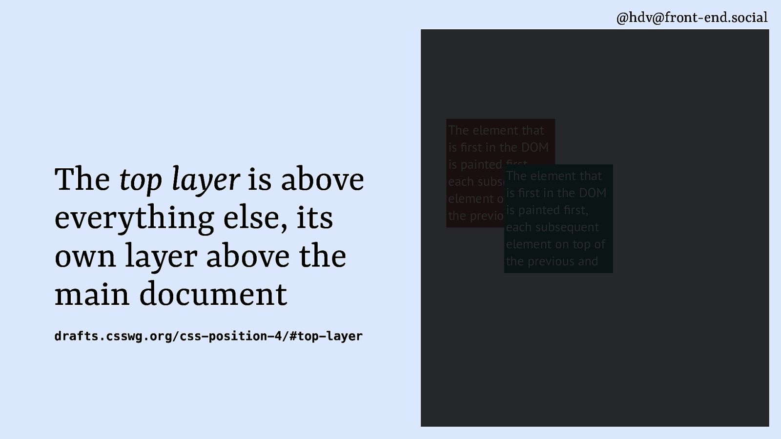
Slide 71
Top layer really changes the game here, because it’s basically a layer that’s on top of everything else. It’s on on top of your highest z-index. If you put a z-index of, like, 3 million, top layer will still be on top. It’s really like its own layer kind of next to the main document.
Slide 72
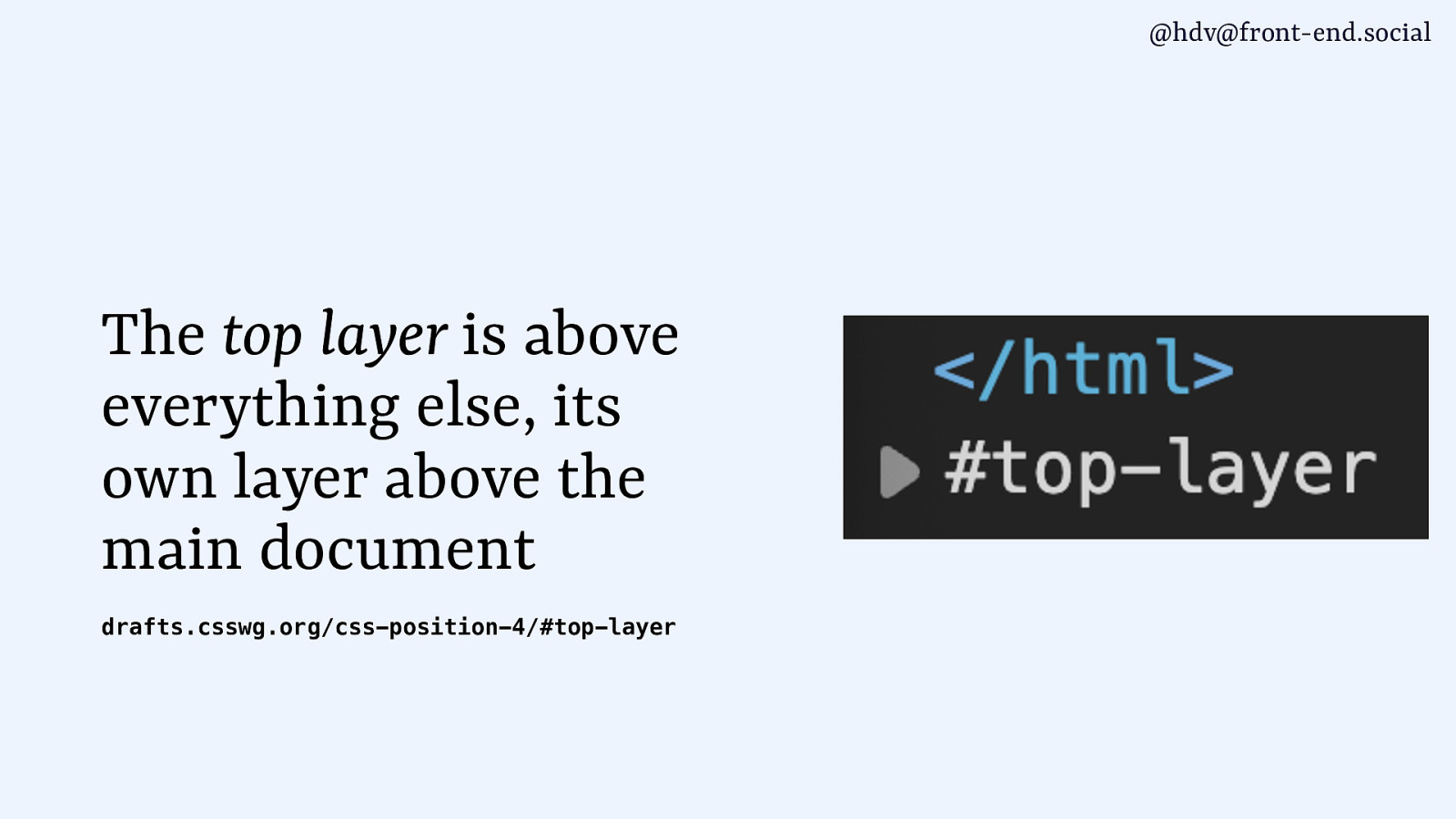
That’s also how it’s visualised in the dev tools. So you get the HTML element closing, and then Chrome will display that top layer right next to it. So it’s really its own thing, and if you want to decide the order of elements that are in the top layer, you can’t even use z-index for that.
Slide 73
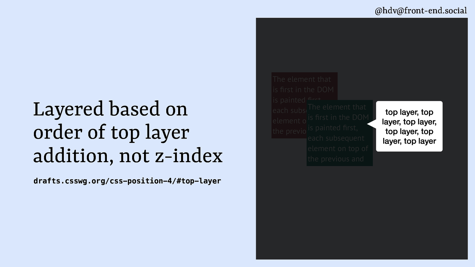
It’s kind of based on the order in which they are added to the page. So, one element might be added, and then when you add the next one, it will be on top.
Slide 74
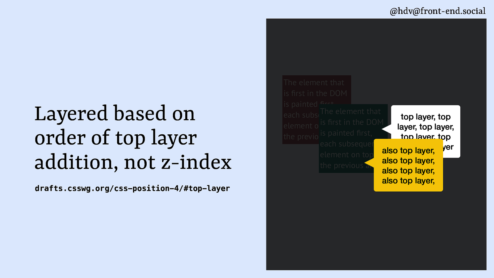
If you want to reorder, you have to take everything out of the top layer and then put it in the order that you want it to show up. So that’s a bit of a gotcha with top layer.
Slide 75
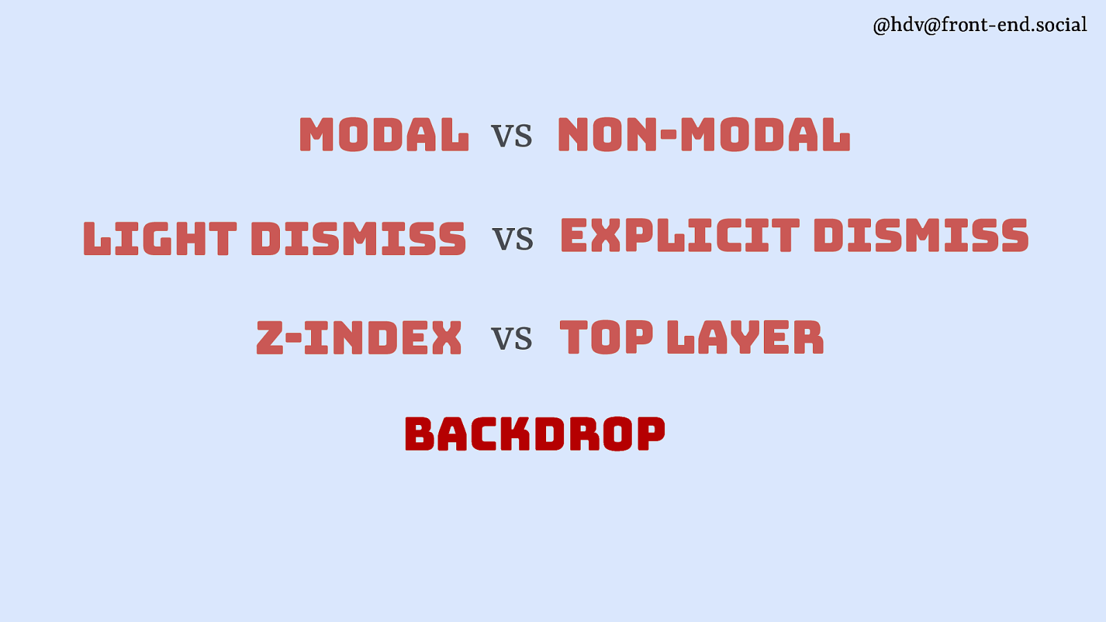
Then backdrops, they are common with modal overlays. So, sometimes you want to have a backdrop to signify that the content that’s behind this modal is not available for anyone to do anything with.
Slide 76
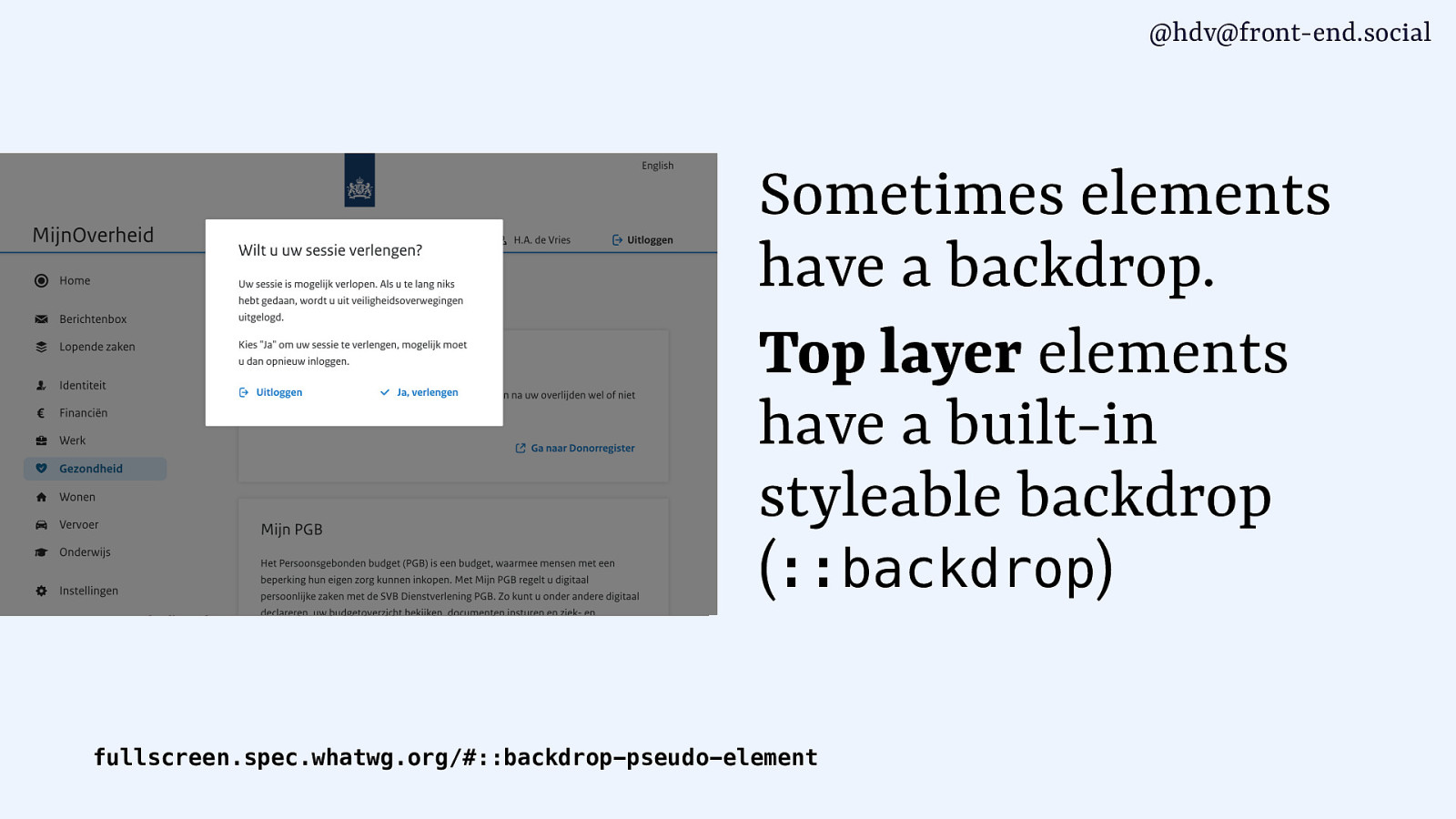
Top layer elements have a stylable built-in backdrop that you can use with ::backdrop. Allows you to style it, give it a different colour, blur effects, everything you want.
Slide 77
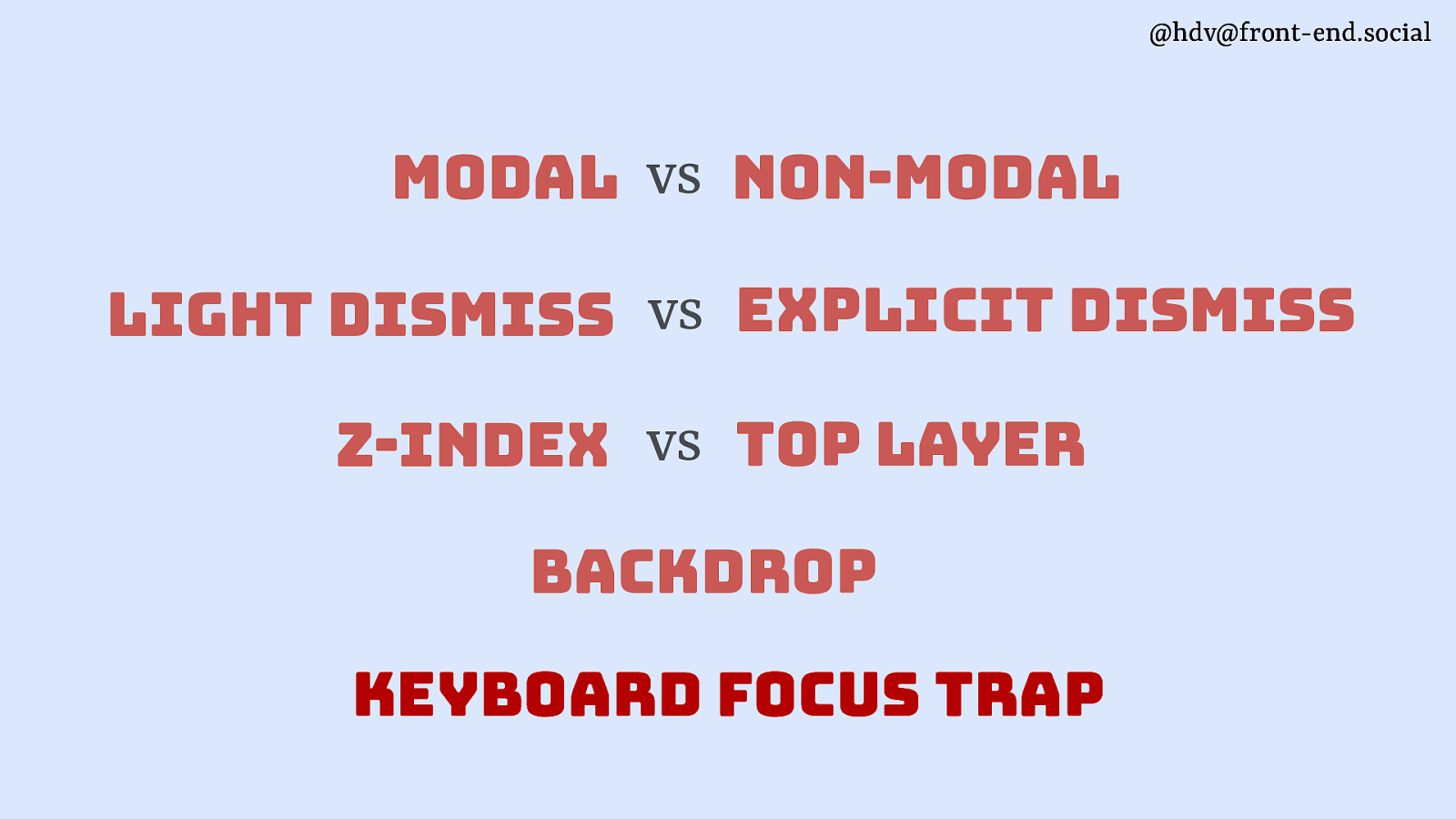
the last one is keyboard focus traps, which is a pattern that, again, you would use quite often with modal overlays because it makes sense to lock people inside of the area, because they can’t access the stuff that’s outside of it.
Slide 78
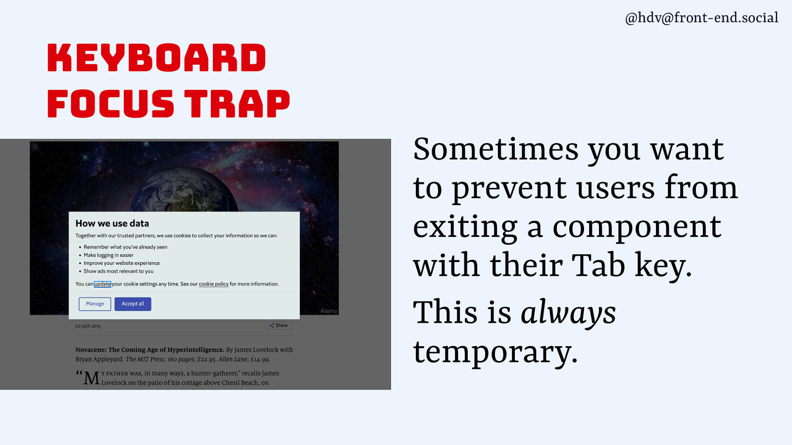
That’s always a temporary measure. Very rarely you also want to do this with popovers. Like, some calendar widgets, it makes sense to kind of keep people inside of your calendar for the time being without it being a modal.
Slide 79
So these are kind of the different angles in which these patterns can be different and where if you’re building this or designing this, you want to make some explicit choices. Now let me show you how these web standards actually work together with these angles.
Slide 80
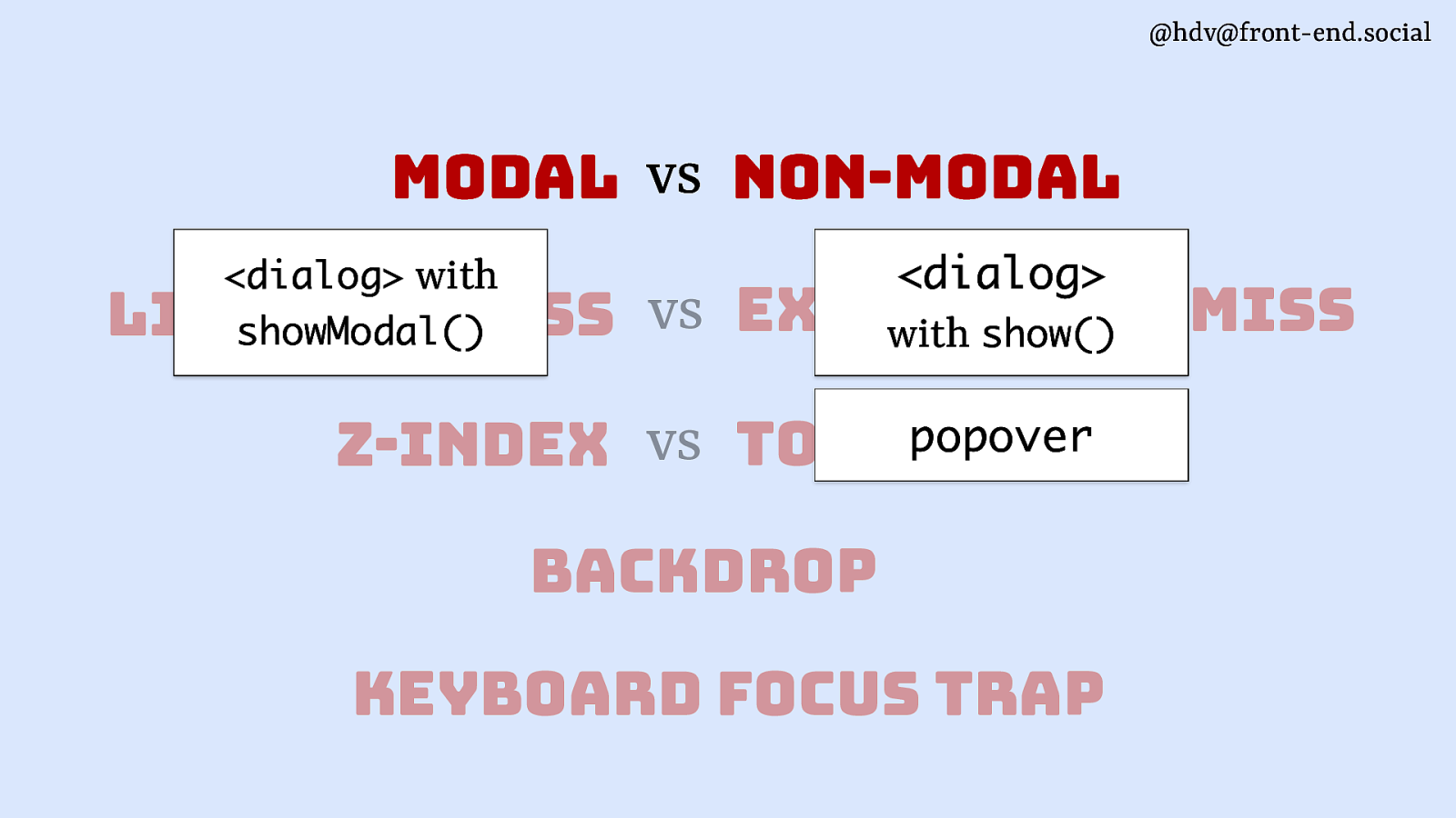
You can make something modal by using a dialog with that showModal method that I showed earlier. So that is actually the only way that on the web platform you can make something modal and get that for free from the browser. For non-modals, you’ll use a dialog with the show method, or a popover, or anything else, really. Like, any div will also be non-modal.
Slide 81
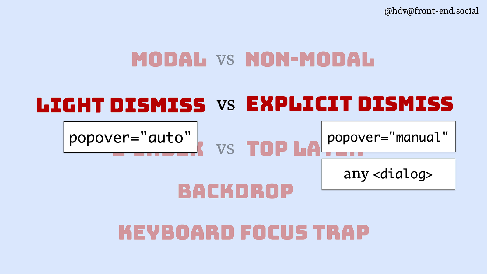
If you want light dismiss, you should use popover=”auto”. That has light dismiss built in, and it’s the only way to get free light dismiss from the browser. If you want explicit dismiss, you can use a dialog, or you can use popover=”manual” and have that done explicitly, or via script.
Slide 82
When it comes to layering, to get access to the top layer, to put any element in there, you’ll need either a popover or a dialog with showModal. Those are the only ways to make something show up in the top layer. And then everything else, you’ll need to use z-index. So, dialog with show or any other method that you might be using to build these.
Slide 83

If you want a backdrop, again, you’ll use the same elements that support top layer, because it comes with top layer. So that’s, again, popover and dialog with showModal. If you’re doing it with popover, do consider whether that maybe should be a modal dialog instead, because if you’re going to hide visually kind of the background of your popover, chances are that people can’t interact with them anyway, and it makes more sense as a modal.
Slide 84
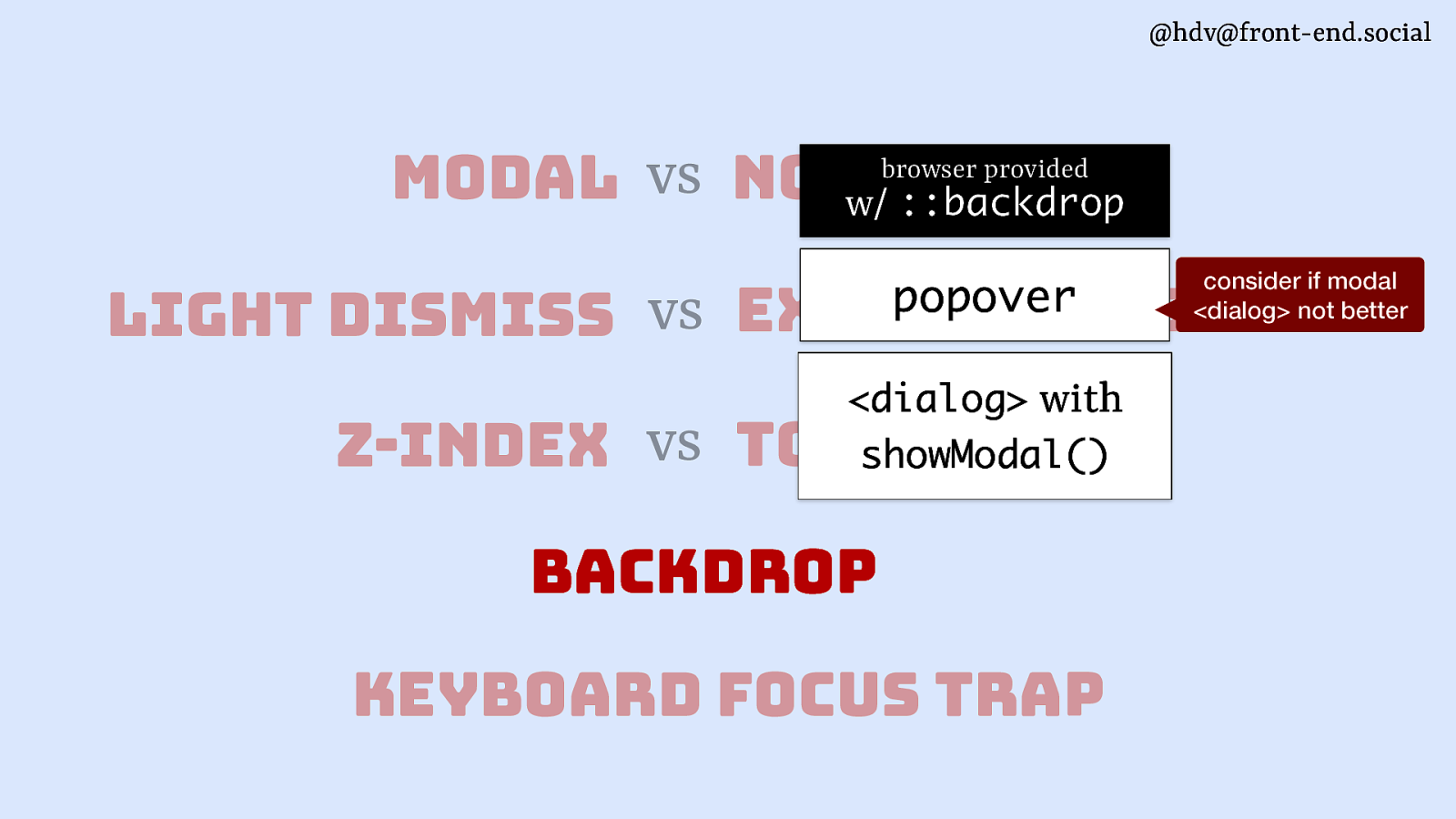
The last one is a keyboard focus trap, which is usually what you want to do for a modal.
Slide 85
It’s also what you get for free from the browser if you use dialog with showModal.
Slide 86
Slide 87
With those patterns out of the way, let’s look at how accessibility is impacted, and also kind of what sort of things we expect in terms of accessibility in the browser. So I’m going to talk about accessibility semantics.
Slide 88
Sometimes when we talk about semantics in browsers, we talk about semantic HTML. So, what kind of element are you using? Now I’m using the term accessibility semantics in the sense that it’s used in the ARIA specification, meaning that accessibility semantics is meta information that browsers expose so that tools can use them. So they expose things like, what’s the role of this, but also, what’s the state of this or what’s the name? Basically, everything that you’ll find in the accessibility tree you could refer to as accessibility semantics. So let’s look at roles first.
Slide 89
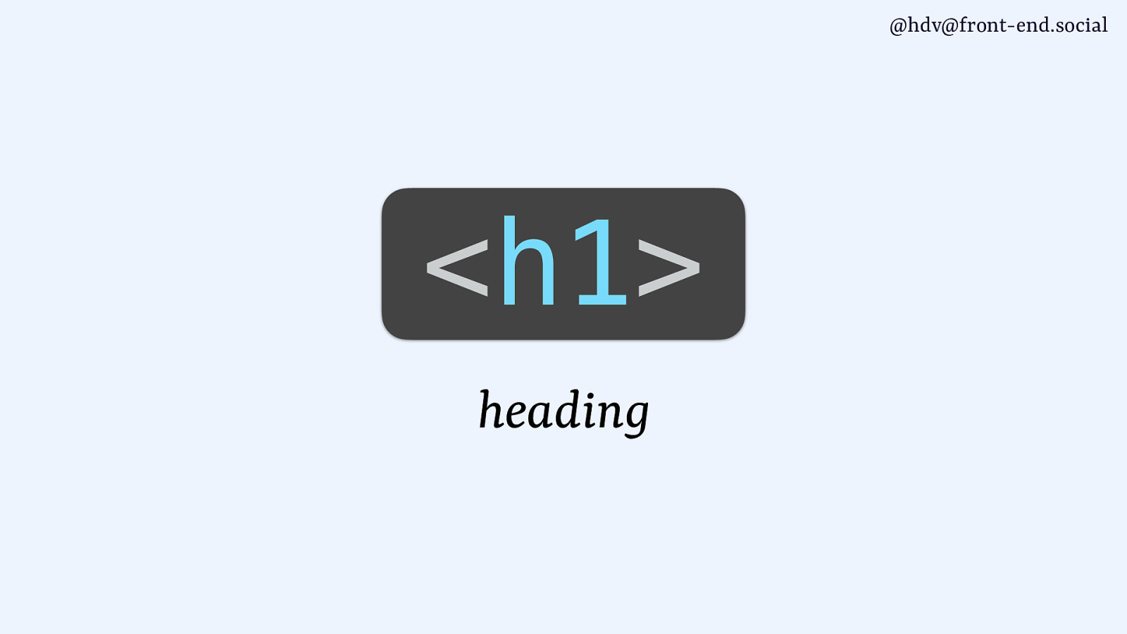
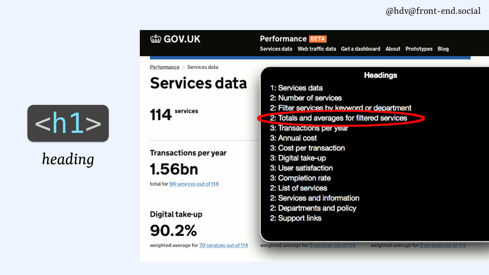
You probably know that a lot of HTML elements, they have built in roles that you get for free with the elements. So if you use a heading element, a h1, for instance, it gets a heading role, and that sort of information is then used by tools such as screen readers to allow users to browse the content by heading.
Slide 90
They can only do that if they know what the headings are, which is the information you’re giving them by assigning that role or using that element.
Slide 91
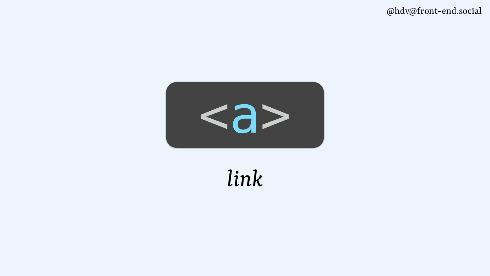
An anchor tag has a link role…
Slide 92
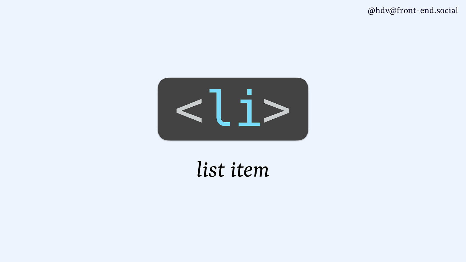
…an li tag has a list item role…
Slide 93
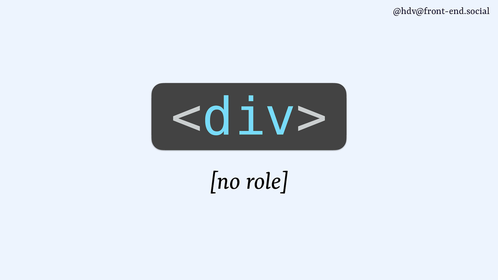
…then the div famously comes with no role, which is sometimes what you want.
If you have an element that has no significance in the page and it doesn’t do anything special, maybe div is what you want to do.
Slide 94
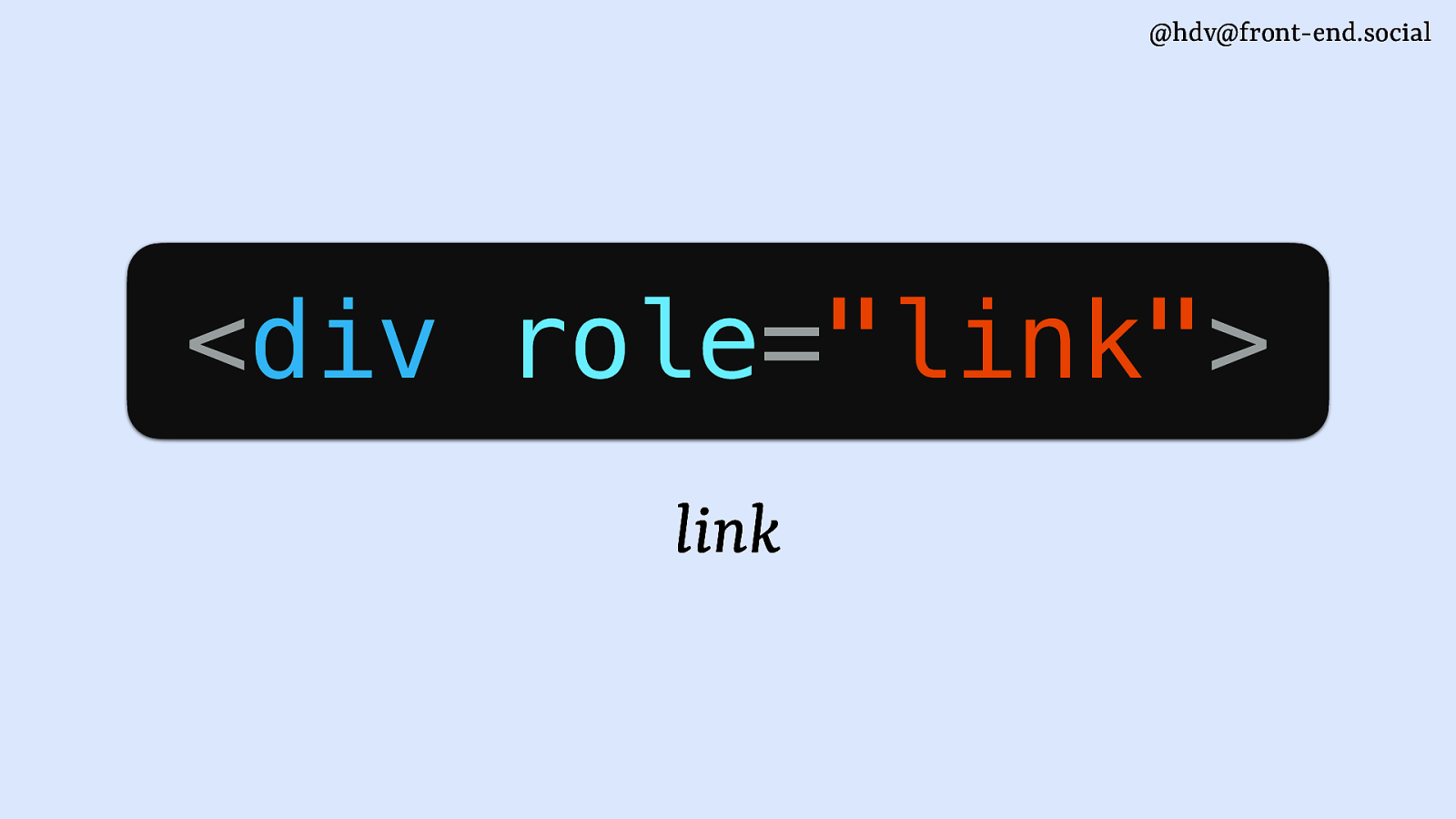
ARIA has the role attribute that you can use to add a role even to that element that doesn’t have a role. So for divs, you can say, I’m now making this a link.
Then you’ll need to do lots of other things as well, so don’t do this just on its own. You’ll also need to do everything else that a browser does for link. So, not recommended, but you can add a role to any element to change what its role is. S
Slide 95
Looking at dialogs and popovers…
Slide 96
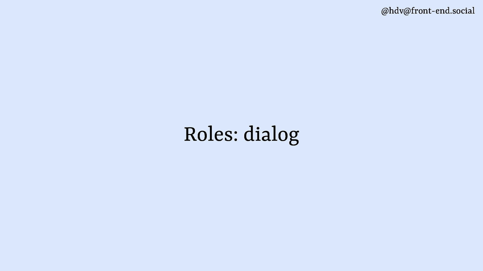
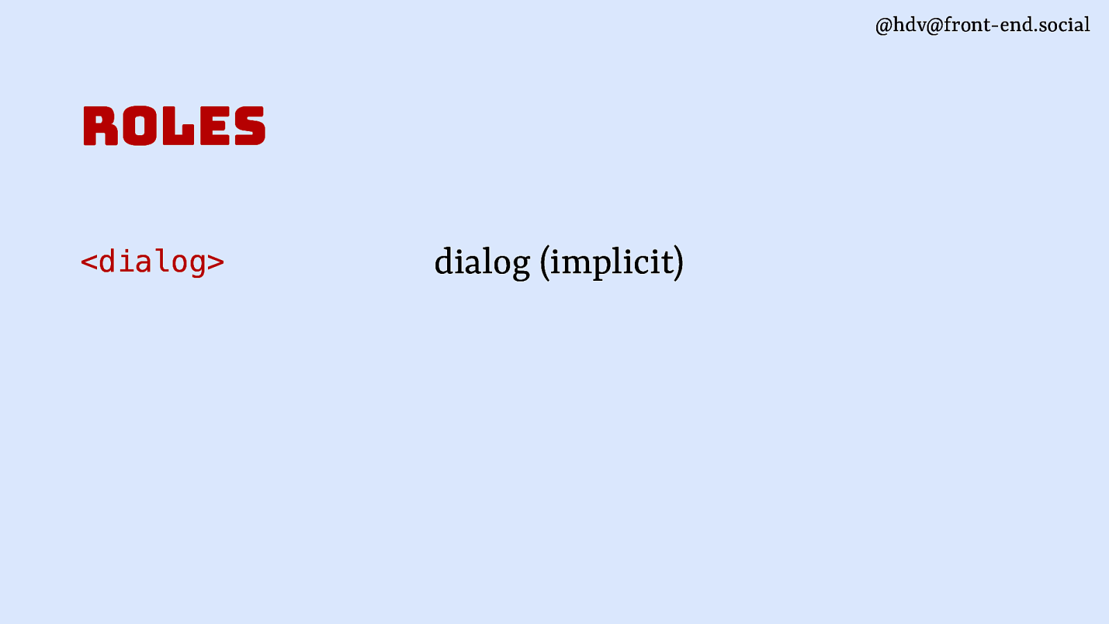
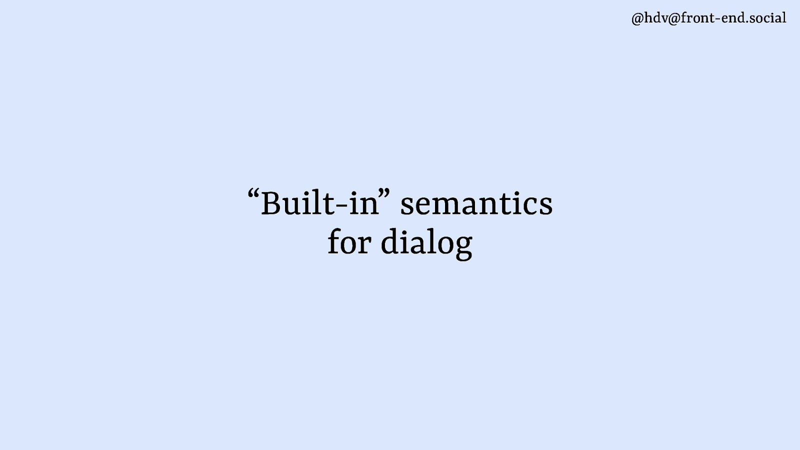
the dialog comes with a dialog role. That’s a really short story, that’s what dialogs do, it comes with that element.
Slide 97
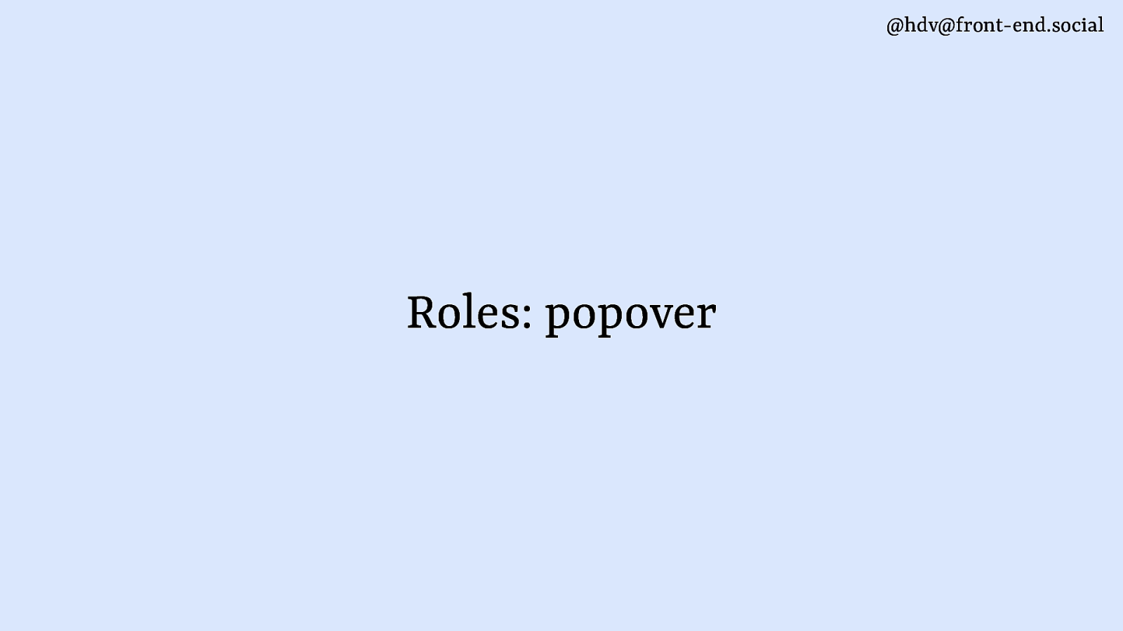
Popovers are a bit more specific because they don’t come with any roles. If you add popover to a div, you’ll have no role.
Slide 98
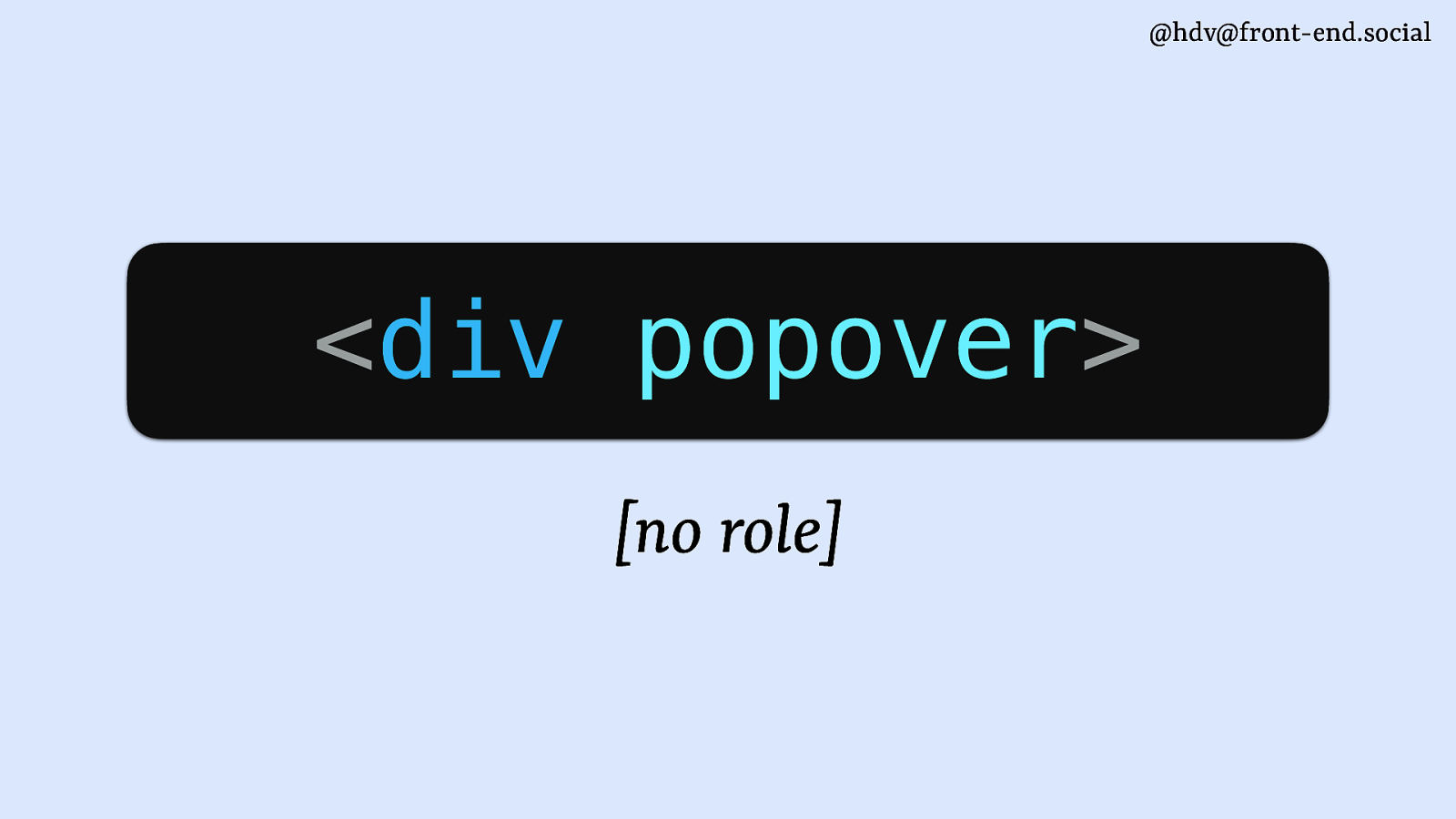
If you add popover to a div, you’ll have no role.
Background to that is that first, we kind of imagined popover to be an element, at which point it was still called popup. And the popup element, we were struggling to come up with a role that would make sense as a default, because there are so many different examples, like I showed, there’s menus, there’s tooltips, there is all sorts of things. So there’s not one role that makes sense with popovers, which is why it became an attribute.
Slide 99
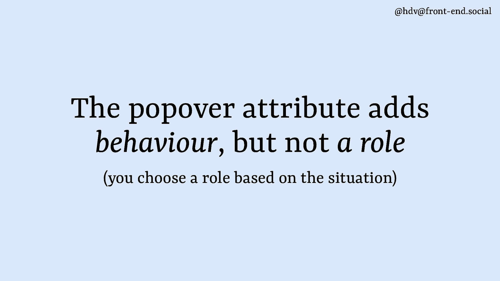
It’s a bit like the contenteditable attribute or the tabindex attribute in that sense. It adds a little bit of behaviour to an element, but it doesn’t change any of the roles.
The popover attribute adds behaviour, it doesn’t add a role, and you’ll need to add it yourself.
And to make that easier, I have some examples for you of roles that make sense together with popovers.
Slide 100
Starting with dialogs. Maybe somewhat confusingly because I kind of contrasted between the two, but it perfectly makes sense to have a dialog that has a popover behaviour. So you have a dialog element, you add popover to it, it means that semantically, that’s a dialog, and then behaviorally, it becomes a popup, or meaning it goes to the top layer and it comes with light dismiss.
Slide 101
Perfectly valid use case for all those cases where you have, like, a sub window type of thing. It also makes sense for teaching UI.
Slide 102
Or even for mega navs that you might have with headings and links and buttons and images and all these kinds of things.
It kind of makes sense as a structure for that to be a dialog more than other things.
Slide 103
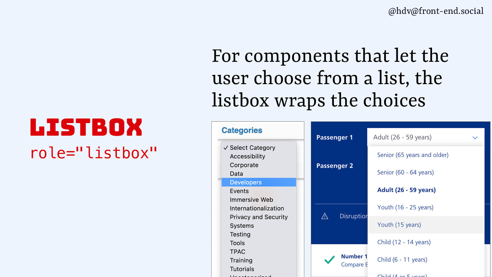
Another role that you can use is the listbox role. It’s what is used by the select element that is in the browser, so the bit that pops out, and where your options are, that’s the listbox. And if you’re building one of these yourself, you’re making a custom one, listbox is the role to add to your popover, and again, you want that to be in the top layer, you want it to light dismiss. So popover is the behaviour you want, and listbox is the role.
Slide 104
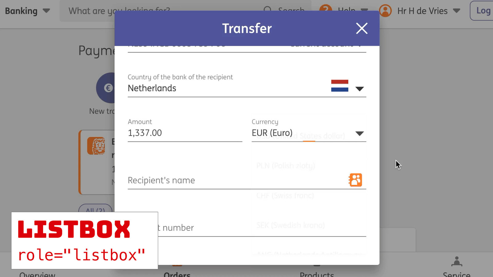
There are lots of examples. I’ve got a banking example for you, Sophie. Different ways you can use popovers.
Slide 105
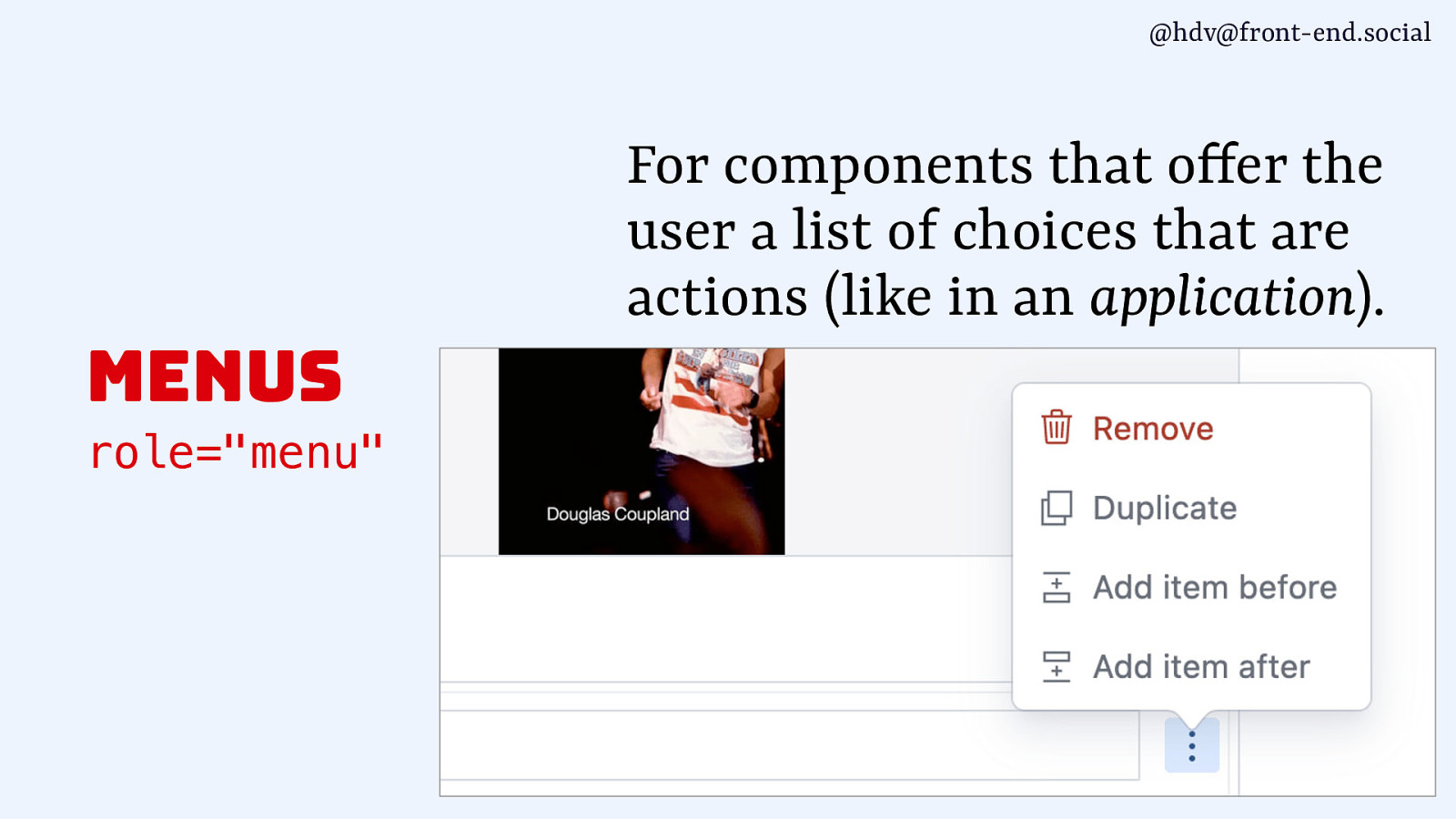
Then the menu role is another one that you can use with popover, and that one is a bit less common when you’re building websites and more common when you’re using web apps, if that is a distinction that makes sense. So, menus aren’t navigation, they’re not, like, to take you somewhere else, they are for actions, so for, basically, a list of buttons that you want to build. So that’s when the role of menu comes in.
Slide 106
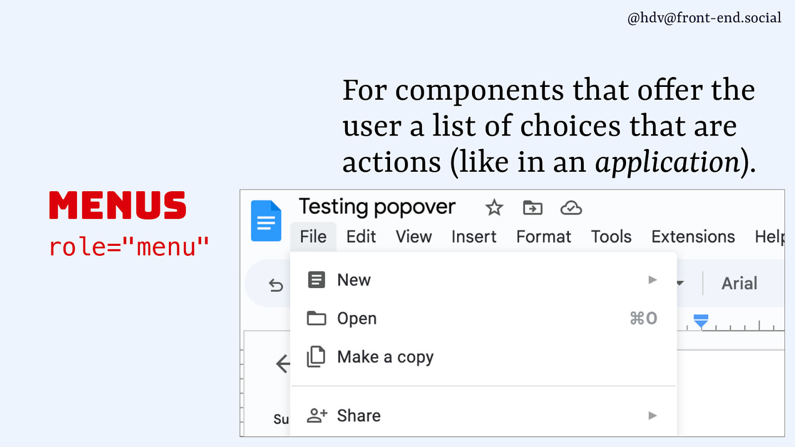
It’s also what you would use if you have a text processing application like this one, for the actual menu that’s inside of that.
Slide 107
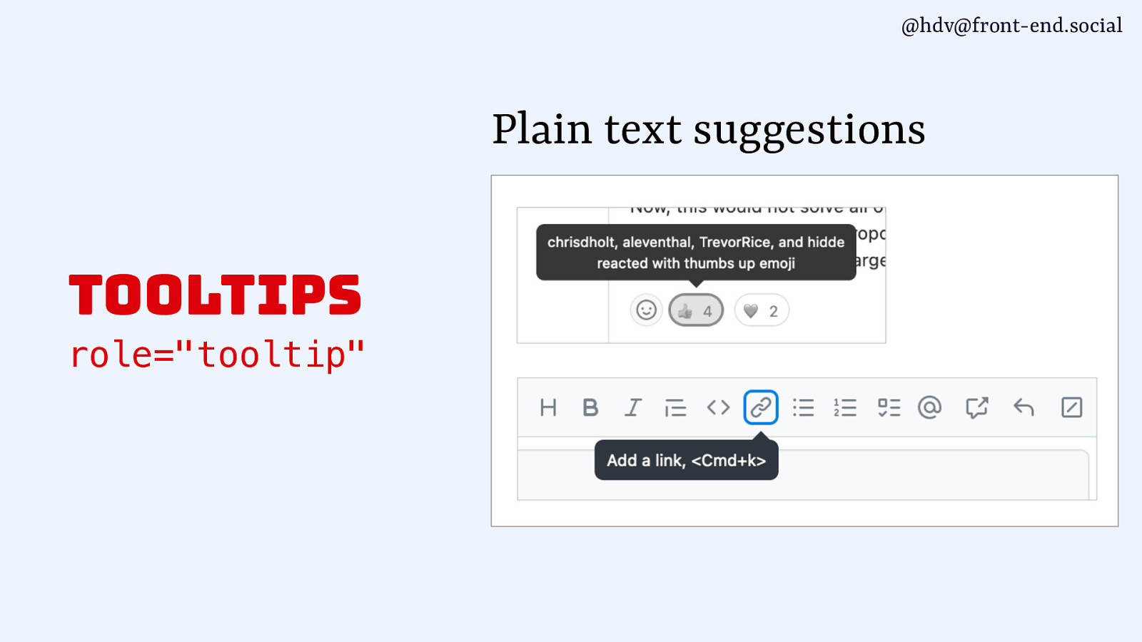
Then another role you can use with popovers is the the tooltip role. That’s basically for plain text suggestions, so anything that would kind of be one string of text.
Slide 108
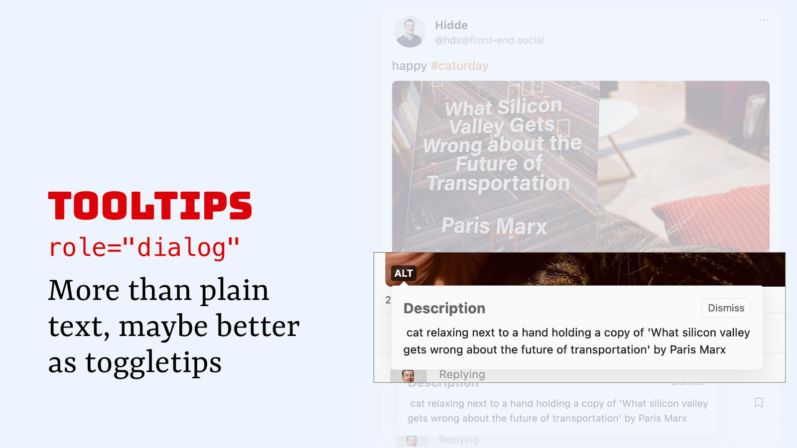
There shouldn’t be any other, like, structure inside of that, because as soon as you add a new structure to a tooltip, it makes more sense to make that a dialog, because maybe you have a heading in there or a button, and maybe you are even toggling it and not showing it just on hover and focus. So, dialog is often also used for tooltips. And that brings me to this overview.
Slide 109
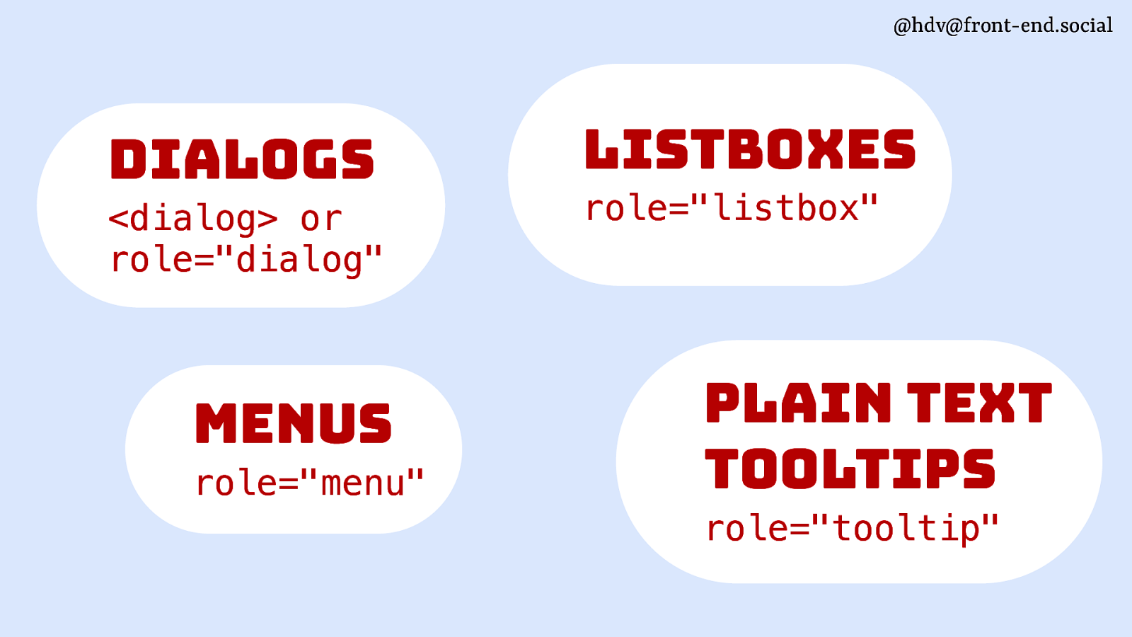
So we’ve got the dialog role for dialogs, menu role for menus, listbox role for listboxes, and then tooltip if you’re using a tooltip that is plain text.
Slide 110
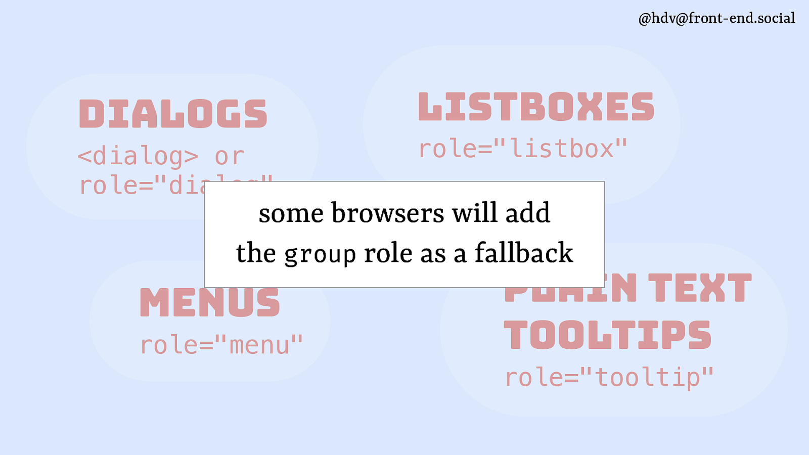
Now, sometimes you still might not be adding a role, and in that case, most or some browsers will add the group role as a fallback to your popover. And the reason it will do that is so that screen readers and other assistive tech have a way to figure out what the boundaries are of your popover. So, it will do that for you for free. afari doesn’t do it at the moment. The other browsers do based on some heuristics.
Slide 111
So in terms of roles, we’ve got the dialog role on dialog.
Slide 112
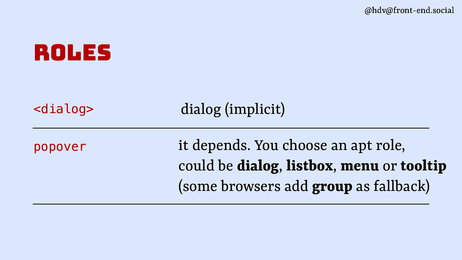
For popover, it depends. You’ll need to add one yourself. You can choose from the ones I listed. There are probably other roles as well that make sense for popovers, like footnotes and other stuff.
Slide 113
Then apart from roles, there are other semantics as well that these elements can have, and some of them are built into the elements.
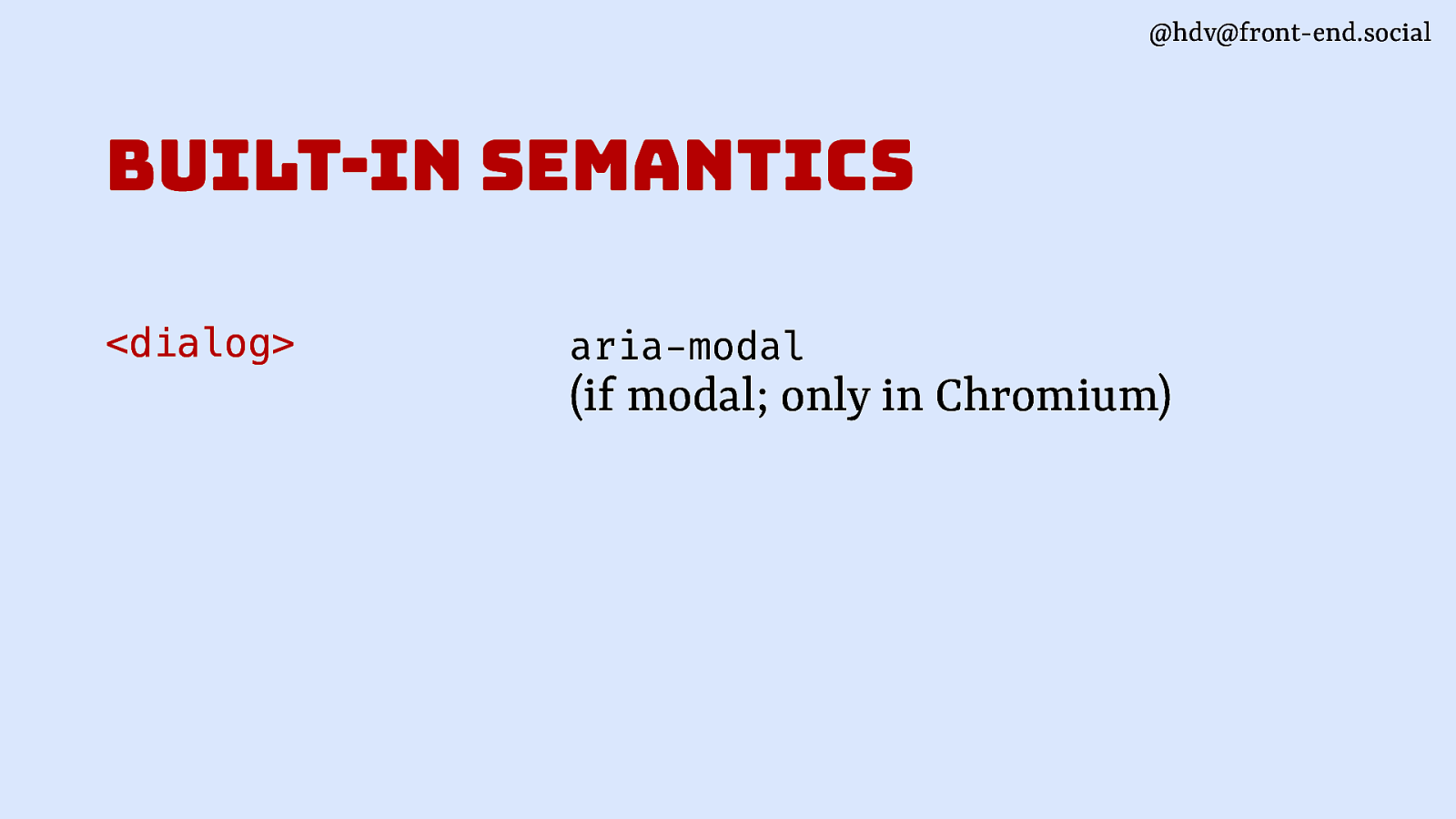
Slide 114
With dialog, there are not that many. The only one I could find in browsers today is the modal state that is added by Chromium based browsers on modal dialogs. So it will set modal for you even if you don’t add it yourself.
Slide 115
For popover, there’s a couple more things that happen and that browsers will do for you.
Slide 116
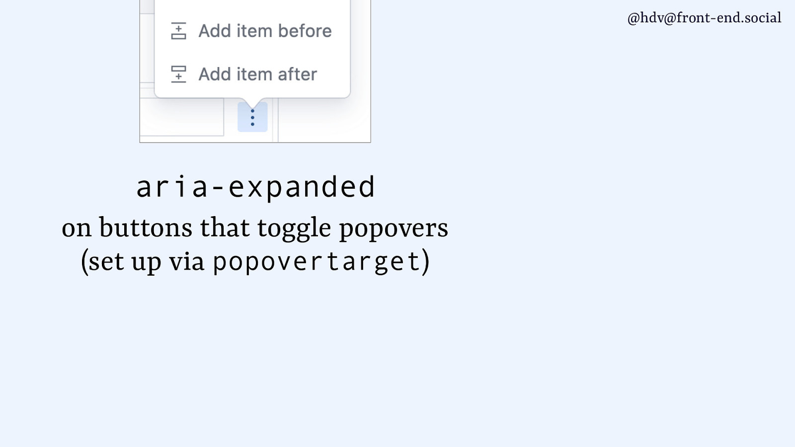
The first one is aria-expanded. So, on the button that opens your popover, aria-expanded is set for you on the button, as long as you set it with popovertarget.
Slide 117
This works across all the browsers that support popover, and it’s helpful because then users of assistive technologies will know that your popover is open or closed.
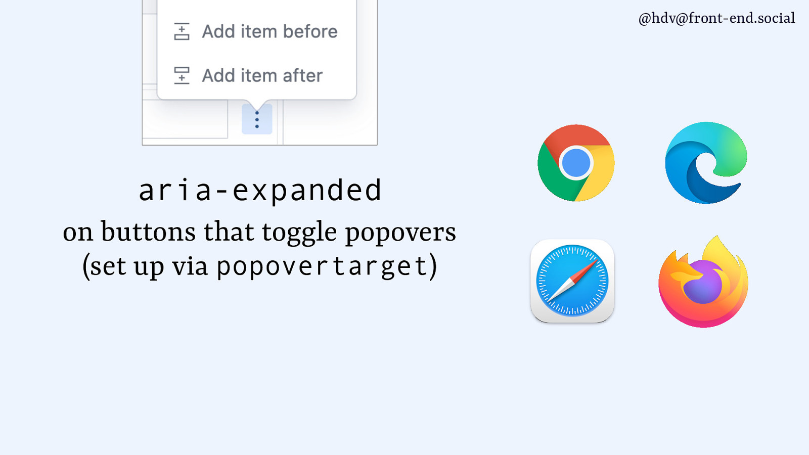
Slide 118
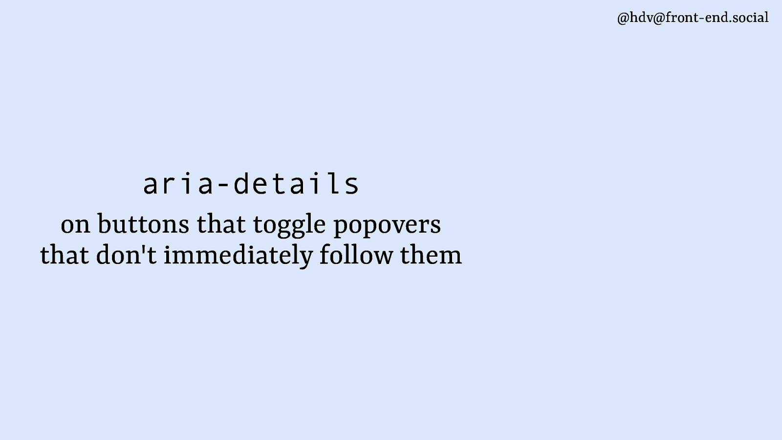
Another bit of aria that is added by browsers is aria-details. It’s only added based on some heuristics, and usually for popovers that don’t immediately follow their button, so if they’re somewhere else on the page.
Slide 119
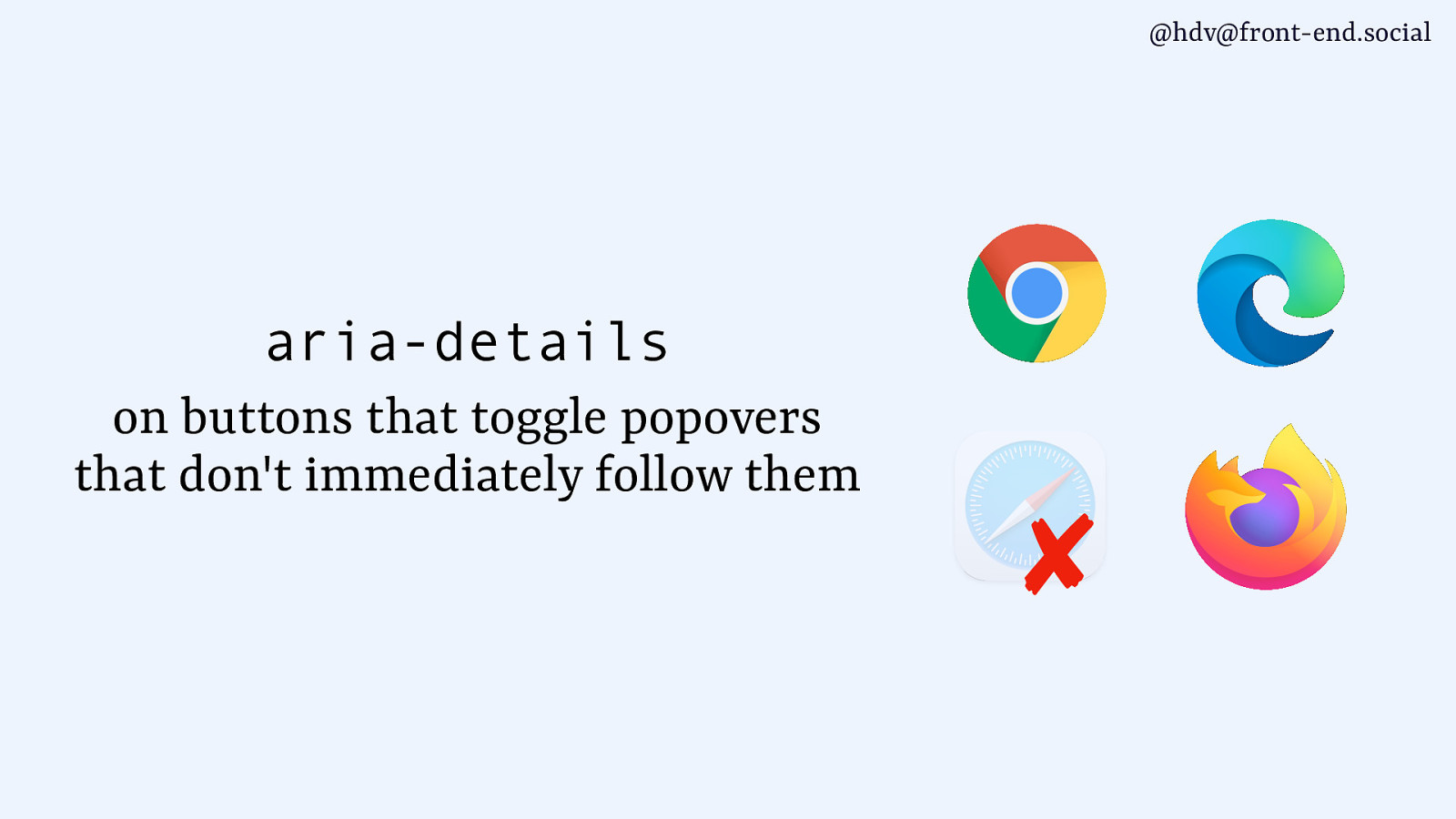
This is on all the major browsers except for Safari.
For the Safari bits, I’ve reached out to various Safari folks, trying to get information about what I could potentially publicly say. I did not get answers, so I don’t really know. I’m hoping that they’re still working on this, because it would be helpful to have this interoperable and everything. But I genuinely don’t know.
Slide 120
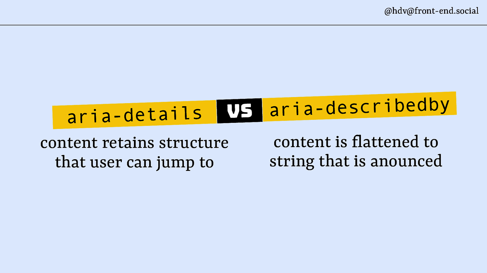
aria-details is where you’re saying this element has some more details available somewhere else, and that details has structure as well. And it allows users to jump to that structure using a shortcut. Now, that makes it a little bit like aria-describedby. At least that’s what I was reminded of when I read the description. And the difference is that aria-describedby also will give you extra information about an element, but it’s content that is then flattened and announced immediately. So when a button has aria-describedby and you get to that button with your screen reader, it’s going to read out all that information that is in the describedby, which might not be what you want, especially with more complex structures like the stuff that everyone can put into popovers, like, there could be lots of stuff in there.
You don’t want to hear everything inside of the popover immediately once you read the button that invokes it. So, that’s kind of why the difference exists.
Slide 121
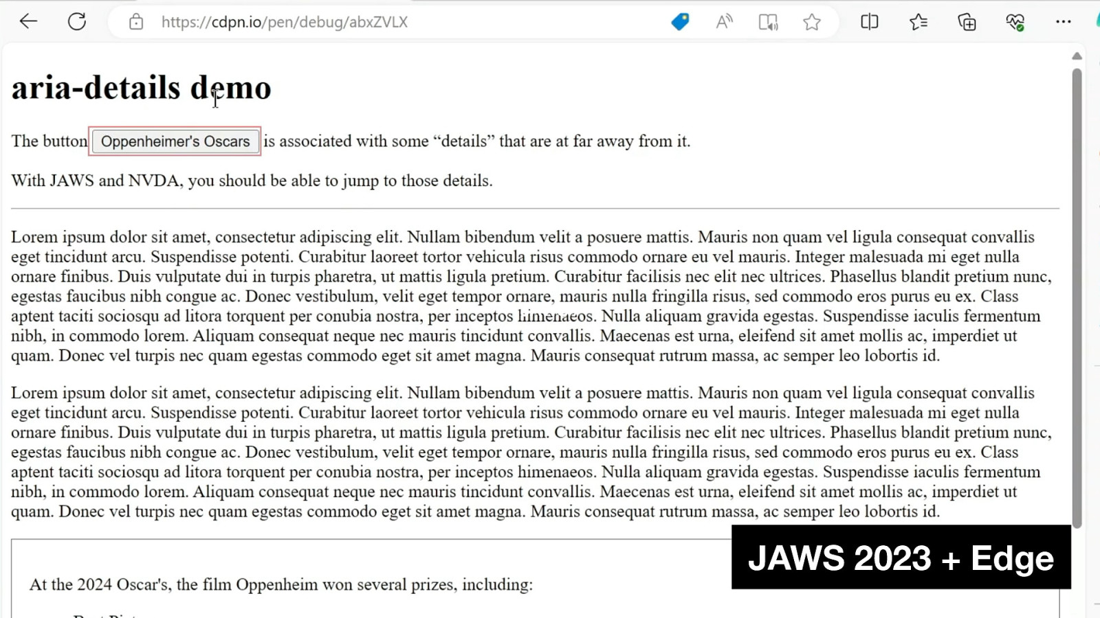
I’ll show you a demo if the demo gods allow me.
I have a demo here that has a button called Oppenheimer’s Oscars, surrounded by lots of text, more text, some lorem ipsum, and then all the way at the bottom, I have some information about those Oscars, because they were just announced when I was making this demo. So, when I get to the button, it’s going to tell me that there are details available. Now, when I press the shortcut, it’s going to jump through that information and allow me to explore the structure of it, rather than just reading it out as one flat string. So here’s my button.
[during the talk the audio didn’t work so I voiced what the video would have said]
What it says in the video is, “Has details button, Oppenheimer’s Oscars.” Then when I press my short key, it’s taking me there, it’s going to read out the structure, and then it says I have a list of three items, and then when you get to the link, it says there’s a link.
So it basically allows me to look at the whole structure that’s available there rather than flattening it all into one string.
Slide 122
So, for dialog, you’ll get aria-modal, but only in one of the browsers.
Slide 123
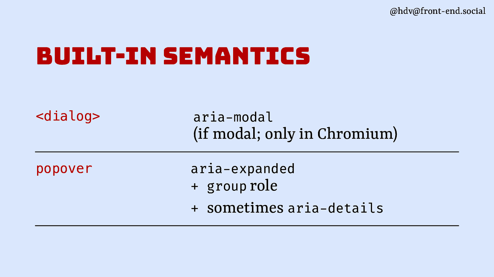
For popover, you’ll get aria-expanded. That’s very helpful because it tells people about whether the thing is expanded or not if they can’t see it, the group role as a fallback, and then sometimes aria-details depending on how it’s built and depending on whether you use Safari or not.
Slide 124
That’ll conclude the accessibility part of this talk.
To end… when you actually start to work with popover specifically, there are some glitches around layering and positioning that I want to mention so that you know they exist.
Slide 125
The first one being layering. That’s what happens when you want to basically take care when you’re using popovers together with modal overlays.
Slide 126
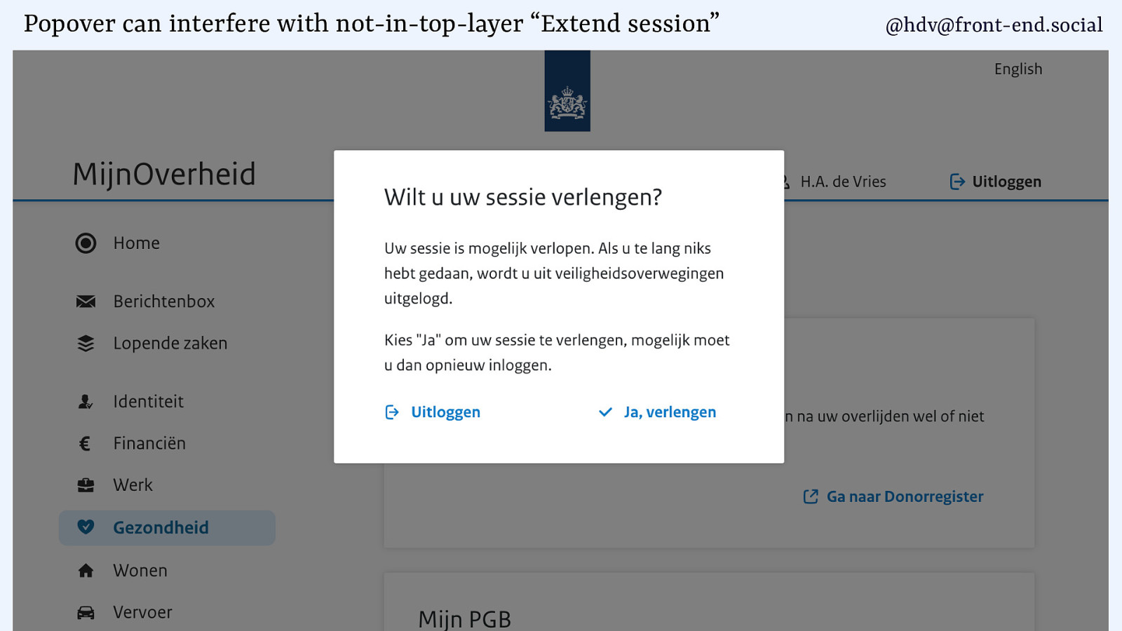
So in this case, I have that government overlay where I can extend my session, and it’s got a button to extend my session there on the right.
Slide 127
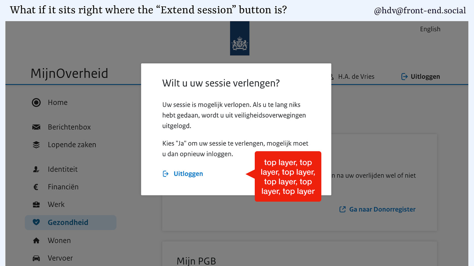
Now, if my page were to have a popover underneath, and the popover sits in the exact same spot as the button to extend my session, what will happen is that it shows up on top, because the popover is in the top layer and the overlay has no way to go to the top layer unless it is built with a dialog with the showModal method. So, unless you use the browser built in dialog, you will get these layering issues.
Slide 128
So the takeaway here is if you start adding popover to your systems, like, design systems or a website, do also check all of your dialogs and whether they actually use that showModal, because you might run into layering problems.
This is of course a made up case, I’ve positioned this very carefully to have a problem, but it could very well happen, especially if you’re on smaller screens, you know, it might be very hard for users to find the button. If they were using a screen reader, they would have no problem because they would get to the button, but if you’re trying to visually do this, it would be really hard
Slide 129
The other gotcha, and this one’s a bit longer, is around positioning, and in how they’re different for dialog and popover. And I’ll say that I like the default when it comes to dialogs and less so when it comes to popover.
Slide 130
our demo is based on a website that I have. I have hidde.blog, where I write stuff, and I have log.hidde.blog for data that I collect about stuff that I do.
Slide 131
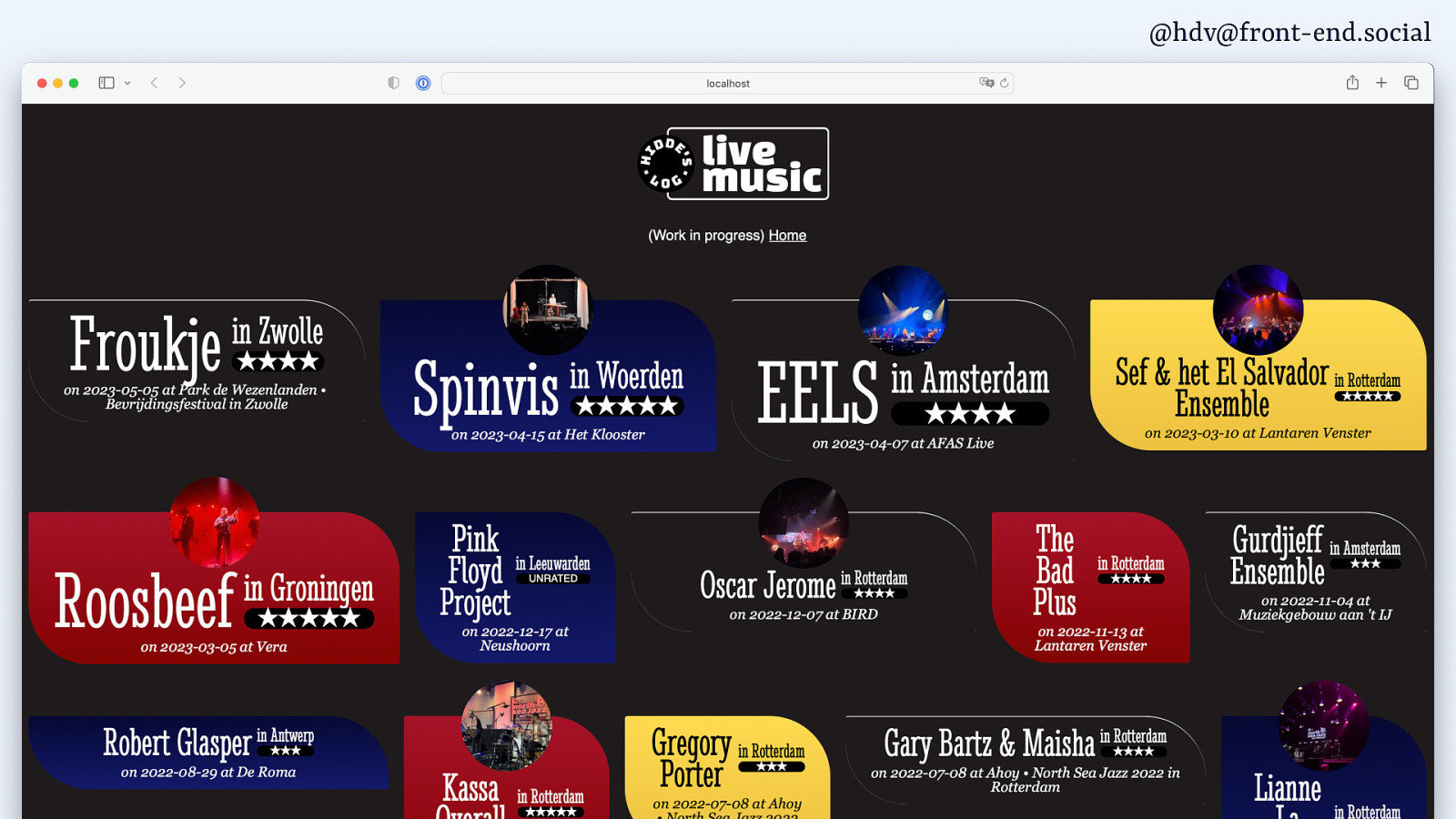
I have a website with concerts that I go to, with some pictures…
Slide 132
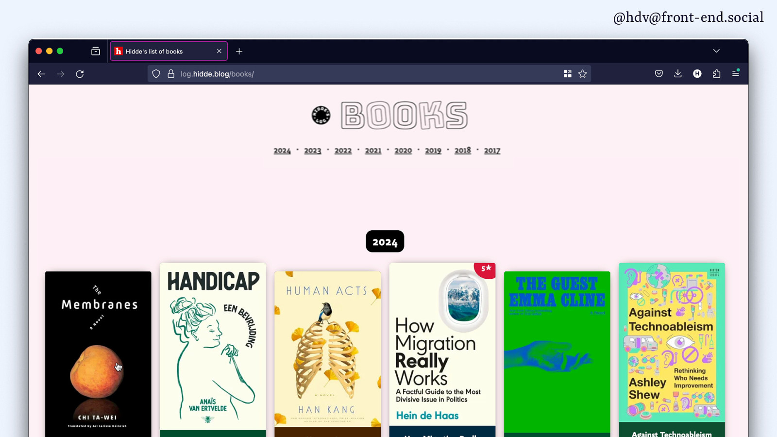
… and I have a website with books that I’ve been reading, you know, for my own entertainment, really.
I also use it to play around with dialogs and popovers.
Slide 133
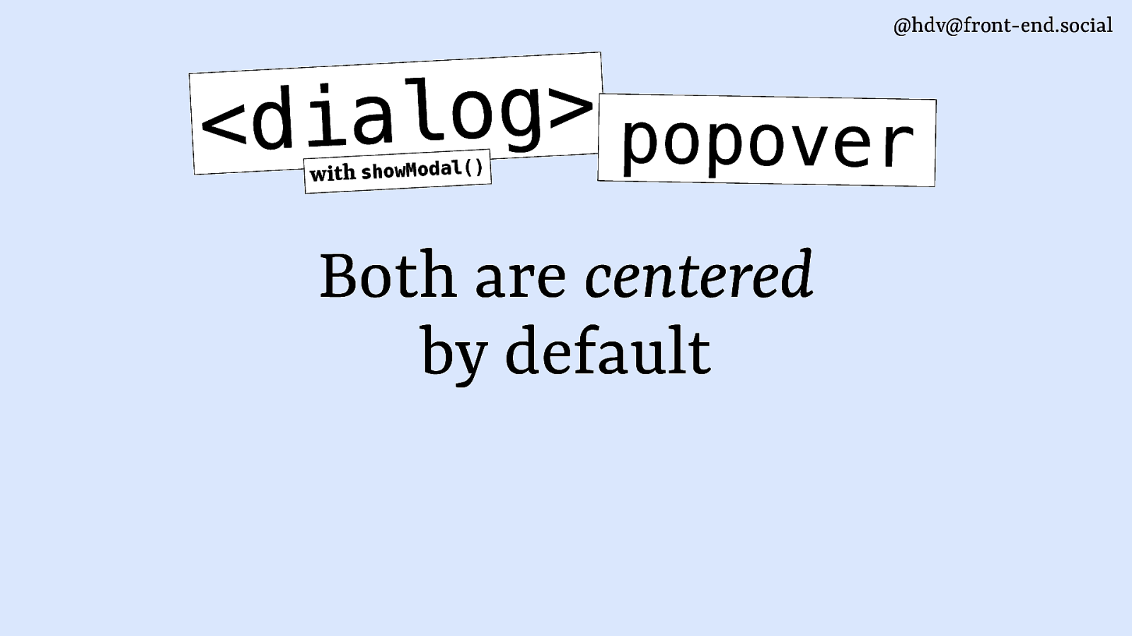
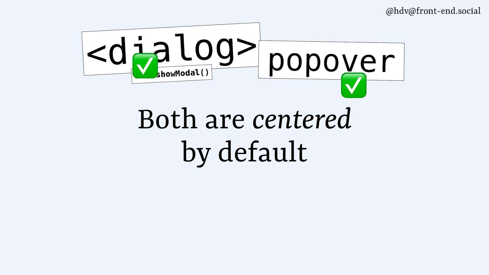
The thing to know about dialogs and popovers, particularly the dialog with showModal, is because both are in the top layer, they are centred by default.
For dialogs, that’s pretty much what you want. So, let’s add a dialog to this photo gallery thing.
Slide 134
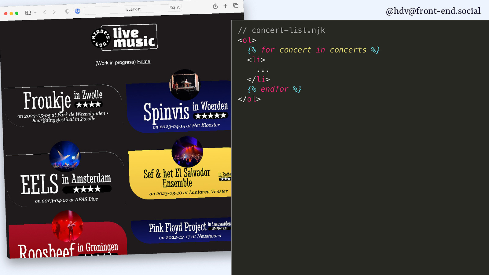
I’ve got pictures with some of my concerts, so what I can do is I can loop through them.
Slide 135
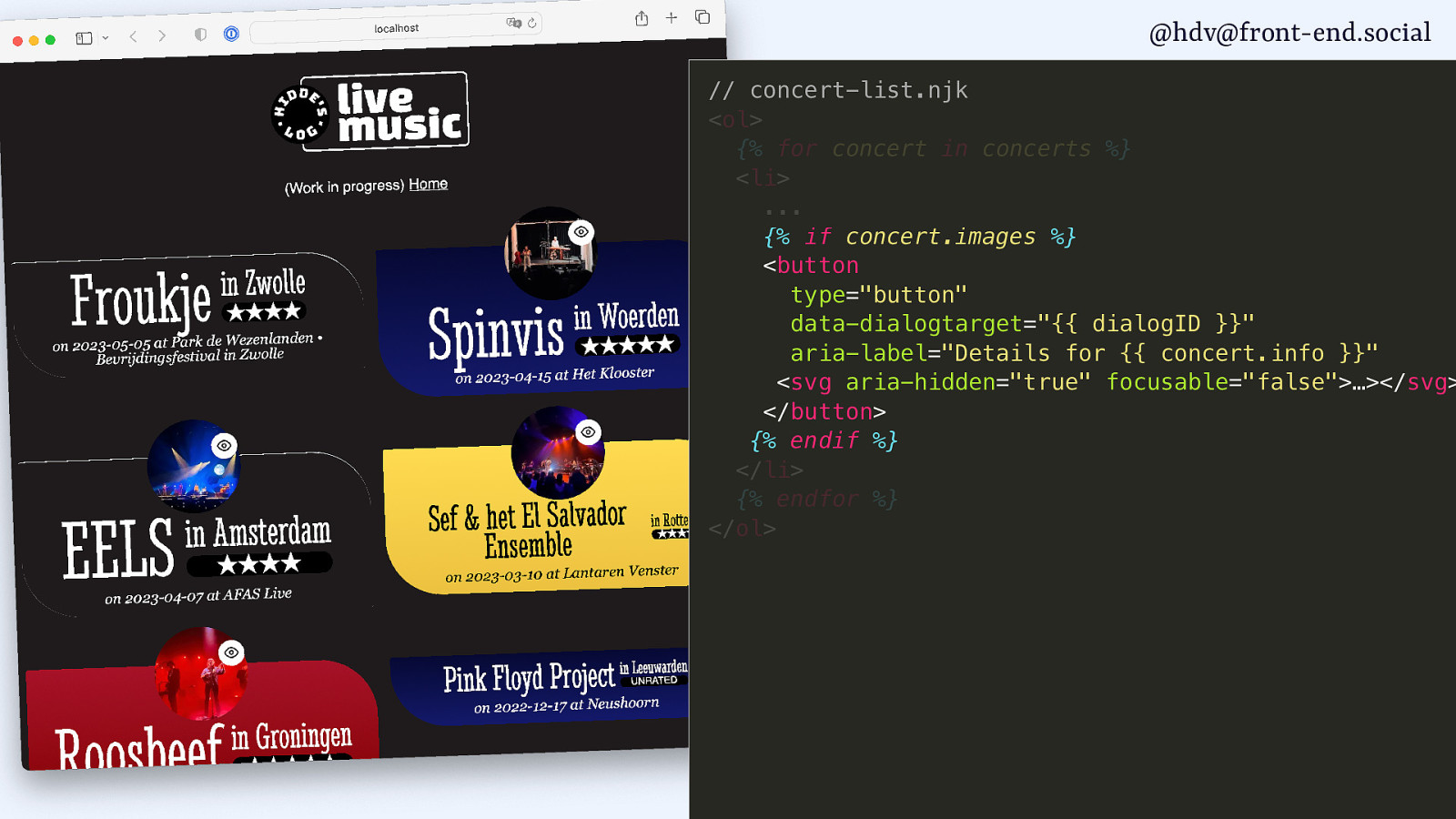
I’ll add a button for each of them.
Slide 136
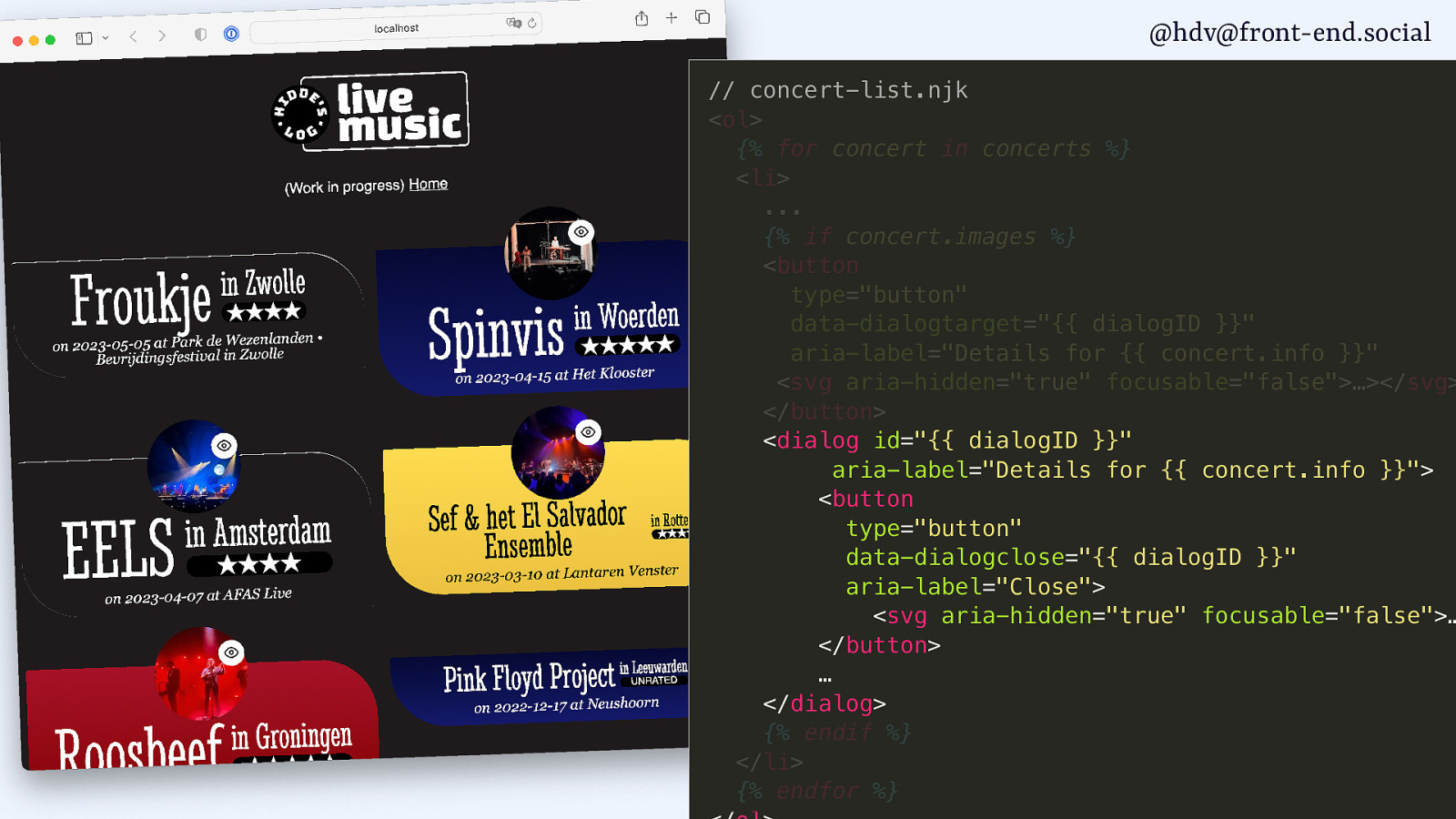
And then I add a dialog for each of them.
Slide 137

And then in script, I find the buttons.
Slide 138

And their dialogs.
Slide 139
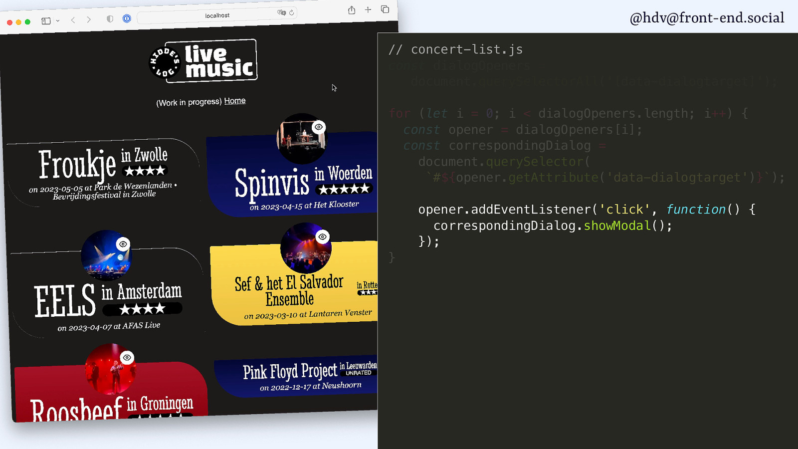
Then I call the showModal method on the buttons.
Slide 140
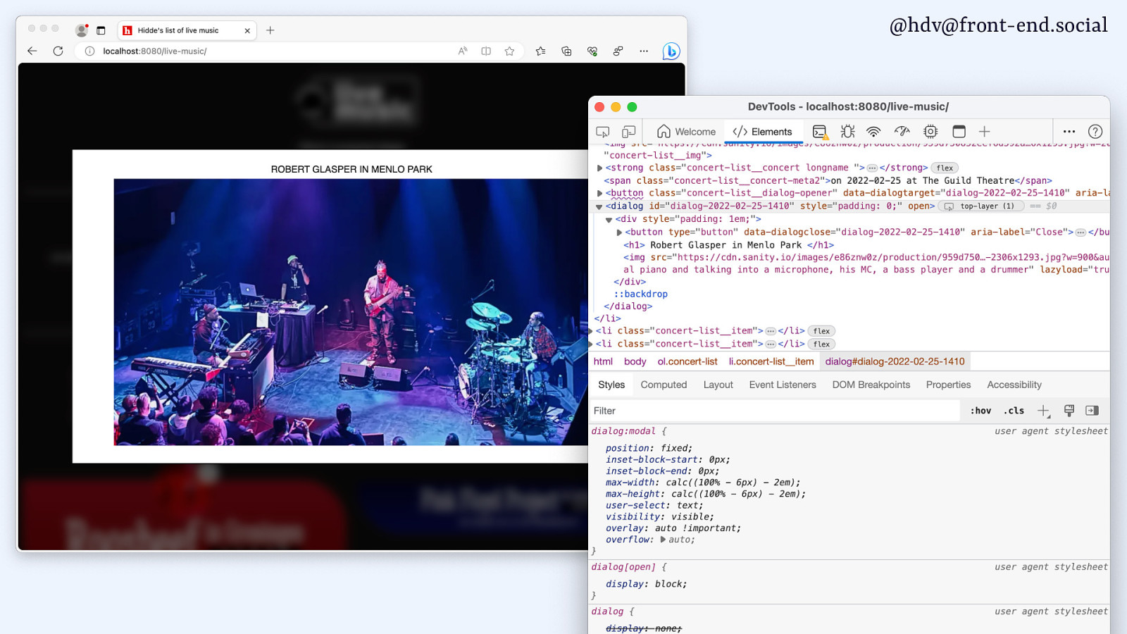
As soon as I call that showModal method, what it’s going to do is open that dialog as a modal.
Slide 141
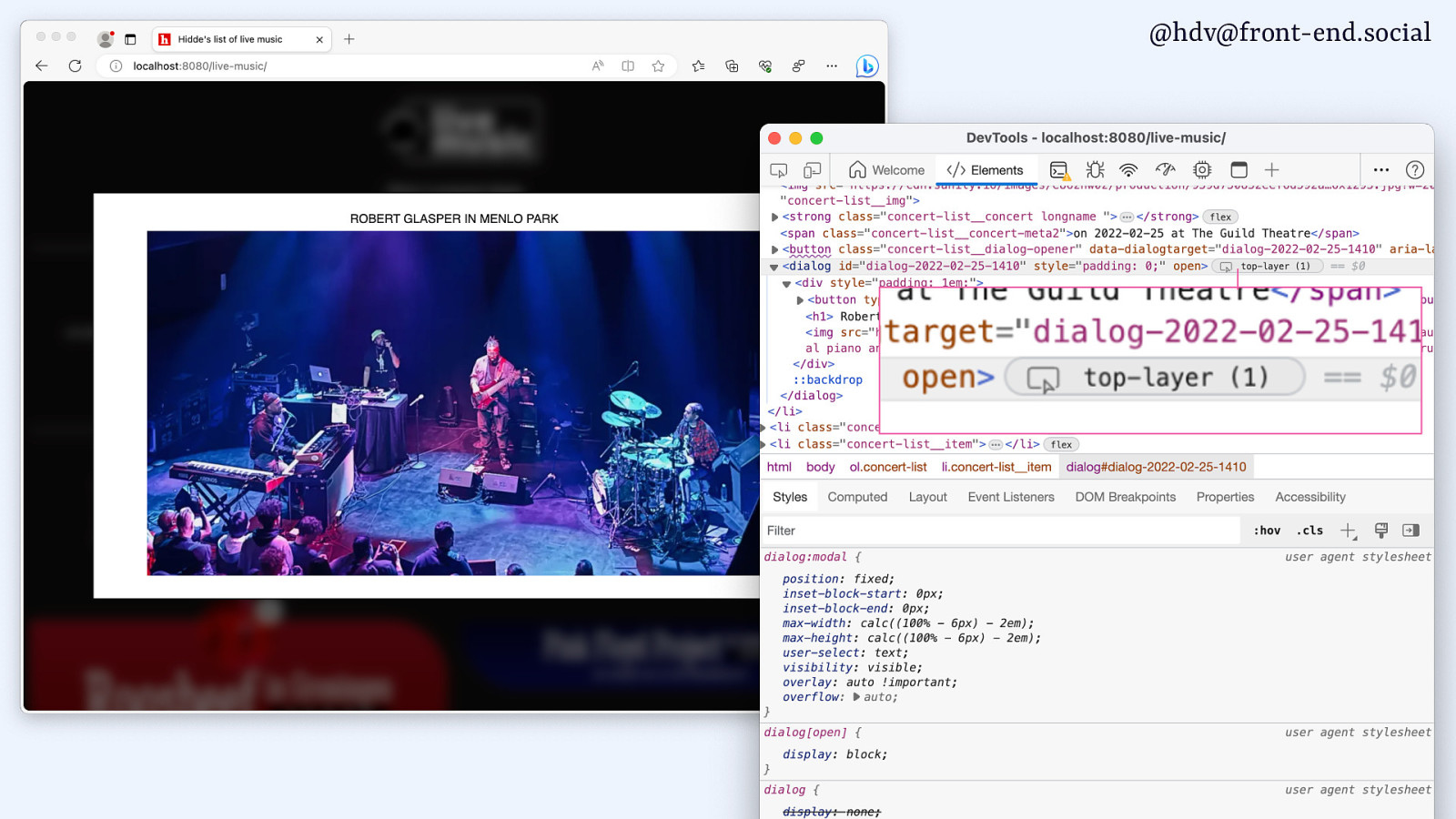
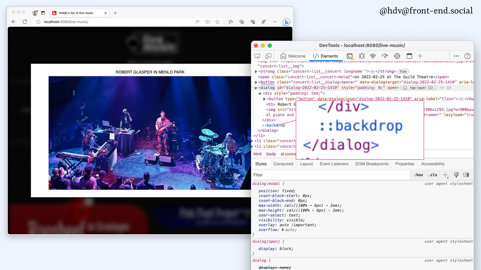
In my case, that means I’ll have pictures of my concerts that show up full screen. That’s what I want, and it works well. It goes to the centre, but I kind of want it to be in the centre.
If it’s modal, it’s the only thing I can look at, it’s the only thing I’m going to interact with, so it makes a lot of sense for that to be in the centre.
You can see it does some useful things, like, it shows that it is indeed in the top layer.
Slide 142
And there is a backdrop that I’ve actually styled to be blurry.
I didn’t go more creative than that.
Slide 143
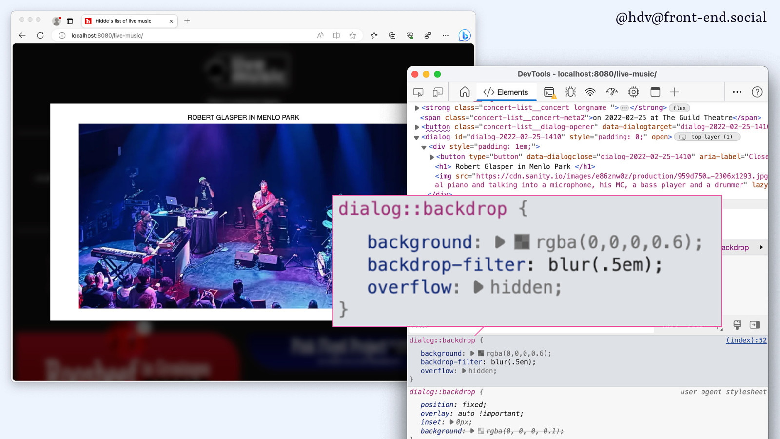
And there is some user agent styles as well that are available. So they are centred by default, and for the dialog, I feel like that makes sense, because it’s modal and it’s the only thing I can interact with.
Slide 144
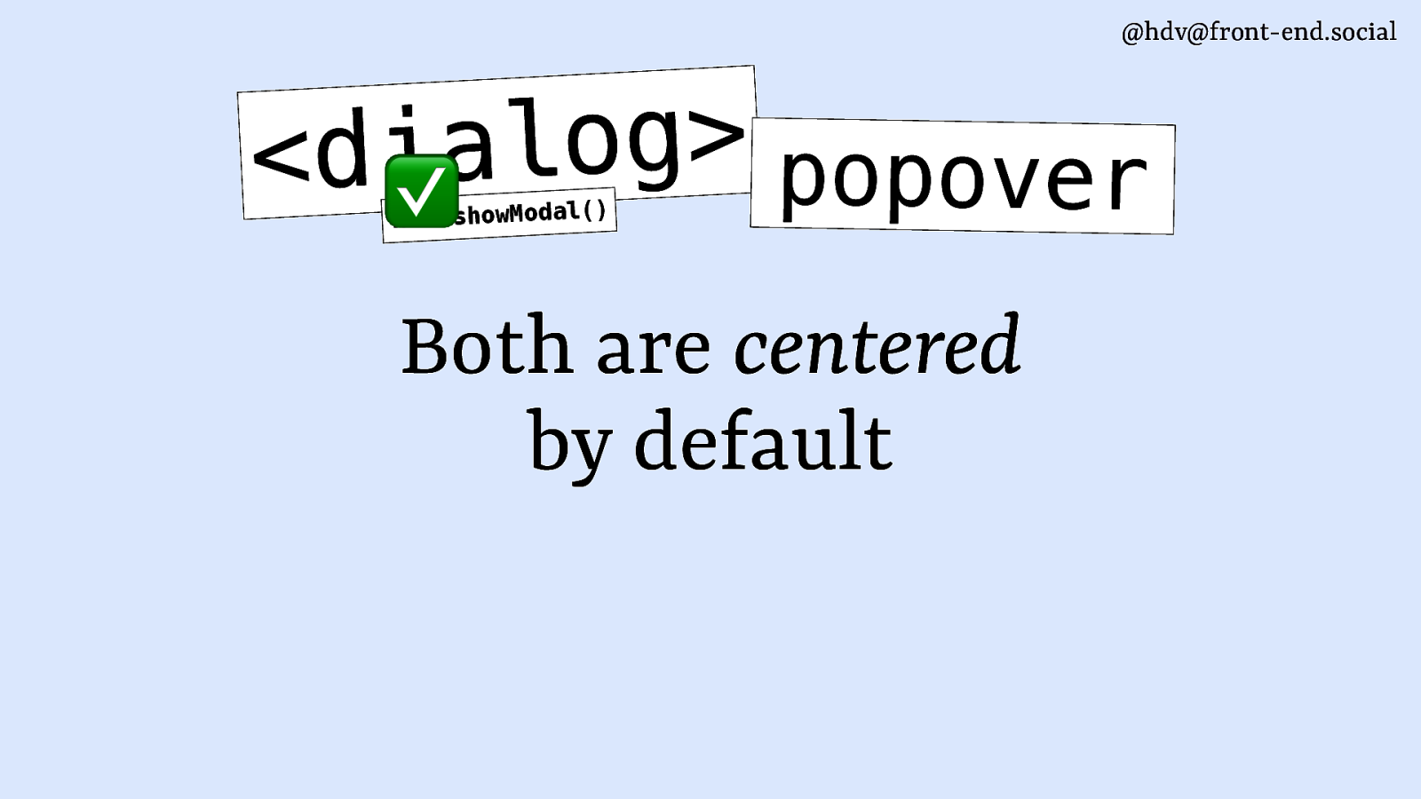
For popovers though, I feel like it makes less sense, because usually a popover is anchored to the button that opened it.
Slide 145
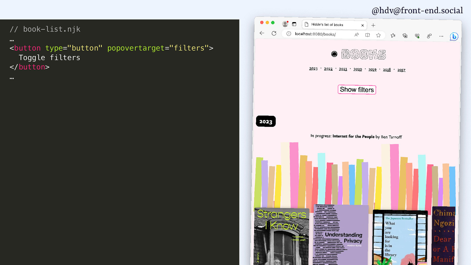
In my books website, I wanted to add some filters, and, you know, I started doing that.
Slide 146
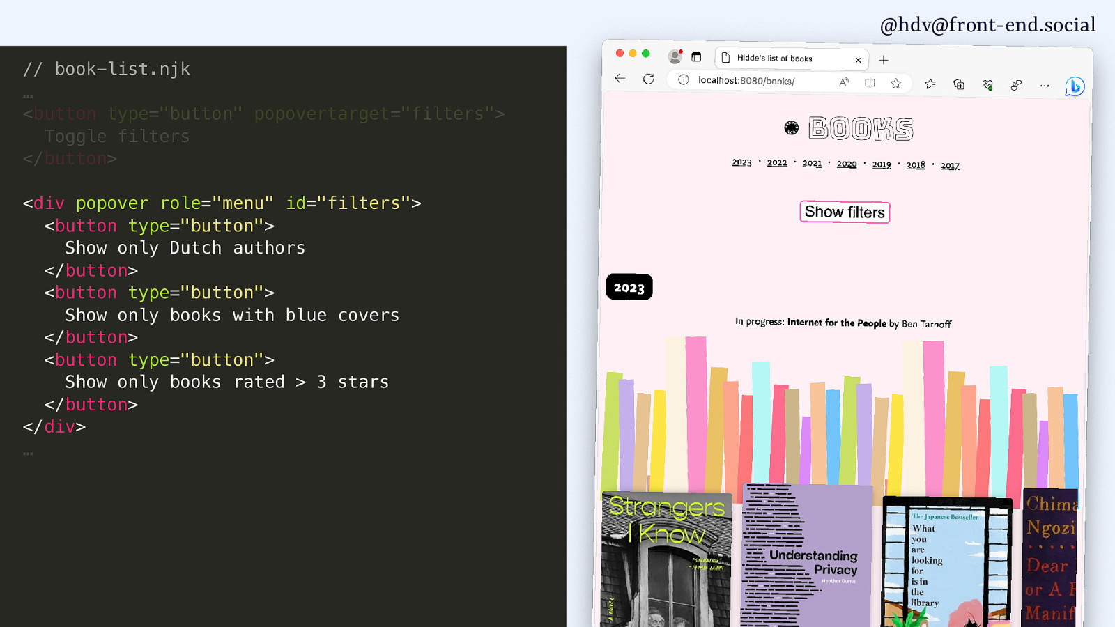
I added a popover that is a menu.
Slide 147
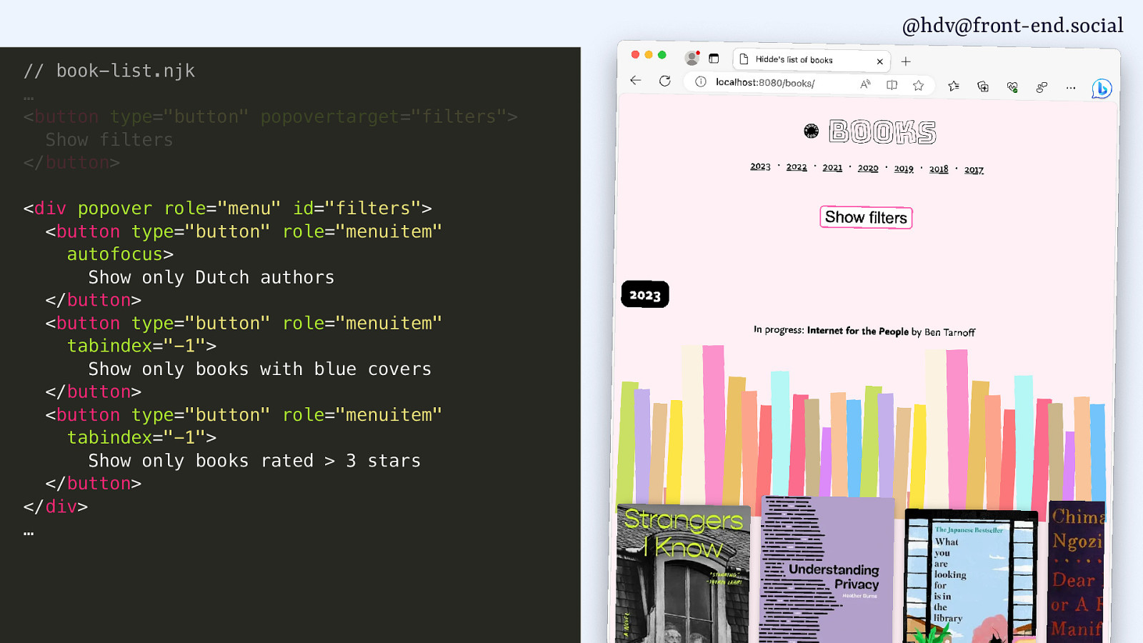
Which I’ve wired up with the right area roles, so there are menus and menuitems.
Slide 148
I do some tabindexy stuff.
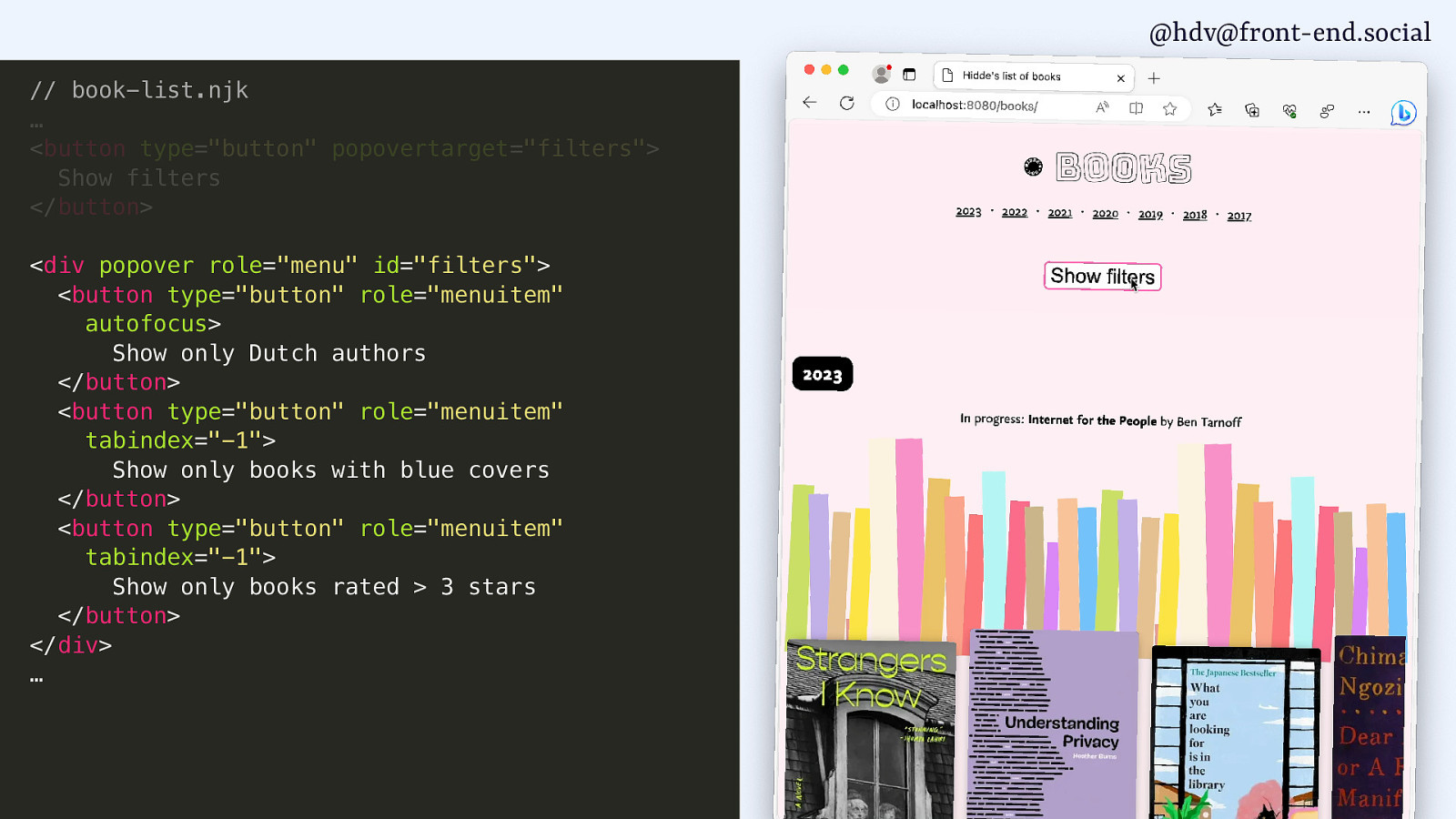
Slide 149
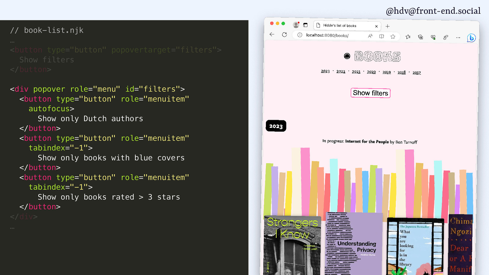
And what I see now is when I open that…
Slide 150
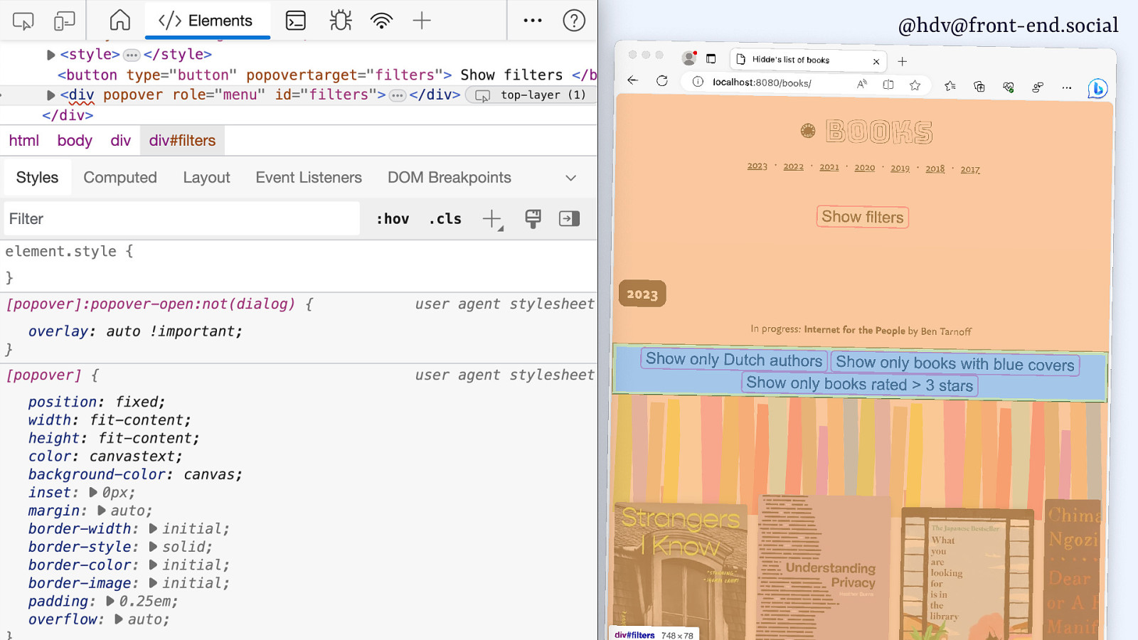
…the popover opens in the middle of the screen, which is basically what you would expect. So, if you look at browser dev tools, you’ll see that popover has a default style sheet where margin auto is applied.
Contrary to popular belief, centering in CSS is very easy, you set margin to auto. And that’s what they do. They set it to auto, it goes to the middle, it makes perfect sense. And this is in the UA style sheet.
But I don’t like it because it is very far away from my button, and if I weren’t my own user, I would probably not know where to look. So, I asked the Chrome engineers that worked on this, “Why is this the UA style sheet? Like, couldn’t you just make it automatically be closer to my button?” I don’t really care where it is, as long as it’s, like, somewhere close to the button, that would make it more usable. But that is really hard because this popover is in the top layer, while the button is not in the top layer.
Slide 151
Things that are in the top layer can’t know about things that are outside of the top layer. They don’t have any connection between them. So, that’s a bit tricky, somewhat annoying to deal with, but it basically means that we’ll need to do our positioning ourselves.
Slide 152
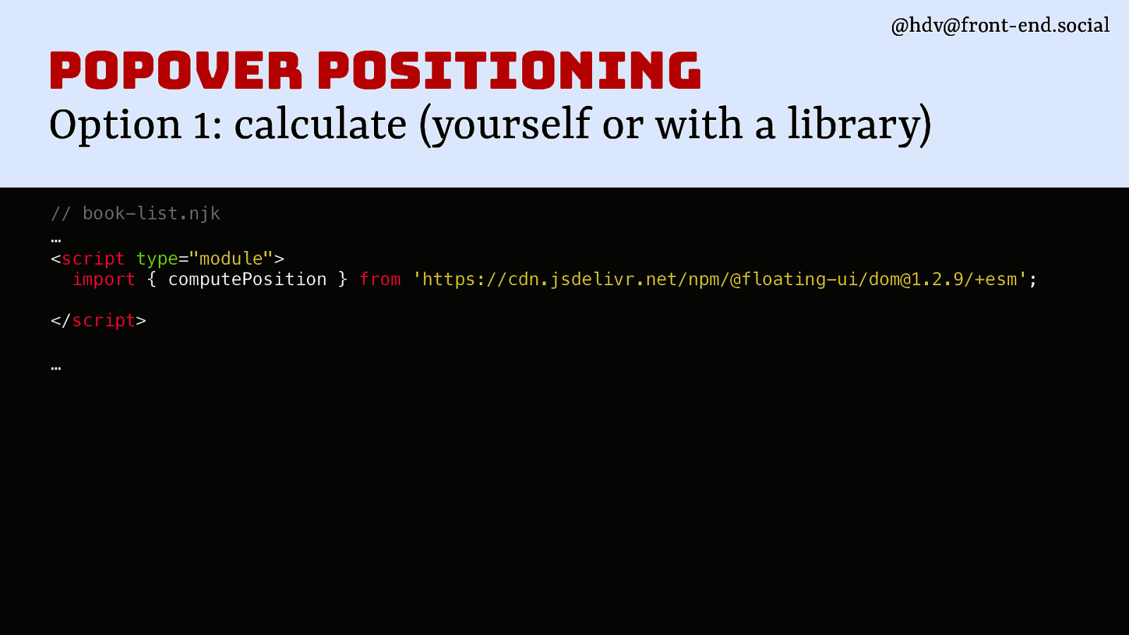
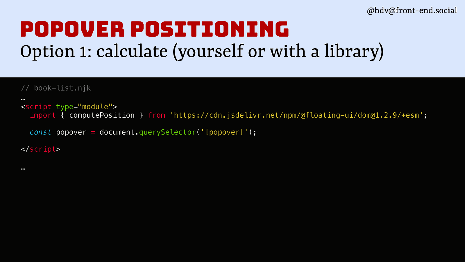
We can do that. There are libraries for that. So basically, two options, and the first one is to calculate it yourself manually. I don’t recommend. You can use a library, ‘cause there’s lots of libraries where they figure out all the maths details. Unless you really like maths, you can also do it yourself. So I’m using computePosition.
Slide 153
I’m finding my popover.
Slide 154
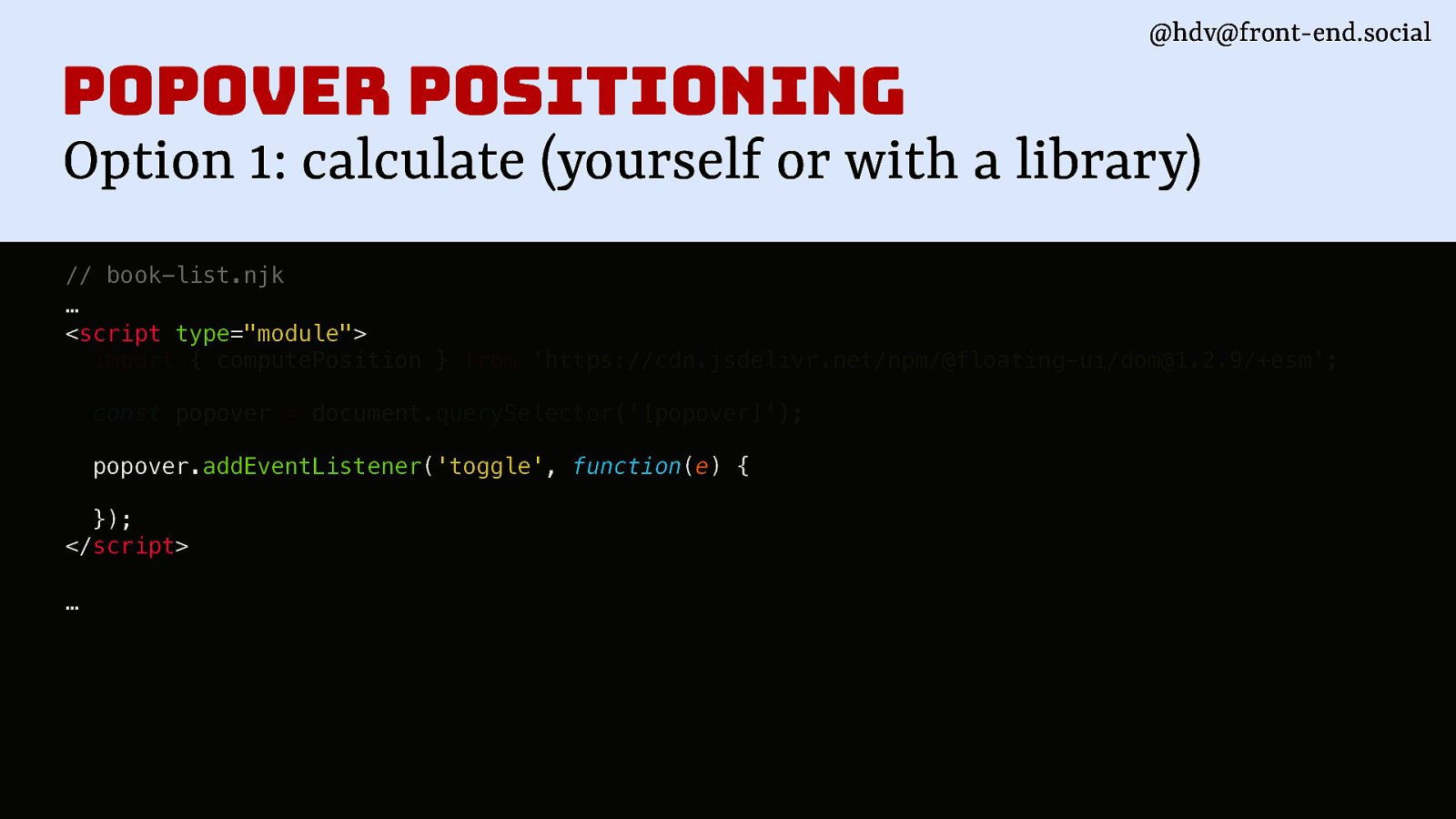
Then whenever it toggles…
Slide 155
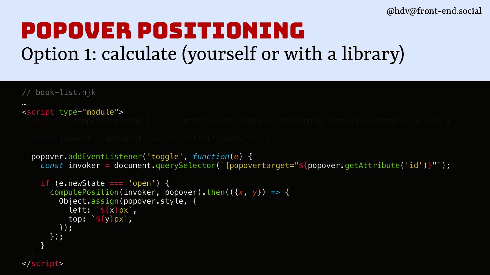
I basically set inline styles for the popover. I did that for my demo, and it works very nicely.
Slide 156
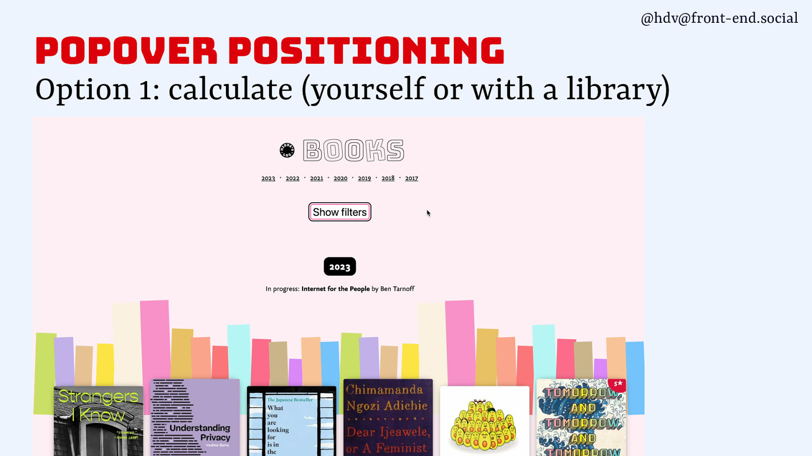
So now my menu is right where I want it to be. This is cool. It’s kind of, it feels like a weird hack maybe, but it actually works quite okay, and it’s not a massive library that you’re importing, it’s just doing a bit of the maths for you.
Slide 157
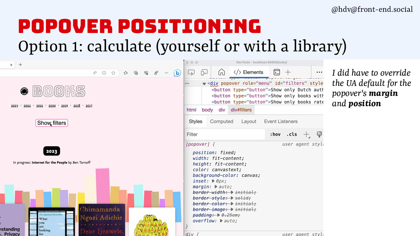
One thing I did note, though, is I did have to take away the default margin and position, because it somehow applied all of that margin still to my popover, which, fine, I removed that, and it worked.
Slide 158
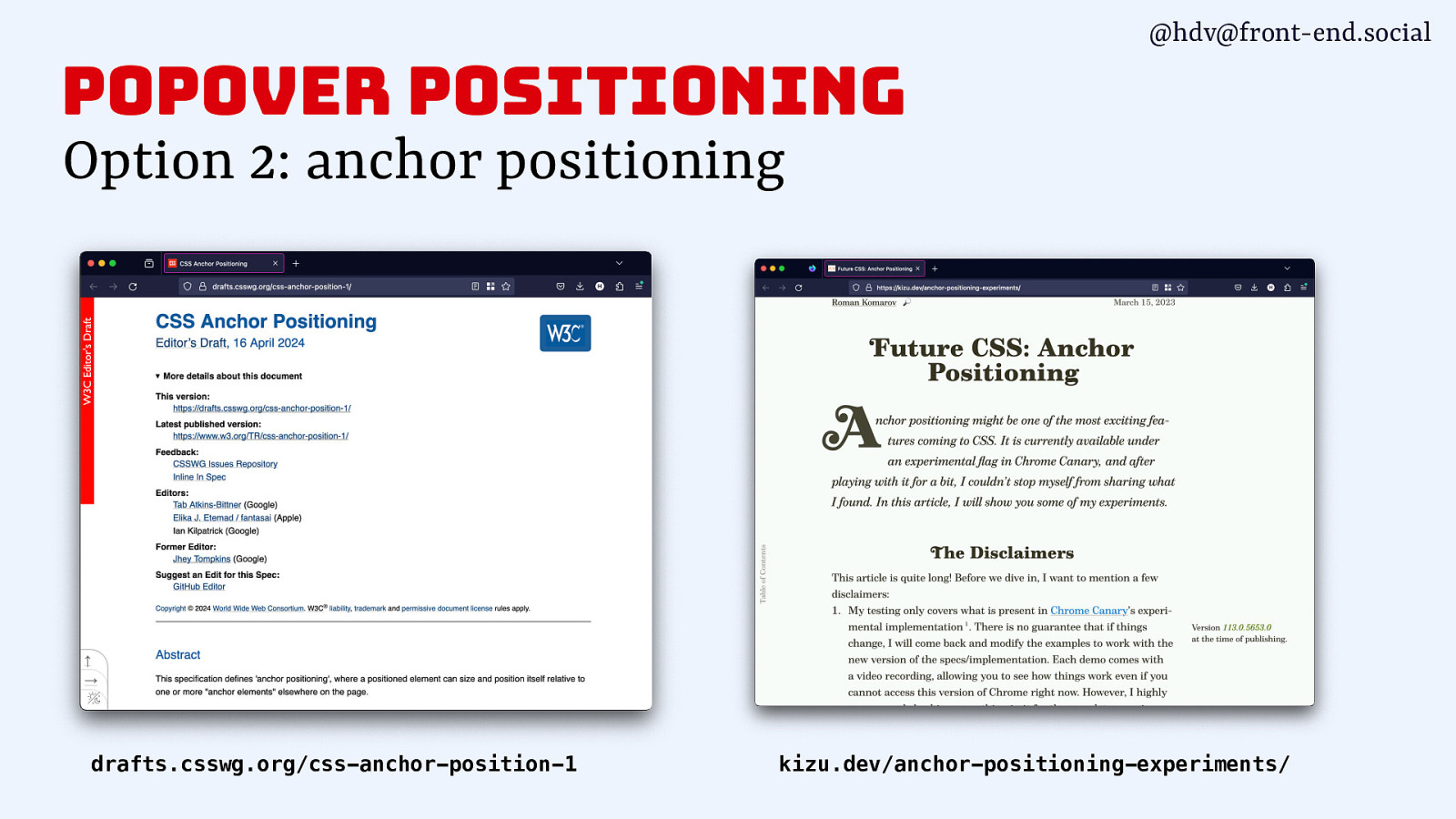
So that’s one way that you can use it today. Now, one other way, and people were talking to me about this in the break, is anchor positioning. And yes, anchor positioning is really exciting because it is going to solve this problem in CSS. Basically, in a way, if I really had to summarise it, you define a button as an anchor, and then you can tell the popover to be anchored to that anchor in various ways. So you can tell it to go above or underneath, or the the one I really like, to go wherever it fits, which is probably what I would be using. I’m quite lazy like that. I don’t really want to decide where it goes, I want it to go wherever there is space. But basically, that’s what is going to be solved by anchor positioning. It’s a proposal that was done about a year ago, and at that time, I was very excited about it. I first started talking about popovers, and I couldn’t wait for anchor positioning to come.
But then there were some more discussions in the CSS working group, and the current status is that a few weeks ago, a new version was released of this specification. It was updated. There are some things that are different. Before, you would do the anchoring or could do it in HTML, now you’re doing it in in CSS. And there’s a few more things that have kind of changed around anchor positioning.
There’s a really good blog post by Roma on kizu.dev that goes into how anchoring works. A lot of his examples don’t actually use popovers, but footnotes. So he has footnotes that are underneath his post, and then he positions them alongside his post. I think you can see that here, actually. So there’s a version number that is attached to the thing that’s there. So, he makes these connections between his main content and stuff that are kind of related to it. You can do lots of cool stuff with anchor positioning. I’m looking forward to use it. I’ve been trying to put a demo together for this talk, but I found that it wasn’t doing exactly what it should be doing in Canary, but you can definitely go and play with it.
Slide 159
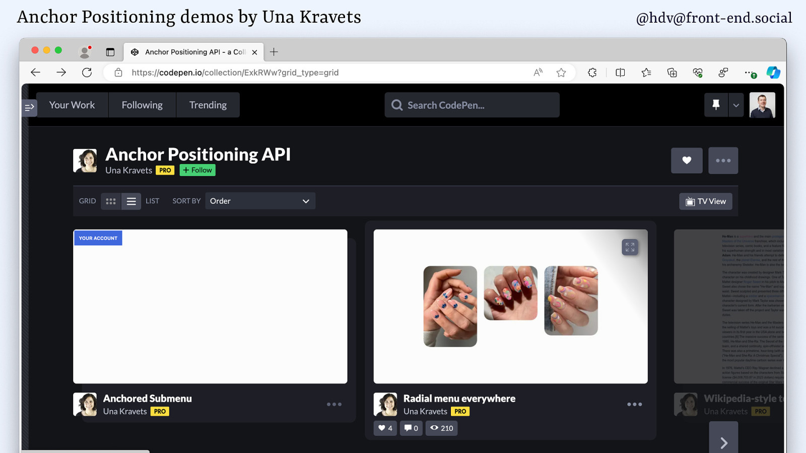
And I would recommend checking Una Kravets’ demos, because she’s done a bunch of different ones, including some that have one or more popovers. So if you want to see that in production, do check it out in a Canary version of Chrome. I don’t think it’s in other browsers yet. It might be in Safari, but not sure. We’ll hear when it comes out.
Slide 160
Anyway, we’ll wrap up.
Slide 161

Today we’ve talked about what each of these features does. So, popover versus dialog. Then we’ve looked at what kind of accessibility semantics you’ll need to set yourself versus the ones that you get for free from the browser. And then lastly, we’ve just seen two gotchas to look at.
Slide 162
What I hope you take away: dialog and popover can really massively reduce your JavaScript bundle, because it means you no longer need to use libraries to do your modals and your dialogs. It’s built into HTML now.
Slide 163
Second, that the popover attribute only adds behaviour, it doesn’t add roles, you’ll need to decide them yourself.
Slide 164
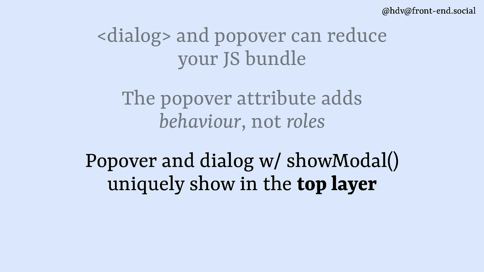
Now, the thing to look out for is that popovers and dialogs with showModal are the only things that can show up in the top layer. Anything else will not go there. However high you set their z-index, they will be below the top layer. So if you want top layer, do take care of everything in your application to not get confusing situations where they compete.
Slide 165
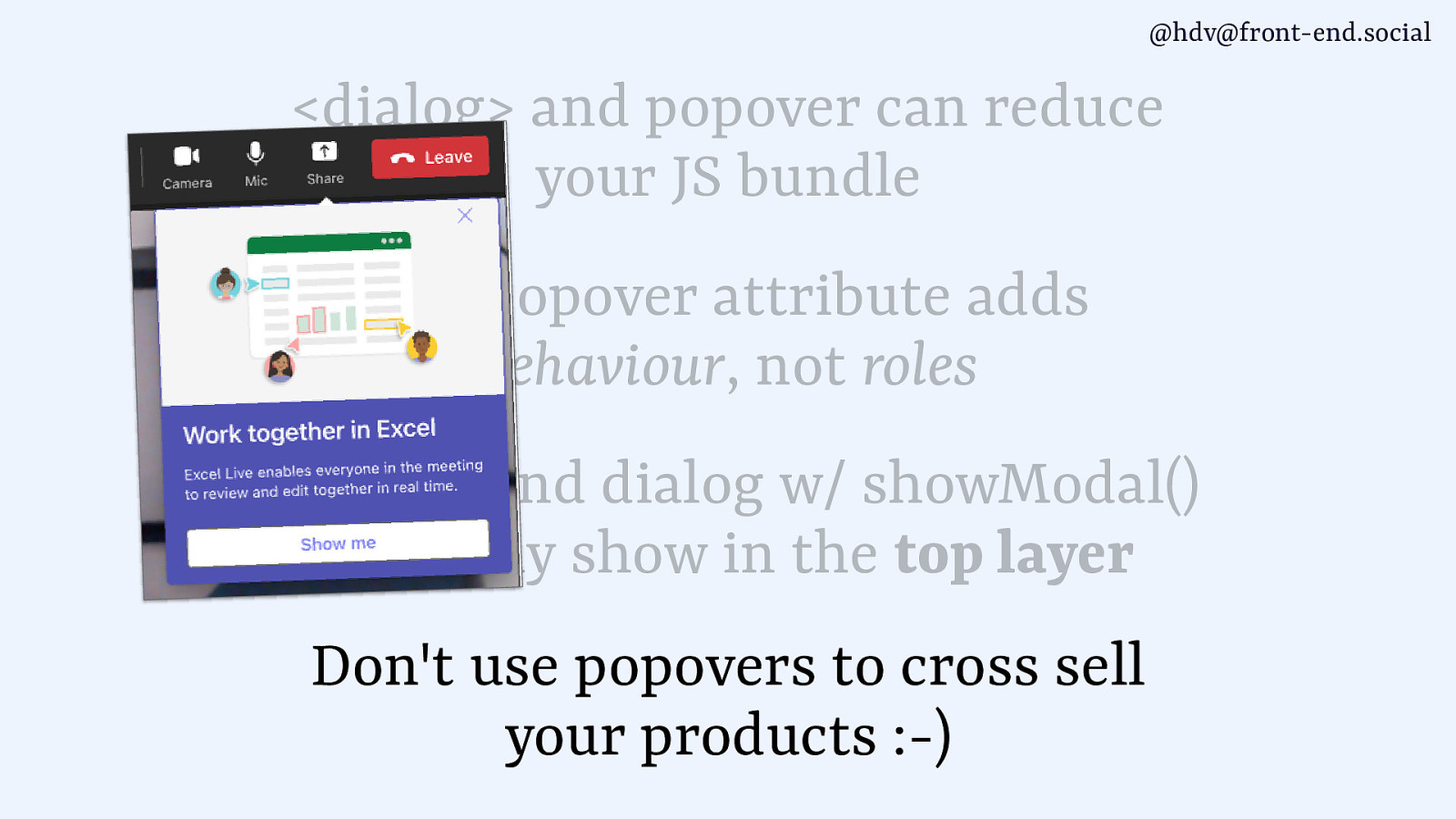
And lastly, do not use popovers to cross sell your products. It’s not what they’re for.
Slide 166
And with that, I want to thank you very much.