Hello and thanks for joining!
Slide 1
Slide 2
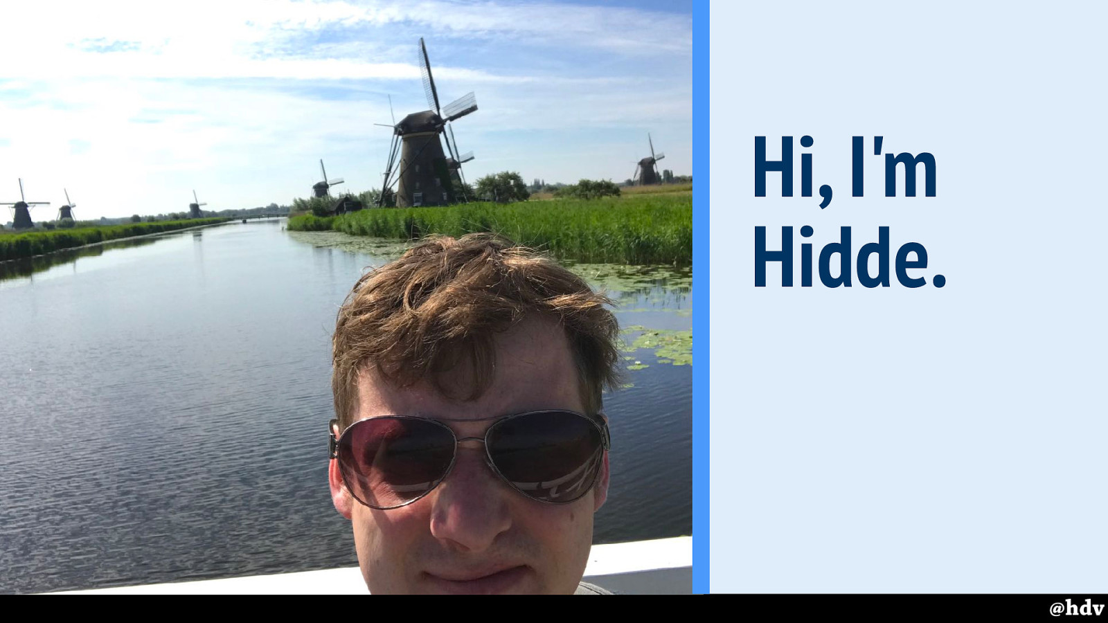
My name is Hidde de Vries, I am a front-end web developer, I work as a freelancer slash contractor for all sorts of organisations.
Slide 3
I currently work at Mozilla as a contractor in their Open Innovation team, on Identity and Access Management. It has very little to do with CSS, but I'm happy to chat about it in the break.
Slide 4
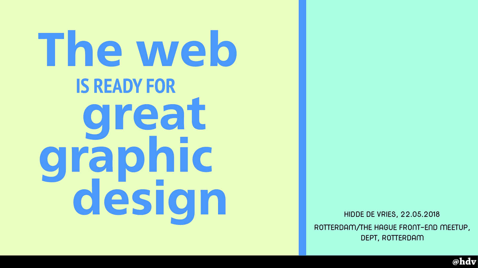
What I'd like to talk to you about today is graphic design and the web.
Slide 5
My main reason for looking into this is probably that Grid Layout was going to get built into browsers…
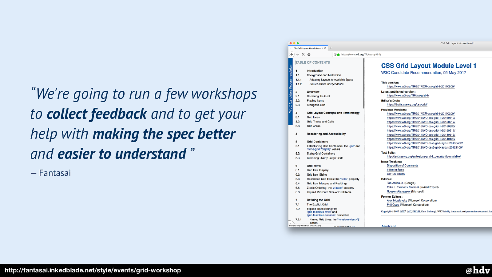
And a workshop; in 2016, Fantasai, one of the creators of Grid Layout and too many other specs to count, tweeted about her idea for a workshop. It involved getting together, reading a spec, understanding it and making it more understandable for others.
Slide 6
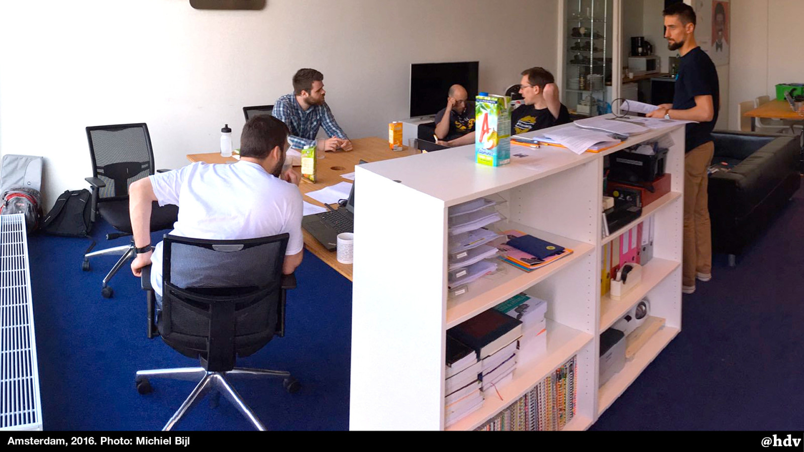
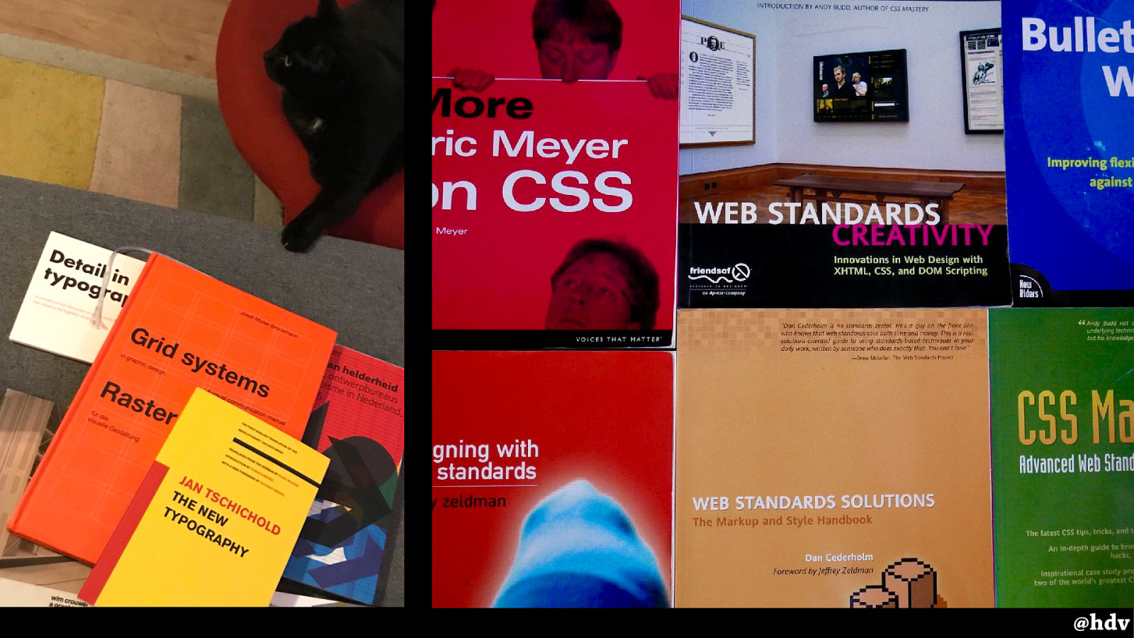
It was a sunny day like today and we sat in a warm office with that long spec. In the train back, I kept feeling “shit I'll need to know more than just CSS -I'll need to read more about graphic design history now” I had always been interested in that stuff, so I had a few books, but I started to buy more.
I also started reading some older blog posts about layout on the web, and took out the books that taught me how to build websites.
Slide 7
It was fascinating to have a look through. These books describe things like how you can build navigation bars with CSS, do tabbed layouts with rounded corners and shadows… I remember how inspiring they were at the time, but also realised that a lot of the things in there are currently possible with JUST CSS.
Slide 8
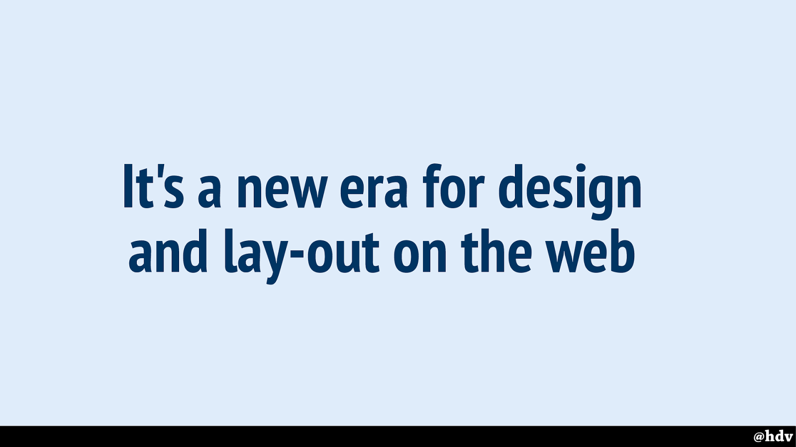
It is clearly a new era for design and lay-out on the web. We have stuff built in to browsers now that did not exist before.
Slide 9
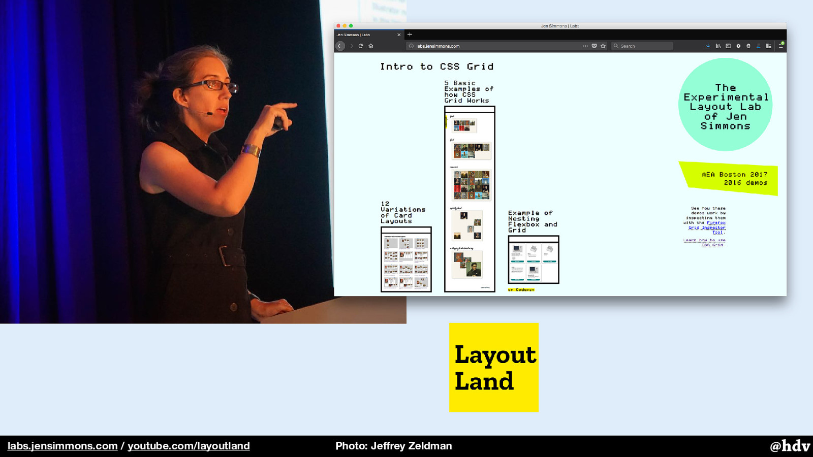
I was inspired by people like Jen Simmons, who experimented so much with Grid Layout in her Layout Lab before it even existed in browsers. She's currently doing a great video series on YouTube too, check it out if you haven't, the first season of it has just finished.
Slide 10
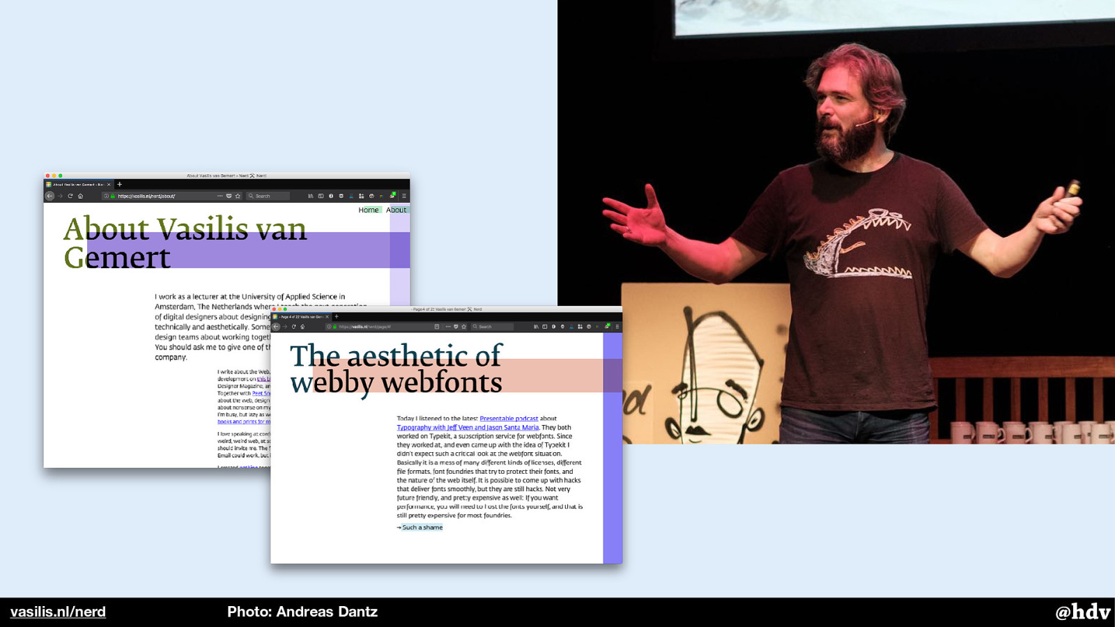
And by Vasilis van Gemert, a teacher at the University of Applied Sciences in Amsterdam. A few years ago he read all those graphic design classics and blogged about his findings. He has one of the coolest looking blogs out there, check it out.
Slide 11
I'm afraid I don't have a definition of great graphic design. I may have chosen the wrong word, really. Because what's great is up to any individual.
Slide 12
Maybe it is effective design we're looking for that might be more measurable.
Slide 13
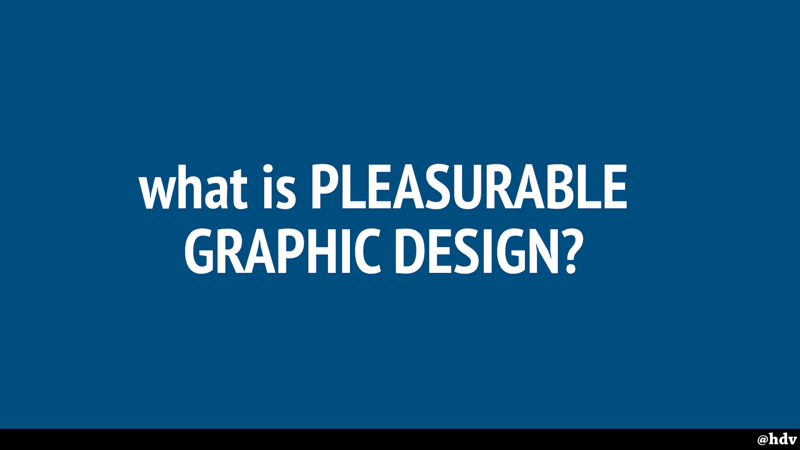
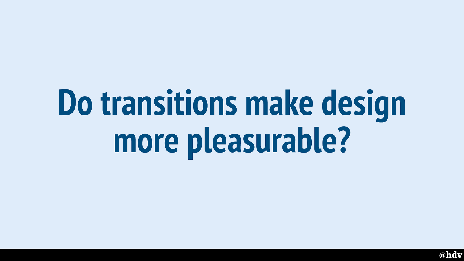
Or maybe it is pleasurability that can be our metric?
Slide 14
There's a particular direction in recent graphic design history I wanted to look at.
Why? It is still popular around us, many of us have phones that could be characterised as modernised. It is also, like CSS, pretty rule-based and it started as a response to the industrialisation: we got more machines around us and needed an aesthetic to match. We now have the web… more machines than ever!
Slide 15
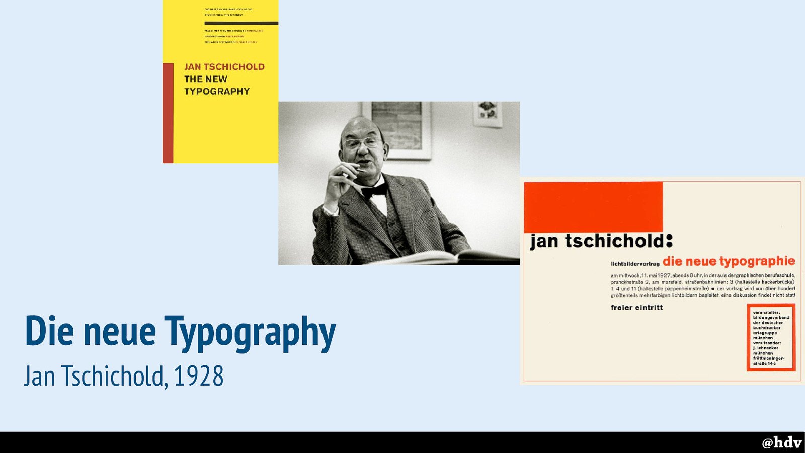
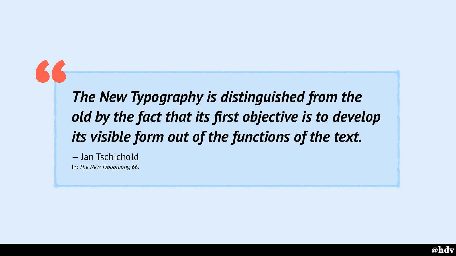
Let's start with one of the fathers of modernism in graphic design. In 1928, Jan Tschichold published his manifesto “Die neue Typographie”, or “The new typography”. It was meant as a handbook for printers, but super interesting for those of us interested in typography. I read the modern English translation, published years later and complimented with various introductions and some context.
In a short history lesson, he takes us from old typography, basically designing books, to modern art in various shapes, and talks about some examples of New Typography. The old typography has serif typefaces, hand drawn decorations and, I guess, more elaborate visuals… the new typography is much more to the point.
Slide 16
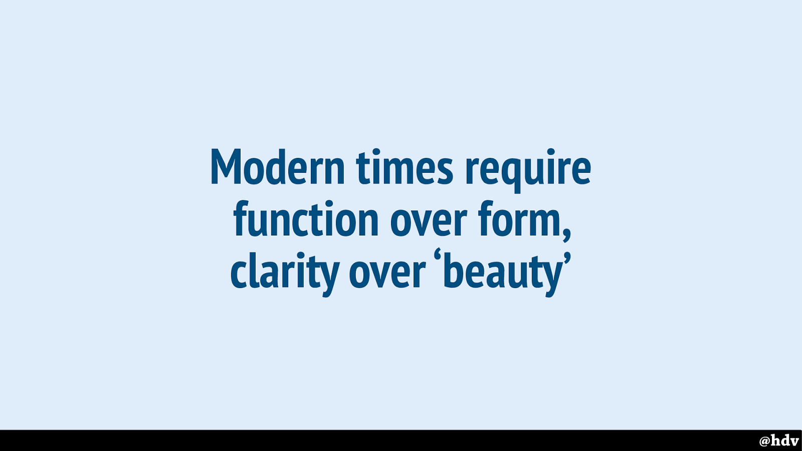
He talked about the need to adapt type: because people get more and more “printed matter” in their hands, it can't just be beautiful, it needs to consider readability (“we no longer read quietly line by line, but glance quickly over the whole, and only if our interest is awakened, do we study it in detail” - DNT, 64).
If 1928 was a modern time, then 2018 definitely is. We may not have ‘printed matter’ in our hands, but wow, most of us have a lot of text in our days. We see this principle still followed on the web, with companies using user testing to figure out which clarity they need.
Slide 17
Tschichold encouraged a functional approach to things, tying what something looks like to what it does. I feel this is where he almost is almost web-by, CSS is pretty suitable for styling things with specific functions.
So it is not just decorating, it is really thinking about the contention providing clarity.
Slide 18
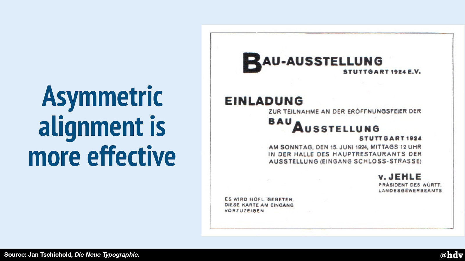
And then he talked about the advantages of asymmetry. Showing some examples where text is just centered on a page, he explains that it is difficult to focus, it lacks effectiveness.
Asymmetry should lead to better reading order, too. This image is an example of something Tschichold considered to have good reading order.
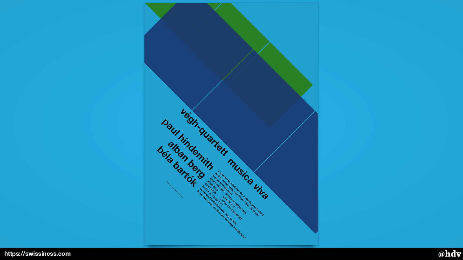
Slide 19
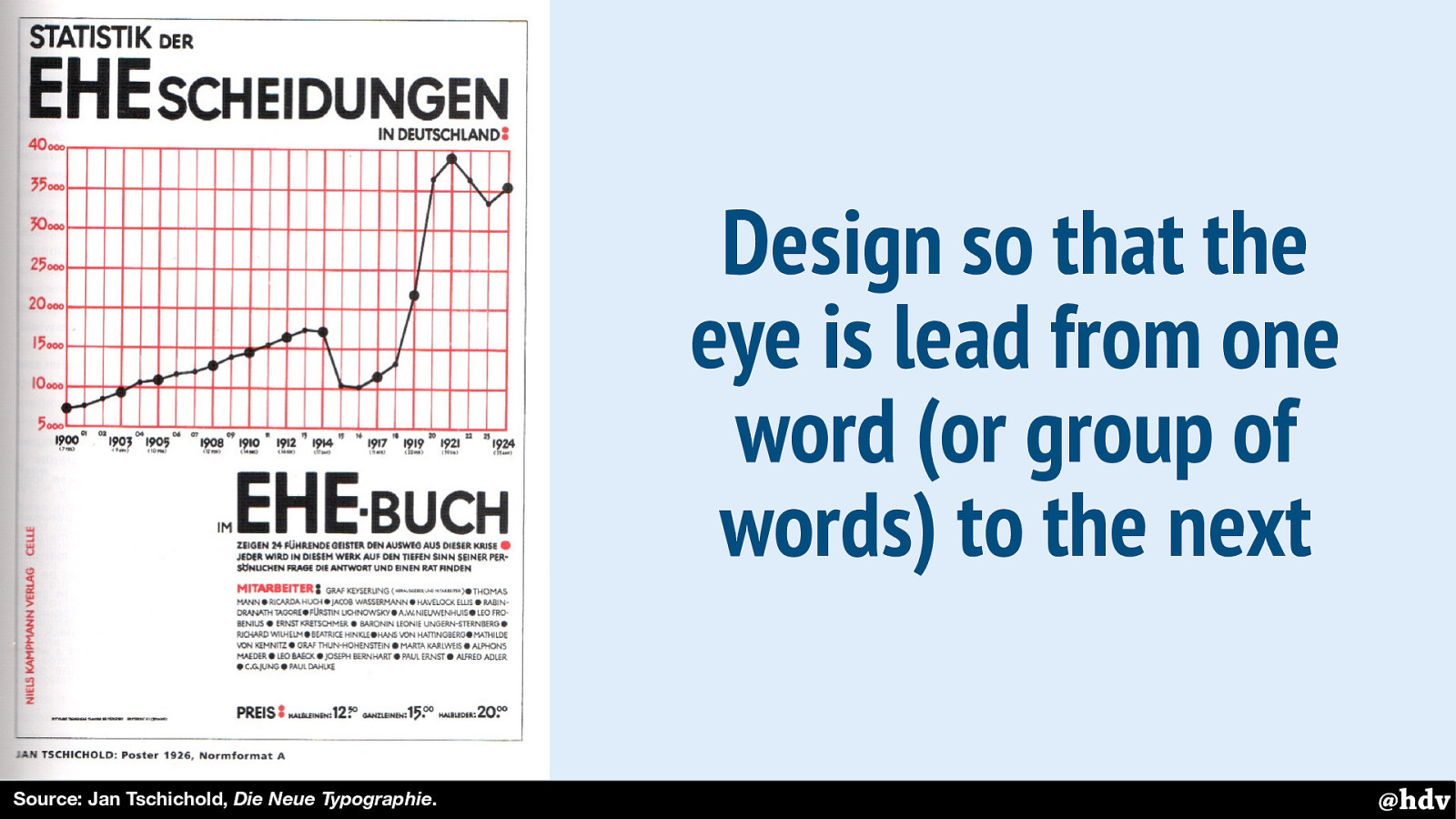
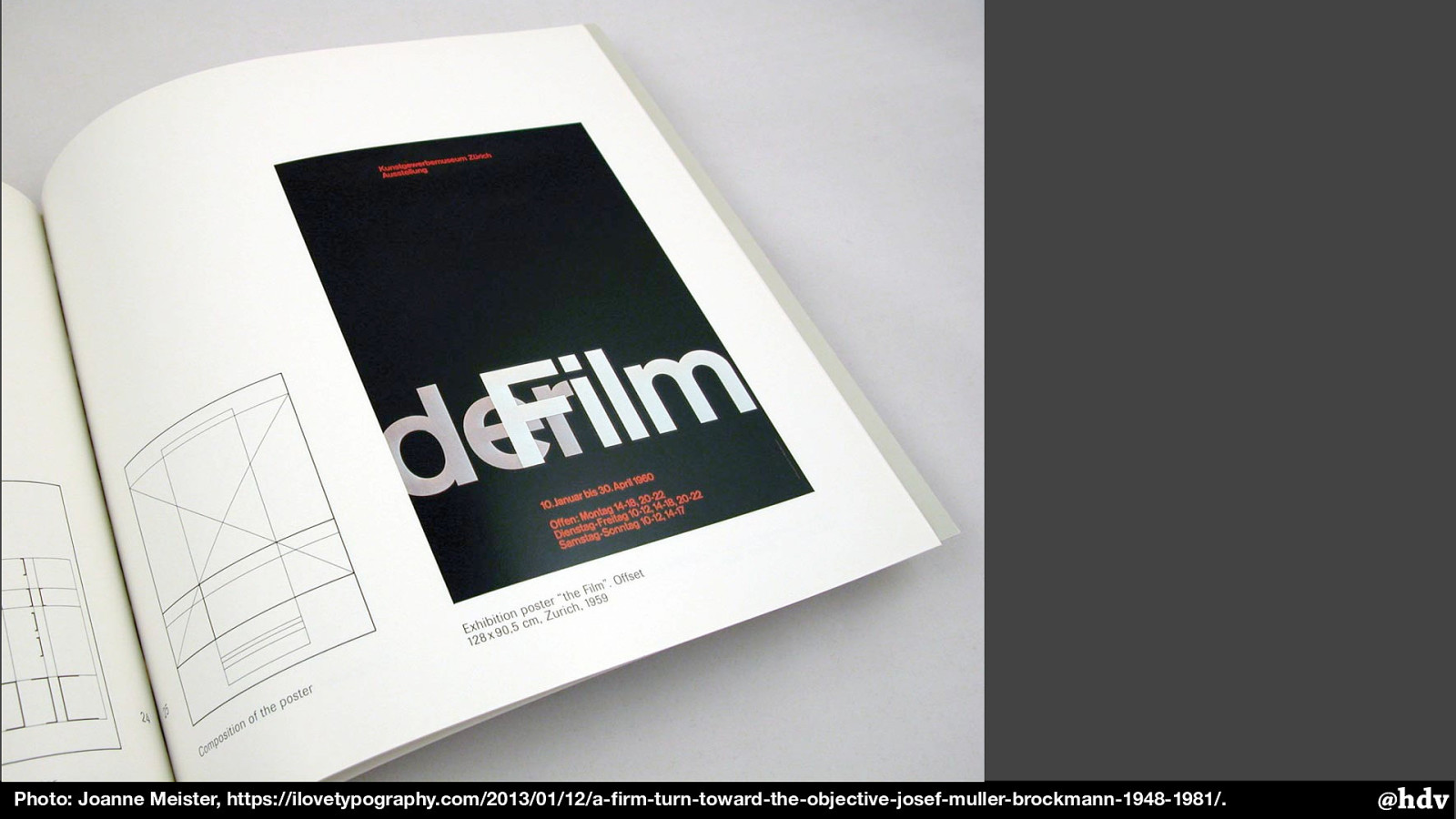
Here's another example: this poster has contrasts between red and black colors, and large and small font sizes. And the text column isn't exactly half of the page.
Slide 20
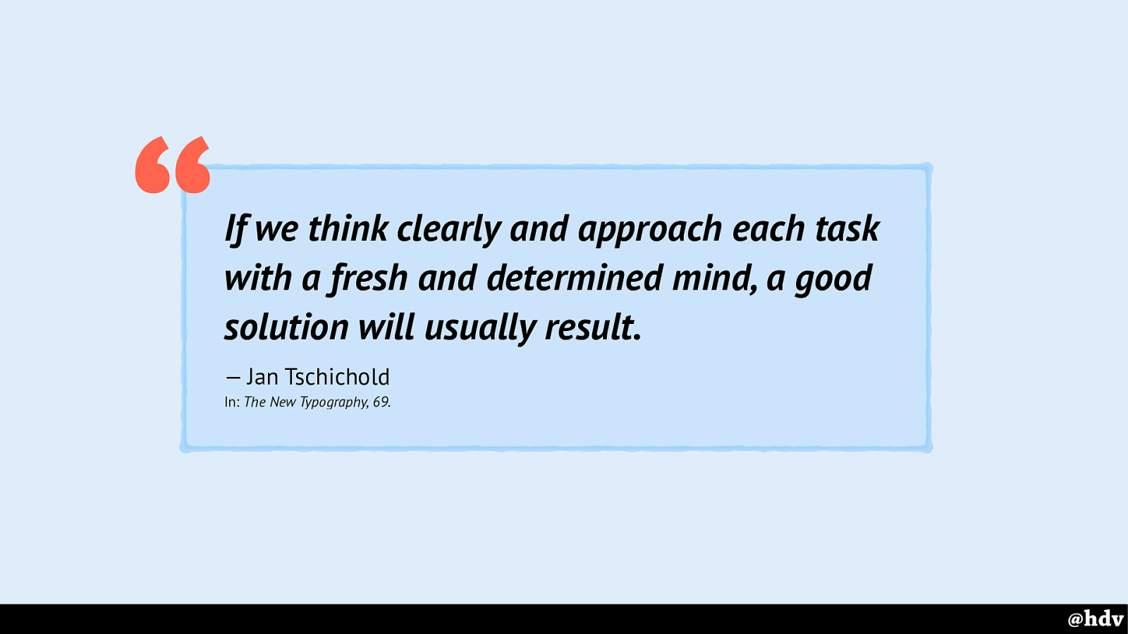
Lastly, Tschichold emphasised we should be intentional about our work. This may be at odds with how flexible the web is, we can have good intentions, but our solutions won't look the same in every browser.
Slide 21
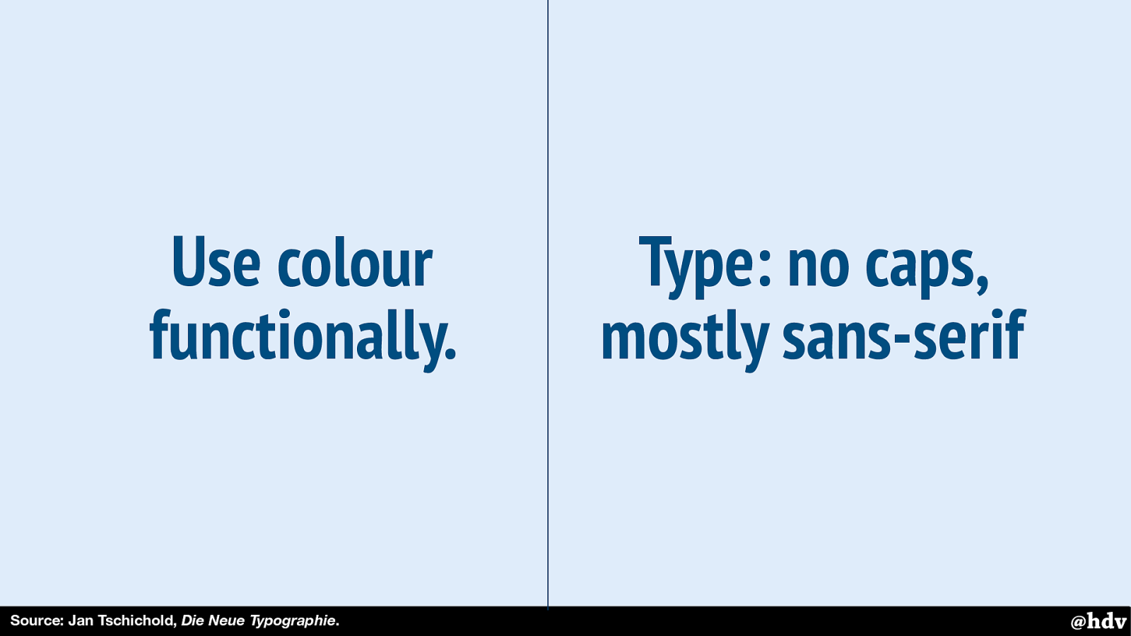
He also mentions color and typography aspects of The New Typography. He's a big fan of using colour functionally, for example to make it clear that two things are different. And he spends a couple of pages on how much he likes lowercase and sans-serif typography. It's an interesting read.
Slide 22
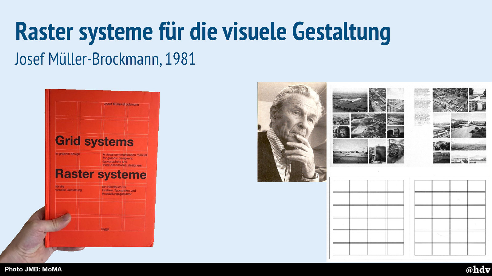
The clarity that Tschichold was after, Müller-Brockmann continued thinking about to make it better. Designing with grids was a large part of that.
Slide 23
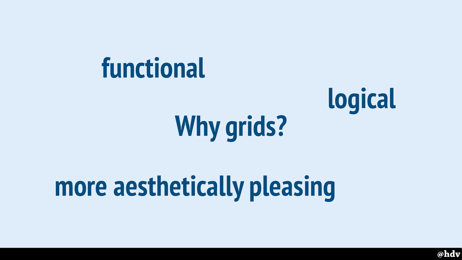
Müller-Brockmann explains why we'd want grids in the first place.
He explains that if you have a bunch of content that needs to go into a lay-out, a grid can give solutions that are functional, logical, and just look better.
Slide 24
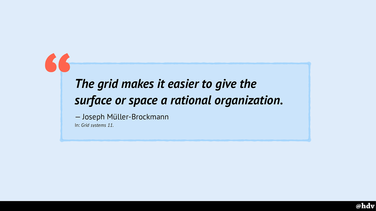
When a grid is applied to it, a surface an more easily be organised in a way that is rational.
Slide 25
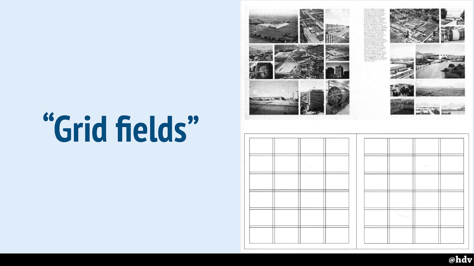
He explained that you can build a grid by dividing a canvas into something that he called grid fields. I can't go into the details of grid based design too much here, I'd like to refer to the book if you want to know more.
Slide 26
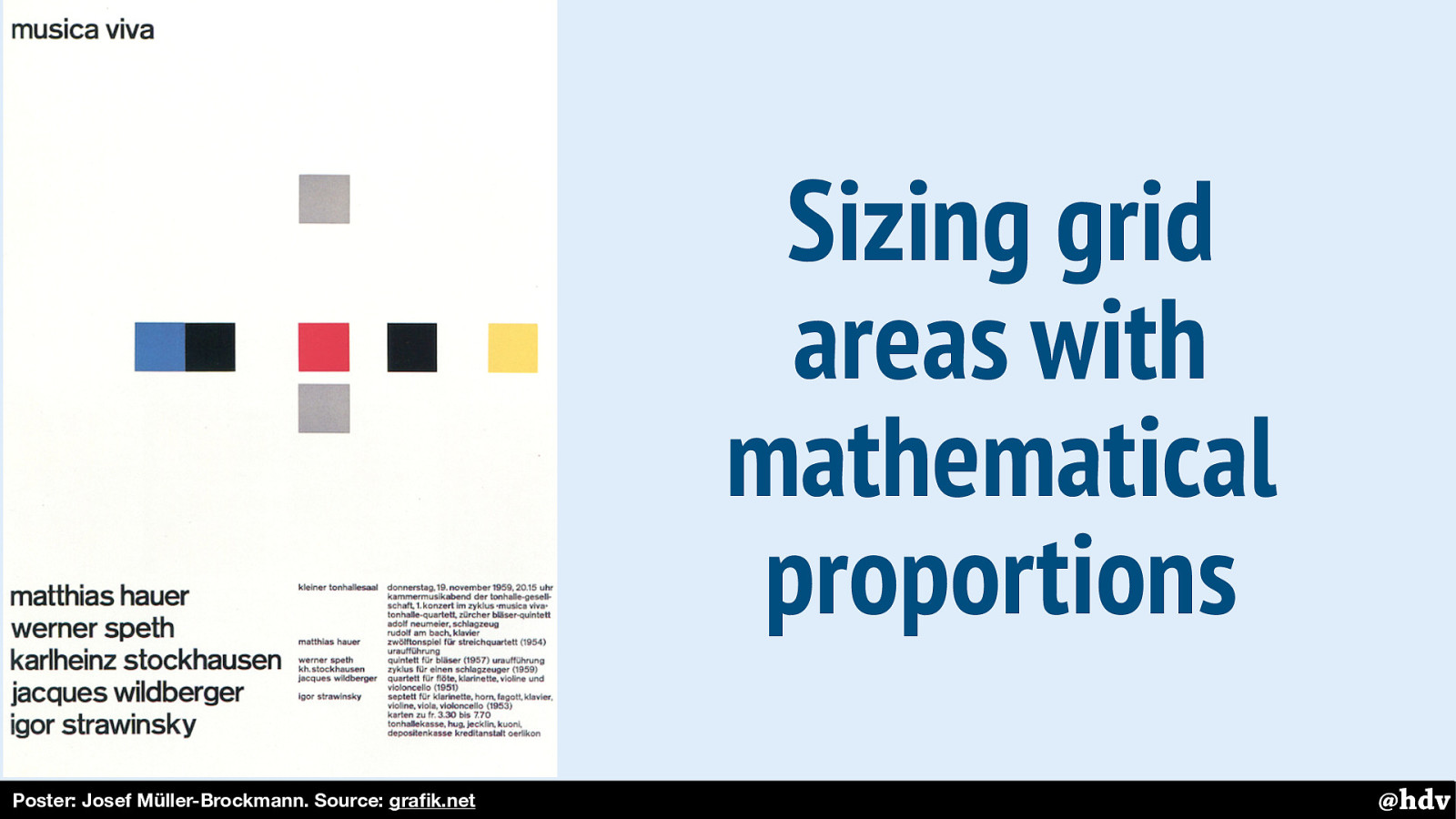
Müller-Brockmann really believed in the benefits of mathematical proportions in grids. Not only as a way to make a more interesting or pretty design, but also to aid focus and create order and hierarchy.
Here's on example.
Slide 27
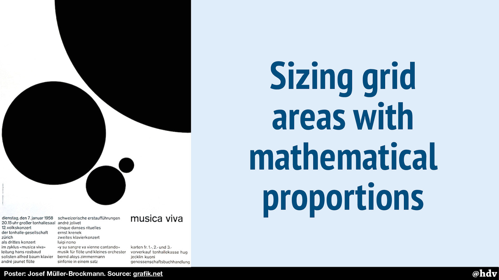
And here is another.
Slide 28
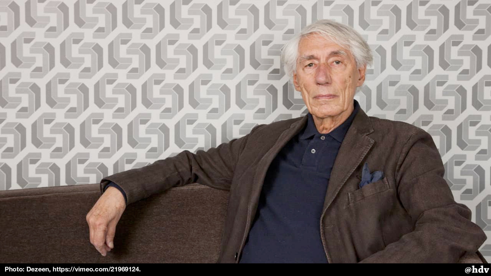
In the early sixties, modernism got very popular in the Netherlands, for a large part because of this man: Wim Crouwel, graphic designer and known for his grid-heavy design work and his agency Total Design.
Slide 29
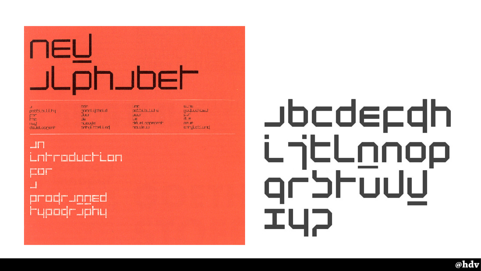
He is well-known for this creation of his: The New Alphabet. In a response to how screens work, with rasters, so everything is squares. That made rendering serif fonts like Garamond impossible, so he came up with an aesthetic that took the constraint into account. This typeface only uses horizontal and vertical lines. Consequently, it is super hard to read especially the a and the w. So the title says 'new alphabet'.
Slide 30
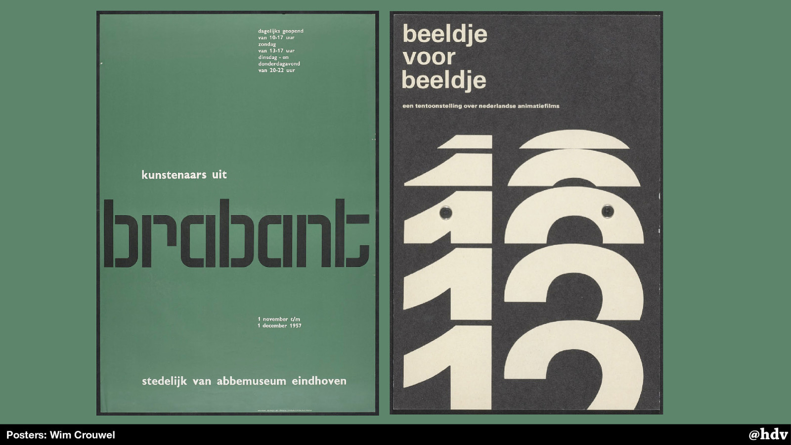
His designs were typography heavy, and had creative use of whitespace.
Slide 31
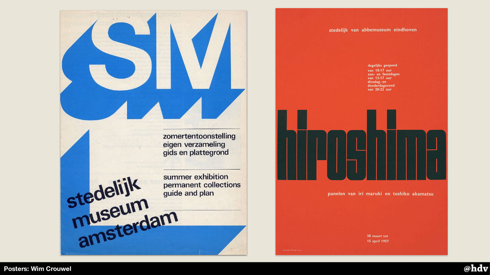
Sometimes with graphical elements, and with rotations. The poster on the right is one of his most famous, he created the typeface for this poster specifically.
Slide 32
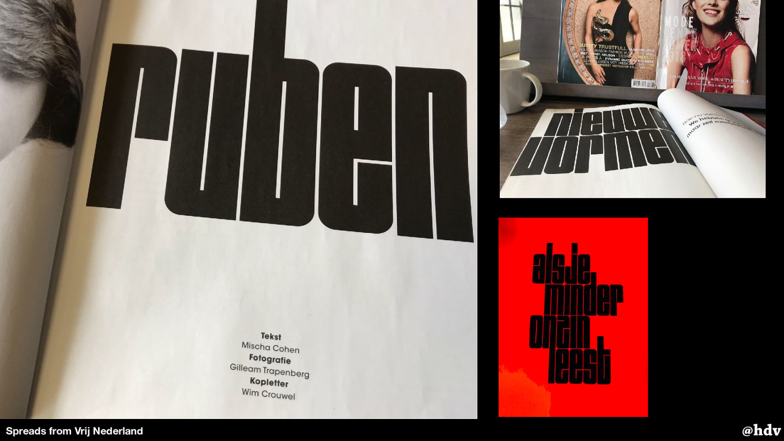
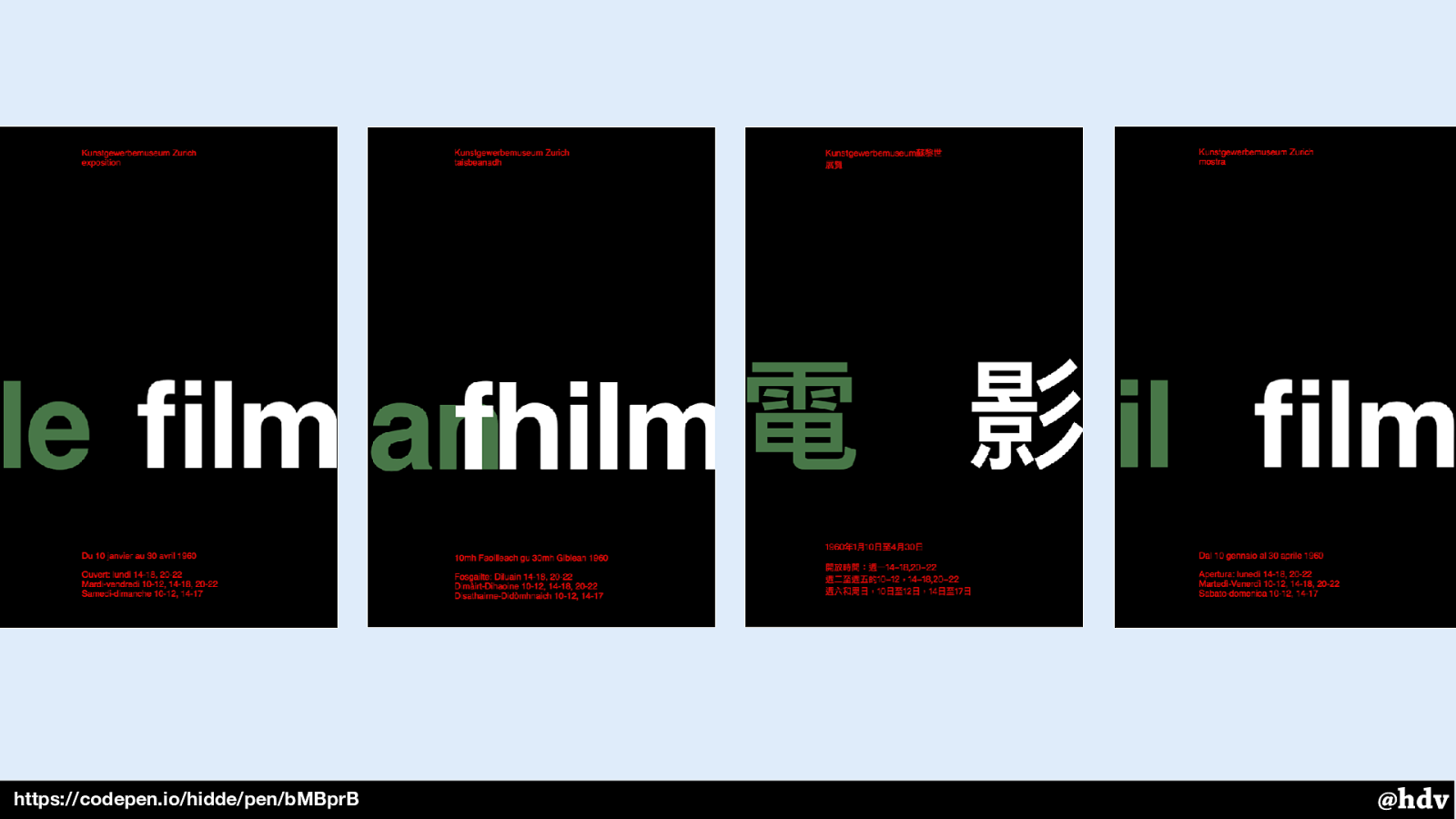
In this year's redesign, the Dutch magazine Vrij Nederland used the 'Shima' typeface for some of its headings. This is special, they even credit the type designer along with the author and photographer.
Slide 33
We've seen some examples of posters for museums and events, but really, a lot of modernism in graphic design took off when corporations started getting ‘house styles’. It became quite a thing in the early sixties.
Companies realised that their visual style was all over the place and they desired on system to make themselves more recognisable and get more trust from their customers or the general public.
Slide 34
You could say it was during this time that we had something like design systems 1.0. With different materials, of course, but perhaps similar goals.
Slide 35
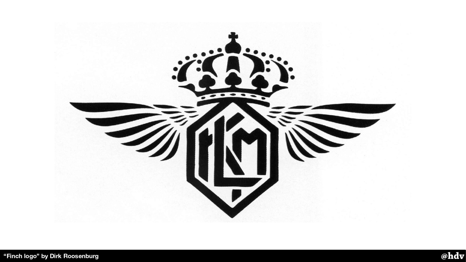
The first company in the Netherlands that introduced their own ‘house style’ is KLM, the airline.
They used to have this as a logo. As you look at it, you might see some recognisability problems right away. The crown is pretty ok, although it is quite eloborate. The letters ‘KLM’ are downright hard to recognise. But they're there.
Slide 36
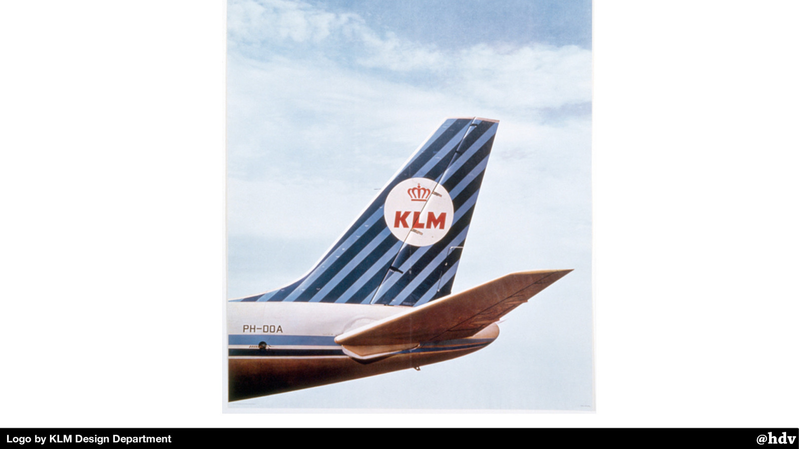
Their internal design team worked with an American design company that helped them develop an identity that they could use on planes, newspaper ads, napkins, you name it. It had colourful stripes and a much simplified version of the logo.
Slide 37
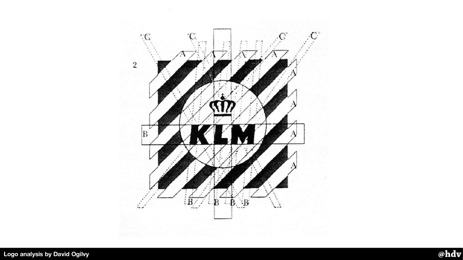
But it was still a bit complex in shape, they found in further research. The designer David Ogilvy drew these lines on top of the logo, as part of his research, and found it was still quite a lot of lines.
Slide 38
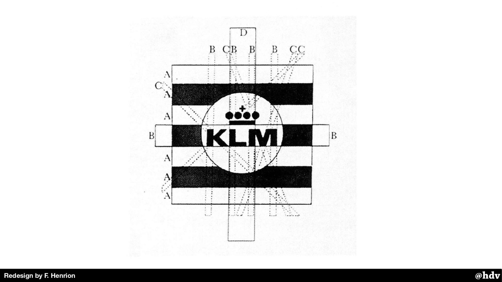
With only a few changes that hardly changed the feel of the logo, they were able to have a much simpler shape, and, perhaps, more recognisable.
With the KLM redesign, Dutch agencies started to realise that they could take on large house style projects, and they did. Total Design, which Wim Crowed co-founded, is one of those pioneering agencies.
Slide 39
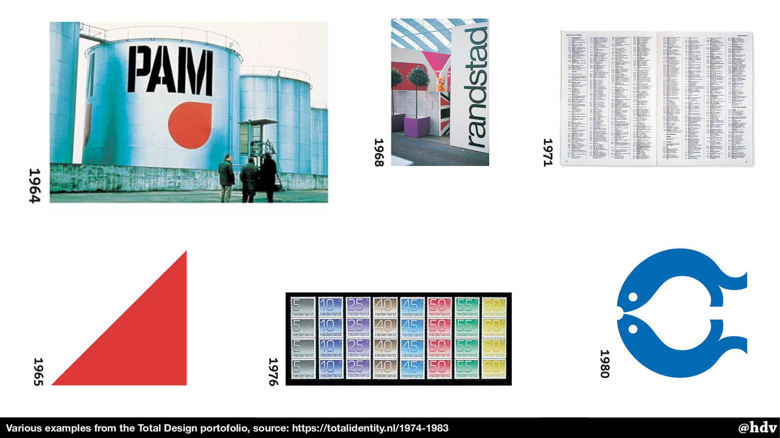
They completely restyled the PAM, but also worked on phonebooks, stamps and many other visual identities.
And there were more. Their competitor Tel Design did a new house style for the national railways.
Slide 40

Designed in 1968, it looked like this and it is still around. This redesign project went massively over budget, but it was very effective and, indeed, timeless.
Slide 41
Modernist graphic design wasn't just about visuals: it was also during this time that things like paper sizes and colours started to get standardised.
With huge advantages, including financial advantages: it made large corporations much more efficient and it aided the idea of having one visual style everywhere.
Slide 42
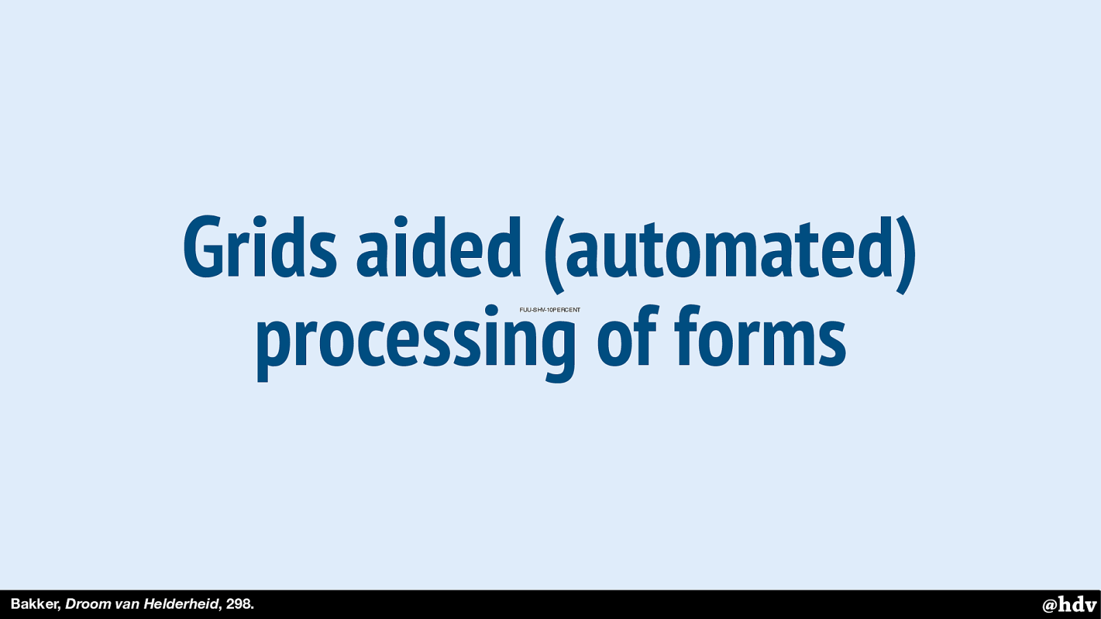
Grids were super popular, and even used to make print easier work with computer involvement. Because if the phone number in a form is always placed in the same place, that is easier to process and paves the way for automated processing with computers.
Slide 43
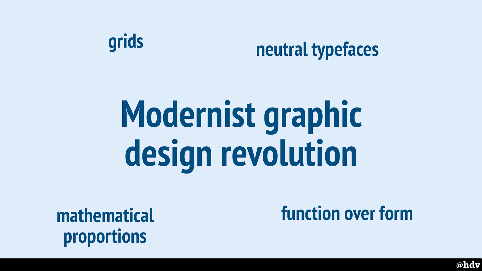
In the sixties and seventies of the last centuries, many, many large companies in The Netherlands got some sort of house style, almost all of them in an orderly, modernist way. With grids, neutral typefaces, simple shapes, mathematical proportions, et cetera.
Slide 44
Not everybody liked this modernist revolution
Slide 45
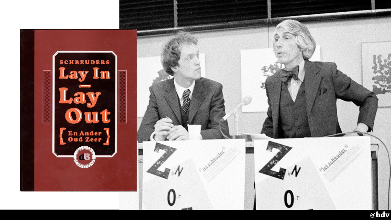
The designer Piet Schreuders, the Dutch amongst us may know him for his work for VPRO and de Poezenkrant, wrote an essay in which he openly criticised the work by his modernist colleagues.
This is him on the left, graphic designer Wim Crouwel on the right, he is presenting his book. During the presentation he teared apart one of Crouwel's posters. Quite the statement.
Slide 46
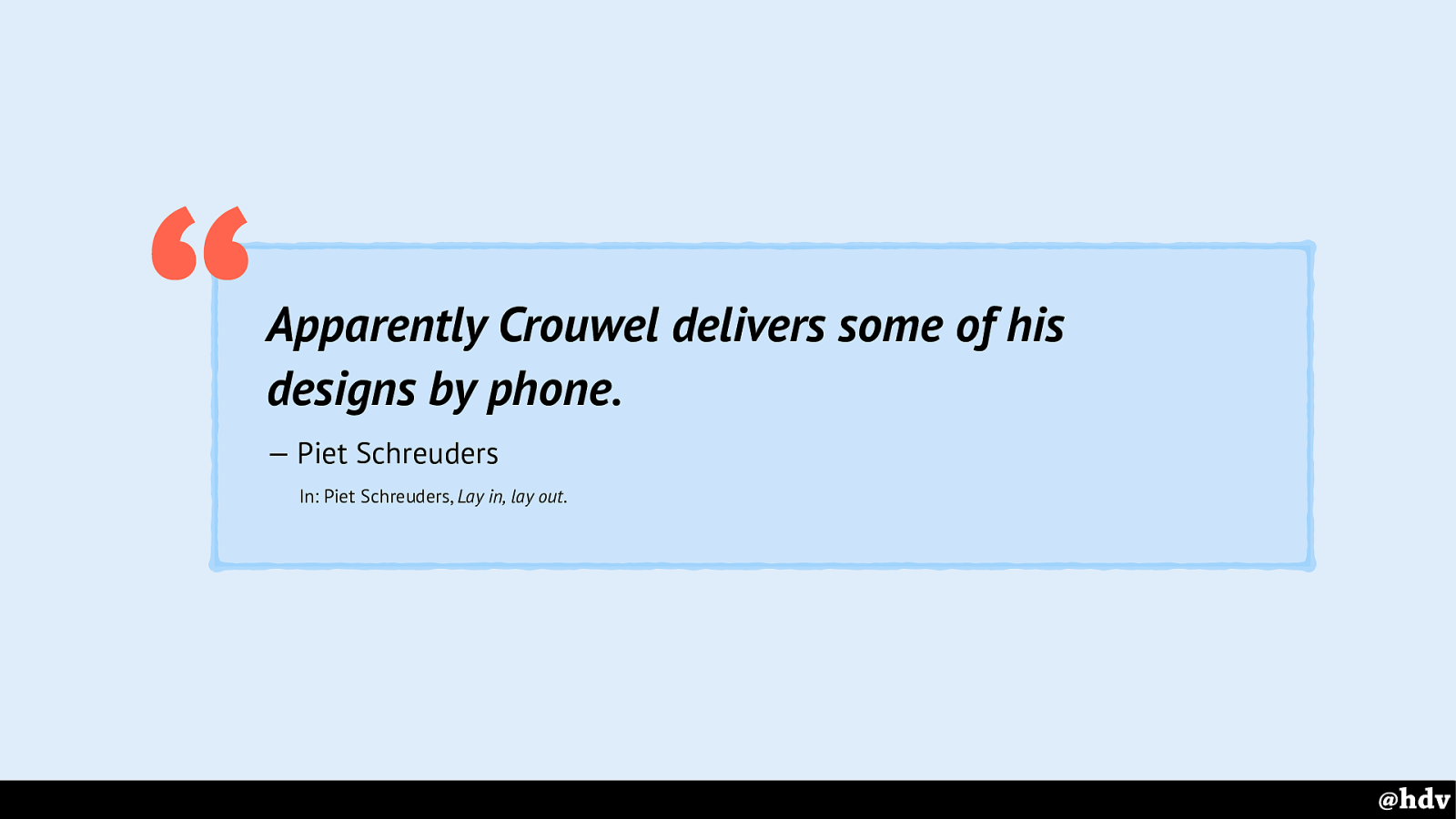
Schreuders spent several pages ridiculing Crouwel's work, for example he says it is too mundane: apparently so simple the designs can be delivered by phone.
Lay In, Lay Out is still sold, much recommended reading, it is very funny and puts all that modernism nicely into perspective.
Slide 47
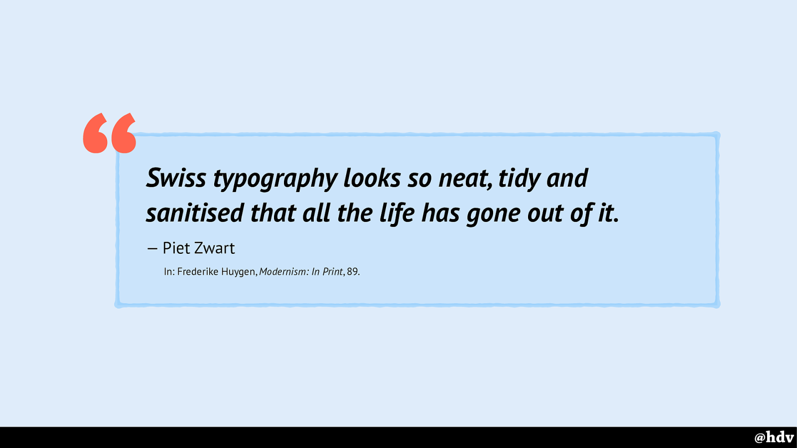
Other graphic designers like Piet Zwart also commented on the downsides of modernism: all the life has gone out of it.
Slide 48
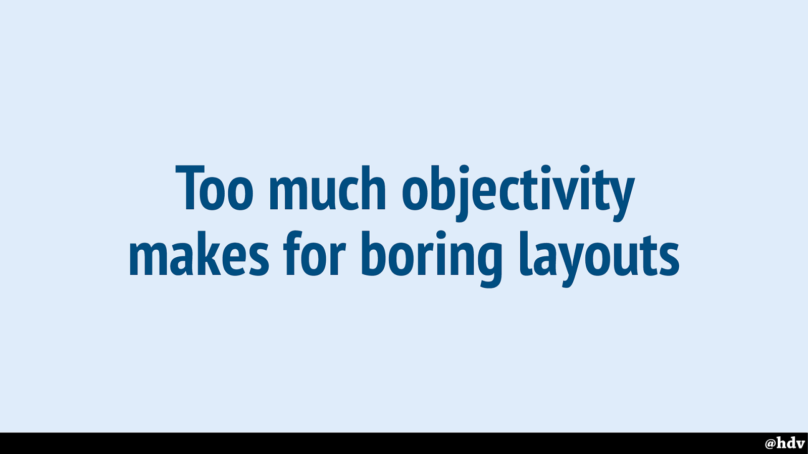
If we're using grid to create too much order, that might make for a boring layout.
Slide 49
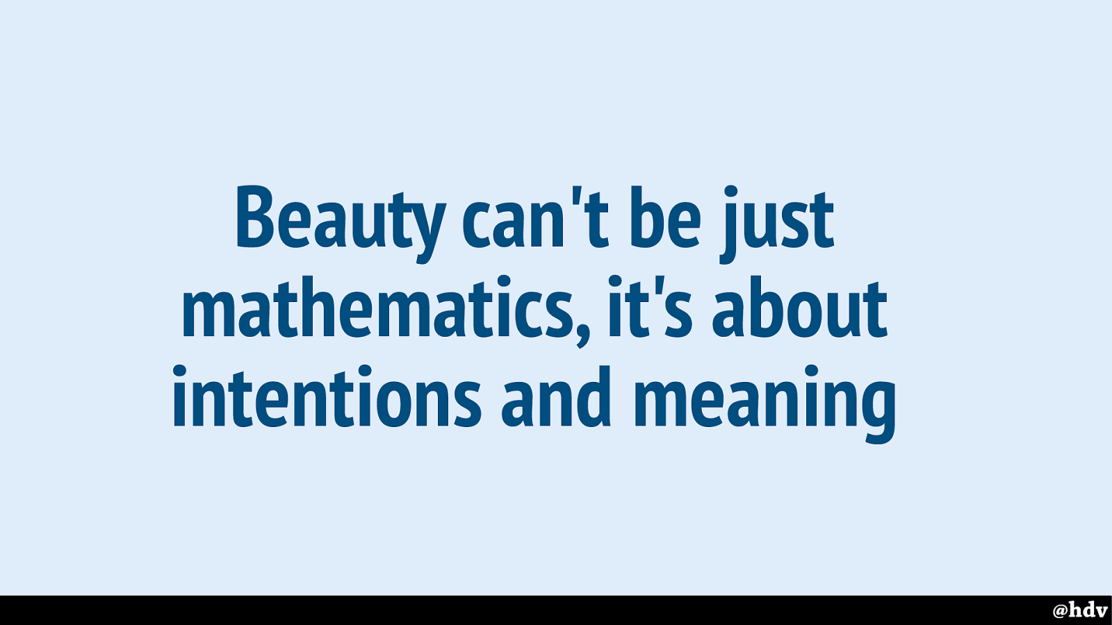
Because surely beauty can't just be mathematics. Some great graphic designers have lived by mathematical ratios to justify their design decisions, but I'm sure you can do weird and ugly design that still conforms to the golden ratio.
Slide 50
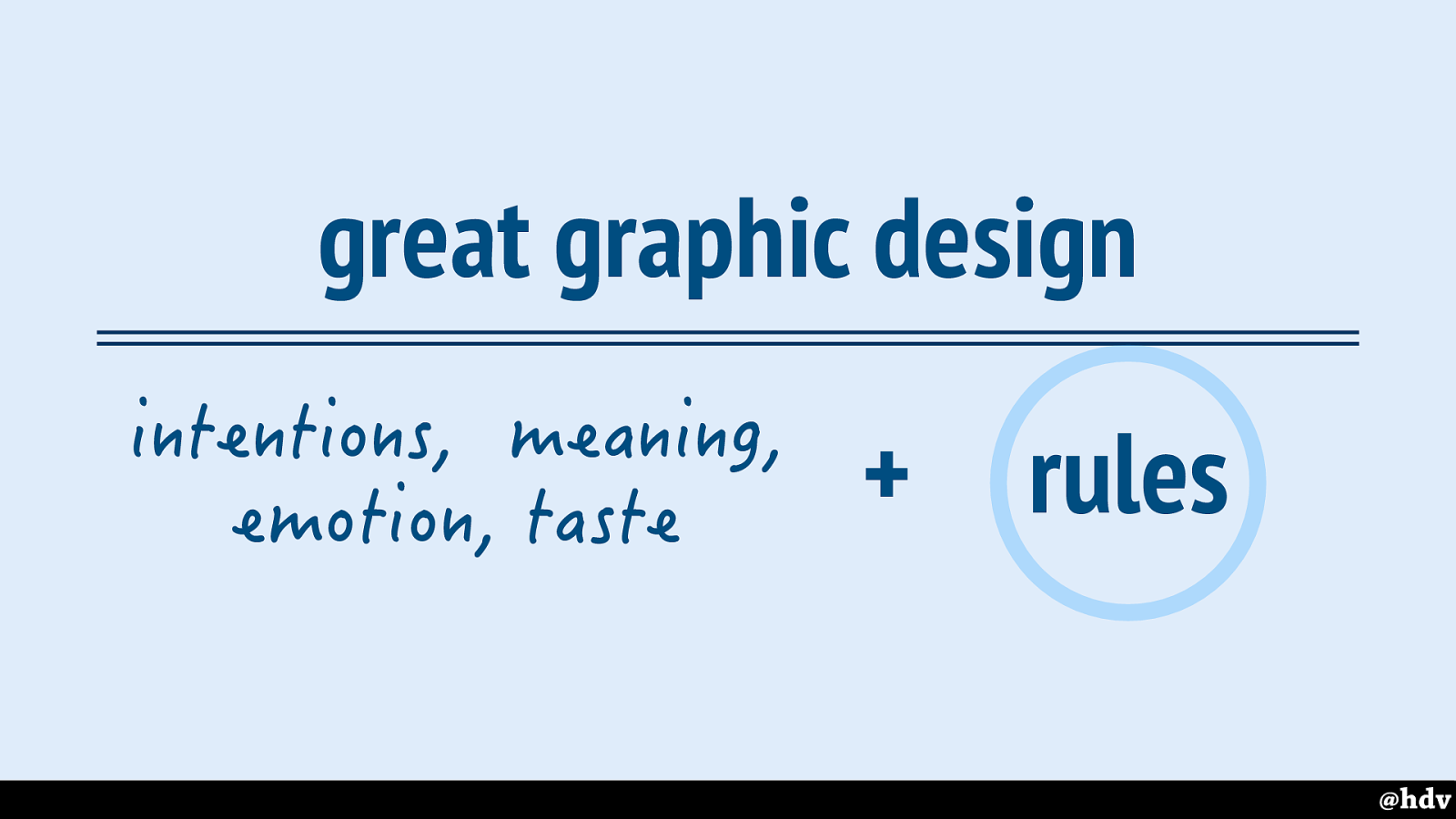
Great graphic design is more than just following rules, it is rules combined with things that can't be measured: intentions, meaning, emotions and taste. Of the designer.
It is of course a subset of great WEB design, because that requires excellent usability, accessibility, et cetera. I'm just talking visual design now.
But anyway, rules is what I'll mostly talk about it in the rest of this talk, because that is the part that CSS can help with.
Slide 51
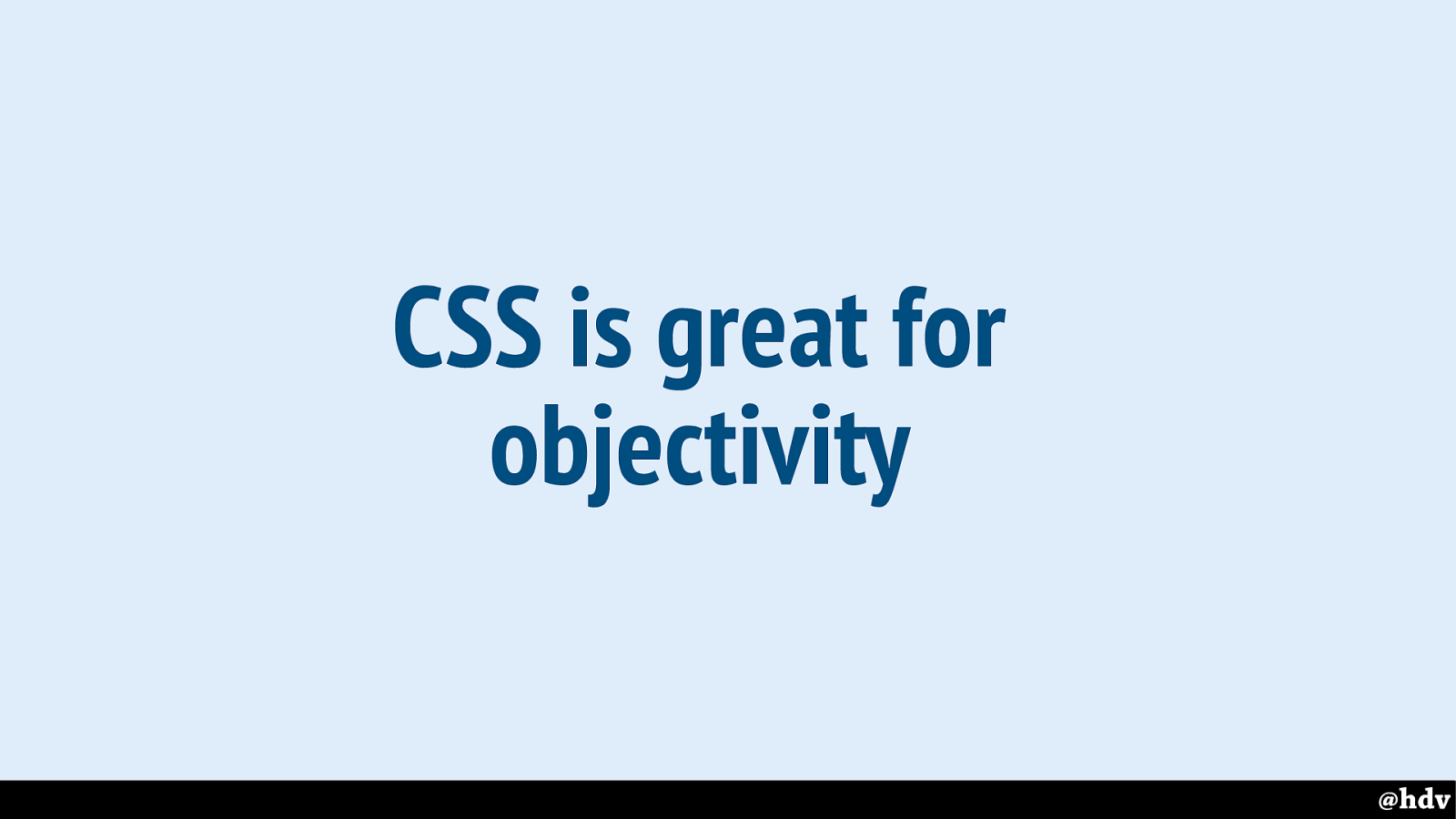
CSS is awesome for rules, and we will look at some great CSS rules in a minute.
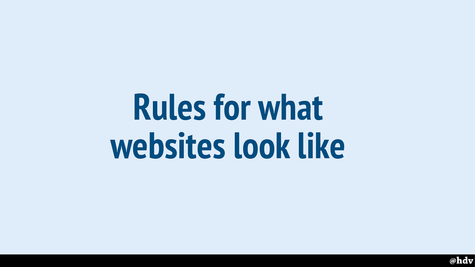
Slide 52
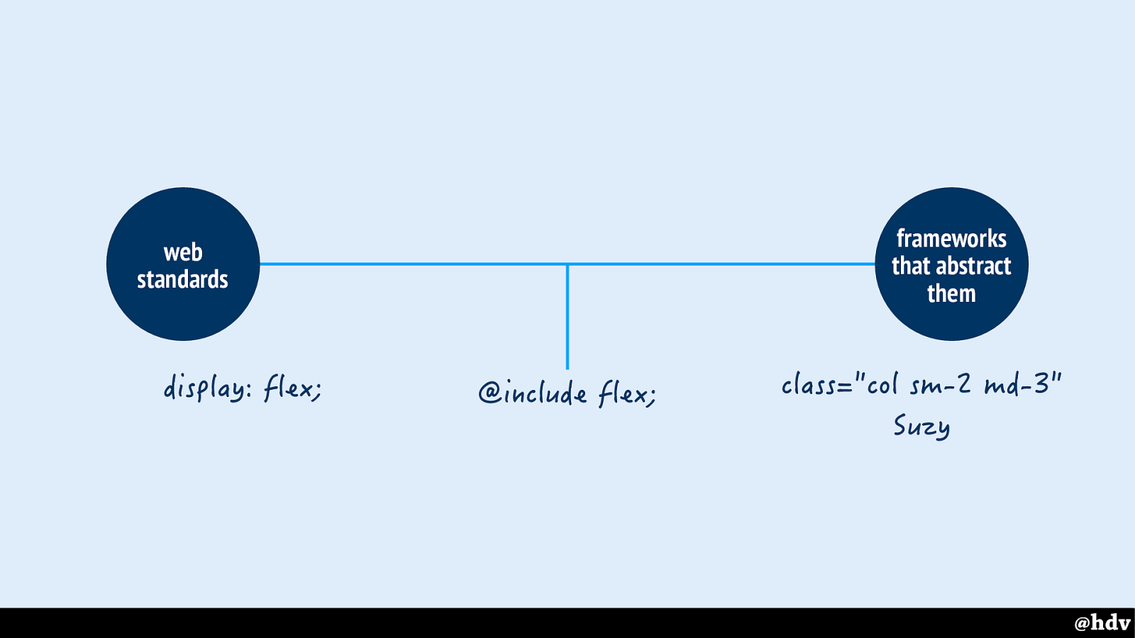
My vision on CSS is that it is a language to set rules for what websites look like.
Slide 53
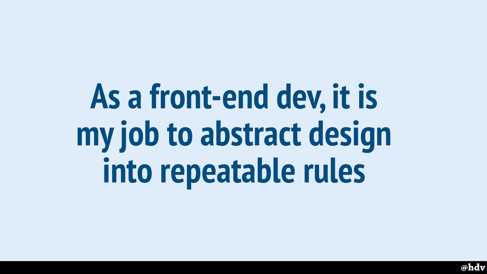
And that's a large part of my job as a front-end developer writing CSS. I take designs and turn them into repeatable rules. Trying hard not to take the life out of them.
Slide 54
So let's look at doing great graphic design on the web
Slide 55
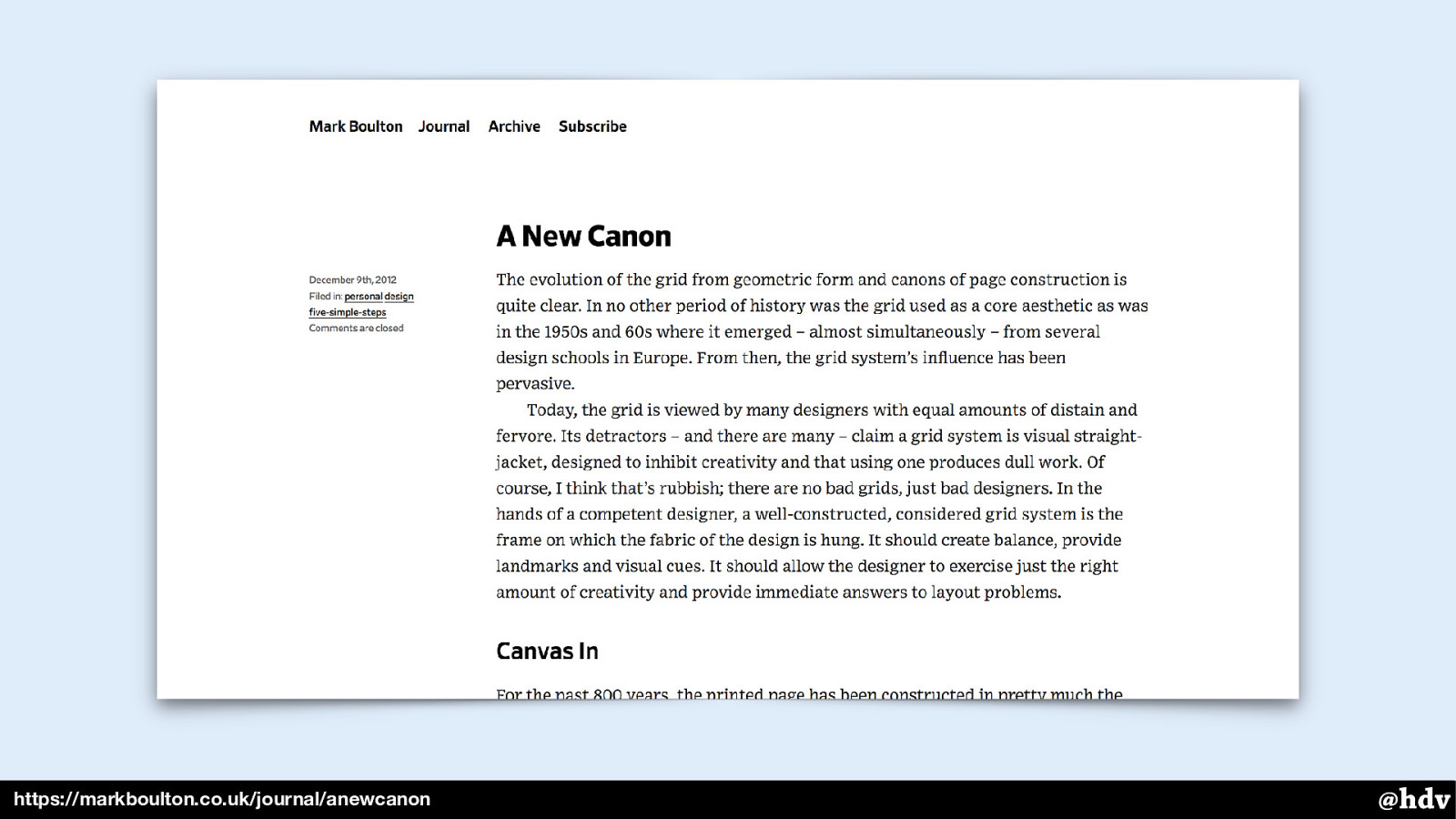
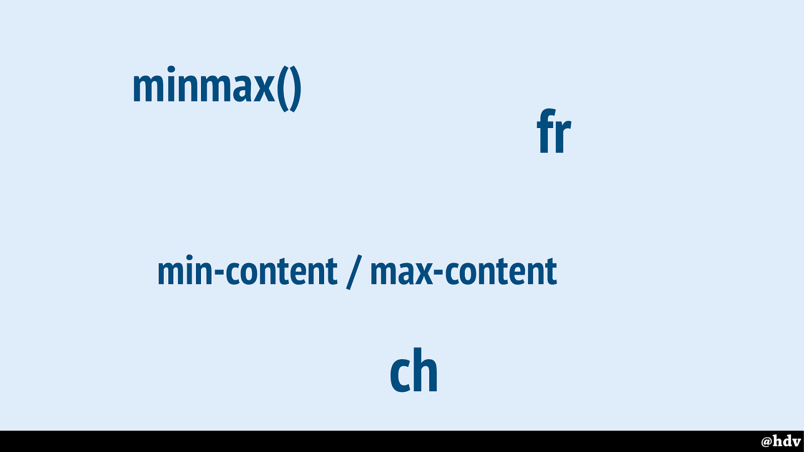
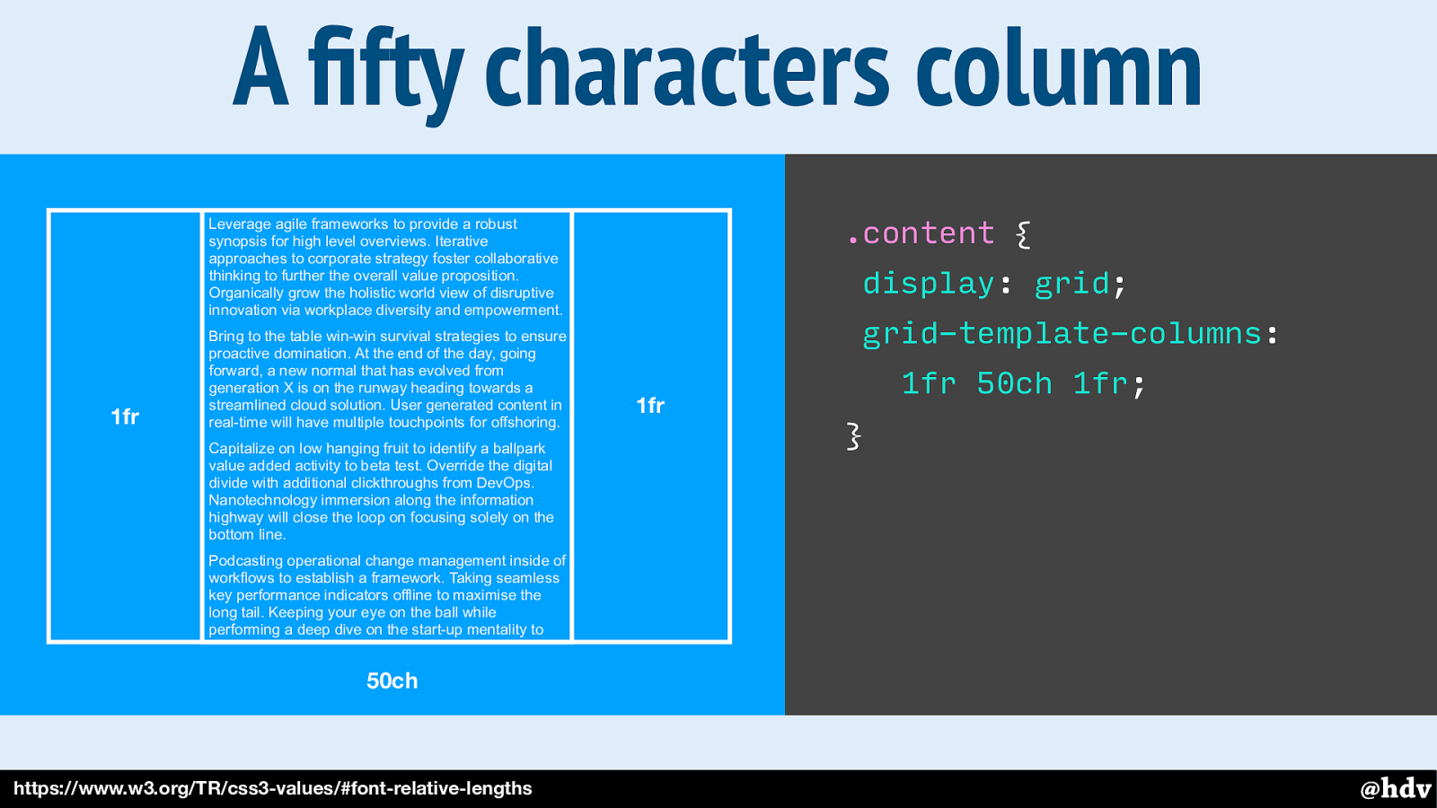
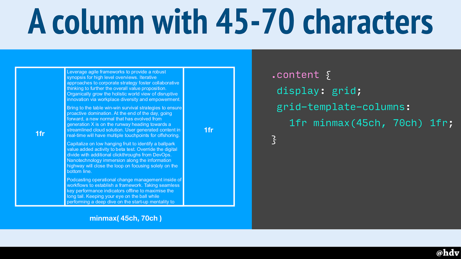
A lot has been written about doing great graphic design in CSS. In 2012, Mark Boulton already reapplied Tschichold's New Typography to the web in an article called The New Canon. A lot has changed since then, and a lot of the maths that he had to work out at the time, we can now leave to the browser.
Slide 56
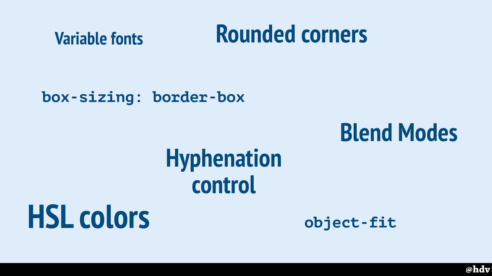
There have been many improvements in CSS recently, that make graphic design on the web easier.
Slide 57
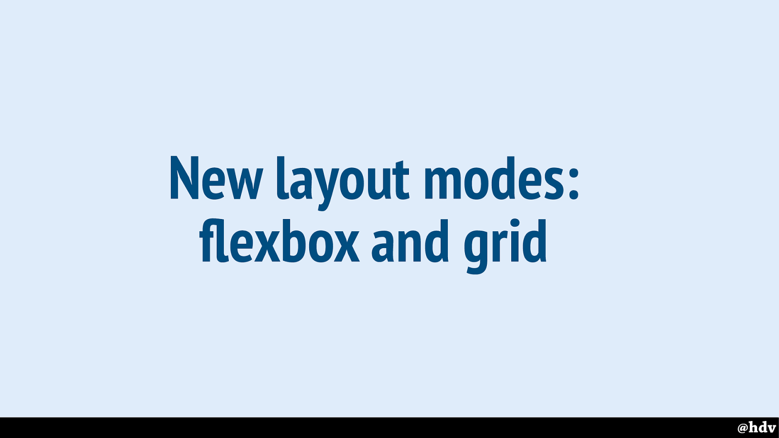
But I'll focus on layout. Because it seems that is where before we could not do a lot of things that make graphic design great. And now we can. Flexbox and grid are new and well-supported.
If you take away one thing from this presentations: these are the first non-hacky methods for doing lay-out on the web and they are built in right into the browser. Into all recent versions of all browsers. They'll let us define what we want, and make the browser deal with the mathematical fiddly bits.
Slide 58
So equal heights is one thing that has traditionally been difficult to deal with. I've had this often, where I was building a design that had three perfectly lined up columns, each with the same content.
Slide 59
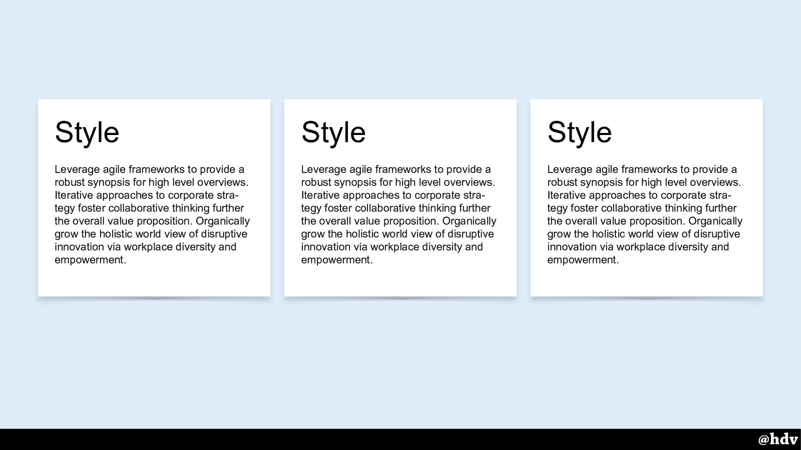
Something like this. Fits perfectly.
Slide 60
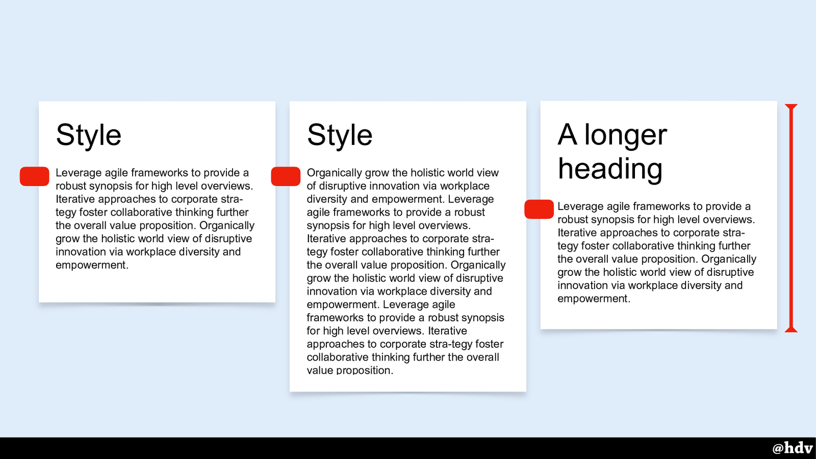
Being the naughty front-end developer that I am, I would add some different content to them, and then they would no longer be the same height. Designer in shock, and I would try to explain ‘this is how the web works’. Super difficult argument to make.
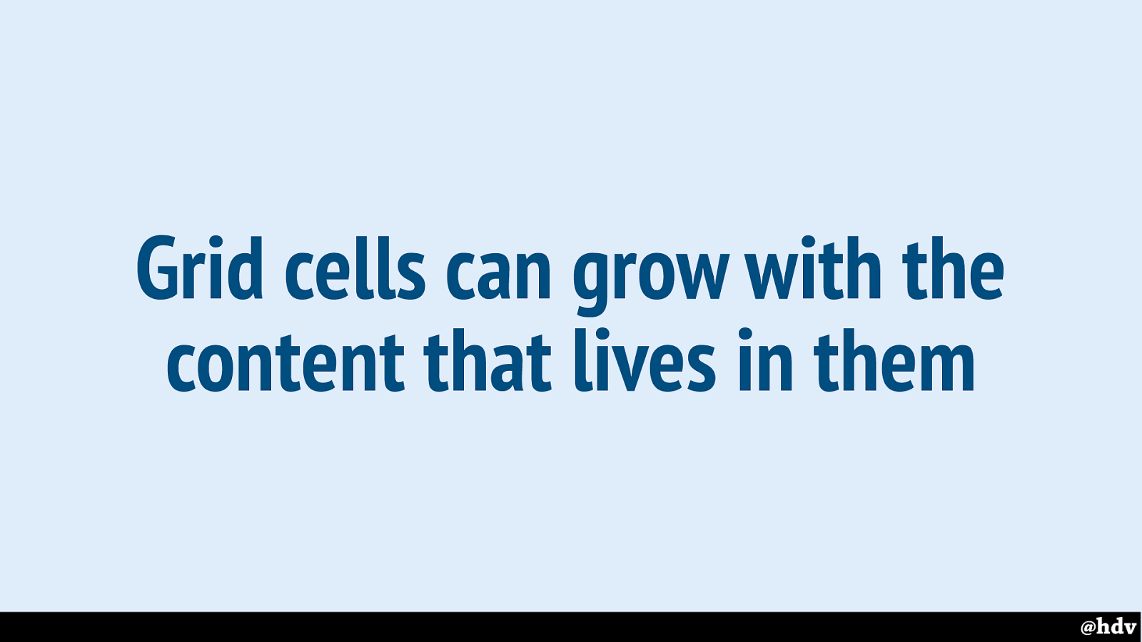
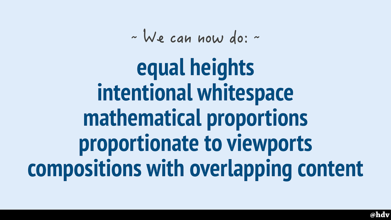
This is fixed in our two new layout modes. Both grid cells and flex items have a default size of ‘stretch’, which makes them fill all available space.
Slide 61
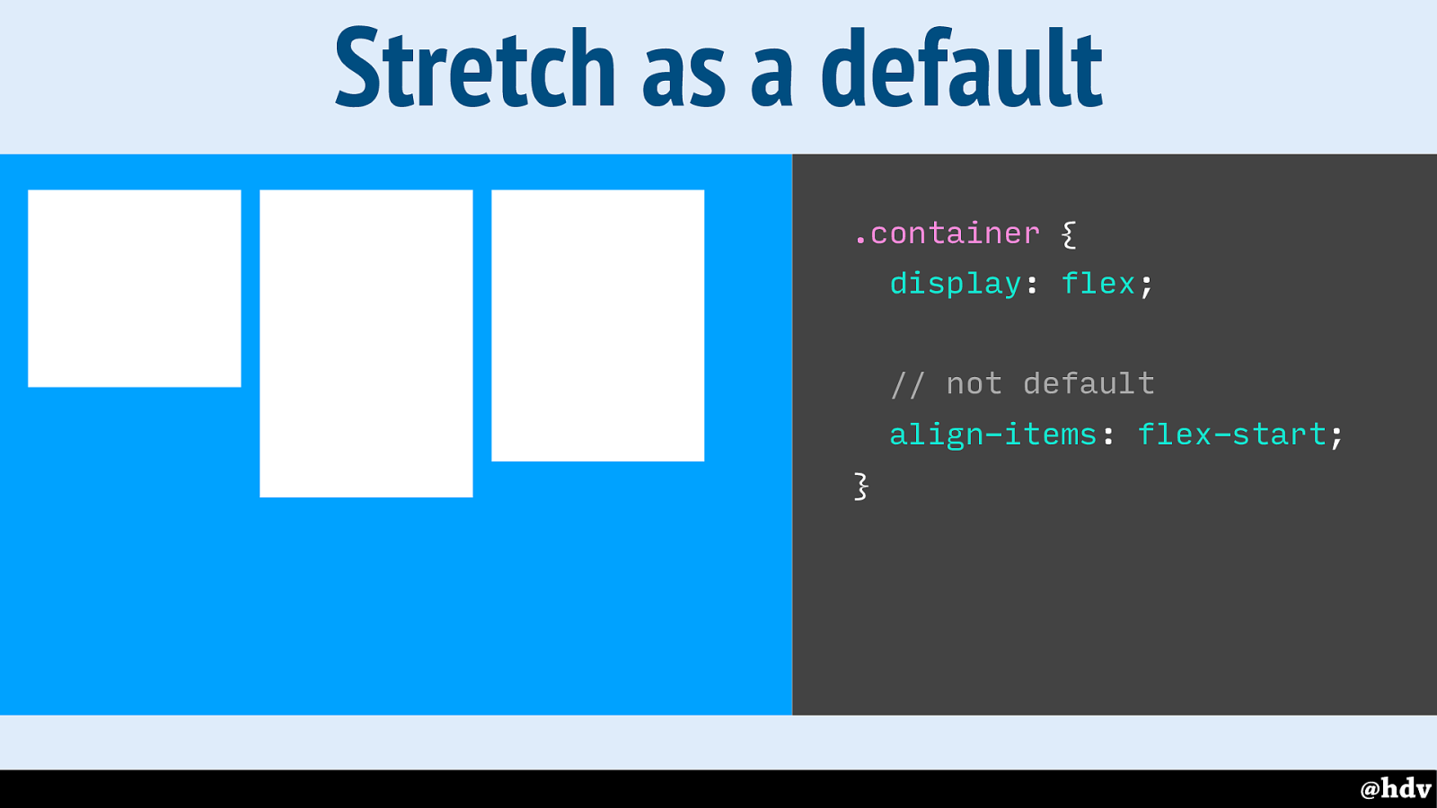
Let's look at this in practice. So because grid and flexbox allow left over space to exist and be reassigned, we can choose where we want it. So here we have three items aligned to the start of the container.
Slide 62
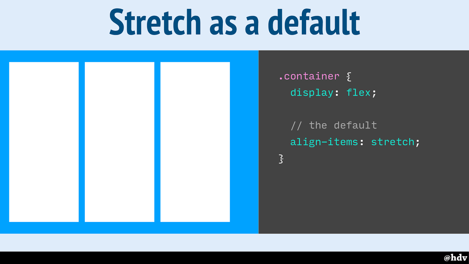
With stretch, these items will take all available space. The 'stretch' value is actually the default, so by default these things get the same height. (And the size of the container depends on the tallest item)
Slide 63
A large part of what makes great graphic design, I think, is composition. It's about where you put things and which places you leave empty, intentionally.
Slide 64
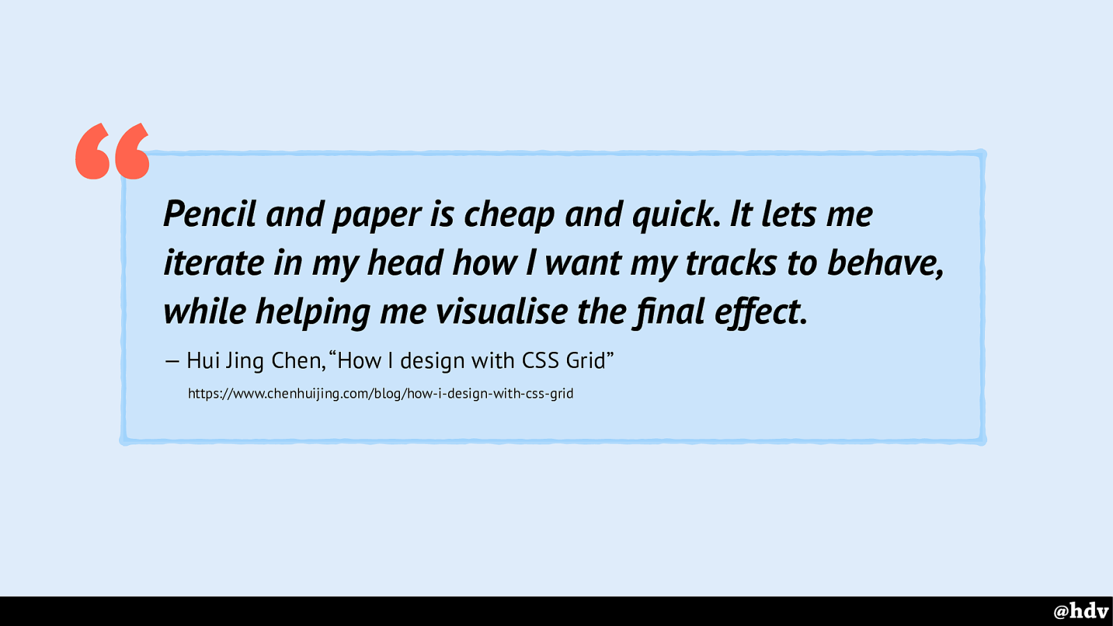
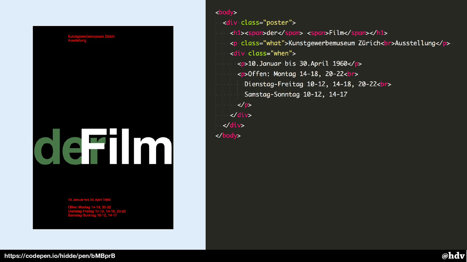
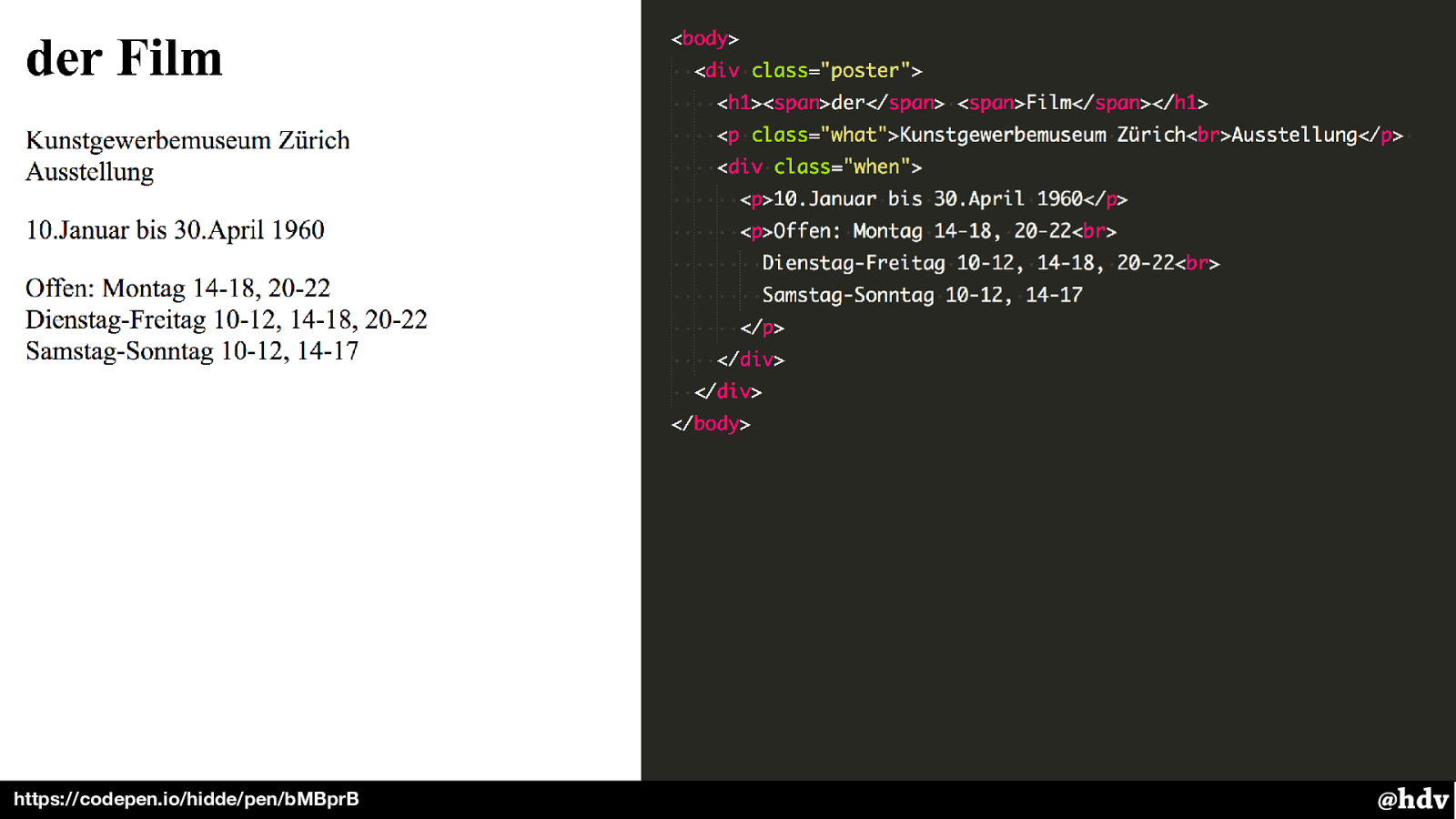
The best article I saw recently about designing with Grid Layout, is written by Hui Jing Chen, she explains that when building grid layouts, it helps her a lot to sketch them out on paper.
Slide 65
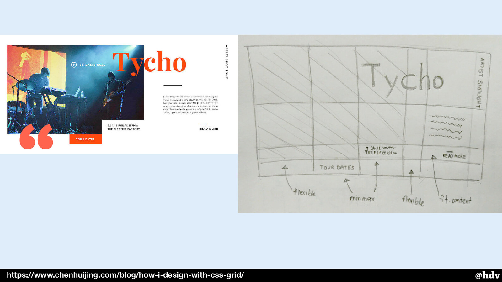
Here's the example she shows in her article: the design on the left and the sketch on the right.
Sketching is also a great approach if you're trying to have whitespace in your design, if you need to decide where it needs to go.
Slide 66

So here's a bit of content in its default mode. With no further CSS applied to it, it just takes up all the available space in the viewport.
Slide 67
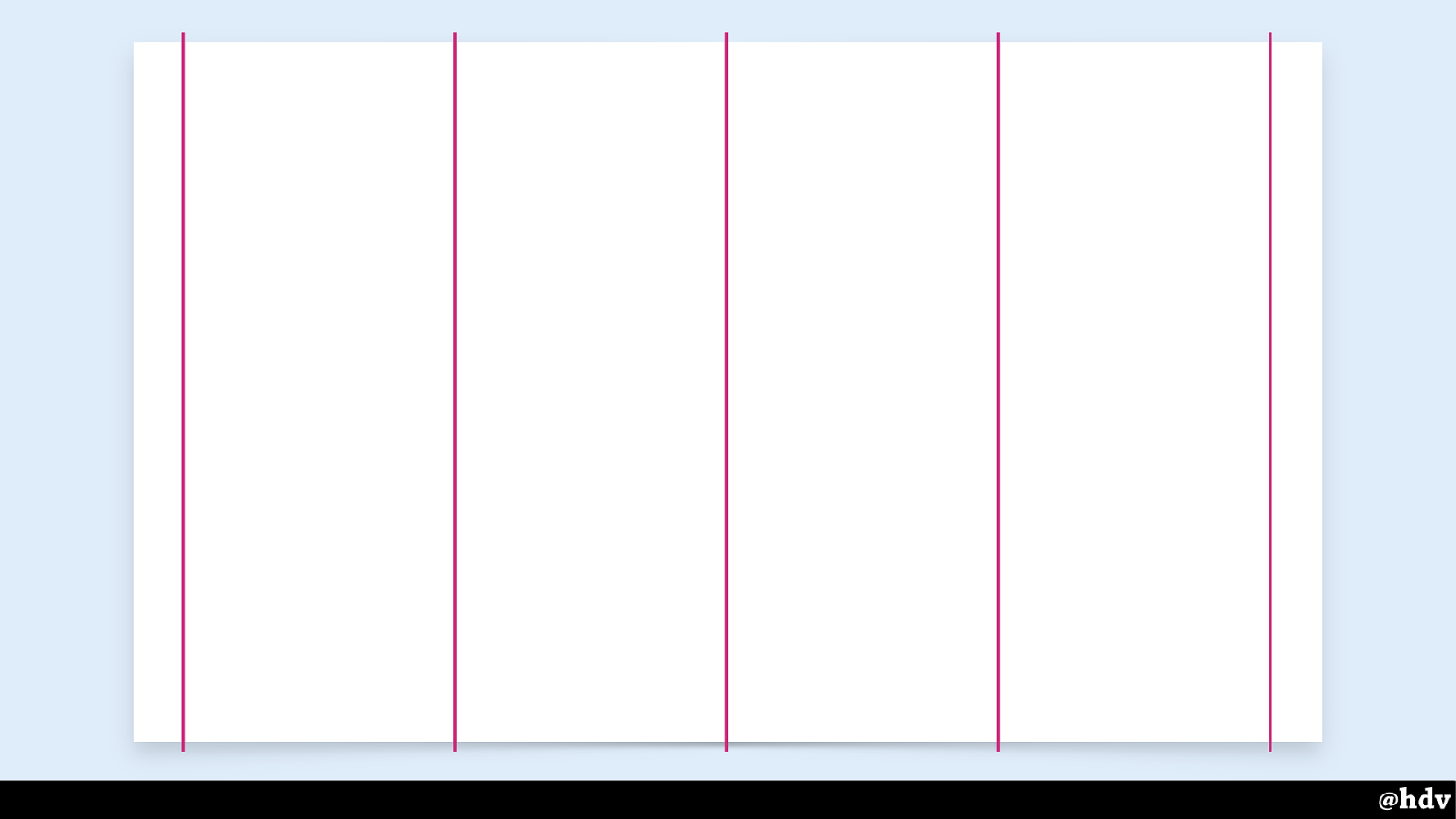
Maybe we want to organise this layout into four columns.
Slide 68
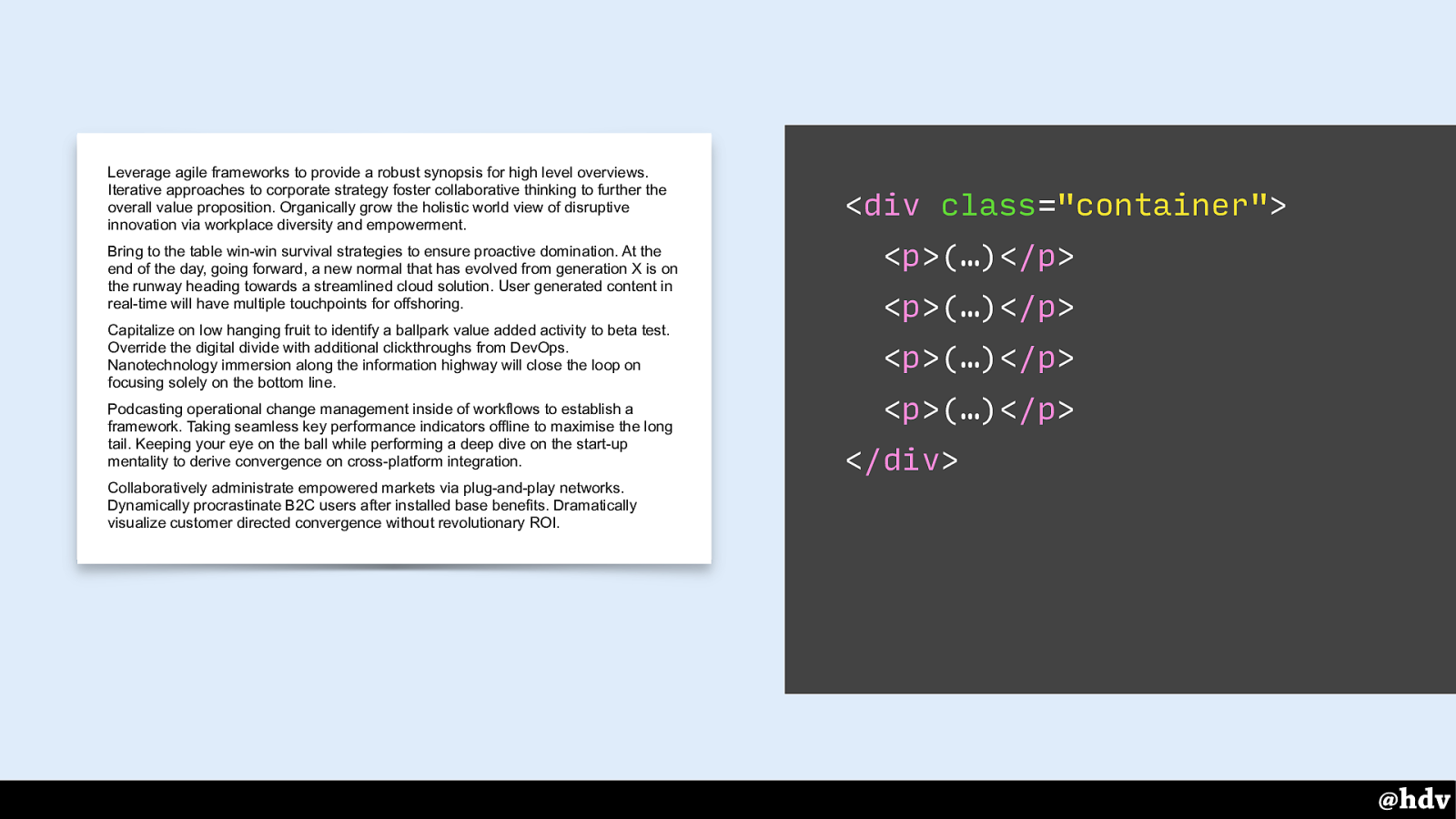
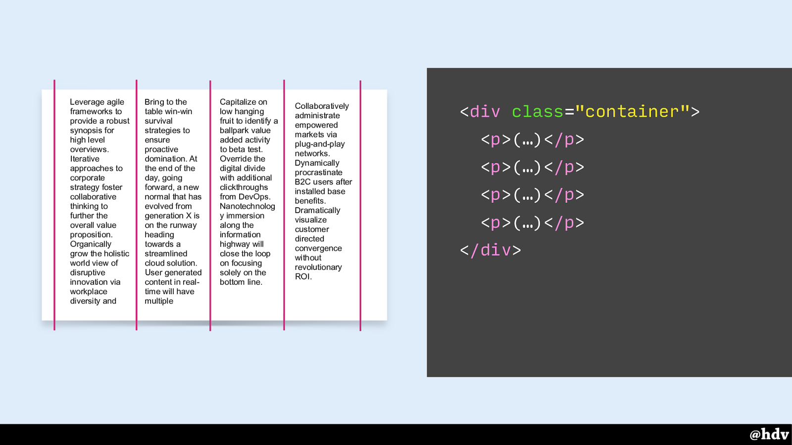
This is the page as I showed it before, it has four paragraphs of text. So: four columns, four paragraphs.
Slide 69
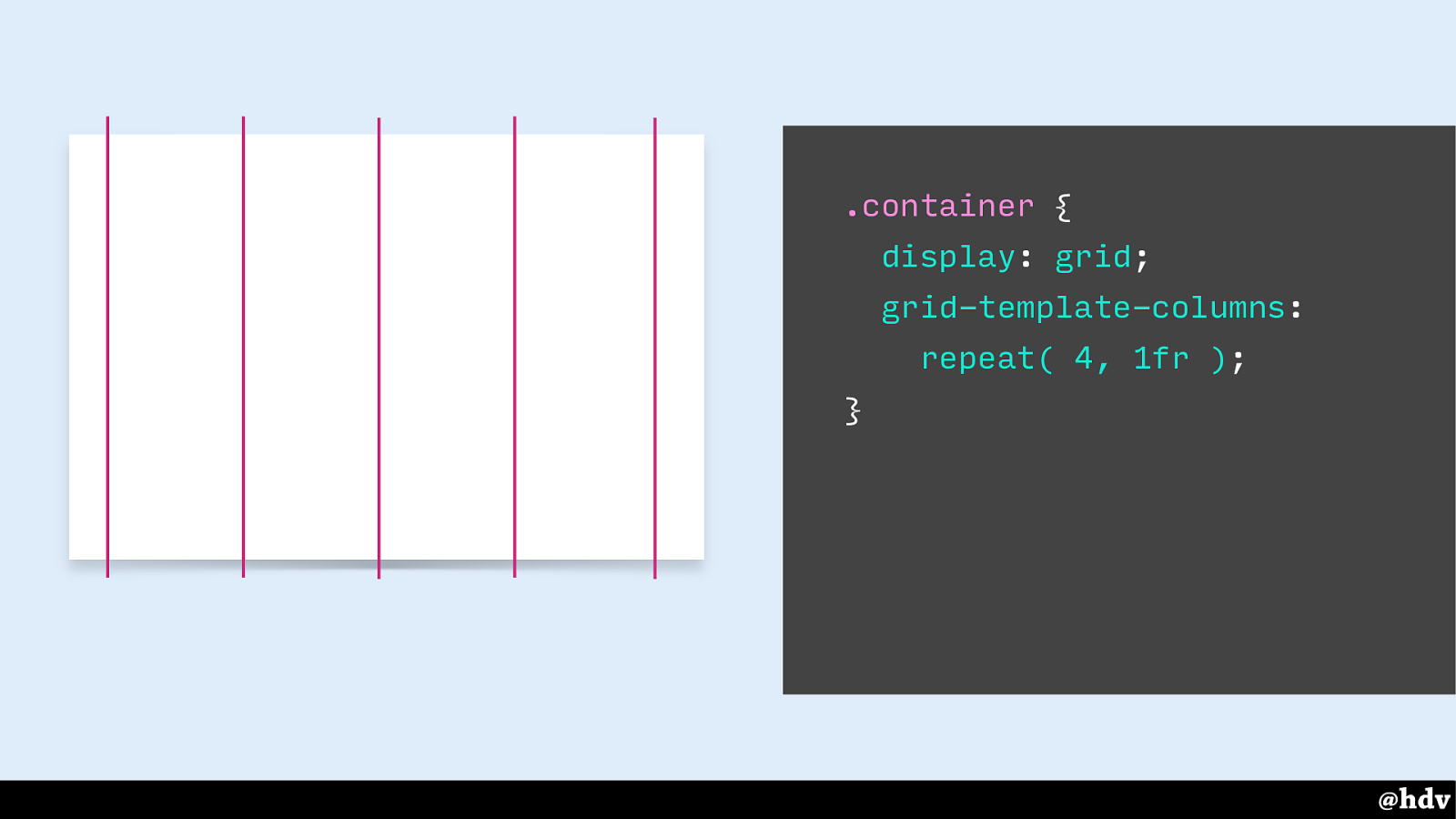
With CSS, we can turn the container into a grid container. That's what happens as soon as 'display: grid' gets applied to the container, it then becomes a grid container. With the second property, we set it up so that there are 4 columns that each take equal space. So we have four columns, four paragraphs.
Slide 70
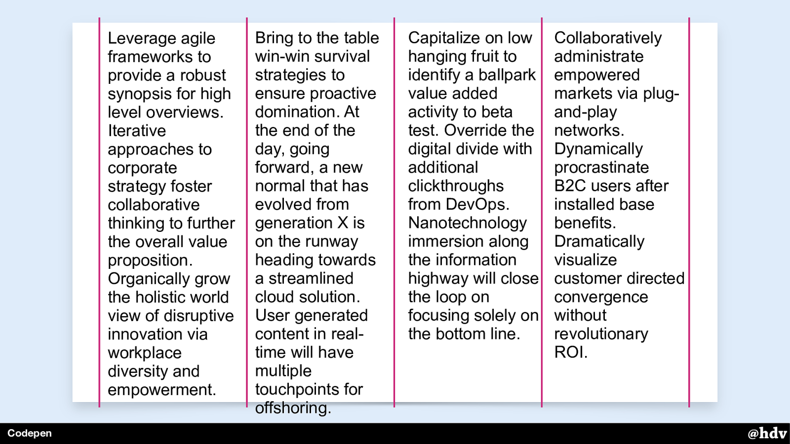
Auto placement will put each of these paragraphs into the first available column. So the first paragraph goes into the first column, the second goes into the second column.
Slide 71
Each paragraph goes into a column. This is because they are direct children of the grid container, and direct children become grid items.
What if we wanted to group them and put them all into one column? We can do that by wrapping the paragraphs into one element.
Slide 72
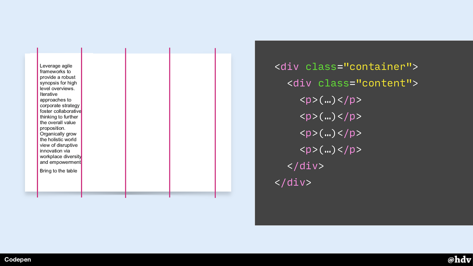
Now that one element is the only grid item and it goes into the first available container.
Slide 73
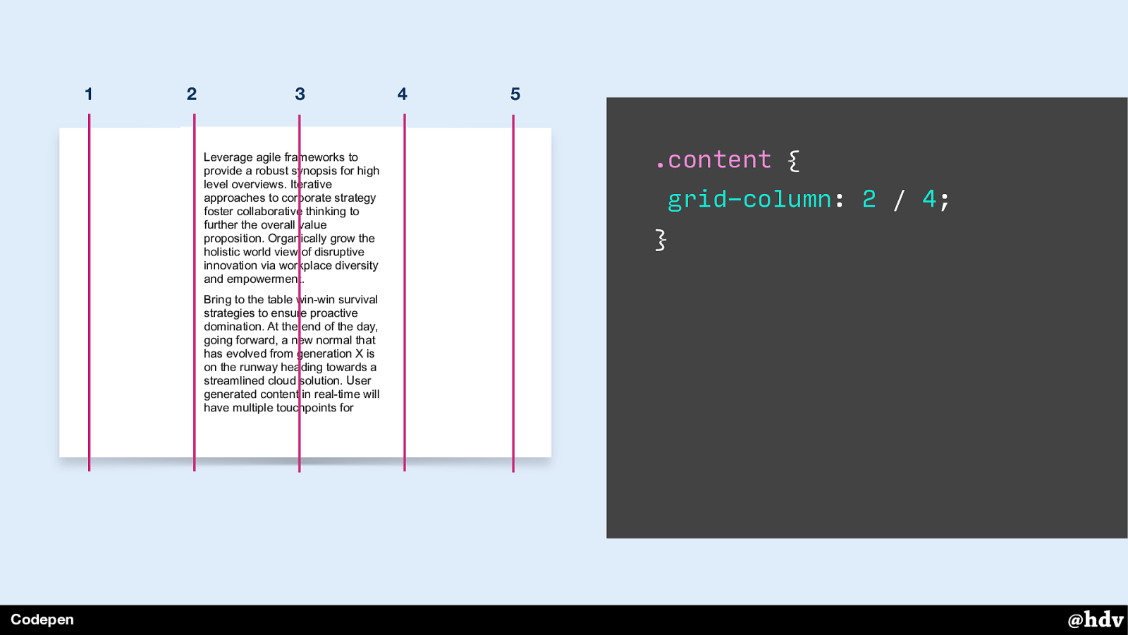
Grid Layout also lets us intentionally place content in specific grid columns. For example, we can put content into the second and third column. Note that with this syntax, we're putting content between numbered grid lines.
Slide 74
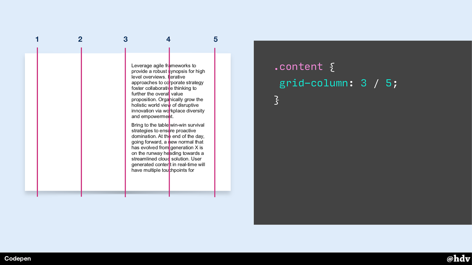
Or in the two last columns.
Slide 75
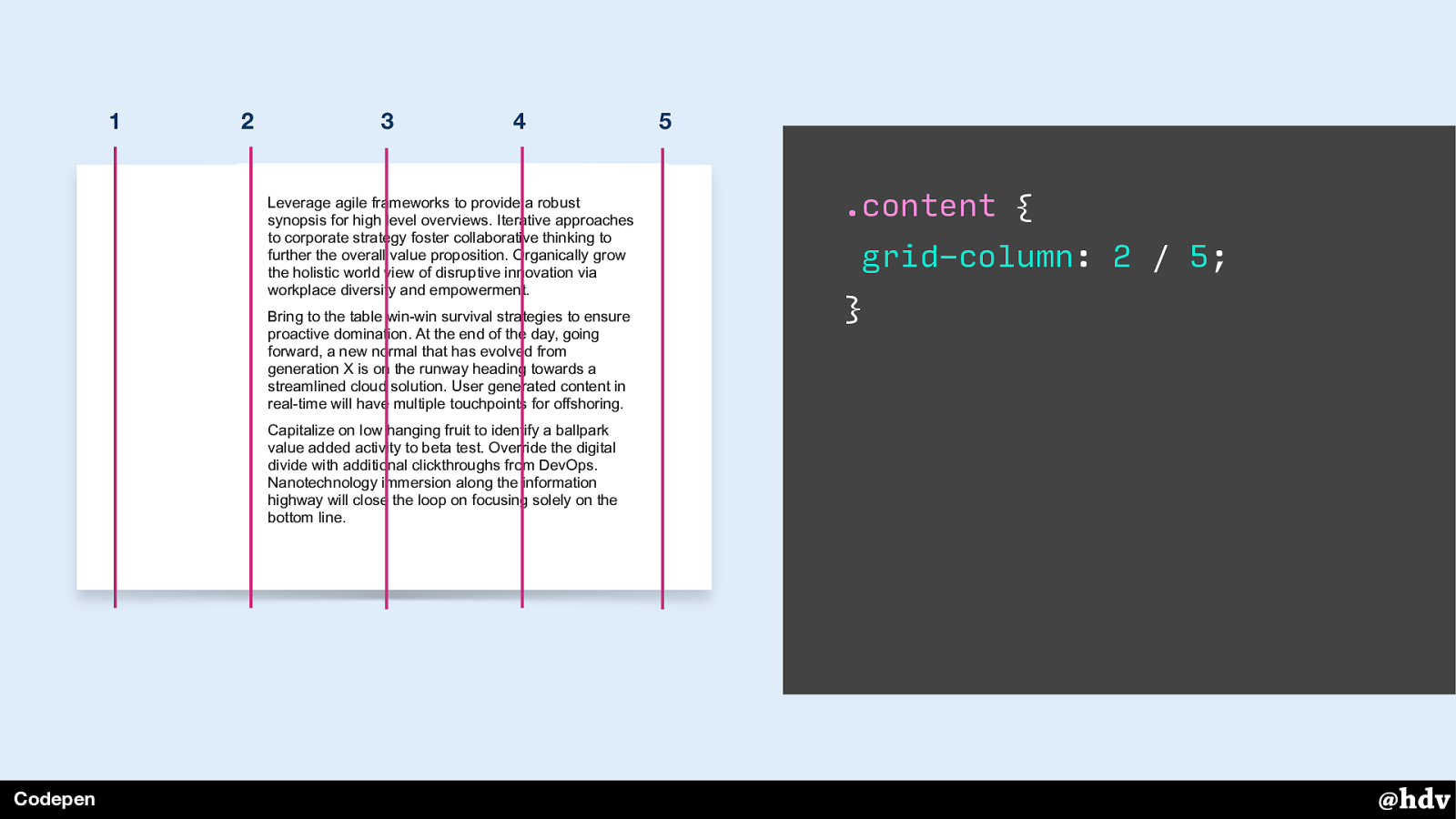
Or three columns, that also works.
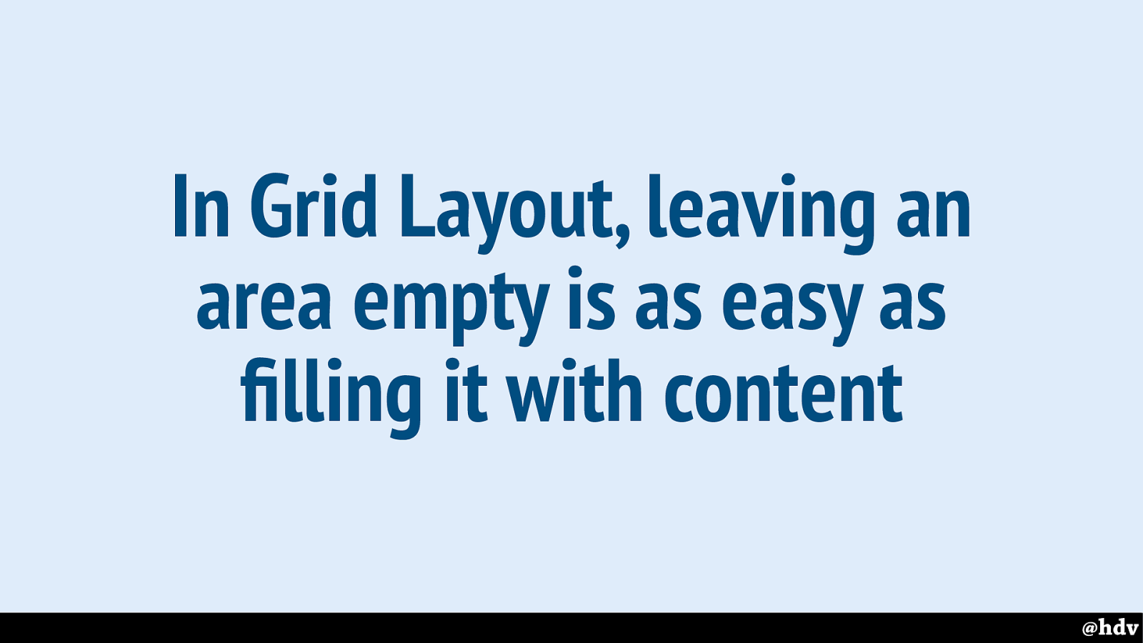
Slide 76
The point is, in Grid Layout it is as easy to fill parts of the grid with content as to leave them empty and have whitespace. The whitespace will stay, we don't need to add content to them for them to remain visible.
Slide 77
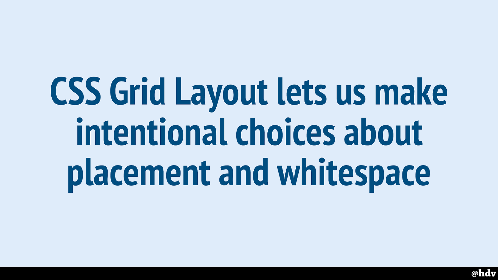
Old graphic design heroes talked about making deliberate choices about whitespace and where to put things, how to organise things. CSS Grid Layout is the first thing in CSS that brings that kind of intentional choices to the web.
Slide 78
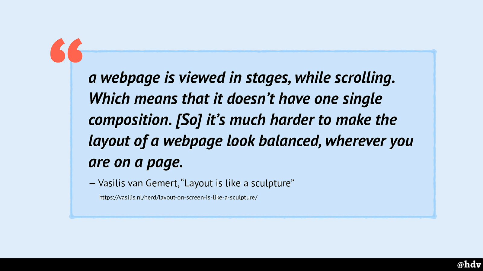
It's still the web, so intentional placement is harder than in print. It's all about composition, and that is arguably harder on the web. This is due to scrollbars, you never see the whole thing. Vasilis van Gemert wrote a great short post on this.
Slide 79
A second thing that we see the great graphic designers do a lot, is to use mathematical proportions to lay things out. Both flexbox and Grid Layout let us do this.
Neither is better than the other. Flexbox let us do this from items, Grid Layout from the container.
Slide 80
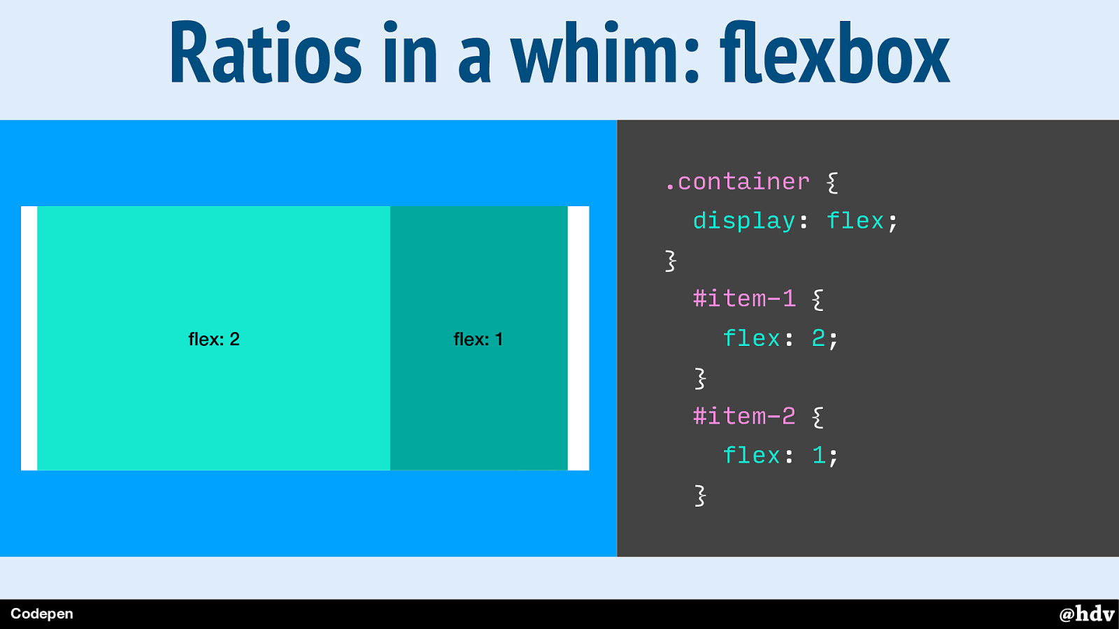
So flexbox lets us do proportions from the item.
When we set display:flex to the container, its direct children become flex items, which means we can give them flex properties. With flex, we can say something about their size in relation to the other items in the same flex container.
Slide 81
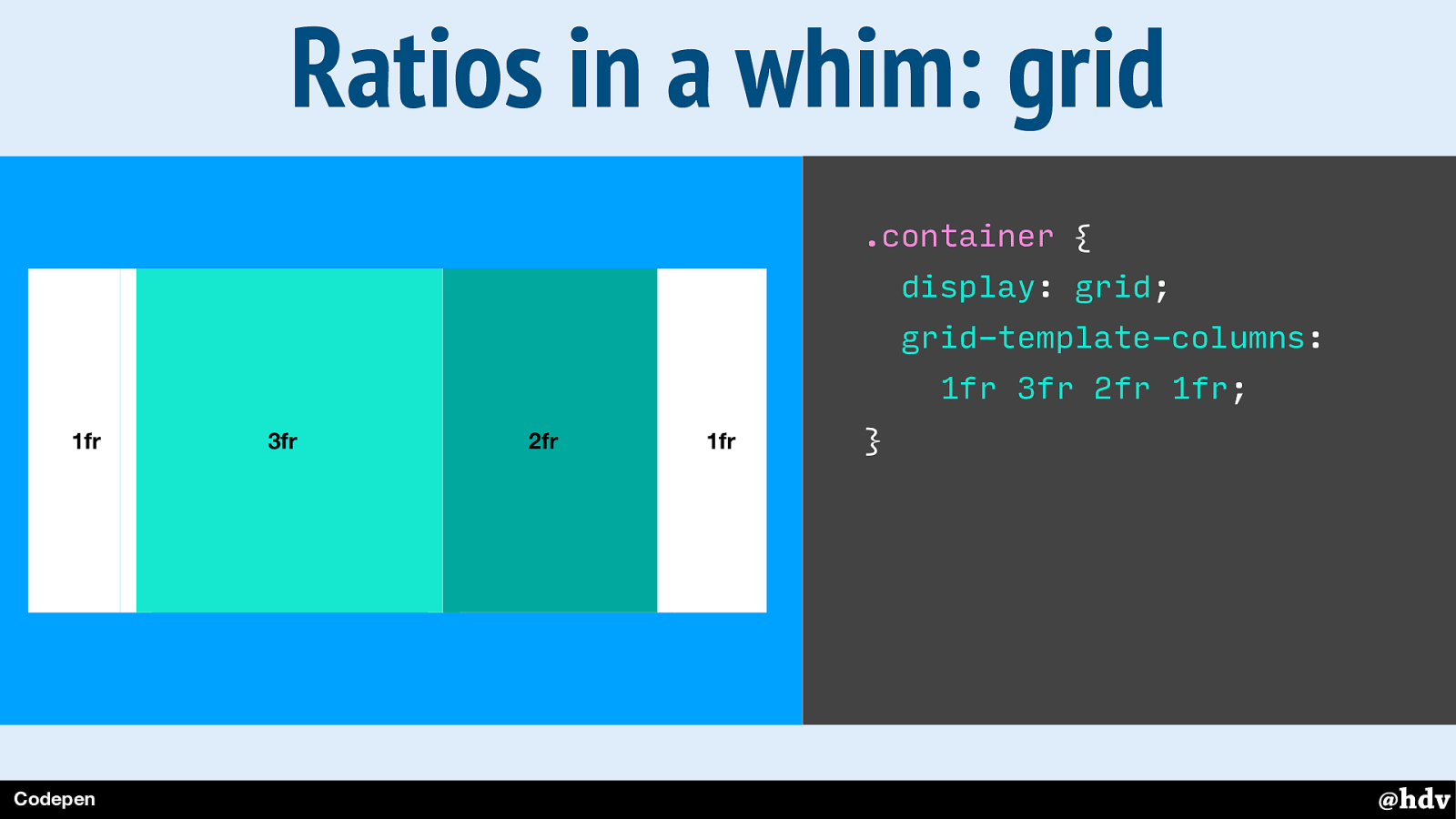
With Grid Layout, we work from the container, we define the layout on the container. In this example, I am creating a grid with some columns, so each value in that grid-template-columns property is one column. They are set with the fr unit, which means fraction. Basically, we're saying that the second column can be 3 times as wide as the first, the third twice as big.
Slide 82
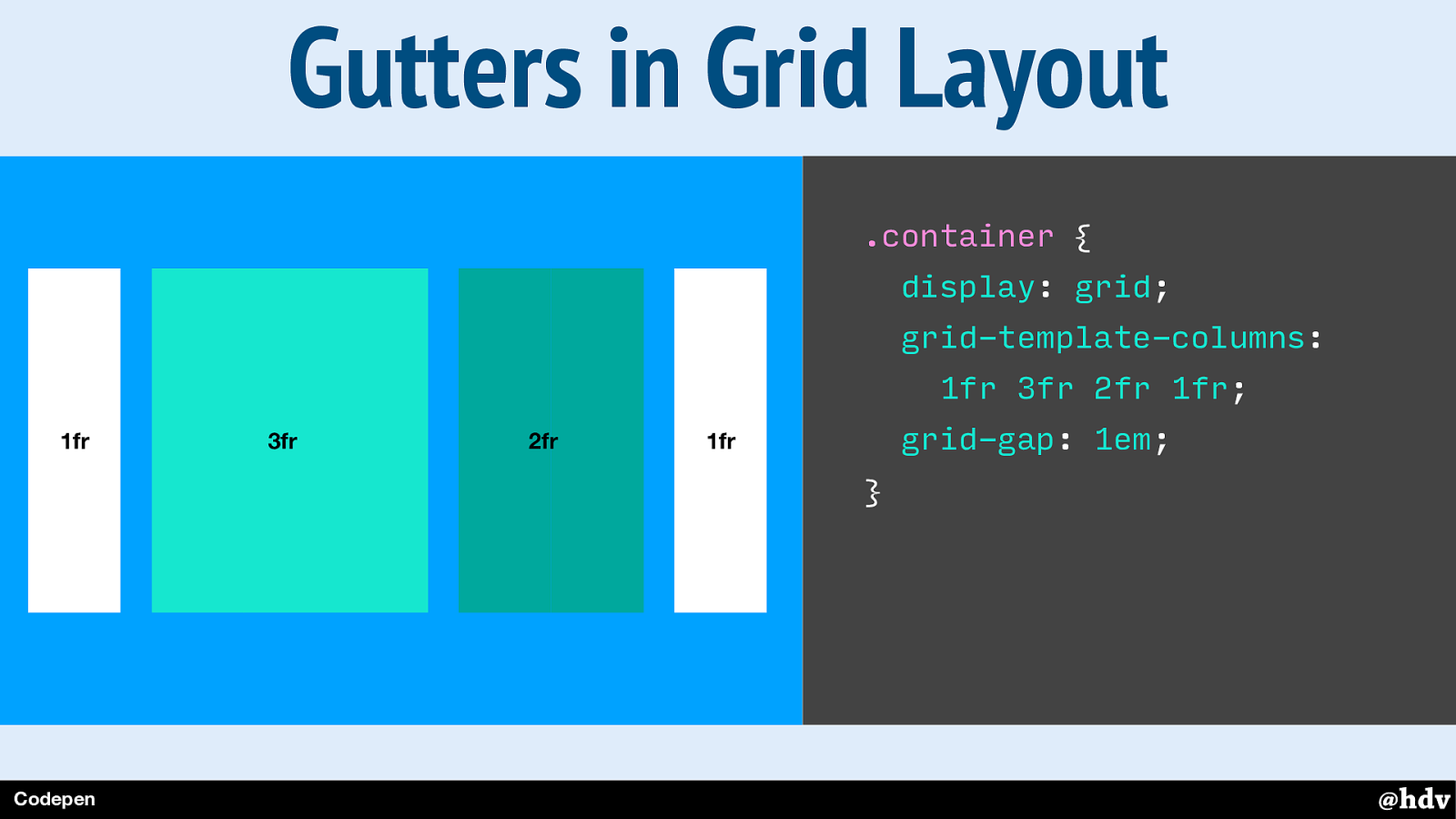
With grid-gap, you can also create gutters in a grid layout, they go in between your columsn and rows.
Slide 83
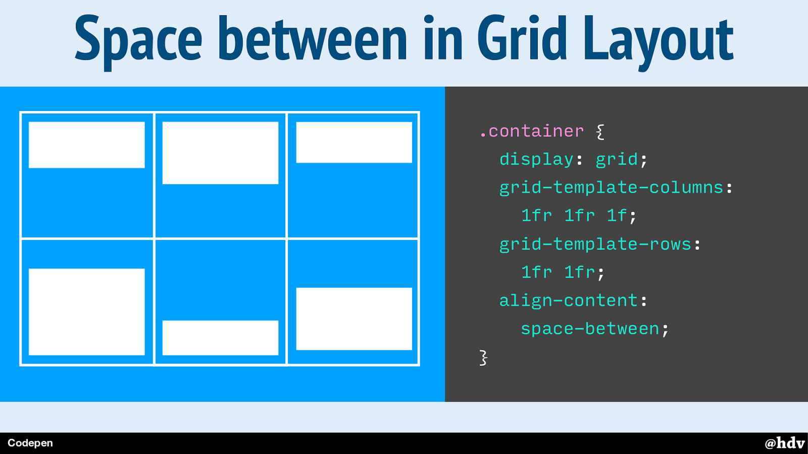
There are more ways for space between your content, for example align-content lets you have this.
Slide 84
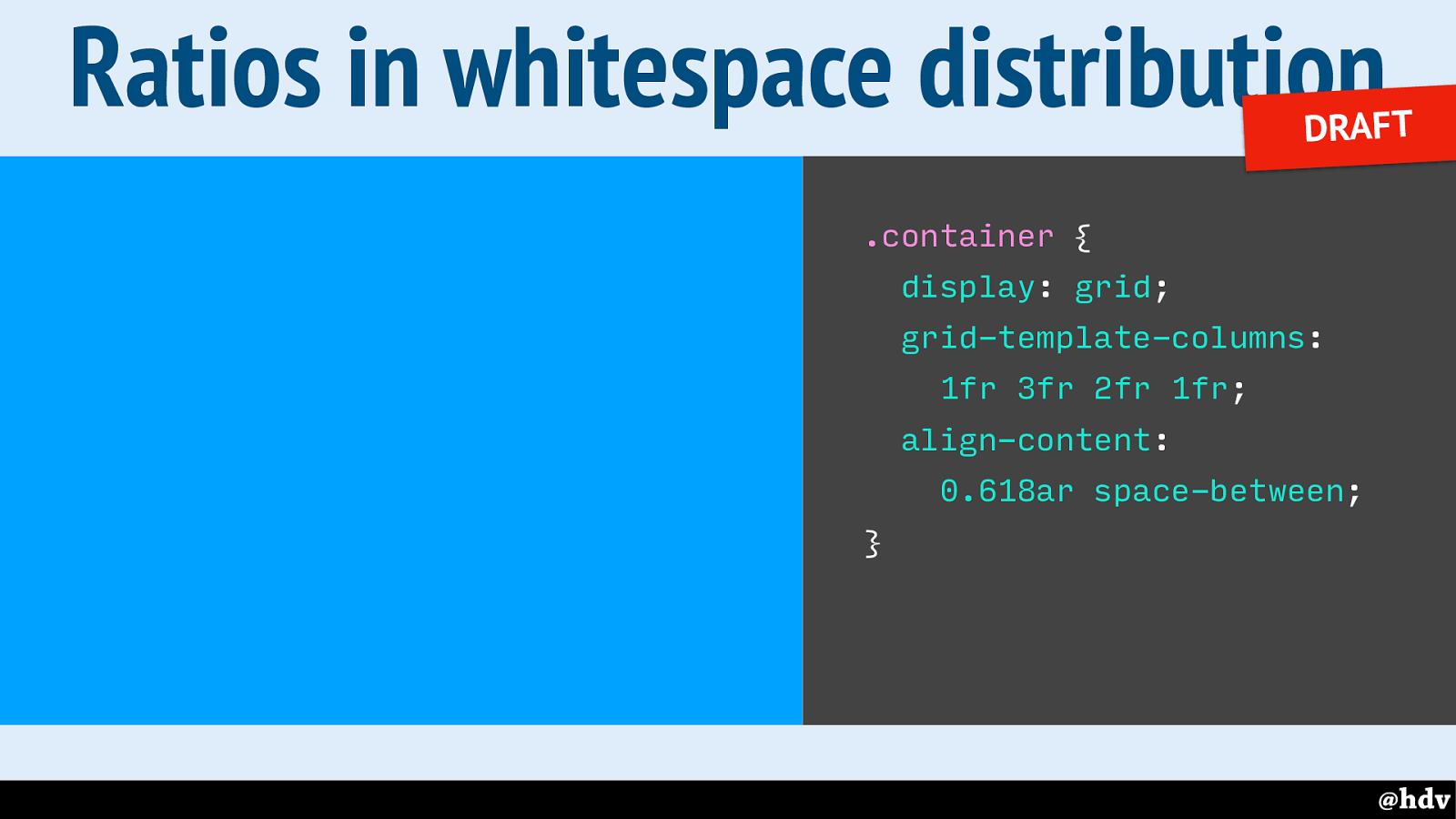
With the newly proposed ar unit, you could have the space between be a ratio between row and column gaps! So we can outsource even more of our maths to the browser. We come up with the rato, the browser will make it happen.
Slide 85
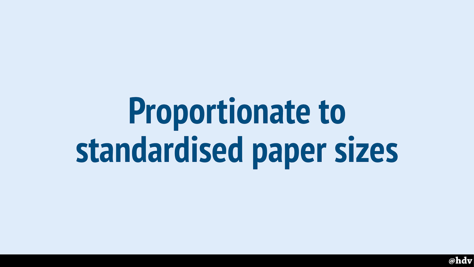
Another thing that kept last century's designers busy is standardised paper sizes. They based some of their grids on standard paper sizes. Can we do something similar?
Slide 86
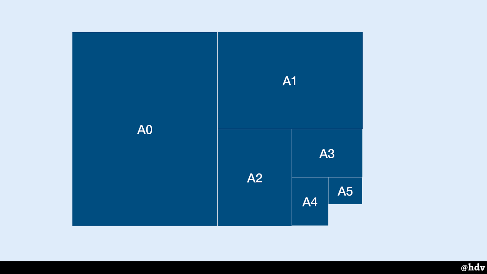
Paper sizes, for example.
Slide 87
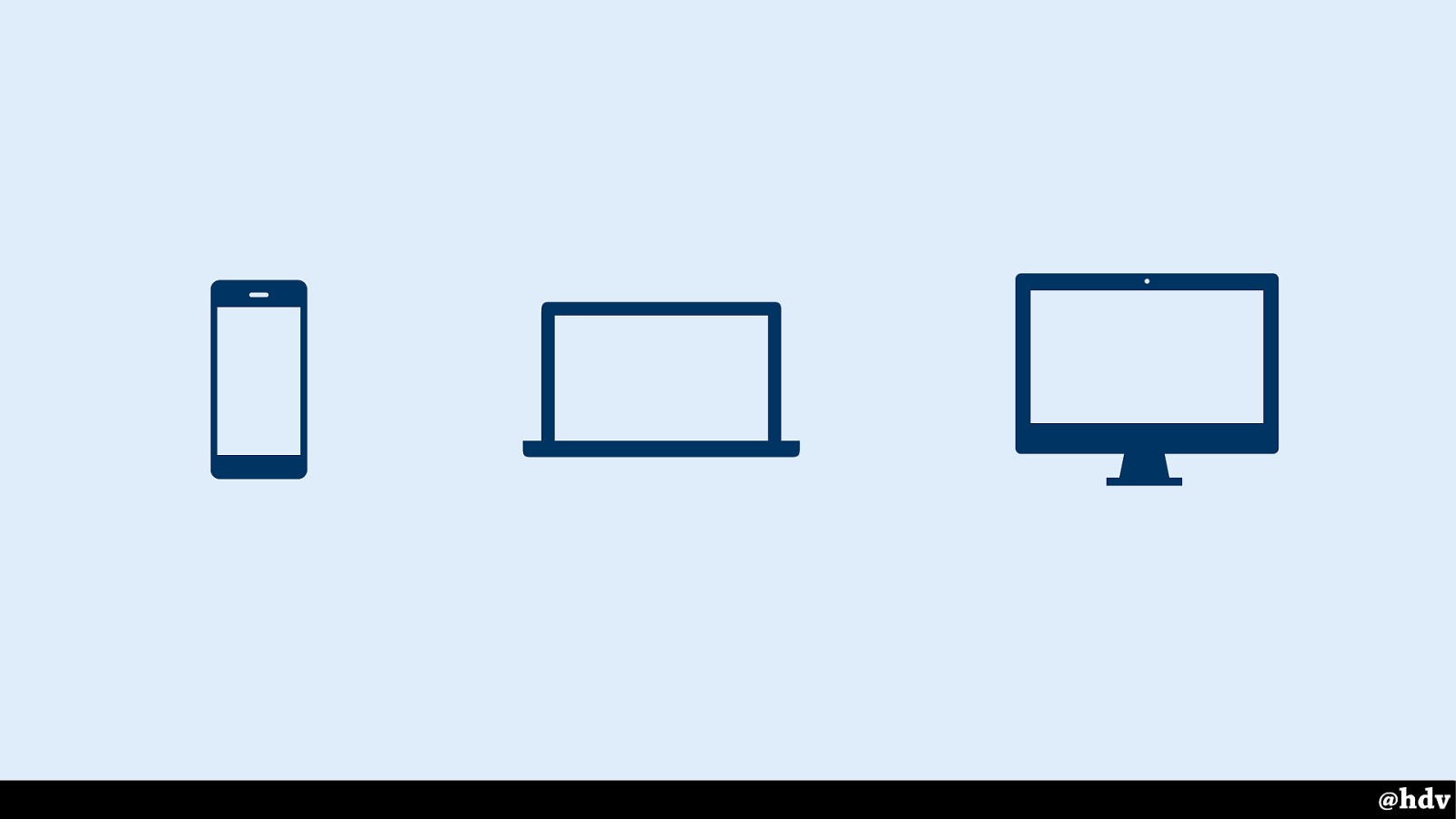
Here's our standard, right? Phones, laptops desktops. Boom. Easy. Or is it? Wouldn't it be great?
Slide 88
I still see this happen it at my clients, designers design stuff for specific viewports, e.g. one iPhone design, one iPad design and one MacBook design.
It is not the worst thing ever, it can even work well, as long as we keep in mind there's hundreds of possibilities in between.
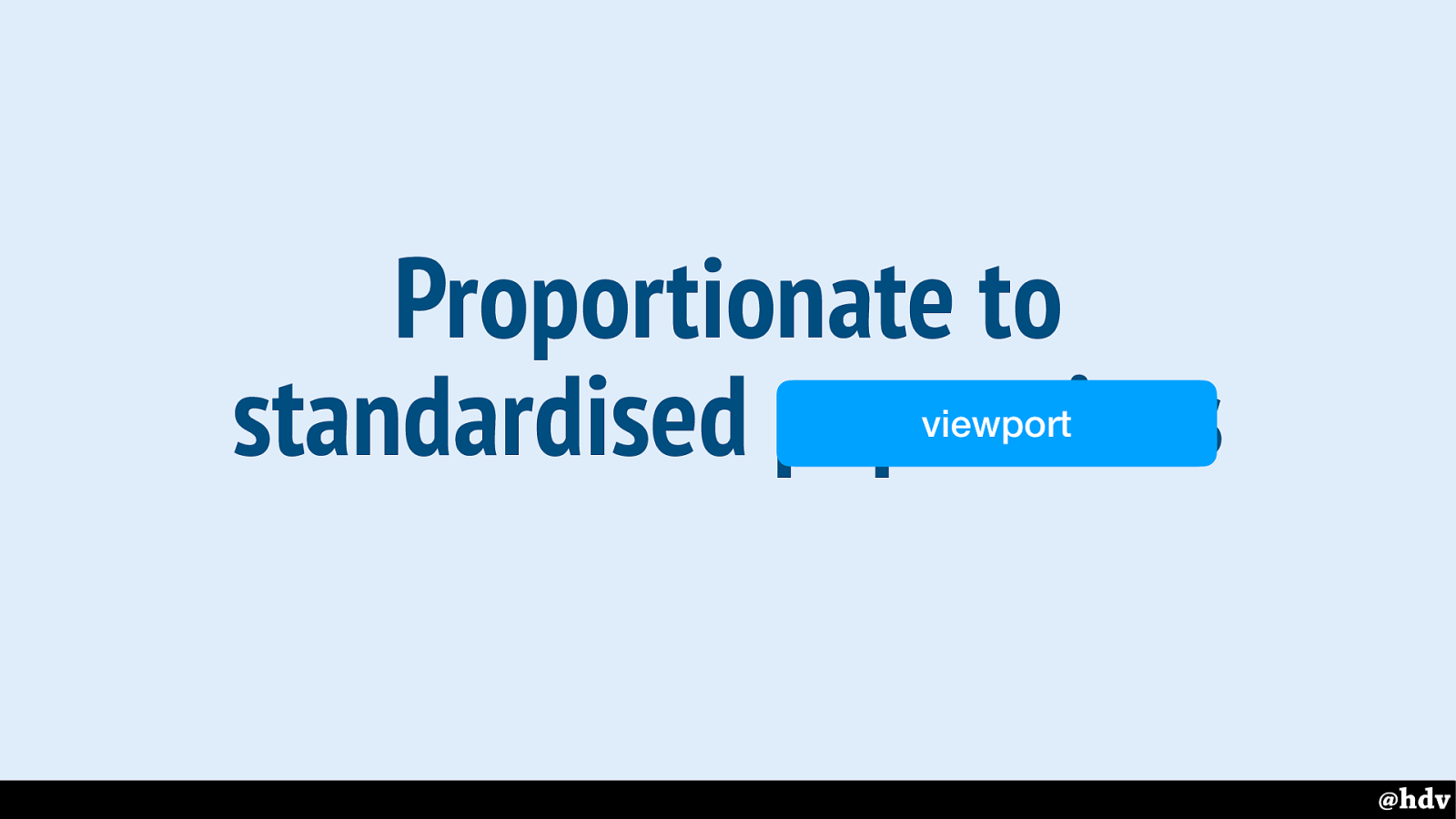
Slide 89
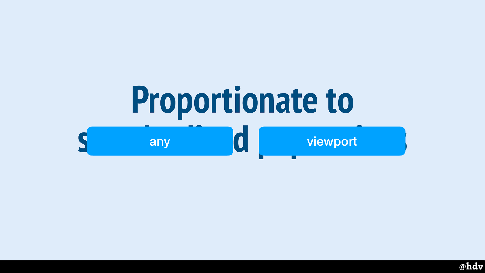
We're working for any viewport when designing for the web.
Slide 90

Viewport width is a number between 1 and 100 and basically a percentage of the viewport. Vh is the same for height.
Slide 91
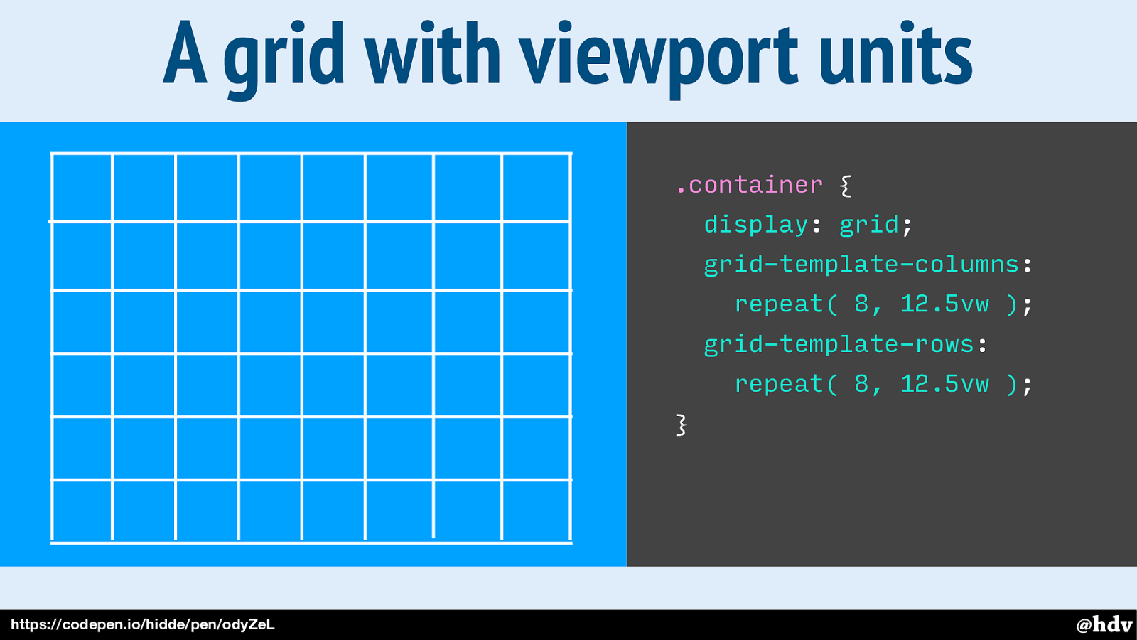
We can base our layouts on viewport units and create some ‘grid fields’, or as we call them in CSS, ‘grid cells’.
Slide 92
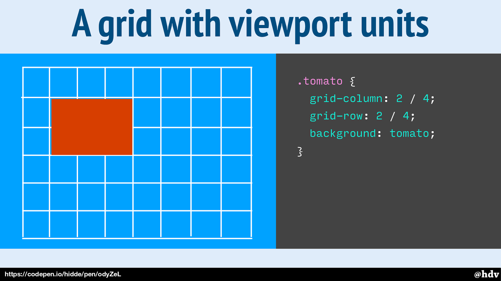
So if we add a div called tomato onto it, we can tell it which cells to occupy.
Slide 93
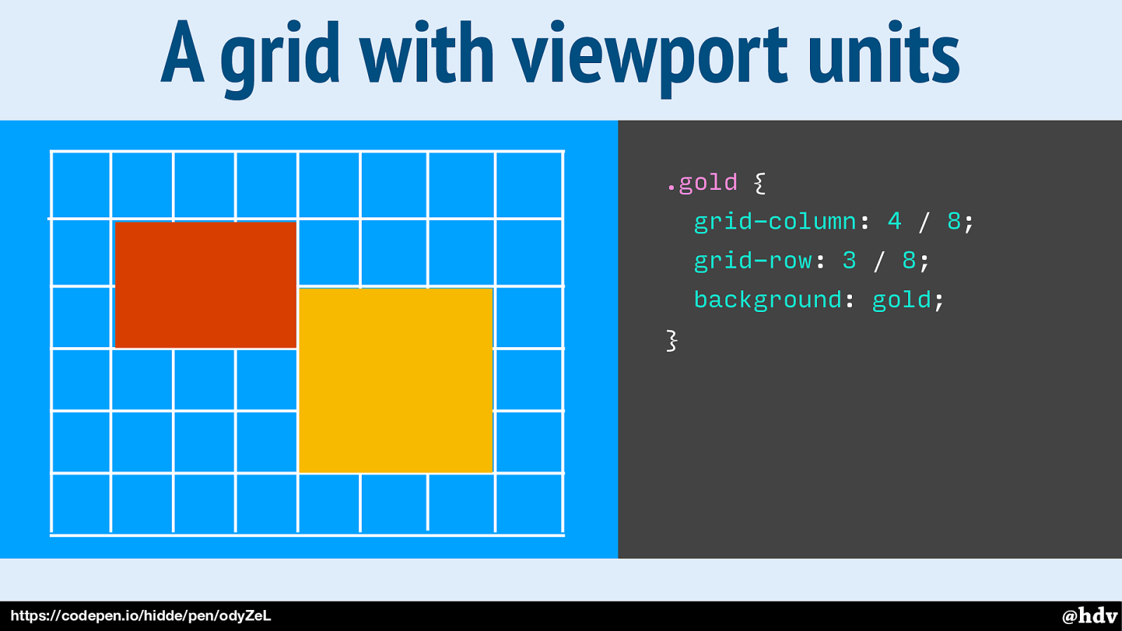
And let's add another div, called gold.
Slide 94
Slide 95
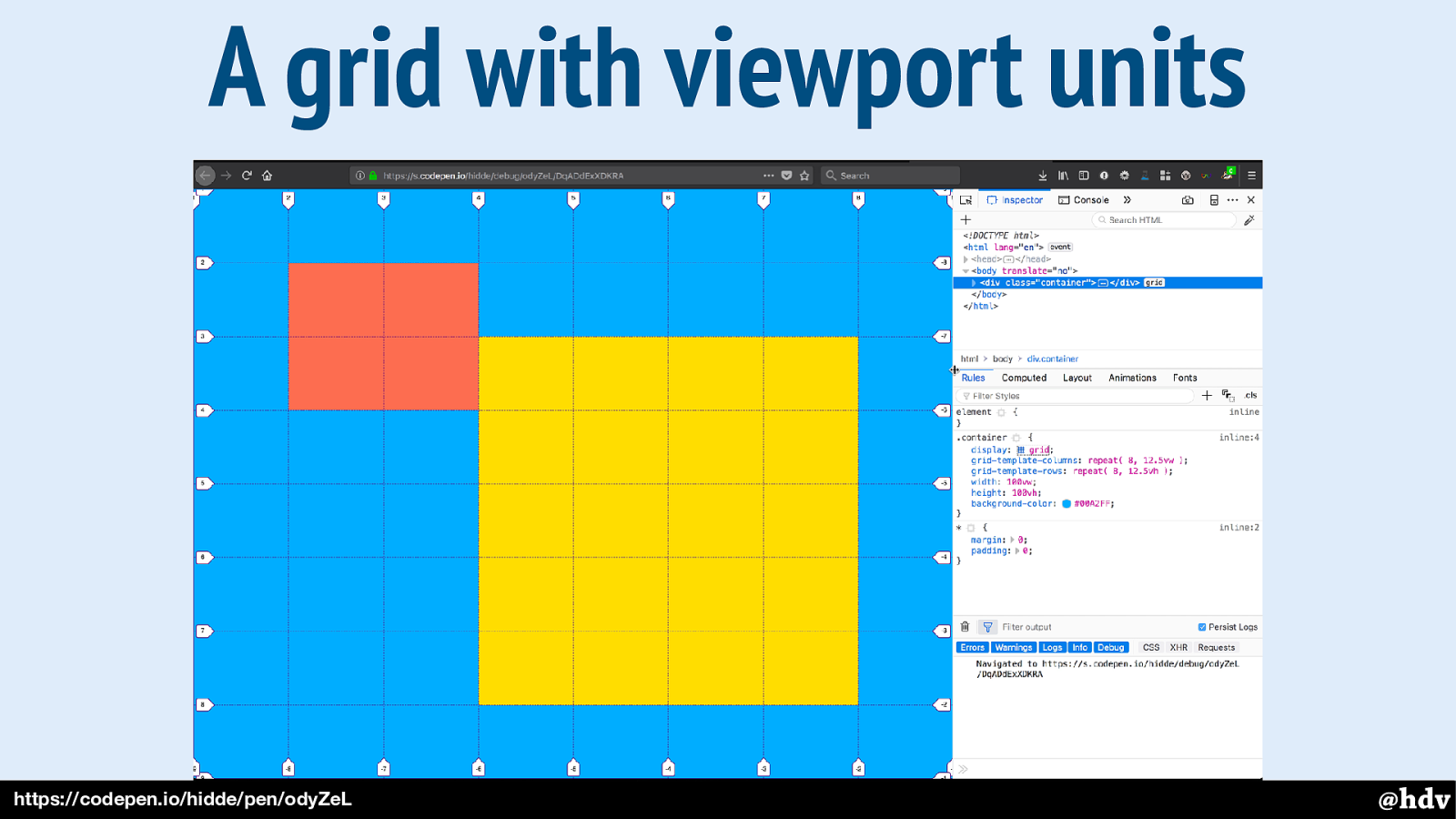
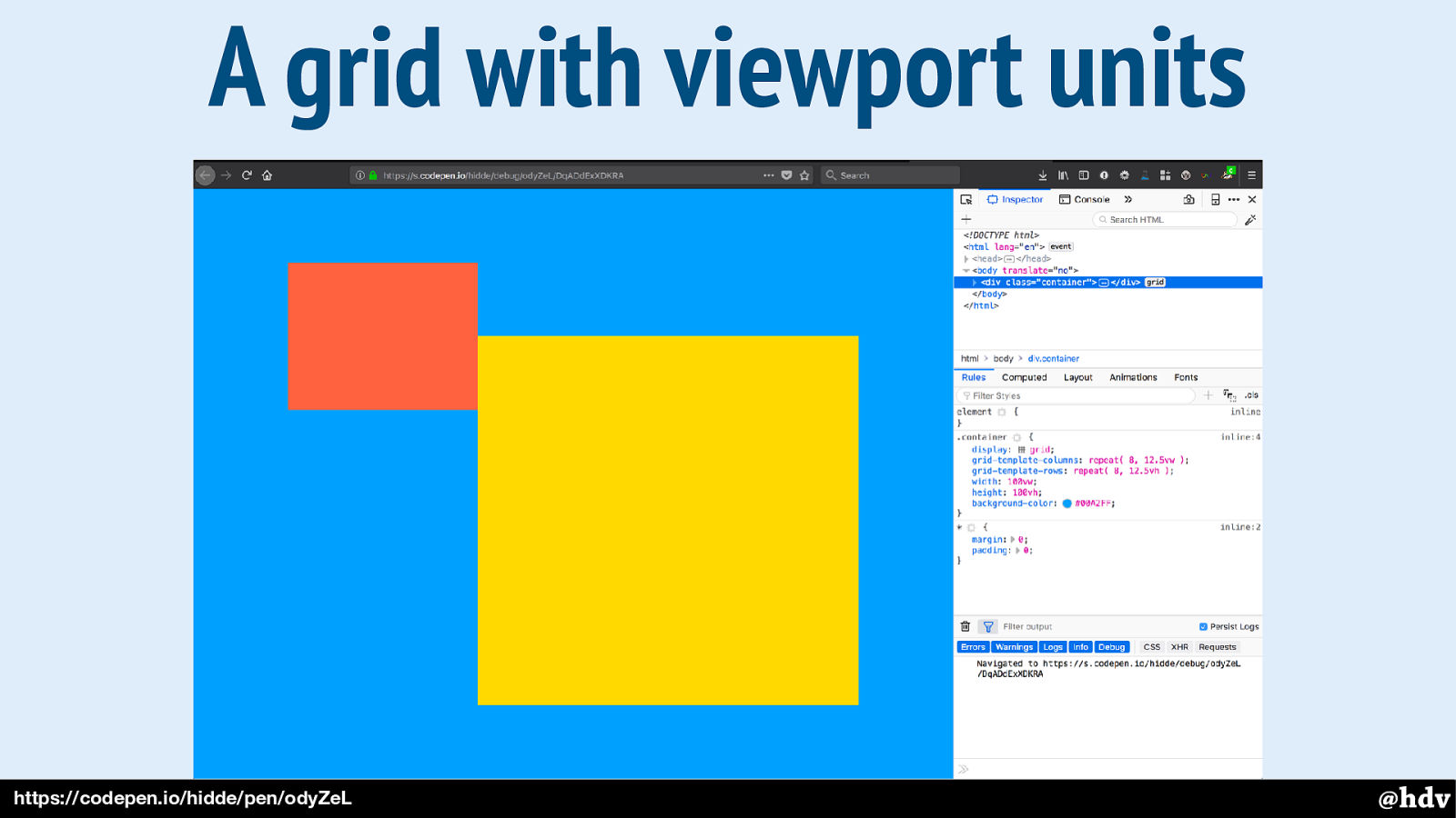
And this is what it looks like with the Grid overlayed, using Firefox' Grid inspector.
Slide 96
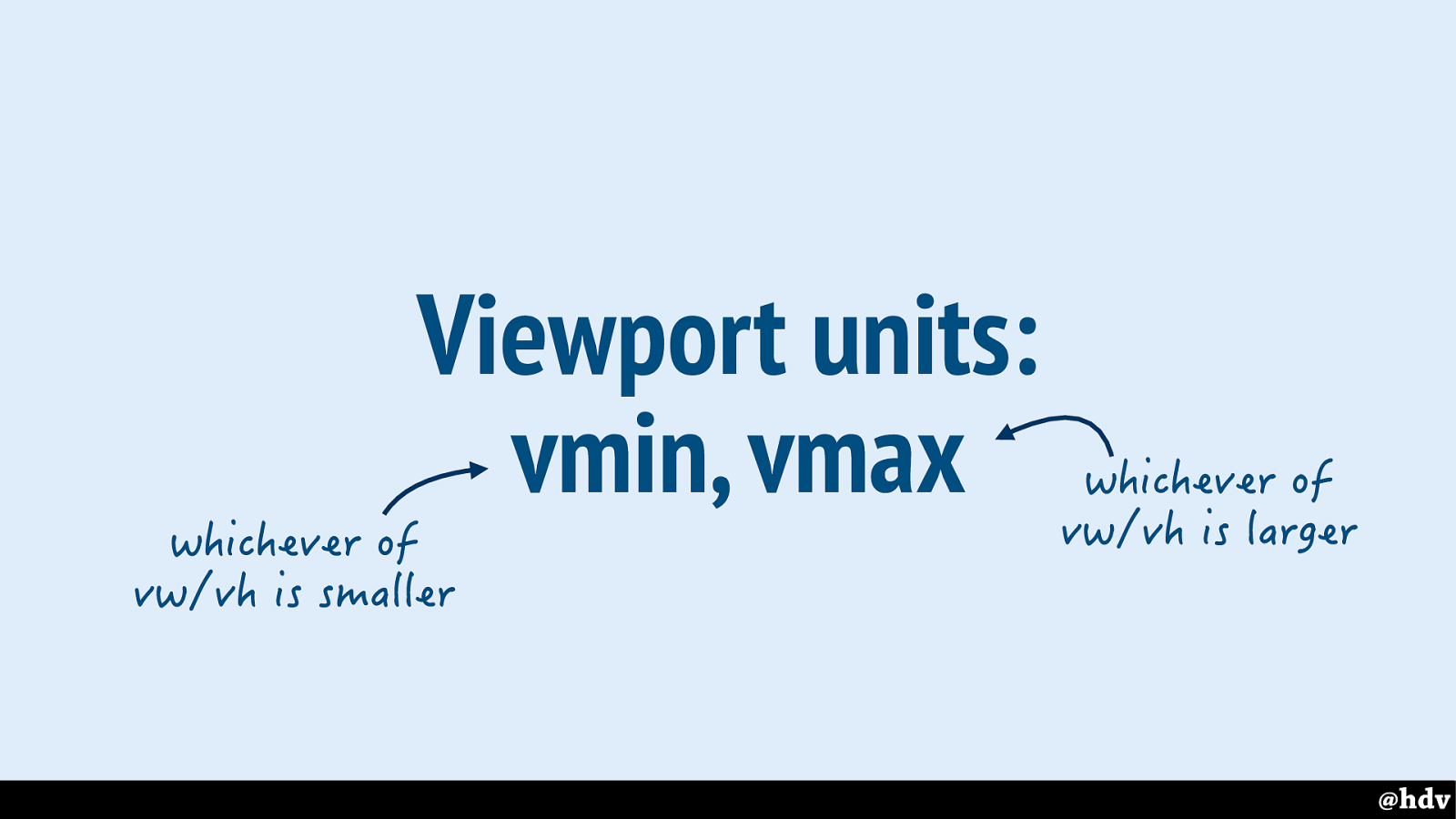
There is also vain and vmax; vmin: whichever of vw/vh is smaller, vmax is whichever of the two is larger.
I'm sure you all can do more creative things with that then I'll do here, but let's have a look at something that is made possible by these units.
Slide 97
Grid Layout helps mixing typography with photo, as it lets us put two things into the same place.
Slide 98
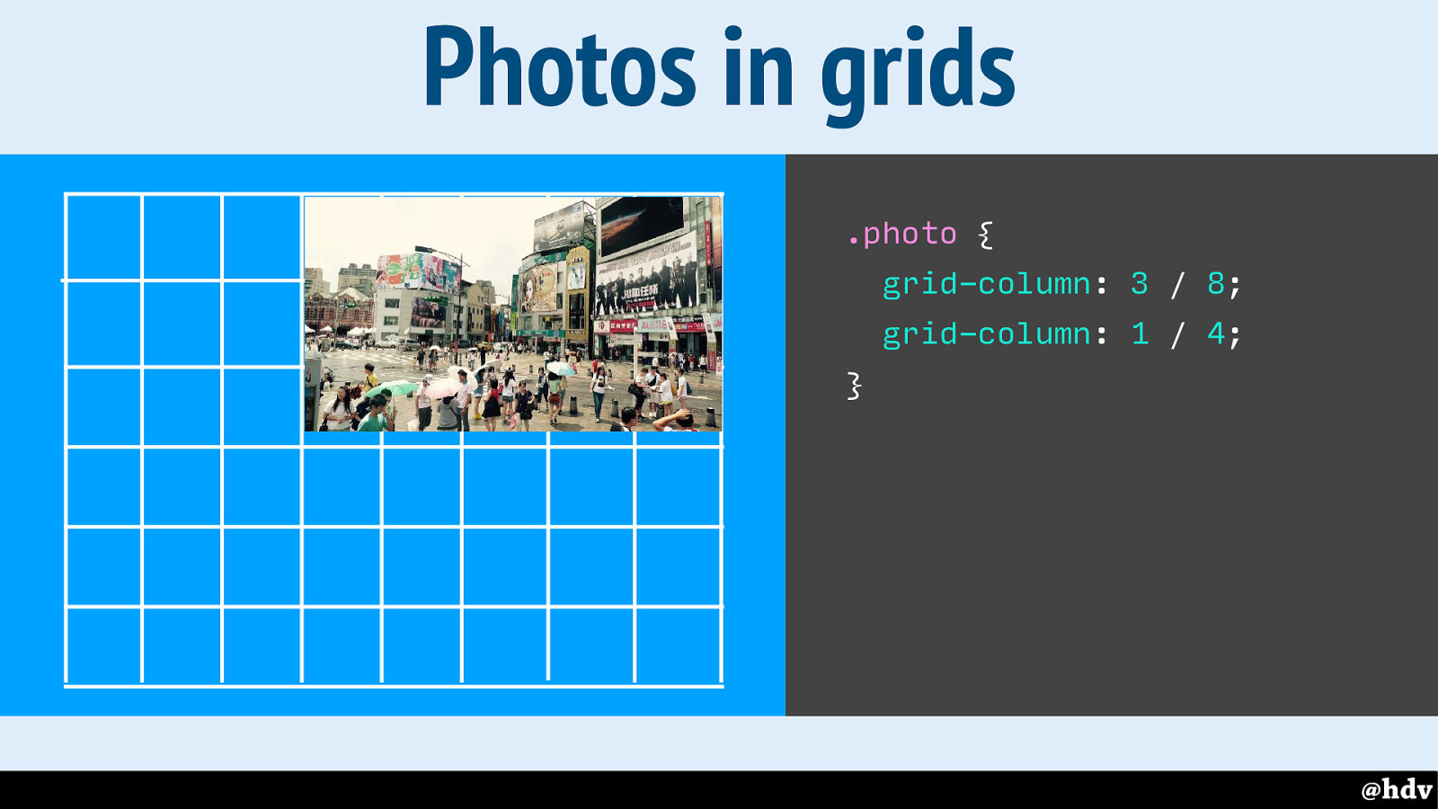
Let's place a photo onto the grid.
Slide 99
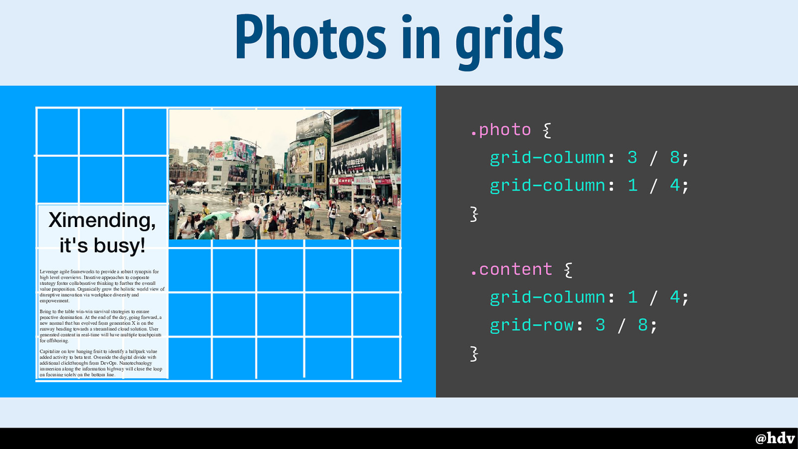
And some content.
Slide 100
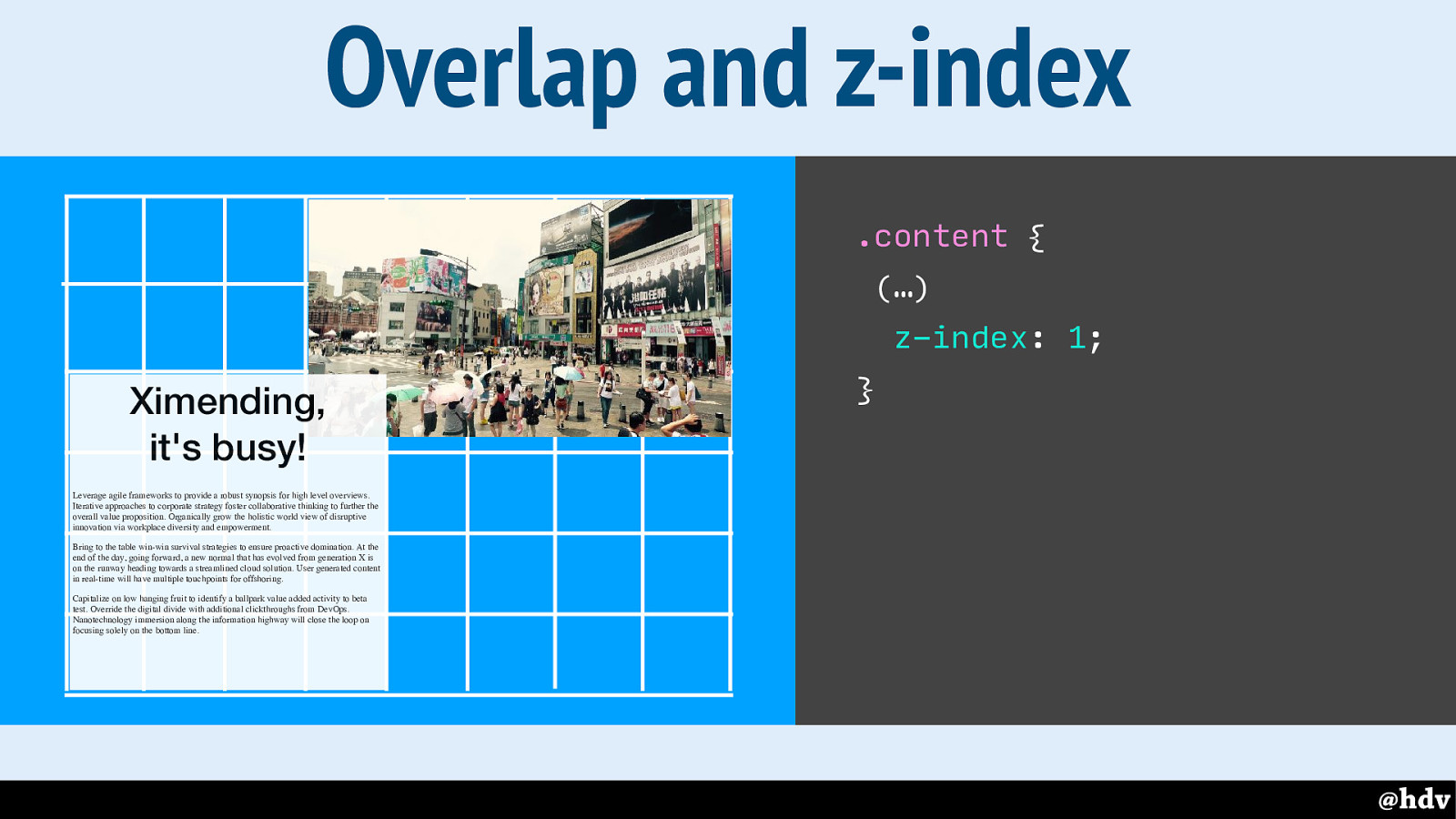
It is totally possible to put two things into the same space, in which case you can use z-index to decide which things need to be in front of others.
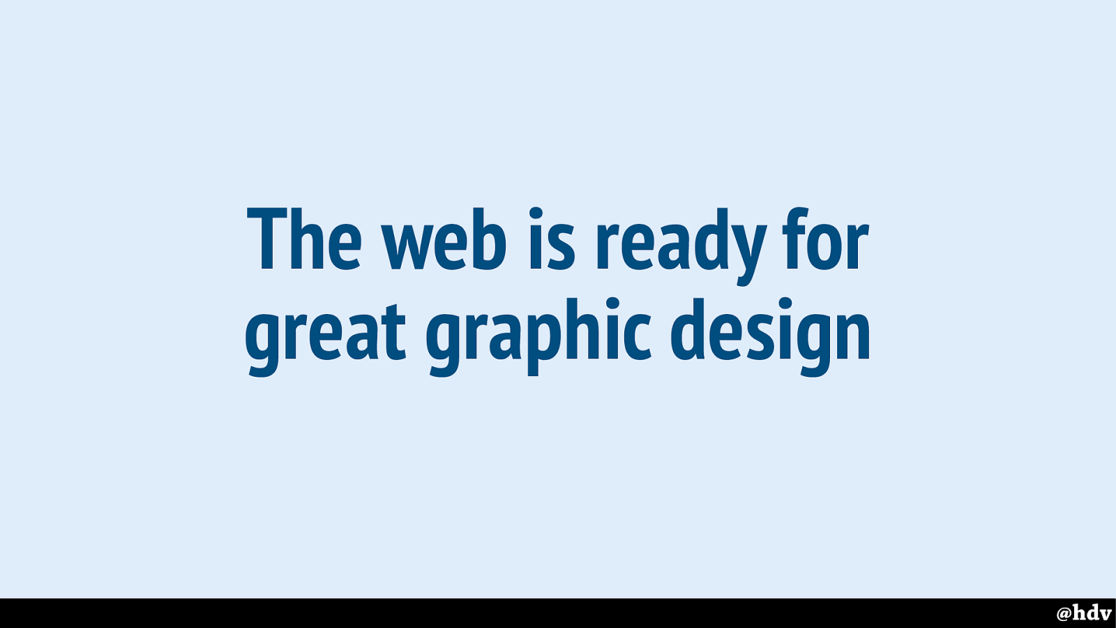
Slide 101
So are we ready to do great graphic design on the web?
Slide 102
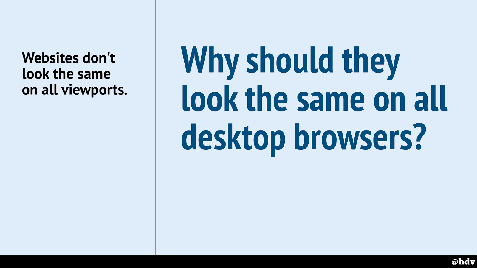
When giving workshops about CSS Layout, this is the question that many attendees asked: will everything look the same in every browser? If you've been to any web conferences in the last 10 years, it must really sound like a broken record, but I'll repeat it once more: website's don't need to look the same in every browser.
But I'll try and be realistic, I know we don't all live in happy land, some of us work for huge corporate clients, where process demands things to be the same. When I talked to some friends that work on big sites, one of them said they will wait a couple of years, until IE11 is no longer used, before they start using Grid Layout. That's the real world some people are in.
With that in mind, let me try to show you Grid is ok to use NOW.
Slide 103
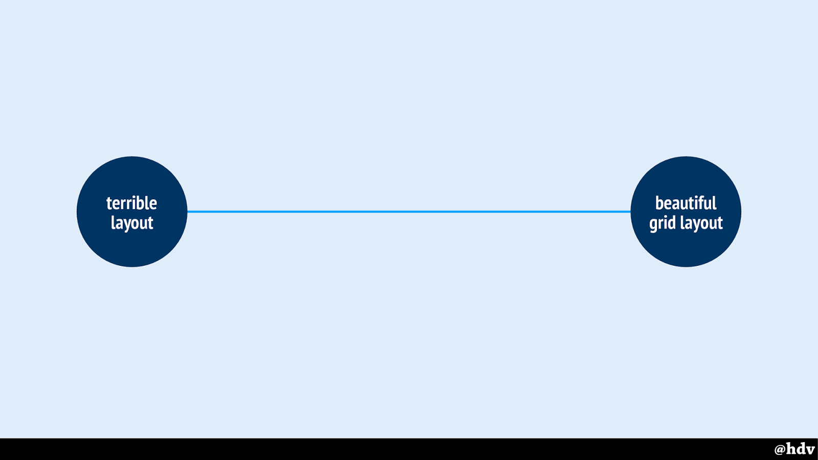
I've drawn a quick line as to what can happen between browsers that support grid and those that don't.
Slide 104
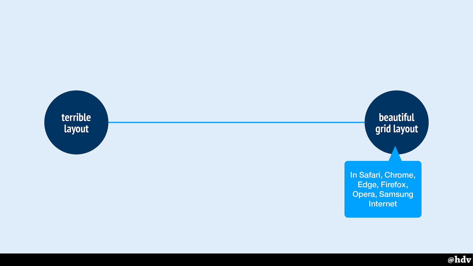
Supporting browsers will have beautiful grid layout, and non supporting ones terrible layout. Maybe?
Slide 105
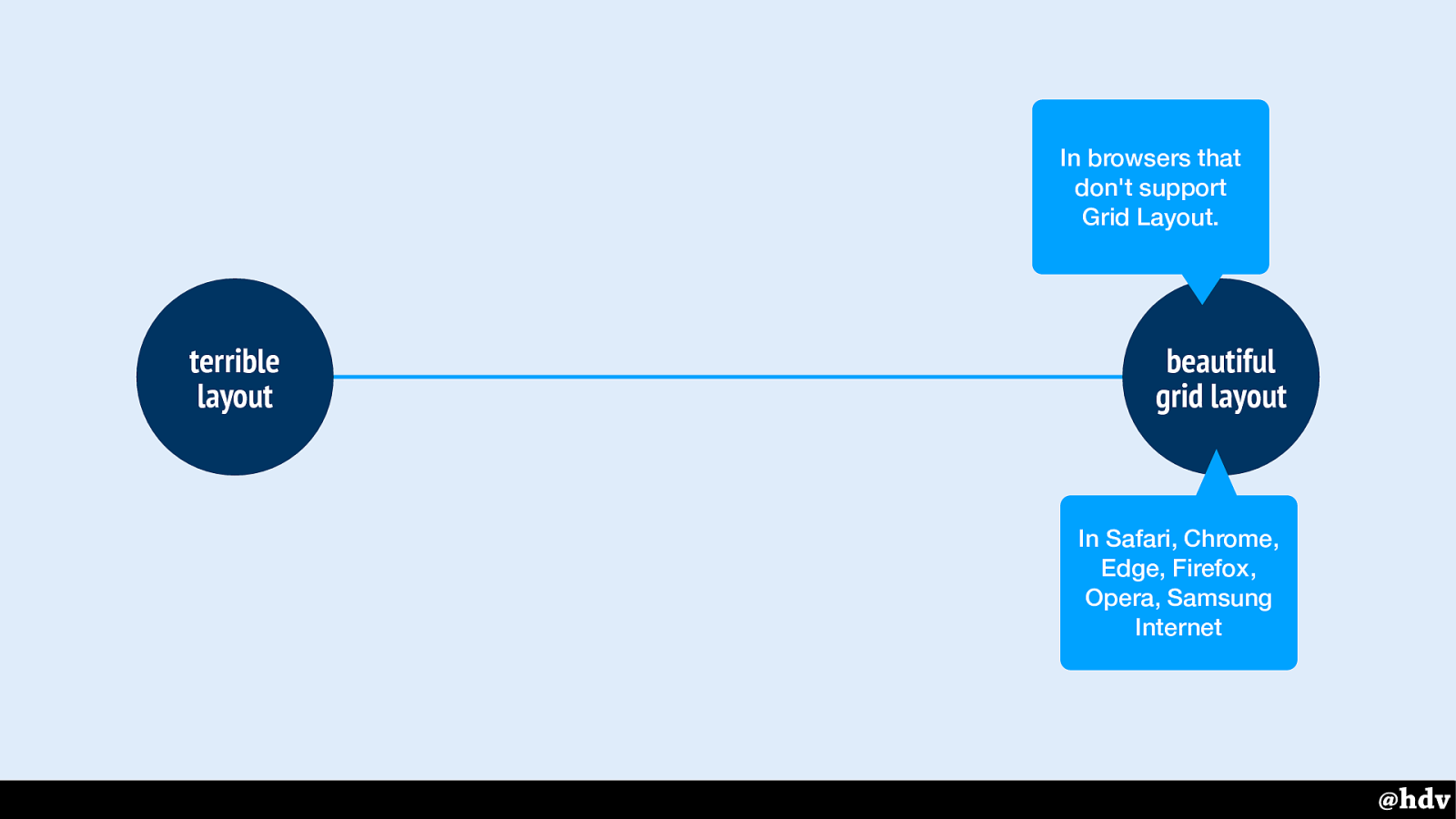
Some will try to get exactly the same layout in browsers that don't support Grid Layout, or look for frameworks or tools that help do this. But this might take so much time that you might as well just use technologies that work in more browsers. You'll use =processior
Slide 106
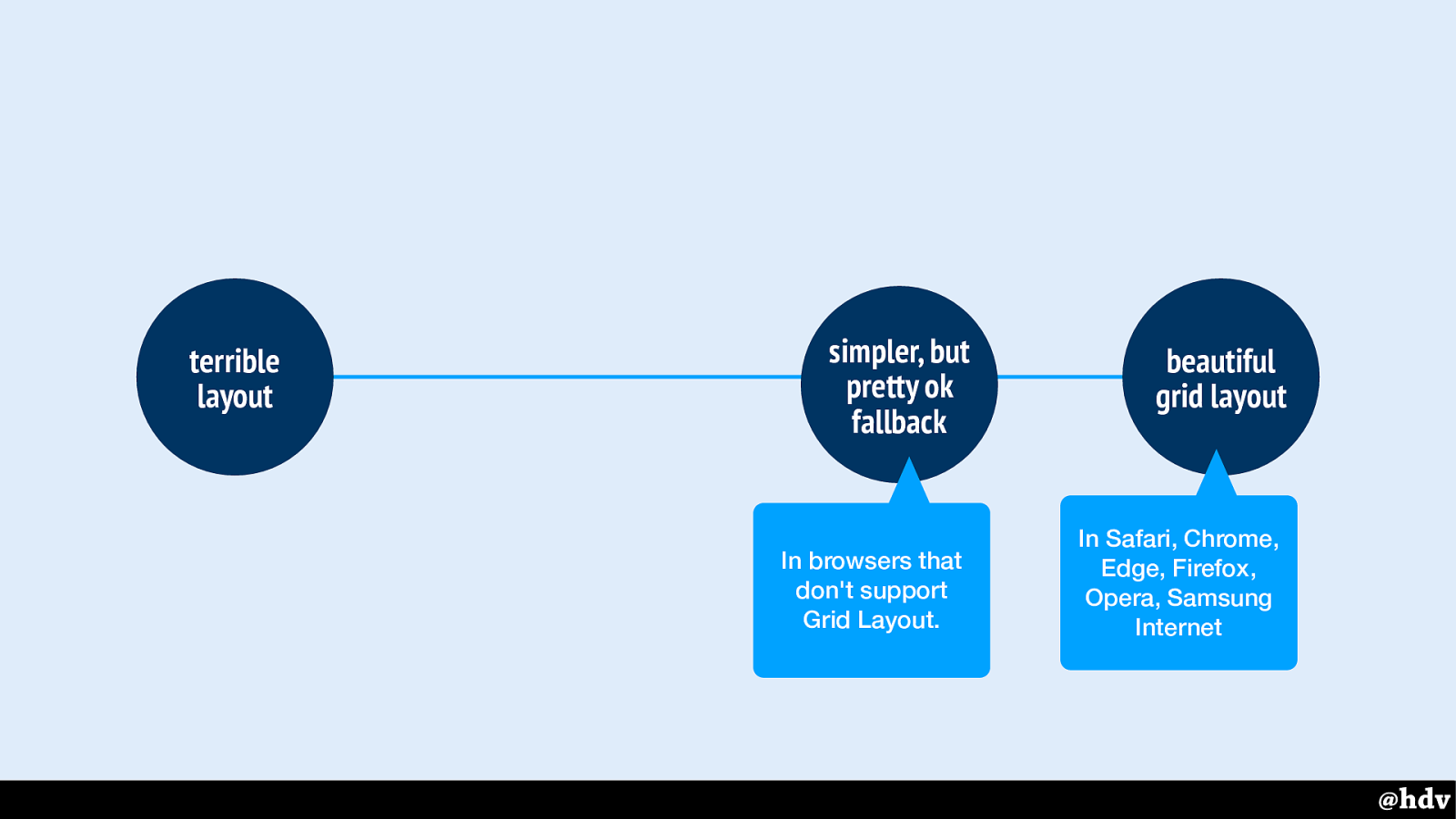
It really doesn't have to be like that, we can have a simple fallback that effectively makes the content look pretty ok.
That fallback will then work in browsers that don't support grid lay-out, so that nobody needs to suffer from a terrible layout.
Slide 107
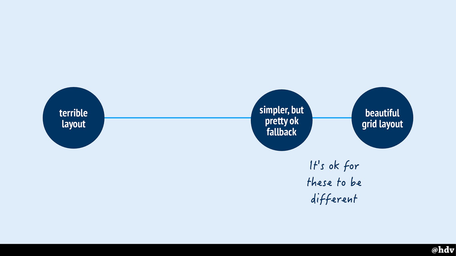
And keep in mind that it is ok for these to be different, we can have different but equally-good-looking layouts.
As a CSS developer: make intentional choices, like we saw Tschichold and Brockmann do. Make good suggestions to designers. Leverage the cascade, don't go overboard and keep it simple.
Slide 108
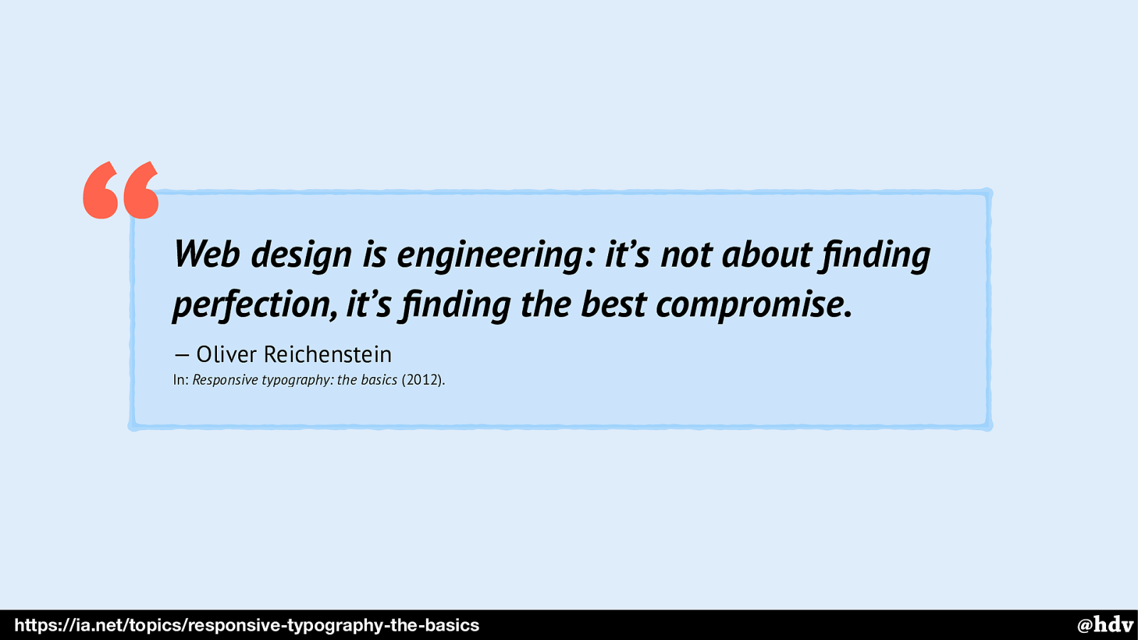
CSS and designing for the web is about compromises, it was 5 years ago and it still is.
Slide 109
We've made the argument so many times and if you attended any conferences in past ten years, you have heard this 'websites don't need to look exactly the same in all browsers' scenario.
Slide 110
It might sound like a broken record, but this is one worth repeating and and argument worth learning: talk about these things with other team members.
Slide 111
I was saying earlier that the web is ready for great graphic design, but really what I've been showing is something else. But should we stop there? Vasilis, who I mentioned earlier, laughed when I talked to him about the slides I was preparing about modernist graphic design… is that all there is to it, that we can be inspired by graphic design? What if we turn it around, how can we make it so that graphic designers get inspired by our web design?
Slide 112
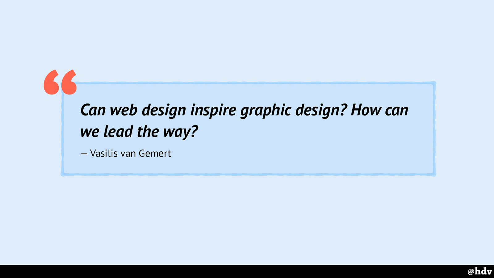
How can we lead the way? How can we make great web design that is better than the graphic design of the day, and can inspire modern graphic design?
Slide 113
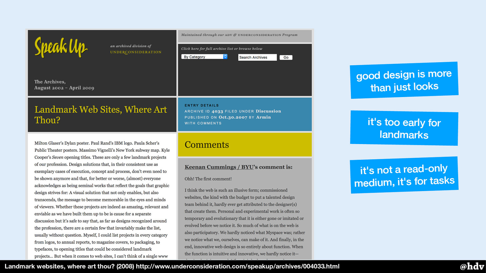
This question has been asked before, of course. Armin Vit asked where the IBM logo's and the New York Subway maps of web design are. Note that the first comment is ‘The first comment!’
This is from the time that people still commented on websites and long discussions happened. Some conclusions are that design isn't just aesthetics, especially not web design; that the web is too young to really have land marks; that it is for tasks, so a site like Amazon that has lots of people buying books is successful design.
Slide 114
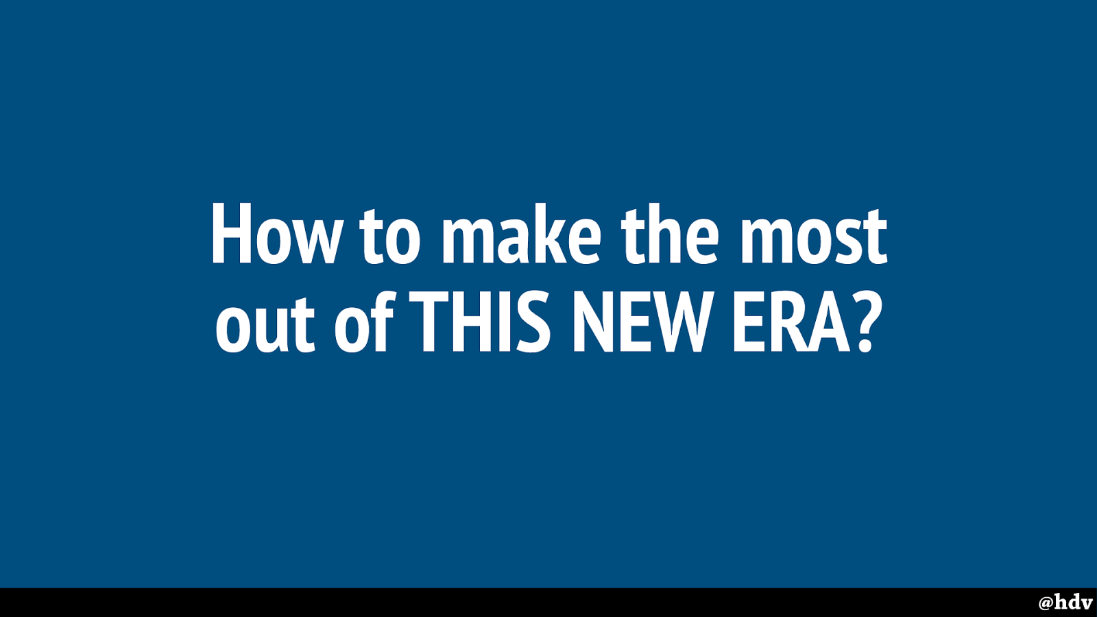
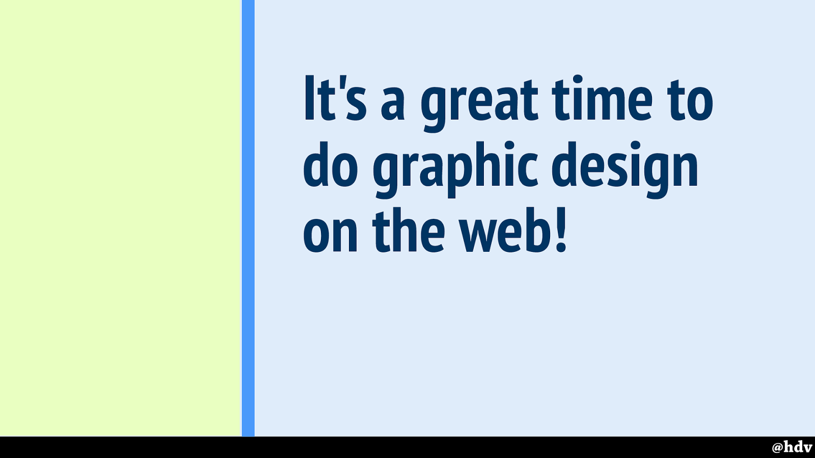
So how can we make the most out of this new era?
Slide 115
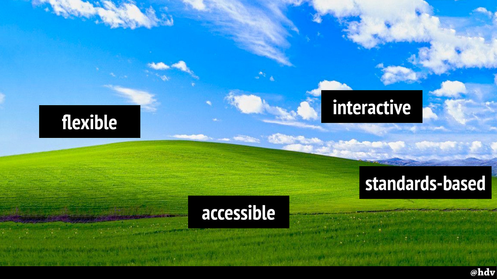
To do that, let's look at some defaults…
To have great graphic design on the web, that can truly inspire print design, we'll at least need to get these defaults for the web right. We'll need to embrace these defaults and to create great experiences that make them more usable than traditional graphic design.
Slide 116
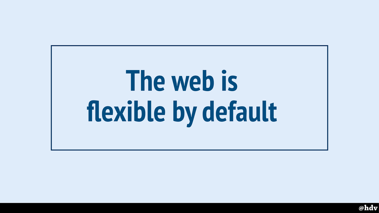
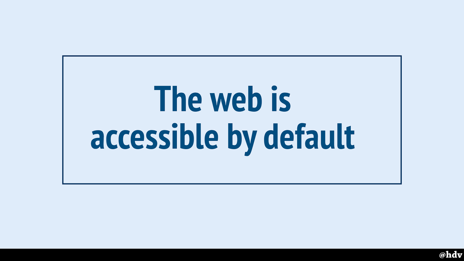
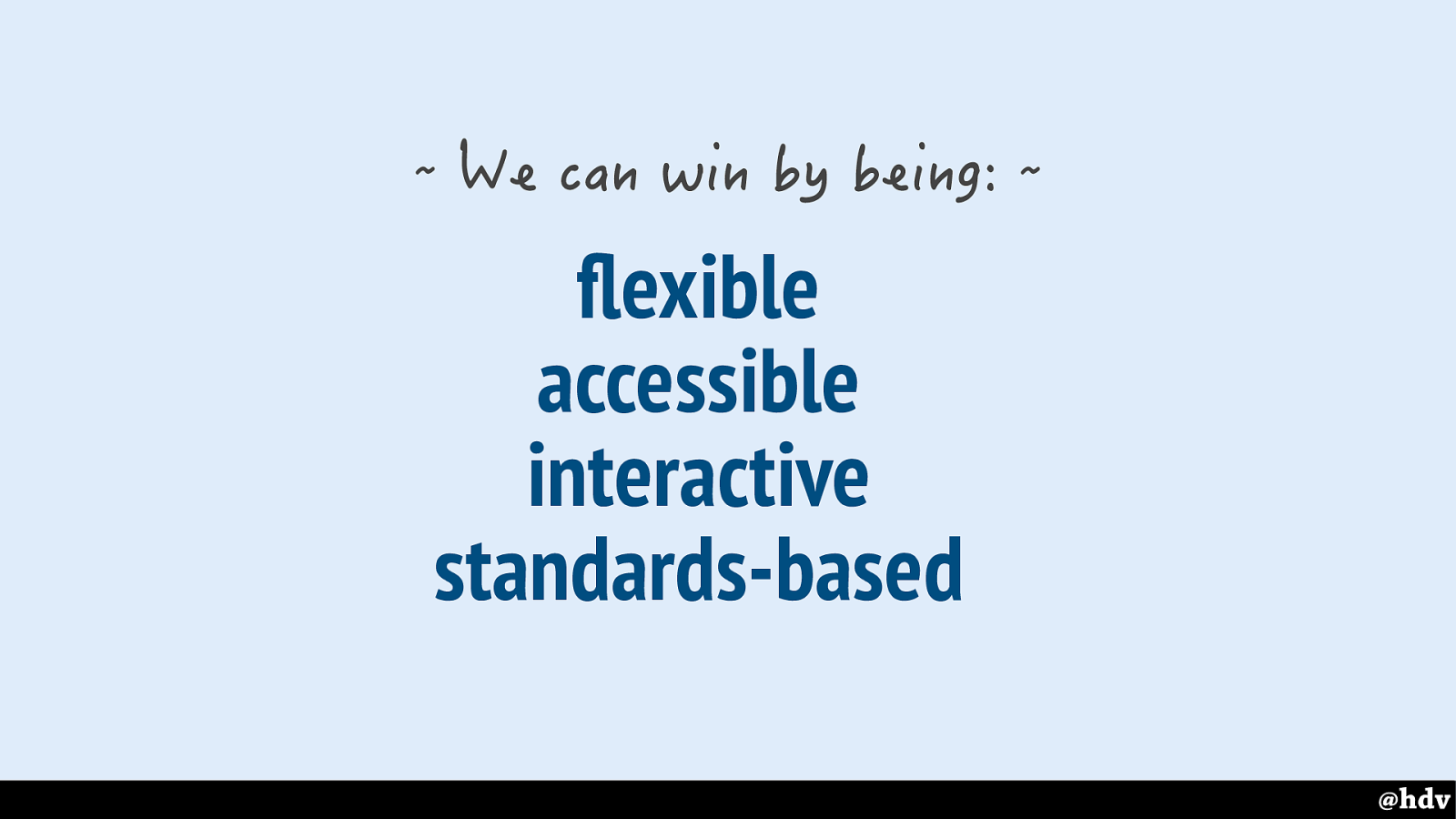
Let's start with flexibility. The web is flexible by default
Slide 117
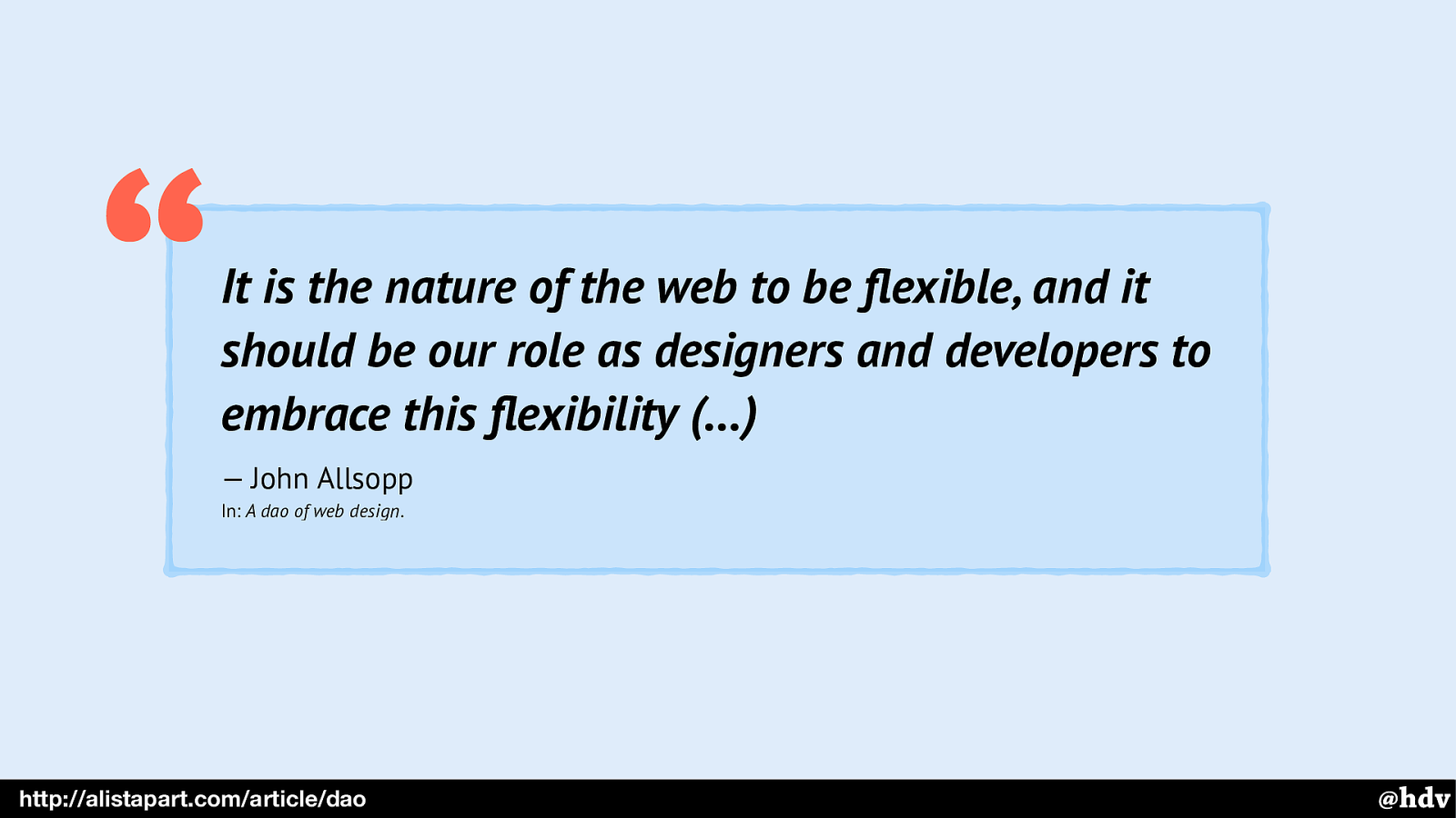
There's this great post about flexibility by John Allsopp that many of you have probably seen before, it was the post that inspired Responsive Web Design.
Slide 118
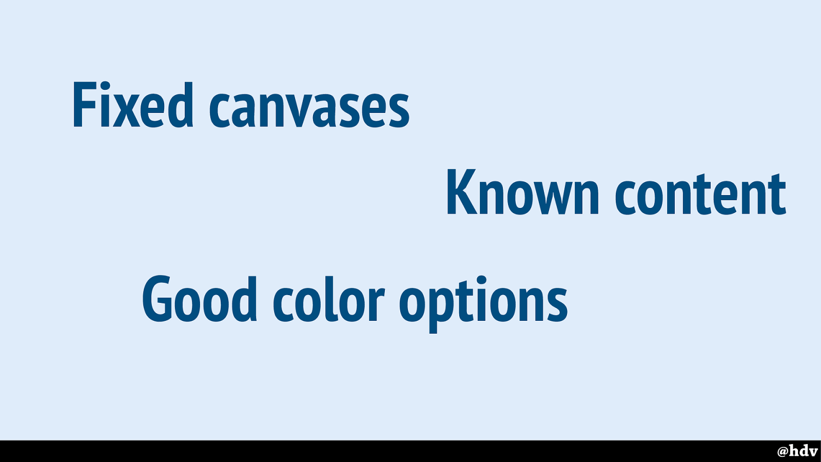
Print designers have fixed canvases, known content and good color options.
Slide 119
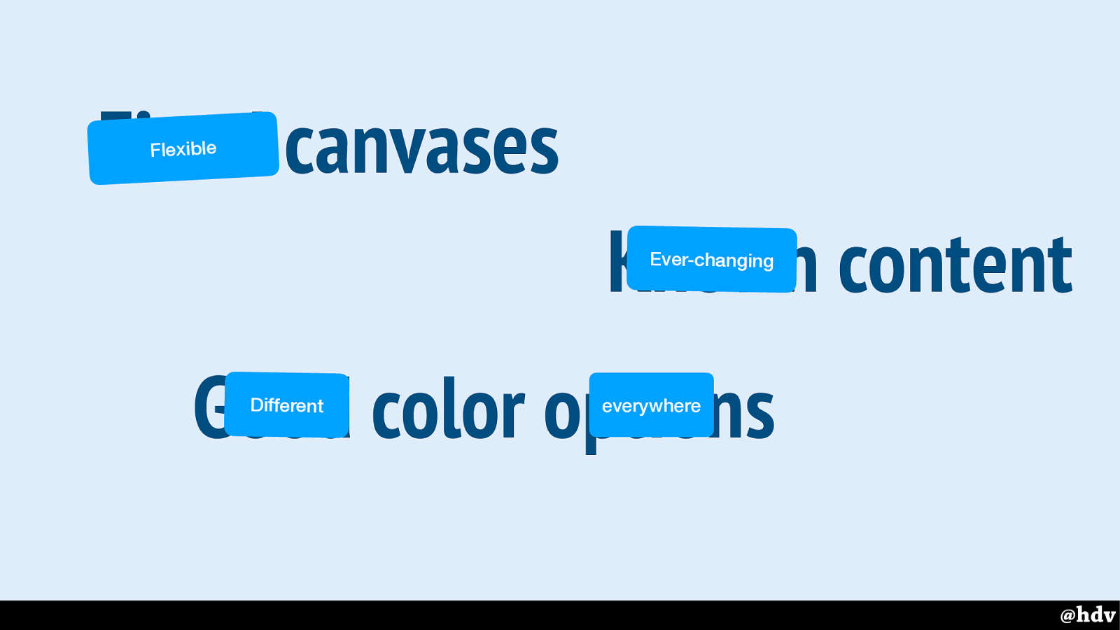
We don't have any of that, our canvases are flexible, we have no idea what content is going to end up in our sites because CMSes and colours look different everywhere, it could be that some of your users have a black and white kindle that they browse your site with.
Slide 120
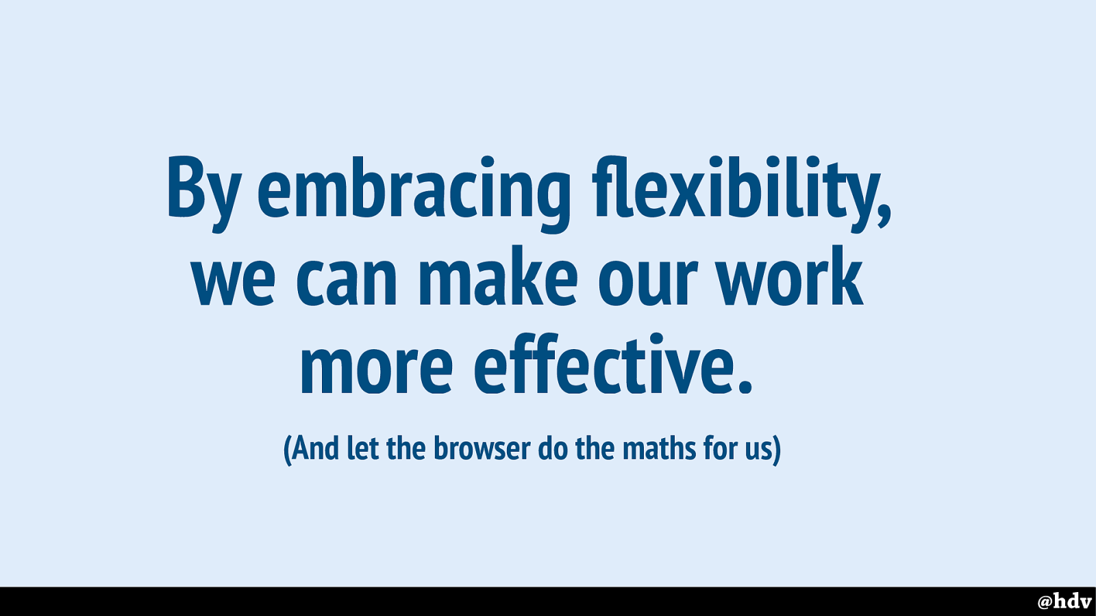
The only way to be effective is by trying to let go of control, as clearly the reality is we don't have control anyway, and focus on how to embrace flexibility.
Slide 121
Slide 122
Slide 123
Slide 124
Slide 125
Slide 126
Slide 127
Slide 128
Slide 129
Slide 130
Slide 131
Slide 132
Slide 133
Slide 134
Slide 135
Slide 136
Slide 137
Slide 138
Slide 139
Slide 140
Slide 141
Slide 142
Slide 143
Slide 144
Slide 145
Slide 146

Slide 147
Slide 148
Slide 149
Slide 150
Slide 151