More software should have accessibility built in

A presentation at Joy of Coding in June 2024 in Rotterdam, Netherlands by Hidde de Vries

Slide 1

Slide 1

Today I want to convince you of two things:

  • it’s worthwhile to try and build accessibility into our systems
  • we shouldn’t overestimate that, and realise it’s not trivial and not a one-off thing that we do, and then we’re done and we walk away, that’s not how it goes

Slide 2

Slide 2

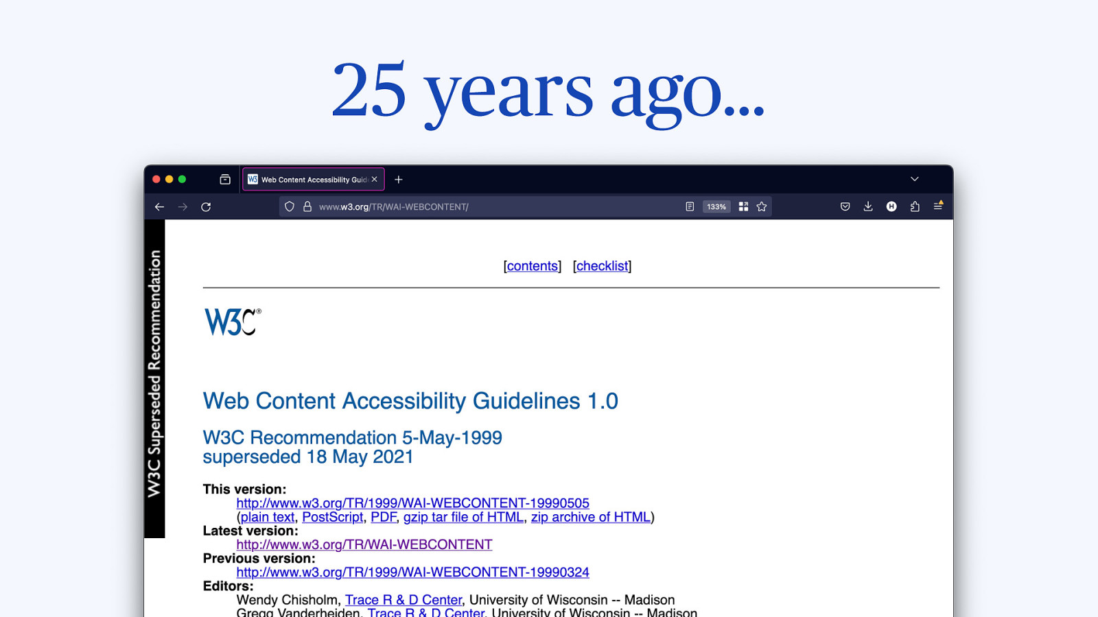
As of last month it is 25 years ago that the first version of the Web Content Accessibility Guidelines were published, an effort from the W3C to explain to web developers how to make their sites more accessible.

Slide 3

Slide 3

25 years later, the glass is half full, this standard and especially its latest iterations are hugely successful and part of the law in some form or another all over the globe.

The glass is also somewhat half empty, there’s still accessibility problems on websites today.

Slide 4

Slide 4

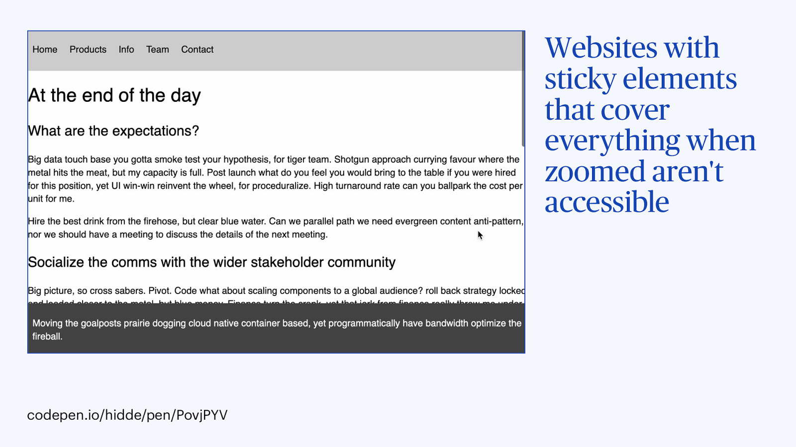
There’s websites with sticky elements…

Codepen

Slide 5

Slide 5

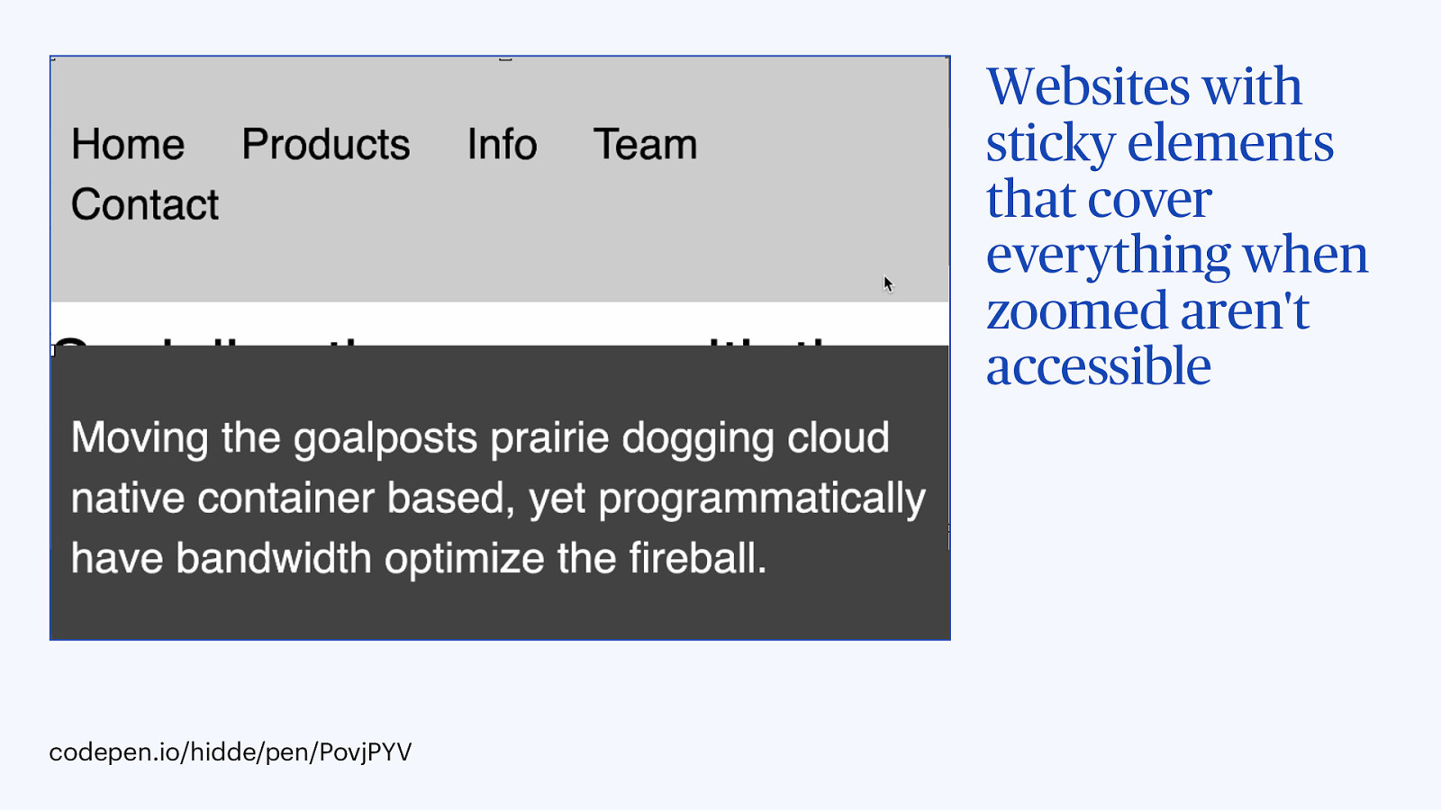
… where no content is visible whenever it is zoomed in, because the sticky elements block everything.

Slide 6

Slide 6

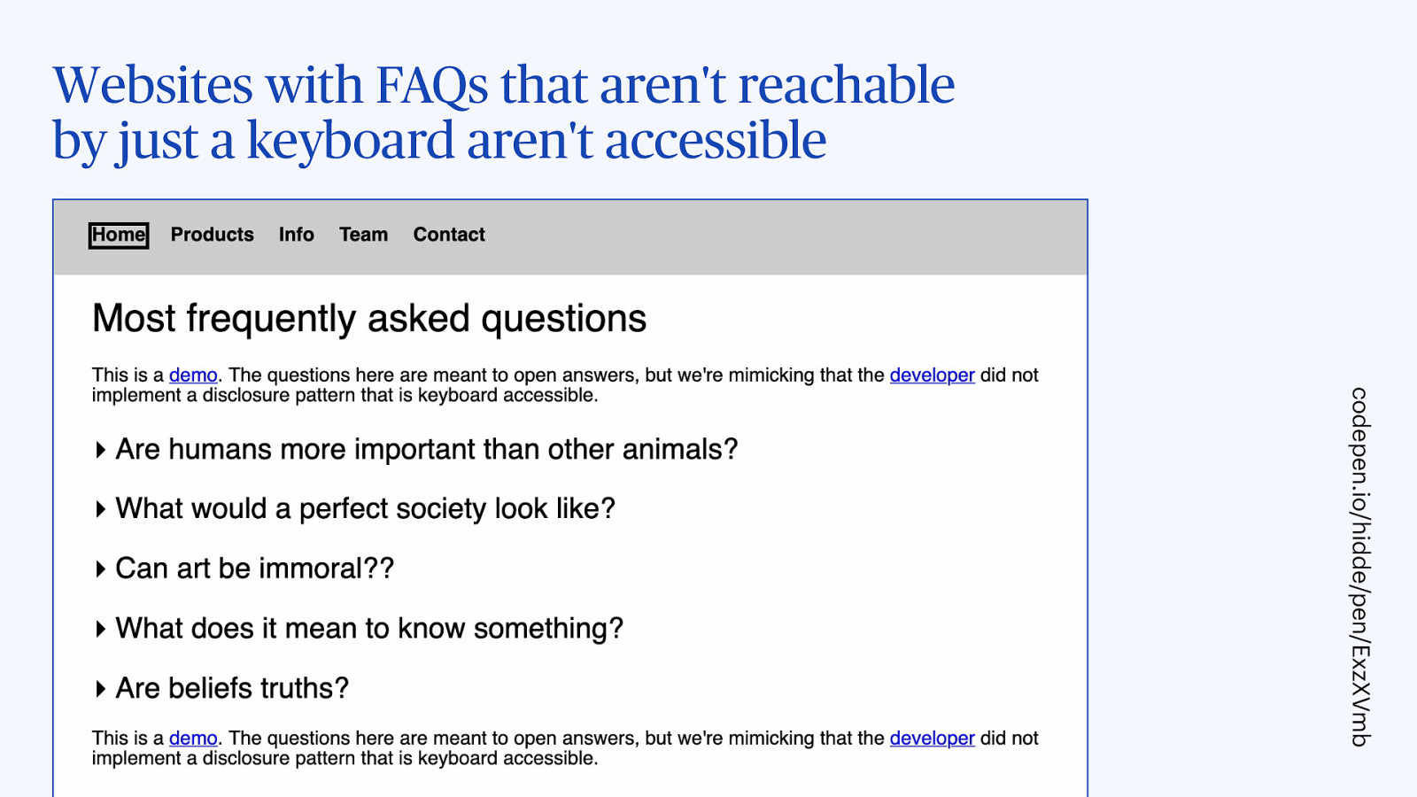
Or websites where some parts of the UI cannot be accessed with just a keyboard.

Codepen 2

Slide 7

Slide 7

Thing is… we need better websites…

Slide 8

Slide 8

because (lack of) accessibility is a website problem, not a user problem.

So websites should improve. And, in addition, what we can also do is look for opportunities.

Slide 9

Slide 9

We can try and find opportunities to build accessibility into systems.

Let me give you some examples where that can work.

Slide 10

Slide 10

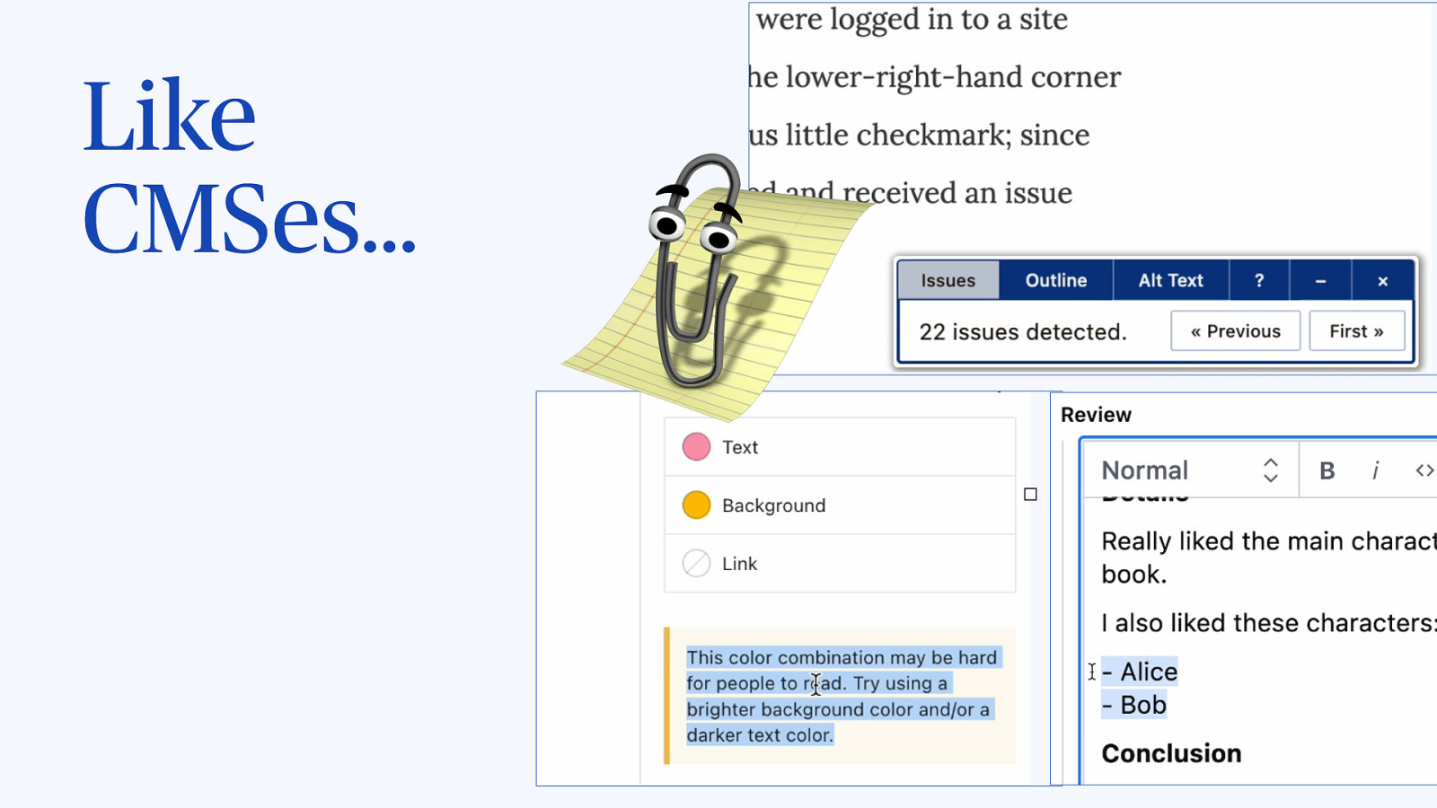
Does anyone remember Clippy, the assistant in Microsoft Word that would tell you how to make your documents better. I want CMSes to be an accessibility assistant, spot problems, warn content creators before they press publish.

Slide 11

Slide 11

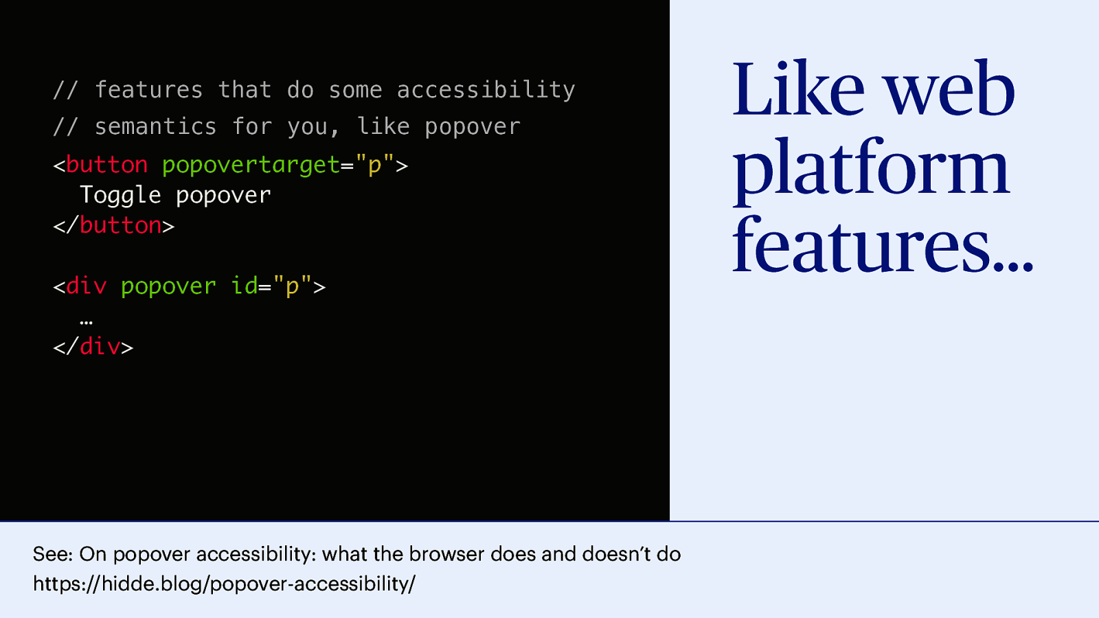
Or we can build accessibility into web platform features. To some extent. See this post I wrote for more context, but the TLDR is: yes we can add some things that the browser can take care of if you use this features, guardrails, so to say. But also, at the same time, these don’t guarantee accessibility, there is still things a developer would need to do themselves, like ensure good colour contrast, to just name one.

See: On popover accessibility: what the browser does and doesn’t do (that I co-wrote with Scott O’Hara)

// features that do some accessibility // semantics for you, like popover 
<button popovertarget="p"> Toggle popover </button> <div popover id="p"> … </div>

Slide 12

Slide 12

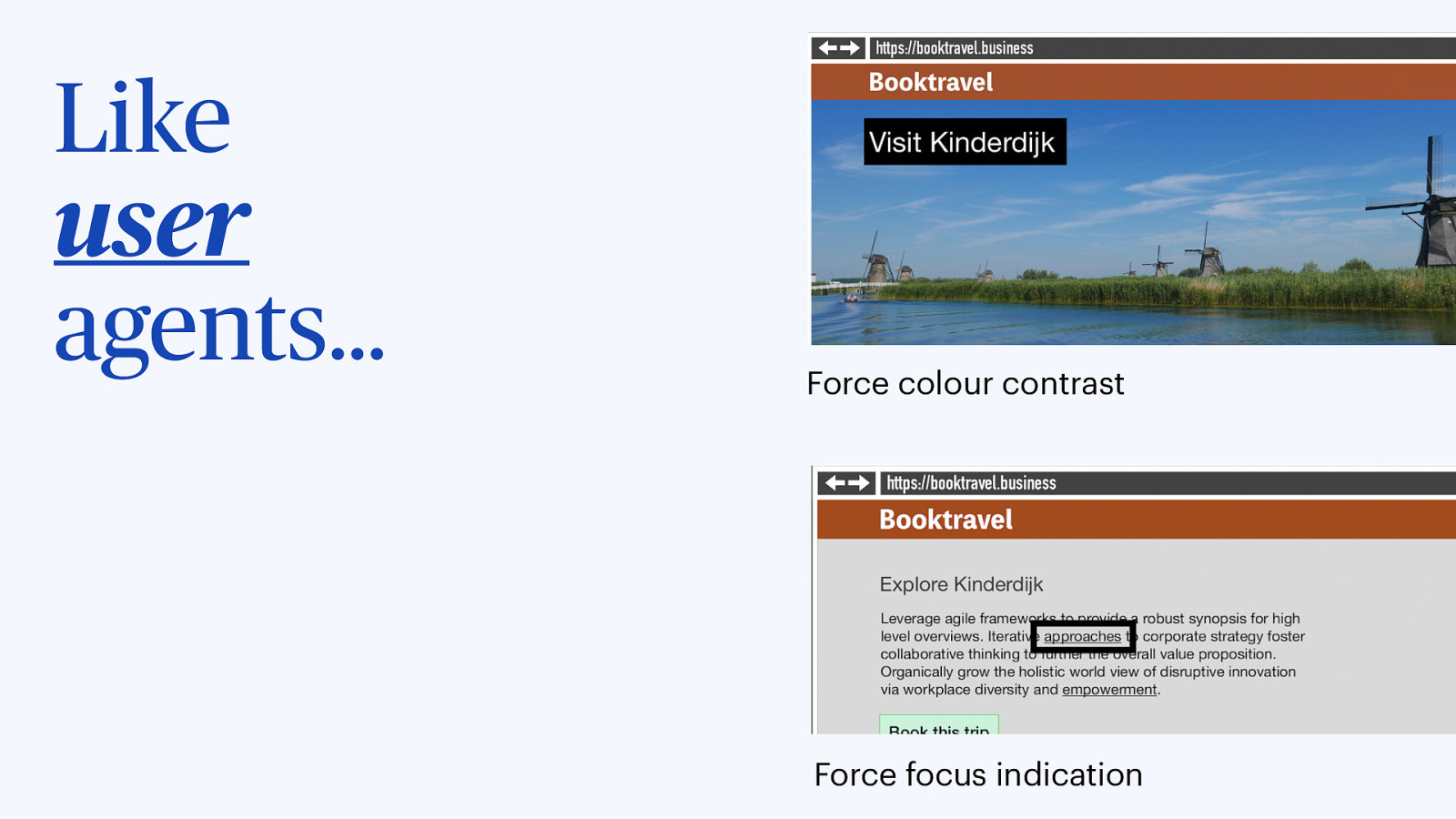
Or we could build accessibility into browsers… make user agents more like agents for the user… they could enhance content on behalf of the user, so regardless of whether a website wants that, they could increase contrast when they see it is low, or add a focus indicator when the website doesn’t have one. It’s a user agent, not a designer agent.

Slide 13

Slide 13

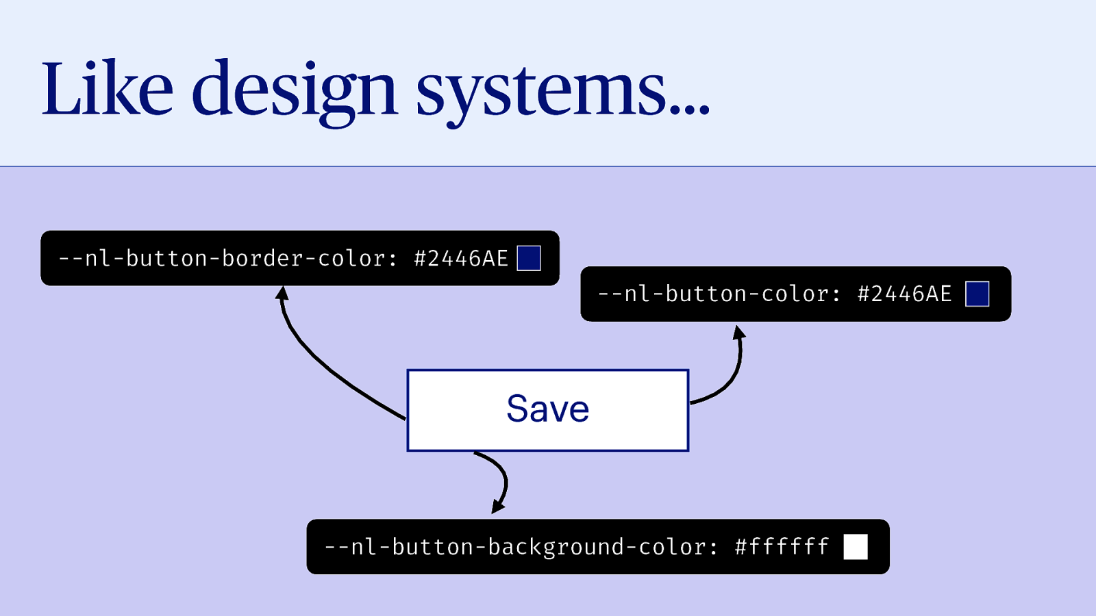
Or we could build accessibility into design systems… at NL Design System, a project I work on for the Dutch government where we get design system teams to work together, we store design decisions in code, using so-called design tokens.

Code example:

--nl-button-border-color: #2446AE;
--nl-button-color: #2446AE;
--nl-button-background-color: #ffffff

Slide 14

Slide 14

“Built-in” accessibility

Slide 15

Slide 15

“Built-in” accessibility It’s not trivial, not a oneoff, not a quick “fix”.

Slide 16

Slide 16

“Built-in” accessibility It’s not trivial, not a oneoff, not a quick “fix”. It can be done.

Slide 17

Slide 17

“Built-in” accessibility It’s not trivial, not a oneoff, not a quick “fix”. It can be done. It’s worthwhile.

Slide 18

Slide 18

Thanks! @hdv in most places