ARIA, the good parts

A presentation at Paris Web in September 2023 in Paris, France by Hidde de Vries

Slide 1

Slide 1

feedback on this transcript format and/or the contents of this talk is welcomed! Let me know what you think, or if you disagree with anything in particular, I’m @hdv in most places.

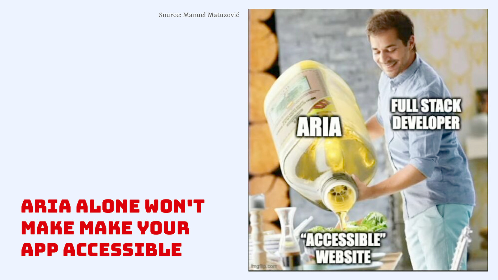
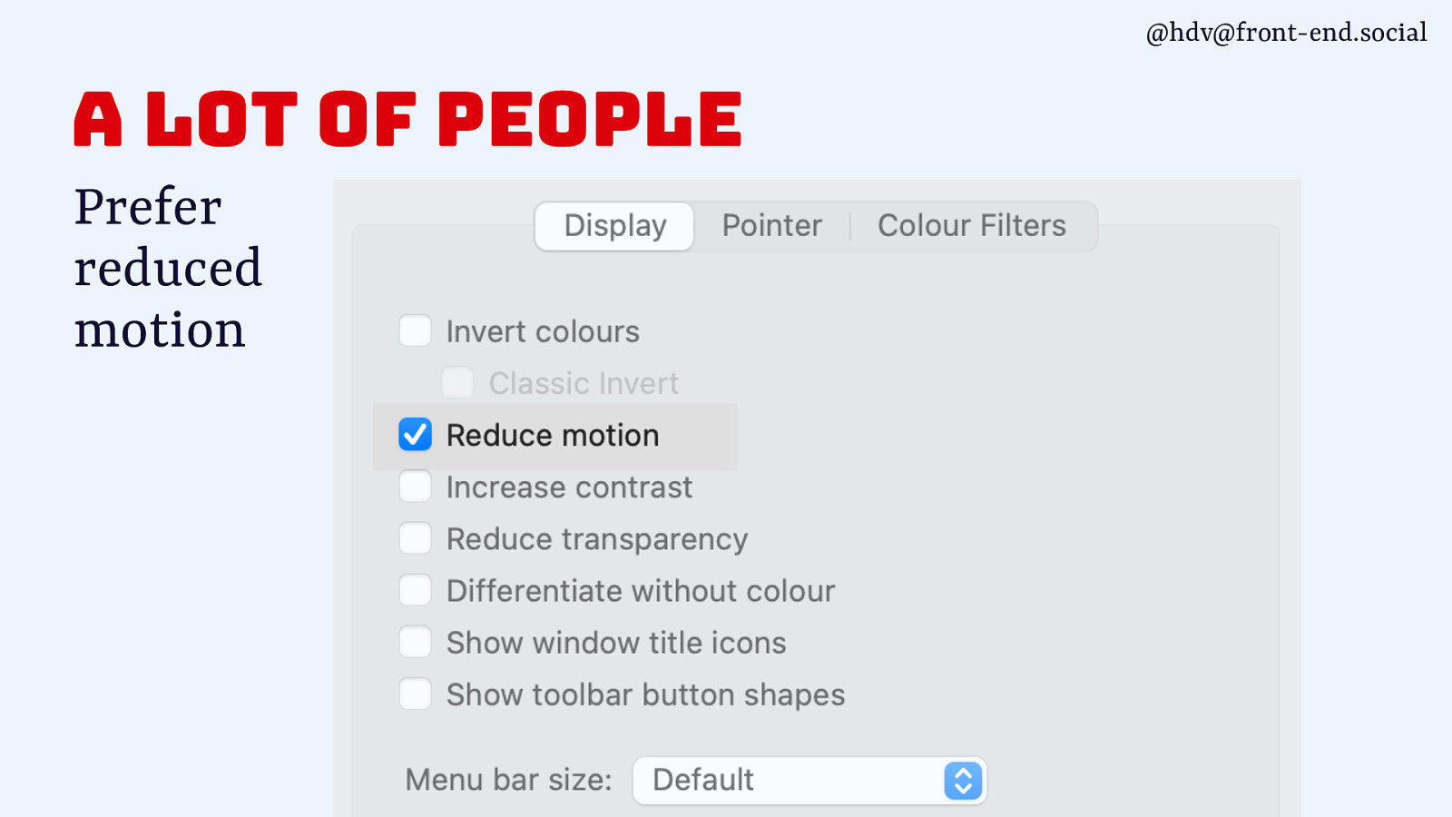
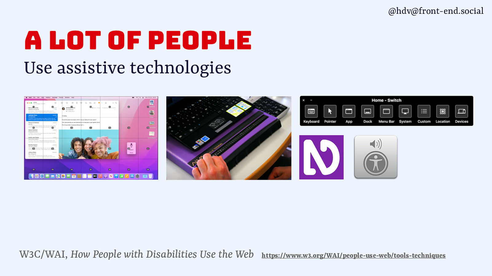
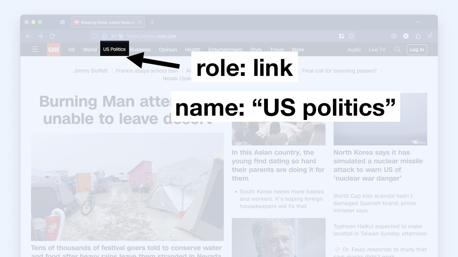
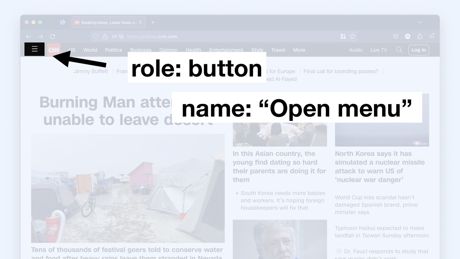
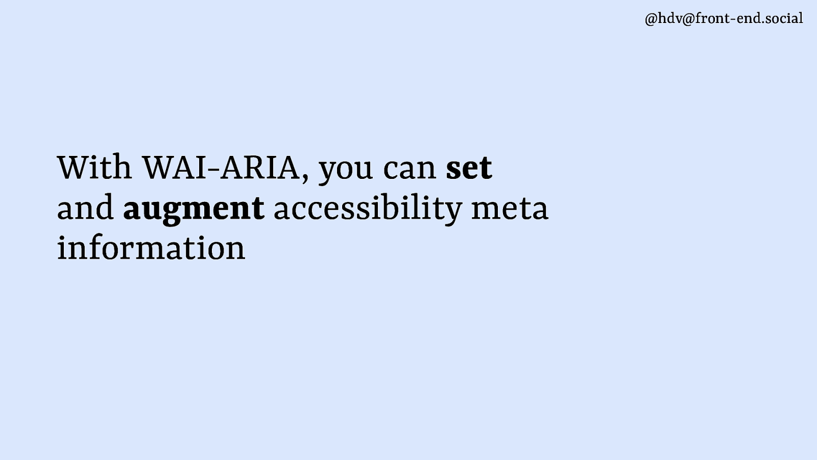
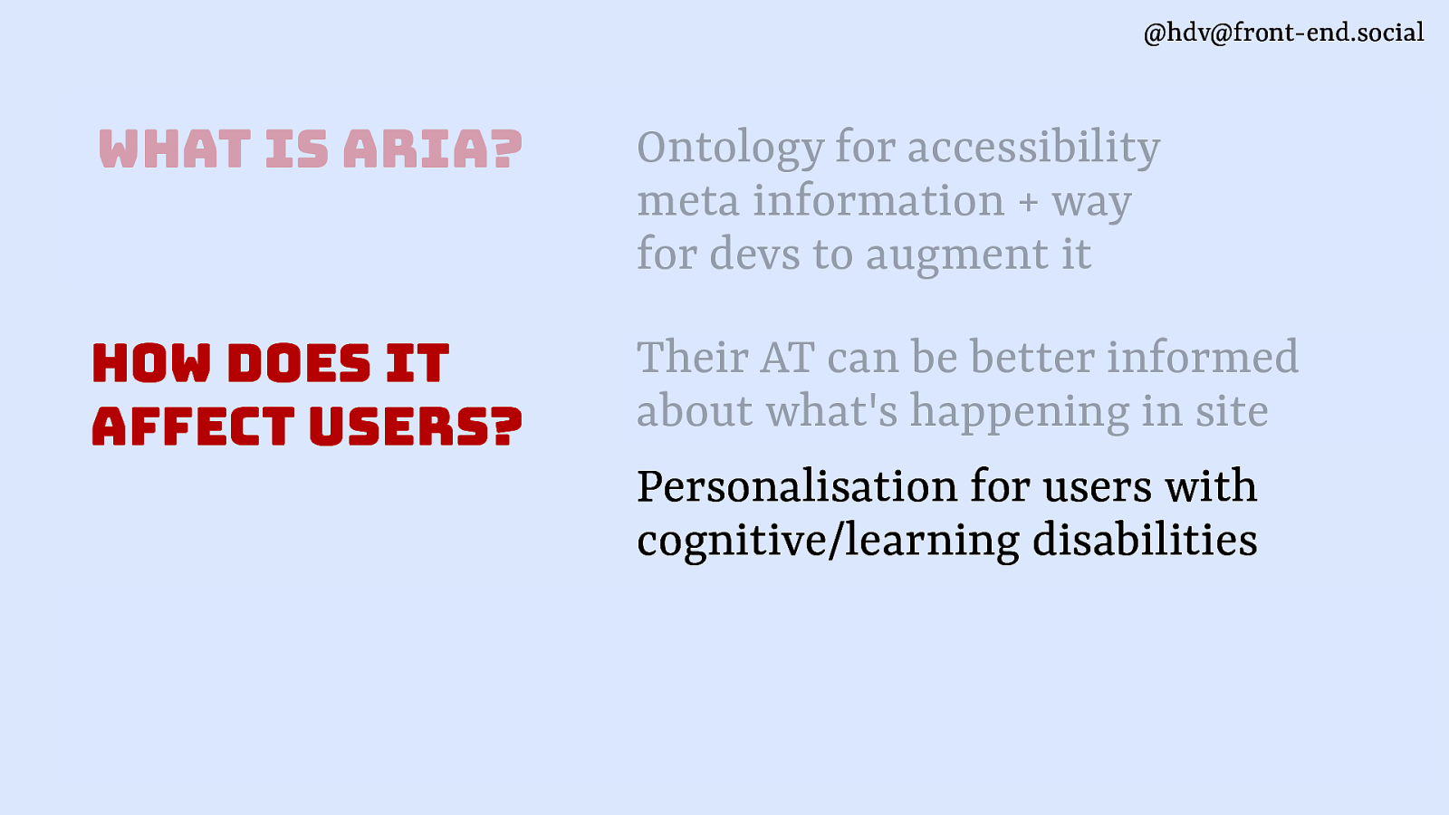
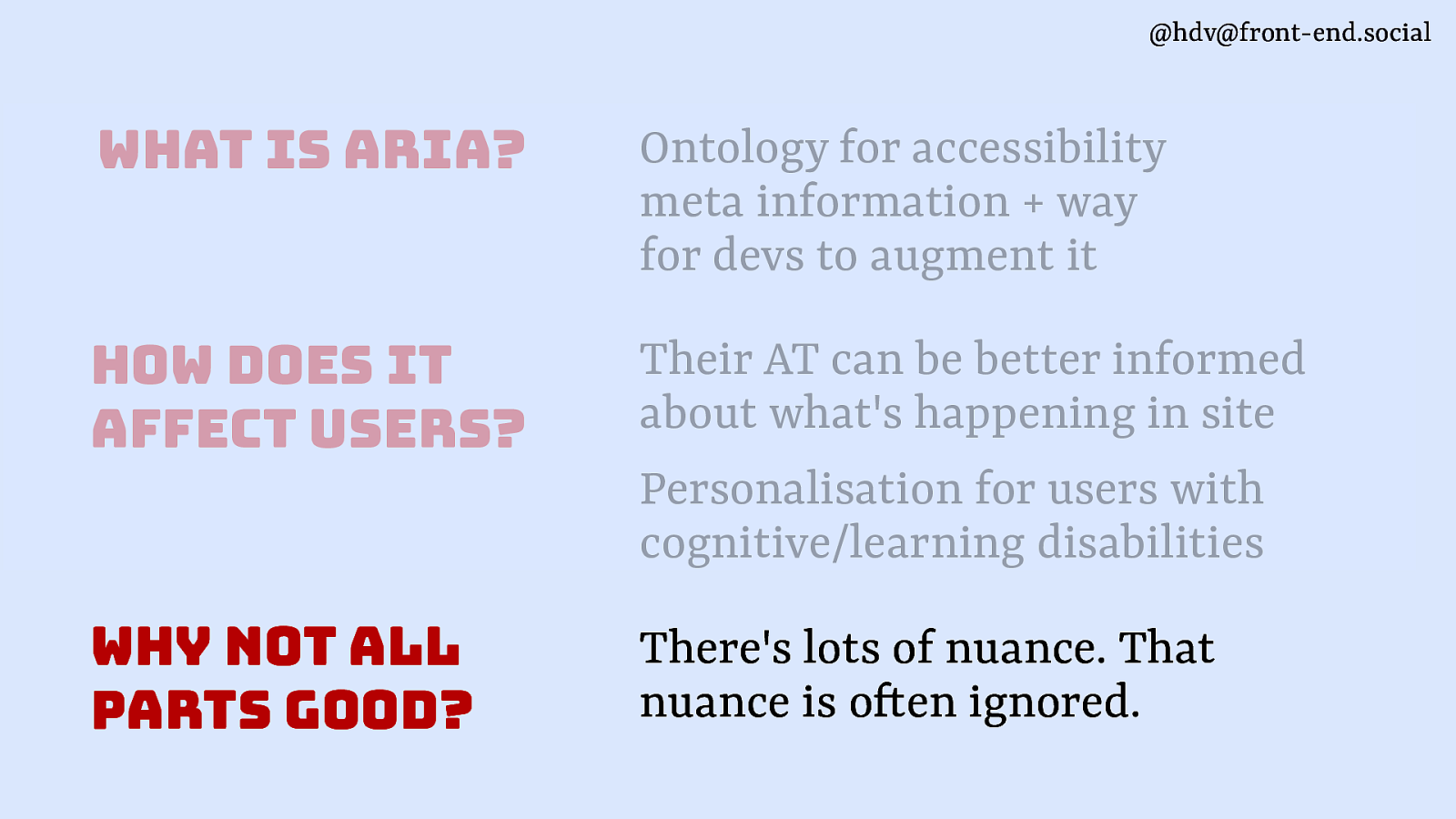
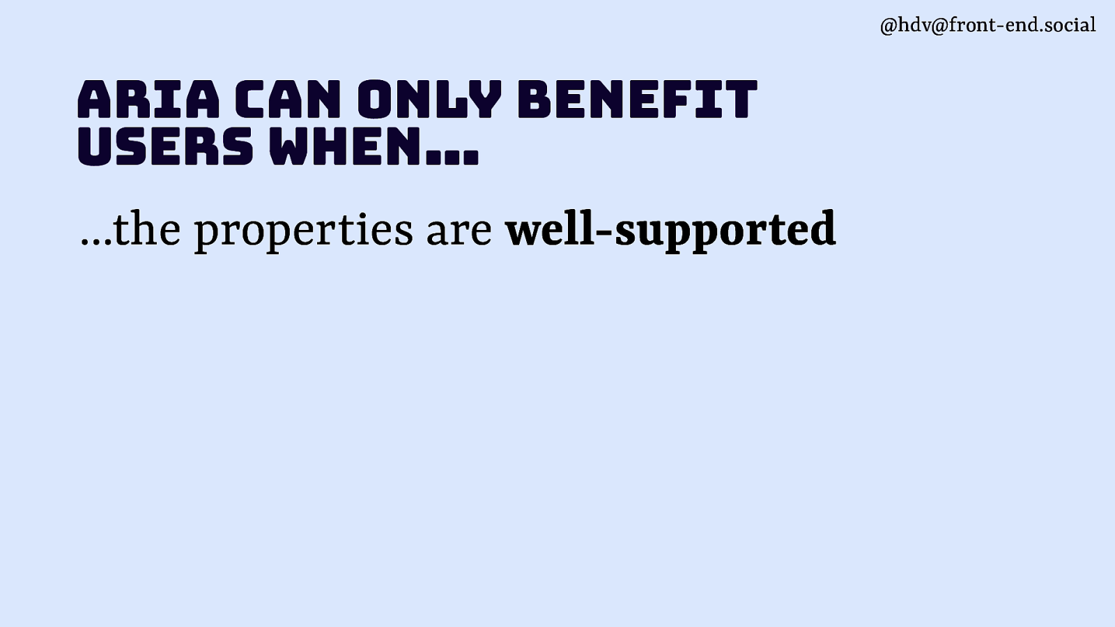
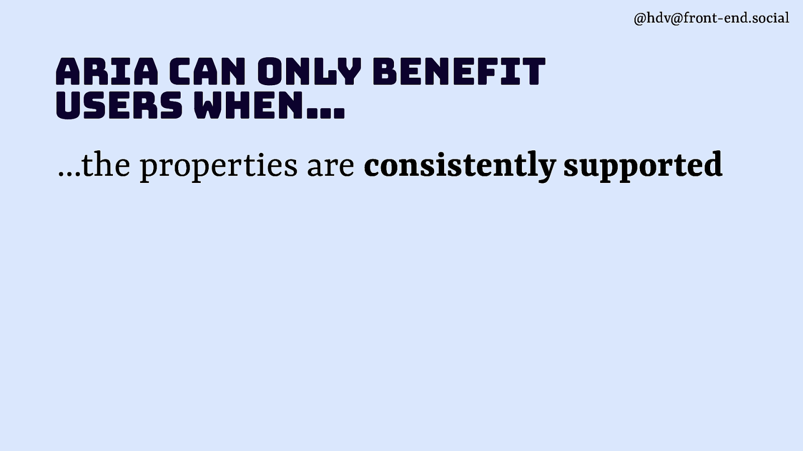
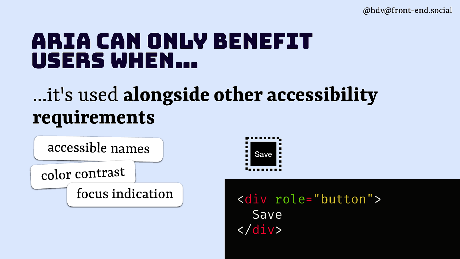
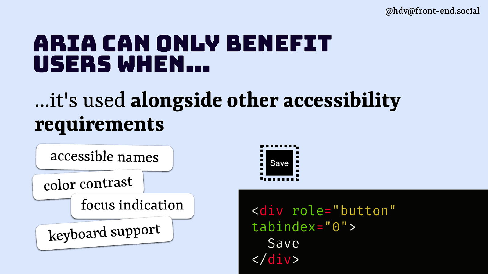
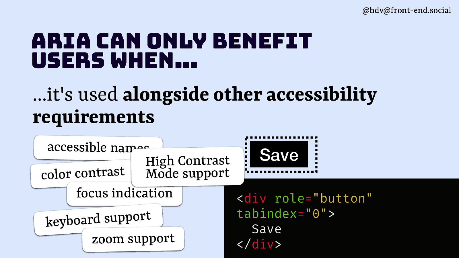
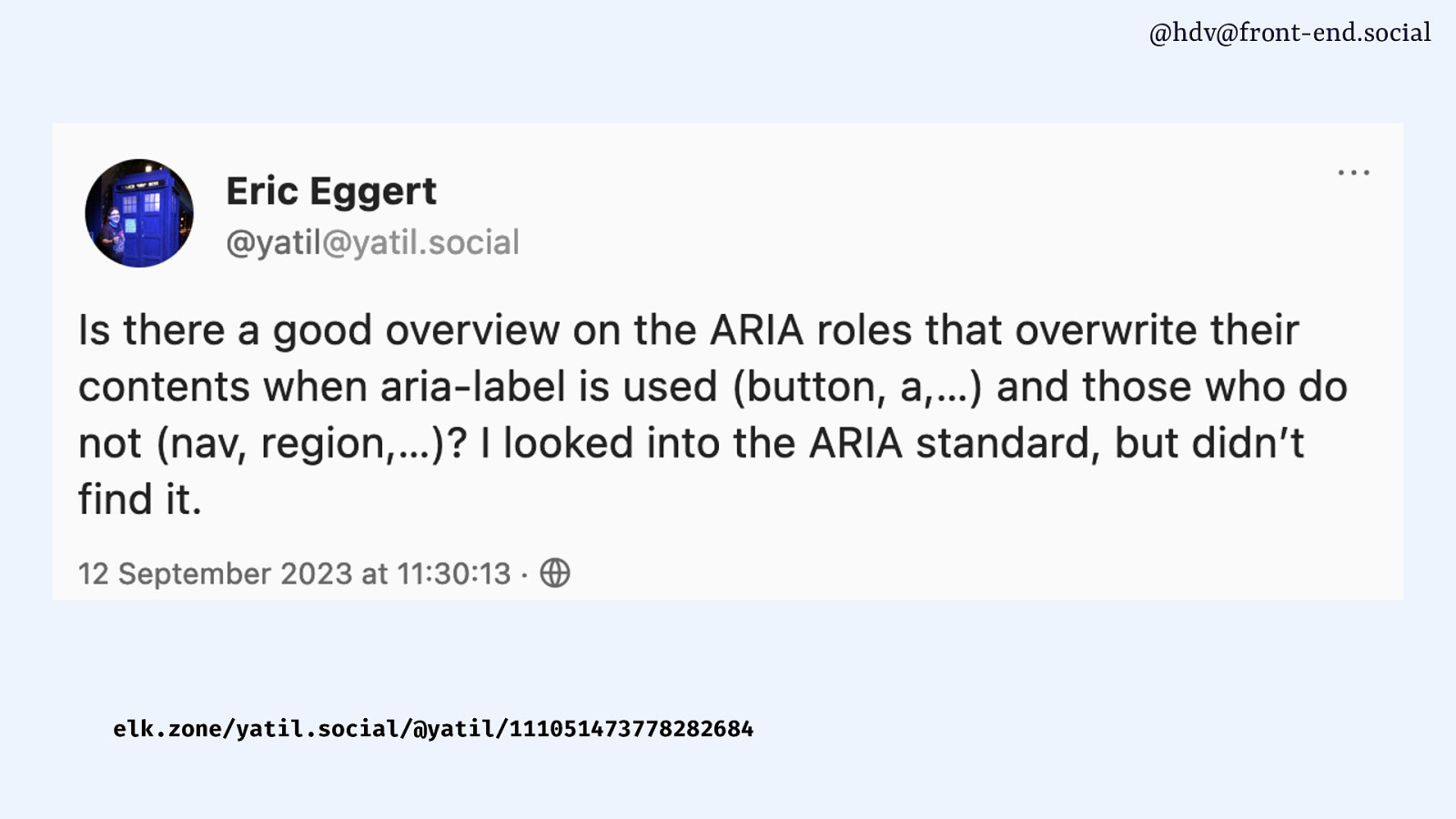
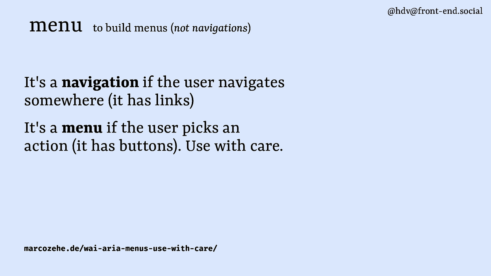
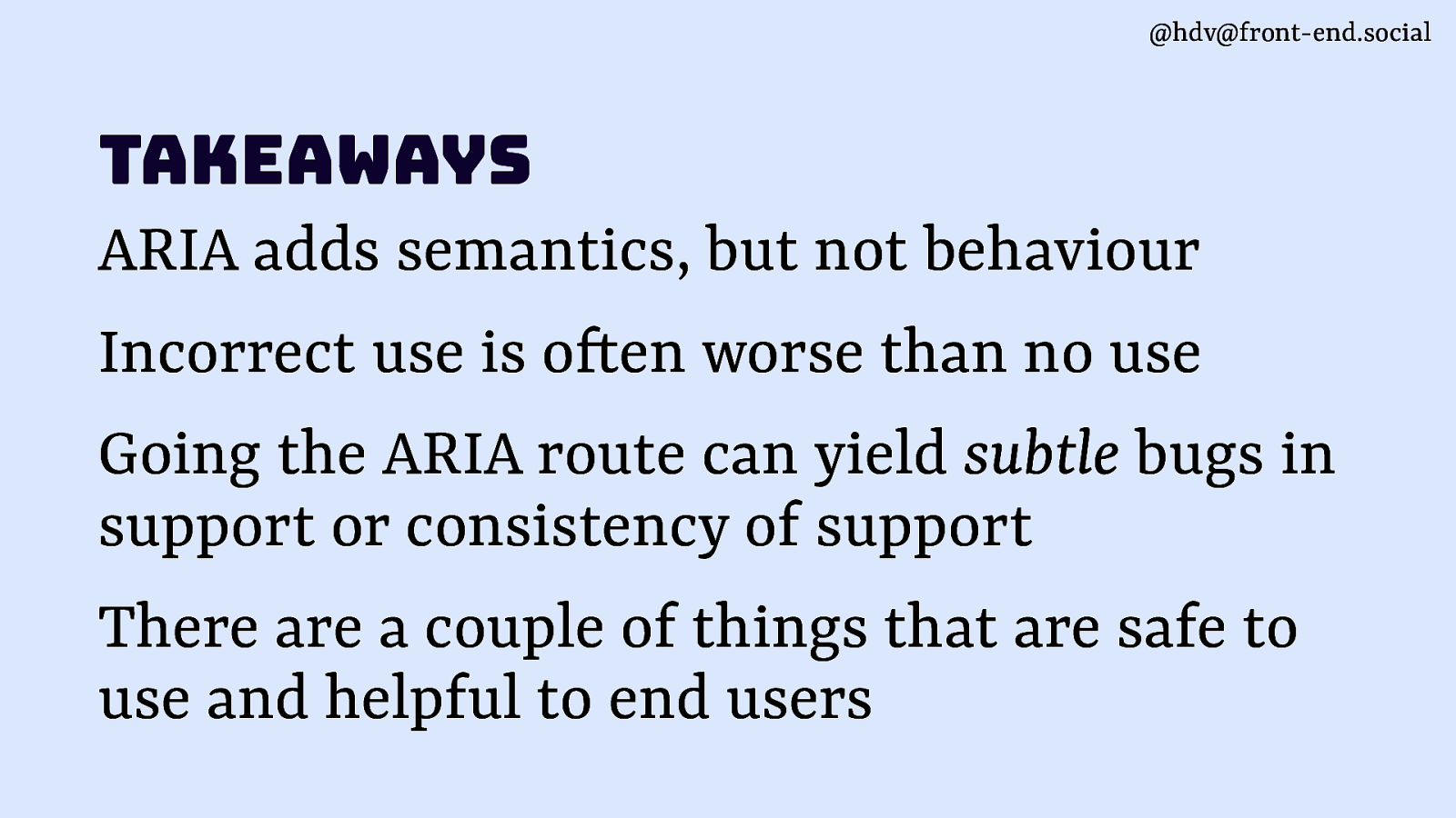
Hello! My talk is about accessibility and I’m going to talk specifically about the good parts of ARIA. When I talked about this subject to fellow accessibility people, some looked surprised. Others laughed. This is because ARIA is a somewhat controversial subject within the accessibility community.
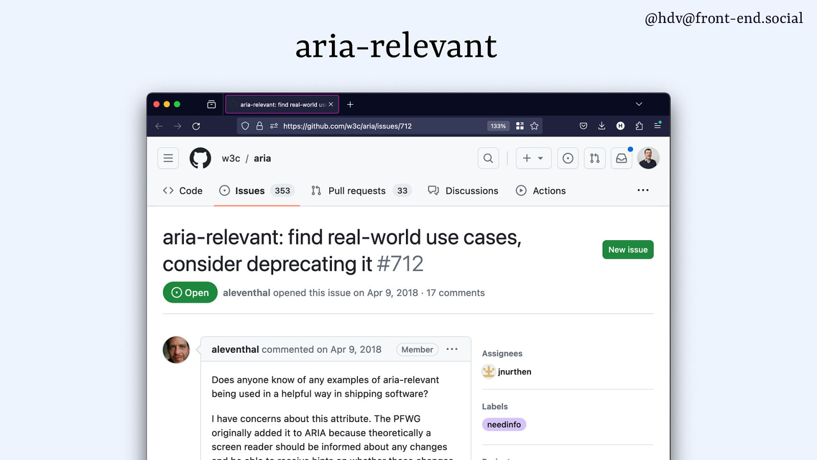
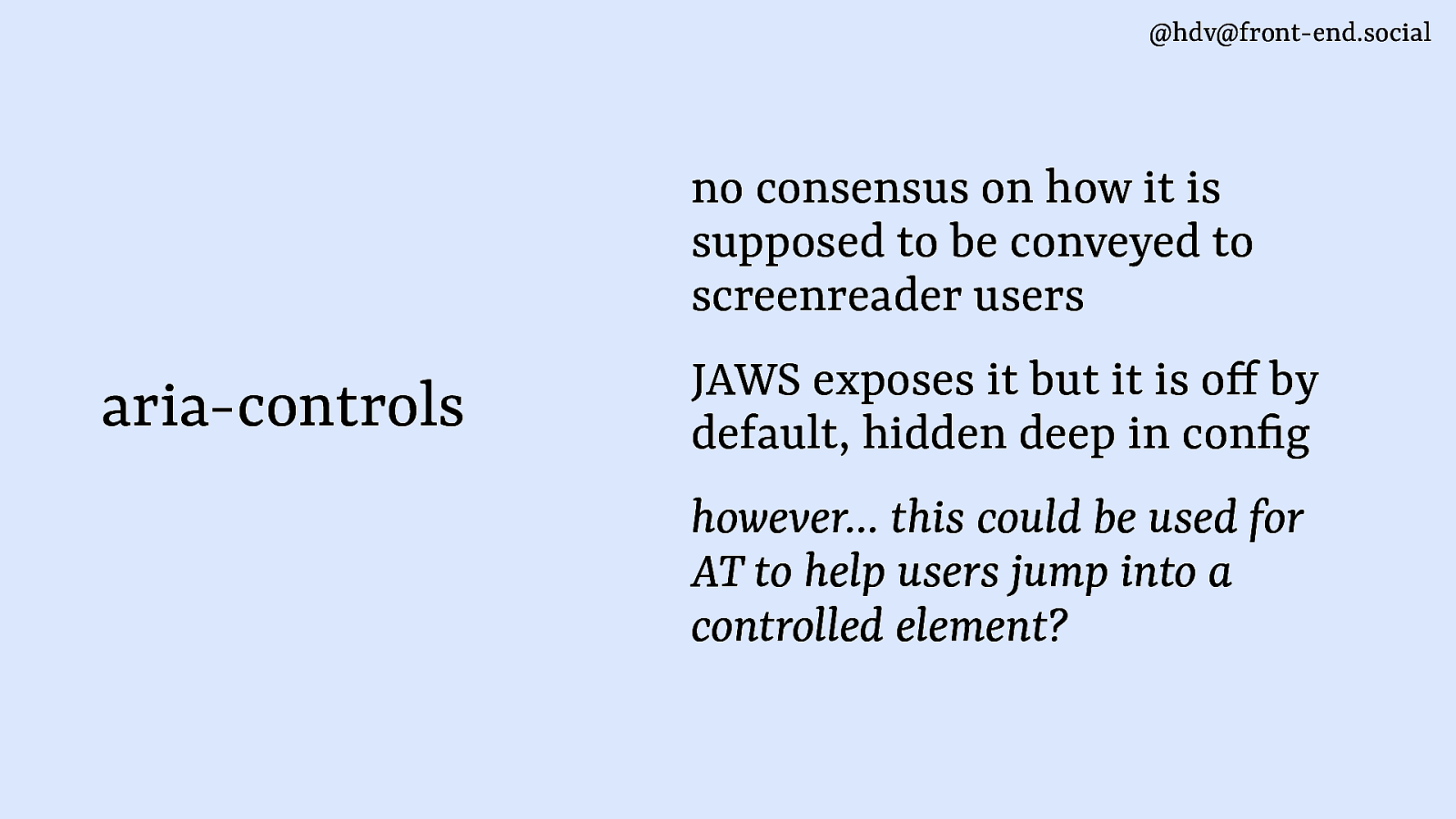
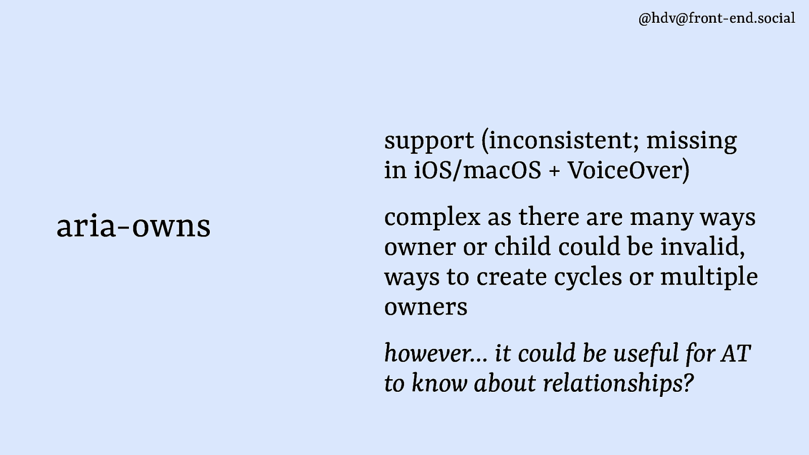
Slide 2

Slide 2

One reason is that many accessibility auditors have seen a lot of wrong usage of ARIA. Sometimes it seems people wrongly assume adding more ARIA will yield more accessibility and that isn’t necessarily true.

(Meme: person labelled full stack developer pours gigantic bottle of salad dressing, labelled ARIA, into salad, labelled “accessible” website. Source: Manuel Matuzovic)

Slide 3

Slide 3

But I am serious in this talk, there must be good parts! ARIA was conceived at the W3C, by its accessibility initiative, invented by a diverse group of people, including people with disabilities, to address accessibility problems.

This is my quest into which parts are actually pretty good when you use them.

Slide 4

Slide 4

Showing your good parts is a strategy commonly employed by marketeers. Like in this case, in the poster for the film Legend, they’ve put lots of 4 and 5 stars reviews around the faces of the two main characters displayed. And there’s two stars in between their faces. For the Guardian review looks like 2 stars are displayed and more are hidden underneath their faces, but no.

Slide 5

Slide 5

It’s actually only two stars in the Guardian, you’ll find if you look it up. They’re showing only their good parts.

Slide 6

Slide 6

It’s also commonly done by oil companies. All the large oil companies, I haven’t found exceptions anyway, list on their homepages how they have efforts around reducing CO2 emissions. That’s a great part of what they do and I appreciate it. However they fail to mention the not so good part: if you look at their financial statements, you’ll find most of their spending goes to activities that don’t reduce CO2 emissions at all. They’re clearly broadcasting just the good parts.

Slide 7

Slide 7

So the plan is, I’ll talk about what and why of ARIA, and then cover some parts that I think are good and bad.

Slide 8

Slide 8

Before I continue more, my name is Hidde, I am a freelancer in developre relations and accessibility, currently working in the core team for the NL Design System at the Dutch government. This is part of a larger accessibility effort, to try and give people well tested components and guidance to build from.

At the W3C I participate at the Open UI CG and I’m an invited expert to the CSS Working Group.

And I spend an unhealthy amount of time on this blog I have, it’s on Hidde.blog, feel free to like and subscribe.

Slide 9

Slide 9

Here’s a picture of said blog.

Slide 10

Slide 10

In the next part I will sometimes be referring to articles and blog posts and things, this is a QR code that takes you straight to the slides page, that has a list of links to all resources I’ll be mentioning. You can also use this to follow along.

Slide 11

Slide 11

The what and why

Okay, let’s start with the what and why of WAI-ARIA.

Slide 12

Slide 12

Accessibility is the “A” in ARIA and accessibility on the web is about how people use the web. How people use the web is fixed, you cannot changed that. People come to your website in however way they like. It’s different from when you’re building an app for something that is kind of fixed, at this point you may know almost exactly how people are going to use it. If you make a website, and you put it on the web, people can then go and use your stuff in whichever way they like.

Slide 13

Slide 13

People will come to your website and zoom in on them.

Slide 14

Slide 14

They’re going to use high contrast modes on their machines, which could mean that the colours that you’ve chosen are actually overridden by the operating system.

Slide 15

Slide 15

A lot of people will use reduced motion, which your website may or may not respond to or browser features may or may not respond to.

Slide 16

Slide 16

A lot of people will come to your site without a mouse, so they might use a keyboard or something that presents as a keyboard, like switch control.

Slide 17

Slide 17

And that means when you’re building controls for the web, you can’t just assume that, oh, we’re going to have only mouse users on this website.

Slide 18

Slide 18

You also need to build controls that work with keyboards or like arrows and things like that.

Accessibility is often framed in terms of conformance… do you conform to this law or to this guidelines? But in the end, the point of it is that people can use your thing and also that they will use your thing in whatever way they like. It is the web.

Slide 19

Slide 19

A lot of people use assistive technologies. They are things like voice control that allow people to control the screen with their voice, braille displays, but also screen readers. They read out what happens on the screen and in order that to work, they need to understand what’s on our site.

Slide 20

Slide 20

They need to understand it well, which is why websites expose what I like to call “accessibility meta information”.

Slide 21

Slide 21

I look for that stuff when I do an audit of a webpage, just any in particular. I’ll look for what the meta information does and compare it to what I see visually in order to report on the state of accessibility.

So here is the CNN homepage, as an example. I can see a navigation bar at the top, with a bunch of links. So when I go and look at that, I see that visually. As an auditor, I then confirm with tooling like browser dev tools that the accessibility meta information is what you’d expect.

Slide 22

Slide 22

That first link has a role of “link” and that link has a name of “world”, for world news.

Slide 23

Slide 23

There’s another link that has a name of US politics. Let’s not talk about that.

Slide 24

Slide 24

There’s another role with button and that has a name of open menu. I’ve made this up for the example, BTW. In reality, the roles and names websites expose don’t always correspond so well with the visual.

Slide 25

Slide 25

All websites expose “accessibility meta information”. If you look at a website with developer tools, you can find out what the meta information is.

Slide 26

Slide 26

If you’re a developer, your choices can directly influence the quality of it. How do you make sure that the meta information that exists in your app in your website is most helpful?

Slide 27

Slide 27

With WAI-ARIA you can set and augment “accessibility meta information”. I’ve been using that word a lot. It’s basically things like the role and the name that I just showed.

Slide 28

Slide 28

With great power comes great responsibility.

Developers have power and should use it wisely. By the way, I thought this was a quote actually from Spider Man, but found upon a quick search that it is actually a quote from Jesus Christ. Do with that information what you want.

In any way, with great power comms create responsibility. If you’re making websites, you are going to be making accessibility meta information and it’s up to you how good it is and you can use ARIA to improve it, augment it, etc.

Slide 29

Slide 29

If you look at the specification for ARIA, it says ARIA is an “ontology”, so I’ll call it an ontology for “accessibility meta information”.

Slide 30

Slide 30

An ontology is basically a defined, standardised naming structure. Like a content structure. It’s basically a way so that we all talk about the same stuff and not just us as humans talking about the same stuff, but more importantly, devices, assistive technologies, anything technically.

We will also use that same naming structure and then can make assumptions about what’s happening on your page to then expose it to users.

Slide 31

Slide 31

So what’s in the ontology? It’s things like roles, states and properties. Those are the main things that exist there.

Slide 32

Slide 32

They’re collectively referred to as semantics in WAI-ARIA. I have a philosophy background, so when I think about semantics, I think about lots of things like (we’ve spent years looking at different meanings and stuff like that). But “semantics” in the sense of WAI-ARIA is basically these three things. It’s roles, states and properties… basically what I’ve been referring to as “accessibility meta information”.

Slide 33

Slide 33

It works like this: we have a bunch of roles and the roles, they have states properties that belong to them in a way, so the roles support a state or they support a property, or multiple of them.

Slide 34

Slide 34

These roles and properties exist inside of your HTML.

Slide 35

Slide 35

They can also exist inaside of your SVG, XML, JSX etc.

It doesn’t really matter, ARIA itself is “host language“ independent. So it’s not a language to do accessibility with HTML necessarily. It could be with any kind of markup language, or any language even. I was in a project at the W3C, where we looked at using the same informational structure for assigning accessibility meta information for virtual reality. I think this makes sense, it is a naming structure, an ontology, so you could just as well use these kind of concepts in other places.

But today I’ll be talking about mostly how it affects HTML and web page.

Slide 36

Slide 36

It affects them with or without ARIA attributes. You could have ARIA attributes in your page or you could have no ARIA. There will still be some roles and still be some states.

Slide 37

Slide 37

Sometimes that’s also impacted by our HTML and CSS.

Slide 38

Slide 38

So these sit in your webpage and they have an impact. Namely they have an impact on interface affordances that a screen reader can have or a user’s switch control or voice control. Lots of other systems make use of this, but often we talk about screenreaders…

Slide 39

Slide 39

I’m going to flatten that even more, basically the code of your website impacts your user’s UI. That’s big, that’s why I said “with great power comes great responsibility”. You’ve got to make sure that whatever your code exposes, it’s useful.

Slide 40

Slide 40

And with that, I do need to note that there are a lot of different people and tools. Sometimes we assume or we talk about this, okay, we’ll do this for “The Blind User”, but there is no such thing as “The Blind User”.

The variety of people is huge and they’ll have different preferences, different settings, different devices, et cetera, et cetera. So you can’t really make any assumptions on how it is going to be end up used, which is why in this talk I focus mostly on the part before: the code of your website, the kind of stuff that you can expose that is then going to be used. You don’t really know how and you can’t really control how because people have their preferences, but at least you can make sure that your code layer makes a lot of sense.

Slide 41

Slide 41

In the browser, the information ends up being an Accessibility Tree. That is somewhat new… it used to be the case that assistive technologies would guess what happens on a page and then there was stuff in between. And now we have accessibility trees that we can read.

If you use Chrome or you use Firefox or Safari, you can actually see this in your Dev Tools. This slide is an example of an accessibility tree. There’s main and then underneath there’s a form and then that contains three different branches. One is a radio button that’s called “roundtrip”. It’s in the selected state and you can press it. Then the second one is a slider that has a value of seven, but it can be between zero and 24. It’s called departure time and you can increment or decrement it. And then the last one is a button which has a name of “search” and the action of “press”.

Now when I read this out to you, especially if you’re a designer, you could probably think of lots of different ways to design something with this information. So this is the meta information and it ends up being in a UI and could be used like a slider for instance. You can implement that in lots of different ways.

Slide 42

Slide 42

Ok, so ARIA is an ontology for accessibility meta information. It allows you to set and augment that information.

Slide 43

Slide 43

It affects users a lot, because it can be better or less informed about what’s happening on your site.

Slide 44

Slide 44

It can also be used for personalization. There is a Task Force for that at the W3C, where they look at ARIA for cognitive disabilities to replace or supplement some content or UI elements with icons, for instance.

Slide 45

Slide 45

So why are not all parts of ARIA good, You might be wondering. There’s lots of nuance and that nuance is often ignored. So if you want to get good at ARIA, realise whenever you’re using it, you want to make sure that you get it right. Small mistakes can have big consequences.

Slide 46

Slide 46

The good parts

Ok, let’s move on to The Good Parts then. I do want to do a couple more caveats before I start saying what’s so great.

Slide 47

Slide 47

The first one being that area can only really benefit users when properties are well supported. That’s somewhat tricky, because there’s lots of ways to measure that.

Some people say it’s supported when a screenreader announces something, but there are also properties in ARIA that maybe aren’t announced but still have a use.

There are various websites out there that will show you support on different combinations of browsers. Even the ARIA Working Group themselves mesure things in a project called ARIA-AT (though this is a long and somewhat slow moving project for various reasons).

Slide 48

Slide 48

Also, not everything is consistently supported. That’s another thing to look at. If you have a property that does something completely different in the one browser versus the other, then that’s not very helpful.

Slide 49

Slide 49

Another thing to look out for is that accessibility is much bigger than just ARIA. ARIA is the accessibility meta information. It’s useful, but on top that you’ll need to do everything else. There’s lots of other accessibility requirements usually.

Slide 50

Slide 50

Let’s say you’re building a button and you’ve done that with a div that has a role of button.

I know people get tired of the button example, but I’m using this and you can extrapolate this to any ARIA that you use… when you merely slap a role, it’s going to do nothing, you’ll need to meet other accessibility requirements in ways that may or may not involve ARIA.

Slide 51

Slide 51

So there are other things you can do. You need to put some content in so that there is an accessible name.

Slide 52

Slide 52

You’ll need to add some colours so that it has colour contrast that is sufficient.

Slide 53

Slide 53

You need to indicate focus.

Slide 54

Slide 54

You need to think about keyboard support.

Slide 55

Slide 55

You need to think about zoom support, high contrast mode support, all these kinds of things.

So ARIA will do one thing, on top of which you need to do other things as well.

Slide 56

Slide 56

Moving on to good parts, or the parts that add some value for end users that are somewhat helpful.

Slide 57

Slide 57

The first one I’ll start with is landmarks.

Slide 58

Slide 58

I like to explain that by looking at this auditorium.

Slide 59

Slide 59

When you present this auditorium to people, you would explain sort of different parts of the auditorium, right? You’ll say, okay, here’s the stage. There is the toilets, there is the registration downstairs. So you start to kind of point out different parts of the environment. Landmarks in ARIA are basically that, but for your website.

In the auditorium you wouldn’t say that’s chair number 42, that’s chair number 86. You wouldn’t do the individual chairs. You would go for the main areas and the main things that you want to convey about the website.

Slide 60

Slide 60

Slide 61

Slide 61

You can do that with HTML elements that have the ARIA roles built into them. Like the nav element, youcan have a nav that’s labelled by a heading. Or you can have an aside element or headers, footers, sections, search form, they’re all landmarks.

Slide 62

Slide 62

Now it’s important, like I said, to only make the most important things in your page a landmark. Not everything because it will make it really hard to browse.

You want to label them, so if you have multiple navs, then they could be differentiated, it’s important toindicate what the differences between them. They all have HTML elements, so that’s useful. You can use those.

Slide 63

Slide 63

Moving to “why landmarks?”. Having the landmarks in place directly improves the experience of people who like to navigate via landmarks.

Slide 64

Slide 64

Let’s move on to aria-expanded. When I asked a lot of accessibility professionals what their favourite ARIA was, (I know, weird question), many said, yeah, aria-expanded is somewhat useful. So I’ll give you an example of what that’s for.

Slide 65

Slide 65

Let’s say you have a “question mark” button. When it’s clicked, it opens a toggle tip. It visually indicates that the thing is open by being open on the screen. If you can see this, you can see that there is an open toggletip.

The website or the AT doesn’t actually know that it is open. That’s what aria-expanded brings. It conveys this is now open or this is now closed, you set it on the button.

Slide 66

Slide 66

Another example is sections that open and close like accordion type of things.

Slide 67

Slide 67

So how do you best use aria-expanded? Only on elements that toggle.

Sometimes the browser manages this aria-expanded for you, by the way: when you use details/summary. but also when you use, ha, Adrian said I would talk about this, the popover attribute. When you use popover, browsers would expose the aria-expanded relationship and keep its state up to date.S,

Slide 68

Slide 68

Concluding. you’d use aria-expanded to convey the visual expanded state programatically.

Slide 69

Slide 69

Next: aria-pressed.

Slide 70

Slide 70

You can use it to make a toggle button. Toggling is something for instance you can do when you’re watching a music video, like this awesome concert by Hiromi at Tiny Desk. I recommend watching, and wouldn’t actually mute it at all.

Anyway, YouTube players have a mute button, and mute buttons are kind of two state thing. It’s either muted or not muted and you can switch between those states. When you click it again, you go from mute to not mute, to mute to not mute. The aria-pressed attribute will convey the state for you.

Slide 71

Slide 71

Another example is when you post inspirational quotes on LinkedIn, people can like these, or unlike. The like button, like a mute button, can be presead or not pressed.

Slide 72

Slide 72

The how of aria-pressed is: you toggle the attribute’s value between true and false.

Slide 73

Slide 73

The why is that it conveys a visual state programatically. just like aria-expanded.

Slide 74

Slide 74

The next one is aria-label and aria-labelledby.

Slide 75

Slide 75

This one is somewhat controversial: these are attributes that you can use to name something. There are lots of other ways to name things that don’t involve ARIA. You don’t have to use this, but there are cases where maybe it makes sense.

For instance, on the new Eurostar website, which is also the new Thalys website, I think it went live today, I used it to book trains between Rotterdam, where I live, and Paris.

Slide 76

Slide 76

There is a button to swap departure and arrival input, two arrows in opposite directions, that has no visible label. You could build this with visually hidden text, but aria-label is also a way to do it, and the result, a name, is useful.

Slide 77

Slide 77

The same site has a secton with a heading Ideas for your next trip.

Slide 78

Slide 78

You could use aria-labelledby to set the name of that section landmark to be that heading.

Slide 79

Slide 79

ARIA labels is for when you ran out of other labelling techniques. You want to do it with unique and to the point names, because they are used by, for instance, use of screen readers, they need to know what the name is. It’s also used by voice control, so we want to avoid differences between what the label is programatically and what it is visually. I’ll show you an example of that.

Slide 80

Slide 80

Let’s say you have a menu button. It’s got the word “menu” in there and a hamburger icon. In the markup there’s a button with inside of it an SVG and the text “menu”.

Slide 81

Slide 81

You can add an aria-label of “Open hamburger thingy” but then you’ve created a mismatch.

Slide 82

Slide 82

A mismatch between the aria-label and visual label is a failure of the Label in Name criterion of WCAG.

Slide 83

Slide 83

With labels, keep in mind that they work slightly differently on buttons (override contents and make them inaccessible) and say, landmarks (don’t override). Eric Eggert wrote about this on Mastodon.

Slide 84

Slide 84

So the reason we need ARIA labels (but really all labels, the ones you do without ARIA work just as well) is that users can navigate much more easily. Do make sure the names are unique and useful.

Slide 85

Slide 85

Moving on to aria-describedby. An ARIA label names something, aria-describedby provides a description. That is useful when you’re building a form and you want to associate error messages with the form label and the field.

Slide 86

Slide 86

You can make associations with fields as well as fieldsets.

Slide 87

Slide 87

Slide 88

Slide 88

Then aria-current, which is what you can use to distinguish within a set of links. Which one is the current one? So I’ve got a couple of examples here. If you have a navigation bar and one of them has a different colour, different styling, the current page or if you have a breadcrumb, one of them will be the current page. Or, if you have navigation for different pages like 1, 2, 3… again, one of them has a current state.

That’s the thing that you see visually, but that isn’t indicated automatically to assistive technology: aria-current fixes that gap.

Slide 89

Slide 89

It makes the visual state programatically available.

Slide 90

Slide 90

It is probably better than visually hidden text like the word current, because it doesn’t need to be translated by the developer, and it is standardised so tools can choose how to expose it.

Slide 91

Slide 91

Lastly, it is well supported.

Slide 92

Slide 92

Then, aria-live, it exists as sometimes things change in a page that people need to know about status changes and important updates.

Slide 93

Slide 93

Here’s an example from a Dutch government website where if you log in, your session times out after 15 minutes. All Dutch government websites do this, usually they’ll have a warning after 10 minutes to let the user extend their session. That’s important, because maybe you’re filling out your tax return… I don’t know about here, but in the Netherlands that’s going to take you, like, an hour. It’s a long form. If it takes you an hour and you press submit, you may have been logged out already.

So these messages are important and they need to be conveyed immediately to users. That’s annoying, but it’s important, and less annoying than being logged out. It’s a bit like an alarm bell in the morning. You don’t want to wake up, but it’s good to know you have to.

Slide 94

Slide 94

aria-live can also be used in shopping carts. When someone found an article they want to buy and press the button to add to the cart, many webshops will show a shopping cart with an icon that tells you you’ve now got one or two items in there, it updates on the fly.

That kind of change could be useful to convey to users because it means it was successful… you’ve successfully put it into your shopping cart, nothing went wrong.

Slide 95

Slide 95

How to use aria-live? You can use the attribute. You could also use the output element in HTML, which will give you a nameable polite region that mostly works. There’s a really interesting post about this by Scott O’Hara where he explores that option and some potential pitfalls.

Slide 96

Slide 96

Speaking of, it’s important not to focus the live region (no need and you could disorientate users) and not to trigger announcements too many times, that could easily become annoying.

Link: article: To ARIA! The Cause of, and Solution to, All Our Accessibility Problems

Slide 97

Slide 97

Why would you use aria-live? Well, status updates and warnings are often clearly marked visually. With live regions, you’re ensuring they also show up programatically.

Slide 98

Slide 98

Next up is aria-hidden. I wasn’t sure whether to include it because what it allows you to do is make something invisible to assistive technologies.

There might be valid use cases where maybe you have redundant content, where it doesn’t really help to have it in assistive technologies. One example I can think of is when you have a header and you put that same header there again for styling, like do a shadow effect or something like that. Then I guess it’s best to make that second one aria-hidden.

Another case could be SVG elements that are icons and that also have visible labels, like an SVG icon as part of a link of your favourite social network plus the name of that network. Removing the icon from the accessibility tree would be fine, because the link’s name would still be there.

Slide 99

Slide 99

But, keep in mind that this shouldn’t be added to focusable elements, and that some screenreader users are sighted, to these users it could add confusion.

Slide 100

Slide 100

The reason to use aria-hidden is to remove redundant content, which, I’ll stress again, should be fairly rare.

Slide 101

Slide 101

Also note that aria-hidden is different from role=presentation (which only removes an element’s default role, it doesn’t remove it from the accessibility tree).

Slide 102

Slide 102

So, we’ve looked at a bunch of different things that I think are good parts of ARIA, that when you use them it’s actually helpful for users, like landmarks, aria-expanded, aria-pressed, labels, descriptiont, aria-current and aria-hidden.

This brings me into territory now, that I like to call “the more complex widgets”. Using these can be very useful to users, but it’s a lot easier to get it wrong. There’s even more caveats there.

Slide 103

Slide 103

Slide 104

Slide 104

Or, as Sarah Higley said in a post that she wrote about roles and descriptions: “talk to your kids about ARIA before it’s too late”. She stresses this, comparing the somewhat “simpler” ARIA things with the more complex widgets.

I did want to include one such widget: menu. I think there are valid cases to build menus.

Slide 105

Slide 105

For instance, this is a CMS that offers a menu that goes with an image upload section: it lets you remove it or download the original file. This is a menu: you can click the button, an it opens a bunch of options or actions.

Slide 106

Slide 106

The menu itself gets a role of menu.

Slide 107

Slide 107

Then individual items get a role=menuitem.

Slide 108

Slide 108

On top which you add a roving tabindex, which means people can’t Tab to all of the individual things, they can only get to one at the time (because everything else gets tabindex=-1.

Slide 109

Slide 109

Then you need to make it usable with arrow keys.

Slide 110

Slide 110

And also with a bunch of other keys, like Escape and Enter and Home and End and Tab and Space. Plus all of the printable characters… so if the user pressed the U, the first action with the letter U (upload) is selected, something native controls do, too.

Slide 111

Slide 111

This is something that’s probably very rare. So when I do accessibility audits, I more often see things that are not menus that are built as menus, then the other way around.

It’s important to point out that menus aren’t navigation: it’s navigation when a user navigates somewhere and it’s a menu when it has actions. So the way I like to think about, it’s like the difference between links and buttons. A link goes somewhere, it’s navigation and a menu has buttons where you can do stuff.

Slide 112

Slide 112

The bad parts

Let’s go to the bad parts. Or, more like, the common pitfalls.

Slide 113

Slide 113

There are lots of things you can get wrong in ARIA, and I want to warn you about those things today.

Slide 114

Slide 114

The first bit I want to talk about is a pitfall that’s not really on individual websites, but more of a standards guidance pitfall.

Slide 115

Slide 115

Adrian touched upon that a little bit as well. One thing that I find is often misunderstood is that some things at the W3C are standards, so WCAG, ATAG, UAAG and also WAI-ARIA. They are standards, or so-called Recommendations, which means they’ve gone through a really long process. It’s a complex process, but then you have something that a lot of people agree about and that has had input from a lot of stakeholders. So it’s good, these are norms (and in the case of WCAG, they become law in some places, or are referred to by law).

In addition to that, there is also the documents that are “not normative”. They are different. They don’t go through that process, they don’t get that official status and it also means that they are often more opinionated or done by smaller groups with less input.

Slide 116

Slide 116

If you’re using the ARIA Authoring Practises only, then you’re kind of limiting yourself to just ARIA (in addition to some other problems that that document has). It’s important to keep in mind that you don’t necessarily have to use ARIA.

These are also all documents that are based on specific standards, not on “what’s accessible” per se. So ARIA Authoring Practices, COGA Guidance, less so, but Understanding and Techniques, they’re all things that help you with a specific standard.

Slide 117

Slide 117

So they help you with WCAG, in the case of Understanding and Techniques.

Slide 118

Slide 118

Or they help you with ARIA, in the case of APG, if you want to do ARIA.

Slide 119

Slide 119

An important point here is: web accessibility is about how people use the web.

Slide 120

Slide 120

Which you impact with code.

Slide 121

Slide 121

That code isn’t necessarily ARIA, it’s a combination of lots of different things like CSS, HTML, SVG and JavaScript, plus lots of other things like your design and other things. So your website accessibility has to do with all these different things.

Slide 122

Slide 122

I did write a long rant blog post about that as well. I think we need guidance that is broader than just ARIA guidance or WCAG guidance.

Slide 123

Slide 123

Now let’s move to issues that are in individual websites.

Slide 124

Slide 124

A lot of HTML elements provide your accessibility meta information for you, so then you don’t need to add area to your HTML, you don’t need to double it up.

Slide 125

Slide 125

Another issue that I find often is where there’s a conflict between state and UI. So you are doing something with a state like aria-expanded, but then your UI doesn’t match what’s in the attribute.

Slide 126

Slide 126

An example of that is if you have a button that opens a menu, the menu is not open, but in the DOM it says aria-expanded=true. That’s a mismatch and it’s easy to miss, as it sits in your DOM and you’re not looking at your DOM all the time (you’re probably spending time in your text editor or you look at what it visually looks like in a browser).

This is an issue, because you’re basically telling users “I’ve got some information for you” but then end up giving them wrong information, it’s probably worse than not providing a state at all.

Slide 127

Slide 127

Another example: you indicate of your navigation, one item is current, but it’s not the actually current item, it’s a different page. I see this in audits all the time, it’s easy to forget.

Slide 128

Slide 128

Another issue is disappearing focus. That’s something where you can really break the user experience for people. The ARIA spec says: when an element disappears, focus should go to a logical element (paraphrasing).

Slide 129

Slide 129

Let’s say you have that widget that I showed earlier, a question mark that opens a toggletip.

Slide 130

Slide 130

Let’s say it has a button inside of it.

Slide 131

Slide 131

And you navigate to that.

Slide 132

Slide 132

Now, when you make that toggletip disappear, where should the focus go? It can’t really stay on the button because the button is going to go away. It no longer exists.

It’s important when this kind of case is that you take particular care of moving the focus yourself. Otherwise, the browser is going to put it at the beginning of the document.

Imagine someone is in a complex form, like their tax return… they’re midway and then they’re moved back to the start. That’s really annoying. So we want to move it back to the button that opened it, which is probably next to the input that this is about.

Slide 133

Slide 133

Another thing you shouldn’t do is give “screenreader instructions” in your markup.

Adrian has a fantastic post about that, called that “Stop giving control hints to screen readers”. For instance, if you have a button that has an aria-label of “hello if you’re a screen reader user, this is for you”. I have seen variations of this in websites.

This can be well-intended, but it is kind of going beyond your job as a developer. You want to expose accessibility meta information, but you don’t want to write directly to people who use screenreaders. You don’t even know if someone is going to use this with a screenreader or with voice control or with whatever else.

Slide 134

Slide 134

Moving on to the application role. This is somewhat of a contested thing and the recommendation is not to use it unless you really, really, really have to. Should be rare.

What role of application does, is that it stops a screenreader from intercepting shortcut keys, so that you as a developer can define your own shortcuts instead. For instance, people with screenreaders press the H key to browse between different headings. That will stop working in application mode so it will make it hard for people to browse around. That’s annoying. Unless you implement something that is really like your own UI. It can create massive barriers and a confusing user experience.

A link to two blog posts here, one by Marco Zehe who says don’t use it, and one by Léonie Watson who mentions one use case where it might actually be useful (in a slide deck when giving a presentation).

(Note: after the talk, I got feedback from two more screenreader users, of which one said he also liked application mode in video players on the web, to make it much easier to jump to a specific part of the video or change the volume.)

Slide 135

Slide 135

Another one is aria-roledescription, which allows you to override the description of a role, so instead of “button” you could have your special button announced as “special button”.

Adrian wrote a post about aria-roledescription, from which I took these three points against aria-roledescription:

  • doesn’t allow for auto translation. So if you’re overriding what the description says with your own wording, then that can’t be translated because it’s not a standard thing.
  • can also easily increase verbosity, because you’re usually making it more specific, so you end up with more words
  • it can create very confusing situations

Slide 136

Slide 136

I’ll show you an example of what that looks like in practise. So let’s say I have a that is called “Upload photo”. Here is how that’s announced.

[video of screenreader that says “You are currently on web content, upload photo button, web content. You are currently on a button inside web content.”].

So that’s a button. Now if I add aria-roledescription to that and I put the word “Nonsense” right in there, this happens:

[screenreader in video: “Upload photo, nonsense, you are currently on a nonsense inside web content.”]

It says I’m “in a Nonsense” and if I’m a user, I don’t really know what a “Nonsense” is. This button ruins my experience there. I don’t know how to use a “Nonsense”. Safari actually then also goes on to say: “to click this button”, so it seems to not completely throw it away, but the instruction that the website gives is “don’t call this a button anymore”. So yeah, don’t do that. It’s usually not what you want to do.

Slide 137

Slide 137

Then aria-relevant is an ARIA attribute where people are still looking for use cases, so I would avoid it for now. There’s a GitHub issue detailing the issue.

Slide 138

Slide 138

Other parts

There were also two things I couldn’t really place in good or bad, I wasn’t sure where they’d belong.

Slide 139

Slide 139

One is aria-controls. The issue is there’s no consensus about what AT should actually do with it. A lot do nothing at all with it.

JAWS does expose it, but then you need to go into a setting and yeah, that’s somewhat confusing. I was recently told though that aria-controls can be used by assistive technologies to understand your page structure better and make better decisions. So even if there are no announcements, it’s not necessarily broken: maybe the controls relationship is still used for something. I’m a bit in two minds about this one.

Slide 140

Slide 140

Lastly, aria-owns: the main issue is that implementers, like the Blink engine that’s used by Chrome, has some implementation issues, like dealing with multiple owners and cyclical references.

Slide 141

Slide 141

Takeaways

I’ll end with some takeaways.

Slide 142

Slide 142

  • ARIA is to define semantics related to accessibility, it relies on developers to add relevant behaviour on top.
  • Make sure you get it right. Incorrect use is often worse than no use at all.
  • Going the ARIA route can give you subtle bugs that are really hard to find or inconsistencies.
  • To end on a happy node: there are some things that are safe and good to use and actually helpful to end users, especially if you think about what their purpose is and use them in that specific way.