It’s the markup that matters - Hidde de Vries 15.03.2019 Amsterdam
Slide 1
Slide 2

This is my website, hiddedevries.nl, it has a blog where I talk about a lot of the things that I’ll talk about today, but it it also my company. I’m a freelance front-end developer.
Slide 3

Currently I spend most of my time at Mozilla, as a front-end developer in their Open Innovation team, and at the City of The Hague, where I work on a patterns library and accessibility, specifically.
Slide 4

But let’s talk about Web Components!
Slide 5
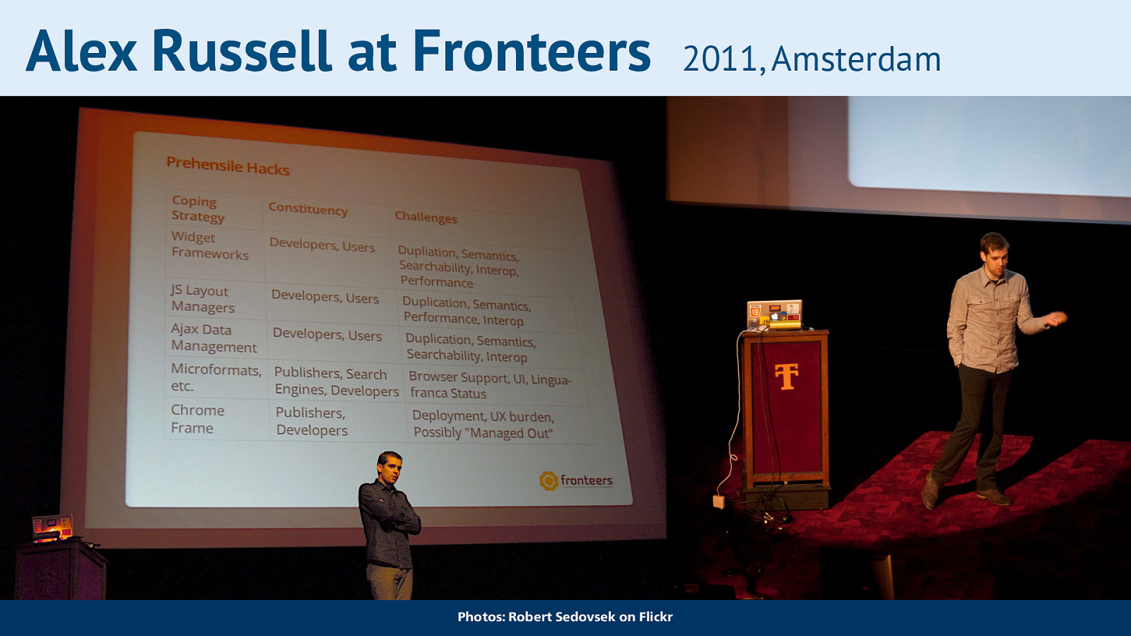
They were first introduced here in Amsterdam, at Fronteers conference. I can’t actually remember if I saw all of this talk, as I also volunteered and that can get quite busy, but I rewatched it recently. In this talk, Alex introduced the idea for Web Components.
Slide 6
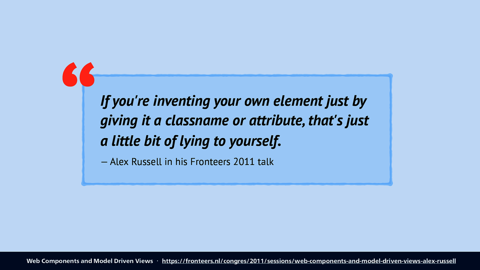
He talks about how on the web we like to make our own things in addition to existing things. Interestingly, he explains how we treat something as a component if it just has a class or an attribute, but that he calls “lying to yourself”.
Quote: if you’re inventing your own element just by giving it a classname or atribute, that’s just a little bit of lying to yourself. Credit: Alex Russell in his fronteers 2011 talk
Slide 7
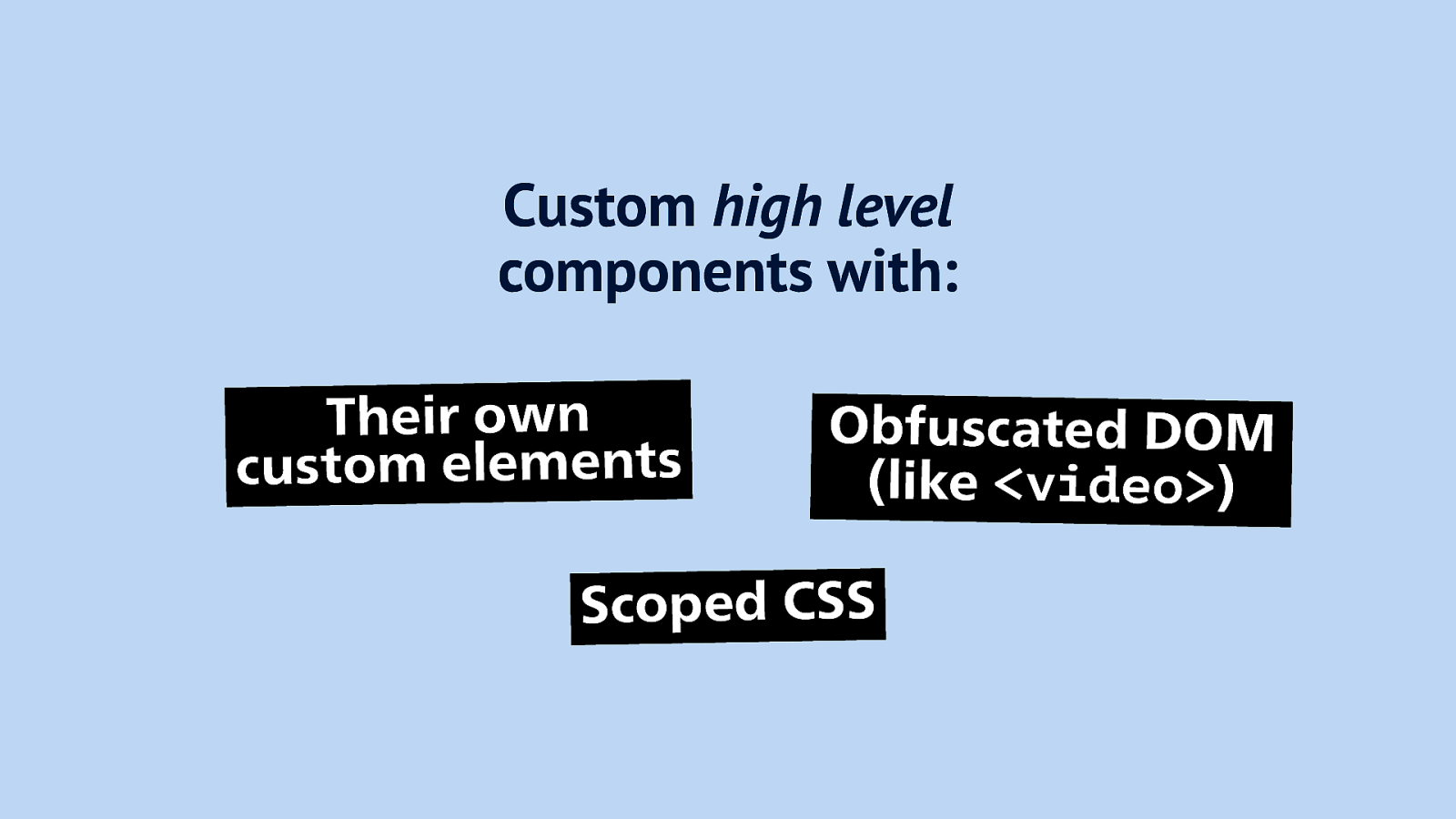
He explained it would be cool to have components like buttons and video elements, high level components, but one’s that we make ourselves. Three characteristics: they are their own elements, their DOM is hidden away, just like in the video element, all the magic stuff is not in the DOM, you don’t add it at the time of use, and scoped CSS that doesn’t interfere with other CSS.
Slide 8
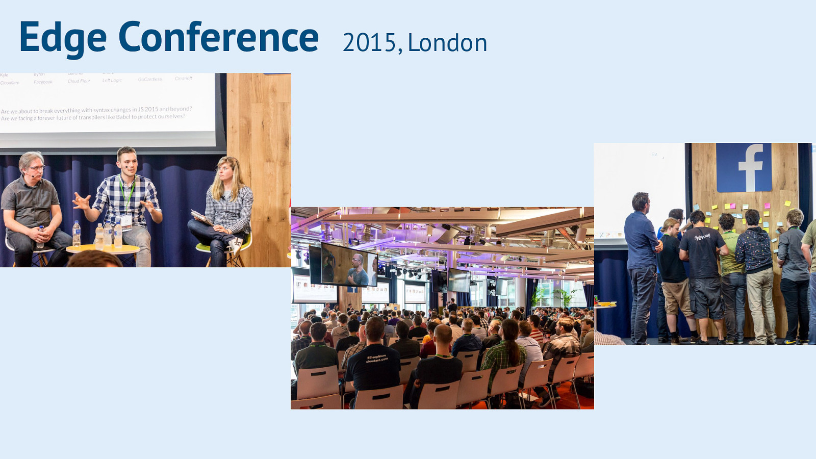
A couple of years later I attended Edge Conference, a gathering of web standards people, browser makers, developers and others to talk about near and far future ideas for the web. Web Components was one of the topics of the day. One feeling I left with, was that a lot of the peolpe there that were very excited, also worked for very big companies like Google and Facebook, where it was hosted. I had this idea that these big companies have a lot of budget and time to make quality components. I had different expectations from everyone else, working at just regular companies with tinier budgets. I’ve kind of change my mind there, because there are lots of open source components available that people have put lots of time into, not powered by a big company.
Slide 9
But yea… that’s my main worry. If Web Components are going to be supplementary to built-in elements, will they really be just as good as the built-in stuff? Because the built-in stuff is good. Elements like <video> and <select> come with lots of built-in ergonomics, some of which we don’t even realise until we have a close look at it.
Slide 10
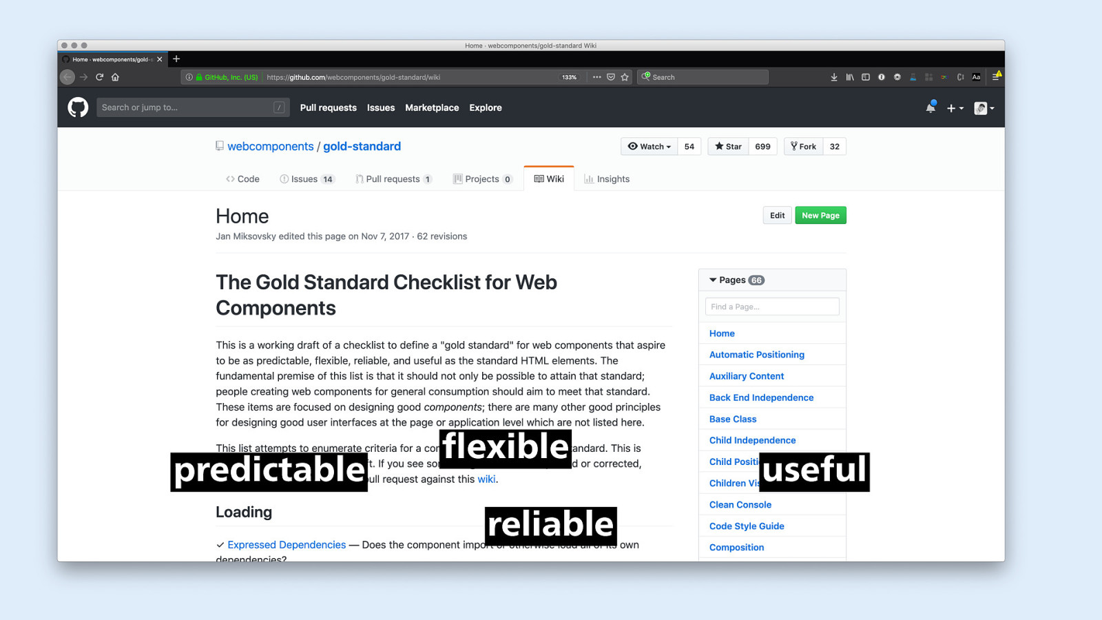
A good thing is that at the time someone created this list, a Gold Standard Checklist for Web Components, which has lots of quality aspects covered, including usability, reliability and accessibility.
Slide 11
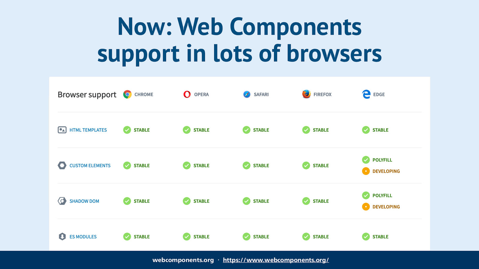
Things have changed quite a bit in the last few years. Web Component support is in our user’s browsers, a lot of people now use browsers that natively support web components.
Slide 12
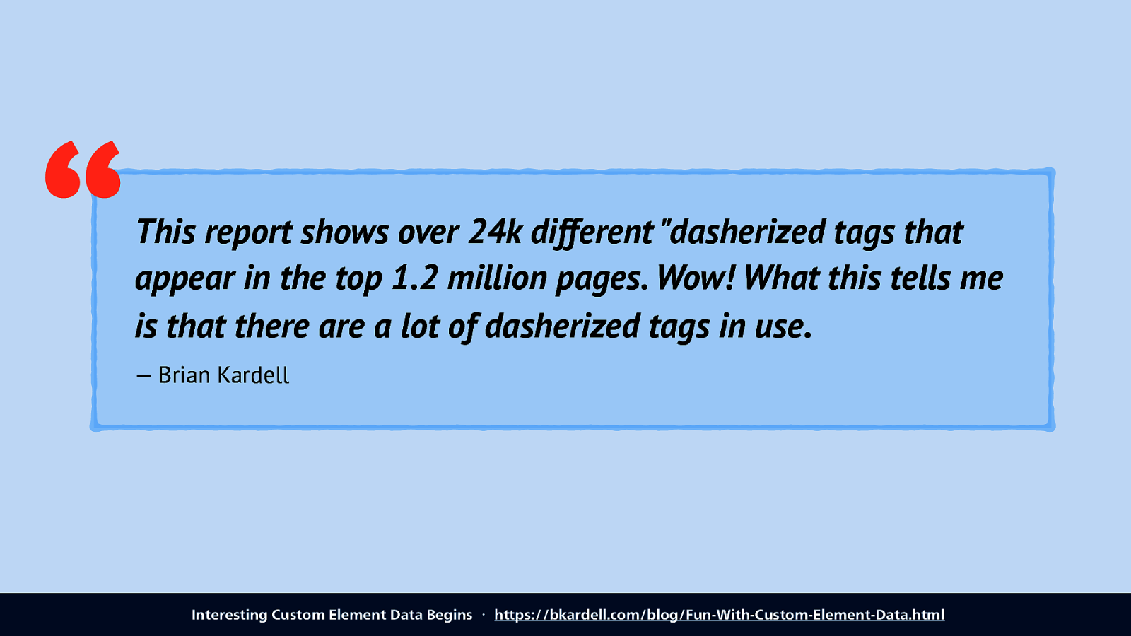
They get used too! Brian Kardell got his hands on a dataset that is used to analyse how people use the web platform, and he looked specifically at how many custom elements were in use. Quite a lot, his post shows, over 3000 different custom elements. He did not that, sadly, many of them were ad or AMP related.
Quote: This report shows over 24k diferent dasherized tags that appear in the top 1.2 million pages. Wow! What this tells me is that there are a lot of dasherised tags in use.
Slide 13
So, ok, let’s talk a bit more about the quality of our components. I am specifically interested in how we can get the accessibility of components right. What do we need to do for that?
Slide 14
So yes, this is actually an accessibility talk.
Slide 15
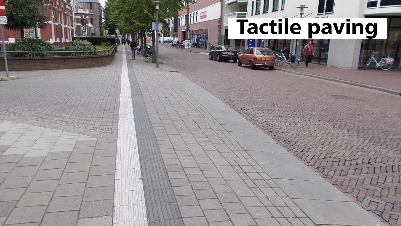
Accessibility is something we do a lot in the real world. It is super common. Things like this tactile pavement helps people navigate a street more easily.
Slide 16

Elevators are a great example too. This is in Rotterdam, where I live. In the train station, the platforms aren’t on ground level, you get there via the stairs. Because not everyone can access stairs, they’ve installed elevators for every two platforms, so that the service can be accessed by more people. These are huge investments, it isn’t cheap to build and maintain an elevator, let alone 10 elevators. But we want this, so that the service can be used by more people, for example people who are in a wheelchair, people with young kids in a stroller, and people with lots of luggage.
Slide 17
Web accessibility is about making your app work for more people, on the web. It’s doing the elevator thing but on websites.
Slide 18
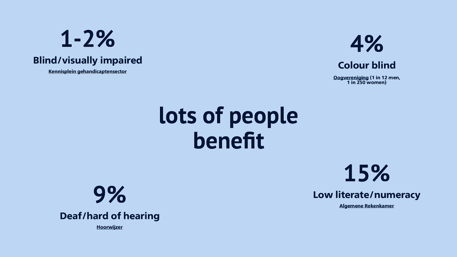
Lots of people benefit from this. Some statistics from The Netherlands: 1-2% of peolpe are blind or visually impaired, 4% colour blind, 9% deaf or hard of hearing, 15% low literate or numerate. Lots of people that benefit from accessibility optimisations.
Slide 19
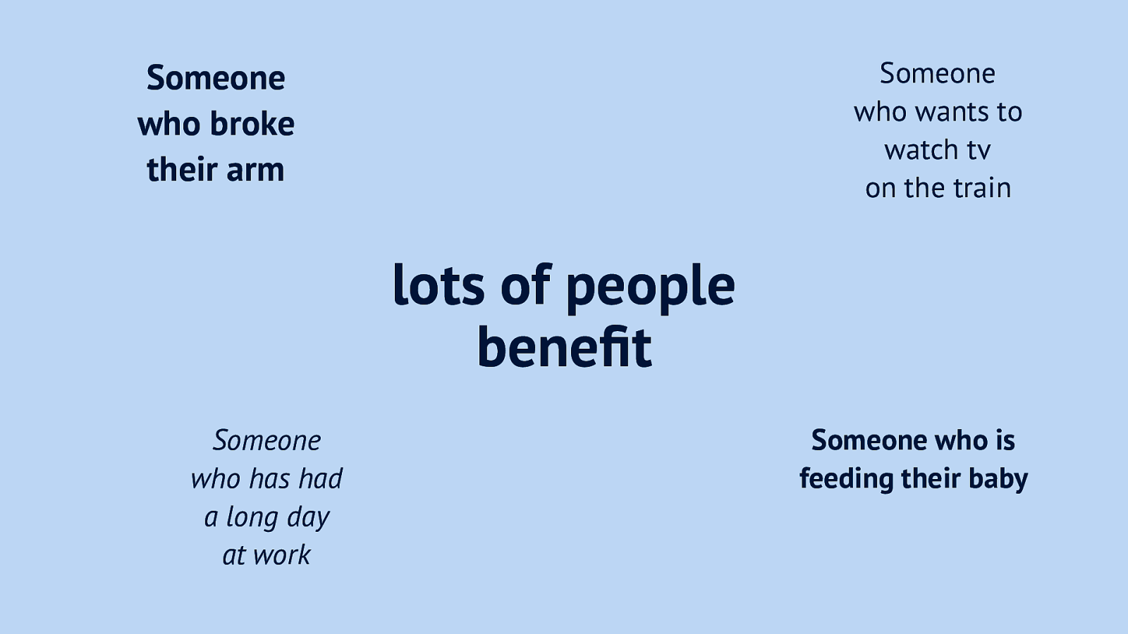
And people can also benefit when they have temporary impairments. For example, if you want to feed your baby and use your phone, you need an app to have better ergonomics. If you feel stressed, you need a more to the point interface. Even if you want to watch the news in the train and you’re in one of them silent carriages, you want subtitles.
Slide 20

Let’s look at a couple of aspects we can focus on to improve accessibility. Colour is a big one: good contrast helps people with colour blindness, or people whose phone is almost out of battery so they set the brightness really low. Or people like me who work at a government, where screens don’t show different shades of gray.
Slide 21

Language can also make a huge difference, it’s one of the things we focus on at the City of The Hague. When a citizen wants to change their parking permits, we want to make sure they understand everything they have to read, we stick to B1 at the minimum. Complicated language and jargon gets in the way.
Slide 22

And then there’s of course code, we can also optimise code to make our components more accessible. This is what I’ll talk about today, I am a front-end dev.
Slide 23
The good news is, when we compare online accessibility to building elevators in train stations, it’s actually cheaper online. Elevators cost a lot to build and maintain, the web has accessibility built-in.
Slide 24

This is because of how it was invented. A research institution needed a way to better exchange documents, and the platform to enable that required universality, as there were a lot of different scientists, with different machines and different preferences.
Slide 25
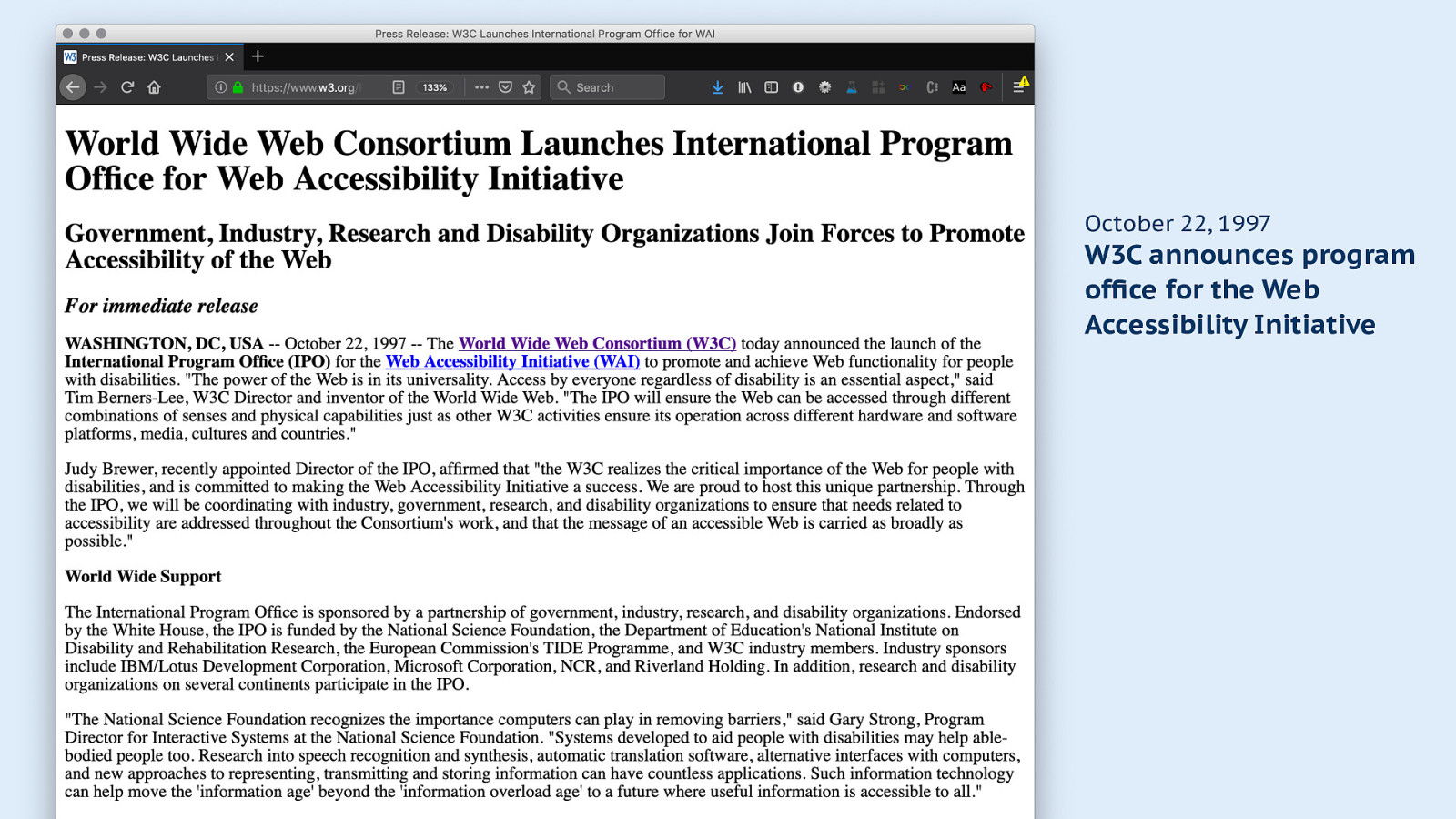
Accessibility has been important to the W3C for a long time, for example in 1997 they launched a program office for their Web Accessibility Initiative.
October 22, 1997 W3C announces program office for the Web Accessibility Initiative
Slide 26
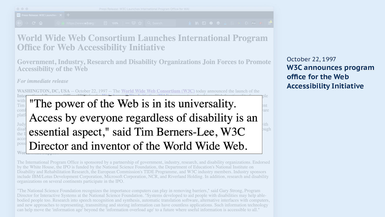
The announcement quotes Tim Berners-Lee, who says the power of the web is in its universality, we need to make it work regardless of disability.
Slide 27
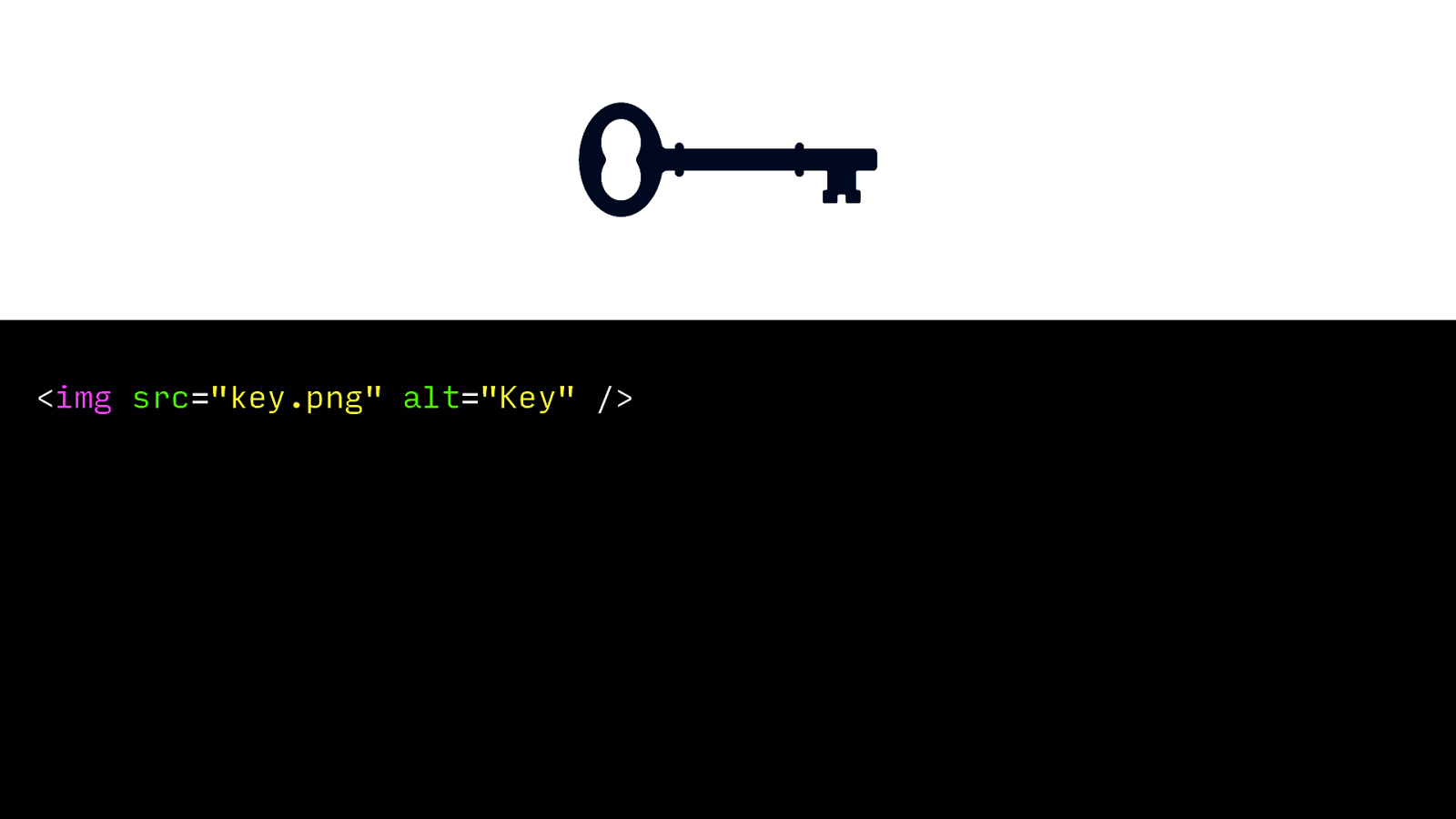
Proof for that is in basic HTML tags we use everyday. The image element has an attribute to provide an alternative, so that not only people can see this is a picture of a key, they can also hear it if they use AT.
<img src=”key.png” alt=”Key” />Slide 28
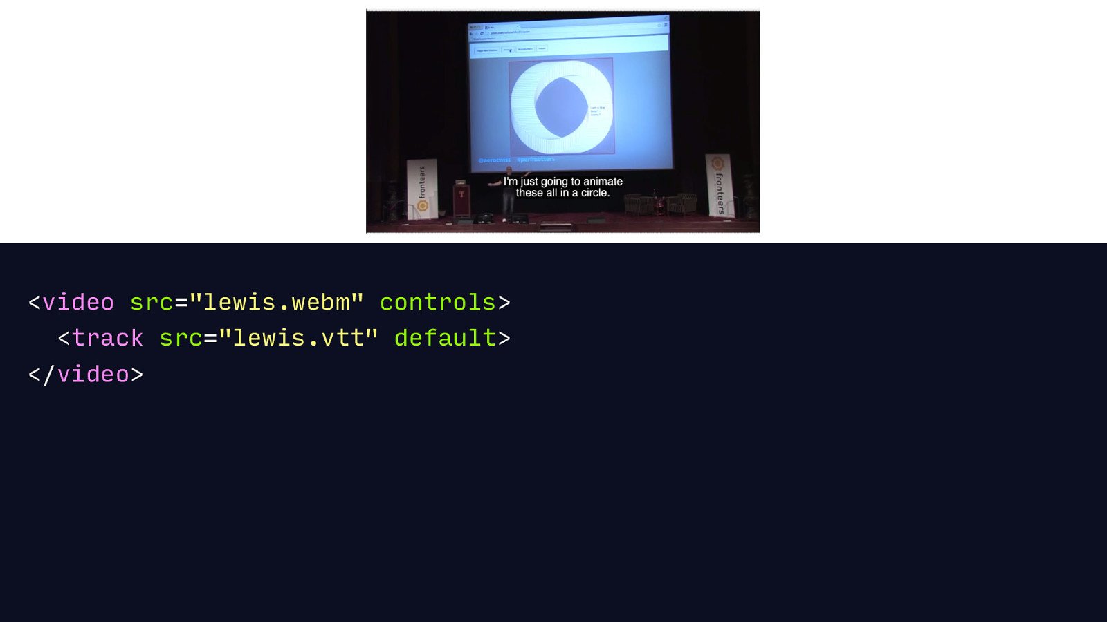
The video is another element where accessibility is built in: you can provide subtitles by just including a subtitle file, and the web will take care of showing them at the right time and in the right size, and provide users an option to turn them on and off again, or switch between different versions. Nice!
<video src=”lewis.webm” controls> <track src=”lewis.vtt” default> </video>
Slide 29
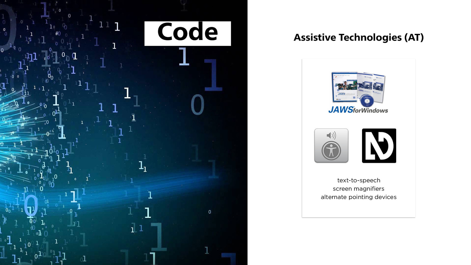
So if we’re optimising code, what we’re really optimising for is Assistive Technologies. They are tools that bridge the gap between people and their screens for example people that are blind.
Slide 30
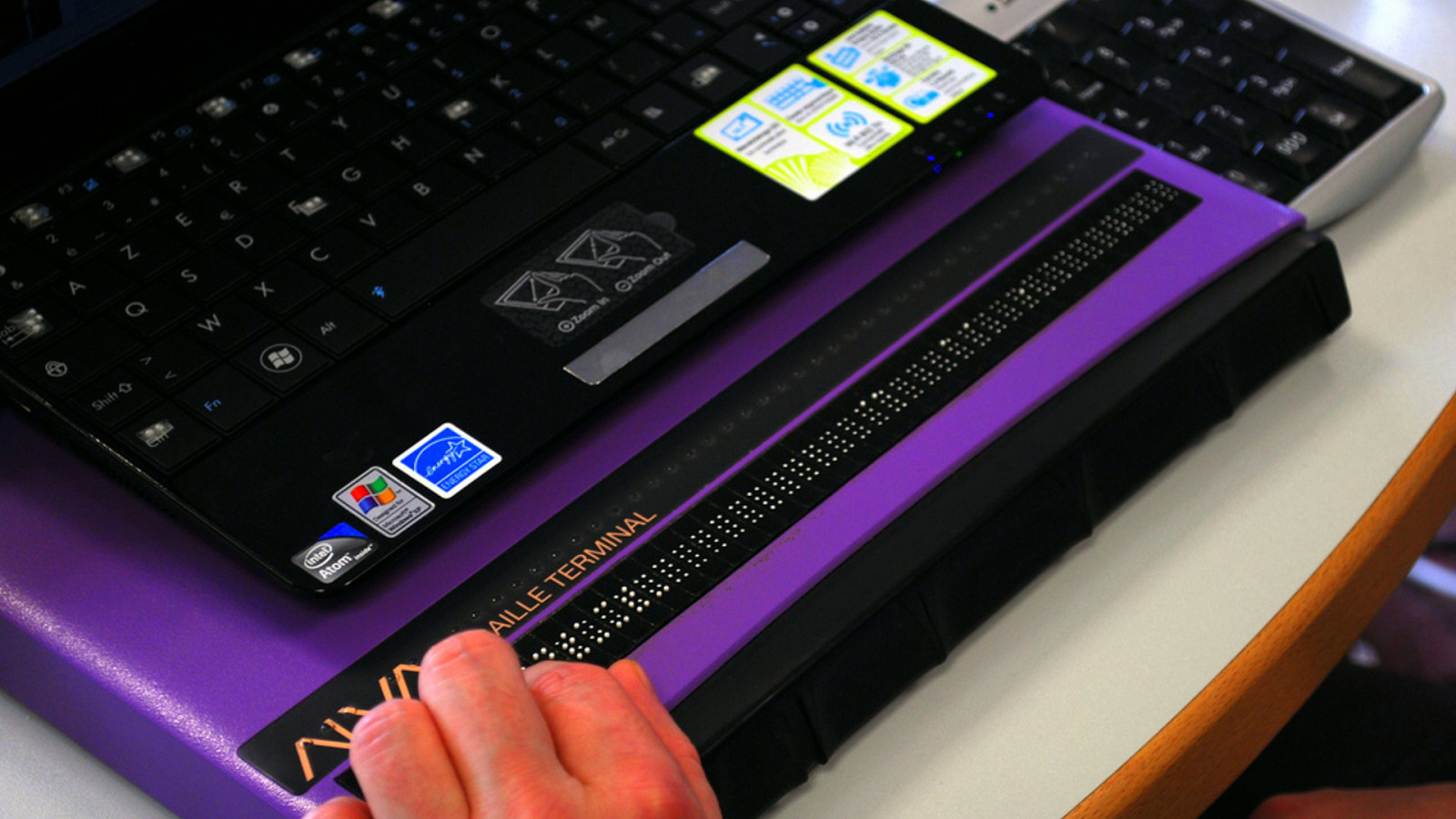
They are tools that read out what’s on a screen, or translate it into braille.
Slide 31
So what do we need to optimise for assistive technologies? Well, semantics, mostly.
Slide 32
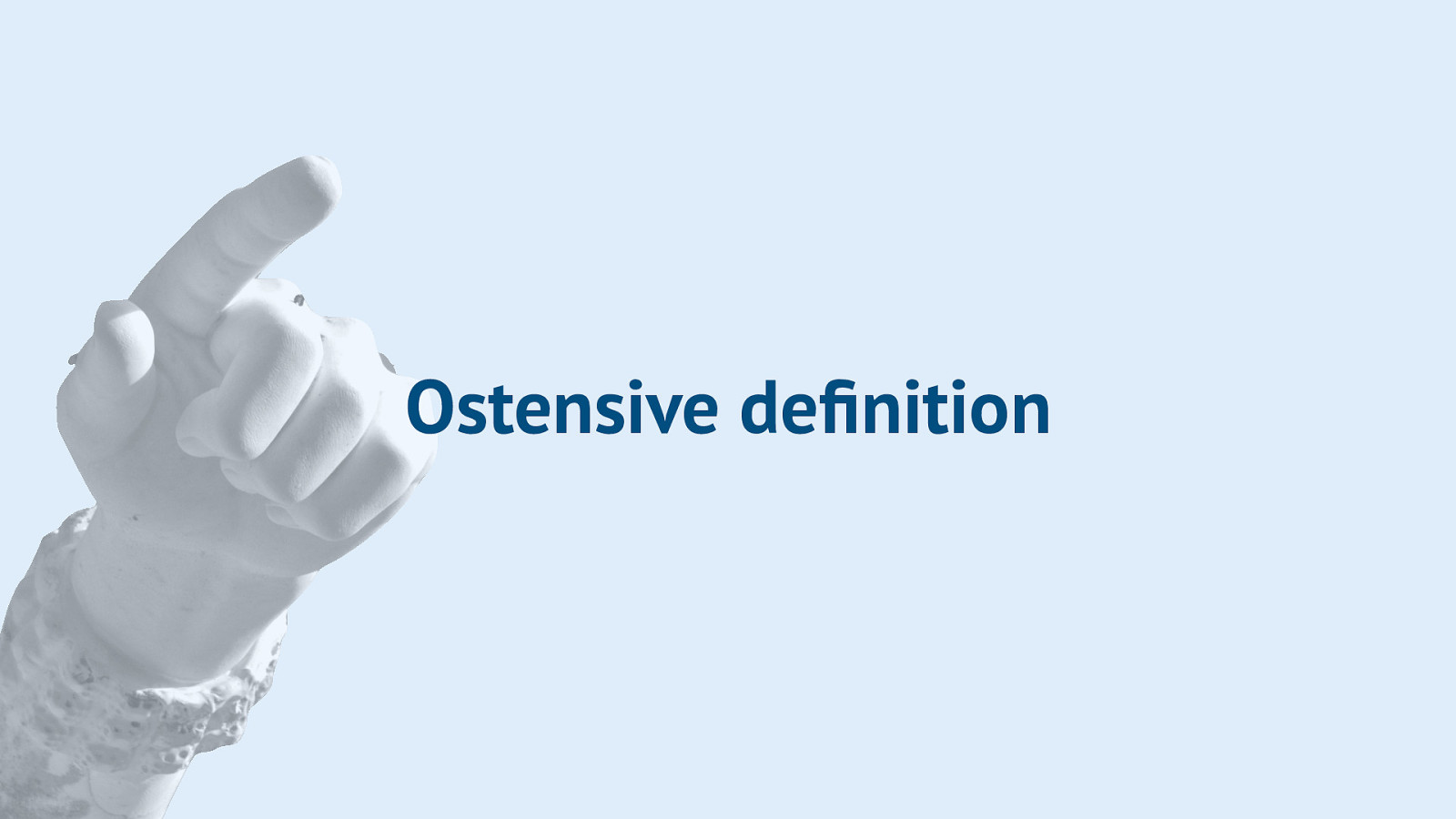
When I think about semantics, there’s this phrase that comes to mind from the philosophy of language. Ostensive definition means defining by pointing at stuff. It’s showing what something is, by pointing at it.
Slide 33
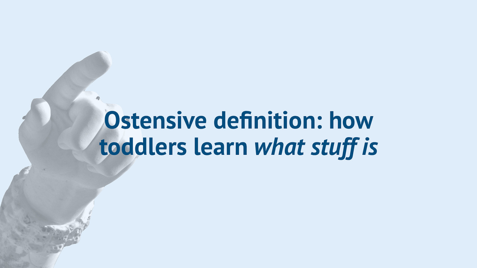
This may sound super familiar, because it is how we have all learned everything. It’s how toddlers learn what stuff is.
Slide 34

I have a 1.5 year old that is learning what stuff means, like, a lot. For example, I taught her what eggs are by pointing at them, and now she can say the word and recognises eggs in supermarkets, books and… well… anywhere. Photo: brianna.lehman on Flickr
Slide 35

The same with ducks, we have a lot of ducks around her house and she starts to recognise them, even weird looking ones, like we see black and white ducks sometimes. She learned what they are because we pointed at them and said the word.
Slide 36
When it comes to machines, we can also point at what stuff is, by writing accessible code. This makes a huge difference.
Slide 37
When you send markup to the browser, it generates two trees.
Slide 38
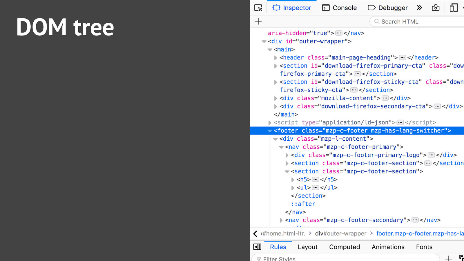
The first one is the DOM tree, it contains objects of everything that you specified, all these nodes have properties and methods… well, we probably all know this.
Slide 39
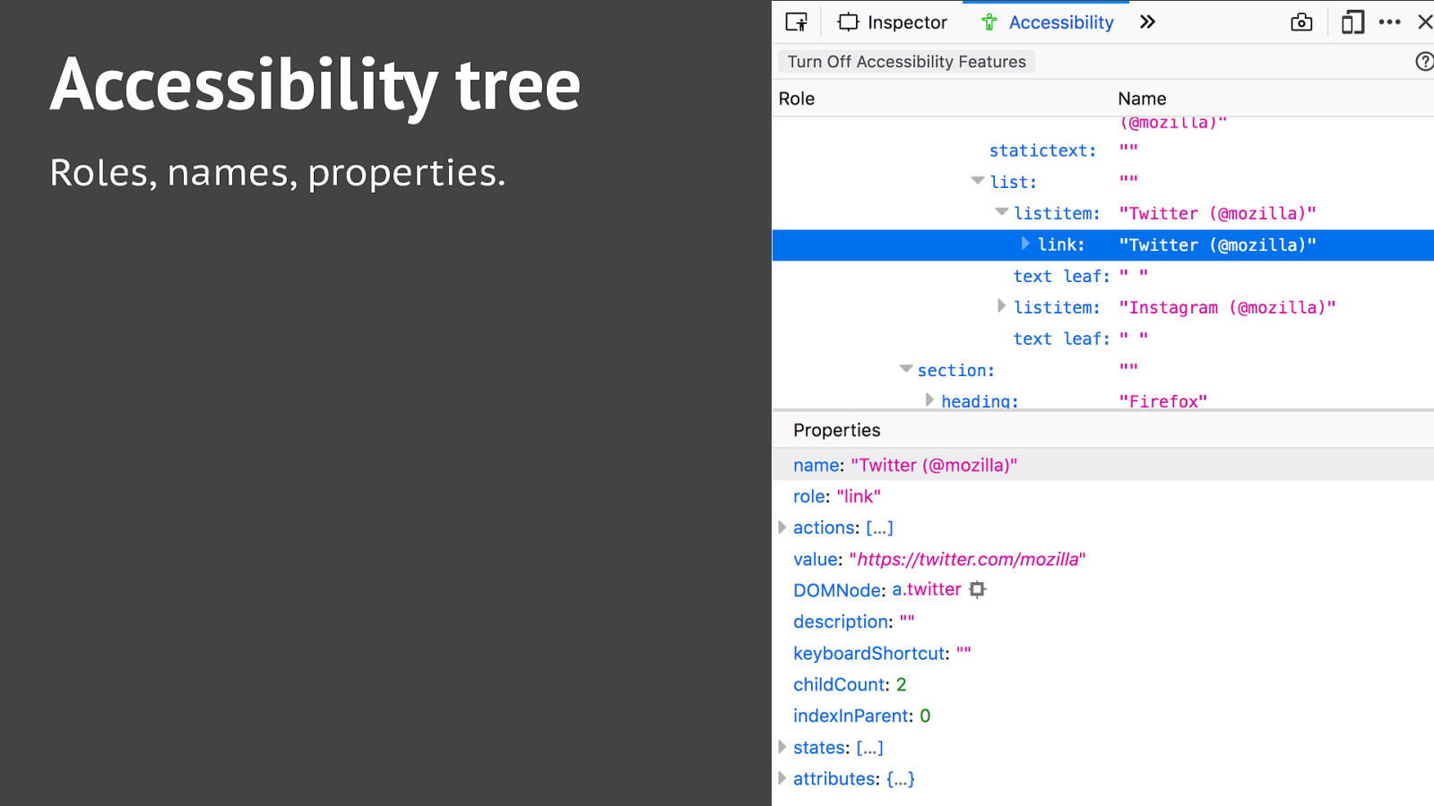
What not everyone knows is that browsers can also generate an accessibility tree. It is based on the DOM tree, and contains all the accessibility information for stuff on our page: roles, names, properties.
Slide 40
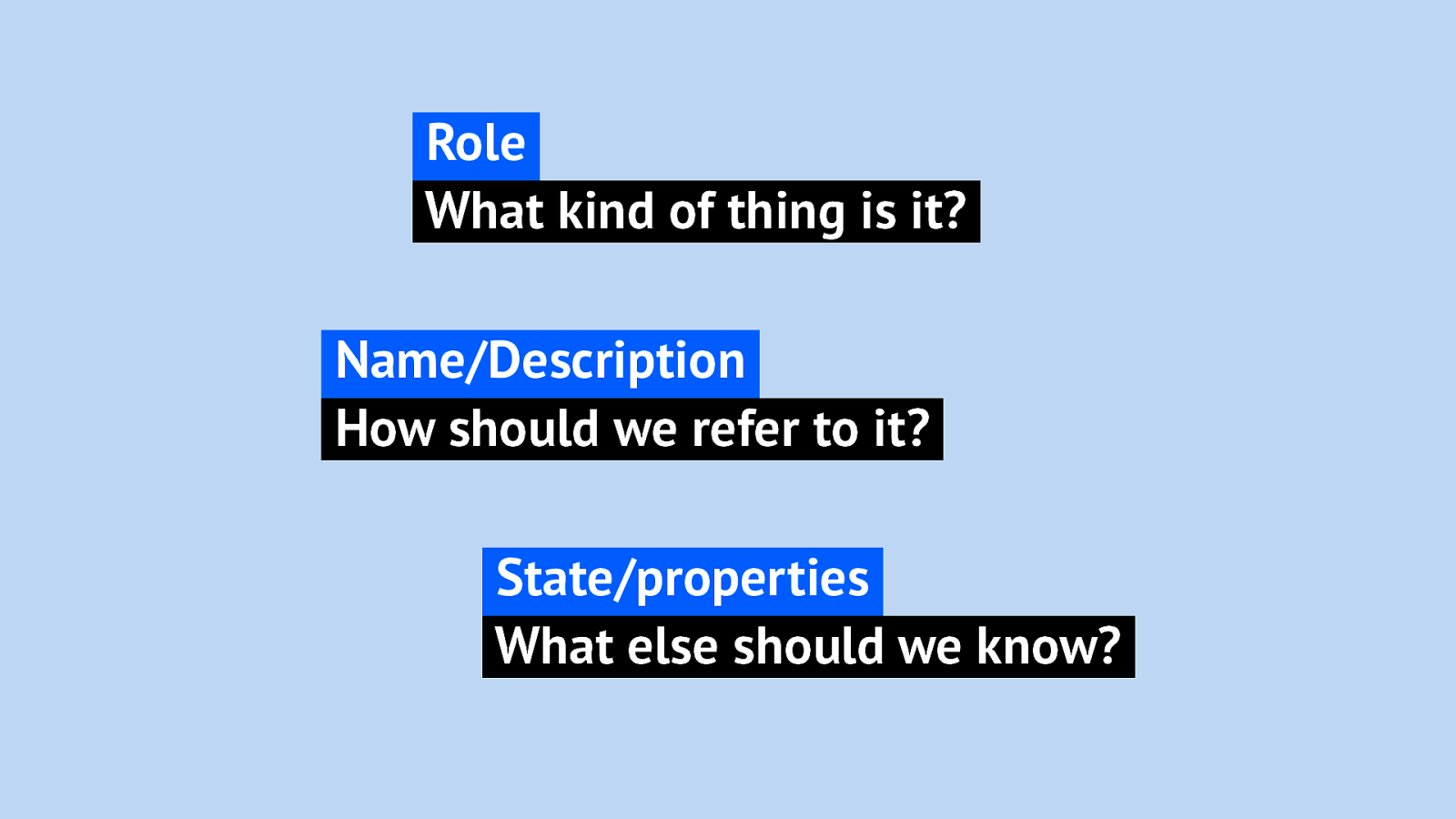
In more detail: a role answers the question “What kind of thing is it?” A button, a checkbox, a navigation, a header, a footer? Names provide a way to refer to something. Very important to have unique names for everything in your page, I’ll get to that later. It answers “How should we refer to it?” And then lastly, there are properties related to states and more.
Slide 41
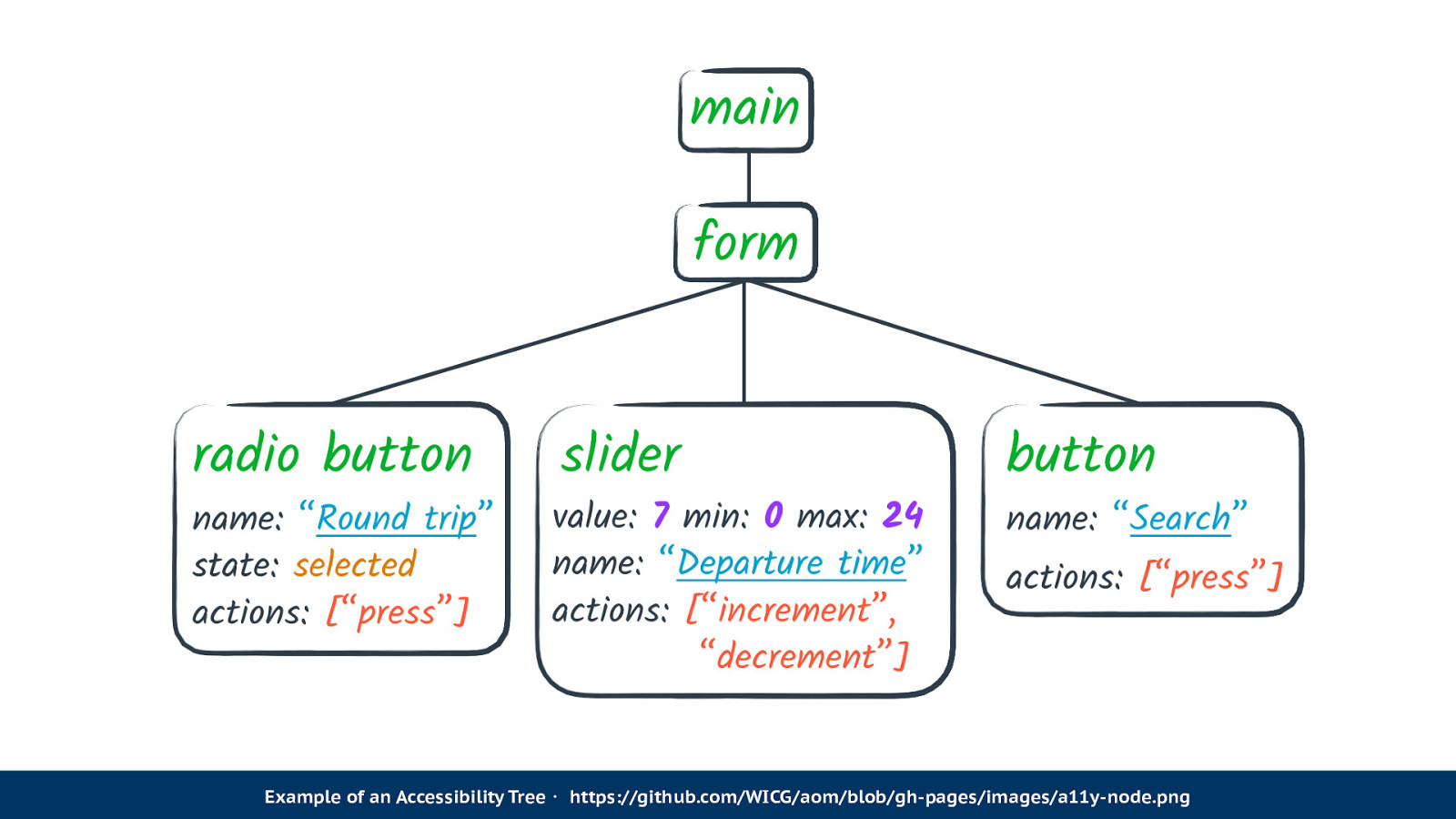
Here’s an example of an Accessibility Tree. It’s a form with three elements in it, a radio button, a slider and a button. The slider has all sorts of properties, like its minimum and maximum values, and also its current value. And there are actions, like incrementing and decrementing the value. This is all information that informs what everything on the page is. The cool thing is, when we look at this tree, without knowing what the interface looks like, we can probably thing of various ways of creating a UI that does these things.
https://github.com/WICG/aom/blob/gh-pages/images/a11y-node.png
Slide 42
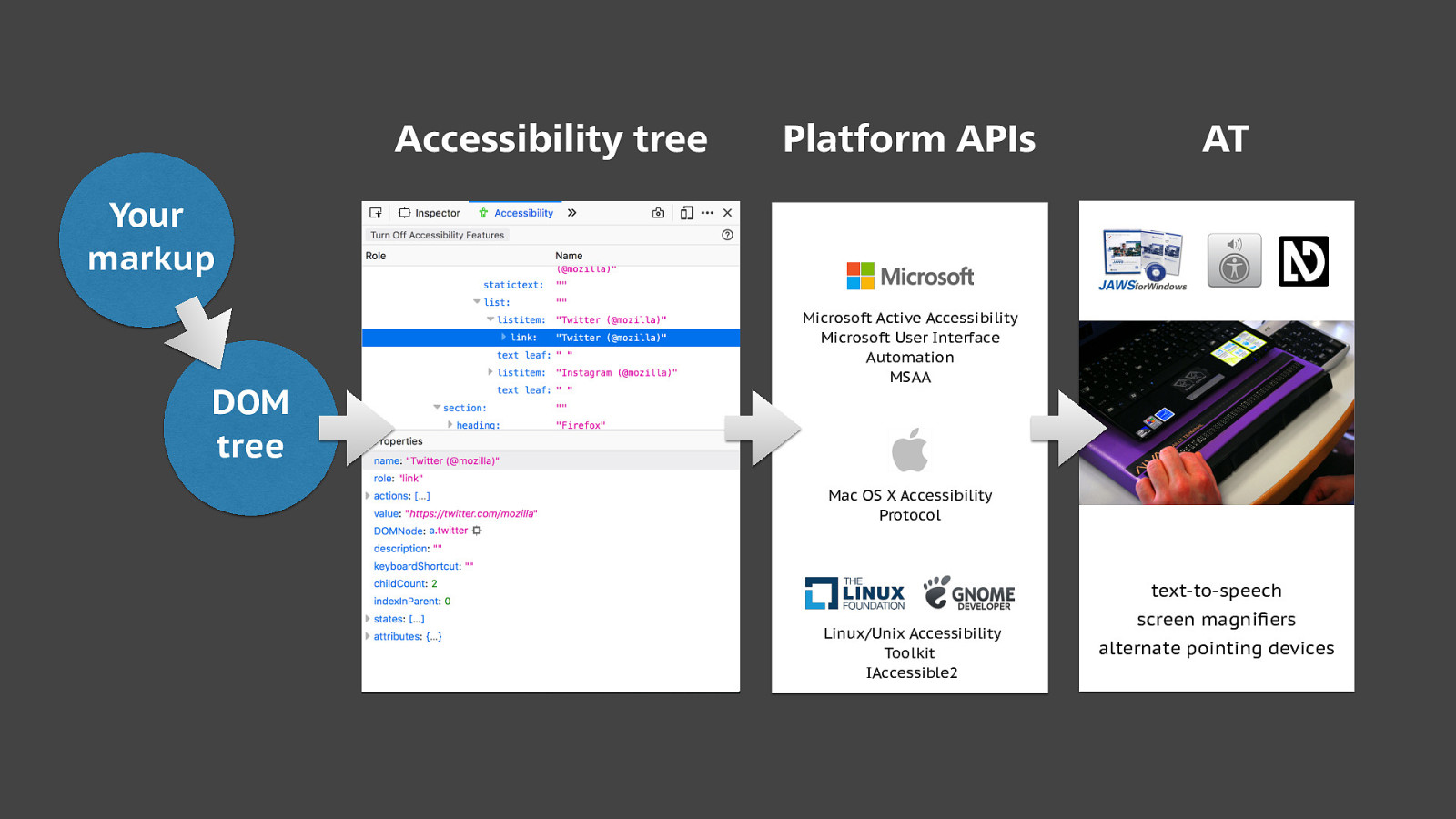
So how does this work? Well, AT needs to know what’s going on on your screen, so that it can inform its users. It gets this information from APIs that are built into the platform, they come with the platforms. It knows about everything in the OS, like the browser and the buttons in the browser. What it doesn’t know is the web pages you visit, it’s never seen those web pages. This is where the accessibility tree comes in, it informs AT of everything related to the actual site. As I said before it is based off the DOM tree, which is based on our markup. We play a huge role here. And of course, where it says markup, that could be anywhere… in your JSX in React or in your Vue component, or perhaps in a Web Component’s template. At some point all of those things result in DOM nodes, that can end up in an accessibility tree.
Slide 43
You may by now wonder where you can look at these trees. They are exposed in current versions of Firefox, Chrome, Internet Explorer and Safari Tech Preview, each in their own way. I like how Firefox does it, they have a separate tab for it.
Slide 44

So by now I hope the title of my talk makes sense… it’s the markup that matters. Markup helps get semantics or meaning to our users.
Slide 45
First question we probably all have when we come to a web page, is: what is this page?
Slide 46
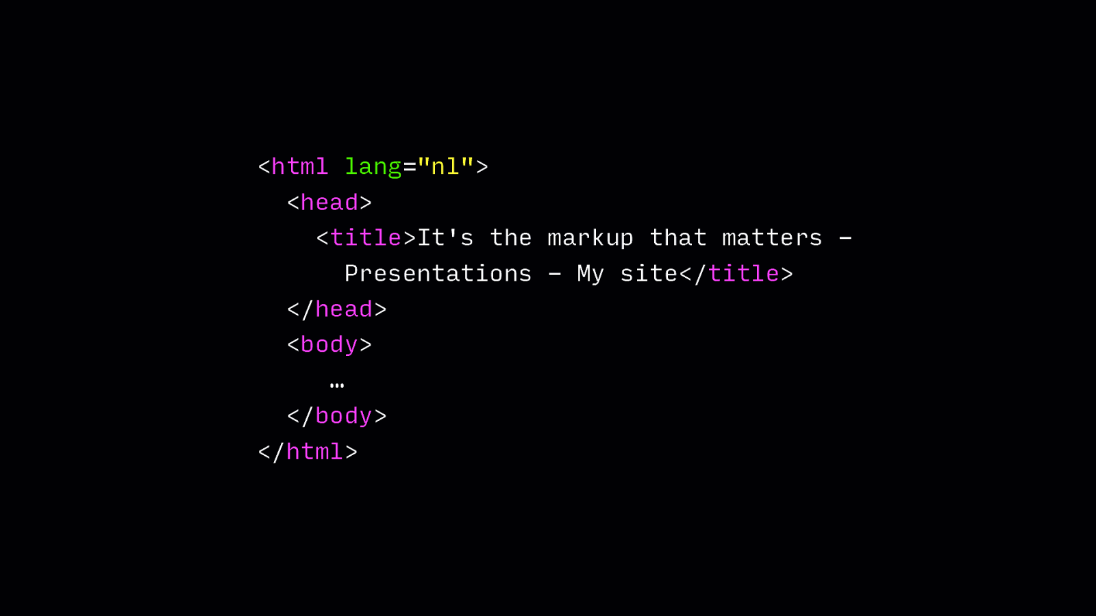
The way of figuring out that most of us use is just by looking at the page, but if you rely on AT, you may not be able to. That’s where the title element comes in, it gets read out when the user hits the page.
Code example: <html lang=”nl”> <head> <title>It’s the markup that matters Presentations - My site</title> </head> <body> … </body> </html>
Slide 47
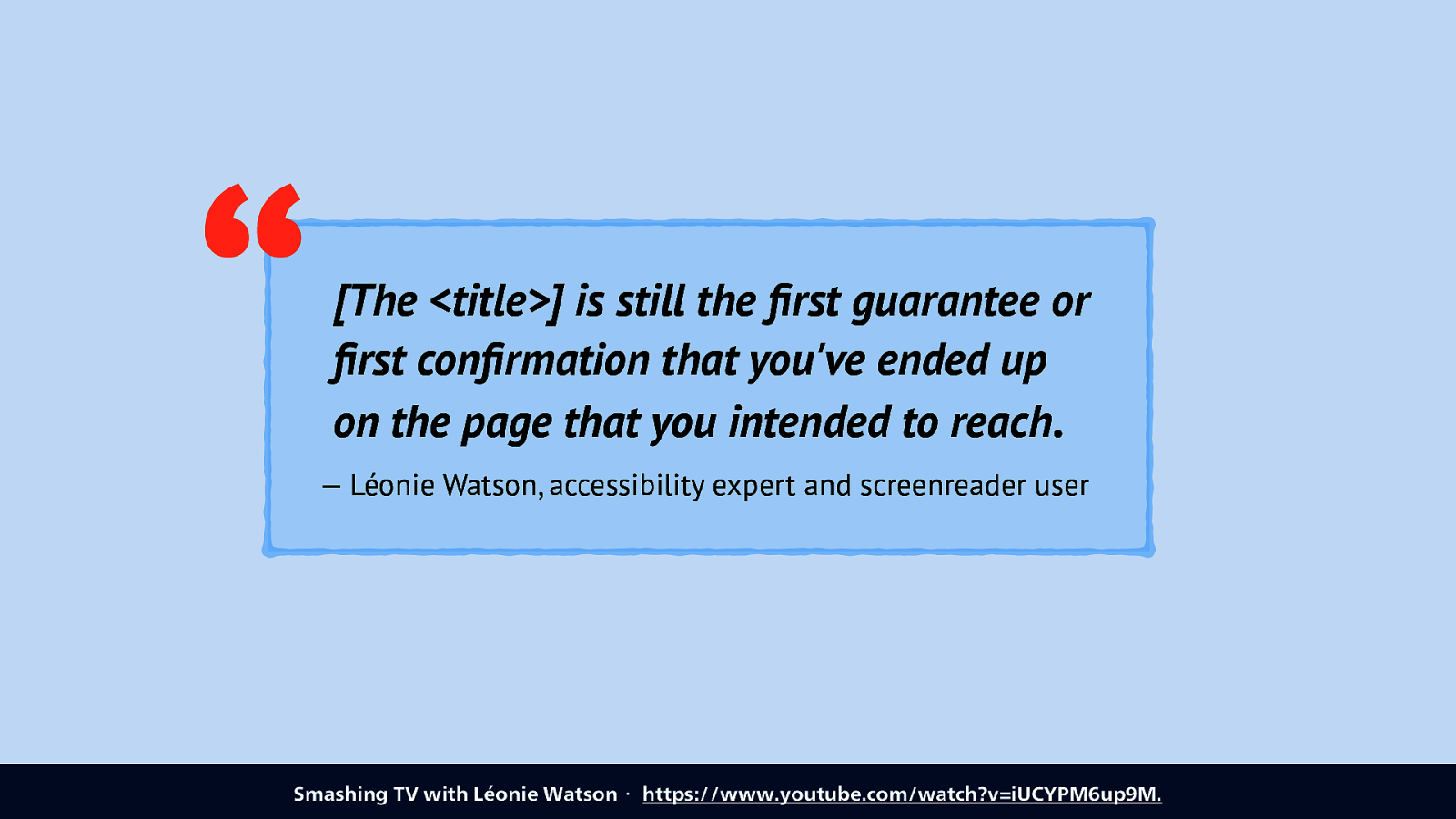
Léonie Watson recently reiterated this in a video for Smashing TV, for her is important as it tells her she’s on the right page. This is specifically important to take care of in Single Page Apps… if you do client side routing you may want to update the page title on route.
“[The <title>] is still the first guarantee or first confirmation that you’ve ended up on the page that you intended to reach. — Léonie Watson, accessibility expert and screenreader user Smashing TV with Léonie Watson・ https://www.youtube.com/watch?v=iUCYPM6up9M.
Slide 48

Then, when you know what page you’re on, you probably want to figure out what’s on the page. Headings help here.
Slide 49
“Navigate by heading” is a very common way for AT users to figure out what’s on a page.
Heading structures are tables of contents ・ https://hiddedevries.nl/en/blog/2018-09-01-heading-structures-are-tables-of-contents
Slide 50
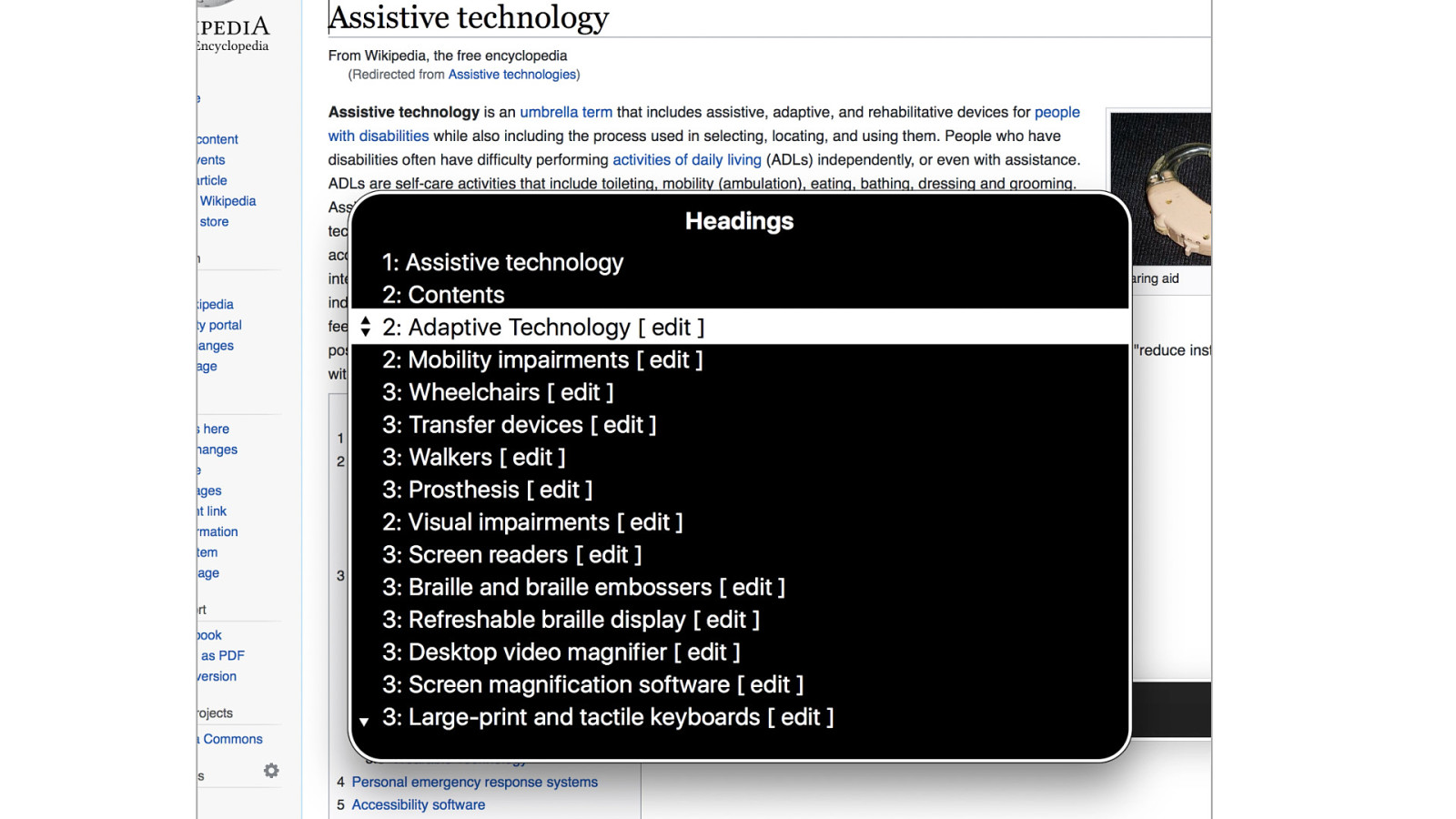
This is a Wikipedia page, where I’ve pulled up the header menu in the VoiceOver screenreader menu. It lists all the headings that are on this page and lets me pick one, that will take me to that heading. This is navigation by heading.
Slide 51
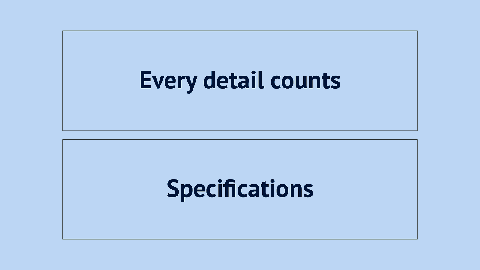
For this it is important that headings have sensible names. On Volvo’s website when you look at a car, there’s a heading called ‘Every detail counts’, but imagine that is in your headings menu and you can’t see the page, would you know where it would take you? Well… it goes to a specifications section. So my suggestion would be to use “Specifications” as the heading text.
Slide 52
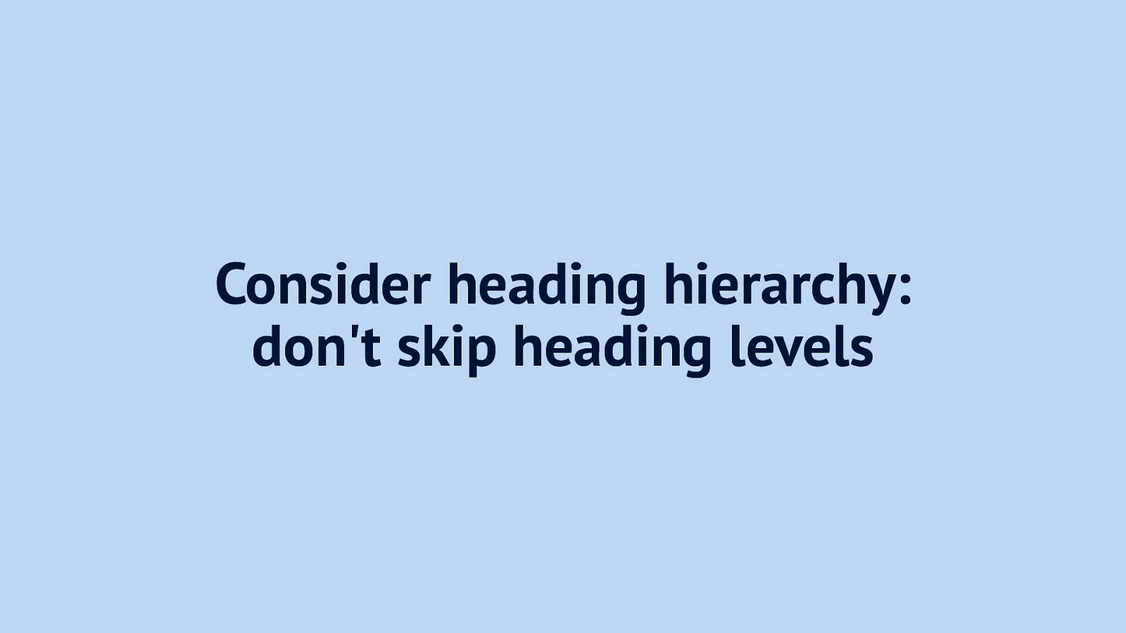
With headings it is also important not to skip levels, so if you have a h2, the next one can’t be h4, it would have to be h3. Skipping the level would be like having a book with a paragraph 3.5, but no chapter 3 to list it under. That would be weird.
Slide 53
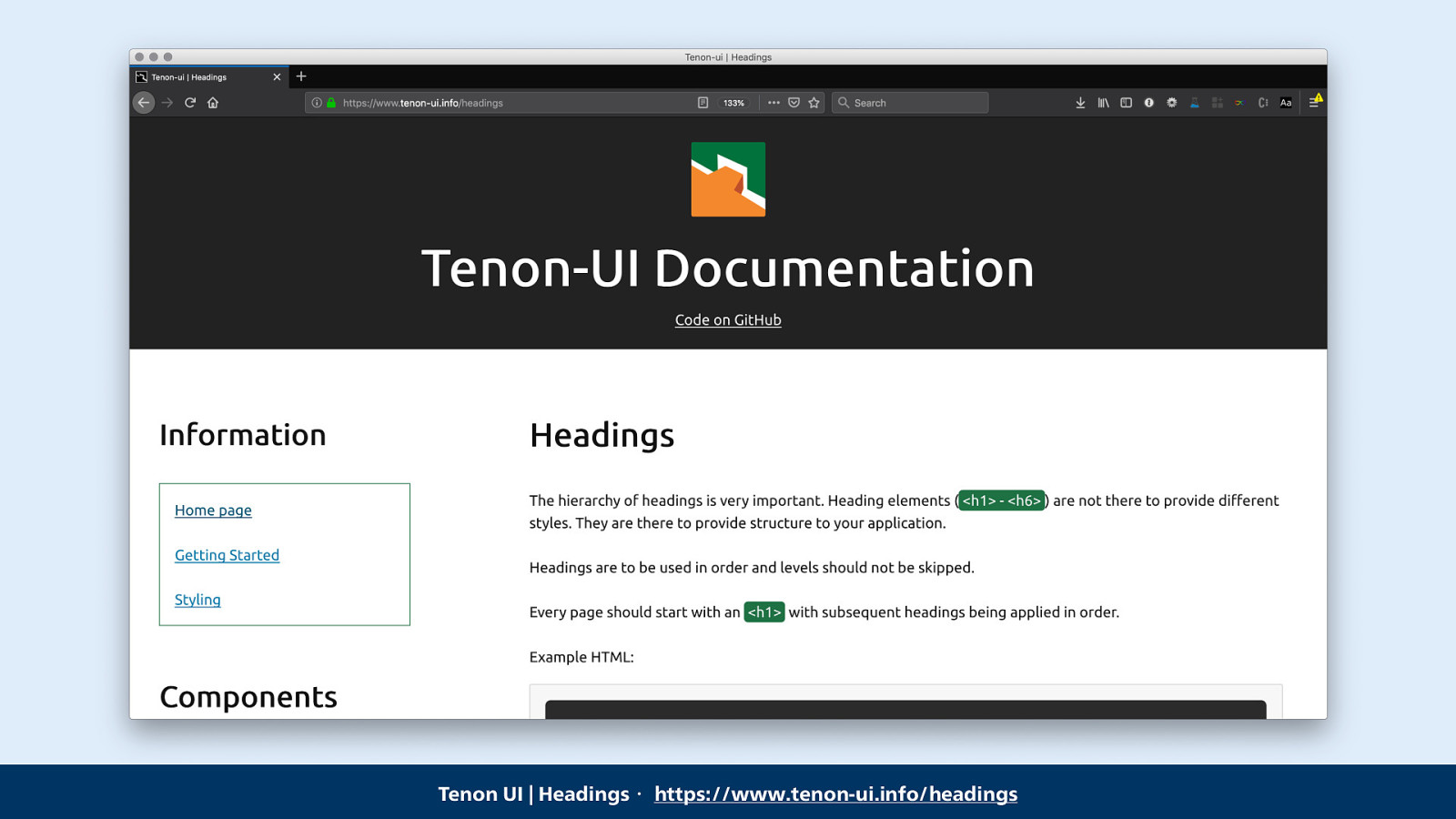
This is potentially hard to get right when you work with components, because you don’t necessarily know where the component is used in the page. The kind people of Tenon, an accessibility testing tool, have released a React component that deals with this automagically, it is used as Heading and computes to the right heading level.
Link: Tenon UI | Headings・ https://www.tenon-ui.info/headings
Slide 54
The second thing that is a useful way for AT users to figure out what’s on a page is landmarks.
Slide 55
Landmarks let you specify which sections a page has, so that people can navigate to them.
Slide 56
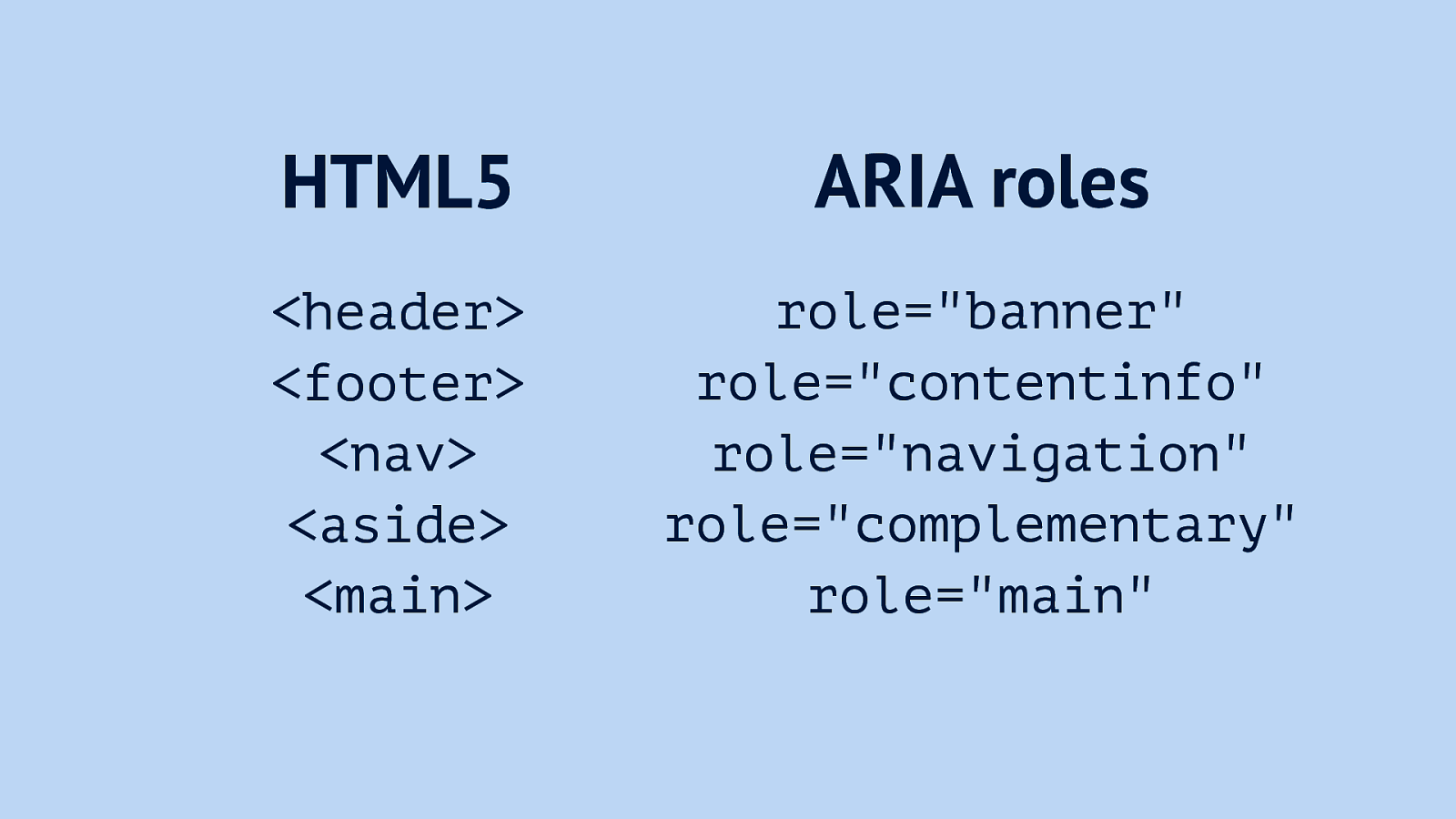
There are two ways to do this, one is to use HTML5 sectioning elements and the other is to apply roles, you can set those to any div or whatever element you like.
Examples of HTML5 sectioning elements: <header> <footer> <nav> <aside> <main>
Examples of ARIA roles: role=”banner” role=”contentinfo” role=”navigation” role=”complementary” role=”main”
Slide 57
But as the wise Bruce Lawson said: built-in beats bolt-on
Slide 58
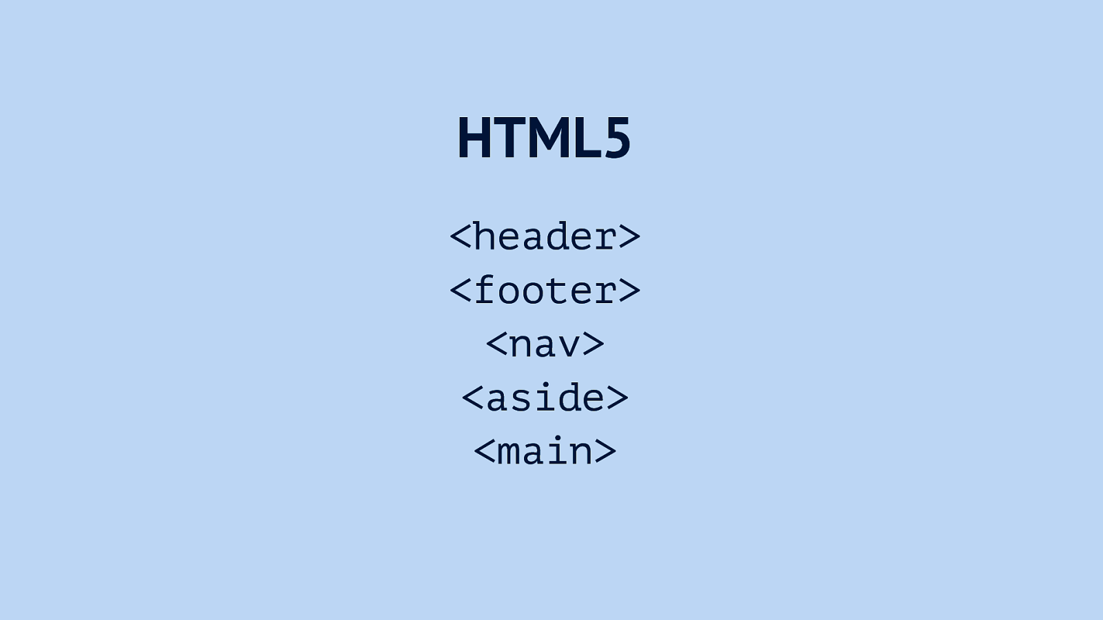
In terms of compatibility, it’s fine to use just the HTML5 elements, they have good support and have the roles built-in.
Slide 59
Something else that we can make a huge difference with for AT users is getting our form controls right.
Slide 60
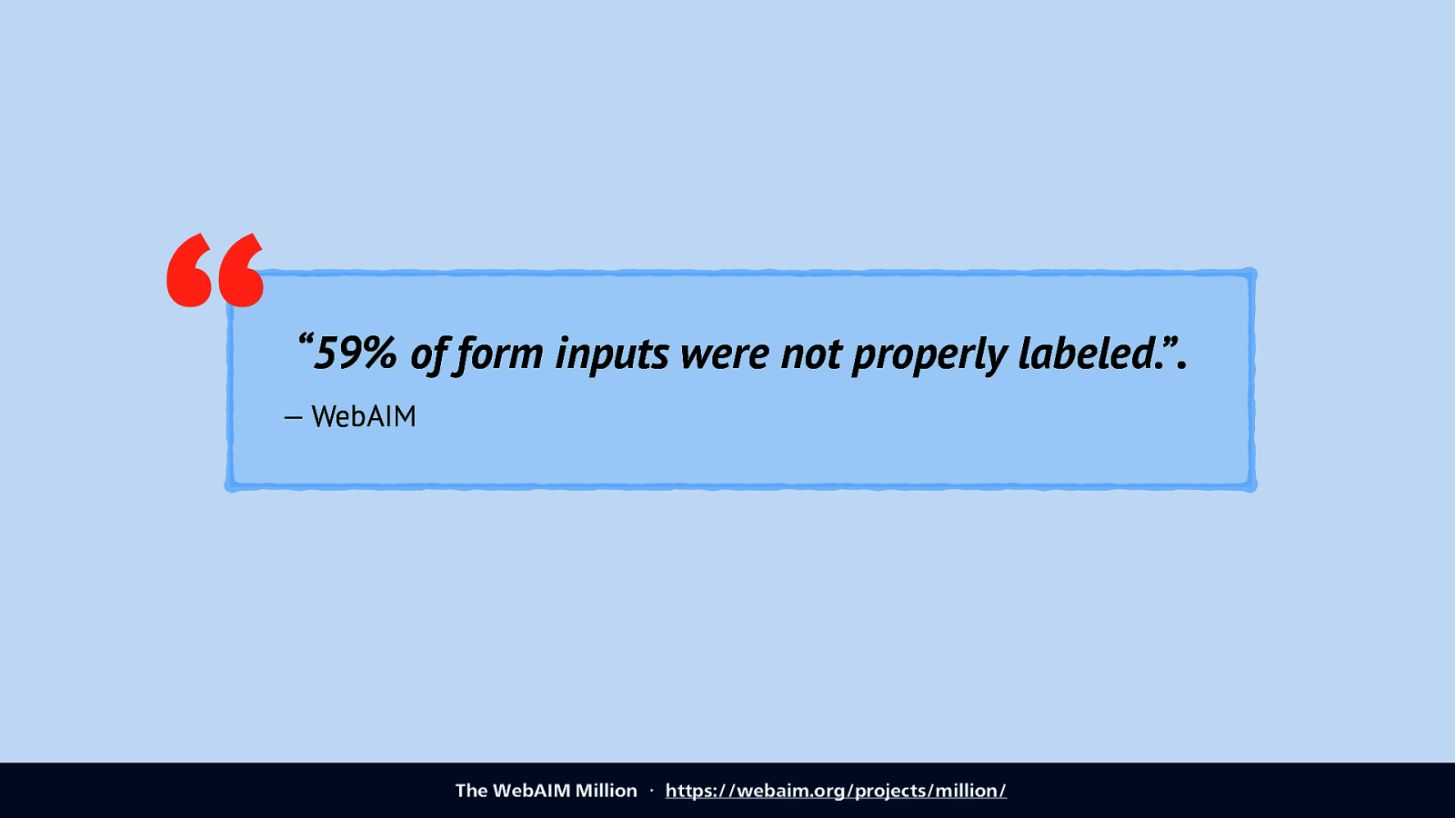
When WebAIM, an organisation that does accessibility consulting and lots of knowledge sharing, researched 1 million websites. They published this as the WebAIM Million. One interesting thing they found: almost 60 percent or websites had form inputs that were not properly labeled. “59% of form inputs were not properly labeled.”. — WebAIM The WebAIM Million ・ https://webaim.org/projects/million/
Slide 61
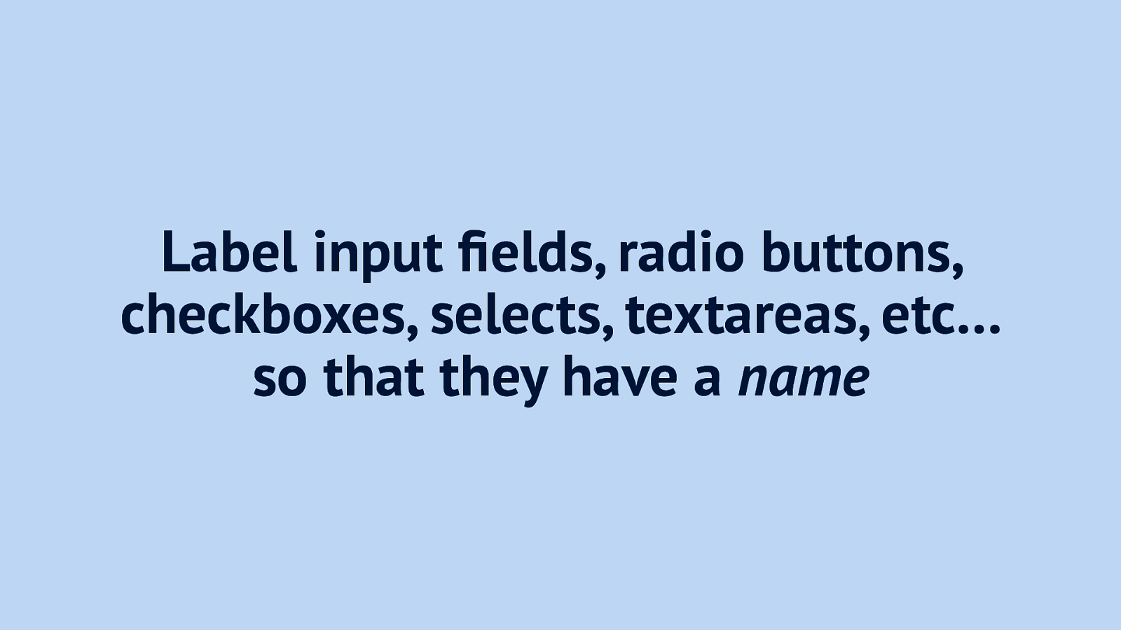
So the advice here is: label input fields, radio buttons, checkboxes, selects, textareas, etc… so that they have a name when they show up in the accessibility tree.
Slide 62
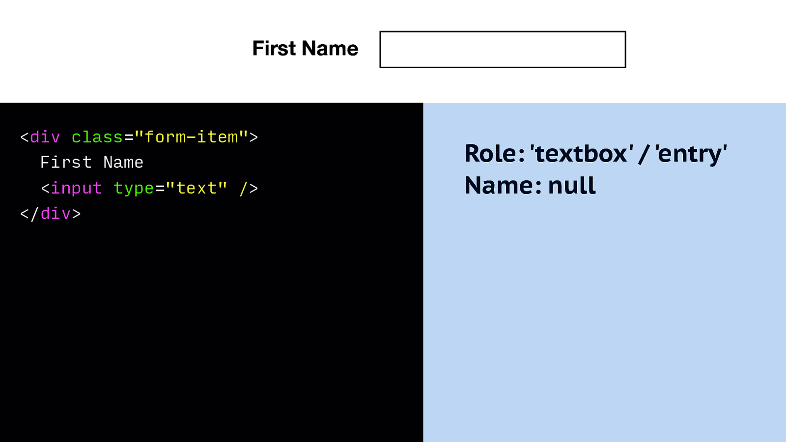
So let’s look at an example: this is an input field where you can input a first name. On first sight it might look fine, there’s a text that says First Name and there’s an input. Problem is, if we look in the accessibility tree, the name has resolved to null. This input has no name!
Markup: <div class=”form-item”> First Name <input type=”text” /> </div>
Accessibility tree: Role: ‘textbox’ / ‘entry’ Name: null
Slide 63
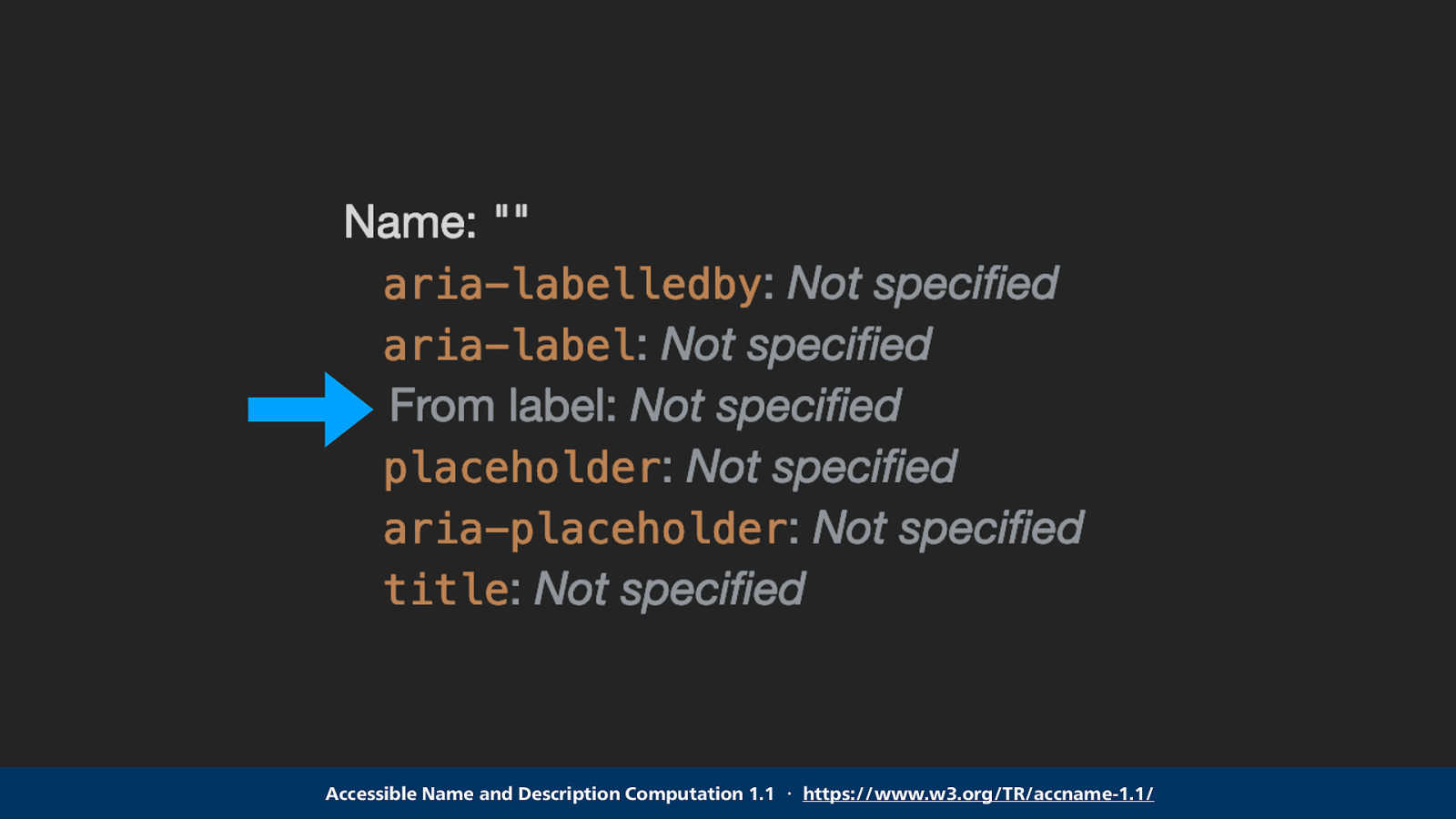
Names for accessible nodes get computed by the browser and can be derived from various different places, including the label. More info on that in the specification linked below. The label is the best supported thing, so let’s try that.
Accessible Name and Description Computation 1.1 ・ https://www.w3.org/TR/accname-1.1/
Slide 64
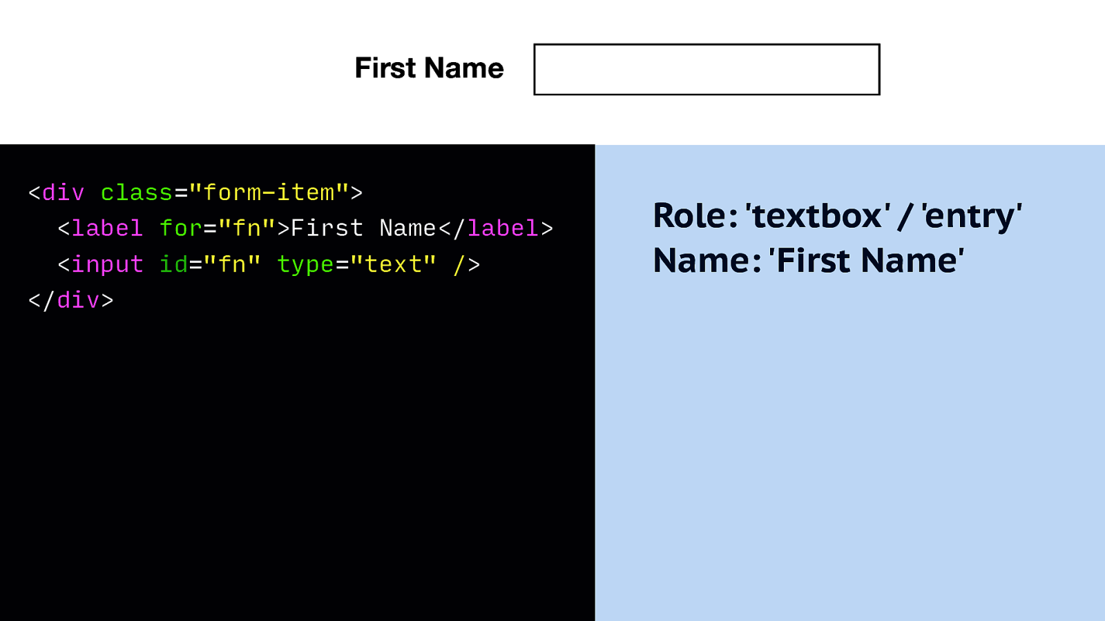
Basically we add the label element, and in the for attribute we use the same string that’s in the ID attribute on the input. This is all, this relates them.
Markup: <div class=”form-item”> <label for=”fn”>First Name</label> <input id=”fn” type=”text” /> </div>
Accessibility tree: Role: ‘textbox’ / ‘entry’ Name: ‘First Name’
Slide 65
Let’s look at table semantics now.
Slide 66
Tables make tabular data easier to navigate, but we have to ensure that tables get recognised as a data table. In a not too long ago past, we used tables for layout. So AT have some heuristics to figure out whether to treat a table as a layout table or as a data table.
Slide 67
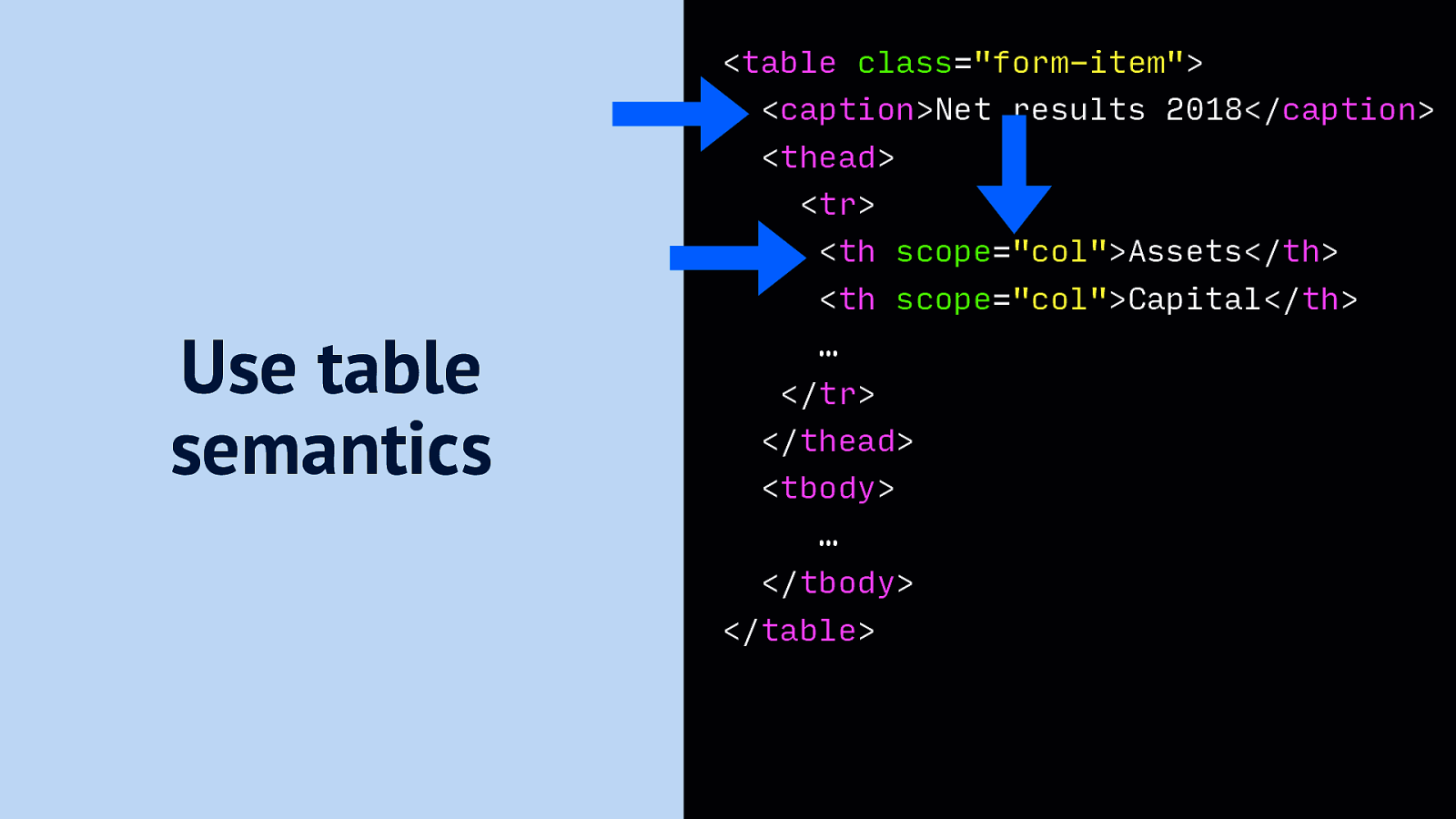
The best way to ensure a table gets treated as a data table is to add some semantics. There’s three things that you can do. The first is to add a caption, using a <caption> element as the first child. Imagine the page has 5 tables, with each different financial info, let’s say for a different year. Ideal captions would distinguish these 5 tables, so that someone who is an accountant but cannot see the page, can quickly jump to the right table. Because like the headers menu that I showed before, there is also a table menu. [video of the table menu]
Markup: <table class=”form-item”> <caption>Net results 2018</caption> <thead> <tr> <th scope=”col”>Assets</th> <th scope=”col”>Capital</th> … </tr> </thead> <tbody> … </tbody> </table>
Slide 68
Language is also important, specifically two attributes.
Slide 69
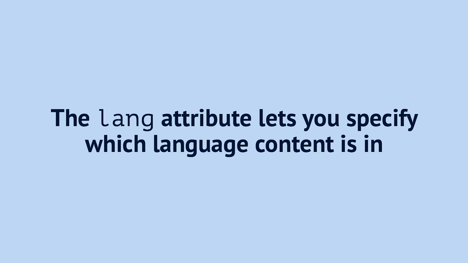
The lang attribute lets you specify which language content is in, this is usually done on the HTML element
Slide 70
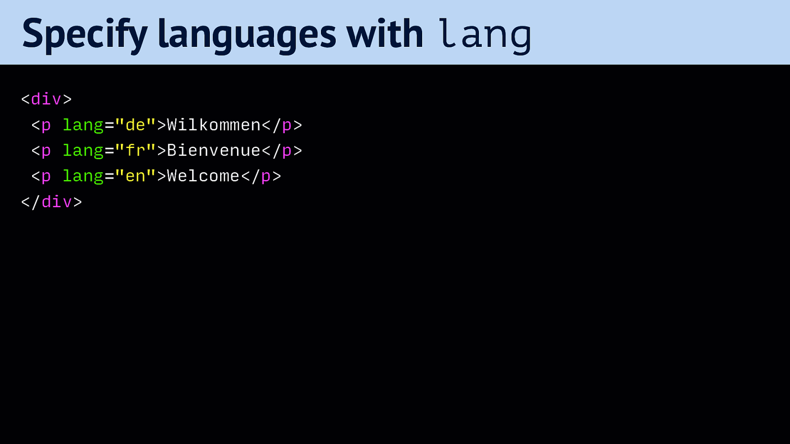
If you have elements in your DOM that are in a different language, you can specify that too, some screenreaders will change the voice they use. This is great, as everyone who’s heard an English Google Maps voice butcher Dutch streetnames
Markup example: <div> <p lang=”de”>Wilkommen</p> <p lang=”fr”>Bienvenue</p> <p lang=”en”>Welcome</p> </div>
Slide 71
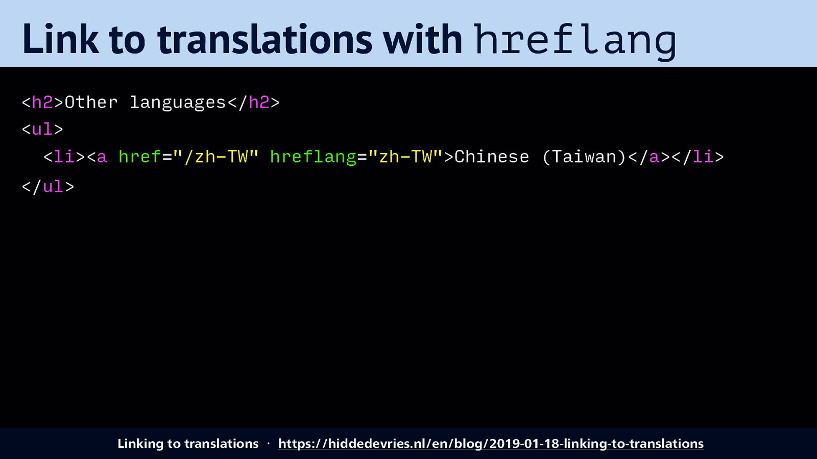
With the hreflang attribute you can set what language the destination of your link is in.
Markup example: <h2>Other languages</h2> <ul> <li><a href=”/zh-TW” hreflang=”zh-TW”>Chinese (Taiwan)</a></li>中⽂文 </ul>
Source: Linking to translations ・ https://hiddedevries.nl/en/blog/2019-01-18-linking-to-translations
Slide 72
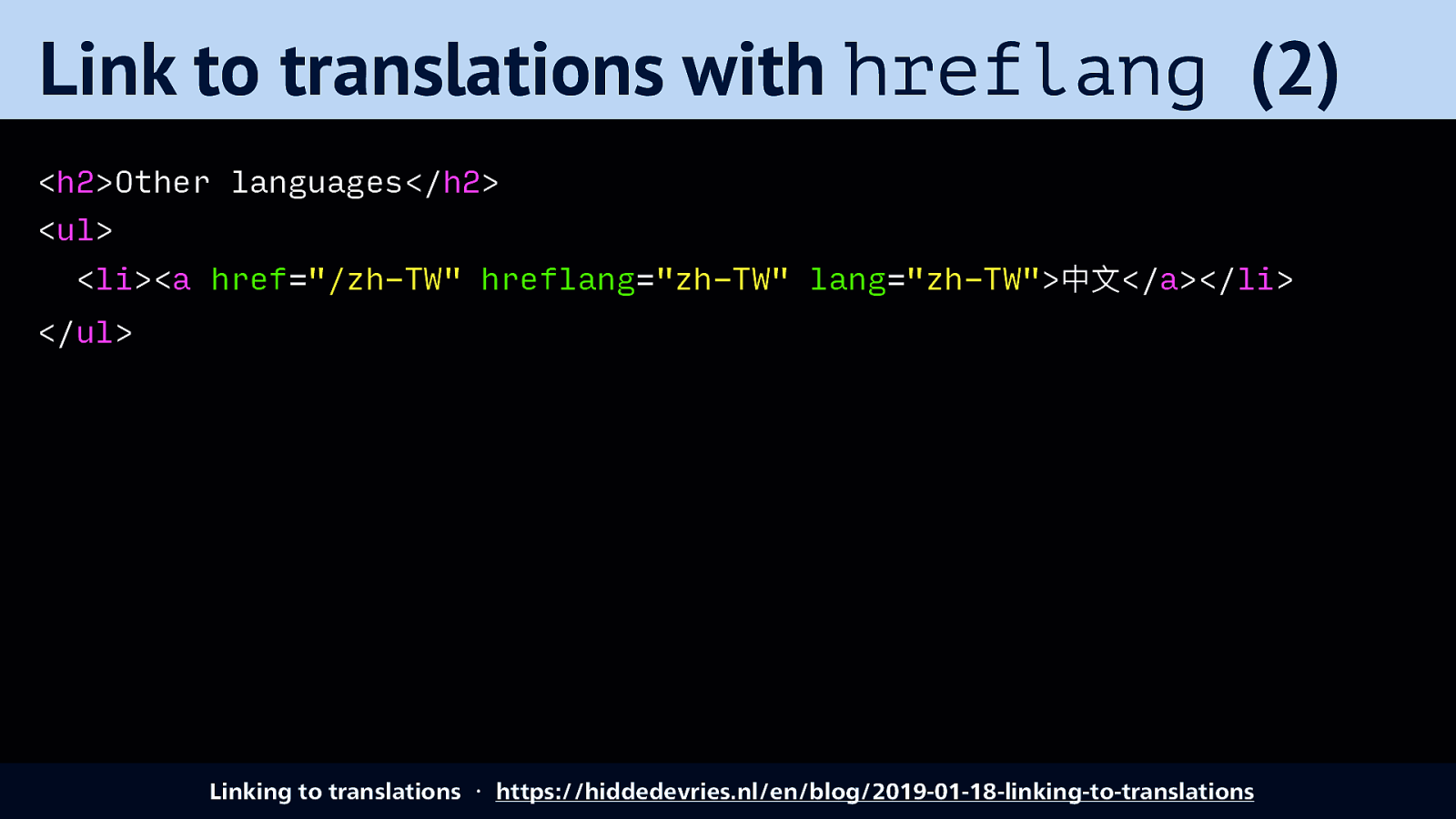
And you can have both, if the destination and the link text itseflf is in a different language.
Markup example: <h2>Other languages</h2> <ul> <li><a href=”/zh-TW” hreflang=”zh-TW” lang=”zh-TW”>中⽂文</a></li> </ul>
Slide 73
You may have implemented these before: icons that work as buttons. Of course, visible labels are usually better because clarity and not ambiguous, but there are valid use cases.
Slide 74
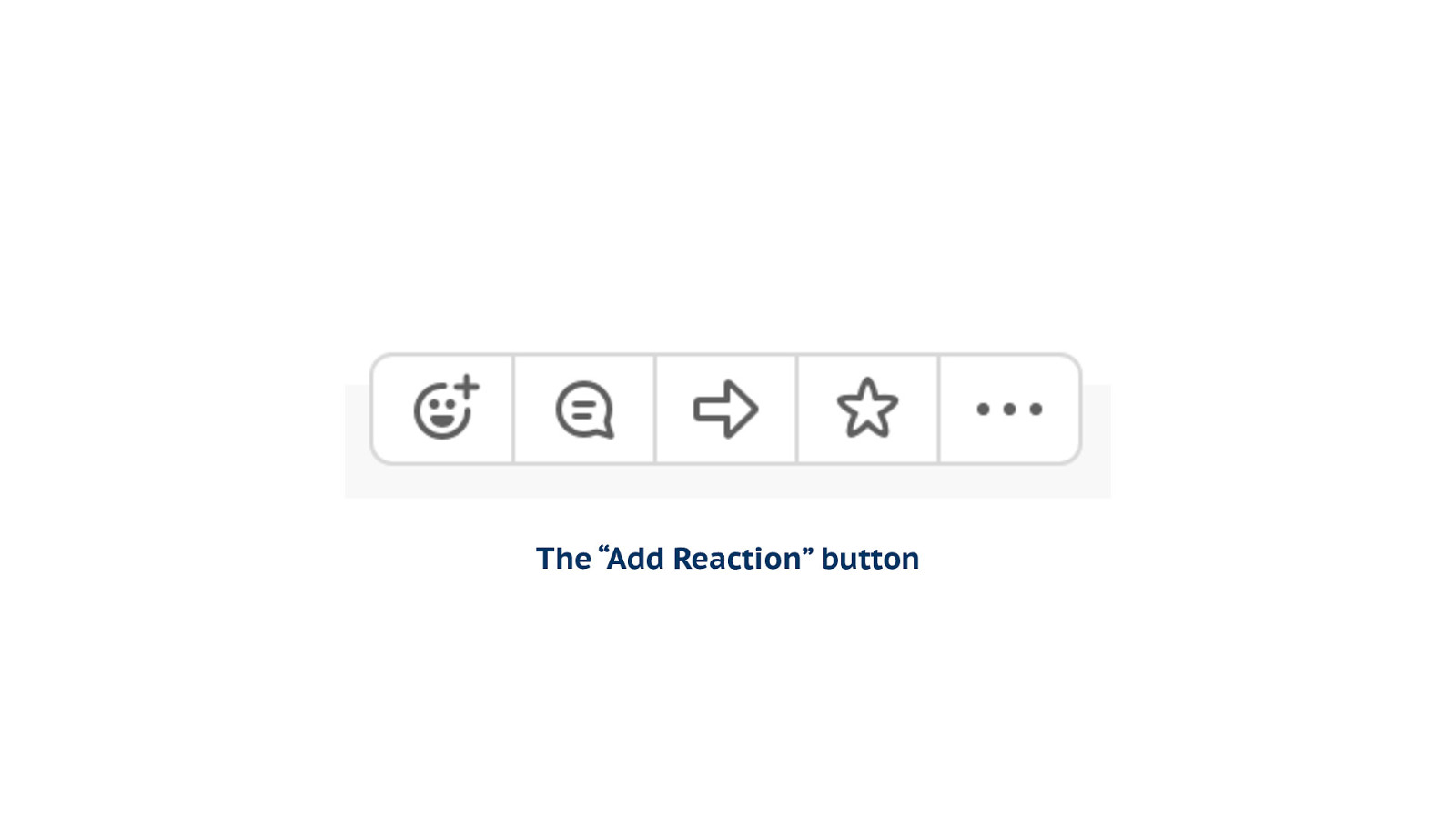
What about… for example… the “Add Reaction” button. Or, you know, the thing in Slack that triggers the emoji.
Slide 75
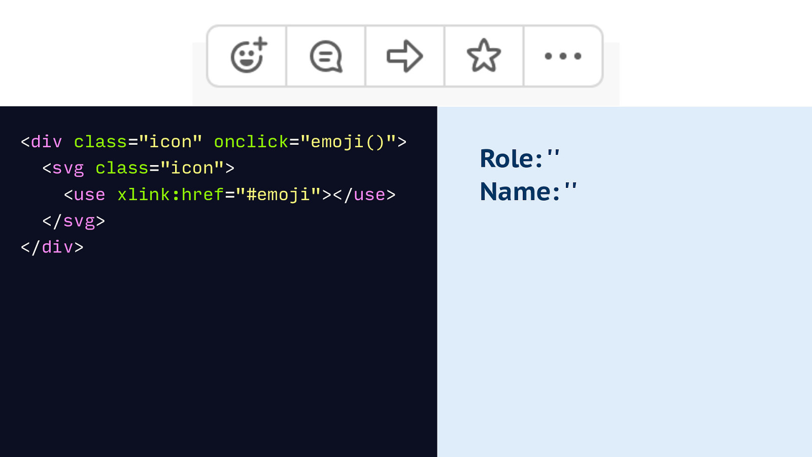
Maybe you use a div that onclick triggers the emoji thing. This leaves you with an accessibility tree that is empty.
Markup: <div class=”icon” onclick=”emoji()”> <svg class=”icon”> <use xlink:href=”#emoji”></use> </svg> </div> Accessibility tree: Role: ” Name: ”
Slide 76
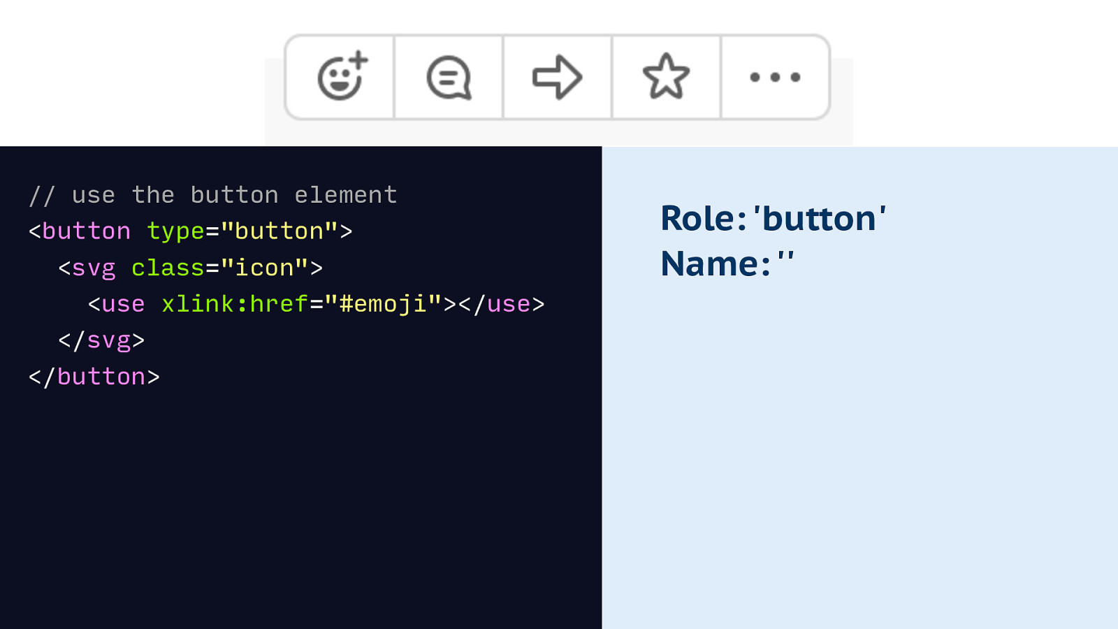
To fix the role first, we can use the button element. This also gives us free keyboard behaviour and lets us activate the button with other AT. Yay!
Markup: <button type=”button”> <svg class=”icon”> <use xlink:href=”#emoji”></use> </svg> </button> Accessibility tree: Role: ‘button’ Name: ”
Slide 77
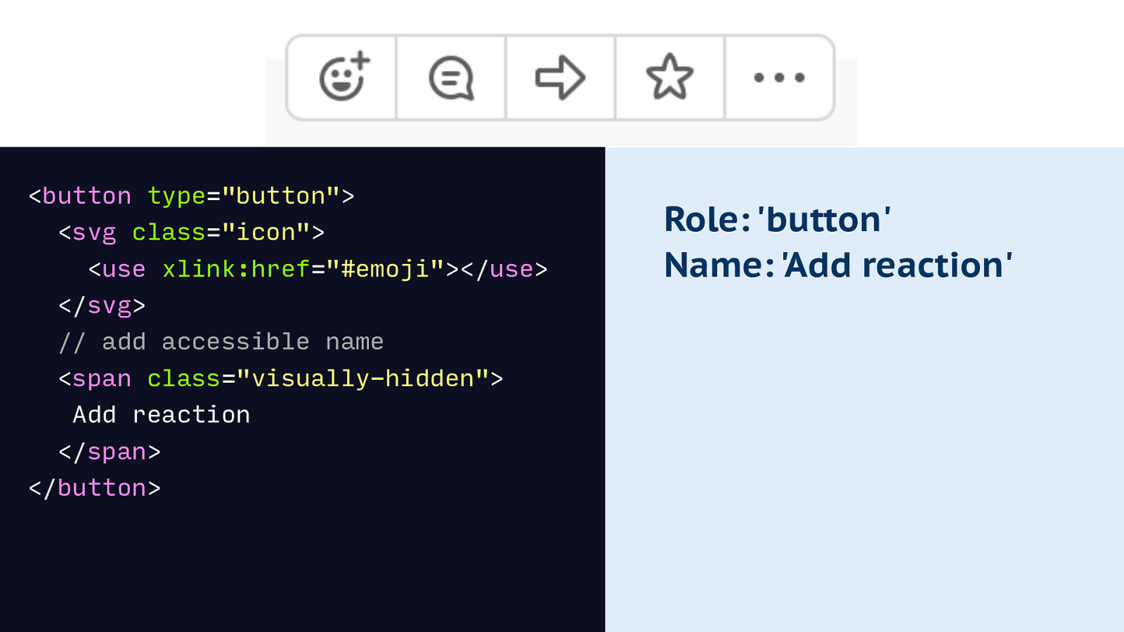
We then want to fix the name, and can do that by adding some text into the markup. The trick here is to hide it not with display none, but with a visually hidden trick, for example position absolute.
Markup: <button type=”button”> <svg class=”icon”> <use xlink:href=”#emoji”></use> </svg> // add accessible name <span class=”visually-hidden”> Add reaction </span> </button> Accessibility tree: Role: ‘button’ Name: ‘Add reaction’
Slide 78
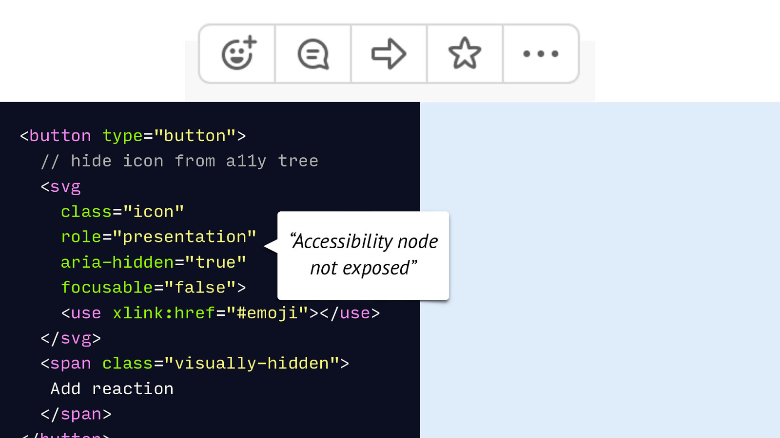
The last thing that would be good is to deal with the image. We can remove it from the accessibility tree by giving it a role of presentation and setting aria-hidden to true. This will result in the node showing up as ‘not exposed’ in the tree.
<button type=”button”> // hide icon from a11y tree <svg class=”icon” role=”presentation” aria-hidden=”true” “Accessibility node not exposed” focusable=”false”> <use xlink:href=”#emoji”></use> </svg> <span class=”visually-hidden”> Add reaction </span>
Slide 79
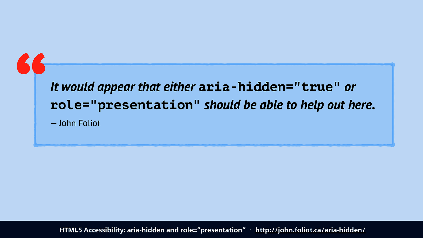
Neither of these two attributes is supported by all browsers, so best use both to get full coverage.
Link: HTML5 Accessibility: aria-hidden and role=”presentation” ・ http://john.foliot.ca/aria-hidden/
Slide 80
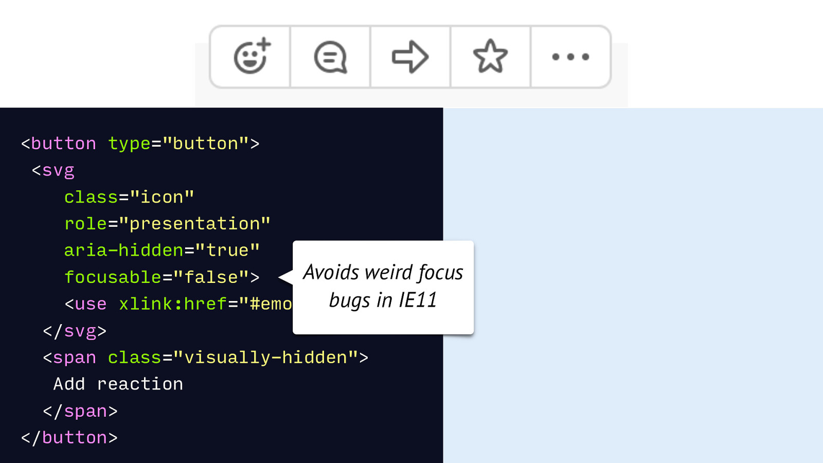
The last thing that is useful specifically for SVG icons is to make it not focusable in IE11, by setting the non standard focusable=false. If you don’t mind non standard code.
HTML: <button type=”button”> <svg class=”icon” role=”presentation” aria-hidden=”true” Avoids weird focus bugs in IE11 xlink:href=”#emoji”></use> focusable=”false”> <use </svg> <span class=”visually-hidden”> Add reaction </span> </button>
Slide 81
So we’ve talked about a lot of different markup examples that can aid accessibiltiy. But what if there’s no meaningful mark-up for your component? Well, ARIA can polyfill!
Slide 82
ARIA can provide names, roles, property and states through attributes. Source: Accessible Rich Internet Applications (WAI-ARIA) 1.1 ・ https://www.w3.org/TR/wai-aria/
Slide 83
Two caveats though, before I continue. There usually is existing HTML for your problem, combining existing elements is usually better than polyfilling with ARIA, because there is just a lot more browser support! See also: Web Components as compositions of native elements ・ https://hiddedevries.nl/en/blog/2017-10-19-web-components-as-compositions-of-native-elements
Slide 84
Second caveat: not all ARIA has good support or provides good usability for AT users. So always be cautious when you decide to add ARIA: it may not help. In fact, I’ve recently heard more and more accessibility auditors say that they encountered sites with too much ARIA, leading to less accessible. Two ways to avoid this: test with real (AT) users if you can, and/or research ARIA properties, there’s lots of blogposts out there from people who were able to test with users.
Slide 85
One example where ARIA is helpful, is expandables. It can expose the relationship and state.
Slide 86
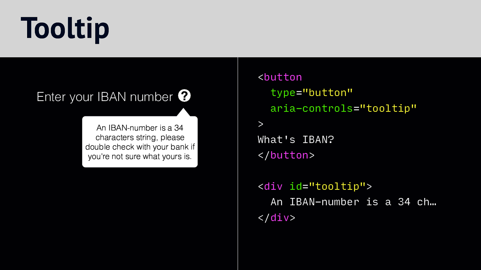
For example, in this tooltip we can relate the button that opens it with the actual content, by using aria-controls, that refers to the ID on the tooltip.
HTML example: <button type=”button” Enter your IBAN number ? aria-controls=”tooltip” An IBAN-number is a 34 characters string, please double check with your bank if you’re not sure what yours is.
What’s IBAN? </button> <div id=”tooltip”> An IBAN-number is a 34 ch… </div>
Slide 87
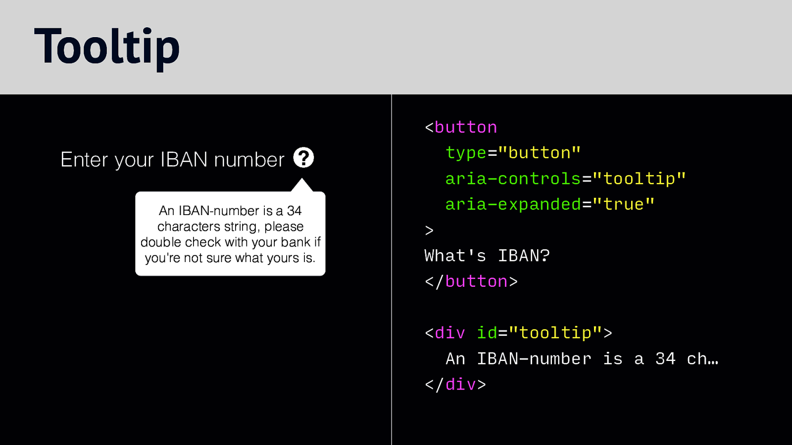
We can add the aria-expanded attribute to expose what state the tooltip is in. We set it to true when it is open…
Slide 88
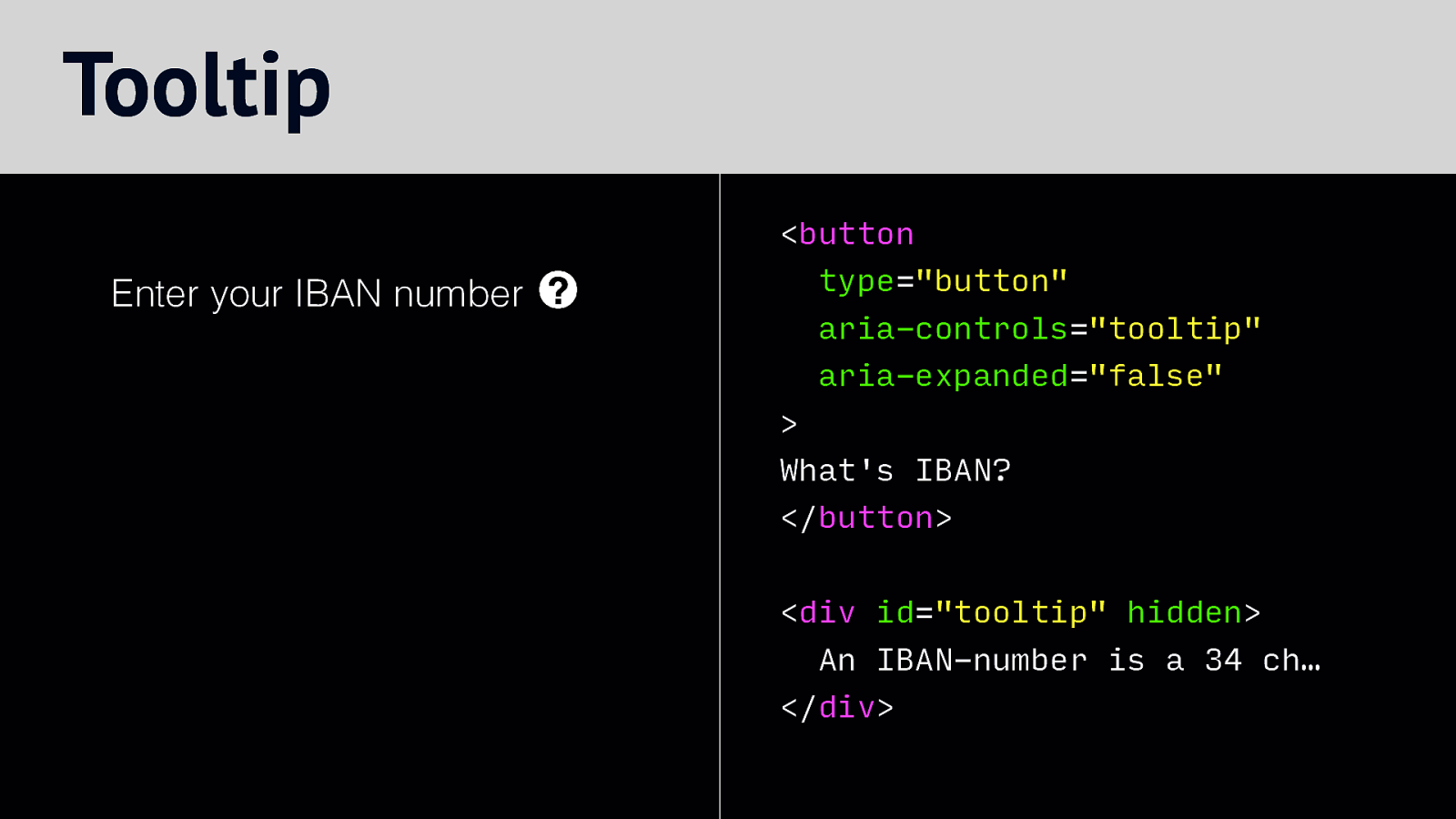
and to false when it is closed.
Slide 89

Something else ARIA can help with is announcements, this is useful when you dynamically add content to a page or component, like a notification,
Slide 90

Take for example this message, or Toast, as a recently learned it is called: “Your changes were saved successfully!”. As soon as this gets added into the DOM, sighted users will see it. But how can we tell users of AT that this is new content?
Slide 91
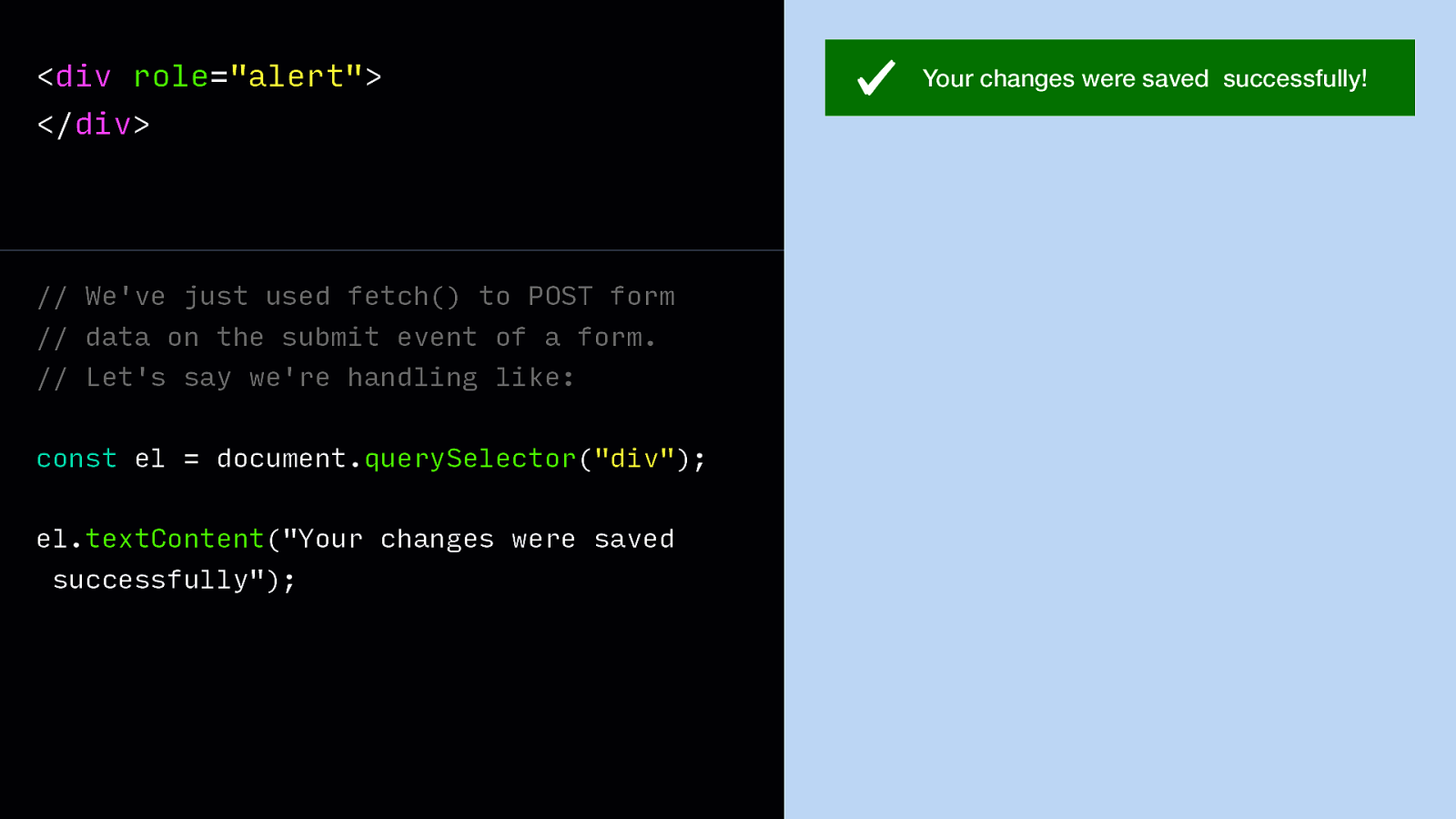
This is where ‘ARIA live regions’ come in handy. They turn an element, like this div, into something that the browser watches and announces upon change. So say our form is submitted and we get a success response from the server, we may insert a success message into it. The live region notices the change and the screenreader will announce the contents.
HTML:
<div role=”alert”> </div>JavaScript: // We’ve just used fetch() to POST form // data on the submit event of a form. // Let’s say we’re handling like: const el = document.querySelector(“div”); el.textContent(“Your changes were saved successfully”);
Slide 92
I’ve been talking a lot about how markup can help. In the future this might change. In this last part of the talk, let’s look at how we can have meaning without mark-up with the Accessibility Object Model.
Slide 93
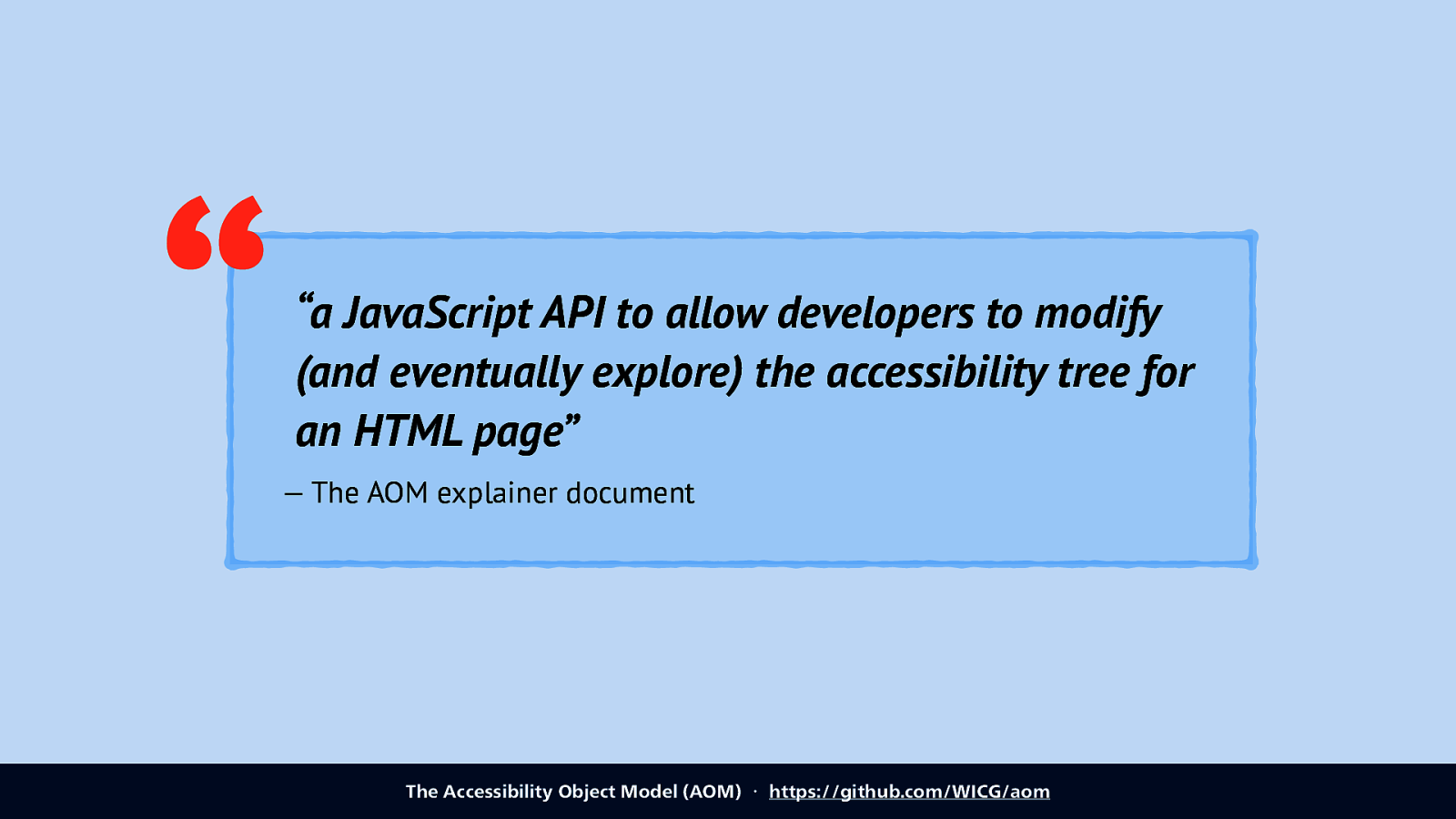
So the AOM is “a JavaScript API to allow developers to modify (and eventually explore) the accessibility tree for an HTML page”, it’s being specced by people from Mozilla, Google and Apple.
Source: The Accessibility Object Model (AOM) ・ https://github.com/WICG/aom
Slide 94
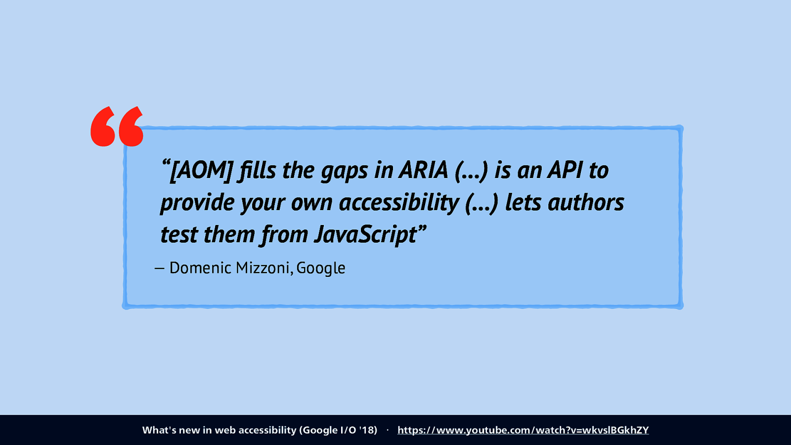
Domenic Mizzoni, who works on this from the Google side, summarised it as these three things: “[AOM] fills the gaps in ARIA (…) is an API to provide your own accessibility (…) lets authors test them from JavaScript” Source: What’s new in web accessibility (Google I/O ‘18) ・ https://www.youtube.com/watch?v=wkvslBGkhZY
Slide 95
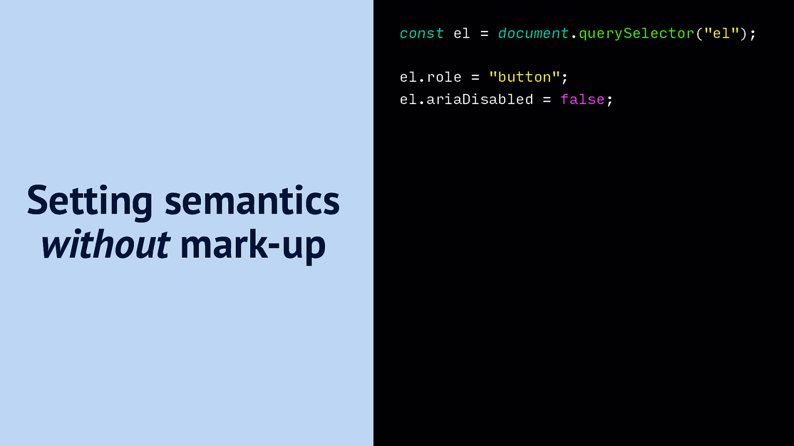
One thing that it lets us do is set semantics without markup, by applying properties directly in JavaScript.
JavaScript: const el = document.querySelector(“el”); el.role = “button”; el.ariaDisabled = false;
Slide 96
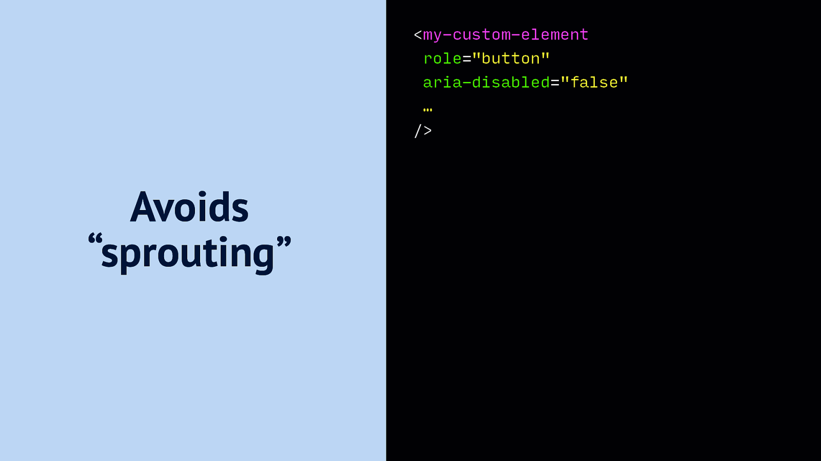
This lets us have components with less attributes, less ‘sprouting’ as the AOM explainer document calls it. It lets us treat accessibility properties as things internal to the document.
Markup: <my-custom-element role=”button” aria-disabled=”false” … /> Avoids “sprouting”
Slide 97
With AOM, we may also get relationships without IDREFs, so we won’t have to come up with unique IDs to relate labels and inputs, or ARIA attributes and elements. There are lots of ARIA attributes that require IDrefs, see next slide.
Slide 98

aria-activedescendant aria-colcount aria-colindex aria-colspan aria-controls aria-describedby aria-details aria-errormessage aria-flowto aria-labelledby aria-owns aria-posinset aria-rowcount aria-rowindex aria-rowspan aria-setsize
Slide 99
Something else that AOM hopes to provide is events from Assistive Technologies. This is somewhat controversial, because it has privacy implications, do we want sites to know which users use AT?
Slide 100
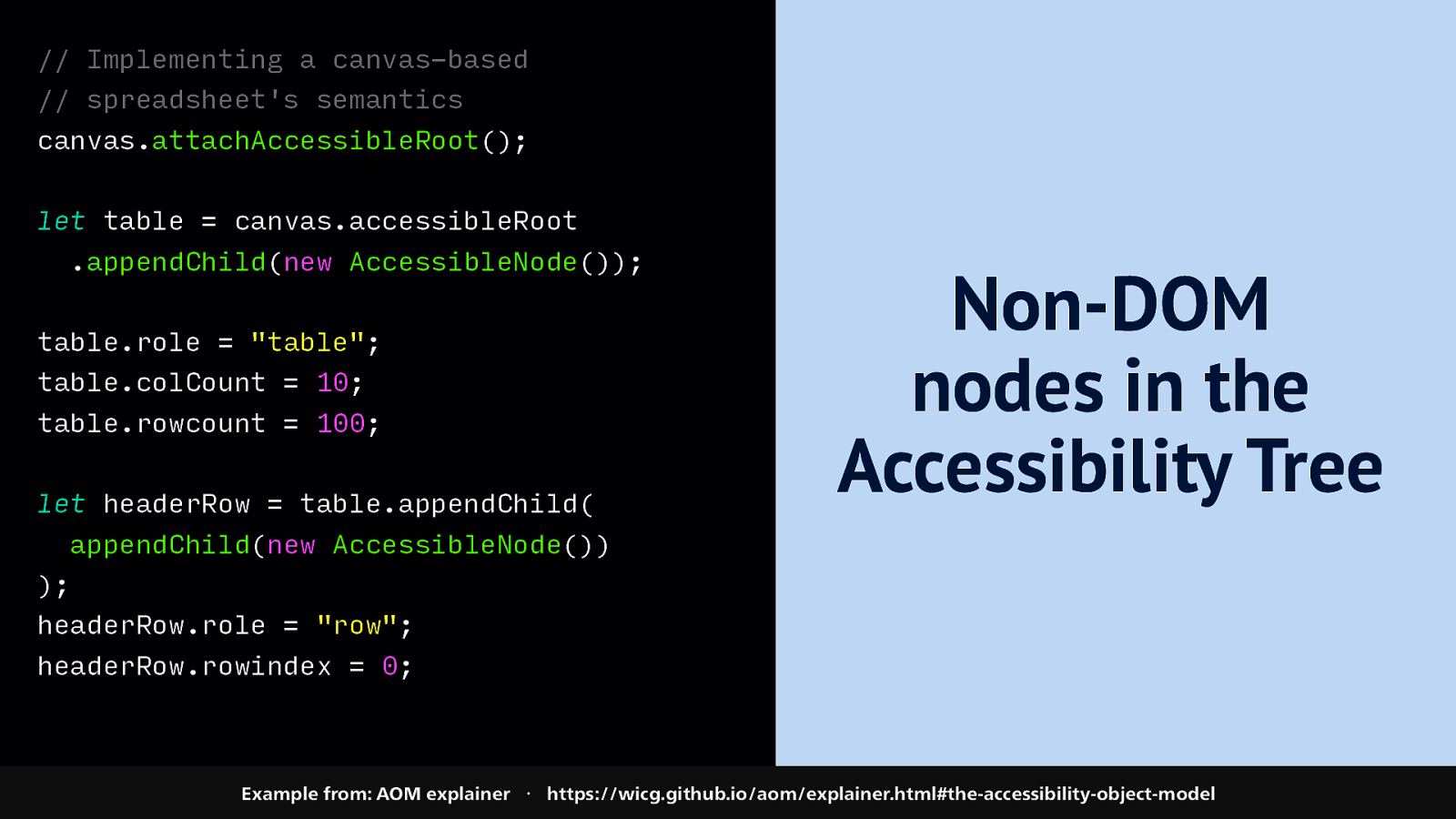
Another cool thing that AOM wants to cover is to let us add nodes to the accessibility tree that don’t exist in the DOM, for example to provide accessibility for something that only exists as a canvas element.
JavaScript: // Implementing a canvas-based // spreadsheet’s semantics canvas.attachAccessibleRoot(); let table = canvas.accessibleRoot .appendChild(new AccessibleNode()); table.role = “table”; table.colCount = 10; table.rowcount = 100; let headerRow = table.appendChild( Non-DOM nodes in the Accessibility Tree appendChild(new AccessibleNode()) ); headerRow.role = “row”; headerRow.rowindex = 0; Example from: AOM explainer ・ https://wicg.github.io/aom/explainer.html#the-accessibility-object-model
Slide 101
And lastly, AOM wants to make open up the accessibility tree for reading in JavaScript, the main use case imagined for that is automated accessibility testing.
Slide 102

Note that the AOM work is very much in progress. You can find these things in various browsers, sometimes behind flags, but they are not stable just yet, and the team have recently gone back to the drawing board, so the specifics may still change.
So… TLDR, my message for today I’d like to summarise as three takeaways:
Slide 103
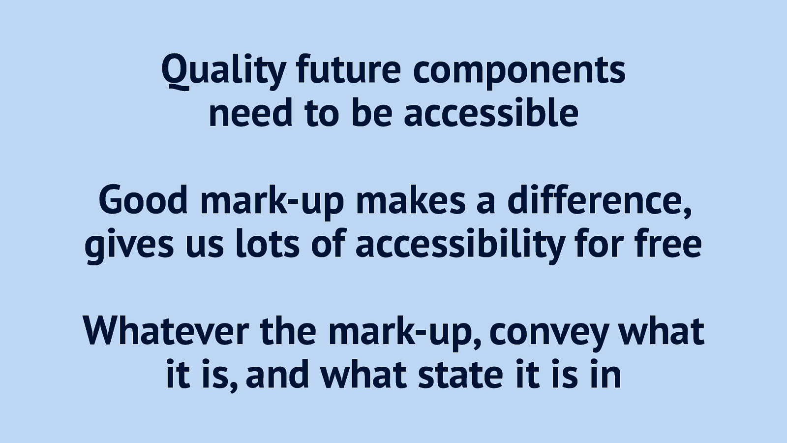
- Quality future components need to be accessible.
- Good mark-up makes a difference, gives us lots of accessibility for free
- Whatever the mark-up, convey what it is, and what state it is in
Slide 104
Thanks! Questions? Reach me on Twitter: @hdv, email: hidde@hiddedevries.nl or find the slides on https://talks.hiddedevries.nl