Hello everyone. Thanks for having me.
Slide 1
Slide 2
Hi, I’m Hidde. I’m a freelance front-end developer and currently I spend most of my week at Mozilla, where I work in the Open Innovation team, and I work at the City of The Hague on their design system and the accessibility of that.
Slide 3
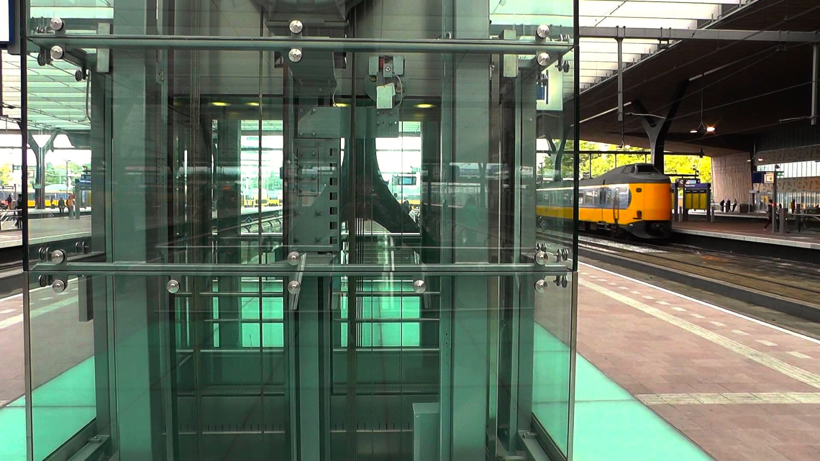
Accessibility is all around is, we are super familiar with it in the real world. This is a photo of an elevator at Rotterdam Central Station. It is there, because it provides access to a service that to people that would otherwise find it hard to use the service. The platforms aren’t on the ground floor, there are stairs, but these are for people who can’t use stairs, because they’re in a wheelchair or have a stroller with young children, or heavy suitcases, or maybe a combination of those things. Elevators are super expensive to design, build and maintain, but we find it makes sense to have them anyway, so that more people can access this service. But yea, they cost money.
Slide 4
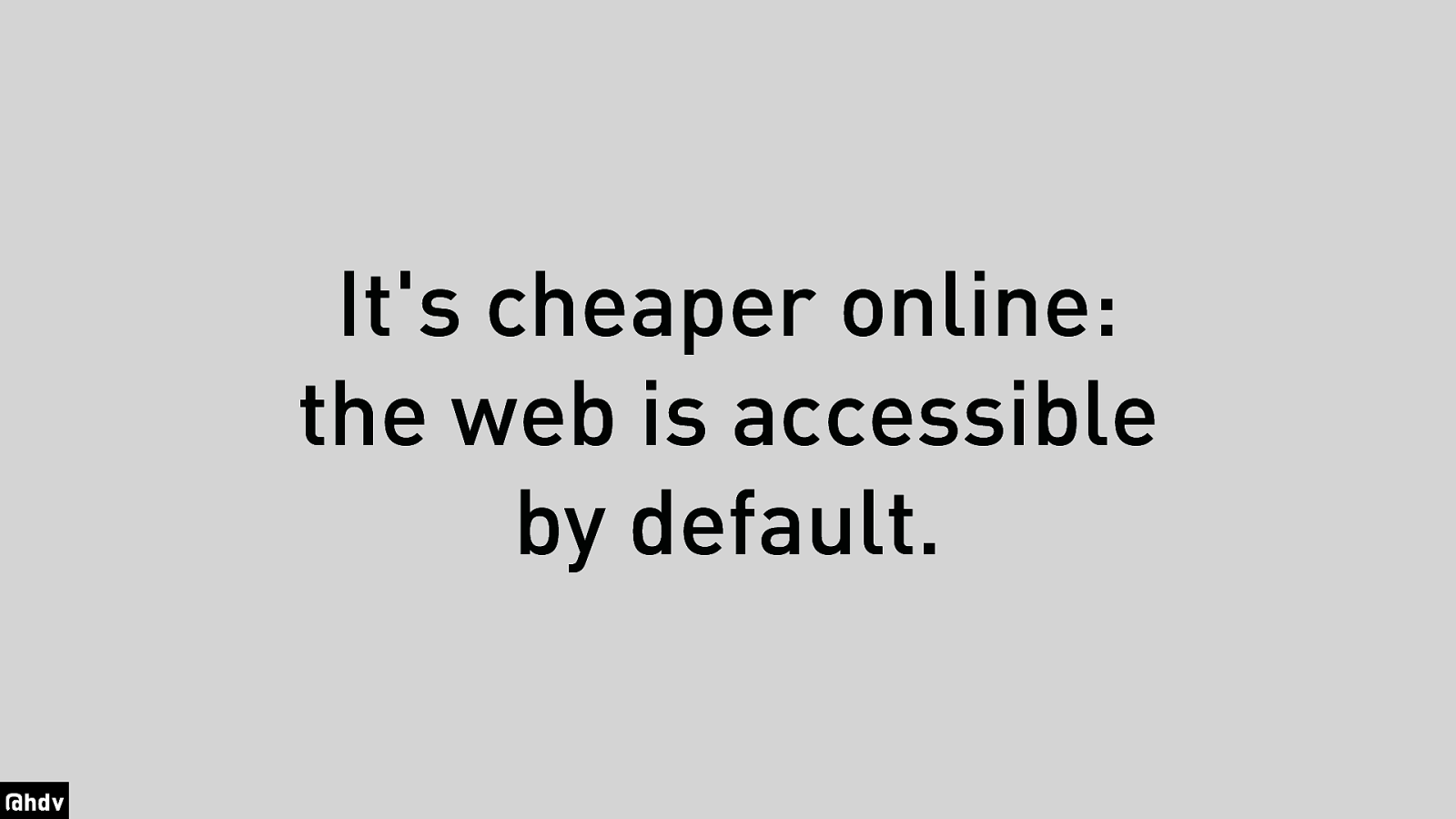
If we want to make digital services accessible, there is good news: it’s cheaper online, because the web is accessible by default. It’s got a lot of accessibility built in.
Slide 5

This has a lot to do with the context in which it was invented: there was a need for a way for scientists from across the globe to communicate with each other, and exchange documents. It had to take everyone’s weird operating systems into account, so universality was pretty much a design principle.
Slide 6
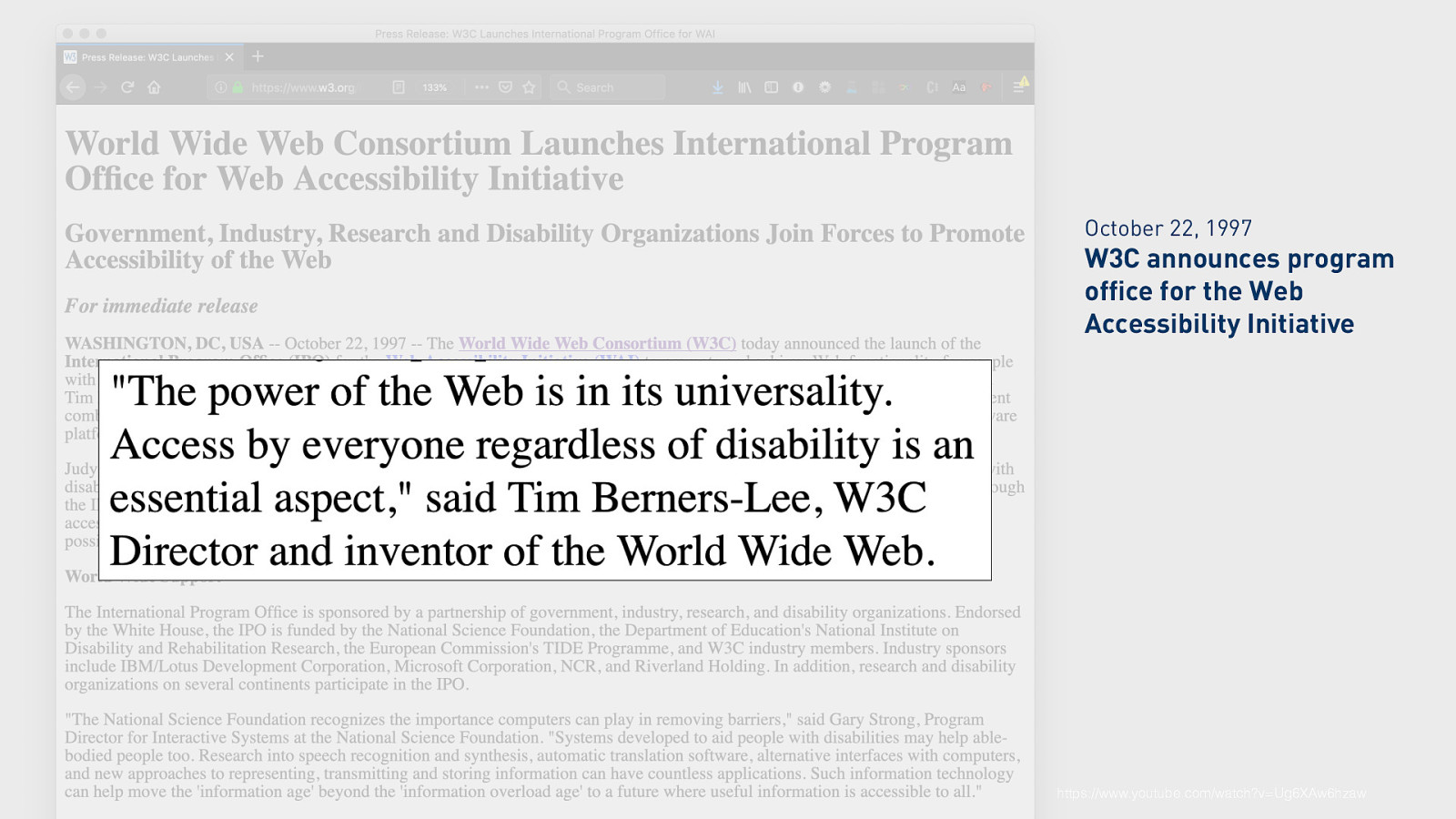
Berners-Lee is often quoted saying: ‘the power of the web is in its universality’, and that definitely also applies to universal access.
October 22, 1997 W3C announces program office for the Web Accessibility Initiative https://www.youtube.com/watch?v=Ug6XAw6hzaw
Slide 7
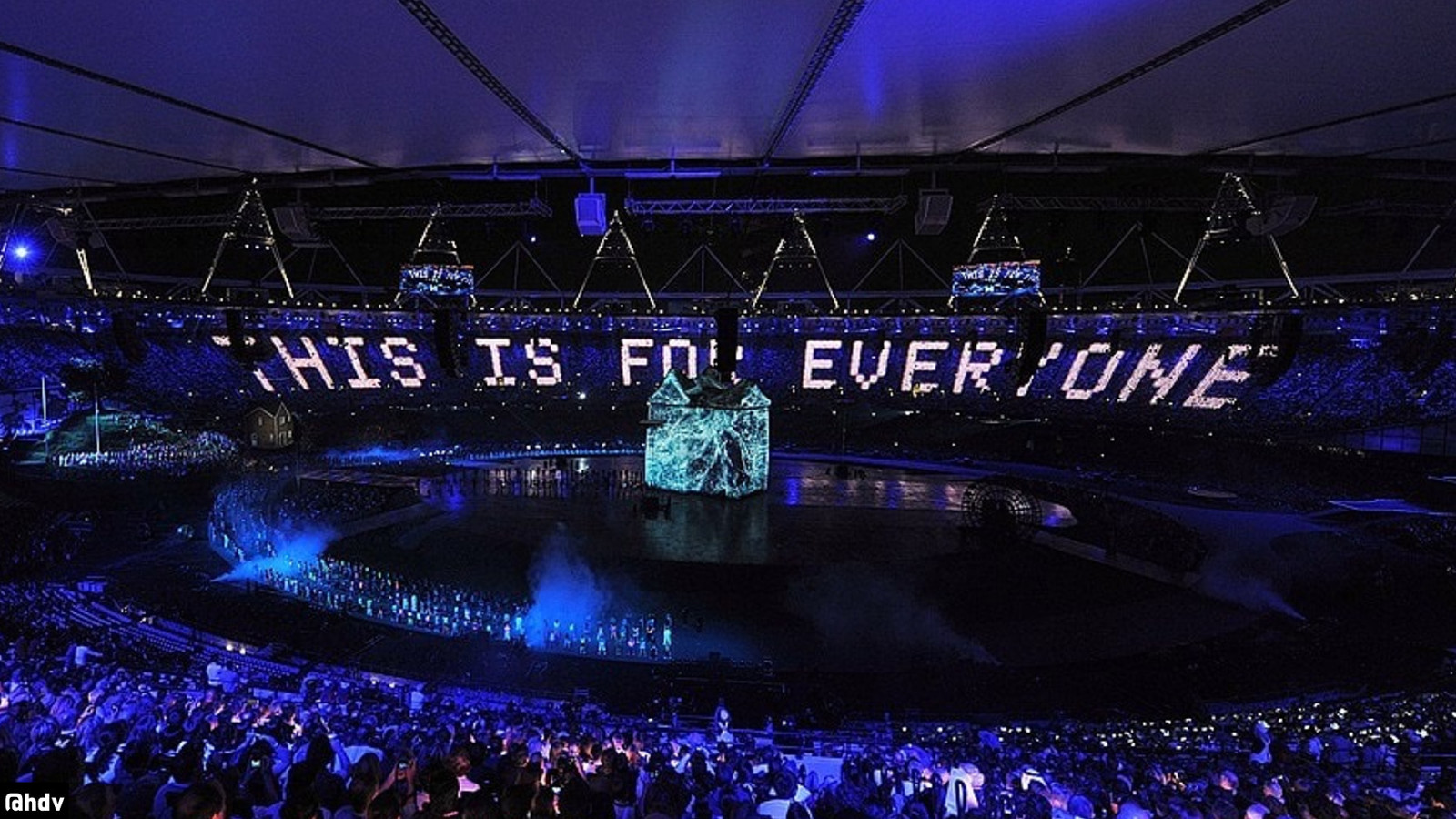
Yup, the web is for everyone.
(Picture showing stadium with huge letters: this is for everyone)
Slide 8
Ok, let’s talk about 6 ways to make your site more accessible. They are all things that I’ve encountered a lot on the web, while looking at other people’s sites. They are also all things that aren’t necessarily hard to get right, as long as you know about them.
Slide 9
- Expose names
The first one may be a little odd: it is to expose names.
Slide 10
The story behind this is… when someone goes to your website, they type in the URL and do a request, the response they get is HTML, markup. The browser parses that, and it creates trees.
Slide 11
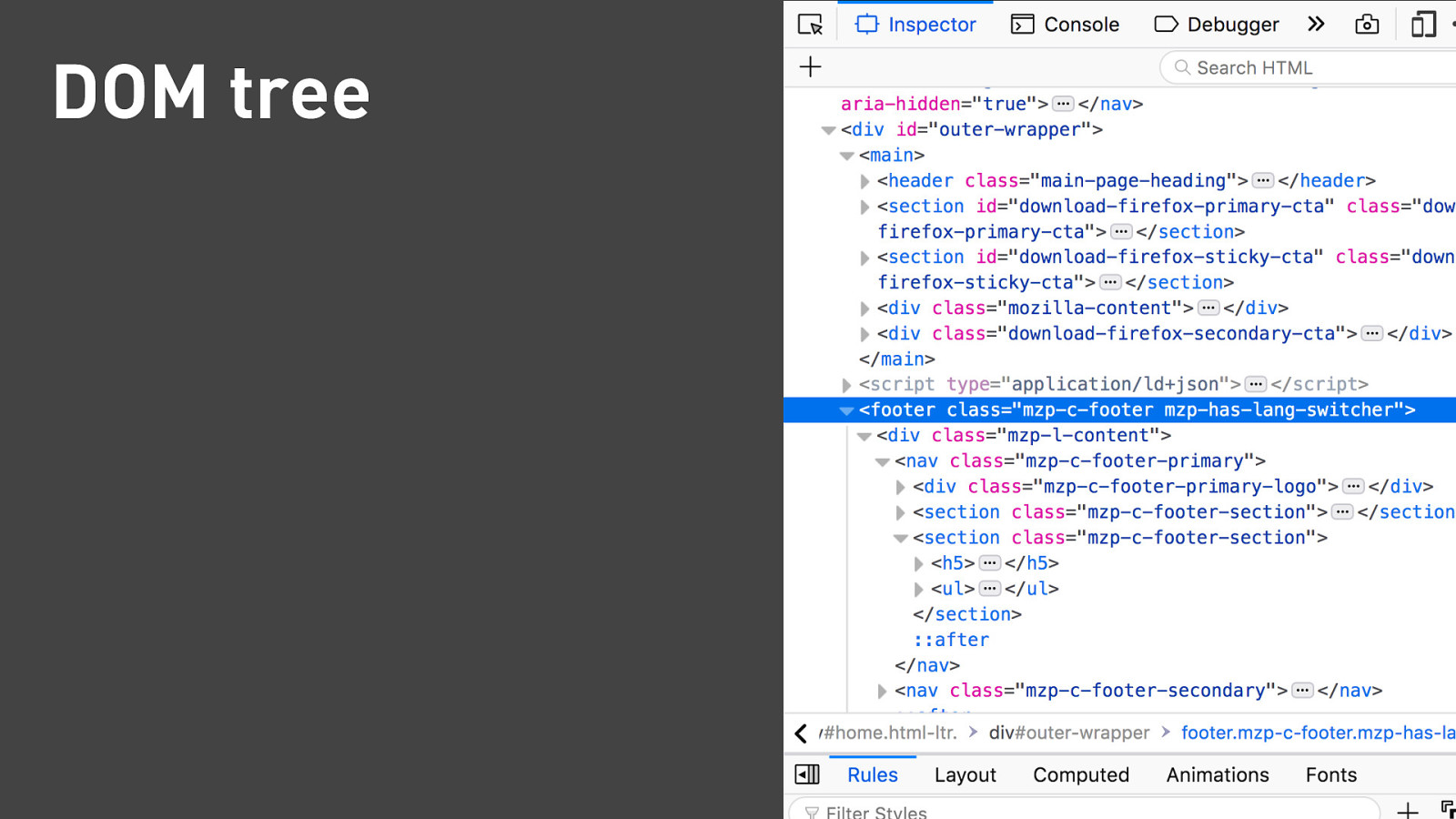
The first one is the DOM tree, the developers here should be pretty familiar with it, for others: it is what you see when you open the dev tools. It’s the markup, parsed by the browser, put into a structure.
Slide 12
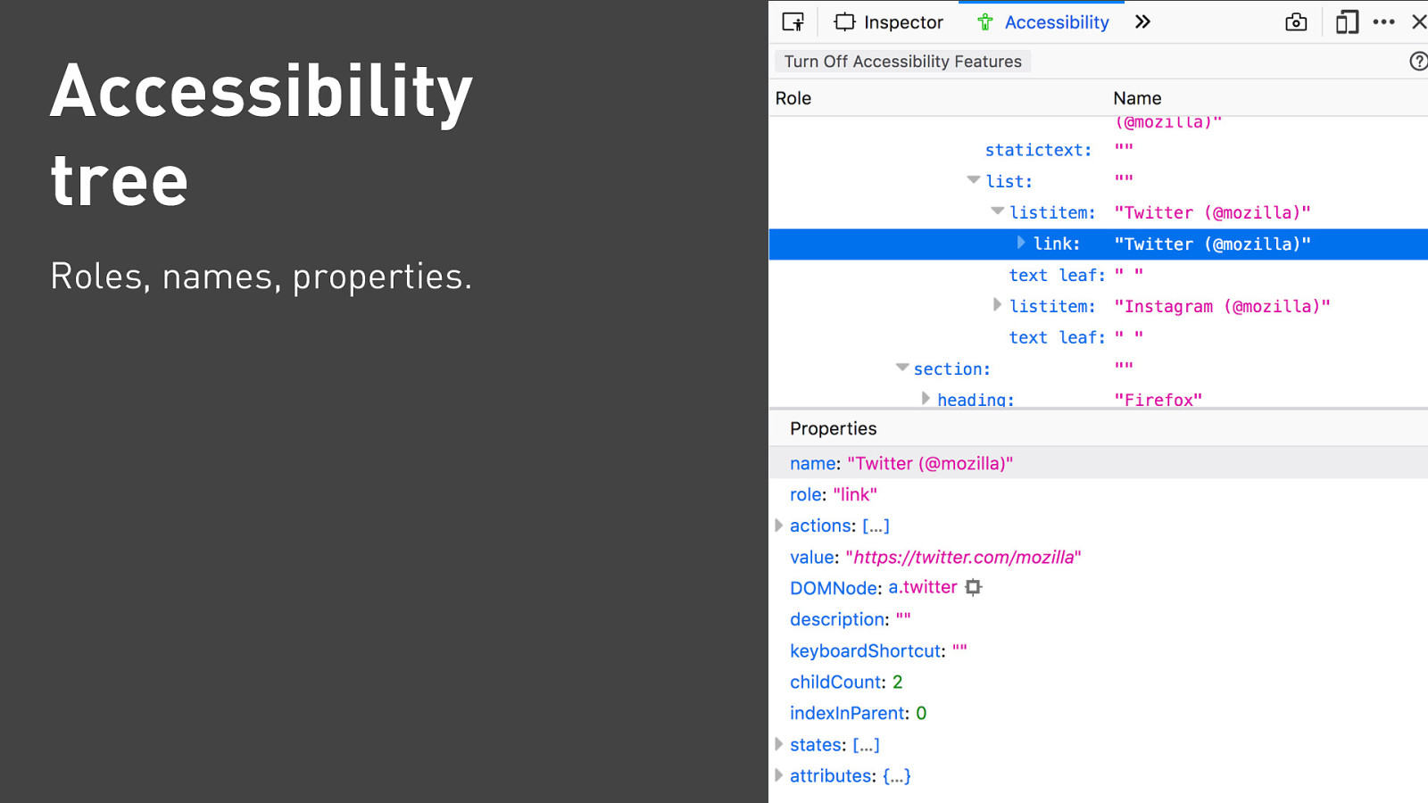
Accessibility tree: Roles, names, properties.
What many people don’t know is that there is a second tree: the accessibility tree. It is based off the DOM tree and contains accessibility information of DOM nodes.
Slide 13
One way I like to explain it is: the accessibility tree is how your page gets exposed to assistive tech.
Slide 14
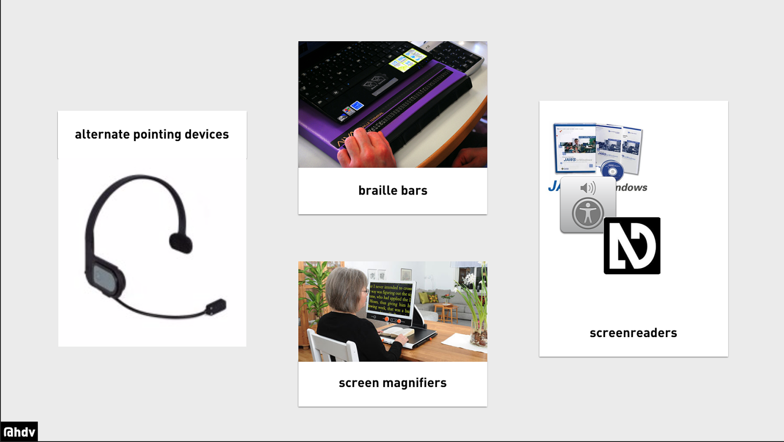
So what’s assistive tech? It is tools that people use to access the web if they haves some sort of impairment that makes it hard for them to use the web like most people. For example, screenreaders read out everything that happens on the screen, so that users can listen to their screen if they are blind.
Slide 15
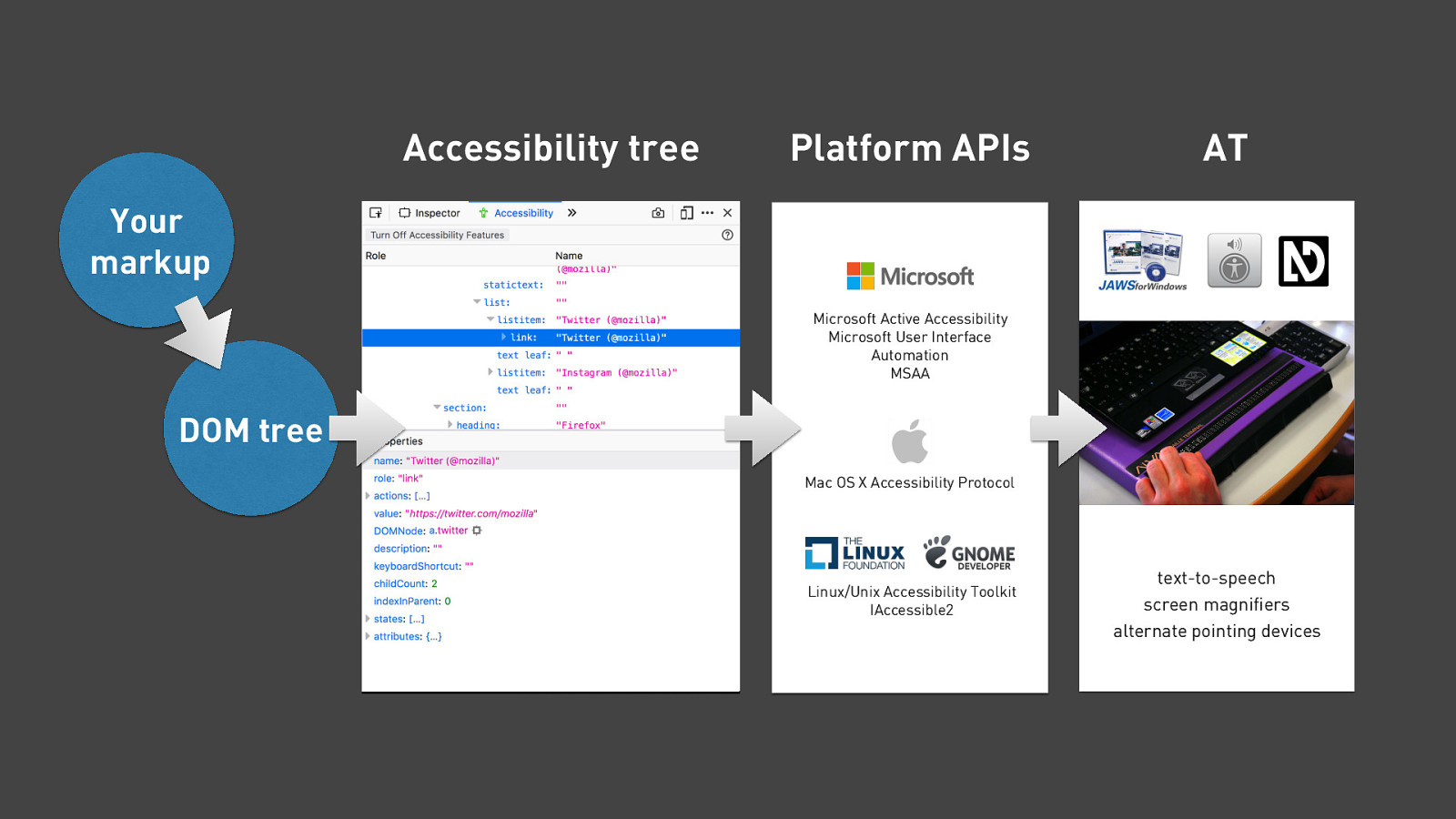
To work efficiently, assistive tech needs to know what is happening on the screen. They find out by accessing APIs that are built in to the platform, so Windows, Mac, Linux all have these things built in. Those APIs know a lot, but what they don’t know is what happens on your website. Because when a user types in a URL and they get all that markup, this is the first time they system encounters all this. To make sense of how to expose all this to the user, the accessibility tree is used. As I said before it is based on the DOM tree which is based on our markup. This is where we come in as makers of websites.
Slide 16
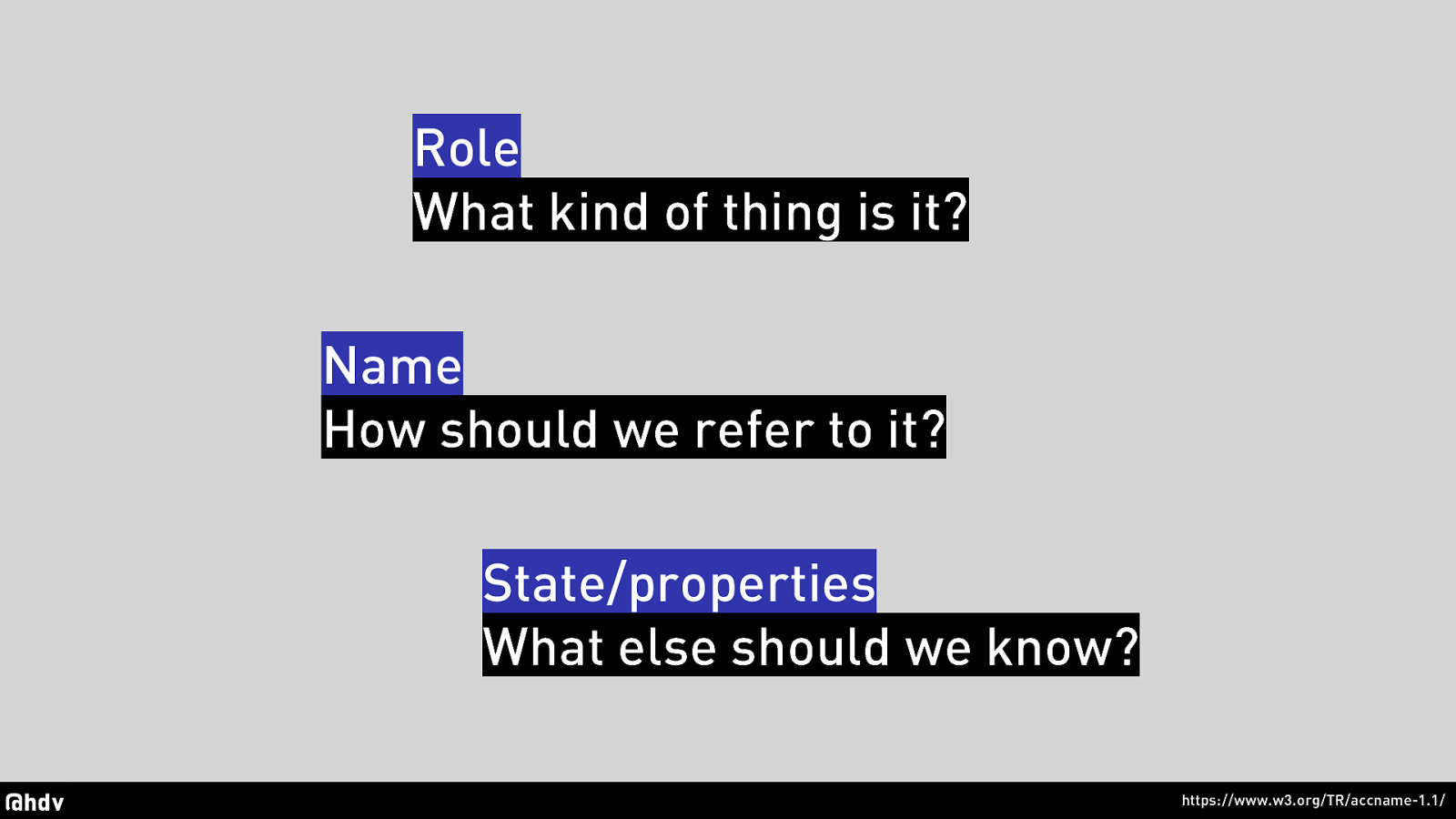
There are roughly three types of things in these trees: roles: what kind of thing is it (header, footer, nav?0, names (how should we refer to it? For example if your link says click here that will likely become its name in the accessibility tree, I’ll get into that in a bit). And then there’s states and properties, they are things like is this hamburger menu collapsed or expanded, is this checkbox checked or not. https://www.w3.org/TR/accname-1.1/
Slide 17
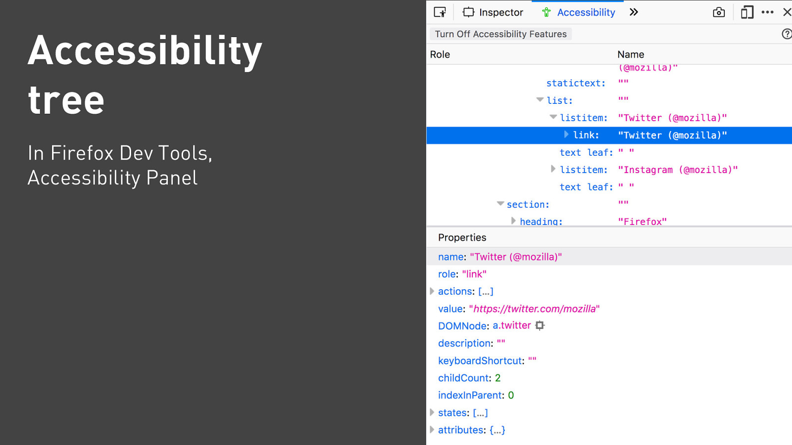
The Accessibility Tree can be accessed in Firefox Dev Tools, Accessibility Panel, this also has awesome contrast indicators.
Slide 18
Other browsers display this stuff too, all in slightly different ways, so play with it and see which one you like more.
Slide 19
Let’s look at naming things a bit now, because I believe the names we have in the accessibility tree make a big difference to users of assistive tech.
Slide 20
The <a> tag names a link
Slide 21
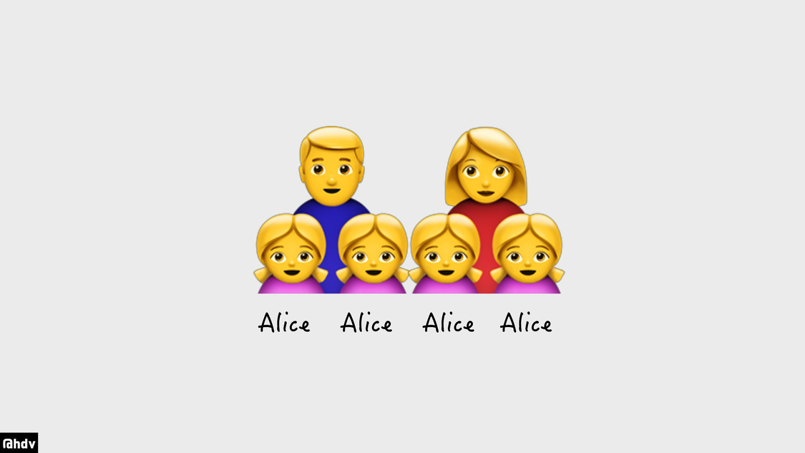
This is a bit of a weird example, but please bear with me. Imagine you have four daughters, and the first one is called Alice. If the second one is also named Alice, and the third and fourth, too, this is going to cause lots of technical problems. If you don’t give your children unique names it gets super hard to distinguish between them.
Slide 22

Yet this is what we do when we build a news section with four items, where each item has a link that is called Read more. If you use this in a screenreader, it will announce Link Read More, Link Read More, Link Read More, Link Read More. This isn’t helpful, with no unique names it gets hard to distinguish between those items.
Slide 23
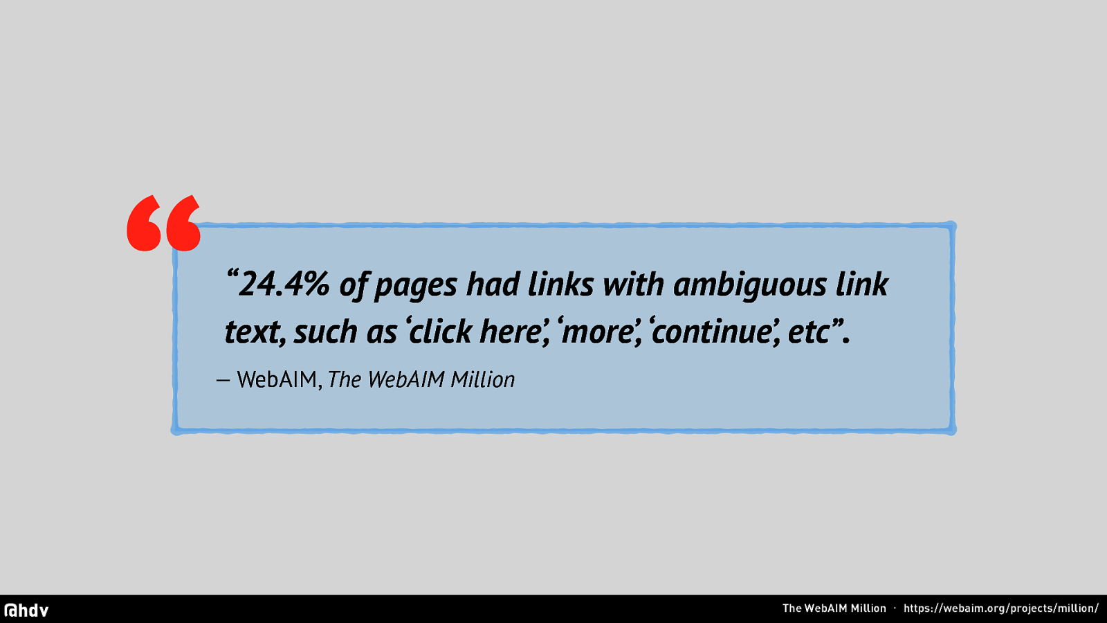
This is actually quite common. WebAIM, a non profit specialising in accessibility, researched the top 1 million website in a recent project that they called the WebAIM Million. They found 25% of sites used links like click here, read more and continue.
Slide 24
So the advice here is: make an effort to use unique link text that also makes sense out of context, for example when it is read by a screenreader to a user that cannot see your interface.
Slide 25
Another important HTML element that names thinks, is the label element. It names form fields.
Slide 26
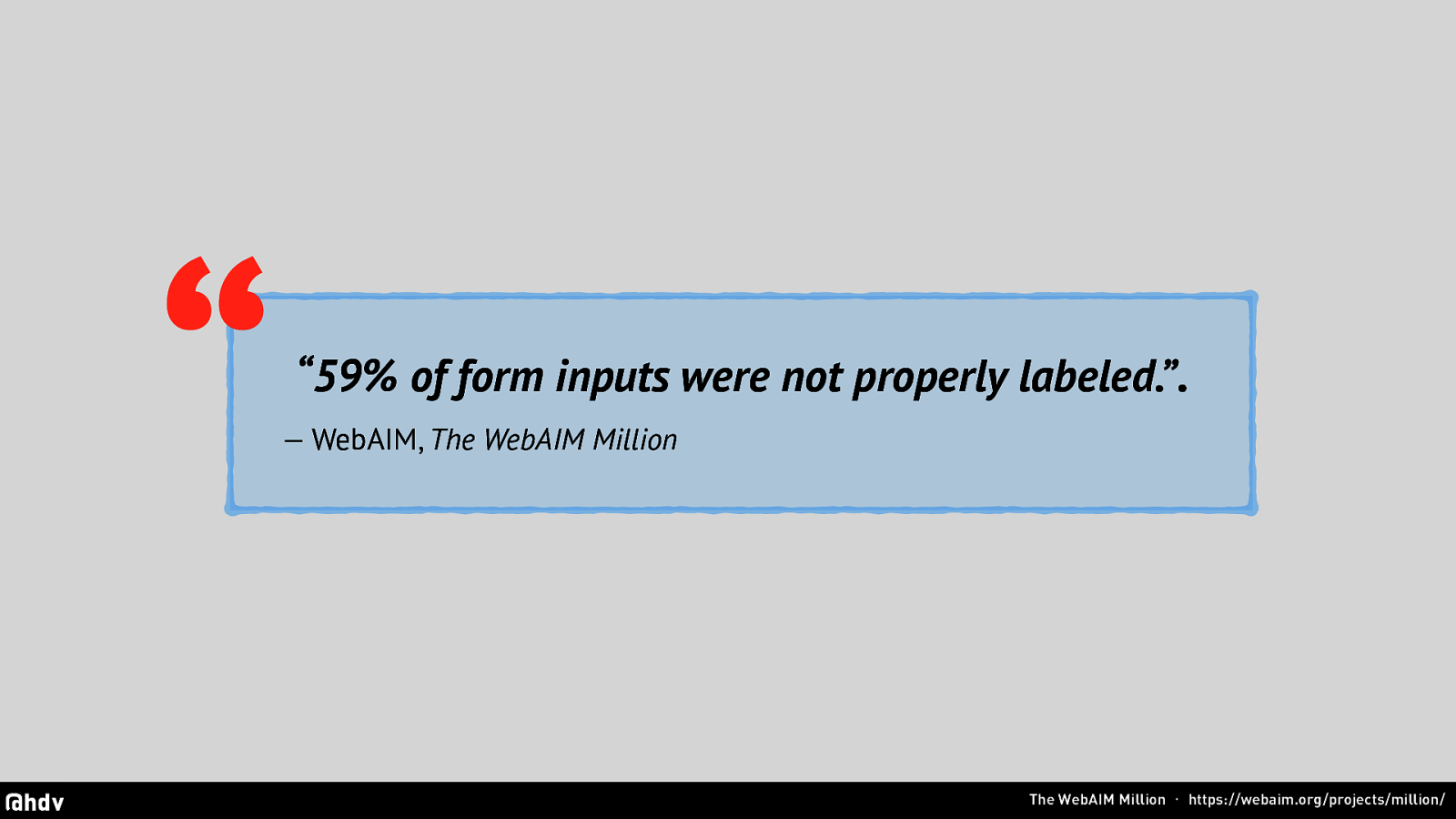
This same WebAIM survey found that almost 60% of websites got this wrong.
Slide 27
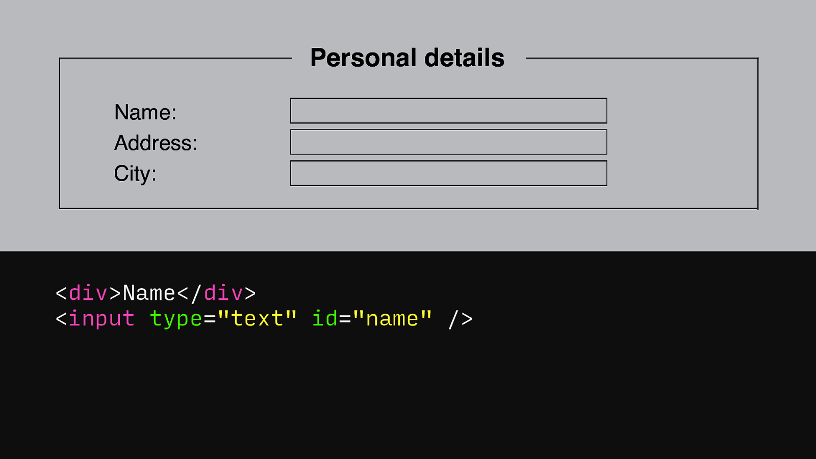
So here’s an example. I have a form field for a name. One way to build it is to have a DIV with the word ‘Name’ in it, and an input. Visually this is helpful, because the input displays right next to the label, and people can associate. Except, this does not work for assistive tech or the accessibility tree. For that, you’ll need to associate label and input
Slide 28
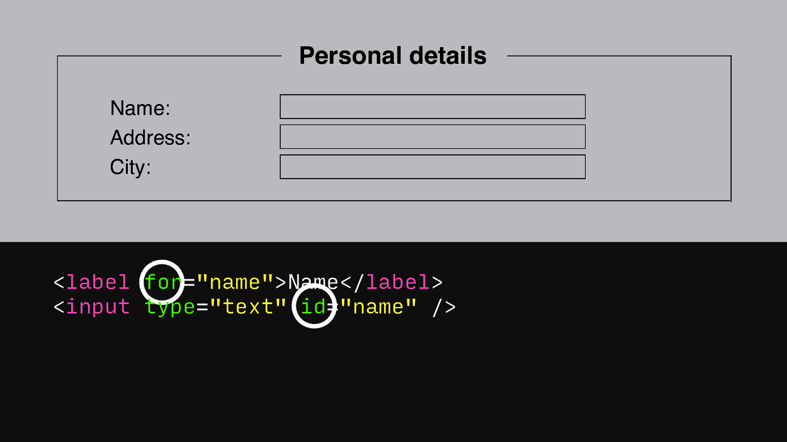
For those who are not familiar with how label elements work, you use a label element with a for attribute and an input that has an id, and the for and id need to be the same string. This associates them and now ‘Name’ will show up as the name in the accessibility tree.
<label for=”name”>Name</label> <input type=”text” id=”name” />
Slide 29
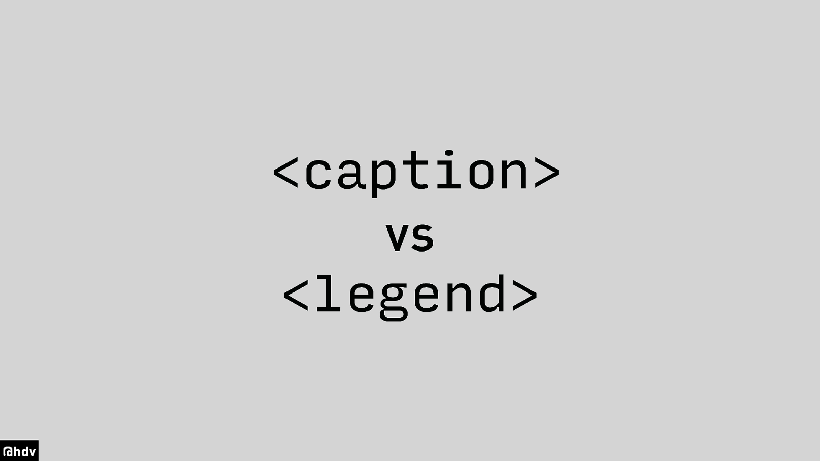
Two more elements that also effectively name things: caption and legend.
Slide 30
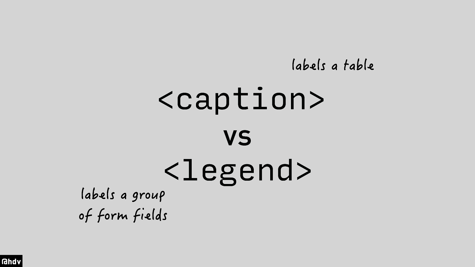
A caption labels a table and a legend labels a group of form fields. Again, this makes it useful for users of assistive tech to find the elements they are looking for. For example an accountant who looks at five tables related to financial results, may be looking for the results of 2017. If it has that in the name, this makes it easier to find.
Slide 31
Part 2: choose your markup. This is a recurring theme throughout the talk, it is the markup that matters.
Slide 32
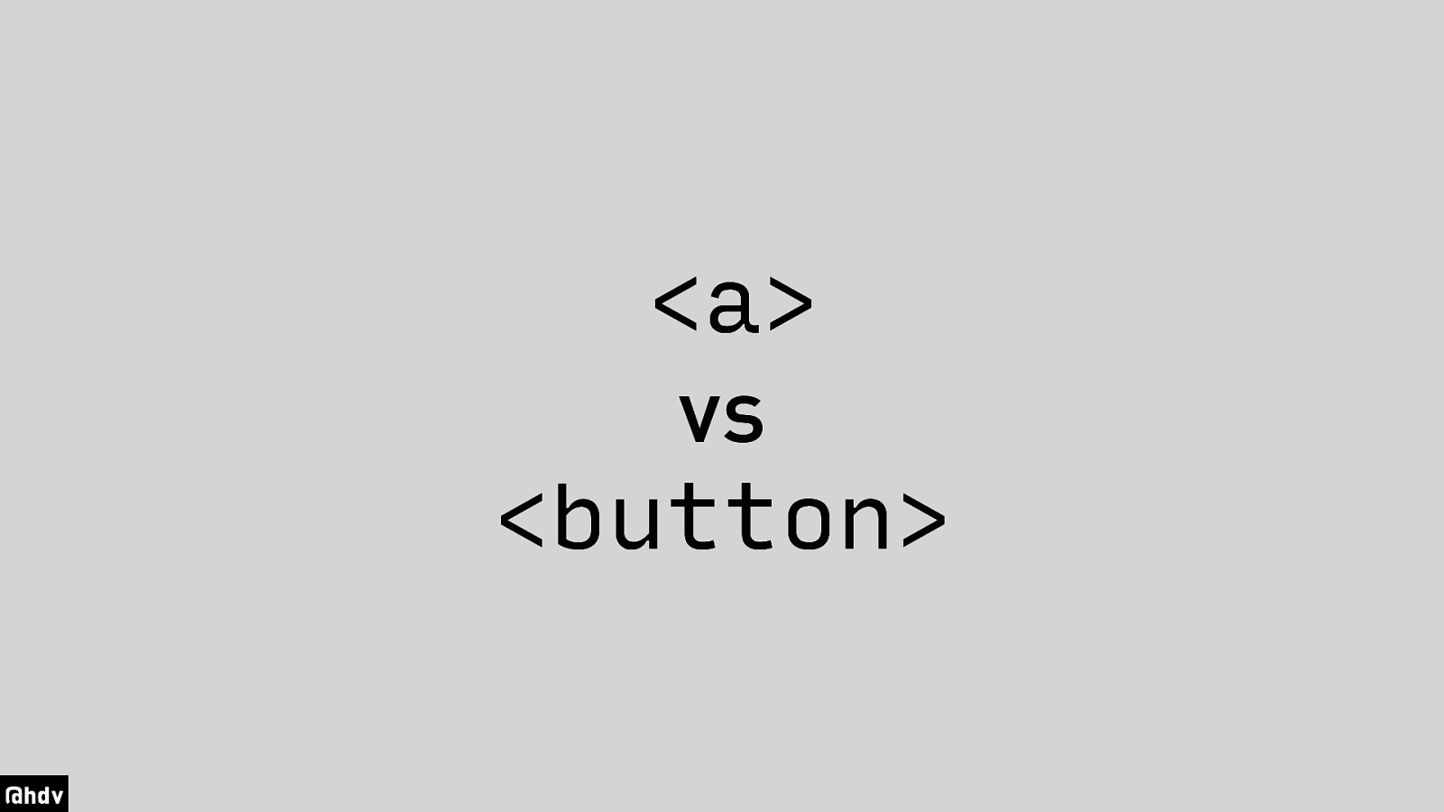
One thing I often see problems with is the distinction between anchors and buttons.
Slide 33
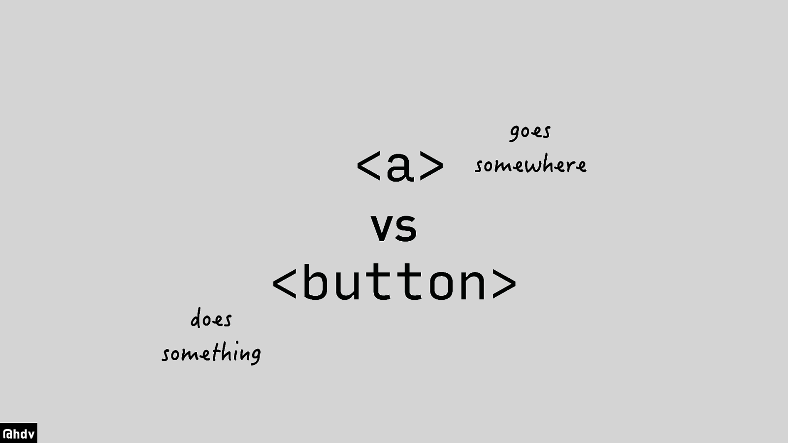
The difference is this: an anchor goes somewhere and a button does something.
Slide 34
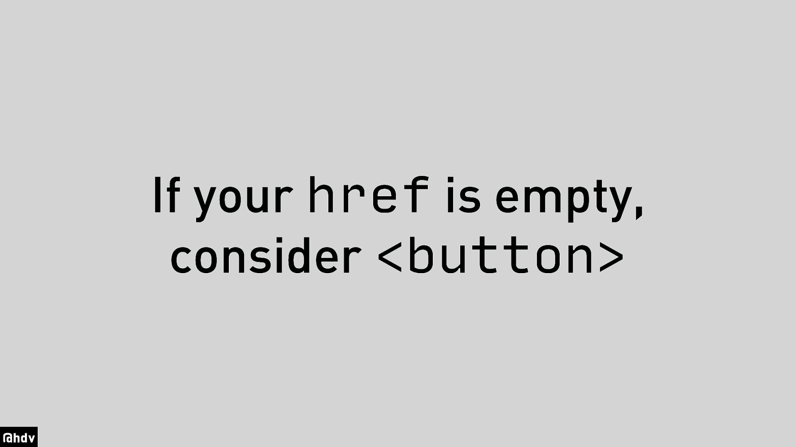
A rule of thumb: if your href attribute is empty, or it contains just a hash, you probably want to use a button. In any case, don’t use a div for either.
Slide 35
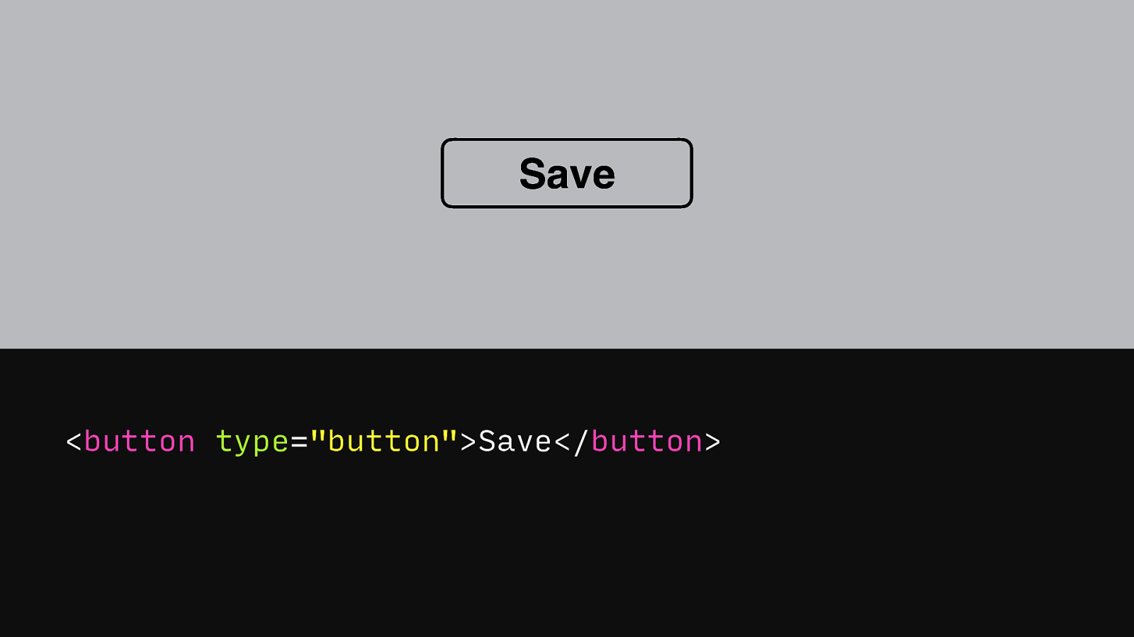
For example if you have a button that saves some content, that’s not a div, it’s a button.
Slide 36
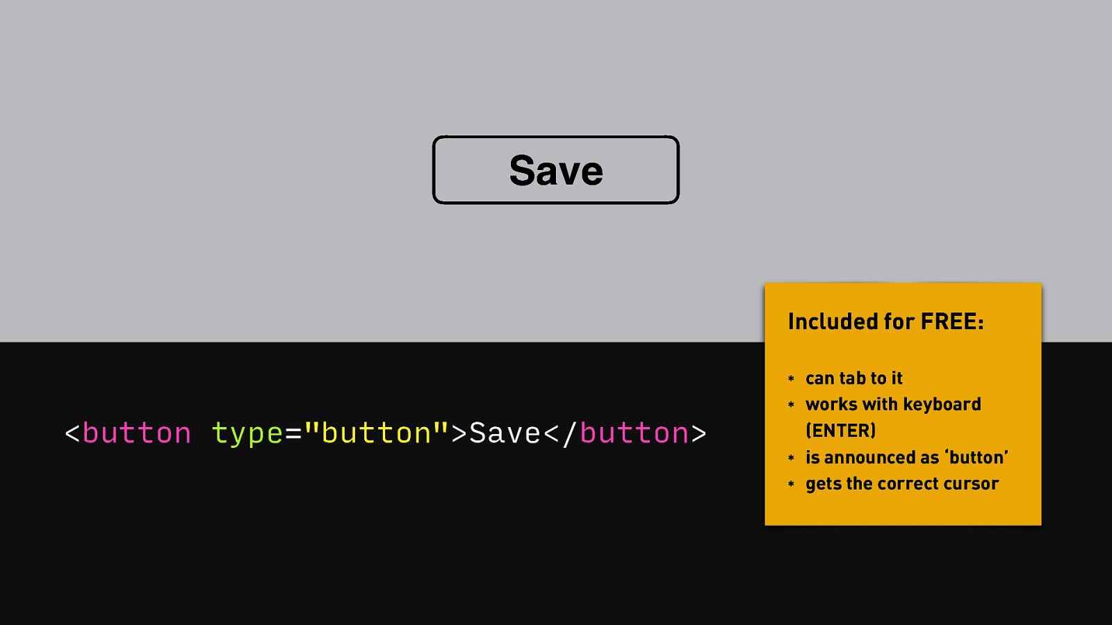
There are various advantages to using an actual button element over a div, for example that it works with keyboard, and is announced as ‘button’ by screenreader software.
Slide 37
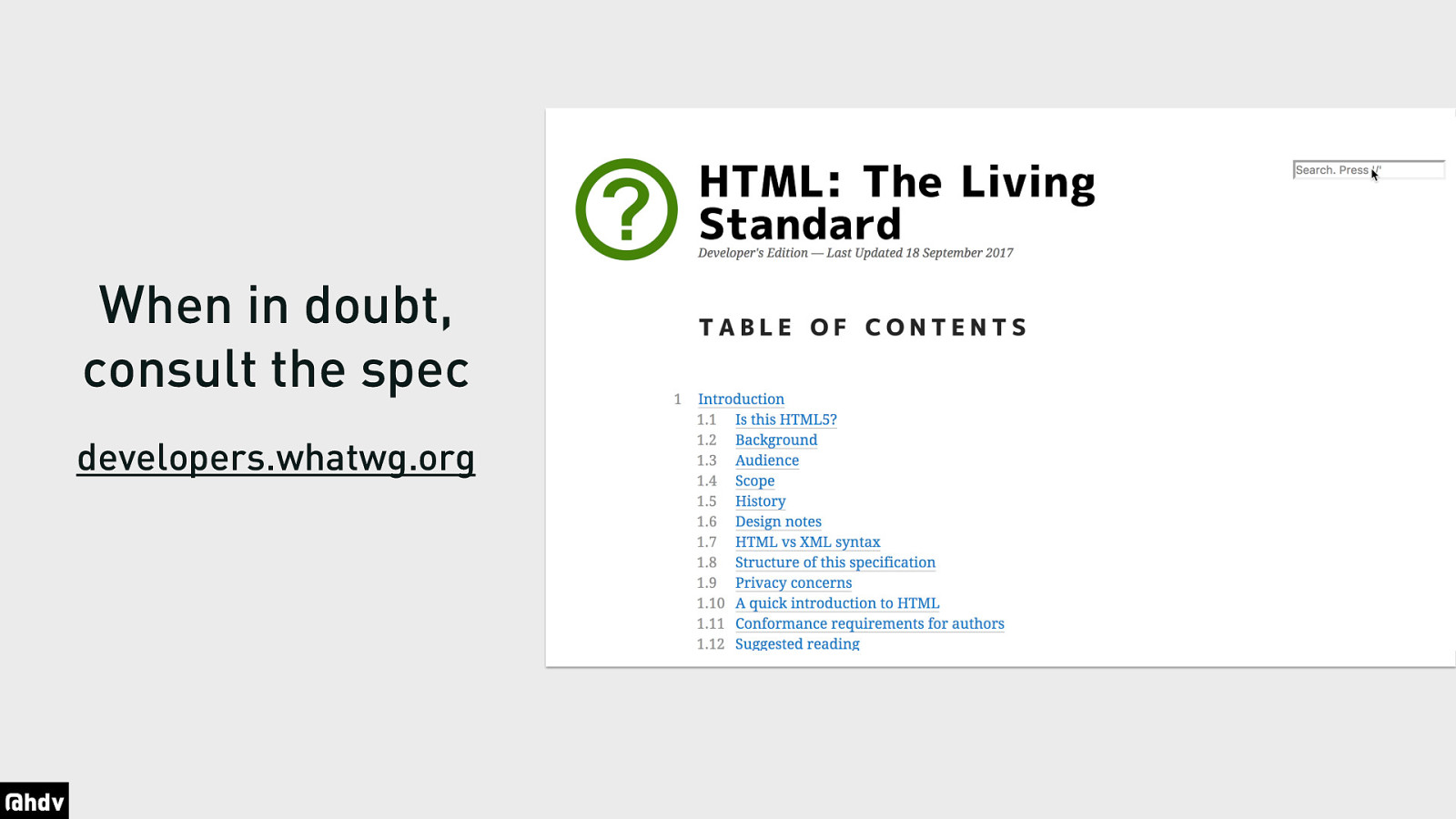
If you’re not sure which HTML element to use, I would recommmend to look at the HTML specification for developers, offered by the WHAT working group on developers.whatwg.org
Slide 38
Tip 3 is to provide structure.
Slide 39
One way to provide structure is to think about the title of each page, and by title I mean the title element that sits in the header of your document.
Slide 40
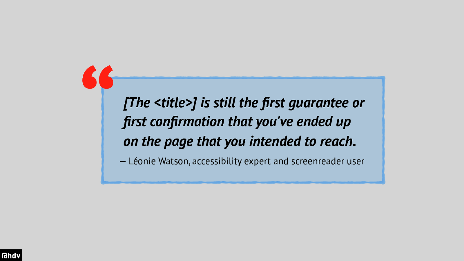
I was recently reminded of this again by accessibility expert and screenreader user Léonie Watson, who recorded a video for Smashing Magazine in which she showed how she browsers the web.
Quote: [The <title>] is still the first guarantee or first confirmation that you’ve ended up on the page that you intended to reach. — Léonie Watson, accessibility expert and screenreader user
Slide 41
Headings are also super helpful when it comes to structure. They are like a tables of contents for assistive tech.
Slide 42
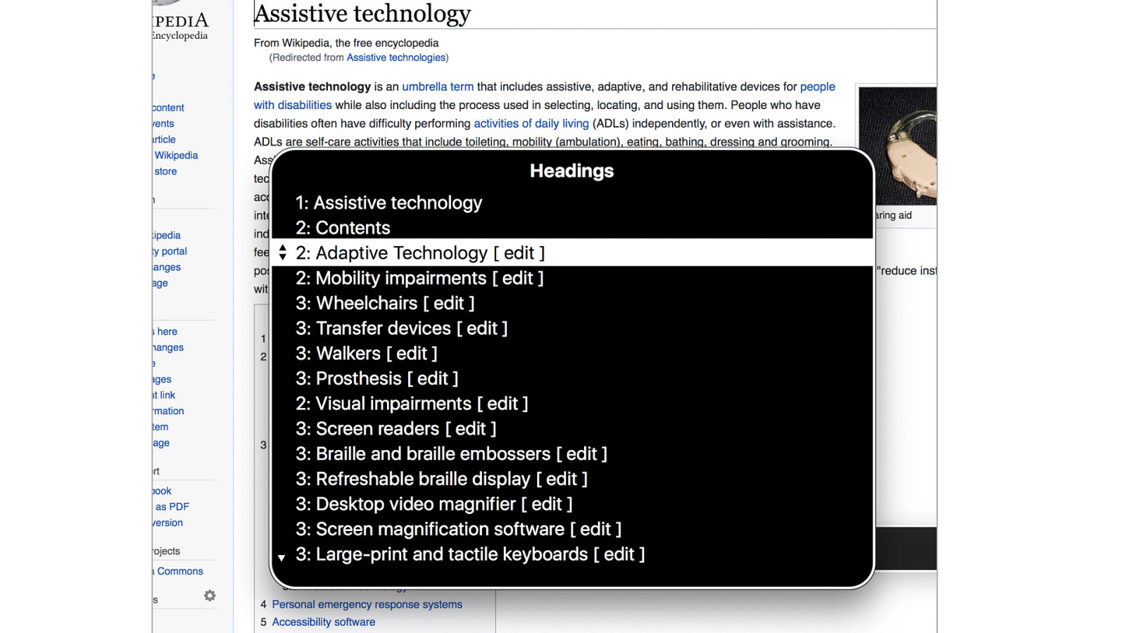
This is because screenreaders often come with shortcuts to get to the headings of a page. Screenreaders CAN read out a full web page to the users, but listening to all webpages always costs a lot of time. Therefoer they come with keyboard shortcuts to access just the headings. This is an example of VoiceOver on the Mac, used on the Wikipedia page of assistive technology.
Slide 43
A very general tip is to turn off your CSS and then verify if your page still makes sense. Without CSS there’s just structure, or lack of it, so it is a good way to find things that need improvement.
Slide 44
Ok, the fourth way to make your site more accessible.
Slide 45
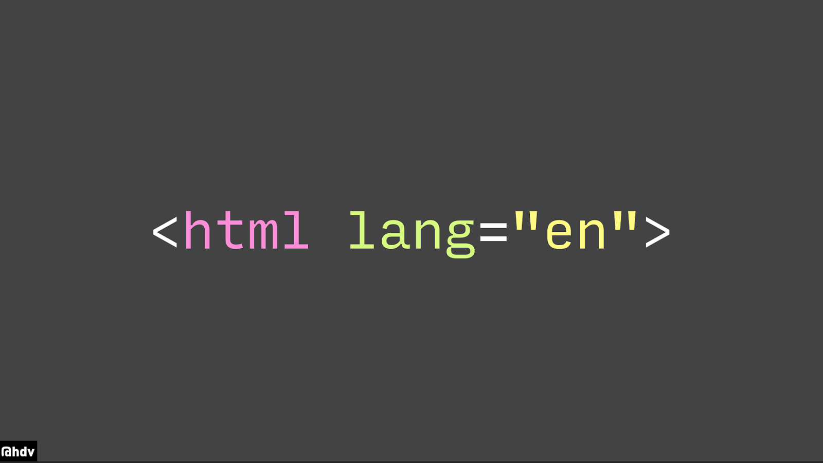
It is to specify language. Jules already mentioned it this morning. Set a language for the document, so that search engines but also assistive tech know what the language is. This works not just on the document, but also on individual elements.
Slide 46
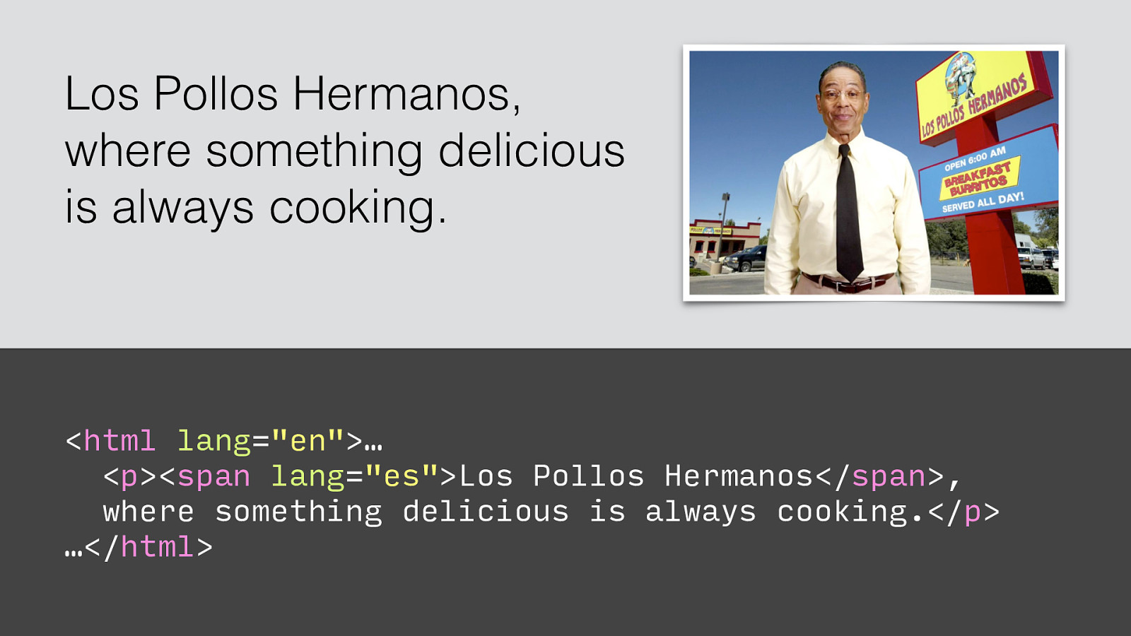
For example if you have a couple of words or a whole paragraph in a different language, you can set a lang attribute locally.
Slide 47
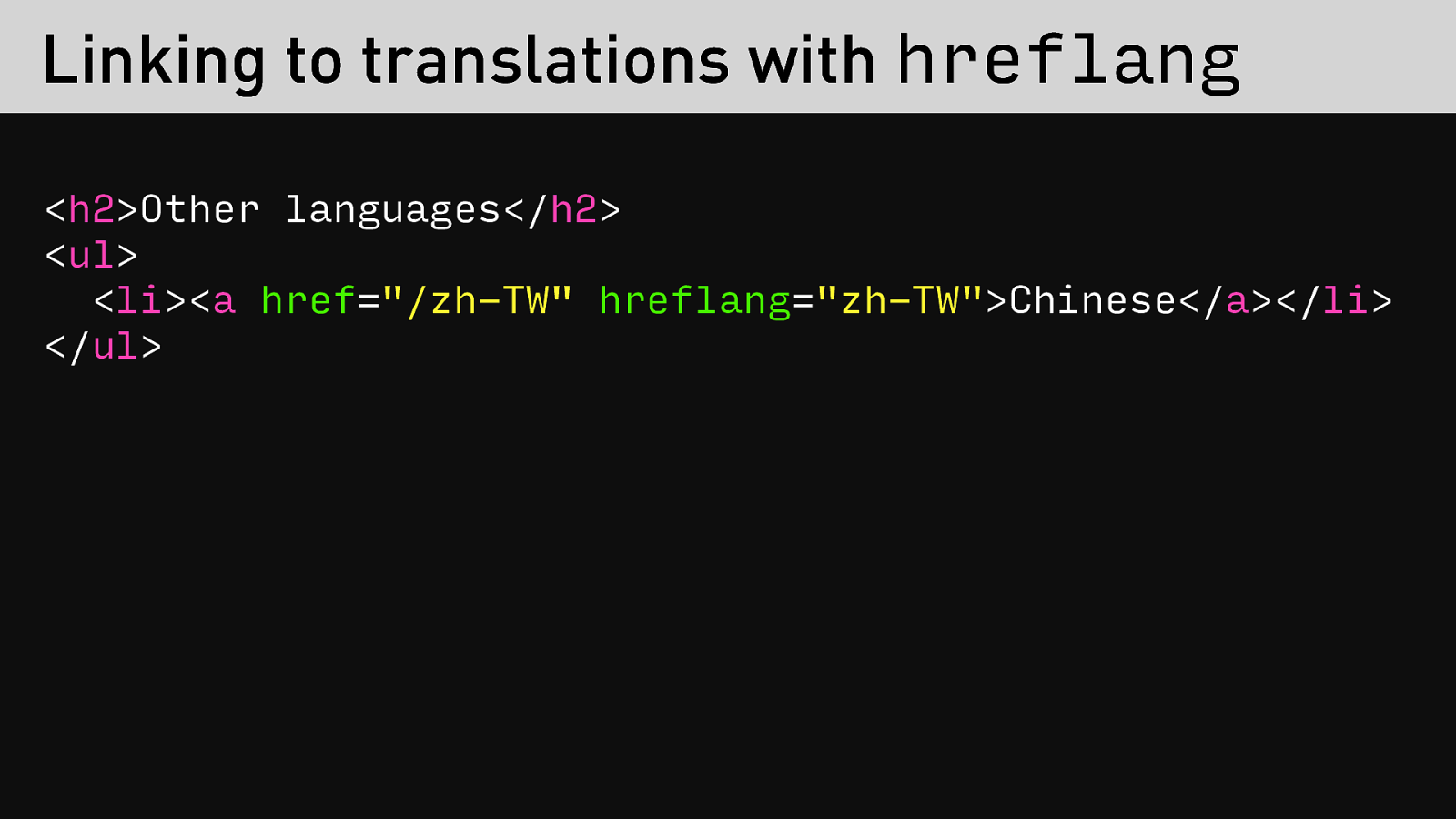
An attribute I only learned about recently is the hreflang attribute. It lets you specify the language of the destination of a link. So if you’re linking to a translation, specify what language that page is in.
Slide 48
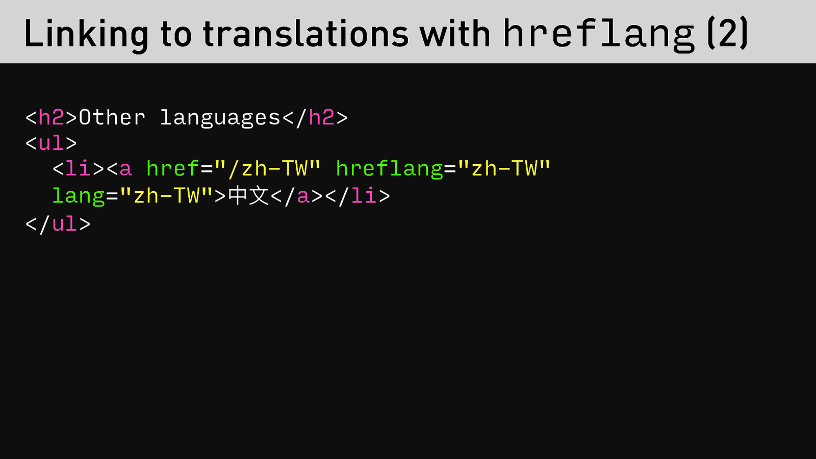
And of course you can also combine this with a lang attribute, if your link text is also in a different language itself.
Slide 49
- Text alternatives
Slide 50
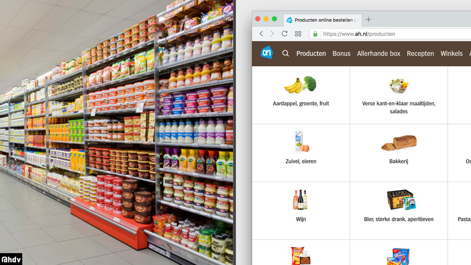
A friend of mine, who is blind, told me that when she goes to a supermarket, she needs to bring her partner or ask a member of staff in order to find products, discover prices, figure out ingredients, et cetera. Using the website of her supermarket, she can just access everything herself and do her own shopping. This is awesome, truly inspiring, and a big reason that this works is this:
Slide 51
The web is mostly text
Slide 52
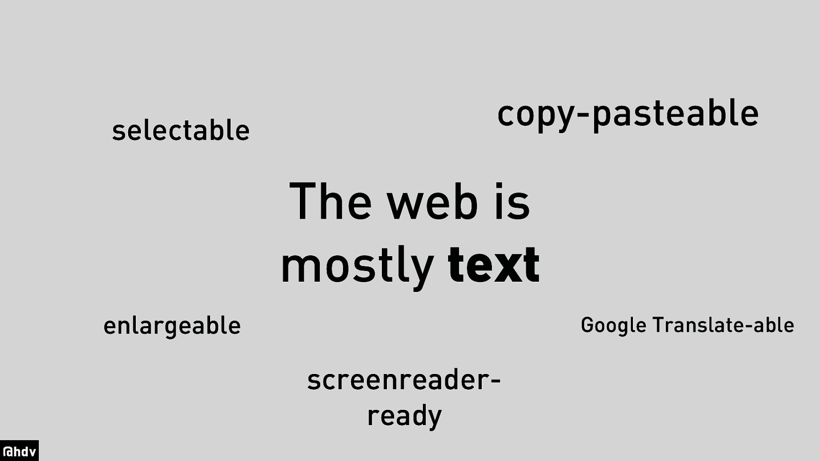
Text is awesome, because you can select it, copy paste is, make it larger, throw it into Google Translate, et cetera et cetera.
Slide 53
My point is: text lets us have accessibility automatically.
Slide 54
So it’s up to use to make sure that we have text, or at least alternatives for text.
Slide 55
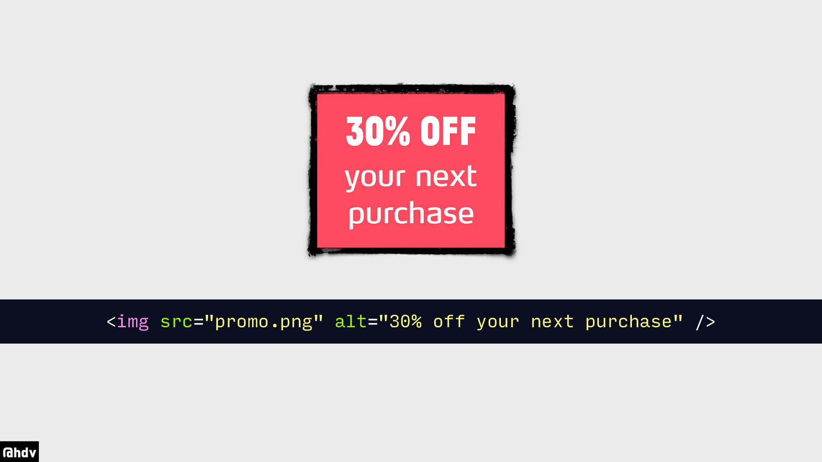
We probably all know about ALT attributes for images. For example this image says 30% OFF your next purchase, so ensure that this text is reflected in the ALT.
Code: <img src=”promo.png” alt=”30% off your next purchase” />
Slide 56
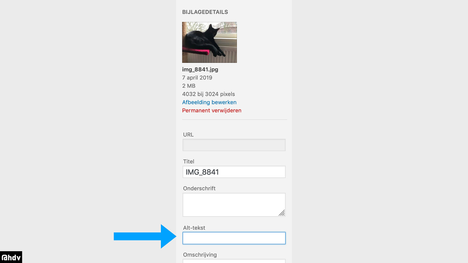
This is what that looks like in the WordPress editor.
Slide 57
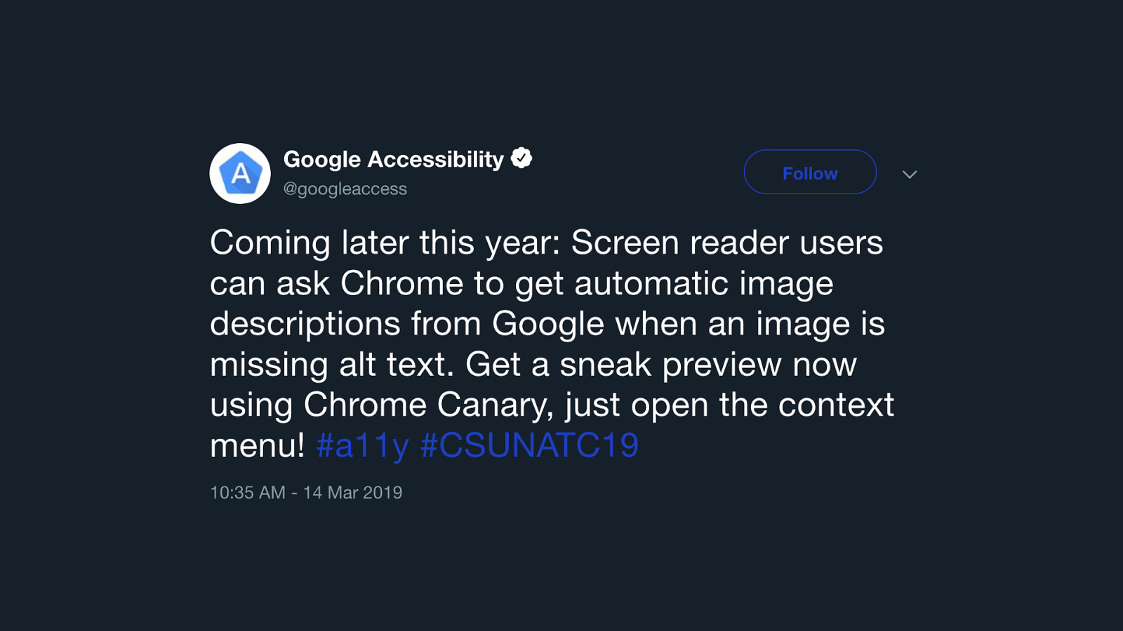
Some of you may think… with the rise of AI and machine learning, can’t alt attributes be generated automatically? Yes they can! But that isn’t necessarily good. One: modern screenreaders aren’t near having these kinds of capabilities. Google and Microsoft are investing in AI for accessibility, and Google announced at CSUN they will have a feature in Chrome that will let you get missing alt texts. But what about the privacy implications?
Slide 58
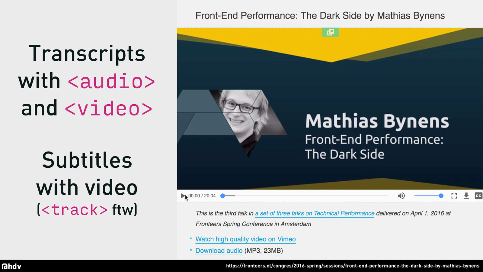
With audio and video, you can and should also provide alternative texts. See for example this page we have on the Fronteers website, where under the video there’s a full transcript available, which you can even click to get to this part of the video. This works because the video element has a JavaScript API so that you can jump the video to a specific point in time. Alt texts for video are srt files.
Slide 59
- Test with a keyboard
Slide 60
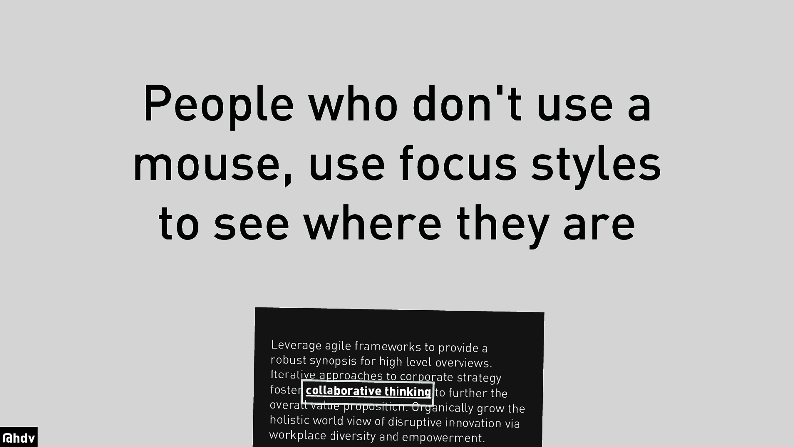
People who don’t use a mouse, use focus styles to see where they are.
Slide 61

When there’s a bit of text with two links of it, the way to know which link you’re about to click is to look at where your mouse pointer is: the link that it is hovering above is the one you’re about to click.
Slide 62
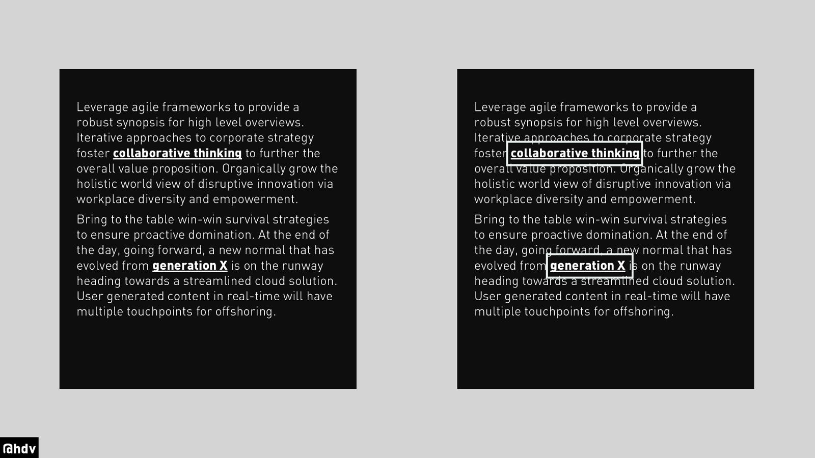
That requires a mouse and for people who don’t have a mouse, an alternative is needed. This is where focus styles come in, they show where the keyboard currently is, so that people know which element they’re about to click. This is great.
Slide 63
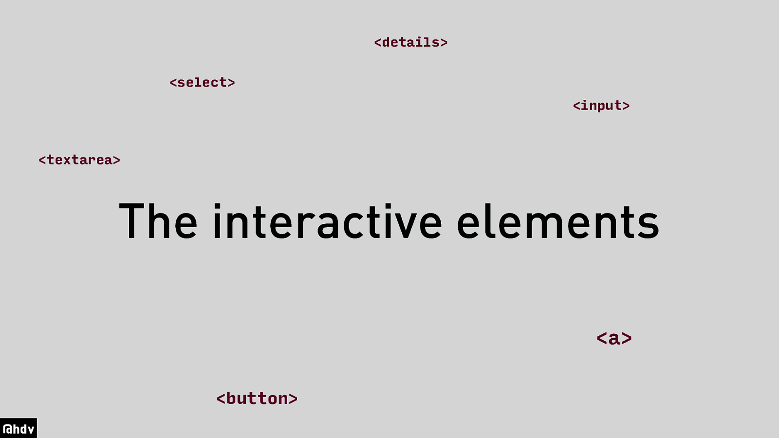
Focus styles and keyboard usage works with all the “interactive elements”. These include textareas, select, details, input, button and a. You can make it work on divs do, but that’s usually best avoided.
Slide 64

Some people say that focus styles are ugly. So are streetlights, but they are extremely helpful when I walk home in the dark, as they let me see where I am. Focus styles do this on the web for keyboard users.
Slide 65
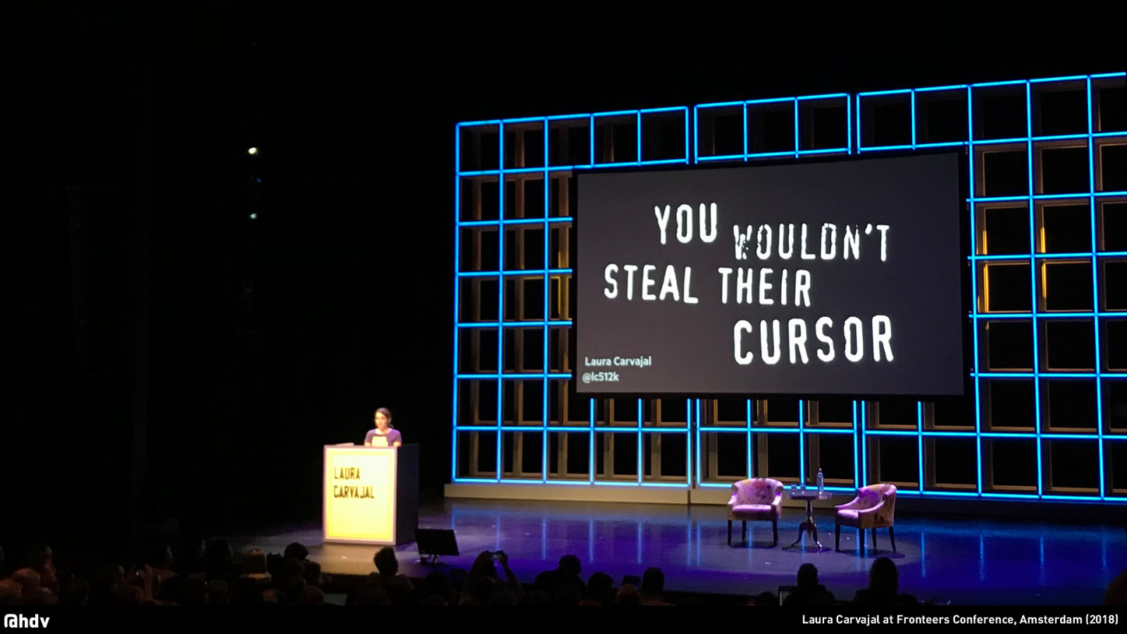
As Laura Carvajal beautifully said at Fronteers Conference last year: you wouldn’t steal their cursor!
Slide 66
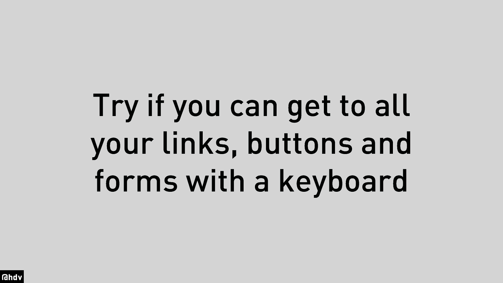
So the main tip here, to summarise: try if you can get to all your links, buttons and forms with a keyboard. If that works, you’ve come a long way in making your site work for users who use keyboards or other input methods.
Slide 67
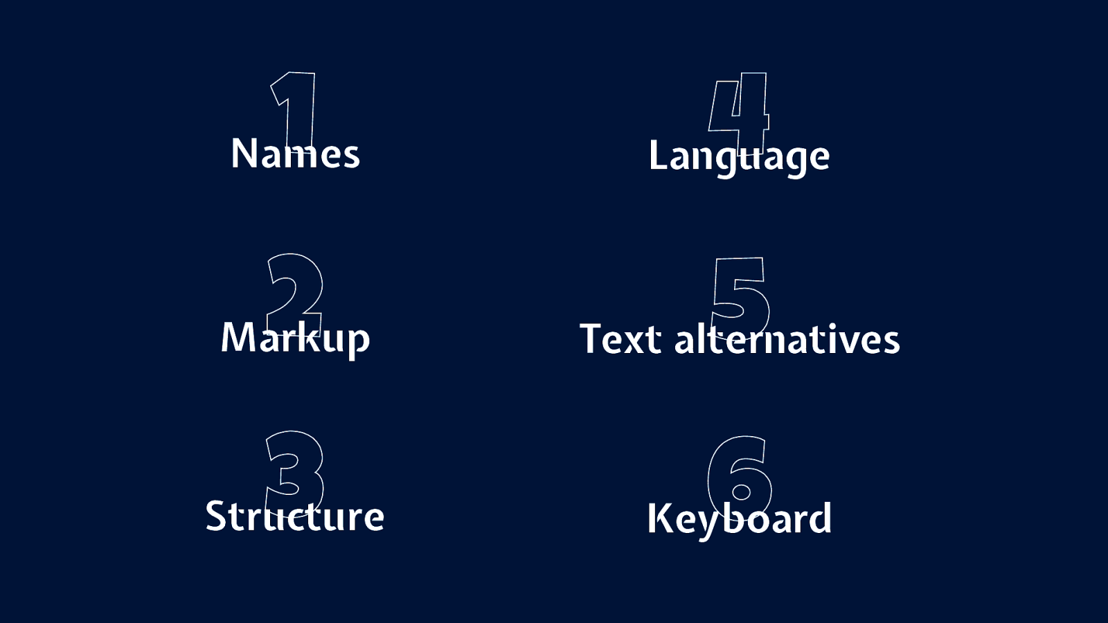
In summary, my six tips: name things so that they show up right in the accessibility tree and people with Assistive Technologies are able to distinguish between them; write good markup and check the spec if you’re not sure; have a good structure that even works without CSS; declare languages; provide text alternatives for images, audio and video, and make your site usable with a keyboard.
Slide 68
Thanks for listening! For any questions, feel free to email hidde@hiddedevries.nl, tweet @hdv or find these slides on Notist https://talks.hiddedevries.nl