So, hello and good morning everyone! I am so happy to be here.
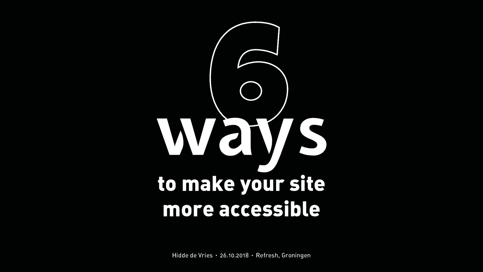
Slide 1
Slide 2
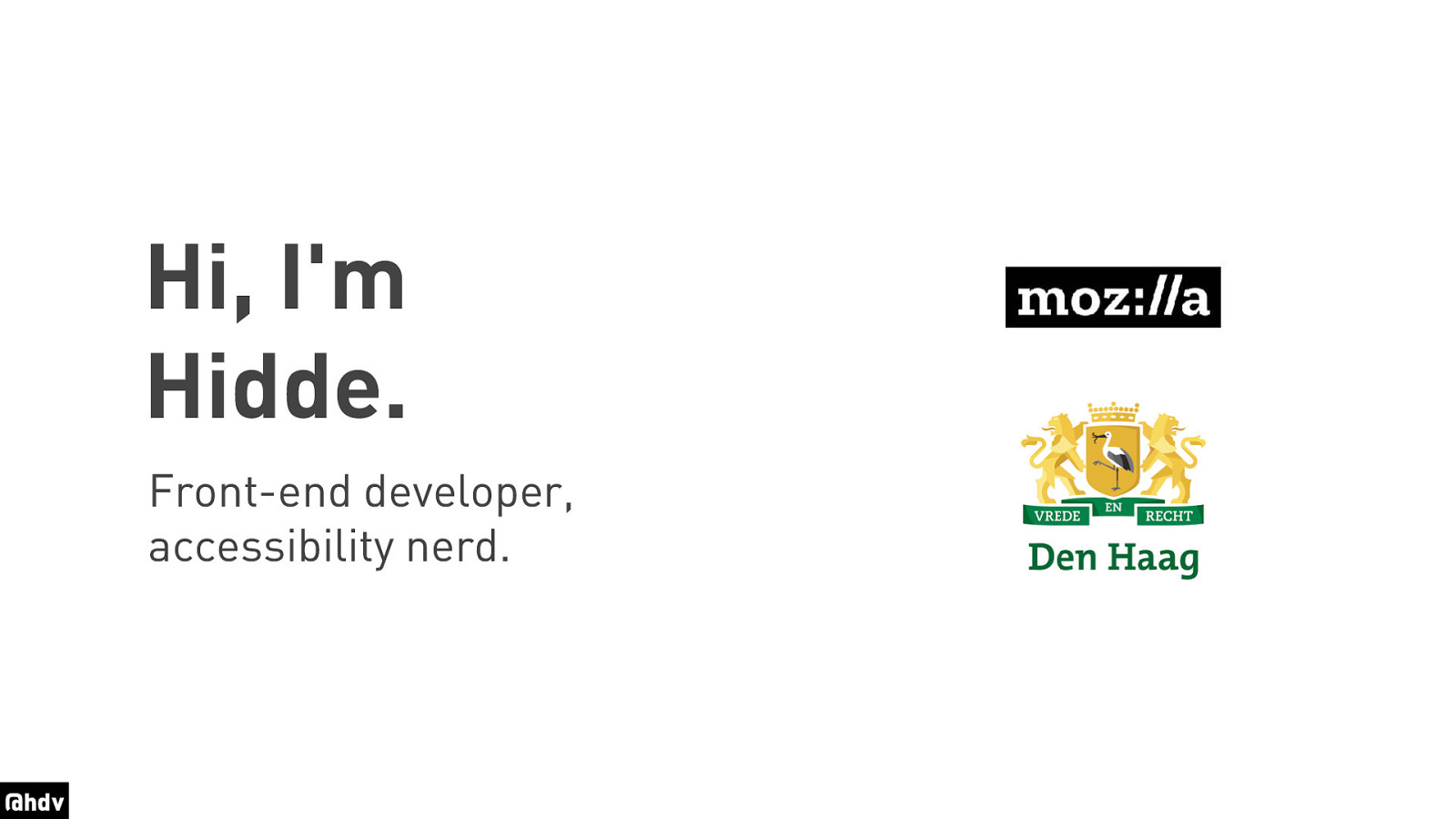
In my daily life, I am a front-end developer and that will be my perspective today, these are six things you can help with as a frontend developer. I currently spend most of my time at Mozilla, in their Open Innovation team, and I am in the city of The Hague for a day a week to help them with their accessibility and front-end.
Slide 3
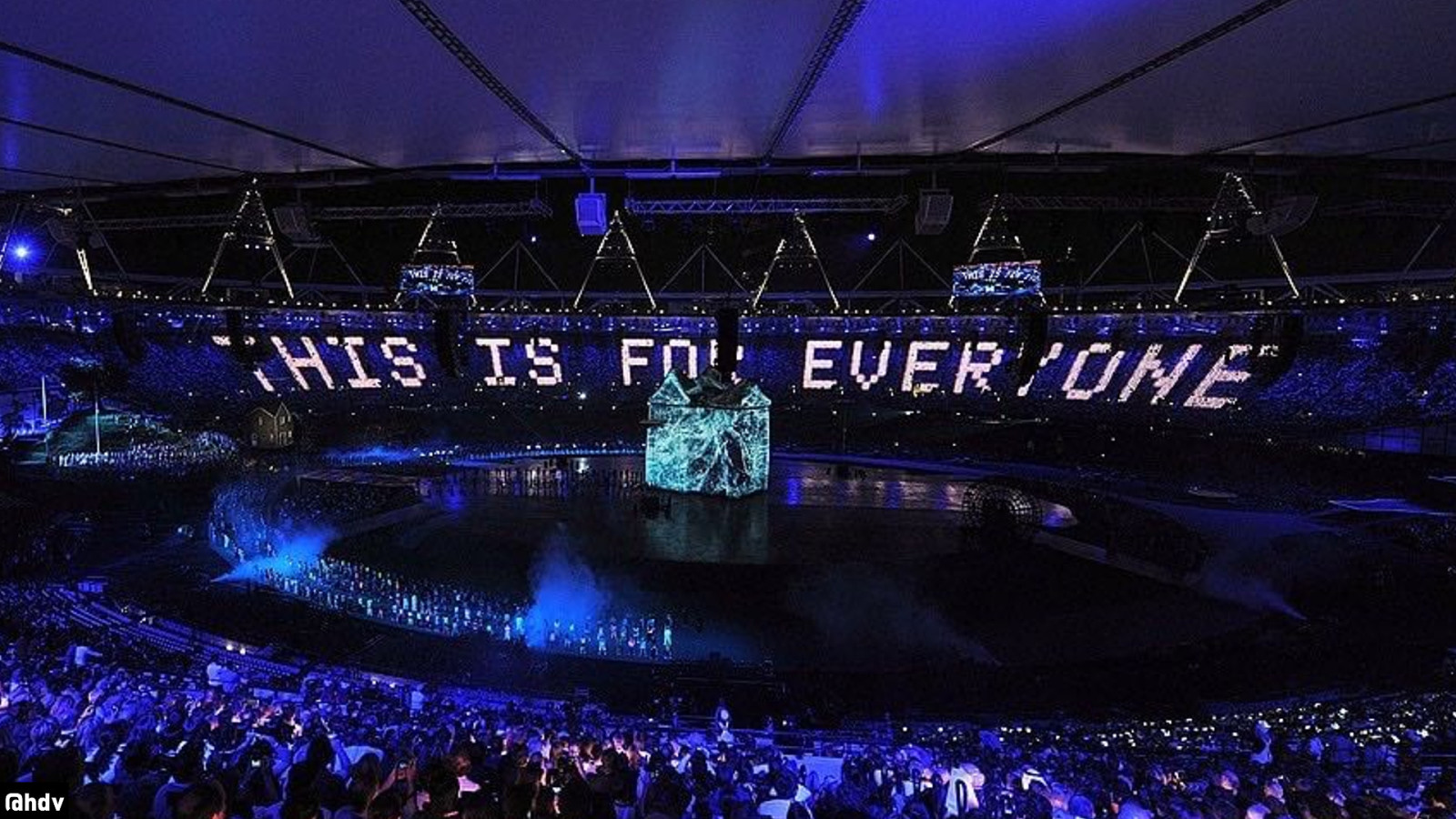
At the opening ceremony of the 2012 Olympic Games in London, the Brits showcased all sorts of great British inventions and ideas… (Brexit hadn't happened yet). They also invited sir Tim Berners-Lee, the inventor of the world wide web and he made these words appear in the stadium: this is for everyone. This resonated a lot with me as there are many ways this applies to the web. First, everyone can get on the web. You don't need an invite or pass a test. Second, everyone can have a website, you don't need to be a government or a bank or anything official, if you like the Vengaboys, you can start a fansite. Third: it works for everyone, at least the technology allows for lots of accessibility. Berners-Lee is the director of the W3C, the body that creates web standards, and I'm confident he assures web standards are made to work for everyone.
Slide 4
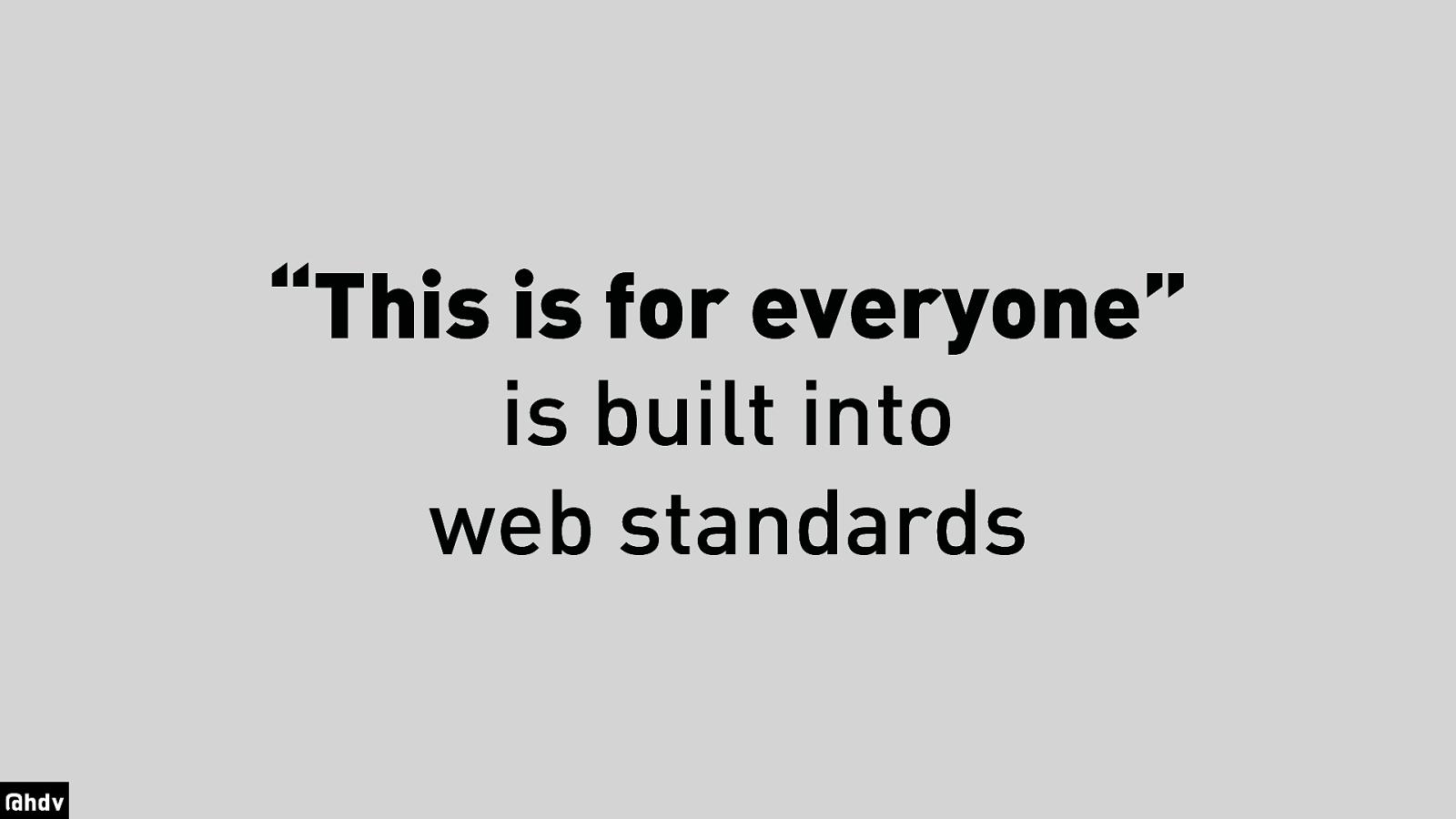
You could say this is for everyone is built into web standards.
Slide 5
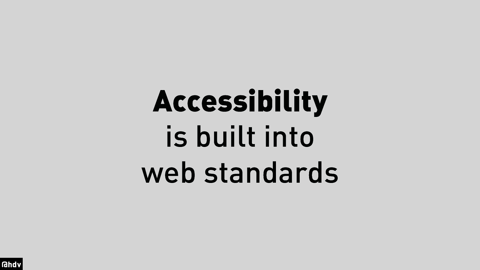
And with that, that accessibility is built into web standards. This is good news, we don't need to implement accessibility from scratch. By purposefully using web standards, we can get a lot of it for free.
Slide 6
It's this idea that is core to this talk. Let's get to it: six ways to make your site more accessible.
Slide 7
So let's start of with the first way to make your site more accessible: structure.
Slide 8
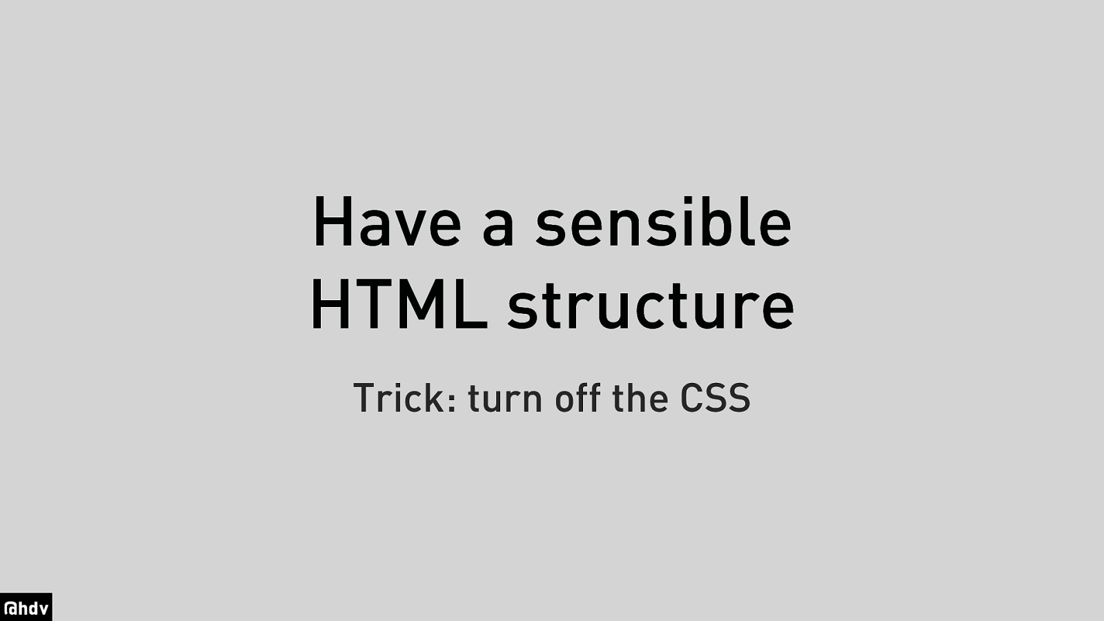
HTML structure makes a huge difference in how accessible pages on your site are. Something I always do when I audit a site for accessibility, is turn off the CSS. Not because I strongly believe there are actual users that browse with CSS turned off, but because a lot of users don't experience the CSS for other reasons. When it is off, you see your site in the browser default stylesheet and it gives a good impression of the quality of your page structure.
Slide 9
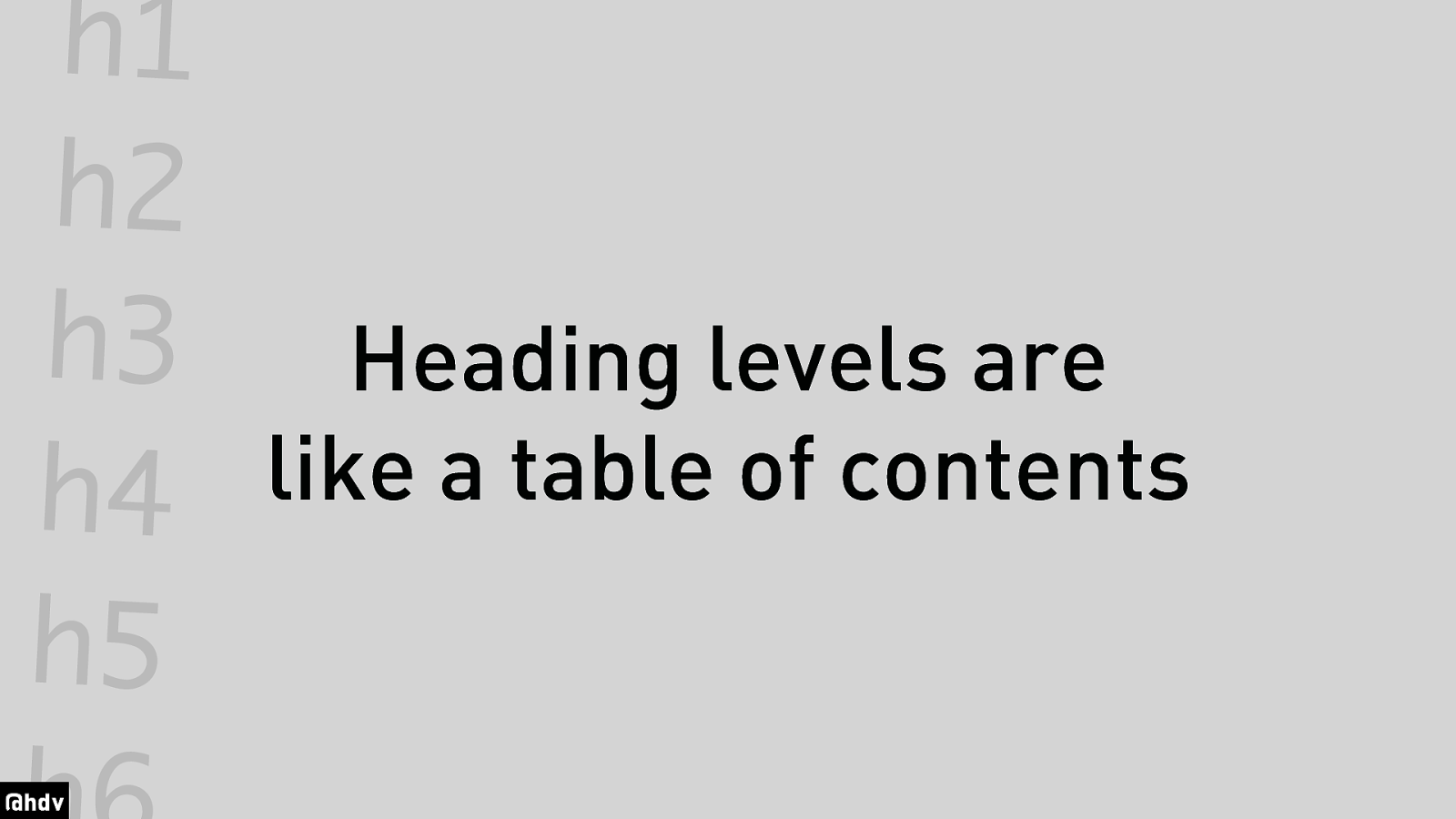
Another structural thing that is important to get right is heading levels, they are HTML elements like h1, h2, h3. It's important not to skip any, but also to remember they could be taken out of context.
Slide 10
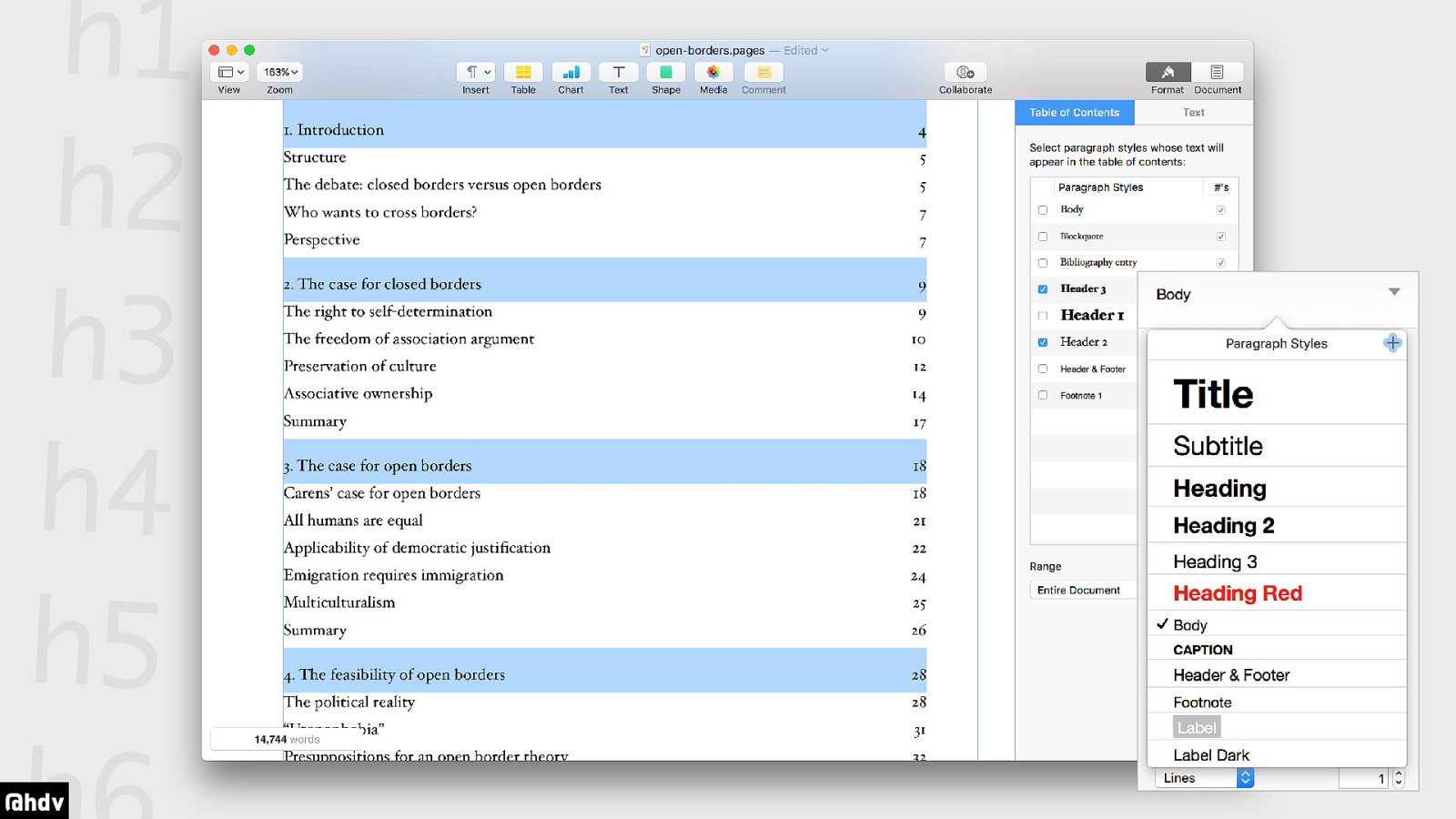
One thing I like to compare heading structures to, is this nerdy feature in word processors like Pages. If you have this really long document, you can generate a table of contents, which automatically populates and has the right page numbers and everything. This feature only works if you pick content to be a heading, specify its type, and not when you set text to bold. You might see how this relates to HTML.
Slide 11
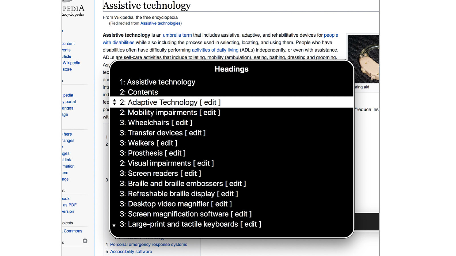
An example of how your headings are used in different ways: users of screenreaders can have the whole page read out to them. But they don't have more time than the rest of us do, and want to get around quicker. This is why screenreaders often have a 'navigate by heading' button that lets users hear just the headings. Not a gimmick, actually one of the most popular ways for blind people to navigate he web.
Slide 12
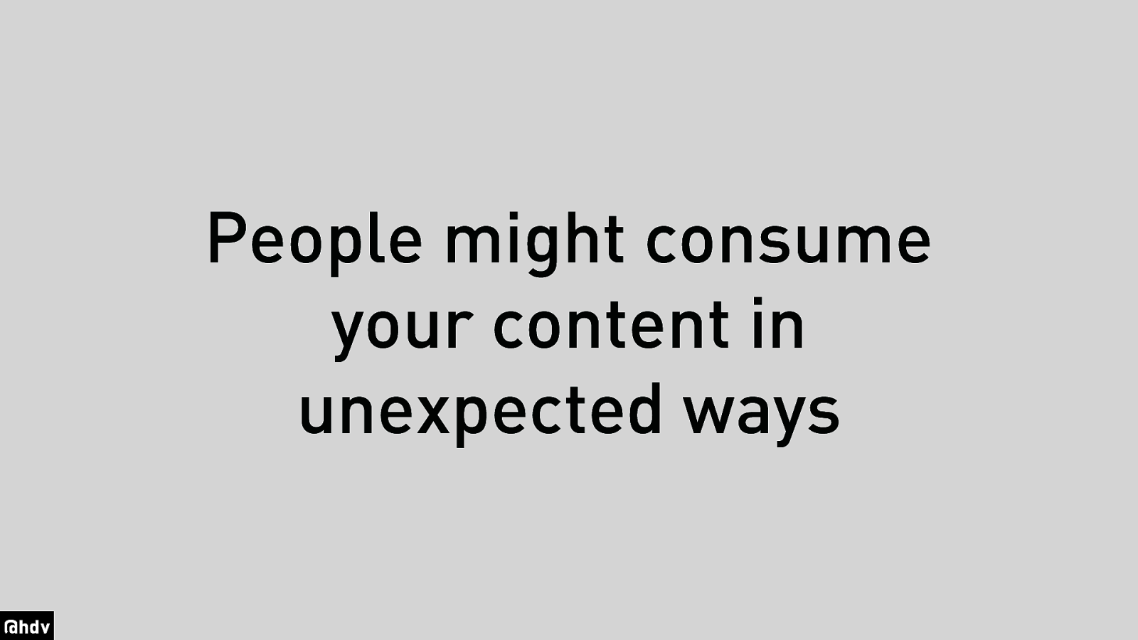
This all comes down to the fact that there is big chance people consume your content in ways you did not think about.
Slide 13
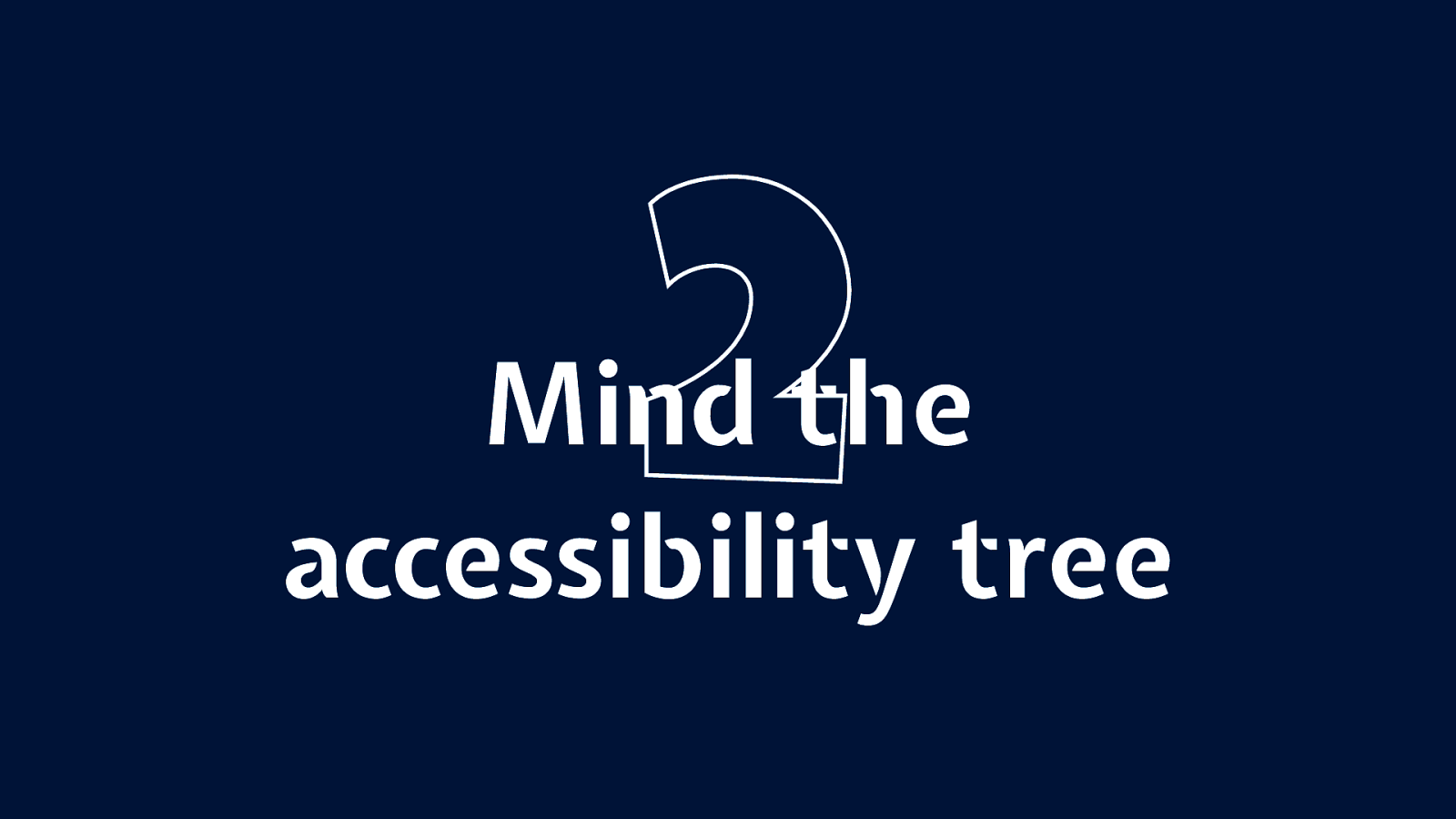
Let's talk about the accessibility tree now.
Slide 14
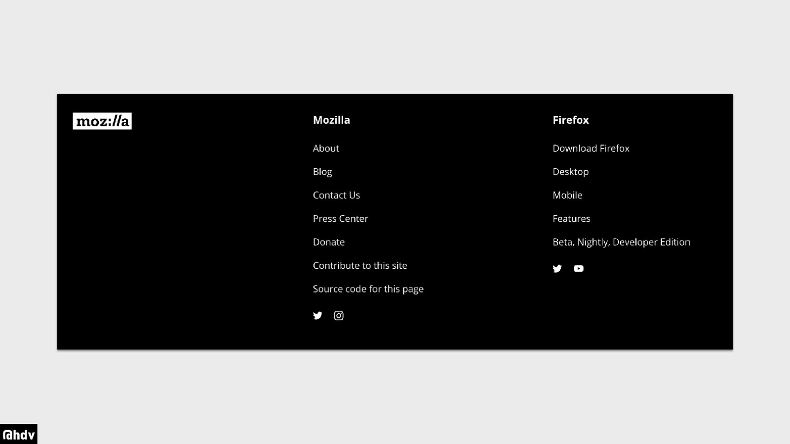
Say, you're building a new component, for example this footer. It has a logo, a number of links, some icons that are probably links too…
Slide 15
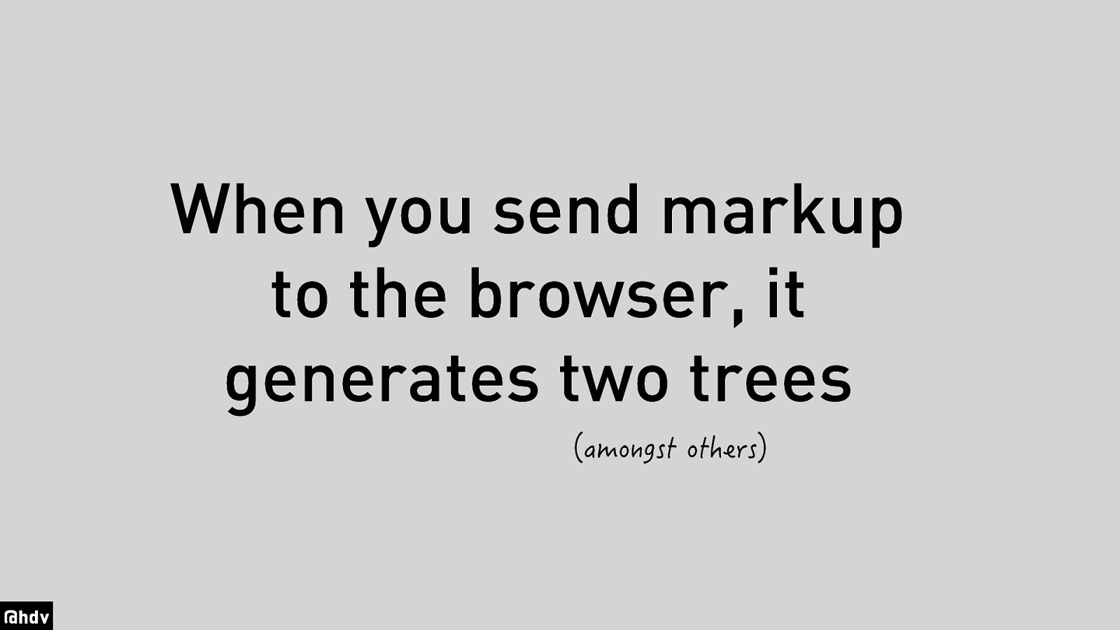
When you send markup to the browser, it generates two trees.
Slide 16
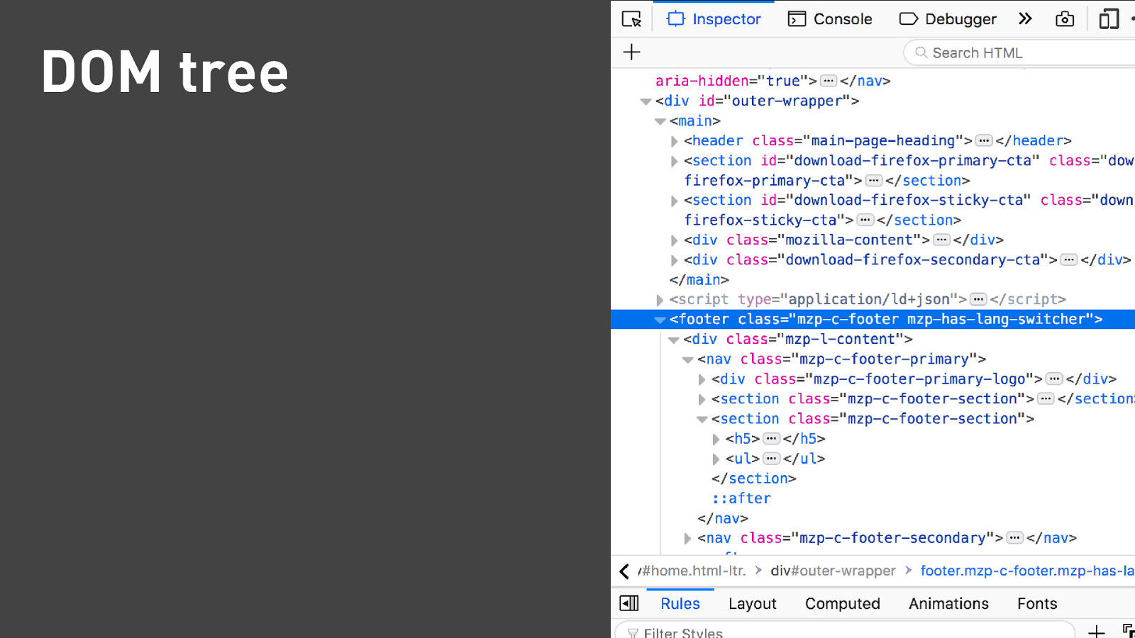
The first is the DOM tree. I'm probably not telling you anything new here, but the DOM is a live representation of the markup that the browser received. For our purposes, it doesn't really matter if that came from the server or was injected by a JavaScript framework.
Slide 17
Based on the DOM tree, there is a second tree, it has in recent years come to browsers and it is specific for accessibility-related properties. Roles, names and properties. Why would you want that?
Slide 18
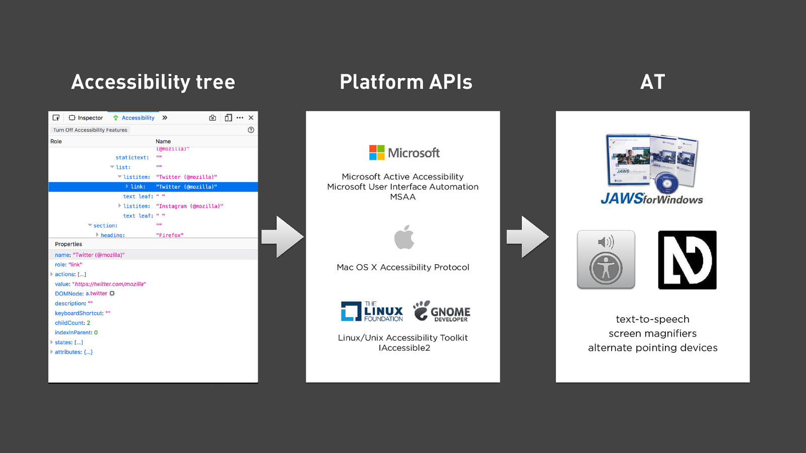
Well… people who use the web in unconvential ways, for example with screenreaders, magnifiers or pointing devices, collectively called Asssistive Technologies, their tools need to know what's going on on the screen.
Platform APIs provide to give this information, and they are super capable of doing that for stuff happening in your OS: the Dock, the start bar, your home screen… but when it comes to browsers in websites, they don't really know, it is often the first time they see them. Now, this is where the accessibility tree comes in.
Slide 19
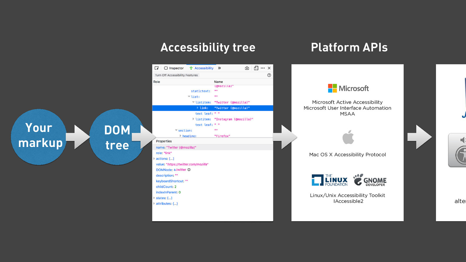
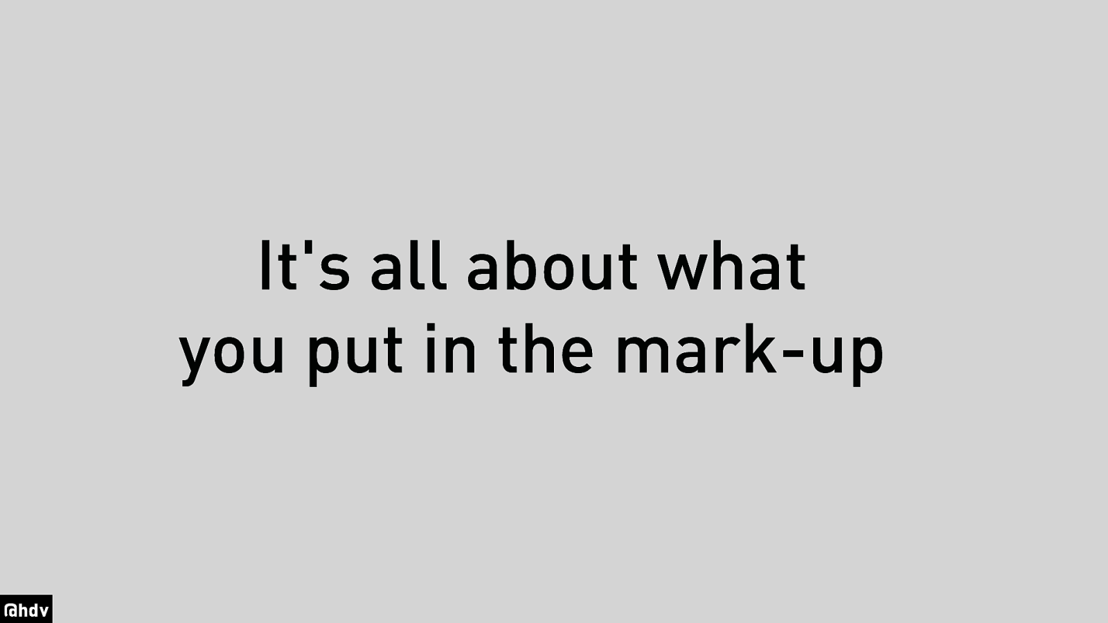
As I just said, this tree is based on the DOM tree, which is based on our markup. This is where we come in, if we write good markup, it will end up in the tools our users use.
Slide 20
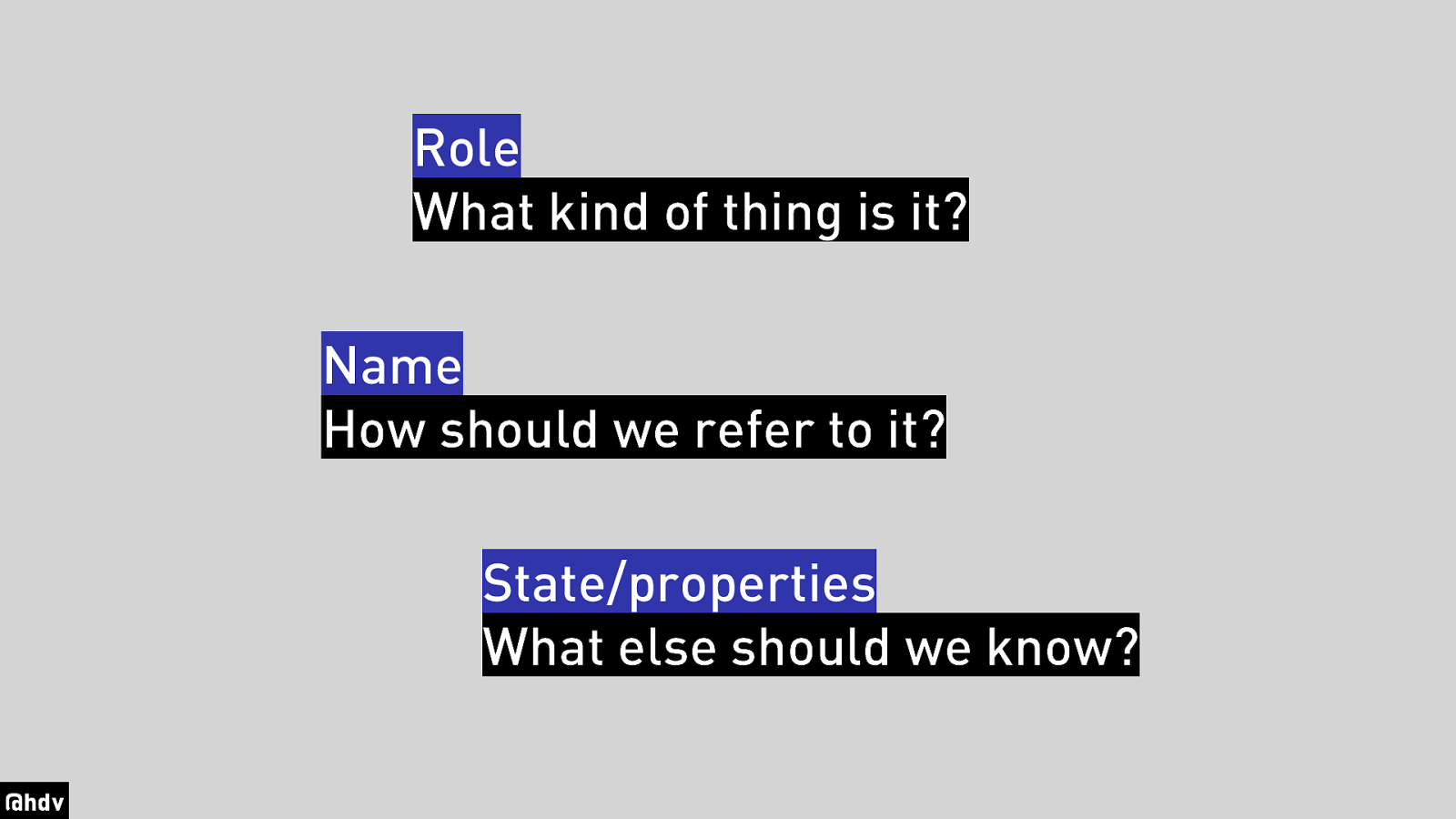
So these are the three things that you'll find in the accessibility tree.
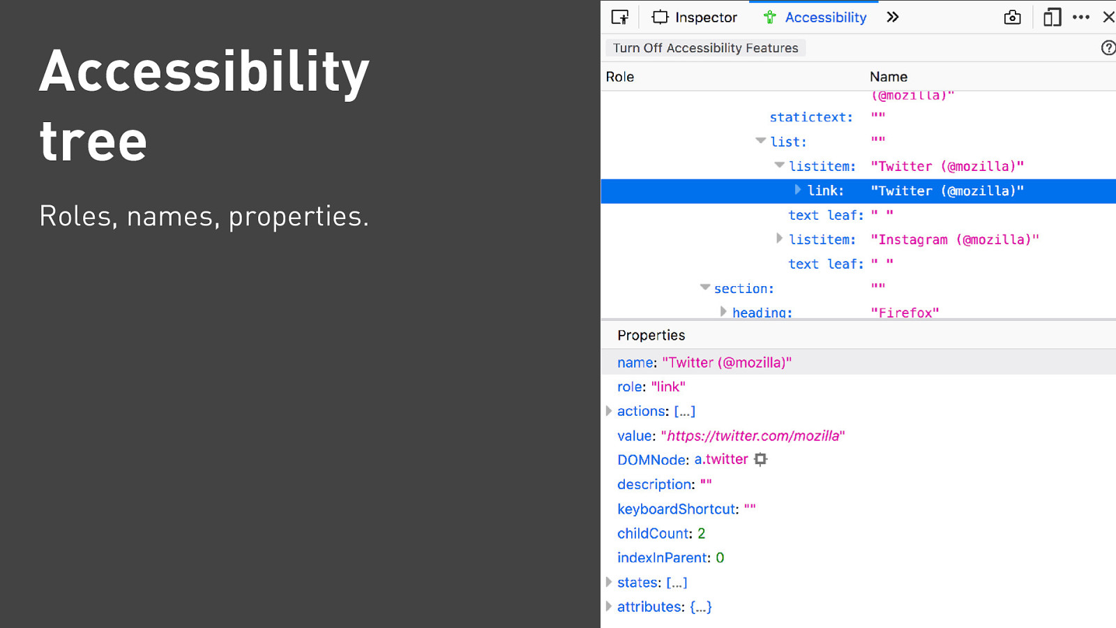
Roles are about what we're dealing with; is it an image, a link, a button, et cetera.
Names are about what the thing is called, for example in a link it is usually the link text, for a heading it would be the heading's text. There are many more complex cases, like images with alt attributes in empty headings, find them in the Accessible Names spec (linked).
Slide 21
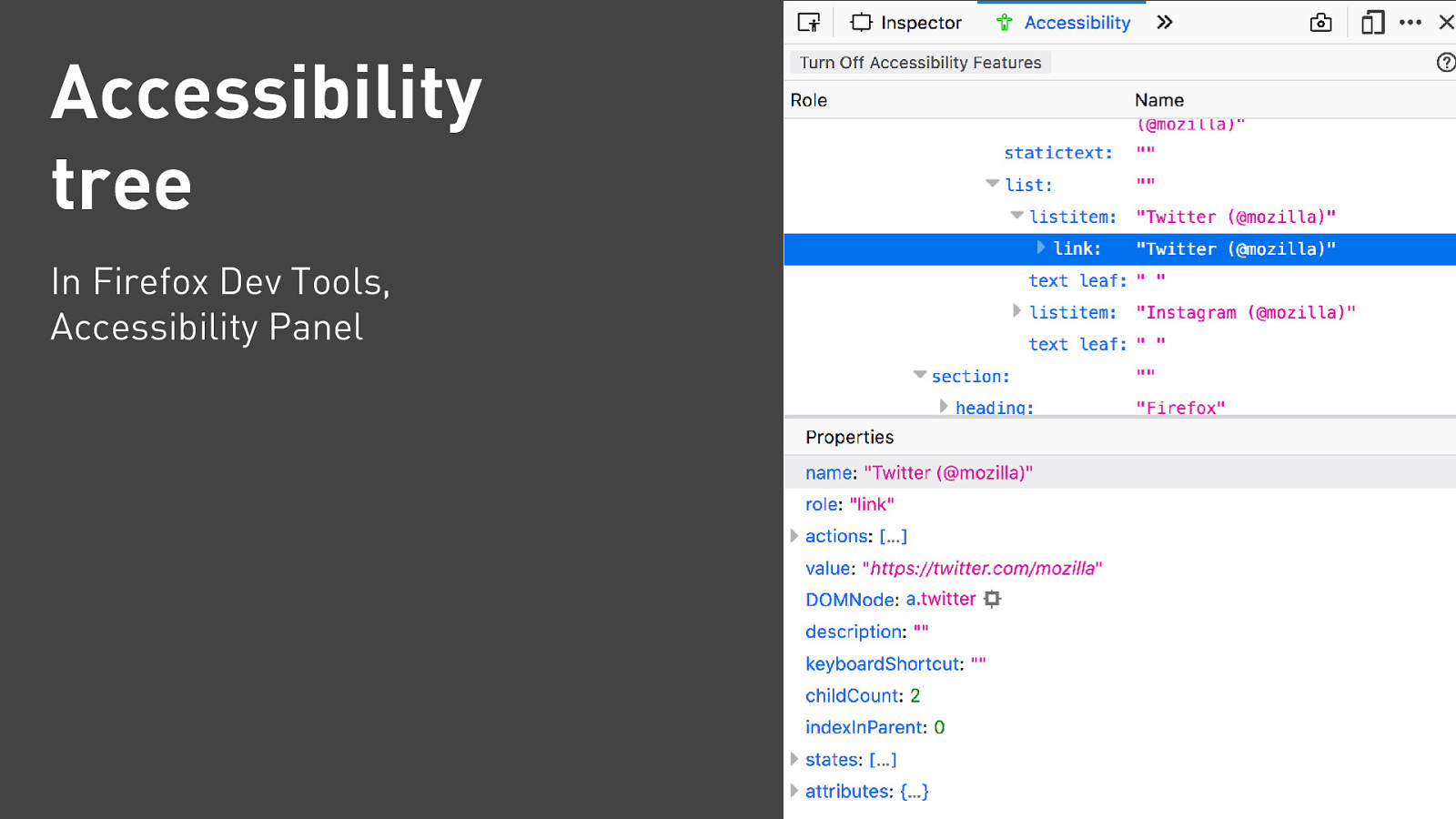
You can find the accessibility tree in Stable Firefox, there is an Accessibility panel, which you might need to turn on in Settings. As you see in this example, we're looking at the Twitter icon, and we see it (the link around it) has a role of link and a useful name (Twitter (@mozilla)).
Slide 22
You might see a recurring theme in this talk by now , which is that markup is really important. And it is not easy to write markup, in fact it is easy to get this stuff wrong, so here's a couple of examples of where good markup can make a difference. These are some elements I still regularly come across in pull requests or accessibility audits.
Slide 23
These two often get confused: anchors and buttons.
Slide 24
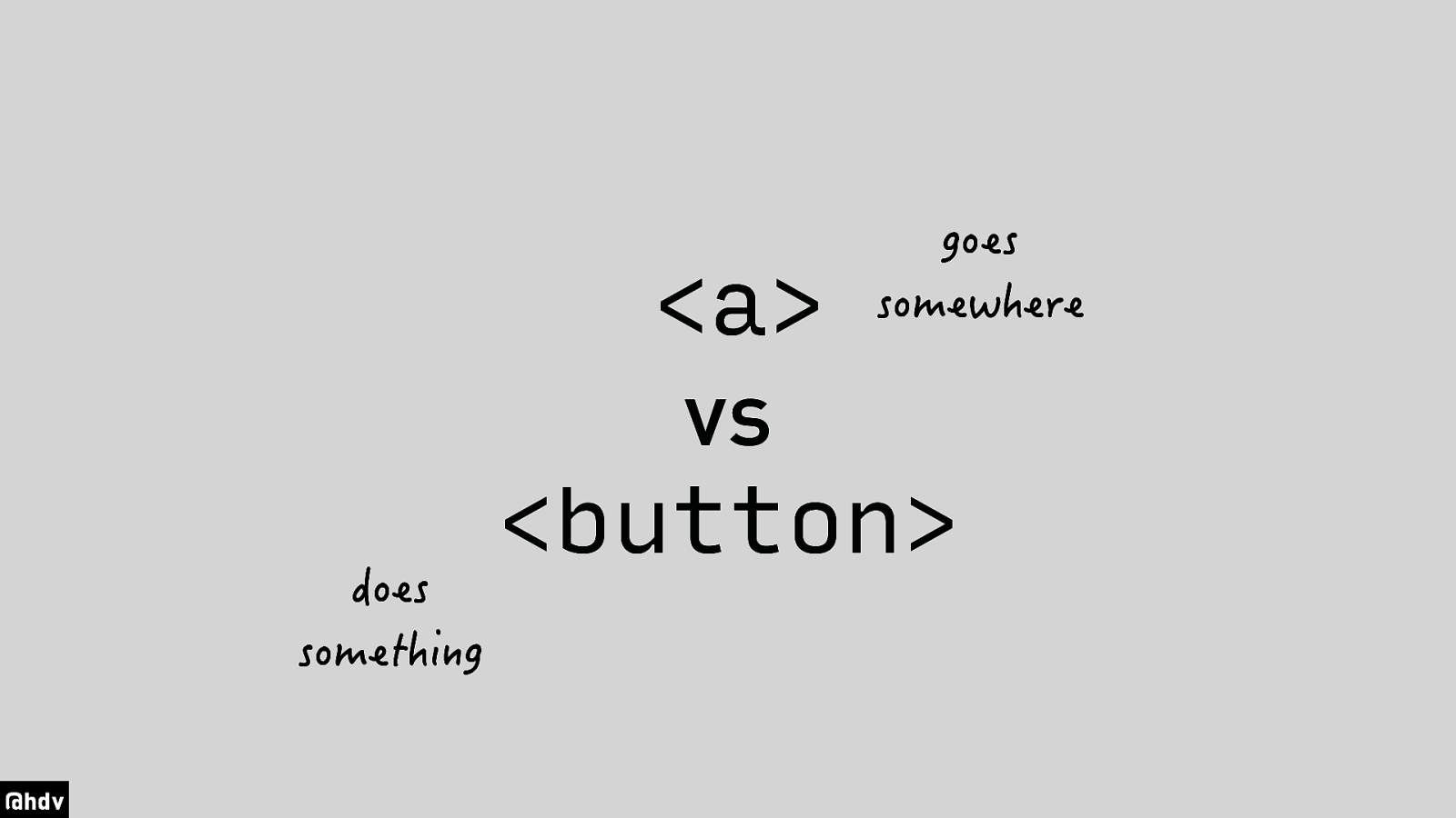
The shortest definitions I could come up with: anchors go somewhere, buttons do something.
Slide 25
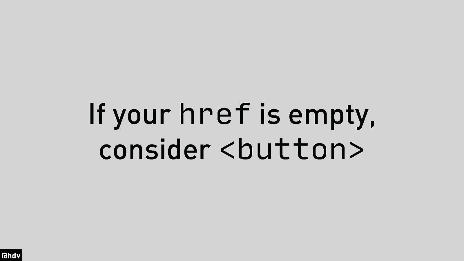
If you href attribute is empty, you should probably consider a button instead.
Slide 26
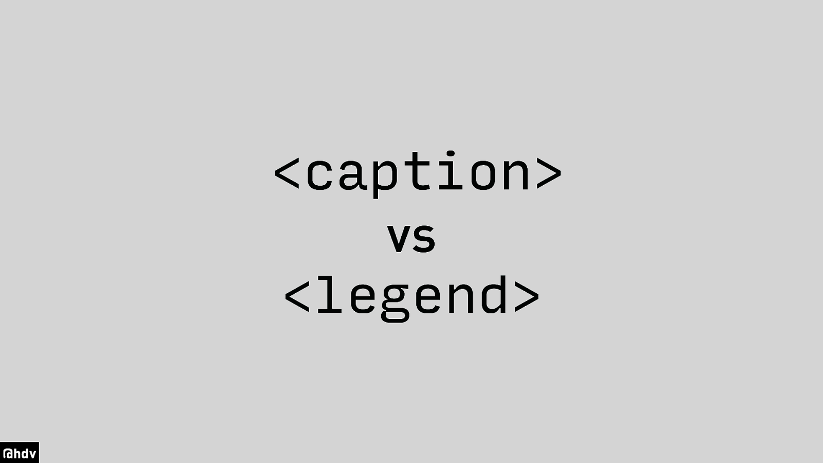
caption and legend are two elements that are used to label things on your page.
Slide 27
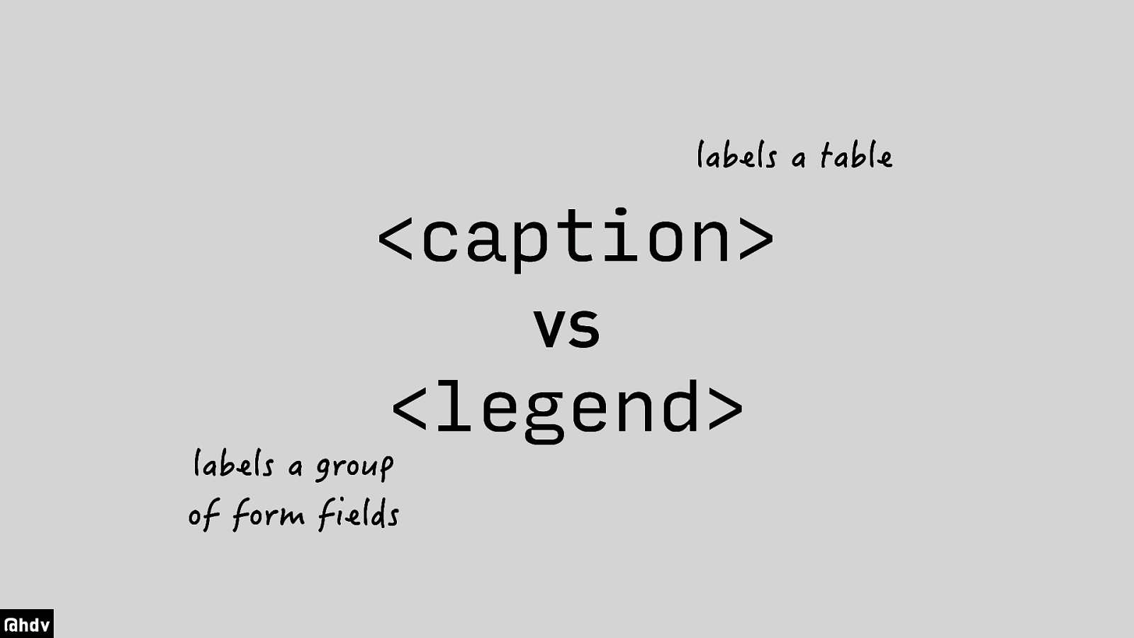
Captions label a table, legends, label a form.
Slide 28
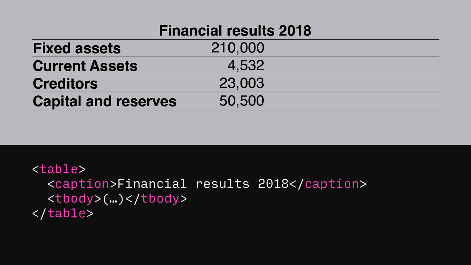
So for example, here's a table with financial results over 2018. Someone I used to work with does an internship at PwC, the accounting firm, can directly use this information to figure out which tables he needs to look at. If there are multiple tables on a page, there's this menu in the screenreader that lets you see a list of all tables, like the heading example, and this is useful for figuring out which table is of interest.
Slide 29
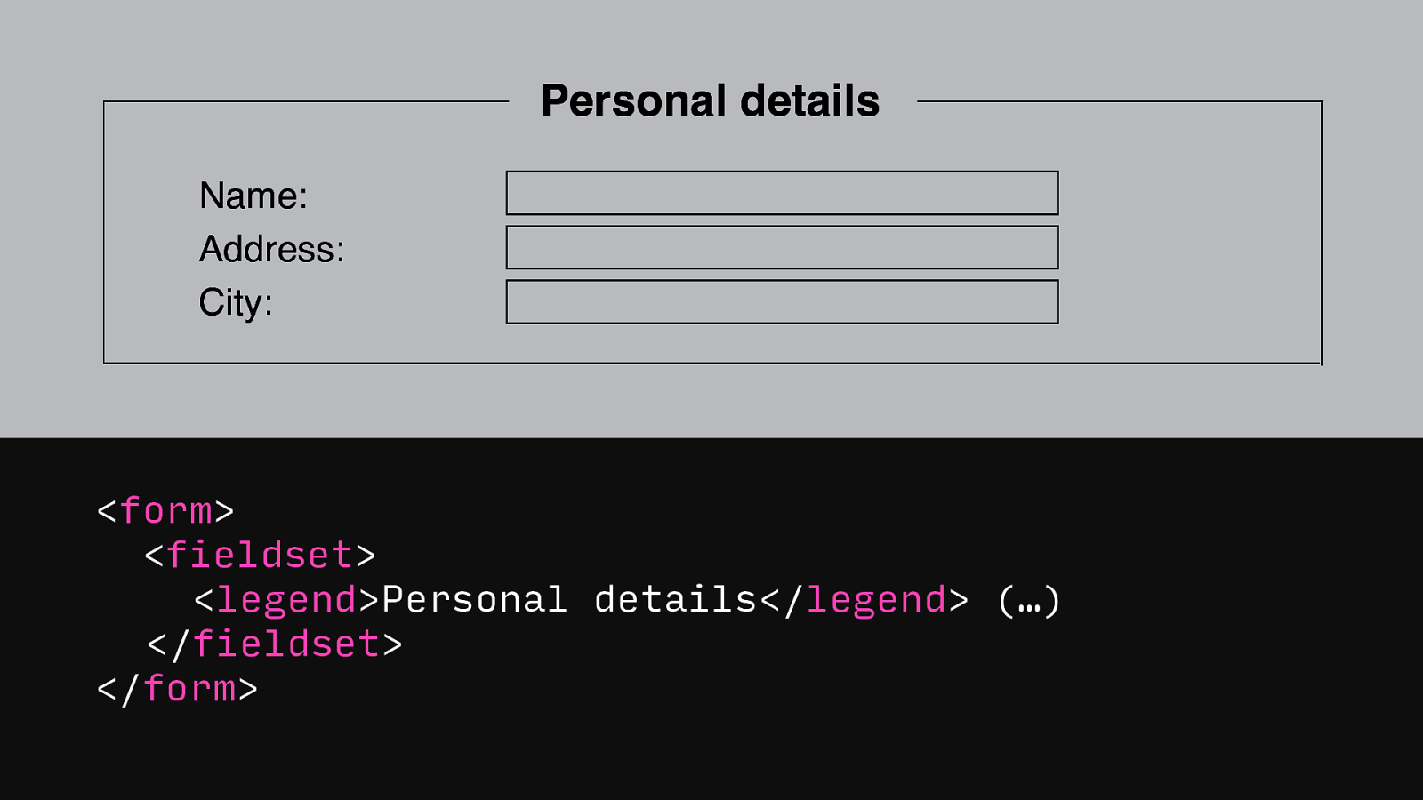
Similarly, the legend element does this for groups of form fields.
Slide 30
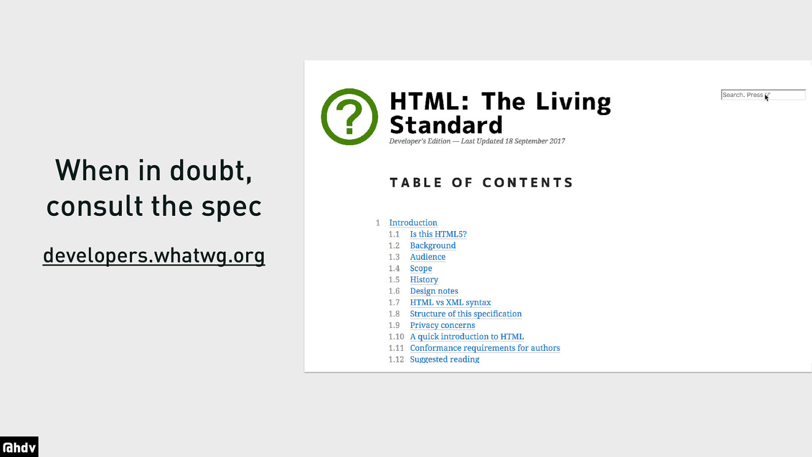
If you're not sure which elements to use, and I have to admit I have this all the time, look them up in the spec. The site developers.whatwg.org is great, because it is the HTML spec, with the browser bits taken out, just the info relevant for developers.
Slide 31

The third thing I wanted to mention to you is language, as we just heard from Paul, localisation is important.
Slide 32
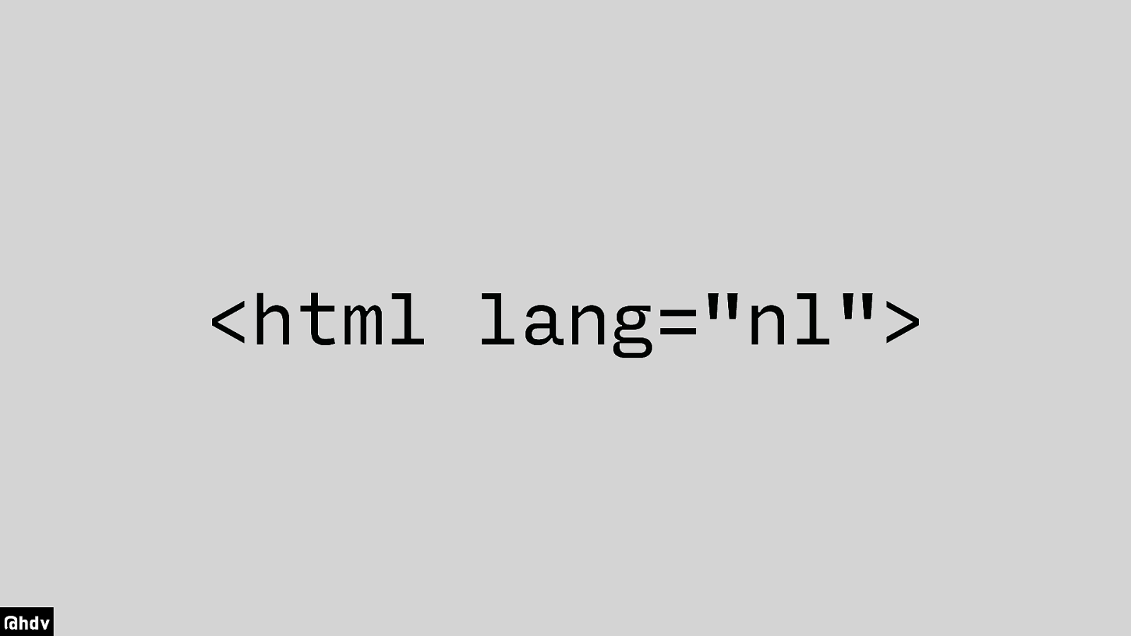
You can set the document's language by adding the lang attribute to the HTML tag. This helps users of screenreaders, because it lets those pick the right voice. I personally have my phone set to English, but when I navigate with Google Maps in The Netherlands, the English voice continuously butchers Dutch street names, which actively makes it hard for me to figure out where I am.
Slide 33
Hiding is super important in our modern web application world.
Slide 34

The important difference to make there is that between visually hiding something and completely hiding something. The main difference is that when visually hiding, you are providing visual cues, whereas if you completely hide something, you make it unavailable to all people.
Slide 35
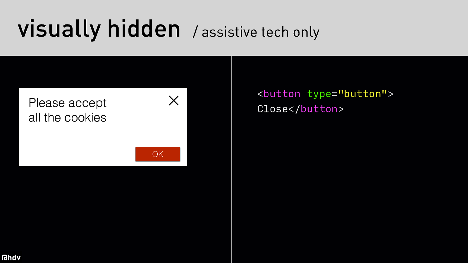
Take for example this cookie warning, which has in the right top corner a close button, that is visually a close icon. If you want to code this, you'll want to use a button element, because it is a button, and put in some text that makes it clear what this button does, even if it is out of context. So the word 'Close' will end up in the accessibility tree this way, to it ends up with our users. they now know what the button is for, even if they can't see it.
Slide 36
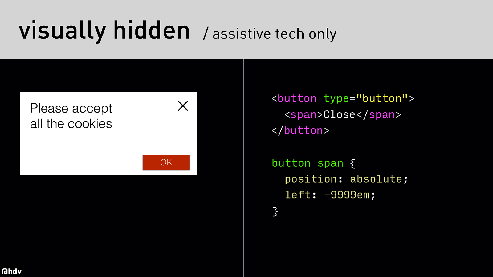
Then, if you don't want the text 'Close'' to not be visible for sighted users, you can use the visually hidden technique.. Here's some example CSS to do that, using position absolute. It is a very old technique but still does the trick.
<button type="button"> <span>Close</span> </button> OK button span { position: absolute; left: -9999em; } @hdv
Slide 37
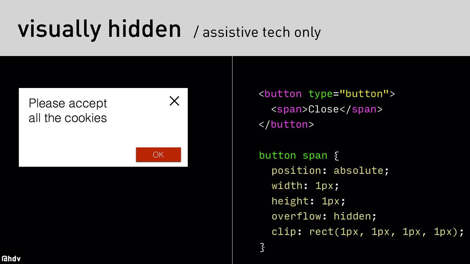
And here's another method you could use. There are lots of other ways, just Google for visually hidden.
button span { position: absolute; width: 1px; height: 1px; overflow: hidden; clip: rect(1px, 1px, 1px, 1px); } @hdv
Slide 38
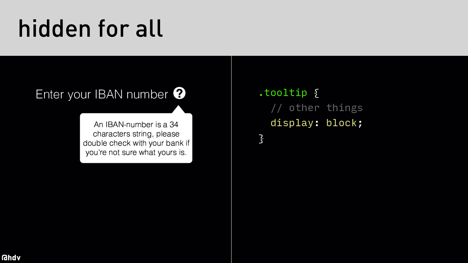
Here's an example of hiding from everybody. This is a tooltip, which in its expanded state will have a display value of something like 'block'.
.tooltip { // other things display: block; }
Slide 39
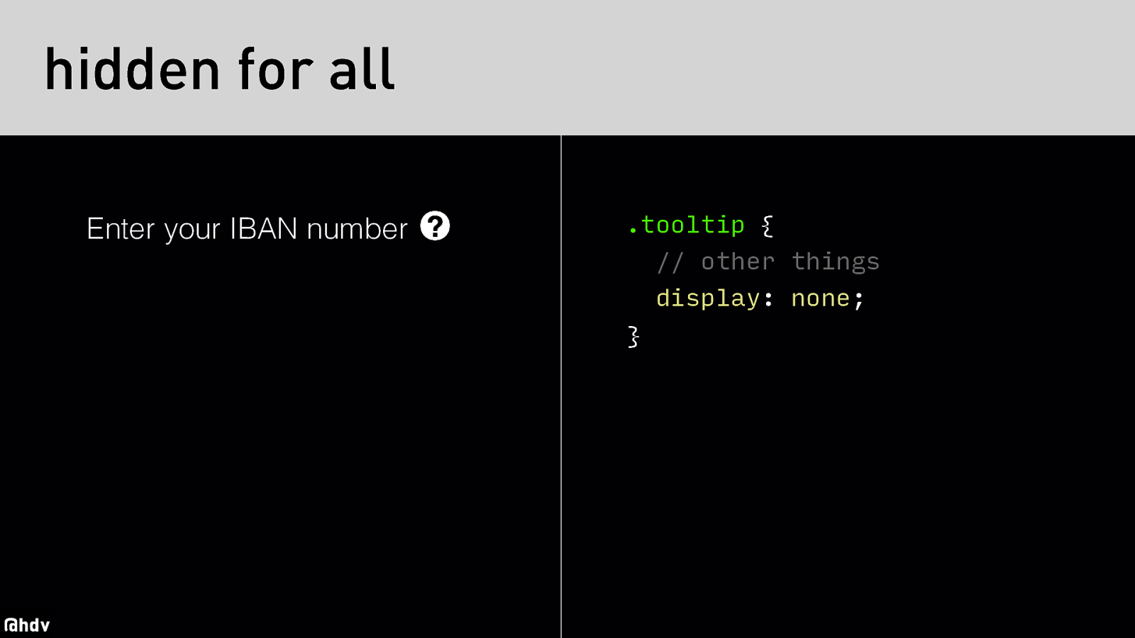
Then, when you close it, you update the display value to none. This makes it hidden from everyone, and removes it from the accessibility true.
.tooltip { /* other things */ display: none; }
Slide 40
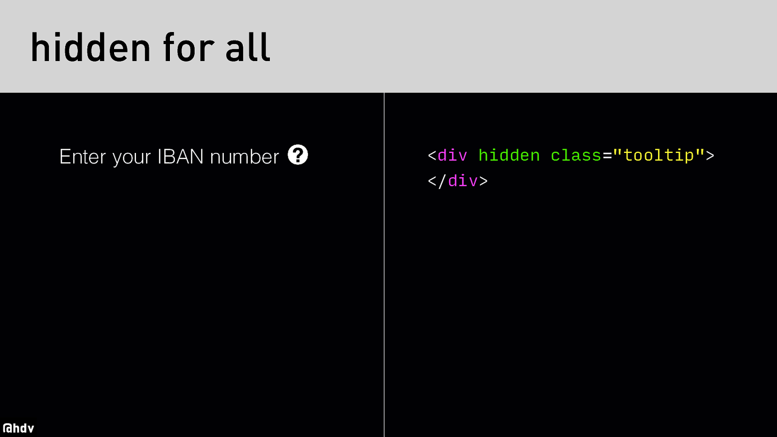
Thers is also a hidden attribute, which effectively does the same as display none, it is that value applied via the user agent stylesheet.
<div hidden class="tooltip"> </div>Slide 41
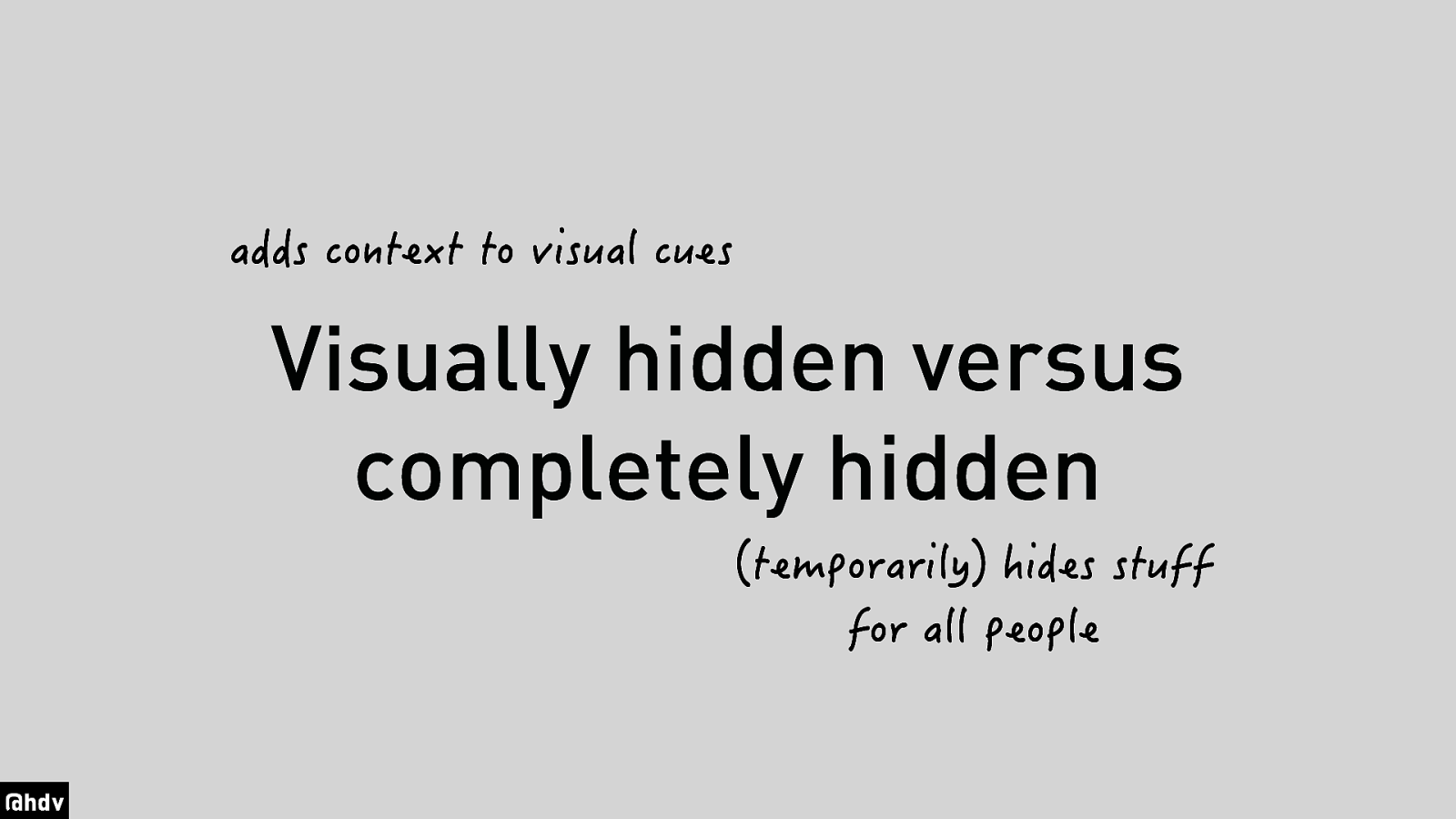
So there you go, visually hiding is to provide visual cues and completely hiding is to hide from everyone.
Slide 42
Then, text alternatives.
Slide 43
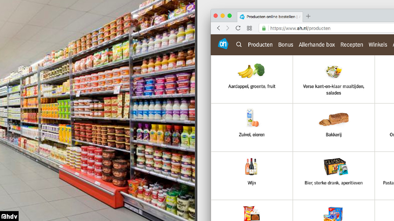
A friend of mine is blind and she once told me that when she goes to a supermarket, she has to take someone with her, her partner or a member of the staff, in order to figure out where products are or simple things like figure out how much salt is in the ketchup.
The website of the supermarket, on the contrary, lets her do groceries independently.
Slide 44
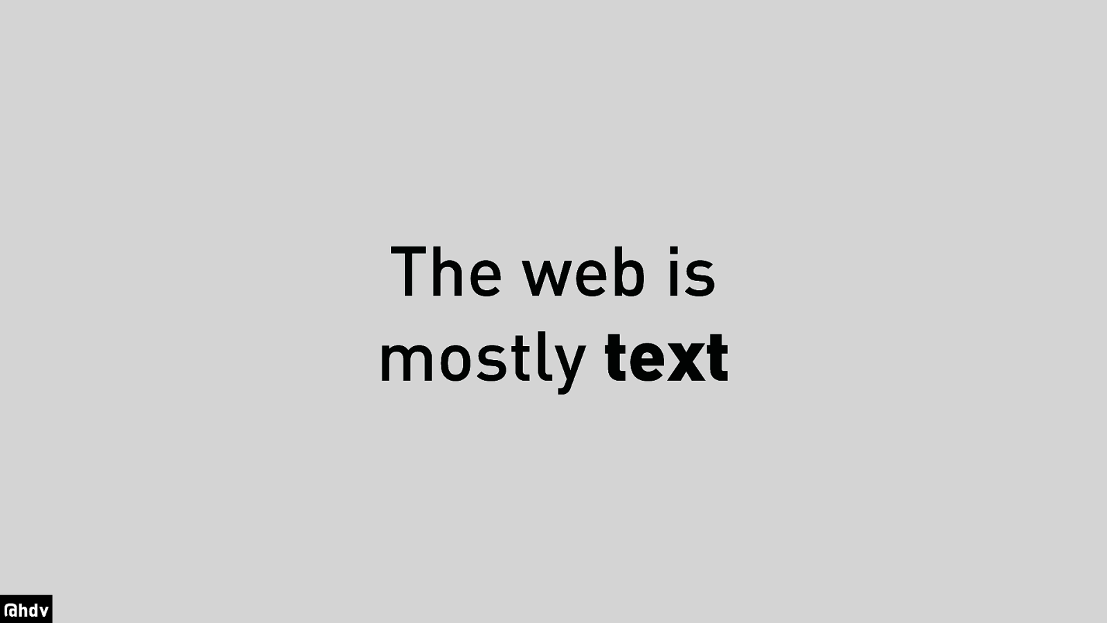
A major reason for this is that the web is mostly text.
Slide 45
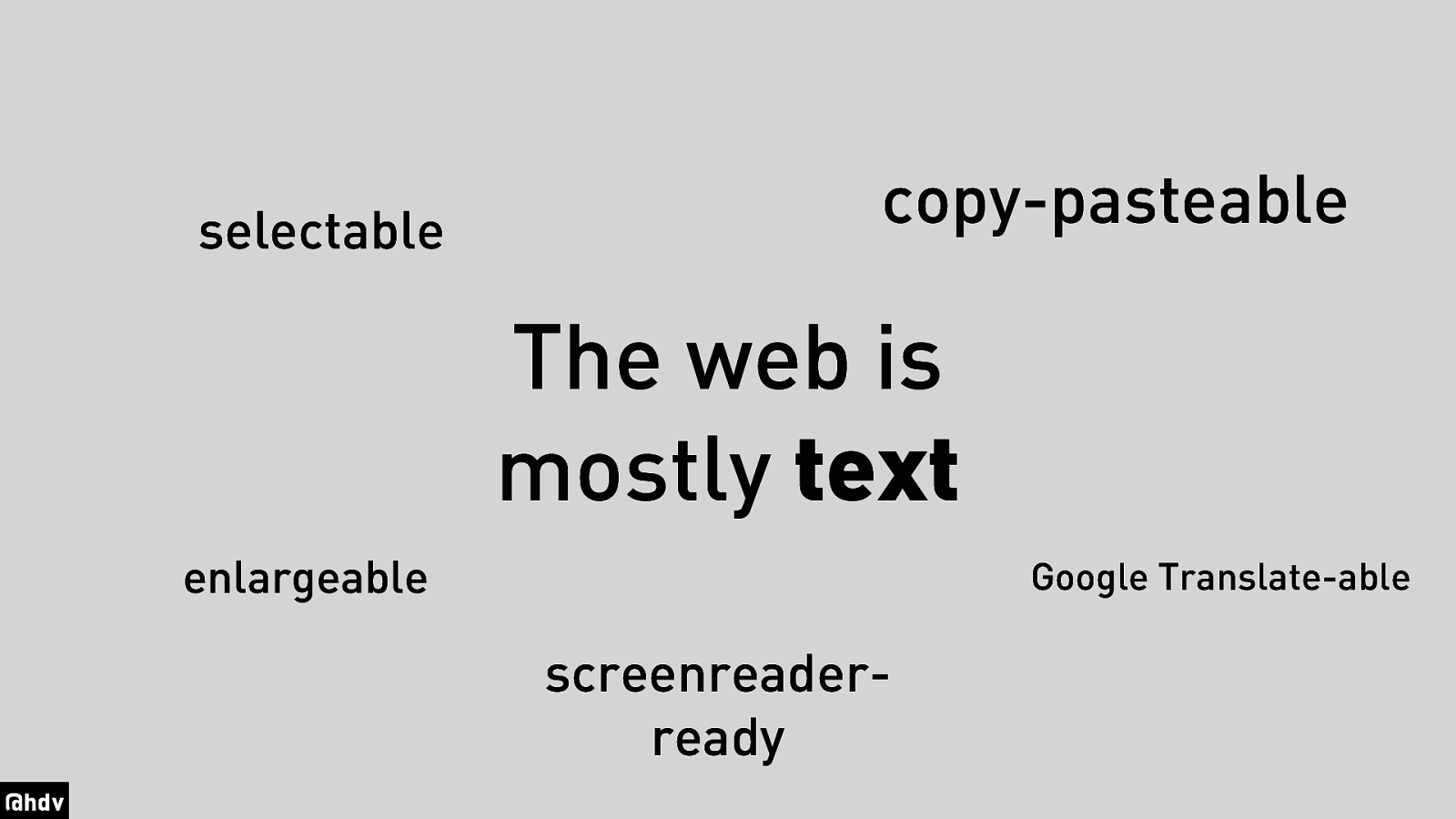
Text is awesome, it lets us do things like copy pasting, selecting, making it larger, putting it into Google translate and of course it is screenreader ready, as they take text as their input.
Slide 46
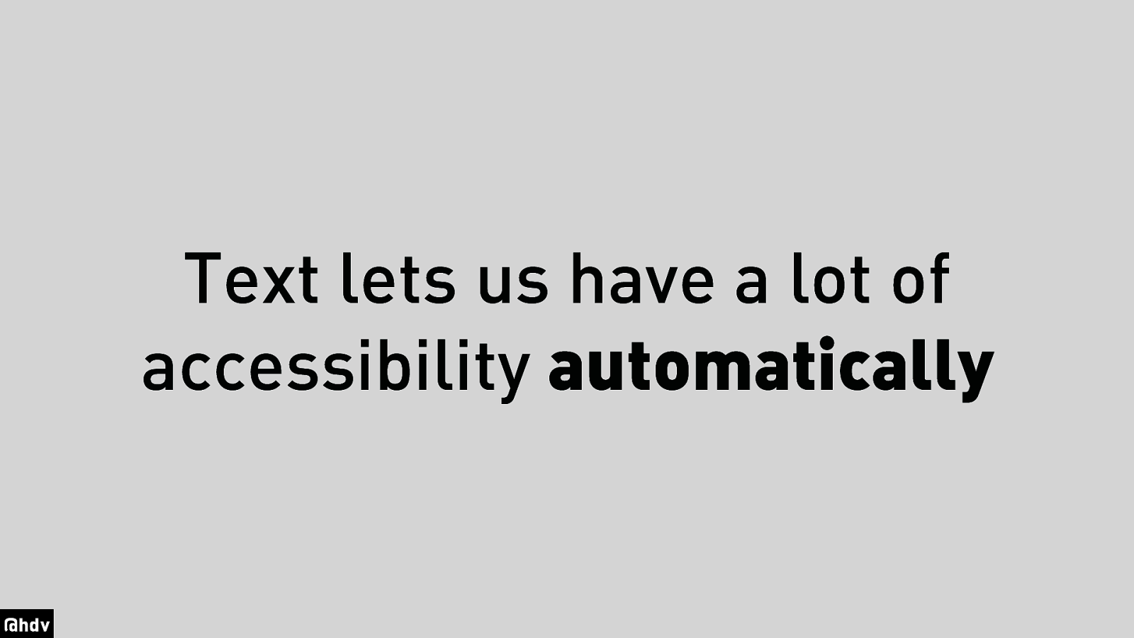
In other words, text lets us have accessibility automatically.
Slide 47
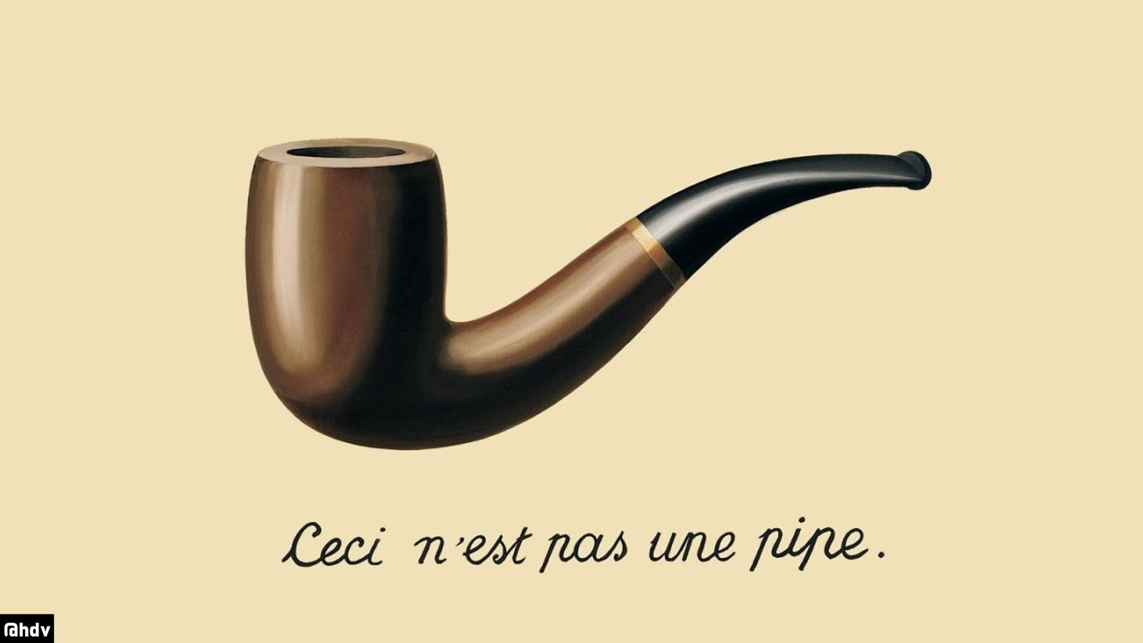
You may be familiar with this painting by the Belgian artist Rene Magritte, who painted this pipe and wrote 'Ceci n'est pas une pipe' underneath, this is not a pipe. His point here is, you cannot smoke this pipe, it is a picture of a pipe.
Slide 48
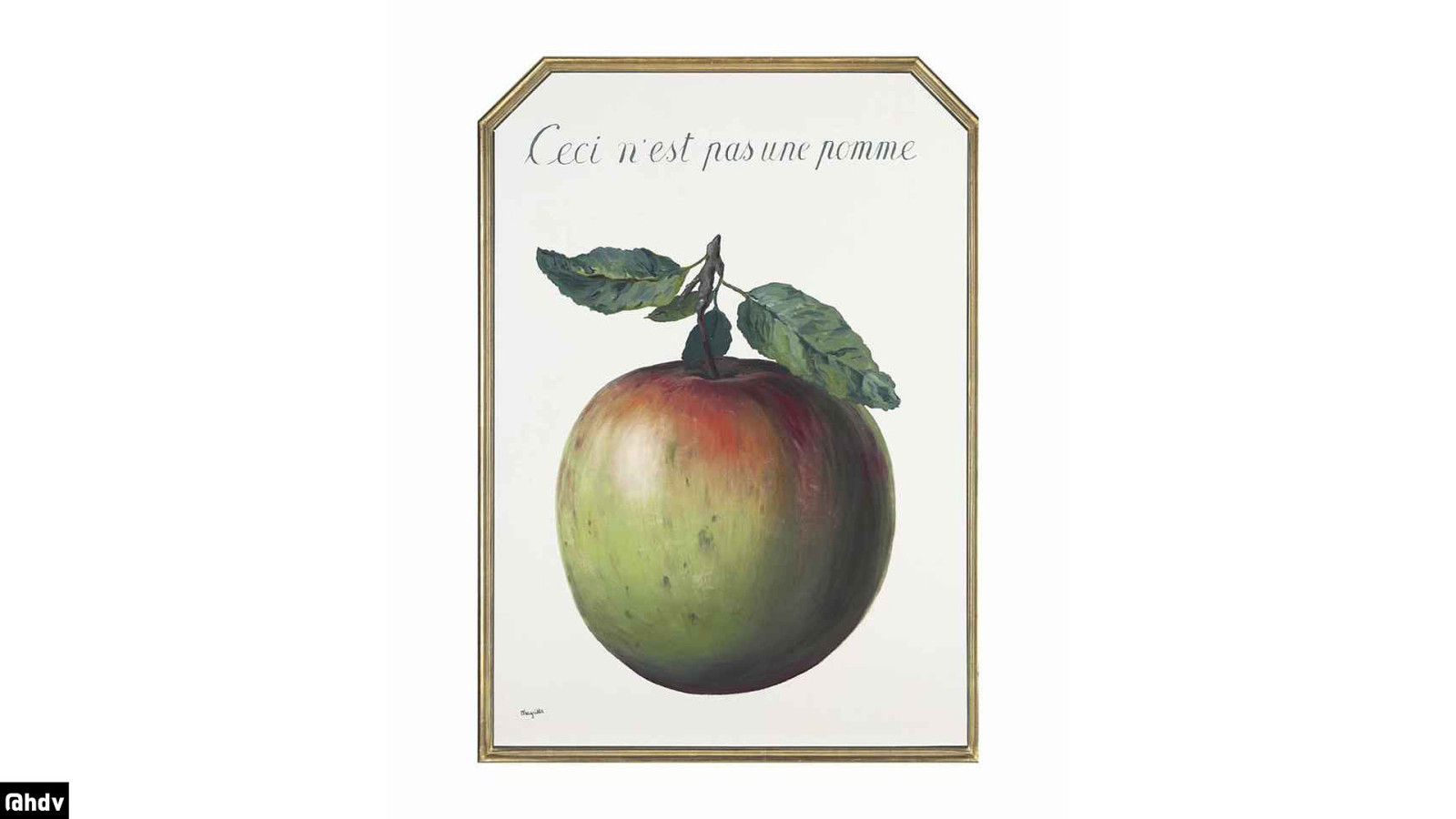
He did more of these, like this apple, again, he wrote this is not an apple, because you cannot bite it.
Slide 49
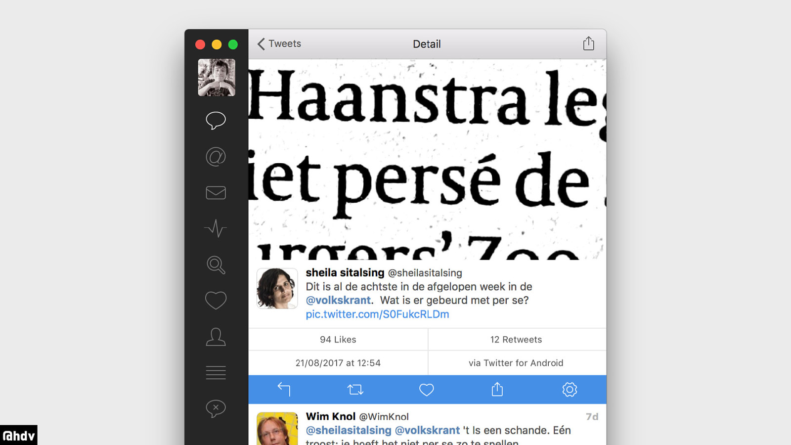
With that in mind, what do you think is wrong with this? Screenshot of tweet with photo of newspaper attached.
Slide 50
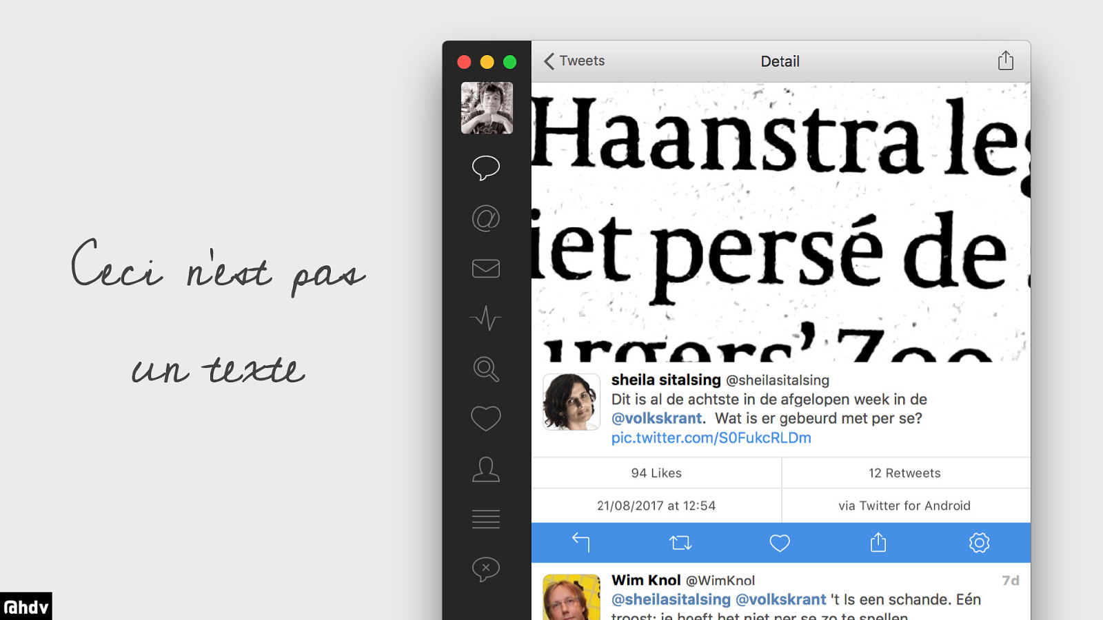
Well, ceci n'est pas un texte, it is not a text, it is a picture of text.
Slide 51
We can mitigate this by providing alternatives for our text.
Slide 52
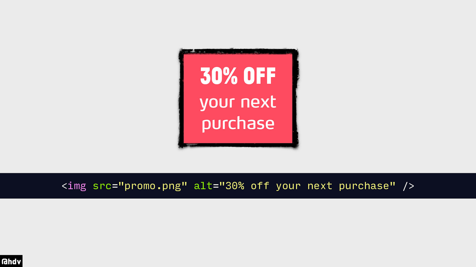
For example, in this picture that says there's 30% off your next purchase, it makes sense to add an alternative. Make sure this happens. I know as a front-end developer, you may not be adding all the images yourselves, so ensure everyone on the team knows about this requirement, as it helps people to actually figure out what's on your page.
Slide 53
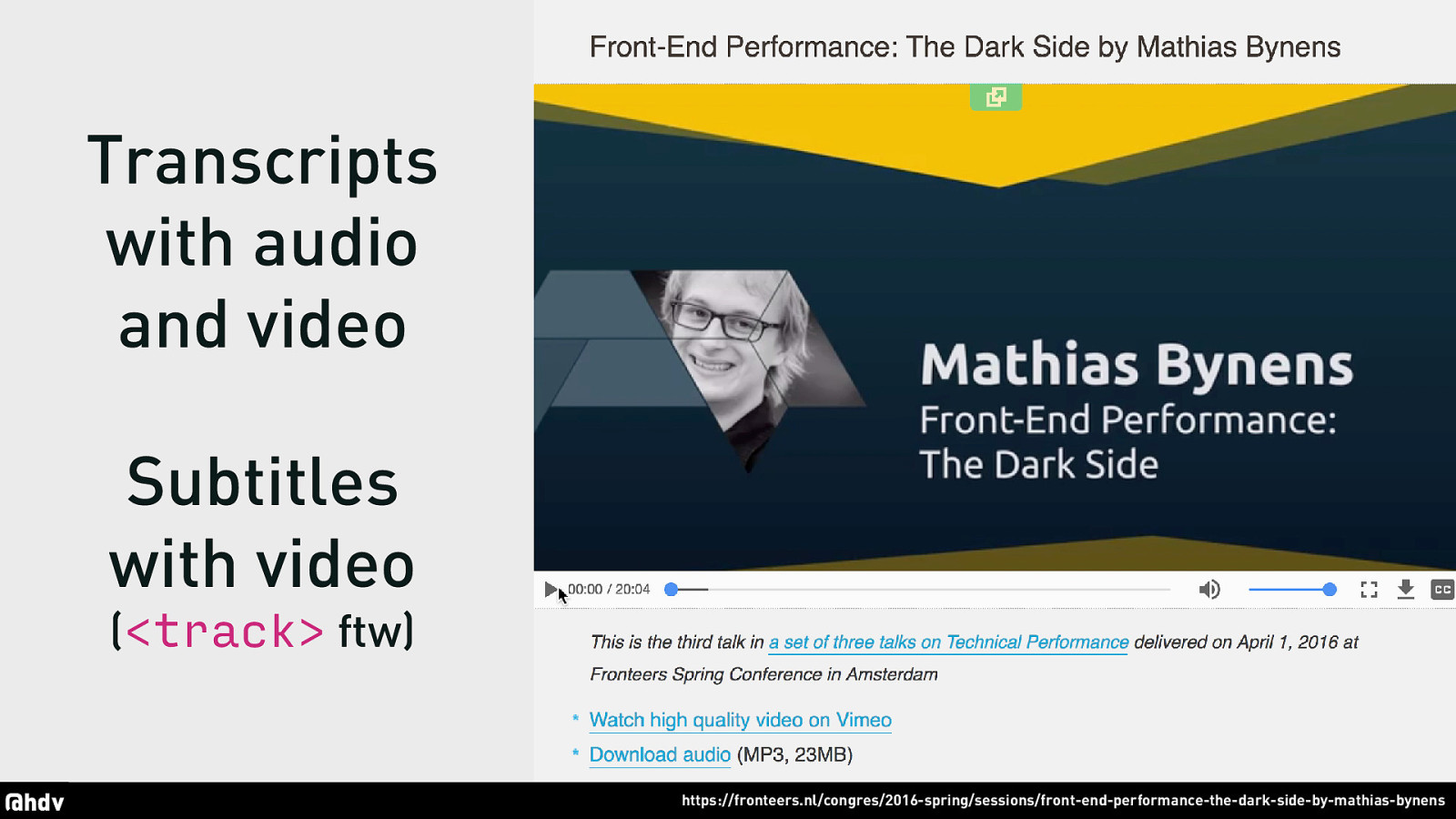
This also goes for audio and video. Provide transcriptions and subtitles with your videos so that people who cannot hear can also experience the video. But of course it also helps people whose first language isn't English, to follow along with a fast-speaking speaker. This is all done with web standards, using the track element that is in HTML.
Transcripts with audio and video Subtitles with video (<track> ftw) @hdv https://fronteers.nl/congres/2016-spring/sessions/front-end-performance-the-dark-side-by-mathias-bynens
Slide 54

Last subject I want to talk about is focus.
Slide 55
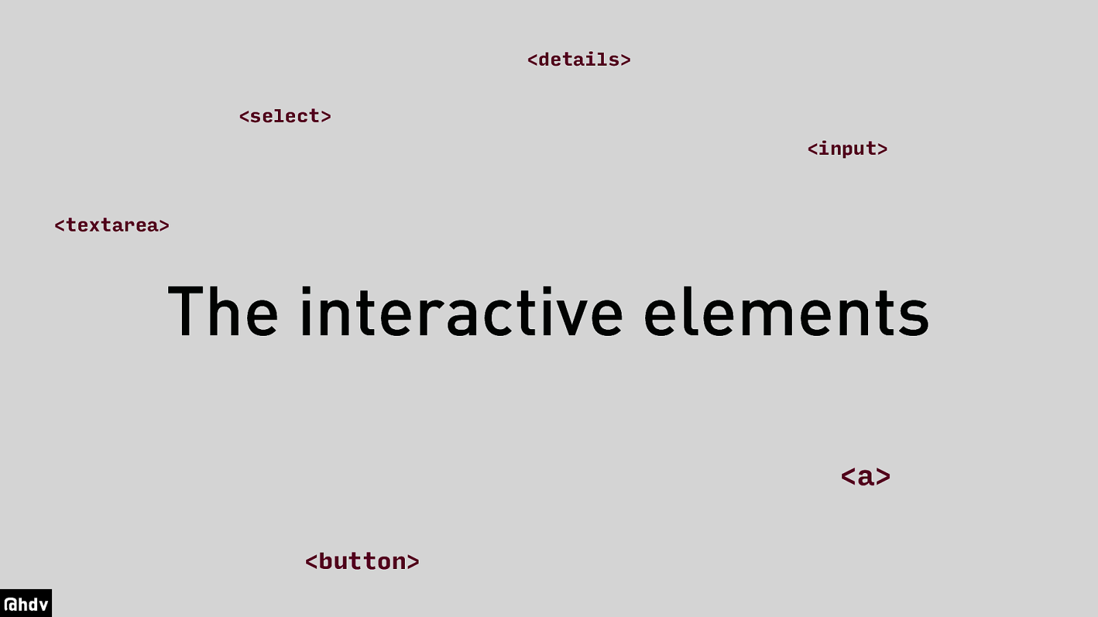
Focus is something that happens between the set of interactive elements on a page. They are elements like links, buttons and form fields.
Slide 56
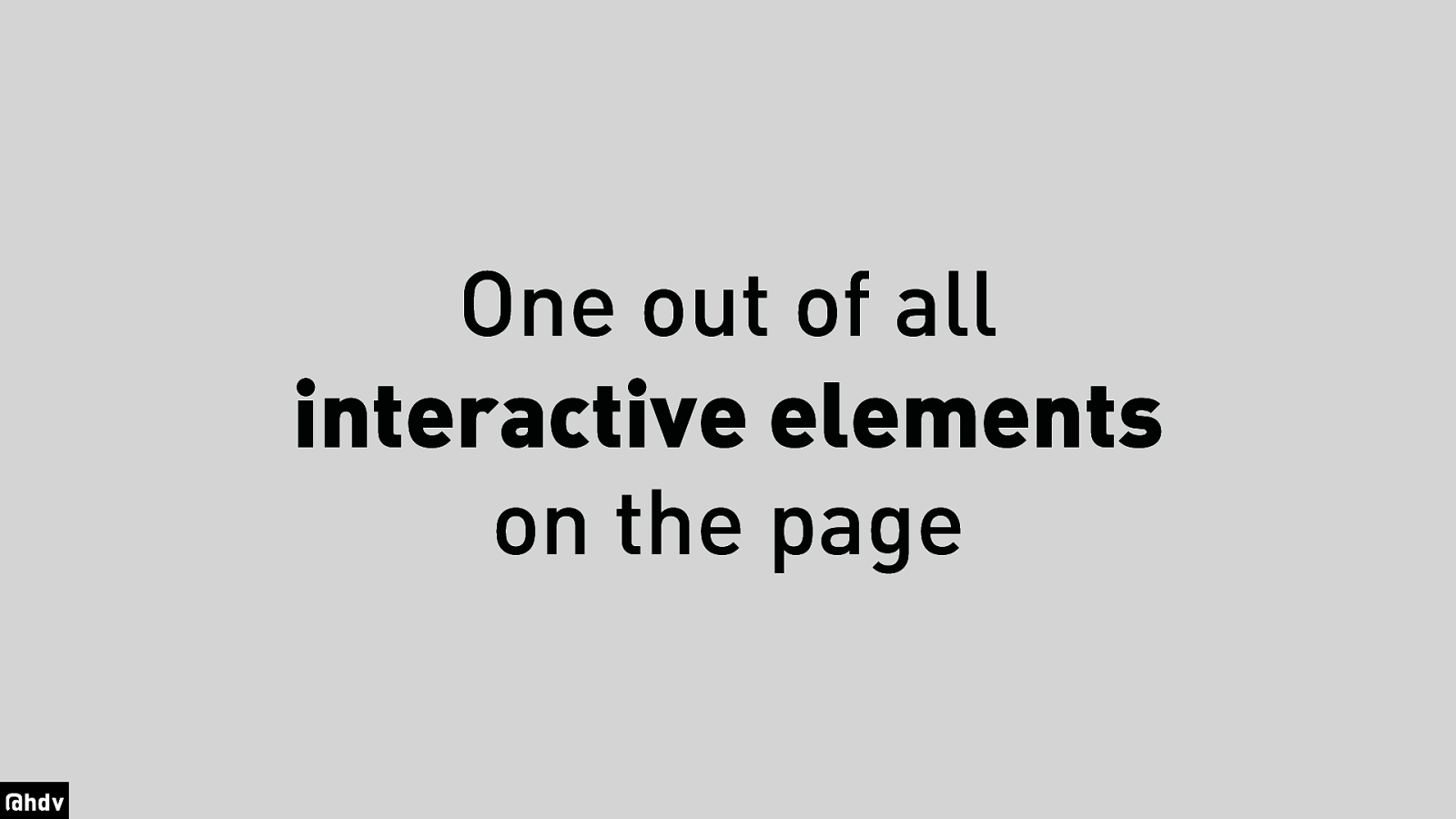
note that it is always one of those elements, it can't be multiple at the same time.
Slide 57

So there's an example of a bit of text with two links in it. If I use a mouse and hover over that first link, that is how I know which link I am about to click.
Slide 58
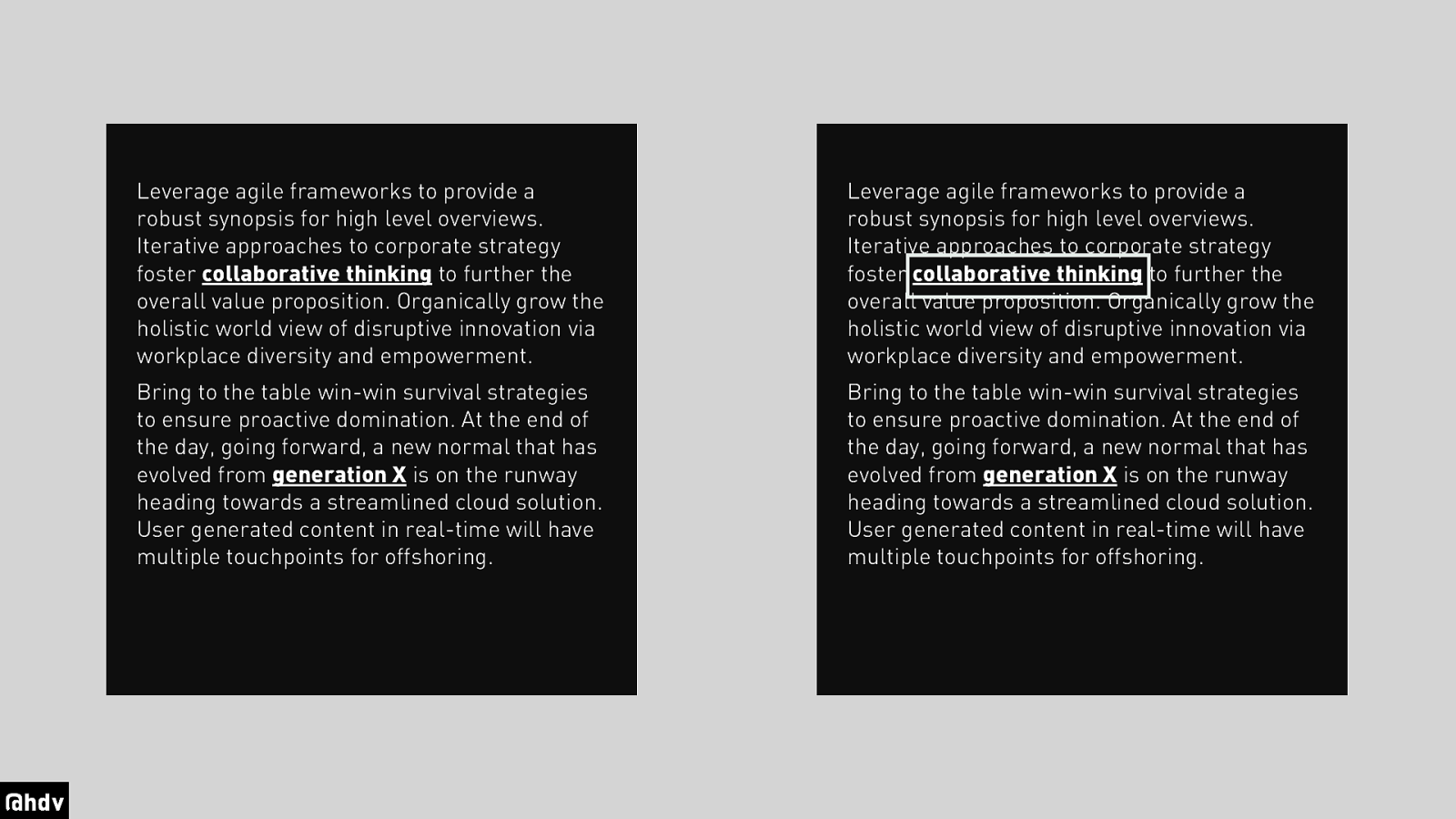
If you use a keyboard or any other way of browsing what happens on a screen, you'll need another indicator. This is the focus indicator, it shows which link you're about to activate. I admit it does not look very pretty.
Slide 59

But so aren't streetlights. They aren't pretty. But when I walk home in the dark they help me see where I am. They're an affordance.
Slide 60
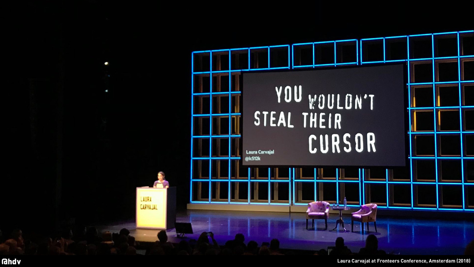
Don't take away this outline, as many sites do, because it would be like taking away someone's cursor, like Laura Carvajal beautifully said at Fronteers a couple of weeks ago. 'You wouldn't steal their cursor'. You can actually, in CSS you can use cursor: none to turn off cursors, but you would never do that because mouse users would be unable to use the site.
Slide 61
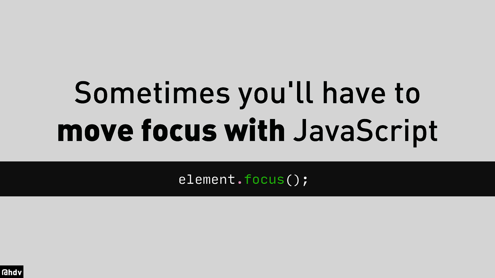
That's all for the outline part, let's talk a bit about how you can influence focus with code. First, you can move focus to an element by calling the focus() method on that element. That works on interactive elements, which is probably all you'd need, but it can also work on elements like div, if you give them a tabindex of -1. This enables the element to be focusable with JavaScript. Use this sparingly.
Slide 62
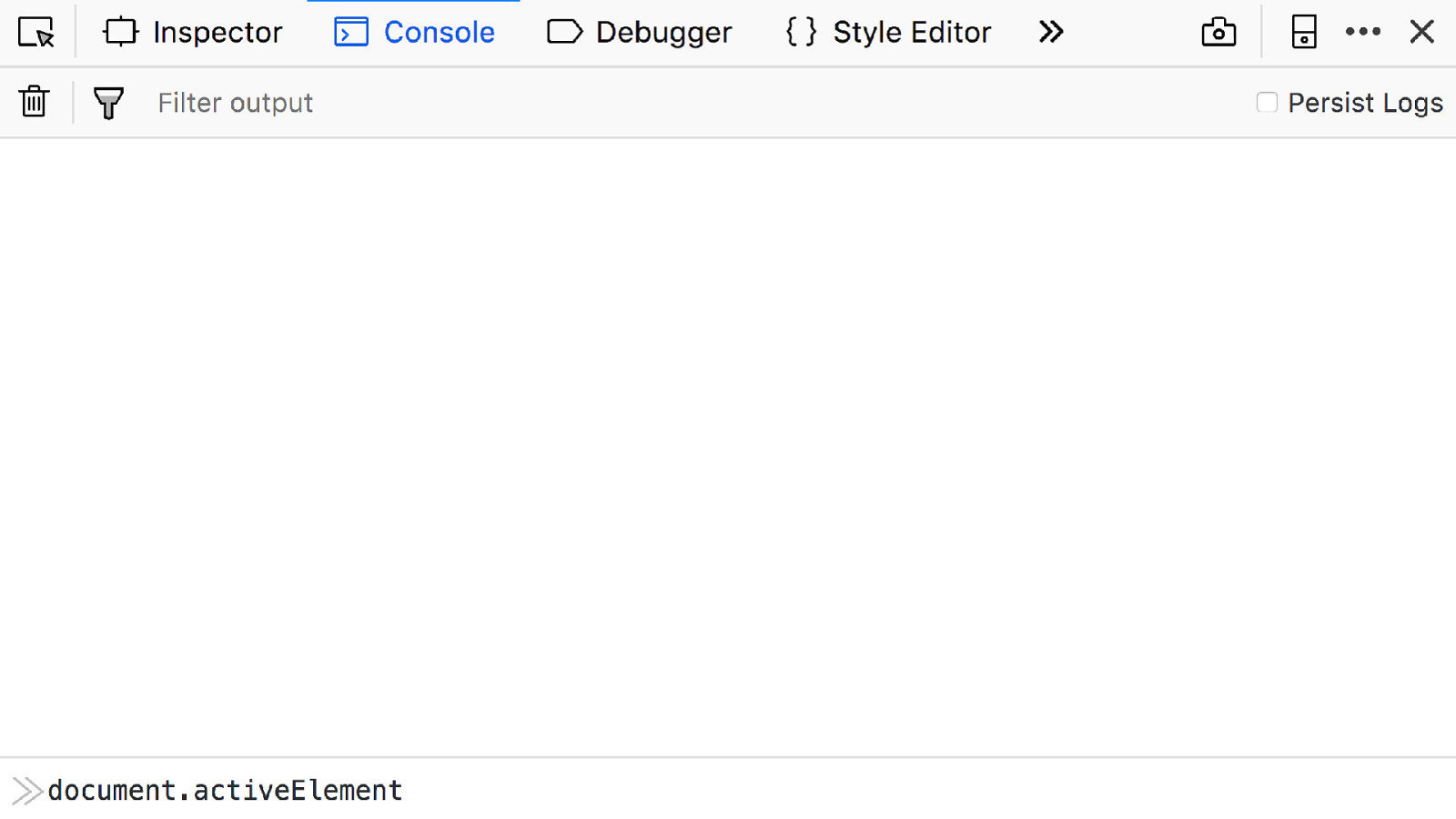
You can find what the currently focused element is by looking at document.activeElement.
Slide 63
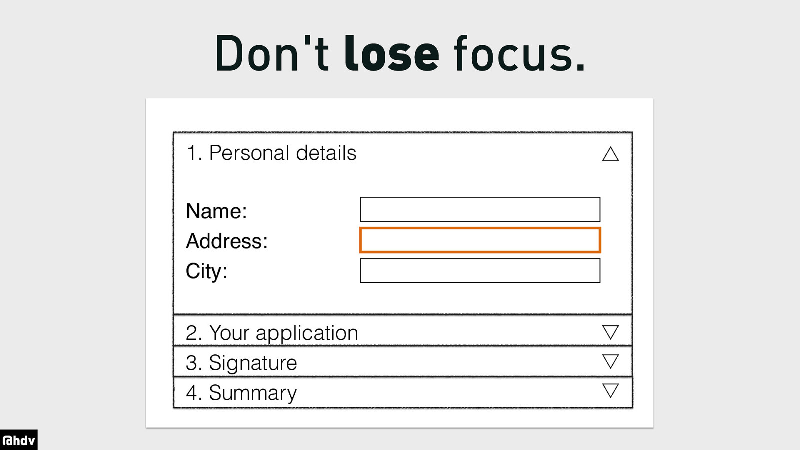
I have two tips around focus that I want to leave you with. The first is, make sure you don't lose focus. This is what happens when an element that has focus, or its parent, gets removed or hidden. At that point, always be concerned with where the focus goes. In this case, the focus is in the address field in the personal details section. When we close that section, the focused element is hidden and it will lose focus. So what should we do with the focus? In this case it is fairly easy, it can go to the button that closed the section, as that is an interactive element. You won't even need to move it yourself as the browser will focus it when it is clicked.
When you have a modal overlay, upon closing it, it would make sense to move focus back to the element that initially opened the overlay. So yes, you'd need to keep track of what that element is.
Slide 64
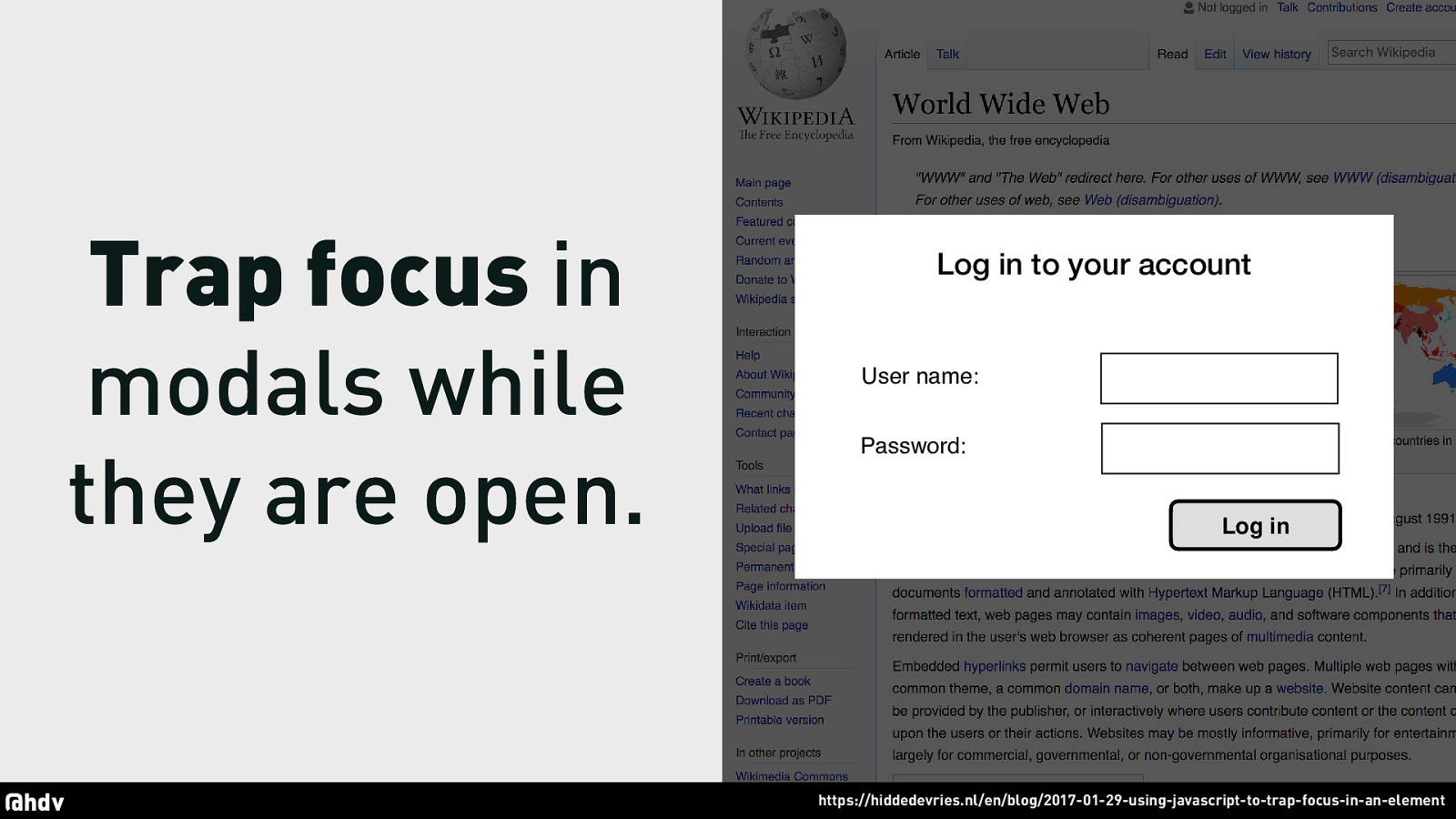
Speaking of modals, when they are open, it is recommended that the focus stays inside the modal. In other words, you should make sure while it is open, people can't move focus to the links in the page in the background, because then the focused thing would not be visible and people get lost. The solution is to keep the focus inside the modal. I have a blog post on how to do that.
Slide 65
So that's all for me today, these are six things that I think are important when you're a front-ender trying to do the accessible thing. If you get these right, you have a great start into having a very accessible website.
Slide 66
Thanks for listening! Contact hidde@hiddedevries.nl Twitter @hdv Slides https://noti.st/hdv