Hello people, thanks for having me on today. I love simple web technology and always try to make parts of my stacks simpler. Today I want to share some good practices around baking accessibility into components.
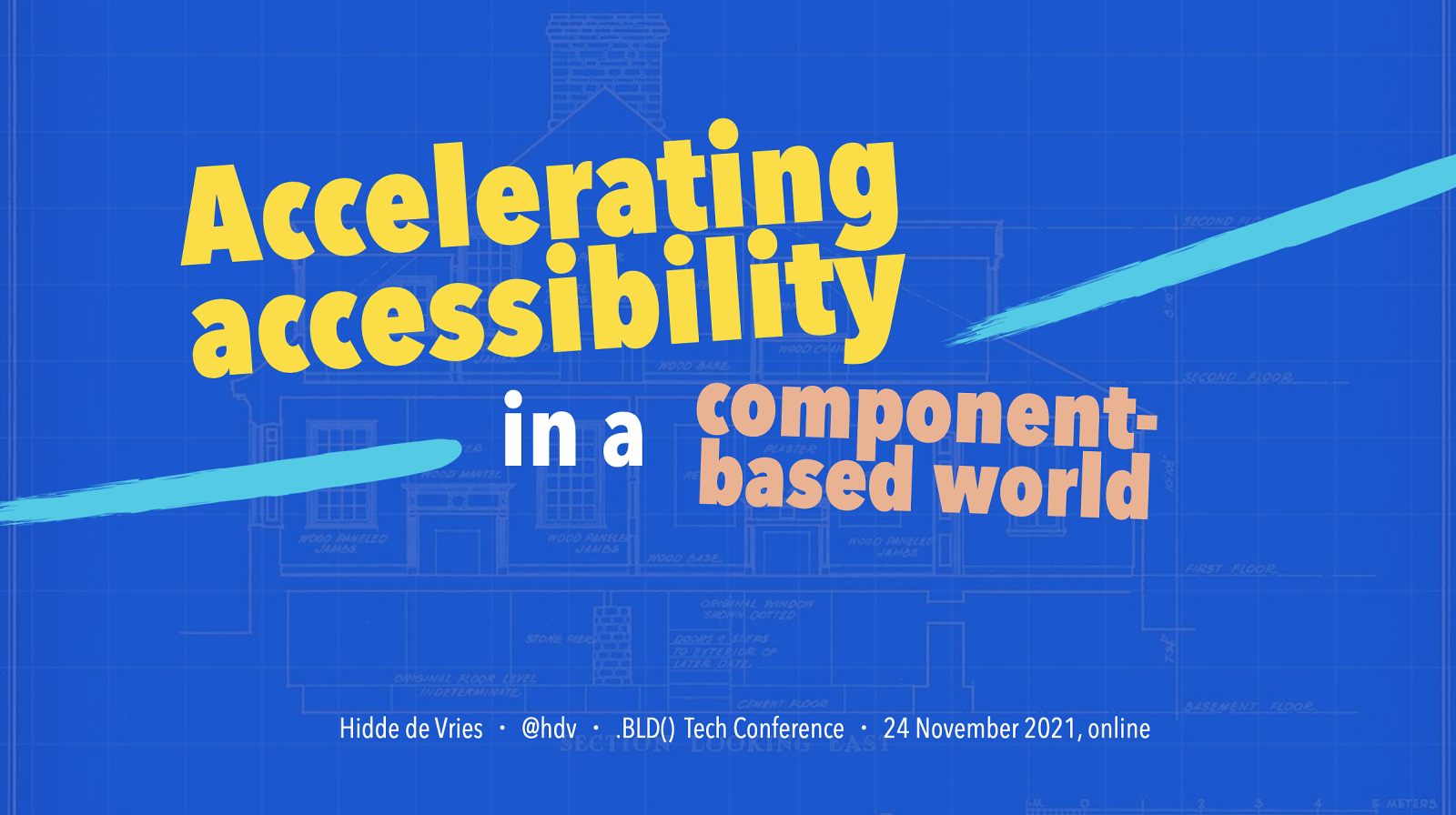
Slide 1
Slide 2
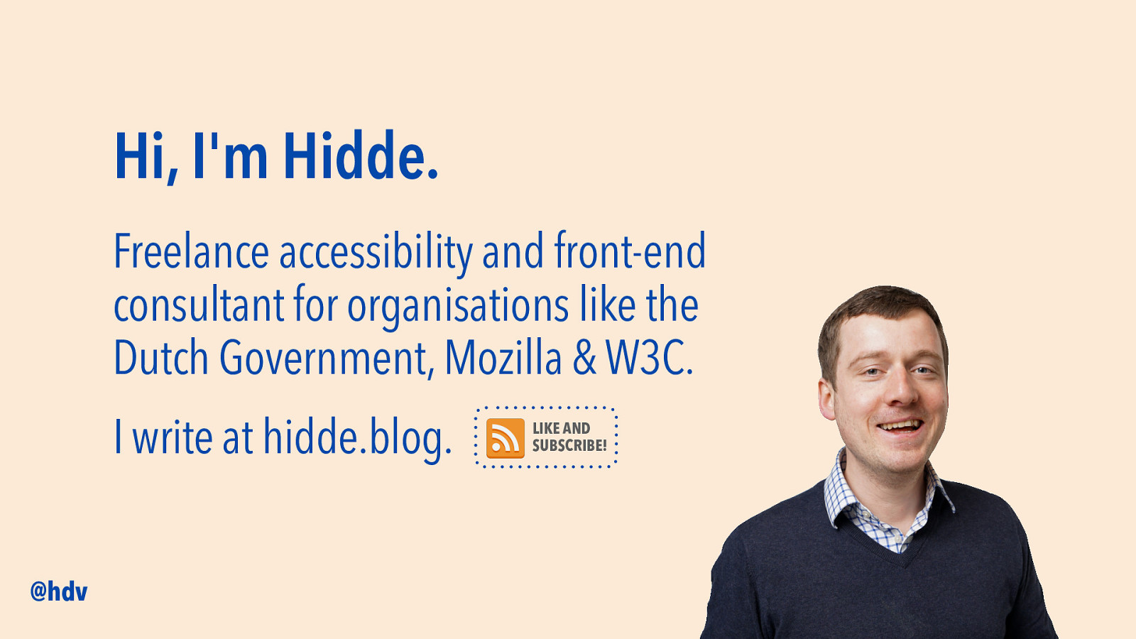
My name is Hidde, I am a freelance accessibility and front-end consultant. I do this for various parts of the Dutch government, the browser maker Mozilla and the W3C, World Wide Web Consortium, where I’m currently involved in a project in the accessibility team. I also write online… @hdv is my Twitter handle, but I also post on hidde dot blog, it is my personal blog, where I write about HTML, CSS, JavaScript, standards, tech in general… like and subscribe! I mean, there’s RSS.
Slide 3
Today’s subject is accessibility and components, and we’ll start with accessibility! Let’s look a bit at what it is, so that we’re all on the same page.
Slide 4
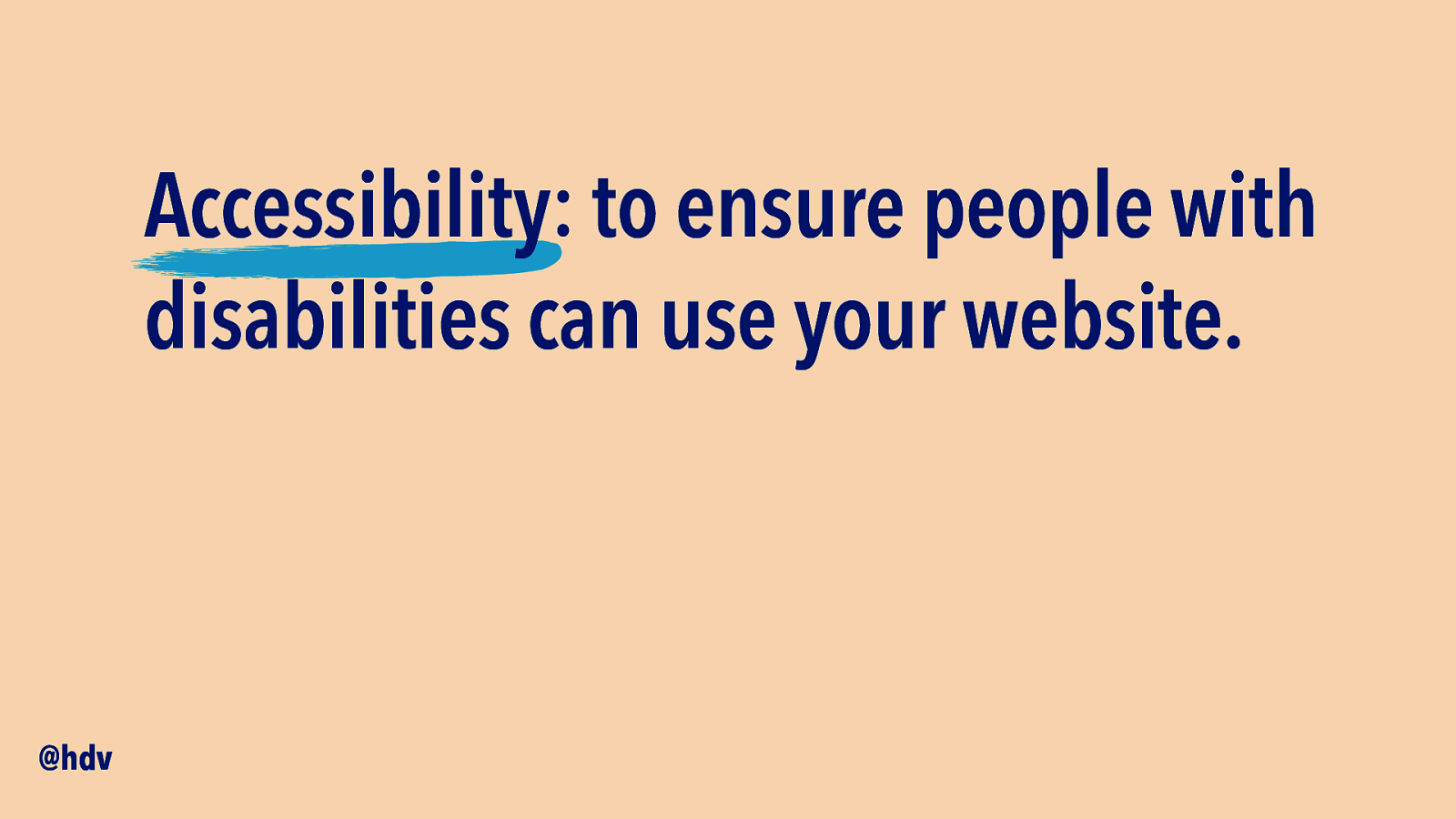
Web accessibility is all about ensuring your site can be used by people with disabilities.
Slide 5

It’s to make your site in a way that people with disabilities can buy your products.
Slide 6
That people with disabilities can complete all the steps.
Slide 7
Or in other words… that people with disabilities can use your service.
Slide 8
Maybe you have a disability yourself, or a relative, neighbour or friend who does. Many of us have disabilities, which can be visible and sometimes hidden. This includes people who are blind or have other vision impairments, people who are deaf or are hard of hearing, people with physical disabilities and people with cognitive disabilities. Sometimes from birth, sometimes from disease or accident, sometimes developed with age.
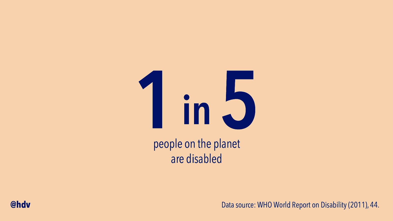
Statistics are a bit tricky, because different countries and health organisations have different ways of defining and measuring… the WHO cites two surveys in their Report on Disability that say 15% and 20% of the people respectively.
Slide 9
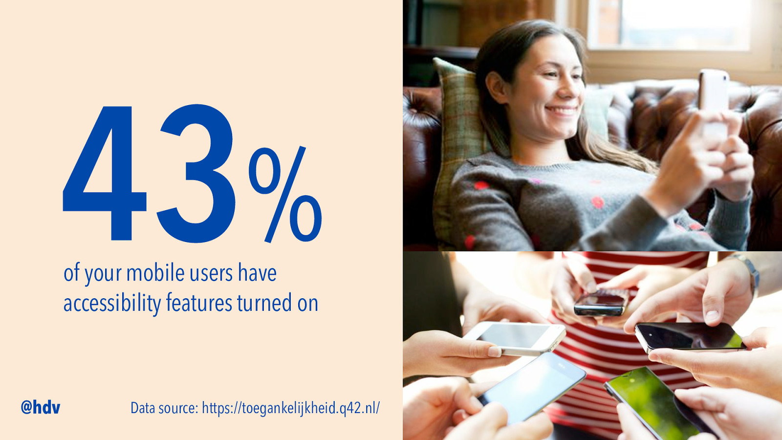
And just to highlight how common accessibility features are… many people use accessibility preferences, too. The Dutch web development consultancy Q42 looked at telemetry data from some of the apps they built for clients. They were able to share that 43% of their mobile users had accessibility features turned on. This is based on data from 1 million users, from some top apps in The Netherlands.
Slide 10
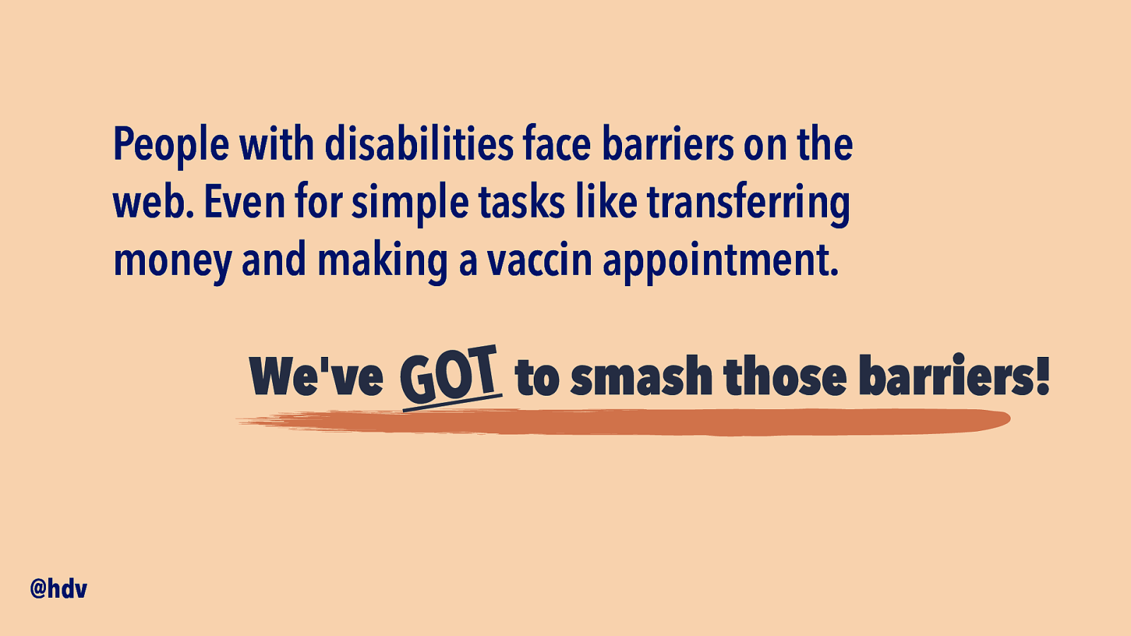
So, there are a lot of people out there with different needs, we’ve got to make sure to address everyone’s needs. People with disabilities face barriers on the web. Even for simple tasks like transferring money and making a vaccin appointment. We’ve got to smash those barriers.
Slide 11
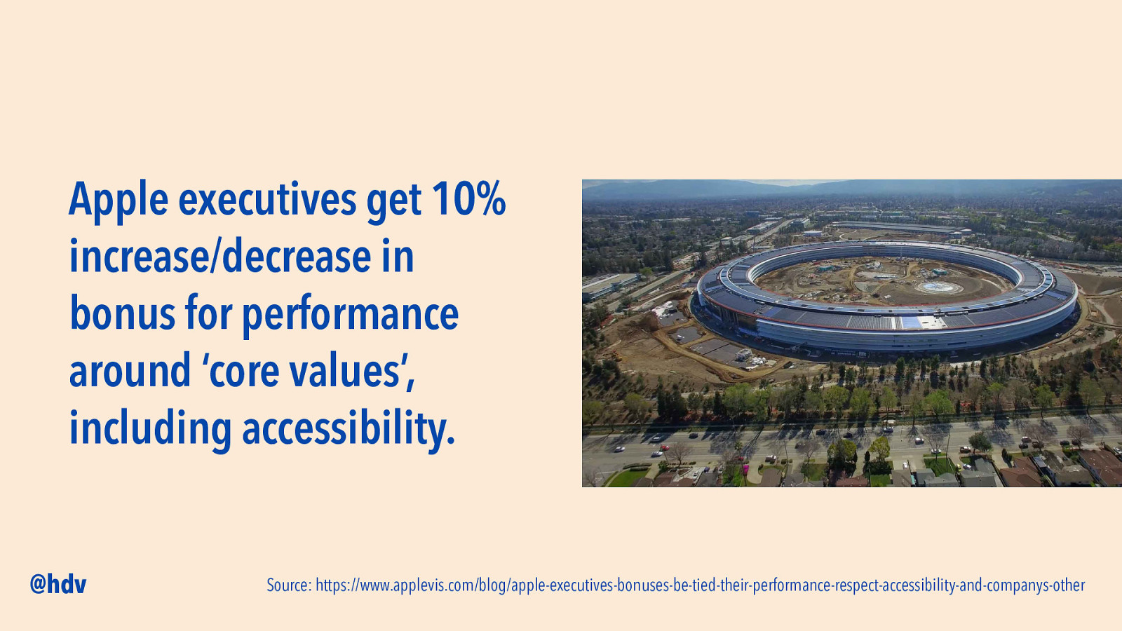
This is obviously not new, many companies, from small to large, have accessibility policies and processes. One of the largest companies in the world, Apple, has recently made bonus payments relative to performance around “core values”, which include accessibility. Many of the large tech companies, including Apple, Microsoft and Google, are super innovative when it comes to inventing new tech: from built-in screenreaders and voice control to high contrast mode to automated captions.
Slide 12
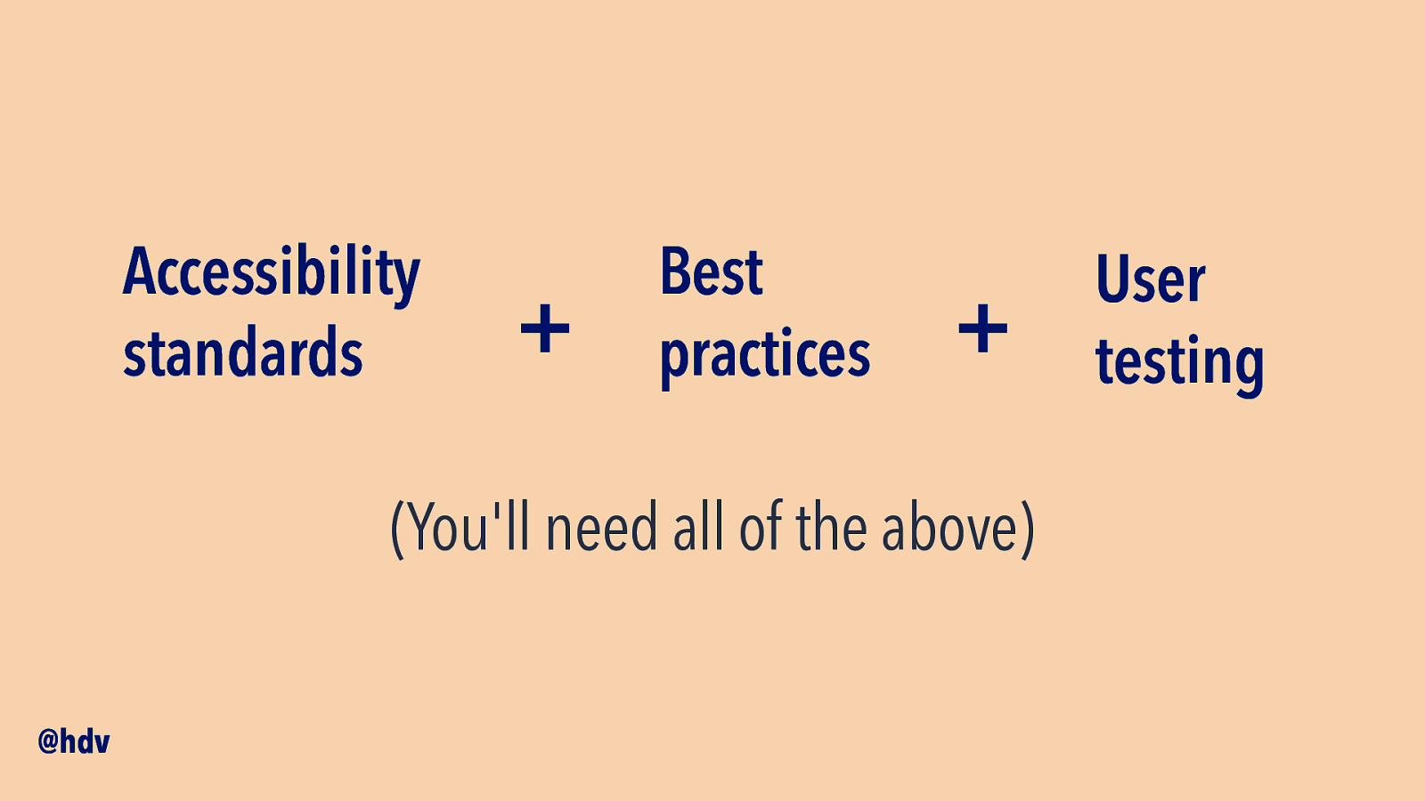
If we want to focus more on accessibility, there are a couple of different routes. As I mentioned, people are diverse… you’ll want to use accessibility standards that are built to take into account many different disabilities. Best practices can help a lot when it comes to putting things in practice, and lastly, user tests are essential, include people with disabilities in your user tests.
Slide 13
As I said, we’ll want to talk about components today.
Slide 14
When I started out as a developer, about 15 years ago, I would be handed a Photoshop file, or actually a folder of them… 10 pages, ten files… it would be really like coding a page at the time. Of course you’d think about CSS and not repeating yourself too much…
Slide 15
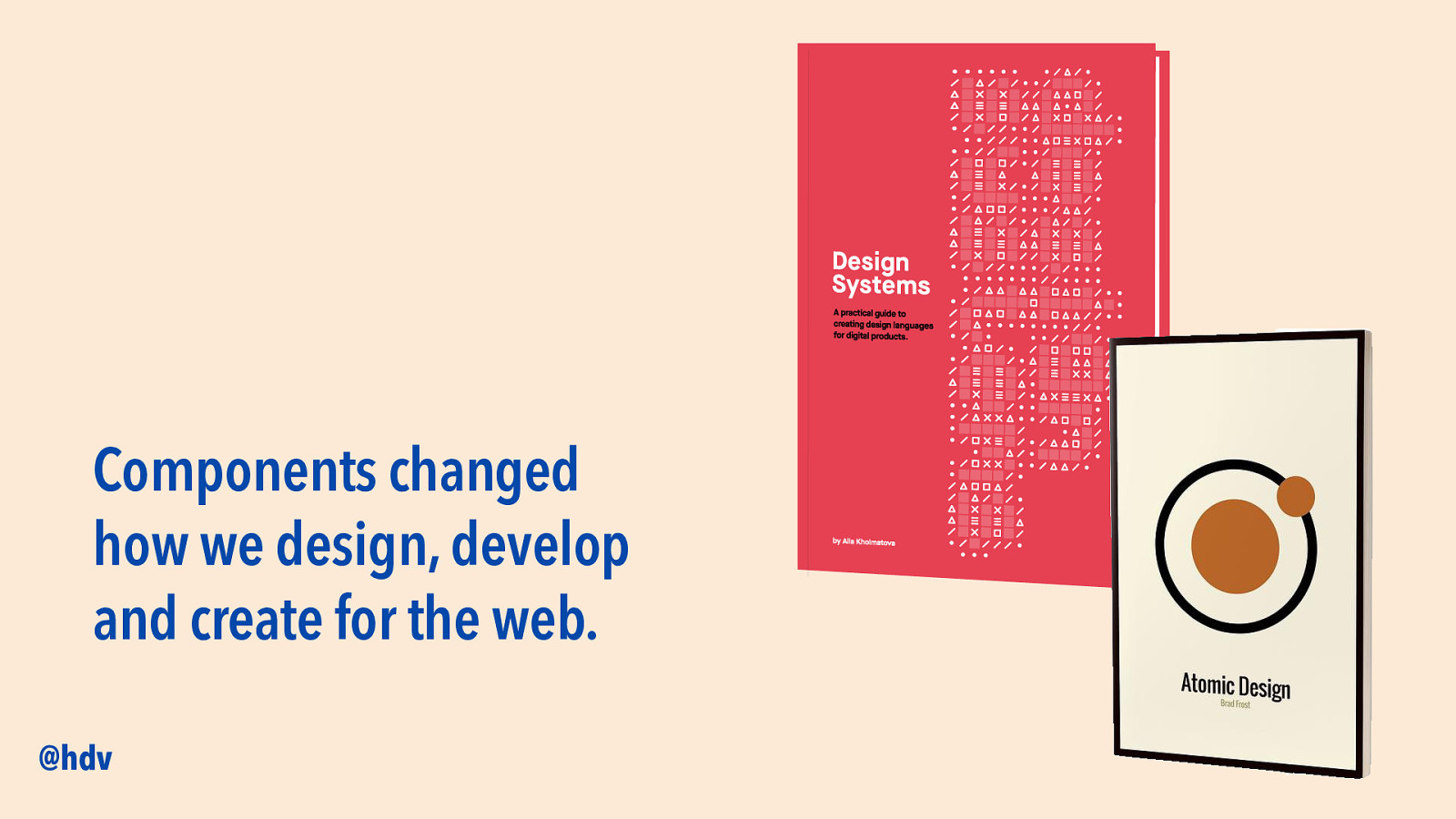
Components changed the way many of us work. That goes for developers, as we also saw in Rob’s talk, lots of separating into components when it comes to code, but also for designers and even the agile process. We think in terms of components instead of full pages.
Slide 16
One of the key benefits of components is reusability. We want to reuse design work, we want to reuse development work, and we also want to reuse accessibility work. With components, we can make some accessibility reusable.
Slide 17
We’ve got to look out too… with components we repeat ourselves. So if we forgot to include accessibility, we risk repeating inaccessible patterns. Let’s not repeat inaccessible patterns, let’s repeat accessible patterns.
Slide 18
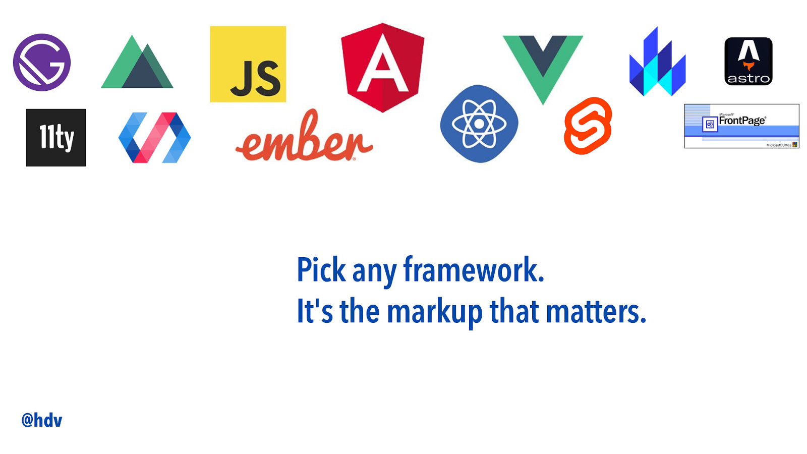
And this time, it doesn’t really matter which framework you do that with. You could be using Angular, React, Vue, Svelte, Astro… vanilla JavaScript or Web Components… When it comes to accessibiltiy, at least the part of accessibility that requires code code, it’s the markup that matters.
Slide 19
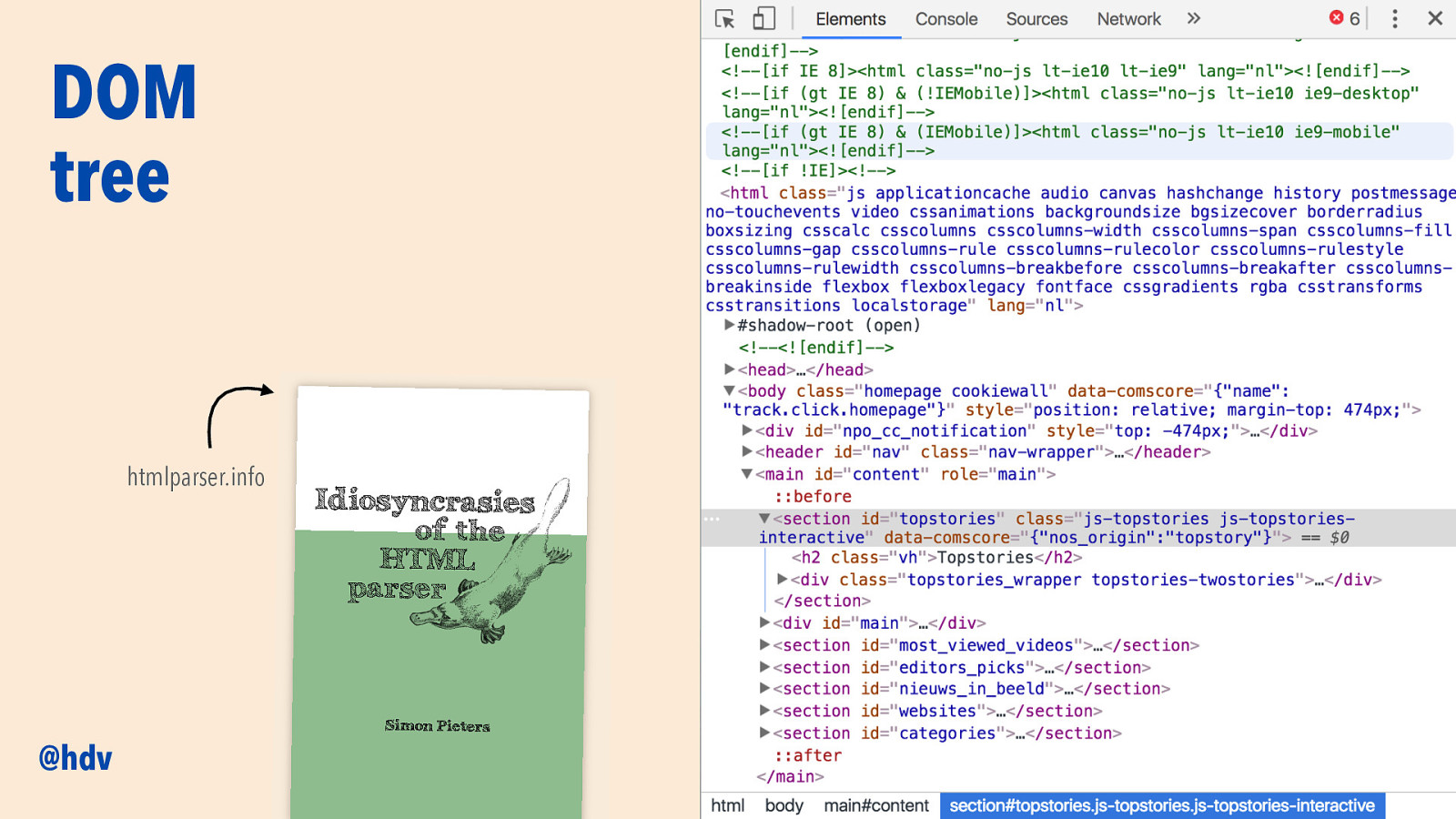
When you go to a website, a user types in a URL, the browser sends a request and gets responded with… a DOM tree. It’s a model of the markup that’s sent… if your markup has errors, they will be fixed, an there’s lots of stuff going when your markup gets parsed into this tree.
A great book about this, that I can’t recommend enough, Simon Pieters’ “Idiosyncrasies of the HTML parser”, see htmlparser.info.
Slide 20
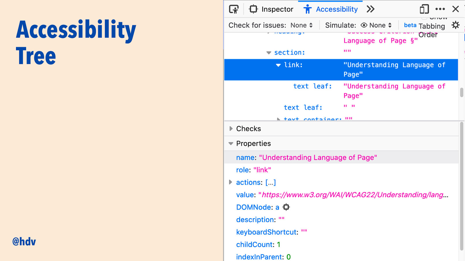
Not everyone knows that besides the DOM tree, the browser can also generate a second tree: the Accessibility Tree. It exists alongside the DOM tree and is based on it. It contains information relevant to accessibility.
Slide 21
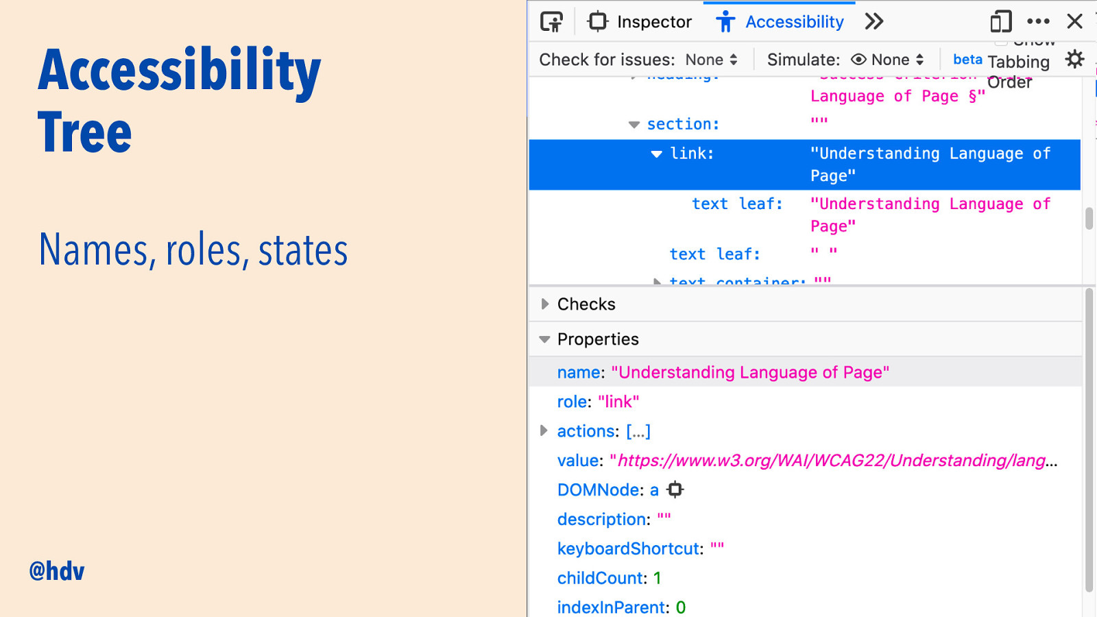
The three most important bits of data that the Accessibility Tree contains are: names, roles and states.
Names are how to refer to something on the page… if you have a link with the text “click here”, terrible link text by the way, its computed accessible name in this tree will be “click here”.
Roles are what something is in the page. Is it a button, a link, a checkbox?
States say things like this checkbox is checked or this toggle is expanded.
Slide 22
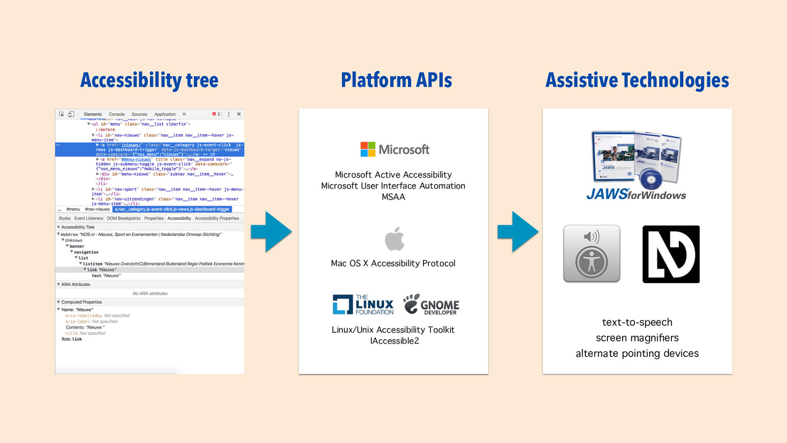
Basically, what AT do is convey to their users what’s happening on their screen. In order to do that, they need to know what’s going on on the screen. For this, they rely on platform-specific accessibility APIs, that basically know what everything is on your platform. the only thing they don’t know is what happens in your browser, as they’ve never seen your website. This is where the accessibility tree comes in.
Slide 23
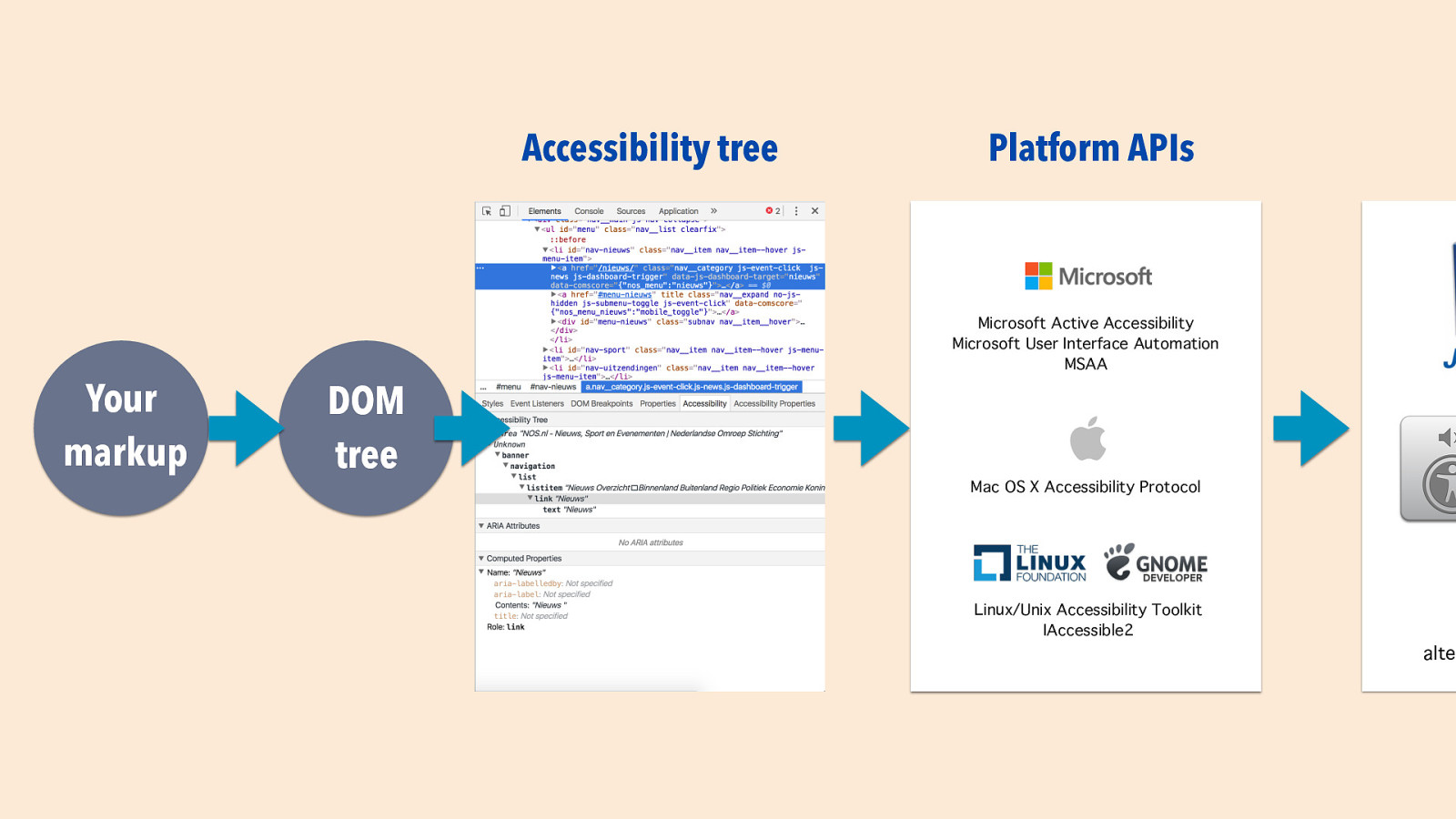
And as I mentioned before, the Accessibility Tree is based off the DOM tree, which is based on your markup: it’s your markup that matters, because it, indirectly but surely, impacts how users with disabilities experience your site through their assistive technologies.
Slide 24
To bake in a basic layer of accessibility into components, I’d like to share a couple of things we can do for almost each component we ship. These are things that I see commonly go wrong in accessibility audits I do, and that can be fixed with code, on a component level. Other accessibility issues may be more about design and content, or require the whole page. For these, I’ve tried to come up with stuff that matters specifically for components.
Slide 25
The first one: ensure that your component works fully without a mouse.
Slide 26
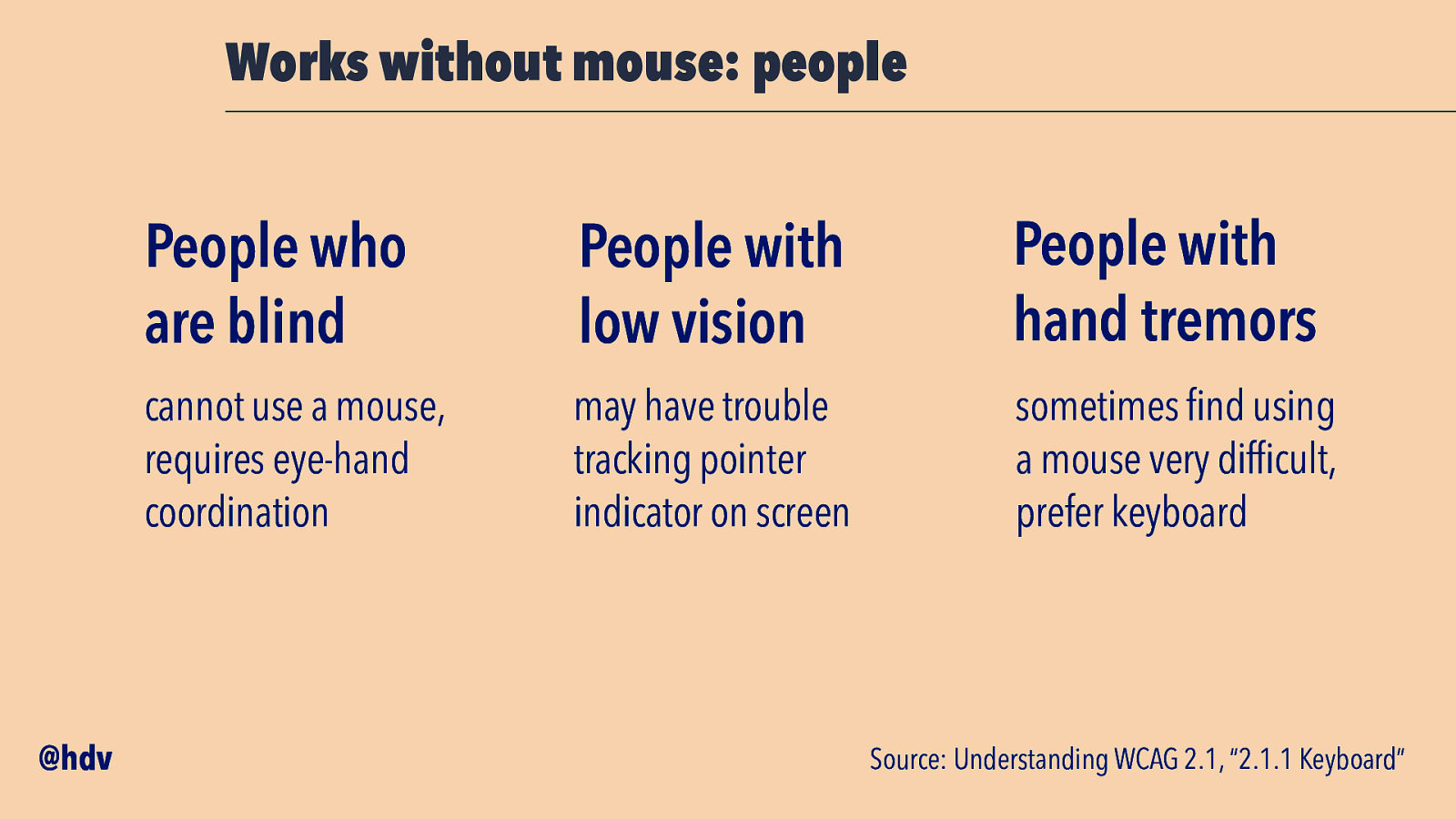
This is specifically important for people who are blind; they cannot use a mouse as this requires eye hand coordination. It matters to people with low vision, who may have trouble tracking a pointing indicator on the screen. And it is also important for folks with hand tremors or other physical disabilities that make use of a mouse difficult or impossible.
Slide 27
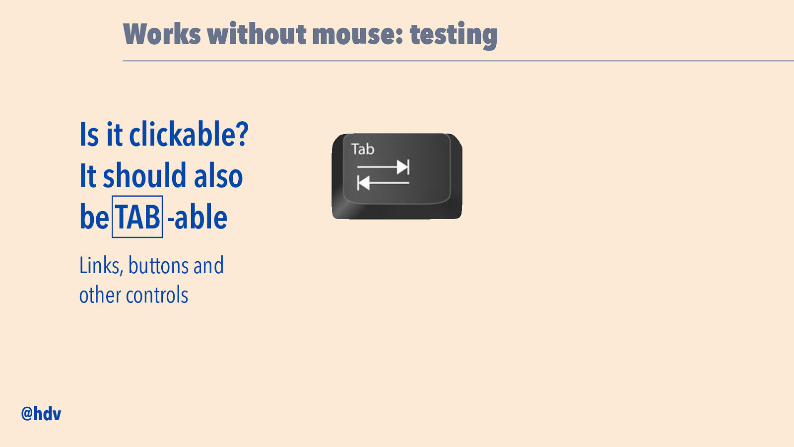
This thing to check is, for any item on your page that is clickable: are you able to get their with just your TAB key (or shift-TAB). This should be checked for controls like links and buttons, anything you could normally click or hover.
Slide 28
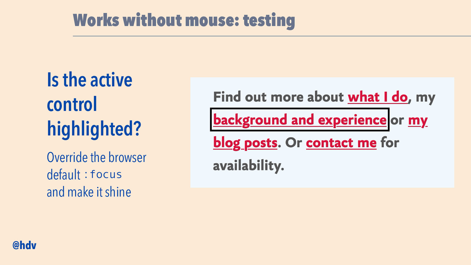
What’s also important is that the current control is clearly highlighted, like in this screenshot of my website, there are four links and with TAB I can go to the next. I know I’m on the next because we draw this large rectangle around the link. Browsers come with built-in focus styles, but my recommendation is to actually go and override those with something clerarer. You can make it shine, maybe add a subtle transition or animation while you’re at it, but the main point is: can folks see where they are? This is a bit like if you’re using a TV interface with a remote control, which is also not a mouse, you’ll want to see which item you’ve selected when you pick something to watch.
Slide 29
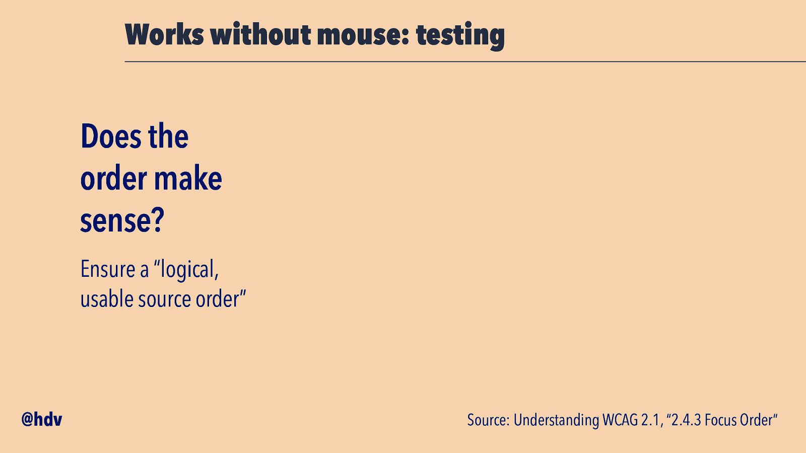
Lastly, the tabbing order should be sensible: the spec says “logical and usable source order”. This is mostly a problem when you do things like open a modal overlay, but it is at the end of the DOM just before the closing body tag.
Slide 30
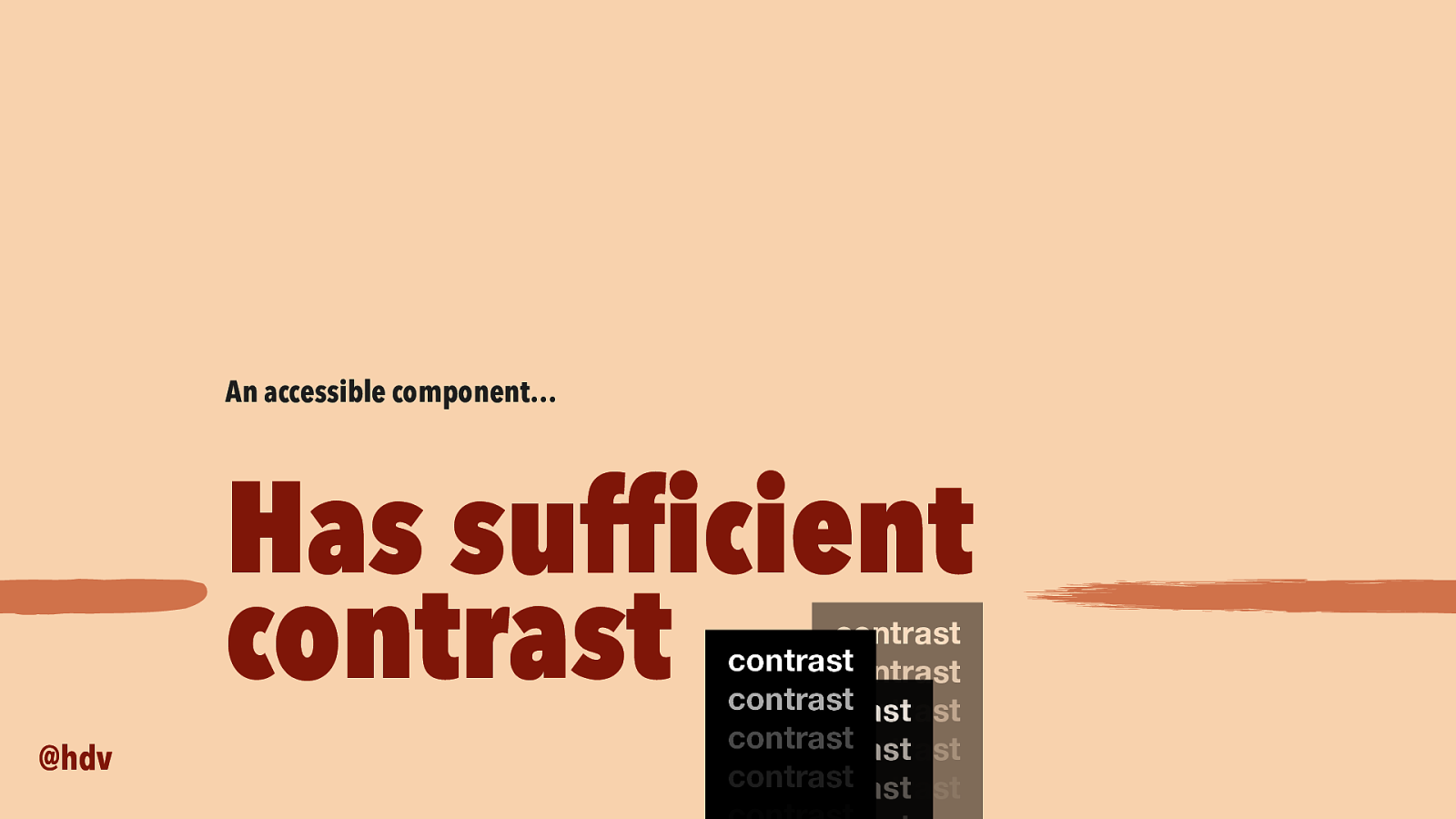
Then, the next thing we want to bake into components to make them accessible and not inaccessible, is to ensure everything has sufficient contrast. If your component includes colors, that is.
Slide 31
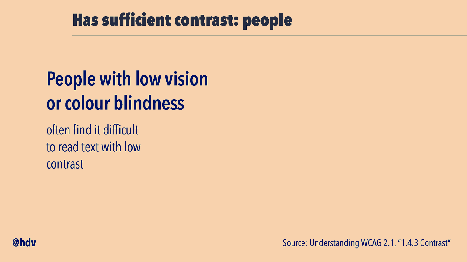
This is important to people with low vision conditions such as colour blindness, they may find it hard to read text with low contrast.
Slide 32
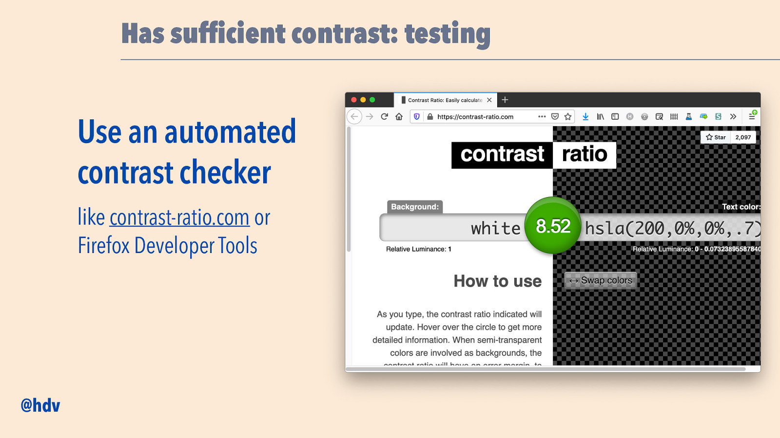
Accessiblity standards have contrast ratios, you can check these with tools, such as the website contrast-ratio.com by the awesome Lea Verou, or with Developer Tools. The Firefox Developer Tools are recommended, as they can also take into account gradients in the background. Note: not all tools can calculate all contrasts, if in doubt, manually pick your colours and check the contrast.
Slide 33
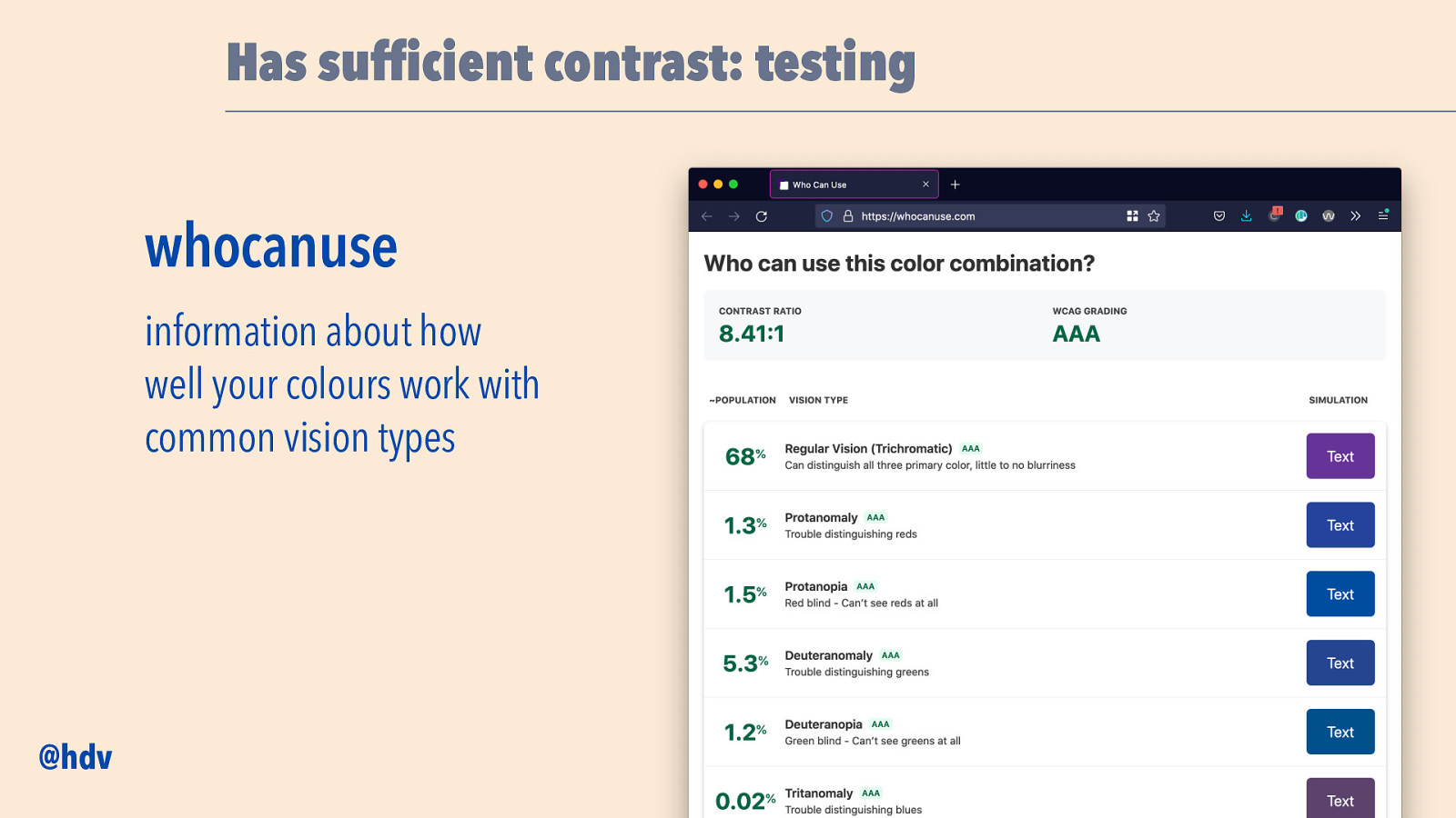
A useful website about colour contrast is whocanuse.com, which explains for two colours how well they will work for people with common vision types.
Slide 34
Then, I mentioned names in the accessibility tree before, accessible components also require good names for all controls.
Slide 35
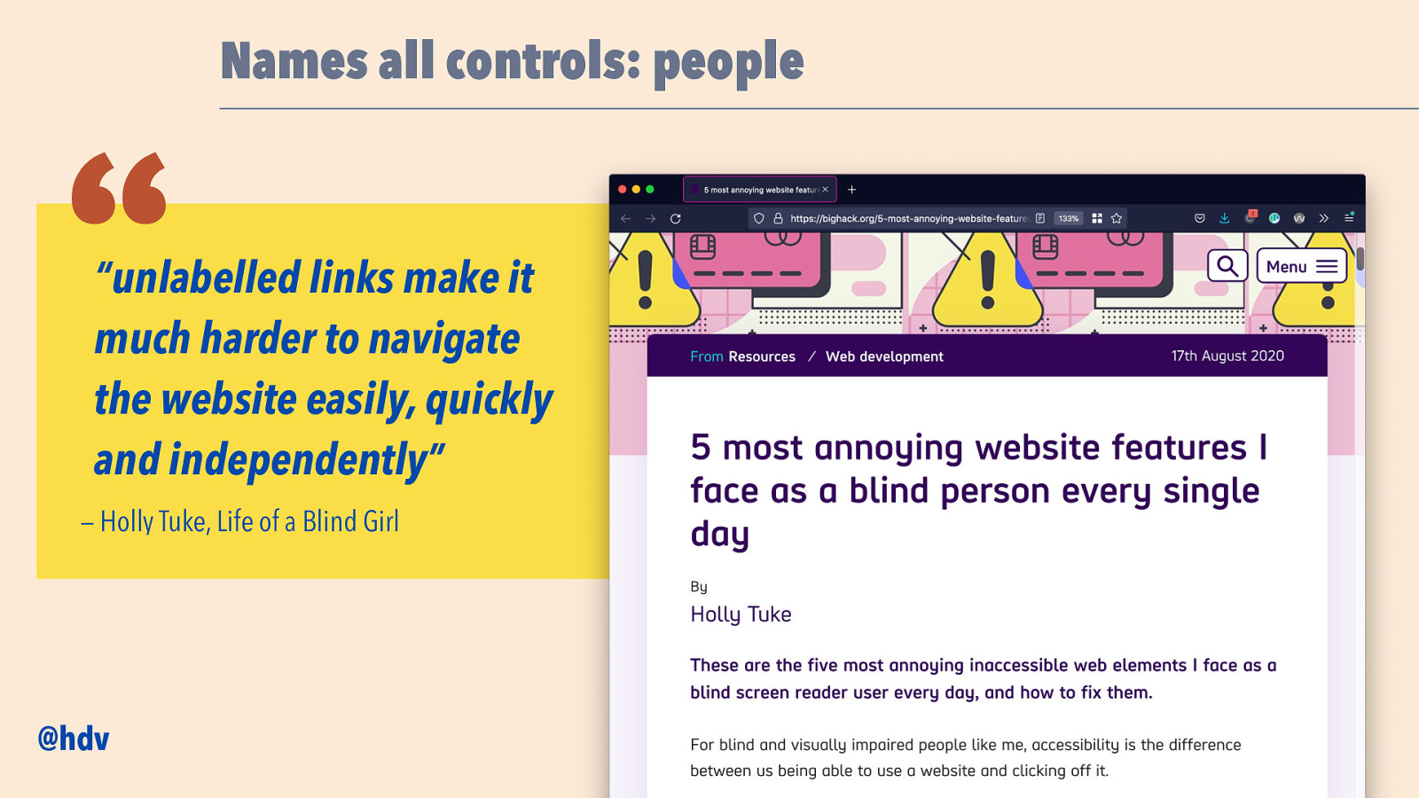
Holly Tuke, who blogs as Life of a Blind Girl, wrote a blog post called “5 most annoying website features I face as a blind person every single day”, and the first one she mentions is about names. “Unlabelled links”, she says, “make it much harder to navigate the website easily, quickly and independently”.
Slide 36
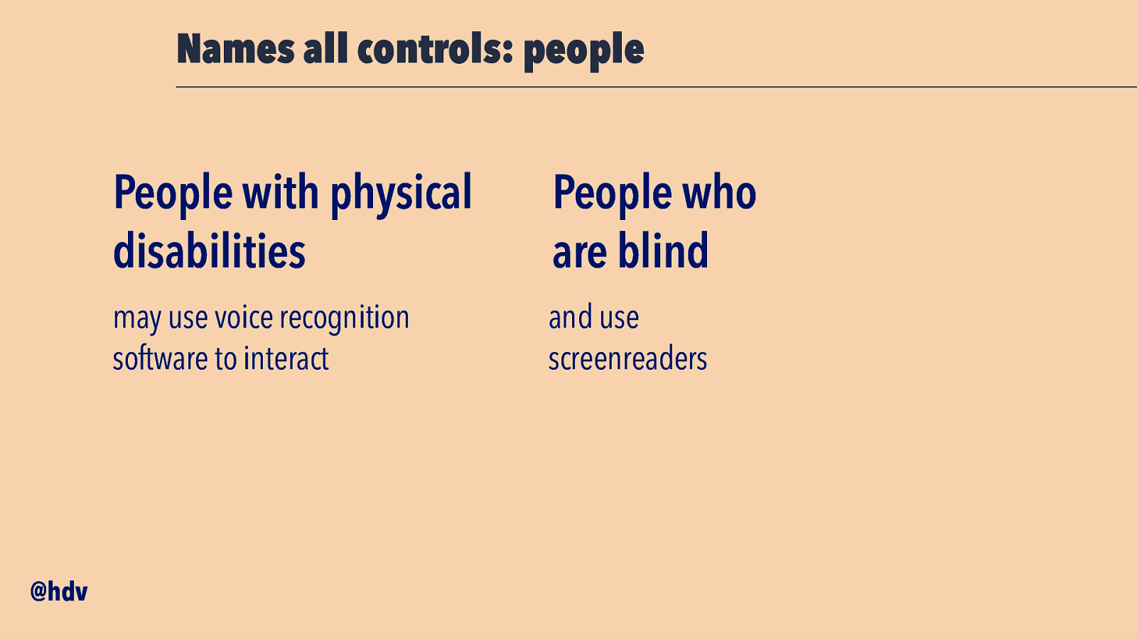
So, unnamed links make the life hard of screenreader users like Holly, and also for people who use software to control their device with voice.
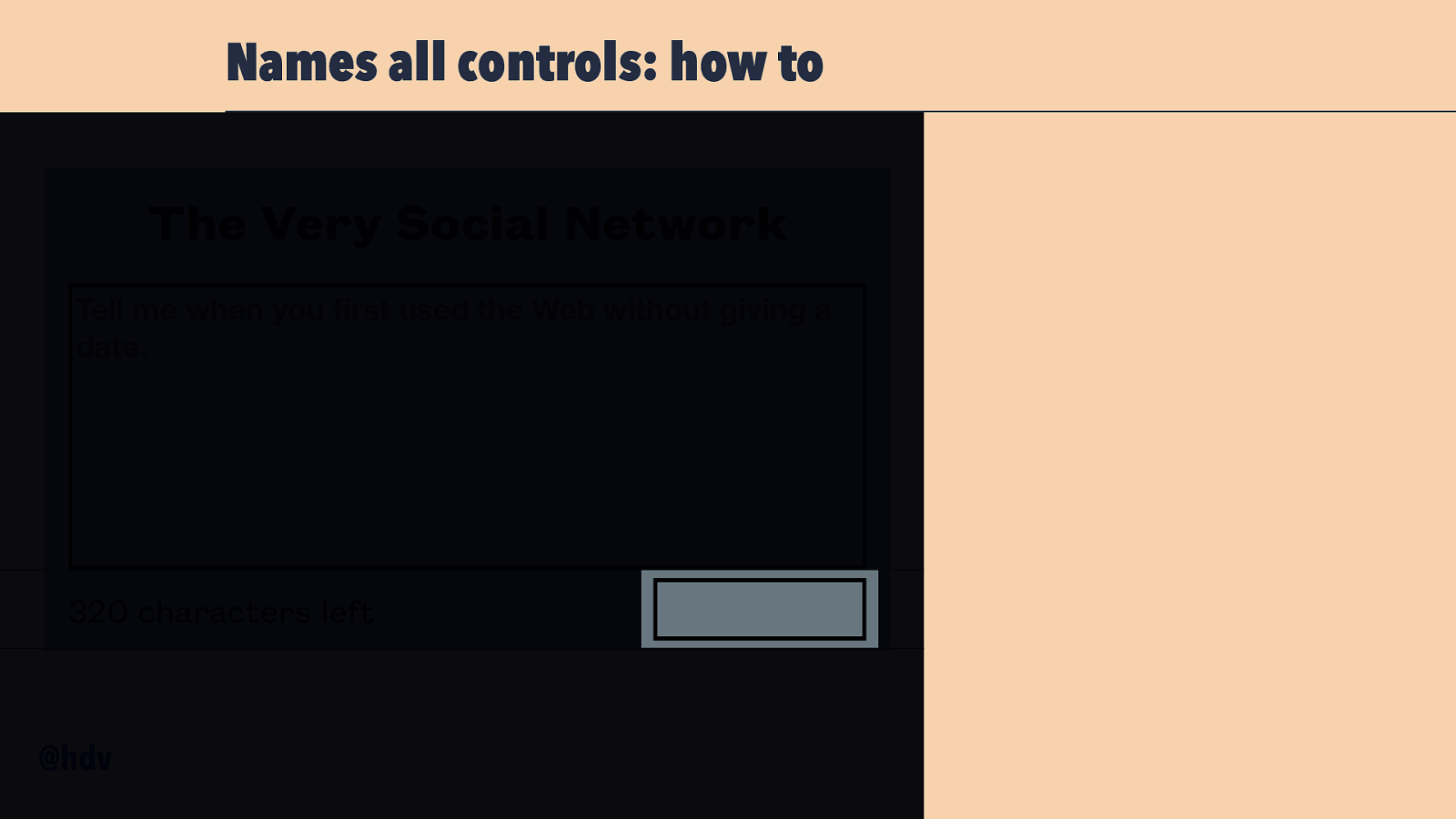
Slide 37
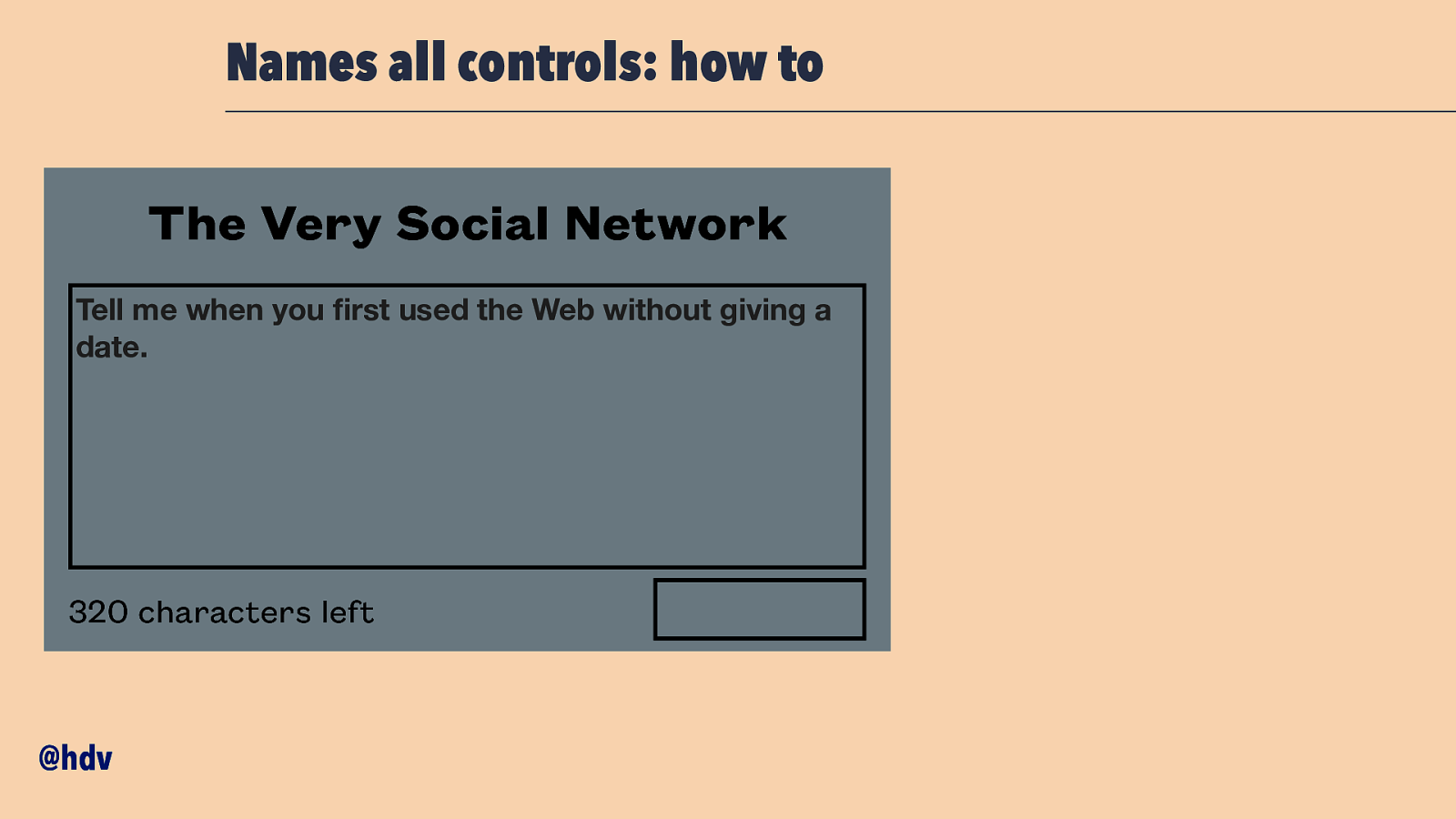
Let’s say you’re building a Very Social Network and there is this component with a text box and a send button.
Slide 38
Let’s focus on that button for a bit. How would we build that in HTML?
Slide 39
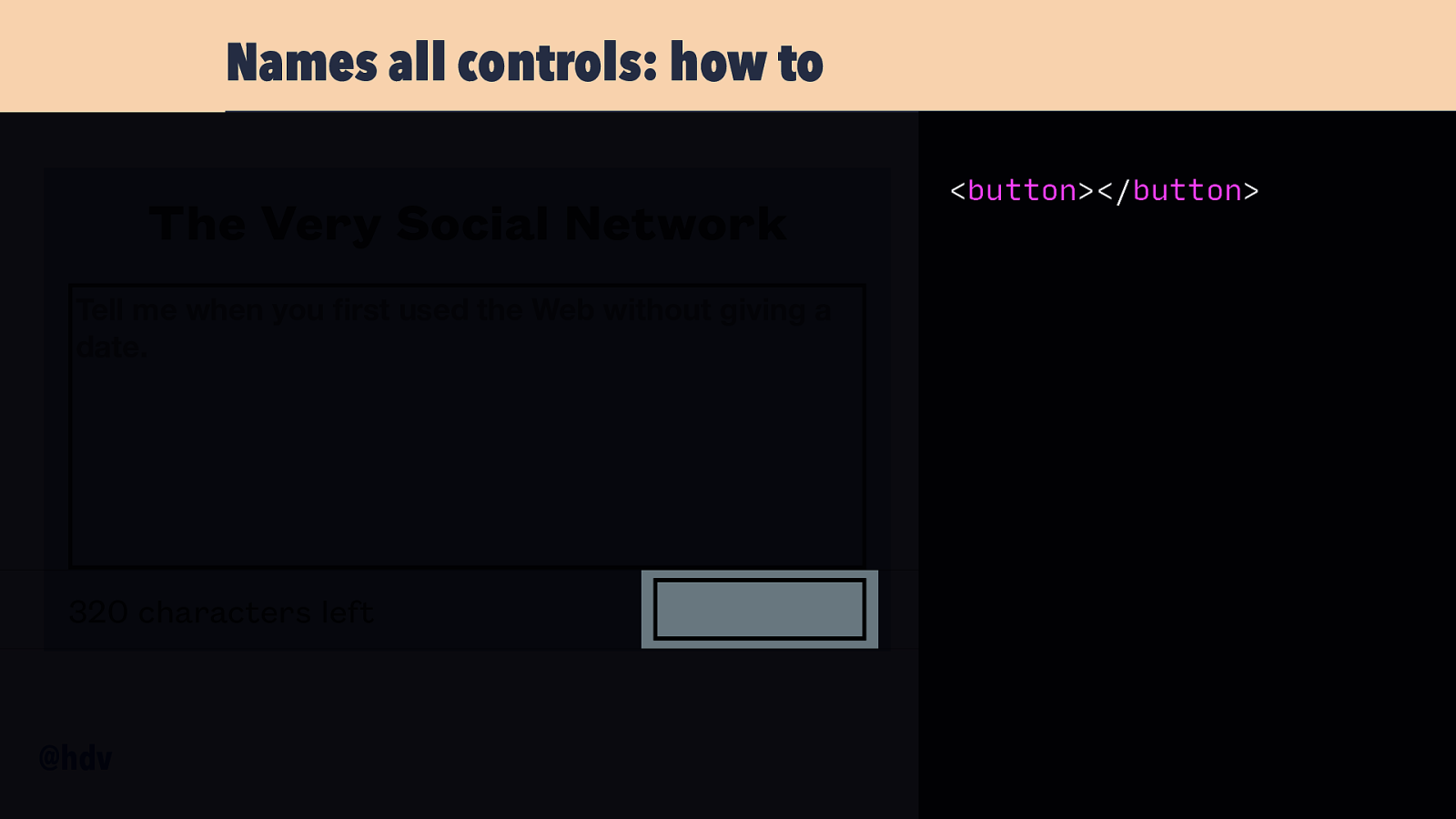
Probably by using a button element. As soon as we put that into our DOM, the browser will update the Accessibility Tree and assign it properties.
Slide 40
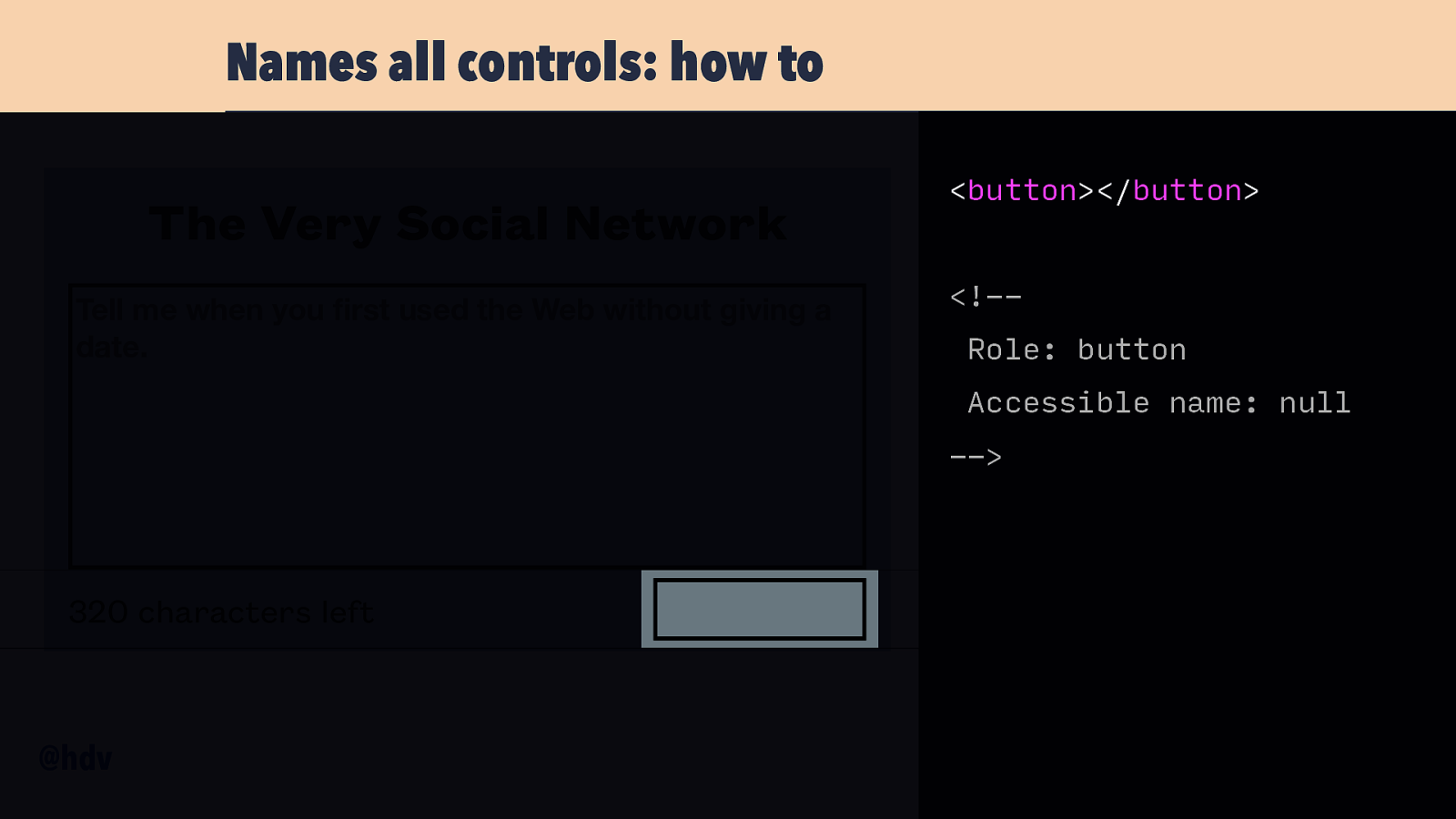
It will compute the role to be button, that is the default role for button elements, very convenient. It will also set an accessible name, which will resolve to ‘null’, or the empty string in some browsers. That’s not great, because this way, assistive tech can only refer to it as ‘that button’, and users will be unable to distinguish it from other buttons.
Slide 41
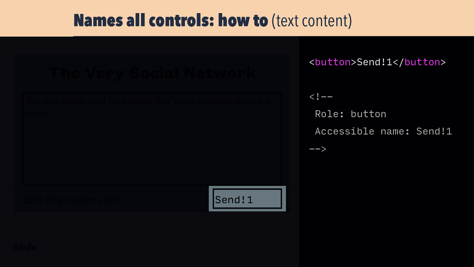
If we put some name inside the button, that text will become the accessible name. If we write ‘Send’ inside the button, the accessible name will compute to ‘Send’. I could stop here, really, because this is the most effective and easy to use way to name a button. Or a link, for that matter. Text content it is.
Slide 42
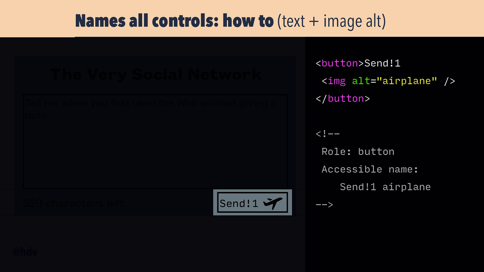
But there are other things that can contribute to names, too. For instance, images with alternative text. Let’s say I’ve put an image of an aeroplane inside my button. With an alt text of ‘airplane’, and the existing preceding text of ‘Send’, our button will now read ‘Send airplane’. This may be super confusing, will this button send airplanes? To where? In a pandemic?
Slide 43
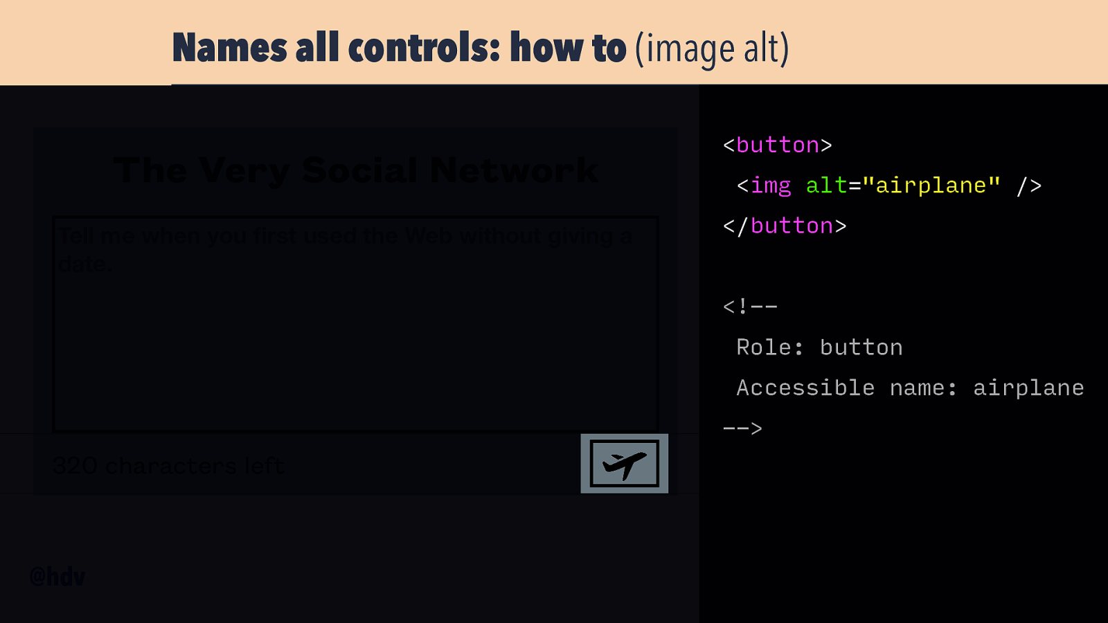
This also happens without other texts: with just an image as button context, the alt of that image will be the button’s name. I see this a lot in audits, where folks link to the homepage with a logo, and the name of that link is the alternative text of the logo. Something to keep in mind.
Slide 44
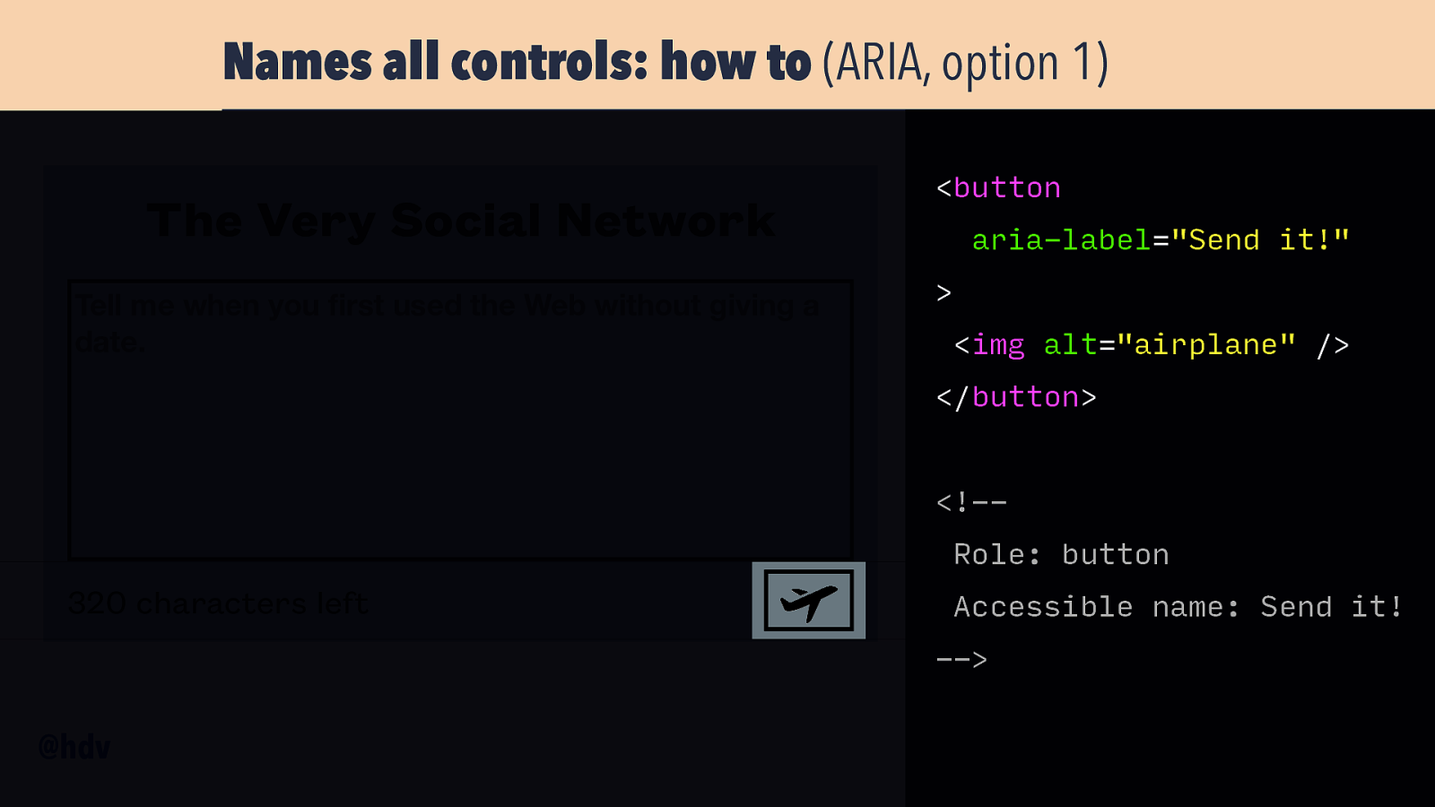
You can also name stuff with ARIA, for instance with the aria-label attribute that you can add to the button element. It overrides the button content, so with aria-label=”Send it” and an image inside the button, the name will still be “Send it”.
Slide 45
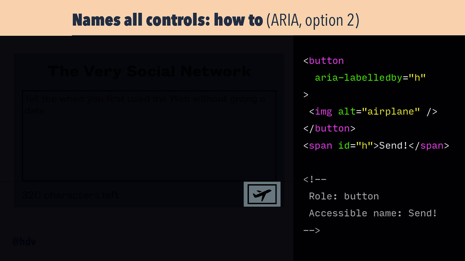
Or you can use aria-labelledby, which you can use to refer to some other element on the page, that will then become the name.
Slide 46
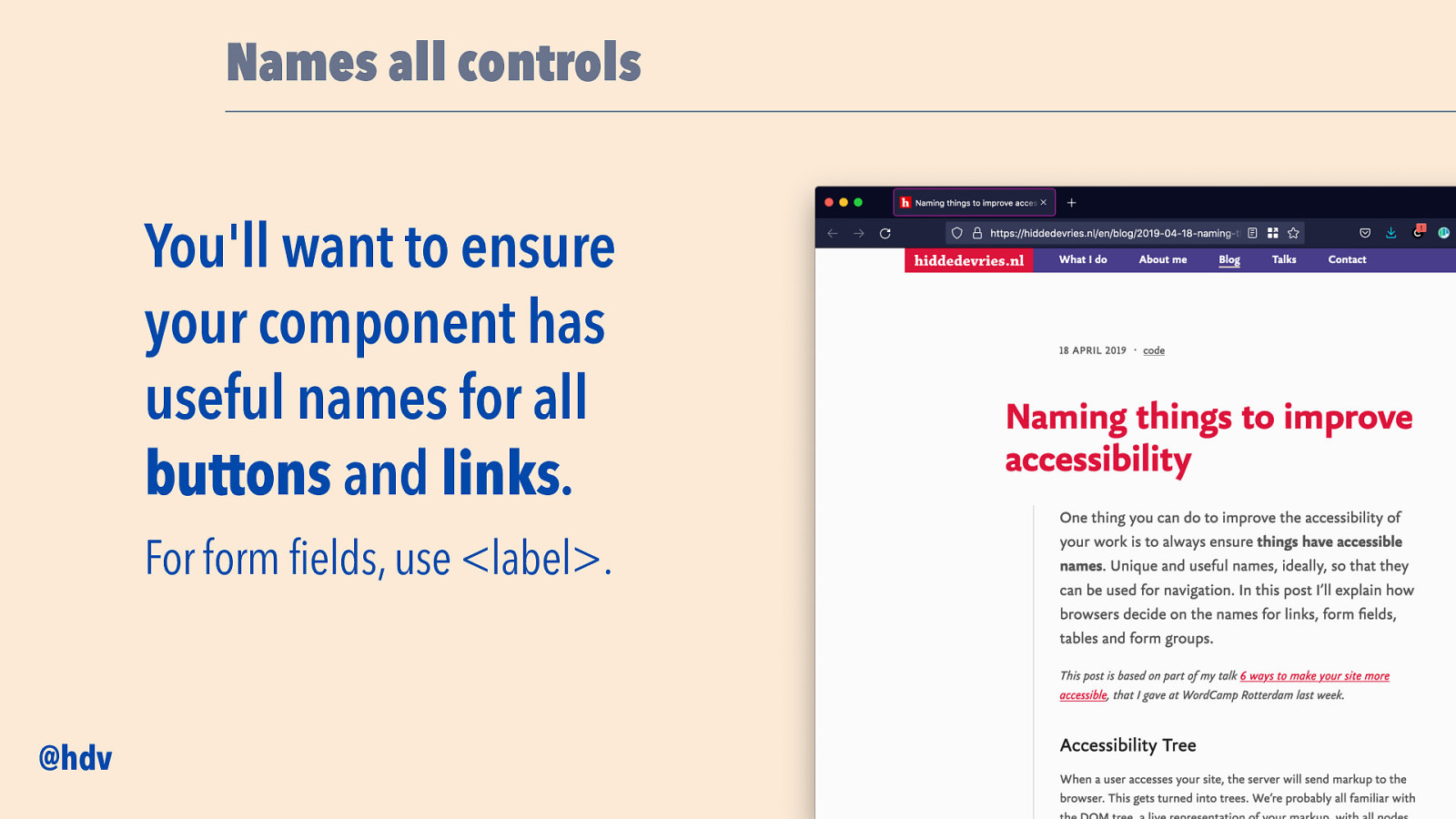
If you want to read more about this at your own page, I have a blog post called Naming things to improve accessibility which explains these mechanisms in detail, also for form fields and tables.
Slide 47
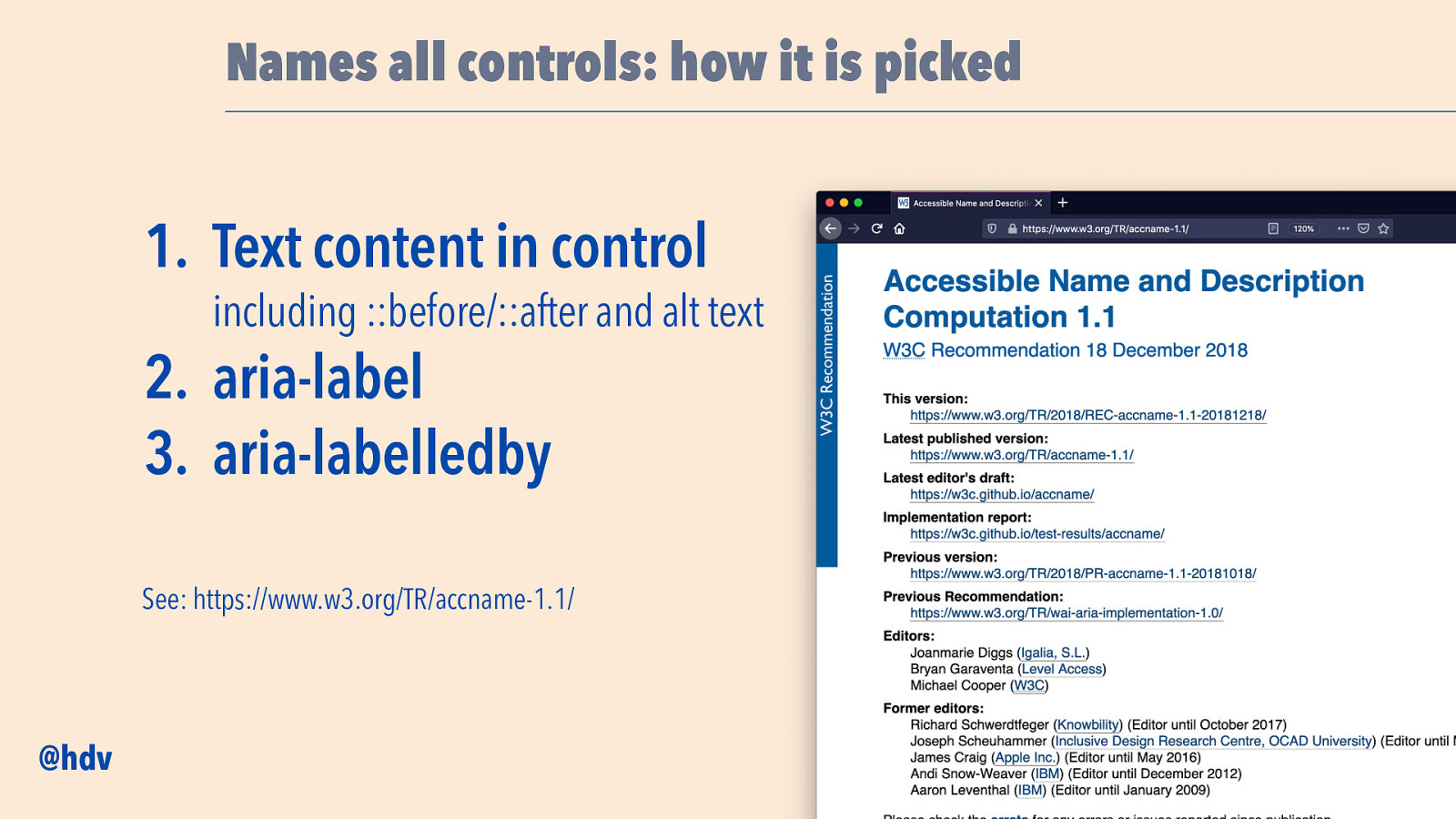
Or if you want to know exactly how names are computed: check out the specification for it: Accessible Name and Description Computation 1.1. In summary, this is the order of things names get picked: first, text content, then aria-label, it will override text content, then aria-labelledby, it will override either of those two.
Slide 48
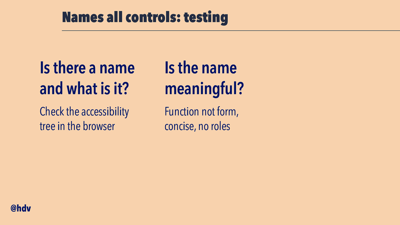
The things to check when it comes to names: is there a name and what is it? You can find this in your browser’s accessibility tree, for instance the Accessibility tab in Firefox and the element popover in Chromium-based browsers.
Then, decide if the name is meaningful. Make sure it describes function, not form, so if you have an airoplane for a send button, still call the button ‘Send’, not ‘airoplane’. The web is full of buttons that are called hamburger, but people who cannot see the visual metaphor are lost as to what this means. ‘Open menu’ would be a much better name for those. Also, be concise, so prefer ‘Send’ to ‘Hello if you want to send this press here’. Well, pretty much the same advice as for buttons in general. And lastly, avoid roles in names. Don’t name the send button ‘send button’, name it ‘send’, because the role is already set in the role property.
Slide 49
Then, accessible components should also work well with browser zoom.
Slide 50
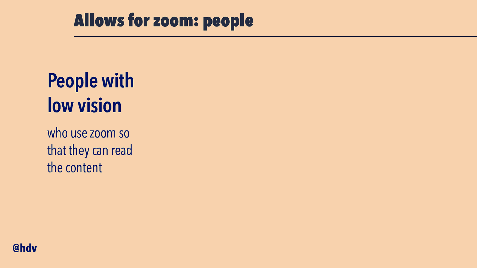
People with low vision often rely on zoom to read content. This could be 150% zoom, but also 400%.
Slide 51
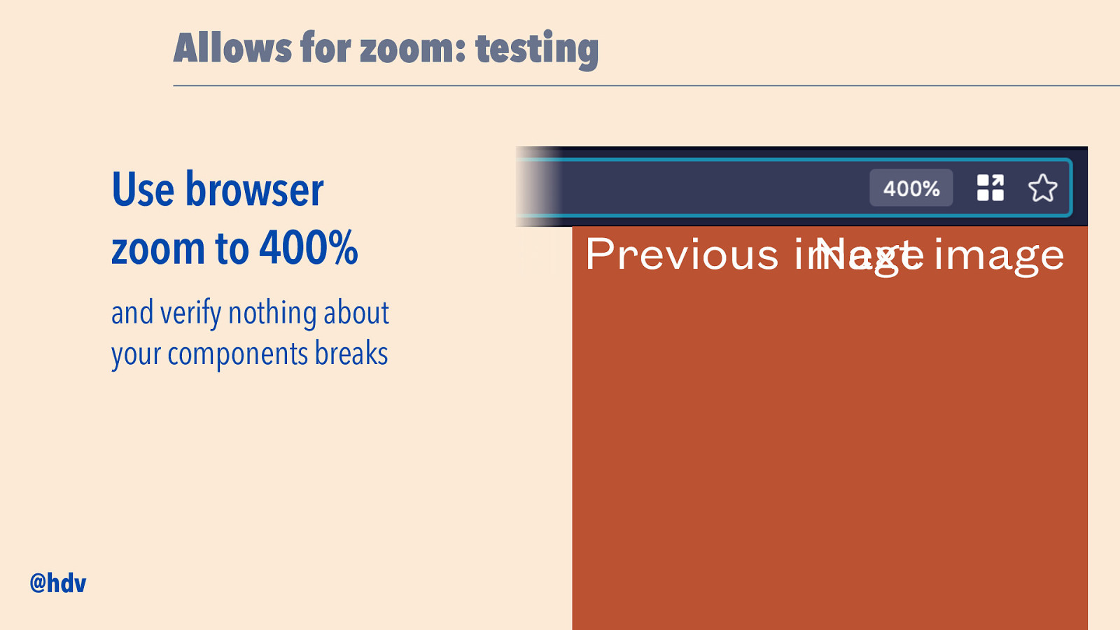
Following accessibility standards, we want to make sure the interface doesn’t break when we zoom up to 400%. So let’s say we have a button “previous image” and one “next image”, one left, one right, when we zoom in, there may start to overlap at some point. If that happens they both become unreadable and users won’t know what the buttons are for.
This is pretty much responsive design: if there’s less space, we’ll need different solutions. For instance, wrap the words over multiple lines or use shorter texts.
Slide 52
Something else that can be baked into components as a basic layer of accessibility, is to convey states to assistive technologies.
Slide 53
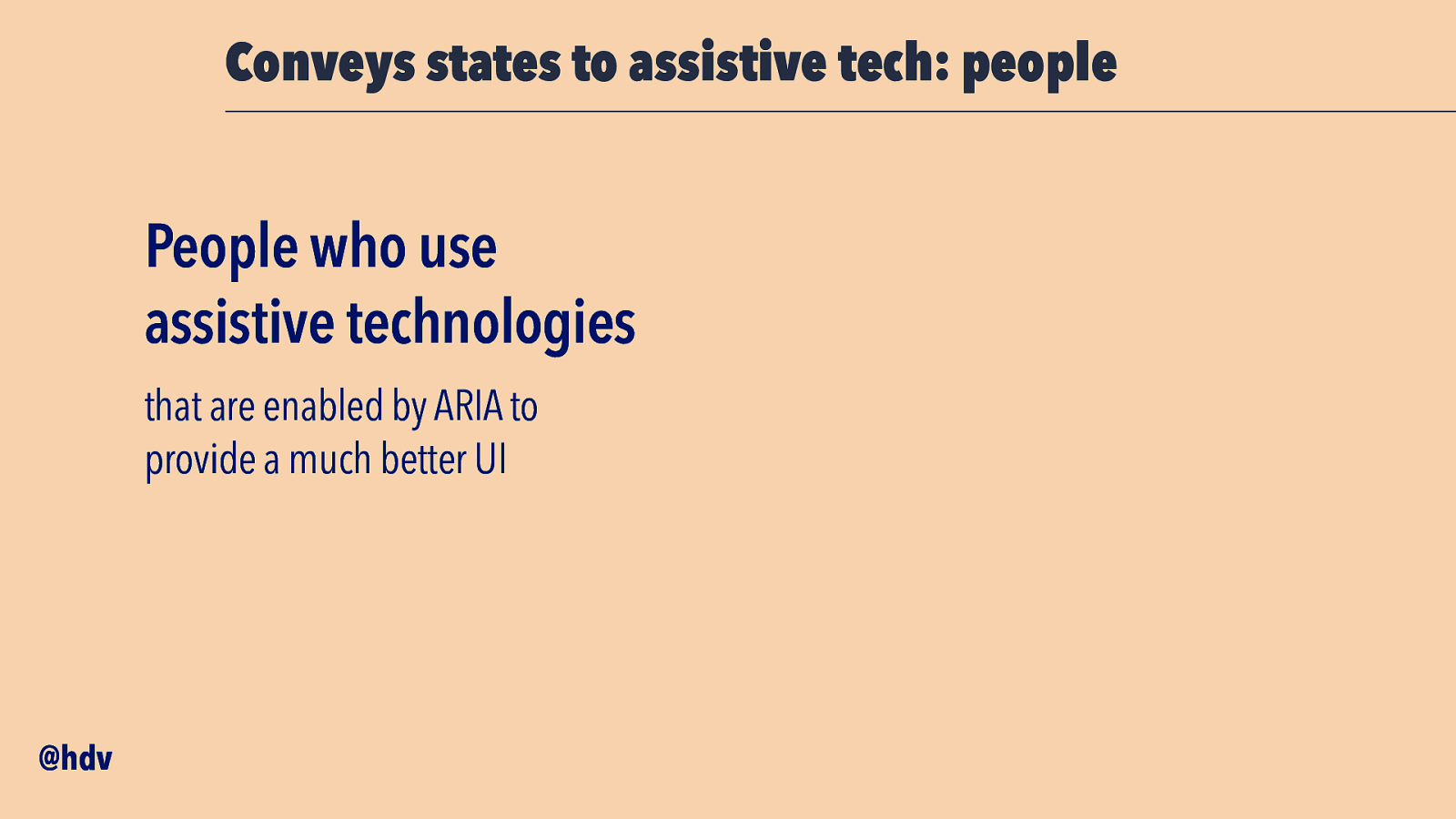
This is important to anyone who uses assistive technologies, like screenreaders and voice control.
Slide 54
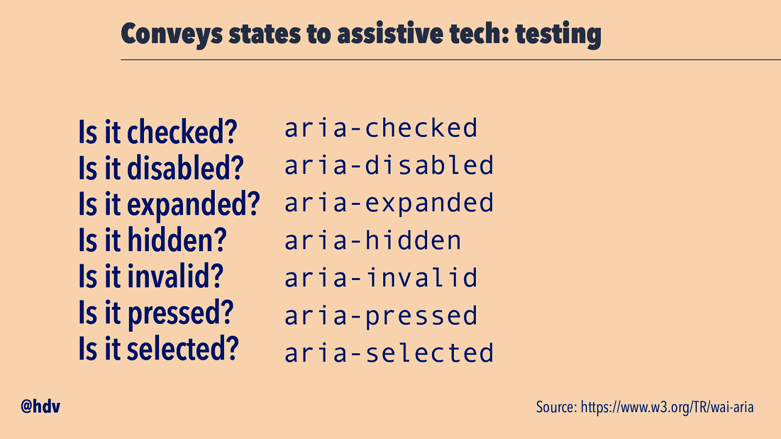
You’ll want to make sure the states within your components are conveyed through the Accessibility Tree: is it checked, disabled, expanded, hidden, invalid, pressed or selected? Make sure that it gets reflected in ARIA attributes (with exception of aria-checked, which you can do with a native input type is checkbox).
Slide 55
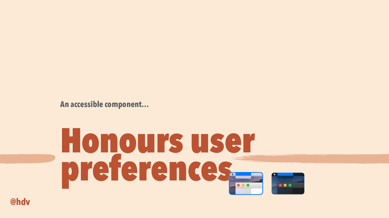
The last thing I wanted to talk about that can help bake accessibility into your components, is to really be sure to honour user preferences. This is a common theme across a lot of accessibility work, and it makes sense, because you don’t know what sort of device your user will use when they come to your site. If they’re on a phone or a tablet, a black and white screen, you name it… they may also have set preferences in terms of what they want to see, which is what I want to talk about a bit.
Slide 56
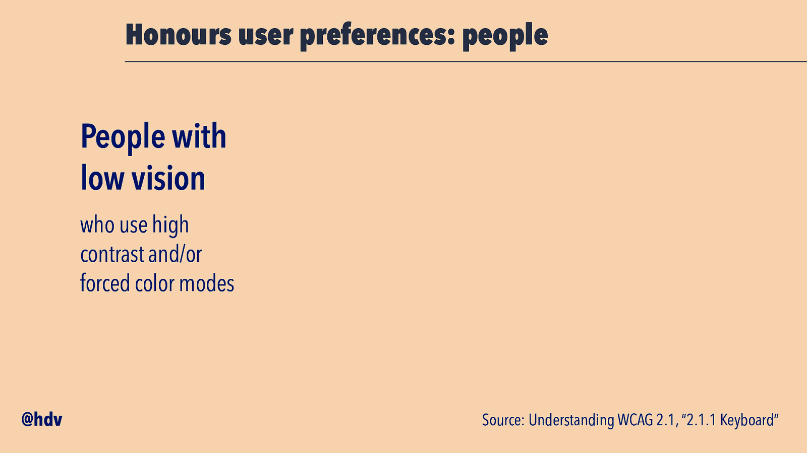
This is important for people with low vision, who may be using high contrast or other forced color modes.
Slide 57
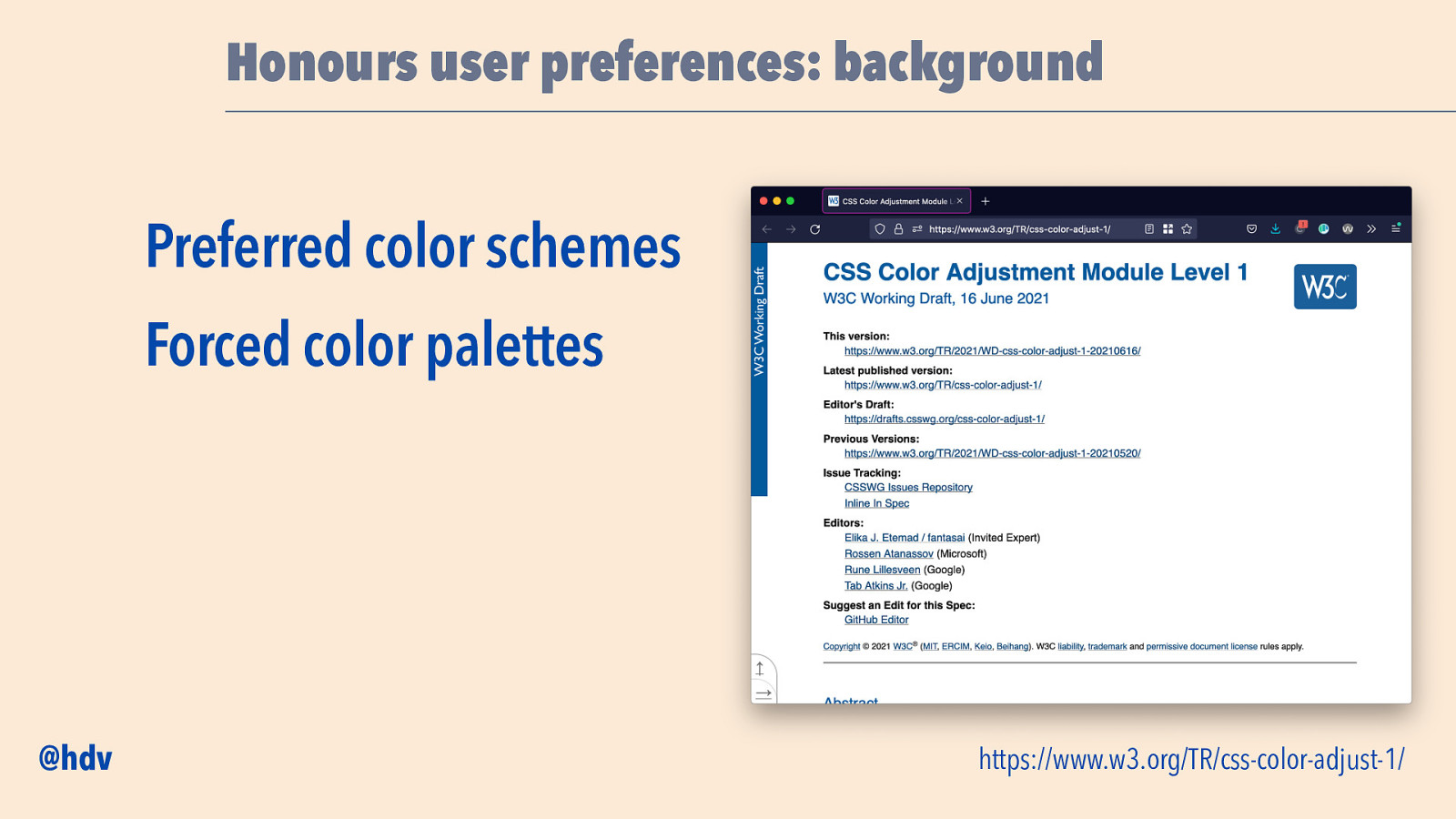
In terms of color modes, there is the CSS Color Adjustment Module in CSS, where two types of color modes are described: preferred colour schemes, which is you setting colors based on a media query for stuff like dark and light mode, and forced color palettes, which is the browser of the platform forcing certain colours on your website based on user preferences. I will discuss the latter here: forced palettes. The most common implementation of that is High Contrast Mode on Windows.
Slide 58
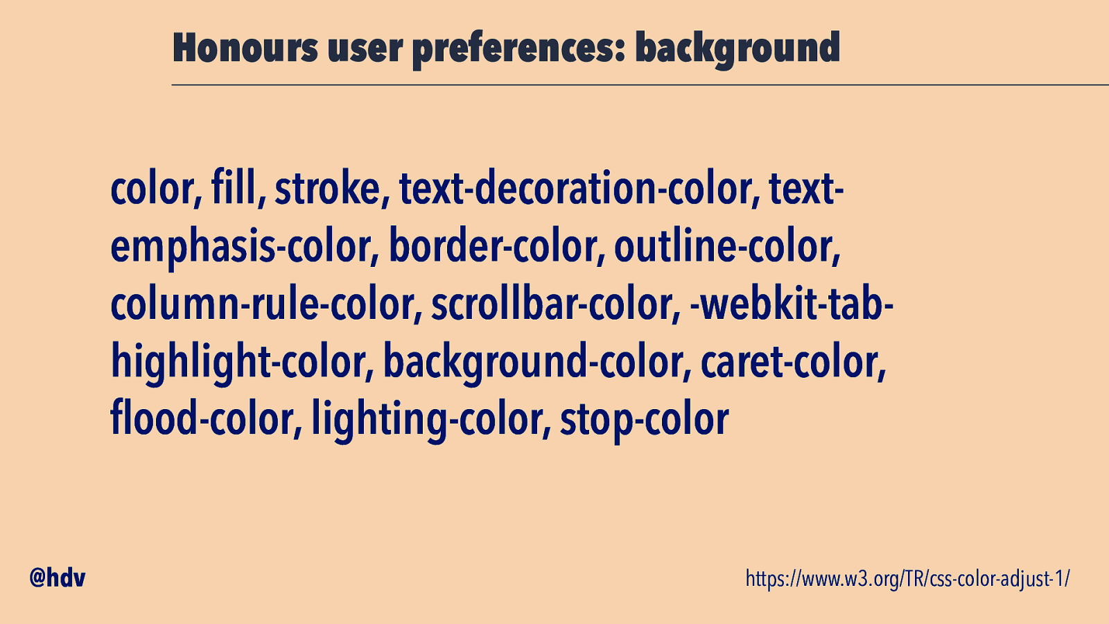
There are a bunch of CSS properties related to colour that may get different values if the user uses this mode.
They are: color, fill, stroke, text-decoration-color, textemphasis-color, border-color, outline-color, column-rule-color, scrollbar-color, -webkit-tabhighlight-color, background-color, caret-color, flood-color, lighting-color and stop-color.
Slide 59
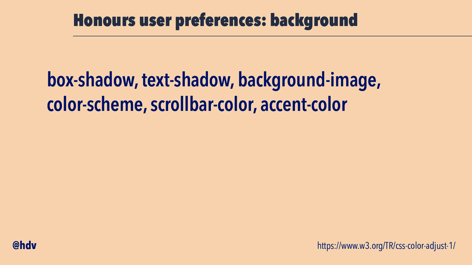
There are also properties that could get completely reset: box-shadow, text-shadow, background-image, color-scheme, scrollbar-color and accent-color.
Slide 60
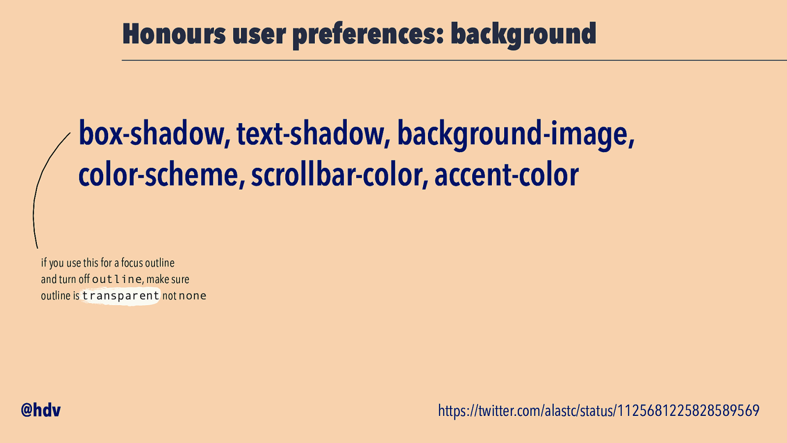
Should you be using box-shadow as a focus outline, be careful. If you’ve unset the outline property with none, that may result in no outline for users with High Contrast Mode turned on. You’ll want to unset it usin outline-color transparent, rather than no outline at all, so that in the case your box-shadow is reset, you’ll still have the outline as a fallback (which will get assigned a colour by the browser).
Slide 61
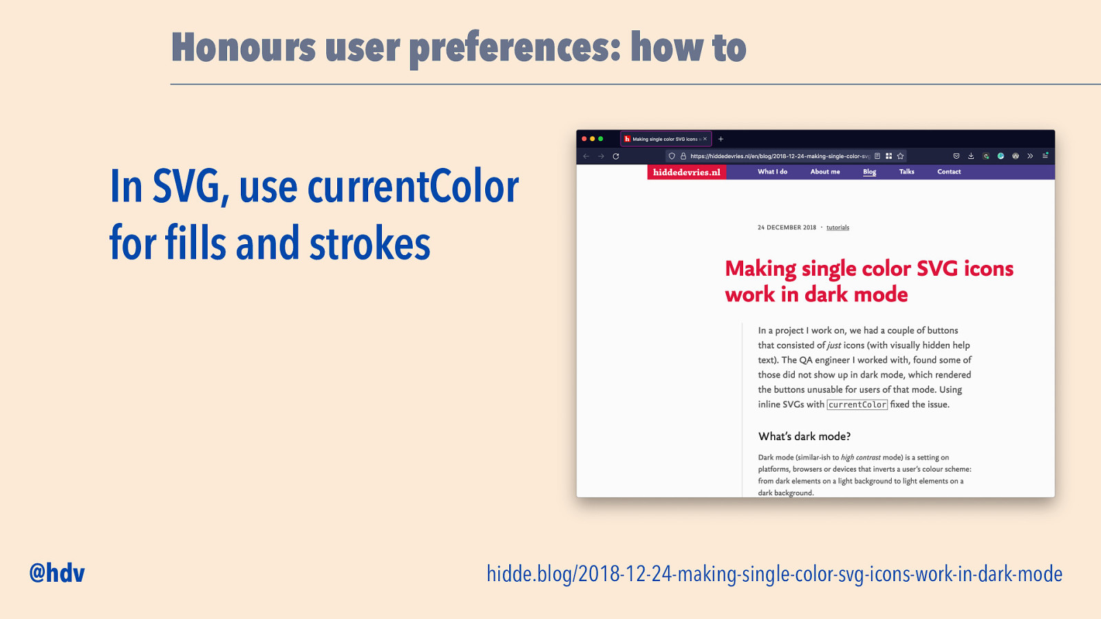
If you’re using SVGs that are single colour and take the text colour, you’ll likely want to use currentColor to assign that colour, so that if the text colour in the page gets changed by High Contrast Mode, the icons do too.
Slide 62
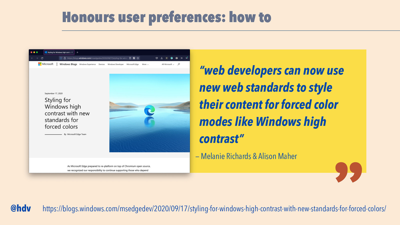
In the interest of time I can’t go into too much detail, but I’d like to refer you to this excellent blog post from Melanie Richards and Alison Maher, from the Edge team, where they write about how to use these. “Web developers can now use new web standards to style their content for forced color modes like Windows high contrast”.
Slide 63
Before I let you go I want to mention this new proposal that is being worked on: Accessibility Object Model, or AOM. We talked about the Accessibility Tree earlier.
The Accessibility Object Model would give you some access to the the Accessibility Tree through JavaScript. I’m not sure if I can 100% compare, but I like to think AOM gives developers access to the accessibility laye, like Houdini gives developers access to the style layer, and Service Workers give developers access to the network layer. Again, not sure if the comparison works exactly, but like those others, it is lots of power, and lots of responsibility.
Slide 64
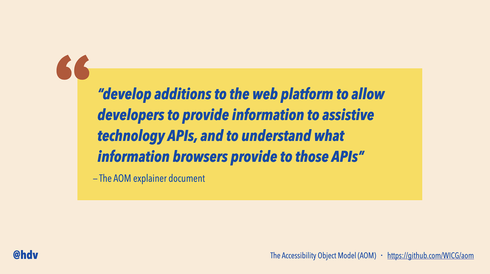
The goal of AOM is to “develop additions to the web platform to allow developers to provide information to assistive technology APIs, and to understand what information browsers provide to those APIs”, says the explainer document.
Slide 65
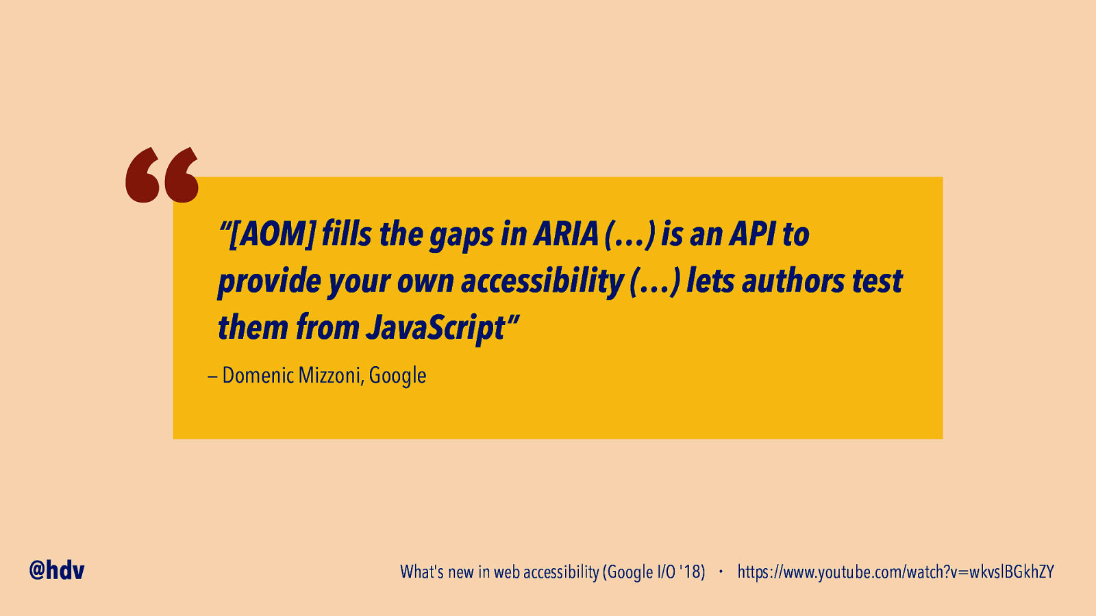
In a presentation at Google I/O in 2018, Domenic Mizzoni of Google said that “[AOM] fills the gaps in ARIA (…) is an API to provide your own accessibility (…) lets authors test them from JavaScript”.
Slide 66
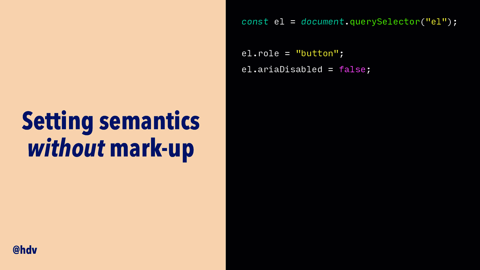
One of the things the proposals talk about, is to allow you to set some accesibility properties in JavaScript. So rather than adding them as attributes in your HTML, you can set them when you create an element, or a custom element.
Code example:
const el = document.querySelector("el");
el.role = "button"; el.ariaDisabled = false;
Slide 67
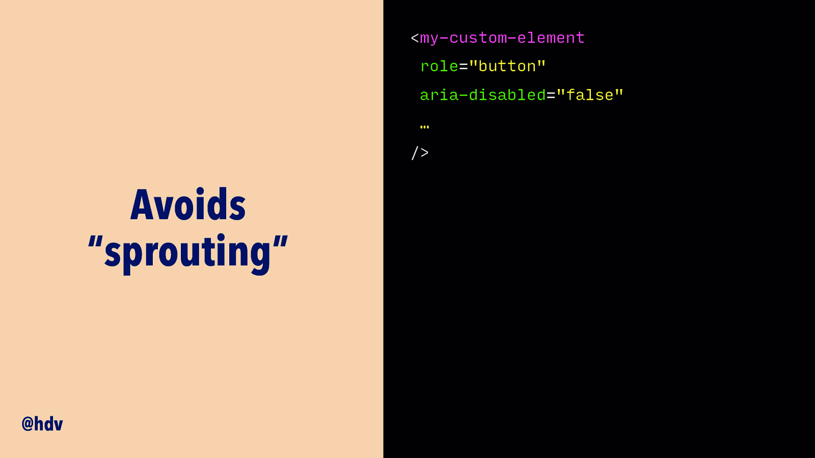
This would mean you avoid “sprouting”, as they call it in the explainer, having to add too many attributes to each of your component instances.
Slide 68
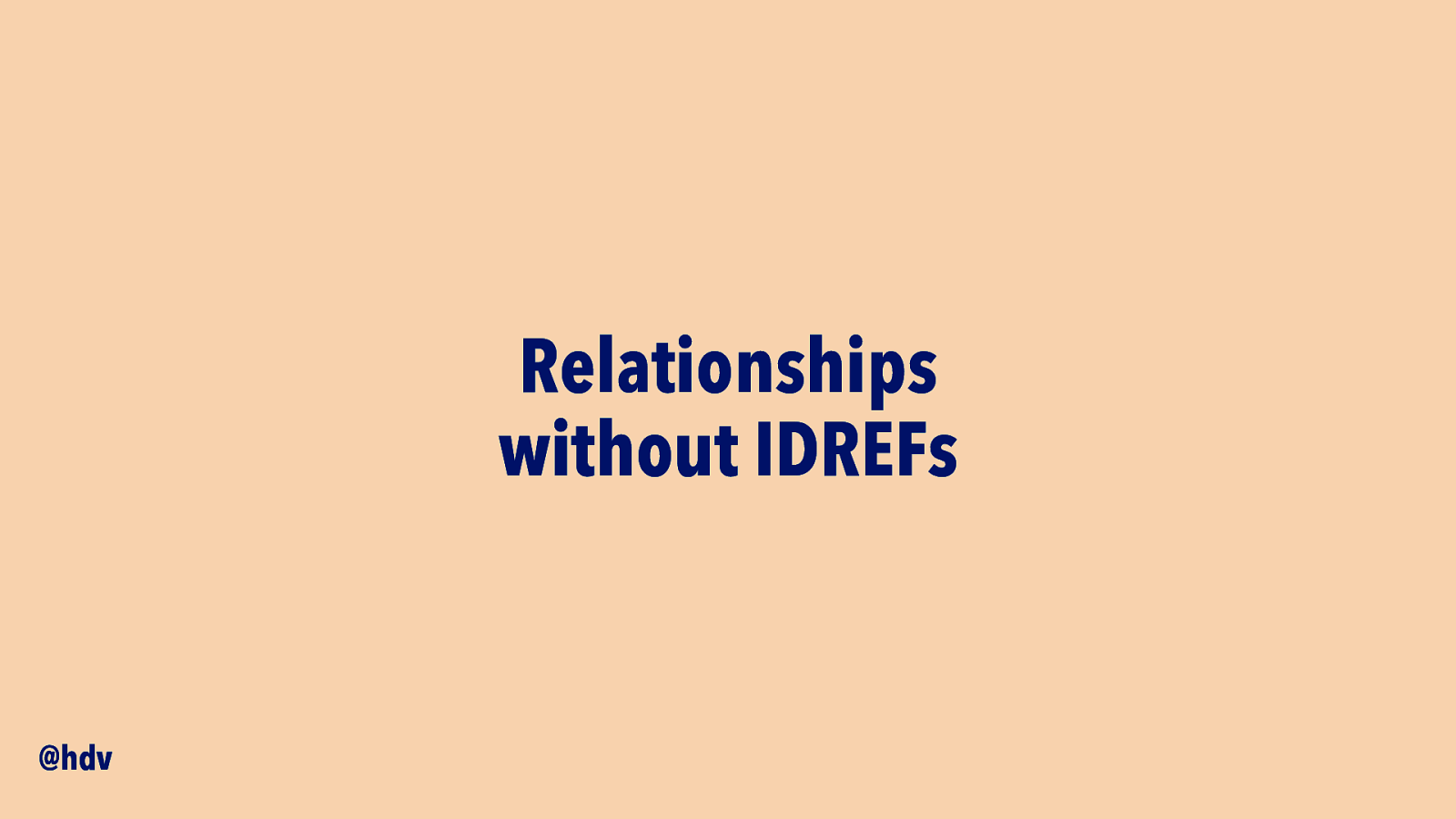
It is also planned to let you add relationships between elements right in JavaScript. A label and form element are related with a corresponding for and id attribute, and in ARIA there are a bunch of relationships like that for which no IDL properties exist. AOM could introduce those.
Slide 69
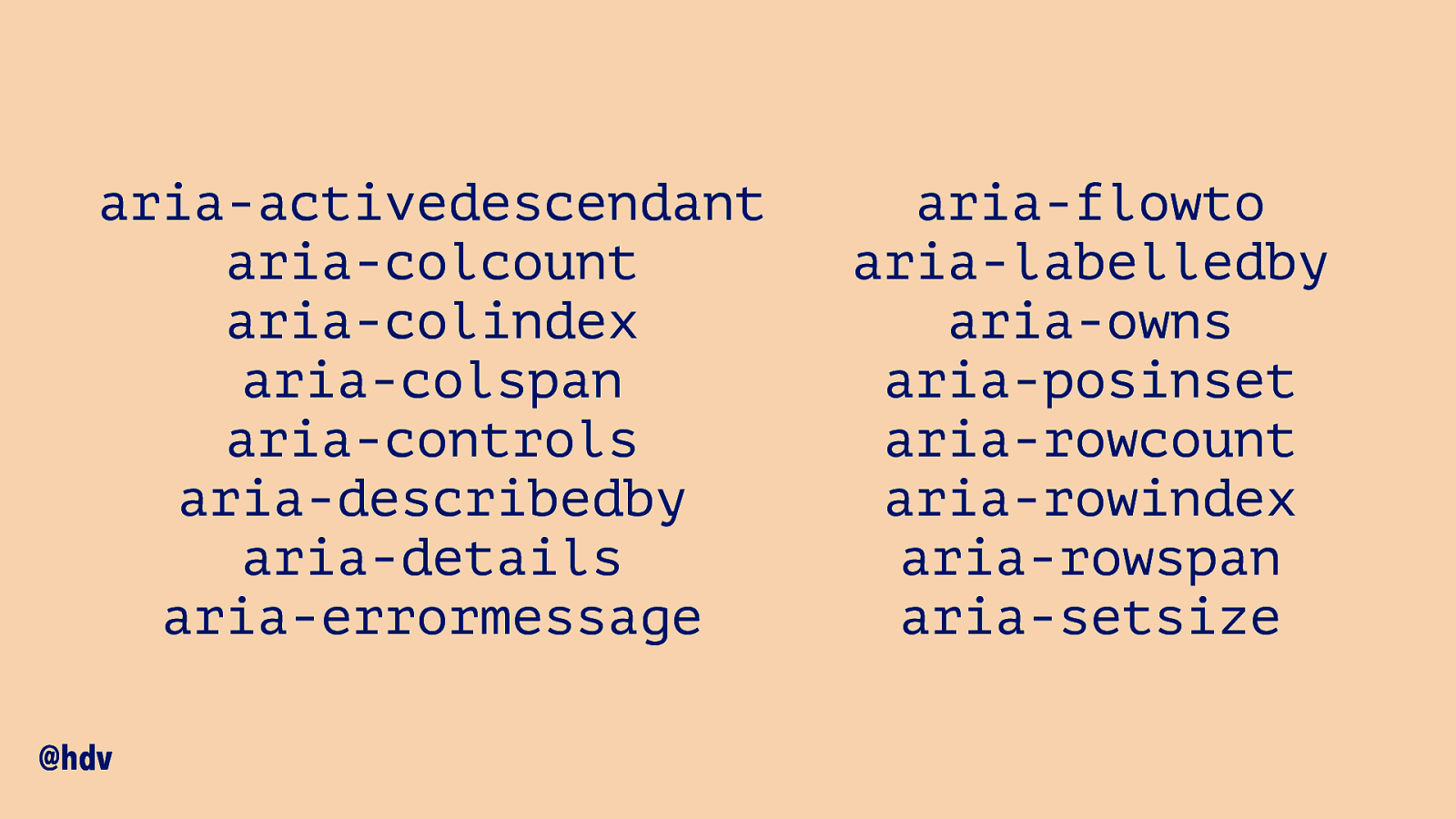
This could apply to a lot of ARIA attributes.
Full list: aria-activedescendant aria-colcount aria-colindex aria-colspan aria-controls aria-describedby aria-details aria-errormessage aria-flowto aria-labelledby aria-owns aria-posinset aria-rowcount aria-rowindex aria-rowspan aria-setsize
Slide 70
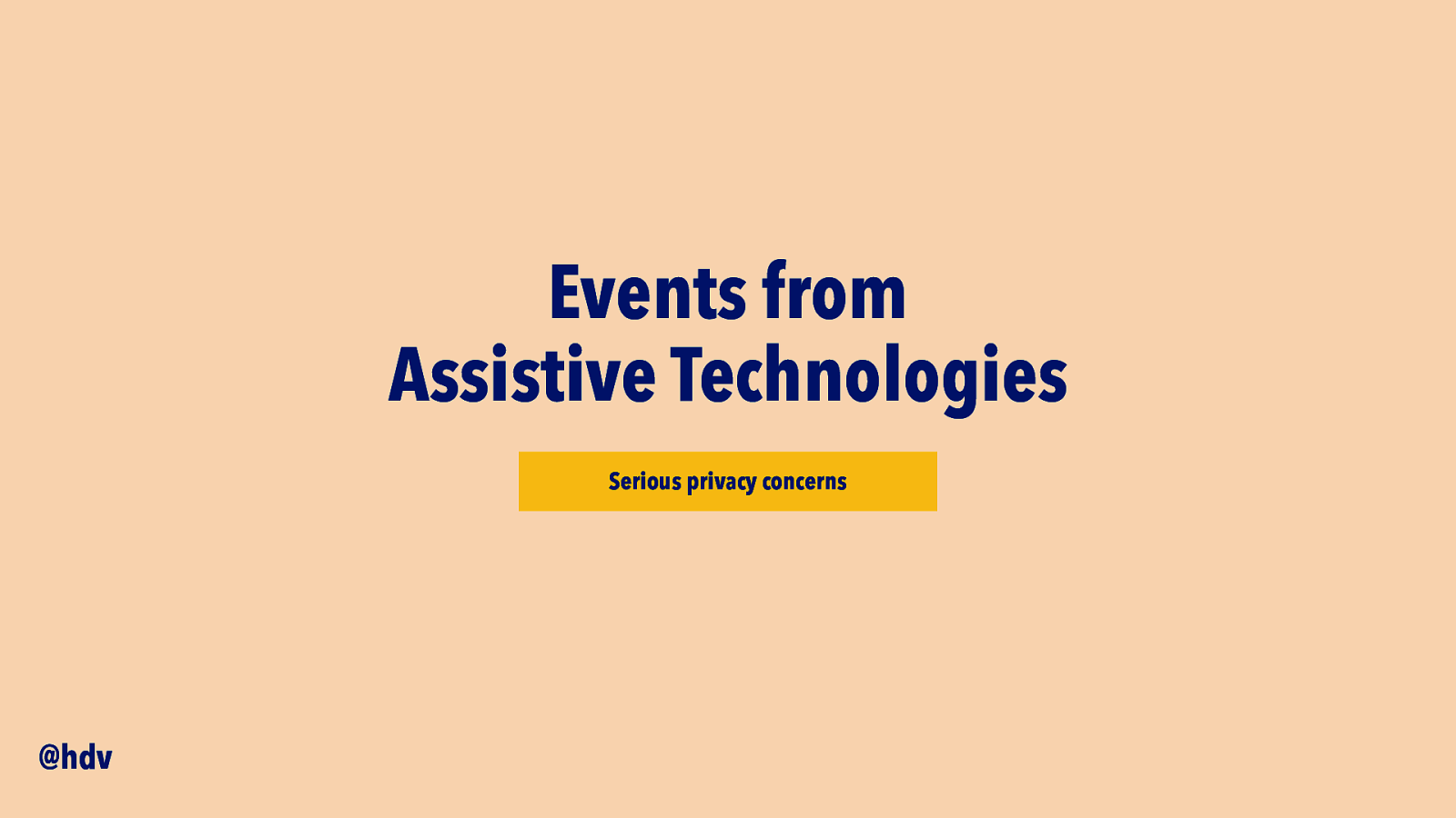
There has also been talk about exposing events from Assistive Technologies, but there has been a lot of pushback. This would essentially allow developers to find out whether are using assistive technologies, which is a degree of data leak that may not be worth any of the imagined benefits.
Slide 71
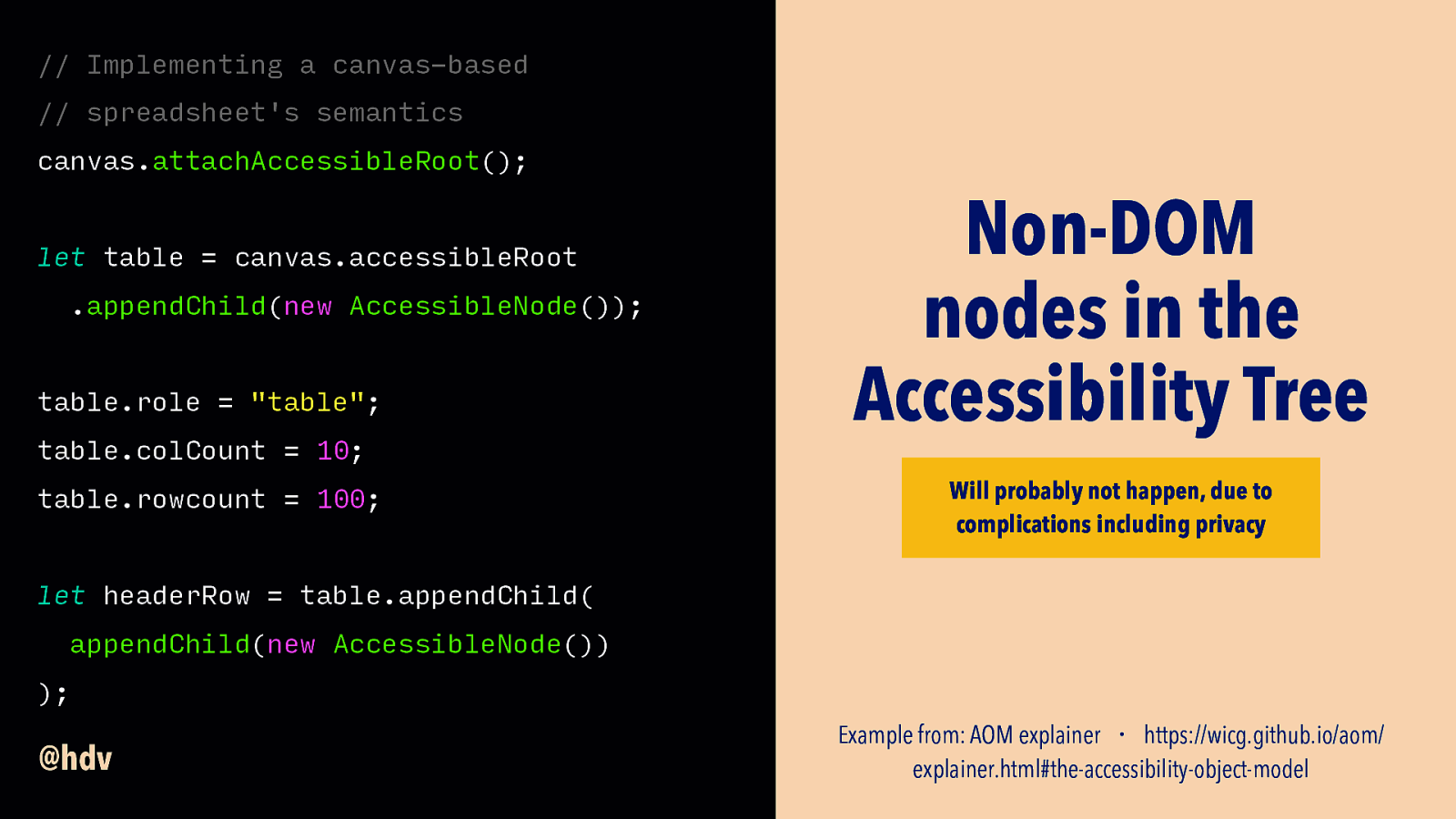
The same is the case for an idea that would allow developers to insert nodes into the Accessibility Tree that don’t exist in the DOM. Again, currently developers just interact with the DOM and they can’t know whether that DOM is then used to create an Accessibility Tree; if they could interact with the Accesibility Tree directly in this way, they could find out if users were using assistive technologies and that is a privacy concern.
Slide 72
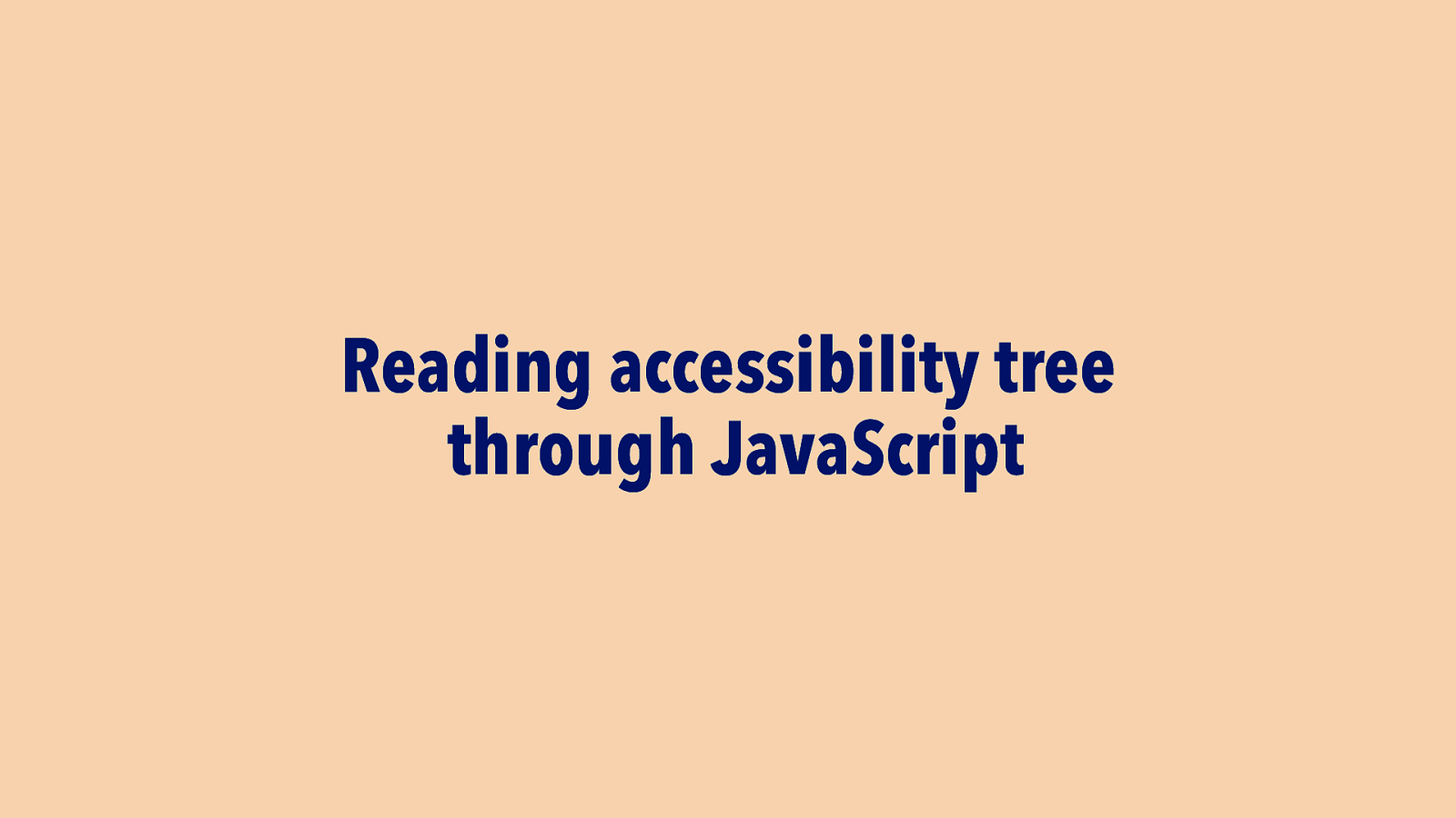
Something that does sound promising is the idea of allowing developers to read from the accessibility tree in JavaScript. This may be useful when writing tests, so that actually computed names, roles and valus could be tested against, rather than just the existence of attributes and text content in the DOM.
Slide 73

So, that’s pretty much what I wanted to share with you today.
Slide 74
Let me quickly reiterate what I hope you’ll take away from this.
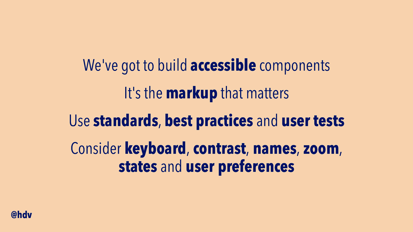
Firstly, we’ve got to build accessible components, so that we can repeat accessibility and not inaccessibility.
For this, markup is essential, and I encourage everyone to hire for HTML knowledge, make it a point in job interviews.
To get accessibility right, you’ll likely need a combination of accessibility standards, best practices and user tests.
For each component, best consider that it works with keyboard, has plenty of contrast, there are names for all controls, it can be zoomed, states are exposed and user preferences are honoured.
Slide 75
That’s all for me, thanks so much for listening!