Dialog dilemmas and modal mischief: a deep dive into popovers and how to build them
A presentation at Front Conference in in Zürich, Switzerland by Hidde de Vries
t u o b a e r a s r e v o p o p w o h t o l e l o h w a e m o to bec d l i u b o t easier Hidde de Vries 1 September 2023 Front Conference, Zurich
& f e i h c s i Modal m g o l a di s a m m dile Hidde de Vries 1 September 2023 Front Conference, Zurich
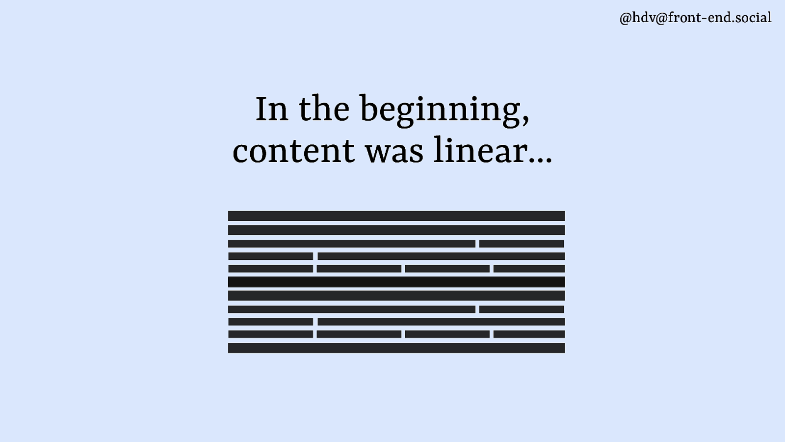
@hdv@front-end.social In the beginning, content was linear…
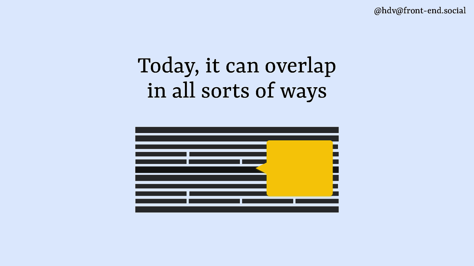
@hdv@front-end.social Today, it can overlap in all sorts of ways
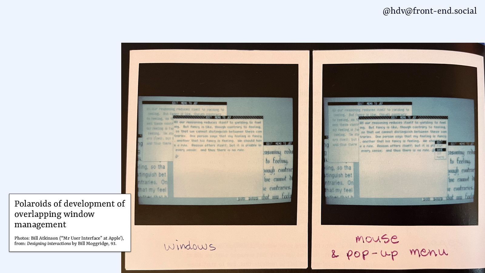
@hdv@front-end.social Polaroids of development of overlapping window management Photos: Bill Atkinson (‘“Mr User Interface” at Apple’), from: Designing interactions by Bill Moggridge, 93.
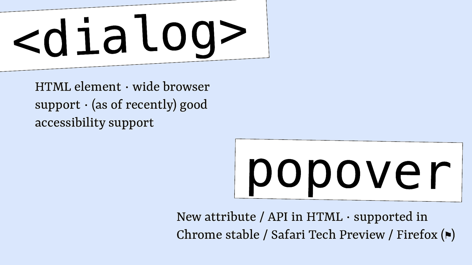
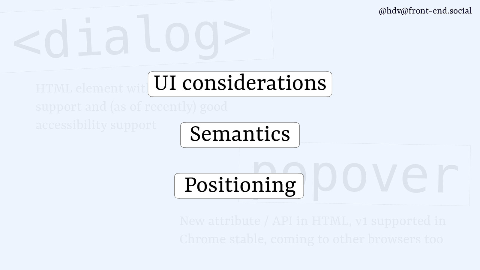
g o l a i <d HTML element ∙ wide browser support ∙ (as of recently) good accessibility support popover New attribute / API in HTML ∙ supported in Chrome stable / Safari Tech Preview / Firefox (⚑)

g o l a i <d @hdv@front-end.social UI considerations HTML element with wide browser support and (as of recently) good accessibility support Semantics popover Positioning New attribute / API in HTML, v1 supported in Chrome stable, coming to other browsers too
@hdv@front-end.social Hi, I’m Hidde developer relations + accessibility at NL Design System participant at Open UI CG hidde.blog LIKE & SUBSCRIBE
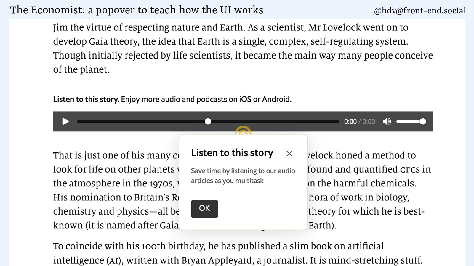
The Economist: a popover to teach how the UI works @hdv@front-end.social
@hdv@front-end.social
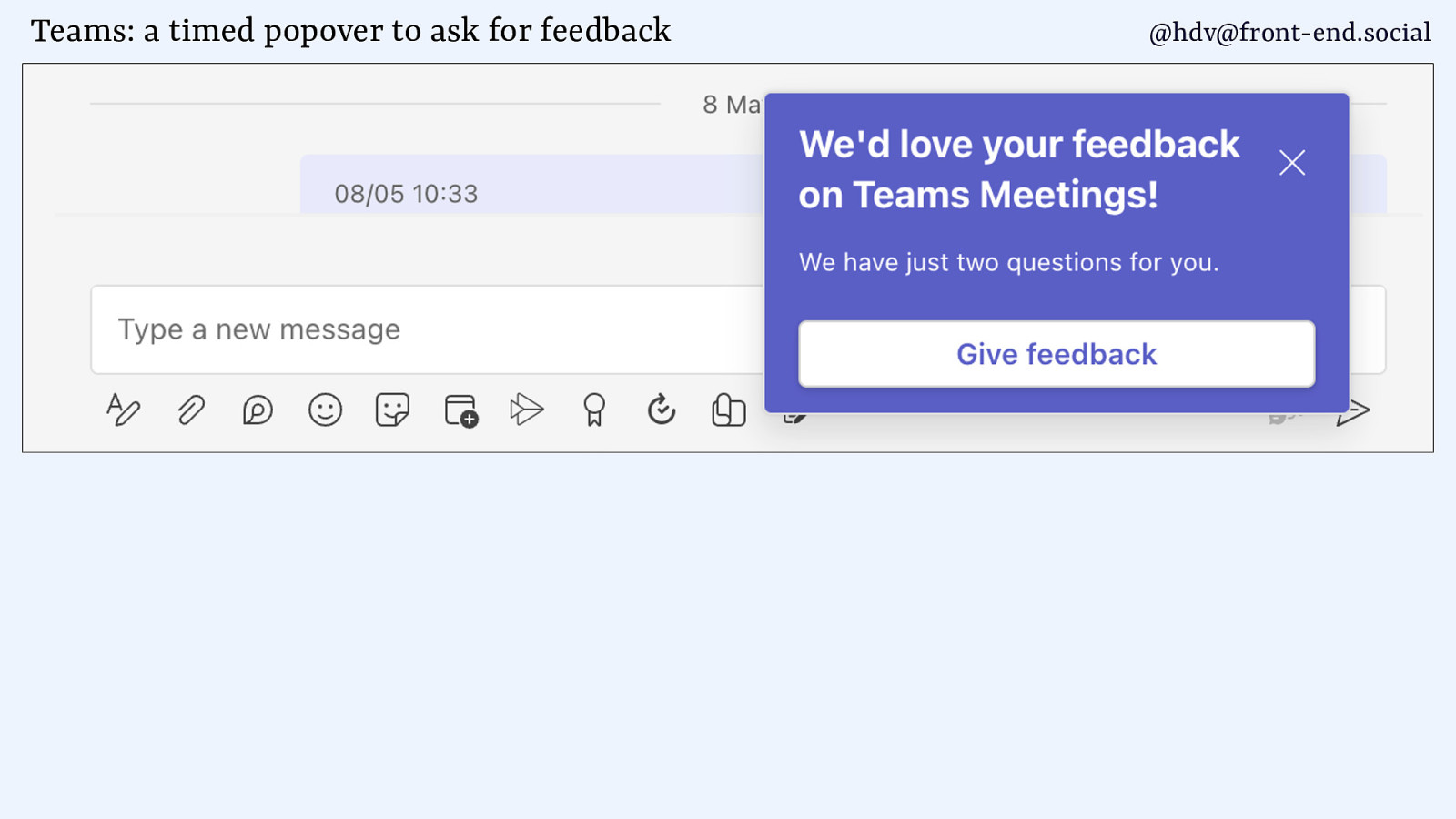
Teams: a timed popover to ask for feedback @hdv@front-end.social
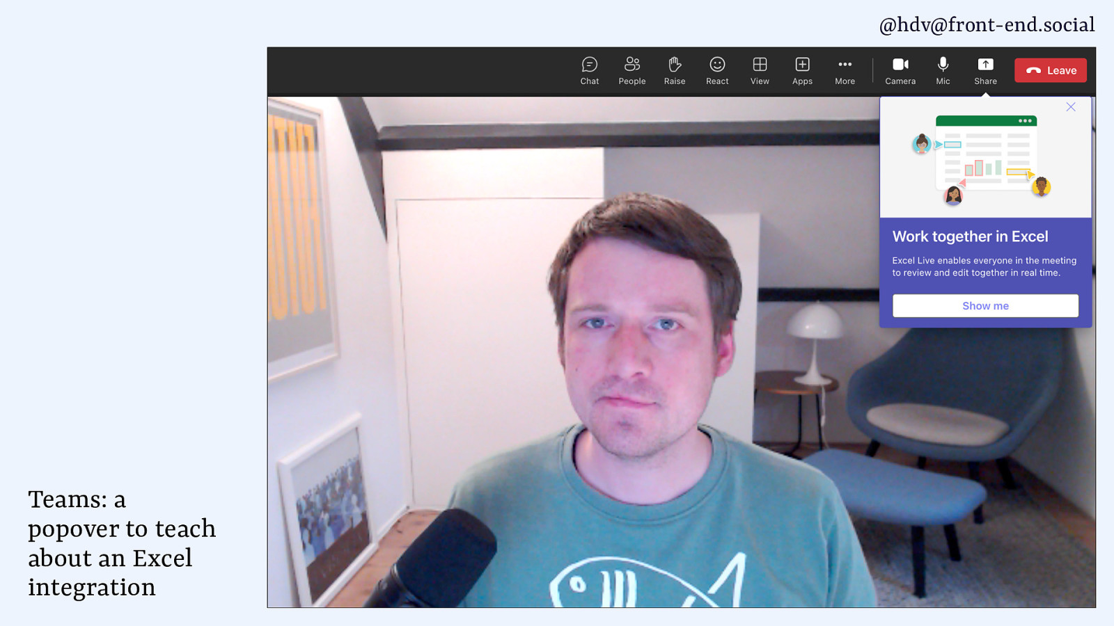
@hdv@front-end.social Teams: a popover to teach about an Excel integration
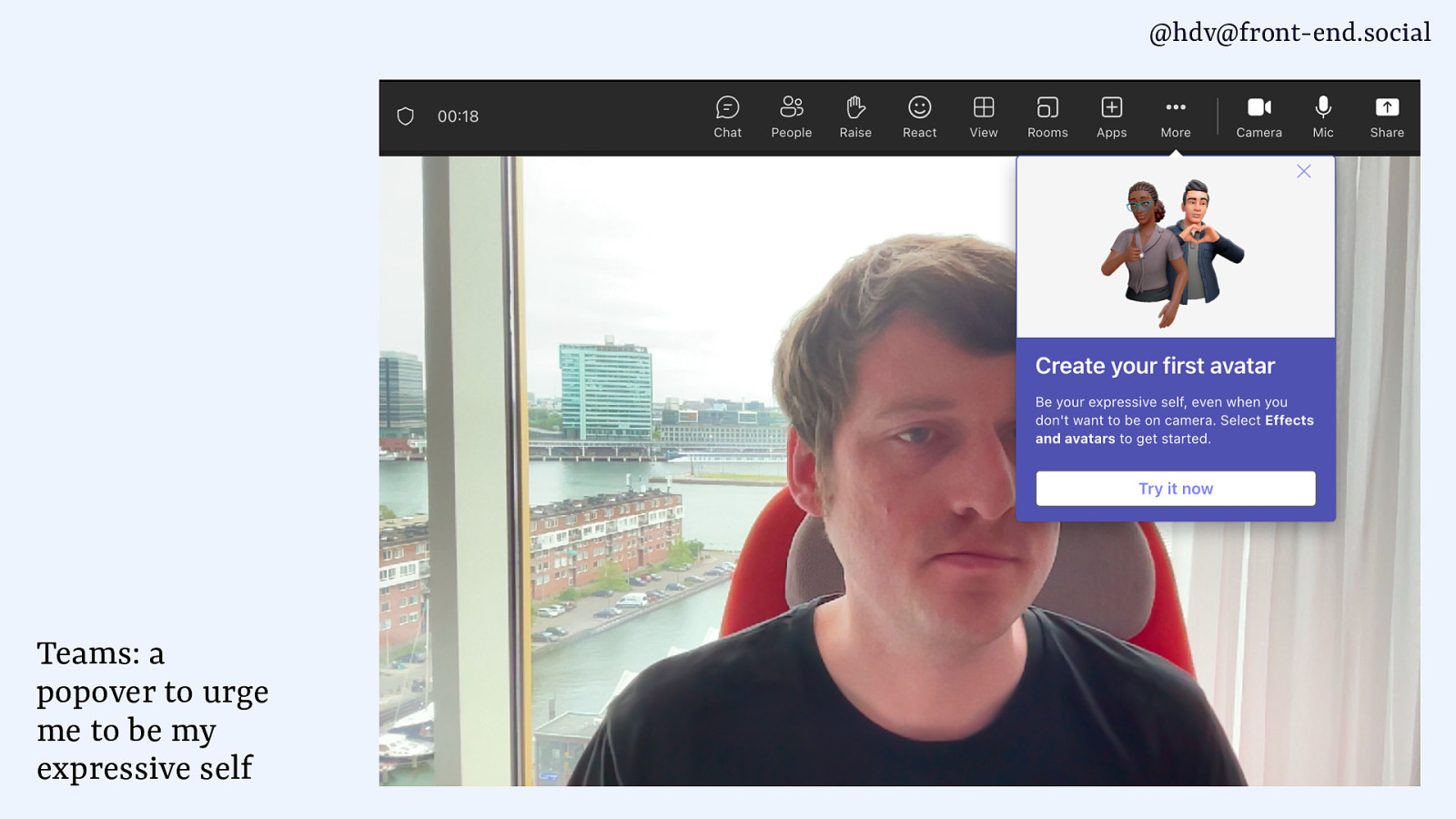
@hdv@front-end.social Teams: a popover to urge me to be my expressive self
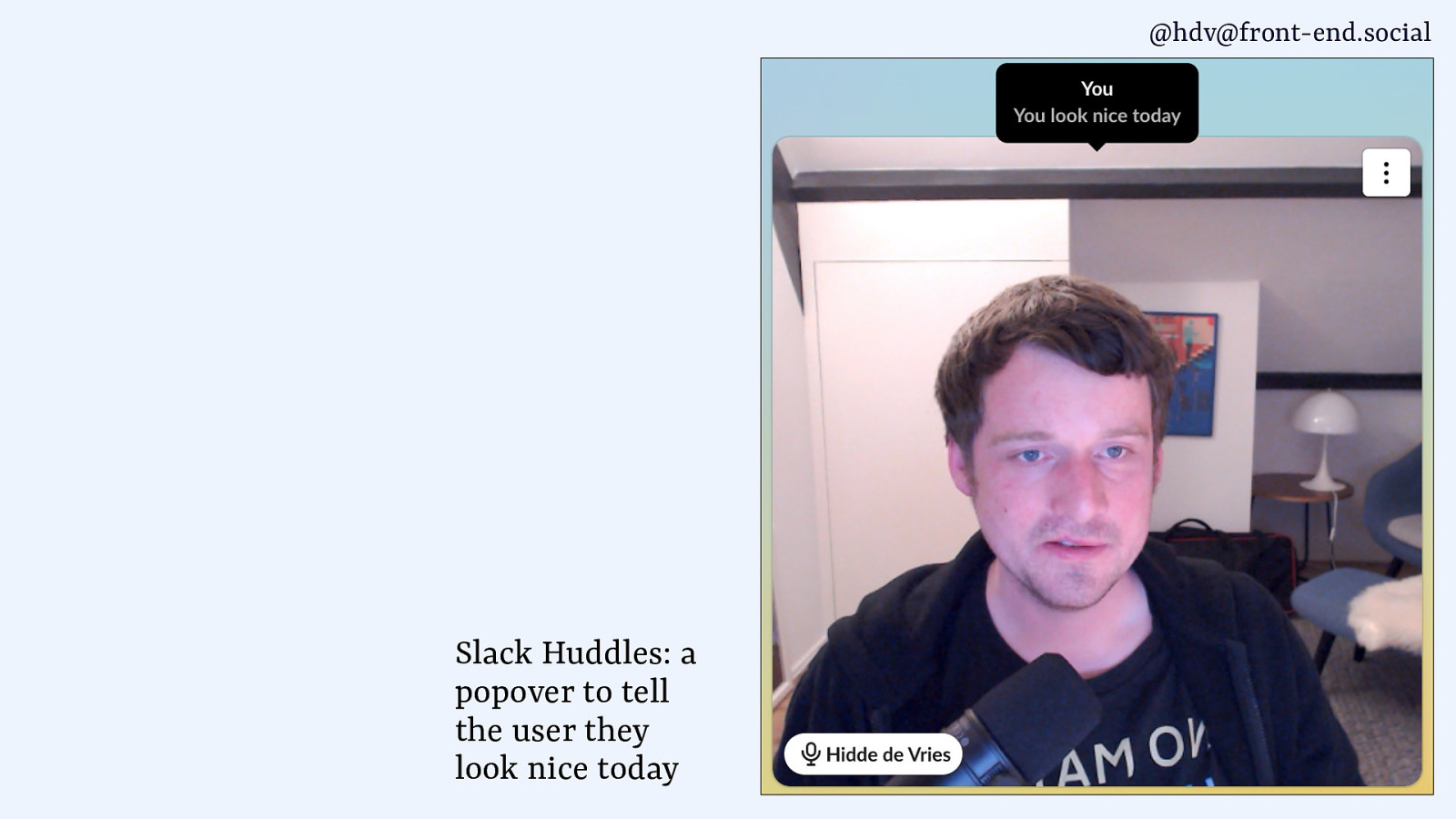
@hdv@front-end.social Slack Huddles: a popover to tell the user they look nice today
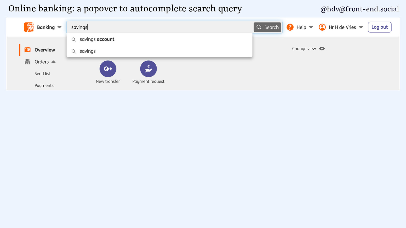
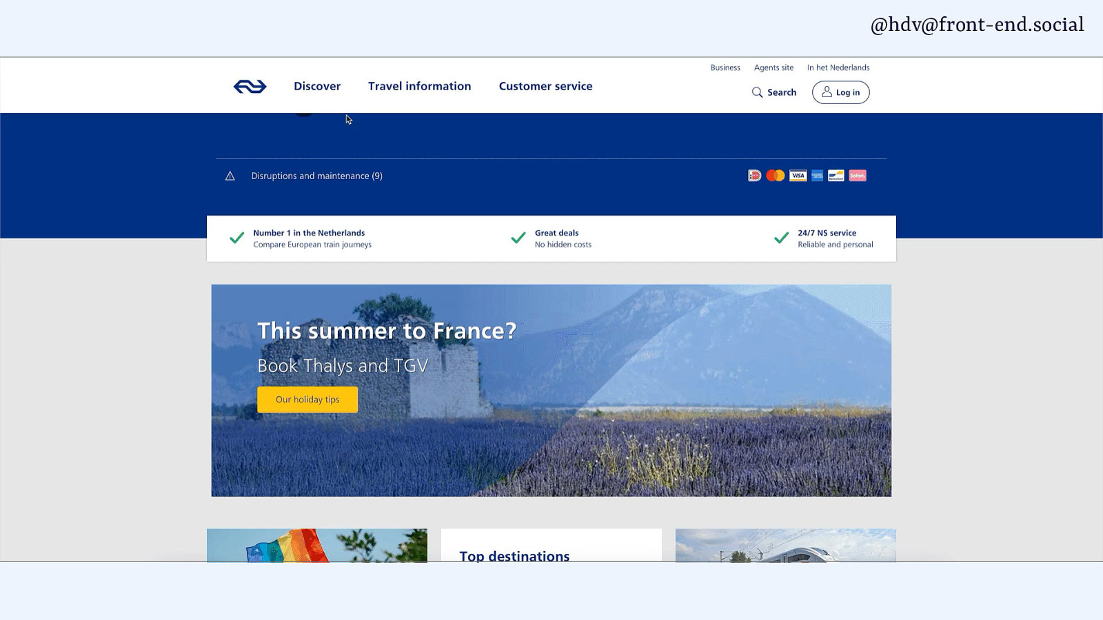
Online banking: a popover to autocomplete search query @hdv@front-end.social
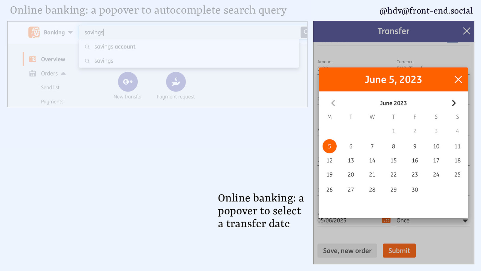
Online banking: a popover to autocomplete search query Online banking: a popover to select a transfer date @hdv@front-end.social
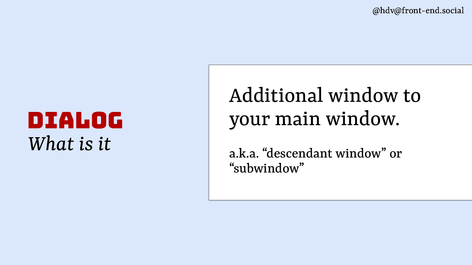
@hdv@front-end.social dialog What is it Additional window to your main window. a.k.a. “descendant window” or “subwindow”
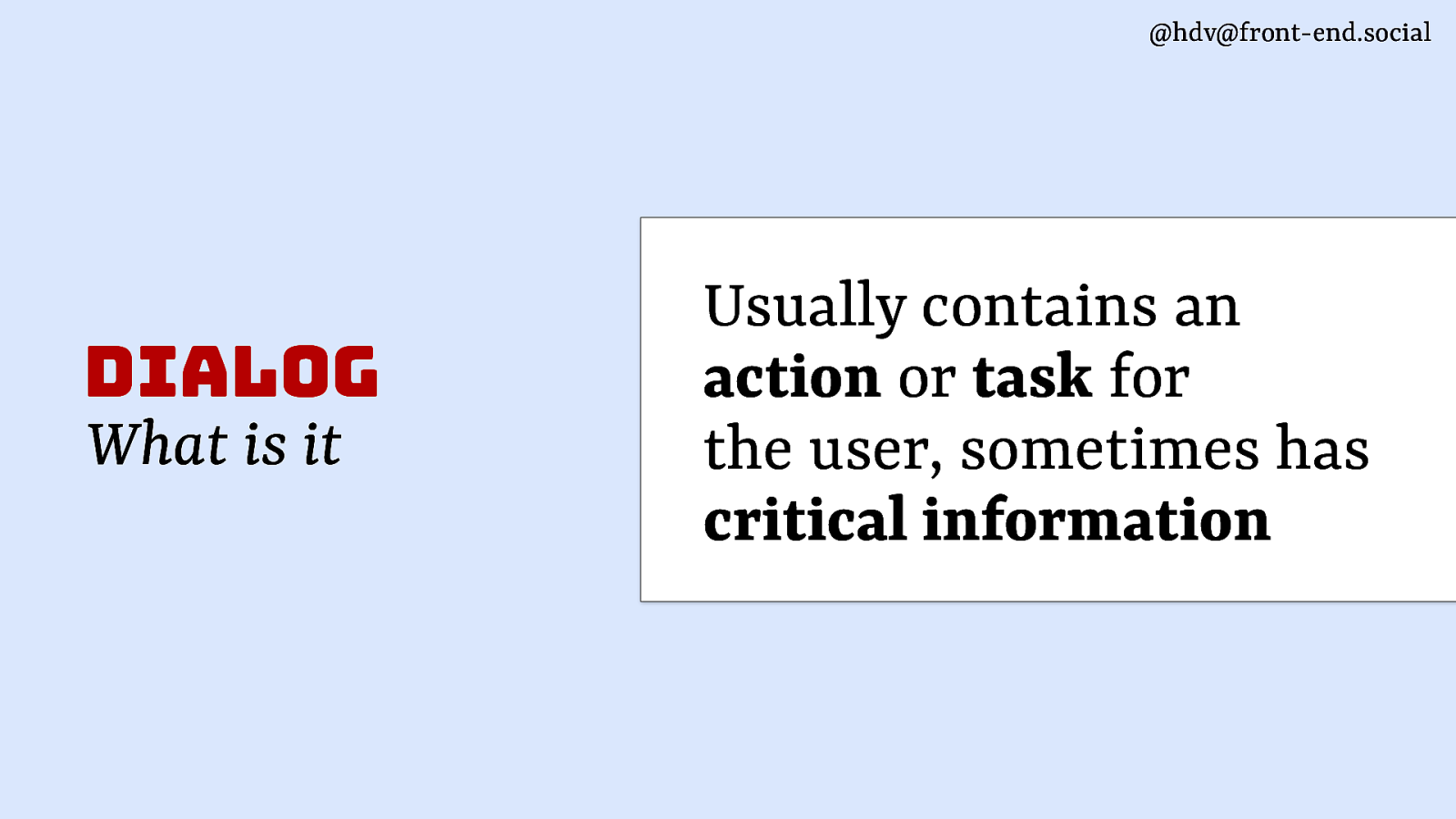
@hdv@front-end.social dialog What is it Usually contains an action or task for the user, sometimes has critical information
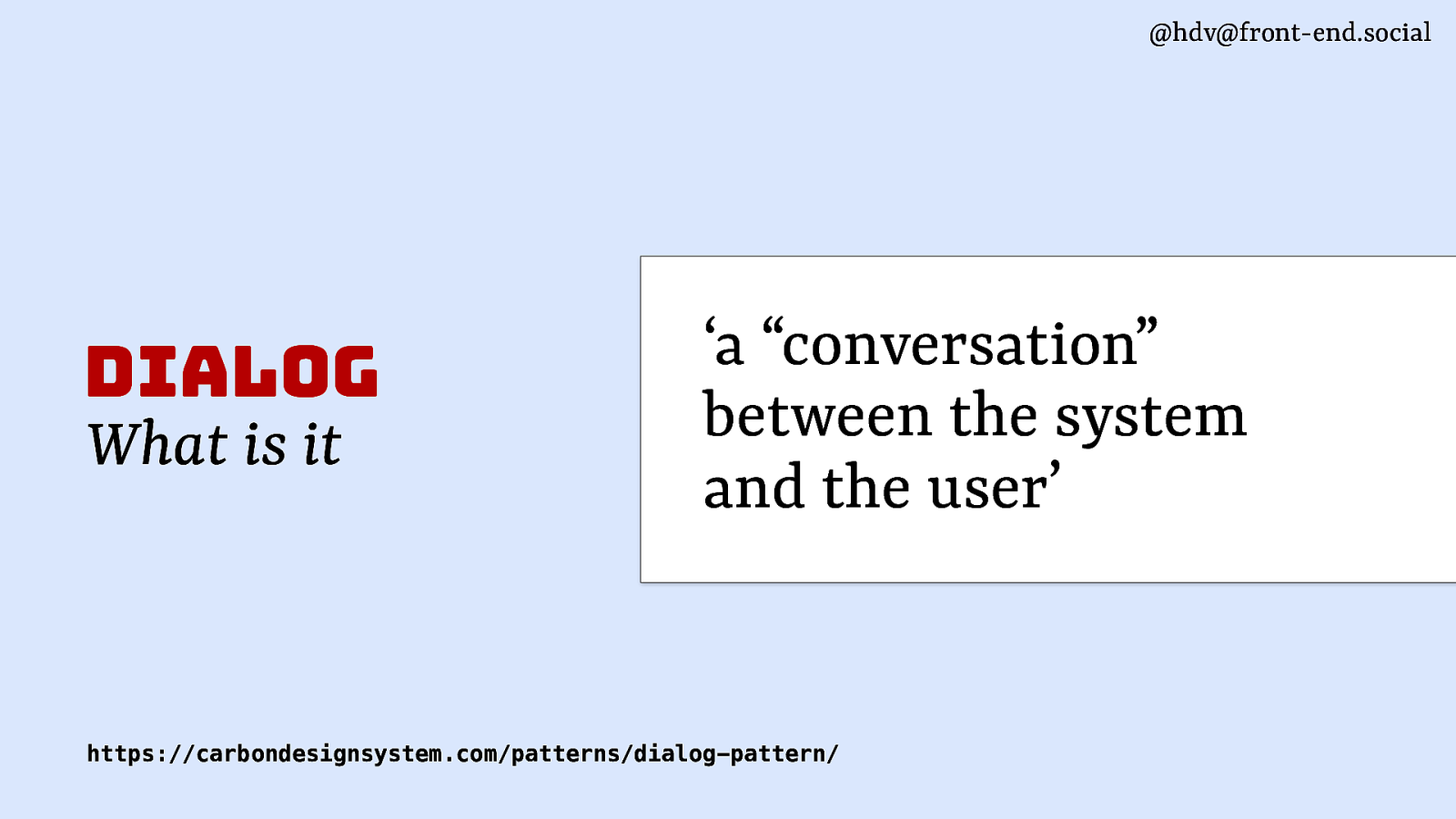
@hdv@front-end.social dialog What is it ‘a “conversation” between the system and the user’ https://carbondesignsystem.com/patterns/dialog-pattern/
@hdv@front-end.social
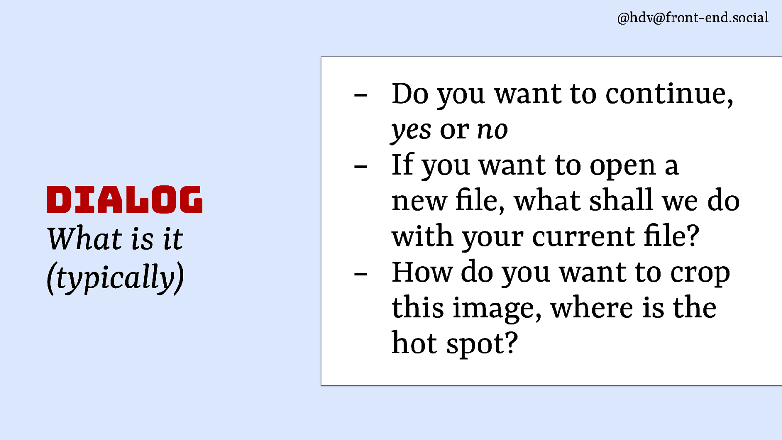
fi fi dialog What is it (typically) Do you want to continue, yes or no If you want to open a new le, what shall we do with your current le? How do you want to crop this image, where is the hot spot?
@hdv@front-end.social
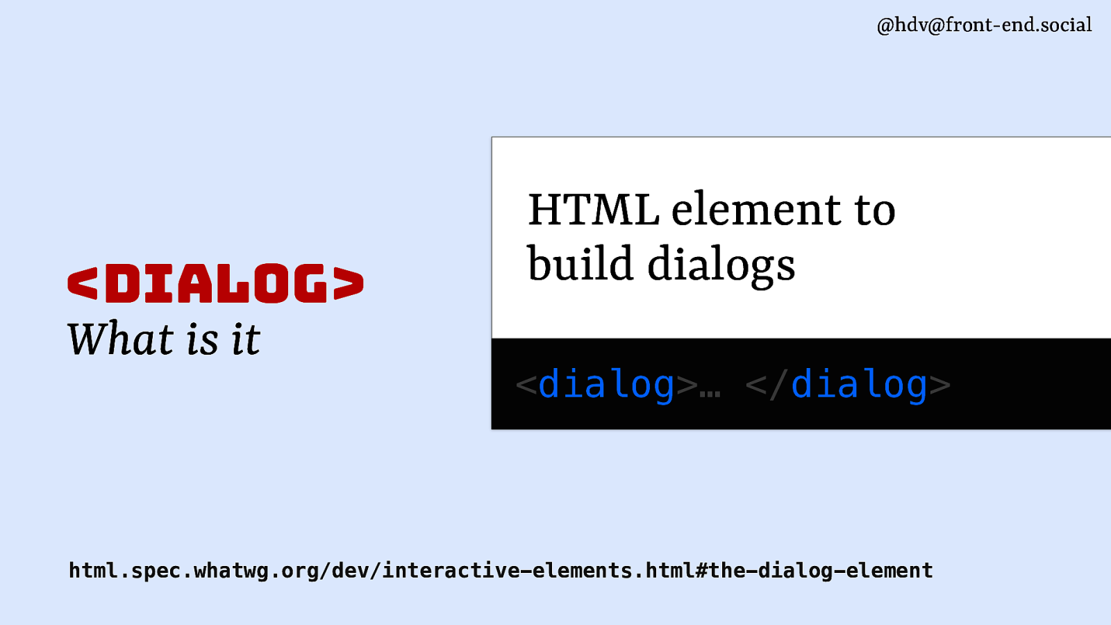
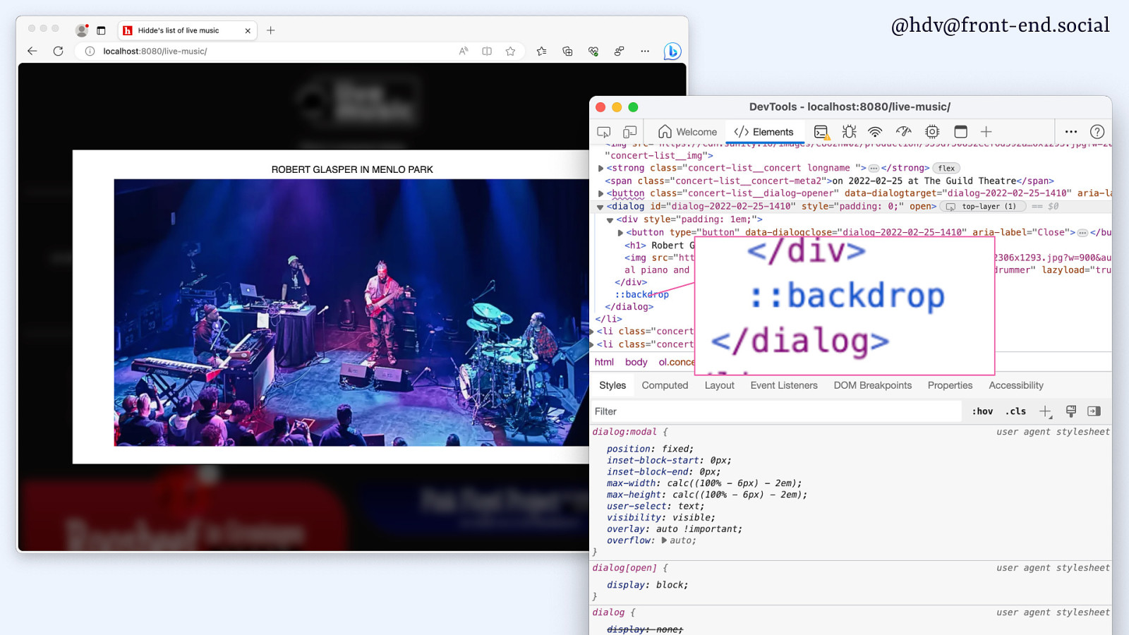
<dialog> What is it HTML element to build dialogs <dialog>… </dialog> html.spec.whatwg.org/dev/interactive-elements.html#the-dialog-element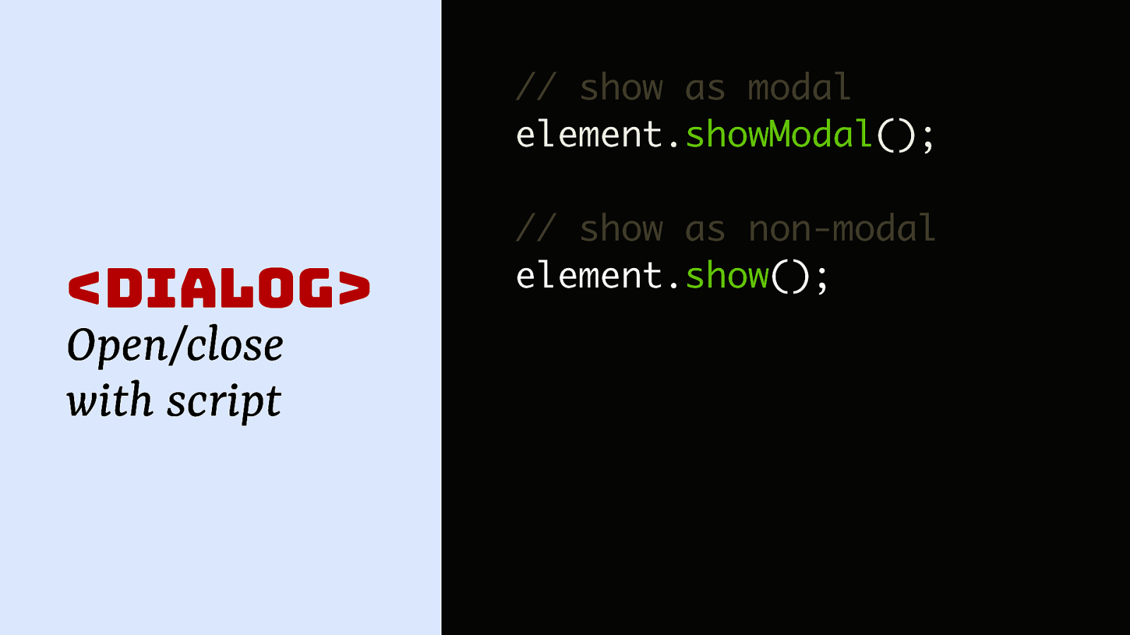
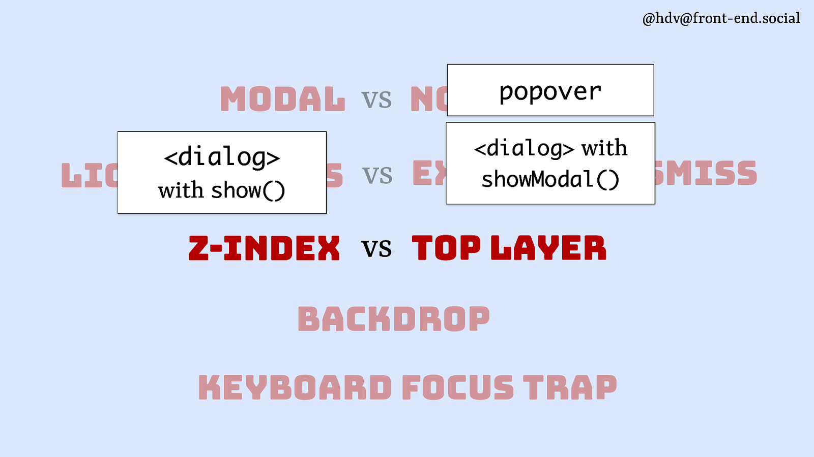
@hdv@front-end.social // show as modal element.showModal();
<dialog> Open/close with script // show as non-modal element.show();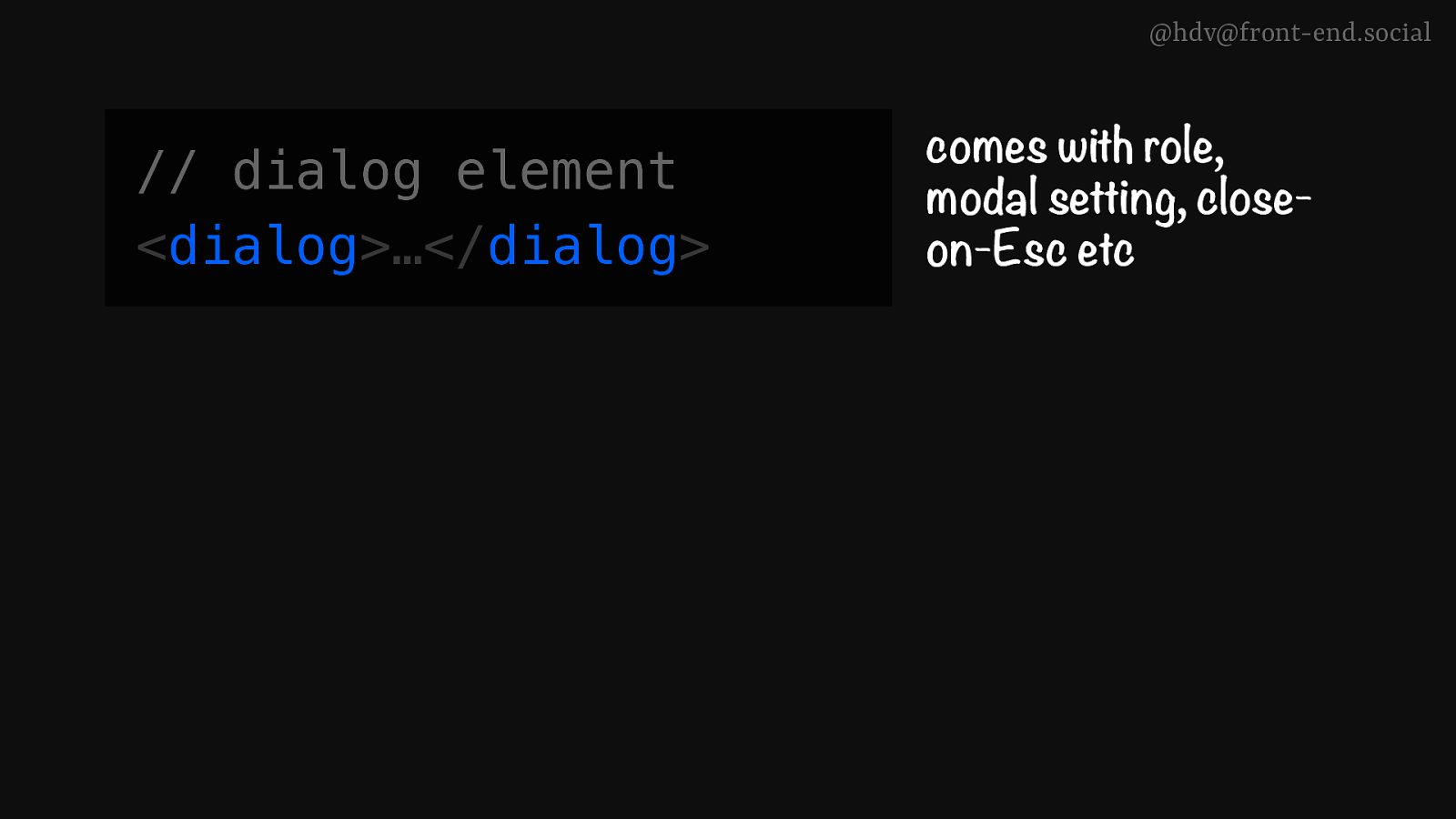
@hdv@front-end.social // dialog element <dialog>…</dialog> comes with role, modal setting, closeon-Esc etc
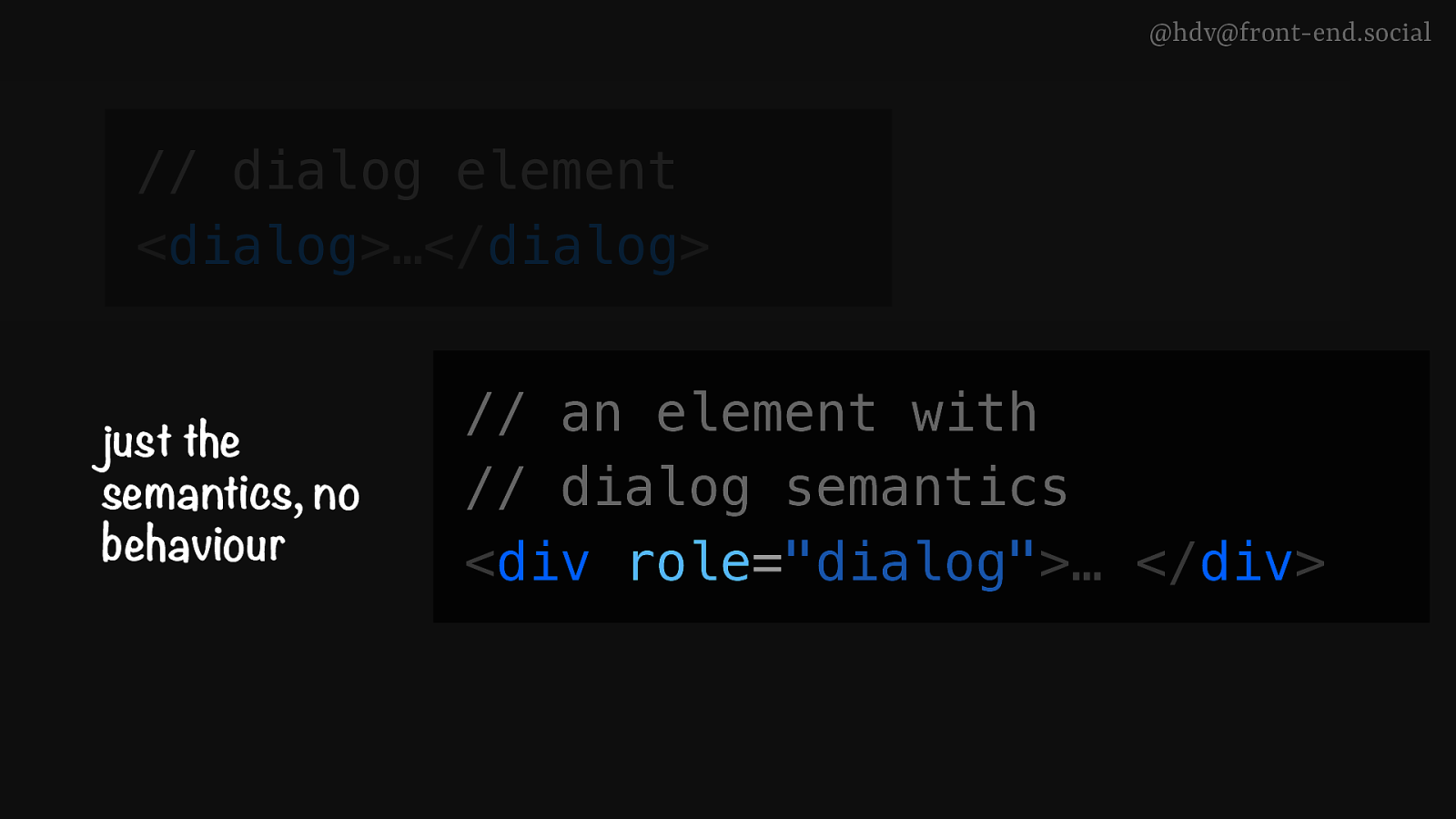
@hdv@front-end.social // dialog element <dialog>…</dialog> just the semantics, no behaviour comes with semantics, top layer, inertness, close-on-Esc etc // an element with // dialog semantics <div role=”dialog”>… </div>
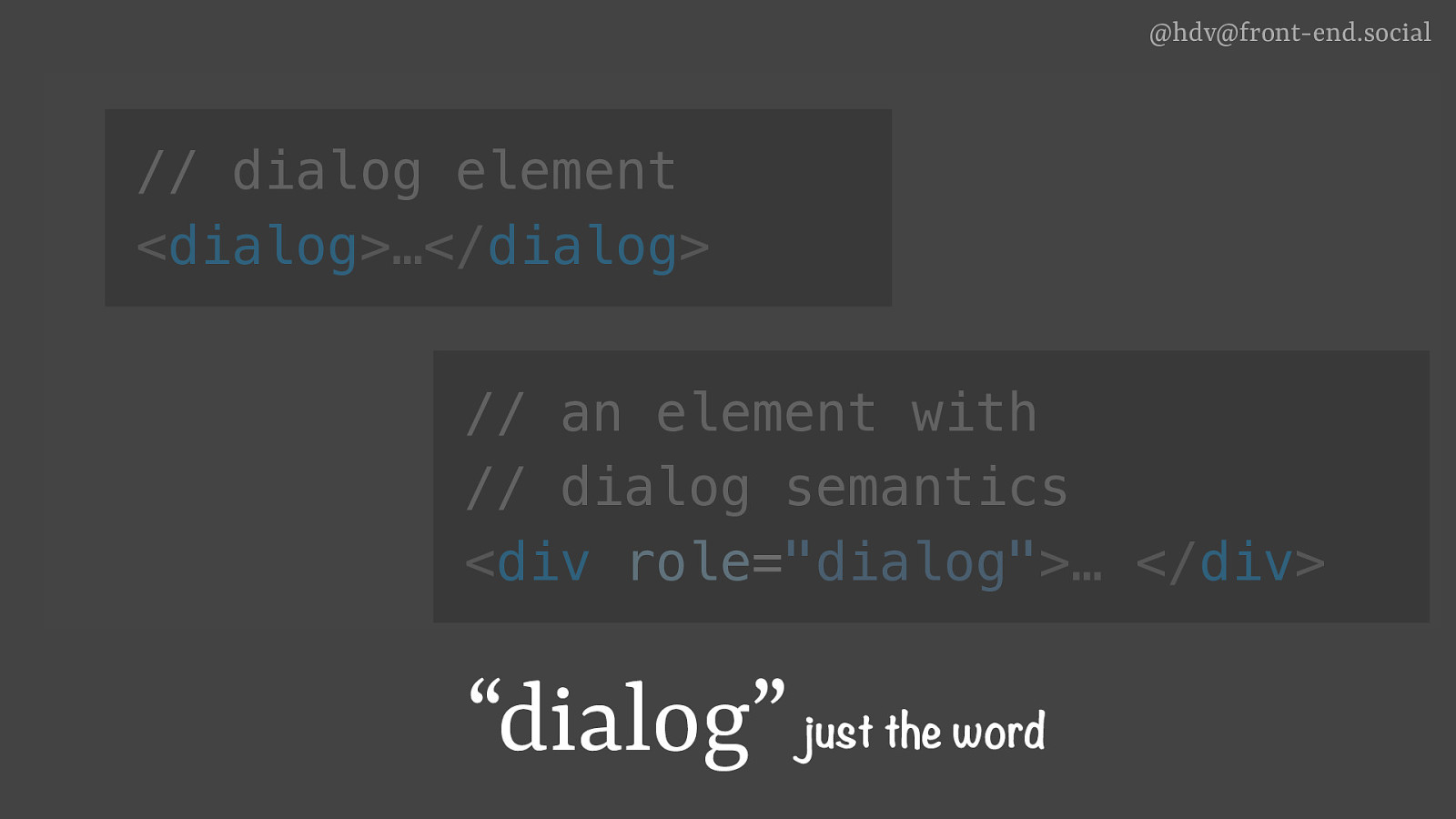
@hdv@front-end.social // dialog element <dialog>…</dialog> just the semantics, no behaviour comes with semantics, top layer, inertness, close-on-Esc etc // an element with // dialog semantics <div role=”dialog”>… </div> “dialog” just the word
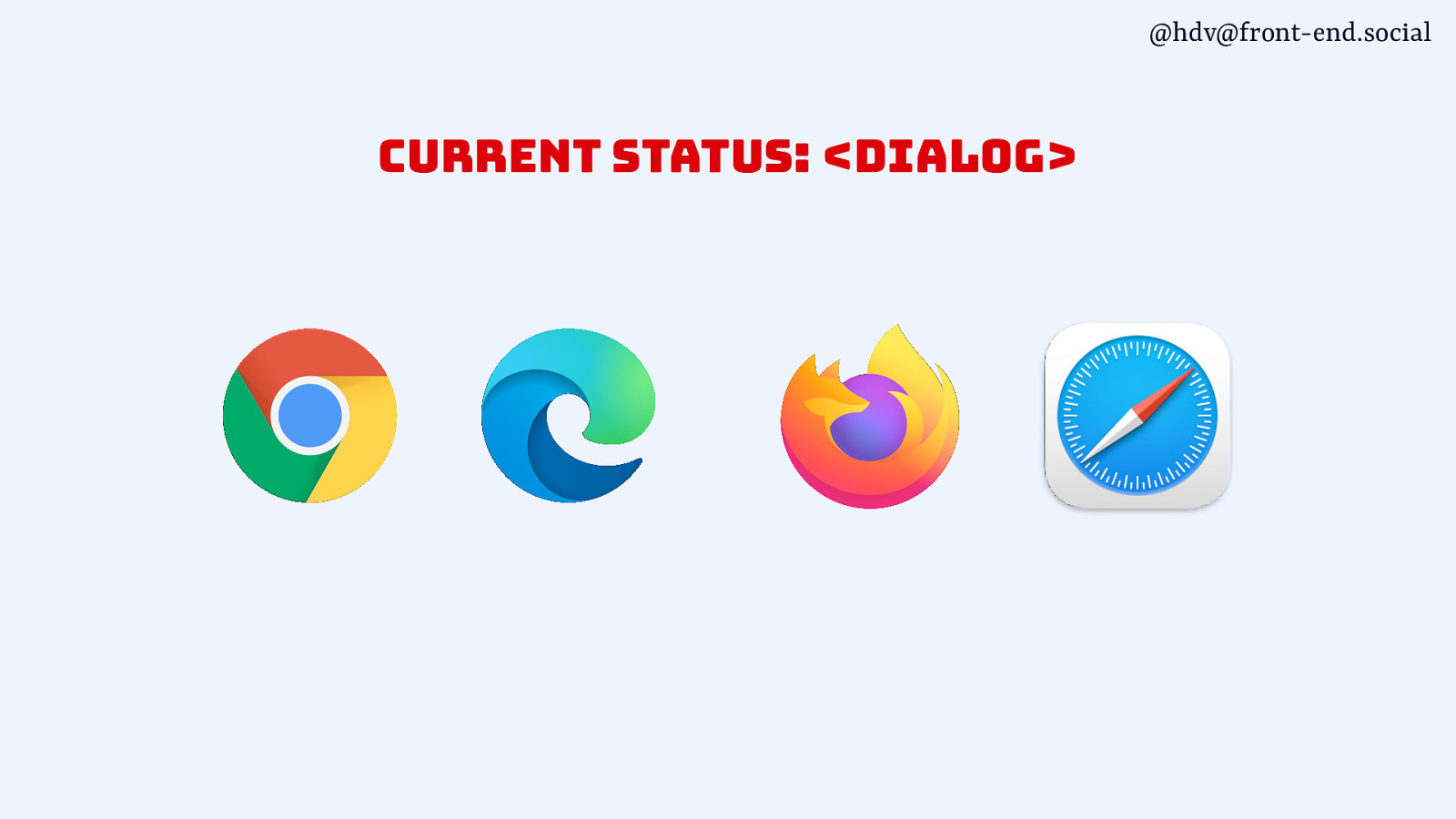
@hdv@front-end.social current status: <dialog>
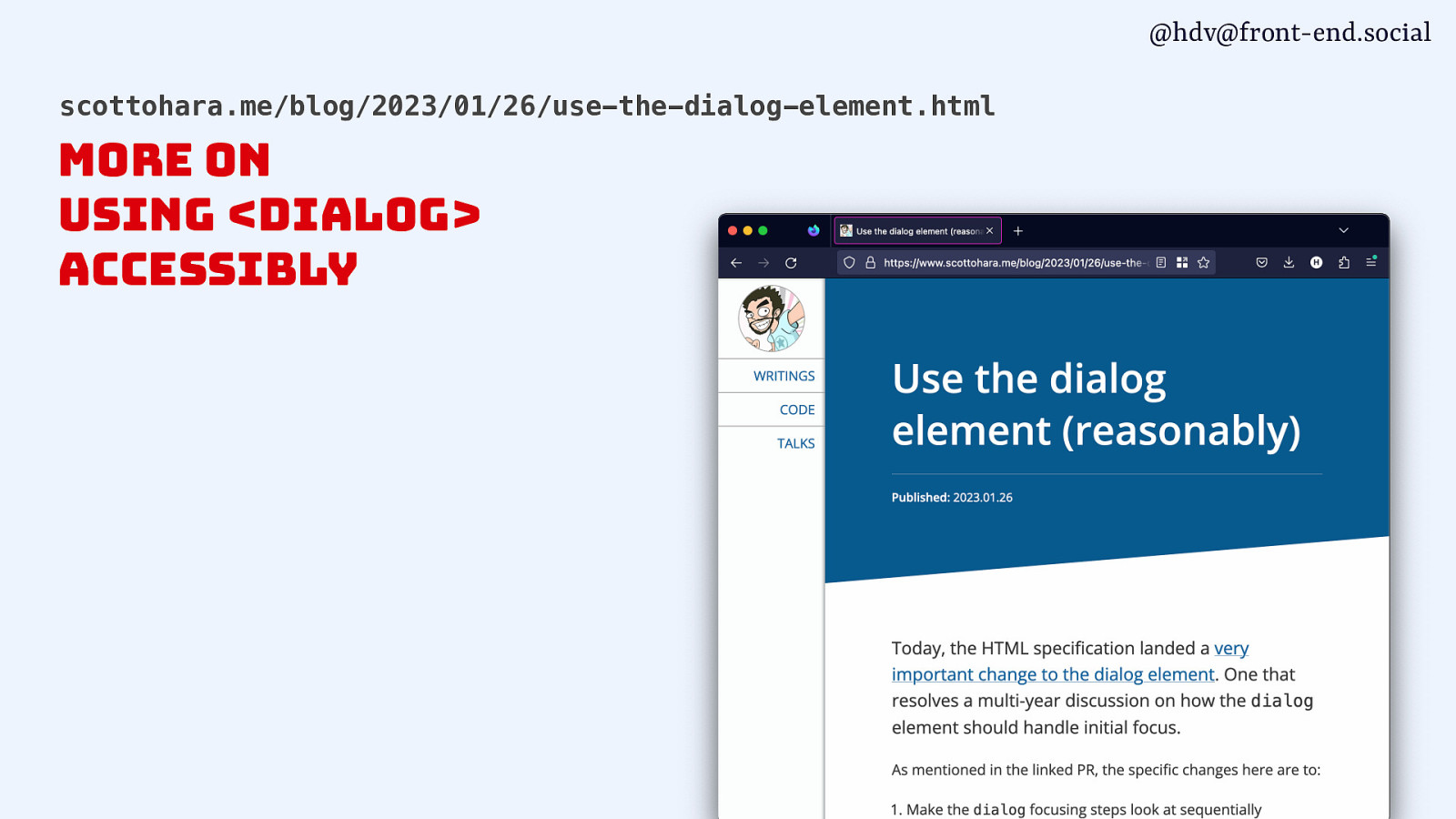
@hdv@front-end.social scottohara.me/blog/2023/01/26/use-the-dialog-element.html more on using <dialog> accessibly
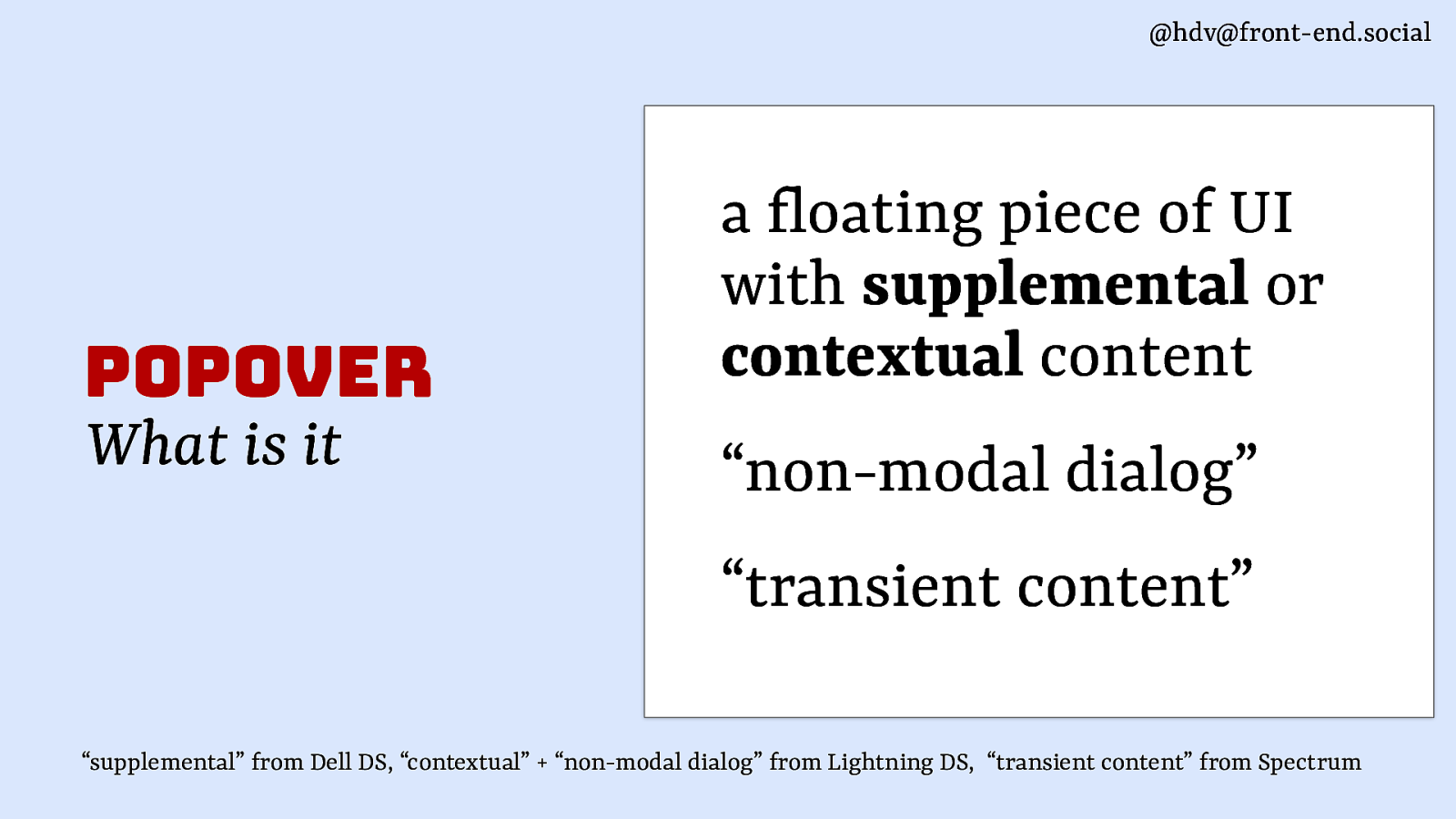
@hdv@front-end.social popover What is it a loating piece of UI with supplemental or contextual content “non-modal dialog” “transient content” f “supplemental” from Dell DS, “contextual” + “non-modal dialog” from Lightning DS, “transient content” from Spectrum
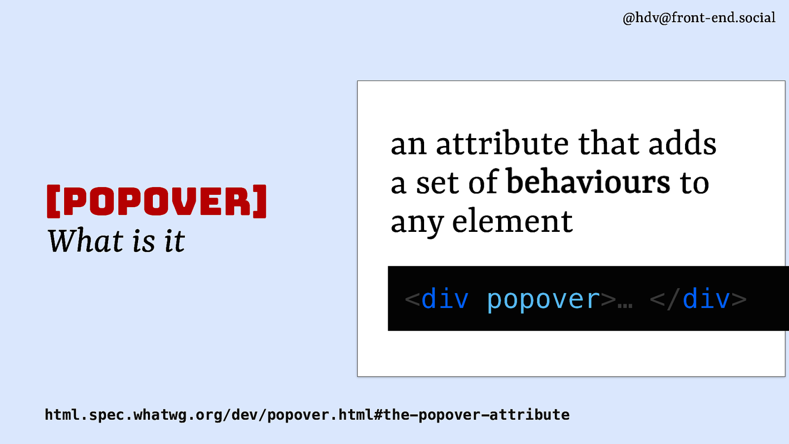
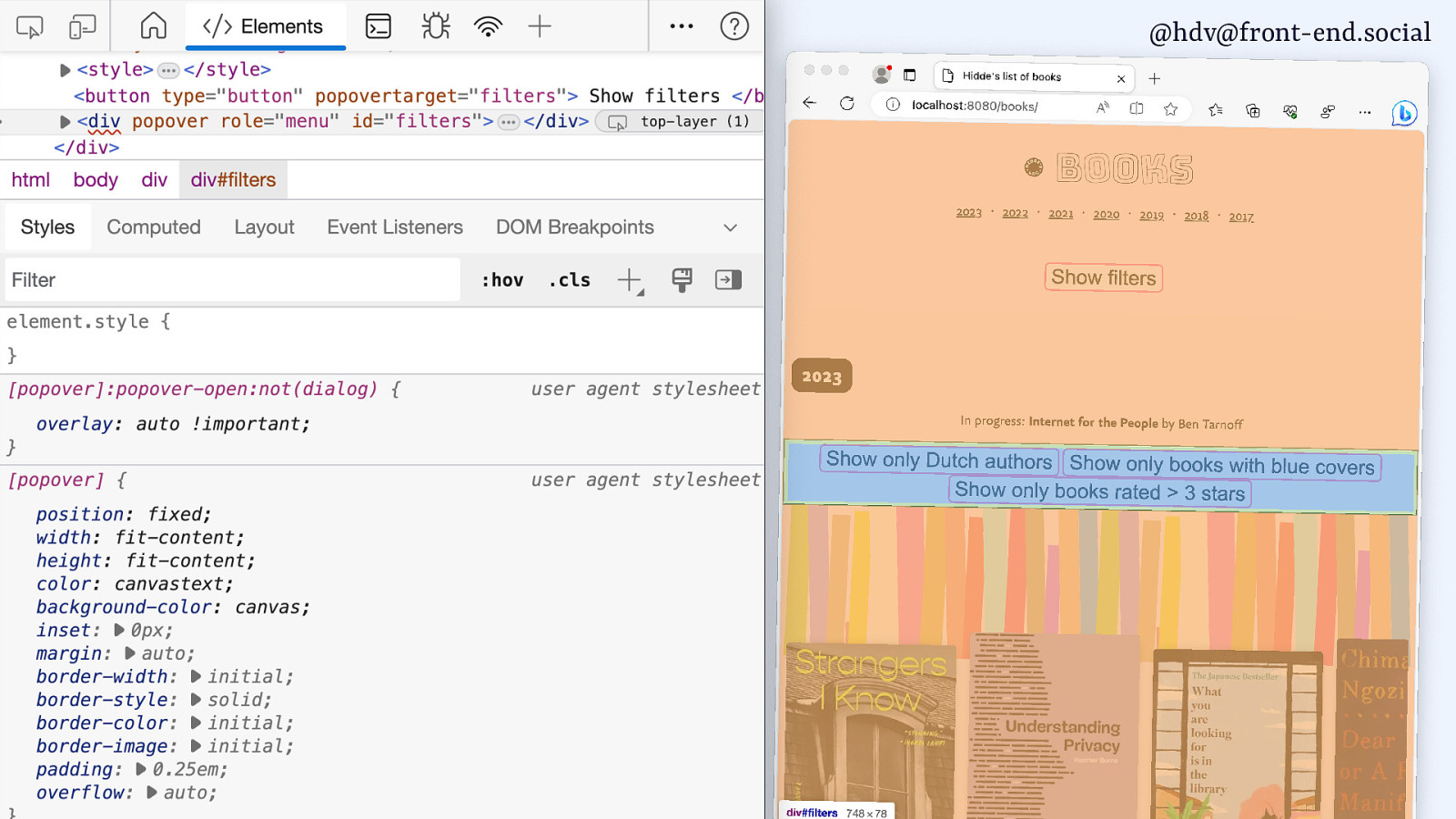
@hdv@front-end.social [popover] What is it an attribute that adds a set of behaviours to any element <div popover>… </div> html.spec.whatwg.org/dev/popover.html#the-popover-attribute
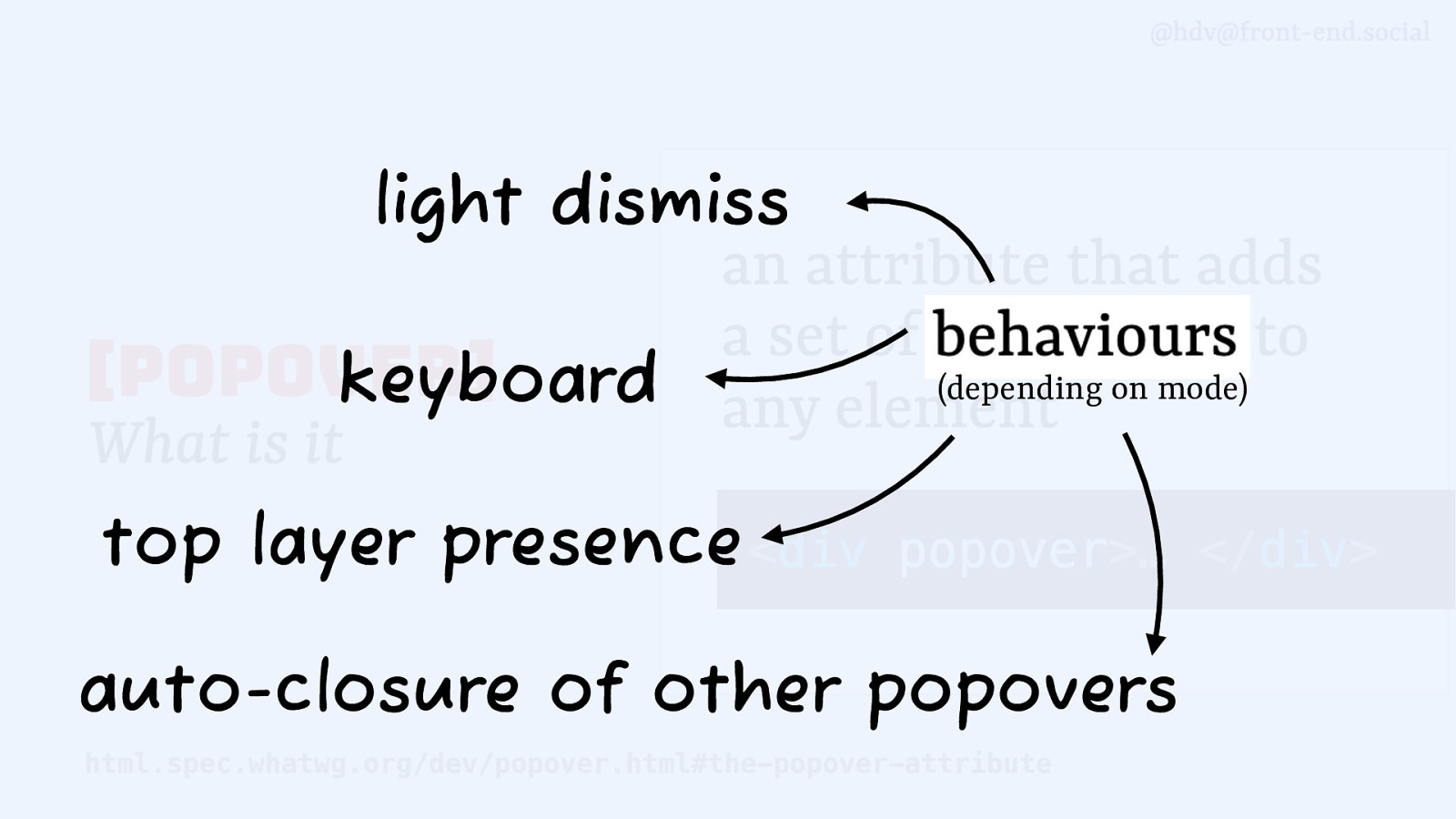
light dismiss keyboard (depending on mode) top layer presence auto-closure of other popovers
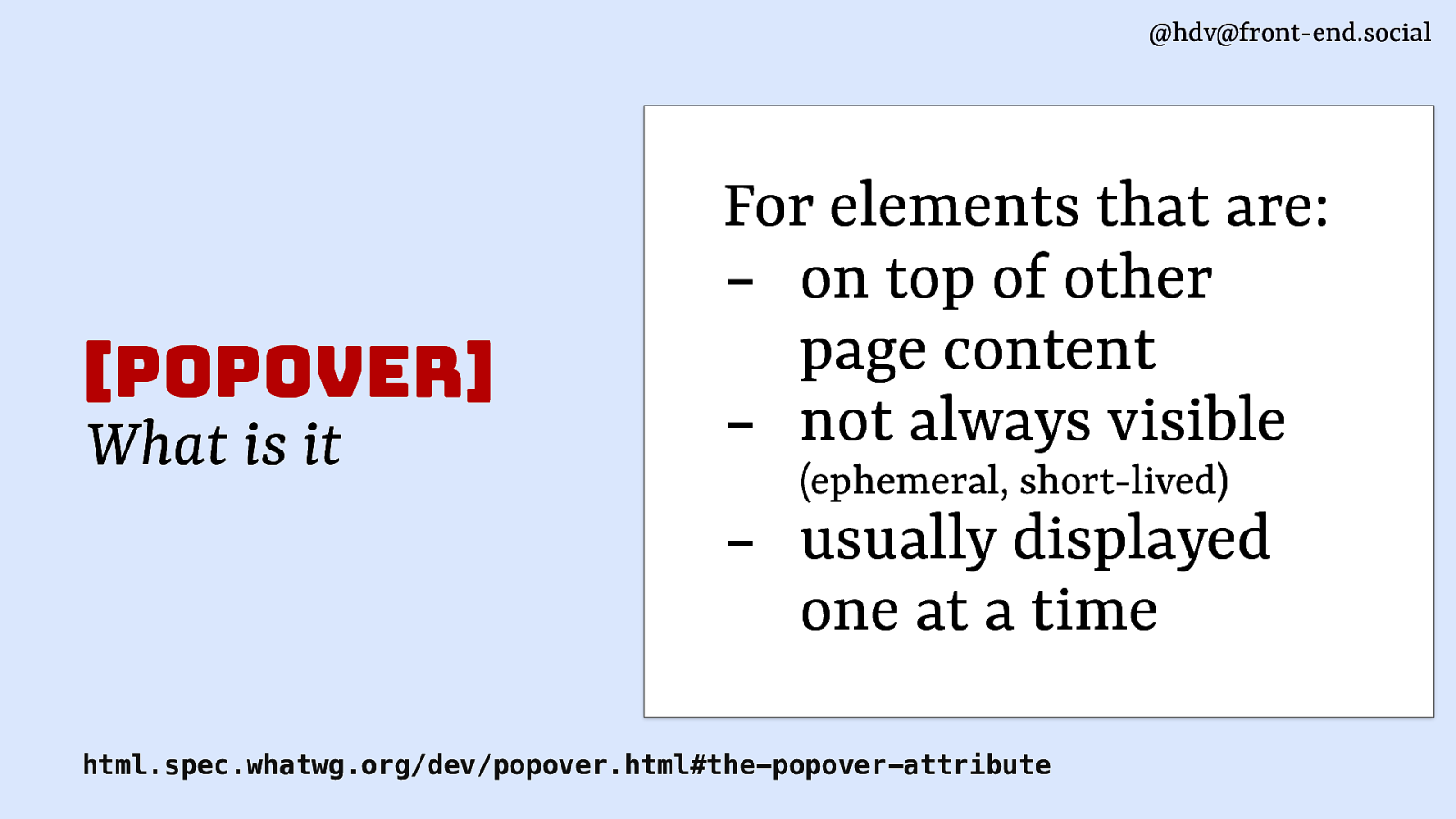
@hdv@front-end.social [popover] What is it For elements that are: - on top of other page content - not always visible
(ephemeral, short-lived) usually displayed one at a time html.spec.whatwg.org/dev/popover.html#the-popover-attribute
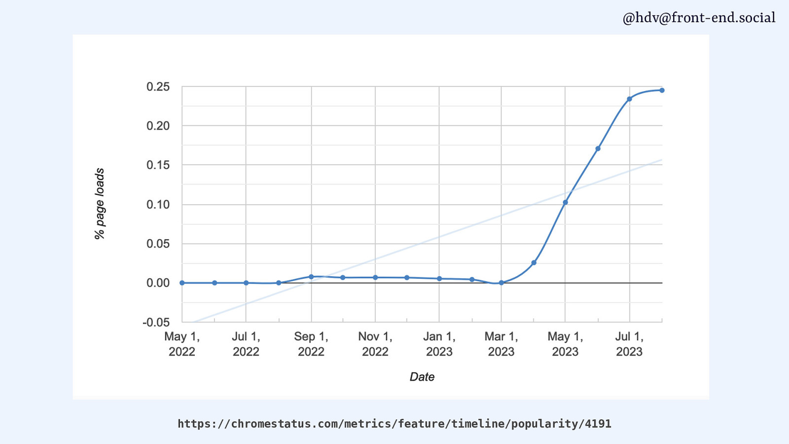
@hdv@front-end.social https://chromestatus.com/metrics/feature/timeline/popularity/4191
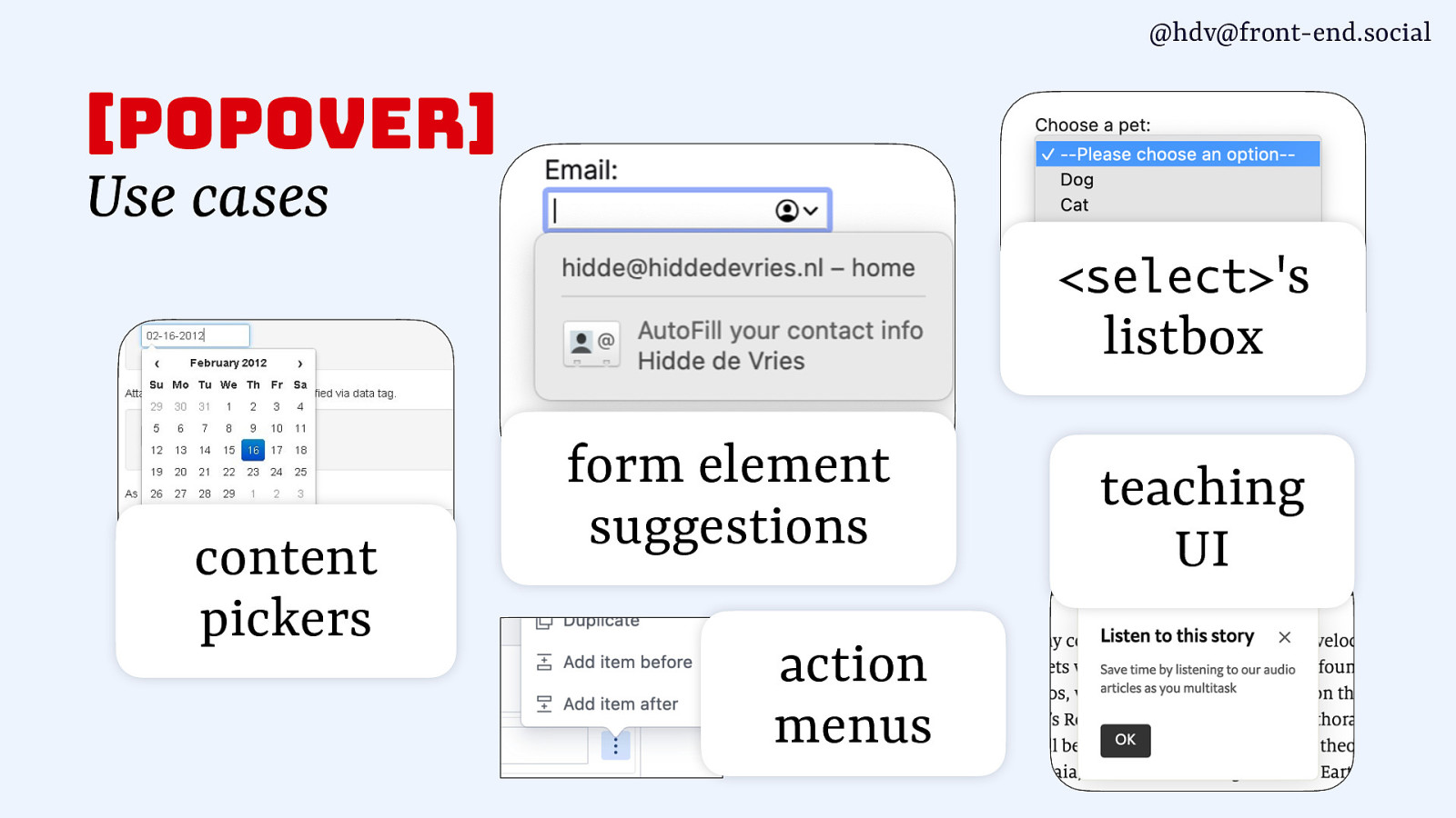
@hdv@front-end.social [popover] Use cases <select>’s listbox content pickers form element suggestions action menus teaching UI

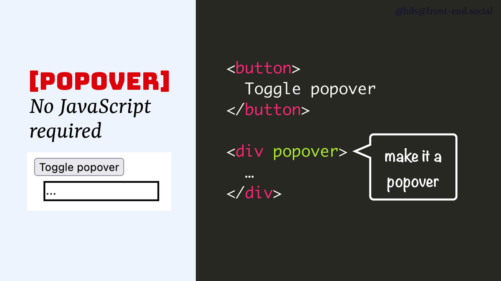
@hdv@front-end.social [popover] No JavaScript required <button> Toggle popover </button> <div> … </div>
@hdv@front-end.social [popover] No JavaScript required <button> Toggle popover </button> <div popover> … </div> make it a popover
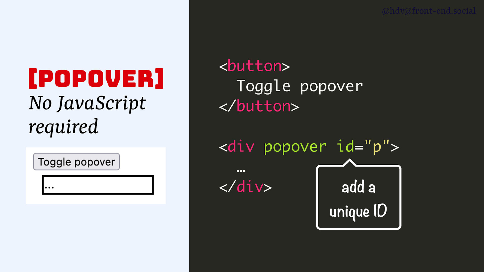
@hdv@front-end.social [popover] No JavaScript required <button> Toggle popover </button> <div popover id=”p”> … </div> add a unique ID
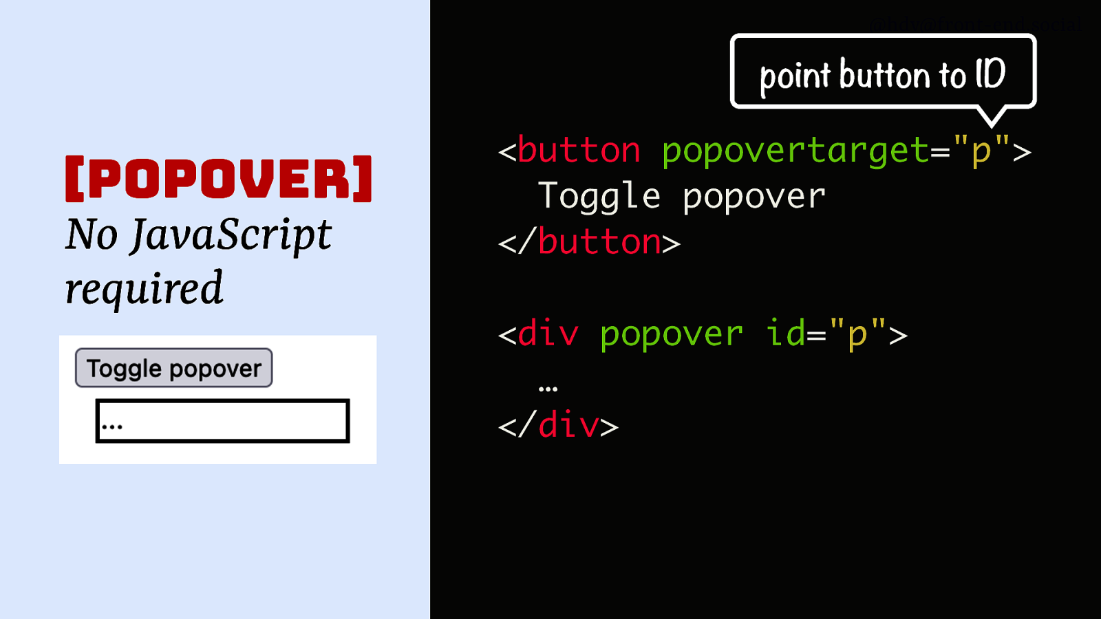
@hdv@front-end.social point button to ID [popover] No JavaScript required <button popovertarget=”p”> Toggle popover </button> <div popover id=”p”> … </div>
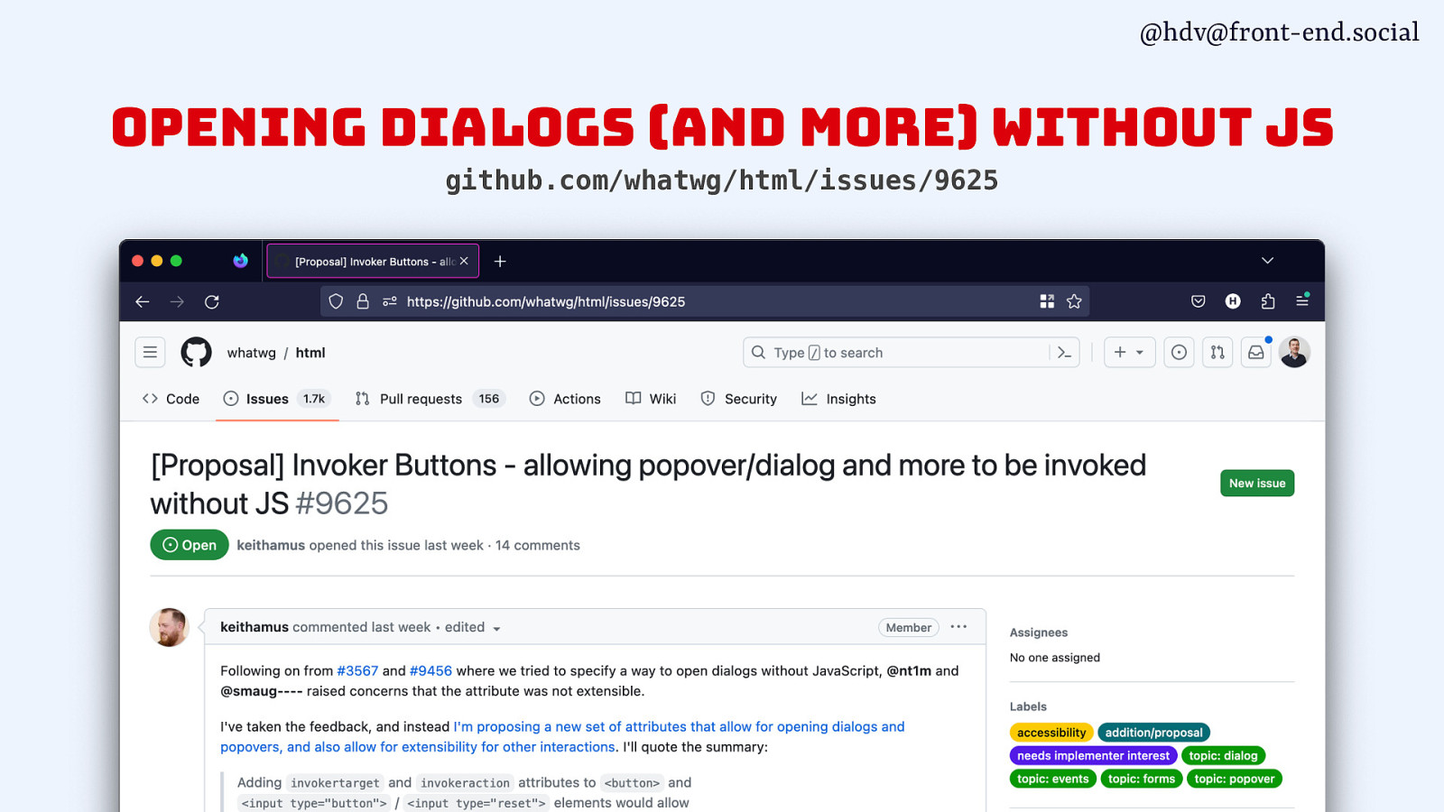
@hdv@front-end.social opening dialogs (and more) without js github.com/whatwg/html/issues/9625
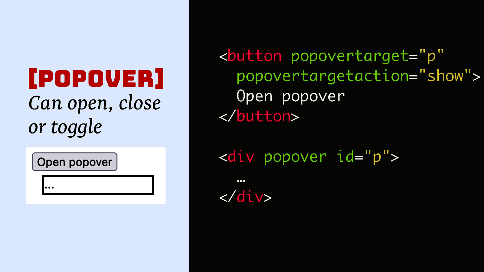
@hdv@front-end.social [popover] Can open, close or toggle <button popovertarget=”p” popovertargetaction=”show”> Open popover </button> <div popover id=”p”> … </div>
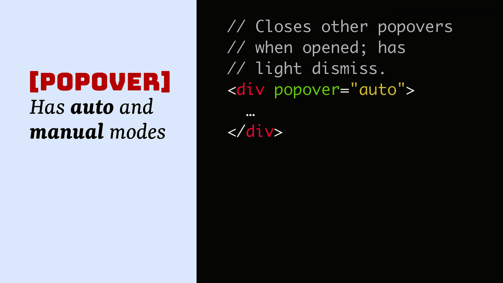
@hdv@front-end.social [popover] Has auto and manual modes // Closes other popovers // when opened; has // light dismiss. <div popover=”auto”> … </div>
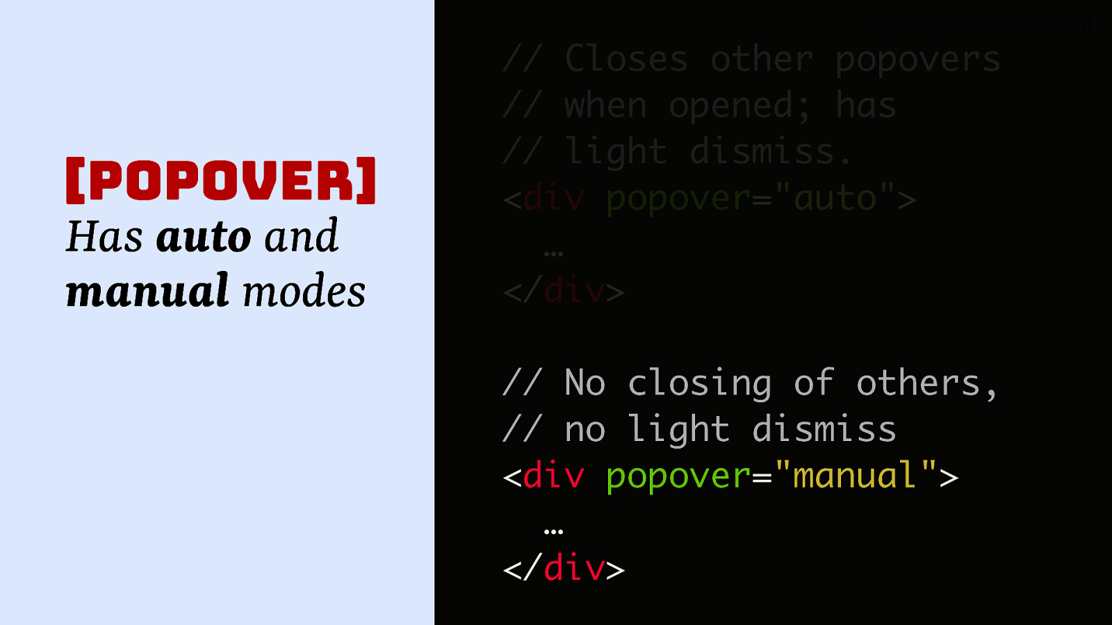
@hdv@front-end.social [popover] Has auto and manual modes // Closes other popovers // when opened; has // light dismiss. <div popover=”auto”> … </div> // No closing of others, // no light dismiss <div popover=”manual”> … </div>
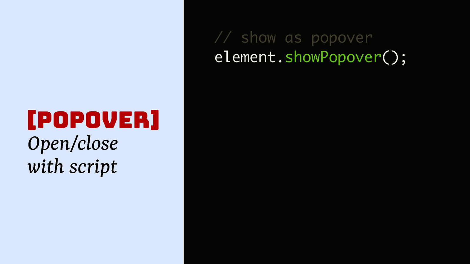
@hdv@front-end.social // show as popover element.showPopover(); [popover] Open/close with script
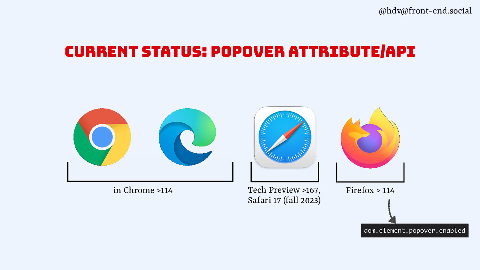
@hdv@front-end.social current status: popover attribute/api in Chrome >114 Tech Preview >167, Safari 17 (fall 2023) Firefox > 114 dom.element.popover.enabled
@hdv@front-end.social 🤔 How are these patterns different?
@hdv@front-end.social modal vs non-modal
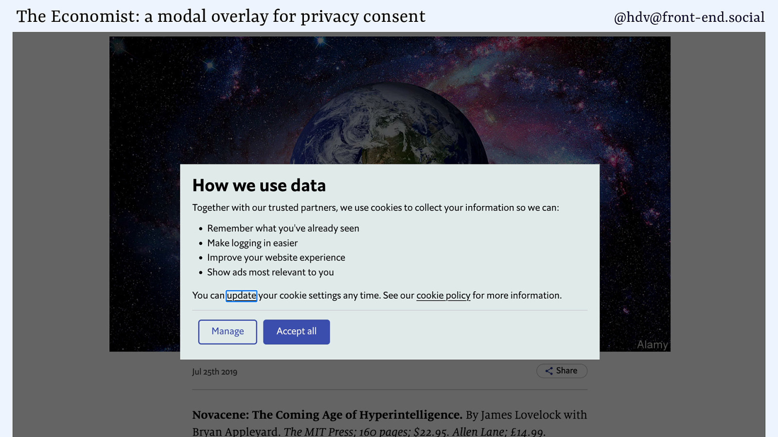
The Economist: a modal overlay for privacy consent @hdv@front-end.social
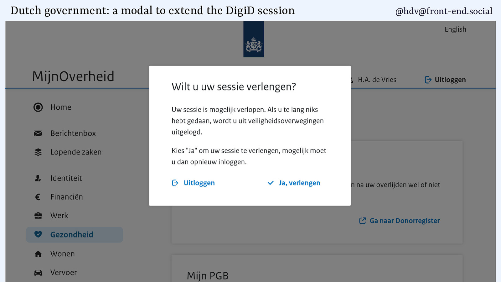
Dutch government: a modal to extend the DigiD session @hdv@front-end.social
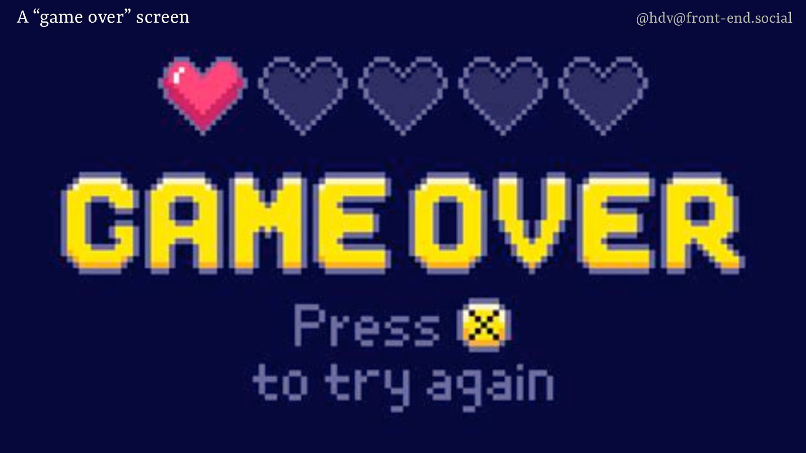
A “game over” screen @hdv@front-end.social
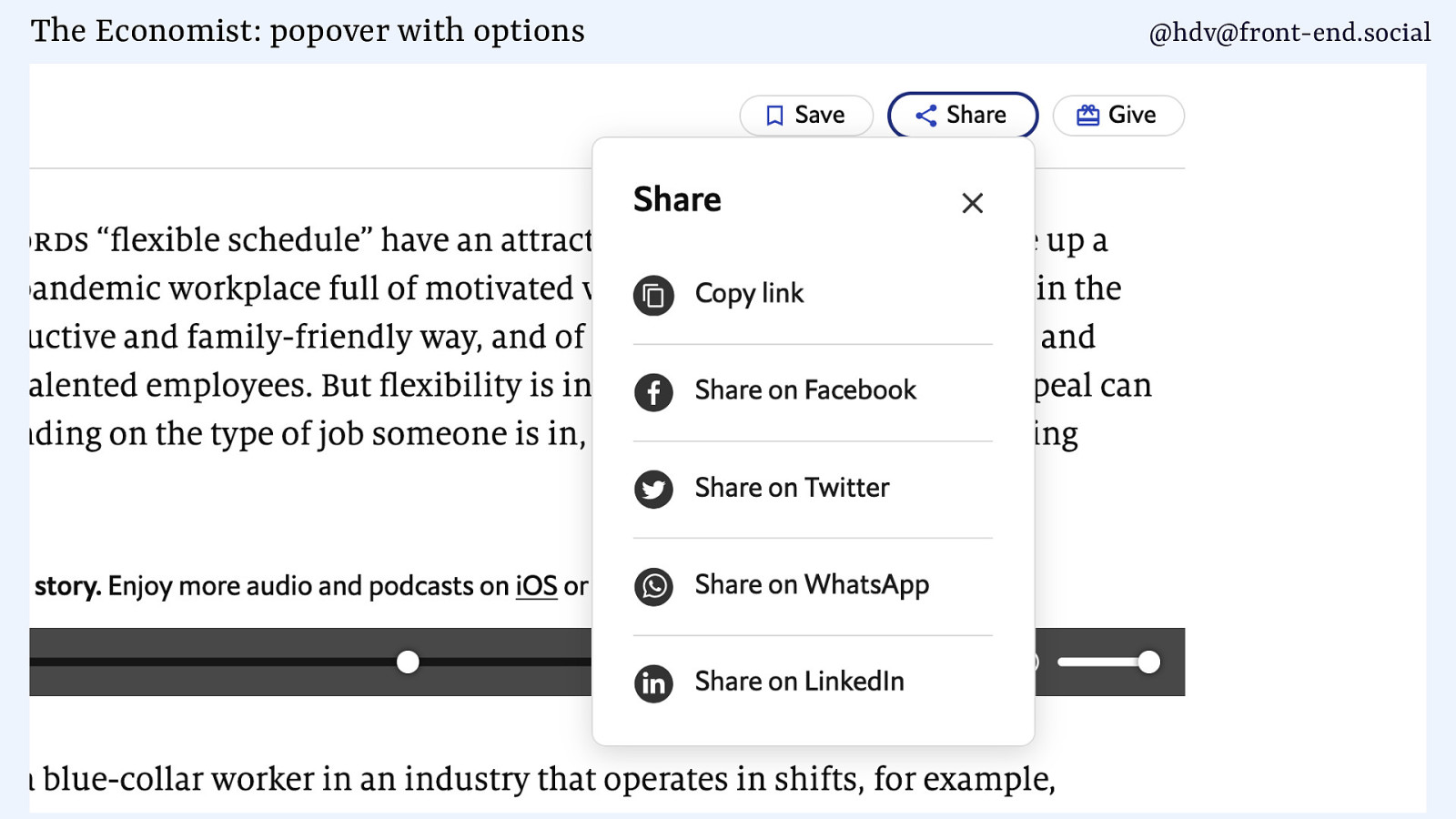
The Economist: popover with options @hdv@front-end.social
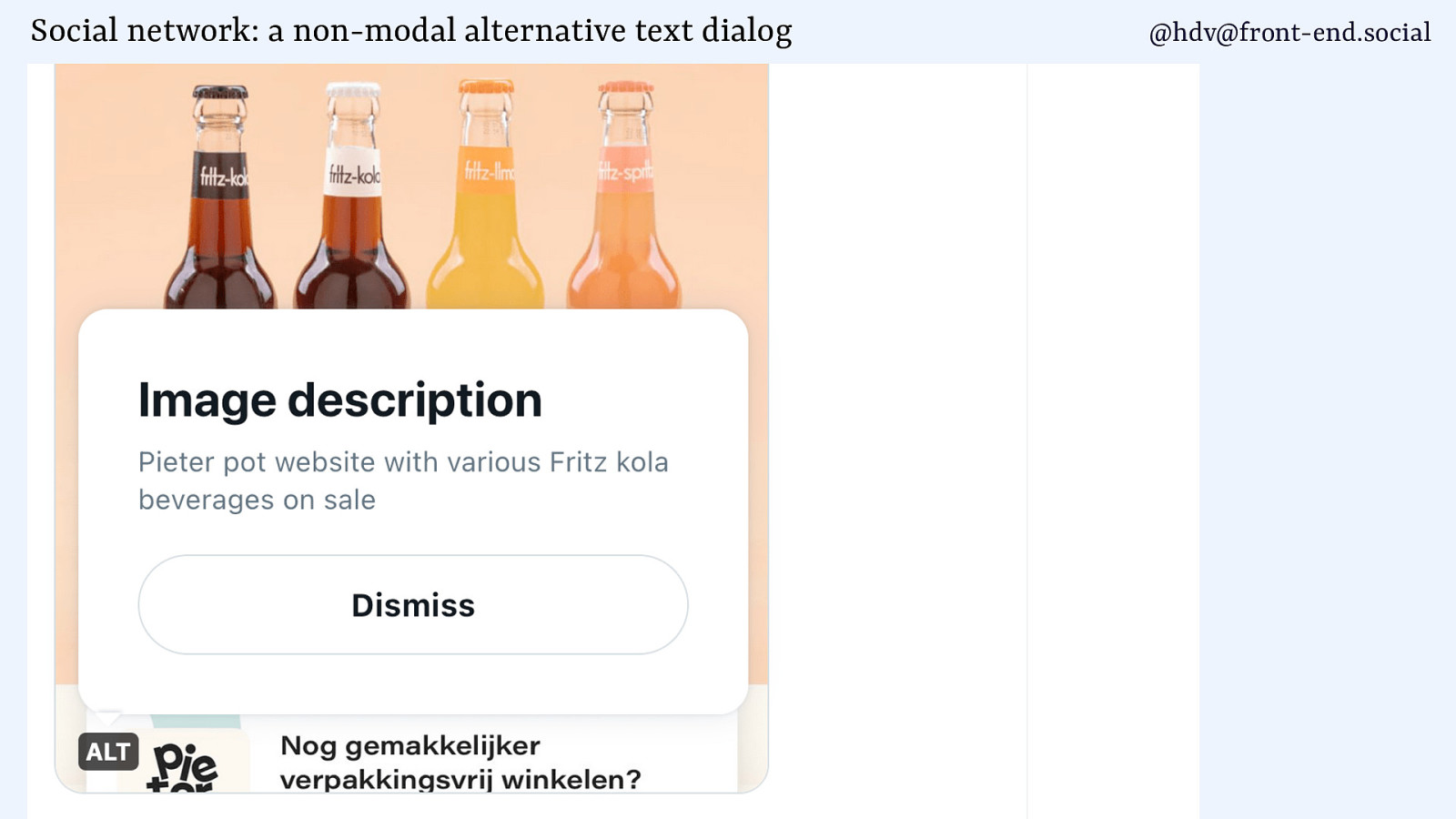
Social network: a non-modal alternative text dialog @hdv@front-end.social
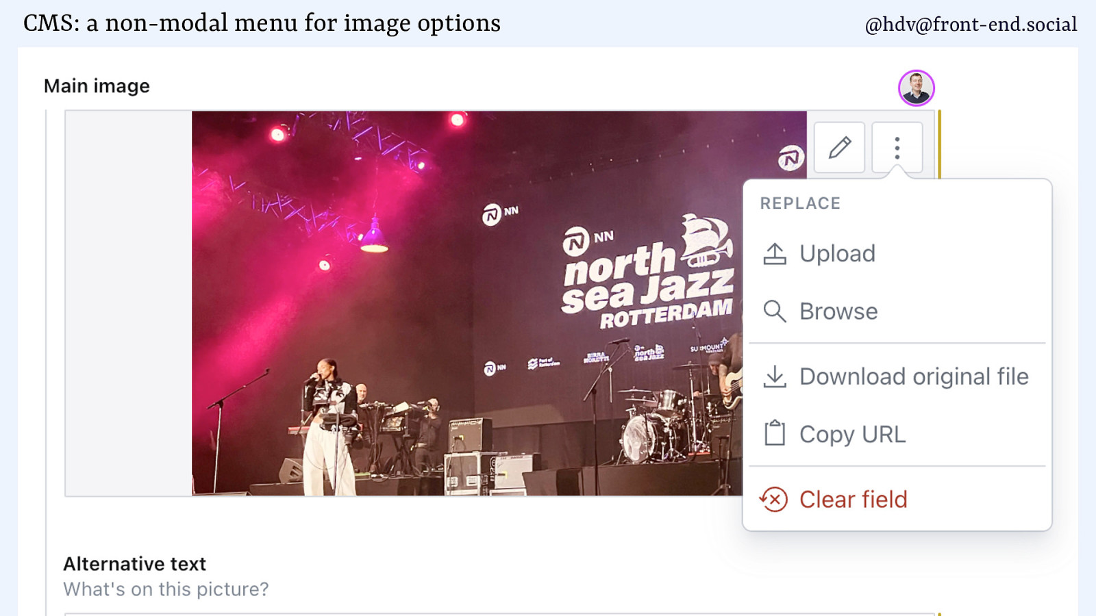
CMS: a non-modal menu for image options @hdv@front-end.social
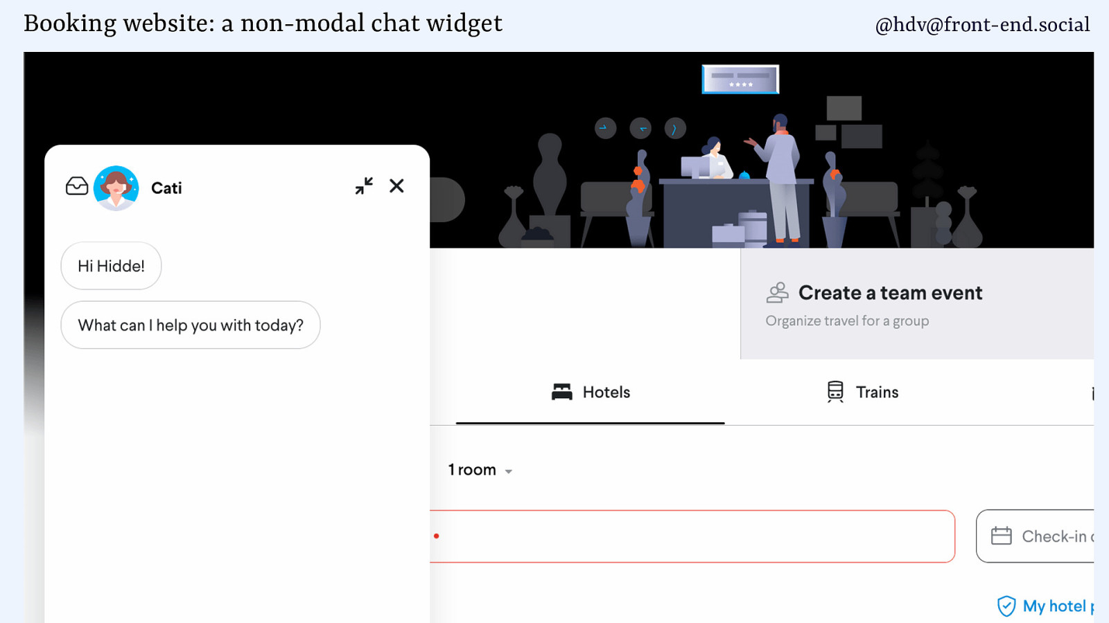
Booking website: a non-modal chat widget @hdv@front-end.social
@hdv@front-end.social Making an element modal is a drastic measure, the user can do nothing else. Use it sparingly!
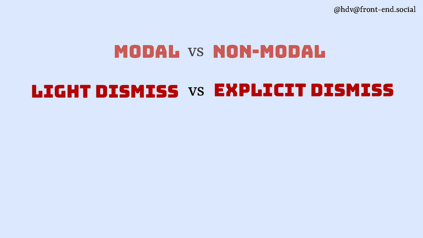
@hdv@front-end.social modal vs non-modal light dismiss vs explicit dismiss
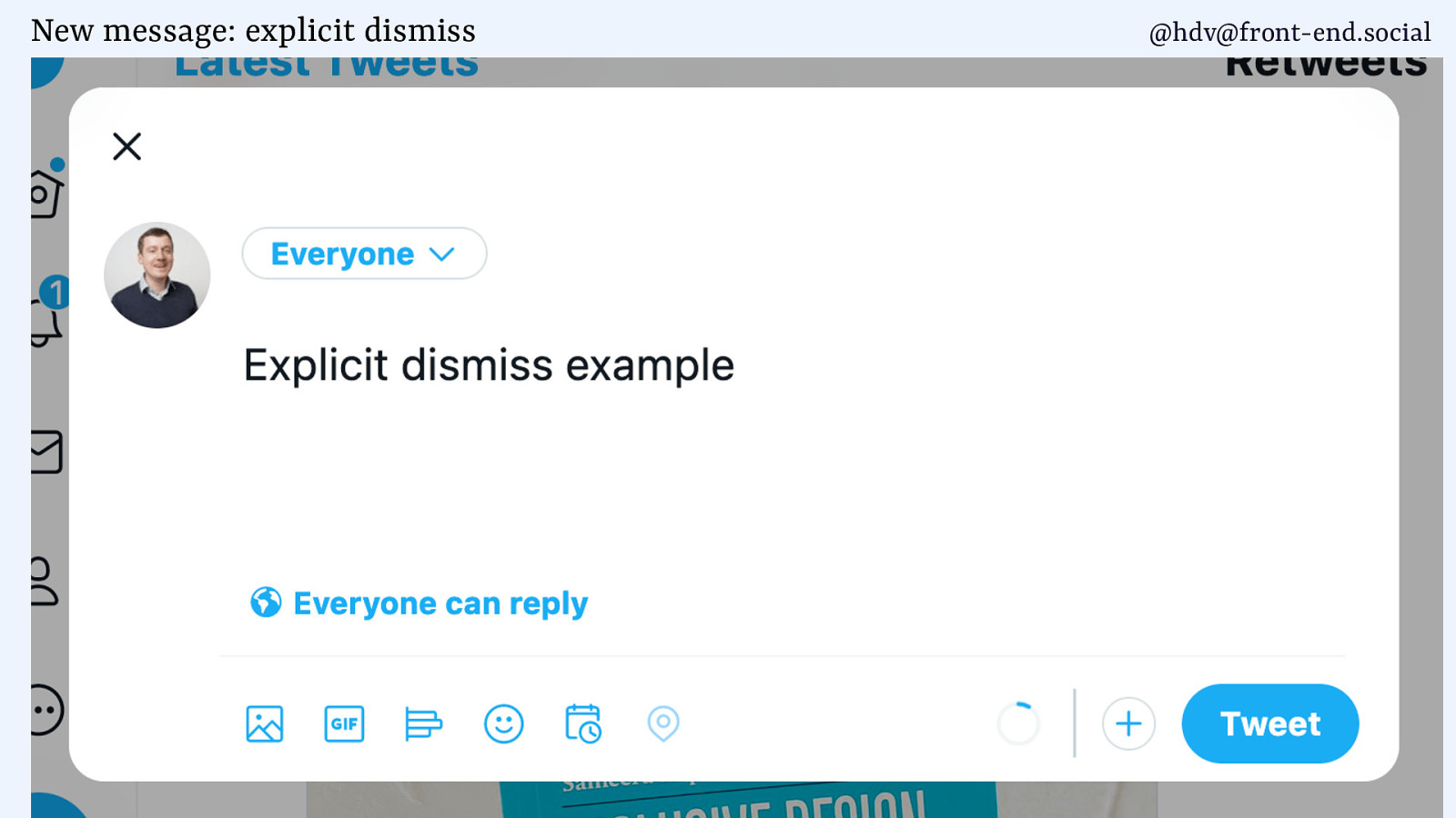
New message: explicit dismiss @hdv@front-end.social
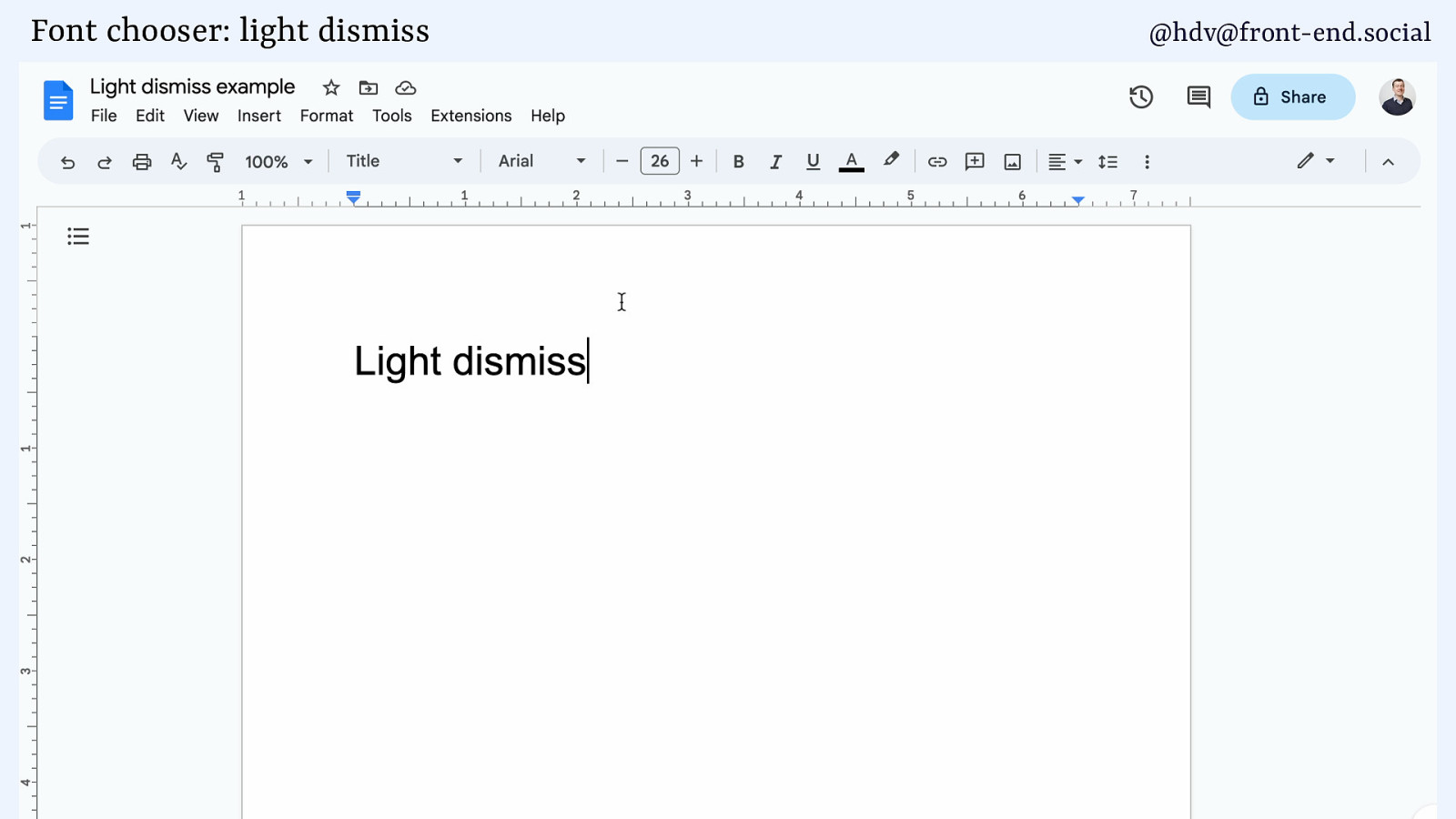
Font chooser: light dismiss @hdv@front-end.social
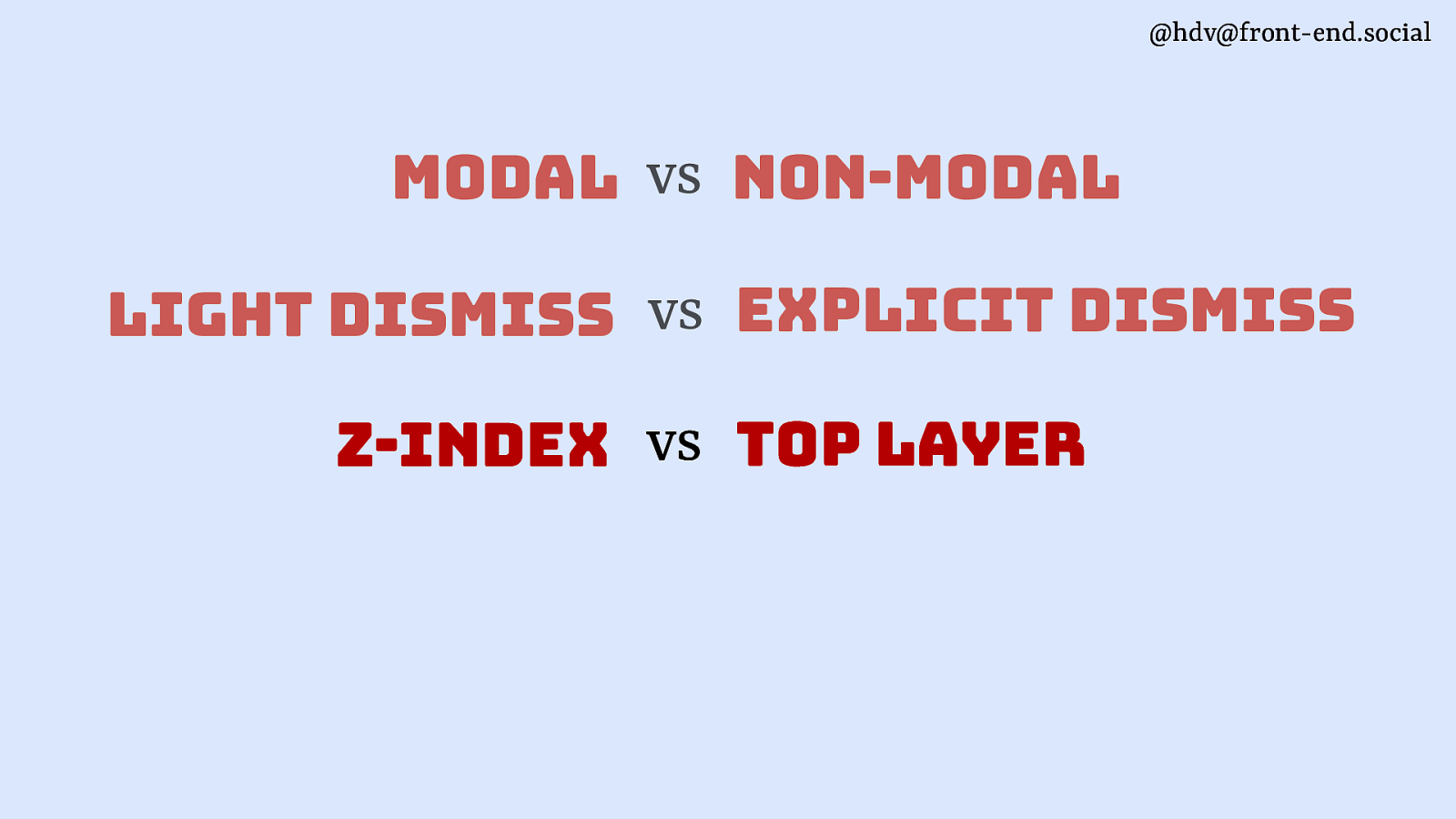
@hdv@front-end.social modal vs non-modal light dismiss vs explicit dismiss z-index vs top layer
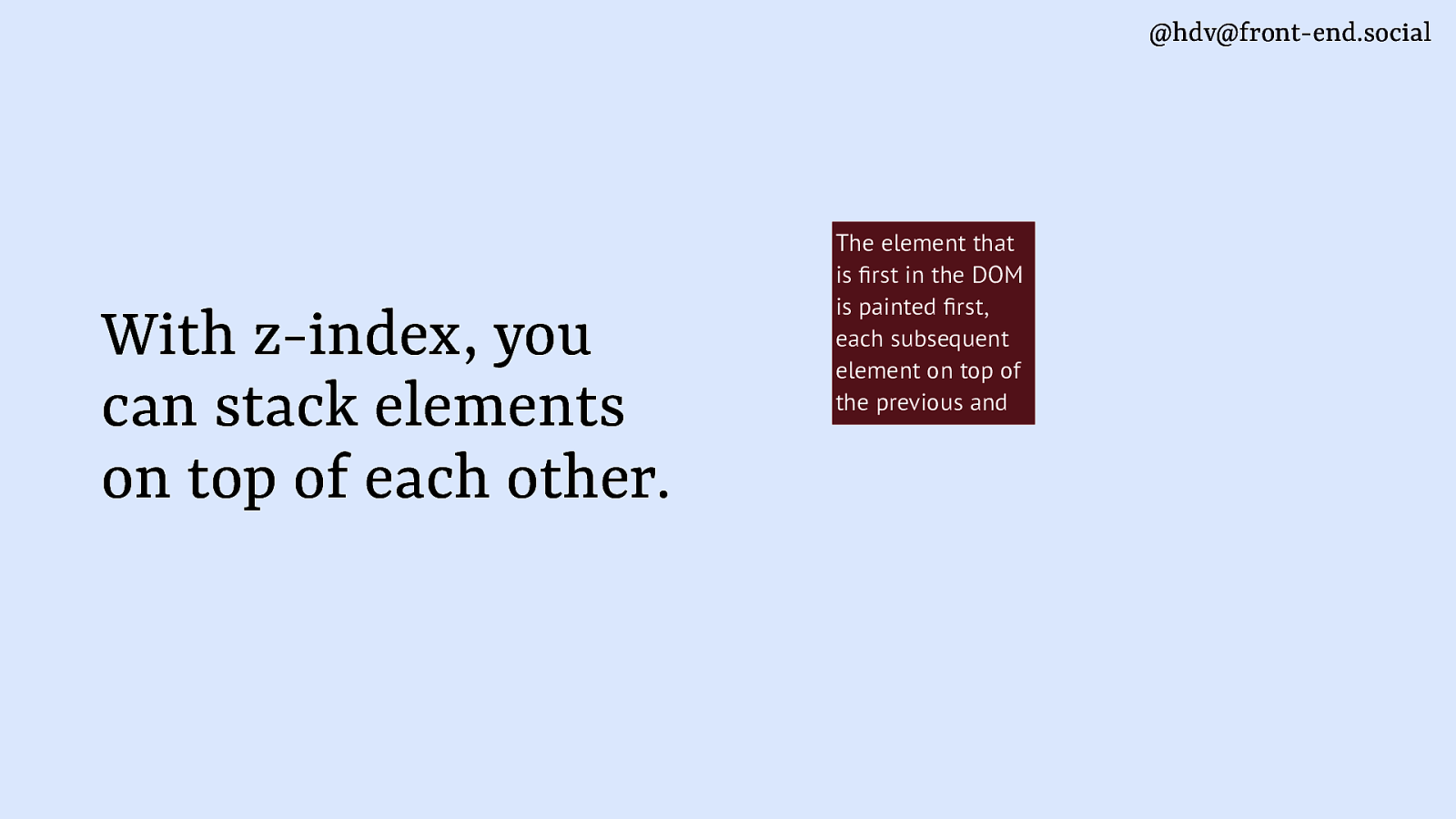
@hdv@front-end.social fi fi With z-index, you can stack elements on top of each other. The element that is rst in the DOM is painted rst, each subsequent element on top of the previous and
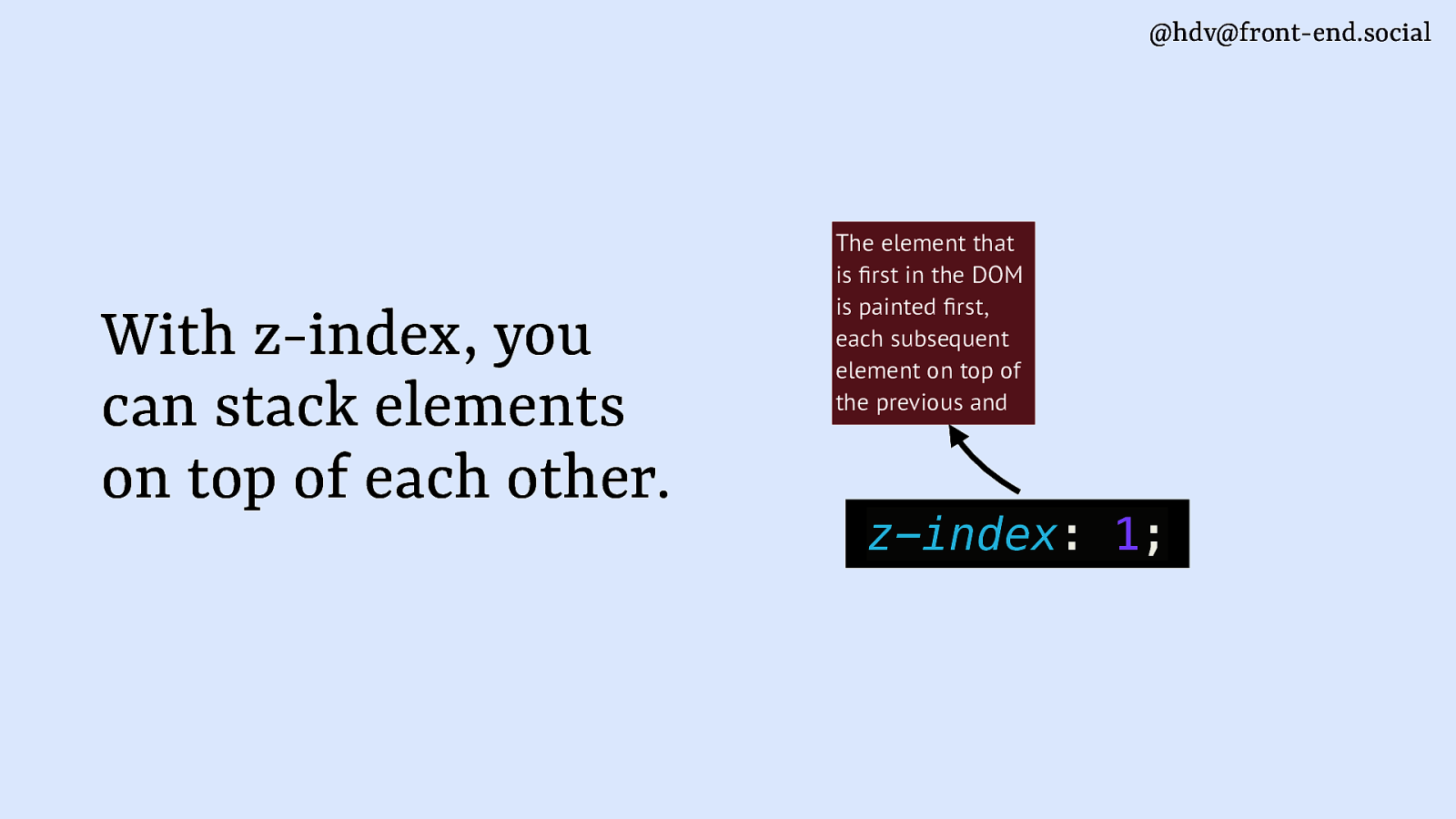
@hdv@front-end.social fi fi With z-index, you can stack elements on top of each other. The element that is rst in the DOM is painted rst, each subsequent element on top of the previous and z-index: 1;
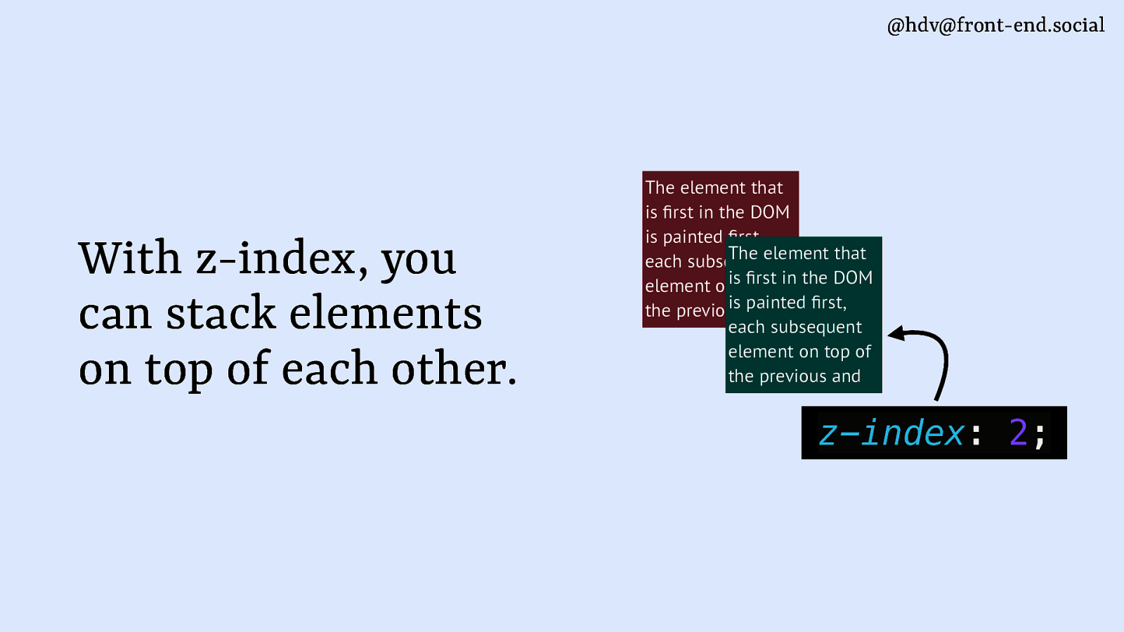
@hdv@front-end.social With z-index, you can stack elements on top of each other. The element that is rst in the DOM is painted rst, The element that each subsequent rstofin the DOM element onistop is painted rst, the previous and each subsequent element on top of the previous and fi fi fi fi z-index: 2;

@hdv@front-end.social The top layer is above everything else, its own layer above the main document fi fi fi fi drafts.csswg.org/css-position-4/#top-layer The element that is rst in the DOM is painted rst, The element that each subsequent rstofin the DOM element onistop is painted rst, the previous and each subsequent element on top of the previous and
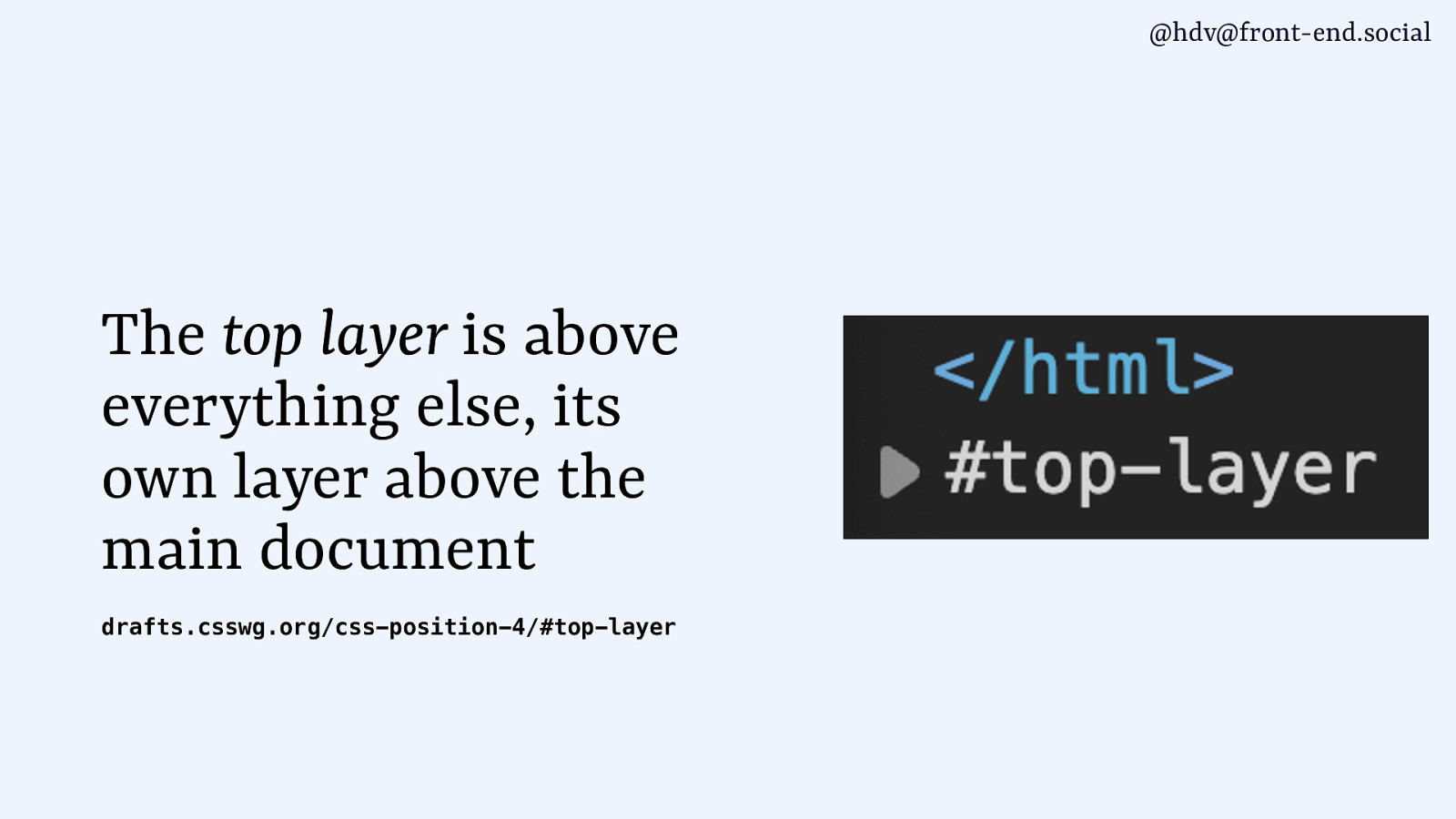
@hdv@front-end.social The top layer is above everything else, its own layer above the main document drafts.csswg.org/css-position-4/#top-layer
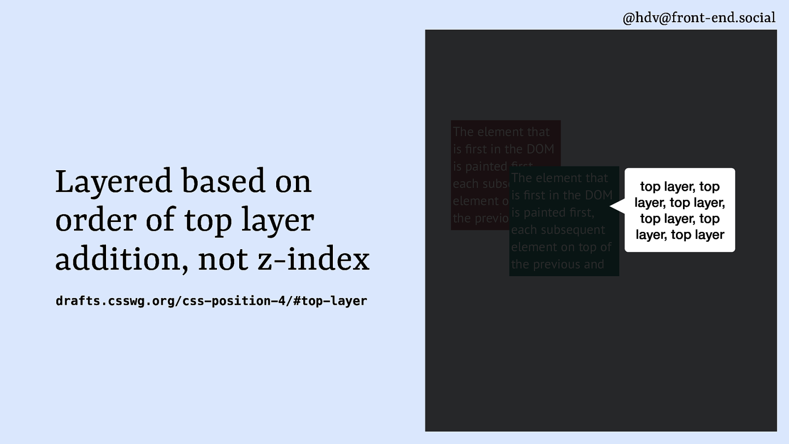
@hdv@front-end.social Layered based on order of top layer addition, not z-index fi fi fi fi drafts.csswg.org/css-position-4/#top-layer The element that is rst in the DOM is painted rst, The element that each subsequent rstofin the DOM element onistop is painted rst, the previous and each subsequent element on top of the previous and top layer, top layer, top layer, top layer, top layer, top layer
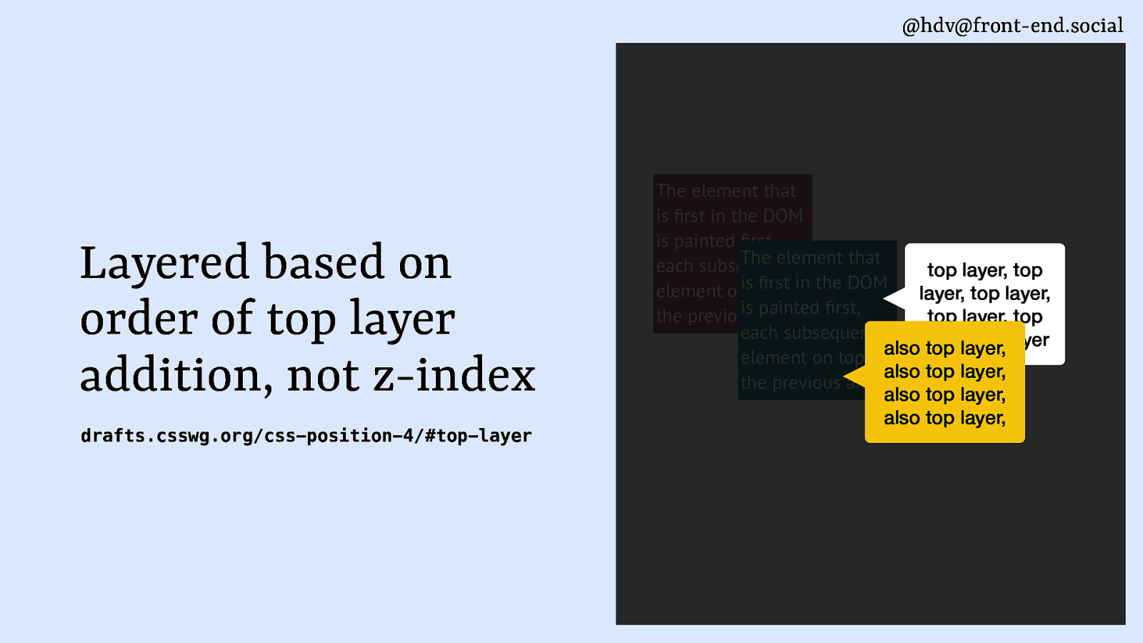
@hdv@front-end.social Layered based on order of top layer addition, not z-index fi fi fi fi drafts.csswg.org/css-position-4/#top-layer The element that is rst in the DOM is painted rst, The element that each subsequent top layer, top rstofin the DOM element onistop layer, top layer, is painted rst, the previous and top layer, top each subsequent layer, top layer also top layer, element on top of also top layer, the previous and also top layer, also top layer,
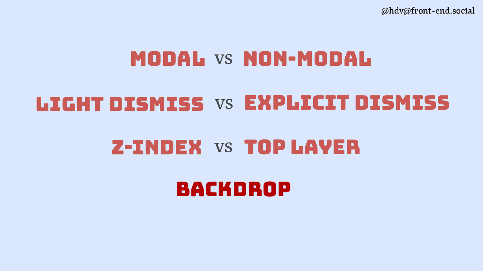
@hdv@front-end.social modal vs non-modal light dismiss vs explicit dismiss z-index vs top layer backdrop
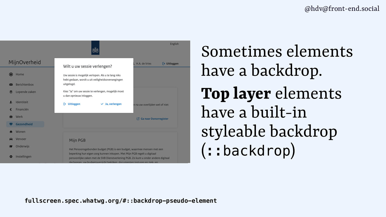
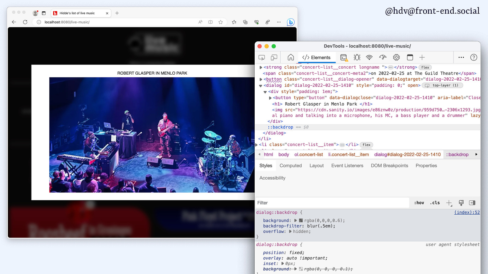
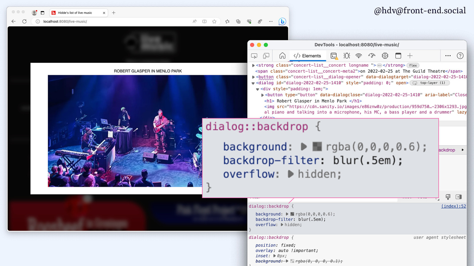
@hdv@front-end.social Sometimes elements have a backdrop. Top layer elements have a built-in styleable backdrop (::backdrop) fullscreen.spec.whatwg.org/#::backdrop-pseudo-element
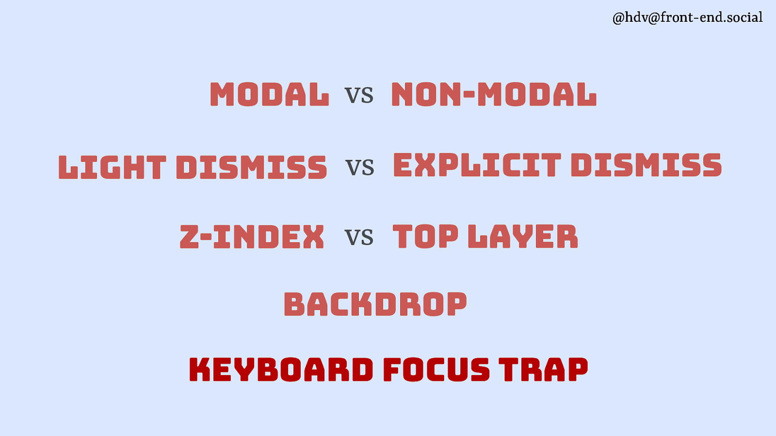
@hdv@front-end.social modal vs non-modal light dismiss vs explicit dismiss z-index vs top layer backdrop keyboard focus trap
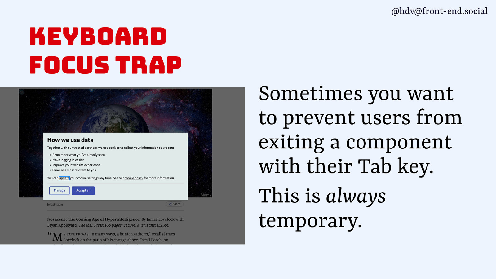
@hdv@front-end.social keyboard focus trap Sometimes you want to prevent users from exiting a component with their Tab key. This is always temporary.
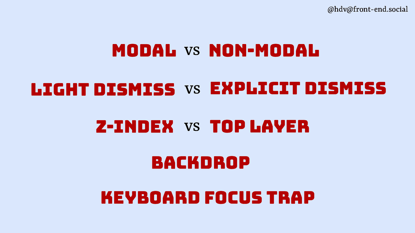
@hdv@front-end.social modal vs non-modal light dismiss vs explicit dismiss z-index vs top layer backdrop keyboard focus trap
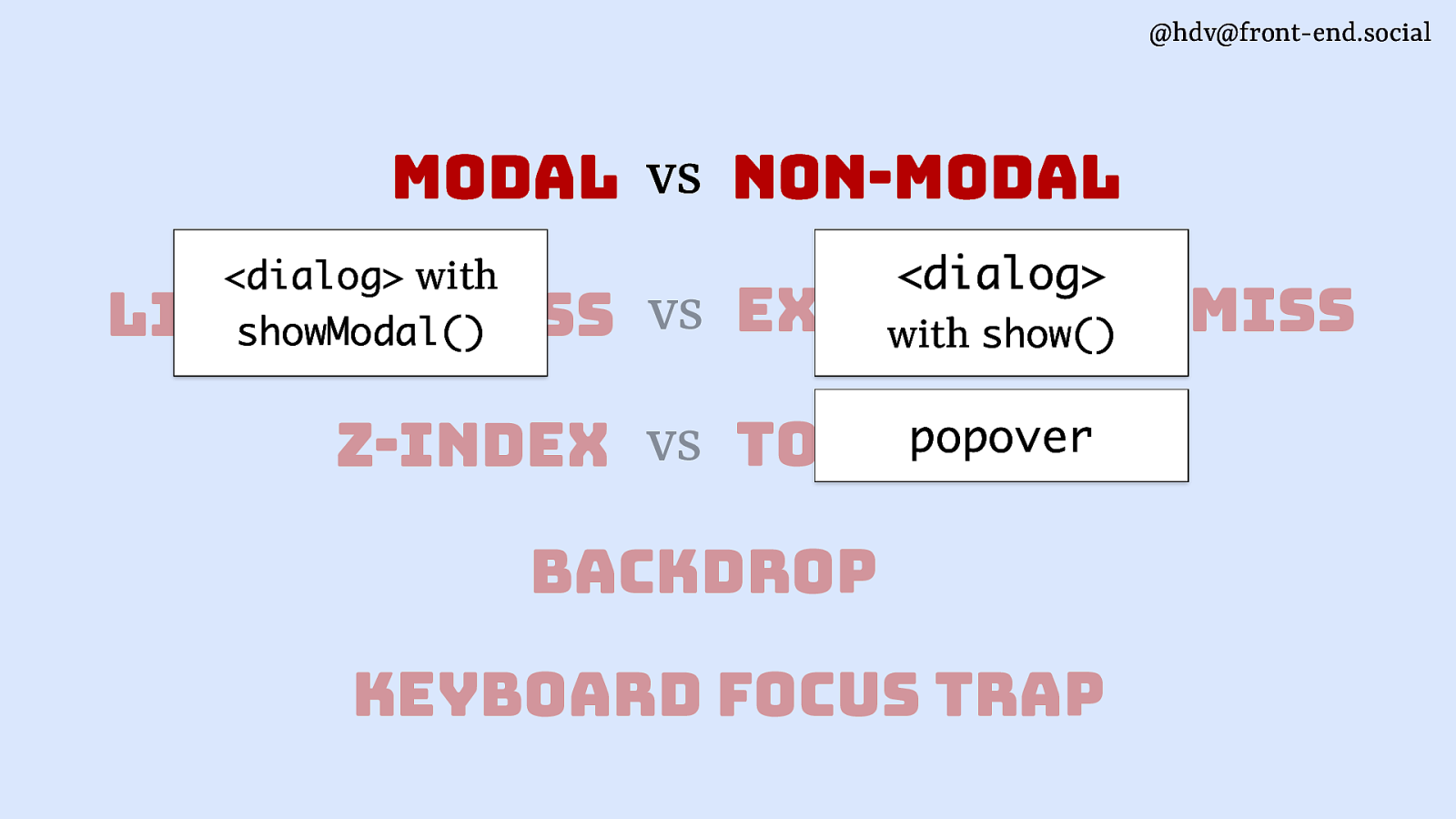
@hdv@front-end.social modal vs non-modal <dialog>
<dialog> with showModal() dismiss light dismiss vs explicit with show() popover vs top layer z-index backdrop keyboard focus trap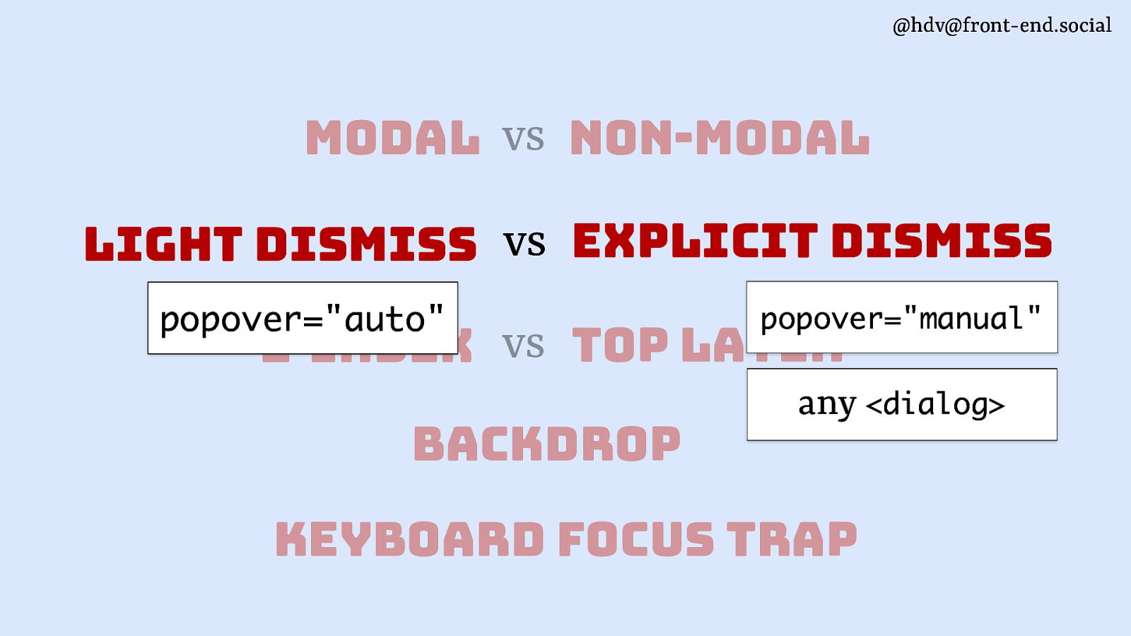
@hdv@front-end.social modal vs non-modal light dismiss vs explicit dismiss popover=”auto” popover=”manual” z-index vs top layer backdrop any <dialog> keyboard focus trap
@hdv@front-end.social modal vs <dialog> popover non-modal <dialog> with showModal() vs explicit dismiss light dismiss with show() z-index vs top layer backdrop keyboard focus trap
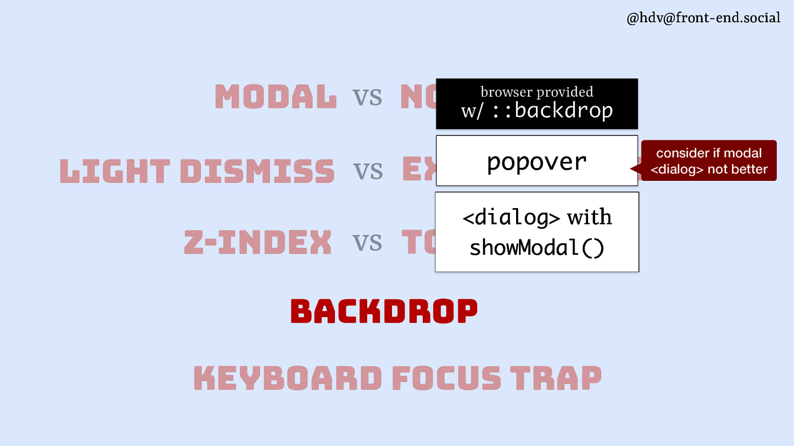
@hdv@front-end.social modal vs non-modal w/ ::backdrop browser provided light dismiss vs consider if modal <dialog> not better popover explicit dismiss <dialog> with showModal() z-index vs top layer backdrop keyboard focus trap

@hdv@front-end.social modal vs non-modal w/ ::backdrop browser provided light dismiss vs consider if modal <dialog> not better popover explicit dismiss <dialog> with showModal() z-index vs top layer backdrop keyboard focus trap
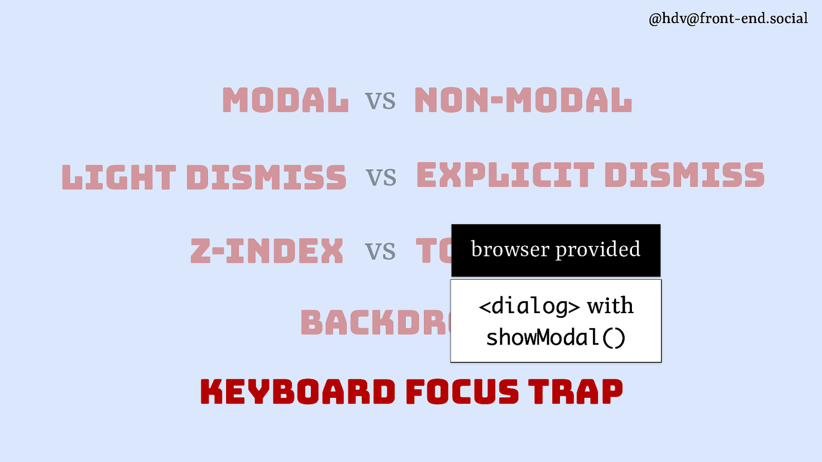
@hdv@front-end.social modal vs non-modal light dismiss vs explicit dismiss browser provided vs top layer z-index <dialog> with showModal() backdrop keyboard focus trap
@hdv@front-end.social semantics
“What is this thing?” — philosophers @hdv@front-end.social
“What is this thing in this page/app?” —web developers @hdv@front-end.social
@hdv@front-end.social
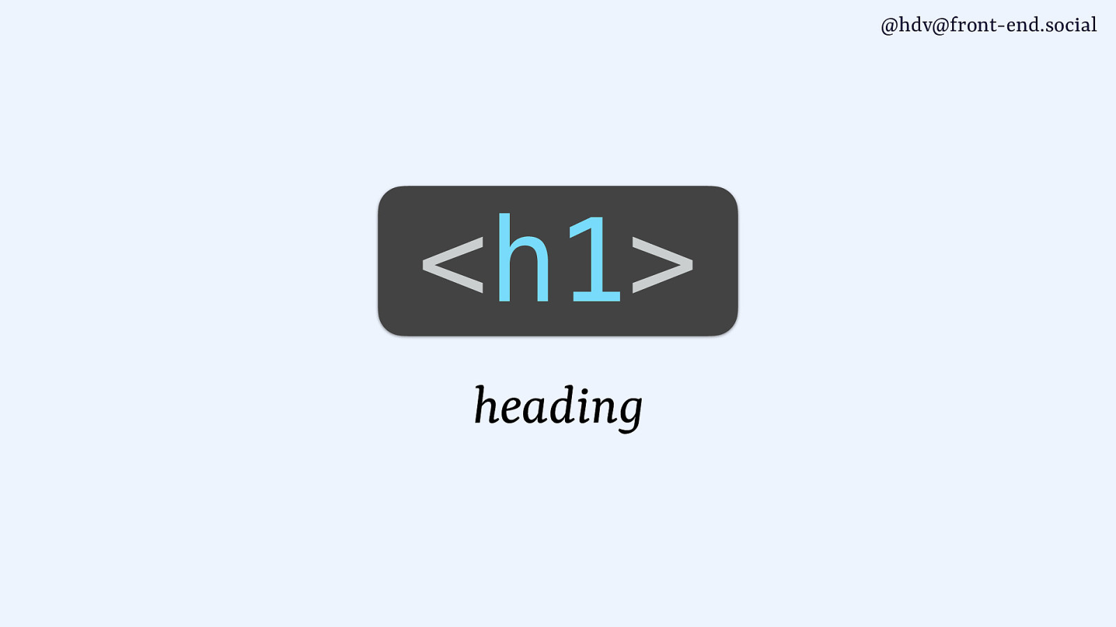
<h1> heading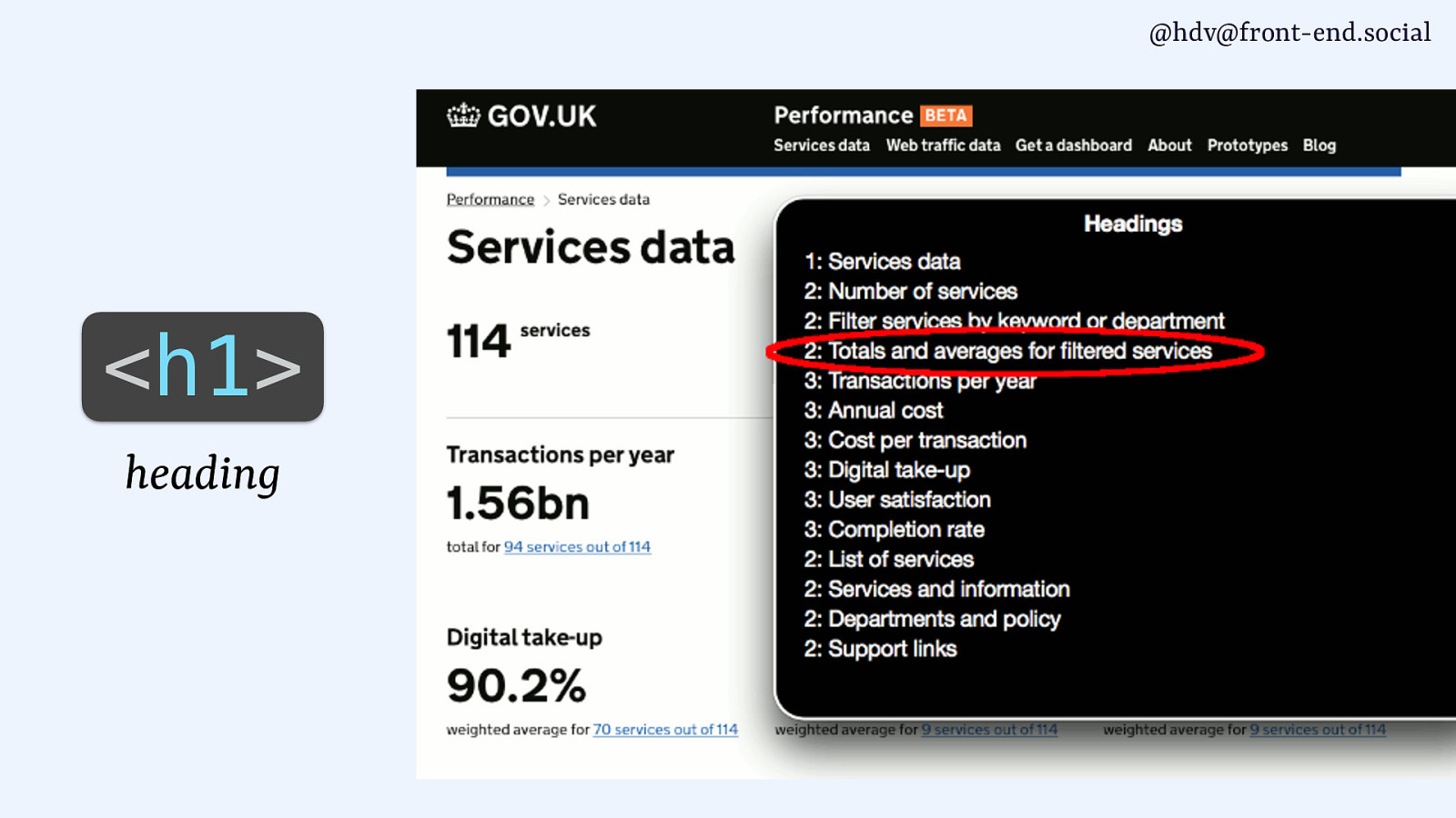
@hdv@front-end.social
<h1> heading
@hdv@front-end.social <a> link
@hdv@front-end.social
<li> list item
@hdv@front-end.social
<dialog> dialog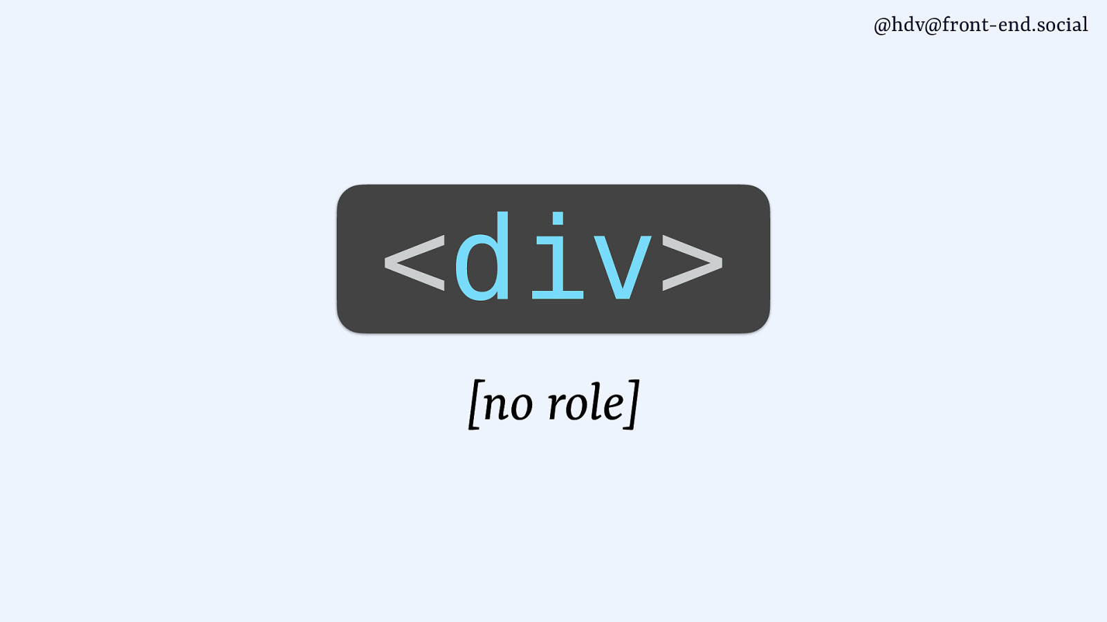
@hdv@front-end.social
<div> [no role]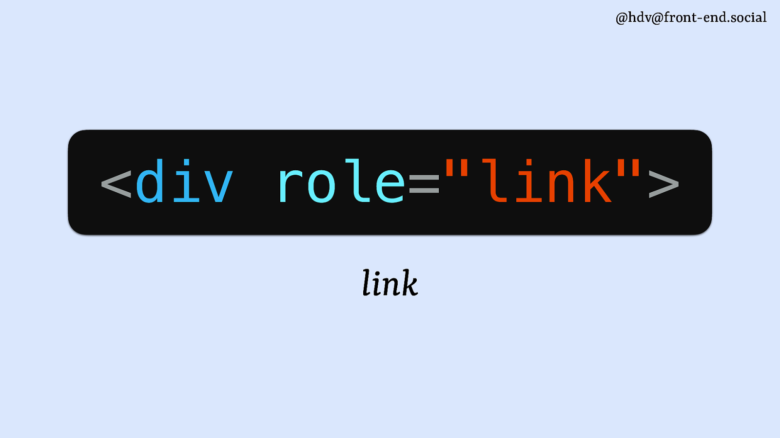
@hdv@front-end.social
<div role=”link”> link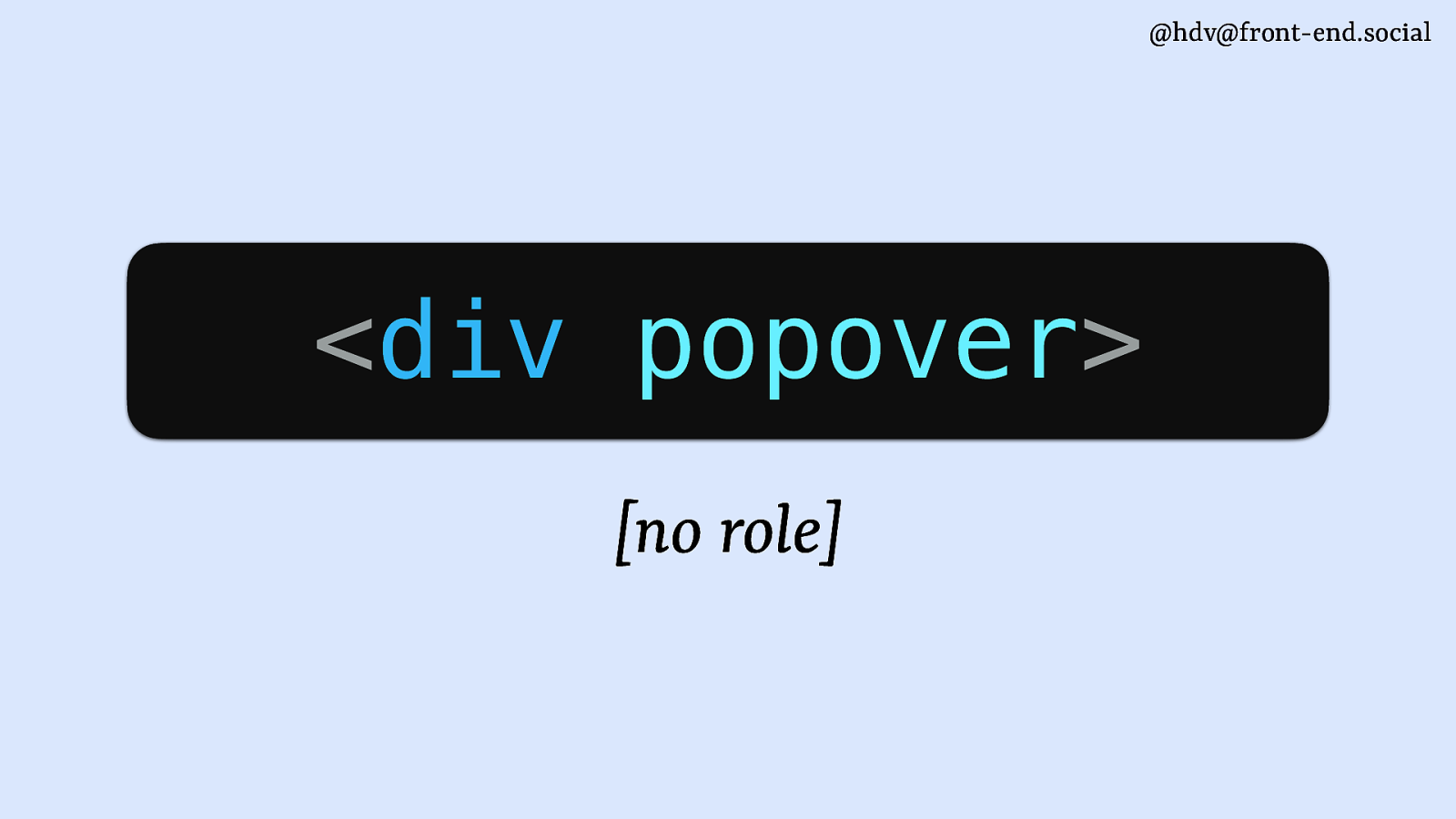
@hdv@front-end.social
<div popover> [no role]
@hdv@front-end.social The popover attribute adds behaviour, not semantics (you choose a role based on the situation)

@hdv@front-end.social For components that are like a smaller window / subwindow on top of the main page dialogs <dialog> or role=”dialog”

@hdv@front-end.social For components that are like a smaller window / subwindow on top of the main page
@hdv@front-end.social For components that are like a smaller window / subwindow on top of the main page
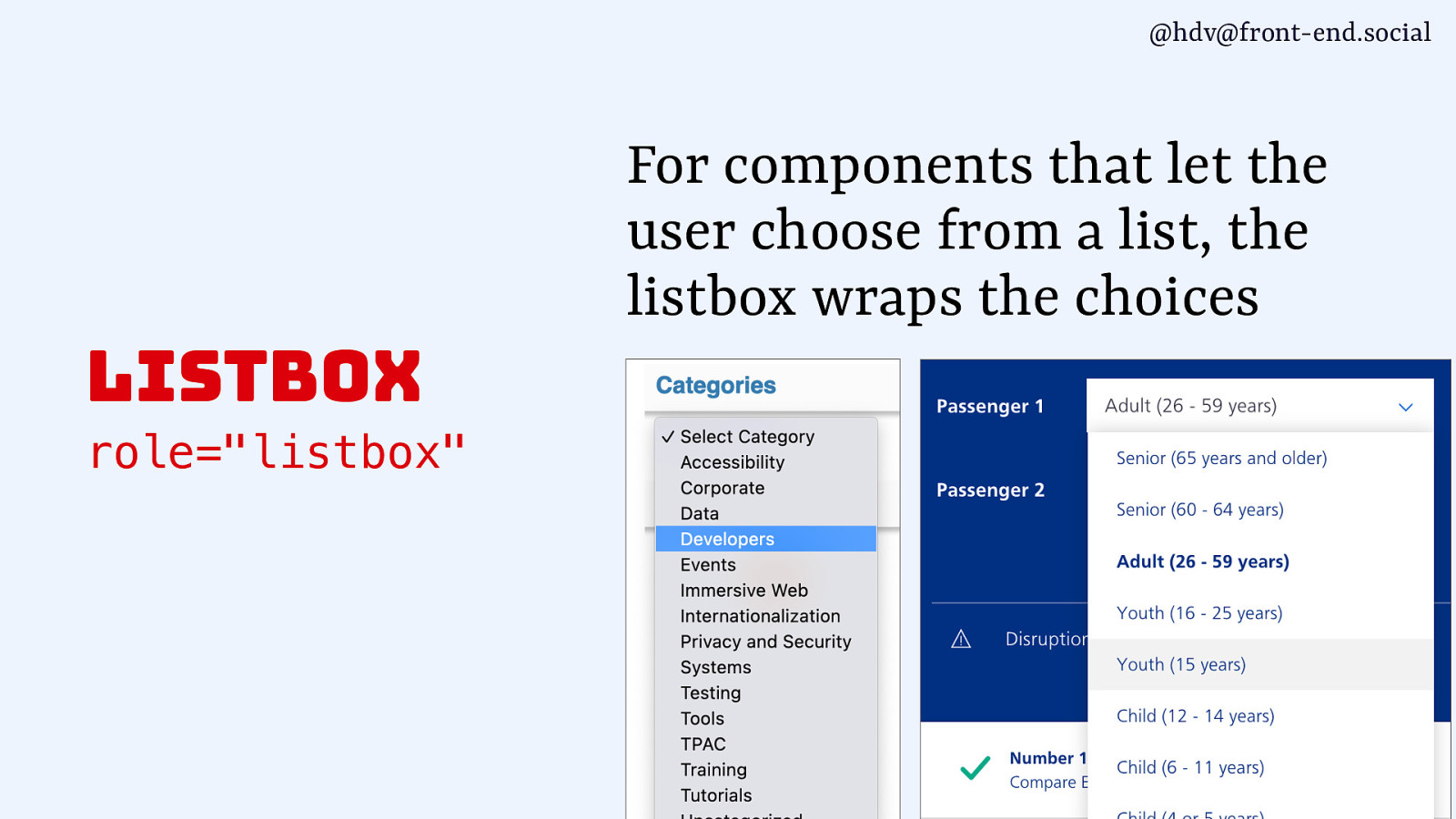
@hdv@front-end.social For components that let the user choose from a list, the listbox wraps the choices listbox role=”listbox”
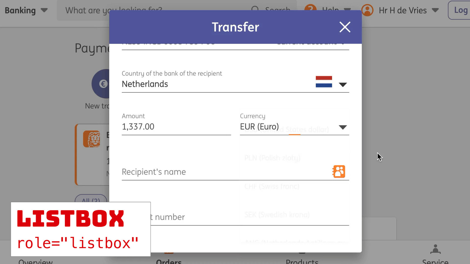
@hdv@front-end.social For components that let the user choose from a list, the listbox wraps the choices listbox role=”listbox” listbox role=”listbox”
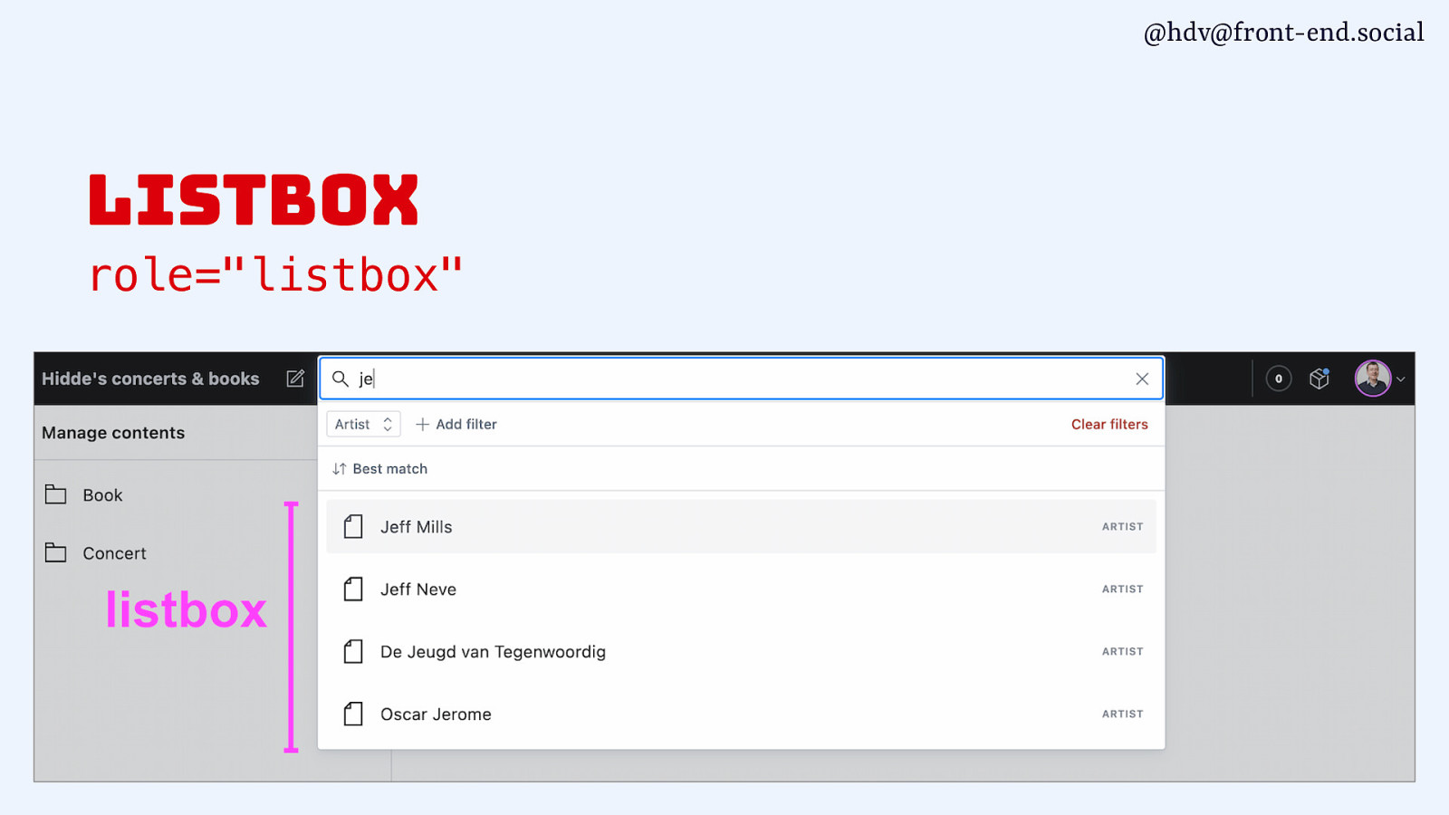
@hdv@front-end.social listbox role=”listbox”
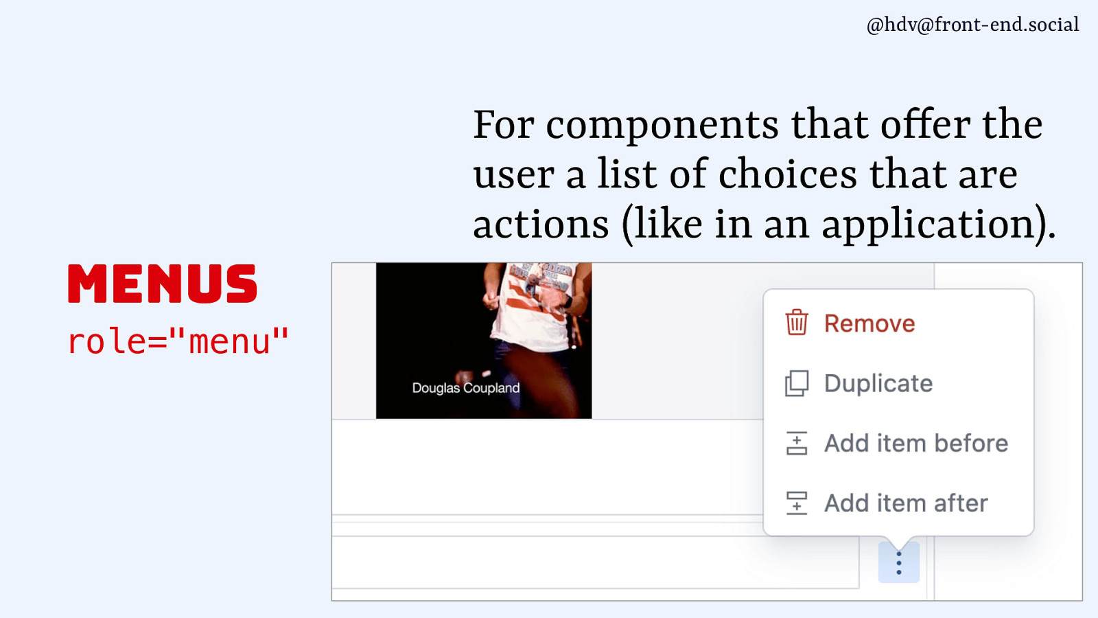
@hdv@front-end.social For components that o fer the user a list of choices that are actions (like in an application). menus f role=”menu”
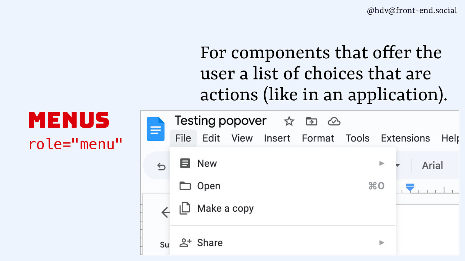
@hdv@front-end.social For components that o fer the user a list of choices that are actions (like in an application). menus f role=”menu”

@hdv@front-end.social For components that o fer the user a list of choices that are actions (like in an application). menus f role=”menu”
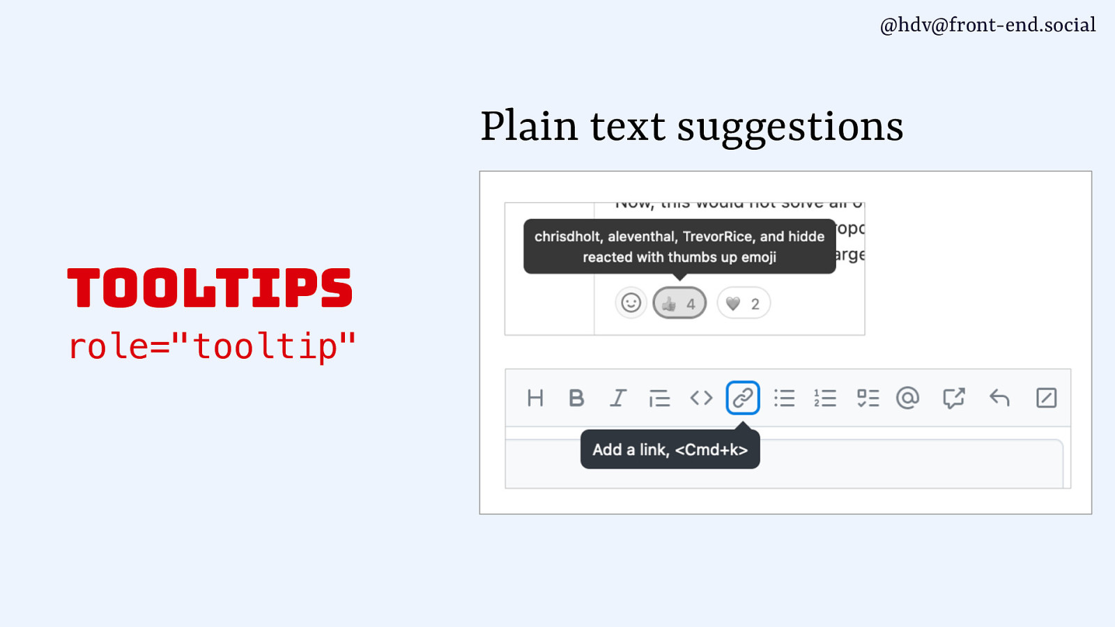
@hdv@front-end.social Plain text suggestions tooltips role=”tooltip”
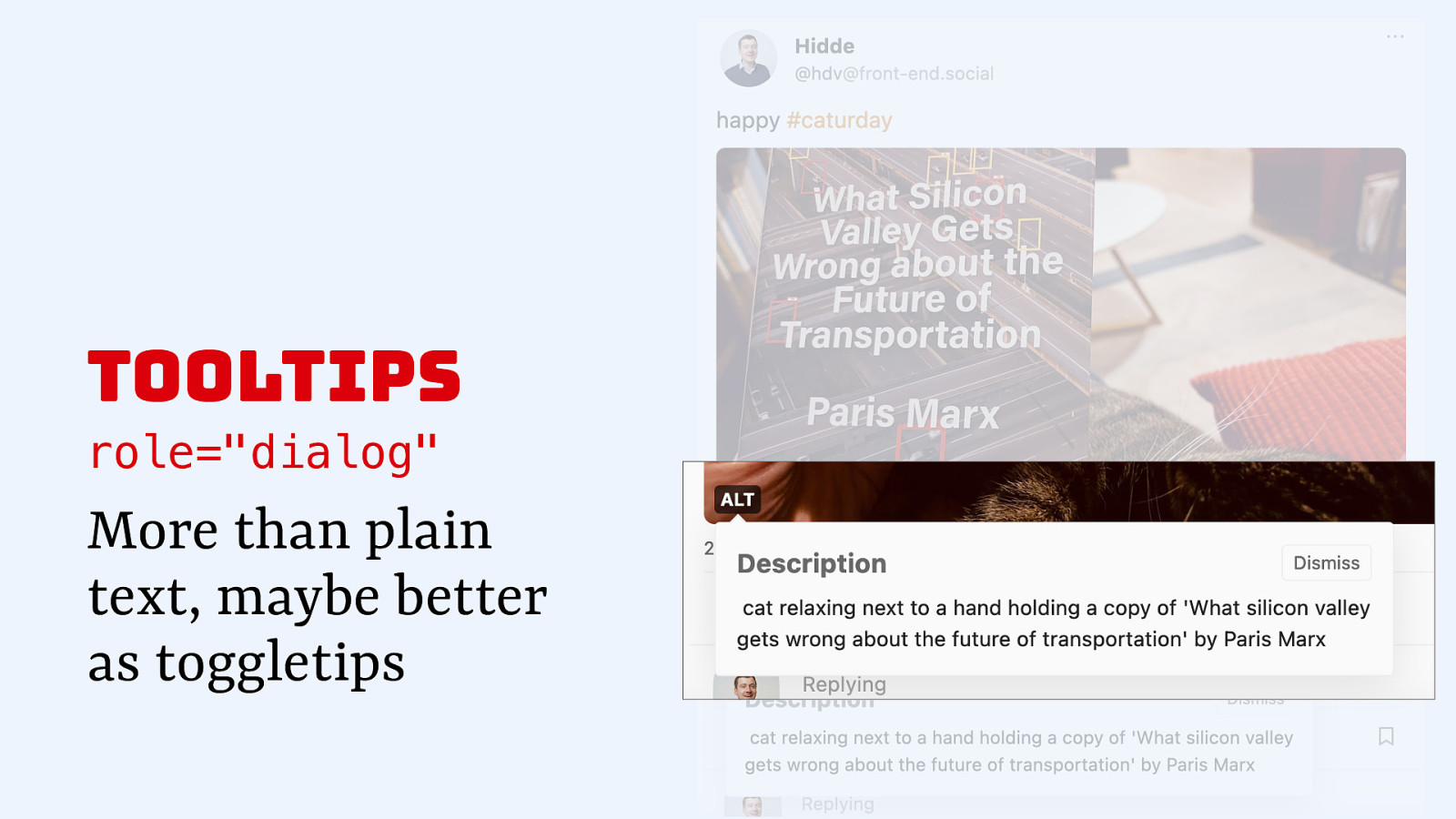
tooltips role=”dialog” More than plain text, maybe better as toggletips
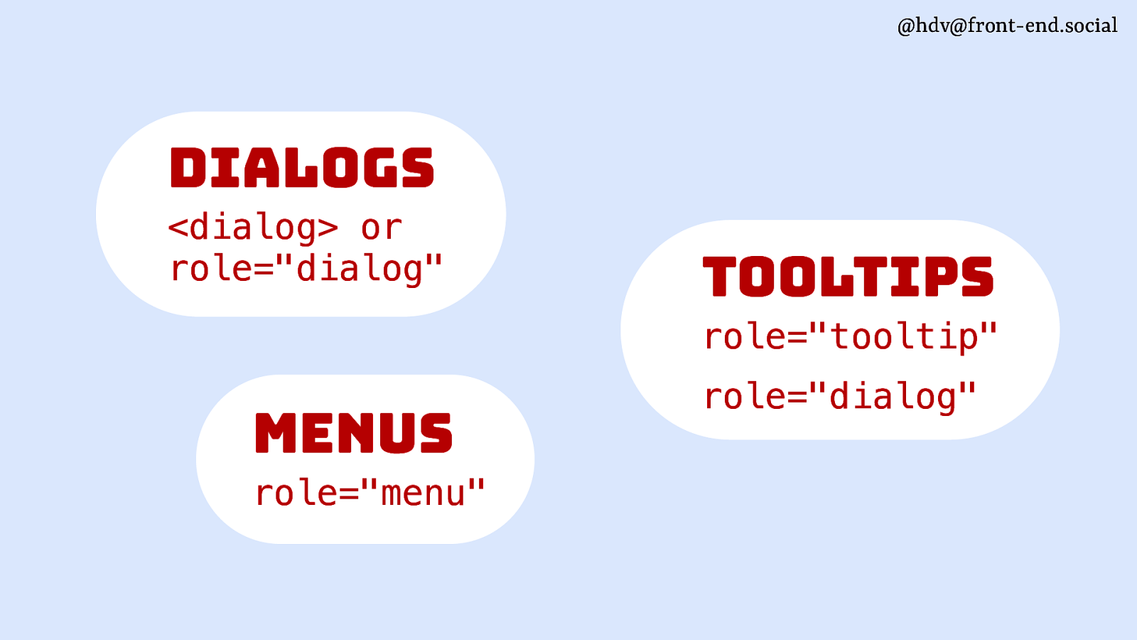
@hdv@front-end.social dialogs <dialog> or role=”dialog” tooltips role=”tooltip” menus role=”menu” role=”dialog”
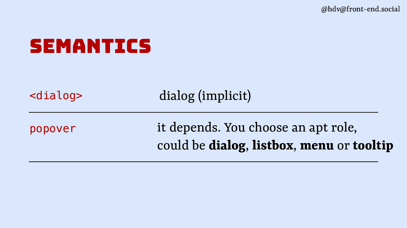
@hdv@front-end.social semantics <dialog> dialog (implicit) popover it depends. You choose an apt role, could be dialog, listbox, menu or tooltip
@hdv@front-end.social positioning
@hdv@front-end.social
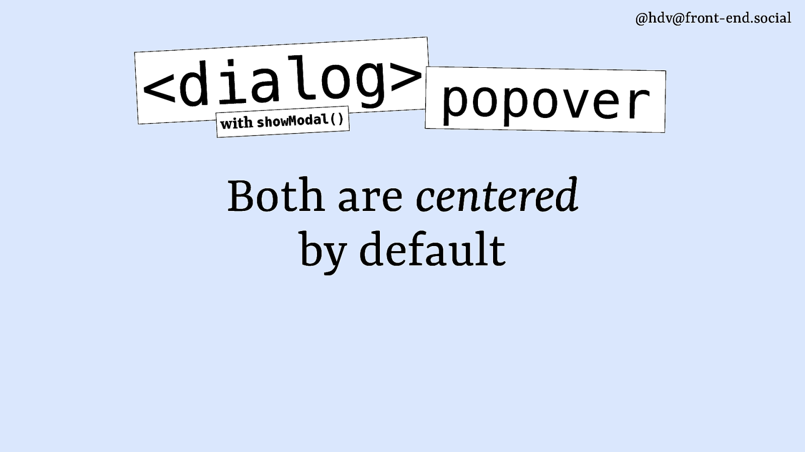
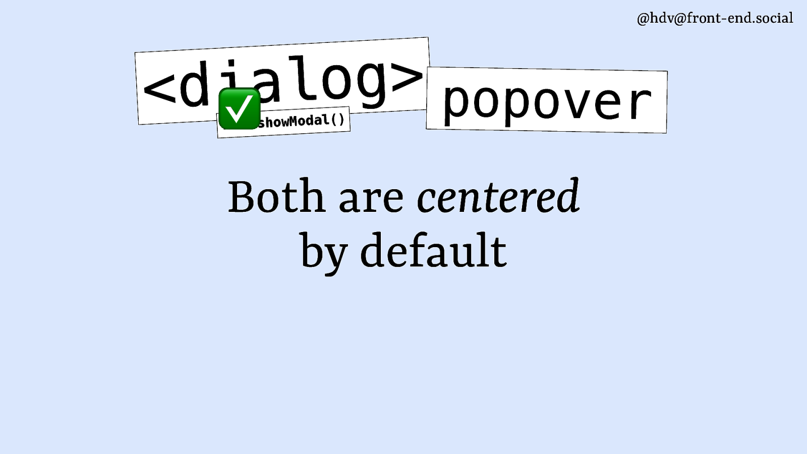
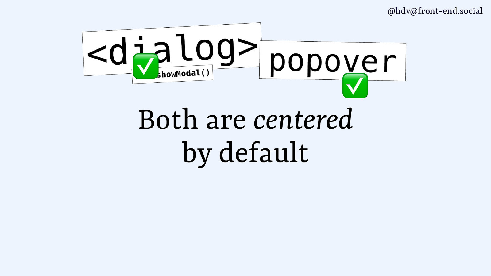
g o l a i d < popover ) ( l a d o M w o h s h t i w Both are centered by default
@hdv@front-end.social log.hidde.blog
@hdv@front-end.social
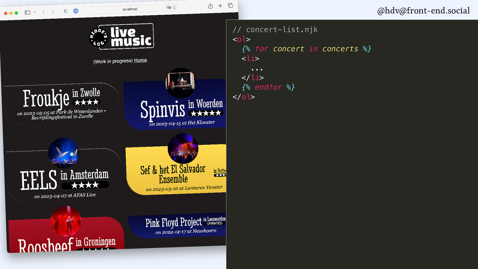
@hdv@front-end.social // concert-list.njk <ol> {% for concert in concerts %} <li> … </li> {% endfor %} </ol>
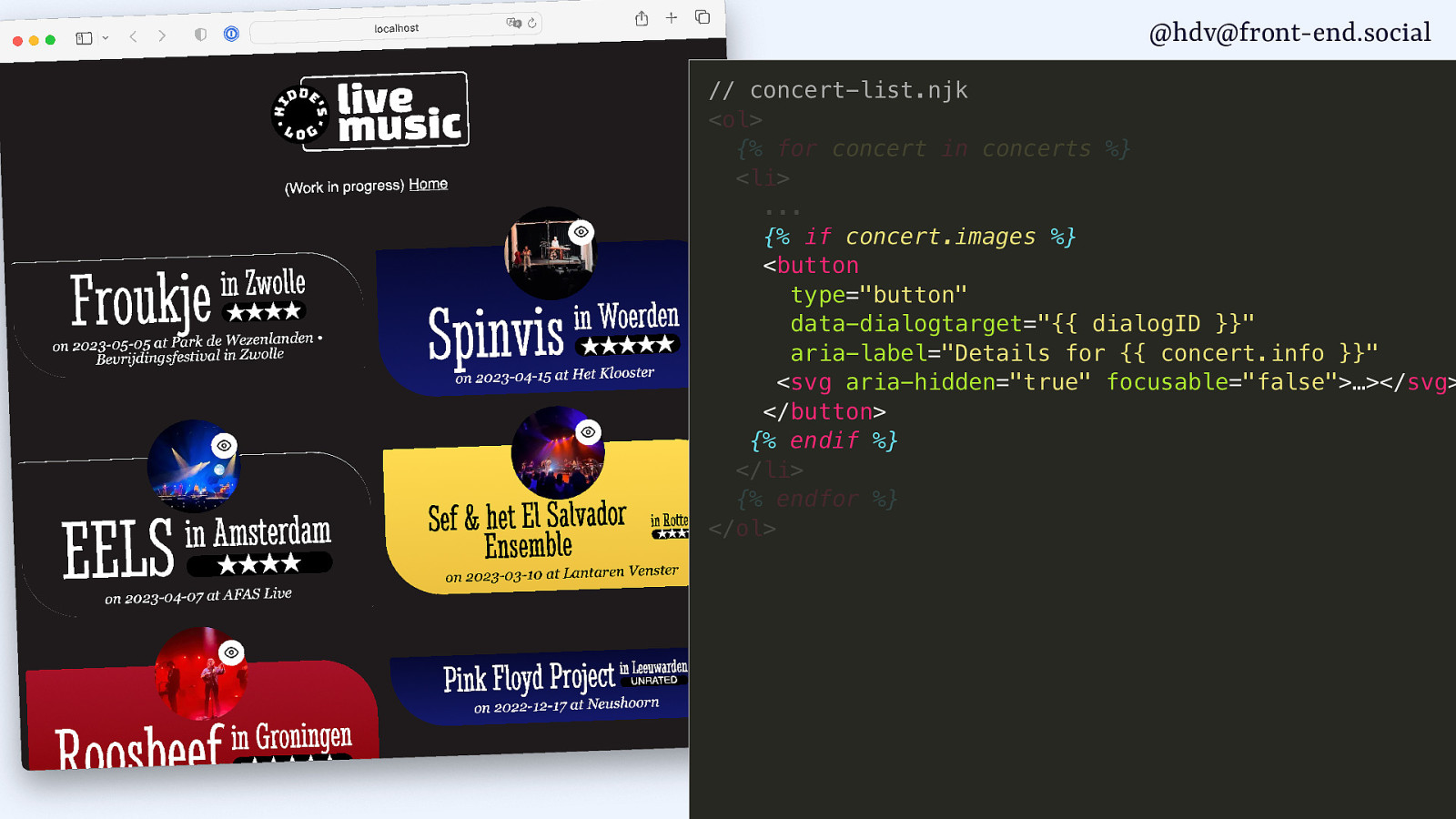
@hdv@front-end.social // concert-list.njk <ol> {% for concert in concerts %} <li> … {% if concert.images %} <button type=”button” data-dialogtarget=”{{ dialogID }}” aria-label=”Details for {{ concert.info }}” <svg aria-hidden=”true” focusable=”false”>…></svg> </button> {% endif %} </li> {% endfor %} </ol>
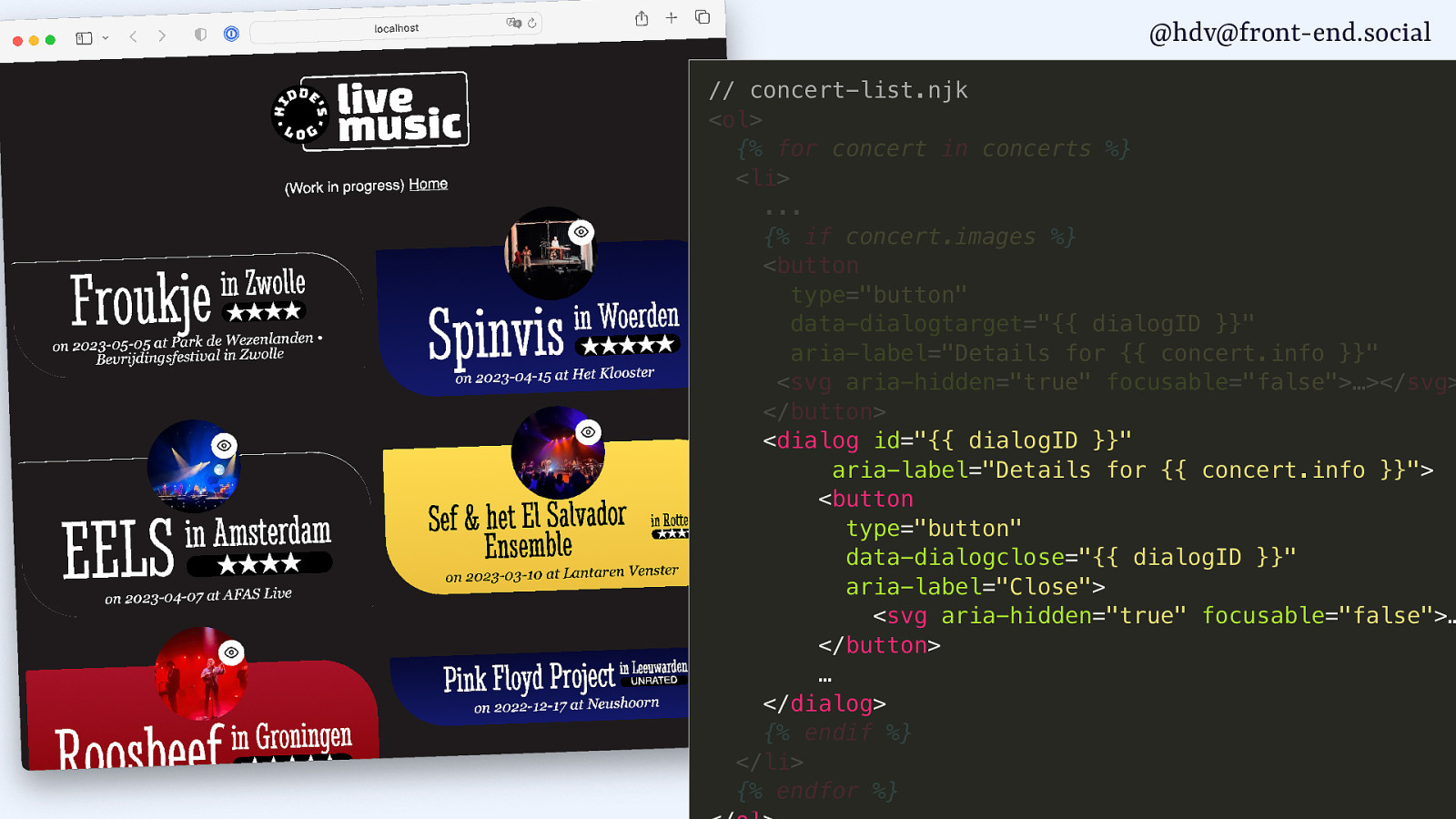
@hdv@front-end.social // concert-list.njk <ol> {% for concert in concerts %} <li> … {% if concert.images %} <button type=”button” data-dialogtarget=”{{ dialogID }}” aria-label=”Details for {{ concert.info }}” <svg aria-hidden=”true” focusable=”false”>…></svg> </button> <dialog id=”{{ dialogID }}” aria-label=”Details for {{ concert.info }}”> <button type=”button” data-dialogclose=”{{ dialogID }}” aria-label=”Close”> <svg aria-hidden=”true” focusable=”false”>… </button> … </dialog> {% endif %} </li> {% endfor %}
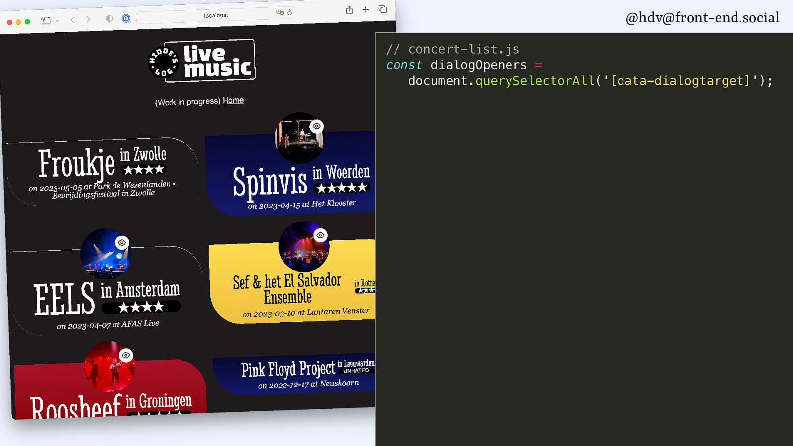
@hdv@front-end.social // concert-list.js const dialogOpeners = document.querySelectorAll(‘[data-dialogtarget]’);

@hdv@front-end.social // concert-list.js const dialogOpeners = document.querySelectorAll(‘[data-dialogtarget]’); for (let i = 0; i < dialogOpeners.length; i++) { const opener = dialogOpeners[i]; const correspondingDialog = document.querySelector( #${opener.getAttribute('data-dialogtarget')}); }

@hdv@front-end.social // concert-list.js const dialogOpeners = document.querySelectorAll(‘[data-dialogtarget]’); for (let i = 0; i < dialogOpeners.length; i++) { const opener = dialogOpeners[i]; const correspondingDialog = document.querySelector( #${opener.getAttribute('data-dialogtarget')}); opener.addEventListener(‘click’, function() { correspondingDialog.showModal(); }); }
@hdv@front-end.social
@hdv@front-end.social
@hdv@front-end.social
@hdv@front-end.social
@hdv@front-end.social
@hdv@front-end.social
g o l a i d < ✅ popover ) ( l a d o M w o h s h t i w Both are centered by default
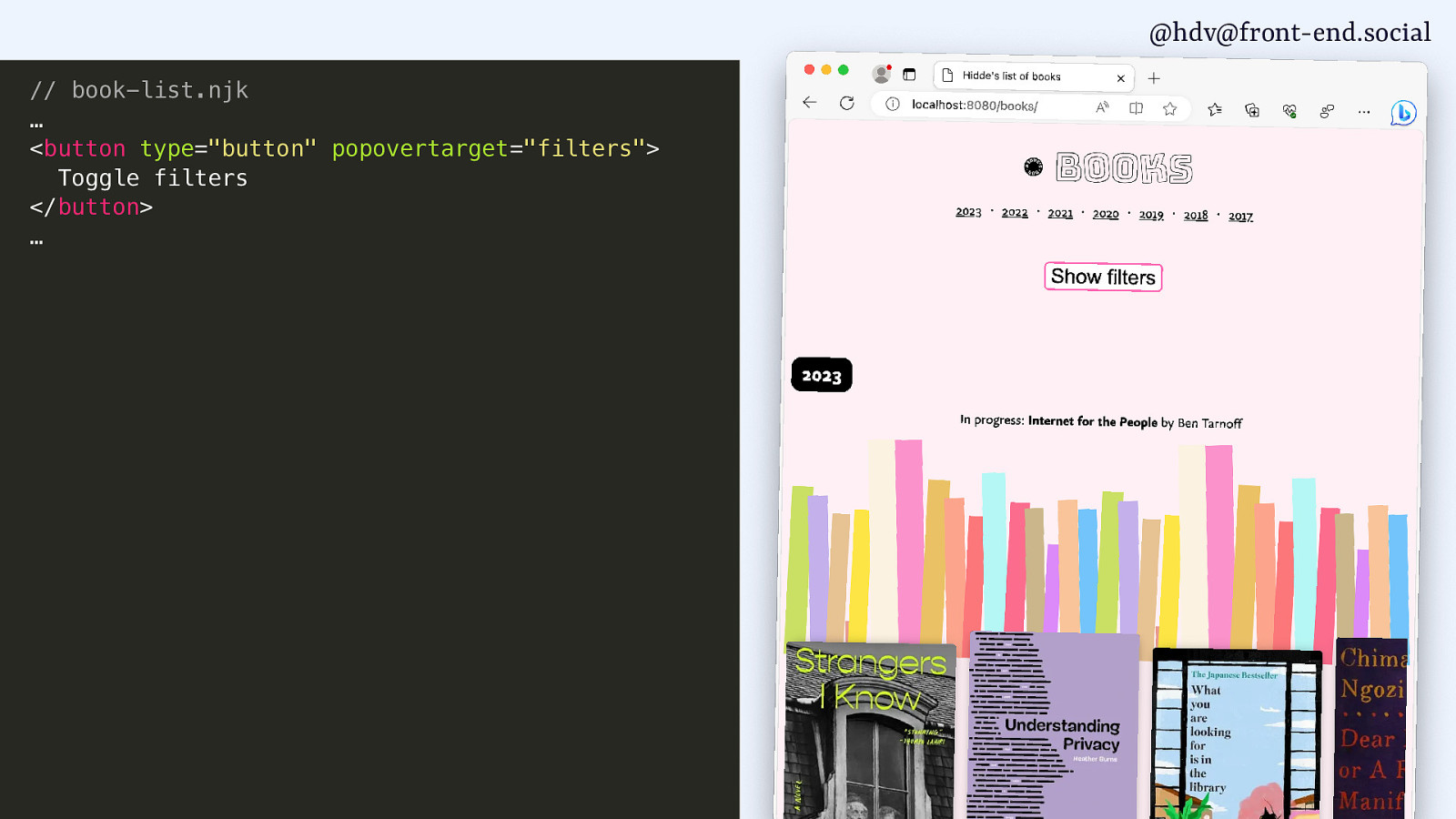
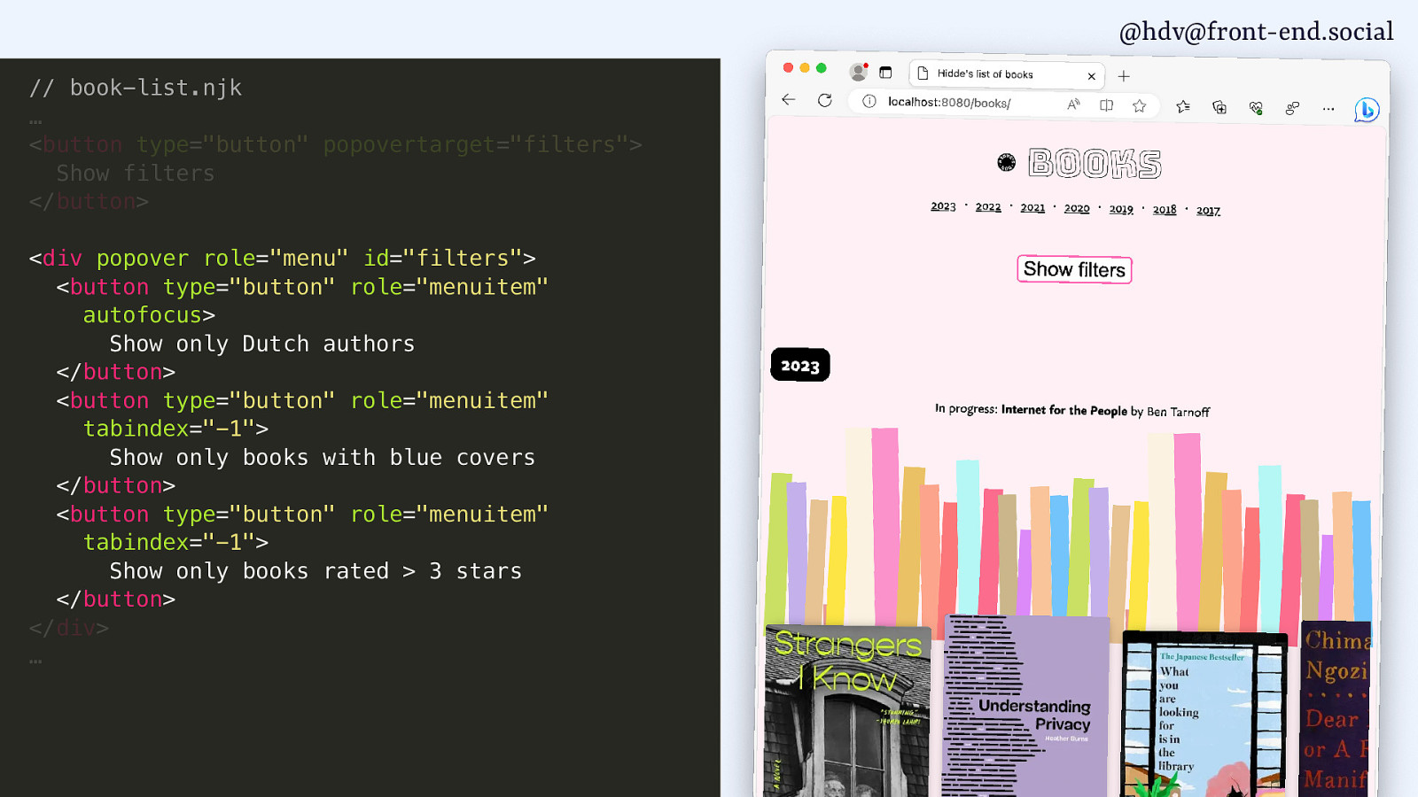
@hdv@front-end.social // book-list.njk … <button type=”button” popovertarget=”filters”> Toggle filters </button> …
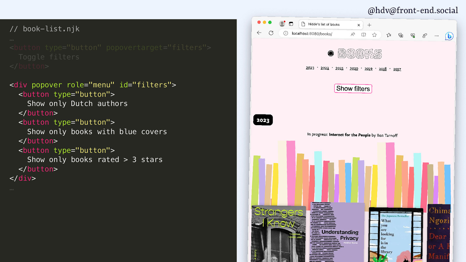
@hdv@front-end.social // book-list.njk … <button type=”button” popovertarget=”filters”> Toggle filters </button> <div popover role=”menu” id=”filters”> <button type=”button”> Show only Dutch authors </button> <button type=”button”> Show only books with blue covers </button> <button type=”button”> Show only books rated > 3 stars </button> </div> …
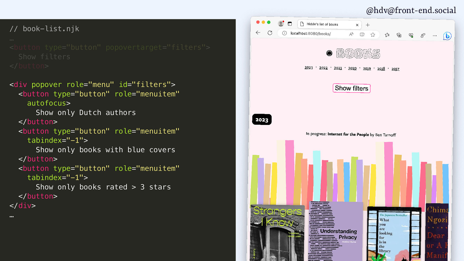
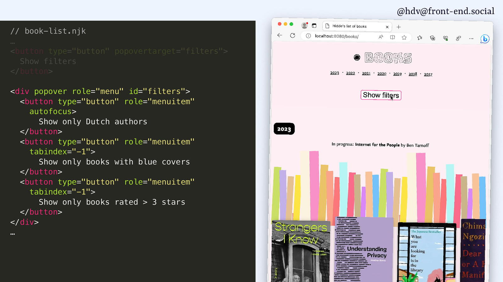
@hdv@front-end.social // book-list.njk … <button type=”button” popovertarget=”filters”> Show filters </button> <div popover role=”menu” id=”filters”> <button type=”button” role=”menuitem” autofocus> Show only Dutch authors </button> <button type=”button” role=”menuitem” tabindex=”-1”> Show only books with blue covers </button> <button type=”button” role=”menuitem” tabindex=”-1”> Show only books rated > 3 stars </button> </div> …
@hdv@front-end.social // book-list.njk … <button type=”button” popovertarget=”filters”> Show filters </button> <div popover role=”menu” id=”filters”> <button type=”button” role=”menuitem” autofocus> Show only Dutch authors </button> <button type=”button” role=”menuitem” tabindex=”-1”> Show only books with blue covers </button> <button type=”button” role=”menuitem” tabindex=”-1”> Show only books rated > 3 stars </button> </div> …
@hdv@front-end.social // book-list.njk … <button type=”button” popovertarget=”filters”> Show filters </button> <div popover role=”menu” id=”filters”> <button type=”button” role=”menuitem” autofocus> Show only Dutch authors </button> <button type=”button” role=”menuitem” tabindex=”-1”> Show only books with blue covers </button> <button type=”button” role=”menuitem” tabindex=”-1”> Show only books rated > 3 stars </button> </div> …
@hdv@front-end.social // book-list.njk … <button type=”button” popovertarget=”filters”> Show filters </button> <div popover role=”menu” id=”filters”> <button type=”button”> Show only Dutch authors </button> <button type=”button”> Show only books with blue covers </button> <button type=”button”> Show only books rated > 3 stars </button> </div> …
@hdv@front-end.social
g o l a i d < ✅ popover ) ( l a d o M w o h s h t i w ✅ Both are centered by default
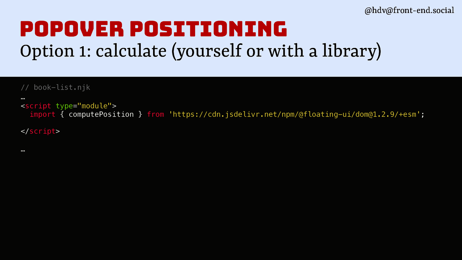
@hdv@front-end.social popover positioning Option 1: calculate (yourself or with a library) // book-list.njk … <script type=”module”> import { computePosition } from ‘https://cdn.jsdelivr.net/npm/@floating-ui/dom@1.2.9/+esm’; </script> …
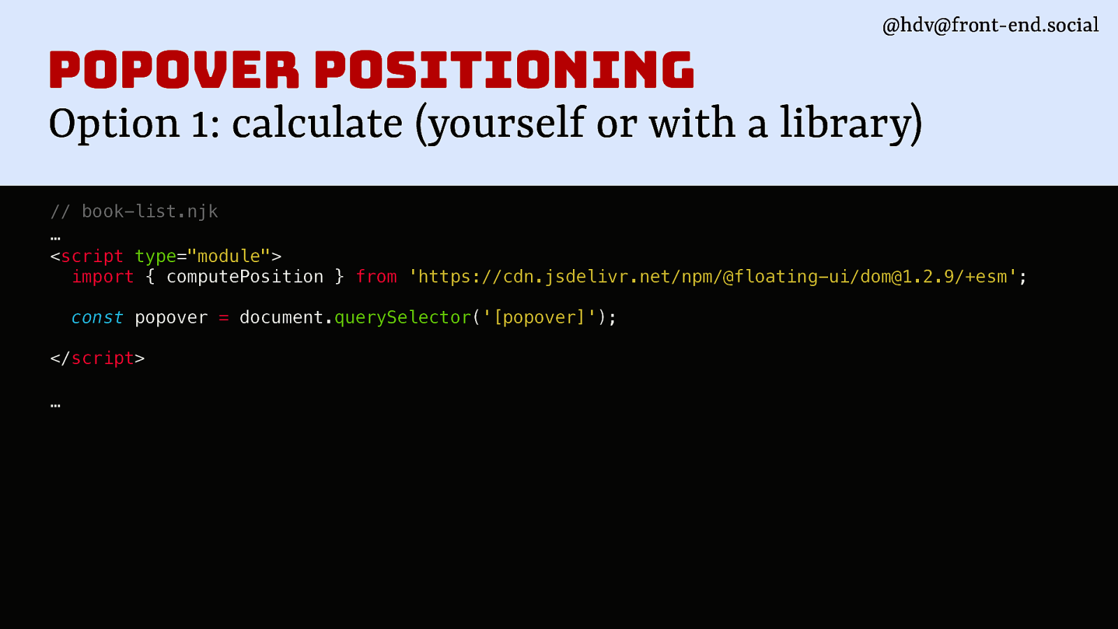
@hdv@front-end.social popover positioning Option 1: calculate (yourself or with a library) // book-list.njk … <script type=”module”> import { computePosition } from ‘https://cdn.jsdelivr.net/npm/@floating-ui/dom@1.2.9/+esm’; const popover = document.querySelector(‘[popover]’); </script> …
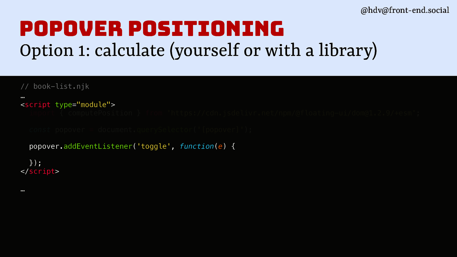
@hdv@front-end.social popover positioning Option 1: calculate (yourself or with a library) // book-list.njk … <script type=”module”> import { computePosition } from ‘https://cdn.jsdelivr.net/npm/@floating-ui/dom@1.2.9/+esm’; const popover = document.querySelector(‘[popover]’); popover.addEventListener(‘toggle’, function(e) { }); </script> …
@hdv@front-end.social
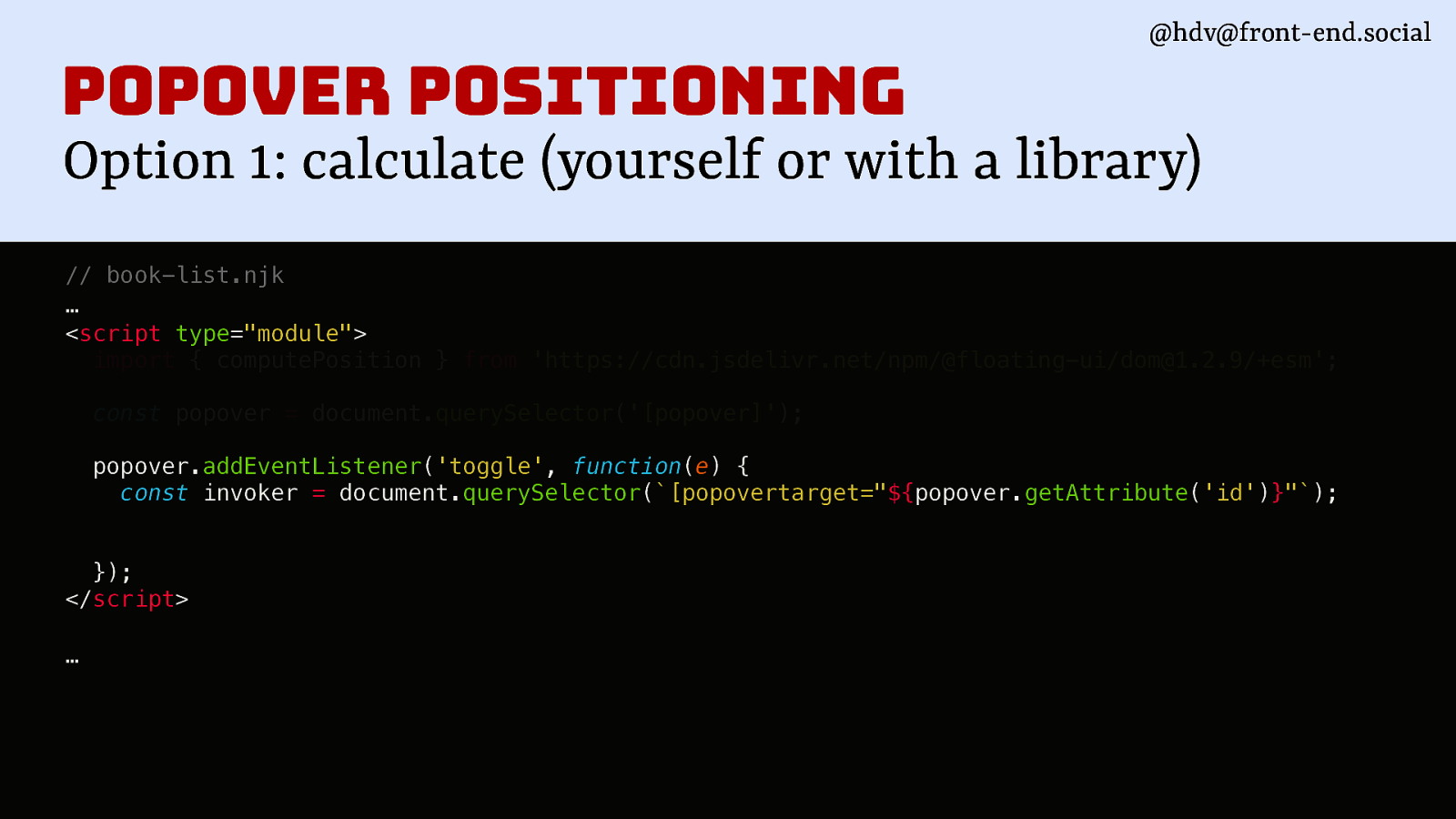
popover positioning Option 1: calculate (yourself or with a library) // book-list.njk … <script type=”module”> import { computePosition } from ‘https://cdn.jsdelivr.net/npm/@floating-ui/dom@1.2.9/+esm’; const popover = document.querySelector(‘[popover]’); popover.addEventListener(‘toggle’, function(e) { const invoker = document.querySelector([popovertarget="${popover.getAttribute('id')}"); }); </script> …
@hdv@front-end.social
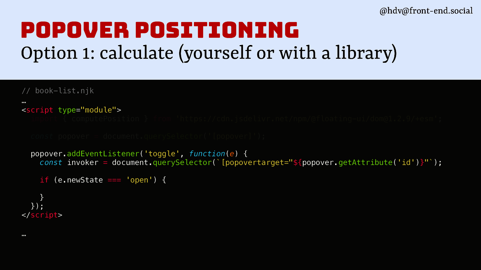
popover positioning Option 1: calculate (yourself or with a library) // book-list.njk … <script type=”module”> import { computePosition } from ‘https://cdn.jsdelivr.net/npm/@floating-ui/dom@1.2.9/+esm’; const popover = document.querySelector(‘[popover]’); popover.addEventListener(‘toggle’, function(e) { const invoker = document.querySelector([popovertarget="${popover.getAttribute('id')}"); if (e.newState === ‘open’) { } }); </script> …

@hdv@front-end.social
popover positioning Option 1: calculate (yourself or with a library) // book-list.njk … <script type=”module”> import { computePosition } from ‘https://cdn.jsdelivr.net/npm/@floating-ui/dom@1.2.9/+esm’; const popover = document.querySelector(‘[popover]’); popover.addEventListener(‘toggle’, function(e) { const invoker = document.querySelector([popovertarget="${popover.getAttribute('id')}"); if (e.newState === ‘open’) { computePosition(invoker, popover).then(({x, y}) => { Object.assign(popover.style, { left: ${x}px, top: ${y}px, }); }); } }); </script>
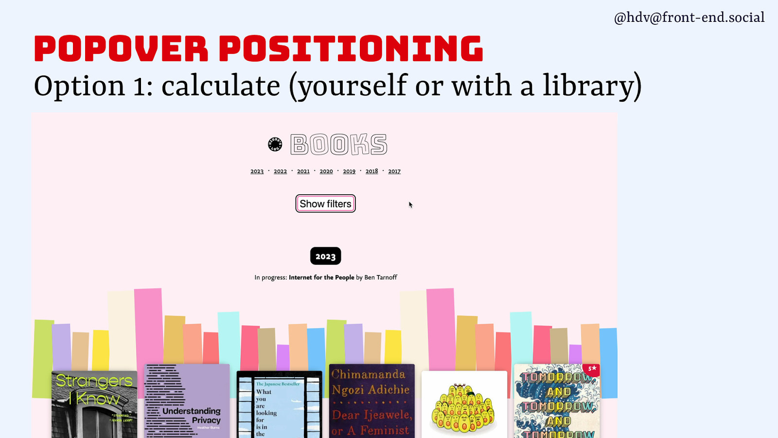
@hdv@front-end.social popover positioning Option 1: calculate (yourself or with a library)
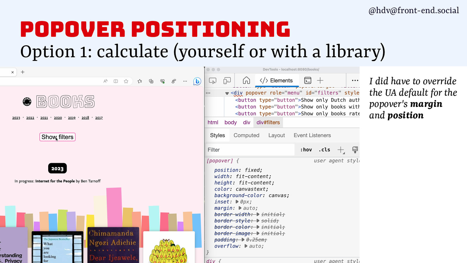
@hdv@front-end.social popover positioning Option 1: calculate (yourself or with a library) I did have to override the UA default for the popover’s margin and position
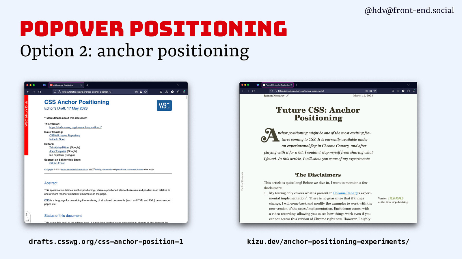
@hdv@front-end.social popover positioning Option 2: anchor positioning drafts.csswg.org/css-anchor-position-1 kizu.dev/anchor-positioning-experiments/
@hdv@front-end.social wrapping up
g o l a i <d @hdv@front-end.social UI considerations HTML element with wide browser support and (as of recently) good accessibility support Semantics popover Positioning New attribute / API in HTML, v1 supported in Chrome stable, coming to other browsers too
thank you! Questions @hdv on most platforms Slides/resources talks.hiddedevries.nl Thanks Scott O’Hara, Adrian Roselli, Jhey Tompkins

Our design systems commonly feature components that show on top of other content: tooltips, date pickers, menus and teaching UI, to name just a few. Proposed web platform features are about to make building these “popovers” a whole lot easier. You might not even need JavaScript. In this talk, you’ll learn all about the upcoming ‘popover’ attribute, when to use modality and access to the top layer.
Resources
The following resources were mentioned during the presentation or are useful additional information.
-
<dialog> in HTML spec
-
Popover attribute in HTML spec
-
Backdrop pseudo in CSS Positioned Layout Module Level 4
-
Use the dialog element (reasonably) by Scott O’Hara
-
Brief Note on Popovers with Dialogs by Adrian Roselli
Suggests only using popover if also building modal dialogs exclusively using <dialog>, so that both popovers and modal dialogs are in top layer. Combining popover with role=dialog-based modal dialogs, would cause the popover to be above whatever is in the dialog.
-
GitHub issue: “ [Proposal] Invoker Buttons - allowing popover/dialog and more to be invoked without JS #9625”
Discussion about extending HTML with a declarative way for making buttons dialog openers.
-
Marco Zehe: use WAI-ARIA menus with care
Buzz and feedback
Here’s what was said about this presentation on social media.